
Logo
Symbol/ Word mark
The classic combination of the logo and word mark stands for clear positioning. The strong word mark creates a bold-light contrast to the logo and expresses confidence and strength.
Proportional ratios
Spacing and proportions of the classic logo and word mark are precisely defined and many not be modified. The ratio of the logo to the cap height of the word mark corresponds to the ratio 1.5:1 and the distance to the logo is exactly one cap height:
Recommended open space
The recommended open space around the Lufthansa logo is one crane symbol.
Minimum open space:
If the logo and word mark are in a colored area, an image, or other surface, there must be a boundary to the edge of the region with a minimum of 1/6 its outer diameter.
Orientation and visual alignment
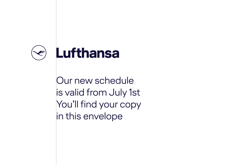
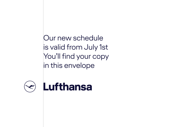
The text design should always allow the logo and word mark to remain clearly visible and recognizable. Text elements are preferably placed flush with the logo and word mark. They also preferable orient themselves flush with the "L" of the word mark. If this alignment is not possible, they can also be placed flush with the inner edge of the circle section.
- 01:
The illustration shows an example of the preferred left-justified alignment to the "L" in the Lufthansa lettering above the text
- 02:
Even if the figurative mark is below the text, an alignment of the text field to the "L" of the word mark can be made.
- 03:
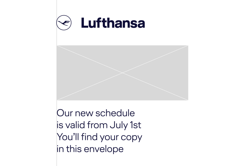
This is an example when the direct relationship between the word mark and the text block is interrupted. The text block can be flush with the inner edge of the crane's circle.
(-> see detailed view for 02)
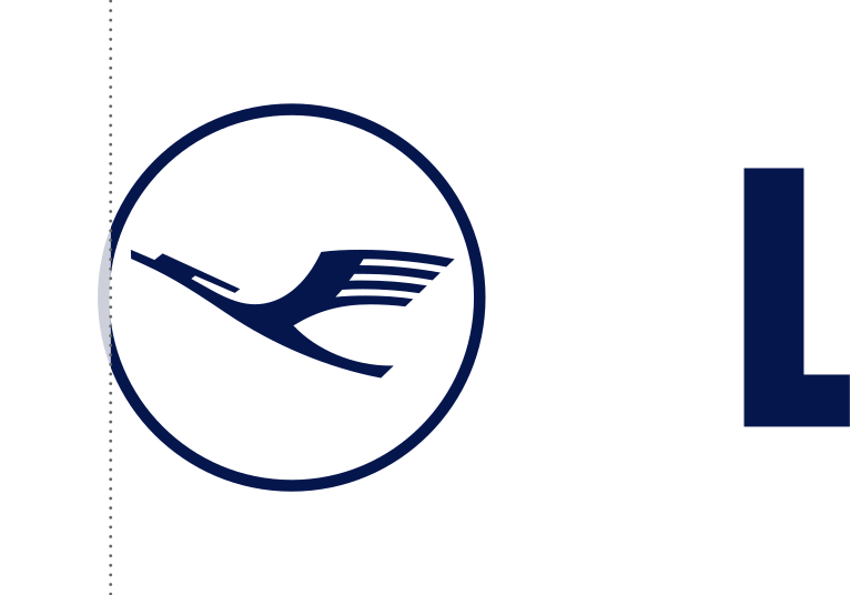
- Detailed View of 03: Optical Overhang
If there is a text block, color, image or other area that is not flush with the "L," it should align flush with the circle of the crane - specifically with the inner edge of the circle to create a flushed alignment.
Logo
The crane logo is the central element of our brand image and is widely recognized. It has been revised for legibility in digital use, modifying its lightness and elegance.
There are two scalable versions of the crane logo available to suit all applications.
The two sizes are matched to each other to ensure uniform perception in the respective application.
Applications for both size variations
The STANDARD variation is used in most cases. The SMALL variation may only be used in applications that are smaller than 1cm/50px or if necessary for technical reasons.
Angle of the crane
The angle of the crane is correct when the upper beak and highest point of the wing are flush on a horizontal line with one another.
Flight direction
The flight direction of the crane is always right to left. The only exception is on the right side of vehicles and aircraft - when the crane logo stands alone. This is the only case where the crane may fly from left to right.
Minimum open space
If the crane logo is in a colored area, image or other surface, it must have a spacing of at least 1/6 of its outer diameter to the surface boundary.
Visual alignment
If a text block, colored area, image or other surface is on the same axis as the crane logo, the element should stand flush with the inner edge of the crane's circle to achieve visual alignment.
Small variations
The use of the correct size variations must be observed. There are two scalable variations which cover all applications:
Features of small cranes:
The ring is thicker
The wing and the area between the neck and the head feathers are opened wider
The body is generally stronger
Word mark
The Lufthansa word mark may not be adjusted. The individual letters differ in thickness from the Lufthansa Head font and are perfectly matched to each other in their character spacing.
L's Height
The "Lufthansa" word mark was developed form the "Lufthansa Logo" font. The character spacing is predetermined. The horizontal leg of the "L" has been shortened for visual purposes.
The "Lufthansa" word mark may only be used in connection with the crane logo. Use of the word mark alone is only permitted under special circumstances, e.g. if sending together with the crane logo, it is not possible for technical reasons and only after consultation with FRA LM/M
Applications
Three different applications allow the opportunity to select the right versions for each touch point and medium.
01 Logo alone
The crane logo can be used confidently in application alone, without the word mark and without further additions. The crane logo alone is high quality and restrained. Due to its lower lever of recognizability compared to the complete branding of the logo and word mark together, the solitary crane logo is preferably only used within a Lufthansa context (e.g. aircraft cabin, lounges, etc.).
The crane logo used alone on a Lufthansa brand panel
Size and position
- Positioning
Preferably, the figurative mark is positioned at the top left or right. Depending on the application, the crane can also be positioned aligned left on the vertical.
- Confident application
Normally, the figurative mark is not placed in the center. However, in selected applications, the crane can also be placed confidently in the center of the format. The minimum protection zone is 1/6 of the crane height.
- Maximum size
The figurative mark is never larger than half of the short format page (consider the protection space of 1/4 figurative mark). Otherwise it moves into the center of the format.
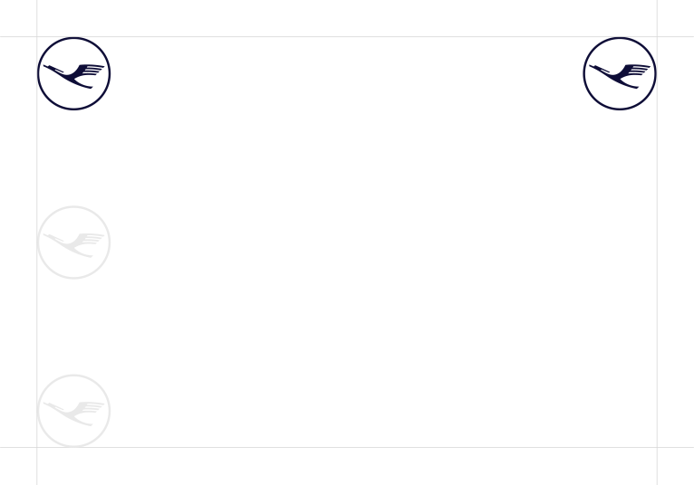
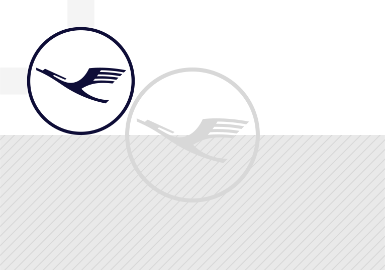
Examples of the crane logo alone
The solitary crane logo is preferably used within the Lufthansa context:
02 Combined logo and word mark
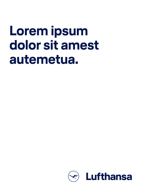
The classic combination of the logo and word mark can be used for all applications. It is the first choice and thus the preferred variation. This use is important for differentiation within an airline-specific competitor context and has the highest level of recognition internationally.
Classic logo and word mark use on office stationery.
Size and position
- Positioning
Depending on the medium, the logo and word mark can be used in all corners of the layout or vertically centered on the left or right edge. The preferred variation is bottom right.
- Confident application
The logo and word mark are generally not placed in the middle. In some situations however, the crane can be consciously and confidently placed in the middle.
- Maximum size
The logo and word mark are never larger than half the length of the page, otherwise it should be scaled to its full format.
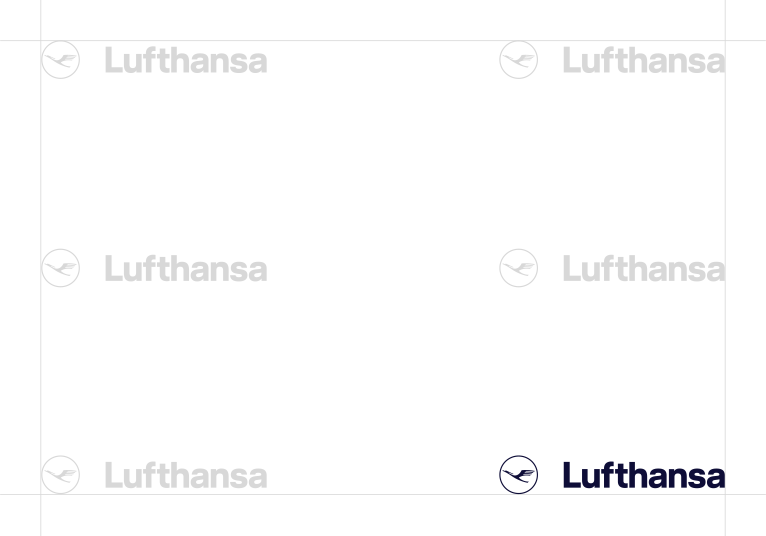
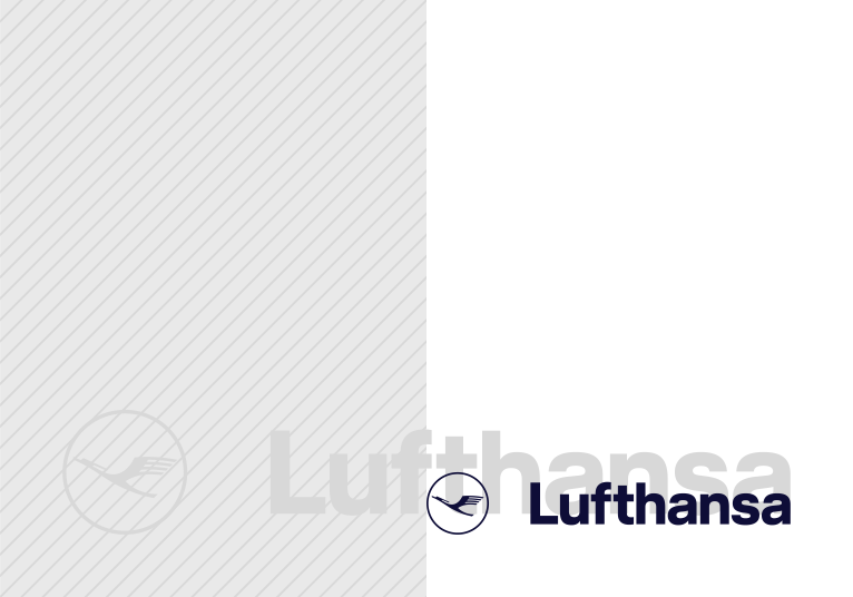
Examples of the combined logo and word mark
03 Decoupled word mark and logo
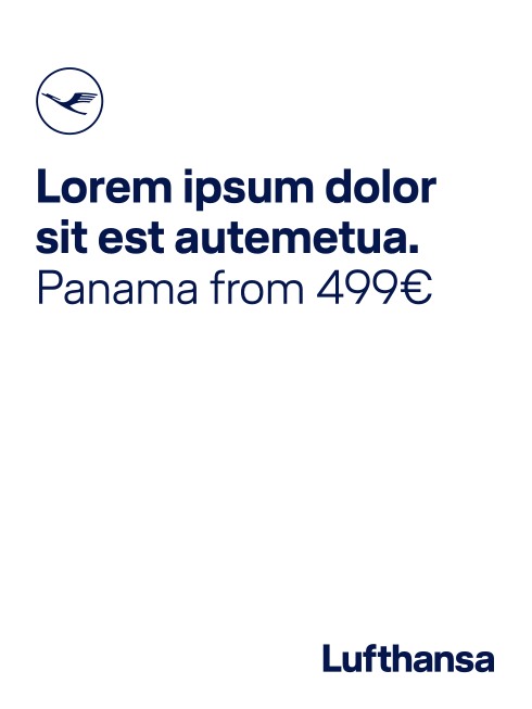
In communications, the word mark and logo can be used separately from one another to create new design possibilities. The decoupled crane logo is directly related to the headline and creates a connection to the content. This direct interaction of content and brand creates mutual strengthening. This use is only recommended if the attached headline has a direct brand reference.
Decoupled logo and word mark for maximum flexibility.
Important: To avoid over-saturated branding, the crane logo and word mark are not used more than once per page. If you word with the detached crane logo, only the word mark can be used without a crane. Thus, a combination of the classic logo and word mark and additional detached crane logo is not an option.
Defined proportions between the crane and text ensure the visual consistency across the brand's entire appearance. If the crane logo is used detached from the word mark, it stands in a fixed proportion to the font. Depending on the application, the crane logo can be twice the cap height (CH) or three times the cap height (CH) for the combined font. The distance to the text amounts in each instance to half of the crane logo (for a 2CH crane, corresponding to a 1CH distance; 3CH crane has 1.5CH distance).
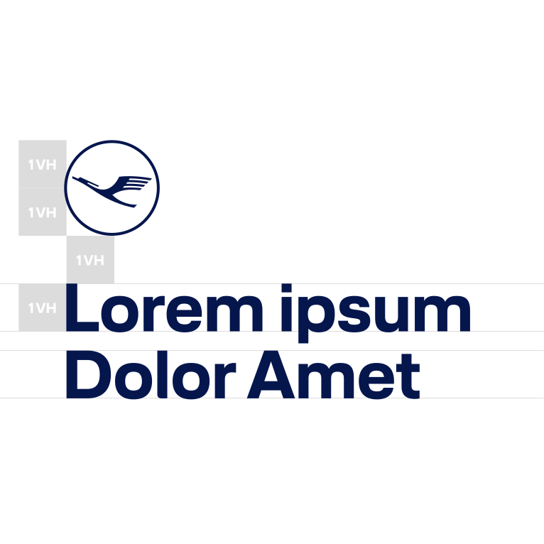
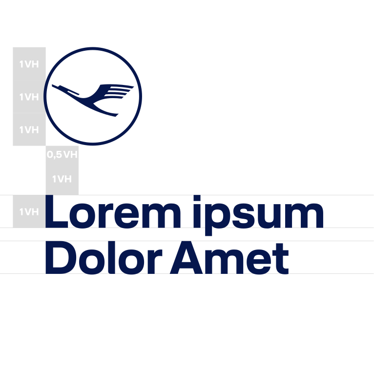
Important: the font combined in direct interaction with the logo is always Lufthansa Head Bold.
Optical compensation
In relation to the headline, the crane logo is placed so that a slight optical overhang is present. This is done so that the inner edge of the crane logo lies on the vertical axis with the beginning of the headline.
The proportion ratio of the crane logo to the headline is fixed and must not be changed (2CH or 3CH). The entire construct of both elements can be freely positioned and scaled with the text area:
Within the text area, the unit made of the crane logo and text can be freely positioned vertically. Care must be taken to keep sufficient distance from the word mark.
The crane logo and text are freely scalable as long as the correct proportions are maintained.
Decoupled logo and word mark: orientation
In addition to the preferred variation of the crane logo above the text, it is also possible to place the crane logo in front of the text.
Color spectrum
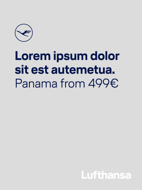
The detached logo is always the same color as the associated text element:
- Crane logo, headline and word mark in the same color
Ideally, all three elements will be the same color.
- Crane logo and headline in the same color
If, due to the background motif, the word mark cannot be the same color as the crane logo and headline, it is possible to use a different color for the word mark
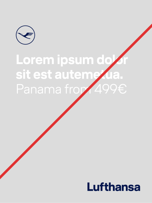
- Crane logo and headline in different colors
Even if the word mark and crane are the same color, this use is incorrect because the crane logo must always have same color as the headline.
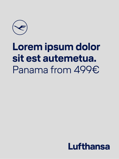
Size of the word mark in relation to the headline
The word mark used for the decoupled use should not be larger than the headline.
Recommendations for the word mark size:
Eye-catching: same cap height as headlineSubtle: same x-height as headline
Examples of the decoupled logo and word mark
Color scheme
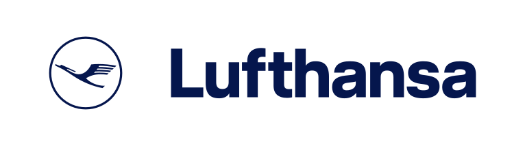
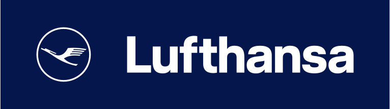
The Lufthansa logo and word mark is always set in white or blue:
Greyscale
The following greyscale variations are possible:
Color scheme on images
The logo and word mark are always set in white or blue on images and ensuring sufficient contrast:
Don’ts
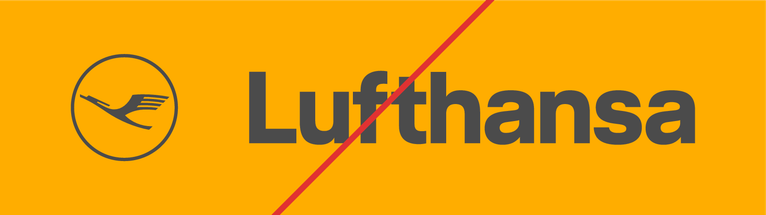
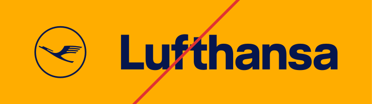

Note:All color combinations also apply to the stand-alone use of the logo.
3D Branding
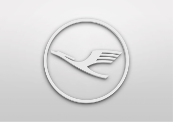
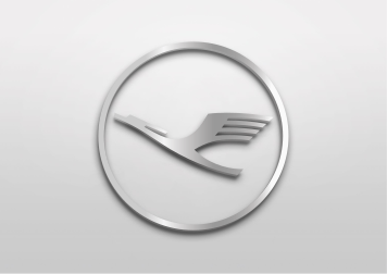
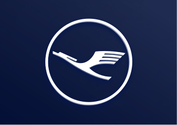
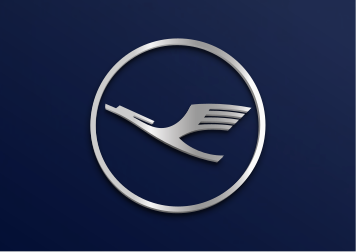
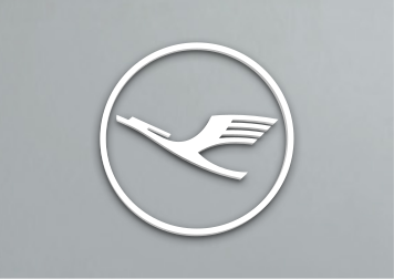
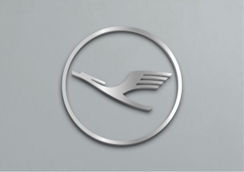
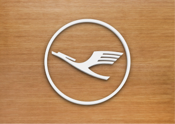
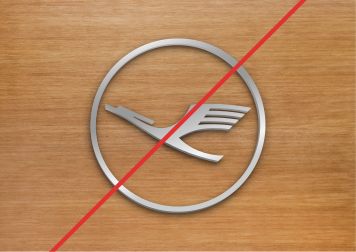
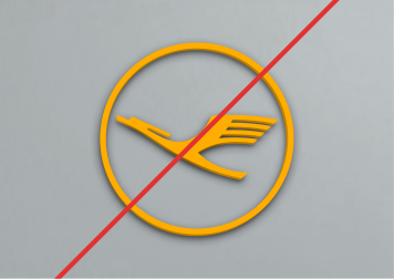
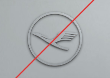
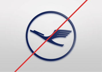
In a 3D context, only white and silver cranes are used. A blue crane is not permitted. Likewise, avoid large blue areas (for example, walls painted entirely blue).
3D indoor branding
Example lounges: white logo on a white background (tone-in-tone) with shadow gap
Dos & don’ts
- White on white
Tone-in-tone, example: lounges
- Silver on whiteExample: First Class Cabin
- White on blue
Note: This variation is not used in interiors, such as lounges, offices and in the cabin (exception: A350 and welcome panel).
- Silver on blueNote: only in the cabin
- White on greyExample: gate
- Silver on grey
Tone-in-tone, example: cabin
- White on woodExample: lounges
- Silver on wood
This variation may still be used transitionally in the lounges.
- Yellow CraneObsolete
- Grey on grey
- Blue Crane
Illumination
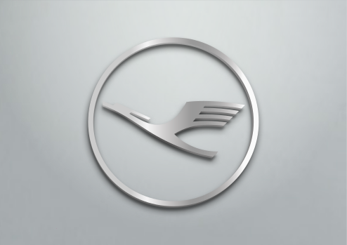
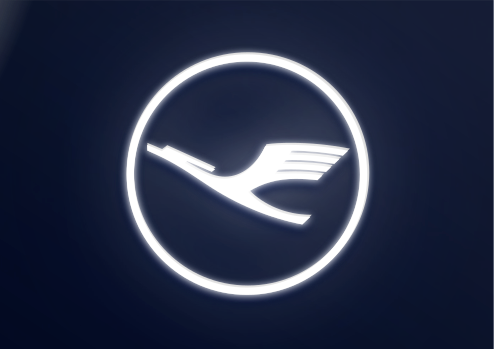

Examples
3D outdoor branding
Lufthansa buildings or airport entrances for areas used exclusively by Lufthansa can be identified by a 3D illuminated logo (symbol and logotype) or with the crane symbol alone.
There are no standard sizes for this type of signage, since buildings have various dimensions and proportions. FRA AM/MQ will therefore provide customized production documents.
Basics
- As a basic principle, illuminated 3D letters and symbols are only used for marking the exterior of buildings.
- 3D illuminated exterior markings must be turned on day and night.
- Wherever possible, the 3D letters and symbols are mounted without any visible assembly underneath and as close to the wall as possible.
- Only the production documents (layout, material specifications and text) that are provided by FRA AM/MQ may be used for production. These files may only be used in their original form.
- If the signs are produced locally, the materials must conform to Lufthansa quality standards. These material and color requirements will be found on the production documents.
Technical specifications
Composition
A
The letter covering is always white Plexiglas Trueled WH72.
B
The letter body is made of plexiglass or aluminum, depending on the size and profile variant. The outside of the letter body is coated with RAL 9006 or RAL 9007, the inside with reflective white.
C
The material of the base plate can vary depending on the construction. The inside is always reflective white. The outside is the same color as the letter body.
Depth
The depth is calculated using the outline (1) of the crane symbol. The ratio of depth to symbol outline must be between 1.5:1 and 2:1.
The minimum depth is 1.5:1. The recommended depth is 2:1.
Color
The external coating of the letter body and the base can be applied in RAL 9006 White Aluminum or RAL 9007 Gray Aluminum, depending on the color of the area it will be mounted on.
On gray backgrounds such as silvery facades, the darker gray tone RAL 9007 should be used. For white backgrounds, use RAL 9006.
The covering of the lettering as well as the inside of the body and base must be white.


Possible Dimensions for Different Building Types
VBX Nano
Size (Ø symbol) | Letter covering | Letter body | Base | Light source |
|---|---|---|---|---|
500 mm to | Plexiglas Trueled WH72, 5 mm | Plexiglas, coated Interior: reflective white Exterior: RAL 9006 or 900r | Aluminium sheeting, powder-coated Interior: reflective white Exterior: RAL 9006 or 9007 | LED, individually replaceable, Light temperature 6500°K |
Example: depth for a symbol diameter of 500 mm
Outline (1) = 15 mm × 1.5 = 22.5 mm
Outline (1) = 15 mm × 2 = 30 mm
Depth of 22.5 mm to 30 mm
Profil 6
Size (Ø symbol | Letter covering | Letter body | Base | Light source |
|---|---|---|---|---|
1000 mm to | Plexiglas Trueled WH72, 5 mm | natural aluminum, polished and sealed | 10 mm PVC, milled with a surrounding collar Interior: reflective white coating Exterior: RAL 9006 or 9007 coating | LED, CHIPLITE XM-O type, light temperature 6500°K, high-end converter (MEANWELL) |
Example: depth for a symbol diameter of 1000 mm
Outline (1) = 30 mm × 1.5 = 45 mm
Outline (1) = 30 mm × 2 = 60 mm
Depth of 45 mm to 60 mm
Profil 8
Size (Ø symbol) | Letter covering | Letter body | Base | Light source |
|---|---|---|---|---|
1000 mm to | Plexiglas Trueled WH72, 5 mm | Plexiglas, coated Interior: reflective white Exterior: RAL 9006 or 9007 | Aluminum sheeting, powder-coated Interior: reflective white Exterior: RAL 9006 or 9007, internal frame (25 mm height) | LED, CHIPLITE XO-L type, light temperature 6500°K, high-end converter (MEANWELL) |
Example: depth for a symbol diameter of 1200 mm
Outline (1) = 36 mm × 1.5 = 54 mm
Outline (1) = 36 mm × 2 = 72 mm
Depth of 54mm to 72mm
Profil 4
Size (Ø symbol) | Letter covering | Letter body | Base | Light source |
|---|---|---|---|---|
over 2000 mm | Plexiglas Trueled WH72, 5 mm | Aluminum, powder-coated Interior: reflective white Exterior: RAL 9006 or 9007 | Aluminum sheeting, powder-coated Interior: reflective white Exterior: RAL 9006 or 9007, internal frame (25 mm height) | LED, Typ CHIPLITE XO-L, light temperature 6500°K, high-end converter (MEANWELL) |
Logo additions
In case there are cooperations between Lufthansa and external companies or partners, the logo and word mark is used in combination with an addition to the logo. Use by the respective company must be approved by the Lufthansa Brand Management.
The vertical distance to the word mark is always one cap height. The addition is flush with the "L" of the word mark. The logo and word mark with the addition is fixed in size and spacing - it may not be repositioned.
Chinese / Arabic/ Persian / Korean / Sorani
There are special guidelines for the Chinese, Arabic, Persian, Korean and Sorani versions of the logo. The Lufthansa logo and word mark are supplemented with an additional logo in the respective script. The size and spacing of the logo and word mark with the various additions are defined and may not be adjusted.
Lufthansa Logo Chinese
The distance to the word mark is the height of an x. The addition is always fully justified with the word mark.
Lufthansa Logo Arabic
Lufthansa Logo Persian
Lufthansa Logo Korean
Lufthansa Logo Sorani
Color Intensity: The color of the addition depends on the color of the Lufthansa logo and word mark and the background, which is precisely defined. The color of the addition always corresponds to the color intensity of the logo.
Related links

Last modified onTue, 28. Oct 2025 09:51