

Antivaxxers love misleading charts
Or: How to make true but irrelevant claims seem compelling

Making the rounds recently has been an incredibly ugly chart that claims to show why we don’t really need vaccines and how the death rate from vaccine preventable diseases was dropping since before there were vaccines for any of those diseases.
https://learntherisk.org/vaccines/diseases/
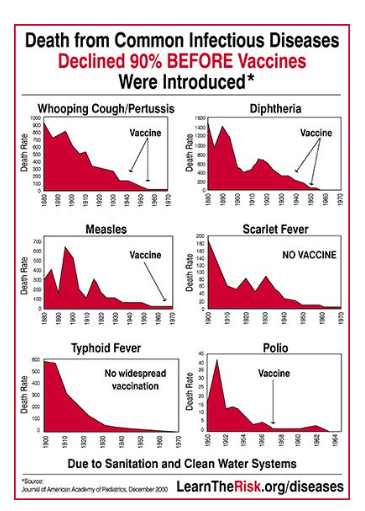
It looks pretty damning for vaccines right?
It leaves a couple things out. First, that’s nothing like ALL vaccine preventable diseases. Also, there exist two typhoid fever vaccines. We don’t give them in the US because typhoid isn’t endemic here, but they were developed in 1896. So right before the date on that chart (If I’m reading it correctly, it’s absurdly low res, so I can’t be fully certain). So it appears that, for at least 1 disease on the chart the vaccine came before the drop in deadliness. They’re right that the vaccine is probably not the cause, but it’s a real confusing decision on their part (and more than a little dishonest)
Smallpox is also not on the chart, but the story of the fall of Smallpox is probably too big for this particular post. Suffice to say that after the vaccine was introduced in 1796 the disease fairly quickly killed a LOT fewer people.
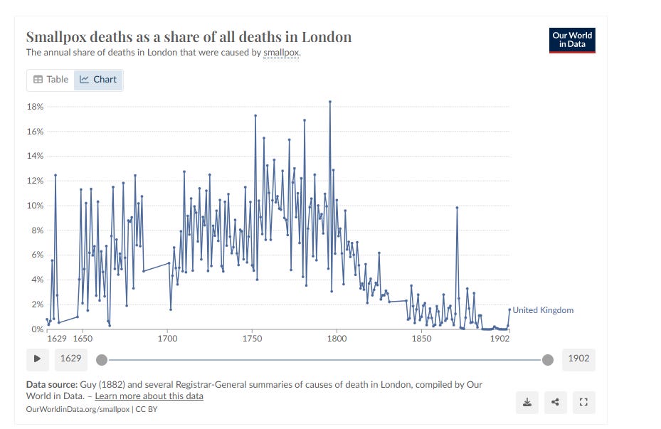
So right there we’ve got a serious problem for the antivax chart. It includes diseases that had vaccines that they claimed didn’t and it leaves off the most obvious example of vaccines reducing deaths from a disease.
One might be tempted to stop there and declare the chart incredibly stupid, but let’s take a slightly different tack.
Looking at those charts we see that deaths from essentially all diseases were dropping from 1900 on. This makes perfect sense. Sanitation WAS improving, germ theory of disease had taken hold (Koch’s postulates so beloved of virus deniers had been published in 1884) and medicine was getting more and more scientific. So it makes prefect sense that as we professionalized and made scientific the practice of medicine and other public health (John Snow had famously taken the pump handle 50 years previous) that deaths from all causes would go down. More handwashing, less bloodletting. All good things.
But sanitation can’t explain all the drop in vaccine preventable disease.
Polio stands out. You’ll note that their chart starts most of the diseases at 1900. this makes sense, that’s when we started to get good at actually doing critical care for diseases. But the polio chart starts at 1950. I wonder why.
Turns out that sanitation made Polio worse.
As we cleaned up the water supply to prevent diseases like Cholera we started to see kids getting exposed to polio later and later in life.

For about the first six months after birth (and even after I now learn) you have a lot of antibodies from your mother. They can help protect you against diseases she recovered from (or was vaccinated against). With Polio that meant, historically, that as long as you were infected very early in life you’d get a mild case thanks to those antibodies and, as a result, you recover and get lifetime immunity without dying or being paralyzed. So as sanitation improves and more and more kids don’t get exposed to Polio until they get older the disease causes more death and paralysis
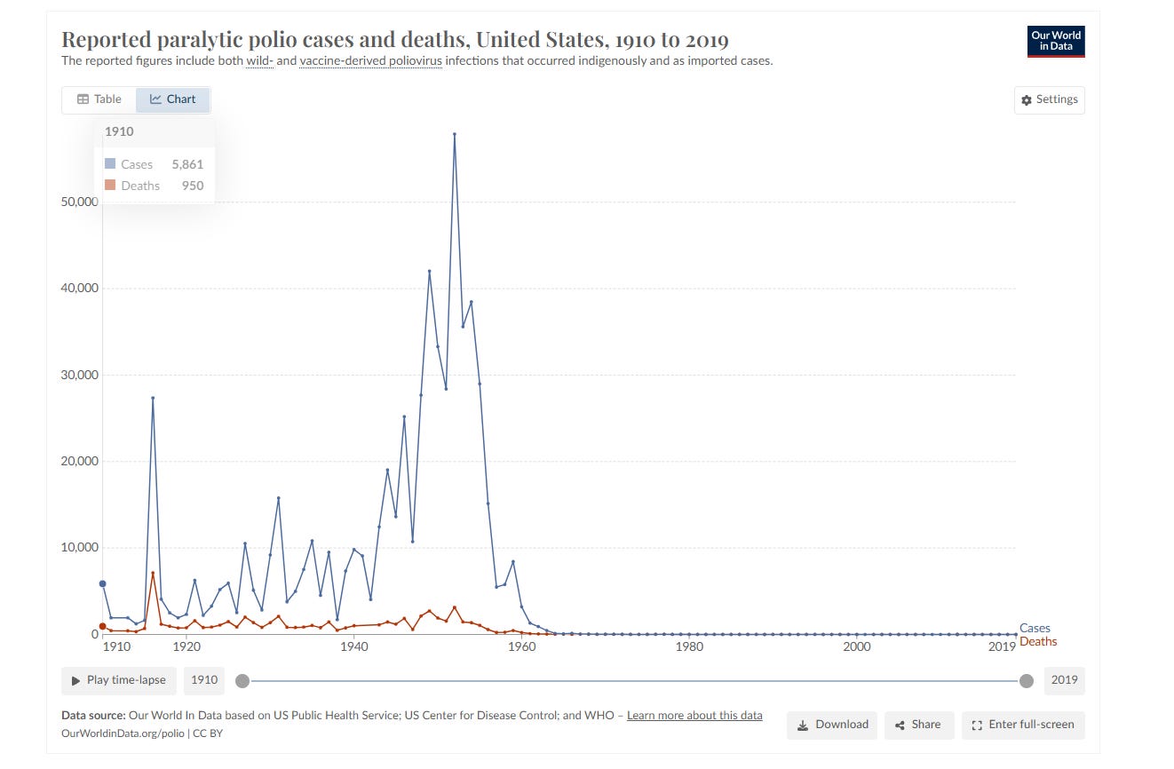
Given that the first polio vaccine came out in 1955 that’s a pretty damning chart for anyone claiming that the Polio vaccine wasn’t the cause of the drop in Polio.
Let’s zoom in on the chart to match the dates on the silly antivaxxer picture.
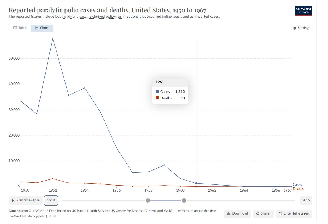
If you look closely at their chart they claim that the Polio vaccine was in 1957, not 19555, we know better, but if you look at this chart it’s pretty clear that the vaccine caused most of the decline. Paralytic cases peaked in 1952, people got scared and did things like closing pools and other infection control measures that reduced cases from the peak and then the vaccine quite rapidly completely eliminated cases in less than a decade.
It’s a huge medical success story and antivaxxers claiming it’s fake is incredibly disgusting.
Now, let’s look at Measles.
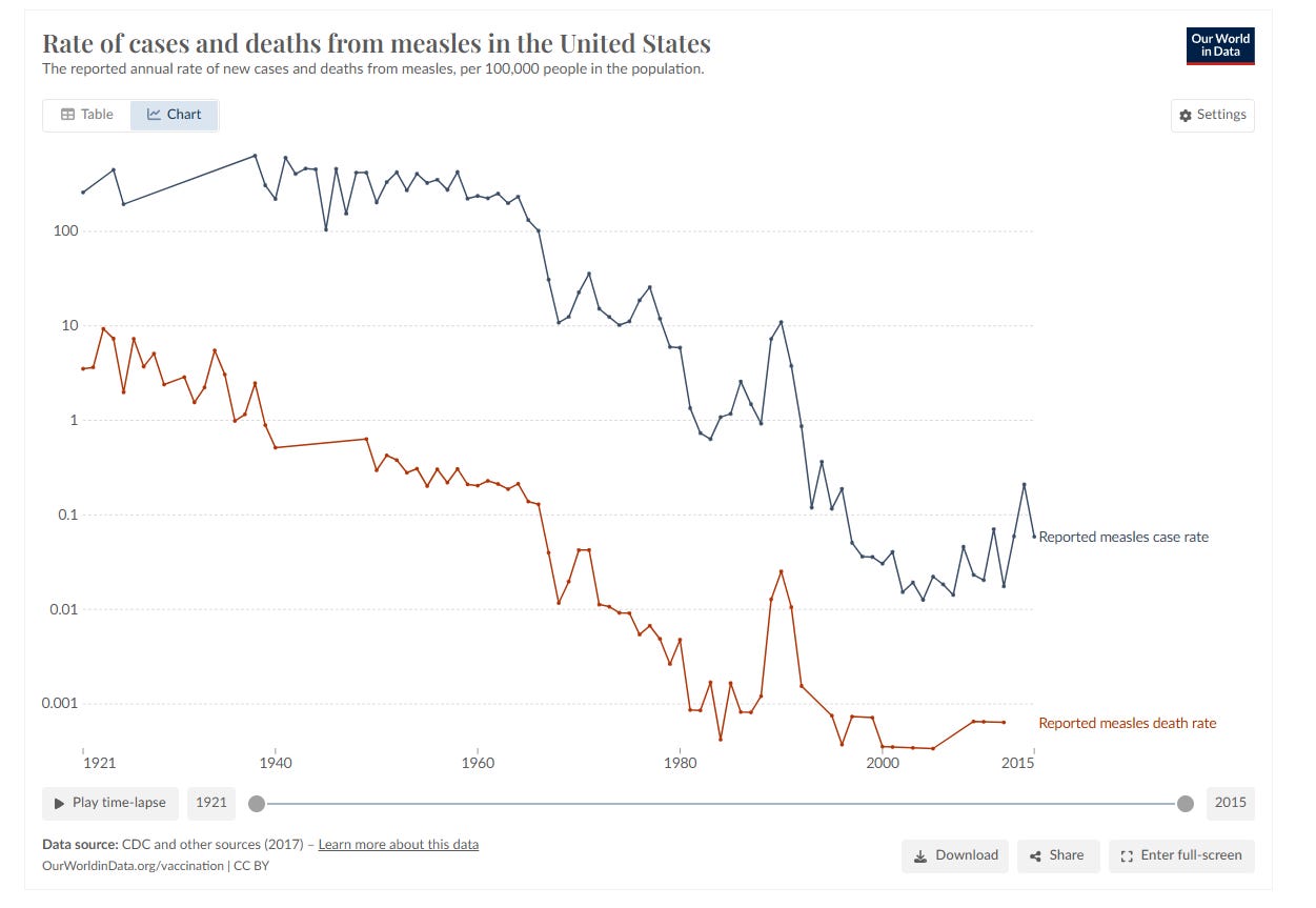
Other than that chart being on a logarithmic scale which minimizes the decline HUGELY we can clearly see the decline after 1963. It’s unmistakable. And while deaths HAD been declining a bit before the vaccine they pretty rapidly dropped to basically zero along with cases. Cases hadn’t been declining before vaccines. If you just look at cases on a more normal scale graph the effects of the vaccine are even more pronounced.

So we see that even if deaths from vaccine preventable diseases declines before the vaccines were introduced (except smallpox, that one declined because of vaccines) that’s not the entire story.
Vaccines took diseases that essentially every got and that killed a few hundred or a few thousand and hospitalized tens of thousands a year and turned them into non-issues. No one dies of Polio or Measles in the US anymore and that’s due to vaccines.
Don’t let anyone tell you different.


Here's your applied logic..
..There's a room full of people with a dead body on the floor.
Ryan is in the room and holding a gun.
The police enter the room, don't interrogate any of the people in the room, don't check the body for bullet wounds, don't do forensic investigations on the gun.
they simply speculate that Ryan was the murderer and convict and imprison him on spec.
Do you accept that outcome as reasonable and correct?
Why not put climate change denier on top?