Wes Wilson (1937–2020) was a psychedelic poster designer who gained recognition for his anti-Vietnam War protest posters before creating the iconic concert handbills of San Francisco’s 1960s psychedelic era.
{KC Green's “This is Fine” meme} conveyed in Wes Wilson's signature psychedelic poster art style: {
Wes Wilson (1937–2020): Architect of the Psychedelic Poster
The worlds of psychedelic posters, art history, and the counterculture suffered a profound loss early in 2020 with the passing, within days of one another, of two of the most formative artists of the 1960s psychedelic poster movement: Robert Wesley Wilson (July 15, 1937–January 24, 2020) and Bonnie MacLean (December 28, 1939–February 4, 2020). That Wilson would become the defining graphic voice of an era was far from inevitable — the product, instead, of an unusually eclectic formation.
Formation: From Sacramento to San Francisco (1937–1964)
Born in Sacramento, California, Wilson was shaped from the outset by a diverse range of influences. His mother, Ethel Thomson Wilson, was herself an artist, nurturing his early self-initiated interest in drawing, though no formal training was initially available to him. His academic pursuits ran first toward the natural world — forestry and horticulture at a junior college in Auburn, California — before a stint in the U.S. Army and Army National Guard during the Korean War era crystallized the political convictions that would later animate his countercultural work. Upon returning to civilian life, he transferred to the San Francisco Art Institute in 1958, where sustained exposure to Surrealism and Abstract Expressionism began to reorient his creative ambitions. He subsequently studied philosophy and religion at San Francisco State University, dropping out in 1963 to support his family, before continuing his development through night classes at Laney College and eventually earning a Master of Arts in painting from the University of California, Berkeley.
It was his practical professional experience, however, that most directly forged his graphic foundations. A brief tenure as an in-house designer for an insurance company gave him a working command of mainstream typography and layout conventions — ones he would soon systematically subvert. Settling in San Francisco's Wently apartment complex, a hub for alternative creatives, he partnered with fellow resident Bob Carr to establish Contact Printing in Carr's basement. Producing flyers, handbills, and notices for North Beach coffeehouses, poetry circles, and jazz clubs, Wilson immersed himself in the visual vernacular of the counterculture and quietly assembled the typographic fluency that would define his imminent breakthrough.
1965: The Birth of the Rock Poster and the Foundations of Are We Next?
That breakthrough announced itself decisively in the summer of 1965 — a flashpoint that effectively birthed the modern rock poster. The movement emerged from two distinct catalysts: "The Seed," a western-gothic, hallucinatory poster by George Hunter and Michael Ferguson for the Charlatans' residency at the Red Dog Saloon in Virginia City, Nevada; and Wilson's own self-published protest poster, Are We Next? — printed and distributed at anti-Vietnam War rallies as raw countercultural agitprop. It was precisely this poster that caught the attention of promoters Chet Helms and, later, Bill Graham, who enlisted Wilson to design concert bills for the Avalon Ballroom and the Fillmore Auditorium.
Rather than anticipating the fluid, organic letterforms of his later "Summer of Love" aesthetic, Are We Next? reveals the rigorous typographic and graphic foundation beneath it — one informed by a constellation of historical precedents synthesized into something entirely his own. The most structurally direct is Alfred Roller's (1864–1935) poster for the Vienna Secession's sixteenth exhibition in 1903, in which typography functions not as subordinate annotation but as the primary compositional force: monumental, geometrically severe letterforms stacked into column-like structures that simultaneously operate as image, architecture, and rhetoric. Wilson realized this principle while simultaneously drawing from the graphic strategies of Russian Constructivism — channeling El Lissitzky (1890–1941) and Alexander Rodchenko (1891–1956), who weaponized utilitarian design as revolutionary agitprop — employing a restricted, high-contrast palette to convey stark geometric urgency and housing his Secessionist lettering within a Constructivist grid to broadcast undeniable ideas to the masses. The conceptual engine of the poster, meanwhile, relies on a strategy of radical iconographic subversion sharing DNA with Dadaist photomontage and Pop Art: by colliding the stars and stripes of American democracy with the geometric footprint of the Nazi swastika, Wilson forces a confrontational dialectical dialogue — echoing both John Heartfield's anti-fascist collages of the 1930s and Andy Warhol's recontextualization of cultural icons to strip them of their comforting familiarity. The result is a masterclass in counterculture focality: maximizing visual impact and evocative urgency while calibrating legibility precisely enough to compel further inspection. This early foundational rigidity, however, soon gave way to radical fluidity.
1966–1968: The Fillmore Marathon and the Metamorphosis into Psychedelic Fluidity
The psychedelic poster boom of 1966 was propelled by two rival promoters of sharply contrasting temperament: the community-minded Chet Helms of Family Dog Productions and the fiercely business-minded Bill Graham. Initially sharing the Fillmore Auditorium on alternating weekends, their partnership dissolved, prompting Helms to relocate to the Avalon Ballroom while Graham claimed the Fillmore as his crucible. For five demanding months, Wilson designed for both simultaneously before stepping away from Family Dog — drawn by Graham's expansive artistic freedom and energized by his marriage to his second wife, Eva — committing exclusively to the Fillmore for the defining era of his career.
Within this environment, Wilson emerged as a cornerstone of the "San Francisco Five" — the legendary circle of psychedelic poster artists also including Stanley Mouse (b. 1940), Rick Griffin (1944–1991), Victor Moscoso (b. 1936), and Alton Kelley (1940–2008). Though each possessed a distinct hand, all five shared a deep affinity for the irreverent line work of underground comix. Wilson's dialogue with his peers — particularly Moscoso, whose training under Josef Albers (1888–1976) introduced sophisticated optical color-vibration theory to the scene — helped refine his aesthetic. Together, they synthesized underground comix irreverence, Vienna Secession decorative structure, and Russian Constructivist urgency into a rhythmic, subversive visual language now synonymous with the countercultural explosion of the 1960s San Francisco Bay Area.
Producing fifty-six posters for the Fillmore in just fourteen months — averaging one per week — Wilson's sustained creative pressure catalyzed rather than diminished his signature psychedelic aesthetic. This period marked a deliberate departure from the disciplined, architecturally stacked lettering of his early work. In its place, he pioneered a graphic language of distorted, hand-drawn letterforms that bulged, compressed, and liquefied into color-blocked organic shapes that appeared to breathe and shift on the page.
The Anatomy of Mature Psychedelic Typography: Visual Mechanics and Metaphor
Rather than relying on illusionistic trompe-l'œil depth, Wilson harnessed the flat, vibrating perceptual mechanics of Op Art — his spatial distortions and high-key "radioactive" palettes indebted to Victor Vasarely (1906–1997) and Richard Anuszkiewicz (1930–2020) — utilizing ambiguous figure-ground relationships to warp the picture plane and generate an almost physical sense of motion. This kinetic optical tension was simultaneously fueled by the sinuous, biomorphic energy of Jugendstil and Art Nouveau: channeling the decadent, undulating ink lines of Aubrey Beardsley (1872–1898), the botanical flowing tresses of Alphonse Mucha (1860–1939), and the fluid graphic segmentation of Will Bradley (1868–1962), Wilson weaponized late-19th-century elegance to capture the acid-soaked visual frequency of the 1960s counterculture — aligning it with the era's bohemian spirit of folk-protest music, Beatnik ideals, modern jazz, and the radical student movement.
Under this dual pressure of optical vibration and organic line, Wilson developed a highly adaptive display typography approach, transforming his posters into dense visual puzzles where text and image share a unified semantic vocabulary. By mapping hand-drawn lettering along undulating baseline guides, he generated fluid distortion effects with a tactile sensitivity to physical texture and "typographic color"—the overall visual density and tonal weight of text on the page.
Rather than allowing individual letterforms to narrowly morph into specific illustrative elements, Wilson designed cohesive, bespoke display systems that functioned as dense, decorative typographic blocks. By embedding the visual semantics of the complementing imagery directly into the structural DNA of these text blocks, he established a systemic thematic unity across the entire layout. Depending on the musical performance, the entire typographic block would adapt its formal logic, adopting cohesive stylistic registers — such as soft, pillowy volumes, jagged, scratchy strokes, or dendritic, root-like filigrees — while maintaining its structural integrity as a solid graphic mass. This method allowed the text blocks to double as textured, illustrative fields that framed the central imagery with a decorative elegance perfectly suited to the era's emerging album covers and editorial layouts. Ultimately, this intentionally arcane typographic quality served as a visual shibboleth: rewarding the patient decoding of the countercultural initiate while deliberately excluding the uninitiated mainstream.
To integrate his figures into these shifting typographic landscapes, Wilson employed a fluid segmentation echoing both the luminous leaded compartments of stained glass and the space-partitioning qualities of Cubist multi-perspectivism. Rather than adopting the sharp, fractured facets of analytical Cubism, he delineated subjects with continuous, melting contours that dissolved the boundary between human form and graphic background. Consequently, his catalog spans a vast stylistic spectrum: while some compositions remain anchored in structured Western illustration and classical framing, others surrender entirely to viscous, amoebic biomorphism or dense typographic patterns that closely mirror the geometric, primal motifs of Polynesian kapa and tapa bark cloth — all achieving a compelling visual paradox of apparent gestural spontaneity concealing meticulous, disciplined draftsmanship.
Post-Fillmore, Return, and Late-Career Synthesis (1968–2020)
Following his split with Graham in 1968, Wilson stepped back from commercial poster work to pursue fine-art portraiture — applying his characteristic fluid segmentation and melting contours to a sustained gallery practice before returning to poster design in 1987. In the 1990s, he edited Off the Wall, a short-lived but influential journal on poster art, and organized the Rock Art Expos, large-scale poster conventions held in San Francisco.
Operating from his office in Aurora, Missouri, Wilson synthesized his disparate career eras into a trio of posters for the annual San Francisco Rock Poster Expos between 1992 and 1994. These late-career works demonstrate the enduring potency of his graphic economy: the 1992 edition returns to the flowing botanical line-art of Art Nouveau, while the 1993 and 1994 posters pivot toward photographic realism, high-contrast halftones, and photomontage — echoing the structural collaged tension of 1920s Constructivism and the saturated optical effects of Pop Art. Yet regardless of illustrative approach, Wilson unified each composition through his signature typographic architecture, returning to the dense, blocky lettering of Roller's 1903 Secessionist designs and transforming functional concert information into an emotively focal, highly decorative graphic framework — bringing his career full circle.
Overarching Design Framework and Legacy
Wes Wilson's conceptual design framework can be understood as a synthesized subversion of historical graphic traditions — rooting itself in the monumental typographic architecture of Alfred Roller's Vienna Secession, while systematically liquefying its rigid formal order through the sinuous biomorphism of Jugendstil and Art Nouveau, the stark rhetorical urgency of Russian Constructivism, and the perceptual destabilization of Op Art. The result is a compositional language that does not merely illustrate the psychedelic experience but structurally enacts it: boundaries dissolve, letterforms breathe, and figure merges with ground in a continuous, fluid negotiation that mirrors the mind-expanding, hierarchy-dissolving ethos of the counterculture itself.
This Secessionist foundation ran deeper than Roller alone. Wilson drew additional inspiration from Leopold Forstner (1878–1936) and Koloman Moser (1868–1918), whose contributions to the landmark Secessionist design journal Die Fläche (Surface Art) emphasized flat planes of color, stenciled forms, and the deliberate dissolution of illustrative depth in favor of impactful, two-dimensional surface design — strategies that directly informed Wilson's preference for color-blocked, non-illusionistic compositions. Upon this flattened, Secessionist pictorial foundation, Wilson enacted his most radical typographic innovation: physically warping, bending, and stretching hand-drawn, interlocking letterforms to densely inhabit and animate his compositions. This approach proved enormously influential, inspiring a generation of imitators and prompting modern digital type designers to develop dedicated revivals, among them Versacrum NF (Nick Curtis, 2015), Roller Poster (HiH, 2006), Libido (Matthijs Herzberg, 2021), and Preta (Maximiliano Sproviero, 2017).
Within this framework, Wilson's posters deliver their narratives through a unified psychedelic visual semantics — compositions synthesizing mystic resonance, sensual ornamentation, and fantastical escapist imagery into a single, harmonious pictorial field, deployed through a carefully restricted yet chromatically vibrant palette that allegorized hypnotic states of mind and championed a graceful dissolution of traditional graphic boundaries. This transportive, mythic evocativeness drew from the grand visual rhetoric of classic cinema poster art — particularly the illustrated tradition of science fiction, fantasy, and epic odyssey film posters, whose compositional strategies Wilson absorbed and psychedelicized. Like those cinematic precedents, Wilson anchored each composition around a small number of boldly rendered, iconically legible focal elements — whether a commanding figure, a symbolic object, or an atmospheric scene — preserving their illustrative clarity and dramatic presence with the same economy of means that made mid-century promotional art immediately and viscerally communicative.
Where the classic film poster subordinated its typography to the hero image and conveyed its contextual setting through photographic backgrounds, Wilson enacted a revolutionary psychedelic inversion. He fused text and image into an indivisible pictorial proposition: his bespoke display typography was designed as a direct thematic extension of the central image — its layout, stylization, and rhythmic distortion actively abstracting and re-expressing the atmospheric context surrounding the focal elements. Critically, this typographic integration extended beyond visual form to the deliberate economy of his wording itself. Wilson consistently distilled his textual content — performer names, dates, venues, and evocative titles — to the most succinct, rhythmically potent phrasing possible, ensuring that the quantity, weight, and cadence of his words were precisely calibrated to fill and animate the molded typographic blocks without disrupting their compositional density or decorative coherence. A surplus of words would have fractured the visual mass; too few would have left it inert. Wilson's editorial precision ensured that the verbal content carried exactly the semantic weight required to complete the pictorial statement, while its physical presence on the page harmonized with the sculpted typographic architecture surrounding it. The resulting typographic blocks enveloped and consecrated the central motifs, functioning simultaneously as ornamental framework, narrative amplifier, and rhythmically charged compositional field wherein the thematic essence of the scene was restated, abstracted, and deepened. Thus, hero image and decorative typography operated as two registers of the same psychedelic statement — each legible independently, yet fully meaningful only in their mutual inhabitation of the pictorial field.
This transportive resonance, enriched by deep cultural and mythological references, set Wilson's work sharply apart from his contemporaries:
Where Gary Grimshaw (1946–2014) channeled a harder, more angular rock 'n' roll energy — graphic, confrontational, and rhythmically percussive — Wilson leaned toward the biomorphically organic, rewarding sustained close inspection through liquefied typographic labyrinths.
Where David Edward Byrd (1941–2025) constructed pictorial richness through elaborate micro-patterning and densely ornamented surface detail, Wilson achieved equivalent visual density through typographic centrality alone, turning the letterform itself into the primary vehicle of both meaning and decoration.
Where Bonnie MacLean (1939–2020) — who assumed design duties at the Fillmore following Wilson's split with Bill Graham—retained an elegant, classical legibility that balanced artistic expression with the pragmatic commercial demands of concert promotion, Wilson operated with a free-spirited defiance toward such mainstream advertising pressures, willingly sacrificing immediate legibility to dissolve his text blocks into dense, hallucinatory typographic patterns.
And where artists like Alan Forbes (b. 1968) maintained a conventionally illustrative tradition — keeping text and image as functionally and visually distinct entities — Wilson dissolved that boundary entirely, forging a highly plastic, reciprocal relationship in which neither element could be extracted from the composition without collapsing the meaning of the other.
It is precisely this reciprocal plasticity that defines the deepest structural logic of Wilson's mature work. Rather than establishing a rigid hierarchy, his posters thrive on a playful, kinetic balance where imagery and typography mutually sculpt and define one another. The organic, flowing letterforms bend to contour, frame, and physically compress his illustrated subjects, while these pictorial elements simultaneously push back, carving out negative space and dictating the physical boundaries of the surrounding letters. This plastic feedback loop allows the illustrations to function as an evocative, highly legible pre-context that emotively primes and narratively anchors the viewer before the text is fully decoded, even as they remain stylistically attuned to and inflected by the distilled visual semantics embedded in the typographic system they inhabit and disrupt. Crucially, Wilson's typography never merely labels or annotates — its layout, stylization, and precisely economized wording simultaneously abstract the visual background into an interlocking typographic pattern that radiates from the focal imagery, each word chosen not only for its meaning but for its visual and rhythmic contribution to the molded typographic mass it inhabits. This renders the textual and the pictorial not as separate communicative channels, but as two simultaneous, mutually reinforcing readings of the same psychedelic statement. Ultimately, Wilson's compositions achieve a remarkable equilibrium: the typography acts as a living, liquid framework that envelops and structures the illustration, while the iconic, legible imagery — cinematic in its dramatic presence and compositional economy — serves as the necessary anchor that grounds and contextualizes the deliberately arcane typographic environment from which it organically emerges.
}
Sources
Pioneers of psychedelic art: an appreciation of Bonnie MacLean and Wes Wilson — tandfonline


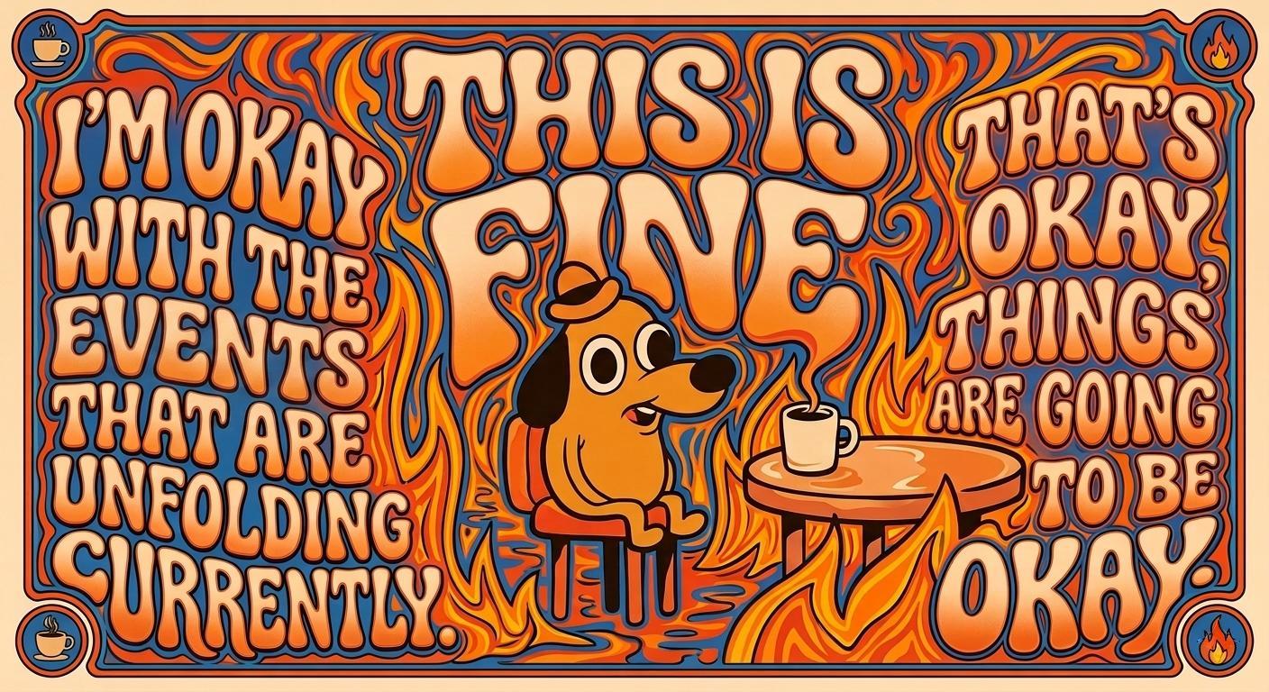
{KC Green's “This is Fine” meme} conveyed in Wes Wilson's signature psychedelic poster art style: {
The worlds of psychedelic posters, art history, and the counterculture suffered a profound loss early in 2020 with the passing, within days of one another, of two of the most formative artists of the 1960s psychedelic poster movement: Robert Wesley Wilson (July 15, 1937–January 24, 2020) and Bonnie MacLean (December 28, 1939–February 4, 2020). That Wilson would become the defining graphic voice of an era was far from inevitable — the product, instead, of an unusually eclectic formation.
Born in Sacramento, California, Wilson was shaped from the outset by a diverse range of influences. His mother, Ethel Thomson Wilson, was herself an artist, nurturing his early self-initiated interest in drawing, though no formal training was initially available to him. His academic pursuits ran first toward the natural world — forestry and horticulture at a junior college in Auburn, California — before a stint in the U.S. Army and Army National Guard during the Korean War era crystallized the political convictions that would later animate his countercultural work. Upon returning to civilian life, he transferred to the San Francisco Art Institute in 1958, where sustained exposure to Surrealism and Abstract Expressionism began to reorient his creative ambitions. He subsequently studied philosophy and religion at San Francisco State University, dropping out in 1963 to support his family, before continuing his development through night classes at Laney College and eventually earning a Master of Arts in painting from the University of California, Berkeley.
It was his practical professional experience, however, that most directly forged his graphic foundations. A brief tenure as an in-house designer for an insurance company gave him a working command of mainstream typography and layout conventions — ones he would soon systematically subvert. Settling in San Francisco's Wently apartment complex, a hub for alternative creatives, he partnered with fellow resident Bob Carr to establish Contact Printing in Carr's basement. Producing flyers, handbills, and notices for North Beach coffeehouses, poetry circles, and jazz clubs, Wilson immersed himself in the visual vernacular of the counterculture and quietly assembled the typographic fluency that would define his imminent breakthrough.
That breakthrough announced itself decisively in the summer of 1965 — a flashpoint that effectively birthed the modern rock poster. The movement emerged from two distinct catalysts: "The Seed," a western-gothic, hallucinatory poster by George Hunter and Michael Ferguson for the Charlatans' residency at the Red Dog Saloon in Virginia City, Nevada; and Wilson's own self-published protest poster, Are We Next? — printed and distributed at anti-Vietnam War rallies as raw countercultural agitprop. It was precisely this poster that caught the attention of promoters Chet Helms and, later, Bill Graham, who enlisted Wilson to design concert bills for the Avalon Ballroom and the Fillmore Auditorium.
Rather than anticipating the fluid, organic letterforms of his later "Summer of Love" aesthetic, Are We Next? reveals the rigorous typographic and graphic foundation beneath it — one informed by a constellation of historical precedents synthesized into something entirely his own. The most structurally direct is Alfred Roller's (1864–1935) poster for the Vienna Secession's sixteenth exhibition in 1903, in which typography functions not as subordinate annotation but as the primary compositional force: monumental, geometrically severe letterforms stacked into column-like structures that simultaneously operate as image, architecture, and rhetoric. Wilson realized this principle while simultaneously drawing from the graphic strategies of Russian Constructivism — channeling El Lissitzky (1890–1941) and Alexander Rodchenko (1891–1956), who weaponized utilitarian design as revolutionary agitprop — employing a restricted, high-contrast palette to convey stark geometric urgency and housing his Secessionist lettering within a Constructivist grid to broadcast undeniable ideas to the masses. The conceptual engine of the poster, meanwhile, relies on a strategy of radical iconographic subversion sharing DNA with Dadaist photomontage and Pop Art: by colliding the stars and stripes of American democracy with the geometric footprint of the Nazi swastika, Wilson forces a confrontational dialectical dialogue — echoing both John Heartfield's anti-fascist collages of the 1930s and Andy Warhol's recontextualization of cultural icons to strip them of their comforting familiarity. The result is a masterclass in counterculture focality: maximizing visual impact and evocative urgency while calibrating legibility precisely enough to compel further inspection. This early foundational rigidity, however, soon gave way to radical fluidity.
The psychedelic poster boom of 1966 was propelled by two rival promoters of sharply contrasting temperament: the community-minded Chet Helms of Family Dog Productions and the fiercely business-minded Bill Graham. Initially sharing the Fillmore Auditorium on alternating weekends, their partnership dissolved, prompting Helms to relocate to the Avalon Ballroom while Graham claimed the Fillmore as his crucible. For five demanding months, Wilson designed for both simultaneously before stepping away from Family Dog — drawn by Graham's expansive artistic freedom and energized by his marriage to his second wife, Eva — committing exclusively to the Fillmore for the defining era of his career.
Within this environment, Wilson emerged as a cornerstone of the "San Francisco Five" — the legendary circle of psychedelic poster artists also including Stanley Mouse (b. 1940), Rick Griffin (1944–1991), Victor Moscoso (b. 1936), and Alton Kelley (1940–2008). Though each possessed a distinct hand, all five shared a deep affinity for the irreverent line work of underground comix. Wilson's dialogue with his peers — particularly Moscoso, whose training under Josef Albers (1888–1976) introduced sophisticated optical color-vibration theory to the scene — helped refine his aesthetic. Together, they synthesized underground comix irreverence, Vienna Secession decorative structure, and Russian Constructivist urgency into a rhythmic, subversive visual language now synonymous with the countercultural explosion of the 1960s San Francisco Bay Area.
Producing fifty-six posters for the Fillmore in just fourteen months — averaging one per week — Wilson's sustained creative pressure catalyzed rather than diminished his signature psychedelic aesthetic. This period marked a deliberate departure from the disciplined, architecturally stacked lettering of his early work. In its place, he pioneered a graphic language of distorted, hand-drawn letterforms that bulged, compressed, and liquefied into color-blocked organic shapes that appeared to breathe and shift on the page.
Rather than relying on illusionistic trompe-l'œil depth, Wilson harnessed the flat, vibrating perceptual mechanics of Op Art — his spatial distortions and high-key "radioactive" palettes indebted to Victor Vasarely (1906–1997) and Richard Anuszkiewicz (1930–2020) — utilizing ambiguous figure-ground relationships to warp the picture plane and generate an almost physical sense of motion. This kinetic optical tension was simultaneously fueled by the sinuous, biomorphic energy of Jugendstil and Art Nouveau: channeling the decadent, undulating ink lines of Aubrey Beardsley (1872–1898), the botanical flowing tresses of Alphonse Mucha (1860–1939), and the fluid graphic segmentation of Will Bradley (1868–1962), Wilson weaponized late-19th-century elegance to capture the acid-soaked visual frequency of the 1960s counterculture — aligning it with the era's bohemian spirit of folk-protest music, Beatnik ideals, modern jazz, and the radical student movement.
Under this dual pressure of optical vibration and organic line, Wilson developed a highly adaptive display typography approach, transforming his posters into dense visual puzzles where text and image share a unified semantic vocabulary. By mapping hand-drawn lettering along undulating baseline guides, he generated fluid distortion effects with a tactile sensitivity to physical texture and "typographic color"—the overall visual density and tonal weight of text on the page.
Rather than allowing individual letterforms to narrowly morph into specific illustrative elements, Wilson designed cohesive, bespoke display systems that functioned as dense, decorative typographic blocks. By embedding the visual semantics of the complementing imagery directly into the structural DNA of these text blocks, he established a systemic thematic unity across the entire layout. Depending on the musical performance, the entire typographic block would adapt its formal logic, adopting cohesive stylistic registers — such as soft, pillowy volumes, jagged, scratchy strokes, or dendritic, root-like filigrees — while maintaining its structural integrity as a solid graphic mass. This method allowed the text blocks to double as textured, illustrative fields that framed the central imagery with a decorative elegance perfectly suited to the era's emerging album covers and editorial layouts. Ultimately, this intentionally arcane typographic quality served as a visual shibboleth: rewarding the patient decoding of the countercultural initiate while deliberately excluding the uninitiated mainstream.
To integrate his figures into these shifting typographic landscapes, Wilson employed a fluid segmentation echoing both the luminous leaded compartments of stained glass and the space-partitioning qualities of Cubist multi-perspectivism. Rather than adopting the sharp, fractured facets of analytical Cubism, he delineated subjects with continuous, melting contours that dissolved the boundary between human form and graphic background. Consequently, his catalog spans a vast stylistic spectrum: while some compositions remain anchored in structured Western illustration and classical framing, others surrender entirely to viscous, amoebic biomorphism or dense typographic patterns that closely mirror the geometric, primal motifs of Polynesian kapa and tapa bark cloth — all achieving a compelling visual paradox of apparent gestural spontaneity concealing meticulous, disciplined draftsmanship.
Following his split with Graham in 1968, Wilson stepped back from commercial poster work to pursue fine-art portraiture — applying his characteristic fluid segmentation and melting contours to a sustained gallery practice before returning to poster design in 1987. In the 1990s, he edited Off the Wall, a short-lived but influential journal on poster art, and organized the Rock Art Expos, large-scale poster conventions held in San Francisco.
Operating from his office in Aurora, Missouri, Wilson synthesized his disparate career eras into a trio of posters for the annual San Francisco Rock Poster Expos between 1992 and 1994. These late-career works demonstrate the enduring potency of his graphic economy: the 1992 edition returns to the flowing botanical line-art of Art Nouveau, while the 1993 and 1994 posters pivot toward photographic realism, high-contrast halftones, and photomontage — echoing the structural collaged tension of 1920s Constructivism and the saturated optical effects of Pop Art. Yet regardless of illustrative approach, Wilson unified each composition through his signature typographic architecture, returning to the dense, blocky lettering of Roller's 1903 Secessionist designs and transforming functional concert information into an emotively focal, highly decorative graphic framework — bringing his career full circle.
Wes Wilson's conceptual design framework can be understood as a synthesized subversion of historical graphic traditions — rooting itself in the monumental typographic architecture of Alfred Roller's Vienna Secession, while systematically liquefying its rigid formal order through the sinuous biomorphism of Jugendstil and Art Nouveau, the stark rhetorical urgency of Russian Constructivism, and the perceptual destabilization of Op Art. The result is a compositional language that does not merely illustrate the psychedelic experience but structurally enacts it: boundaries dissolve, letterforms breathe, and figure merges with ground in a continuous, fluid negotiation that mirrors the mind-expanding, hierarchy-dissolving ethos of the counterculture itself.
This Secessionist foundation ran deeper than Roller alone. Wilson drew additional inspiration from Leopold Forstner (1878–1936) and Koloman Moser (1868–1918), whose contributions to the landmark Secessionist design journal Die Fläche (Surface Art) emphasized flat planes of color, stenciled forms, and the deliberate dissolution of illustrative depth in favor of impactful, two-dimensional surface design — strategies that directly informed Wilson's preference for color-blocked, non-illusionistic compositions. Upon this flattened, Secessionist pictorial foundation, Wilson enacted his most radical typographic innovation: physically warping, bending, and stretching hand-drawn, interlocking letterforms to densely inhabit and animate his compositions. This approach proved enormously influential, inspiring a generation of imitators and prompting modern digital type designers to develop dedicated revivals, among them Versacrum NF (Nick Curtis, 2015), Roller Poster (HiH, 2006), Libido (Matthijs Herzberg, 2021), and Preta (Maximiliano Sproviero, 2017).
Within this framework, Wilson's posters deliver their narratives through a unified psychedelic visual semantics — compositions synthesizing mystic resonance, sensual ornamentation, and fantastical escapist imagery into a single, harmonious pictorial field, deployed through a carefully restricted yet chromatically vibrant palette that allegorized hypnotic states of mind and championed a graceful dissolution of traditional graphic boundaries. This transportive, mythic evocativeness drew from the grand visual rhetoric of classic cinema poster art — particularly the illustrated tradition of science fiction, fantasy, and epic odyssey film posters, whose compositional strategies Wilson absorbed and psychedelicized. Like those cinematic precedents, Wilson anchored each composition around a small number of boldly rendered, iconically legible focal elements — whether a commanding figure, a symbolic object, or an atmospheric scene — preserving their illustrative clarity and dramatic presence with the same economy of means that made mid-century promotional art immediately and viscerally communicative.
Where the classic film poster subordinated its typography to the hero image and conveyed its contextual setting through photographic backgrounds, Wilson enacted a revolutionary psychedelic inversion. He fused text and image into an indivisible pictorial proposition: his bespoke display typography was designed as a direct thematic extension of the central image — its layout, stylization, and rhythmic distortion actively abstracting and re-expressing the atmospheric context surrounding the focal elements. Critically, this typographic integration extended beyond visual form to the deliberate economy of his wording itself. Wilson consistently distilled his textual content — performer names, dates, venues, and evocative titles — to the most succinct, rhythmically potent phrasing possible, ensuring that the quantity, weight, and cadence of his words were precisely calibrated to fill and animate the molded typographic blocks without disrupting their compositional density or decorative coherence. A surplus of words would have fractured the visual mass; too few would have left it inert. Wilson's editorial precision ensured that the verbal content carried exactly the semantic weight required to complete the pictorial statement, while its physical presence on the page harmonized with the sculpted typographic architecture surrounding it. The resulting typographic blocks enveloped and consecrated the central motifs, functioning simultaneously as ornamental framework, narrative amplifier, and rhythmically charged compositional field wherein the thematic essence of the scene was restated, abstracted, and deepened. Thus, hero image and decorative typography operated as two registers of the same psychedelic statement — each legible independently, yet fully meaningful only in their mutual inhabitation of the pictorial field.
This transportive resonance, enriched by deep cultural and mythological references, set Wilson's work sharply apart from his contemporaries:
(Continued)
(Continued)
It is precisely this reciprocal plasticity that defines the deepest structural logic of Wilson's mature work. Rather than establishing a rigid hierarchy, his posters thrive on a playful, kinetic balance where imagery and typography mutually sculpt and define one another. The organic, flowing letterforms bend to contour, frame, and physically compress his illustrated subjects, while these pictorial elements simultaneously push back, carving out negative space and dictating the physical boundaries of the surrounding letters. This plastic feedback loop allows the illustrations to function as an evocative, highly legible pre-context that emotively primes and narratively anchors the viewer before the text is fully decoded, even as they remain stylistically attuned to and inflected by the distilled visual semantics embedded in the typographic system they inhabit and disrupt. Crucially, Wilson's typography never merely labels or annotates — its layout, stylization, and precisely economized wording simultaneously abstract the visual background into an interlocking typographic pattern that radiates from the focal imagery, each word chosen not only for its meaning but for its visual and rhythmic contribution to the molded typographic mass it inhabits. This renders the textual and the pictorial not as separate communicative channels, but as two simultaneous, mutually reinforcing readings of the same psychedelic statement. Ultimately, Wilson's compositions achieve a remarkable equilibrium: the typography acts as a living, liquid framework that envelops and structures the illustration, while the iconic, legible imagery — cinematic in its dramatic presence and compositional economy — serves as the necessary anchor that grounds and contextualizes the deliberately arcane typographic environment from which it organically emerges.
}