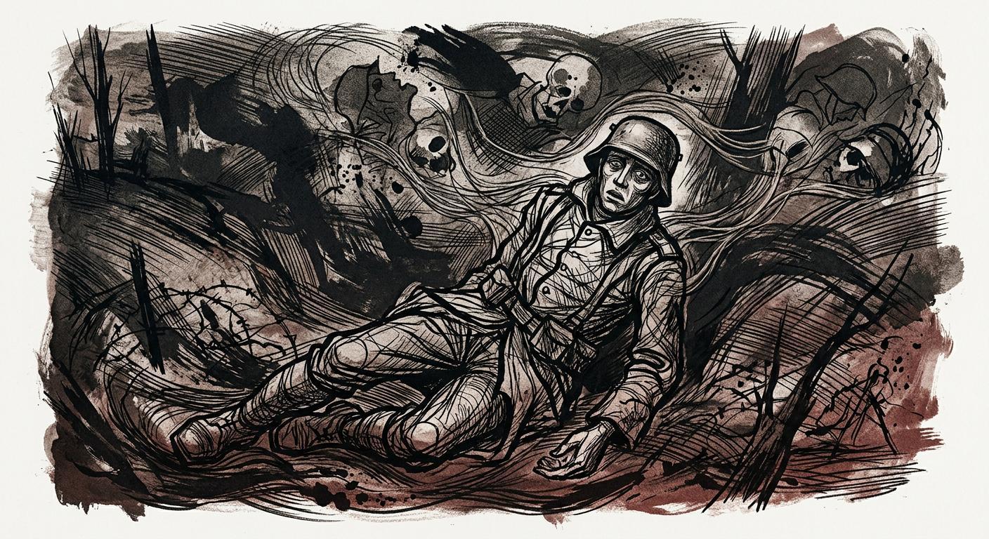
Charles Keeping's (1924–1988) signature decorative Graphic Expressionism: A stylized distortion using hair-like parallel linework to evoke allegorical overtones of nature's force and decay. [Gemini Nano Banana 2]
{"All Quiet on the Western Front" (1929 book by Erich Maria Remarque)} illustrated in Charles Keeping's (1924–1988) signature Graphic Expressionism art style, which is a unique, stylized distortion that externalizes heavy emotional weight through a symbolically hyperbolized decorative composition, rendered with a highly romanticized linear approach that uses dense, hair-like parallel linework to evoke decadent allegorical overtones of nature's raw force and inevitable entropy, transforming living beings into an analogous poetry of elemental decay: {
Charles Keeping was born in South London on September 22, 1924—a secure childhood later reflected in his books Shaun and the Cart Horse (1966) and Adam and Paradise Island (1989). Leaving school at 14, he studied art by correspondence and worked various jobs before joining the Royal Navy in 1942. After a four-year service, he attended the Regent Street Polytechnic to specialize in illustration and lithography, setting the stage for a prolific career. Keeping's work is characterized by profound emotional intensity and technical virtuosity, bridging the palatability of commercial graphic design with the critical subjectivity of fine art through pioneering lithographic processes and an uncompromising treatment of social and psychological themes.
Early Foundations (1953–1958)
His early work was conventional yet highly disciplined. His first book commission, Ted Kavanagh’s Why Die of Heart Disease? (1953), featured mid-20th-century British pen-and-ink illustrations with clean, ligne claire–like linework, minimalist black shadows, and efficient contouring. These foundational elements—flattened spatiality, crisp outer contouring, scalar depth, and rhythmic tonal modulation—anchored his later, more viscerally abstract renderings.
In Rosemary Sutcliff’s Warrior Scarlet (1958), Keeping shifted toward a primitivist aesthetic suited to the narrative's harsh Bronze Age setting. He created dynamic monochrome vignettes that juxtaposed his early discipline with newfound raw expressionism. Within flattened compositions, cleanly contoured human figures often act as stark white negative space, providing structural integrity. Surrounding them, natural elements and furs are rendered with aggressive, abstract gestural marks—sweeping, scratchy lines and dense, mottled scumbling. By deliberately allowing subjects to break geometric borders, Keeping captured the narrative's untamed energy, establishing his mature conceptual framework: using precise structural bounds to contain and amplify intensely emotional, abstract textures.
The Sutcliff Collaborations and Stylistic Maturation (1960–1965)
Throughout the early 1960s, Keeping heavily collaborated with Sutcliff on Knight's Fee (1960), Dawn Wind (1961), The Mark of the Horse Lord (1965), and Heroes and History (1965). During this period, his style progressively matured. He constructed subjects with thick segmentations akin to the lead came of Byzantine stained glass, functioning reductively as deep dimensional shadows to anchor core anatomy. Within these rigid boundaries, continuous gestural linework patterned surfaces, balancing sculptural chiaroscuro with dark, cinematic contrast.
In Dawn Wind, he used scratchy, directional marks to emphasize action and focal intensity over pure texture. By The Mark of the Horse Lord, Keeping employed monochrome lithographs with energetic, calligraphic linework. Echoing Jackson Pollock (1912–1956), Keeping maintained the subject's visual mass through continuous scribble-like linework, omitting random splatters. For the volume's colored cover, the main subject was stylized as linocut art with symbolic color blocking, directional splatters, and soft textural brushstrokes—a kinetic piece recalling primitivist ritual paintings.
In Heroes and History, his monochrome kineticism peaked. Continuous looping lines for figural rendering contrasted heavily with the rigid black geometry of weapons, supplemented by deliberate ink splatters and slashing marks to inject motion. While recalling Pollock's thread-like linework and organic splatters, this abstraction was anchored by deliberate spatial segmentation and the visual weight characteristic of Golden Age illustrators Harry Clarke (1889–1931) and Kay Nielsen (1886–1957).
Keeping also authored and illustrated Shaun and the Cart Horse (1966) using lithographic crayon and ink. He built fausse naïve compositions with flat viewpoints and a limited, emotionally resonant saturated palette deployed in broad scumbled blocks. Despite the vivid colors and childlike directness, this approach conceptually aligned with his monochrome work: emotive tonal color-blocking functioned as atmospheric undertones, transforming domestic settings into warm emotional fields rather than literal spaces.
The Folio Society Classics and Psychological Darkness (1964–1971)
Simultaneously, Keeping’s mastery of mood led him to illustrate adult classics for the Folio Society, including Emily Brontë's Wuthering Heights (1964), Erich Maria Remarque's All Quiet on the Western Front (1966), and Fyodor Dostoevsky's The Idiot (1971). He pushed lithography into profound psychological darkness, using broad gestural background strokes to symbolize characters' internal turmoil.
In Wuthering Heights, figures became towering silhouettes—solid black masses recalling the stark graphic weight of Jeffrey Alan Love (b. 1978)—dominated by aggressive dry brushstrokes echoing Willem de Kooning (1904–1997). Slashing grey marks representing the Yorkshire wind atmospherically enveloped the characters, merging volatile psyches with a hostile landscape.
This environmental consumption evolved further in All Quiet on the Western Front. Figures featured tortured angular postures and primitivist contouring in a restricted earthy duotone. Dense scumbling and heavy ink consumed the hunched figures in monumental shadows, set against textured undertones recalling the matière of Jean Fautrier (1898–1964). Anguished bodily distortion recalling Egon Schiele (1890–1918) was grounded in a crushing mass reminiscent of Käthe Kollwitz's (1867–1945) lithographs. This aggressive mark-making effectively visualized both romantic and historical trauma through a chilling monumental decorativeness.
Diversifying the Decorative Vocabulary (1967–1970)
In Geoffrey Trease’s Bent is the Bow (1967), Keeping experimented with gestural monoline figuration, synthesizing the efficient contouring of Jean Cocteau (1889–1963), the scratchy kinetic energy of Ronald Searle (1920–2011), and the fragile postures of Egon Schiele. Keeping elevated these influences by using varying line weights for undulating visual mass. He anchored airy upper bodies within dense, abstracted environments, creating a vignette where fluid linework simultaneously depicted shape, tone, and texture.
For James Reeves’s An Anthology of Free Verse (1968), Keeping crafted striking high-contrast illustrations using solid-black silhouettes reminiscent of woodblock prints. He aggressively pierced these monolithic forms with white negative space and fluid linework. Architectural forms fractured into decorative collage recalling Gustav Klimt's (1862–1918) murals. This balance of dramatic chiaroscuro with kinetic patterning anticipated the Gothic theatricality of Jeffrey Alan Love.
In Robert Louis Stevenson's Dr. Jekyll and Mr. Hyde... (1968), Keeping eschewed clean outer contouring entirely. He built disembodied portraits using dense networks of directional crosshatching, building structural mass through the obsessive accumulation of razor-thin lines. By carving uninked highlights against deep shadows, he achieved a sculptural chiaroscuro recalling Edmund Joseph Sullivan (1869–1933), perfectly visualizing creeping internal corruption.
For The God Beneath the Sea (1970), Keeping employed an aggressive technique with sweeping linear striations. Subjects bled into their environments like fluid dynamics, punctuated by explosive black strokes. This blurring of boundaries between anatomy and elemental energy externalized the text's psychological violence, cementing a deeply visceral approach to mythology.
The Mature Synthesis (1972–1975)
In Roger Squire’s Wizards and Wampum (1972), Keeping abandoned rigid outlines for fluid, topographical contours mimicking woodgrain and flowing water. Applying these swirling patterns to both subjects and environments, he created a dynamic animism where figures appear to materialize directly from the primal landscape.
Robert Newman's The Twelve Labors of Hercules (1972) encapsulates his highly kinetic mature aesthetic. Organically undulating parallel monolines simultaneously contoured anatomy, sculpted volume, and created atmospheric depth. Pushed into abstraction, stratified horizontal hatching generated sweeping motion blur. Extremities often dissolved entirely into the page's white space, contrasting mythological power with ephemeral mortality.
Revisiting his historical roots, Keeping's 1974 edition of Knight's Fee featured linocut-like angular figures reminiscent of János Kass (1927–2010). Sweeping parallel linework and flattened spatial patterning typical of Edward Bawden (1903–1989) contrasted with dense, Pollock-esque scribbles within garments. This dynamic interplay solidified his framework of balancing heavy structural mass with fragile, frantic energy.
For Monsters, Monsters, Monsters (1975), Keeping depicted mass using dense cellular shapes mimicking reptilian skin, counterbalanced by solid black ink. Conversely, in P.L. Travers' About the Sleeping Beauty (1975), he adopted a lyrical approach with thread-like linework to construct gossamer garments. Blooming watercolor washes spilled beyond contours, anchored by monumental black architectural voids. This delicate, dissolving linework juxtaposed with creeping darkness anticipates Stephen Gammell (b. 1943).
In Inter-City (1977), Keeping used a varied mixed-media technique. He layered translucent watercolor glazes over fluid parallel hatching and pointillist-style stippling to simulate motion and reflective light on train windows, establishing the book's visual rhythm.
Late Atmospheric Poetry (1981–1987)
In his late era, Keeping's art grew increasingly atmospheric. For Alfred Noyes’s The Highwayman (1981), he utilized poetically fluid linework with a Gothic, Deco-Nouveau flatness. This matched the poem's ephemerality, recalling the ukiyo-e masters Utagawa Kuniyoshi (1797–1861), Katsushika Hokusai (1760–1849), and Utagawa Kunisada (1786–1865), as well as the modern concept art of Yoshitaka Amano (b. 1952).
Kevin Crossley-Holland's Beowulf (1982) featured stark monochrome lithographs with violent, spidery crosshatching and oppressive black spaces, capturing the epic's primal fatalism. In Charles Keeping's Book of Classic Ghost Stories (1986), soft washes combined with sharp ink created a spectral 'double-exposure' effect, superimposing translucent figures over solid backgrounds.
The Tale of Sir Gawain (1987) continued this ethereal melancholy. Gestural linework paired with diffuse ink washes softened shadows, presenting ephemerality through optical fluid dispersion—akin to a sketch dissolving in flowing water.
Overarching Conceptual Design Framework
Ultimately, Charles Keeping's conceptual framework relied on an overarching allegory that defined the entire composition directly from the foundational undersketch design stage. To enhance this structural allegory and editorialize his macro-level subjects, he often isolated the narrative's key heroic focal point, freezing the chapter's climactic moment into a suspended, monumental tableau. Within a Nouveau-Deco flattened armature, this compositionally embedded allegory externalized the inner psychological states and soulful kineticism of mortal beings into the surrounding decorative space. By doing so, he poetically paralleled the flickering transience of memory with the vulnerability of the soul, enveloping his frozen subjects in greater atmospheric forces.
His overarching strength lies in pioneering a commercial illustration approach that carries the intense emotional charge of fine art. While sharing Edward Bawden's flattened space and infrastructural patterning, Keeping's mature style distinguished itself through this highly unconventional use of hyperbolically elongated, hair-like continuous lines. He synthesized Jackson Pollock's emotionally charged kineticism with Harry Clarke and Aubrey Beardsley's (1872–1898) decadent segmentation, Lynd Ward's (1905–1985) noir-inspired chiaroscuro, and rhythmic tonal washes. Crucially, Keeping used these fluid, sweeping strands to poeticize his visual narration. Rather than merely defining volume, this fibrous, parallel linework actively amplified the pre-designed flow of the undersketch, allegorically evoking the emotive currents of natural elements—mimicking the swirling gusts of wind, the striated grooves of woodgrain and bark, or the rushing dynamics of water. Through this visceral stylization, Keeping transformed his frozen narrative heroes into what appears to be illustrations of primitivist crafts. The imagery creates the distinct illusion of a mixed-media decoration, as if the subjects were rendered from artifacts carved into ancient wood or painted across the surface of rippling water. This artifact-like abstraction was highly intentional, designed to completely externalize the emotional, subjective perspective of the scene. By dissolving the barrier between flesh and environment, this approach inextricably framed the depicted characters as literal manifestations of nature’s enduring power and mortality’s sweeping ephemerality.
This parallel linework-driven framework afforded Keeping remarkable tonal versatility. At one extreme, he rendered heavy, grim themes through interwoven abstract, bold kinetic lines evocative of Jackson Pollock, creating a Byzantine stained-glass-like luminescence recalling Harry Clarke. This synthesis created cinematic silhouettes reminiscent of Jeffrey Alan Love, fused with the suggestive chiaroscuro of Leonard Baskin (1922–2000) and anchored by aggressive, kinetic brushstrokes echoing Willem de Kooning. His figures, frozen in resonant angular poses akin to Egon Schiele, were embedded within a larger allegorical flowing force. This force was articulated through dense, heavy parallel linework that functioned dually as an externalized inner trauma and an allegory for nature's equalizing, elemental power. At the opposite extreme, he romanticized his depictions through the same gossamer, hair-like parallel lines—recalling the flowing topographical precision of Mœbius (Jean Giraud; 1938–2012), the atmospheric linearity of Kay Nielsen (1886–1957), and the hypnotic, moiré‑like rhythmic hatching of Franklin Booth (1874–1948). He paired these delicate linear rhythms with powdery watercolor washes reminiscent of Stephen Gammell (b. 1943), dissolving the boundary between figure and atmosphere entirely. The result is a lyrical composition where physical form is reduced to a transient whisper of elemental energy, fraying into unravelling threads to achieve a decadent visual poetry of maximalist, organic expressionism.


{"All Quiet on the Western Front" (1929 book by Erich Maria Remarque)} illustrated in Charles Keeping's (1924–1988) signature Graphic Expressionism art style, which is a unique, stylized distortion that externalizes heavy emotional weight through a symbolically hyperbolized decorative composition, rendered with a highly romanticized linear approach that uses dense, hair-like parallel linework to evoke decadent allegorical overtones of nature's raw force and inevitable entropy, transforming living beings into an analogous poetry of elemental decay: {
Charles Keeping was born in South London on September 22, 1924—a secure childhood later reflected in his books Shaun and the Cart Horse (1966) and Adam and Paradise Island (1989). Leaving school at 14, he studied art by correspondence and worked various jobs before joining the Royal Navy in 1942. After a four-year service, he attended the Regent Street Polytechnic to specialize in illustration and lithography, setting the stage for a prolific career. Keeping's work is characterized by profound emotional intensity and technical virtuosity, bridging the palatability of commercial graphic design with the critical subjectivity of fine art through pioneering lithographic processes and an uncompromising treatment of social and psychological themes.
His early work was conventional yet highly disciplined. His first book commission, Ted Kavanagh’s Why Die of Heart Disease? (1953), featured mid-20th-century British pen-and-ink illustrations with clean, ligne claire–like linework, minimalist black shadows, and efficient contouring. These foundational elements—flattened spatiality, crisp outer contouring, scalar depth, and rhythmic tonal modulation—anchored his later, more viscerally abstract renderings.
In Rosemary Sutcliff’s Warrior Scarlet (1958), Keeping shifted toward a primitivist aesthetic suited to the narrative's harsh Bronze Age setting. He created dynamic monochrome vignettes that juxtaposed his early discipline with newfound raw expressionism. Within flattened compositions, cleanly contoured human figures often act as stark white negative space, providing structural integrity. Surrounding them, natural elements and furs are rendered with aggressive, abstract gestural marks—sweeping, scratchy lines and dense, mottled scumbling. By deliberately allowing subjects to break geometric borders, Keeping captured the narrative's untamed energy, establishing his mature conceptual framework: using precise structural bounds to contain and amplify intensely emotional, abstract textures.
Throughout the early 1960s, Keeping heavily collaborated with Sutcliff on Knight's Fee (1960), Dawn Wind (1961), The Mark of the Horse Lord (1965), and Heroes and History (1965). During this period, his style progressively matured. He constructed subjects with thick segmentations akin to the lead came of Byzantine stained glass, functioning reductively as deep dimensional shadows to anchor core anatomy. Within these rigid boundaries, continuous gestural linework patterned surfaces, balancing sculptural chiaroscuro with dark, cinematic contrast.
In Dawn Wind, he used scratchy, directional marks to emphasize action and focal intensity over pure texture. By The Mark of the Horse Lord, Keeping employed monochrome lithographs with energetic, calligraphic linework. Echoing Jackson Pollock (1912–1956), Keeping maintained the subject's visual mass through continuous scribble-like linework, omitting random splatters. For the volume's colored cover, the main subject was stylized as linocut art with symbolic color blocking, directional splatters, and soft textural brushstrokes—a kinetic piece recalling primitivist ritual paintings.
In Heroes and History, his monochrome kineticism peaked. Continuous looping lines for figural rendering contrasted heavily with the rigid black geometry of weapons, supplemented by deliberate ink splatters and slashing marks to inject motion. While recalling Pollock's thread-like linework and organic splatters, this abstraction was anchored by deliberate spatial segmentation and the visual weight characteristic of Golden Age illustrators Harry Clarke (1889–1931) and Kay Nielsen (1886–1957).
Keeping also authored and illustrated Shaun and the Cart Horse (1966) using lithographic crayon and ink. He built fausse naïve compositions with flat viewpoints and a limited, emotionally resonant saturated palette deployed in broad scumbled blocks. Despite the vivid colors and childlike directness, this approach conceptually aligned with his monochrome work: emotive tonal color-blocking functioned as atmospheric undertones, transforming domestic settings into warm emotional fields rather than literal spaces.
Simultaneously, Keeping’s mastery of mood led him to illustrate adult classics for the Folio Society, including Emily Brontë's Wuthering Heights (1964), Erich Maria Remarque's All Quiet on the Western Front (1966), and Fyodor Dostoevsky's The Idiot (1971). He pushed lithography into profound psychological darkness, using broad gestural background strokes to symbolize characters' internal turmoil.
In Wuthering Heights, figures became towering silhouettes—solid black masses recalling the stark graphic weight of Jeffrey Alan Love (b. 1978)—dominated by aggressive dry brushstrokes echoing Willem de Kooning (1904–1997). Slashing grey marks representing the Yorkshire wind atmospherically enveloped the characters, merging volatile psyches with a hostile landscape.
This environmental consumption evolved further in All Quiet on the Western Front. Figures featured tortured angular postures and primitivist contouring in a restricted earthy duotone. Dense scumbling and heavy ink consumed the hunched figures in monumental shadows, set against textured undertones recalling the matière of Jean Fautrier (1898–1964). Anguished bodily distortion recalling Egon Schiele (1890–1918) was grounded in a crushing mass reminiscent of Käthe Kollwitz's (1867–1945) lithographs. This aggressive mark-making effectively visualized both romantic and historical trauma through a chilling monumental decorativeness.
In Geoffrey Trease’s Bent is the Bow (1967), Keeping experimented with gestural monoline figuration, synthesizing the efficient contouring of Jean Cocteau (1889–1963), the scratchy kinetic energy of Ronald Searle (1920–2011), and the fragile postures of Egon Schiele. Keeping elevated these influences by using varying line weights for undulating visual mass. He anchored airy upper bodies within dense, abstracted environments, creating a vignette where fluid linework simultaneously depicted shape, tone, and texture.
For James Reeves’s An Anthology of Free Verse (1968), Keeping crafted striking high-contrast illustrations using solid-black silhouettes reminiscent of woodblock prints. He aggressively pierced these monolithic forms with white negative space and fluid linework. Architectural forms fractured into decorative collage recalling Gustav Klimt's (1862–1918) murals. This balance of dramatic chiaroscuro with kinetic patterning anticipated the Gothic theatricality of Jeffrey Alan Love.
In Robert Louis Stevenson's Dr. Jekyll and Mr. Hyde... (1968), Keeping eschewed clean outer contouring entirely. He built disembodied portraits using dense networks of directional crosshatching, building structural mass through the obsessive accumulation of razor-thin lines. By carving uninked highlights against deep shadows, he achieved a sculptural chiaroscuro recalling Edmund Joseph Sullivan (1869–1933), perfectly visualizing creeping internal corruption.
For The God Beneath the Sea (1970), Keeping employed an aggressive technique with sweeping linear striations. Subjects bled into their environments like fluid dynamics, punctuated by explosive black strokes. This blurring of boundaries between anatomy and elemental energy externalized the text's psychological violence, cementing a deeply visceral approach to mythology.
In Roger Squire’s Wizards and Wampum (1972), Keeping abandoned rigid outlines for fluid, topographical contours mimicking woodgrain and flowing water. Applying these swirling patterns to both subjects and environments, he created a dynamic animism where figures appear to materialize directly from the primal landscape.
Robert Newman's The Twelve Labors of Hercules (1972) encapsulates his highly kinetic mature aesthetic. Organically undulating parallel monolines simultaneously contoured anatomy, sculpted volume, and created atmospheric depth. Pushed into abstraction, stratified horizontal hatching generated sweeping motion blur. Extremities often dissolved entirely into the page's white space, contrasting mythological power with ephemeral mortality.
Revisiting his historical roots, Keeping's 1974 edition of Knight's Fee featured linocut-like angular figures reminiscent of János Kass (1927–2010). Sweeping parallel linework and flattened spatial patterning typical of Edward Bawden (1903–1989) contrasted with dense, Pollock-esque scribbles within garments. This dynamic interplay solidified his framework of balancing heavy structural mass with fragile, frantic energy.
For Monsters, Monsters, Monsters (1975), Keeping depicted mass using dense cellular shapes mimicking reptilian skin, counterbalanced by solid black ink. Conversely, in P.L. Travers' About the Sleeping Beauty (1975), he adopted a lyrical approach with thread-like linework to construct gossamer garments. Blooming watercolor washes spilled beyond contours, anchored by monumental black architectural voids. This delicate, dissolving linework juxtaposed with creeping darkness anticipates Stephen Gammell (b. 1943).
In Inter-City (1977), Keeping used a varied mixed-media technique. He layered translucent watercolor glazes over fluid parallel hatching and pointillist-style stippling to simulate motion and reflective light on train windows, establishing the book's visual rhythm.
In his late era, Keeping's art grew increasingly atmospheric. For Alfred Noyes’s The Highwayman (1981), he utilized poetically fluid linework with a Gothic, Deco-Nouveau flatness. This matched the poem's ephemerality, recalling the ukiyo-e masters Utagawa Kuniyoshi (1797–1861), Katsushika Hokusai (1760–1849), and Utagawa Kunisada (1786–1865), as well as the modern concept art of Yoshitaka Amano (b. 1952).
Kevin Crossley-Holland's Beowulf (1982) featured stark monochrome lithographs with violent, spidery crosshatching and oppressive black spaces, capturing the epic's primal fatalism. In Charles Keeping's Book of Classic Ghost Stories (1986), soft washes combined with sharp ink created a spectral 'double-exposure' effect, superimposing translucent figures over solid backgrounds.
The Tale of Sir Gawain (1987) continued this ethereal melancholy. Gestural linework paired with diffuse ink washes softened shadows, presenting ephemerality through optical fluid dispersion—akin to a sketch dissolving in flowing water.
Ultimately, Charles Keeping's conceptual framework relied on an overarching allegory that defined the entire composition directly from the foundational undersketch design stage. To enhance this structural allegory and editorialize his macro-level subjects, he often isolated the narrative's key heroic focal point, freezing the chapter's climactic moment into a suspended, monumental tableau. Within a Nouveau-Deco flattened armature, this compositionally embedded allegory externalized the inner psychological states and soulful kineticism of mortal beings into the surrounding decorative space. By doing so, he poetically paralleled the flickering transience of memory with the vulnerability of the soul, enveloping his frozen subjects in greater atmospheric forces.
His overarching strength lies in pioneering a commercial illustration approach that carries the intense emotional charge of fine art. While sharing Edward Bawden's flattened space and infrastructural patterning, Keeping's mature style distinguished itself through this highly unconventional use of hyperbolically elongated, hair-like continuous lines. He synthesized Jackson Pollock's emotionally charged kineticism with Harry Clarke and Aubrey Beardsley's (1872–1898) decadent segmentation, Lynd Ward's (1905–1985) noir-inspired chiaroscuro, and rhythmic tonal washes. Crucially, Keeping used these fluid, sweeping strands to poeticize his visual narration. Rather than merely defining volume, this fibrous, parallel linework actively amplified the pre-designed flow of the undersketch, allegorically evoking the emotive currents of natural elements—mimicking the swirling gusts of wind, the striated grooves of woodgrain and bark, or the rushing dynamics of water. Through this visceral stylization, Keeping transformed his frozen narrative heroes into what appears to be illustrations of primitivist crafts. The imagery creates the distinct illusion of a mixed-media decoration, as if the subjects were rendered from artifacts carved into ancient wood or painted across the surface of rippling water. This artifact-like abstraction was highly intentional, designed to completely externalize the emotional, subjective perspective of the scene. By dissolving the barrier between flesh and environment, this approach inextricably framed the depicted characters as literal manifestations of nature’s enduring power and mortality’s sweeping ephemerality.
This parallel linework-driven framework afforded Keeping remarkable tonal versatility. At one extreme, he rendered heavy, grim themes through interwoven abstract, bold kinetic lines evocative of Jackson Pollock, creating a Byzantine stained-glass-like luminescence recalling Harry Clarke. This synthesis created cinematic silhouettes reminiscent of Jeffrey Alan Love, fused with the suggestive chiaroscuro of Leonard Baskin (1922–2000) and anchored by aggressive, kinetic brushstrokes echoing Willem de Kooning. His figures, frozen in resonant angular poses akin to Egon Schiele, were embedded within a larger allegorical flowing force. This force was articulated through dense, heavy parallel linework that functioned dually as an externalized inner trauma and an allegory for nature's equalizing, elemental power. At the opposite extreme, he romanticized his depictions through the same gossamer, hair-like parallel lines—recalling the flowing topographical precision of Mœbius (Jean Giraud; 1938–2012), the atmospheric linearity of Kay Nielsen (1886–1957), and the hypnotic, moiré‑like rhythmic hatching of Franklin Booth (1874–1948). He paired these delicate linear rhythms with powdery watercolor washes reminiscent of Stephen Gammell (b. 1943), dissolving the boundary between figure and atmosphere entirely. The result is a lyrical composition where physical form is reduced to a transient whisper of elemental energy, fraying into unravelling threads to achieve a decadent visual poetry of maximalist, organic expressionism.
}