2


Dean Motter's (b. 1953) comic art style: an album-cover graphic designer and magazine editor who collaborated with various comic artists and authors, combining Bauhaus and Art Deco sleek efficiency with retro-futurist noir and pop comix. [Gemini Pro]
 — generated by Gemini 3 Pro.
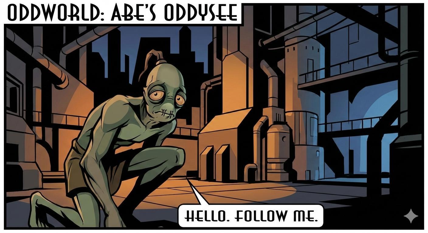
This digital illustration, styled after the retro-futurist comic art of Dean Motter, depicts Abe from the video game \"Oddworld: Abe’s Oddysee\" in a somber, industrial setting. Abe, a spindly green creature with large, weary orange eyes and a stitched mouth, is shown in a three-quarter crouch in the foreground, looking toward the viewer with a mournful expression. He wears a simple brown loincloth, and his signature hair tuft stands upright. Behind him, a sprawling, multi-leveled factory environment is rendered with Art Deco geometric rigor and dramatic Chiaroscuro lighting, featuring towering silos, pipes, and walkways cast in deep blacks and muted ochre tones against a dark blue sky. A clean white speech bubble at the bottom center contains the iconic game text \"HELLO. FOLLOW ME.\" in a stylized, blocky font, while the top left corner features a title bar reading \"ODDWORLD: ABE'S ODDYSEE.\"")

2
100% Upvoted
{Oddworld: Abe's Oddysee (1997 video game)} illustrated in Dean Motter's (b. 1953) signature comic pictorial style: {
Dean Motter's creative foundation was established at Fanshawe College in London, Ontario, where he studied Creative Electronics and Recording under mentors including Radio Caroline's Tom Lodge, Marshall McLuhan's collaborator Eric McLuhan, John Mills-Cockell, and neon sculptor Michael Hayden. His early visual sensibilities were shaped by a diverse confluence of influences: the cinematic storytelling of Will Eisner's The Spirit (1940–1952), the atmosphere of classic film noir, the geometric rigor of Art Deco, German Expressionism, and a soupçon of Soviet propaganda art. Upon moving to Toronto, Motter applied these influences to children's books and animation before joining the Silver Snail comic shop. There, he served as editor for Andromeda comic magazine, curating a roster that included John Allison (b. 1976), Paul Rivoche, Robert MacIntyre, Tony Meers (b. 1953), Ken Steacy (b. 1955; illustrator for the War Bears graphic novels), and Tom Nesbitt. This publication bridged the raw energy of the underground comix movement with traditional sci‑fi themes, presented with a polished production value that distinguished it from typical counterculture titles.
Concurrent with his editorial work on Andromeda, Motter established a rigorous visual vernacular as a graphic designer and album artist for Canadian musicians—including Marie Lynn Hammond, Dale Jacobs, The Diodes, and Anvil—during the late 1970s and early 1980s. He designed album covers for Toronto's independent, new wave, and post-punk music scenes alongside broader publication and editorial design work. This design background, operating at the intersection of typography, image composition, and single-surface narrative compression (where an album cover must communicate genre, mood, and identity within a single composed image), directly informed the Gesamtkunstwerk integration of text, spatial composition, and figuration that would ultimately define his comics. His formative visual influences during this period included the European science-fiction comics originating in Métal Hurlant (1974–1987) and disseminated through its American counterpart Heavy Metal. These publications introduced artists such as Moebius (Jean Giraud, 1938–2012), Philippe Druillet (b. 1944), and Enki Bilal (b. 1951), who fused speculative-futurist imagery with surrealist narrative structures. Additionally, he drew from underground comix's anti-institutional formal experimentation and the broader tradition of 1970s–80s painted science-fiction and album-cover illustration. The latter included the work of Syd Mead (1933–2019), Chris Foss (b. 1946), Roger Dean (b. 1944), and the Hipgnosis design group (1968–1983), characterized by dramatically staged directional chiaroscuro and smoothly graduated airbrushed tonal modeling that rendered surfaces as seamlessly polished, quasi-industrial volumes. In Motter's later transition to sequential comics art, this sculptural volumetric thinking underwent a critical material translation: the continuous-tone painted rendering of his design-illustration background was reconceived in the flat, high-contrast idiom of ink line work, solid-black shadow masses, and uninflected color-blocking. This shift retained the same architectonic lighting logic and streamlined surface idealization while operating through categorically different graphic means.
Following his editorial tenure on Andromeda, Motter assumed the role of art director at Byron Preiss Visual Publications in the early 1980s. In this capacity, he orchestrated the visual adaptation of hard science fiction by authors such as Isaac Asimov, Arthur C. Clarke, Ray Bradbury, and Harlan Ellison, while coordinating the output of technical-realist illustrators including Wayne Barlowe (b. 1958), Ralph McQuarrie (1929–2012), Dave Gibbons (b. 1949), and Will Eisner (1917–2005). This administrative and creative positioning was pivotal: it transitioned Motter's practice from the single-surface constraints of album art to the expansive, systematic world-building required by literary science fiction. The exposure to McQuarrie's industrial conceptualism and Gibbons's architectonic line work directly catalyzed a shift in Motter's own aesthetic, moving away from abstract collage toward the coherent, structurally immersive urban environments that would anchor the retro-futurist narratives of Mister X and Terminal City.
Fascinated by sleeplessness, somnambulism, hardboiled detective fiction, and the visual storytelling of silent cinema, Motter created and wrote Mister X, first published by Vortex Comics in 1984. Paul Rivoche was instrumental in defining the comic's distinctive retro-futurist visual design before his departure from Vortex Comics. Publisher Bill Marks subsequently assigned the art duties to the Hernandez brothers—Jaime (b. 1959), Gilbert (b. 1957), and Mario Hernandez (b. 1953)—who illustrated the earliest published issues before themselves leaving the project. Seth (Gregory Gallant, b. 1962), Ty Templeton (b. 1962), and Klaus Schonefeld (1963–1986) then contributed to the series' evolving visual identity, with Motter himself assuming primary illustration duties in the final issue (#14, 1988) and in later incarnations published by Caliber Comics and Dark Horse Comics.
Motter's visual idiom draws sincerely and directly from mid-century commercial illustration, graphic design, Art Deco, and Streamline Moderne—the very source material Pop Art later ironized. The distinction is structurally significant: Motter works within a mid-century design tradition; Pop Art works about it. In Mister X, this idiom operates as a terminal distillation of a longer formal genealogy: the ornamental naturalism and moralized figurative staging of the Pre-Raphaelites, progressively geometricized through the Arts and Crafts movement, Art Nouveau, and Art Deco into the streamlined, legibility-driven forms Motter inherited and refined. His environments are composed through architectonic draftsmanship grounded in Constructivist and Bauhaus design principles and informed by Le Corbusier's (1887–1965) urbanist theory; indeed, the fictional Radiant City directly references Le Corbusier's Ville Radieuse. His chiaroscuro staging and cinematic framing draw from German Expressionist cinema (such as Fritz Lang's Metropolis, with its monumental, psychologically oppressive architecture) and the expressionist cinematography of Orson Welles's (1915–1985) films. This visual logic achieves a spatial-narrative legibility comparable to the European Ligne Claire, without adopting that tradition's uniform line weight or shadowless rendering. This cinematic lineage extends to the self-reflexive narrative strategies of the French New Wave, particularly the works of Jean-Luc Godard (1930–2022) and François Truffaut (1932–1984). The architectural estrangement of Godard's Alphaville (1965)—which repurposed contemporary modernist structures to signify a dystopian future through framing alone—parallels Motter's strategy of recontextualizing retro-architecture as futuristic spectacle, while the New Wave's use of jump cuts and disjointed montage informs the comic's elliptical, accelerated panel transitions. Silent cinema's reliance on mise-en-scène, gestural staging, and compositional lighting to carry narrative weight without dialogue stands as a further structural influence on Motter's visual storytelling logic.
Figures and settings are composed with a narrative-formal economy and tonal rhythm akin to Saul Bass's (1920–1996) poster designs, governed by a directional-lighting logic similar to Horst P. Horst's (1906–1999) dramatic chiaroscuro studio photography. Under this framework, light functions architectonically—sculpting volumetric form, establishing depth, and organizing compositional rhythm through shadow. Figural and drapery complexity is streamlined in a manner comparable to Tamara de Lempicka's (1894–1980) Art Deco figuration: organic forms are reduced to smooth, volumetrically coherent, quasi-geometric shapes that retain physical presence without naturalistic excess. The Hernandez brothers' initial visual interpretation of the series—particularly Jaime Hernandez's organically fluid figural contour work—further inflected Motter's originally angular, hard-edged Art Deco draftsmanship toward a rounder, more naturalistic figural idiom. This convergence produced the characteristic duality of his mature style: rectilinear architectural geometry inhabited by softly curved, volumetrically fluid figures. This same economy extends to character design, where period-specific sartorial detail—1940s–50s tailoring, Art Deco-inflected silhouettes, and noir-coded costuming—is rendered with the geometric clarity applied to environments, producing figures whose costuming reads as architecturally integrated rather than illustratively incidental. To this end, Motter frequently utilized Marshall McLuhan's From Cliché to Archetype (1970) as a reference for populating his fictional worlds, ensuring that his characters functioned as powerful visual symbols within their environments.
The illustrations employ solid flat color-blocking and stark solid-black shadow masses organized with a systemic coherence prioritized for the reader's visual experience: typography, architectural setting, spatial composition, color, and figure work function as an integrated design system serving both graphic-compositional equilibrium and temporal narrative clarity. Restricted color palettes use atmospheric gradients and temperature contrasts—warm against cool—to heighten dramatic tension while maintaining tonal cohesion and spatial consistency across panels and page sequences. Comparable to Gilbert and Jaime Hernandez's draftsmanship in Love and Rockets, Motter demonstrates a fluent, structurally assured capacity to construct environments and staged scenes with distilled, consistent clarity, sustaining narrative legibility without becoming schematically reductive or spatially indeterminate. The resulting panels read as polished storyboard frames and arrested film noir stills—cinematic in framing and chiaroscuro atmosphere—executed through the variable line weight of crowquill nibs and the uniform mechanical precision of Rapidograph technical pens. Ultimately, Motter's illustrations for Mister X have been noted for elevating the visual narrative far beyond what the written script alone sustains.
Overall, Dean Motter's signature art style constitutes a retro-futurist graphic storytelling idiom deeply rooted in album-cover design practice. This framework represents a modernist graphic approach that balances functional clarity with branding-oriented aesthetic impact—whether realized as cover art, editorial layout, or sequential illustration. Catalyzed by extensive collaboration with artists such as Paul Rivoche and the Hernandez brothers, his visual language fuses the sleek visual-semantic concision of Art Deco and Bauhaus geometricism with a pop-figural warmth and fluidity. This warmth mirrors the work of the Hernandez brothers, whose own stylistic synthesis merged the polished idiom of post-war American commercial art with the raw expressiveness of underground comix. Motter's compositional staging synthesizes vernaculars from diverse traditions of visual persuasion through spatial dramaturgy: film noir's directional low-key lighting, canted framings, and shadow deployed as narrative architecture are seamlessly layered with Soviet propaganda poster art's monumentalizing graphic immediacy and the stark layout dynamics of the French New Wave. This rich stylistic inheritance—architectonic rigor tempered by vernacular warmth and cinematic tension—affords Motter a singular adaptability. His retro-futuristic idiom translates coherently across media and formats, sustaining a unified visual identity in which the utopian formalism of early twentieth-century modernism is continually reanimated through the kinetic immediacy of popular graphic culture.
}