1


Richard Corben's (1940–2020) comic art style: A seminal figure of the underground comix scene who rose to prominence defying the Comics Code Authority, praised by global visionaries ranging from Guillermo del Toro to Hayao Miyazaki. [Gemini 3 Pro]


1
100% Upvoted
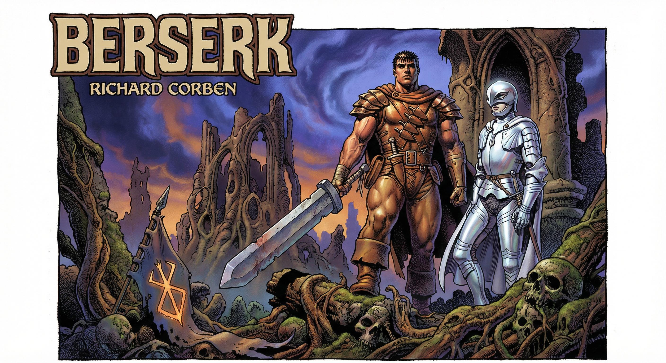
{"Berserk" by Kentaro Miura} illustrated in Richard Corben's (1940–2020) signature art style: {
Corben's signature aesthetic was forged in the isolation of the American Midwest; raised in Sunflower, Kansas, his rural upbringing instilled a tactile, earthy grounding that would later anchor his wildest fantasies in grit and sweat. His initial visual vocabulary was shaped by an obsession with the EC Comics line, specifically their macabre grotesquerie and heavy chiaroscuro, which taught him to merge horror with dark comedy. However, his conceptual framework was solidified not in art school, but during his nine-year tenure at the Calvin Company. Working as an animator on industrial films, Corben was forced to abandon the flat planes of traditional illustration for the rotational geometry and volumetric lighting required by cinema. This technical discipline transformed his approach to the page: he began treating comic panels as storyboards and his figures as moveable armatures, utilizing a filmmaker's understanding of lens distortion and stage lighting to create a style that was structurally rigorous yet visually subversive.
Transitioning from fanzine contributions to the professional arena, Corben leveraged the Underground Comix explosion to liberate his subject matter from the strictures of the Comics Code Authority. The debut of Fantagor was not born of counterculture politics, but of an obsessive homage to the EC Comics tradition—stories that had been effectively legislated out of existence in the 1950s. As Corben noted in his editorial, his objective was 'the realm of fantasy, horror, science fiction and adventure' rather than political manifestos, committing to the macabre narratives that mainstream publishers deemed taboo. While other underground artists were deliberately crude, embracing a punk aesthetic, Corben was constructing fully-realized worlds with weight and texture—imagery whose three-dimensional physicality transcended the flat graphic conventions of both mainstream and underground comics. This creative latitude allowed him to infuse his work with a visceral biological realism—a 'funk' aesthetic defined by sweat, grime, and exaggerated anatomy found in titles like Skull and Slow Death. Simultaneously, his reverence for Jim Warren's black-and-white magazines (Creepy, Eerie) necessitated a shift in technique toward atmospheric chiaroscuro. To achieve this cinematic depth without a studio budget, Corben engineered a bespoke production pipeline: he frequently sculpted clay maquettes not merely to reference complex lighting but to study how light behaved on matte, rounded, material surfaces—the way it scattered beneath skin, pooled in the recesses of muscle, and graduated across curved planes without hard reflective edges. This physical modeling instilled in his draftsmanship a ceramic tactility: his figures would always carry the density and surface quality of sculpted objects rather than drawn ones. He devised a labor-intensive, four-plate acetate overlay process to build color manually. This resulted in an uncanny, photographic immediacy that traditional mechanical separations could not replicate. By immersing himself in this technical duality, Corben forged his signature framework: the structural rigor of commercial illustration applied to the visceral content of the counter-culture—a synthesis of scientific precision and psychedelic intensity that parallels the subversive chromatic electricity and underground-fused anatomical illustrations of his contemporary, William Stout (b. 1949), and the otherworldly allure of Philippe Druillet (b. 1944).
Rowlf (1969–1971), serialized in the fanzine Voice of Comicdom, represents one of Corben's earliest and most technically foundational works—a medieval horror tale in which a loyal dog defends his mistress against demonic forces with a ferocity that Corben rendered as genuinely monumental. Working entirely in black and white, Corben was compelled to achieve his signature volumetric depth through mark-making alone: a linocut-like precision of line combined with dense layers of hand-stippling, crosshatching, and mechanical zip-a-tone screens that built form from texture rather than color. This tonal commitment placed him in the lineage of Lynd Ward (1905–1985) and Frans Masereel (1889–1972), artists who treated black-and-white not as a limitation but as a complete visual language—though where their woodcut contrasts were flat and expressionistic, Corben's were rounded and sculptural. The result was a suite of dynamic figures set within granulated natural environments, unified by an intensely atmospheric chiaroscuro that carved space and drama from the page—recalling Gustave Doré (1832–1883). Rowlf also introduced what might be called Corben's principle of sympathetic grotesquerie: by applying the elastic facial acting and gestural wit of Mort Drucker's (1929–2020) caricatures to an animal protagonist, he rendered a hideous creature genuinely lovable—conferring upon it the same heroic gravitas he would later apply to the hyper-muscular Den. In doing so, Rowlf established that Corben's sculptural framework was fundamentally subject-agnostic: driven not by the narrative identity of the character, but by the physics of light falling on form. Corben continued to refine this black-and-white vocabulary in The Beast from Wolfton (1972), another transformation narrative whose increasingly cinematic staging and tonal sophistication bridged the foundational mark-making of Rowlf and the full-color sculptural maturity of Den.
Corben's international breakthrough came with Den, a serial set in the primordial fantasy world of Neverwhere. The strip originated as a half-hour 16mm film, Neverwhere (1968)—part hand-drawn animation, part live action—produced using the equipment and facilities of the Calvin Company, where Corben was still employed as an animator. When he adapted this material into sequential art for Métal Hurlant (c. 1975) and subsequently its American counterpart Heavy Metal (1977), the cinematic origins remained structurally visible: panels functioned as storyboard frames, composed with a filmmaker's instinct for camera angle, focal depth, and dramatic key lighting. It was in Den that Corben's sculptural approach reached full maturity, marked by a decisive departure from conventional comic draftsmanship: he largely abandoned hard linework as a defining contour, instead building form almost entirely through black-heavy chiaroscuro gradients modulated by tonal color shifts. The result was figures that appeared not drawn but sculpted from light itself—particularly Den himself, a scrawny everyman transfigured into a towering nude titan, whose flesh possessed a chromatic translucency achieved through airbrush gradients shifting from warm, vascular highlights to cool reflected shadows—effectively simulating subsurface scattering, the optical phenomenon in which light penetrates a translucent material and diffuses beneath its surface before re-emerging. This technique, combined with his preference for matte, non-specular surface rendering, gave his figures the uncanny presence of painted clay or glazed ceramic rather than flat ink on paper. These tactile, almost molten bodies were set against environments rendered with a contrasting granular hyper-detail, producing a tension between the organic softness of the figure and the geological hardness of the world. His vast, depopulated landscapes shared the primordial scale of Moebius's own world-building in Arzach (1975)—both artists, now publishing side by side in the same magazine, were constructing civilizations from the ground up—though where Moebius built with air and line, Corben built with mass and shadow, his lineless volumes standing as the direct antithesis of the French master's calligraphic precision.
Corben co-created Mutant World (1978) with Jan Strnad for Warren Publishing's 1984 magazine. Here, Corben applied his signature volumetric style to a 'junkyard' post-apocalypse, rendering a nature-reclaimed landscape defined by textural decay—crumbling concrete, moss, and rust—rather than sleek futurism. His approach to color shifted into a register of chromatic toxicity with a deliberately restricted and symbolic palette: moody washes of purple, blue, and pink were set against acid greens and stark whites used for irradiated open-sky lighting, creating a high temperature contrast against deep, atmospheric shadows that evoked both toxic contamination and eerie beauty. These hues were applied using his airbrush technique to create a haziness that suggested airborne contamination and stifling humidity. Luminescent glows and atmospheric haze simulated radioactive depth-of-field, lending the compositions a ghostly ephemerality that paradoxically elevated his grotesque figures into something monumental and quasi-mythic—primitive gods rendered with the same volumetric reverence he afforded his heroic archetypes, set against the looming threat of technocratic antagonists whose sterile, mechanical presence provided a stark visual counterpoint to the organic chaos of the mutant world. In this environment, Corben proved the versatility of his 'hyper-anatomical' caricature by designing the protagonist, Dimento, not as a god-like hero, but as a sympathetic, ogre-like scavenger, grounding the fantastic setting in a pathetic, tactile reality. Corben and Strnad further explored their collaborative range in New Tales of the Arabian Nights, which transposed the same sculptural approach into a mythological register, demonstrating that Corben's visual system could accommodate narrative traditions well beyond the post-apocalyptic.
In the four-issue miniseries Startling Stories: Banner (2001) with writer Brian Azzarello, Corben applied his signature underground aesthetic to the mainstream superhero genre, effectively inverting the Hulk from power fantasy into body horror. Azzarello's script treated the transformation as psychological dread rather than heroic spectacle, giving Corben license to adapt the hyper-muscular architecture of his earlier Den work while stripping the character of any traditional heroic gloss—presenting Banner's alter ego as a lumpy, vein-distended monstrosity rather than a figure of aspirational strength. Technically, this phase demonstrated Corben's successful translation of his analog methods into the digital era: he employed linework-driven chiaroscuro enhanced by digital color modeling, simulating the soft luminosity of his classic airbrush and acetate process while achieving the high-contrast dynamism expected of mainstream superhero publishing. The result was a 'mature readers' visual experience that grounded the fantastical elements of the Marvel Universe in a tactile, organic physicality—proof that his sculptural framework could absorb even corporate IP without aesthetic compromise.
Corben's final graphic novel, Murky World (often archived as the Dimwood saga), was completed just before his death in 2020 and serves as the definitive testament to his late-style evolution. Collaborating with colorist José Villarrubia (b. 1961)—whose digitally painterly palette work, honed through his partnership with Alan Moore (b. 1953), provided a chromatic sophistication that complemented Corben's sculptural draftsmanship—he produced a work in which every element of his mature style operated in concert. His caricatured, elastically expressive physiognomies were rendered with full sculptural weight, unified by a meticulously calibrated chiaroscuro and composed through dynamic, cinematic angles that treated each panel as a fully realized storyboard frame. Villarrubia's psychologically calibrated, narrative-responsive color palette intensified the atmospheric depth, shifting temperature and saturation to mirror the story's emotional register. The result was the purest distillation of Corben's central paradox: anatomical caricature rendered with photorealistic conviction—figures simultaneously cartoonish and tangibly physical, inhabiting environments of tactile, textural density, delivered with the compositional authority of adventure-film cinematography.
Overall, Corben's aesthetic represents a singular intersection of underground comix and classical illustration. His approach to the figure applies the obsessive material realism of the Pre-Raphaelite brotherhood—their commitment to rendering skin, fabric, and stone as tangible, matte-surfaced substances—to the elastic physiognomic exaggeration of Mort Drucker, though where Drucker's distortions serve satirical wit, Corben's tend toward a hypertrophic, almost mythic amplification, swelling musculature and feature into heroic grotesquerie that aims for the trompe-l'œil presence of sculptural muralism. The result is a unique 'hyper-anatomical' caricature that recalls the work of Jeffrey Catherine Jones (1944–2011), whose gesturally fluid realism similarly balanced detailed figuration with dynamic comic expressionism—though Corben pushed further toward tactile, organic textural density, heightening sensual gender expression and physical mass until his figures occupied a liminal space between comic art and fumetti photo-realism.
This figural architecture is given three-dimensional weight through a spatial lighting scheme indebted to N. C. Wyeth (1882–1945)—an airbrushed, sculptural chiaroscuro that transforms 2D ink contours into palpable, resonating mass. He simultaneously employs the cinematic, pitch-black shadows of Lynd Ward's woodcuts, creating a claustrophobic immersion that anticipates the megastructural oppression of Tsutomu Nihei's (b. 1971) dystopian manga, while his dramatic use of deep atmospheric darks to isolate and spotlight the figure against compositional voids shares the theatrical stagecraft of Frank Frazetta (1928–2010). While sharing the infinite, world-building scope of Moebius (Jean Giraud, 1938–2012), Corben saturates his planes with a heavier, granular texture punctuated by passages of polished, Art Deco-inflected surfaces recalling Tamara de Lempicka (1894–1980). His color philosophy—electric, temperature-contrasted, and mineral-toned—parallels the subversive chromatic intensity of William Stout, applied not decoratively but with deliberate story-framing intent. These elements are unified by the selective, commercial polish of Elbert McGran Jackson (1896–1962), producing illustrations that oscillate between photographic realism—through their detailed forms and textures—and the hyperbolic postures and cinematic compositions of fantasy action comics, sharing a distinct industrial-gothic kinship with Juan Giménez (1943–2020).
Corben's influence extends beyond his own body of work. His sculptural chiaroscuro and volumetric approach to the figure can be traced in the hyper-muscular, painterly brutalism of Simon Bisley (b. 1962), the high-tension, architecturally composed fantasy illustration of Jim Murray, and the gestural expressionism of Bill Sienkiewicz (b. 1958)—all of whom absorbed elements of his tonal depth, physical intensity, or chromatic audacity into their own distinct visual languages.
}