1


The celebrity caricature style of Morris "Mort" Drucker (1929–2020) in MAD magazine: Fusing illustrative authority of movie posters with the affectionate, character-driven intimacy of Charles M. Schulz to create comedy troupe for adults. [Nano Banana Pro]
 — generated by Gemini Nano Banana Pro.
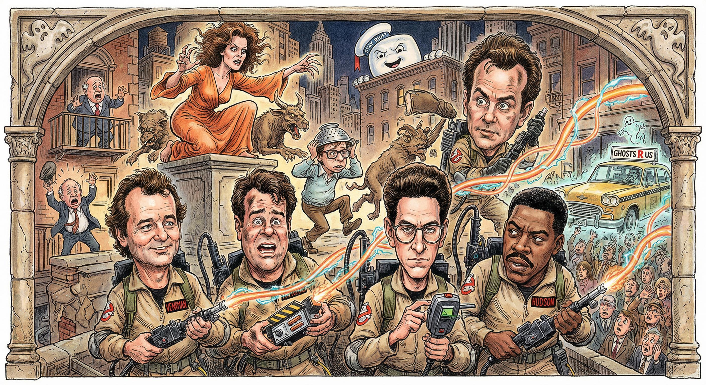
A color-illustrated caricature montage in the signature Mort Drucker style depicts the main cast of the 1984 film Ghostbusters within a decorative stone-arched frame. The foreground features highly detailed likenesses of Peter Venkman, Ray Stantz, Egon Spengler, and Winston Zeddemore equipped with proton packs and ghost-hunting gear amidst a panicked New York City crowd. The dense, layered composition captures iconic cinematic moments, including a possessed Dana Barrett atop a pedestal, Louis Tully wearing a metal colander, the towering Stay Puft Marshmallow Man looming over the skyline, and the ECTO-1 taxiing through the chaos.")
 — generated by Gemini Nano Banana Pro.
A color-illustrated caricature montage in the signature Mort Drucker style parodies the Fast & Furious franchise under the title \"MAD MAGAZINE SPOOFS: THE FAST AND THE SPURIOUS.\" The scene depicts a densely crowded nocturnal street race where a hyper-muscular Vin Diesel, leaning out of a red Mazda RX-7, complains via speech bubble that \"this script feels longer\" than a quarter-mile, while a wide-eyed, sweating Paul Walker in an orange Toyota Supra questions if he is a cop, a racer, or just a \"dude with too much hair gel.\" Surrounding the central duo are caricatures of Michelle Rodriguez and Jordana Brewster, a \"Race Wars\" banner offering free tacos, and a prominent sign mockingly defining \"FAMILY\" as the only thing the characters talk about.")
1
100% Upvoted
{Ghostbusters (1984 film)}, color-illustrated in the wordless unified caricature montage style of Morris "Mort" Drucker (1929–2020): {
The history of American illustration is often bifurcated between the earnest, aspirational realism of the early twentieth century—the tradition of Howard Pyle (1853–1911), N.C. Wyeth (1882–1945), and Norman Rockwell (1894–1978)—and the subversive, satirical sensibility that emerged in the post-war era. Standing at the nexus of these two traditions was Morris "Mort" Drucker. Born in Brooklyn in 1929, Drucker attended Erasmus Hall High School—an incubator for creative talent—but his aesthetic sensibilities were forged outside formal higher education. Aside from a brief, unfulfilling stint at Parsons School of Design, Drucker was a determined autodidact whose "classroom" was the commercial newsstand. By bypassing rigid academic dogma in favor of analyzing the working methods of successful commercial illustrators—supplemented by hands-on apprenticeship and early freelance assignments—he developed a pragmatic, results-oriented versatility. This lack of formal pedigree paradoxically served his mature style: he did not learn to draw "cartoons"; he learned to mimic the sophisticated, idealized vernacular of advertising and editorial illustration, acquiring the technical camouflage that would later allow his satires to infiltrate and dismantle the very media landscapes they parodied.
In 1947, facilitated by Will Eisner, Drucker began his career assisting Bert Whitman (b. 1908) on the syndicated strip Debbie Dean, Career Girl at New York Post Syndicate—a formative phase that established the foundational illustrative competence essential to his later work. Working within the "good girl art" tradition, he mastered the mechanics of multi-figure staging and reactive body language, learning to compose intelligible, cohesively interacting ensembles. This apprenticeship instilled the idealized realism and fluid brush control that would later serve as the crucial "straight" anchor to his satirical exaggerations, ensuring his parodies would remain grounded in a convincing, illustratively authoritative reality.
Around 1950, Drucker entered a prolific freelance period, contributing to publishers including Dell, Atlas (later Marvel), St. John, Better Publications, ACG, and National Periodical Publications (DC Comics). At DC, he honed his narrative pacing across diverse genres—war, western, and romance—building the cinematic storytelling vocabulary that would later structure his parody work. His four-year tenure drawing DC's The Adventures of Bob Hope proved particularly pivotal, requiring him to sustain a recognizable celebrity likeness across extended narratives while balancing slapstick comedy with convincing figure drawing—an early rehearsal for the core demands of his mature MAD parodies.
During this period, Drucker also served as a ghost artist for Paul Webb's The Mountain Boys—a long-running cartoon feature in Esquire magazine that was later adapted into a syndicated strip. Following Webb's direction, he pivoted from idealized realism to stylized character comedy, mastering the vernacular of humorous posture and distinct physiognomic "typing." Under Webb's rustic template, he learned to compose loose, atmospherically textured scenes that prioritized expressive body language and situational absurdity over illustrative polish. This dual experience—cinematic narrative grounding at DC and comedic exaggeration under Webb—moved him decisively toward a style that could anchor subtly caricatured figures within textured, realistic environments.
Drucker debuted in MAD Magazine with issue #32 (April 1957), initially contributing advertising satires—notably "The Most Nauseating TV Commercials of 1956"—and general humor pieces rather than the movie and television parodies that would later define his tenure. His early MAD figures possessed a volumetric solidity and polished line weight that lent a paradoxical authority to absurd material—the illustrative conviction of the rendering making the satirical content land as pointed commentary rather than mere silliness.
In this period, he primarily illustrated text-driven lampoons written by Tom Koch and the comedy team of Bob Elliott and Ray Goulding—an assignment structure that trained him to subordinate his drawing to MAD's editorial satirical framework, learning to time visual gags to a writer's rhythm rather than pursuing self-directed illustration. This writer-artist collaboration model shaped his entire career at the magazine. Visually, he employed the compositional clarity of 1950s American commercial illustration rendered in sculptural tonal modeling consistent with MAD's house aesthetic—though with lighter, less densely rendered hatching than colleagues like Wally Wood (1927–1981) or Jack Davis (1924–2016), favoring gestural economy over tonal saturation. By his first full-scale television parody in issue #48 (July 1959)—"The Night That Perry Masonmint Lost a Case"—he had adapted his sculptural realism to the demands of narrative spoofing, sustaining recognizable celebrity likenesses across multiple panels while demonstrating that grounding ridiculous behavior in anatomically convincing draftsmanship made the satire sharper, more specific, and more effective. This transitional phase established two pillars of his mature method: the discipline of serving a comedic script visually and the confidence to render recognizable public figures within satirical narratives.
While continuing at MAD, Drucker maintained freelance relationships with DC Comics and other publishers, contributing to both war and humor titles. His growing reputation also generated high-profile commissions across diverse commercial contexts. The JFK Coloring Book (1962)—which sold over two million copies—and later The Ronald Reagan Coloring Book (1988) showcased his mature caricature method in a pared-down format, demonstrating that his approach retained its precision and impact independent of MAD's editorial context. He contributed covers and illustrations to Time, TV Guide, and other national publications, and produced work for movie posters, album covers, advertisements (clients including Heinz Ketchup, the U.S. Postal Service, and Whirlpool), and children's books. This commercial breadth reinforced the range of his illustrative vocabulary while confirming that his caricature method—rooted in realistic authority—could operate effectively across media, contexts, and degrees of finish.
In his most celebrated body of work—the movie and television parodies for MAD spanning the 1960s through the 2000s—Drucker's method achieved its fullest expression, synthesizing every element refined across the preceding decades. His approach operated with a sculptural intelligence grounded in forensic study of filmed performances: he caricatured not merely celebrities but actors inhabiting specific roles, capturing their gestural vocabulary and screen presence in character rather than simply reproducing a static likeness. Working in sustained creative partnership with writers including Larry Siegel, Dick DeBartolo, Arnie Kogen, and Stan Hart, he subordinated his virtuosity to the comedic script's rhythm—timing visual payoffs, embedding background gags, and orchestrating complex multi-character sequences in precise synchronization with the script's comedic architecture. His environments, costumes, and props were meticulously researched, faithfully recreating the source material's production design and grounding the caricatured performances in a convincingly rendered world. Though visually worlds apart from the minimalism of Charles M. Schulz (1922–2000), Drucker's parodies share a tonal kinship with Schulz's character-driven humor: an affectionate irony rooted in deep familiarity with the subject, generating laughter through recognition rather than ridicule—Schulz channeling this through archetypal childhood neuroses, Drucker through the amplified mannerisms of real performers rendered for an adult audience intimately familiar with the source material. Across four decades of parodies, his linework captured not just the physiognomy of a performer but their dynamic personality in motion.
Taken as a whole, Drucker's signature style is grounded in detailed illustrative realism—anatomically sound, sculpturally rendered figure drawing with fluid, confident brush and pen work marked by varied line weight, and controlled yet gesturally expressive cross-hatching and rich textural shadows, with only occasional reliance on mechanical screen tones (Zip-a-Tone)—fully effective in black and white yet further complemented by color. When the narrative accommodates, he employs dramatic tonal chiaroscuro that invites comparison with the volumetric precision of Robert Fawcett (1903–1967), while his use of lighting as narrative mood and tension recalls Will Eisner (1917–2005). His figurative work is governed by several core observational priorities—the spatial relationships between facial features, the expressiveness of hands, and the totality of body language—that inform both his caricature method and his approach to character performance. His caricature method applies selective exaggeration to each subject's physiognomic traits—attending not merely to individual features (a prominent nose, a characteristic jawline, a telltale squint) but to the proportional relationships between them—to amplify recognizability, heighten expressiveness, and imbue the figures with theatrical charm. Critically, his figures retain largely naturalistic body proportions, and his facial exaggerations prioritize likeness over iconography—distortion deployed to sharpen recognition, not to reduce the subject to a symbol. Simultaneously, his figures exhibit convincing, nuanced "acting" expressed through their full physical vocabulary—eloquent hands, fluid facial expressions, and considered posture—achieving a kinetic expressiveness comparable to Al Hirschfeld's (1903–2003) through elaboration and dimensional rendering rather than Hirschfeld's characteristic linear reduction, grounding each character's performance in theatrical realism.
His compositions employ an internal choreography of figural staging: ensemble figures are arranged so that the viewer's eye reads them in a deliberate sequence—lead performer first, reactive figures second, background incident last—creating comedic timing through gestural contrast, spatial pacing, and directed eye-line flow within the frame itself. This figural rhythm operates independently of, and in concert with, his page-level cinematic grammar of establishing shots, medium groupings, and close-ups, producing a layered visual narrative that mirrors the source material's own filmic pacing while embedding sequential setup-and-payoff across both the individual composition and the page as a whole. His densely populated compositions—layered background gags, parallel conversations, and cameo-filled tableaux—recall the richly detailed multi-figure compositions of Harold Foster (1892–1982) and the compositional density characteristic of mid-century editorial illustrators such as Albert Dorne (1904–1965), while his settings and period details are rendered with production-designer attentiveness. The satirical power of Drucker's work ultimately derives from the productive tension at the core of his artistic identity—between the aspirational realism of the American illustration tradition and the subversive sensibility of the post-war satirists: the world looks almost right, the people are unmistakably themselves, yet everything has been reframed as an ensemble performance in the narrative-tableau tradition of Norman Rockwell, transforming the source material into a distinctly recognizable, self-contained satirical commentary that simultaneously honors and skewers its subject.
}