1


Edward Bawden's (1903–1989) signature graphic style, rooted in linocut aesthetics, conveys complex decorative scenes while maintaining observational clarity; he was part of a generation of artists that survived two World Wars. [Gemini Nano Banana Pro]
 — generated by Gemini Nano Banana Pro
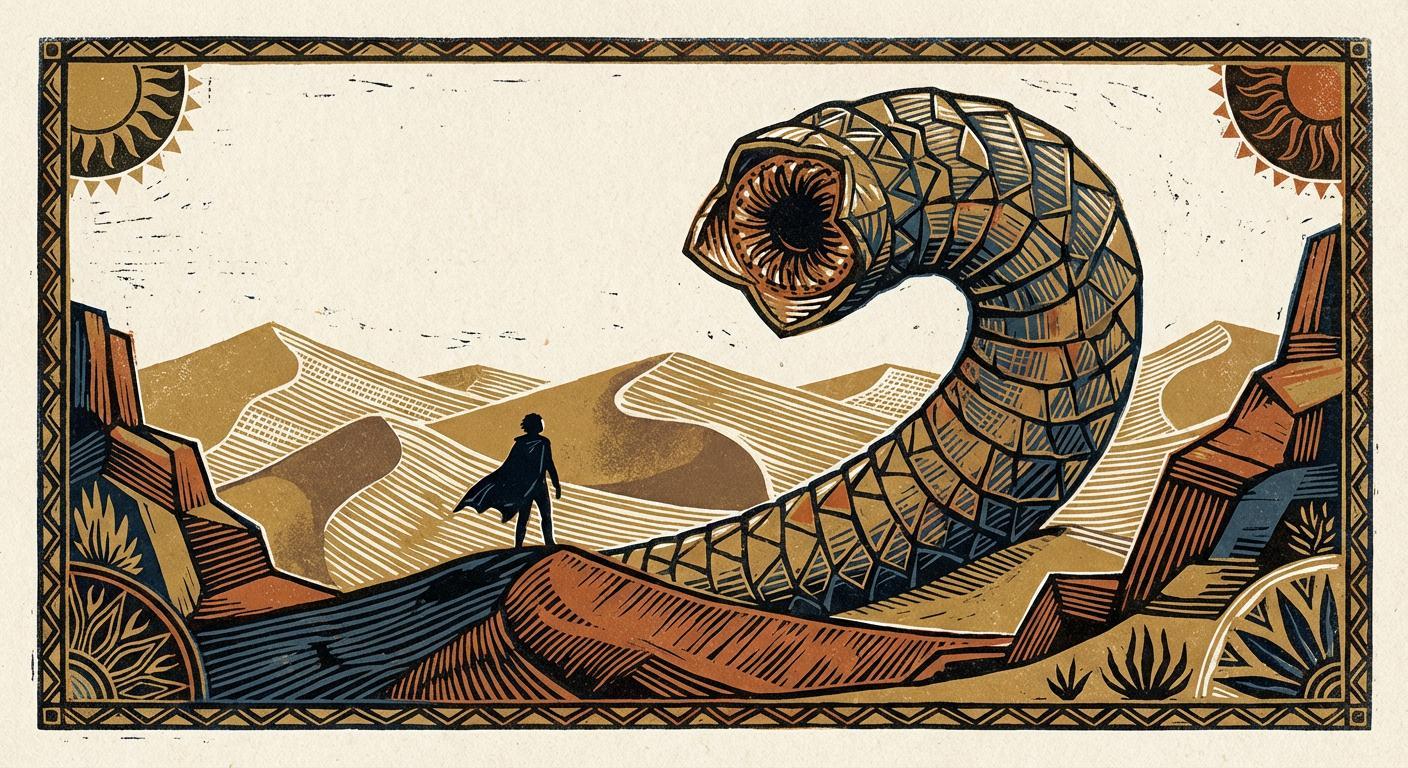
This horizontal illustration of Paul Atreides facing a towering sandworm is rendered in Edward Bawden’s signature mid-century linocut style, characterized by architectural geometry and rhythmic patterning. The composition features a lone, caped figure standing upon a dark dune in the foreground, dwarfed by the massive, segmented body of a sandworm that curves overhead in a disciplined, sculptural arc. Utilizing a limited palette of terracotta, ochre, and slate blue against a cream background, the scene translates the desert landscape into repetitive, parallel linework and stylized topographical forms. The entire image is enclosed by a decorative geometric border and flanked by two stylized suns, blending a flattened modernist perspective with the rigorous graphic craft of traditional British print design.")

1
100% Upvoted
{Clevedon Pier in Somerset, England}, illustrated in Edward Bawden’s (1903–1989) adaptable print design approach, an experimental blend between craft-based draughtsmanship and modern clarity: {
Edward Bawden's artistic identity was forged not in the fluid freedom of painterly expression, but in the rigorous discipline of industrial design and calligraphy. His early training began at the Cambridge School of Art (1919–1922), followed by three formative years at the Royal College of Art (RCA) in London (1922–1925). Lacking confidence in the traditional disciplines of painting and sculpture, Bawden pragmatically opted for the School of Design. While he later claimed no inherent passion for calligraphy, his exceptional capacity for "taking pains" and his willingness to tackle new media allowed him to master it. This choice was pivotal; he specialized in writing and illuminating—arts that demand control rather than dash. Consequently, his style remained subservient to the discipline of tools and materials, inseparable from the slow, evolutionary traditions of craftsmanship. This training planted the germ of his lifelong interest in typography, bookmaking, and the confident calligraphic quality of his draughtsmanship. Over the course of his career, Bawden seamlessly blurred the boundaries between commercial design work and fine art.
Bawden was not left to navigate this path alone; his precocious craftsmanship, sense of design, and innate sardonic humour were quickly recognized by his tutor in design at the RCA, the renowned artist Paul Nash (1889–1946). Nash, who influenced Bawden more than any other figure, introduced him to the concept of using rhythmic architectural patterning to harmonize dense decorative compositions. Through Nash, Bawden was introduced to the proprietors of the Curwen Press, leading to early professional triumphs such as the elaborate pictorial map for the Wembley Exhibition and poster commissions for the London Underground immediately upon graduation.
Historically, Bawden looked back to the Victorian eccentrics; the clean, severe linework of Aubrey Beardsley (1872–1898) provided a template for his clarity, while Edward Lear (1812–1888), whose illustrated limericks combined economy of line with whimsical humor, and Richard "Dicky" Doyle (1824–1883), known for intricate fairy illustrations and decorative borders, fueled his satirical wit and love for Victorian ornamentation.
In 1925, Edward Bawden designed book dust jackets for The Curwen Press. For Lance Sieveking’s The Ultimate Island (1925), he employed a linocut graphic featuring a surreal composition framed by the distorted perspective of a convex mirror. This early work showcased his ability to orchestrate complex, decoratively illustrated scenes that maintain spatial integrity and observational detail without resorting to reductive abstraction except when deliberately applied.
Between 1927 and 1929, Bawden produced a suite of copper engravings (later published as Fifteen Engravings in 1988). In these works, he adapted the chaotic, surreal scenic qualities of Hieronymus Bosch (c. 1450–1516) into disciplined, decorative compositions marked by stylized perspective, sculptural forms with playful manipulation of scale, and chiaroscuro rendered through rhythmic patterning—treating both light and shadow as tangible, structural graphic elements. This period of experimentation coincided with his first major public breakthrough: in 1928, he and Eric Ravilious were commissioned to paint murals for the refectory of Morley College in Lambeth. Unveiled by Prime Minister Stanley Baldwin in 1930, the murals utilized a similar aesthetic framework as the engravings and received widespread praise, establishing Bawden's reputation and marking the first pinnacle of his professional achievement.
In 1931, Tom Laughton, a Scarborough hotelier and brother of actor Charles Laughton, commissioned Bawden to create a decorative map for The Pavilion Hotel. The cartographic work demonstrates Bawden's facility for transforming topographical features—buildings, cliffs, waves, terraced headlands—into rhythmic decorative patterns that frame scenes of seaside leisure as the main, high-angle vignette, effectively integrating his observational humor within a structural composition.
From 1932, Bawden's aesthetic was further solidified by his residence in Great Bardfield, Essex, where he lived alongside a community of artists including his close friend and fellow RCA student Eric Ravilious (1903–1942), portrait painter Duffy Ayers (1915–2017), John Bolam (b. 1922), Bernard Cheese (1925–2013), Tirzah Garwood (1908–1951; married to Ravilious), Michael Rothenstein (1908–1993), Elizabeth Joan Glass (1915–2000), Laurence Scarfe (1914–1993), Stanley Clifford-Smith (1906–1968), Enid Marx (1902–1998; a fellow designer known for bold textile patterns), and others. Many of these peers shared a background in the English design tradition, which emphasized rigorous draughtsmanship, lettering, and applied graphic craft. The "Great Bardfield Artists" were diverse in style but shared a love for figurative art, making the group distinct from the better-known St Ives community in Cornwall, who, after World War II, were chiefly dominated by abstractionists. Among these peers, Eric Ravilious was Bawden's most significant interlocutor. The two artists influenced each other's development through close proximity and collaborated on mural projects. Their parallel careers in wood engraving, linocut, commercial illustration, and watercolor painting reveal an ongoing modernist artistic dialogue.
During the 1930s, Bawden's landscape style evolved further through close collaboration with his Great Bardfield neighbor, the painter John Aldridge (1905–1983). Painting the same Essex scenes en plein air in oils, the two artists shared an interest in structured pictorial space and the rhythmic organization of landscape elements. This approach allowed Bawden to translate natural light and form into stylized volumes within a decorative composition, creating a distinctive visual tension that oscillates between topographical realism and the compressed, modernist abstraction rooted in graphic printmaking. This sensibility extended to applied design; in 1939, Aldridge and Bawden jointly produced wallpapers printed from linocuts by Curwen Press. Ranging from organic to architectural relief-like patterns, these designs showcased a textile-like decorativeness that struck a disciplined balance between the natural intricacy of William Morris and the mathematical precision of Arabesque patterning, executed with modern clarity.
Simultaneously, Bawden became a sought-after commercial artist. Between 1935 and 1936, he produced illustrations for major clients including Westminster Bank, the Orient Line, Twinings, Shell-Mex, and Imperial Airways. In these commissions, he utilized varying perspective modes—ranging from the mathematically precise depth of Quattrocento frescoes to playful cartoonish isometrics—to scaffold his decorative figures and environments. By the late 1930s, he had established a rigorous graphic vocabulary through his mastery of the linocut, as exemplified in Cattle Market, Braintree (1937) and the Kew Gardens Underground poster (1937). While linocut was often dismissed as a crude medium capable only of blunt effects, Bawden subverted this expectation. He achieved a monumental decorativeness akin to Byzantine stained glass through rhythmic blocking and bold color temperature contrasts reminiscent of Enid Marx, aesthetically organized for maximum visual impact. This disciplinary background in printmaking deeply informed his approach to painting.
In 1940, Bawden applied this graphic sensibility to his role as an official British war artist attached to the British Expeditionary Force (B.E.F.). While his medium of pen and wash shared the atmospheric immediacy of his peer Edward Ardizzone (1900–1979), Bawden distinguished himself by prioritizing structural order and decorative composition over naturalistic reportage. He focused on the collective atmosphere of the scene rather than individual emotive portraits. This tendency is exemplified in works such as The Quay at Dunkirk, where the chaos of the evacuation is organized into a cohesive, rhythmic graphic arrangement rather than a purely realistic documentation.
Following his evacuation from Dunkirk, Bawden spent the remainder of his commission in the Middle East, producing illustrations across Egypt, Libya, Sudan, and Iraq. During this period, he refined a unique ink-and-wash technique dictated by his use of 'lettering paper'—a smooth, non-absorbent stock typically deemed unsuitable for watercolor. On this slick surface, his washes did not sink in but pooled to create deliberately granulated, reticulated textures that mimic the blurry quality of realistic surfaces. Working with a limited palette, he exploited the temperature contrast between warm ochres and cool blues, overlaying these fluid, atmospheric washes with sharp pen-and-ink contours and sgraffito scratches. The juxtaposition of soft, granulated color against incisive black lines creates a surreal visual oscillation: mediating between the bokeh-like, atmospheric haze of the desert and the crisp, focused contours of documentary reportage.
In 1946, Edward Bawden created monotone illustrations for Contact magazine. These works showcase a playful effortlessness through casual yet elegant linework and loose crosshatching, evoking the cartoonish editorial conventions of mid-century American magazines such as The New Yorker. His urban landscapes possess a breezy spontaneity that belies his characteristic structural discipline.
In 1955, Edward Bawden began a celebrated collaboration with Fortnum & Mason, illustrating their Christmas catalogs. These commissions mark a crucial evolution in his commercial style, moving away from the severe geometry of the 1930s toward a more playful, 'folk-art' complexity to accomodate the brand's festive messaging. In these works, Bawden’s mastery of visual rhythm is paramount; he arranges eclectic assortments of consumer goods into dense, decorative vignettes that function like a cohesive jigsaw puzzle. This approach successfully harmonized the functional demands of a product inventory with the whimsy of Victorian scrapbooks, anticipating the organic fluidity of his later Aesop's Fables series.
Throughout his post-war career, Bawden remained particularly associated with linocut printmaking, which suited his preference for bold, decisive marks and flattened pictorial space. The medium's limitations—its resistance to fine detail and encouragement of simplified forms—aligned with his graphic sensibility. His compositions frequently employ structurally strong, mathematically precise arrangements where repetition creates a pleasing order. The rhythmic parallelism in his linework and patterning, as influenced by Paul Nash, recalls algorithmic or parametric designs—spirographs, guilloché patterns—though Bawden's aesthetic aims for architectural rather than purely curvilinear beauty. Pattern serves not merely as decoration but as a compositional armature. Influenced by the decorative perspective of English Neo-Romanticism, Bawden regularly employed patterned elements as framing devices—architectural features, decorative borders, repeated motifs—to organize pictorial space and guide the viewer's eye through complex scenes.
In 1967, commissioned by Curwen Prints, Bawden produced a series of six linocuts titled London Markets, depicting Billingsgate, Borough, Covent Garden (two views), Leadenhall, and Smithfield. In these works, he translated the intricate Victorian cast-iron architecture of the markets into a monumental graphic language. Synthesizing the sharp linework of his early influences with bold mid-century colour-blocking, Bawden treated the repetitive architectural trusses as rhythmic patterns that create directional visual flow and depth. The result is a collage-like composition possessing the charm of printed ephemera; it captures the chaotic energy of the markets by filtering their details through a streamlined geometry, unifying the scene within a disciplined, flattened modernist perspective.
In 1970, Bawden produced a series of eight linocuts based on Aesop's Fables, published in a limited edition of fifty. In contrast to the rigid architecture of his London Markets series, these works feature fluid, organic compositions dominated by curvilinear linework and a vivid elemental color palette. Despite this stylistic shift, Bawden maintained his signature rhythmic patterning, creating a simplified worldview that possesses a naive, storybook charm. This versatility was further demonstrated in his monotone illustrations for Robert Paltock's The Life & Adventures of Peter Wilkins (1973), which feature idealized sculptural chiaroscuro, stylized solid-black shading, and fine contouring. These scenic compositions are built from juxtaposed blocks of rhythmic patterning, creating a compressed spatiality that possesses the decorative density of textile design—anticipating the intricate papercut aesthetics of British artist Rob Ryan (b. 1962).
Overall, Edward Bawden's signature graphic style fuses the surreal, structural parallelism of his mentor Paul Nash (1889–1946) with the calligraphic rigor of his Royal College of Art training. Rooted in the subtractive logic of the linocut, his work synthesizes scenic perspectival depth with architectural geometry, utilizing these rigid structures as a visual armature for rhythmic color blocking. He employs a limited, temperature-contrasted palette to convey Art Deco-like graphic immediacy without sacrificing the image's scalar and spatial integrity. His scenes often recall the work of Eric Ravilious, yet Bawden distinguishes himself by using perspective depth as a framework for color-blocked repetitions of linework and sgraffito scratches, as exemplified in the Borough Market linocut (1967). Drawing on English craft traditions, Victorian ornamentation, and the mathematical precision of Arabesque and guilloché patterning, Bawden achieves a contextually adaptable Modernism—a collage-like decorative vernacular that remains distinct whether applied to a book jacket, a mural, or a commercial advertisement. The resulting images oscillate between atmospheric softness and mechanical precision, creating a deliberate stylistic tension that bridges the gap between Victorian wit and Modernist abstraction, and between the idiosyncrasy of the draughtsman's hand and the functional demands of the printing press.
}