2


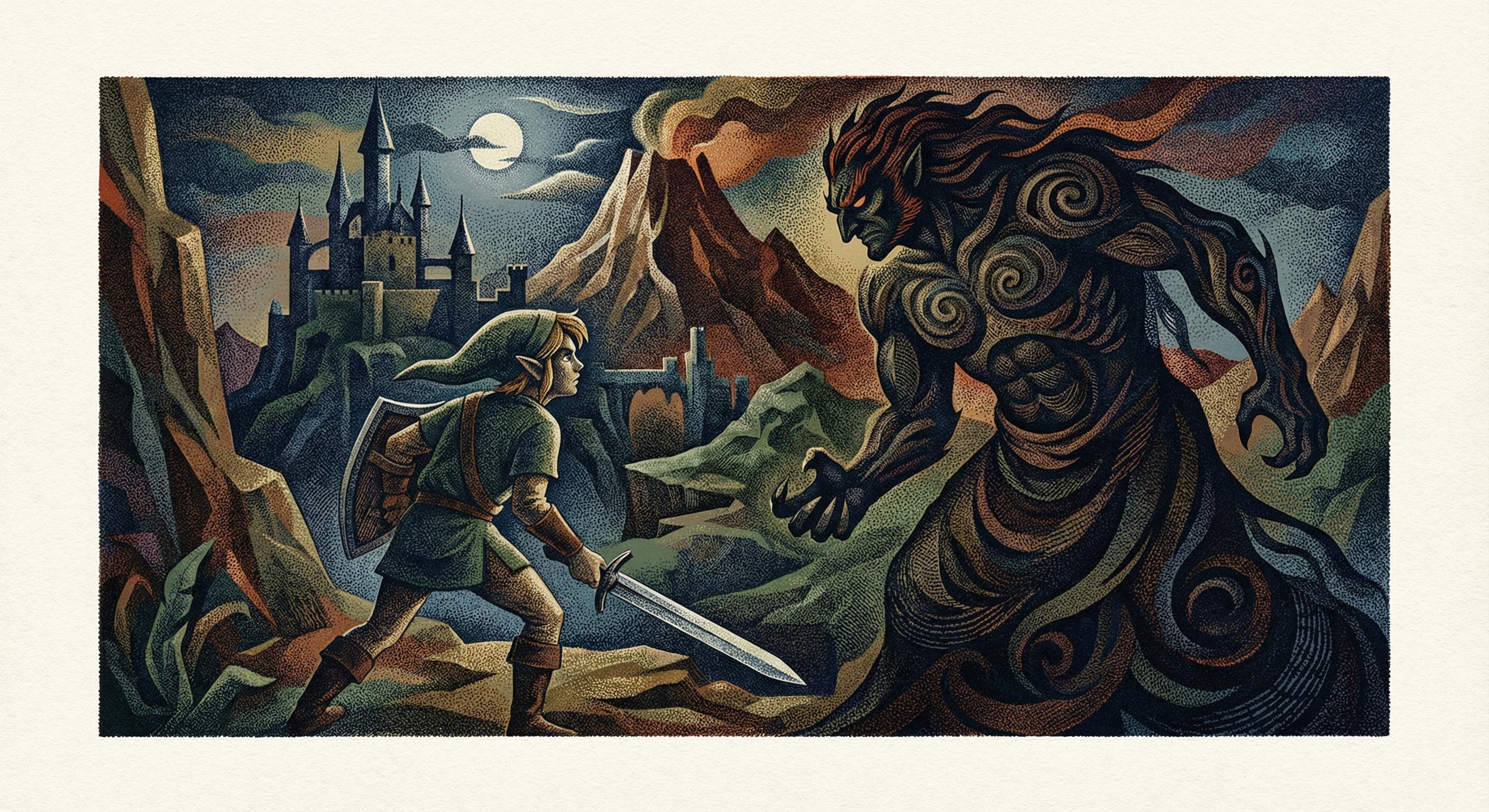
Stippled chiaroscuro style of Lynd Kendall Ward (1905–1985): A noir-inspired wood engraving aesthetic using fine stippling to create sculptural forms and varying textural density within deep, cinematic shadows. [Gemini Nano Banana Pro]


2
100% Upvoted
{The Legend of Zelda} illustrated in the polychromatic stippled chiaroscuro style of Lynd Kendall Ward (1905–1985), exemplified in his 1939 edition of Beowulf: {
Lynd Kendall Ward's illustration style draws on his mastery of wood engraving to produce fine gradations within noir-inspired chiaroscuro, employing primarily stippling effects that can be combined with varying textural cross-hatchings. This approach conveys mysticism, tension, nostalgia, and other emotive framings through stylization and directional lighting, rendered in vignette-like atmospheres that establish an intimate narrative perspective.
Born in Chicago, Illinois, Ward attended Teachers College of Columbia University, majoring in fine arts, before studying under Hans Alexander Mueller (1888–1963), a wood engraving master at the State Academy of Graphic Arts in Leipzig in 1926 and 1927. It was in Germany that Ward encountered the pictorial narratives of Frans Masereel (1889–1972) and Otto Nückel (1888–1955), both pioneers of the wordless novel in woodcut form, whose influence proved formative. He also absorbed the broader currents of German Expressionism, with its emphasis on stark tonal contrasts and psychological intensity—an aesthetic lineage traceable through Käthe Kollwitz (1867–1945) and Ernst Barlach (1870–1938). Upon returning to the United States, Ward created his own wordless novel, Gods' Man (1929), a book of 139 captionless wood engravings that was enthusiastically received and followed by five more wordless novels over the next eight years: Madman's Drum (1930), Wild Pilgrimage (1932), Prelude to a Million Years (1933), Song Without Words (1936), and Vertigo (1937). From his training under German masters to his subsequent role as a WPA-era artist and pioneer of children's literature, Ward's art came to embody high-contrast chiaroscuro, dramatic compositional staging, and a lifelong devotion to the 'Social Gospel' that his father, the Methodist minister Harry F. Ward, had championed.
Ward's method employs a versatile visual framework of stippled chiaroscuro that shifts from graphic boldness to atmospheric subtlety. Following principles outlined in Mueller's How I Make Woodcuts and Engravings (1939), Ward favored oil-based inks for color work because their transparency permitted chromatic overlapping, whereby two colors yield a third—reducing the number of blocks required while expanding tonal range. Crucially, his rendering eschews explicit linear outlines, relying instead on the juxtaposition of light and dark to establish form. This approach, where edges are defined by tonal contrast rather than drawn boundaries, creates figural contouring with a sculptural monumentality that parallels, though differs in tone from, the polished Art Deco stylization of Tamara de Lempicka (1894–1980). Where Lempicka pursued luxurious sensuality, Ward exploited the noir somberness of stark chiaroscuro to serve narrative and social commentary. His contemporaries Rockwell Kent (1882–1971) and Fritz Eichenberg (1901–1990) shared his commitment to the wood engraving medium and socially conscious subject matter, though Ward distinguished himself through concentrated dramatic emphasis within his atmospheric chiaroscuro, where Kent favored expansive tonal unity and Eichenberg pursued angular expressionist directness. His figural stylization ranges from the angular, expressionist monumentality of his early wordless novels to the softer mid-century realism of his later illustrated books.
Through consistent gradation rather than explicit contour lines, Ward defines form and conveys depth within stylized perspectives—a tonal approach that distinguishes his work from the linear clarity of contemporaries such as Rockwell Kent. He invokes implicitly surreal angles that anticipate Chris Van Allsburg's (b. 1949) uncanny scaling of perspective, adopts dream-like compositions with the memorial gravity of Ted Coconis's (1927–2023) figurescape murals, and occasionally embraces visual ambiguity reminiscent of the double-image surrealism characteristic of Karel Thole (1914–2000). His range extends from bold, poster-like renderings with flattened perspective—recalling the editorial illustration conventions of mid-century American magazines such as The New Yorker during the 1930s–1950s—to soft, atmospheric stippling that creates sandstone-like surfaces with dramatic spatial recession. At times he graduated his fine stippling toward texturally evocative cross-hatching and micro-patterns that echo the virtuosic engraving tradition extending from Albrecht Dürer (1471–1528) through the Italian master Benvenuto Disertori (1887–1969).
This versatility is evident across his body of work. His landmark wordless novels Gods' Man (1929) and Madman's Drum (1930) employ bold graphic contrasts, combining pristine parallel linework with stark tonal transitions to create a relief-like chiaroscuro descended from the noir wood engraving tradition of Masereel. In Wild Pilgrimage (1932), Ward employs dense black with only minimal white gradients to contour the chiaroscuro, producing a profoundly somber atmosphere. His illustrations for Frankenstein: Or the Modern Prometheus (1934), created for the Harrison of Paris edition of Mary Wollstonecraft Shelley's Gothic novel, exemplify Ward's signature statuette-like, stylized chiaroscuro, employing varying textural qualities that define focal points through contrast and convey depth despite flattened rendering—images of such enduring power that they have been reissued in subsequent editions. Song Without Words (1936) extends this visual logic into double-image surrealism, embedding secondary figures within compositions in a manner reminiscent of Charles Allan Gilbert's (1873–1929) All Is Vanity (1892). His illustrations for Beowulf (1939) depict heavily stylized monumental figures through a metallic chiaroscuro rendered in chromatic-toned modulation, animated by temperature contrast, with depth defined primarily through lighting logic. In The Count of Monte Cristo (1941), illustrating Alexandre Dumas's novel, Ward calibrates his monochrome chiaroscuro to complement the printed text, concentrating tonal weight selectively to balance illustration against prose rather than dominate the page.
As Ward moved into color illustration, his techniques adapted while retaining their essential character. In The Innocent Voyage (1944), illustrating Richard Hughes's novel (originally published as A High Wind in Jamaica), he introduced color in both the light and dark areas of his chiaroscuro, with highlights rendered chromatically and shadows modulated from deep saturated colors toward gray or black, creating an ephemeral, soft pastel atmosphere with a controlled tonal range. For America's Paul Revere (1946), written by Esther Forbes, his chiaroscuro rendering modulates planar color-blocking, enabling complex narrative compositions while maintaining printing cost efficiency through a limited palette.
The 1950s marked a period of particular refinement and variety. In The Biggest Bear (1952), for which Ward won the Caldecott Medal in 1953, he both wrote and illustrated using casein paint, blending children's book accessibility with naturalistic mid-century realism. His compositions emphasize broad tonal contrasts, atmospheric negative space, and painterly textures rather than the stark, dense chiaroscuro of his earlier woodcuts, evoking a gentler narrative style distinct from, yet occasionally reminiscent of, the lighter touch of E.H. Shepard (1879–1976). The Arabian Nights: Tales of Wonder and Magnificence (1953), retold by Padraic Colum, displays refined stippling—at times gestural to suggest texture or kinetic visual flow—combined with mythical, cinematic lighting to produce dramatic pictorials characterized by statuette-like forms and polished, sandstone-like surfaces. That same year, Martin Luther, written by his wife May McNeer, reveals a more refined mid-century realism in both rendering and composition, though Ward's hallmark noir-inspired atmospheric chiaroscuro remained dominant, enhanced by a temperature-modulated color palette that complemented and guided visual flow. By Armed with Courage (1957), also written by McNeer, Ward employed more organic surface treatments—almost the opposite of his earlier polished renderings—using varied textural effects in fabrics and coarse treatments for architectural elements to create striking contrast between figures and their surroundings.
His later work continued to explore the expressive possibilities of chiaroscuro. In his illustrations for a later edition of Johnny Tremain (c. 1960), Esther Forbes's Newbery Medal–winning historical novel, Ward employed angled perspective to achieve dramatic scaling and chiaroscuro—rendered through cross-hatching—between foreground and background, establishing a vantage imbued with melancholic nostalgia.
Across these varied projects, Ward's work demonstrates a coherent artistic vision: the conviction that stippled chiaroscuro and temperature-modulated tonal gradation, rooted in the wood engraving tradition but adaptable across media from monochrome prints to casein painting, could serve both aesthetic pleasure and moral seriousness. His influence extends through subsequent generations of illustrators who have embraced atmospheric tonal rendering as a vehicle for narrative depth, from Van Allsburg's quietly surreal picture books to Clifford Harper's (b. 1949) anarchist graphics, which sharpen Ward's chiaroscuro vocabulary through heightened modernist economy. Ward's synthesis of German Expressionist intensity, American social realism, and dramatic visual composition established a distinctive aesthetic legacy that continues to resonate in contemporary book illustration and printmaking.
}