1


The children's book illustration style of Walter Crane (1845–1915): Resisting the soul‑destroying effects of industrialization, Crane insisted on high‑quality craftsmanship in his "toy books," despite cost‑cutting pressures. [Gemini Nano Banana Pro]


1
100% Upvoted
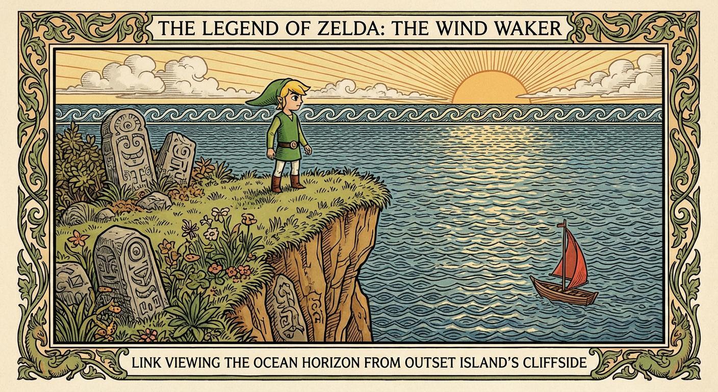
{The Legend of Zelda: The Wind Waker — Link viewing the ocean horizon from Outset Island’s cliffside} illustrated in the children's book illustration style of Walter Crane (1845–1915), as exemplified in his toy books series: {
Walter Crane's children's book illustrations represent a deliberate elevation of the "toy book" from disposable commodity to unified art object. His signature style synthesized a diverse global archive of ornament—Japanese, Pre-Raphaelite, Renaissance, Islamic, and medieval—into a singular visual language. This style fused the clarity of wood engraving with a nature-inspired lyricism of line, characterized by bold outlines, flat color fields, curvilinear organic motifs, and the seamless integration of text and image. This approach treated each page as an architectural whole: legible to the child, yet possessing the structured presence of a mural or classical frieze.
These aesthetic commitments emerged from the reformist currents of mid-Victorian England. Central to this milieu were the writings of John Ruskin (1819–1900): Modern Painters (1843–1860), which argued that art must be rooted in close observation of nature; The Seven Lamps of Architecture (1849), which taught integrity of craftsmanship and the rejection of applied ornament unrelated to structure; The Stones of Venice (1851–1853), which championed Gothic architecture as moral and spiritual expression; and Unto This Last (1860), which linked aesthetic value with social justice. These principles informed the Pre-Raphaelite circle and the later Arts and Crafts Movement, both of which looked to medieval craft guilds as models—valuing what Ruskin called the worker's "expression of his pleasure in the labor"—and opposed the mechanization that severed design from execution. The Arthurian medievalism of Alfred, Lord Tennyson's Idylls of the King (1859–1885) provided a complementary imaginative vocabulary of purposeful labour and decorative elaboration. Crane absorbed these currents as practical orientation: art should unify beauty with utility, dignify labour, and address the whole environment of human life.
Crane's formation prepared him for this synthesis. Born in Liverpool to Thomas Crane (1808–1859), a portrait painter and miniaturist, Walter was introduced to the demands of precision and scale from infancy—an early exposure that likely instilled the close attention to detail characterizing his densely patterned compositions. His formal training began with an apprenticeship in wood-engraving under William James Linton (1812–1897) from 1859 to 1862, following his father's death. Linton sent Crane to the Zoological Gardens to make animal studies—often modelled on the approach of Sir Edwin Landseer (1802–1873)—for a projected natural history volume, instilling the discipline of rapid observational drawing that would lend vitality to his more formalized compositions.
The technical command Crane acquired under Linton prepared him for partnership with Edmund Evans (1826–1905), a pioneering woodblock and color printer. Beginning in 1865 with inexpensive "toy books" such as The House That Jack Built, Crane resisted Evans's initial inclination toward the "good enough" standard that governed cheap fiction of the period—sometimes called "mustard plasters" for their rapid, formulaic production. Instead, Crane insisted on compositional integrity within severe commercial constraints, demonstrating that affordability need not preclude considered design.
Crane's mature toy book style is defined by four interdependent formal principles: outline structure, color organization, spatial compression, and page architecture. From Japanese woodblock prints (ukiyo-e), Crane adopted the "key-block" method: bold black outlines defining primary forms, with delicate secondary contours articulating interior detail. This hierarchical outline system established immediate legibility while permitting decorative elaboration within bounded zones. The line itself carried expressive weight—thickening for emphasis, thinning for recession—functioning as both structural armature and ornamental element.
Complementing this outline structure, Crane employed flat, unmodulated color fields contained within outline boundaries, rejecting the tonal gradation of academic painting. His palette relied on strategic chromatic contrast: warm advancing hues against cool receding grounds, creating visual flow across the page without illusionistic depth. The color printing limitations of Evans's wood-engraving process—typically three to four ink blocks—became a compositional discipline rather than a constraint, enforcing economy and clarity.
These principles of outline and color operated within a deliberately compressed pictorial space. Crane flattened figures and settings into interlocking decorative zones, arranging them in shallow, frieze-like planes parallel to the picture surface. This compressed dimensionality—influenced by both ukiyo-e and medieval manuscript illumination—suppressed recession in favour of surface pattern, yet maintained spatial intelligibility through overlapping, scale gradation, and color temperature contrast.
Unifying these elements was Crane's treatment of the page as an architectural unit. Each spread functioned as a unified compositional field in which image, border, and text formed an integrated design. Crane conceived the double-page spread as a balanced structure, distributing pictorial incident across facing pages and using ornamental borders to frame and contain narrative action. This approach transformed sequential pages into a rhythmic visual environment rather than a series of discrete illustrations.
Within this formal framework, Crane synthesized an eclectic vocabulary of historical ornament. He drew upon classical motifs—the acanthus leaf, the palmette, and Renaissance grotesques derived from ancient Roman wall decoration—alongside the fluid linearity of Italian textile patterns and stylized floral forms. The geometric interlace of Islamic arabesque contributed structural rhythm, while the hieratic symbolism of medieval European manuscript illumination informed his treatment of figures and narrative space. This dense layering of historical reference, unified by Crane's consistent rhythmic contour, produced pages of decorative complexity that maintained compositional legibility.
Crane's figural treatment further distinguished his work. Where his Pre-Raphaelite sources—particularly Dante Gabriel Rossetti (1828–1882)—tended toward static, iconic arrangement, Crane rendered mobile countenances and animated gestures suited to narrative illustration. He maintained a similar distinction between his work and the more systematic stylization of his French contemporary Eugène Grasset (1845–1917), characterizing his own approach as more naturalistic and less beholden to the rigid decorative formulas he perceived in Grasset’s Art Nouveau compositions. Figures act within their decorative environments—pointing, striding, turning—and their gazes direct the viewer's attention through narrative sequence. This figural animation, combined with compressed spatial depth, produced a graphic style legible as storytelling yet coherent as surface design.
Central to Crane's method was the treatment of typography as a decorative element. Rather than relegating text to separate zones, he incorporated letterforms into the ornamental scheme—using them as framing devices, weaving them into borders, or allowing illustrated elements to interact with the text block. This fusion embodied the Arts and Crafts principle of unified design: the book as a total work in which no element existed in isolation. When Crane contributed illustrations to books produced by William Morris's Kelmscott Press in the 1890s, he worked alongside Morris's custom typefaces—Golden, Troy, and Chaucer—designed to harmonize with decorative borders and illustrations in the manner Crane had long advocated.
From the mid-1870s onward, Crane extended these graphic sensibilities into the decorative arts—designing wallpapers for Jeffrey & Co., as well as tapestries, ceramics, tiles, mosaics, and architectural friezes. Through association with William Morris (1834–1896), Edward Burne-Jones (1833–1898), and Philip Webb (1831–1915)—and through shared participation in the Arts and Crafts circle—he developed an ornamental vocabulary in which illustration and decoration became reciprocal disciplines. The scale of architectural ornament informed the compositional gravity of his picture books, while the narrative demands of illustration lent vitality to his decorative schemes. Crane also applied his decorative principles to theatrical production, designing costumes and sets for masques and civic pageants—extending his approach to ornamental unity into three-dimensional and performative contexts.
Together with Kate Greenaway (1846–1901) and Randolph Caldecott (1846–1886)—both also published by Evans—Crane helped redefine the visual standards of children's literature in late Victorian and Edwardian Britain. His mature works, including The Baby's Opera (1877) and The Baby's Bouquet (1878), elevated picture books into collectible objects. Crane later became a central figure in the Arts and Crafts Movement, serving as the first president of the Arts and Crafts Exhibition Society (founded 1888) and collaborating with William Morris, whose movement championed handcraftsmanship against industrial mass production and the alienation of labour from creative purpose.
Crane's synthesis drew upon antecedents beyond the Pre-Raphaelites. The German Nazarene movement—particularly Julius Schnorr von Carolsfeld (1794–1872), illustrator of the Nibelungenlied frescoes and Die Bibel in Bildern (1860)—had pioneered clear outline, hieratic figuration, and compressed spatial planes derived from medieval and early Renaissance sources. This Germanic lineage, transmitted through the Pre-Raphaelites, reinforced the architectural clarity and monumental stillness that Crane adapted for narrative illustration. The principle that decorative elaboration need not compromise narrative integrity also resonated beyond Britain: in Vienna, Heinrich Lefler (1863–1919) and his collaborator Joseph Urban (1872–1933) pursued analogous aims within the Jugendstil tradition, producing children's books such as Kling-Klang Gloria (1907) in which ornamental borders, flat color fields, and integrated typography served to clarify rather than obscure narrative sequence. Crane and Lefler, working independently within related reform movements, arrived at convergent solutions to reconciling decorative ambition with communicative function.
Crane's influence bifurcated among his successors. Aubrey Beardsley (1872–1898) pushed Crane's linear economy toward stark abstraction, eliminating color and reducing form to graphic contrast. Arthur Rackham (1867–1939), in his Ring of the Niblung illustrations (1910–1911), translated the Nibelungen tradition into an atmospheric, organically distorted idiom distinct from Crane's architectural clarity—dissolving space into tonal gradation and gnarled organic form. Both trajectories confirmed the status Crane had helped secure for the illustrated book as a unified work of visual art.
Crane's work thus represents a synthesis of disparate influences—from the linear precision of Japanese woodblocks to the symbolic programme of the Pre-Raphaelites, the hieratic monumentality of the Nazarene tradition, the reformist vision of Ruskin, and the structured classicism of the Italian Renaissance. This synthesis produced a multidisciplinary visual language that functioned with equal efficacy as narrative storytelling and functional ornament. In his integration of clear outline with hierarchical tonal contrast, gaze- and gesture-driven visual flow, and segmented narrative clarity, Crane anticipated formal qualities that would later characterize the ligne claire tradition of European comics—exemplified by Hergé's Tintin (begun 1929). Yet where ligne claire typically subordinates ornament to narrative efficiency, Crane pursued what might be termed utilitarian maximalism: a balanced density of decorative incident, structured like tapestry or stained glass, that rewarded sustained attention while guiding the eye along clear visual paths. The depicted objects and environments within the narrative—castles, garments, flora, furnishings, and landscapes—were themselves transformed into vehicles of ornament. Crane embedded historical ornamental forms directly onto their surfaces and structures, making the literal architecture of the storyworld (its pillars, textiles, foliage, and artefacts) the primary site of decorative elaboration.
Crane's legacy encompassed both trajectories: the economical outline and narrative clarity that informed streamlined graphic traditions of the twentieth century, and the ornamental density and mythological seriousness continued by illustrators working in atmospheric and elaborated modes. Both confirmed the transformation he had effected: the illustrated book as a unified work of visual art, legible to the child yet sustaining the prolonged attention of the connoisseur.
}