1


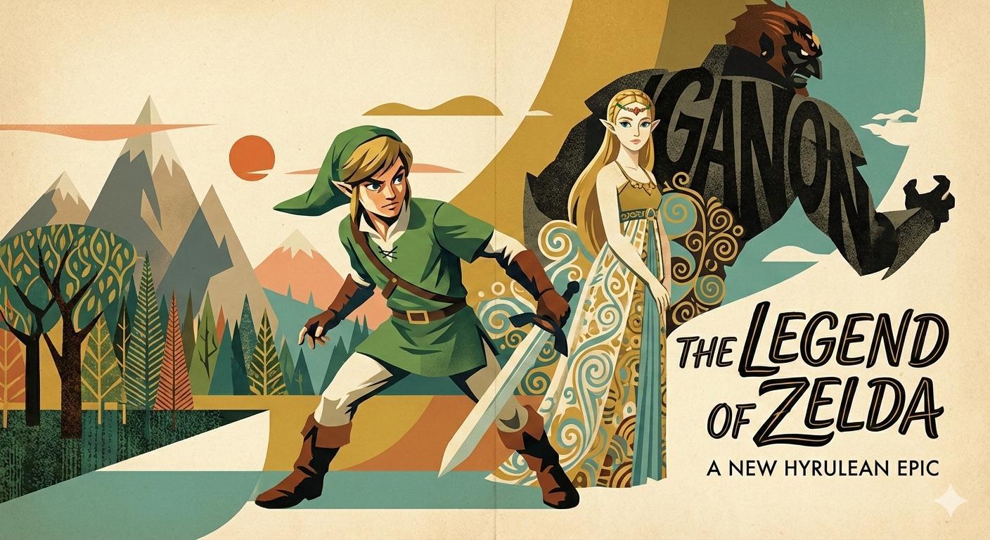
The adaptive Mid-Century Modernism of Al Parker (1906–1985): an illustrator whose jazz background informed his "chameleon" adaptation of mid-century realism toward the modernist pop commercial aesthetics of 1950s America. [Gemini Nano Banana Pro]


1
100% Upvoted
{The Legend of Zelda} illustrated in the Mid-Century Illustrative Modernism style of Al Parker (1906–1985): {
Al Parker was the defining architect of mid-century commercial art, bridging the narrative realism of the "Golden Age" and the graphic formalism of Modernism. His distinctive aesthetic synthesized the rhythmic improvisation of his background as a jazz musician with the visual innovations of the mid-20th century: the unconventional framing and immediacy of modernist photography, and the bold, flat abstractions of contemporary painting. Consequently, his approach was defined not by a static signature style but by a philosophy of stylistic impermanence—a "chameleon" aesthetic marked by kinetic vitality. Yet despite this adaptability, Parker's default mode remained the classical realism of mid-century commercial illustration; he departed from this foundation only when clear strategic reasoning—narrative emphasis, emotional tone, or client requirements—demanded an alternative approach. Central to this consistency was his reliance on gesture drawing as the structural armature of every composition: regardless of how stylized the surface rendering became, his figures originated from rapid, rhythmic gestural underdrawings that captured weight, movement, and attitude in a few confident strokes—a practice that imbued even his most graphically modern work with the nostalgic classiness of traditional figure illustration.
He achieved this modernization by adopting the streamlined modularity of the International Typographic Style (Swiss Style), utilizing its asymmetric grids to organize complex compositions with graphic clarity. However, he tempered that movement's rationalist austerity with a decorative sensibility subtly recalling Gustav Klimt (1862–1918)—layering stylized decorative motifs and chromatic planes in textile-like rhythms across his compositions to balance geometric structure with organic warmth. Yet while his layouts embraced Swiss modularity, his figures resisted geometric reduction: their silhouettes retained the fluid, calligraphic quality of gesture drawing, creating a dynamic tension between the rectilinear page architecture and the organic humanity of the figures inhabiting it. This synthesis resulted in graphic-stylized figures composed within a fluid, modernist framework that possessed the overall decorative balance of fabric design, yet remained anchored by posterized volumetric rendering, hard-edged shadows, controlled color-temperature patterning, and above all, silhouettes of immediate gestural clarity. Parker's approach—sophisticated, structurally grounded, and free of cartoonish exaggeration—would later find a distant, simplified echo in the flat vector aesthetics of Corporate Memphis, though that digital style lacked the anatomical credibility, gestural foundation, and compositional depth that defined Parker's work.
Crucially, while Parker absorbed the emerging Pop Art movement's visual cadences and playful typographic experimentation, he tempered these influences with the dignity and refined grace of classical mid-century commercial illustration—favoring sophisticated glamour over whimsical humor, and aspirational elegance over ironic detachment. Rather than imposing a single style, he endlessly reinvented his visual language to match the shifting anxieties and aspirations of an America reshaped by the Great Depression, wartime mobilization, and post-war suburban expansion. By blending fine art traditions with the immediate energy of popular culture, he forged a progressive glamour aesthetic that resonated with upwardly mobile readers seeking sophisticated visual narratives for their evolving social identities.
This adaptability was built upon a rigorous technical foundation forged in the heterogeneous artistic environment of the New Rochelle colony—a foundation in classical realism that remained his structural baseline throughout his career. Central to this training was mastery of gesture drawing: the ability to capture a figure's essential action, weight distribution, and emotional attitude in rapid, intuitive strokes before any detail was applied. From the colony's master storytellers, Dean Cornwell (1892–1960) and Mead Schaeffer (1898–1980), Parker learned monumental staging and cinematic blocking, yet he stripped away their Beaux-Arts density in favor of a lighter, more contemporary clarity. He internalized Norman Rockwell's (1894–1978) command of emotional specificity—capturing fleeting human expressions—but rejected anecdotal literalism. Instead of self-contained vignettes, Parker treated figures as integrated components of the overall page design, their gestural silhouettes functioning as bold graphic shapes that anchored the composition. He also drew from Harold Anderson's (1894–1973) ability to render domestic scenes with psychological warmth while maintaining compositional clarity—a balance Parker would later exploit when depicting the suburban idealism of the postwar era. These realist competencies, grounded in gestural fluency, formed the bedrock upon which all his subsequent stylistic experiments were constructed.
Parker's crucial innovation was to graft these narrative roots onto the "New School" aesthetics of graphic design, transforming his foundational realism into a "stylish pop" aesthetic when assignments warranted such treatment. Influenced by Edward Penfield (1866–1925) and Coles Phillips (1880–1927), he dissolved the boundary between illustration and layout. He adopted Phillips' "Fadeaway" technique—merging figure and ground through shared color fields—and extended it into a broader philosophy of selective rendering, where strategic areas of the composition remained unpainted, allowing the white ground to function as light, atmosphere, and elegant negative space. This economy demanded that silhouettes carry maximum communicative weight: Parker's gesture-trained contours ensured that even partially rendered figures read with complete clarity, their poses instantly legible as bold, rhythmic shapes against the page. In this restraint, Parker paralleled Elbert McGran Jackson (1896–1962), whose economical brushwork demonstrated that sophistication resided not in exhaustive detail but in knowing precisely what to omit. To this framework of graphic economy, Parker added the confident, rhythmic brushwork of J.C. Leyendecker (1874–1951), modernizing Leyendecker's rigid iconography into a looser, casual elegance. Parker's synthesis flourished during an era of typographic experimentation epitomized by Photo-Lettering Inc., whose vast catalog of custom display faces enabled designers to treat letterforms as expressive graphic elements. Parker embraced this resource fully, integrating elaborate script faces, bold display types, and decorative lettering into his compositions—not as supplementary captions, but as integral visual components that reinforced mood, directed the viewer's eye, and unified illustration with layout. He synthesized these elements using noir-inspired chiaroscuro and contrasting color temperatures, evolving the colony's high-society elegance into a modern visual language defined by strategic minimalism, graphic compositional efficiency, and the enduring readability of gesture-based silhouettes. Crucially, this modernization—including his use of white space as an active design element—never compromised his commitment to naturalistic anatomy; even his most graphically stylized compositions retained the structural realism of his training, with fluid, organic contours and believable human proportions anchoring the decorative surface rendering.
While fellow members of the New Rochelle colony—including Albert Dorne (1904–1965) with his bold graphic linework and Robert Fawcett (1903–1967) with his meticulous crosshatched draftsmanship—built careers on instantly recognizable rendering techniques, Parker pushed the medium into avant-garde territory with a radical willingness to disrupt conventional polish when the conceptual brief justified such departure. When the task demanded it, he incorporated a raw, gestural mark-making that anticipated the textural energy of later artists like Jean-Michel Basquiat—though Parker applied this expressionistic roughness to decorative ornaments and brushwork, never to anatomical distortion. Similarly, he recognized the graphic power of mass media early on, utilizing flat color fields and the bold, mechanical clarity of commercial printing—a pop sensibility that paralleled the halftone aesthetics of Roy Lichtenstein, yet without adopting cartoon stylization or exaggerated features. His figures, even when rendered with stark graphic economy or decorative stylization, remained structurally grounded in realistic figuration: proportionally accurate, gesturally fluid, and anatomically credible—their silhouettes retaining the rhythmic, confident contours of classical gesture drawing. This gestural integrity maintained the representational rigor he shared with Dorne and Fawcett, even as his surface rendering and compositional strategies diverged radically from theirs. He famously illustrated a single 1953 issue of Cosmopolitan using five different pseudonyms and five distinct styles—ranging from tight classical realism to abstract collage—proving that an illustrator's identity could reside in conceptual agility rather than manual habit, while demonstrating that each stylistic departure served a specific editorial purpose rather than arbitrary experimentation.
This relentless experimentation allowed Parker to absorb and recontextualize a vast array of global influences while maintaining an unwavering commitment to naturalistic figuration as his structural core. Beyond standard rendering, he integrated—as needed—the flat spatial compression of ukiyo-e, the compositional dynamism of adventure comic illustration, and dramatic low-angle cropping that paralleled the cinematic intensity of gekiga-style realism. He borrowed the graphic boldness of these traditions but never their caricatured exaggerations or decorative stylizations that would compromise anatomical credibility; his contours remained fluid and organic, his anatomy proportionally sound, his figures structurally realistic beneath whatever stylized surface treatment the assignment required. It was this unwavering foundation in gesture drawing—the calligraphic confidence of his silhouettes, the rhythmic flow of his contours—that granted Parker's work its distinctive nostalgic classiness: however modern or experimental the graphic treatment, his figures carried the timeless elegance of the mid-century illustration tradition he loved. Parker stabilized these disparate elements through an innate sense of design, maintaining a market-responsive visual identity through page-aware modernist layouts where illustration, typography, and white space functioned as a single cohesive system. In doing so, Parker did not merely survive the graphic design interregnum—the post-war shift marked by photography, television, and the rise of phototypesetting—he defined it. His legacy demonstrated that commercial illustration could possess the experimental rigor of fine art without sacrificing the figurative credibility that distinguished editorial realism from cartooning, proving that stylistic innovation need not abandon structural realism, and that an artist's defining characteristic need not be a fixed visual manner, but the conceptual intelligence to match form to function.
}