Casein and gouache painting style of Perry Peterson (1908–1958): a mid-century commercial illustration adapted into modernist graphic style. [Gemini Nano Banana]
Thank you, but it was created from article summaries and various LLM outputs, adding comparative references, then refining them using Claude and Gemini.
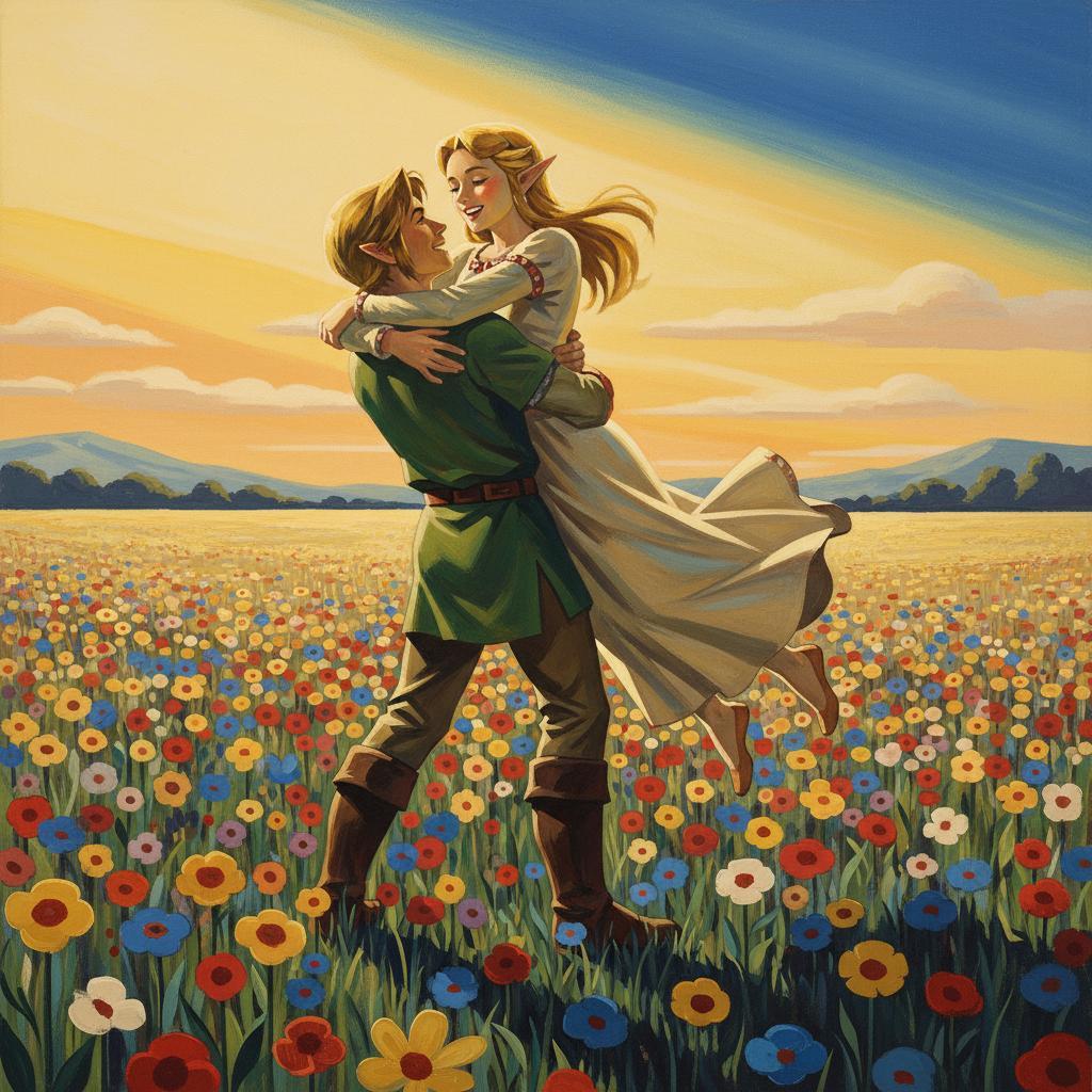
{Link and Princess Zelda share a lift hug in a flower field on a sunny day} illustrated in the casein and gouache painting style of Perry Peterson (1908–1958): {
A meticulous late-golden-age illustration technique executed in casein and gouache on illustration board, adapting mid-century commercial illustration into a modernist graphic framework—inflected with the mid-gesture immediacy of fashion photography and the dramatic, cinematic angles and cropping of action comics, staged in noir‑theatre chiaroscuro. The approach resonates with the experimental, anti-traditional spirit that would emerge in the French New Wave (La Nouvelle Vague) of the late 1950s and 1960s.
ARTISTIC VISION & PHILOSOPHY:
Rooted in meticulous pre-visualization and draftsmanship from the pre-color photography era, the work synthesizes European modernist design (Art Nouveau organic geometry meeting Bauhaus clarity through judicious streamlining) with American mid-century idealism. Mid-century charm emerges through the interplay of bold, broadly applied color areas against delicately detailed passages, creating visual flow through their tension. The picture plane is subtly flattened, reducing atmospheric perspective while maintaining believability—echoing the era's shift toward design-conscious layouts. Forms possess sculptural, stage-set solidity, their volumes defined by stark directional chiaroscuro lighting. Restrained color palettes are punctuated with singular vibrant accents, vibrating with emotional intensity while remaining naturalistic. Every element—figure, prop, ground line—functions as a graphic component within a kinetic composition, creating dynamic tension between representational accuracy and abstract pictorial design. The overall effect: timeless, elegant drama that is aspirational, polished, and visually resonant.
COMPOSITION & STAGING:
Influenced by 1950s film noir, contemporary photography, and pulp fiction covers, Peterson employs extreme dramatic cropping that isolates the subject, often filling two-thirds or more of the frame. Framing utilizes the Golden Mean or rule-of-thirds for off-center focal points. Dynamic diagonals slice through space, energizing the picture plane; foreshortening emphasizes action or interiority, with scenes captured mid-action to propel narrative beyond the static image. Backgrounds echo geometric abstraction while retaining realistic authenticity. Staging evokes mid-century modernist interiors, urban streets, or stylized studio portraits with an editorialized, lifestyle magazine quality. Props are simple, iconic, and functional, treated with graphic clarity. Narrative is implied through pose, expression, and the interplay of stark light and void, rendered with modernist sensibilities.
FIGURE TREATMENT:
Idealized figures rendered with precise anatomical plausibility yet subtly stylized—possessing graceful elongation and clean contours. Portrayals balance dignified realism with theatrical drama; characters are not mere mannequins but personae imbued with interiority, agency, and ambiguity. Figures engage in self-absorbed, emotionally charged cinematic moments within romantic or suspenseful contexts, elevated to gentle charm and subdued glamor while embodying universal emotions: longing, suspense, determination, chic nonchalance. Personality is conveyed through alluring, intentional gaze; economical, meaningful posture; period-specific glamour and impeccable grooming. Facial expressions and body language communicate psychological states, ambiguous relationships, and subtle drama, inducing intrigue. Feminine figures embody elegance, mystery, and vulnerability through soft curves and sharp tailoring. Masculine figures project strength, resolve, and brooding intensity through angular shoulders and restrained gestures. Ambiguity lies in the potential for action and emotional complexity, not overt narrative.
MEDIUM & TECHNIQUE:
Watercolor undertones meticulous layered with casein and gouache, producing a signature matte-finish aesthetic through thoroughly pre-planned draftsmanship. Bold, flat color blocks meet at crisp, clean edges. Lines are rendered with confident, sweeping, single-stroke calligraphic precision, avoiding blurred silhouettes. Smooth tonal transitions create volume through pristine modulated washes that convey polished matte surfaces and skin. Lighting is sharply defined and cinematic—reminiscent of 1950s French film posters and noir aesthetics—featuring stark, dramatized chiaroscuro with deep, cool shadows contrasting vivid, warm highlights. Directional lighting is heightened through complementary color juxtaposition in shadows and highlights to convey tension. Subsurface scattering is suggested subtly through soft, diffused edges, adding ethereal quality. The work demonstrates mastery in conveying narrative through theatrical figural orchestration—props, spotlighting, gestural expression—all streamlined within a modernist design-conscious composition.
COMPARATIVE POSITIONING:
Peterson's distinctive balance among contemporaries:
vs. Jon Whitcomb (1906–1988): more painterly and atmospheric with softer edges
vs. Al Parker (1906–1985): more gestural and spontaneous with looser brushwork
vs. Coby Whitmore (1913–1988): more photorealistic and overtly glamorous
Peterson's unique position: graphic clarity unified with painterly sophistication, combining design rigor with emotional nuance.
}
While illustrator Perry Peterson is largely forgotten today, for fans of vintage illustration his work lives on. During his career he produced hundreds of illustrations for magazines like the Saturday Evening Post, American Magazine, Cosmopolitan, Collier’s, and many more.
His untimely death at the age of 50 in 1958 was a tragedy, and to some extent coincided with the decline of illustration itself at the start of the 19060s. Color photography — rather than beautiful paintings — began appearing regularly on the covers of most national magazines, and by 1963 even the venerable Saturday Evening Post, known for thousands of illustrated covers, left Norman Rockwell and his colleagues behind to focus exclusively on photographic covers. Illustration was suddenly old fashioned. While you could still find it on paperback book covers, in men’s adventure magazines, or comic books, it was no longer the cultural force it had been for so many years.
During his career, Perry was a master of the difficult mediums of gouache and casein. His bold brushstrokes, vibrant color sense, eye for modern fashions, and confident draftsmanship made him one of the very top illustrators of his day. His paintings even now continue to radiate a thrilling life and energy that make them feel fresh and alive.


You ARE a prompt artist. The results you get are pretty damn good.
Thank you, but it was created from article summaries and various LLM outputs, adding comparative references, then refining them using Claude and Gemini.
{Link and Princess Zelda share a lift hug in a flower field on a sunny day} illustrated in the casein and gouache painting style of Perry Peterson (1908–1958): {
A meticulous late-golden-age illustration technique executed in casein and gouache on illustration board, adapting mid-century commercial illustration into a modernist graphic framework—inflected with the mid-gesture immediacy of fashion photography and the dramatic, cinematic angles and cropping of action comics, staged in noir‑theatre chiaroscuro. The approach resonates with the experimental, anti-traditional spirit that would emerge in the French New Wave (La Nouvelle Vague) of the late 1950s and 1960s.
ARTISTIC VISION & PHILOSOPHY:
Rooted in meticulous pre-visualization and draftsmanship from the pre-color photography era, the work synthesizes European modernist design (Art Nouveau organic geometry meeting Bauhaus clarity through judicious streamlining) with American mid-century idealism. Mid-century charm emerges through the interplay of bold, broadly applied color areas against delicately detailed passages, creating visual flow through their tension. The picture plane is subtly flattened, reducing atmospheric perspective while maintaining believability—echoing the era's shift toward design-conscious layouts. Forms possess sculptural, stage-set solidity, their volumes defined by stark directional chiaroscuro lighting. Restrained color palettes are punctuated with singular vibrant accents, vibrating with emotional intensity while remaining naturalistic. Every element—figure, prop, ground line—functions as a graphic component within a kinetic composition, creating dynamic tension between representational accuracy and abstract pictorial design. The overall effect: timeless, elegant drama that is aspirational, polished, and visually resonant.
COMPOSITION & STAGING:
Influenced by 1950s film noir, contemporary photography, and pulp fiction covers, Peterson employs extreme dramatic cropping that isolates the subject, often filling two-thirds or more of the frame. Framing utilizes the Golden Mean or rule-of-thirds for off-center focal points. Dynamic diagonals slice through space, energizing the picture plane; foreshortening emphasizes action or interiority, with scenes captured mid-action to propel narrative beyond the static image. Backgrounds echo geometric abstraction while retaining realistic authenticity. Staging evokes mid-century modernist interiors, urban streets, or stylized studio portraits with an editorialized, lifestyle magazine quality. Props are simple, iconic, and functional, treated with graphic clarity. Narrative is implied through pose, expression, and the interplay of stark light and void, rendered with modernist sensibilities.
FIGURE TREATMENT:
Idealized figures rendered with precise anatomical plausibility yet subtly stylized—possessing graceful elongation and clean contours. Portrayals balance dignified realism with theatrical drama; characters are not mere mannequins but personae imbued with interiority, agency, and ambiguity. Figures engage in self-absorbed, emotionally charged cinematic moments within romantic or suspenseful contexts, elevated to gentle charm and subdued glamor while embodying universal emotions: longing, suspense, determination, chic nonchalance. Personality is conveyed through alluring, intentional gaze; economical, meaningful posture; period-specific glamour and impeccable grooming. Facial expressions and body language communicate psychological states, ambiguous relationships, and subtle drama, inducing intrigue. Feminine figures embody elegance, mystery, and vulnerability through soft curves and sharp tailoring. Masculine figures project strength, resolve, and brooding intensity through angular shoulders and restrained gestures. Ambiguity lies in the potential for action and emotional complexity, not overt narrative.
MEDIUM & TECHNIQUE:
Watercolor undertones meticulous layered with casein and gouache, producing a signature matte-finish aesthetic through thoroughly pre-planned draftsmanship. Bold, flat color blocks meet at crisp, clean edges. Lines are rendered with confident, sweeping, single-stroke calligraphic precision, avoiding blurred silhouettes. Smooth tonal transitions create volume through pristine modulated washes that convey polished matte surfaces and skin. Lighting is sharply defined and cinematic—reminiscent of 1950s French film posters and noir aesthetics—featuring stark, dramatized chiaroscuro with deep, cool shadows contrasting vivid, warm highlights. Directional lighting is heightened through complementary color juxtaposition in shadows and highlights to convey tension. Subsurface scattering is suggested subtly through soft, diffused edges, adding ethereal quality. The work demonstrates mastery in conveying narrative through theatrical figural orchestration—props, spotlighting, gestural expression—all streamlined within a modernist design-conscious composition.
COMPARATIVE POSITIONING:
Peterson's distinctive balance among contemporaries: