"); font-size: 28px; position: absolute; right: 28px; transform: translateY(-3px); transition: unset !important; } .is-open.has-plus-icon::after { transform: rotate(180deg) translateY(-3px) translate(0px); color: rgb(239, 102, 25); float: none !important; padding: 0px !important; transition: unset !important; } .sidenav #shopify-section-ea-megamenu a.chat { font-size: 19px; line-height: 1.5; text-align: left; justify-content: center; align-items: center; display: flex !important; } .sidenav #shopify-section-ea-megamenu a.chat svg { margin: 0px 5.4px 0px 0px; object-fit: contain; } } @media only screen and (max-width: 989px) { .sidenav #shopify-section-ea-megamenu a .rimage { padding-top: 0px !important; } .sidenav #shopify-section-ea-megamenu a .rimage img { position: relative !important; } } .sidenav .nav__items { align-items: flex-start; flex-direction: column; border-bottom: 1px solid rgb(237, 231, 223); margin: 16px; } .sidenav .nav__item { width: 100%; flex: 1 1 0%; } .sidenav .nav--secondary { padding-bottom: 140px; } .sidenav .nav--secondary .nav__items { flex-flow: wrap; border-bottom: none; display: flex; } .sidenav .nav--secondary .nav__items .nav__item { flex: 0 0 50%; box-sizing: border-box; } .sidenav .nav--secondary .nav__items .nav__item .nav__link { padding: 3px 0px; color: rgb(18, 18, 18); font-size: 16px !important; } .sidenav .nav__link { display: flex; align-items: center; justify-content: space-between; font-weight: 500; font-size: 1.5rem; color: rgb(50, 68, 119); } .sidenav .nav__link.m-icon i { font-size: 4px; } .sidenav .nav__link.accordion__title { display: flex; justify-content: flex-start; padding: 15px; font-weight: 500; text-transform: uppercase; font-size: 16px; } .sidenav .nav__link.accordion__title::after { display: none; } .sidenav .nav__link.accordion__title i { margin-left: 1em; font-size: 16px; } .sidenav .nav__link.m-level-2 { padding: 7.5px 15px; text-transform: none; font-weight: 400; text-align: left; color: rgb(255, 255, 255); font-size: 14px; } .sidenav .nav__link.m-level-3 { font-size: 14px; } .sidenav .accordion .accordion__content { padding: 0px 30px; } .sidenav .sidenav_header_bg { height: 40px; background-color: rgb(237, 231, 223); margin: -50px -30px 0px; } @media only screen and (max-width: 989px) { .sidenav .sidenav_header_bg { margin-right: 0px; margin-bottom: 0px; margin-left: 0px; margin-top: -50px !important; } } .sidenav .side-menu-wrap { display: flex; flex-direction: column; justify-content: space-between; align-items: center; height: 100%; } .sticky-menu-footer { position: fixed; bottom: 0px; left: 0px; right: 0px; z-index: 999; background-color: rgb(248, 243, 236); } .sticky-menu-footer__content { padding: 15px 0px 2px; } .sticky-menu-footer__button .btn.btn--primary { width: 100%; font-weight: 600; } .sticky-menu-footer__text { text-align: center; font-size: 14px; color: rgb(35, 35, 35); font-weight: 400; padding: 12px; } @media only screen and (max-width: 989px) { .sidenav .side-menu-wrap > div { width: 100%; } } .sidenav .site-header__shop_sp { margin-left: auto; margin-right: auto; padding-top: 45px; display: flex; justify-content: center; align-items: center; } @media only screen and (max-width: 989px) { .sidenav .site-header__shop_sp { display: none !important; } } .sidenav .site-header__shop_sp a { font-family: sofia-pro, sans-serif; font-size: 19px; font-weight: 800; font-stretch: normal; font-style: normal; line-height: 1.26; letter-spacing: normal; text-align: center; color: rgb(255, 85, 0); } @media only screen and (max-width: 989px) { .sidenav .site-header__shop_sp a { color: rgb(0, 0, 0); padding-top: 7.5px; padding-bottom: 7.5px; text-decoration: none; } } .sidenav__close.btn.m-icon-only { color: rgb(255, 255, 255); } .sidenav__close.btn.m-icon-only .close_menu { font-family: sofia-pro, sans-serif; font-size: 14px; font-weight: 700; font-stretch: normal; font-style: normal; line-height: 1.14; letter-spacing: normal; text-align: left; color: rgb(0, 0, 0); padding-left: 10px; } .sidenav_header { display: flex; justify-content: flex-start; align-items: center; position: fixed; top: 0px; left: 0px; right: 0px; padding: 8px 16px 8px 0px; background-color: rgb(248, 243, 236); } .sidenav__close.m-icon-only_logo { transform: translateY(-2px); } .sidenav__close.m-icon-only_logo svg { width: 86.129px; height: 24px; } .sidenav__close.m-icon-only_logo svg .cls-0, .sidenav__close.m-icon-only_logo svg .cls-2 { fill: rgb(0, 0, 0); } .sidenav-bg { z-index: -1; position: fixed; inset: 0px; background: rgba(0, 0, 0, 0.75); opacity: 0; transition: opacity 0.33s ease-in-out 0s; } body.is-menu-open .sidenav-bg { opacity: 1; z-index: 997; } body.is-menu-open { overflow: hidden; } .side-menu-social svg { max-height: 19px; } @media only screen and (max-width: 989px) { .side-menu-social { padding-top: 15px; padding-bottom: 15px; } } .site-footer-container { display: none; bottom: 0px; left: 0px; right: 0px; } @media only screen and (max-width: 989px) { .site-footer-container { display: block; position: static; } } .needsclick.notranslate.kl-private-reset-css-Xuajs1 { padding: 10px 0px 10px 7px !important; border-radius: 7px !important; } .site-footer { background: rgb(0, 0, 0); color: rgb(248, 243, 236); } .site-footer .container { max-width: 1440px; padding-left: 45px; padding-right: 45px; } @media only screen and (max-width: 989px) { .site-footer .container { padding-left: 15px; padding-right: 15px; } } .footer-cta-hidden .site-footer { margin-top: 0px; padding-top: 60px; } .site-footer .nav__link { color: inherit; font-size: 14px; } @media only screen and (max-width: 989px) { .site-footer .nav__link { font-size: 14px; } } .site-footer .nav__link:hover { text-decoration: none; } .site-footer .title { font-weight: 800; font-size: 16px; color: inherit; text-align: left; padding-bottom: 12px; padding-top: 0px; } @media only screen and (max-width: 989px) { .site-footer .title { align-items: center; font-weight: 500; } } @media only screen and (max-width: 989px) { .site-footer [data-accordion-button] .icon-minus, .site-footer [data-accordion-button].is-open .icon-plus { display: none; } .site-footer [data-accordion-button].is-open .icon-minus { display: block; } .site-footer [data-accordion-content] { display: none; padding-bottom: 10px; } } @media (max-width: 990px) { .site-footer__top .col-md-4, .site-footer__top .col-md-8 { flex: 0 0 100%; max-width: 100%; } } .site-footer__logo img, .site-footer__logo svg { width: auto; height: 57px; } .site-footer__logo path, .site-footer__logo polygon { fill: currentcolor !important; } .site-footer__info { margin: 7.5px 0px 0px; line-height: 24px; font-size: 12px; color: rgb(204, 204, 204); } .site-footer__info a { color: rgb(255, 255, 255); text-decoration: underline; } .site-footer__info p { margin-bottom: 0px; } .site-footer__info p + p { margin-top: 0.5rem; } .social-links { margin: 0.5rem -7.5px 0px; color: inherit; text-align: center; justify-content: center; } @media only screen and (max-width: 989px) { .social-links { margin-top: 15px; } } .social-links .nav__link { padding: 7.5px; font-size: 19px; } .social-links .nav__link:hover { text-decoration: none; } .site-footer__nav { line-height: 24px; } .site-footer__nav .customer_social { justify-content: flex-end; align-items: flex-end; } .site-footer__nav .customer_social .nav__item:last-child svg { margin: 15px 12px 0px 0px; fill: rgb(248, 243, 220); } .site-footer__nav .nav__title { display: flex; font-size: 19px; font-weight: 500; font-stretch: condensed; white-space: nowrap; } .site-footer__nav .nav__items .nav__item { margin-top: 3px; margin-bottom: 3px; } .site-footer__nav .nav__items .nav__item.nav__item-info { margin-top: 5px; margin-bottom: 5px; } @media only screen and (max-width: 989px) { .site-footer__nav .nav__items .nav__item { margin-top: 0px; margin-bottom: 0px; } } .site-footer__nav .nav__items .nav__item a { height: auto; } .site-footer__nav.nav.m-vertical { justify-content: space-between; padding-right: 60px; } @media (max-width: 1024px) { .site-footer__nav.nav.m-vertical { padding-right: 0px; } } @media only screen and (max-width: 989px) { .site-footer__nav.nav.m-vertical { padding-right: 0px; } } .site-footer__nav.nav.m-vertical .nav__col { flex: 1 1 0%; } .site-footer__nav.nav.m-vertical .nav__col.social_box { flex: 0 1 0%; fill: rgb(248, 243, 236); } .site-footer__nav.nav.m-vertical .nav__col.social_box svg { margin: 15px 12px 0px 0px; } .site-footer__nav.nav.m-vertical .nav__link { padding: 0px; } .site-footer__nav.nav.m-vertical .nav__link:hover { color: rgb(244, 232, 220); } .site-footer__bottom { border-top: 1px solid rgb(248, 243, 236); color: rgb(204, 204, 204); font-size: 12px; display: flex; justify-content: center; margin-top: 50px; padding-top: 15px; } @media only screen and (max-width: 989px) { .site-footer__bottom { font-size: 14px; margin-top: 30px; } } .site-footer__bottom a { color: rgb(255, 255, 255); text-decoration: none; } .site-footer__bottom-menu .nav__item { line-height: 1; } @media only screen and (max-width: 989px) { .site-footer__bottom-menu .nav__link { text-transform: uppercase; font-weight: 500; font-stretch: condensed; } } .site-footer__bottom-menu .nav__item + .nav__item { margin-left: 10px; padding-left: 10px; border-left: 1px solid currentcolor; } .site-footer__bottom-menu .nav__link { padding: 0px; } .site-footer__copy { border-left: 1px solid rgb(248, 243, 236); margin-left: 15px; padding-left: 15px; } @media only screen and (max-width: 989px) { .site-footer__copy { border: none; margin-left: 0px; padding-left: 0px; } } .site-footer__copy p { margin-bottom: 0px; font-family: sofia-pro, sans-serif; font-size: 14px; font-weight: 500; font-stretch: normal; font-style: normal; line-height: 1.5; letter-spacing: 0.32px; text-align: center; color: rgb(0, 0, 0); } .site-footer__copy p + p { margin-top: 1em; } .site-footer__copy span { margin: 0px 5px; vertical-align: middle; color: rgb(156, 8, 8); font-family: sofia-pro, sans-serif; font-size: 1.25em; } .site-footer__copy a { color: rgb(0, 0, 0); font-size: 16px; } .site-footer__copy a, .site-footer__copy p, .site-footer__term a, .site-footer__term p { font-family: sofia-pro, sans-serif; font-size: 14px; font-weight: 400; line-height: 1.4; letter-spacing: normal; text-align: center; color: rgb(248, 243, 236); } .site-footer__copy p, .site-footer__term p { margin-bottom: 0px; } @media only screen and (max-width: 989px) { .site-footer__copy, .site-footer__term { margin-left: 10px; margin-right: 10px; } } @media only screen and (max-width: 989px) { .site-footer__term { padding-top: 10px; padding-bottom: 10px; } } .footer-box.col-md-4 { order: 2; } @media only screen and (max-width: 989px) { .footer-box.col-md-4 .klaviyo-form-Rm9nS6.klaviyo-form.form-version-cid-1 form.needsclick.klaviyo-form.klaviyo-form-version-cid_1.kl-private-reset-css-Xuajs1 { float: none !important; } .footer-box.col-md-4 .klaviyo-form-Rm9nS6.klaviyo-form.form-version-cid-1 form.needsclick.klaviyo-form.klaviyo-form-version-cid_1.kl-private-reset-css-Xuajs1 input.kl-private-reset-css-Xuajs1 { margin-right: 5px; transform: translateY(3px); border-radius: 7px !important; } .footer-box.col-md-4 .klaviyo-form-Rm9nS6.klaviyo-form.form-version-cid-1 form.needsclick.klaviyo-form.klaviyo-form-version-cid_1.kl-private-reset-css-Xuajs1 button.needsclick.kl-private-reset-css-Xuajs1 { border-radius: 7px !important; } } .footer-box.col-md-4 .klaviyo-form-Rm9nS6.klaviyo-form.form-version-cid-1 form.needsclick.klaviyo-form.klaviyo-form-version-cid_1.kl-private-reset-css-Xuajs1 > .needsclick.kl-private-reset-css-Xuajs1 > .needsclick.kl-private-reset-css-Xuajs1:last-child { padding: 10px !important; } @media only screen and (max-width: 989px) { .footer-box.col-md-4 .klaviyo-form-Rm9nS6.klaviyo-form.form-version-cid-1 form.needsclick.klaviyo-form.klaviyo-form-version-cid_1.kl-private-reset-css-Xuajs1 > .needsclick.kl-private-reset-css-Xuajs1 > .needsclick.kl-private-reset-css-Xuajs1:last-child { padding-left: 0px !important; margin-left: -5px; } } @media only screen and (max-width: 989px) { .footer-box { border-top: 1px solid rgb(255, 248, 238); } .footer-box.col-md-4 { margin-bottom: 30px; padding-left: 5px; border-top: none !important; } .footer-box.col-md-4 .container { padding-left: 0px; padding-right: 0px; } .footer-box.social_box { padding-top: 10px; } .footer-box.m-no-border { border: 0px; } .footer-box p { margin-bottom: 0px; } } .footer-box h4.title { width: 100%; } .site-footer__newsletter { position: relative; width: 55%; } @media only screen and (max-width: 989px) { .site-footer__newsletter { width: 100%; } } .site-footer__blocks { width: 45%; color: rgb(255, 255, 255); background: rgb(0, 0, 0); text-align: center; } @media only screen and (max-width: 989px) { .site-footer__blocks { width: 100%; padding: 45px 30px 1px; margin-bottom: -1px; } .site-footer__blocks .accordion__content li.nav__item, .site-footer__blocks .footer-box { padding: 0px; } } .site-footer__newsletter_title { margin: 0px 0px 10px; font-family: sofia-pro, sans-serif; font-size: 34px; font-weight: 900; font-stretch: normal; font-style: normal; line-height: 1.24; letter-spacing: normal; text-align: left; color: rgb(248, 243, 236); } @media only screen and (max-width: 989px) { .site-footer__newsletter_title { text-align: left; font-size: 28px; font-weight: 800; line-height: 1.25; } } .site-footer__newsletter_description { width: 331px; margin: 15px 0px; font-family: sofia-pro, sans-serif; font-size: 16px; font-weight: 500; font-stretch: normal; font-style: normal; line-height: 1.38; letter-spacing: normal; text-align: left; color: rgb(248, 243, 236); } @media only screen and (max-width: 989px) { .site-footer__newsletter_description { text-align: left; font-size: 14px; line-height: 1.64; width: 100%; margin-left: auto; margin-right: auto; } } .site-footer__newsletter_input { border-radius: 7px; background-color: rgb(248, 243, 236); border: 1px solid rgb(248, 243, 236); font-family: sofia-pro, sans-serif; font-size: 14px; font-weight: 500; font-stretch: normal; font-style: normal; line-height: 2.86; letter-spacing: normal; color: rgb(0, 0, 0); width: 368px; height: 40px; } @media only screen and (max-width: 989px) { .site-footer__newsletter_input { width: 100%; } } .site-footer__block_title { font-family: sofia-pro, sans-serif; font-size: 19px; font-weight: 800; font-stretch: normal; font-style: normal; line-height: 1.26; letter-spacing: 0.86px; text-align: left; color: rgb(248, 243, 236); } @media only screen and (max-width: 989px) { .site-footer__block_title { font-size: 16px; font-weight: 800; font-stretch: normal; font-style: normal; line-height: 1.5; letter-spacing: normal; text-align: left; color: rgb(255, 253, 252); } } .pt-50 { padding-top: 50px; } @media only screen and (max-width: 989px) { .pt-50 { padding-top: 0px; } } .site-footer__block { padding-left: 40px; max-width: 540px; } .d-flex { display: flex; text-decoration: unset; } .customer_chat a { text-decoration: none !important; } .customer_chat .chat_text { margin-left: 10px; } .chat_text { font-family: sofia-pro, sans-serif; font-size: 14px; font-weight: 400; font-stretch: normal; font-style: normal; line-height: 1.71; letter-spacing: 0.28px; text-align: left; color: rgb(248, 243, 236); } .site-footer__newsletter_main { display: flex; align-items: center; } @media only screen and (max-width: 989px) { .site-footer__newsletter_main { justify-content: flex-start; } } .site-footer__newsletter_icon { margin-left: -30px; } .site-footer__newsletter_icon svg { fill: rgb(0, 0, 0); } .site-footer__newsletter_icon button { border: none !important; } @media only screen and (max-width: 989px) { .site-footer .row { width: 100%; margin-left: unset; margin-right: unset; } .site-footer .nav.m-flex { display: block; } .site-footer .nav__title { justify-content: space-between; align-items: center; margin-bottom: 0px; padding-bottom: 15px; border-bottom: 1px solid rgb(255, 253, 252); } .site-footer .nav__title.is-open i { transform: rotate(-180deg); } .site-footer .nav__title i { display: inline-block; font-family: sofia-pro, sans-serif; font-size: 9px; color: rgb(255, 253, 252); transition: all 0.33s ease 0s; } .site-footer .title { padding: 12px 0px 10px; text-transform: unset; display: flex; justify-content: space-between; } .site-footer .customer_chat { padding-top: 10px; } .site-footer .chat_text { font-family: sofia-pro, sans-serif; font-size: 16px; font-weight: 800; font-stretch: normal; font-style: normal; line-height: 1.5; letter-spacing: 0.32px; text-align: left; color: rgb(255, 253, 252); } .site-footer .customer_social { justify-content: center; } } @media only screen and (max-width: 989px) and (max-width: 989px) { .site-footer .customer_social .nav__item { padding: 15px 3px 0px; } .site-footer .customer_social .nav__link { padding: 15px 3px 3px; } } @media only screen and (max-width: 989px) { .site-footer__logo { text-align: center; } .site-footer__info { font-family: sofia-pro, sans-serif; font-size: 14px; } .site-footer__top { padding-right: 0px; } .site-footer__bottom { padding: 0px; display: block; border: 0px; text-align: center; } .site-footer__bottom .nav__items { flex: 1 1 0%; justify-content: center; } .site-footer__bottom-menu { margin-top: 15px; } .site-footer__copy.footer-box { border-top: unset; padding-bottom: 10px; } .site-footer__block { padding-left: 0px; padding-right: 0px; } #shopify-section-ea-footer { margin-bottom: -16px; } .accordion__content li.nav__item { text-align: left; padding-left: 15px; } .nav__link .chat_text { font-size: 14px; font-weight: 400; font-stretch: normal; font-style: normal; line-height: 1.71; letter-spacing: 0.28px; text-align: left; color: rgb(248, 243, 236); } } .site-footer__blocks .accordion__title::after { display: none; } .site-footer__blocks .accordion__content { display: block; } @media only screen and (max-width: 989px) { .site-footer__blocks .accordion__content { display: none; } } .site-footer__blocks .accordion__content li.nav__item { text-align: left; } .klaviyo-form-V7dDeE .ql-editor p strong { color: rgb(248, 243, 236) !important; font-family: sofia-pro, sans-serif !important; font-weight: 800 !important; font-size: 16px !important; } @media only screen and (max-width: 989px) { .klaviyo-form-V7dDeE .ql-editor p strong { font-weight: 500 !important; } } .klaviyo-form-V7dDeE .ql-editor p span { color: rgb(248, 243, 236) !important; font-family: sofia-pro, sans-serif !important; line-height: 1.5 !important; } .klaviyo-form-V7dDeE button { padding-top: 12px !important; padding-bottom: 12px !important; } .klaviyo-form-V7dDeE .bQDdTc.bQDdTc { border-radius: 7px; overflow: hidden; } .klaviyo-form-Rm9nS6.klaviyo-form { margin-top: -30px; } @media only screen and (max-width: 989px) { .klaviyo-form-Rm9nS6.klaviyo-form { margin-top: 0px; margin-bottom: -30px; } } .bjfocJ.bjfocJ { margin-left: 1px; padding-top: 10px !important; padding-bottom: 10px !important; } .bjfocJ.bjfocJ button { border-radius: 2px !important; height: 35px !important; padding-top: 0px !important; padding-bottom: 0px !important; } .klaviyo-form-Rm9nS6.klaviyo-form.form-version-cid-2 input { transform: translateY(3px); margin-right: 5px; border: none !important; outline: none !important; border-radius: 7px !important; } .klaviyo-form-Rm9nS6.klaviyo-form.form-version-cid-2 button { border-radius: 7px !important; } .cJWVbS.cJWVbS { max-width: unset !important; } @media only screen and (max-width: 989px) { .cJWVbS.cJWVbS { float: unset !important; } } .klaviyo-form-Rm9nS6 .jHZITc.jHZITc { margin-top: -35px; max-width: unset !important; padding-right: 0px !important; } .klaviyo-form-Rm9nS6 .iJNIpr.iJNIpr { padding-top: 10px !important; padding-bottom: 10px !important; padding-right: 0px !important; } .klaviyo-form-Rm9nS6 .egtrUg.egtrUg { padding-left: 6px !important; } .klaviyo-form-Rm9nS6 .UPHfx.UPHfx.UPHfx.UPHfx.UPHfx.UPHfx { border: none; outline: none; } .klaviyo-form-Rm9nS6 .ftedkM.ftedkM.ftedkM.ftedkM.ftedkM.ftedkM, .klaviyo-form-Rm9nS6 .UPHfx.UPHfx.UPHfx.UPHfx.UPHfx.UPHfx { border-radius: 5px 0px 0px 5px; border: none !important; outline: none !important; height: 36px !important; } .klaviyo-form-Rm9nS6 .gtdYXd.gtdYXd.gtdYXd.gtdYXd.gtdYXd.gtdYXd { margin-left: 1px; border-top-left-radius: 0px !important; border-bottom-left-radius: 0px !important; } .klaviyo-form-Rm9nS6 .kl-private-quill-wrapper-Lkqws1.kl-private-quill-wrapper-Lkqws1.kl-private-quill-wrapper-Lkqws1 .ql-editor strong { font-weight: 800; } @media only screen and (max-width: 989px) { .klaviyo-form-Rm9nS6 > .needsclick { height: 160px !important; } } .eFxKkv.eFxKkv { padding: 0px 10px 9px 1px !important; } @media only screen and (max-width: 989px) { .klaviyo-form-Rm9nS6 > .needsclick { height: auto !important; } .fEZdew.fEZdew { float: unset !important; } } .hero-container { display: flex; } @media only screen and (max-width: 989px) { .hero-container { display: block; } } .hero { flex: 1 1 0%; min-width: 50%; position: relative; } .hero__container { width: 100%; } .hero__info-wrap { position: absolute; inset: 0px calc(50% - 600px); } @media only screen and (min-width: 589px) { .template-index .hero__info, .template-page-elk-lander .hero__info { width: 45%; } .template-index .hero__info.middle-right, .template-page-elk-lander .hero__info.middle-right { right: 3%; } } .template-index .hero__info.text_align_left .hero__title, .template-page-elk-lander .hero__info.text_align_left .hero__title { font-weight: 900 !important; } @media (min-width: 990px) and (max-width: 1200px) { .hero__info-wrap { left: calc(50% - 400px); right: calc(50% - 400px); } } @media only screen and (max-width: 989px) { .hero__info-wrap { left: 0px; right: 0px; } } .hero__info-wrap.m-half.m-index-1 { width: auto; left: calc(100% - 600px); right: 0px; } .hero__info-wrap.m-half.m-index-2 { width: auto; left: 0px; right: calc(100% - 600px); } .hero__info { max-width: 60%; padding: 0px 15px; position: absolute; z-index: 1; color: rgb(0, 0, 0); } .hero__info .pretitle { color: rgb(0, 0, 0); } .hero__info.m-white, .hero__info.m-white .pretitle { color: rgb(255, 255, 255); } .hero__info.text_align_left .hero__title, .hero__info.text_align_left .section-banner_descriptoin, .hero__info.text_align_left .section-banner_description { text-align: left; } .hero__info.text_align_left .section-banner_shop { justify-content: flex-start; } .hero__info.text_align_center .hero__title, .hero__info.text_align_center .section-banner_descriptoin, .hero__info.text_align_center .section-banner_description { text-align: center; } .hero__info.text_align_center .section-banner_shop { justify-content: center; } .hero__info.text_align_right .hero__title, .hero__info.text_align_right .section-banner_descriptoin, .hero__info.text_align_right .section-banner_description { text-align: right; } .hero__info.text_align_right .section-banner_shop { justify-content: flex-end; } @media only screen and (max-width: 989px) { .hero__info.mobile_text_align_left .hero__title, .hero__info.mobile_text_align_left .section-banner_descriptoin, .hero__info.mobile_text_align_left .section-banner_description { text-align: left; } .hero__info.mobile_text_align_left .section-banner_shop { justify-content: flex-start; } .hero__info.mobile_text_align_center .hero__title, .hero__info.mobile_text_align_center .section-banner_descriptoin, .hero__info.mobile_text_align_center .section-banner_description { text-align: center; } .hero__info.mobile_text_align_center .section-banner_shop { justify-content: center; } .hero__info.mobile_text_align_right .hero__title, .hero__info.mobile_text_align_right .section-banner_descriptoin, .hero__info.mobile_text_align_right .section-banner_description { text-align: right; } .hero__info.mobile_text_align_right .section-banner_shop { justify-content: flex-end; } } .hero__info.top-left { text-align: left; top: 8%; left: 8%; right: auto; transform: none; } .hero__info.top-center { text-align: center; margin: auto; top: 8%; left: 50%; right: auto; transform: translateX(-50%); } .hero__info.top-right { text-align: right; left: auto; right: 8%; top: 50px; } .hero__info.middle-left { text-align: left; left: 8%; right: auto; transform: translateY(-50%); top: 50%; } .hero__info.middle-center { text-align: center; left: 50%; top: 50%; transform: translate(-50%, -50%); } .hero__info.middle-right { text-align: right; left: auto; right: 8%; top: 50%; transform: translateY(-50%); } .hero__info.bottom-left { text-align: left; left: 8%; right: auto; bottom: 50px; transform: none; } .hero__info.bottom-center { text-align: center; left: 50%; transform: translateX(-50%); right: auto; bottom: 8%; } .hero__info.bottom-right { text-align: right; left: auto; right: 0px; bottom: 8%; transform: none; } @media only screen and (max-width: 989px) { .hero__info.mobile_top-left { text-align: left; inset: 30px auto auto 0px; transform: none; } .hero__info.mobile_top-center { text-align: center; margin: auto; inset: 30px auto auto 50%; transform: translateX(-50%); } .hero__info.mobile_top-right { text-align: right; inset: 50px 15px auto auto; } .hero__info.mobile_middle-left { text-align: left; inset: 50% auto auto 0px; transform: translateY(-50%); } .hero__info.mobile_middle-center { text-align: center; left: 50%; top: 50%; bottom: auto; transform: translate(-50%, -50%); } .hero__info.mobile_middle-right { text-align: right; inset: 50% 0px auto auto; transform: translateY(-50%); } .hero__info.mobile_bottom-left { text-align: left; inset: auto auto 50px 0px; transform: none; } .hero__info.mobile_bottom-center { text-align: center; inset: auto auto 30px 50%; transform: translateX(-50%); } .hero__info.mobile_bottom-right { text-align: right; inset: auto 0px 30px auto; transform: none; } } .hero__text, .hero__title { color: inherit; } .pretitle + .hero__title { margin-top: 0.33em; } .hero__title + .subtitle { margin-top: 15px; } .hero__text { margin-top: 1.5em; font-size: 1.75vw; line-height: 1.25; } .hero__text p { margin-bottom: 0px; } .hero__text p + p { margin-top: 0px; } .hero__img { text-align: right; position: relative; margin-left: auto; z-index: 0; } @media only screen and (max-width: 989px) { .hero__img { margin-right: auto; margin-top: 30px; } } @media only screen and (max-width: 989px) { .template-index .hero__img { max-width: unset; margin-top: 0px; } } @media (min-width: 768px) { #shopify-section-16118817955caff0e9 .d-flex-image.container { max-width: 1100px; margin-left: auto; margin-right: auto; } } .hero.m-blog { min-height: 0px; height: auto; } .hero.m-blog .hero__img { padding: 0px; } .hero.m-blog .hero__title { font-size: 70px; } .hero.m-blog .hero__info { display: block; height: auto; position: static; text-align: center; transform: none; } @media only screen and (max-width: 989px) { .hero__info { width: 100%; white-space: normal; } .hero__info .subtitle { font-size: 14px; max-width: 100%; } .hero__title { font-size: 29px; } .hero.m-blog .hero__title { font-size: 24px; } .hero.m-blog .hero__img { padding: 0px 15px; } } @media only screen and (max-width: 989px) { #section-ea-collection-banner { padding-left: 28px; padding-right: 28px; } } #shopify-section-hero-banner-blog .container { max-width: unset; padding-left: 45px; padding-right: 45px; } @media only screen and (max-width: 989px) { #shopify-section-hero-banner-blog .container { padding-left: 28px; padding-right: 28px; } } #shopify-section-hero-banner-blog .hero { background: transparent; } #shopify-section-hero-banner-blog .hero .hero__img { border-radius: 7px; overflow: hidden; } #shopify-section-hero-banner-blog .hero .hero__info { max-width: 300px; margin: 0px !important; } @media (max-width: 1370px) and (min-width: 770px) { #shopify-section-hero-banner-blog .hero .hero__info { max-width: 600px; } } #shopify-section-hero-banner-blog .hero .title { font-size: 36px; font-weight: 800; } @media only screen and (max-width: 1100px) { #shopify-section-hero-banner-blog .hero .title { font-size: 28px; } } #shopify-section-blog-main-recipe .subtitle h2 { margin-bottom: 30px; font-size: 24px; margin-top: 5px; } #shopify-section-blog-main-recipe .subtitle { margin-top: 5px !important; } #shopify-section-hero-banner-blog .hero .subtitle { font-size: 18px; font-weight: 900; margin-top: 20px; } #shopify-section-hero-banner-blog .hero .subtitle, #shopify-section-hero-banner-blog .hero .title { color: rgb(255, 253, 252); } #shopify-section-blog-ingredients .hero__info.text-align-left, #shopify-section-blog-main-recipe .hero__info.text-align-left, #shopify-section-blog-main .hero__info.text-align-left { text-align: left; } #shopify-section-blog-ingredients .hero__info.text-align-center, #shopify-section-blog-main-recipe .hero__info.text-align-center, #shopify-section-blog-main .hero__info.text-align-center { text-align: center; } #shopify-section-blog-ingredients .hero__info.text-align-right, #shopify-section-blog-main-recipe .hero__info.text-align-right, #shopify-section-blog-main .hero__info.text-align-right { text-align: right; } @media only screen and (max-width: 989px) { #shopify-section-blog-ingredients .hero__info.mob-text-align-left, #shopify-section-blog-main-recipe .hero__info.mob-text-align-left, #shopify-section-blog-main .hero__info.mob-text-align-left { text-align: left; } #shopify-section-blog-ingredients .hero__info.mob-text-align-center, #shopify-section-blog-main-recipe .hero__info.mob-text-align-center, #shopify-section-blog-main .hero__info.mob-text-align-center { text-align: center; } #shopify-section-blog-ingredients .hero__info.mob-text-align-right, #shopify-section-blog-main-recipe .hero__info.mob-text-align-right, #shopify-section-blog-main .hero__info.mob-text-align-right { text-align: right; } } @media (min-width: 990px) and (max-width: 1200px) { #shopify-section-blog-ingredients { padding-bottom: 100px; } } #shopify-section-blog-ingredients .container { max-width: unset; padding-left: 45px; padding-right: 45px; } @media only screen and (max-width: 989px) { #shopify-section-blog-ingredients .container { padding-left: 0px !important; padding-right: 0px !important; } } #shopify-section-blog-ingredients .hero-container { position: relative; padding-left: 15px; padding-right: 15px; } #shopify-section-blog-ingredients .hero-container::before { content: ""; position: absolute; width: 100%; height: 200px; left: 0px; top: 0px; background: rgb(248, 243, 236); } @media only screen and (max-width: 989px) { #shopify-section-blog-ingredients .hero-container::before { content: none; } } @media (min-width: 990px) and (max-width: 1200px) { #shopify-section-blog-ingredients .hero-container { padding-left: 0px; padding-right: 0px; } } #shopify-section-blog-ingredients .hero { background: transparent !important; } #shopify-section-blog-ingredients .hero__info { max-width: 500px; margin: 0px !important; } @media (min-width: 990px) and (max-width: 1200px) { #shopify-section-blog-ingredients .hero__info { max-width: 600px; width: 600px; } } @media only screen and (max-width: 989px) { #shopify-section-blog-ingredients .hero__info { max-width: 300px; padding-left: 0px; padding-right: 0px; } } #shopify-section-blog-ingredients .title { font-size: 36px; font-weight: 800; } @media only screen and (max-width: 989px) { #shopify-section-blog-ingredients .title { font-size: 28px; } } #shopify-section-blog-ingredients .subtitle { font-size: 16px; margin-top: 20px; } @media only screen and (max-width: 989px) { #shopify-section-blog-ingredients .subtitle { display: none; } } #shopify-section-blog-ingredients .subtitle, #shopify-section-blog-ingredients .title { color: rgb(255, 253, 252); } #shopify-section-blog-main .container { padding-left: 45px; padding-right: 45px; } @media only screen and (max-width: 989px) { #shopify-section-blog-main-recipe .container, #shopify-section-blog-main .container { padding-left: 0px; padding-right: 0px; } } #shopify-section-blog-main-recipe .hero-container, #shopify-section-blog-main .hero-container { padding-left: 15px; padding-right: 15px; } @media (min-width: 990px) and (max-width: 1200px) { #shopify-section-blog-main-recipe .hero-container, #shopify-section-blog-main .hero-container { padding-left: 0px; padding-right: 0px; } } #shopify-section-blog-main-recipe .hero, #shopify-section-blog-main .hero { background: transparent !important; } #shopify-section-blog-main-recipe .hero__info, #shopify-section-blog-main .hero__info { max-width: 500px; margin: 0px !important; } @media (min-width: 990px) and (max-width: 1200px) { #shopify-section-blog-main-recipe .hero__info, #shopify-section-blog-main .hero__info { max-width: 489px; width: 489px; } } @media only screen and (max-width: 989px) { #shopify-section-blog-main-recipe .hero__info, #shopify-section-blog-main .hero__info { max-width: 300px; top: 50px; } } #shopify-section-blog-main-recipe .title, #shopify-section-blog-main .title { font-size: 36px; font-weight: 700; } body.template-blog-recipe #shopify-section-blog-main-recipe .title, body.template-blog-recipe #shopify-section-blog-main .title { font-weight: 600; margin: 0px; } @media only screen and (max-width: 989px) { #shopify-section-blog-main-recipe .title, #shopify-section-blog-main .title { font-size: 24px; } } #shopify-section-blog-main-recipe .subtitle, #shopify-section-blog-main .subtitle { font-size: 16px; margin-top: 20px; } @media only screen and (max-width: 989px) { #shopify-section-blog-main-recipe .subtitle, #shopify-section-blog-main .subtitle { display: none; } } #shopify-section-blog-main-recipe .subtitle, #shopify-section-blog-main-recipe .title, #shopify-section-blog-main .subtitle, #shopify-section-blog-main .title { color: rgb(255, 253, 252); } .hero__info.text-align-left, .hero__info.text-align-left * { text-align: left; } .hero__info.text-align-center, .hero__info.text-align-center * { text-align: center; } .hero__info.text-align-right, .hero__info.text-align-right * { text-align: right; } @media only screen and (max-width: 989px) { .hero__info.mob-text-align-left, .hero__info.mob-text-align-left * { text-align: left; } .hero__info.mob-text-align-center, .hero__info.mob-text-align-center * { text-align: center; } .hero__info.mob-text-align-right, .hero__info.mob-text-align-right * { text-align: right; } } #shopify-section-ea-page-about-banner .hero__info { min-width: 40%; } @media only screen and (max-width: 989px) { #shopify-section-ea-page-about-banner .hero__img { margin-top: 0px; } #shopify-section-ea-page-about-banner .hero__img .rimage img { border-radius: 0px; } } #shopify-section-ea-faq-banner .hero__info { min-width: 60%; } @media only screen and (max-width: 989px) { #shopify-section-ea-faq-banner .hero__info { min-width: unset; } } #shopify-section-ea-faq-banner .hero__info .faq-banner_search input { margin-left: auto; margin-right: auto; text-align: left !important; } @media (min-width: 768px) and (max-width: 1023px) { #section-16104933877028f182 .hero__container { padding-left: 15px; padding-right: 15px; } #section-16104933877028f182 .hero__info { height: max-content; width: 40%; transform: unset; } #section-16104933877028f182 .hero__info .hero__title, #section-16104933877028f182 .hero__info .section-banner_descriptoin { text-align: left; } #section-16104933877028f182 .hero__info .section-banner_shop { justify-content: flex-start; } #section-16104933877028f182 .hero__img { border-radius: 7px; overflow: hidden; } } @media (min-width: 768px) { #section-16104933877028f182 .hero__img.hide--mobile, #shopify-section-16105276121668bf5c .hero__img.hide--mobile, #shopify-section-blog-ingredients .hero__img.hide--mobile, #shopify-section-blog-main-recipe .hero__img.hide--mobile, #shopify-section-blog-main .hero__img.hide--mobile, #shopify-section-hero-banner-blog .hero__img.hide--mobile { display: block !important; } #section-16104933877028f182 .hero__img.hide--desktop, #shopify-section-16105276121668bf5c .hero__img.hide--desktop, #shopify-section-blog-ingredients .hero__img.hide--desktop, #shopify-section-blog-main-recipe .hero__img.hide--desktop, #shopify-section-blog-main .hero__img.hide--desktop, #shopify-section-hero-banner-blog .hero__img.hide--desktop { display: none !important; } } @media (max-width: 767px) { #section-16104933877028f182 .hero__img.hide--desktop, #shopify-section-16105276121668bf5c .hero__img.hide--desktop, #shopify-section-blog-ingredients .hero__img.hide--desktop, #shopify-section-blog-main-recipe .hero__img.hide--desktop, #shopify-section-blog-main .hero__img.hide--desktop, #shopify-section-hero-banner-blog .hero__img.hide--desktop { display: block !important; } #section-16104933877028f182 .hero__img.hide--mobile, #shopify-section-16105276121668bf5c .hero__img.hide--mobile, #shopify-section-blog-ingredients .hero__img.hide--mobile, #shopify-section-blog-main-recipe .hero__img.hide--mobile, #shopify-section-blog-main .hero__img.hide--mobile, #shopify-section-hero-banner-blog .hero__img.hide--mobile { display: none !important; } } @media (min-width: 769px) and (max-width: 819px) { #section-16104933877028f182 .hero__info, #shopify-section-16105276121668bf5c .hero__info, #shopify-section-blog-ingredients .hero__info, #shopify-section-blog-main-recipe .hero__info, #shopify-section-blog-main .hero__info, #shopify-section-hero-banner-blog .hero__info { top: 50%; transform: translate(-50%, -50%); left: 50% !important; } } @media (min-width: 768px) and (max-width: 989px) { #shopify-section-16105276121668bf5c .section-homeiconblock_main { top: 200px !important; height: calc(100% - 200px); } #shopify-section-16105276121668bf5c .section-homeiconblock_main .hero__info { top: 50%; left: 50%; transform: translate(-50%, -50%); } } @media (min-width: 768px) and (max-width: 1024px) { #shopify-section-blog-ingredients .subtitle, #shopify-section-blog-ingredients .swipe-text, #shopify-section-blog-main-recipe .subtitle, #shopify-section-blog-main-recipe .swipe-text, #shopify-section-blog-main .subtitle, #shopify-section-blog-main .swipe-text { display: none !important; } } @media (min-width: 768px) and (max-width: 1023px) { #shopify-section-161050109207eed0f3 { padding-bottom: 250px !important; } } #shopify-section-16105028946e358151 { padding-bottom: 120px !important; } #shopify-section-16118817955caff0e9 .section-image_main .section-image_block { margin-top: 5px; margin-bottom: 5px; } #shopify-section-161188247557531f14 { padding-bottom: 0px !important; padding-top: 60px !important; } #shopify-section-161188247557531f14 .section-image_left.section-image_top { transform: translateY(40px); } #shopify-section-161188247557531f14 .section-image_main { padding-top: 90px; } @media only screen and (min-width: 989px) { #shopify-section-1610772021c126f020 { position: relative; z-index: 1; padding-top: 90px !important; } } @media only screen and (max-width: 988px) { #shopify-section-1610772021c126f020 { padding-top: 50px !important; } } @media only screen and (max-width: 767px) { #shopify-section-1610772021c126f020 { padding-top: 0px !important; padding-bottom: 0px !important; } } #shopify-section-16105276121668bf5c { padding-top: 420px !important; } #shopify-section-16105276121668bf5c .hero__img { padding-left: 15px; padding-right: 15px; } #shopify-section-1610772021c126f020 { position: relative; z-index: 1; } #section-hero-banner-press > .container { max-width: unset; padding-left: 45px; padding-right: 45px; } @media only screen and (max-width: 989px) { #section-hero-banner-press > .container { padding-left: 0px; padding-right: 0px; } #section-hero-banner-press > .container .hero__img.hide--desktop { margin-top: 0px; } #section-hero-banner-press > .container .hero__info { max-width: 80%; } } .holiday-page .hero__info.middle-center { top: 35%; } [autoscroll-contents] { overflow: hidden; } [autoscroll-contents] .js-marquee-wrapper { display: flex; } [autoscroll-contents] .js-marquee { display: flex; align-items: center; } [autoscroll-contents] .logo_item { margin-left: 35px; margin-right: 35px; } .s1 .container { display: flex; flex-direction: column; justify-content: flex-end; position: relative; } .s1 .section__content { padding-top: 30px; } .s1 .slider:not(.s1__slider) .slick-slide { display: flex; justify-content: center; align-items: center; } .s1__slider { margin: 0px -15px; display: flex; justify-content: space-between; align-items: center; } .s1__slider .slick-track { min-width: 100%; display: flex; align-items: center; } .s1__slider .slick-slide { outline: none; } .s1__item { flex: 1 1 0%; padding: 15px; height: auto; justify-content: center; align-items: center; text-align: center; position: relative; display: inline-flex !important; } .s1__item img { max-width: 150px; } .s4__content { display: flex; align-items: center; flex-direction: row-reverse; } @media only screen and (max-width: 989px) { .s4__content { display: block; } } .s4__content.m-image-pos-right .s4__image { order: 1; } .s4__content.m-image-pos-right .s4__text { order: 0; } .s4__content.m-image-pos-right .s4__text .title { font-size: 24px; line-height: 1.25; color: rgb(12, 4, 4); } .s4__content.m-image-pos-right .s4__text .subtitle, .s4__content.m-image-pos-right .s4__text .title { font-family: sofia-pro, sans-serif; font-weight: 800; font-stretch: normal; font-style: normal; letter-spacing: normal; text-align: left; } .s4__content.m-image-pos-right .s4__text .subtitle { font-size: 16px; line-height: 1.5; color: rgb(162, 162, 162); } .s4__content.m-image-pos-right .s4__text .description { font-family: sofia-pro, sans-serif; font-size: 14px; font-weight: 500; font-stretch: normal; font-style: normal; line-height: 1.57; letter-spacing: normal; text-align: left; color: rgb(0, 0, 0); padding-bottom: 20px; } .s4__image { min-width: 500px; max-width: 500px; } @media only screen and (max-width: 989px) { .s4__image { min-width: 0px; max-width: 100%; } } .s4__text { flex: 1 1 0%; padding: 90px 45px; } @media only screen and (max-width: 989px) { .s4__image + .s4__text { margin: -150px 30px 0px; padding: 20px; position: relative; } } .s4__text .title + .subtitle { margin-top: 15px; } @media only screen and (max-width: 989px) { .s4__text .pretitle { font-size: 12px; } } @media only screen and (max-width: 989px) { .s4__text .subtitle { max-width: 100%; } } .s5 .container { position: relative; } .s5 .container .slider-controls { position: absolute; left: -45px; right: -45px; top: 50%; transform: translateY(-50%); } @media only screen and (max-width: 989px) { .s5 .container .slider-controls { position: static; transform: none; padding: 30px 60px 0px; justify-content: space-between; } .s5 .container .slider-controls .slider-arrow { position: static; } } .s5__slide { display: flex !important; } @media only screen and (max-width: 989px) { .s5__slide { display: block !important; } } .s5__text { margin-right: -215px; padding-right: 215px; padding-top: 150px; padding-left: 120px; flex: 1 1 0%; order: 0; position: relative; } @media only screen and (max-width: 989px) { .s5__text { margin: -150px 30px 0px; padding: 20px; position: relative; z-index: 99; } } .s5__image { padding: 75px 0px; min-width: 430px; max-width: 430px; position: relative; order: 1; } @media only screen and (max-width: 989px) { .s5__image { padding: 0px; min-width: 0px; max-width: 100%; } } .s5__product-image { width: 150px; position: absolute; bottom: 75px; right: 250px; } @media only screen and (max-width: 989px) { .s5__product-image { display: none; } } @media only screen and (max-width: 989px) { .s6 .slider-arrow { margin: 0px; color: rgb(0, 0, 0); font-size: 14px; position: static; } .s6 .slider-dots { margin: 0px 15px; } .s6 .slider-dots li { margin: 0px; line-height: 0; } } @media only screen and (max-width: 989px) { .s6 .row { display: flex; flex-wrap: wrap; margin: 0px 0px -7.5px; } } .s6 [class^="col"]:nth-child(3n+2) { margin-top: 75px; } @media only screen and (max-width: 989px) { .s6 [class^="col"]:nth-child(3n+2) { margin-top: 0px; } } @media only screen and (max-width: 989px) { .s6 [class^="col"] { min-width: 100%; max-width: 100%; padding: 0px 7.5px; } } .s6 .slick-slide { margin-top: 0px; transition: all 0.33s ease 0s; } .s6 .slick-current + .slick-slide { margin-top: 75px; } @media only screen and (max-width: 989px) { .s6 .slick-current + .slick-slide { margin-top: 0px; } } .s6 .slider-controls { margin-top: 30px; } .ceo__image { min-width: 725px; max-width: 725px; } @media only screen and (max-width: 989px) { .ceo__image { min-width: 0px; max-width: none; margin: 0px -15px; } } .ceo__text { flex: 1 1 0%; min-width: 480px; background: rgb(254, 247, 241); position: relative; z-index: 1; } @media only screen and (max-width: 989px) { .ceo__text { } } .ceo__image + .ceo__text { padding: 100px 50px 150px; max-width: 480px; margin-left: -240px; } @media only screen and (max-width: 989px) { .ceo__image + .ceo__text { margin: 0px -15px; padding: 25px 45px; max-width: none; min-width: 0px; } } .ceo__content { display: flex; align-items: center; } @media only screen and (max-width: 989px) { .ceo__content { display: block; } } .ceo__bgimage { width: 250px; position: absolute; bottom: -50px; left: -30px; } @media only screen and (max-width: 989px) { .ceo__bgimage { width: 100px; } } .how-to-video { margin: 100px auto; max-width: 850px; } .how-to-videos__slider { margin: 0px auto; max-width: 1080px; } .how-to-videos__slider .slick-track { display: flex !important; } .how-to-videos__slider .slick-slide { height: inherit !important; } @media only screen and (max-width: 989px) { .how-to-videos__slider .slick-slide { padding: 0px 15px; } } .how-to-videos__slider .slick-slide > div, .how-to-videos__slider .slick-slide > div > div { height: 100%; } .how-to-videos__slider .slick-slide.slick-active .how-to-videos__slide { box-shadow: rgba(0, 0, 0, 0.1) 0px 0px 9px 0px; } .how-to-videos__slide { max-width: 230px; padding: 15px; background: rgb(254, 247, 241); text-align: center; } .how-to-videos__slide .title { margin-top: 0.5em; font-weight: 500; font-size: 16px; font-family: sofia-pro, sans-serif; } .how-to-use { margin: 75px auto 0px; max-width: 650px; text-align: center; } .how-to-use__steps { margin-top: 75px; display: flex; justify-content: space-between; } @media only screen and (max-width: 989px) { .how-to-use__steps { justify-content: center; flex-wrap: wrap; } } @media only screen and (max-width: 989px) { .how-to-use__step { min-width: 50%; max-width: 50%; padding: 0px 15px; } } .how-to-use__step .title { margin-top: 30px; color: rgb(0, 0, 0); font-family: sofia-pro, sans-serif; font-weight: 700; font-size: 19px; text-transform: uppercase; } .how-to-use__step .subtitle { margin-top: 15px; } .how-to-use__icon { height: 67px; max-width: none; display: inline-block; } .newsletter { padding: 30px 0px; background: rgb(255, 253, 252); } .newsletter .container { display: flex; justify-content: space-between; align-items: center; } .newsletter .title { margin: 0px; font-weight: 400; } .newsletter .pretitle { margin: 10px 0px 0px; letter-spacing: 0.05em; } @media only screen and (max-width: 989px) { .newsletter .pretitle { text-transform: none; font-stretch: normal; font-weight: 100; letter-spacing: normal; font-size: 14px; } } .newsletter .form-field { display: flex; align-items: center; position: relative; background: rgb(254, 247, 241); } .newsletter .input { width: 300px; padding: 0px 15px; background: rgb(254, 247, 241); border-color: transparent; border-radius: 0px; } .newsletter .input::-webkit-input-placeholder { color: rgb(0, 0, 0); } .newsletter .btn { margin-right: 15px; border-bottom: 1px solid currentcolor; font-weight: 500; font-size: 14px; font-stretch: normal; } @media only screen and (max-width: 989px) { .newsletter .container { display: block; } .newsletter .form-field { justify-content: space-between; margin-top: 20px; } .newsletter .input { width: auto; flex: 1 1 0%; font-size: 14px; } .newsletter .btn { letter-spacing: normal; } } @media only screen and (max-width: 989px) { .collection .title { padding-bottom: 0.1em; text-align: center; font-size: 32px; font-weight: 600; border-bottom: 1px solid rgb(204, 204, 204); } } .collection .section__content { padding-top: 0px; } .collection .hover_img .img, .collection .hover_img .second_img { border-radius: 7px; overflow: hidden; } .collection .hover_img .second_img img { border-radius: 7px; } .product-cell__img .second_img .rimage img { transform: scale(1.05); transition: all 0.5s ease 0s; } .collection .hover_img .second_img { opacity: 0; position: absolute; width: 100%; height: 100%; top: 0px; left: 0px; } .collection .hover_img a.img_wrapper { position: relative; } @media (min-width: 990px) { .collection .hover_img a.img_wrapper:hover .img { opacity: 0; } .collection .hover_img a.img_wrapper:hover .second_img { opacity: 1; } } @media only screen and (max-width: 989px) { .collection .hover_img a.img_wrapper .img { opacity: 1; } .collection .hover_img a.img_wrapper .second_img { opacity: 0; } } .collection.m-singlerow .container { max-width: 100%; } .collection.m-singlerow .product-cell { margin-top: 0px; } .collection.m-singlerow .product-cell:hover .product-cell__info { opacity: 1; } .collection.m-singlerow .product-cell__info { opacity: 0; } .filter { display: flex; justify-content: space-between; align-items: flex-end; padding: 45px 0px; border-bottom: 1px solid rgb(255, 253, 252); } @media only screen and (max-width: 989px) { .filter { display: block; text-align: center; } } .filter .label { margin-bottom: 10px; font-size: 16px; } .filter .nav { padding: 0px 0px 7.5px; } @media only screen and (max-width: 989px) { .filter .nav { margin-top: 30px; justify-content: center; } } .filter .nav__item:not(:first-child) { margin-left: 45px; } .filter .nav__link { padding: 0px 0px 0.1em; text-transform: uppercase; font-size: 19px; font-weight: 500; font-stretch: condensed; border-bottom: 2px solid transparent; } .filter .nav__link.is-active { color: rgb(0, 0, 0); border-bottom-color: rgb(0, 0, 0); } @media only screen and (max-width: 989px) { .filter .tab { min-width: 100px; } } .collection__pagination { margin: 30px 0px; display: flex; align-items: center; justify-content: center; } @media only screen and (max-width: 989px) { .featured-products .title { font-size: 24px; text-align: center; } } .product-cell-wrap deliverr .css-fvmqcl { padding-top: 5px !important; padding-bottom: 5px !important; } .product-cell-wrap .product-cell-price { font-weight: 700; } .product-cell-wrap .product-cell-price .was-price { font-size: 18px; font-weight: 600; color: rgb(187, 187, 187); text-decoration: line-through; left: -2px; position: relative; } .products-slider { margin: 0px -15px; } .products-slider .product-cell-wrap { min-width: 100%; max-width: 100%; padding: 0px 15px; } .product-cell-wrap .product-option .product-option__label { position: relative; } .product-cell-wrap .product-option .product-option__label.checked { border: none; height: 24px; width: 24px; } .product-cell-wrap .product-option .product-option__label.checked::before { height: 22px; width: 22px; top: 1px; left: 1px; } @media only screen and (max-width: 900px) { .product-cell-wrap .product-option .product-option__label.checked::before { height: 20px; width: 20px; top: 1px; left: 1px; } } .product-cell-wrap .product-option .product-option__label::after { position: absolute; display: block; content: ""; height: 100%; width: 100%; border-radius: 27px; background: radial-gradient(circle at 30% 30%, rgba(255, 255, 255, 0), rgba(0, 0, 0, 0.11)); top: 0px; } .product-cell-wrap .product-option .product-option__label svg { display: none; position: absolute; left: 0px; top: 0px; width: 100%; height: auto; } .section-results .section__content { padding-top: 45px; } @media only screen and (max-width: 989px) { .section-results .section__content { padding-top: 15px; } } .results h2, .results h3 { font-weight: 400; font-family: sofia-pro, sans-serif; } .results h2 { margin-bottom: 30px; font-size: 29px; color: rgb(0, 0, 0); } .results h3 { font-size: 62px; color: rgb(0, 0, 0); } @media only screen and (max-width: 989px) { .results h3 { font-size: 29px; } } .results h4 { font-stretch: condensed; font-size: 16px; font-weight: 300; } @media only screen and (max-width: 989px) { .results h4 { font-size: 16px; } } .results table, .results tbody { display: block; } .results tr { display: flex; padding: 30px 0px; justify-content: space-between; align-items: flex-end; } .results tr + tr { border-top: 1px solid rgb(255, 253, 252); } .results td { max-width: 240px; display: block; flex: 1 1 0%; } @media only screen and (max-width: 989px) { .results__tabs .tab { min-width: 115px; font-size: 14px; } } .results__content { margin-top: 60px; display: flex; } @media only screen and (max-width: 989px) { .results__content { margin-top: 30px; display: block; } } .results__text { flex: 1 1 0%; max-width: calc(100% - 430px); padding-right: 105px; order: 0; } @media only screen and (max-width: 989px) { .results__text { max-width: 100%; padding: 15px; } } .results__images { flex: 1 1 0%; min-width: 430px; max-width: 430px; order: 1; } @media only screen and (max-width: 989px) { .results__images { min-width: 0px; max-width: 100%; } } @media only screen and (max-width: 989px) { .results__images .before-after__label { background: rgb(255, 253, 252) !important; } } .faq { position: relative; } .faq .container.m-short { max-width: 720px; } .faq .container.m-short .section__content { padding-top: 45px; } @media only screen and (max-width: 989px) { .faq .container.m-short .section__content { padding-top: 0px; } } .faq-item { border: none; color: inherit; } .faq-item.accordion.subfaq { border-bottom: 1px solid rgb(204, 204, 204); margin-bottom: 20px; } .faq-item + .faq-item { margin-top: -20px; } .faq-item h1, .faq-item h2, .faq-item h3, .faq-item h4, .faq-item h5, .faq-item h6, .faq-item p { margin-bottom: 0px; font-size: inherit; color: inherit; } .faq-item p:first-child { margin-top: 0px; } .faq-item p { margin-top: 0px; } .faq-item .faq-item__title { display: flex; align-items: center; justify-content: space-between; padding: 15px 0px; font-size: 30px; font-weight: 700; font-stretch: normal; font-style: normal; line-height: 1.62; letter-spacing: normal; text-align: left; color: rgb(12, 4, 4); position: relative; } .faq-item .faq-item__title::after { display: none; } .faq-item .faq-item__title i { color: rgb(0, 0, 0); } .faq-item .faq-item__title i svg { width: 30px; } .faq-item .faq-item__title i.icon-minus svg { width: 43px; margin-right: -5px; } @media only screen and (max-width: 989px) { .faq-item .faq-item__title { font-size: 19px; font-weight: 800; line-height: 1.84; margin-bottom: -20px; } .faq-item .faq-item__title i { color: rgb(0, 0, 0); } .faq-item .faq-item__title i svg { width: 14px; } .faq-item .faq-item__title i.icon-minus svg { width: 23px; margin-right: -5px; } } .faq-item .faq-item__subtitle { display: flex; align-items: center; justify-content: space-between; font-size: 18px; font-weight: 500; font-stretch: normal; font-style: normal; line-height: 1.26; letter-spacing: normal; text-align: left; color: rgb(23, 21, 22); position: relative; padding: 20px 0px; } .faq-item .faq-item__subtitle.is-open { font-weight: 700; color: rgb(35, 35, 35); } .faq-item .faq-item__subtitle.is-open .cls-1 { font-size: 28px; color: rgb(35, 35, 35); } .faq-item .faq-item__subtitle::after { display: none; } .faq-item .faq-item__subtitle:not(.is-open) svg { transform: rotate(180deg); } .faq-item .faq-item__subtitle i { color: rgb(0, 0, 0); } .faq-item .faq-item__subtitle i.icon-minus svg { width: 43px; margin-right: -5px; } .faq-item .faq-item__subtitle i svg { width: 30px; } @media only screen and (max-width: 989px) { .faq-item .faq-item__subtitle { font-size: 16px; font-weight: 500; line-height: 1.5; padding: 10px 0px; } .faq-item .faq-item__subtitle i { color: rgb(0, 0, 0); } .faq-item .faq-item__subtitle i svg { width: 14px; } .faq-item .faq-item__subtitle i.icon-minus svg { width: 23px; margin-right: -5px; } .faq-item .faq-item__subtitle span { max-width: calc(100% - 30px); } } .faq-item .faq-item__content { font-size: 16px; font-weight: 300; font-stretch: normal; font-style: normal; line-height: 1.5; letter-spacing: normal; text-align: left; color: rgb(12, 12, 12); text-decoration: none; } .faq-item .faq-item__content a:not(.btn) { color: rgb(255, 85, 0); text-decoration: underline; } .faq-item .faq-item__content a:not(.btn):hover { color: rgb(12, 12, 12); } .faq-item .faq-item__content .btn:last-of-type { margin-left: 0.8rem; } .faq-item .faq-item__content .btn { margin-top: 0.5rem; max-width: calc(50% - 1rem); min-width: calc(50% - 1rem); margin-bottom: 0.5rem; } @media only screen and (max-width: 989px) { .faq-item .faq-item__content { font-size: 14px; font-weight: 400; line-height: 1.64; margin-right: 30px; } } .faq-item .faq-item__content .image_wrapper { margin: 0px auto 20px; } .faq-item .faq-item__content .image_wrapper.half_width { width: 50%; } @media only screen and (max-width: 989px) { .faq-item .faq-item__content .image_wrapper.half_width { width: 100%; } } .faq-item .d-none, .faq-item [data--hidden] { display: none; } .faq-grid { display: flex; flex-wrap: nowrap; } @media only screen and (max-width: 989px) { .faq-grid { display: block; } } .faq-topbar { padding: 20px; background: rgb(207, 219, 213); } @media only screen and (max-width: 989px) { .faq-topbar { padding: 20px 0px 15px; overflow: auto; } } .faq-topbar .container { display: flex; justify-content: space-between; flex-wrap: wrap; } @media only screen and (max-width: 989px) { .faq-topbar .container { display: flex; margin: 0px; flex-wrap: nowrap; width: max-content; } } @media only screen and (max-width: 989px) { .faq-topbar__item { min-width: unset; max-width: unset; padding: 0px 20px; } } .faq-topbar__title { margin: 0px; font-size: 19px; font-weight: 500; font-stretch: condensed; color: rgb(20, 20, 21); transition: all 0.33s ease 0s; cursor: pointer; } @media only screen and (max-width: 989px) { .faq-topbar__title { padding-bottom: 0.2em; display: inline-block; position: relative; } } .faq-topbar__title.is-active, .faq-topbar__title:hover { color: rgb(0, 0, 0); } @media only screen and (max-width: 989px) { .faq-topbar__title.is-active::after, .faq-topbar__title:hover::after { opacity: 1; } } .faq-questions { flex: 1 1 0%; color: rgb(0, 0, 0); } .faq-image + .faq-questions { padding: 45px 0px 45px 75px; } @media only screen and (max-width: 989px) { .faq-image + .faq-questions { padding: 0px; } } @media only screen and (max-width: 989px) { .faq-questions { margin-top: 30px; } } .faq-section { display: none; } .faq-section.is-active { display: block; } .faq-image { min-width: 500px; max-width: 500px; } @media only screen and (max-width: 989px) { .faq-image { min-width: 0px; max-width: none; margin: 0px -15px; } } .faq__more { margin-top: 60px; font-size: 24px; text-align: center; } .faq__more a { color: rgb(0, 0, 0); font-weight: 600; text-decoration: none; } .faq__more-title { font-size: inherit; font-weight: 300; color: rgb(0, 0, 0); } .faq.m-product .faq-section { display: block; } .need-help { text-align: center; margin: 68px 0px; } @media only screen and (max-width: 989px) { .need-help { margin: 82px; } } .need-help .title { color: rgb(0, 0, 0); font-weight: 700; font-size: 19px; } .need-help .action-blocks { margin-top: 48px; justify-content: center; } @media only screen and (max-width: 989px) { .need-help .action-blocks { margin-top: 68px; } } .need-help .action-block { padding: 0px 65px; } @media only screen and (max-width: 989px) { .need-help .action-block { padding: 0px 45px; } } .need-help .action-block .image { margin-bottom: 15px; } .faq-main { max-width: 890px; margin-left: auto; margin-right: auto; } @media only screen and (max-width: 989px) { .faq-main { max-width: 100%; } .faq-main .btn.ea--btn { width: 100%; min-width: auto; max-width: none; display: inline-block; margin-left: 0px !important; } } @media (min-width: 768px) and (max-width: 1024px) { .faq-main { max-width: 680px !important; } .faq-main .faq-item__content { max-width: calc(100% - 50px) !important; } } #product-faq .user_guide_meta { display: flex; justify-content: center; } #product-faq .user_guide_meta .btn.ea--btn:last-of-type { margin-left: 0.8rem !important; } .productTemplate--newBundle #product-faq .faq-main .accordion .faq-item__content { margin-top: 20px; } .productTemplate--newBundle .faq-main { max-width: 100% !important; margin-top: 20px; } .faq-item__sub { padding-top: 100px; } @media only screen and (max-width: 989px) { .faq-item__sub { padding-top: 50px; } } .faq-item__question { font-size: 36px; font-weight: 800; font-stretch: normal; font-style: normal; line-height: 1.25; letter-spacing: normal; text-align: center; color: rgb(12, 4, 4); width: 513px; margin-left: auto; margin-right: auto; padding-bottom: 50px; } @media only screen and (max-width: 989px) { .faq-item__question { font-size: 27px; line-height: 1.3; width: 100%; } } .faq-item__contact { border-radius: 7px; border: 1px solid rgb(12, 12, 12); background-color: rgb(248, 243, 236); width: 250px; height: 36px; margin-left: auto; margin-right: auto; display: flex; justify-content: center; align-items: center; } .faq-item__contact a { text-decoration: unset; } .faq-item__contact a:hover { color: unset; } .faq-item__contact { opacity: 1 !important; } .faq-item__contact:hover { background: rgb(0, 0, 0); border-color: rgb(0, 0, 0); color: rgb(255, 253, 252); text-decoration: none !important; } .faq-item__contact:hover span { color: rgb(255, 253, 252); } .faq-item__button { font-family: sofia-pro, sans-serif; font-size: 14px; font-weight: 800; font-stretch: normal; font-style: normal; line-height: 1.71; letter-spacing: normal; text-align: center; color: rgb(0, 0, 0); } [data-faq-search-btn] { cursor: pointer; } @media (min-width: 768px) and (max-width: 1023px) { #shopify-section-ea-product-faq .slick-list.draggable, #shopify-section-ea-product-faq .slick-list.draggable .slick-track { display: flex; } #shopify-section-ea-product-faq .slick-list.draggable .slick-track .slick-slide > div, #shopify-section-ea-product-faq .slick-list.draggable .slick-track .slick-slide > div .col-md-4 { height: 100%; } #shopify-section-ea-product-faq .slick-list.draggable .slick-track .slick-slide > div .col-md-4 > div { height: 50%; } } .section.m-promo.m-scroll { overflow: visible; } .section.m-promo.m-scroll .container { padding-left: 10%; } @media only screen and (max-width: 989px) { .section.m-promo.m-scroll .container { padding-left: 15px; } } .section.m-promo.m-scroll .list__item { margin-bottom: 120px; } @media only screen and (max-width: 989px) { .section.m-promo.m-scroll .list__item { margin-bottom: 0px; } } .section.m-promo.m-scroll .promo__img-wrap { max-width: 400px; height: 400px; margin: 0px auto; position: sticky; top: 200px; } .section.m-promo.m-scroll .promo__img-wrap img { width: auto; max-height: 100%; } .section.m-promo.m-short .promo__info__inner { max-width: 450px; } .section.m-promo.m-image-left .promo__info__inner { margin-left: auto; text-align: right; } @media only screen and (max-width: 989px) { .section.m-promo.m-image-left .promo__info__inner { text-align: center; } } .promo { overflow: hidden; z-index: 1; } .promo__container, .promo__item { position: relative; } .promo__item { background: rgb(255, 255, 255); visibility: hidden; } .promo__item.is-visible { visibility: visible; } .promo__info { height: 100%; display: flex; align-items: center; } .animations-on .promo__info p { opacity: 0; transform: translateY(25px); transition: all 0.5s cubic-bezier(0.165, 0.84, 0.44, 1) 0.25s; } .animations-on .section-in .promo__info p { opacity: 1; transform: translateX(0px) translateY(0px); } .animations-on .promo__info .list__item:not(.m-opacity) { opacity: 0; transform: translateY(25px); transition: all 0.5s cubic-bezier(0.165, 0.84, 0.44, 1) 0.33s; } .animations-on .section-in .promo__info .list__item:not(.m-opacity) { opacity: 1; transform: translateX(0px) translateY(0px); } .promo__img, .promo__img-wrap { position: relative; } .promo__img { z-index: 2; width: 100%; } .promo__svg { width: 60%; height: 0%; padding-top: 65%; top: -15%; position: absolute; z-index: 1; pointer-events: none; } .promo__svg svg { height: 100%; width: 100%; position: absolute; top: 0px; left: 0px; } .promo__svg--left { left: -40%; } .promo__svg--right { right: -40%; } .svg-vertical .promo__svg { width: 100%; height: 100%; padding-top: 0px; top: 0px; } .promo.section--ceo { color: rgb(20, 20, 21); } .promo.section--ceo .row { align-items: flex-start; } .promo.section--ceo .title { margin-top: 60px; line-height: 0.75; } .promo.section--ceo .title span:first-child { font-size: 31px; } .promo.section--ceo .title span:nth-child(2) { font-size: 23px; letter-spacing: 0.05em; } .promo.section--ceo .promo__svg { height: 100%; left: 0px; } .promo.section--ceo .promo__lines { height: 130%; top: -40%; left: -210%; } .scroll-line { position: relative; margin-top: 60px; padding-bottom: 30px; } @media only screen and (max-width: 989px) { .scroll-line { margin-top: 30px; } } .scroll-line.is-active .e-end-marker { display: block; } .scroll-line .list { margin-top: 0px; } .scroll-line .e-line { width: 1px; position: absolute; top: 4px; left: 36px; background: rgb(0, 0, 0); } @media only screen and (max-width: 989px) { .scroll-line .e-line { left: 6px; } } .scroll-line .e-end-marker { display: none; width: 9px; height: 9px; border-radius: 50%; background: rgb(143, 156, 178); position: absolute; left: 32px; bottom: -9px; } @media only screen and (max-width: 989px) { .scroll-line .e-end-marker { left: 2px; } } @media only screen and (max-width: 767px) { .promo [class^="col"]:nth-child(2) { margin-top: 30px; } } .instagram-feed { margin: 0px -5px; } .instagram-feed.is-hidden { visibility: hidden; } .instagram-feed::after { content: ""; display: table; clear: both; } .instagram-feed .slick-prev { left: -30px; } .instagram-feed .slick-next { right: -30px; } .instagram-feed__post { margin-top: 10px; display: block; padding: 0px 5px; width: 20%; float: left; outline: none; position: relative; } @media only screen and (max-width: 989px) { .instagram-feed__post { width: 33.3333%; } } .instagram-feed__post:first-child { width: 40%; } @media only screen and (max-width: 989px) { .instagram-feed__post:first-child { width: 100%; } } .instagram-feed__post:hover::after, .instagram-feed__post:hover span { visibility: visible; } .instagram-feed__post::after { content: ""; position: absolute; background: rgba(0, 0, 0, 0.3); inset: 0px 5px; z-index: 1; visibility: hidden; } .instagram-feed__post span { display: block; position: absolute; left: 0px; right: 0px; top: 50%; transform: translateY(-50%); color: rgb(255, 255, 255); font-size: 14px; z-index: 2; visibility: hidden; } .instagram-feed__post i { font-size: 1.2em; margin-right: 10px; position: relative; top: 1.5px; } .instagram-feed__post b + b { margin-left: 25px; } .instagram-feed__post img { width: 100%; } @media only screen and (max-width: 989px) { .section.m-instagram .subtitle { font-size: 16px; font-weight: 700; } .instagram-feed { margin: -15px; overflow: hidden; } .instagram-feed .slick-list { margin: 0px -100px; } } .benefits-section { border-top: 1px solid rgb(204, 204, 204); } .benefits-section .section__content { padding-top: 45px; } .benefits { display: flex; flex-wrap: wrap; margin: 0px -30px; } .benefits__item { min-width: 25%; max-width: 25%; padding: 0px 30px; } .benefits__item img, .benefits__item svg { height: 80px; max-width: none; } .benefits__title { margin-top: 30px; font-size: 19px; font-weight: 800; } .benefits__text { font-size: 16px; } .benefits__text p { line-height: 1.625; } .benefits__bottom { margin-top: 45px; text-align: center; } @media only screen and (max-width: 989px) { .benefits { flex-wrap: wrap; } .benefits .btn.m-underline.m-bold { font-size: 19px; } .benefits__item { min-width: 100%; max-width: 100%; margin-top: 30px; margin-left: 0px; margin-right: 0px; text-align: center; } .benefits__item:first-child { margin-top: 0px; } .benefits__text { font-size: 14px; } .benefits__title { margin-top: 15px; font-size: 19px; font-weight: 700; } } .section.m-testimonials .container { max-width: 720px; } .section.m-testimonials .slick-arrow { margin-top: -40px; } .testimonials__item { font-size: 19px; } .testimonials__text { max-width: 320px; margin: 30px auto 0px; } .testimonials__author { margin-top: 60px; font-weight: 600; } @media only screen and (max-width: 989px) { .testimonials__item { padding: 0px 15px; } .testimonials__text { font-size: 14px; } .testimonials__author { font-weight: 700; } } .team .container { max-width: 1080px; } @media only screen and (max-width: 989px) { .team .section__content { padding-top: 0px; } } .persons { justify-content: space-between; flex-wrap: wrap; display: flex; } .persons .break { flex-basis: 100%; } .person { margin-top: 30px; max-width: 430px; text-align: center; } .animations-on .person { opacity: 0; transform: translateY(50px); transition: all 0.5s cubic-bezier(0.165, 0.84, 0.44, 1) 0s; } .animations-on .section-in .person { opacity: 1; transform: translateX(0px) translateY(0px); } .person__image img { width: 300px; height: 300px; object-fit: contain; max-width: none; border-radius: 50%; } @media only screen and (max-width: 989px) { .person__image img { width: 200px; height: 200px; } } .person__title { margin-top: 30px; } .person__subtitle { margin-top: 45px; font-size: 24px; font-weight: 400; } @media only screen and (max-width: 989px) { .person__subtitle { margin-top: 15px; font-size: 14px; } } .page-section { margin-top: 90px; padding: 30px 0px; } @media only screen and (max-width: 989px) { .page-section { margin-top: 0px; } } .page-content { margin-top: 1em; } .animations-on .page-content { opacity: 0; transform: translateY(25px); transition: all 0.5s cubic-bezier(0.165, 0.84, 0.44, 1) 0.25s; } .animations-on .section-in .page-content { opacity: 1; transform: translateX(0px) translateY(0px); } .page-content h1 { font-size: 32px; } @media only screen and (max-width: 989px) { .page-content h1 { font-size: 29px; } } .page-content h2 { font-size: 29px; } @media only screen and (max-width: 989px) { .page-content h2 { font-size: 19px; } } .page-content h3 { font-size: 24px; } @media only screen and (max-width: 989px) { .page-content h3 { font-size: 16px; } } .page-content h4 { font-size: 19px; } @media only screen and (max-width: 989px) { .page-content h4 { font-size: 16px; } } .page-content h5 { font-size: 16px; } @media only screen and (max-width: 989px) { .page-content h5 { font-size: 14px; } } .page-content h6 { font-size: 14px; } @media only screen and (max-width: 989px) { .page-content h6 { font-size: 12px; } } .page-content p { margin-bottom: 1em; } .page-content iframe { max-width: 100%; } body.template-page .section.page-section { min-height: calc(-522px + 100vh); } .featured-text .section__content { max-width: 80%; margin: 0px auto; padding: 0px; } @media only screen and (max-width: 989px) { .featured-text .section__content { max-width: 100%; } } .text-video-section { position: relative; } @media only screen and (max-width: 989px) { .text-video-section .subtitle, .text-video-section .title { text-align: center; } } .text-video-section .video-item { padding: 0px 105px 105px; position: relative; } @media only screen and (max-width: 989px) { .text-video-section .video-item { padding: 0px; margin-top: 100px; } } .text-video-section .video-item::before { content: ""; display: block; width: 100%; height: 100%; position: absolute; inset: -60px 0px 0px; z-index: 0; pointer-events: none; background-repeat: no-repeat; background-position: 50% center; background-size: cover; } .image-and-text-section { background-position: 0px 0px; background-repeat: no-repeat; background-size: cover; } .image-and-text-section.has-dark-overlay { height: 530px; z-index: 3; } @media only screen and (max-width: 989px) { .image-and-text-section.has-dark-overlay { height: auto; } } .image-and-text-section.has-dark-overlay::before { content: ""; display: block; width: 100%; height: 100%; position: absolute; inset: 0px; z-index: 0; pointer-events: none; background-color: rgb(0, 0, 0); opacity: 0.5; } .image-and-text-section .container { max-width: 1080px; } .image-and-text-section .skewed-shape { padding-left: 15px; clip-path: polygon(0px 0px, 60% 0px, 53% 100%, 0px 100%); } @media only screen and (max-width: 989px) { .image-and-text-section .skewed-shape { clip-path: none; } } .image-and-text-section .skewed-shape + .title { margin-top: 30px; } @media only screen and (max-width: 989px) { .image-and-text-section .title { text-align: center; } } @media only screen and (max-width: 989px) { .image-and-text-section .subtitle { text-align: center; font-size: 16px; } } @media only screen and (max-width: 989px) { .image-and-text__image { margin-top: 30px; } } @media only screen and (max-width: 989px) { .image-and-text__image.m-big-image { margin-top: 0px; } } .image-and-text__image.m-big-image img { max-width: none; width: 800px; margin-top: -80px; margin-bottom: -100px; position: relative; left: -160px; } @media only screen and (max-width: 989px) { .image-and-text__image.m-big-image img { max-width: 100%; width: auto; margin-top: 0px; margin-bottom: 0px; position: static; left: auto; } } .image-and-text__text.m-white .subtitle, .image-and-text__text.m-white .title { color: rgb(255, 255, 255); } @media only screen and (max-width: 989px) { .shopify-section.image-and-text-simple .main_wrapper { flex-direction: column; } } .shopify-section.image-and-text-simple .main_wrapper .image_wrapper { min-width: 50%; max-width: 50%; padding: 100px; } @media only screen and (max-width: 989px) { .shopify-section.image-and-text-simple .main_wrapper .image_wrapper { margin-left: auto; margin-right: auto; min-width: unset; width: 100%; max-width: 100%; padding: 0px; } } @media (min-width: 768px) and (max-width: 1023px) { .shopify-section.image-and-text-simple .main_wrapper .image_wrapper { max-width: 50%; } } .shopify-section.image-and-text-simple .main_wrapper .text_wrapper { display: flex; justify-content: center; flex-direction: column; min-width: 50%; max-width: 50%; padding: 100px 100px 100px 60px; } @media only screen and (max-width: 989px) { .shopify-section.image-and-text-simple .main_wrapper .text_wrapper { margin-left: auto; margin-right: auto; min-width: unset; max-width: unset; padding: 0px 10px; text-align: center; } } .shopify-section.image-and-text-simple .main_wrapper .text_wrapper .title { font-size: 36px; } @media only screen and (max-width: 989px) { .shopify-section.image-and-text-simple .main_wrapper .text_wrapper .title { font-size: 28px; } } .shopify-section.image-and-text-simple .main_wrapper .text_wrapper .text { font-size: 16px; font-weight: 500; margin-top: 20px; } @media only screen and (max-width: 989px) { .shopify-section.image-and-text-simple .main_wrapper .text_wrapper .text { font-size: 14px; } } .shopify-section.image-and-text-simple .main_wrapper .text_wrapper .text p { margin: 0px; } .shopify-section.image-and-text-simple .main_wrapper .text_wrapper .btn_wrapper { margin-top: 20px; } .shopify-section.image-and-text-simple .main_wrapper .text_wrapper .btn_wrapper a { width: 100%; background: rgb(255, 212, 93); border-radius: 7px; color: rgb(35, 35, 35); font-size: 14px; font-weight: 1000; line-height: 1; padding: 6px 24px; opacity: 1 !important; } .shopify-section.image-and-text-simple .main_wrapper .text_wrapper .btn_wrapper a:hover { text-decoration: none; color: rgb(248, 243, 236); background: rgb(35, 35, 35); } @media only screen and (max-width: 989px) { .shopify-section.image-and-text-simple .main_wrapper .text_wrapper .btn_wrapper a { padding-top: 8px; padding-bottom: 8px; } } #section-banner img { border-radius: 10px; } @media only screen and (max-width: 989px) { #section-banner { margin-top: -64px; } #section-banner img { border-radius: unset; } } @media (min-width: 768px) and (max-width: 1023px) { #section-banner { margin-top: 0px; } } .section-banner_main { max-width: unset; padding-left: 45px; padding-right: 45px; } @media only screen and (max-width: 989px) { .section-banner_main { padding-left: unset; padding-right: unset; } } .section-banner_text { position: absolute; top: 50%; left: 50%; transform: translate(-50%, calc(-50% - 30px)); } @media only screen and (max-width: 989px) { .section-banner_text { top: 100%; transform: translate(-50%, calc(-100% - 30px)); } } .section-banner_title { margin: 0px 0px 10px; font-family: sofia-pro, sans-serif; font-size: 36px; font-weight: 800; font-stretch: normal; font-style: normal; line-height: 1.12; letter-spacing: normal; text-align: left; color: rgb(248, 243, 236); } @media only screen and (max-width: 989px) { .section-banner_title { font-size: 32px; text-align: center; line-height: 1.25; } } .section-banner_descriptoin { max-width: 405px; margin: 0px 0px 10px; font-family: sofia-pro, sans-serif; font-size: 18px; font-weight: 800; font-stretch: normal; font-style: normal; line-height: 1.33; letter-spacing: normal; text-align: left; color: rgb(248, 243, 236); } .section-banner_preheader { margin: 0px 0px 4px; font-family: sofia-pro, sans-serif; font-size: 18px; font-weight: 500; font-stretch: normal; font-style: normal; line-height: 1.33; letter-spacing: normal; color: rgb(248, 243, 236); text-align: center; } @media only screen and (max-width: 989px) { .section-banner_descriptoin { text-align: center; width: unset; margin-left: auto; margin-right: auto; font-size: 15px; } .section-banner_preheader { text-align: center; width: unset; margin-left: auto; margin-right: auto; font-size: 18px; } } .section-banner_shop { height: 35px; margin: 23px 0px 0px; display: flex; justify-content: center; align-items: center; } .section-banner_shop a, .section-banner_shop btn { background-color: rgb(248, 243, 236); padding: 25px; border-radius: 7px; min-width: 132px; height: 100%; display: flex; justify-content: center; align-items: center; font-family: sofia-pro, sans-serif; font-size: 22px; font-weight: 600; font-stretch: normal; font-style: normal; line-height: 1.5; letter-spacing: normal; text-align: center; color: rgb(0, 0, 0); opacity: 1 !important; } .section-banner_shop a:hover, .section-banner_shop btn:hover { background-color: rgb(0, 0, 0); color: rgb(255, 253, 252); text-decoration: unset !important; } @media only screen and (max-width: 410px) { .section-banner_shop { margin: 390px 0px 0px; } } @media only screen and (min-width: 411px) and (max-width: 689px) { .section-banner_shop { margin: 450px 0px 0px; } } @media only screen and (max-width: 989px) { .section-banner_shop btn { min-width: 300px; min-height: 50px; font-size: 20px; background: rgb(255, 212, 93) !important; color: rgb(0, 0, 0) !important; } } .section-homeproduct_main { display: flex; justify-content: center; } @media only screen and (max-width: 989px) { .section-homeproduct_main { margin-top: 0px; } } .section-homeproduct_title { padding: 28px 0px 80px; opacity: 0.99; font-family: sofia-pro, sans-serif; font-size: 50px; font-weight: 800; font-stretch: normal; font-style: normal; line-height: 1.2; letter-spacing: normal; text-align: center; color: rgb(0, 0, 0); max-width: 620px; } .section-tile_title { font-family: sofia-pro, sans-serif; font-size: 36px; font-weight: 800; font-stretch: normal; font-style: normal; line-height: 1.25; letter-spacing: normal; text-align: center; color: rgb(12, 4, 4); padding-bottom: 42px; } @media only screen and (max-width: 989px) { .section-tile_title { font-size: 28px; font-weight: 800; font-stretch: normal; font-style: normal; line-height: 1.25; letter-spacing: normal; text-align: center; color: rgb(12, 4, 4); padding-bottom: 42px; } } .section-tile_btn { height: 35px; margin: 24px auto; display: flex; justify-content: center; align-items: center; } .section-tile_btn a, .section-tile_btn btn { background-color: rgb(248, 243, 236); border-radius: 7px; min-width: 132px; max-width: 320px; height: 100%; display: flex; justify-content: center; align-items: center; font-family: sofia-pro, sans-serif; font-size: 20px; font-weight: 600; font-stretch: normal; font-style: normal; line-height: 1.5; letter-spacing: normal; text-align: center; color: rgb(0, 0, 0); padding: 25px 80px; text-transform: lowercase; opacity: 1 !important; } .section-tile_btn:hover, .section-tile_btn a:hover, .section-tile_btn btn:hover { opacity: 0.7; text-decoration: unset !important; } @media only screen and (max-width: 991px) { #section-homeproduct a.tab_space { margin-top: 0px; } #section-homeproduct .left-col { margin-bottom: 62px !important; } #section-homeproduct .product-cell { padding-top: 0px !important; } #section-homeproduct .add-to-checkout:not(.tab_space) { margin-top: 20px !important; } #section-homeproduct .right-col { padding-left: 15px; } #section-homeproduct .section-homeproducts-wrapper { margin-top: 0px; } } @media only screen and (max-width: 989px) { .section-homeproduct_title { font-size: 40px; line-height: 1; padding: unset; } } .section-homeproduct_index { font-family: sofia-pro, sans-serif; font-size: 24px; font-weight: 800; font-stretch: normal; font-style: normal; line-height: 6.25; letter-spacing: normal; text-align: left; color: rgb(237, 231, 223); margin-top: -25px; text-transform: uppercase; } .section-homeproduct_blocks { display: flex; justify-content: center; } .section-tile_blocks { display: flex; justify-content: space-around; text-align: center; } .section-tile_desc { font-weight: 600; font-size: 30px; line-height: 1.2; } @media only screen and (max-width: 989px) { .section-homeproduct_index { font-size: 16px; line-height: 1; margin-top: -10px; } .section-tile_desc { font-weight: 600; font-size: 24px; line-height: 1.2; } .section-tile_subdesc { font-weight: 300; font-size: 18px; line-height: 1.2; } .section-tile_blocks { display: block; text-align: left; } .section-tile_block { width: 100% !important; padding: 12px 0px !important; } .section-tile_blocks .landscape { width: 100% !important; height: 220px !important; } .section-tile_desc { font-size: 1.3rem; padding-left: 0px !important; padding-right: 0px !important; } .section-tile_title { padding-bottom: 24px; } } .section-homeproducts-wrapper { margin: 0px -12px; } .section-homeproducts-wrapper .product-cell .learn_more_btn { display: none !important; } .section-homeproducts-wrapper .product-cell .product-split__title { font-weight: 500; font-size: 16px; width: auto !important; } .left-col .product-cell .product-split__title { font-size: 19px; font-weight: 500; line-height: 1.43; color: rgb(18, 18, 18); margin-bottom: 6px; position: relative; display: block; } .product-cell .product-options__list .product-cell .product-cell-desc { font-size: 14px; } .section-homeproducts-wrapper .product-cell .product-options__list { margin-top: 0px; } .section-homeproducts-wrapper .product-cell { padding: 0px 12px; max-width: 20%; } .section-homeproducts-wrapper.split-wrapper { justify-content: flex-start; } .section-homeproducts-wrapper.split-wrapper .product-cell { padding: 0px 15px 15px; max-width: 30%; width: 30%; border-right: none !important; } .section-homeproducts-wrapper .product-cell { justify-content: flex-start; } .section-homeproducts-wrapper.split-wrapper .product-cell .product-cell__img { flex: 0 1 0%; background: none; margin-bottom: 5px; padding: 20px 0px 5px; } .section-homeproducts-wrapper.split-wrapper .product-options__list { row-gap: 6px; } @media screen and (max-width: 767px) { .section-homeproducts-wrapper.split-wrapper .product-cell { width: 100%; max-width: 100%; border-right: none !important; } .section-homeproducts-wrapper.split-wrapper.section-homeproduct_blocks { display: flex !important; } .right-col { padding-left: 15px !important; } .section-split_title { text-align: center !important; width: 100% !important; margin-top: 36px !important; } .left-col .btn.btn--primary, .right-col .btn.btn--primary, .section-image_linkblock .btn.btn--primary { width: 100% !important; } .left-col .left-column { margin-right: 0px !important; } .left-col { margin-bottom: 62px !important; } .left-col .left-column .product-cell__title { width: 100%; } } .section-split_title { margin: 0px 0px 20px; font-family: sofia-pro, sans-serif; font-size: 36px; font-weight: 800; font-stretch: normal; font-style: normal; line-height: 1.25; letter-spacing: normal; text-align: left; color: rgb(12, 4, 4); width: 493px; } .left-col { display: flex; flex-direction: column; justify-content: space-between; } .left-col .sticker_image { width: 72px; position: absolute; top: 10px; right: 12px; } .right-col .sticker_image { width: 62px; position: absolute; top: 2px; right: 2px; } .right-col { border-left: 1px solid rgb(191, 146, 119); padding-left: 40px; } .right-col .product-cell__title { padding: 0px !important; } .right-col .product-cell .product-cell-price { font-size: 19px !important; } body.template-index .right-col .product-cell .product-cell-price { position: relative; } body.template-index .section-homeproducts-wrapper .product-cell .product-split__title { width: 100%; display: block; position: relative; line-height: 110%; margin: 0px 5px; } .right-col .product-cell .product-cell-price .was-price { font-weight: 400; position: relative; left: -2px; font-size: 18px !important; } .left-col .left-column .product-option__color { height: 24px; width: 24px; } .left-col .left-column .product-option__color:hover::before { height: 22px; width: 22px; } .left-col .product-cell__img { max-width: 50%; } .left-col .left-column .product-option__color.checked::before { height: 22px; width: 22px; z-index: 1; } .right-col .product-option__color { height: 22px; width: 22px; } .right-col .product-option__color:hover::before { height: 20px; width: 20px; } .right-col .product-option__color.checked::before { height: 20px; width: 20px; z-index: 1; } .right-col .product-option { padding: 0px 3px; } .left-col .left-column { background: rgba(255, 255, 255, 0.6); border-radius: 14px; padding: 0px 14px 14px 0px; margin-right: 0px; } .left-col .left-column .product-cell__title { font-size: 20px; font-weight: 600; line-height: 1.43; color: rgb(18, 18, 18); margin-bottom: 6px; } .left-col .left-column .product-cell-desc { font-size: 15px; font-weight: 300; line-height: 1.43; color: rgb(18, 18, 18); } .left-col .product-cell .product-cell-desc, .left-col .product-cell__info, .left-col .product-cell .product-cell-price, .section-homeproducts-wrapper.split-wrapper .product-cell .product-cell-desc, .section-homeproducts-wrapper.split-wrapper .product-cell__info, .section-homeproducts-wrapper.split-wrapper .product-cell .product-cell-price { text-align: left; } .left-col .product-cell .product-cell-price, .left-col .product-cell .product-options__list, .section-homeproducts-wrapper.split-wrapper .product-cell .product-cell-price, .section-homeproducts-wrapper.split-wrapper .product-cell .product-options__list { justify-content: flex-start; } @media only screen and (min-width: 900px) and (max-width: 1440px) { .section-homeproducts-wrapper.split-wrapper .product-cell { max-width: 33.333%; width: 33.333%; } .section-homeproducts-wrapper.split-wrapper .product-cell__title { width: 100%; } } @media only screen and (min-width: 770px) and (max-width: 900px) { .section-homeproducts-wrapper.split-wrapper .product-cell { max-width: 50%; width: 50%; } } .left-col .left-column .product-cell__title { width: 100%; } @media only screen and (min-width: 900px) { .section-homeproducts-wrapper .product-cell:not(:last-child) { border-right: 1px solid rgb(0, 0, 0); padding: 0px 12px; } } @media only screen and (max-width: 900px) { .section-homeproducts-wrapper { flex-wrap: wrap; } .section-homeproducts-wrapper .product-cell { max-width: 33.33%; padding: 12px; } body.template-index .section-homeproducts-wrapper .product-cell .product-split__title { font-size: 19px; margin: 5px 0px; } body.template-index .section-homeproducts-wrapper .product-cell__info-left { margin-left: 10px; } } @media only screen and (max-width: 767px) { .section-homeproducts-wrapper .product-cell { max-width: 100%; } } .section-homeproducts-wrapper .product-cell .product-cell-price { font-weight: 700; } .section-homeproducts-wrapper .product-cell .product-option__color.checked::before { border-color: rgb(255, 255, 255); } @media (min-width: 768px) and (max-width: 1023px) { .section-homeproduct_blocks { display: flex !important; margin-top: 30px; } .section-homeproduct_blocks .about-tech-slider_content { display: none !important; } .section-homeproduct_blocks .section-homeproduct_block { width: 33.3333%; padding: 0px 25px; } .section-homeproduct_blocks .section-homeproduct_block .Rectangle-1600 { width: 100%; } } @media only screen and (max-width: 989px) { .section-homeproduct_blocks { display: block; } .section-homeproduct_blocks .slick-track { display: flex !important; } .section-homeproduct_blocks .slick-slide { height: inherit !important; padding-bottom: 0px; } .section-homeproduct_blocks .slick-slide > div, .section-homeproduct_blocks .slick-slide > div > div { height: 100%; } .section-homeproduct_blocks .cta-btn { margin-top: 20px; text-align: center; } .section-homeproduct_blocks .cta-btn a { background: rgb(255, 85, 0); border-radius: 7px; color: rgb(255, 255, 255); display: inline-block; font-size: 14px; font-weight: 800; height: 35px; line-height: 35px; padding-left: 15px; padding-right: 15px; text-transform: lowercase; } } @media (min-width: 768px) and (max-width: 1023px) { .about-tech-slider_content { display: none !important; } } .section-tile_block { display: flex; flex-direction: column; justify-content: flex-start; width: 420px; padding: 0px 30px; position: relative; } .section-homeproduct_block { display: flex; flex-direction: column; justify-content: flex-end; width: 320px; padding: 0px 30px; position: relative; } .section-homeproduct_block:not(:last-child)::before { content: ""; position: absolute; width: 1px; right: 0px; top: 50%; transform: translateY(-50%); background-color: rgb(112, 112, 112); height: 80%; } .section-homeproduct_block > .h-350 { flex: 1 1 0%; height: auto; } @media (min-width: 990px) { .section-homeproduct_block:hover .section-homeproduct_productitle a { color: rgb(255, 85, 0); } } .section-homeproduct_block .product-price { position: absolute; right: 0px; top: 0px; z-index: 1; } .section-homeproduct_block .product-price .product-price__save { background-color: rgb(239, 102, 25); color: rgb(255, 255, 255); } .section-homeproduct_price { font-family: sofia-pro, sans-serif; font-size: 19px; font-weight: 900; font-stretch: normal; font-style: normal; line-height: 1.32; letter-spacing: normal; text-align: center; color: rgb(35, 35, 35); } @media only screen and (max-width: 989px) { .section-homeproduct_price { margin-top: 22px; margin-bottom: 22px; } } .section-homeproduct_price .compare-at-price { font-size: 14px; font-family: sofia-pro, sans-serif; font-weight: 900; color: rgb(130, 130, 130); text-decoration: line-through; margin-right: 10px; } .section-homeproduct_pricecompare { width: 75px; height: 25px; margin: -14px 0px 0px 160px; padding: 5px 9px 5px 10px; background-color: rgb(255, 255, 255); border-radius: 13px 0px 0px 13px; } .section-homeproduct_pricechange { width: 56px; height: 15px; font-family: sofia-pro, sans-serif; font-size: 12px; font-weight: 600; font-stretch: normal; font-style: normal; line-height: 1.67; letter-spacing: normal; text-align: center; color: rgb(0, 0, 0); } .section-homeproduct_image { text-align: center; } .h-350 { height: 280px; } .section-homeproduct_productitle { margin: 10.3px 0px 0px; font-family: sofia-pro, sans-serif; font-size: 19px; font-weight: 800; font-stretch: normal; font-style: normal; line-height: 1.32; letter-spacing: normal; text-align: center; color: rgb(35, 35, 35); } .section-homeproduct_productitle a { cursor: pointer; text-decoration: none; opacity: 1 !important; } .section-homeproduct_productitle a:hover { color: rgb(255, 85, 0); } .section-homeproduct_desc { margin: 10px auto 16px; font-family: sofia-pro, sans-serif; font-size: 14px; font-weight: 400; font-stretch: normal; font-style: normal; line-height: 1.36; letter-spacing: normal; text-align: center; color: rgb(0, 0, 0); width: 190px; height: 56px; } @media (min-width: 768px) and (max-width: 1023px) { .section-homeproduct_desc { margin-top: 5px; } } .Rectangle-1600 { width: 224.8px; } .landscape { width: 100%; max-height: 260px; height: 220px; padding-top: 0px !important; } .section-tile_desc { padding: 12px; } #shopify-section-ea-section-homeproduct-second .btn_wrapper { margin-top: 45px; text-align: center; } #shopify-section-ea-section-homeproduct-second .btn_wrapper a { background: rgb(34, 70, 211); border-radius: 7px; color: rgb(255, 253, 252); display: flex; align-items: center; justify-content: center; font-weight: 800; margin-left: auto; margin-right: auto; width: 120px; height: 35px; text-decoration: none; transition: none 0s ease 0s; } #shopify-section-ea-section-homeproduct-second .btn_wrapper a:hover { background: rgb(0, 0, 0); } .template-page-store-locator .page-content { margin-bottom: 60px; } .template-page-store-locator #shopify-section-ea-section-products-store-locator { margin-bottom: 40px; } #product-video .embed_container, #section-video .embed_container { margin-left: auto; margin-right: auto; width: 750px; position: relative; } #product-video .embed_container iframe, #product-video .embed_container video, #section-video .embed_container iframe, #section-video .embed_container video { border-radius: 7px; } @media only screen and (max-width: 989px) { #product-video .embed_container, #section-video .embed_container { width: 100%; } } body.template-index .section-video_title { height: unset; font-size: 24px; line-height: 1.42; max-width: 690px; margin-left: auto; margin-right: auto; padding-bottom: 15px; } body.template-index .section-video_form { margin: 20px 0px; } @media only screen and (max-width: 989px) { body.template-index .section-video_form { margin-bottom: 0px; } } .section-video_title { height: 55px; -webkit-text-stroke: 1px transparent; font-family: sofia-pro, sans-serif; font-size: 36px; font-weight: 800; font-stretch: normal; font-style: normal; line-height: 1.25; letter-spacing: normal; text-align: center; color: rgb(12, 4, 4); } .section-video_desc { text-align: center; font-family: sofia-pro; font-weight: 600; font-size: 18px; line-height: 1.3; } @media only screen and (max-width: 680px) { .section-video_title { padding: 20px 0px; font-size: 28px; } } .section-video_form { position: relative; display: flex; justify-content: center; margin: 34px 0px; } [data-video-replay] { display: none; margin-bottom: 30px; text-align: center; } [data-video-replay] svg { cursor: pointer; width: 40px; height: auto; } @media (min-width: 990px) { [data-video-replay] { display: none; } } .video_play { position: absolute; right: 0px; bottom: 0px; transform: translateX(50px); border: none; background: transparent; display: none !important; } .video_play:focus { outline: none; } .video_play i.video_pause_icon svg { width: 30px; height: auto; } .video_play i.video_start_icon svg { width: 50px; height: auto; transform: translate(10px, 10px); } .product_video_play { position: absolute; left: 50%; transform: translate(215px, calc(-100% - 65px)); border: none; background: transparent; } .product_video_play:focus { outline: none; } .section-video_form.video { height: auto; } @media only screen and (max-width: 989px) { .section-video_form.video { pointer-events: none !important; max-height: 250px; } } .section-video_form.external_video { height: 0px; padding-bottom: 56.25%; position: relative; } .section-video_form.external_video * { width: 100%; height: 100%; position: absolute; } .section-video_video:focus { outline: none; } .section-video_video::-webkit-media-controls { display: none; } .Rectangle-1606 { width: 1000px; padding: 50px 0px; border-radius: 10px; } .section-video_descriptoin { width: 649px; height: 79px; margin-bottom: 176px; font-family: sofia-pro, sans-serif; font-size: 19px; font-weight: 500; font-stretch: normal; font-style: normal; line-height: 1.47; letter-spacing: normal; text-align: center; color: rgb(0, 0, 0); } .section-video_text { position: absolute; left: 50%; transform: translateX(-50%); width: 649px; } .product-video_form { position: relative; display: flex; justify-content: center; margin-top: 35px; } #product-register-video { margin-bottom: -170px; } #product-register-video .video_wrapper.d-flex { justify-content: space-between; } @media only screen and (max-width: 989px) { #product-register-video .video_wrapper.d-flex { flex-direction: column; } } #product-register-video .video_wrapper.d-flex .embed_container { min-width: 45%; max-width: 45%; position: relative; } #product-register-video .video_wrapper.d-flex .embed_container video { width: 100%; } @media only screen and (max-width: 989px) { #product-register-video .video_wrapper.d-flex .embed_container { min-width: 100%; max-width: 100%; } } @media only screen and (max-width: 989px) { #product-register-video { margin-bottom: -230px; } } #product-register-video iframe, #product-register-video video { border-radius: 7px; } @media only screen and (max-width: 989px) { body.template-index #section-video .section-video_main { display: flex; flex-direction: column-reverse; height: auto !important; } } body.template-index #section-video .video_block.d-flex { justify-content: space-between; } @media (min-width: 768px) { body.template-index #section-video .video_block.d-flex .embed_container { min-width: 45% !important; max-width: 45% !important; } } @media (max-width: 767px) { body.template-index #section-video .video_block.d-flex { flex-direction: column; } body.template-index #section-video .video_block.d-flex .embed_container:first-child .section-video_form { margin-bottom: 0px; } body.template-index #section-video .video_block.d-flex .embed_container:last-child .section-video_form { margin-top: 0px; } } body.template-index #section-video .video_block.d-flex .embed_container { min-width: 45%; max-width: 45%; } @media only screen and (max-width: 989px) { body.template-index #section-video .video_block.d-flex .embed_container { min-width: 100%; max-width: 100%; margin-top: 15px; margin-bottom: 15px; } } .productTemplate--newBundle #product-video .container { max-width: unset; } .productTemplate--newBundle #product-video .section-video_main { position: relative; width: 100%; padding-top: calc(100% / var(--aspect-ratio, 1.76)); max-width: 900px; margin: 0px auto; z-index: 1; } @media only screen and (min-width: 990px) { .productTemplate--newBundle #product-video .section-video_main { padding-top: calc(900px / var(--aspect-ratio, 1.76)); border-radius: 9px; overflow: hidden; } } .productTemplate--newBundle #product-video .embed_container { width: 100%; } .productTemplate--newBundle #product-video .section-video_form { margin: 0px; } .productTemplate--newBundle #product-video iframe { border-radius: unset; } .productTemplate--newBundle #product-video .video_play { display: block; position: absolute; left: 50%; top: 50%; transform: translate3d(-50%, -50%, 0px); } .productTemplate--newBundle #product-video .video_play .video_start_icon svg { width: 90px; transform: unset; } div.main-video { padding-left: 50px; padding-right: 50px; } @media only screen and (max-width: 989px) { div.main-video { padding-left: 0px; padding-right: 0px; } } div.main-video .main-video__wrapper { width: 100%; padding-top: calc(100% / var(--aspect-ratio, 1.78) - 5px); max-width: var(--max-width, unset); margin: 0px auto; z-index: 1; } @media only screen and (min-width: 1400px) { div.main-video .main-video__wrapper { padding-top: calc(var(--max-width, 1) / var(--aspect-ratio, 1.78) - 5px); } } @media (max-aspect-ratio: 4503599627370496 / 8016407336719483) { div.main-video .main-video__wrapper { padding-top: calc(100% / var(--aspect-ratio, 1.78) - 5px); } } div.main-video video-component { border-radius: 10px; overflow: hidden; z-index: 1; } @media only screen and (max-width: 989px) { div.main-video video-component { border-radius: unset; } } div.main-video video-component .js-video-wrapper video { position: absolute; top: 0px; left: 0px; width: 100%; height: 100%; object-fit: contain; object-position: center center; max-height: unset; } div.main-video video-component .section-video_form { margin: 0px; } div.main-video video-component iframe { border-radius: unset; } div.main-video video-component button[aria-label="Pause Video"] svg, div.main-video video-component button[aria-label="Play Video"] svg { width: 90px; } @media only screen and (max-width: 767px) { div.main-video video-component button[aria-label="Pause Video"] svg, div.main-video video-component button[aria-label="Play Video"] svg { width: 75px; } } @media only screen and (max-width: 767px) { div.main-video video-component button[aria-label="Pause Video"] svg { width: 50px; } } iframe[src*="youtube.com"] .ytp-chrome-bottom { display: none; } #shopify-section-16105276121668bf5c { margin-top: -50px; } @media only screen and (max-width: 989px) { #shopify-section-16105276121668bf5c { margin-top: -420px; } } .section-homeiconblock_blocks { display: flex; justify-content: center; padding: 120px 210px 70px; } @media only screen and (max-width: 989px) { .section-homeiconblock_blocks { display: block; padding: 10px 0px 50px; } } @media (min-width: 768px) and (max-width: 1200px) { .section-homeiconblock_blocks { display: flex; padding-left: 45px; padding-right: 45px; } } @media (min-width: 768px) and (max-width: 1024px) { .section-homeiconblock_blocks { padding-top: 50px; } } .section-homeiconblock_main { top: 265px !important; } @media only screen and (max-width: 989px) { .section-homeiconblock_main { top: 320px !important; height: calc(100% - 320px); } .section-homeiconblock_main .hero__info { width: 100%; } .section-homeiconblock_main .hero__info.mob-text-align-center { padding-left: 30px; padding-right: 30px; } .section-homeiconblock_main .hero__info.mob-text-align-left { padding-left: 30px; padding-right: 60px; } .section-homeiconblock_main .hero__info.mob-text-align-right { padding-left: 60px; padding-right: 30px; } } @media (min-width: 990px) and (max-width: 1024px) { .section-homeiconblock_main { left: calc(50% - 400px); right: calc(50% - 400px); } } .section-homeiconblock_block { flex-grow: 1; min-width: 33.3333%; max-width: 33.3333%; } @media (max-width: 767px) { .section-homeiconblock_block { min-width: unset; max-width: unset; } } .section-homeiconblock_image { text-align: center; } @media only screen and (max-width: 989px) { .section-homeiconblock_image svg { width: 50px !important; height: auto; } } .section-homeiconblock_title { font-family: sofia-pro, sans-serif; font-size: 16px; font-weight: 600; font-stretch: normal; font-style: normal; line-height: 1.5; letter-spacing: normal; text-align: center; color: rgb(35, 35, 35); padding: 15px 0px; } @media only screen and (max-width: 989px) { .section-homeiconblock_title { font-size: 14px; font-weight: 400; line-height: 1.42; } } .Path-58289 { width: 35px; height: 35px; margin: 4px 15px 4px 0px; object-fit: contain; background-color: rgb(255, 255, 255); } .section-homeiconblock__banner { position: absolute; top: 50%; left: 50%; transform: translateY(-5%); } .section-homeiconblock__banner a { text-decoration: unset; } .section-homeiconblock__banner a:hover { color: rgb(255, 255, 255); } @media only screen and (max-width: 989px) { .section-homeiconblock__banner { top: 50%; left: 100%; transform: translate(calc(-100% - 30px)); width: 100%; } } .hero__info.text-align-left .section-homeiconblock__banner_description, .hero__info.text-align-left .section-homeiconblock__banner_description p, .hero__info.text-align-left .section-homeiconblock__banner_title, .hero__info.text-align-left .section-homeiconblock__banner_title p { text-align: left !important; } .hero__info.text-align-left .section-homeiconblock__banner_icon { justify-content: flex-start !important; } .hero__info.text-align-center .section-homeiconblock__banner_description, .hero__info.text-align-center .section-homeiconblock__banner_description p, .hero__info.text-align-center .section-homeiconblock__banner_title, .hero__info.text-align-center .section-homeiconblock__banner_title p { text-align: center !important; } .hero__info.text-align-center .section-homeiconblock__banner_icon { justify-content: center !important; } .hero__info.text-align-right .section-homeiconblock__banner_description, .hero__info.text-align-right .section-homeiconblock__banner_description p, .hero__info.text-align-right .section-homeiconblock__banner_title, .hero__info.text-align-right .section-homeiconblock__banner_title p { text-align: right !important; } .hero__info.text-align-right .section-homeiconblock__banner_icon { justify-content: flex-end !important; } @media only screen and (max-width: 989px) { .hero__info.mob-text-align-left .section-homeiconblock__banner_description, .hero__info.mob-text-align-left .section-homeiconblock__banner_description p { text-align: left !important; } .hero__info.mob-text-align-left .section-homeiconblock__banner_icon { justify-content: flex-start !important; } .hero__info.mob-text-align-center .section-homeiconblock__banner_description, .hero__info.mob-text-align-center .section-homeiconblock__banner_description p, .hero__info.mob-text-align-center .section-homeiconblock__banner_title, .hero__info.mob-text-align-center .section-homeiconblock__banner_title p { text-align: center !important; } .hero__info.mob-text-align-center .section-homeiconblock__banner_icon { justify-content: center !important; } .hero__info.mob-text-align-right .section-homeiconblock__banner_description, .hero__info.mob-text-align-right .section-homeiconblock__banner_description p, .hero__info.mob-text-align-right .section-homeiconblock__banner_title, .hero__info.mob-text-align-right .section-homeiconblock__banner_title p { text-align: right !important; } .hero__info.mob-text-align-right .section-homeiconblock__banner_icon { justify-content: flex-end !important; } } .hero__info .section-homeiconblock__banner_icon a { text-decoration: none; transition: unset; opacity: 1 !important; } .hero__info .section-homeiconblock__banner_icon a:hover { color: rgb(0, 0, 0); } .hero__info .section-homeiconblock__banner_icon a:hover path, .hero__info .section-homeiconblock__banner_icon a:hover svg { fill: rgb(0, 0, 0); } .hero__info .section-homeiconblock__banner_icon a:hover path { stroke: rgb(0, 0, 0); } .section-homeiconblock__banner_title { font-family: sofia-pro, sans-serif; font-size: 36px; font-weight: 800; font-stretch: normal; font-style: normal; line-height: 1.53; letter-spacing: normal; text-align: left; color: rgb(248, 243, 236); padding-bottom: 10px; } @media only screen and (max-width: 989px) { .section-homeiconblock__banner_title { line-height: 1.25; text-align: right; color: rgb(255, 253, 252); } } .section-homeiconblock__banner_description { width: 469px; padding-bottom: 10px; } .section-homeiconblock__banner_description p { font-family: sofia-pro, sans-serif; font-size: 16px; font-weight: 500; font-stretch: normal; font-style: normal; line-height: 1.58; letter-spacing: normal; text-align: left; margin-top: 0px; } @media only screen and (max-width: 989px) { .section-homeiconblock__banner_description { width: 100%; margin-left: auto; } .section-homeiconblock__banner_description p { font-size: 14px; font-weight: 500; line-height: 1.53; text-align: right; } } .section-homeiconblock__banner_icon { display: flex; align-items: center; } .section-homeiconblock__banner_icon a { font-family: sofia-pro, sans-serif; font-size: 16px; font-weight: 800; font-stretch: normal; font-style: normal; line-height: 1.58; letter-spacing: normal; text-align: left; } .section-homeiconblock__banner_icon a svg { width: 24px; height: auto; } @media only screen and (max-width: 989px) { .section-homeiconblock__banner_icon a { font-size: 13px; font-weight: 800; line-height: 1.88; float: right; } .section-homeiconblock__banner_icon svg { width: 18.4px; height: 10.5px; } } @media only screen and (max-width: 989px) { .banner-img { padding-left: 15px; padding-right: 15px; } } .section-image_right { flex-direction: row-reverse; } .section-image_top { top: 100%; transform: translateY(100px); } @media (min-width: 990px) and (max-width: 1200px) { .section-image_top { transform: translateY(30px); } } @media only screen and (max-width: 989px) { .section-image_top { top: unset; transform: unset; } } .feature-image_top { top: 100%; transform: translateY(-70px); } @media only screen and (max-width: 989px) { .feature-image_top { top: unset; transform: unset; } } #section-product-picture:nth-child(2) { margin-top: 150px; } @media only screen and (max-width: 989px) { #section-product-picture { transform: translateY(-90px); margin-top: -40px; } } .product-picture_main { display: flex; } @media (max-width: 1240px) and (min-width: 989px) { .product-picture_main { padding-right: 60px; padding-left: 60px; } } @media only screen and (max-width: 989px) { .product-picture_main { display: block; } } .product-picture_left { width: 50%; top: 100%; transform: translateY(-80px); } @media only screen and (max-width: 989px) { .product-picture_left { width: 100%; top: 0px; transform: unset; text-align: unset !important; margin-left: unset !important; } .product-picture_left img { width: 100%; margin-left: auto; margin-right: auto; border-radius: 7px; } } .product-picture_right { display: flex; align-items: center; width: 50%; } @media only screen and (max-width: 989px) { .product-picture_right { width: 100%; } } body.template-index .section-image_left [data--hidden] { display: none; } @media only screen and (max-width: 989px) { body.template-index #section-product .section-image_description p, body.template-index #section-product .section-image_option, body.template-index #section-product .section-image_title { text-align: left; } body.template-index #section-product .section-product_blocks { align-items: flex-start; justify-content: flex-start; } body.template-index #section-product .section-Product_button { margin-top: 0px; margin-left: auto; margin-right: auto; width: 100%; } } @media (min-width: 768px) and (max-width: 1200px) { body.template-index #section-product .rimage { aspect-ratio: 1 / 1.2; } } .section-image_left { width: 50%; } .section-image_left.section_content { display: flex; align-items: center; } @media only screen and (max-width: 989px) { .section-image_left { width: 100%; text-align: unset !important; margin-left: unset !important; } .section-image_left img { margin-left: auto; margin-right: auto; border-radius: 7px; } } .section-image_main { padding: 30px; } @media only screen and (max-width: 989px) { .section-image_main { margin-top: 0px; max-width: 100%; padding-top: 12px; text-align: center; width: 100% !important; margin-left: 0px !important; margin-right: 0px !important; } } @media (min-width: 768px) and (max-width: 1200px) { .section-image_main { width: 100%; max-width: 480px; padding: 30px; margin-left: auto !important; margin-right: auto !important; text-align: left !important; } .section-image_main .section-image_title { font-size: 28px; } .section-image_main .section-image_description { font-size: 15px; } } @media (min-width: 890px) { .product-picture_right .section-image_main { padding-top: 0px; margin-top: -160px; } } @media (min-width: 768px) { .template-product .section-image_left { padding-top: 0px; } } @media only screen and (max-width: 989px) { #section-product .section-image_description, #section-product .section-image_option, #section-product .section-image_title, #section-product .section-product_blocks { margin-left: 0px; } } .section-image_title { margin: 0px 0px 20px; font-family: sofia-pro, sans-serif; font-size: 36px; font-weight: 800; font-stretch: normal; font-style: normal; line-height: 1.25; letter-spacing: normal; text-align: left; color: rgb(12, 4, 4); width: 493px; } @media (min-width: 990px) and (max-width: 1200px) { .section-image_title { width: 100%; } } @media only screen and (max-width: 989px) { .section-image_title { font-size: 28px; text-align: left; width: 100%; margin-left: auto; margin-right: auto; margin-bottom: 0px; padding-top: 5px; } } @media (min-width: 768px) { .section-image_title { text-align: left !important; } } .section-image_description { font-family: sofia-pro, sans-serif; font-size: 16px; font-weight: 500; font-stretch: normal; font-style: normal; line-height: 1.4; letter-spacing: normal; text-align: left; color: rgb(0, 0, 0); } .section-image_description p { line-height: 1.4; } @media only screen and (max-width: 989px) { .section-image_description { width: 100%; padding-bottom: 10px; } .section-image_description, .section-image_description p { font-size: 14px; font-weight: 500; margin-left: auto; margin-right: auto; text-align: left; } .section-image_description p { line-height: 1.64; } } @media (min-width: 768px) { .section-image_description, .section-image_description p { text-align: left !important; } } .section-image_price-group { display: flex; margin-top: 33px; align-items: center; } @media only screen and (max-width: 989px) { .section-image_price-group { margin-top: 15px; } .section-image_price-group .origin_price { font-size: 19px; } } .compare_price { font-size: 19px; color: rgb(0, 0, 0); text-decoration: line-through; margin-right: 10px; display: none; } .compare_price, .origin_price { font-family: sofia-pro, sans-serif; } .origin_price { font-size: 24px; font-weight: 800; } .section-image_option { font-family: sofia-pro, sans-serif; font-size: 16px; font-weight: 700; font-stretch: normal; font-style: normal; letter-spacing: normal; text-align: left; color: rgb(0, 0, 0); padding-top: 15px; margin-bottom: 10px; } .section-image_option span { font-weight: 400; } @media only screen and (max-width: 989px) { .section-image_option { width: 100%; margin-left: auto; font-size: 14px; line-height: 2.14; padding-top: unset; } .section-image_option span { font-weight: 400; } } .section-image_block { display: flex; margin: 15px 0px; opacity: 0; transform: translateY(25px); transition: all 0.5s cubic-bezier(0.165, 0.84, 0.44, 1) 0s; align-items: center; } .section-image_block.is-active { opacity: 1; transform: translateX(0px) translateY(0px); } @media only screen and (max-width: 989px) { .section-image_block { justify-content: flex-start; } } @media (min-width: 768px) { .section-image_block { padding-left: 0px !important; } } .section-product_blocks { display: flex; justify-content: space-between; width: 80px; margin-top: -10px; } @media only screen and (max-width: 989px) { .section-product_blocks { width: 320px; margin-left: auto; justify-content: unset; margin-top: -14px; padding-left: 4px; } } .section-product_block { display: flex; margin: 15px 8px 15px 0px; } .section-product_block.is-active { opacity: 1; transform: translateX(0px) translateY(0px); cursor: pointer; } #section-product .section-image_blockicon { cursor: pointer; position: relative; width: 22px; height: 22px; border-radius: 50%; border: none; display: flex; align-items: center; justify-content: center; } #section-product .section-image_blockicon::after { position: absolute; display: block; content: ""; height: 100%; width: 100%; border-radius: 27px; background: radial-gradient(circle at 30% 30%, rgba(255, 255, 255, 0), rgba(0, 0, 0, 0.11)); top: 0px; } #section-product .section-image_blockicon svg { width: 120px; height: 15px; } #section-product .section-image_blockicon:not(.checked):hover::before { content: ""; width: 20px; height: 20px; border: 2px solid rgb(255, 255, 255); border-radius: 100%; position: absolute; top: 1px; left: 1px; z-index: 1; } #section-product .section-image_blockicon.checked::before { content: ""; width: 20px; height: 20px; border: 2px solid rgb(255, 255, 255); border-radius: 100%; position: absolute; top: 1px; left: 1px; z-index: 1; } .section-image_blocktext { margin: 0px 0px 0px 10.6px; font-family: sofia-pro, sans-serif; font-size: 16px; font-weight: 700; font-stretch: normal; font-style: normal; line-height: 1.5; letter-spacing: normal; text-align: left; color: rgb(0, 0, 0); } @media only screen and (max-width: 989px) { .section-image_blocktext { font-size: 14px; font-weight: 700; font-style: normal; line-height: 1.71; text-align: left; } } .section-image_linkblock { margin-top: 15px; } .section-image_linkblock a:hover { text-decoration: unset; } .section-image_linkblock .section-image_link { font-weight: 1000; } @media only screen and (max-width: 989px) { .section-image_linkblock { padding-bottom: 50px; padding-top: 10px; margin-top: 0px; text-align: left; } } .section-image_linkbutton.black_color * { font-size: 19px; color: rgb(0, 0, 0) !important; fill: rgb(0, 0, 0) !important; stroke: rgb(0, 0, 0) !important; } .section-image_link { margin: 0px 8.1px 0px 0px; font-family: sofia-pro, sans-serif; font-size: 16px; font-weight: 700; font-stretch: normal; font-style: normal; line-height: 1.88; letter-spacing: normal; text-align: left; color: rgb(255, 85, 0); } @media only screen and (max-width: 989px) { .section-image_link { font-size: 13px; font-weight: 800; line-height: 1.85; } } .section-image_linkbutton { text-transform: lowercase; display: inline-flex; opacity: 1 !important; } .section-image_linkbutton:hover .section-image_link { color: rgb(0, 0, 0); } .section-image_linkbutton:hover path, .section-image_linkbutton:hover svg { fill: rgb(0, 0, 0) !important; stroke: rgb(0, 0, 0) !important; } @media only screen and (max-width: 989px) { .section-image_linkbutton { justify-content: center; width: 100%; } .section-image_linkbutton div { width: inherit !important; } } .section-image_linkbutton .section-image_button:hover { background: rgb(0, 0, 0) !important; } .section-image_button { border-radius: 7px; font-weight: 600; font-size: 20px; min-width: 260px; padding: 10px 24px 13px; background-color: rgb(255, 212, 93); color: rgb(0, 0, 0); display: flex; justify-content: center; align-items: center; margin-top: 20px; } .section-image_linkbutton .btn { margin-top: 24px; } .section-image_secondary_button { margin: 0px; min-width: 220px; width: fit-content; padding: 12px 30px; height: auto; border-radius: 7px; background-color: transparent; font-family: sofia-pro, sans-serif; border: 1px solid rgb(18, 18, 18); font-size: 20px; font-weight: 600; font-stretch: normal; font-style: normal; line-height: 1.26; letter-spacing: normal; text-align: center; transition: all 0.2s ease 0s; color: rgb(23, 21, 22) !important; } @media only screen and (max-width: 989px) { .section-image_secondary_button { margin-top: 12px; width: 100%; } } .section-image_button a { font-family: sofia-pro, sans-serif; font-size: 14px; font-weight: 800; font-stretch: normal; font-style: normal; line-height: 1.71; letter-spacing: normal; text-align: center; color: rgb(255, 212, 93); text-transform: lowercase; } .section-image_secondary_button:hover { color: rgb(239, 102, 25); } .section-image_button a:hover { text-decoration: unset; color: rgb(255, 212, 93); text-transform: lowercase; } .section-image_button:hover { color: rgb(255, 255, 255); } @media only screen and (max-width: 989px) { .section-image_button { background-color: rgb(255, 212, 93); margin-left: auto; margin-right: auto; font-size: 14px; font-weight: 800; font-stretch: normal; font-style: normal; line-height: 1.71; letter-spacing: normal; text-align: center; color: rgb(255, 253, 252); margin-top: 0px; } } .section-Product_button.buton_style_button2 { font-weight: 800; width: 260px; height: 50px; border-radius: 7px; background-color: rgb(255, 212, 93); display: flex; justify-content: center; align-items: center; } .section-Product_button.buton_style_button2:hover { background-color: rgb(0, 0, 0); color: rgb(255, 255, 255); } .section-Product_button.buton_style_button2:hover * { color: rgb(255, 255, 255); } @media only screen and (max-width: 989px) { .section-Product_button.buton_style_button2:hover { background-color: rgb(255, 212, 93); color: rgb(0, 0, 0); } .section-Product_button.buton_style_button2:hover * { color: rgb(0, 0, 0); } } .section-Product_button a { font-family: sofia-pro, sans-serif; font-size: 17px; font-weight: 800; font-stretch: normal; font-style: normal; line-height: 1.71; letter-spacing: normal; text-align: center; color: rgb(0, 0, 0); opacity: 1 !important; } @media only screen and (max-width: 989px) { .section-Product_button a { font-size: 19px; font-weight: 1000; } } .section-Product_button a:hover { text-decoration: unset; color: rgb(255, 253, 252); text-transform: lowercase; } @media only screen and (max-width: 989px) { .section-Product_button { background-color: rgb(0, 0, 0); } } .section-image_linkicon { width: 21.6px; height: 12.4px; margin: 5.5px 0px 5.1px 8.1px; object-fit: contain; border: 1px solid rgb(255, 85, 0); background-color: rgb(255, 85, 0); } .Rectangle-1599 { border-radius: 7px; } #shopify-section-16105028946e358151::after { height: 38% !important; } @media only screen and (max-width: 989px) { #shopify-section-16105028946e358151::after { height: 65% !important; } } .simple-image_text .container.d-flex-image { position: relative; } .simple-image_text .container.d-flex-image .section-image_left { position: relative; z-index: 10; } .simple-image_text .container.d-flex-image .section-image_title { margin-bottom: 15px; } .simple-image_text .container.d-flex-image .section-image_linkblock { margin-top: 25px; } .simple-image_text .container.d-flex-image .section-image_description p { margin: 0px; } @media (max-width: 767px) { .simple-image_text .container.d-flex-image::after { position: absolute; content: ""; top: 0px; left: 0px; width: 100%; height: 10%; background-color: rgb(255, 253, 252); } } @media (min-width: 768px) { .simple-image_text .container.d-flex-image img { border-top-right-radius: 0px; border-bottom-right-radius: 0px; } } .simple-image_text .container.d-flex-image .section-image_main { height: 100%; display: flex; flex-direction: column; justify-content: center; } .d-flex-image { display: flex; } @media only screen and (max-width: 989px) { .d-flex-image { display: block; padding-top: 25px; } } body.template-index .d-flex-image.right, body.template-page-elk-lander .d-flex-image.right { flex-direction: row-reverse; align-items: center; } @media (max-width: 600px) { body.template-index .d-flex-image.right, body.template-page-elk-lander .d-flex-image.right { position: relative; } body.template-index .d-flex-image.right::after, body.template-page-elk-lander .d-flex-image.right::after { content: ""; width: 100%; height: 30%; left: 0px; top: 0px; position: absolute; background-color: rgb(255, 253, 252); } body.template-index .d-flex-image.right .section-image_left, body.template-page-elk-lander .section-image_left { position: relative; z-index: 10; } } @media (min-width: 768px) { body.template-index .d-flex-image { display: flex !important; } body.template-index .d-flex-image.container, body.template-page-elk-lander .d-flex-image.container { max-width: unset; margin-right: 20px; margin-left: 20px; width: unset; border-radius: 10px; padding: 0px; } } @media (min-width: 768px) and (max-width: 1200px) { body.template-index #shopify-section-16118817955caff0e9 { padding-top: 0px; } } @media only screen and (min-width: 769px) and (max-width: 988px) { .section.hp-img-section { padding-top: 40px !important; } } @media (min-width: 768px) { body.template-index #shopify-section-1610772021c126f020 .section:not(.has-sticky), body.template-index #shopify-section-16118817955caff0e9 .section:not(.has-sticky), body.template-index #shopify-section-161188247557531f14 .section:not(.has-sticky) { overflow: unset !important; } body.template-index #shopify-section-16118817955caff0e9 .section-image_left { transform: translateY(30px); } body.template-index #shopify-section-16118817955caff0e9 .section-image_main { margin-top: -50px; } } @media (min-width: 768px) and (min-width: 768px) { body.template-index #shopify-section-1610772021c126f020 .rimage img { border-top-left-radius: 0px; border-bottom-left-radius: 0px; } body.template-index #shopify-section-1610772021c126f020 .section-image_option { text-align: left; } body.template-index #shopify-section-1610772021c126f020 .section-product_blocks { justify-content: left; } body.template-index #shopify-section-1610772021c126f020 .section-Product_button { margin-left: unset; } } body.template-index .simple-image_text .rimage { max-height: 600px; } body.template-index .simple-image_text .section-image_main { padding-top: inherit; padding-left: 30px; } @media only screen and (max-width: 989px) { body.template-index .simple-image_text .section-image_main, body.template-page-elk-lander .simple-image_text .section-image_main { margin-top: 15px; padding: 0px; margin-right: auto !important; margin-left: auto !important; } } body.template-index .section-product_main { padding: 60px 70px; } @media only screen and (max-width: 989px) { body.template-index .section-product_main { padding: 20px 10px; } } @media (min-width: 768px) and (max-width: 1100px) { body.template-index .section-product_main { padding: 60px 30px 60px 50px; } body.template-index .section-product_main .section-image_subtitle { font-size: 16px; } body.template-index .section-product_main .section-image_title { font-size: 28px; } body.template-index .section-product_main .section-image_description { font-size: 15px; } } body.template-index .section-product_main .section-image_subtitle { font-family: sofia-pro, sans-serif; font-size: 16px; font-weight: 800; line-height: 1.27; text-align: left; color: rgb(255, 85, 0); margin-bottom: 10px; } @media only screen and (max-width: 989px) { body.template-index .section-product_main .section-image_subtitle { font-size: 16px; margin-bottom: 10px; line-height: 24px; } } @media only screen and (max-width: 989px) { body.template-index .section-product_main .section-image_left { position: relative; z-index: 10; } } body.template-index .section-product_main .section-image_title { margin-bottom: 15px; } .section-product_main { padding: 60px 70px; } @media (min-width: 768px) and (max-width: 1023px) { .section-product_main { max-width: 540px; } } @media (min-width: 1100px) and (max-width: 1200px) { .section-product_main { padding-top: 100px; } } @media only screen and (max-width: 989px) { .section-product_main { padding: 0px 20px; margin-left: auto !important; margin-right: auto !important; } .section-product_main .section-image_title { text-align: left; } .section-product_main .section-image_description p { text-align: left; margin-left: 1px; } } .list_wrapper { margin-top: 15px; } .list_wrapper .product-picture_blocktext { font-size: 16px; font-weight: 700; margin-left: 10px; } @media only screen and (max-width: 989px) { .list_wrapper .product-picture_blocktext { font-size: 14px; } } .product-picture_block { display: flex !important; margin-top: 12px; } @media only screen and (max-width: 989px) { .product-picture_block { justify-content: center; margin-top: 8px; } } @media only screen and (max-width: 989px) { .product-picture_blocktext { font-family: sofia-pro, sans-serif; font-size: 13px; font-weight: 800; font-stretch: normal; font-style: normal; line-height: 1.85; letter-spacing: normal; text-align: left; } } @media only screen and (max-width: 989px) { .product-picture_blockicon svg { width: 21.6px; height: 10.4px; } } @media only screen and (max-width: 989px) { #regular-product-feature-picture, #regular-product-picture { margin-top: -90px; } } body.template-product #shopify-section-ea-products-slider .product-cell-wrap .product-cell-desc { display: none !important; } @media only screen and (max-width: 989px) { body.template-product #shopify-section-ea-product-picture #section-product-picture { overflow: unset; } body.template-product #shopify-section-ea-product-picture #section-product-picture .product-picture_left { margin-bottom: -50px; transform: translateY(-50px); } } @media only screen and (max-width: 989px) { body.template-product-regular-feature #shopify-section-ea-product-picture #section-product-picture { overflow: unset; } body.template-product-regular-feature #shopify-section-ea-product-picture #section-product-picture .product-picture_left { margin-bottom: 0px; transform: unset; } body.template-product-regular-feature #shopify-section-ea-product-picture #section-product-picture:nth-child(2) { padding-bottom: 45px; } body.template-product-regular-feature #shopify-section-ea-product-picture #section-product-picture:nth-child(2) .product-picture_left { margin-bottom: -50px; transform: translateY(-50px); } body.template-product-regular-feature #shopify-section-ea-products-slider { padding-top: 0px; } } @media (min-width: 990px) and (max-width: 1200px) { body.template-index .section[data-section-image] { padding-left: 30px; padding-right: 30px; } } .section-othericonblock_blocks { display: flex; justify-content: space-between; flex-wrap: wrap; } @media (min-width: 992px) and (max-width: 1200px) { .section-othericonblock_blocks { justify-content: space-around; padding-left: 75px; padding-right: 75px; } } @media only screen and (max-width: 989px) { .section-othericonblock_blocks { justify-content: center; padding: unset; } } @media (min-width: 768px) and (max-width: 1023px) { .template-collection .section-othericonblock_blocks { justify-content: space-around; } } @media (max-width: 767px) { .template-collection .section-othericonblock_blocks { flex-direction: column; } } @media only screen and (max-width: 989px) { .template-index .section-othericonblock_block, .template-page-about-tool .section-othericonblock_block { min-width: 50%; max-width: 50%; } } .section-othericonblock_block { min-width: calc(20% - 32px); max-width: calc(20% - 32px); text-align: center; padding-top: 12px; } @media only screen and (max-width: 989px) { .section-othericonblock_block { min-width: unset; max-width: unset; flex-grow: 1; padding-top: 24px; } } @media (min-width: 768px) and (max-width: 840px) { .section-othericonblock_block { min-width: 20% !important; max-width: 20% !important; } } @media only screen and (max-width: 989px) { .section-othericonblock_image svg { width: 50px !important; height: 50px; } } .section-othericonblock_title { padding: 0px 40px 80px; font-family: sofia-pro, sans-serif; font-size: 36px; font-weight: 800; font-stretch: normal; font-style: normal; line-height: 1.25; letter-spacing: normal; text-align: center; color: rgb(12, 4, 4); width: 1000px; max-width: 100%; margin-left: auto; margin-right: auto; } @media only screen and (max-width: 989px) { .section-othericonblock_title { font-size: 24px; line-height: 1.46; color: rgb(35, 35, 35); width: 100%; padding: 0px 15px 15px; } } .section-othericonblock_subtitle { margin-top: 25px; font-family: sofia-pro, sans-serif; font-size: 19px; font-weight: 800; font-stretch: normal; font-style: normal; letter-spacing: normal; text-align: center; color: rgb(0, 0, 0); } @media (max-width: 1199px) and (min-width: 990px) { .section-othericonblock_subtitle { min-height: 56px; } } @media only screen and (max-width: 989px) { .section-othericonblock_subtitle { font-size: 16px; font-weight: 800; line-height: 1.44; } } .section-othericonblock_description { font-family: sofia-pro, sans-serif; font-size: 16px; font-weight: 400; font-stretch: normal; font-style: normal; line-height: 1.75; letter-spacing: normal; text-align: center; color: rgb(0, 0, 0); margin-top: 3px; } @media only screen and (max-width: 989px) { .section-othericonblock_description { font-size: 14px; line-height: 1.43; } } #collection-page .section-othericonblock_title { padding: 0px 40px 80px; font-family: sofia-pro, sans-serif; font-size: 36px; font-weight: 800; font-stretch: normal; font-style: normal; line-height: 1.25; letter-spacing: normal; text-align: center; color: rgb(12, 4, 4); width: 1000px; max-width: 100%; margin-left: auto; margin-right: auto; } @media only screen and (max-width: 989px) { #collection-page .section-othericonblock_title { font-size: 28px; line-height: 1.46; width: 100%; padding: 0px 15px 15px; } } @media only screen and (max-width: 989px) { body.template-index #section-othericonblock .section-othericonblock_blocks { padding-left: 10px; padding-right: 10px; } body.template-index #section-othericonblock .section-othericonblock_blocks .section-othericonblock_subtitle { margin-top: 15px; } } .productTemplate--newBundle .section-othericonblock_subtitle { margin-top: 5px; font-size: 20px; color: rgb(23, 21, 22); } @media only screen and (max-width: 767px) { .productTemplate--newBundle .section-othericonblock_blocks { flex-direction: column; } } @media only screen and (max-width: 767px) { .productTemplate--newBundle .section-othericonblock_block { display: flex; align-items: center; } } @media only screen and (max-width: 767px) { .productTemplate--newBundle .section-othericonblock_subtitle { margin-top: 0px; text-align: left; } } @media only screen and (max-width: 767px) { .productTemplate--newBundle .section-othericonblock_description { margin-top: 8px; font-size: 16px; text-align: left; } } @media only screen and (max-width: 767px) { .productTemplate--newBundle .section-othericonblock_image { margin-right: 15px; } } .productTemplate--newBundle .section-othericonblock_image svg { width: 50px; } .section-review_title { font-family: sofia-pro, sans-serif; font-size: 36px; font-weight: 800; font-stretch: normal; font-style: normal; line-height: 1.25; letter-spacing: normal; text-align: center; color: rgb(12, 4, 4); } @media only screen and (max-width: 989px) { .section-review_title { font-size: 28px; width: 300px; margin-left: auto; margin-right: auto; } } .section-review_main { padding: 30px 0px; } .section-review_main .slick-track { padding-left: 100px; padding-right: 100px; } @media only screen and (max-width: 989px) { .section-review_main .slick-track { padding-left: unset; padding-right: unset; } } @media only screen and (max-width: 989px) { .section-review_main .slick-track .slick-slide { text-align: center; } } .section-review_right { border: 1px solid rgb(238, 238, 238); } .section-review_slider .slick-list.draggable { display: flex; } @media only screen and (max-width: 989px) { .section-review_slider .slick-list.draggable { padding-left: 60px !important; padding-right: 60px !important; } } .section-review_slider .slick-list.draggable .slick-track { display: flex; } .section-review_slider .slick-list.draggable .slick-slide { display: flex; height: 100%; flex-direction: column; margin: 0px 5px; } .section-review_slider .slick-list.draggable .slick-slide .item_block, .section-review_slider .slick-list.draggable .slick-slide .section-review_right, .section-review_slider .slick-list.draggable .slick-slide > div { height: 100%; display: flex; } .section-review_slider[data-grid] { display: flex; } .section-review_slider[data-grid] > .item_block { flex: 1 1 0%; } @media only screen and (max-width: 989px) { .section-review_slider[data-grid] > .item_block { flex: unset; } } @media only screen and (max-width: 989px) { .section-review_slider[data-grid] { display: block; } } @media only screen and (max-width: 819px) { .section-review_slider .slick-list.draggable .slick-slide { left: -20px; position: relative; } } .section-review_left, .section-review_right { border-radius: 10px; margin-left: 8px; margin-right: 8px; overflow: hidden; height: 100%; width: 300px; position: relative; } @media (max-width: 767px) { .section-review_left, .section-review_right { width: calc(100% - 20px); } } .section-review_left img, .section-review_right img { border-radius: 5px; border: none; } .section-review_left .section-review_bottom, .section-review_left .section-review_bottom1, .section-review_right .section-review_bottom, .section-review_right .section-review_bottom1 { border-radius: 0px 0px 3px 3px; } .section-review_left .section-review_bottom1 img, .section-review_left .section-review_bottom img, .section-review_right .section-review_bottom1 img, .section-review_right .section-review_bottom img { border-radius: 5px !important; } .section-review_left .section-review_bottom, .section-review_right .section-review_bottom { border-top: 1px solid rgb(238, 238, 238); padding: 8px; } .section-review_left .section-review_bottom1, .section-review_right .section-review_bottom1 { padding-left: 8px; display: flex; align-items: center; } .section-review_left .section-review_top, .section-review_right .section-review_top { background-color: rgba(254, 254, 254, 0.5); border-radius: 3px 3px 0px 0px; padding: 12px; } .section-review_right { display: flex; flex-direction: column; } .section-review_right .section-review_top { flex-grow: 1; display: flex; flex-direction: column; justify-content: flex-start; } .section-review_left { background: rgb(255, 253, 252); } @media only screen and (max-width: 989px) { .section-review_right { display: none; } .section-review_left { margin-right: auto; margin-left: auto; } } .section-review_image { width: 100%; object-fit: cover; height: 250px !important; } .section-review_svg { position: absolute; top: 8px; right: 12px; } .section-review_svg path { fill: rgb(255, 255, 255); stroke: none !important; } @media only screen and (max-width: 989px) { .section-review_svg svg { width: 24.1px !important; height: 24.1px !important; } } .section-review_face { width: 36px; height: 36px; margin: 0px; padding: 0px !important; } @media only screen and (max-width: 989px) { .section-review_face { width: 42px; height: 42px; } } .section-review_email { font-family: sofia-pro, sans-serif; font-size: 14px; font-weight: 500; font-stretch: normal; font-style: normal; line-height: 4.29; letter-spacing: normal; text-align: left; color: rgb(0, 0, 0); padding-left: 10px; } @media only screen and (max-width: 989px) { .section-review_email { font-size: 17px; } } .section-review_top { width: 100%; text-align: left; padding: 0px; } .section-review_bottom, .section-review_bottom1 { width: 100%; height: auto; background-color: rgba(254, 254, 254, 0.5); } @media only screen and (max-width: 989px) { .section-review_bottom, .section-review_bottom1 { height: auto; text-align: left; padding-left: 10px; } } .section-review_star { margin: 8px 0px 6px; text-align: left; } .section-review_description { font-size: 16px; font-weight: 400; line-height: 1.49; } .section-review_address, .section-review_description, .section-review_name { font-family: sofia-pro, sans-serif; font-stretch: normal; font-style: normal; letter-spacing: normal; text-align: left; color: rgb(18, 18, 18); } .section-review_address, .section-review_name { font-size: 16px; font-weight: 600; line-height: 1.57; } .section-review_address { color: rgb(68, 68, 68); opacity: 0.5; font-weight: 400; } .section-review_name { padding-top: 6px; } .section-sticky-bar_main { display: flex; align-items: center; padding: 0px 100px; margin-top: 10px; position: relative; } .section-sticky-bar_left, .section-sticky-bar_right { width: 100%; } .section-sticky-bar_right { display: flex; align-items: center; position: absolute; left: 100%; transform: translateX(-275px); } @media (min-width: 990px) and (max-width: 1200px) { .section-sticky-bar_right { transform: translateX(-295px); } } .section-sticky-bar_title { font-size: 19px; font-weight: 800; line-height: 1.32; text-align: left; color: rgb(12, 4, 4); } .section-sticky-bar_product, .section-sticky-bar_title { font-family: sofia-pro, sans-serif; font-stretch: normal; font-style: normal; letter-spacing: normal; } .section-sticky-bar_product { font-size: 14px; font-weight: 600; line-height: 1.29; text-align: right; color: rgb(35, 31, 32); text-decoration: underline; } .section-sticky-bar_product a:hover { color: unset; } .section-sticky-bar_shop { cursor: pointer; color: rgb(0, 0, 0); font-size: 14px; font-weight: 1000; width: 92px; height: 35px; border-radius: 7px; box-shadow: rgba(0, 0, 0, 0.08) 15px 5px 20px 0px; background-color: rgb(255, 85, 0); margin-left: 20px; display: flex; justify-content: center; align-items: center; } .section-sticky-bar_shop:hover { background-color: rgb(0, 0, 0); } .section-sticky-bar_shop a:hover { text-decoration: unset; color: rgb(255, 255, 255); } .section-sticky-bar_shop a { font-family: sofia-pro, sans-serif; font-size: 14px; font-weight: 800; font-stretch: normal; font-style: normal; line-height: 1.71; letter-spacing: normal; color: rgb(255, 255, 255); display: flex; justify-content: center; align-items: center; } header .add-cart.sticky-add-to-cart, header .section-sticky-bar_shop { color: rgb(0, 0, 0); background: rgb(255, 212, 93) !important; } header .add-cart.sticky-add-to-cart svg path, header .section-sticky-bar_shop svg path { fill: rgb(0, 0, 0); } header .add-cart.sticky-add-to-cart:hover, header .section-sticky-bar_shop:hover { color: rgb(255, 255, 255); background: rgb(0, 0, 0) !important; } header .add-cart.sticky-add-to-cart:hover svg path, header .section-sticky-bar_shop:hover svg path { fill: rgb(255, 255, 255); } .sticky-bottom { background: rgb(248, 243, 236); box-shadow: rgba(0, 0, 0, 0.1) 0px 7px 15px 0px; top: 0px; left: 0px; width: 100%; padding-top: 19px; padding-bottom: 19px; position: fixed; opacity: 0; transition: all 0.3s ease 0s; transform: translateY(-100%); z-index: 999; } .sticky-bottom.visible { opacity: 1; transform: unset; } .sticky-bottom .sticky-bottom-wrapper { justify-content: space-between; align-items: center; max-width: 1126px; } .sticky-bottom .sticky-form { display: flex; position: relative; } .sticky-bottom .sticky-info { max-width: 45%; } .sticky-bottom .sticky-title { font-size: 19px; font-weight: 800; } .sticky-bottom .sticky-desc { font-size: 16px; } .sticky-bottom .sticky-variants { background-image: url(""); background-repeat: no-repeat; background-size: 14px; background-position: calc(100% - 10px) 2px; appearance: none; border-radius: 5px; height: 45px; margin-right: 23px; width: 240px; padding-left: 13px; padding-right: 5px; } .sticky-bottom button { font-weight: 800; padding: 0px; font-size: 16px !important; width: 246px !important; } .sticky-bottom .sticky-desc p:last-child { margin-bottom: 0px; } .sticky-bottom .custom-variants_select { display: flex; width: 240px; height: 50px; background-color: rgb(255, 253, 252); align-items: center; border-radius: 7px; position: absolute; right: 246px; margin-right: 23px; cursor: pointer; } .sticky-bottom .custom-variants_select svg { position: absolute; right: 12px; top: 18px; transform: rotate(180deg); } .sticky-bottom .custom-variants_select div:not(.active)[data-variant_id]:hover { cursor: pointer; background-color: rgb(244, 232, 220); font-weight: 700; } .sticky-bottom .custom-variants_select .desc { display: none; font-weight: 700; } .sticky-bottom .custom-variants_select div { padding-left: 15px; padding-right: 18px; width: 100%; font-weight: 400; } .sticky-bottom .custom-variants_select div.active { font-weight: 700; } .sticky-bottom .custom-variants_select div:not(.active) { display: none; } .sticky-bottom .custom-variants_select.open { position: absolute; right: 246px; align-items: flex-start; flex-direction: column; height: unset; border: 1px solid rgb(0, 0, 0); overflow: hidden; } .sticky-bottom .custom-variants_select.open svg { transform: rotate(0deg); transition: all 0.3s ease-in-out 0s; } .sticky-bottom .custom-variants_select.open .desc { display: block; } .sticky-bottom .custom-variants_select.open div { padding-top: 10px; padding-bottom: 10px; cursor: pointer; background-color: rgb(244, 232, 220); } .sticky-bottom .custom-variants_select.open div:not(.active) { display: block; background-color: rgb(255, 255, 255); } .shopify-section.video-slider-section { opacity: 0; transition: opacity 0.3s ease 0s; } .shopify-section.video-slider-section [data-video-section-wrapper] { display: flex; } .shopify-section.video-slider-section .slider_wrapper { width: 100%; } .shopify-section.video-slider-section .container { max-width: 1440px; padding-left: 45px; padding-right: 45px; } @media only screen and (max-width: 989px) { .shopify-section.video-slider-section .container { padding-left: 15px; padding-right: 15px; } } .shopify-section.video-slider-section .slider_item { border-radius: 7px; overflow: hidden; display: flex !important; } @media only screen and (max-width: 989px) { .shopify-section.video-slider-section .slider_item { display: block !important; } } .shopify-section.video-slider-section .slider_item.reverse { flex-direction: row-reverse; } .shopify-section.video-slider-section .slider_item.reverse [data-video-control] { left: unset; right: 30px; } .shopify-section.video-slider-section .slider_item .video_wrapper { display: flex; min-width: 50%; max-width: 50%; position: relative; } .shopify-section.video-slider-section .slider_item .video_wrapper [data-video-from] { display: flex; } .shopify-section.video-slider-section .slider_item .video_wrapper .video_container { display: flex; align-items: center; justify-content: center; width: 100%; } .shopify-section.video-slider-section .slider_item .video_wrapper .video_container #videoId { height: 100%; } @media only screen and (max-width: 989px) { .shopify-section.video-slider-section .slider_item .video_wrapper .video_container { flex-direction: column; } } .shopify-section.video-slider-section .slider_item .video_wrapper .section-video_form { margin: 0px; } .shopify-section.video-slider-section .slider_item .video_wrapper .section-video_form.external_video { width: 100%; } .shopify-section.video-slider-section .slider_item .video_wrapper .section-video_form.video { max-height: 100%; } @media only screen and (max-width: 989px) { .shopify-section.video-slider-section .slider_item .video_wrapper { min-width: 100%; max-width: 100%; } } .shopify-section.video-slider-section .slider_item .text_wrapper { min-width: 50%; max-width: 50%; min-height: 580px; padding-left: 75px; padding-right: 75px; opacity: 0; transform: translateY(30px); transition: all 0.7s ease 0s; } .shopify-section.video-slider-section .slider_item .text_wrapper.section-in { opacity: 1; transform: unset; } @media only screen and (max-width: 989px) { .shopify-section.video-slider-section .slider_item .text_wrapper { min-height: unset; min-width: 100%; max-width: 100%; padding: 45px 20px; } } .shopify-section.video-slider-section .slider_item .text_wrapper > div { flex-direction: column; justify-content: center; height: 100%; max-width: 480px; position: relative; } @media (min-width: 768px) and (max-width: 1023px) { .shopify-section.video-slider-section .slider_item .text_wrapper > div { margin-left: auto; margin-right: auto; } } .shopify-section.video-slider-section .slider_item .text_wrapper .title { line-height: 1.32; } .shopify-section.video-slider-section .slider_item .text_wrapper .text { margin-top: 10px; } .shopify-section.video-slider-section .slider_item .text_wrapper .text p { margin-bottom: 0px; min-height: 10px; } @media only screen and (max-width: 989px) { .shopify-section.video-slider-section .slider_item .text_wrapper .text.sub_text { padding-right: 5px; } .shopify-section.video-slider-section .slider_item .text_wrapper .text.sub_text p { margin-bottom: 0px; } } .shopify-section.video-slider-section .slider_item .text_wrapper .sub_text_wrapper { justify-content: space-between; margin-top: 20px; } .shopify-section.video-slider-section .slider_item .text_wrapper .sub_text_wrapper .sub_text_item { min-width: 50%; max-width: 50%; padding-right: 10px; } @media only screen and (max-width: 989px) { .shopify-section.video-slider-section .slider_item .text_wrapper .sub_text_wrapper { margin-top: 5px; } } .shopify-section.video-slider-section .slider_item .text_wrapper .btn_wrapper { margin-top: 15px; } .shopify-section.video-slider-section .slider_item .text_wrapper .btn_wrapper a { background: rgb(255, 85, 0); border-radius: 7px; color: rgb(255, 255, 255); display: inline-block; font-weight: 800; padding: 10px 15px; text-decoration: none; transition: none 0s ease 0s; } .shopify-section.video-slider-section .slider_item .image_wrapper { min-width: 50%; max-width: 50%; } .shopify-section.video-slider-section .slider_item .image_wrapper img { width: 100%; } @media only screen and (max-width: 989px) { .shopify-section.video-slider-section .slider_item .image_wrapper { min-width: 100%; max-width: 100%; } } .shopify-section.video-slider-section .slider_item [data-video-control] { bottom: 30px; left: 30px; position: absolute; } @media only screen and (max-width: 989px) { .shopify-section.video-slider-section .slider_item [data-video-control] { bottom: 0px; transform: translateY(100%); left: unset !important; right: 15px !important; } } .shopify-section.video-slider-section .slider_item [data-video-control] [data-video-pause] { cursor: pointer; display: none; } .shopify-section.video-slider-section .slider_item [data-video-control] [data-video-play] { cursor: pointer; opacity: 0; } .shopify-section.video-slider-section .slider_item [data-video-control] [data-video-play] svg { fill: rgb(255, 255, 255); width: 45px; height: auto; } @media only screen and (max-width: 989px) { .shopify-section.video-slider-section .slider_item [data-video-control] [data-video-play] svg { width: 30px; } } .shopify-section.video-slider-section .slider_item [data-video-control][data-play="true"] [data-video-play] { display: none; } .shopify-section.video-slider-section .slider_item [data-video-control][data-play="true"] [data-video-pause] { display: block; } .shopify-section.video-slider-section .slider_item .gradient_bar { height: 100%; width: 30px; position: absolute; z-index: 1; } @media (min-width: 990px) { .shopify-section.video-slider-section .slider_item .gradient_bar.hidden_desktop { display: none !important; } } @media only screen and (max-width: 989px) { .shopify-section.video-slider-section .slider_item .gradient_bar.hidden_mobile { display: none !important; } } .shopify-section.video-slider-section .slider_item .gradient_bar.gradient_top { left: 0px; top: 0px; } .shopify-section.video-slider-section .slider_item .gradient_bar.gradient_bottom { right: 0px; top: 0px; } @media only screen and (max-width: 989px) { .shopify-section.video-slider-section .slider_item .gradient_bar.gradient_bottom { bottom: 0px; top: unset; } } @media only screen and (max-width: 989px) { .shopify-section.video-slider-section .slider_item .gradient_bar { height: 30px; width: 100%; } } .shopify-section.video-slider-section [data-video-slider] { position: relative; } .shopify-section.video-slider-section .sticky-indicator { opacity: 0; position: sticky; transition: opacity 0.3s ease 0s; z-index: 10; } .shopify-section.video-slider-section .sticky-indicator .wrapper { display: flex; flex-direction: column; align-items: center; justify-content: center; left: 15px; position: absolute; transform: translateY(-50%); width: max-content; z-index: 1; } .shopify-section.video-slider-section .sticky-indicator .wrapper [data-indicator-count] { color: rgb(0, 0, 0); font-size: 14px; font-weight: 800; } .shopify-section.video-slider-section .sticky-indicator .wrapper [data-indicator-dots] { background: rgb(0, 0, 0); border-radius: 20px; display: flex; flex-direction: column; align-items: center; justify-content: center; padding: 12px 0px; width: 20px; } .shopify-section.video-slider-section .sticky-indicator .wrapper [data-indicator-dots] span { background: rgb(255, 255, 255); border-radius: 50%; cursor: pointer; display: block; margin: 4px 0px; width: 5px; height: 5px; } .shopify-section.video-slider-section .sticky-indicator .wrapper [data-indicator-dots] span.active { width: 9px; height: 9px; border: 1px solid rgb(255, 212, 93); } .shopify-section.video-slider-section .sticky-indicator .wrapper [data-indicator-arrow] svg { transform: rotate(90deg); } .shopify-section.video-slider-section .sticky-indicator.theme-white [data-indicator-count] { color: rgb(255, 255, 255); } .shopify-section.video-slider-section .sticky-indicator.theme-white [data-indicator-dots] { background: rgb(255, 255, 255); } .shopify-section.video-slider-section .sticky-indicator.theme-white [data-indicator-dots] span { background: rgb(102, 102, 102); } .shopify-section.video-slider-section .sticky-indicator.theme-white [data-indicator-dots] span.active { background: rgb(0, 0, 0); } .shopify-section.video-slider-section .sticky-indicator.theme-white [data-indicator-arrow] svg path { fill: rgb(255, 255, 255); } .shopify-section.rich-text-custom .container { max-width: 1440px; padding-left: 45px; padding-right: 45px; } @media (max-width: 767px) { .shopify-section.rich-text-custom .container { padding-left: 15px; padding-right: 15px; } } .shopify-section.rich-text-custom .main_wrapper { margin-left: auto; margin-right: auto; padding-left: 75px; padding-right: 75px; opacity: 0; transform: translateY(30px); transition: all 0.3s linear 0s; } .shopify-section.rich-text-custom .main_wrapper.section-in { opacity: 1; transform: unset; } @media (min-width: 768px) and (max-width: 1023px) { .shopify-section.rich-text-custom .main_wrapper { max-width: 480px; padding-left: 0px; padding-right: 0px; } } @media (max-width: 767px) { .shopify-section.rich-text-custom .main_wrapper { padding-left: 20px; padding-right: 20px; } } .shopify-section.rich-text-custom .main_wrapper .title { font-size: 65px; font-weight: 800; max-width: 600px; } @media only screen and (max-width: 989px) { .shopify-section.rich-text-custom .main_wrapper .title { font-size: 28px; } } .shopify-section.rich-text-custom .main_wrapper .text { font-size: 16px; font-weight: 500; line-height: 1.81; margin-top: 15px; } @media only screen and (max-width: 989px) { .shopify-section.rich-text-custom .main_wrapper .text { font-size: 14px; } } .shopify-section.rich-text-custom .main_wrapper .text p { margin: 0px; } .main-rich-text .main-rich-text__wrapper { text-align: center; } .main-rich-text .main-rich-text__heading { color: var(--color, #000); font-size: var(--fz-heading-desk, 48px); margin-bottom: 0px; } @media only screen and (max-width: 989px) { .main-rich-text .main-rich-text__heading { font-size: var(--fz-heading-mob, 48px); } } .main-rich-text .main-rich-text__text { max-width: 670px; margin: 24px auto 0px; color: var(--color, #000); font-size: var(--fz-text-desk, 18px); } .main-rich-text .main-rich-text__text strong { font-weight: 900; color: var(--color-bold, #000); } @media only screen and (max-width: 989px) { .main-rich-text .main-rich-text__text { margin-top: 12px; font-size: var(--fz-text-mob, 18px); } } .press-rich-text { text-align: center; } .press-rich-text .title { max-width: 707px; height: 42px; margin: 0px auto 20px; font-size: 34px; font-weight: 800; font-stretch: normal; font-style: normal; line-height: 1.24; letter-spacing: normal; text-align: center; } @media only screen and (max-width: 989px) { .press-rich-text .title { font-size: 24px; } } .press-rich-text .text { margin: 0px auto; font-size: 14px; font-weight: 700; font-stretch: normal; font-style: normal; line-height: 1.43; letter-spacing: 0.56px; text-align: center; max-width: 707px; } .press-rich-text .main_content { margin: 53px auto 0px; border-bottom: 1px solid rgb(213, 211, 203); padding-bottom: 50px; } @media only screen and (max-width: 989px) { .press-rich-text .main_content { padding-bottom: 25px; } } .shopify-section.custom-blocks .container { max-width: 1440px; padding-left: 45px; padding-right: 45px; } @media only screen and (max-width: 989px) { .shopify-section.custom-blocks .container { padding-left: 20px; padding-right: 20px; } } .shopify-section.custom-blocks .main_wrapper { color: rgb(255, 253, 252); justify-content: space-between; } @media only screen and (max-width: 989px) { .shopify-section.custom-blocks .main_wrapper { flex-direction: column; } } .shopify-section.custom-blocks .main_wrapper > div { border-radius: 7px; min-width: calc(50% - 15px); max-width: calc(50% - 15px); } @media only screen and (max-width: 989px) { .shopify-section.custom-blocks .main_wrapper > div { margin: 20px auto; min-width: 100%; max-width: 100%; } } .shopify-section.custom-blocks .main_wrapper .block_items { display: flex; flex-wrap: wrap; align-items: center; justify-content: center; padding-top: 50px; padding-bottom: 50px; } @media only screen and (max-width: 989px) { .shopify-section.custom-blocks .main_wrapper .block_items { padding-top: 15px; padding-bottom: 15px; } } .shopify-section.custom-blocks .main_wrapper .block_items .block_item { display: flex; align-items: center; flex-direction: column; min-width: 50%; max-width: 50%; margin: 25px 0px; text-align: center; } .shopify-section.custom-blocks .main_wrapper .block_items .block_item .icon_wrapper svg { width: 70px; height: auto; } @media only screen and (max-width: 989px) { .shopify-section.custom-blocks .main_wrapper .block_items .block_item .icon_wrapper svg { width: 50px; } } .shopify-section.custom-blocks .main_wrapper .block_items .block_item .item_title { font-size: 19px; font-weight: 800; margin-top: 15px; } @media only screen and (max-width: 989px) { .shopify-section.custom-blocks .main_wrapper .block_items .block_item .item_title { font-size: 16px; } } .shopify-section.custom-blocks .main_wrapper .block_items .block_item .item_subtitle { font-size: 16px; font-weight: 400; margin-top: 5px; } @media only screen and (max-width: 989px) { .shopify-section.custom-blocks .main_wrapper .block_items .block_item .item_subtitle { font-size: 14px; } } .shopify-section.custom-blocks .main_wrapper .text_wrapper { display: flex; flex-direction: column; justify-content: center; padding: 80px; } @media only screen and (max-width: 989px) { .shopify-section.custom-blocks .main_wrapper .text_wrapper { padding: 45px 15px; } } .shopify-section.custom-blocks .main_wrapper .text_wrapper .title { color: rgb(255, 253, 252); font-size: 34px; font-weight: 800; } @media only screen and (max-width: 989px) { .shopify-section.custom-blocks .main_wrapper .text_wrapper .title { font-size: 28px; } } .shopify-section.custom-blocks .main_wrapper .text_wrapper .text { margin-top: 25px; } @media only screen and (max-width: 989px) { .shopify-section.custom-blocks .main_wrapper .text_wrapper .text { font-size: 14px; } } .shopify-section.custom-blocks .main_wrapper .text_wrapper .text p:last-child { margin: 0px !important; } .productTemplate--newBundle .container { max-width: 1280px; padding-left: 20px; padding-right: 20px; } @media only screen and (max-width: 989px) { .productTemplate--newBundle > .container { display: flex; flex-direction: column; } } .pc-container { max-width: 1200px; padding: 0px 30px; margin: 0px auto; } .pc-container--large { max-width: 1300px; } .pc-container--extra-large { max-width: 1440px; padding: 0px 50px; } @media only screen and (max-width: 989px) { .pc-container--extra-large { padding: 0px 20px; } } .pc-container-full-with-padding { max-width: unset; padding: 0px 50px; } @media only screen and (max-width: 989px) { .pc-container-full-with-padding { padding: 0px; } } .pc-section { padding: var(--padding-top) 0 var(--padding-bottom); background-color: var(--section-bg); } @media only screen and (max-width: 989px) { .pc-section { padding: var(--padding-top-mob) 0 var(--padding-bottom-mob); } } .add-to-checkout[disabled="disabled"] { cursor: not-allowed; opacity: 0.65 !important; } @media only screen and (max-width: 1023px) { #section-icon-auto-slider .hide--mobile-icon { display: none !important; } } @media only screen and (min-width: 1024px) { #section-icon-auto-slider .hide--desktop-icon { display: none !important; } } @media only screen and (min-width: 500px) and (max-width: 989px) { #section-icon-auto-slider { margin-top: 10px; } } #section-icon-auto-slider .section-icon-slider_title { padding: 0px 40px; font-family: sofia-pro, sans-serif; font-weight: 700; font-stretch: normal; font-style: normal; line-height: 1.58; letter-spacing: normal; text-align: center; color: rgb(18, 18, 18); width: 1000px; min-height: 50px; margin-bottom: 80px; margin-left: auto; margin-right: auto; font-size: 26px !important; } @media only screen and (max-width: 989px) { #section-icon-auto-slider .section-icon-slider_title { margin-bottom: 30px; width: 90%; padding-left: 0px; padding-right: 0px; font-size: 16px !important; } #section-icon-auto-slider .section-icon-slider_title p { margin-top: 0px; } } #section-icon-auto-slider .section-icon-slider_blocks { display: flex; justify-content: center; max-width: 1040px; margin-left: auto; margin-right: auto; } @media only screen and (max-width: 989px) { #section-icon-auto-slider .section-icon-slider_blocks { display: block; } } #section-icon-auto-slider .section-icon-slider_blocks .section-icon-slider_block { text-align: center; display: flex; flex-direction: column; justify-content: flex-end; } @media only screen and (max-width: 989px) { #section-icon-auto-slider .section-icon-slider_blocks .section-icon-slider_block { padding: 0px !important; } } #section-icon-auto-slider .section-icon-slider_blocks .section-icon-slider_block .section-icon-slider_image { cursor: pointer; height: 50px; opacity: 0.15; } @media only screen and (max-width: 989px) { #section-icon-auto-slider .section-icon-slider_blocks .section-icon-slider_block .section-icon-slider_image { height: 30px; opacity: 1; padding: 0px !important; } } #section-icon-auto-slider .section-icon-slider_blocks .section-icon-slider_block .section-icon-slider_image.is-active { opacity: 1; } #section-icon-auto-slider .section-icon-slider_blocks .section-icon-slider_block .section-icon-slider_image svg { max-width: 100%; } #section-icon-auto-slider .section-icon-slider_blocks .section-icon-slider_block .section-icon-slider_subtitle { color: rgb(0, 0, 0); margin-top: 8px; text-decoration: none; } .shopify-section.product-comparision .title { font-size: 36px; text-align: center; } @media only screen and (max-width: 989px) { .shopify-section.product-comparision .title { font-size: 24px; } } .shopify-section.product-comparision .product-compare-block.d-flex { align-items: flex-start; justify-content: space-between; margin-left: auto; margin-right: auto; max-width: 600px; margin-top: 45px; } @media only screen and (max-width: 989px) { .shopify-section.product-comparision .product-compare-block.d-flex { align-items: unset; margin-top: 20px; } } .shopify-section.product-comparision .product-compare-block.d-flex .compare-item { border: 1px solid rgb(11, 11, 11); border-radius: 8px; display: flex; overflow: hidden; min-width: calc(50% - 10px); max-width: calc(50% - 10px); padding-left: 10px; padding-right: 10px; } @media only screen and (max-width: 989px) { .shopify-section.product-comparision .product-compare-block.d-flex .compare-item { min-width: calc(50% - 4px); max-width: calc(50% - 4px); } } .shopify-section.product-comparision .product-compare-block.d-flex .compare-item [data-ajax-btn] { font-size: 12px; height: 30px; margin-top: 0px; padding-left: 0px; padding-right: 0px; width: 100px; } @media only screen and (max-width: 989px) { .shopify-section.product-comparision .product-compare-block.d-flex .compare-item [data-ajax-btn] { margin-top: 15px; } } .shopify-section.product-comparision .product-compare-block.d-flex .compare-item .product-cell { justify-content: unset; width: 100%; } .shopify-section.product-comparision .product-compare-block.d-flex .compare-item .product-cell .product-item-bottom { display: flex; flex-direction: column; flex: 1 1 0%; margin-top: 20px; padding-left: 45px; padding-right: 45px; } @media only screen and (max-width: 989px) { .shopify-section.product-comparision .product-compare-block.d-flex .compare-item .product-cell .product-item-bottom { margin-top: unset; padding-left: unset; padding-right: unset; } } .shopify-section.product-comparision .product-compare-block.d-flex .compare-item .product-cell .product-item-bottom .product_feature_title { cursor: pointer; display: flex; align-items: center; justify-content: space-between; font-size: 12px; font-weight: 700; } .shopify-section.product-comparision .product-compare-block.d-flex .compare-item .product-cell .product-item-bottom .product_features { display: none; margin-top: 5px; } @media only screen and (max-width: 989px) { .shopify-section.product-comparision .product-compare-block.d-flex .compare-item .product-cell .product-item-bottom .product_features { display: block; flex: 1 1 0%; } } .shopify-section.product-comparision .product-compare-block.d-flex .compare-item .product-cell .product-item-bottom.expanded .product_feature_title svg { transform: rotateX(180deg); } .shopify-section.product-comparision .product-compare-block.d-flex .compare-item .pre_title { background: rgb(255, 255, 255); border-bottom: 1px solid rgb(0, 0, 0); font-size: 12px; height: 28px; line-height: 28px; margin-left: -10px; margin-right: -10px; text-align: center; } .shopify-section.product-comparision .product-compare-block.d-flex .compare-item .pre_title strong { font-size: 14px; } .shopify-section.product-comparision .product-compare-block.d-flex .compare-item .hover_img .img, .shopify-section.product-comparision .product-compare-block.d-flex .compare-item .hover_img .second_img { transition: all 0.3s ease 0s; } .shopify-section.product-comparision .product-compare-block.d-flex .compare-item .hover_img .second_img { opacity: 0; position: absolute; width: 100%; height: 100%; top: 0px; left: 0px; } .shopify-section.product-comparision .product-compare-block.d-flex .compare-item .hover_img a.img_wrapper { position: relative; display: block; } @media (min-width: 990px) { .shopify-section.product-comparision .product-compare-block.d-flex .compare-item .hover_img a.img_wrapper:hover .img { opacity: 0; } .shopify-section.product-comparision .product-compare-block.d-flex .compare-item .hover_img a.img_wrapper:hover .second_img { opacity: 1; } } @media only screen and (max-width: 989px) { .shopify-section.product-comparision .product-compare-block.d-flex .compare-item .hover_img a.img_wrapper .img { opacity: 0; } .shopify-section.product-comparision .product-compare-block.d-flex .compare-item .hover_img a.img_wrapper .second_img { opacity: 1; } } .shopify-section.product-comparision .product-compare-block.d-flex .compare-item .product-cell__img a { font-size: 14px; font-weight: 700; min-height: 36px; padding: 10px 5px 0px; text-align: center; } @media only screen and (max-width: 989px) { .shopify-section.product-comparision .product-compare-block.d-flex .compare-item .product-cell__img a { font-size: 12px; } } .shopify-section.product-comparision .product-compare-block.d-flex .compare-item .product-cell__img a.product_title { color: rgb(0, 0, 0) !important; margin-bottom: 15px; } .shopify-section.product-comparision .product-compare-block.d-flex .compare-item .product-option__color { width: 14px; height: 14px; } .shopify-section.product-comparision .product-compare-block.d-flex .compare-item .product-option__color.checked { border: 2px solid rgb(255, 85, 0) !important; } .shopify-section.product-comparision .product-compare-block.d-flex .compare-item .product-option__color.checked::before { width: 12px; height: 12px; left: -1px; top: -1px; background-color: transparent; border: 1px solid rgb(255, 255, 255); } .shopify-section.product-comparision .product-compare-block.d-flex .compare-item .product-option__color::before { width: 14px; height: 14px; } .shopify-section.product-comparision .product-compare-block.d-flex .compare-item .product-option__color:not(.checked):hover::before { width: 15px; height: 15px; } .shopify-section.product-comparision .product-compare-block.d-flex .compare-item .product-cell-price { font-size: 14px; margin-top: 20px; } @media only screen and (max-width: 989px) { .shopify-section.product-comparision .product-compare-block.d-flex .compare-item .product-cell-price { font-size: 12px; margin-top: unset; } } .shopify-section.product-comparision .product-compare-block.d-flex .compare-item .product-cell-price .was-price { font-size: 14px; } @media only screen and (max-width: 989px) { .shopify-section.product-comparision .product-compare-block.d-flex .compare-item .product-cell-price .was-price { font-size: 12px; margin-top: unset; } } .shopify-section.product-comparision .product-compare-block.d-flex .compare-item .product_features p { font-size: 13px; margin: 3px 0px; padding-left: 15px; position: relative; } @media only screen and (max-width: 989px) { .shopify-section.product-comparision .product-compare-block.d-flex .compare-item .product_features p { font-size: 12px; } } .shopify-section.product-comparision .product-compare-block.d-flex .compare-item .product_features p::before { content: ""; background: rgb(0, 0, 0); border-radius: 50%; display: block; width: 4px; height: 4px; position: absolute; left: 5px; top: 50%; transform: translateY(-50%); } .shopify-section.product-comparision .product-compare-block.d-flex .compare-item .learn_more_btn { margin-top: 10px; margin-bottom: 10px; } .shopify-section.product-comparision .product-compare-block.d-flex .compare-item .learn_more_btn a { color: rgb(0, 0, 0); font-weight: 400; font-size: 14px; height: unset; text-decoration: underline !important; } @media only screen and (max-width: 989px) { .shopify-section.product-comparision .product-compare-block.d-flex .compare-item .learn_more_btn a { font-size: 12px; } } .text-block-lists .text-block-item { background: rgb(255, 253, 252); border-radius: 5px; margin-bottom: 15px; padding: 45px; } @media only screen and (max-width: 989px) { .text-block-lists .text-block-item { flex-direction: column-reverse; padding: 30px 15px 15px; } } .text-block-lists .text-block-item .block-content-text { flex: 1 1 0%; } .text-block-lists .text-block-item .block-content-text a { display: block; font-weight: 800; font-size: 16px; margin-top: 15px; } @media only screen and (max-width: 989px) { .text-block-lists .text-block-item .block-content-text a { color: rgb(204, 167, 135); } .text-block-lists .text-block-item .block-content-text a span { display: inline-block !important; } } .text-block-lists .text-block-item .block-content-text a:hover { color: rgb(255, 85, 0); } .text-block-lists .text-block-item .block-content-image svg { min-height: 75px; width: auto; } @media only screen and (max-width: 989px) { .text-block-lists .text-block-item .block-content-image svg { min-height: 50px; } } .text-block-lists .text-block-item .block-title { font-size: 24px; font-weight: 500; padding-right: 60px; } @media only screen and (max-width: 989px) { .text-block-lists .text-block-item .block-title { padding-right: 0px; } } .text-block-lists .text-block-item .block-title p { margin-top: 0px; } @media only screen and (max-width: 989px) { .text-block-lists .text-block-item .block-title p { font-size: 17px; margin-top: 30px; } } .press-main { background: rgb(248, 243, 236); padding-bottom: 90px; } @media only screen and (max-width: 989px) { .press-main { padding-bottom: 70px; } } .press-main .tab-header-wrapper { display: flex; max-width: 1100px; margin: auto auto 22px; padding-left: 45px; padding-right: 45px; align-items: center; justify-content: center; background: rgb(255, 253, 252); border-radius: 10px; transform: translateY(-50%); box-shadow: rgba(0, 0, 0, 0.11) 0px 7px 15px 0px; } @media (max-width: 1200px) and (min-width: 1101px) { .press-main .tab-header-wrapper { max-width: calc(100% - 145px); } } @media (max-width: 1100px) and (min-width: 768px) { .press-main .tab-header-wrapper { margin-left: 60px; margin-right: 60px; } } @media (max-width: 767px) { .press-main .tab-header-wrapper { margin-left: 20px; margin-right: 20px; max-width: calc(100% - 40px); padding-left: 25px; padding-right: 25px; } } .press-main .tab-header { padding: 20px 30px; font-size: 16px; font-weight: 800; line-height: 1; cursor: pointer; } @media only screen and (max-width: 989px) { .press-main .tab-header { padding: 18px; } } .press-main .tab-header.is-active { position: relative; } .press-main .tab-header.is-active::before { position: absolute; content: ""; width: 100%; height: 5px; left: 0px; bottom: 0px; transform: translateY(50%); background: rgb(255, 85, 0); } @media only screen and (max-width: 989px) { .press-main .tab-content-wrapper { margin-bottom: 20px; } .press-main .tab-content-wrapper > .hide--desktop { padding-right: 15px; } } .press-main .tab-content.is-active { display: flex; flex-wrap: wrap; justify-content: center; gap: 40px; max-width: 1220px; margin-left: auto; margin-right: auto; padding-left: 45px; padding-right: 45px; padding-bottom: 50px; } @media only screen and (max-width: 989px) { .press-main .tab-content.is-active { padding-left: 20px; padding-right: 20px; padding-bottom: 10px; gap: 20px; } .press-main .tab-content.is-active .slick-slide { height: inherit !important; } .press-main .tab-content.is-active .slick-slide > div { height: 100%; } .press-main .tab-content.is-active .slick-track { display: flex !important; } } .press-main .per_page_wrap { flex-flow: wrap; justify-content: space-evenly; display: flex !important; } @media only screen and (max-width: 989px) { .press-main .per_page_wrap { flex-direction: column; } } @media (max-width: 1200px) and (min-width: 768px) { .press-main .per_page_wrap { flex-direction: row; } } .press-main .block_item { max-width: calc(33% - 35px); min-width: calc(33% - 35px); margin-bottom: 35px; border-radius: 10px; border-color: rgb(0, 0, 0); background-color: rgb(255, 253, 252); position: relative; overflow: hidden; height: inherit; transition: all 0.3s ease 0s; box-shadow: none !important; transform: unset !important; } @media only screen and (max-width: 989px) { .press-main .block_item { max-width: unset; width: 100%; margin-bottom: 25px; } } @media (max-width: 1200px) and (min-width: 768px) { .press-main .block_item { max-width: calc(50% - 23px); min-width: calc(50% - 23px); } } @media (min-width: 990px) { .press-main .block_item:hover { background-color: rgb(255, 255, 255); box-shadow: rgba(0, 0, 0, 0.15) 0px 10px 20px !important; transform: translateY(-3px) !important; } } .press-main .block_item > a { display: flex; flex-direction: column; height: 100%; } .press-main .block_item > a:hover { color: unset; text-decoration: initial; } @media only screen and (max-width: 989px) { .press-main .block_item > a { flex-direction: row; } } .press-main .item_badge { position: absolute; left: -2px; top: -2px; padding: 9px 27px; background: rgb(255, 253, 252); border: 2px solid rgb(248, 243, 236); border-bottom-right-radius: 8px; color: rgb(0, 0, 0); font-size: 14px; font-weight: 800; line-height: 1; transition: all 0.25s cubic-bezier(0.02, 0.01, 0.47, 1) 0s; } .press-main .img_wrapper { display: flex; align-items: center; justify-content: space-between; gap: 15px; padding: 20px 0px 10px; border-bottom: 1px solid rgb(213, 211, 203); margin: 0px 37px 10px 42px; min-height: 101px; } .press-main .img_wrapper .rimage { flex: 1 1 0%; padding-top: 0px !important; } @media only screen and (max-width: 989px) { .press-main .img_wrapper { min-height: 125px; min-width: 100px; max-width: 29%; display: block; gap: inherit; padding: inherit; margin: inherit; } .press-main .img_wrapper .rimage { height: 100%; } } .press-main .img_wrapper .shop_name { flex: 1 1 0%; display: flex; } .press-main .text_wrapper { height: inherit; padding: 20px 42px 26px 37px; display: flex; flex-direction: column; } @media only screen and (max-width: 989px) { .press-main .text_wrapper { padding: 11px 17px 11px 14px; width: 71%; height: 100%; min-height: 125px; } } @media only screen and (max-width: 989px) { .press-main .text_wrapper.full-width { width: 100%; } } .press-main .text_footer { flex-grow: 1; display: flex; justify-content: space-between; align-items: flex-end; } .press-main .block_item .rimage img { width: 70px; height: 70px; object-fit: cover; border-radius: 7px; margin-left: auto; position: relative; } @media only screen and (max-width: 989px) { .press-main .block_item .rimage img { object-position: center center; border-radius: 0px; width: inherit; height: inherit; margin-left: inherit; position: absolute; } } .press-main .shop_image_wrap.rimage img { margin-left: 0px; margin-right: auto; width: auto; } .press-main .item_text p { font-size: 16px; font-weight: 400; font-stretch: normal; font-style: normal; line-height: 1.5; letter-spacing: normal; text-align: left; color: rgb(12, 4, 4); } @media only screen and (max-width: 989px) { .press-main .item_text p { font-size: 12px; font-weight: 800; font-stretch: normal; font-style: normal; line-height: 1.17; letter-spacing: normal; text-align: left; color: rgb(12, 4, 4); } } .press-main .item_text { font-size: 16px; font-weight: 500; line-height: 1.3; color: rgb(12, 4, 4); min-height: 120px; } @media only screen and (max-width: 989px) { .press-main .item_text { font-size: 12px; font-weight: 800; font-stretch: normal; font-style: normal; line-height: 1.17; letter-spacing: normal; text-align: left; color: rgb(12, 4, 4); min-height: auto; } } .press-main .shop_name { font-size: 14px; font-weight: 700; font-stretch: normal; font-style: normal; line-height: 1.43; letter-spacing: normal; text-align: right; color: rgb(0, 0, 0); } .press-main .shop_name svg { min-height: 40px; min-width: 20px; max-height: 40px; } @media only screen and (max-width: 989px) { .press-main .shop_name { max-width: calc(100% - 100px); display: flex; flex: 1 1 0%; justify-content: flex-start; } .press-main .shop_name svg { min-height: 25px; min-width: 100px; max-height: 25px; } } .press-main .item_title { font-size: 18px; color: rgb(0, 0, 0); line-height: 1.2; font-weight: 800; flex-grow: 1; padding-bottom: 10px; } .press-main .item_price { color: rgb(0, 0, 0); margin-top: 15px; font-weight: 500; } .press-main .item_button { font-weight: 800; border: 0px; background: rgb(255, 212, 93); color: rgb(0, 0, 0); margin-top: 15px; padding: 5px 10px; border-radius: 7px; transition: all 0.3s ease-in-out 0s; } .press-main .item_button:hover { background-color: rgb(0, 0, 0); color: rgb(255, 255, 255); transition: all 0.3s ease-in-out 0s; } .press-main .item_date { font-size: 14px; font-weight: 700; font-stretch: normal; font-style: normal; line-height: 1.43; letter-spacing: normal; text-align: right; color: rgb(0, 0, 0); min-width: 100px; } @media only screen and (max-width: 989px) { .press-main .item_date { font-size: 14px; font-weight: 700; font-stretch: normal; font-style: normal; line-height: 1.43; letter-spacing: normal; text-align: right; color: rgb(255, 85, 0); text-decoration: underline; text-transform: capitalize; } } .press-main .item_read_more { font-size: 14px; font-weight: 700; font-stretch: normal; font-style: normal; line-height: 1.43; letter-spacing: normal; text-align: right; color: rgb(255, 85, 0); border-bottom: 2px solid rgb(255, 85, 0); } .press-main .slick-arrow { width: 131px; height: 35px; background: rgb(0, 0, 0); text-indent: 0px; transform: none; top: inherit; right: 38%; bottom: -13px; opacity: 1; border-radius: 18px; font-family: sofia-pro, sans-serif; font-size: 16px; font-weight: 800; font-stretch: normal; font-style: normal; line-height: 1.5; letter-spacing: 0.32px; text-align: center; color: rgb(255, 255, 255); display: flex; align-items: center; justify-content: center; gap: 5px; } @media only screen and (max-width: 989px) { .press-main .slick-arrow { right: calc(48% - 131px); bottom: -50px; } } .press-main .slick-arrow.slick-prev, .press-main .slick-arrow.slider-prev { right: auto; left: 38%; } @media only screen and (max-width: 989px) { .press-main .slick-arrow.slick-prev, .press-main .slick-arrow.slider-prev { left: calc(48% - 131px); } } .press-main .slick-arrow.slick-next::after, .press-main .slick-arrow.slick-prev::before { content: "–"; color: rgb(255, 253, 252); font-size: 32px; line-height: 12px; font-weight: 400; margin-top: -3px; display: block; } .press-main .slick-arrow.slick-disabled { visibility: visible; background: rgb(115, 115, 115); } .press-main .slick-arrow:hover { border: 1px solid rgb(12, 4, 4); background-color: rgb(255, 253, 252); color: rgb(12, 4, 4); } .press-main .slick-arrow:hover.slick-next::after, .press-main .slick-arrow:hover.slick-prev::before { color: rgb(12, 4, 4); } .press-main .block_item .text_footer .rimage { height: 70px; padding-top: 0px !important; } @media only screen and (max-width: 989px) { .press-main .block_item .text_footer .rimage { height: 40px; } } .press-main .block_item .text_footer .rimage img { object-fit: contain; object-position: left center; } .press-main .swipe-text { display: none; } .featured-text-section.email-contact .contain-full-width { text-align: center; } @media only screen and (max-width: 989px) { .featured-text-section.email-contact .contain-full-width { padding-left: 25px; padding-right: 25px; } } .featured-text-section.email-contact .contain-full-width .richtext { font-weight: 500; max-width: 290px; margin: 15px auto 30px; font-size: 16px !important; } .featured-text-section.email-contact .contain-full-width a { background: rgb(0, 0, 0); border-radius: 7px; color: rgb(255, 255, 255); font-size: 14px; font-weight: 800; padding: 10px 20px; text-decoration: none; } .featured-text-section.email-contact#shopify-section-page-press-email-contact .content .richtext { margin-top: 30px; margin-bottom: 40px; } .article-slider .feature-blog_contents { max-width: 1160px; margin-left: auto; margin-right: auto; position: relative; } @media only screen and (max-width: 989px) { .article-slider .feature-blog_contents { padding-bottom: 40px; } } @media (min-width: 1025px) { .article-slider .rimage { padding-top: 118% !important; } } @media (min-width: 768px) and (max-width: 1100px) { .article-slider .rimage { padding-top: 100%; } } @media only screen and (max-width: 989px) { .article-slider .rimage { padding-top: 93.75% !important; } } .article-slider .img_wrapper { min-width: 52%; max-width: 52%; } @media only screen and (max-width: 989px) { .article-slider .img_wrapper { min-width: 100%; max-width: unset; } } @media (min-width: 768px) and (max-width: 1100px) { .article-slider .img_wrapper { padding: 45px; } } .article-slider .slider_item { padding-left: 30px; padding-right: 30px; } @media only screen and (max-width: 989px) { .article-slider .slider_item { flex-direction: column-reverse; } } .article-slider .slider-controls { margin-left: 30px; } .article-slider .text_wrapper { padding-top: 200px; } @media only screen and (max-width: 989px) { .article-slider .text_wrapper { padding-top: 30px; } } @media (min-width: 768px) and (max-width: 1100px) { .article-slider .text_wrapper { padding: 100px 45px 45px; } } .article-slider .subtitle { font-family: sofia-pro, sans-serif; font-size: 24px; font-weight: 800; font-stretch: normal; font-style: normal; line-height: 1.25; letter-spacing: normal; text-align: left; color: rgb(12, 4, 4); margin-bottom: 30px; } @media only screen and (max-width: 989px) { .article-slider .subtitle { font-size: 19px; } } .article-slider .comma { color: rgb(0, 0, 0); height: 25px; width: 25px; font-weight: 700; line-height: 1; transform: none; margin-top: 35px; } @media (min-width: 768px) { .article-slider .comma { left: 25px; } } .article-slider .comma svg { width: 25px; height: 25px; transform: rotate(180deg); } .article-slider .item_logo { height: 45px; margin-bottom: 52px; } @media only screen and (max-width: 989px) { .article-slider .item_logo { height: 26px; } } .article-slider .item_text p { font-family: sofia-pro, sans-serif; font-size: 19px; font-weight: 500; font-stretch: normal; font-style: normal; line-height: 1.47; letter-spacing: normal; text-align: left; color: rgb(0, 0, 0); margin: 0px; padding-right: 50px; max-height: 140px; } @media only screen and (max-width: 989px) { .article-slider .item_text p { padding-right: 20px; font-size: 16px; margin-top: 8px; } } .article-slider .slider-arrow { opacity: 1 !important; } .article-slider .slider-arrow svg { position: absolute; bottom: 135px; } @media only screen and (max-width: 989px) { .article-slider .slider-arrow svg { bottom: -35px; transform: translateY(100%); left: 0px; } } @media (min-width: 768px) and (max-width: 1100px) { .article-slider .slider-arrow svg { bottom: 40px; left: 45px; } } .article-slider .slider-arrow.slider-prev { left: 0px; } .article-slider .slider-arrow.slider-next { left: 53px; right: unset; } @media (min-width: 768px) { .article-slider .slick-slide { margin-left: 3px; margin-right: 3px; } } .article-slider .slider-controls button { background: transparent; border: 0px; } .article-slider .feature-blog_slider button.slick-arrow { display: none !important; } @media (max-width: 1240px) and (min-width: 989px) { .ea-text-with-image-container { padding-right: 60px; padding-left: 60px; } } .offer-banner-section .wrapper { max-width: 850px; margin: auto; padding: 0px 20px; } .offer-banner-section .wrapper .align-center { text-align: center; } .offer-banner-section .wrapper .align-right { text-align: right; } .offer-banner-section .wrapper h2 { font-size: 65px; font-weight: 800; line-height: 85px; margin-bottom: 2.5rem; } @media only screen and (max-width: 989px) { .offer-banner-section .wrapper h2 { font-size: 36px; line-height: 46px; margin-bottom: 1rem; } } .offer-banner-section .wrapper h4 { font-size: 19px; font-weight: 700; color: rgb(255, 85, 0); line-height: 30px; } .offer-banner-section .wrapper .richtext { font-size: 18px; color: rgb(12, 4, 4); font-weight: 600; margin: 2.5rem 0px; } @media only screen and (max-width: 989px) { .offer-banner-section .wrapper .richtext { margin: 1rem 0px 1.5rem; font-size: 14px; } } .offer-banner-section .wrapper a { border-radius: 7px; min-width: 132px; font-size: 14px; font-weight: 800; line-height: 1.5; padding: 10px 20px; background: rgb(255, 212, 93); color: rgb(35, 35, 35); } .offer-banner-section .wrapper a:hover { text-decoration: none; background: rgb(35, 35, 35); color: rgb(248, 243, 236); } .review-slide .slick-slide { max-width: 350px; margin-left: 70px; } @media (max-width: 767px) { .review-slide .slick-slide { margin-left: 20px; } } .review-slide .slick-slide .review-slide-list_item .review-slide-list_link { display: flex; flex-direction: column; align-items: center; text-decoration: none; } .review-slide .slick-slide .review-slide-list_item .review-slide-list_image { margin-bottom: 28.8px; width: 100%; } .review-slide .slick-slide .review-slide-list_item .review-slide-list_image img { width: 100%; } .review-slide .slick-slide .review-slide-list_item .review-slide-stars { margin-bottom: 15.4px; } .review-slide .slick-slide .review-slide-list_item .review-slide-list_text { font-family: sofia-pro; font-size: 16px; font-weight: 500; font-stretch: normal; font-style: normal; line-height: 1.5; letter-spacing: normal; text-align: center; color: rgb(12, 4, 4); } @media (max-width: 767px) { #shopify-section-ea-review-slide { display: none; } } .holiday-page .compare-product .image, .holiday-page .compare-product .image_logo { text-align: center; margin-bottom: 34px; } .holiday-page .compare-product .heading { font-family: sofia-pro; font-size: 36px; font-weight: 800; font-stretch: normal; font-style: normal; line-height: 1.25; letter-spacing: normal; text-align: center; color: rgb(12, 4, 4); margin-bottom: 10px; text-transform: capitalize; } @media (max-width: 767px) { .holiday-page .compare-product .heading { font-size: 27px; } } .holiday-page .compare-product .compare-product-wrapper { display: flex; justify-content: space-between; max-width: 1150px; margin: auto; padding: 0px 50px; } .holiday-page .compare-product .compare-product-wrapper .compare-product-item { padding: 30px 51px 29px 53px; background: rgb(244, 232, 220); width: 48%; border-radius: 10px; } .holiday-page .compare-product .compare-product-wrapper .compare-product-item a:hover { color: rgb(0, 0, 0) !important; } .holiday-page .compare-product .compare-product-wrapper .compare-product-item .product-cell__img a { display: block; max-width: 250px; margin: 0px auto; } .holiday-page .compare-product .compare-product-wrapper .compare-product-item .product-cell__img a .second_img { max-width: 250px; } .holiday-page .compare-product .compare-product-wrapper .compare-product-item .product-cell__title { font-family: sofia-pro; font-size: 19px; font-weight: 800; font-stretch: normal; font-style: normal; line-height: 1.26; letter-spacing: normal; text-align: center; color: rgb(12, 4, 4); max-width: unset; margin-bottom: 10px; } @media (max-width: 767px) { .holiday-page .compare-product .compare-product-wrapper .compare-product-item { width: 250px; } } .holiday-page .compare-product .compare-product-wrapper .compare-product-item .product-cell-desc { font-family: sofia-pro; font-size: 16px; font-weight: 500; font-stretch: normal; font-style: normal; line-height: 1.5; letter-spacing: normal; text-align: center; color: rgb(12, 4, 4); max-width: unset; } .holiday-page .compare-product .compare-product-wrapper .compare-product-item .learn_more_btn { display: none !important; } .holiday-page .compare-product .compare-product-wrapper .compare-product-item .product-option .product-option__label { background-image: unset !important; } .holiday-page .compare-product .product-option__color.checked { background: rgb(255, 255, 255); color: rgb(0, 0, 0); font-weight: 600; height: 29px; width: 29px; border: 2px solid rgb(0, 0, 0) !important; } .holiday-page .compare-product .product-option__color.checked::before { content: ""; height: 25px; width: 25px; border-radius: 14px; background-color: transparent; display: block; border: 2px solid rgb(255, 255, 255); top: 0px; position: absolute; left: 0px; } @media (max-width: 767px) { .holiday-page .compare-product .compare-product-wrapper { flex-direction: column; } .holiday-page .compare-product .compare-product-wrapper .compare-product-item { width: 100%; padding: 10px; } } .holiday-page .compare-product .btn-with-arrow { display: flex; align-items: center; justify-content: center; margin-top: 45px; margin-bottom: 31.5px; gap: 4px; } .holiday-page .compare-product .see_compare_btn { font-family: sofia-pro; font-size: 16px; font-weight: 700; font-stretch: normal; font-style: normal; line-height: 1.88; letter-spacing: normal; text-align: left; color: rgb(255, 85, 0); cursor: pointer; } .holiday-page .icon-with-text__wrapper { display: flex; justify-content: center; max-width: 1050px; margin: auto; } .holiday-page .icon-with-text__wrapper .icon-with-text--item { width: 33%; padding: 0px 20px; display: flex; flex-direction: column; align-items: center; } .holiday-page .icon-with-text__wrapper .icon-with-text--item .item__icon { position: relative; width: 28px; height: 28px; border-radius: 50%; border: 2px solid rgb(18, 18, 18); } .holiday-page .icon-with-text__wrapper .icon-with-text--item .item__icon.checked::after { content: ""; display: block; position: absolute; height: 20px; width: 6px; border-bottom: 2px solid rgb(18, 18, 18); border-right: 2px solid rgb(18, 18, 18); top: 50%; transform: translateY(calc(-50% - 3px)) rotate(45deg); left: 12px; z-index: 2; background: rgb(255, 255, 255); } .holiday-page .icon-with-text__wrapper .icon-with-text--item .item__text { font-family: sofia-pro; font-size: 16px; font-weight: 600; font-stretch: normal; font-style: normal; line-height: 1.5; letter-spacing: normal; text-align: center; color: rgb(35, 35, 35); } .holiday-page .product-modal .product-compare .section { margin: auto; } @media (max-width: 767px) { .holiday-page #shopify-section-ea-holiday-product-compare { display: none; } } .hero-container { position: relative; } .hero-container .timer_wrapper { position: absolute; right: 45px; bottom: 0px; z-index: 1; } @media (max-width: 767px) { .hero-container .timer_wrapper { display: none; } } @media (max-width: 990px) { .hero-container .timer_wrapper { right: 0px; } } .hero-container .timer_wrapper .timer_discount.d-flex { align-items: center; display: flex; gap: 50px; padding: 10.5px 23px; background-color: rgb(240, 238, 238); border-radius: 10px 0px; } @media (max-width: 990px) { .hero-container .timer_wrapper .timer_discount.d-flex { padding: 6.5px 23px; } } .hero-container .timer_wrapper .timer_discount.d-flex .countdown.d-flex { padding: 10.2px 23px 7.8px 35px; gap: 31px; background-color: rgb(255, 253, 252); border-radius: 7px; backdrop-filter: blur(30px); border: 1px solid rgb(214, 214, 214); visibility: unset !important; } @media (max-width: 990px) { .hero-container .timer_wrapper .timer_discount.d-flex .countdown.d-flex { padding: 6.2px 23px 2.8px 35px; } } .hero-container .timer_wrapper .timer_discount.d-flex .countdown.d-flex #days, .hero-container .timer_wrapper .timer_discount.d-flex .countdown.d-flex #hours, .hero-container .timer_wrapper .timer_discount.d-flex .countdown.d-flex #minutes, .hero-container .timer_wrapper .timer_discount.d-flex .countdown.d-flex .dot { font-family: sofia-pro; font-size: 18px; font-weight: 800; font-stretch: normal; font-style: normal; line-height: 1; letter-spacing: normal; text-align: center; color: rgb(12, 4, 4); } .hero-container .timer_wrapper .timer_discount.d-flex .countdown.d-flex .days, .hero-container .timer_wrapper .timer_discount.d-flex .countdown.d-flex .hours, .hero-container .timer_wrapper .timer_discount.d-flex .countdown.d-flex .minutes { display: flex; flex-direction: column; align-items: center; } .hero-container .timer_wrapper .timer_discount.d-flex .countdown.d-flex .days label, .hero-container .timer_wrapper .timer_discount.d-flex .countdown.d-flex .hours label, .hero-container .timer_wrapper .timer_discount.d-flex .countdown.d-flex .minutes label { font-family: sofia-pro; text-transform: lowercase; font-size: 12px; font-weight: 600; font-stretch: normal; font-style: normal; line-height: 1; letter-spacing: normal; text-align: center; color: rgb(52, 51, 51); margin: 0px; } .hero-container .timer_wrapper .timer_label { font-family: sofia-pro; font-size: 20px; font-weight: 800; font-stretch: normal; font-style: normal; line-height: 1.3; letter-spacing: normal; text-align: left; color: rgb(12, 4, 4); margin: 0px; } @media (max-width: 767px) { .banner_content { margin: 0px; } } .menu_hide { display: none; } @media only screen and (max-width: 990px) and (min-width: 767px) { .holiday-page #shopify-section-ea-mobile-product-compare { padding: 0px; } } .holiday-page .hide-desktop { display: none; } @media (max-width: 767px) { .holiday-page .hide-desktop { display: block !important; } } @media (max-width: 767px) { .holiday-page .hide-mobile { display: none !important; } } @media (max-width: 767px) { .holiday-page .hero__info-wrap .hero__info--holiday-section-banner { display: none; } } .holiday-page .hero_images .banner_wraps { display: none; } .holiday-page .hero_images .banner_wraps.active { display: block; } .holiday-page .hero_images .banner_wraps.loading-image { display: block; opacity: 0; height: 10px; } .holiday-page .hero_images .banner_wraps .banner_product { margin-top: 62px; z-index: 1; } .holiday-page .hero_images .banner_wraps .banner_product .product-cell__title { font-family: sofia-pro; font-size: 28px; font-weight: 800; font-stretch: normal; font-style: normal; line-height: 1.25; letter-spacing: normal; text-align: center; color: rgb(12, 4, 4); width: auto; margin: 11px 0px 0px; padding: 0px; } .holiday-page .hero_images .banner_wraps .banner_product .product-cell-price { font-family: sofia-pro; font-size: 19px; font-weight: 500; font-stretch: normal; font-style: normal; line-height: 1.53; letter-spacing: normal; color: rgb(12, 4, 4); margin-bottom: 10px; display: flex; flex-direction: column; place-content: center; align-items: center; } .holiday-page .hero_images .banner_wraps .banner_product .product-cell-price span { margin-bottom: 5px; } .holiday-page .hero_images .banner_wraps .banner_product .logo_text { font-family: sofia-pro; font-size: 12px; font-weight: 500; font-stretch: normal; font-style: normal; line-height: 1.33; letter-spacing: normal; text-align: center; color: rgb(12, 4, 4); } .holiday-page .hero_images .banner_wraps .banner_product .shop-pay-wrap { display: flex; gap: 5px; align-items: center; } .holiday-page .hero_images .banner_wraps .image_slide .slick-dots { position: absolute; bottom: 130px; left: 50%; gap: 6px; opacity: 0; transform: translate(-50%); z-index: 1; display: flex !important; } .holiday-page .hero_images .banner_wraps .image_slide .slick-dots button { width: 29px; height: 29px; } .holiday-page .hero_images .banner_wraps .image_slide .r_image { width: 100vw !important; } .holiday-page .hero_images .banner_wraps .image_slide .r_image img { width: 100%; height: 100%; } .holiday-page .hero_images .banner_wraps .modal { display: none; } .holiday-page .hero_images .banner_wraps .modal .modal-content { z-index: 2; animation-name: d; animation-duration: 1s; margin: auto; border-top: none; width: 100%; bottom: 0px; position: absolute; } @keyframes d { 0% { margin-bottom: -550px; } 100% { margin-bottom: 0px; } } .holiday-page .faq-main { background: rgb(244, 232, 220); padding: 19px 23.8px 12px 23.7px; width: 100vw; margin: unset; height: 100%; max-height: 680px; overflow: auto; } .holiday-page .faq-main .faq-item__subtitle { color: rgb(0, 0, 0); } .holiday-page .faq-main .faq-item__subtitle svg .cls-1, .holiday-page .faq-main .faq-item__subtitle svg .faq-item .faq-item__subtitle.is-open .cls-1 { stroke: rgb(0, 0, 0); } .holiday-page .faq-main .faq-item__subtitle .close_button { color: rgb(255, 85, 0); } .holiday-page .faq-main .faq-item:last-of-type { border: none; } .holiday-page .faq-main .faq-item:last-of-type .faq-item__subtitle { justify-content: center; } .holiday-page .btn-box { position: absolute; width: 100%; bottom: 23px; right: 50%; transform: translate(50%); display: flex; flex-direction: column; align-items: center; } .holiday-page .btn-box .product-options__list { margin-bottom: 21px; } .holiday-page .btn-box .btn_feature { margin-top: 17.3px; font-family: sofia-pro; font-size: 16px; font-weight: 700; font-stretch: normal; font-style: normal; line-height: 1.88; letter-spacing: normal; text-align: left; color: rgb(12, 4, 4); } .holiday-page .btn-box .btn_bundle { padding: 7px 24px 8px 25px; border-radius: 5px; background-color: rgb(255, 212, 93); } .holiday-page .btn-box .btn_bundle a { display: block; font-family: sofia-pro; font-size: 14px; font-weight: 800; font-stretch: normal; font-style: normal; line-height: 1.71; letter-spacing: normal; text-align: center; color: rgb(12, 4, 4); text-transform: lowercase; } .holiday-page ._popup { display: none; } @media (max-width: 767px) { .holiday-page ._popup { justify-content: center; flex-direction: column; align-items: center; background: rgb(0, 0, 0); width: 100%; z-index: 9; padding: 14px 0px; display: flex; position: static; bottom: 0px; } .holiday-page ._popup .product-options__list { margin: 9px 0px 13.9px; position: unset !important; bottom: unset !important; right: unset !important; transform: unset !important; } .holiday-page ._popup .product_variant .popup_btn_box { padding: 8.5px 18.9px; border-radius: 5px; background-color: rgb(255, 212, 93); display: flex; align-items: center; gap: 42.1px; border: none; } .holiday-page ._popup .product_variant .popup_btn_box .product-cell__info-right, .holiday-page ._popup .product_variant .popup_btn_box a { font-family: sofia-pro; font-size: 14px; font-weight: 800; font-stretch: normal; font-style: normal; line-height: 1.71; letter-spacing: normal; text-align: center; color: rgb(12, 4, 4); } .holiday-page ._popup .product_variant .popup_btn_box .product-cell__info-right .was-price, .holiday-page ._popup .product_variant .popup_btn_box a .was-price { font-size: 14px; font-weight: 800; } .holiday-page ._popup a { margin-top: 0px !important; } .holiday-page ._popup .add_to_btn button { justify-content: space-between; gap: 44.1px; width: auto; padding: 8.5px 18.9px; margin: 0px; } .holiday-page ._popup .product-cell__title { font-family: sofia-pro; width: auto; font-size: 14px; font-weight: 800; font-stretch: normal; font-style: normal; line-height: 1.21; letter-spacing: normal; text-align: left; color: rgb(255, 253, 252); padding: 0px; } .holiday-page ._popup .product-option label { background-image: unset !important; } .holiday-page ._popup .product-option__color.checked { background: rgb(255, 255, 255); color: rgb(0, 0, 0); font-weight: 600; height: 27px; width: 27px; border: 2px solid rgb(0, 0, 0) !important; } .holiday-page ._popup .product-option__color.checked::before { content: ""; height: 29px; width: 29px; border-radius: 14px; background-color: transparent; display: block; border: 2px solid rgb(255, 255, 255); top: -3px; position: absolute; left: -3px; } .holiday-page .options_slickdots { display: none; } .holiday-page .options_slickdots.active { display: flex; } .holiday-page .options_slickdots .product-options__list .product-option .product-option__label { background-image: unset !important; } } .holiday-page .product-option__color.checked { background: rgb(255, 255, 255); color: rgb(0, 0, 0); font-weight: 600; height: 29px; width: 29px; border: 2px solid rgb(0, 0, 0) !important; } .holiday-page .product-option__color.checked::before { content: ""; height: 25px; width: 25px; border-radius: 14px; background-color: transparent; display: block; border: 2px solid rgb(255, 255, 255); top: 0px; position: absolute; left: 0px; } .holiday-page .product-with-slide .product-with-slide__heading { font-family: sofia-pro; font-size: 28px; font-weight: 800; font-stretch: normal; font-style: normal; line-height: 1.25; letter-spacing: normal; text-align: center; color: rgb(12, 4, 4); max-width: 290px; margin: 0px auto 11px; text-transform: capitalize; } .holiday-page .product-with-slide .product-with-slide__image, .holiday-page .product-with-slide .product-with-slide__logo { text-align: center; margin-bottom: 12px; } .holiday-page .product-with-slide .product-image__slide img { width: 100%; } .holiday-page .product-with-slide .product-image__slide .slide_item { padding: 0px 11px; } .holiday-page .product-with-slide .product-image__slide .slide_item .slide_images { display: flex; flex-wrap: wrap; justify-content: space-between; row-gap: 11px; } .holiday-page .product-with-slide .product-image__slide .slide_item .slide_images .main_image { width: 100%; } .holiday-page .product-with-slide .product-image__slide .slide_item .slide_images .sub_image1, .holiday-page .product-with-slide .product-image__slide .slide_item .slide_images .sub_image2 { width: calc(50% - 6px); } .holiday-page .product-with-slide .products { margin-top: 57px; scroll-margin-top: 150px; } .holiday-page .product-with-slide .products .product-item { margin: 0px 17px 15px 19px; object-fit: contain; border-radius: 7px; background-color: rgb(255, 255, 255); box-shadow: rgba(69, 79, 91, 0.32) 0px 1px 1px; } .holiday-page .product-with-slide .products .product-item.active { box-shadow: rgba(69, 79, 91, 0.32) -2px 1px 15px 2px; } .holiday-page .product-with-slide .products .product-item .product-cell { display: flex; flex-direction: row; } .holiday-page .product-with-slide .products .product-item .product-cell .product-cell__img { width: 30%; border-radius: 7px 0px 0px 7px; } .holiday-page .product-with-slide .products .product-item .product-cell .product-cell__img a { width: 100%; padding: 0px; } .holiday-page .product-with-slide .products .product-item .product-cell .product-cell__img a .rimage { height: 140px; } .holiday-page .product-with-slide .products .product-item .product-cell .product-cell__img a .rimage img { height: 100%; } .holiday-page .product-with-slide .products .product-item .product-cell a { width: 70%; margin: 0px auto; padding-left: 13.5px; padding-right: 23px; } .holiday-page .product-with-slide .products .product-item .product-cell a .product-cell__info .product-cell__title { width: auto; font-family: sofia-pro; font-size: 14px; font-weight: 800; font-stretch: normal; font-style: normal; line-height: 1.21; letter-spacing: normal; text-align: left; color: rgb(12, 4, 4); } .holiday-page .product-with-slide .products .product-item .product-cell a .product-cell-desc { margin: 4px 0px; width: auto; font-family: sofia-pro; font-size: 12px; font-weight: 500; font-stretch: normal; font-style: normal; line-height: 1.33; letter-spacing: normal; text-align: left; color: rgb(23, 21, 22); } .holiday-page .product-with-slide .products .product-item .product-cell a .product-cell-price { justify-content: flex-end; } .holiday-page .product-with-slide .products .product-item .product-cell a:hover { color: rgb(0, 0, 0) !important; } .holiday-page .product-with-slide .products .product-options__list { display: none; } .holiday-page .product-with-slide .see_compare { text-align: center; margin-top: 18.5px; margin-bottom: 30px; } .holiday-page .product-with-slide .see_compare .see_compare_btn { font-family: sofia-pro; font-size: 16px; font-weight: 700; font-stretch: normal; font-style: normal; line-height: 1.88; letter-spacing: normal; color: rgb(255, 85, 0); cursor: pointer; } .holiday-page .product-with-slide .slick-list { padding: 0px !important; } .holiday-page .product-modal { display: none; position: fixed; z-index: 10; padding: 25px; left: 0px; top: 0px; width: 100%; height: 100%; overflow: auto; background-color: rgba(0, 0, 0, 0.4); } @media (max-width: 767px) { .holiday-page .product-modal { padding: 0px; } } .holiday-page .product-modal .product-modal-content { position: relative; overflow: hidden; margin: auto; width: 80%; padding: 30px; } .holiday-page .product-modal .product-modal-content .product-option__color.checked:hover::before, .holiday-page .product-modal .product-modal-content .product-option__color::before { top: 0px !important; left: 0px !important; } .holiday-page .product-modal .product-modal-content .product-option__color:hover::before { border: none; top: 1px !important; left: 1px !important; } @media (max-width: 860px) { .holiday-page .product-modal .product-modal-content { width: 100%; padding: 0px; } } @media (max-width: 1100px) { .holiday-page .product-modal .product-modal-content { width: 100%; } } .holiday-page .product-modal .product-modal-content .product-compare { border-radius: 24px; } @media (max-width: 860px) { .holiday-page .product-modal .product-modal-content .product-compare { border-radius: 0px; } } .holiday-page .product-modal .product-modal-content .product-compare .section { margin: auto !important; } .holiday-page .product-modal .product-modal-content .product-compare_title { width: auto; } .holiday-page .product-modal .product-modal-content .product-compare_title h4 { width: 80%; text-align: center !important; } @media (max-width: 767px) { .holiday-page .product-modal .product-modal-content .product-compare_title h4 { width: auto; } } @media (max-width: 767px) { .holiday-page .product-modal .product-modal-content .product-compare_title { font-size: 21px; } } .holiday-page .product-modal .product-modal-content .product-cell__title { min-height: 83px; } .holiday-page .product-modal .product-modal-content .close { position: absolute; color: rgb(0, 0, 0); float: right; font-size: 38px; font-weight: 700; z-index: 3; top: 45px; right: 70px; opacity: 1; } @media (max-width: 990px) { .holiday-page .product-modal .product-modal-content .close { right: 50px; } } @media (max-width: 860px) { .holiday-page .product-modal .product-modal-content .close { right: 40px; top: 15px; } } @media (max-width: 767px) { .holiday-page .product-modal .product-modal-content .close { top: 2px; right: 25px; } } .holiday-page .product-modal .product-modal-content .close:focus, .holiday-page .product-modal .product-modal-content .close:hover { color: rgb(0, 0, 0); text-decoration: none; cursor: pointer; } html { scroll-behavior: smooth; } .product-iwt .product-iwt__wrapper.product-iwt__wrapper--small { align-items: center; } .product-iwt .product-iwt__wrapper.product-iwt__wrapper--small .product-card__image-wrapper { flex: 0 1 64.5%; padding-top: 64.5%; border-radius: 10px; overflow: hidden; z-index: 1; } .product-iwt .product-iwt__wrapper.product-iwt__wrapper--small .product-card__content-wrapper { flex: 0 1 35%; } .product-iwt .product-iwt__wrapper.product-iwt__wrapper--small .product-card__main-info-wrapper { width: fit-content; max-width: 510px; padding: 80px 40px 75px 50px; margin-left: -70px; border-radius: 10px; overflow: hidden; z-index: 1; } .product-iwt .product-iwt__wrapper.product-iwt__wrapper--small .add-to-checkout { width: 100%; } @media only screen and (max-width: 989px) { .product-iwt .product-iwt__wrapper.product-iwt__wrapper--small .add-to-checkout { width: fit-content; } } .product-iwt .product-iwt__wrapper.product-iwt__wrapper--small .product-price { padding-bottom: 25px; } .product-iwt .product-iwt__wrapper.product-iwt__wrapper--small .product-card__options { margin-bottom: 33px; } .product-iwt .product-iwt__wrapper.product-iwt__wrapper--half { padding: 0px 50px; } .product-iwt .product-iwt__wrapper.product-iwt__wrapper--half .product-card__image-wrapper { border-radius: 10px 0px 0px 10px; overflow: hidden; z-index: 1; } .product-iwt .product-iwt__wrapper.product-iwt__wrapper--half .product-card__main-info-wrapper { display: flex; height: 100%; width: 100%; flex-direction: column; justify-content: center; padding: 40px 17%; background-color: rgb(255, 255, 255); } .product-iwt .product-iwt__wrapper.product-iwt__wrapper--half .product-price .product-price__price { font-size: 30px; } .product-iwt .product-iwt__wrapper.product-iwt__wrapper--half .product-price { padding-bottom: 17px; } .product-iwt .product-iwt__wrapper.product-iwt__wrapper--half .product-card__options { margin-bottom: 44px; } .product-iwt .product-iwt__wrapper.product-iwt__wrapper--half .add-to-checkout { width: 220px; } @media only screen and (max-width: 989px) { .product-iwt .product-iwt__wrapper.product-iwt__wrapper--half .add-to-checkout { width: 100%; } } .product-iwt .product-iwt__wrapper.product-iwt__wrapper--image-right .product-card__wrapper { flex-direction: row-reverse; } .product-iwt .product-iwt__wrapper.product-iwt__wrapper--image-right .product-card__image-wrapper { border-radius: 0px 10px 10px 0px; overflow: hidden; z-index: 1; } .product-iwt .product-iwt__wrapper.product-iwt__wrapper--image-right.product-iwt__wrapper--small .product-card__main-info-wrapper { margin-left: 0px; margin-right: -70px; } @media only screen and (max-width: 989px) { .product-iwt .product-iwt__wrapper.product-iwt__wrapper--half, .product-iwt .product-iwt__wrapper.product-iwt__wrapper--small { padding: 0px 20px; } .product-iwt .product-iwt__wrapper.product-iwt__wrapper--half .product-card__wrapper, .product-iwt .product-iwt__wrapper.product-iwt__wrapper--small .product-card__wrapper { flex-direction: column; } .product-iwt .product-iwt__wrapper.product-iwt__wrapper--half .product-card__image-wrapper, .product-iwt .product-iwt__wrapper.product-iwt__wrapper--small .product-card__image-wrapper { border-radius: 10px 10px 0px 0px; padding-top: 100%; } .product-iwt .product-iwt__wrapper.product-iwt__wrapper--half .product-card__main-info-wrapper, .product-iwt .product-iwt__wrapper.product-iwt__wrapper--small .product-card__main-info-wrapper { padding: 24px 20px 36px; width: 100%; max-width: unset; margin: 0px; border-radius: 0px 0px 10px 10px; } .product-iwt .product-iwt__wrapper.product-iwt__wrapper--half .product-card__custom-reviews, .product-iwt .product-iwt__wrapper.product-iwt__wrapper--small .product-card__custom-reviews { margin-bottom: 20px; } .product-iwt .product-iwt__wrapper.product-iwt__wrapper--half .product-card__custom-reviews-icon, .product-iwt .product-iwt__wrapper.product-iwt__wrapper--small .product-card__custom-reviews-icon { margin-bottom: 8px; } } @media only screen and (max-width: 989px) and (max-width: 989px) { .product-iwt .product-iwt__wrapper.product-iwt__wrapper--half .product-card__custom-reviews-icon, .product-iwt .product-iwt__wrapper.product-iwt__wrapper--small .product-card__custom-reviews-icon { margin-bottom: 0px; } } @media only screen and (max-width: 989px) { .product-iwt .product-iwt__wrapper.product-iwt__wrapper--half .product-card__custom-reviews-icon svg, .product-iwt .product-iwt__wrapper.product-iwt__wrapper--small .product-card__custom-reviews-icon svg { display: block; width: 80px; } .product-iwt .product-iwt__wrapper.product-iwt__wrapper--half .product-card__custom-reviews-text, .product-iwt .product-iwt__wrapper.product-iwt__wrapper--small .product-card__custom-reviews-text { font-size: 14px; color: rgb(23, 21, 22); font-weight: 600; } .product-iwt .product-iwt__wrapper.product-iwt__wrapper--half .product-card__description, .product-iwt .product-iwt__wrapper.product-iwt__wrapper--half .product-card__options-title-wrapper, .product-iwt .product-iwt__wrapper.product-iwt__wrapper--small .product-card__description, .product-iwt .product-iwt__wrapper.product-iwt__wrapper--small .product-card__options-title-wrapper { color: rgb(23, 21, 22); margin-bottom: 6px; } .product-iwt .product-iwt__wrapper.product-iwt__wrapper--half .product-card__option-title, .product-iwt .product-iwt__wrapper.product-iwt__wrapper--small .product-card__option-title { padding-bottom: 6px; } .product-iwt .product-iwt__wrapper.product-iwt__wrapper--half .product-price, .product-iwt .product-iwt__wrapper.product-iwt__wrapper--small .product-price { padding-bottom: 26px; } .product-iwt .product-iwt__wrapper.product-iwt__wrapper--half .product-price .product-price__price, .product-iwt .product-iwt__wrapper.product-iwt__wrapper--small .product-price .product-price__price { font-size: 20px; } .product-iwt .product-iwt__wrapper.product-iwt__wrapper--half .product-card__options, .product-iwt .product-iwt__wrapper.product-iwt__wrapper--small .product-card__options { margin-bottom: 24px; } } @media only screen and (max-width: 989px) { .product-iwt .product-iwt__wrapper.product-iwt__wrapper--small .product-card__custom-reviews { margin-bottom: 10px; } } .product-iwt .product-card__wrapper { display: flex; } .product-iwt .product-card__content-wrapper, .product-iwt .product-card__image-wrapper { flex: 0 1 50%; } .product-iwt .product-card__image-wrapper { padding-top: 50%; } .product-iwt .product-card__content-wrapper { display: flex; align-items: center; } .product-iwt .product-card__main-info-wrapper { background-color: rgb(255, 255, 255); } .product-iwt .product-card__custom-reviews { display: flex; align-items: center; margin-bottom: 18px; } .product-iwt .product-card__custom-reviews .product-card__custom-reviews-icon { margin: 0px 14px 0px 0px; } .product-iwt .product-card__custom-reviews .product-card__custom-reviews-text { font-size: 16px; color: rgb(23, 21, 22); font-weight: 900; line-height: 1.2; margin-bottom: 0px; } .product-iwt .product-card__title { display: block; color: rgb(23, 21, 22); margin-bottom: 12px; } .product-iwt .product-card__title:hover { color: rgb(255, 85, 0); text-decoration: none; } .product-iwt .product-card__description { margin-bottom: 30px; color: rgb(23, 21, 22); } .product-iwt .product-price__prices { display: flex; align-items: center; } .product-iwt .product-card__options-title-wrapper { margin-bottom: 13px; } .product-iwt .product-card__option-title { padding-bottom: 10px; font-weight: 900; font-size: 16px; color: rgb(23, 21, 22); } .product-iwt .product-card__option-title .product-card__options-value { font-weight: 500; margin-left: 5px; } .product-iwt .product-option__color { width: 34px; height: 34px; border-radius: 50%; } .product-iwt .product-option__color:hover::before { height: 32px; width: 32px; border-radius: 50%; top: 0px; left: 0px; } .product-iwt .product-price__save { white-space: nowrap; } .product-iwt .product-card .product__option-item-color .product-form__input:checked + label::before { content: ""; height: 30px; width: 30px; border-radius: 50%; background-color: transparent; display: block; border: 4px solid rgb(255, 255, 255); top: 0px; position: absolute; left: 0px; } .product-iwt .product-card .product-card__error-message-wrapper { bottom: -35px; } .product-iwt .product-card__images { position: absolute; opacity: 0; visibility: hidden; } .product-iwt .product-card__images.active { opacity: 1; visibility: visible; } .product-iwt .product-card__images .slick-dots { margin-top: -120px; } @media only screen and (max-width: 989px) { .product-iwt .product-card__images .slick-dots { margin-top: -50px; } } .product-iwt .product-card__images .product-card__images-item { padding-top: 100%; } @media only screen and (max-width: 989px) { .grid-images .grid-images__wrapper { padding: 0px 20px; } } .grid-images .grid-images__heading { text-align: center; margin-bottom: 0px; color: rgb(23, 21, 22); } .grid-images .grid-images__content { padding: 100px 0px 60px; display: flex; flex-wrap: wrap; justify-content: center; gap: 70px 100px; } @media only screen and (max-width: 989px) { .grid-images .grid-images__content { padding: 48px 0px; row-gap: 24px; } } .grid-images .grid-images__item { width: calc(50% - 50px); } @media only screen and (max-width: 989px) { .grid-images .grid-images__item { width: 100%; } } .grid-images .grid-images__item-image-wrapper { padding-top: 100%; margin-bottom: 40px; background-color: var(--background); border-radius: 10px; overflow: hidden; z-index: 1; } @media only screen and (max-width: 989px) { .grid-images .grid-images__item-image-wrapper { margin-bottom: 24px; } } .grid-images .grid-images__item-text-wrapper { max-width: 90%; color: var(--color); } @media only screen and (max-width: 989px) { .grid-images .grid-images__item-text-wrapper { max-width: 100%; } } .grid-images .grid-images__item-text-wrapper :last-child { margin-bottom: 0px; } .grid-images .grid-images__item-heading { margin-bottom: 12px; } @media only screen and (max-width: 989px) { .grid-images .grid-images__item-heading { line-height: 1.2; } } .grid-images .grid-images__item-description { font-size: 20px; line-height: 1.6; font-weight: 600; text-align: center; } @media only screen and (max-width: 989px) { .grid-images .grid-images__item-description { font-size: 14px; line-height: 1.5; text-align: center; } } .grid-images .grid-images__btn { display: block; margin: 0px auto; } @media only screen and (max-width: 989px) { .grid-videos .grid-videos__wrapper { padding: 0px 20px; } } .grid-videos .grid-videos__content { display: flex; flex-wrap: wrap; justify-content: center; gap: 40px; } @media only screen and (max-width: 989px) { .grid-videos .grid-videos__content { flex-direction: column; gap: 24px; } } .grid-videos .grid-videos__item { flex: 1 0 calc(50% - 20px); } @media only screen and (max-width: 989px) { .grid-videos .grid-videos__item { flex: unset; width: 100%; } } .grid-videos .grid-videos__item-video-wrapper { padding-top: calc(100% / var(--aspect-ratio, 1.78)); border-radius: 10px; overflow: hidden; z-index: 1; } .grid-videos .grid-videos__item-video-wrapper.grid-videos__item-video-wrapper--default { padding-top: 100%; } .grid-videos .grid-videos__item-video-wrapper video { position: absolute; left: 0px; top: 0px; width: 100%; height: 100%; max-height: unset; } .grid-videos .grid-videos__item-video-wrapper video-component { z-index: 2; } .grid-videos .grid-videos__item-video-wrapper video-component .media-video-content svg { inset: auto 53px 45px auto; transform: unset; } @media only screen and (max-width: 989px) { .grid-videos .grid-videos__item-video-wrapper video-component .media-video-content svg { bottom: 28px; right: 22px; width: 50px; height: 50px; } } .grid-videos .grid-videos__item-video-wrapper video-component .media-video-content [aria-label="Pause Video"] svg { width: 90px; bottom: 60px; } .grid-videos .grid-videos__item-video-wrapper video-component .media-video-content [aria-label="Pause Video"] svg path { fill: rgb(0, 0, 0); } @media only screen and (max-width: 989px) { .grid-videos .grid-videos__item-video-wrapper video-component .media-video-content [aria-label="Pause Video"] svg { width: 50px; height: 35px; bottom: 35px; } } .grid-videos .grid-videos__item--left .grid-videos__item-text-wrapper { bottom: 0px; top: auto; margin: 54px 47px; padding: 33px 0px 33px 26px; max-width: 360px; max-height: 80%; border-radius: 10px; overflow: hidden; background-color: var(--background); } @media only screen and (max-width: 989px) { .grid-videos .grid-videos__item--left .grid-videos__item-text-wrapper { position: relative; margin: 0px; background: unset; padding: 24px 24px 0px 0px; max-width: unset; } } .grid-videos .grid-videos__item--left .grid-videos__item-text-wrapper .grid-videos__item-heading { margin-bottom: 8px; padding-right: 26px; } @media only screen and (max-width: 989px) { .grid-videos .grid-videos__item--left .grid-videos__item-text-wrapper .grid-videos__item-heading { padding-right: 0px; } } .grid-videos .grid-videos__item--left .grid-videos__item-text-wrapper .grid-videos__item-description, .grid-videos .grid-videos__item--left .grid-videos__item-text-wrapper .grid-videos__item-subheading { margin-bottom: 25px; padding-right: 26px; } @media only screen and (max-width: 989px) { .grid-videos .grid-videos__item--left .grid-videos__item-text-wrapper .grid-videos__item-description, .grid-videos .grid-videos__item--left .grid-videos__item-text-wrapper .grid-videos__item-subheading { padding-right: 0px; } } .grid-videos .grid-videos__item--left .grid-videos__item-text-wrapper .grid-videos__item-subheading { font-size: 20px; } @media only screen and (max-width: 989px) { .grid-videos .grid-videos__item--left .grid-videos__item-text-wrapper .grid-videos__item-subheading { margin-bottom: 12px; } } .grid-videos .grid-videos__item--left .grid-videos__item-text-wrapper .grid-videos__item-description { font-size: 16px; font-weight: 500; line-height: 1.5; max-height: 200px; overflow: auto; } @media only screen and (max-width: 989px) { .grid-videos .grid-videos__item--left .grid-videos__item-text-wrapper .grid-videos__item-description { margin-bottom: 0px; max-height: unset; } } .grid-videos .grid-videos__item--left .grid-videos__item-text-wrapper .grid-videos__item-description :last-child { margin: 0px; } @media only screen and (max-width: 989px) { .grid-videos .grid-videos__item--left .grid-videos__item-text-wrapper .grid-videos__item-buttons-wrapper { display: none; } } .grid-videos .grid-videos__item--left .grid-videos__item-text-wrapper .grid-videos__item-buttons { width: 63px; height: 63px; z-index: 1; } .grid-videos .grid-videos__item--left .grid-videos__item-text-wrapper .grid-videos__item-buttons button { position: absolute; left: 0px; top: 0px; height: 100%; width: 100%; } .grid-videos .grid-videos__item--left .grid-videos__item-text-wrapper .grid-videos__item-buttons button[aria-label="Play Video"] { visibility: visible; opacity: 1; } .grid-videos .grid-videos__item--left .grid-videos__item-text-wrapper .grid-videos__item-buttons button[aria-label="Pause Video"] { visibility: hidden; opacity: 0; } .grid-videos .grid-videos__item--left .grid-videos__item-text-wrapper .grid-videos__item-buttons button[aria-label="Pause Video"] svg { display: block; height: 50%; width: 50%; margin: 0px auto; } .grid-videos .grid-videos__item--left .grid-videos__item-text-wrapper .grid-videos__item-buttons svg { height: 100%; width: 100%; } .grid-videos .grid-videos__item--left .grid-videos__item-text-wrapper .grid-videos__item-buttons svg circle { fill: rgb(254, 212, 92); } .grid-videos .grid-videos__item--left .grid-videos__item-text-wrapper .grid-videos__item-buttons g path { fill: rgb(0, 0, 0); } .grid-videos .grid-videos__item--left .grid-videos__item-video-wrapper { min-height: 250px; } .grid-videos .grid-videos__item--left video-component .media-video-content svg { display: none; } @media only screen and (max-width: 989px) { .grid-videos .grid-videos__item--left video-component .media-video-content svg { width: 75px; height: 75px; display: block; top: 50%; left: 50%; transform: translate3d(-50%, -50%, 0px); } } @media only screen and (max-width: 989px) { .grid-videos .grid-videos__item--left video-component .media-video-content [aria-label="Pause Video"] svg { width: 50px; height: 50px; } } .grid-videos .grid-videos__item-text-wrapper { position: absolute; top: 0px; left: 0px; width: 95%; padding: 50px; color: var(--color); z-index: 1; } @media only screen and (max-width: 989px) { .grid-videos .grid-videos__item-text-wrapper { max-width: 80%; padding: 27px; } } .grid-videos .grid-videos__item-heading { margin-bottom: 12px; line-height: 1.2; } @media only screen and (max-width: 989px) { .grid-videos .grid-videos__item-heading { margin-bottom: 8px; } } .grid-videos .grid-videos__item-subheading { margin-bottom: 0px; font-size: 24px; font-weight: 900; line-height: 1.2; } @media only screen and (max-width: 989px) { .grid-videos .grid-videos__item-subheading { font-size: 16px; line-height: 1.5; } } .grid-videos .grid-videos__item-description { margin-top: 10px; } .grid-videos .grid-videos__item-description:last-child { margin-bottom: 0px; } .grid-videos .grid-videos__item-buttons-wrapper { display: flex; align-items: center; gap: 11px; font-size: 16px; line-height: 1.5; font-weight: 900; } .grid-videos .grid-videos__item-buttons-description { margin-bottom: 0px; } .grid-videos .grid-videos__btn { display: block; margin: 60px auto 0px; } @media only screen and (max-width: 989px) { .grid-videos .grid-videos__btn { margin: 48px auto 0px; } } .recipe-blogs .recipe-blogs__navigation { padding: 0px 30px 30px; border-bottom: 1px solid rgb(217, 217, 217); overflow: hidden; } @media only screen and (max-width: 989px) { .recipe-blogs .recipe-blogs__navigation { padding: 0px 24px 24px; } } .recipe-blogs .recipe-blogs__navigation .slick-prev:not([aria-disabled="true"]) { opacity: 1; } .recipe-blogs .recipe-blogs__navigation .slick-prev:not([aria-disabled="true"])::before { content: ""; position: absolute; width: 24px; height: 150px; z-index: 3; right: 15px; top: 50%; transform: translateY(-50%); background: linear-gradient(270deg, var(--section-bg) 50%, hsla(0, 0%, 100%, 0)); } .recipe-blogs .recipe-blogs__navigation .slick-next:not([aria-disabled="true"]) { opacity: 1; } .recipe-blogs .recipe-blogs__navigation .slick-next:not([aria-disabled="true"])::after { content: ""; position: absolute; width: 24px; height: 150px; z-index: 3; left: -15px; top: 50%; transform: translateY(-50%); background: linear-gradient(-90deg, var(--section-bg) 50%, hsla(0, 0%, 100%, 0)); } .recipe-blogs .slick-arrow { width: 20px; height: 12px; top: 50%; filter: unset; z-index: 2; } .recipe-blogs .slick-arrow.slick-disabled { visibility: visible; opacity: 0.3; } .recipe-blogs .recipe-blogs__navigation-item { font-size: var(--font-size-desk, 16px); font-weight: 800; line-height: 1.5; text-align: center; color: rgb(23, 21, 22); white-space: normal; transition: all 0.3s ease 0s; } @media only screen and (max-width: 989px) { .recipe-blogs .recipe-blogs__navigation-item { font-size: var(--font-size-mob, 16px); } } .recipe-blogs .recipe-blogs__navigation-item[aria-selected="true"] { color: rgb(239, 102, 25); text-decoration: underline; } @media only screen and (min-width: 768px) { .recipe-blogs .recipe-blogs__navigation-item:hover { color: rgb(239, 102, 25); text-decoration: underline; } } .recipe-blogs .recipe-blogs__tabs-wrapper { padding-top: 40px; } @media only screen and (max-width: 989px) { .recipe-blogs .recipe-blogs__tabs-wrapper { padding-top: 48px; } } .recipe-blogs .recipe-blogs__list-content { display: flex; justify-content: center; gap: 30px; } @media only screen and (max-width: 989px) { .recipe-blogs .recipe-blogs__list-content { flex-wrap: wrap; gap: 12px; } } .recipe-blogs .recipe-blogs__list-item { width: 25%; border-radius: 0px 0px 10px 10px; transition: all 0.3s ease 0s; } @media only screen and (max-width: 989px) { .recipe-blogs .recipe-blogs__list-item { width: calc(50% - 6px); } } .recipe-blogs .recipe-blogs__list-item:hover { box-shadow: rgba(0, 0, 0, 0.15) 0px 10px 20px; transform: translateY(-3px); } @media only screen and (max-width: 989px) { .recipe-blogs .recipe-blogs__list-item:hover { box-shadow: unset; transform: unset; } } .recipe-blogs .recipe-blogs__list-item-link { z-index: 2; } .recipe-blogs .recipe-blogs__list-item-image { padding-top: 100%; border-radius: 10px; overflow: hidden; z-index: 1; } .recipe-blogs .recipe-blogs__list-item-text-wrapper { padding: 20px 5px 10px; font-size: 16px; line-height: 1.5; text-align: center; color: rgb(23, 21, 22); } .recipe-blogs .recipe-blogs__list-item-title { margin-bottom: 6px; font-weight: 800; } .recipe-blogs .recipe-blogs__list-item-excerpt { font-weight: 600; } @media only screen and (max-width: 989px) { .recipe-blogs .recipe-blogs__list-item-excerpt { display: none; } } .recipe-blogs .recipe-blogs__btn { display: block; margin: 50px auto 0px; } @media only screen and (max-width: 989px) { .recipe-blogs .recipe-blogs__btn { width: 100%; max-width: 400px; margin-top: 48px; } } .whats-included .whats-included__heading { color: var(--color-heading); font-weight: 900; margin-bottom: 34px; line-height: 1.6; text-align: center; } @media only screen and (max-width: 989px) { .whats-included .whats-included__heading { margin-bottom: 10px; } } .whats-included .whats-included__list-products-wrapper { margin-right: -30px; overflow-x: auto; scrollbar-width: none; } .whats-included .whats-included__list-products-wrapper::-webkit-scrollbar { display: none; } .whats-included .whats-included__list-products { display: flex; justify-content: center; width: fit-content; margin: 0px auto; padding-top: 26px; padding-right: 15px; gap: 15px; } .whats-included .whats-included__product { width: 100%; max-width: 224px; min-width: 193px; padding: 10px; border-radius: 10px; background-color: rgb(255, 255, 255); } .whats-included .whats-included__product--free { border-radius: 0px 10px 10px; border: 2px solid rgb(0, 0, 0); } .whats-included .whats-included__product-image { padding-top: 85%; width: 85%; margin: 0px auto 12px; } .whats-included .whats-included__product-text-wrapper { display: flex; flex-direction: column; gap: 4px; text-align: center; } .whats-included .whats-included__product-description { font-size: 12px; } .whats-included .whats-included__product-free-content-label { position: absolute; top: 10px; right: 10px; padding: 6px 10px 7px; margin-left: auto; border-radius: 50px; background-color: rgb(59, 169, 116); color: rgb(255, 255, 255); font-size: 12px; font-weight: 900; height: fit-content; } @media only screen and (max-width: 989px) { .whats-included .whats-included__product-free-content-label { padding: 4px 10px 5px; margin-left: 0px; margin-right: auto; } } .whats-included .whats-included__product-free-top-label { position: absolute; left: -2px; bottom: 100%; padding: 5px 9px 6px 11px; background-color: rgb(0, 0, 0); border-radius: 7px 7px 0px 0px; color: rgb(255, 255, 255); font-size: 12px; font-weight: 900; } .template-page-teaser { padding-top: 0px !important; } .template-page-teaser .logo_default, .template-page-teaser .logo_page_special { display: none; } .template-page-teaser .logo_default { display: block; } .template-page-teaser:not(.megamenu-open) .site-header { background: transparent; } .template-page-teaser:not(.megamenu-open) .site-header .cart-count-wrap [data-cart-count], .template-page-teaser:not(.megamenu-open) .site-header__nav .nav__link.m-level-1:not(:hover) { color: rgb(255, 255, 255); } .template-page-teaser:not(.megamenu-open) .site-header .cart-count-wrap:not(:hover) svg rect { stroke: rgb(255, 255, 255); } .template-page-teaser:not(.megamenu-open) .site-header .cart-count-wrap:not(:hover) svg path { fill: rgb(255, 255, 255); } .template-page-teaser:not(.megamenu-open) .site-header__toggle.subpage span { background-color: rgb(255, 255, 255); } .template-page-teaser:not(.megamenu-open) .logo_page_special { display: block; } .template-page-teaser:not(.megamenu-open) .logo_default { display: none; } @media only screen and (max-width: 989px) { .template-page-teaser .site-header-container.is-scrolled .site-header__toggle.subpage span { background-color: rgb(0, 0, 0); } .template-page-teaser .site-header-container.is-scrolled .logo_page_special { display: none; } .template-page-teaser .site-header-container.is-scrolled .logo_default { display: block; } .template-page-teaser .site-header-container.is-scrolled .site-header .cart-count-wrap [data-cart-count], .template-page-teaser .site-header-container.is-scrolled .site-header__nav .nav__link.m-level-1 { color: rgb(0, 0, 0); } .template-page-teaser .site-header-container.is-scrolled .site-header .cart-count-wrap svg rect { stroke: rgb(0, 0, 0); } .template-page-teaser .site-header-container.is-scrolled .site-header .cart-count-wrap svg path { fill: rgb(0, 0, 0); } } .teaser { min-height: var(--height-desk); } @media only screen and (max-width: 989px) { .teaser { min-height: var(--height-mob); } } .teaser .teaser__content { position: absolute; display: flex; flex-direction: column; justify-content: center; padding: 0px 20px; right: 0px; left: 0px; } .teaser .teaser__content--top { top: 10%; } .teaser .teaser__content--center { top: 50%; } .teaser .teaser__content--bottom { bottom: 10%; } @media only screen and (max-width: 989px) { .teaser .teaser__content { top: 50%; bottom: auto; } } .teaser .teaser__subheading { margin-bottom: 20px; text-align: center; font-size: 24px; font-weight: 800; line-height: 1; color: var(--subheading-color); } @media only screen and (max-width: 989px) { .teaser .teaser__subheading { font-size: 22px; } } .teaser .teaser__heading { margin-bottom: 40px; font-size: 100px; font-weight: 800; text-align: center; background-image: ; background-position-x: ; background-position-y: ; background-size: ; background-repeat: ; background-attachment: ; background-origin: ; background-color: ; background-clip: text; -webkit-text-fill-color: transparent; } @media only screen and (max-width: 989px) { .teaser .teaser__heading { margin-bottom: 20px; font-size: 36px; } } #shopify-section-ea-collection-banner { margin-bottom: -65px; } @media only screen and (max-width: 989px) { #shopify-section-ea-collection-banner { margin-bottom: unset; } } @media only screen and (max-width: 989px) { .banner-title_unset { width: 100%; max-width: unset; } } .collection-banner_title { font-family: sofia-pro, sans-serif; font-size: 36px; font-weight: 800; font-stretch: normal; font-style: normal; line-height: 1.25; letter-spacing: normal; text-align: right; color: rgb(0, 0, 0); width: 400px; } @media only screen and (max-width: 989px) { .collection-banner_title { font-size: 28px; text-align: center; width: 100%; } } .collection-banner_description { font-size: 24px; font-weight: 500; line-height: 1.42; text-align: left; color: rgb(0, 0, 0); padding-right: 40px; } .collection-banner_description, .collection-product__title { font-family: sofia-pro, sans-serif; font-stretch: normal; font-style: normal; letter-spacing: normal; } .collection-product__title { font-size: 36px; font-weight: 800; line-height: 1.25; text-align: center; color: rgb(12, 4, 4); width: 700px; margin-left: auto; margin-right: auto; } @media only screen and (max-width: 989px) { .collection-product__title { font-size: 28px; width: unset; margin-left: unset; margin-right: unset; } } .collection-product__sort { font-family: sofia-pro, sans-serif; font-size: 24px; font-weight: 600; font-stretch: normal; line-height: 1.04; letter-spacing: normal; text-align: center; color: rgb(12, 4, 4); padding-bottom: 20px; width: 362px; margin-left: auto; margin-right: auto; } @media only screen and (max-width: 989px) { .collection-product__sort { font-weight: 700; width: unset; margin-left: unset; margin-right: unset; } } .collection-product__sort_items { display: flex; justify-content: center; padding-bottom: 20px; } .collection-product__sort_button { width: 150px; height: 40px; display: flex; justify-content: center; align-items: center; border-radius: 5px; border: 1px solid rgb(0, 0, 0); background-color: rgb(255, 253, 252); margin: 0px 5px; } .collection-product__sort_button .titlewrap { font-family: sofia-pro, sans-serif; font-size: 14px; font-weight: 800; font-stretch: normal; font-style: normal; line-height: 1.57; letter-spacing: 0.28px; text-align: center; color: rgb(0, 0, 0); } @media only screen and (max-width: 989px) { .collection-product__sort_button a { font-size: 13px; line-height: 1; letter-spacing: normal; } } .collection-product__sort_button.active, .collection-product__sort_button:hover { border-bottom: 6px solid rgb(0, 0, 0); padding-top: 5px; } .collection-product__sort_button.active a, .collection-product__sort_button:hover a { font-family: sofia-pro, sans-serif; font-size: 14px; font-weight: 800; font-stretch: normal; font-style: normal; line-height: 1.57; letter-spacing: 0.28px; text-align: center; color: rgb(0, 0, 0); } @media only screen and (max-width: 989px) { .collection-product__sort_button.active a, .collection-product__sort_button:hover a { line-height: 1; letter-spacing: normal; font-size: 13px; } } .collection-product__sort_button a:hover { text-decoration: unset; color: unset; } @media only screen and (max-width: 989px) { .collection-product__sort_button { line-height: 1; letter-spacing: normal; width: 115px; height: 35px; } } .collecttionwrap { display: none; } .collecttionwrap.active { display: block; } .collecttionwrap .section__content { padding: 0px; } .collecttionwrap .product-cell__info-left .product-cell__title { font-weight: 800; } body.template-collection .collecttionwrap .product-cell__info-left .product-cell__title { font-weight: 500; } @media only screen and (max-width: 989px) { .collecttionwrap .product-cell__info-left .product-cell__title { font-size: 14px; } } .collection-list-container { margin: 45px 0px; } .collection-list-container .collection-cell-wrap { min-width: 33.3333%; max-width: 33.3333%; padding: 0px 30px; margin-top: 60px; display: flex; justify-content: center; align-items: center; flex-direction: column; } @media only screen and (max-width: 989px) { .collection-list-container .collection-cell-wrap { min-width: 100%; max-width: 100%; padding: 0px 15px; margin-top: 30px; } } .collection-list-container .collection-list-title { font-size: 1.25rem; } #about-page #shopify-section-ea-products-slider { background-color: rgb(255, 253, 252) !important; } #about-page #shopify-section-ea-products-slider .products-slider .slick-track { display: flex !important; margin-top: 60px; } #about-page #shopify-section-ea-products-slider .products-slider .slick-slide { height: inherit !important; } #about-page #shopify-section-ea-products-slider .products-slider .slick-slide > div { height: 100%; } #about-page #shopify-section-ea-products-slider .products-slider .slick-slide .product-cell-wrap { height: 100%; margin-top: 0px; } #about-page #shopify-section-ea-products-slider .products-slider .slick-slide .product-cell { height: 100%; } #ea-product-slider .product-options__list + a, #shopify-section-ea-collection .product-options__list + a { display: flex; flex-direction: column; flex: 3 1 0%; } @media only screen and (max-width: 989px) { #ea-product-slider .slider-arrow, #shopify-section-ea-collection .slider-arrow { top: unset !important; transform: translateY(2px) !important; } #ea-product-slider .slider-arrow svg, #shopify-section-ea-collection .slider-arrow svg { width: 10px; } #ea-product-slider .slider-arrow.slider-next, #shopify-section-ea-collection .slider-arrow.slider-next { right: 25%; } #ea-product-slider .slider-arrow.slider-prev, #shopify-section-ea-collection .slider-arrow.slider-prev { left: 25%; } } @media only screen and (max-width: 989px) { .template-page-aboutus #shopify-section-ea-products-slider .slider-arrow { top: unset !important; transform: translateY(2px) !important; } } #shopify-section-ea-products-slider .products-slider .slick-track { display: flex !important; margin-top: 30px; } #shopify-section-ea-products-slider .products-slider .slick-slide { height: inherit !important; } #shopify-section-ea-products-slider .products-slider .slick-slide > div { height: 100%; } #shopify-section-ea-products-slider .products-slider .slick-slide .product-cell-wrap { height: 100%; margin-top: 0px; } #shopify-section-ea-products-slider .products-slider .slick-slide .product-cell { height: 100%; } .about-banner_title { font-family: sofia-pro, sans-serif; font-size: 65px; font-weight: 800; font-stretch: normal; font-style: normal; line-height: 1.22; letter-spacing: normal; text-align: center; color: rgb(248, 243, 236); } @media only screen and (max-width: 989px) { .about-banner_title { font-size: 28px; line-height: 1.25; color: rgb(255, 253, 252); } } #page-about-banner img { border-radius: 7px; width: 1350px; height: 380px; } @media only screen and (max-width: 989px) { #page-about-banner img { width: 320px; height: 280px; margin-left: auto; margin-right: auto; } } .about-main_left { width: 50%; } @media only screen and (max-width: 989px) { .about-main_left { width: 100%; } } .about-main_content { width: 383px; margin-left: auto; margin-right: 100px; } @media only screen and (max-width: 989px) { .about-main_content { width: 300px; margin-left: auto; margin-right: auto; } } .about-main_title { font-family: sofia-pro, sans-serif; font-size: 16px; font-weight: 700; font-stretch: normal; font-style: normal; line-height: 1.19; letter-spacing: normal; text-align: left; color: rgb(12, 4, 4); padding-top: 100px; } @media only screen and (max-width: 989px) { .about-main_title { padding-top: 0px; } } .about-main_subtitle { font-family: sofia-pro, sans-serif; font-size: 36px; font-weight: 800; font-stretch: normal; font-style: normal; line-height: 1.25; letter-spacing: normal; text-align: left; color: rgb(12, 4, 4); padding: 10px 0px; } @media only screen and (max-width: 989px) { .about-main_subtitle { font-size: 28px; } } .about-main_description { font-family: sofia-pro, sans-serif; font-size: 16px; font-weight: 400; font-stretch: normal; font-style: normal; line-height: 1.5; letter-spacing: normal; text-align: left; color: rgb(12, 12, 12); padding: 10px 0px; } @media only screen and (max-width: 989px) { .about-main_description { font-size: 14px; line-height: 1.64; color: rgb(0, 0, 0); } } .about-main_right { width: 50%; padding-right: 80px; } @media (min-width: 990px) and (max-width: 1200px) { .about-main_right { padding-right: 0px; } } .about-main_image { transform: translateY(50px); border-radius: 7px; width: 564px; } @media (min-width: 990px) and (max-width: 1200px) { .about-main_image { width: 100%; } } @media (max-width: 1240px) and (min-width: 989px) { #ea-product-slider .container { padding-right: 60px; padding-left: 60px; } } @media only screen and (min-width: 989px) { #shopify-section-pc-product-main .mobile-product-images.product-slider div.slick-current img { height: auto !important; } } #ea-product-slider .pretitle p { font-family: sofia-pro, sans-serif; font-size: 16px; font-weight: 600; font-stretch: normal; font-style: normal; line-height: 1.19; letter-spacing: normal; text-align: center; color: rgb(0, 0, 0); text-transform: uppercase; } @media only screen and (max-width: 989px) { #ea-product-slider .pretitle p { font-size: 14px; line-height: 1.29; } } #ea-product-slider .title { font-family: sofia-pro, sans-serif; font-size: 36px; font-weight: 800; font-stretch: normal; font-style: normal; line-height: 1.25; letter-spacing: normal; text-align: center; color: rgb(0, 0, 0); } @media only screen and (max-width: 989px) { #ea-product-slider .title { font-size: 28px; padding: 0px 20px; } } @media only screen and (max-width: 989px) { #ea-product-slider .slider-controls { margin-top: 20px; } } @media only screen and (max-width: 989px) { #page-about-tech-slider .slick-dots { margin-top: 15px; } } @media (min-width: 990px) and (max-width: 1200px) { #page-about-main { padding-left: 30px; padding-right: 30px; } } .about-tech-slider_title { font-family: sofia-pro, sans-serif; font-size: 36px; font-weight: 800; font-stretch: normal; font-style: normal; line-height: 1.25; letter-spacing: normal; text-align: center; color: rgb(12, 4, 4); } @media only screen and (max-width: 989px) { .about-tech-slider_title { font-size: 28px; width: 300px; margin-left: auto; margin-right: auto; } } .about-tech-slider_description { width: 700px; font-family: sofia-pro, sans-serif; font-size: 16px; font-weight: 500; font-stretch: normal; font-style: normal; line-height: 1.5; letter-spacing: normal; text-align: center; color: rgb(0, 0, 0); padding: 32px 0px; } @media only screen and (max-width: 989px) { .about-tech-slider_description { font-size: 14px; font-weight: 400; line-height: 1.64; width: 300px; margin-left: auto; margin-right: auto; } } .about-tech-slider_main .slick-list { padding-left: 13%; padding-right: 13%; } .about-tech-slider_main .slick-list img { width: 100% !important; } @media only screen and (max-width: 989px) { .about-tech-slider_main .slick-list { padding-left: unset; padding-right: unset; text-align: center; } .about-tech-slider_main .slick-list img { position: relative !important; } } .about-tech-slider_image { padding-right: 30px; padding-left: 30px; } @media only screen and (max-width: 989px) { .about-tech-slider_image { padding-right: unset; padding-left: unset; } } .about-tech-slider_main .slick-slide { padding-left: 30px; padding-right: 30px; } .about-text-slider_title { font-family: sofia-pro, sans-serif; font-size: 19px; font-weight: 700; font-stretch: normal; font-style: normal; line-height: 1.58; letter-spacing: normal; text-align: center; color: rgb(0, 0, 0); padding-bottom: 20px; } @media only screen and (max-width: 989px) { .about-text-slider_title { font-size: 16px; line-height: 1.38; } } .about-tech-slider_content { width: 72px; font-size: 9px; font-weight: 500; line-height: 1.33; color: rgb(150, 150, 150); margin-left: auto; margin-right: auto; padding-top: 10px; } .about-tech-slider_content, .about-text-slider_description { font-family: sofia-pro, sans-serif; font-stretch: normal; font-style: normal; letter-spacing: normal; text-align: center; } .about-text-slider_description { font-size: 35px; font-weight: 700; line-height: 1.57; color: rgb(12, 4, 4); } @media only screen and (max-width: 989px) { .about-text-slider_description { font-size: 24px; line-height: 1.46; } } .j-center { display: flex; justify-content: center; } .about-text-slider_container { width: 950px; margin-left: auto; margin-right: auto; } @media only screen and (max-width: 989px) { .about-text-slider_container { width: 300px; } .about-text-slider_container .slick-dots { margin-top: 15px; } } #page-about-text-slider .testimonial_item .testimonial_title { font-size: 19px; font-weight: 700; margin-bottom: 25px; text-align: center; } @media only screen and (max-width: 989px) { #page-about-text-slider .testimonial_item .testimonial_title { font-size: 16px; } } #page-about-text-slider ul.slick-dots { margin-top: 30px; } @media only screen and (max-width: 989px) { #page-about-text-slider ul.slick-dots { margin-top: 15px; } } .holiday-page .btn_show { position: relative; } .holiday-page .btn_show a { padding: 0px; } .holiday-page .slider.section-banner_shop { position: absolute; top: 50%; left: 50%; transform: translate(-50%, -50%); margin: 0px; } .holiday-page .slider.section-banner_shop a { font-family: sofia-pro; font-size: 19px; font-weight: 800; font-stretch: normal; font-style: normal; line-height: 1.37; letter-spacing: normal; text-align: center; padding: 14px 39px 13px 40px; border-radius: 7px; height: auto; } .holiday-page .slider.section-banner_shop a:hover { border: 2px solid rgb(0, 0, 0); } .slick-arrow { filter: invert(0%); } @media (max-width: 1440px) { .holiday-page .about-tech-slider_main .slick-list { padding: 0px 15.75vw !important; } } @media (max-width: 768px) { .holiday-page .about-tech-slider_main .slick-list { padding: 0px !important; } } @media (min-width: 769px) { .holiday-page .about-tech-slider_main .slick-list .slick-track { display: flex; } } @media (max-width: 1440px) { .holiday-page .about-tech-slider_main .slick-list .slick-track .slick-slide { padding: 0px 20px; width: 68.5vw !important; } } @media (max-width: 768px) { .holiday-page .about-tech-slider_main .slick-list .slick-track .slick-slide { padding: 0px 30px; width: 100vw !important; } } .holiday-page .slick-arrow { margin-top: -32px; width: 65px; height: 30px; border: none; font-size: 0px; text-indent: -9999px; background: url("") 50% center no-repeat; position: absolute; top: 50%; right: 0px; opacity: 0.55; z-index: 1; border-radius: 50%; transition: all 0.33s ease 0s; } .holiday-page .section { z-index: unset; } #faq-banner { text-align: center; } #faq-banner img { width: 1350px; height: 402px; border-radius: 7px; } .faq-banner_main { position: absolute; top: 50%; left: 50%; transform: translate(-50%, -45%); } @media only screen and (max-width: 989px) { .faq-banner_main { position: relative; top: unset; left: unset; transform: unset; } } .faq-banner_title { font-family: sofia-pro, sans-serif; font-size: 65px; font-weight: 800; font-stretch: normal; font-style: normal; line-height: 1.22; letter-spacing: normal; text-align: center; color: rgb(0, 0, 0); } @media only screen and (max-width: 989px) { .faq-banner_title { font-size: 28px; line-height: 1.25; text-align: center; } } .faq-banner_search { display: flex; align-items: center; font-family: sofia-pro, sans-serif; font-size: 16px; font-weight: 500; font-stretch: normal; font-style: normal; line-height: 1.19; letter-spacing: normal; text-align: left; color: rgb(70, 70, 70); margin-top: 50px; } .faq-banner_search:focus { outline: unset; } @media only screen and (max-width: 989px) { .faq-banner_search { font-size: 14px; line-height: 1.29; margin-top: 25px; } } .faq-banner_input { width: 595px; height: 50px; border: 1px solid rgb(211, 211, 211); border-radius: 7px; padding-left: 30px; font-family: sofia-pro, sans-serif; font-size: 16px; font-weight: 500; font-stretch: normal; font-style: normal; line-height: 1.19; letter-spacing: normal; text-align: left; color: rgb(70, 70, 70); background-color: rgb(255, 253, 252); } .faq-banner_input:focus { outline-offset: unset; outline: unset; } @media only screen and (max-width: 989px) { .faq-banner_input { width: 300px; height: 35px; border-radius: 5px; padding-left: 15px; margin-left: auto; font-size: 14px; } } .faq-banner_icon { transform: translateX(-80px); } @media only screen and (max-width: 989px) { .faq-banner_icon { transform: translateX(-45px); } } .wellness-banner_title { width: 250px; font-family: sofia-pro, sans-serif; font-size: 36px; font-weight: 800; font-stretch: normal; font-style: normal; line-height: 1.22; letter-spacing: normal; text-align: center; color: rgb(255, 253, 252); position: absolute; top: 50%; left: 50%; transform: translate(-50%, -100%); } @media only screen and (max-width: 989px) { .wellness-banner_title { top: 40px; transform: translateX(-50%); font-size: 28px; line-height: 1.25; color: rgb(255, 253, 252); } } .wellness-banner_desc { width: 250px; font-family: sofia-pro, sans-serif; font-size: 18px; font-weight: 800; font-stretch: normal; font-style: normal; line-height: 1.33; letter-spacing: normal; text-align: center; color: rgb(255, 253, 252); position: absolute; top: 50%; left: 50%; transform: translate(-50%); } #page-willness-banner img { border-radius: 7px; } .product-main, .product-main-section { position: relative; } .product-main .scroll-next { bottom: 0px; } .product-main__container { display: flex; align-items: flex-start; flex-wrap: nowrap; justify-content: flex-start; } body > div:not(.productTemplate--b) .product-main__container { flex-direction: row-reverse; max-width: unset; } .productTemplate--b .product-main__left, .productTemplate--b .product-main__right { position: sticky; top: 0px; } @media only screen and (max-width: 989px) { .productTemplate--b .product-main__left, .productTemplate--b .product-main__right { position: relative; } } .productTemplate--b.productTemplate--newBundle .product-main__left { min-width: 62%; max-width: 62%; } @media only screen and (max-width: 989px) { .productTemplate--b.productTemplate--newBundle .product-main__left { margin: 0px 0px 55px; } } @media only screen and (max-width: 767px) { .productTemplate--b.productTemplate--newBundle .product-main__left { margin-bottom: 20px; padding: 0px; } } .productTemplate--b.productTemplate--newBundle sticky-info.product-main__right { padding: 30px 0px 0px; max-width: 38%; } @media only screen and (max-width: 989px) { .productTemplate--b.productTemplate--newBundle sticky-info.product-main__right { top: 0px !important; } } @media only screen and (max-width: 767px) { .productTemplate--b.productTemplate--newBundle sticky-info.product-main__right { padding: 0px; } } .productTemplate--b.productTemplate--newBundle .product-info { max-width: unset; margin-right: auto; } .productTemplate--b.productTemplate--newBundle.productTemplate--bundleBeastmode .product-main__right { top: var(--header-nav-height, 50px); padding: 0px; } .productTemplate--b.productTemplate--newBundle.productTemplate--bundleBeastmode .product-form .product-form_options .product-options:first-child { margin-top: 10px; } .product-main__left, .product-main__right { position: relative; } .product-main__left { min-width: 52%; max-width: 52%; } .product-main__left .product-thumbs-slider { right: 70px; transform: translateY(-100%); position: absolute; max-width: 220px; margin-top: -10px; background-color: rgb(248, 243, 236); } @media only screen and (max-width: 989px) { .product-main__left .product-thumbs-slider { max-width: 140px; transform: translate(30%, -50%); } } .product-main__left .product-thumbs-slider .slick-slide { outline: none; width: 56px !important; } @media only screen and (max-width: 989px) { .product-main__left .product-thumbs-slider .slick-slide { width: 35px !important; } } .product-main__left .product-thumbs-slider .slick-current.slick-active { width: 56px !important; } .product-main__left .product-thumbs-slider .slick-current.slick-active .slider_thumb_item::after { display: none; } .product-main__left .product-thumbs-slider .slick-current.slick-active .slider_thumb_item { border: 1px solid rgb(18, 0, 0); } @media only screen and (max-width: 989px) { .product-main__left .product-thumbs-slider .slick-current.slick-active { width: 35px !important; } } .product-main__left .product-thumbs-slider .slider_thumb_item { border-radius: 50px; background-position: 50% center; background-repeat: no-repeat; background-size: cover; cursor: pointer; position: relative; border: 1px solid rgb(195, 195, 195); width: 50px !important; height: 50px !important; } .product-main__left .product-thumbs-slider .slider_thumb_item::after { content: ""; border-radius: 50px; display: block; width: 100%; height: 100%; background: rgba(255, 255, 255, 0.44); position: absolute; } @media only screen and (max-width: 989px) { .product-main__left .product-thumbs-slider .slider_thumb_item { width: 30px !important; height: 30px !important; } } .product-main__left .product-thumbs-slider .slick-arrow { background: url("") 50% center no-repeat rgb(250, 173, 161); opacity: 1; width: 30px; height: 30px; } @media only screen and (max-width: 989px) { .product-main__left .product-thumbs-slider .slick-arrow { width: 25px; height: 25px; } } .product-main__left .product-thumbs-slider .slick-prev { left: -45px; } .product-main__left .product-thumbs-slider .slick-next { right: -40px; } .product-main__right { padding-left: 50px; padding-right: 50px; } @media (max-width: 1190px) { .product-main__right { max-width: 50%; padding-left: 30px; } } @media only screen and (max-width: 989px) { .product-main { min-height: 0px; height: auto; display: block; padding: 0px; } .product-main .scroll-next { display: none; } .product-main__container { display: block; } .product-main__left, .product-main__right { padding: 0px; max-width: 100%; min-width: 100%; width: 100%; flex: 1 1 0%; } .product-main__right { margin: 15px auto 0px; } } .ea-review__title { width: 330px; font-family: sofia-pro, sans-serif; font-size: 36px; font-weight: 800; font-stretch: normal; font-style: normal; line-height: 1.25; letter-spacing: normal; text-align: center; color: rgb(0, 0, 0); margin-left: auto; margin-right: auto; } @media only screen and (max-width: 989px) { .ea-review__title { width: 300px; font-size: 28px; } } #shopify-section-article-regular .product-cell-wrap .product-cell__title { font-weight: 800; } @media only screen and (max-width: 989px) { #shopify-section-article-regular .product-cell-wrap .product-cell__title { font-size: 14px; } } #shopify-section-article-regular .hover_img .img, #shopify-section-article-regular .hover_img .second_img { transition: all 0.3s ease 0s; } #shopify-section-article-regular .hover_img .second_img { opacity: 0; position: absolute; width: 100%; height: 100%; top: 0px; left: 0px; } #shopify-section-article-regular .hover_img a.img_wrapper { padding-bottom: 10px; position: relative; } @media (min-width: 990px) { #shopify-section-article-regular .hover_img a.img_wrapper:hover .img { opacity: 0; } #shopify-section-article-regular .hover_img a.img_wrapper:hover .second_img { opacity: 1; } } body.template-page-aboutus #shopify-section-ea-products-slider .product-cell-desc { display: none !important; } [data-afterpay-pre-selector] { margin-bottom: 5px; } body .fancybox-image, body .fancybox-spaceball { background: rgb(255, 253, 252); border-radius: 7px; } .product-images { position: relative; background-size: contain; text-align: left; } .product-images [data--hidden] { display: none !important; } .product-images .custom-slider-dots ul { display: flex; list-style: none; justify-content: center; margin-top: 10px; padding: 0px; } .product-images .custom-slider-dots ul li { border: 1px solid rgb(0, 0, 0); border-radius: 50%; width: 10px; height: 10px; margin: 0px 3px; transition: all 0.3s ease 0s; } .product-images .custom-slider-dots ul li.active { background: rgb(0, 0, 0); } @media only screen and (max-width: 989px) { .product-images ul.slick-dots { position: relative; margin-top: 10px; bottom: 0px; } } .product-images ul.slick-dots li button { margin-left: 4px; margin-right: 4px; } .product-images button.slick-arrow { bottom: unset; top: 50%; transform: translateY(-50%); background: unset !important; } .product-images button.slick-arrow svg { position: absolute; top: 0px; } .product-images button.slick-arrow.slick-next { right: 20px; } .product-images button.slick-arrow.slick-next svg { right: 0px; } .product-images button.slick-arrow.slick-prev { left: 20px; } .product-images button.slick-arrow.slick-prev svg { left: 0px; } .productTemplate--b .product-images .product-images-grid img:first-child { grid-area: auto; } .productTemplate--b .product-images .product-images-grid img { object-fit: cover; height: 300px; } .productTemplate--b .product-images .product-images-grid .video-iframe { position: relative; border-radius: 7px; overflow: hidden; } .productTemplate--b .product-images .product-images-grid .video-iframe::before { content: ""; position: absolute; width: 100%; height: 100%; background-color: rgb(2, 0, 0); opacity: 0.3; } .productTemplate--b .product-images .product-images-grid .video-iframe svg { position: absolute; width: 76.8px; height: 76.8px; top: 50%; left: 50%; transform: translate(-50%, -50%); } .productTemplate--b .product-images .mobile-product-images .video-iframe { position: relative; border-radius: 7px; overflow: hidden; } .productTemplate--b .product-images .mobile-product-images .video-iframe::before { content: ""; position: absolute; width: 100%; height: 100%; background-color: rgb(2, 0, 0); opacity: 0.3; } .productTemplate--b .product-images .mobile-product-images .video-iframe svg { position: absolute; width: 76.8px; height: 76.8px; top: 50%; left: 50%; transform: translate(-50%, -50%); } .productTemplate--b .product-images-grid { grid-template-columns: repeat(2, 1fr); gap: 20px; padding-right: 20px; display: grid !important; } .productTemplate--b .product-images-grid img:first-child { grid-area: 1 / 1 / 3 / 3; } .productTemplate--b .product-images-grid img { border-radius: 7px; } .productTemplate--b .hide--mobile.product-slider .slick-dots { position: static; margin-top: 20px; } .productTemplate--b .hide--mobile.product-slider button.slick-arrow { bottom: -5px; top: auto; left: 50%; height: 12px; width: 55px; } .productTemplate--b .hide--mobile.product-slider button.slick-arrow svg { height: 12px; } .productTemplate--b .hide--mobile.product-slider button.slick-arrow.slick-prev { left: auto; right: 50%; } .productTemplate--b .hide--mobile.slider-info { font-size: 12px; color: rgb(115, 115, 115); text-align: center; margin-top: 10px; } .product-thumb-slider:not(.product-thumb-slider--bundle) { width: 240px; bottom: 20px; left: 50%; position: absolute; transform: translateX(-50%); } @media only screen and (max-width: 989px) { .product-thumb-slider:not(.product-thumb-slider--bundle) { width: 190px; bottom: unset; margin-left: auto; margin-right: auto; margin-top: 11px; left: unset; position: relative; transform: unset; } } .product-thumb-slider:not(.product-thumb-slider--bundle) .slick-slide { cursor: pointer; margin-left: 5px; margin-right: 5px; overflow: hidden; height: 38px; display: flex; align-items: center; border-radius: 50%; background: rgb(255, 255, 255); width: 38px !important; } @media only screen and (max-width: 989px) { .product-thumb-slider:not(.product-thumb-slider--bundle) .slick-slide { width: 28px !important; height: 28px; } .product-thumb-slider:not(.product-thumb-slider--bundle) .slick-slide > div { display: flex; align-items: center; justify-content: center; position: relative; } .product-thumb-slider:not(.product-thumb-slider--bundle) .slick-slide > div img { filter: unset !important; } } .product-thumb-slider:not(.product-thumb-slider--bundle) .slick-slide.slick-active.slick-current { border: 1px solid rgb(0, 0, 0); } .product-slider { visibility: hidden; } .product-slider.is-visible { visibility: visible; } .product-slider .slick-arrow { top: auto; bottom: -45px; right: calc(50% - 45px); } .product-slider .slick-prev { right: auto; left: calc(50% - 45px); } .product-slider .slick-dots { position: absolute; bottom: 15px; left: 15px; right: 15px; } .productTemplate--b.productTemplate--newBundle .product-images-grid { grid-template-columns: repeat(2, 1fr); gap: 30px; padding-right: 32px; display: grid !important; } .productTemplate--b.productTemplate--newBundle .product-images-grid > :first-child, .productTemplate--b.productTemplate--newBundle .product-images-grid > :nth-child(3n+1) { display: flex; grid-area: span 2 / span 2; } .productTemplate--b.productTemplate--newBundle .product-images-grid img:first-child { grid-area: 1 / 1 / 3 / 3; } .productTemplate--b.productTemplate--newBundle .product-images-grid img { width: 100%; border-radius: 10px; height: fit-content !important; } .productTemplate--b.productTemplate--newBundle .product-images-grid .video-iframe svg { width: 90px; height: 90px; } @media only screen and (max-width: 989px) { .productTemplate--b.productTemplate--newBundle .product-images { width: 100%; margin: auto; } } .productTemplate--b.productTemplate--newBundle .product-thumb-slider { width: auto; bottom: 20px; left: 50%; position: absolute; transform: translateX(-50%); } @media only screen and (max-width: 989px) { .productTemplate--b.productTemplate--newBundle .product-thumb-slider { bottom: unset; margin-left: auto; margin-right: -20px; margin-top: 11px; left: unset; position: relative; transform: unset; } } .productTemplate--b.productTemplate--newBundle .product-thumb-slider .slick-slide { cursor: pointer; margin-left: 0px; margin-right: 8px; display: flex; align-items: center; overflow: hidden; border-radius: 8px; background: rgb(255, 255, 255); opacity: 0.5; border: unset; } .productTemplate--b.productTemplate--newBundle .product-thumb-slider .slick-slide .video-iframe { position: relative; } .productTemplate--b.productTemplate--newBundle .product-thumb-slider .slick-slide .video-iframe .video-thumb { position: absolute; left: 50%; top: 50%; transform: translate3d(-50%, -50%, 0px); width: 30px; } @media only screen and (max-width: 989px) { .productTemplate--b.productTemplate--newBundle .product-thumb-slider .slick-slide > div { display: flex; align-items: center; justify-content: center; position: relative; } .productTemplate--b.productTemplate--newBundle .product-thumb-slider .slick-slide > div img { filter: unset !important; } } .productTemplate--b.productTemplate--newBundle .product-thumb-slider .slick-slide.slick-active.slick-current { opacity: 1; } @media only screen and (max-width: 989px) { .productTemplate--b.productTemplate--newBundle .product-slider .slick-list { padding: 0px; } } .productTemplate--b.productTemplate--newBundle .product-slider .slick-slide { margin-right: 0px; } @media only screen and (max-width: 989px) { .productTemplate--b.productTemplate--newBundle .product-slider .slick-slide { border-radius: 10px; overflow: hidden; } } @media only screen and (max-width: 989px) { .product-images { height: auto; } .product-slider .slick-list { padding: 0px 14% 0px 0px; } .product-slider .slick-slide { margin-right: 11px; } } @media (min-width: 420px) and (max-width: 990px) { .product-images { width: 70%; margin: auto; } } #shopify-section-ea-product-main .product-images img { border-radius: 7px; } .product-info { margin-left: auto; margin-right: 30px; max-width: 457px; } @media only screen and (max-width: 989px) { .product-info { width: auto; max-width: unset; margin-left: 0px; margin-right: auto; } } .product-info .buy-info { margin-top: 15px; font-family: sofia-pro, sans-serif; font-size: 14px; } .product-info .buy-info p { margin: 0px; } .product-info .title { margin-top: 0px; font-family: sofia-pro, sans-serif; font-size: 34px; font-weight: 800; font-stretch: normal; font-style: normal; letter-spacing: normal; text-align: left; color: rgb(12, 4, 4); padding-bottom: 0px; } @media only screen and (max-width: 989px) { .product-info .title { font-size: 28px; margin-bottom: 0px; } } .product-info .product-description { font-family: sofia-pro, sans-serif; font-size: 12px; font-weight: 800; font-stretch: normal; font-style: normal; line-height: 1.4; letter-spacing: normal; text-align: left; color: rgb(0, 0, 0); } .product-info .product-description p { margin-bottom: 0px; } @media only screen and (max-width: 989px) { .product-info .product-description { margin-top: 10px; margin-bottom: 2px; padding: 0px; } } .product-info .product-read-more { font-family: sofia-pro, sans-serif; font-size: 12px; font-weight: 800; font-stretch: normal; font-style: normal; line-height: 2; letter-spacing: normal; text-align: left; color: rgb(0, 0, 0); cursor: pointer; } .product-info .read-more { display: none; } .product-info .subtitle { margin-top: 0px; font-stretch: condensed; color: rgb(0, 0, 0); font-weight: 500; } @media only screen and (max-width: 989px) { .product-info .accordion.subfaq { margin: 0px; } .product-info .accordion.subfaq .faq-item__subtitle { padding: 20px 0px; } .product-info .accordion.subfaq .accordion__content { margin-bottom: 15px; } } .description-tab-wrapper li { margin: 5px 0px; } @media only screen and (max-width: 989px) { .description-tab-wrapper { margin-top: 25px; } } .product-info__blocks { position: relative; } .product-badge-image { position: absolute; top: 6px; left: 8px; z-index: 99; width: 65px !important; } @media only screen and (max-width: 989px) { .product-badge-image { position: absolute; z-index: 99; top: 2px !important; left: 3px !important; width: 35px !important; } } .product-info__blocks .product-benefits.checked:first-child ~ hr { margin-left: 0px; width: 26%; } @media only screen and (max-width: 989px) { .product-info__blocks .product-benefits.checked:first-child ~ hr { width: 32%; } } .product-info__blocks .product-benefits:hover { color: rgb(255, 85, 0); } .product-info__blocks .product-benefits.checked:nth-child(2) ~ hr { margin-left: 28%; width: 33%; } @media only screen and (max-width: 989px) { .product-info__blocks .product-benefits.checked:nth-child(2) ~ hr { margin-left: 32%; width: 23%; } } @media (min-width: 768px) and (max-width: 1023px) { .product-info__blocks .product-benefits.checked:nth-child(2) ~ hr { width: 31%; } } .product-info__blocks .product-benefits.checked:nth-child(3) ~ hr { margin-left: 64%; width: 36%; } @media only screen and (max-width: 989px) { .product-info__blocks .product-benefits.checked:nth-child(3) ~ hr { margin-left: 53%; width: 48%; } } @media (min-width: 768px) and (max-width: 1023px) { .product-info__blocks .product-benefits.checked:nth-child(3) ~ hr { margin-left: 62%; width: 38%; } } .product-info__blocks hr { height: 3px; width: 33%; margin: 0px; background: rgb(0, 0, 0); border: none; transition: all 0.3s ease-in-out 0s; position: absolute; bottom: -2px; left: 0px; opacity: 1; z-index: 1; } .product-benefits { font-family: sofia-pro, sans-serif; font-size: 16px; font-weight: 500; font-stretch: normal; font-style: normal; line-height: 1.54; letter-spacing: normal; text-align: left; color: rgb(0, 0, 0); flex-grow: 1; padding-bottom: 5px; cursor: pointer; } .product-benefits.checked { font-size: 16px; font-weight: 800; position: relative; } @media only screen and (max-width: 989px) { .product-benefits.checked { font-size: 14px; } } .product-benefits.checked::after { content: ""; height: 2px; background: rgb(0, 0, 0); position: absolute; bottom: 0px; left: 0px; width: calc(100% - 18px); display: none; } .product-benefits:nth-child(2) { text-align: center; flex-grow: 2; } .product-benefits:nth-child(3) { text-align: right; } @media (min-width: 768px) and (max-width: 1023px) { .product-benefits { text-align: center !important; } } .product-benefits[data-in-box].checked::after { width: 100%; } .in-box-arrow { position: absolute; right: -2px; top: 26px; z-index: 1; display: none; } .product-desription { font-weight: 500; line-height: 1.43; color: rgb(0, 0, 0); flex-grow: 1; } .product-desription, .product-info__bottom { font-family: sofia-pro, sans-serif; font-size: 16px; font-stretch: normal; font-style: normal; letter-spacing: normal; text-align: left; } .product-info__bottom { padding-top: 20px; padding-bottom: 20px; line-height: 1.4; color: rgb(23, 21, 22); position: relative; border-top: none; font-weight: 300 !important; } @media only screen and (max-width: 989px) { .product-info__bottom { font-size: 14px; } } .product-info__bottom span { line-height: 1.57; } .product-info__bottom [data-read-less], .product-info__bottom [data-read-more] { cursor: pointer; text-decoration: underline; color: rgb(34, 70, 211); } .product-info__bottom.expanded [data-read-more], .product-info__bottom.expanded [data-short-desc], .product-info__bottom:not(.expanded) [data-full-desc], .product-info__bottom:not(.expanded) [data-read-less] { display: none; } .product-info__bottom.expanded [data-read-less] { display: block; width: 100%; } @media only screen and (max-width: 989px) { .product-info__bottom { padding-top: 15px; padding-bottom: 0px; } } .product-info__bottom[data-content-type="desc"] p { display: block !important; padding-bottom: 20px; } .product-info__bottom[data-content-type="desc"] p::before { display: none !important; } .product-info__bottom p { display: flex; margin-bottom: 3px; } .product-info__bottom p::before { content: ""; display: inline-block; padding-right: 1em; width: 5px; height: 5px; background: url("") no-repeat; margin-top: 5px; } .product-info__bottom p:last-child { margin-bottom: unset; } .productTemplate--b .product-info__bottom { font-weight: 500; } .productTemplate--newBundle .product-info .title { margin-bottom: 12px; line-height: 1.15; color: rgb(23, 21, 22); } .productTemplate--newBundle .product-info .product-description { padding-bottom: 10px; font-size: 14px; color: rgb(0, 0, 0); } @media only screen and (max-width: 767px) { .template-product-bundle-mighty .productTemplate--newBundle .product-info .product-description { padding-bottom: 0px !important; } .productTemplate--newBundle .product-info .product-description { padding-bottom: 10px; } } .productTemplate--newBundle .product-info .faq-item__content-specifications { padding: 20px 10px 10px; } .productTemplate--newBundle .product-info .faq-item__content-specifications li { margin-bottom: 5px; } .productTemplate--newBundle .product-info .accordion__title.faq-item__subtitle { font-size: 20px; font-weight: 600; color: rgb(23, 21, 22); } @media only screen and (max-width: 767px) { .productTemplate--newBundle .product-info .accordion__title.faq-item__subtitle { padding: 10px 0px 6px; } } .productTemplate--newBundle .product-payment-terms { text-align: center; font-size: 12px; } .productTemplate--newBundle .product-faq .faq-item__content.accordion__content { margin-top: 20px; } .productTemplate--newBundle [data-read-less], .productTemplate--newBundle [data-read-more] { color: inherit; } .productTemplate--newBundle .faq-main .accordion .faq-item__content { max-width: 100% !important; } .productTemplate--newBundle .accordion__title.is-open + .faq-item__content { margin-bottom: 10px; } .productTemplate--newBundle .accordion__title { padding-bottom: 10px; border-bottom: 1px solid rgb(222, 222, 222); } .productTemplate--newBundle .accordion__title.is-open { border-bottom: 1px solid rgb(0, 0, 0); color: inherit; } .productTemplate--newBundle .accordion__title.is-open svg .cls-1 { stroke: rgb(0, 0, 0); } .productTemplate--newBundle .faq-item.accordion.subfaq { border: unset; margin-bottom: 30px; } @media only screen and (max-width: 989px) { .productTemplate--newBundle .faq-item.accordion.subfaq.is-open { margin-bottom: 10px; } } @media only screen and (max-width: 989px) { .productTemplate--newBundle .faq-item__content { margin-right: 0px; } } .productTemplate--newBundle .faq-item__product { display: flex; align-items: center; padding: 10px; margin-top: 20px; border-radius: 10px; background-color: rgb(255, 255, 255); } @media only screen and (max-width: 767px) { .productTemplate--newBundle .faq-item__product { margin-top: 12px; } } .productTemplate--newBundle .faq-item__product.faq-item__product--free { margin-top: 46px; border-radius: 0px 10px 10px; border: 2px solid rgb(0, 0, 0); } .productTemplate--newBundle .faq-item__product .faq-item__product-free-top-label { position: absolute; left: -2px; bottom: 100%; padding: 5px 9px 6px 11px; background-color: rgb(0, 0, 0); border-radius: 7px 7px 0px 0px; color: rgb(255, 255, 255); font-size: 12px; font-weight: 900; } .productTemplate--newBundle .faq-item__product .faq-item__product-text-container { display: flex; align-items: center; width: 100%; } @media only screen and (max-width: 767px) { .productTemplate--newBundle .faq-item__product .faq-item__product-text-container { align-items: flex-start; flex-direction: column-reverse; } } .productTemplate--newBundle .faq-item__product .faq-item__product-free-content-label { padding: 6px 10px 7px; margin-left: auto; border-radius: 50px; background-color: rgb(59, 169, 116); color: rgb(255, 255, 255); font-size: 12px; font-weight: 900; height: fit-content; } @media only screen and (max-width: 767px) { .productTemplate--newBundle .faq-item__product .faq-item__product-free-content-label { padding: 4px 10px 5px; margin-left: 0px; margin-right: auto; } } .productTemplate--newBundle .faq-item__product .faq-item__product-image { flex: 0 0 auto; width: 80px; padding-top: 80px; margin-right: 12px; } .productTemplate--newBundle .faq-item__product .faq-item__product-text-wrapper { display: flex; flex-direction: column; margin-right: 10px; color: rgb(0, 0, 0); } .productTemplate--newBundle .faq-item__product .faq-item__product-text-wrapper .faq-item__product-title { font-size: 16px; line-height: 1.5; font-weight: 900; } .productTemplate--newBundle .faq-item__product .faq-item__product-text-wrapper .faq-item__product-description { font-size: 14px; line-height: 1.5; font-weight: 500; } .productTemplate--newBundle .faq-item__product .faq-item__product-text-wrapper span { margin-bottom: 2px; } .productTemplate--newBundle .faq-item__product .faq-item__product-text-wrapper span:last-child { margin-bottom: 0px; } .product-info__blocks { display: flex; justify-content: center; align-items: center; padding-top: 10px; } .product-info__reviews { margin-bottom: 15px; } .product-info__descr { margin-top: 15px; font-family: sofia-pro, sans-serif; font-size: 16px; line-height: 1.2; } .product-info__descr p { margin: 0px; } .product-info__descr dl, .product-info__descr li, .product-info__descr ol, .product-info__descr p, .product-info__descr ul { font-family: sofia-pro, sans-serif; font-size: inherit; font-weight: inherit; letter-spacing: inherit; } .product-info__descr ul { margin: 0px; list-style: none; } .product-info__descr li::before { font-family: sofia-pro, sans-serif; font-size: 0.6em; margin-right: 0.5em; } body.template-product .product-price__prices { display: flex; flex-direction: row-reverse; } .product-price { font-family: sofia-pro, sans-serif; font-size: 19px; font-weight: 600; font-stretch: normal; font-style: normal; line-height: 1.84; letter-spacing: normal; text-align: left; color: rgb(23, 21, 22); padding: 0px; min-height: 0px; margin: 0px; } .product-price .bundle-price-wrap { position: relative; margin-left: 10px; transition: margin 0.2s ease-in 0s; } .product-price .bundle-price-wrap.hide { margin-left: 100px; transition: margin 0.2s ease-in 0s; } .product-price .bundle-price { position: absolute; width: 100%; top: 50%; left: 12px; transform: translateY(-50%); font-size: 17px; } @media only screen and (max-width: 989px) { .product-price { line-height: 2.19; margin-bottom: 0px; margin-top: 10px; padding: 5px 0px 0px; } } .was-price { font-family: sofia-pro, sans-serif; font-size: 19px; font-weight: 600; font-stretch: normal; font-style: normal; line-height: 1.84; letter-spacing: normal; text-align: left; color: rgb(187, 187, 187); text-decoration: line-through; } @media only screen and (max-width: 989px) { .was-price { font-size: 19px; line-height: 2.19; } } .product-price__amount.is-hidden { display: none; } .product-info__top-label { position: absolute; left: 0px; top: 0px; right: 0px; } .product-info__bottom-label { margin: 25px -30px 0px; display: flex; align-items: center; justify-content: center; height: 45px; font-family: sofia-pro, sans-serif; font-size: 16px; font-weight: 600; background: rgb(245, 244, 245); text-align: center; } @media only screen and (max-width: 989px) { .product-info__bottom-label { margin: 25px -15px 0px; font-size: 14px; font-weight: 400; font-stretch: normal; font-style: normal; line-height: 1.64; letter-spacing: normal; text-align: left; } } .product-stock { margin-top: 15px; font-weight: 600; text-align: center; } .product-stock__bar { display: inline-block; width: 285px; height: 10px; background: rgb(0, 0, 0); position: relative; border-radius: 10px; } .product-stock__bar::before { content: ""; display: block; width: 25%; height: 100%; background: rgb(156, 8, 8); position: absolute; top: 0px; left: 0px; border-radius: 10px; animation: 2s ease 0s 1 normal none running b; } .membership-info { margin-top: -2px; height: 36px; display: flex; align-items: center; justify-content: center; border: 2px solid rgb(255, 188, 22); border-radius: 3px; font-family: sofia-pro, sans-serif; font-size: 12px; } .membership-info .btn { color: rgb(156, 8, 8); font-weight: 600; } .membership-info i { margin-right: 5px; color: rgb(156, 8, 8); font-family: sofia-pro, sans-serif; font-size: 16px; vertical-align: middle; top: -1px; } .membership-popup-section .popup-window { border-radius: 10px; box-shadow: rgba(0, 0, 0, 0.16) 0px 3px 6px 0px; } .membership-popup-section .close { color: rgb(156, 8, 8); opacity: 1; font-family: sofia-pro, sans-serif; font-size: 19px; } .membership-popup { padding: 30px 45px; color: rgb(0, 0, 0); } .membership-popup .title { font-weight: 800; font-family: sofia-pro, sans-serif; font-size: 24px; color: rgb(0, 0, 0); text-align: center; } .membership-items { margin-bottom: 0px; margin-top: 30px; padding-left: 0px; list-style-type: none; } .membership-items li { position: relative; padding-left: 30px; } .membership-items li::before { content: "✓"; position: absolute; top: 0px; left: 0px; font-family: sofia-pro, sans-serif; font-size: 19px; color: rgb(0, 0, 0); } .membership-items li + li { margin-top: 20px; } .membership-items li .title { margin-bottom: 0px; font-weight: 600; text-align: left; font-family: sofia-pro, sans-serif; font-size: 16px; } .membership-items li .title + .subtitle { margin-top: 0px; } .membership-items li .subtitle { font-family: sofia-pro, sans-serif; font-size: 12px; } .product-form, .product-top-info { color: rgb(0, 0, 0); position: relative; } .product-form.m-recharge, .product-top-info.m-recharge { padding-bottom: 15px; } .product-form .product-top-info__heading-reviews-wrapper, .product-top-info .product-top-info__heading-reviews-wrapper { display: flex; flex-wrap: wrap; } .product-form .product-top-info__heading-reviews-wrapper .product-star-review, .product-top-info .product-top-info__heading-reviews-wrapper .product-star-review { cursor: pointer; position: relative; } .product-form .product-top-info__heading-reviews-wrapper .product-star-review a[data-anchor-link], .product-top-info .product-top-info__heading-reviews-wrapper .product-star-review a[data-anchor-link] { position: absolute; } .product-form .btn.disabled, .product-form .btn:disabled, .product-top-info .btn.disabled, .product-top-info .btn:disabled { opacity: 0.65; cursor: no-drop; color: rgb(255, 253, 252); } .product-form .btn.disabled:hover, .product-form .btn:disabled:hover, .product-top-info .btn.disabled:hover, .product-top-info .btn:disabled:hover { background-color: rgb(0, 0, 0); color: rgb(255, 253, 252); } .product-form [data-custom-dropdown], .product-top-info [data-custom-dropdown] { position: relative; width: 100%; } .product-form [data-custom-dropdown] .selected_val, .product-top-info [data-custom-dropdown] .selected_val { background: rgb(255, 255, 255); border: 1px solid rgb(118, 118, 118); border-radius: 5px; cursor: pointer; color: rgb(52, 51, 51); display: flex; align-items: center; font-size: 16px; font-weight: 500; width: 200px; height: 40px; padding-left: 8px; } .product-form [data-custom-dropdown] .selected_val.active, .product-top-info [data-custom-dropdown] .selected_val.active { border-bottom-right-radius: 0px; border-bottom-left-radius: 0px; } @media only screen and (max-width: 989px) { .product-form [data-custom-dropdown] .selected_val, .product-top-info [data-custom-dropdown] .selected_val { width: 100%; } } .product-form [data-custom-dropdown] .dropdown-list, .product-top-info [data-custom-dropdown] .dropdown-list { border: 1px solid rgb(118, 118, 118); border-radius: 5px; display: none; margin-top: -1px; width: 100%; overflow: hidden; position: absolute; z-index: 9; } .product-form [data-custom-dropdown] .dropdown-list.visible, .product-top-info [data-custom-dropdown] .dropdown-list.visible { border-top-left-radius: 0px; border-top-right-radius: 0px; display: block; background-color: rgb(118, 118, 118); } .product-form [data-custom-dropdown] .dropdown-list span, .product-top-info [data-custom-dropdown] .dropdown-list span { background: rgb(255, 255, 255); cursor: pointer; display: flex; height: 40px; align-items: center; width: 102%; padding-left: 8px; flex: 2 1 0%; } .product-form [data-custom-dropdown] .dropdown-list span.active, .product-form [data-custom-dropdown] .dropdown-list span:hover, .product-top-info [data-custom-dropdown] .dropdown-list span.active, .product-top-info [data-custom-dropdown] .dropdown-list span:hover { background: rgb(244, 232, 220); color: rgb(0, 0, 0); } .product-form .logo_slider, .product-top-info .logo_slider { border-bottom: 1px solid rgb(222, 222, 222); margin-bottom: 10px; padding-bottom: 15px; position: relative; overflow: hidden; max-height: 110px; } .product-form .logo_slider > svg, .product-top-info .logo_slider > svg { position: absolute; top: 0px; right: 0px; } .product-form .logo_slider_wrapper .icon, .product-top-info .logo_slider_wrapper .icon { margin-bottom: 5px; } .product-form .logo_slider_wrapper svg, .product-top-info .logo_slider_wrapper svg { height: 20px; width: auto; } .product-form .logo_slider_wrapper .desc, .product-top-info .logo_slider_wrapper .desc { color: rgb(0, 0, 0); font-style: italic; font-size: 12px; font-weight: 500; } .product-form .logo_slider_wrapper .desc p, .product-top-info .logo_slider_wrapper .desc p { margin-bottom: 0px; } .product-form .preorder_text, .product-top-info .preorder_text { color: rgb(0, 0, 0); font-size: 16px; font-weight: 700; margin-bottom: 10px; } .product-form .faq-main, .product-top-info .faq-main { border-top: 1px solid rgb(214, 214, 214); } .product-form .faq-item .faq-item__subtitle, .product-top-info .faq-item .faq-item__subtitle { font-size: 16px; padding: 25px 0px; font-weight: 800; } .product-form .product-info__bottom, .product-top-info .product-info__bottom { border-top: 0px; padding-top: 0px; } .productTemplate--newBundle #bwpFrame { margin-bottom: -10px; margin-top: -20px; } @media only screen and (max-width: 989px) { .productTemplate--newBundle #bwpFrame { margin-top: -10px; } } .productTemplate--newBundle .product-form, span.or-separator { margin-bottom: 15px; margin-top: 0px !important; } @media only screen and (max-width: 989px) { .productTemplate--newBundle .product-form { margin-bottom: 6px; } } @media only screen and (max-width: 989px) { .productTemplate--newBundle .product-form .product-options__title { font-size: 16px; } } .productTemplate--newBundle .product-form .product-add-to-cart button { background-color: rgb(245, 208, 103); font-size: 20px; } @media only screen and (max-width: 989px) { .productTemplate--newBundle .product-form .product-add-to-cart button { font-size: 16px; } } .productTemplate--newBundle .product-form .product-option__color { width: 34px; height: 34px; border-radius: 50%; } .productTemplate--newBundle .product-form .product-option__color::after { position: absolute; display: block; content: ""; height: 100%; width: 100%; border-radius: 34px; background: radial-gradient(circle at 30% 30%, rgba(255, 255, 255, 0), rgba(0, 0, 0, 0.11)); top: 0px; } .productTemplate--newBundle .product-form .product-option__color:hover::before { border-radius: 50%; top: 1px; left: 1px; z-index: 1; width: 32px !important; height: 32px !important; border: 2px solid rgb(255, 255, 255) !important; } .productTemplate--newBundle .product-form .product-option__color.checked::before { border-radius: 50%; top: 1px; left: 1px; z-index: 1; width: 32px !important; height: 32px !important; border: 2px solid rgb(255, 255, 255) !important; } .productTemplate--newBundle .product-form .product-option__color.checked:hover::before { transform: none; } .productTemplate--newBundle .product-form .product-form_options { border: unset; } .productTemplate--newBundle .product-form .product-form_options .product-options:first-child { margin-top: 20px; } .productTemplate--newBundle .product__error-message-wrapper { color: rgb(156, 8, 8); } .productTemplate--newBundle .logo_slider .logo_slide_item .desc { font-size: 14px; } .product-switcher { padding: 8px 21px 8px 14px; background-color: rgb(249, 246, 243); border-radius: 7px; border: 1.5px solid rgb(180, 174, 169); } @media only screen and (max-width: 989px) { .product-switcher { padding: 5px 15px 5px 10px; } } .product-switcher .product-switcher__item { display: flex; flex-direction: row-reverse; padding: 16px 0px 7px; border-bottom: 2px solid rgb(236, 236, 236); } .product-switcher .product-switcher__item:has(.product-price__compare-at-price) span.savings-badge { position: relative; top: -9px; } .product-switcher .product-switcher__item:last-child { border-bottom: unset; } .product-switcher .product-switcher__item:last-child .product-price { align-items: center; } @media only screen and (max-width: 767px) { .product-switcher .product-switcher__item:last-child .product-price { align-items: baseline; } } .product-switcher .product-switcher__item .product-switcher__item-content { display: flex; flex-direction: row-reverse; flex: 1 1 0%; } @media only screen and (max-width: 989px) { .product-switcher .product-switcher__item .product-switcher__item-content { flex-direction: column-reverse; } } .product-switcher .product-switcher__item .product-price__prices { display: flex; flex-direction: column; text-align: right; } @media only screen and (max-width: 989px) { .product-switcher .product-switcher__item .product-price__prices { flex-direction: row; align-items: baseline; gap: 8px; } } .product-switcher .product-switcher__item .product-price { display: flex; flex-direction: row-reverse; justify-content: space-between; align-items: center; flex: 1 1 0%; min-height: unset; padding-bottom: 0px; } @media only screen and (max-width: 989px) { .product-switcher .product-switcher__item .product-price { flex-direction: row; justify-content: flex-start; gap: 8px; margin-top: 0px; padding-top: 4px; } } .product-switcher .product-switcher__item .product-price .product-price__save { margin-right: 10px; } .product-switcher .product-switcher__item .product-price .product-price__price { font-size: 16px; } .product-switcher .product-switcher__item .product-price .product-price__compare-at-price { font-size: 14px; } .product-switcher .product-switcher__item .product-price .product-price__save { align-self: flex-start; white-space: nowrap; font-size: 12px; background-color: rgb(239, 102, 25); color: rgb(255, 255, 255); } .product-switcher .product-switcher__item .product-price span { margin-right: 0px; } .product-switcher .product-switcher__item .product-price span:first-child { margin-bottom: 8px; } .product-switcher .product-switcher__item .product-price span:last-child { margin-bottom: 0px; } .product-switcher .product-switcher__item .product-switcher__item-product-title { max-width: 168px; margin-right: 10px; font-size: 16px; font-weight: 900; line-height: 1.5; text-transform: capitalize; } @media only screen and (max-width: 989px) { .product-switcher .product-switcher__item .product-switcher__item-product-title { max-width: unset; } } .product-switcher .product-switcher__item label { position: absolute; width: 100%; height: 100%; top: 0px; left: 0px; cursor: pointer; } .product-switcher .product-switcher__item .product-switcher__item-product-swatch { position: relative; flex: 0 0 auto; width: 26px; height: 26px; border-radius: 50%; border: 2px solid rgb(0, 0, 0); margin: 0px 10px 0px 0px; } .product-switcher .product-switcher__item input:checked ~ .product-switcher__item-product-swatch::before { content: ""; position: absolute; top: 50%; left: 50%; transform: translate3d(-50%, -50%, 0px); width: 16px; height: 16px; border-radius: 50%; background-color: rgb(0, 0, 0); } .top_info { border-bottom: 1px solid rgb(214, 214, 214); margin-bottom: 10px; padding-bottom: 10px; } .top_info .top_info-text { color: rgb(0, 0, 0); font-size: 12px; font-weight: 500; } .product-options { margin-top: 15px; } @media only screen and (max-width: 989px) { .product-options { display: flex; justify-content: flex-start; width: 100%; flex-direction: column; flex: 1 1 0%; } } .product-options__title { margin: 7.5px 0px; font-family: sofia-pro, sans-serif; font-size: 16px; font-weight: 700; font-stretch: normal; font-style: normal; line-height: 1.19; letter-spacing: normal; text-align: left; color: rgb(0, 0, 0); } .product-options__title span { font-weight: 400; } .ships-on { display: none; font-size: 15px; margin: 10px auto; font-weight: 500; text-align: center; width: 100%; padding: 10px; border-radius: 6px; border: 1px solid rgb(0, 0, 0); cursor: default; } .mini-cart-ships-on { display: block; width: 100%; } .mini-cart-ships-on .shipon_msg { padding: 2px 6px 3px; margin: 5px 0px 3px; font-size: 10px; letter-spacing: 0.2px; color: rgb(22, 22, 22); background: rgb(231, 242, 230); border-radius: 5px; } @media only screen and (max-width: 989px) { .product-options__title { font-size: 14px; font-weight: 400; line-height: 1.36; width: fit-content; white-space: nowrap; margin-right: 10px; } } .product-custom-review { width: fit-content; padding: 6px 10px; margin-bottom: 10px; margin-top: 10px; margin-right: 10px; background-color: rgb(239, 102, 25); border-radius: 50px; font-family: sofia-pro, sans-serif; font-size: 14px; line-height: 1.2; color: rgb(255, 255, 255); font-weight: 900; } @media only screen and (max-width: 768px) { .product-custom-review { margin-top: 0px; } } .product-price { display: inline-flex; align-items: center; line-height: 1.2; font-weight: 900; } .product-price span.savings-badge { margin-top: 4px; } @media only screen and (max-width: 989px) { .product-price { padding-bottom: 26px; } } @media only screen and (max-width: 768px) { .product-price { padding-bottom: 0px; padding-top: 0px; margin-top: 0px; } } .product-price span { margin-right: 8px; } .product-price .product-price__compare-at-price { text-decoration: line-through; color: rgb(187, 187, 187); font-size: 24px; font-weight: 600; } .product-price .product-price__price { color: rgb(23, 21, 22); font-size: 24px; } @media only screen and (max-width: 989px) { .product-price .product-price__price { font-size: 20px; } } .product-price .product-price__save { width: fit-content; padding: 4px 8px; background-color: rgb(239, 102, 25); border-radius: 8px; font-family: sofia-pro, sans-serif; font-size: 11px; line-height: 1.2; color: rgb(255, 255, 255); font-weight: 600; } @media only screen and (max-width: 989px) { .product-price .product-price__save { padding: 2px 6px; border-radius: 8px; font-size: 9px; font-weight: 300; position: absolute !important; top: 0px !important; right: 0px !important; } } .product-star-review { font-family: sofia-pro, sans-serif; font-size: 16px; font-weight: 400; font-stretch: normal; font-style: normal; line-height: 1; letter-spacing: 0.8px; text-align: left; color: rgb(23, 21, 22); display: flex; align-items: center; margin-bottom: 0px; } @media only screen and (max-width: 989px) { .product-star-review { font-size: 14px; line-height: 1.14; letter-spacing: 0.7px; margin-bottom: 2px; } } .product-options__list { display: flex; flex-wrap: wrap; margin: 0px -5px; position: relative; } .product-options__list svg { position: absolute; right: 13px; top: 15px; } @media only screen and (max-width: 989px) { .product-options__list svg { top: 13px; right: 20px; } } .product-options__list select#option-size2 { border-radius: 5px; } @media only screen and (max-width: 989px) { .product-options__list { display: flex; flex-wrap: wrap; margin: 0px; } } .product-option { padding: 0px 5px 5px; max-width: none; } .product-option.m-half { min-width: 50%; padding: 0px 5px; max-width: none; } .product-option:hover { text-decoration: none; } .product-option:nth-child(n+4) { margin-top: 0px; } .product-option input { display: none; } .product-option.is-checked .product-option__label, .product-option input:checked + .product-option__label { background: rgb(255, 255, 255); color: rgb(0, 0, 0); font-weight: 600; border: none; } .product-option .product-option__label { position: relative; } .product-option .product-option__label svg { display: none; left: 0px; top: 0px; width: 100%; height: auto; position: absolute; } .product-option input.is-disabled + .product-option__label, .product-option input:disabled + .product-option__label { background: rgb(229, 226, 229); text-decoration: line-through; color: rgb(119, 119, 119); position: relative; } .product-option input.is-disabled + .product-option__label svg, .product-option input:disabled + .product-option__label svg { display: block; } .product-option__color, .product-option__label, .product-option__size { display: block; margin-bottom: 0px; border: none; background: rgb(249, 249, 249); font-family: sofia-pro, sans-serif; font-size: 14px; font-weight: 400; text-align: center; color: rgb(0, 0, 0); cursor: pointer; border-radius: 3px; transition: all 0.3s ease 0s; } .product-option__color { height: 24px; width: 24px; border-radius: 100%; position: relative; } .product-option__color::after { position: absolute; display: block; content: ""; height: 100%; width: 100%; border-radius: 27px; background: radial-gradient(circle at 30% 30%, rgba(255, 255, 255, 0), rgba(0, 0, 0, 0.11)); top: 0px; } .product-option__color:hover::before { position: relative; top: 1px; left: 1px; border-radius: 100%; border: 2px solid rgb(255, 255, 255); content: ""; height: 22px; width: 22px; display: block; z-index: 1; } .product-option__color.checked:hover::before { position: absolute; top: 1px; left: 1px; border-radius: 100%; background-color: transparent; display: block; border: 2px solid rgb(255, 255, 255); content: ""; z-index: 1; } .product-option__color.checked::before { content: ""; height: 22px; width: 22px; border-radius: 14px; background-color: transparent; display: block; border: 2px solid rgb(255, 255, 255); top: 1px; position: absolute; left: 1px; } .product-option__text { display: inline-flex; flex-wrap: wrap; align-items: center; justify-content: center; height: 35px; padding: 0px 13px; white-space: nowrap; } .product-option__accent { display: flex; align-items: center; justify-content: center; margin: -25px -1px 0px; height: 25px; font-family: sofia-pro, sans-serif; font-size: 10px; text-align: center; background: rgb(0, 0, 0); font-weight: 400; color: rgb(255, 255, 255); border-radius: 3px 3px 0px 0px; } .product-option__accent p { margin: 0px; } @media only screen and (max-width: 989px) { .redeem-offer .btn.add-to-cart { font-size: 15px; } } .btn.add-to-cart { width: 450px; height: 55px; border-radius: 7px; background-color: rgb(255, 212, 93); font-family: sofia-pro, sans-serif; font-size: 19px; font-weight: 800; font-stretch: normal; font-style: normal; line-height: 1.26; letter-spacing: normal; text-align: center; color: rgb(0, 0, 0); } .btn.add-to-cart[data-sticky-atc] { height: 50px; } @media only screen and (max-width: 989px) { .btn.add-to-cart { width: 300px; font-size: 17px; line-height: 1.33; padding: 0px 5px; } } .btn.add-to-cart span { display: inline-block; margin-left: 5px; } .btn.add-to-cart span.was { font-size: 16px; font-weight: 400; font-style: italic; text-decoration: line-through; } .btn.add-to-cart:hover { color: rgb(255, 253, 252); background: rgb(0, 0, 0); } .btn.add-to-cart.m-recharge { height: 45px; font-weight: 600; font-family: sofia-pro, sans-serif; font-size: 16px; } .add-to-checkout, .minicart__buttons { display: flex; justify-content: center; align-items: center; } .add-to-checkout { width: 250px; height: 55px; border-radius: 7px; background-color: rgb(255, 212, 93); font-weight: 1000; line-height: 2.19; text-align: center; padding: 13px; font-size: 16px; font-stretch: normal; font-style: normal; letter-spacing: normal; font-family: sofia-pro, sans-serif; color: rgb(0, 0, 0) !important; opacity: 1 !important; } .add-to-checkout svg path { fill: rgb(0, 0, 0) !important; } .add-to-checkout:hover { background-color: rgb(0, 0, 0); border: 2px solid rgb(0, 0, 0); color: rgb(255, 255, 255) !important; } .add-to-checkout:hover svg path { fill: rgb(255, 255, 255) !important; } .minicart__footer .add-to-checkout { width: 100%; font-size: 19px; } .product-add-content { font-family: sofia-pro, sans-serif; font-size: 16px; font-weight: 500; font-stretch: normal; font-style: normal; line-height: 1.5; letter-spacing: normal; text-align: right; color: rgb(12, 12, 12); } @media only screen and (max-width: 989px) { .product-add-content { font-size: 14px; line-height: 1.71; } } .product-progress { padding-top: 20px; border-top: 1px solid rgb(214, 214, 214); } .progress-text_content { line-height: 1; font-size: 16px; font-weight: 600; font-stretch: normal; font-style: normal; letter-spacing: normal; text-align: left; color: rgb(0, 0, 0); } .progress-bar_content { display: flex; padding-top: 14px; padding-bottom: 20px; } @media only screen and (max-width: 989px) { .progress-bar_content { padding-bottom: 0px; } } .progress-bar_content .progress-bar { flex: 1 1 0%; border-radius: 14px; position: relative; border: 1px solid rgb(0, 0, 0); overflow: hidden; } .progress-bar_content .sell-bar { position: absolute; height: 100%; border-right: 1px solid rgb(0, 0, 0); border-top-left-radius: 14px; border-bottom-left-radius: 14px; } .progress-bar_content .show_percent { color: rgb(12, 4, 4); text-align: center; font-size: 14px; position: absolute; left: 60%; top: 50%; transform: translate(-50%, -50%); line-height: 1; font-weight: 700; } .progress-bar_content > div:last-child { padding-left: 5px; } .add-to-cart-before-text { font-size: 14px; margin-bottom: 5px; text-align: right; max-width: 50%; margin-left: auto; } .add-to-cart-before-text p { margin-bottom: 0px; } .product-add-to-cart { display: flex; align-items: flex-end; justify-content: space-between; position: relative; } .product-add-to-cart .btn.add-to-cart { flex: 1 1 0%; box-shadow: none; } .product-add-to-cart .qty-selector { margin-right: 10px; height: 60px; font-family: sofia-pro, sans-serif; font-size: 19px; } @media only screen and (max-width: 989px) { .product-add-to-cart .qty-selector { height: 55px; } } .product-add-to-cart .qty-selector .e-controls { border-radius: 3px; } .upsell-product { margin-top: 20px; } .upsell-product [data-oke-reviews-product-listing-rating] { margin-left: -32px; margin-top: -5px; transform: scale(0.8); } @media only screen and (max-width: 989px) { .upsell-product { border-radius: 7px; border: 1px solid rgb(195, 195, 195); background-color: rgb(255, 253, 252); margin-left: auto; margin-right: auto; } } .upsell-product .upsell-product_top { margin-top: 0px !important; } .upsell-product .upsell-product_title { font-family: sofia-pro, sans-serif; font-size: 16px; font-weight: 700; font-stretch: normal; font-style: normal; line-height: 1.44; letter-spacing: normal; text-align: left; color: rgb(0, 0, 0); padding: 7px 0px; } @media only screen and (max-width: 989px) { .upsell-product .upsell-product_title { font-size: 14px; line-height: 1.21; padding: 10px; color: rgb(12, 4, 4); } } .upsell-product .upsell-product_title.accordion__title::after { display: none; } .upsell-product .upsell-product_title i.icon-minus svg { width: 20px; height: 20px; } .upsell-product .upsell-product_main { position: relative; display: flex; border-radius: 5px; border: 1px solid rgb(223, 227, 232); background-color: rgb(255, 253, 252); } @media only screen and (max-width: 989px) { .upsell-product .upsell-product_main { margin: 0px 10px 10px; } } .upsell-product .upsell-product_main .upsell-product_image { max-width: 112px; margin-right: 10px; min-height: 120px; min-width: 120px; background-position: 50% center; background-size: 100%; } .upsell-product .upsell-product_main .upsell-product_image img { min-width: 60px; } .upsell-product .upsell-product_main .upsell-product_submain { display: flex; justify-content: space-between; flex-direction: row; padding: 10px 40px 5px 0px; } .upsell-product .upsell-product_main .upsell-product_submain .upsell-product_subtitle { width: 200px; } .upsell-product .upsell-product_main .upsell-product_submain .upsell-product_item, .upsell-product .upsell-product_main .upsell-product_submain .upsell-product_price, .upsell-product .upsell-product_main .upsell-product_submain .upsell-product_subtitle { display: flex; font-family: sofia-pro, sans-serif; font-size: 14px; font-weight: 800; font-stretch: normal; font-style: normal; line-height: 1.14; letter-spacing: 0.01px; text-align: left; color: rgb(0, 0, 0); padding-bottom: 5px; } @media only screen and (max-width: 989px) { .upsell-product .upsell-product_main .upsell-product_submain { width: 204px; display: block; padding: 15px 30px 5px 0px; } .upsell-product .upsell-product_main .upsell-product_submain .upsell-product_price { font-size: 14px; font-weight: 600; line-height: 1.33; letter-spacing: normal; margin-top: 7px; } } .upsell-product .upsell-product_main .upsell-product_description { font-family: sofia-pro, sans-serif; font-size: 12px; font-weight: 400; font-stretch: normal; font-style: normal; line-height: 1.4; letter-spacing: normal; text-align: left; color: rgb(0, 0, 0); padding-right: 40px; } @media only screen and (max-width: 989px) { .upsell-product .upsell-product_main .upsell-product_description { width: 204px; padding-right: unset; display: none; } } .upsell-product .upsell-product_main .upsell-product_button { position: absolute; top: 0px; right: 0px; height: 100%; width: 30px; background-color: rgb(52, 51, 51); border-radius: 0px 5px 5px 0px; display: flex; justify-content: center; align-items: center; cursor: pointer; } .upsell-product .upsell-product_main .upsell-product_button:hover { background: rgb(255, 85, 0); color: rgb(255, 253, 252); } .upsell-product .upsell-product_main .upsell-product_button span { font-family: sofia-pro, sans-serif; font-size: 12px; font-weight: 800; font-stretch: normal; font-style: normal; line-height: 1.33; letter-spacing: normal; color: rgb(255, 255, 255); text-decoration: unset; position: absolute; display: block; top: 50%; width: 152px; transform: rotate(90deg) translateX(-7px); text-align: center; } .product-form_options { border-top: 1px solid rgb(214, 214, 214); display: flex; justify-content: space-between; padding-bottom: 15px; flex-wrap: wrap; } .product-form_options.no-options { margin-bottom: 10px; padding-bottom: 0px; border: none !important; } .product-form_options .product-options { display: flex; width: 100%; } .product-form_options .product-options .product-options__list { margin-left: auto; } .product-form_options .product-options.m-color .product-options__list { padding-left: 4px; margin-left: auto; } @media only screen and (max-width: 989px) { .product-form_options .product-options.m-color .product-options__list { padding-left: 0px; padding-top: 10px; } } @media only screen and (max-width: 989px) { .product-form_options.options-size-1 { border-bottom: 1px solid rgb(214, 214, 214); display: flex; justify-content: space-between; margin-bottom: 0px; padding-bottom: 0px; } .product-form_options.options-size-1 .product-options { justify-content: space-between; flex-direction: row; } .product-form_options.options-size-1 .product-options.m-color .product-options__list { padding-left: 0px; padding-top: 0px; margin-bottom: 20px; } .template-product-bundle-mighty .product-form_options.options-size-1 .product-options.m-color .product-options__list { margin-bottom: 15px !important; } } @media only screen and (max-width: 768px) { .product-form_options.options-size-1 .product-options { display: block; } .template-product-bundle-mighty .product-form_options.options-size-1 .product-options { margin-top: 0px !important; } .template-product-bundle-mighty .product-form_options.options-size-1 .product-options .product-options__list { margin-top: 30px !important; } } .product-option_select { width: 200px; height: 40px; font-family: sofia-pro, sans-serif; font-size: 16px; font-weight: 500; font-stretch: normal; font-style: normal; line-height: 1.38; letter-spacing: 0.32px; text-align: center; color: rgb(52, 51, 51); appearance: none; padding-left: 8px; } @media only screen and (max-width: 989px) { .product-option_select { width: 146.8px; height: 35px; font-size: 14px; line-height: 1.57; } } @media only screen and (max-width: 989px) { #addToCartForm .product-add-to-cart.bottom-fixed { position: fixed; bottom: 0px; width: 100%; z-index: 899; background: rgb(255, 255, 255); padding: 10px 15px 20px; border: none; margin: 0px -15px; } #addToCartForm .product-form_options.bottom-fixed { position: fixed; bottom: 50px; width: 100%; z-index: 899; background: rgb(255, 255, 255); padding: 0px 15px 5px; border-top: 1px solid rgb(221, 221, 221); border-right: 1px solid rgb(221, 221, 221); border-left: 1px solid rgb(221, 221, 221); border-image: initial; border-bottom: none; margin: 8px -15px 0px; } #addToCartForm .afterpay-paragraph.bottom-fixed { position: fixed; bottom: 75px; width: 100%; z-index: 899; background: rgb(255, 255, 255); padding: 10px 15px 5px; border-top: 1px solid rgb(221, 221, 221); border-image: initial; border-left: none; border-right: none; border-bottom: none; text-align: center; margin: 8px -15px 0px !important; } #addToCartForm .afterpay-paragraph.bottom-fixed .afterpay-text1 { font-weight: 800; padding-right: 7px; } #shopify-section-ea-footer.bottom-fixed { padding-bottom: 100px !important; } } form deliverr .css-fvmqcl { margin-top: -10px; padding-top: 0px !important; padding-bottom: 10px !important; } .hide-deliverr deliverr { display: none !important; } .css-1rxrigj { justify-content: center !important; height: 20px !important; } .css-fvmqcl .deliverr-label { margin-bottom: 0px; } .css-1rxrigj { justify-content: center; height: 20px; } .custom-bis-trigger { margin-bottom: 25px; } .custom-bis-trigger button { width: 100%; height: 45px; border-radius: 7px; border: none; background-color: rgb(255, 85, 0); font-family: sofia-pro, sans-serif; font-size: 18px; font-weight: 1000; font-stretch: normal; font-style: normal; line-height: 1.33; letter-spacing: normal; text-align: center; color: rgb(255, 253, 252); outline: none; transition: all 0.3s ease 0s; } .custom-bis-trigger button:hover { background: rgb(0, 0, 0); } .product-preorder { border-bottom: 1px solid rgb(214, 214, 214); padding-bottom: 20px; margin-bottom: 16px; } @media only screen and (max-width: 989px) { .product-preorder { padding-bottom: 17px; padding-top: 18px; border-top: 0px; } } .product-preorder [data-oke-reviews-product-listing-rating] { pointer-events: none; } .product-preorder-wrapper { color: rgb(0, 0, 0); } @media only screen and (max-width: 989px) { .product-preorder-wrapper .product-preorder-items.open .product-preorder-title { padding-bottom: 10px; } .product-preorder-wrapper .product-preorder-items.open .product-preorder-title svg { transform: rotate(0deg); transition: all 0.3s ease-in-out 0s; } } .product-preorder-wrapper [data-oke-reviews-product-listing-rating] { width: 100%; } .product-preorder-wrapper .product-preorder-title { color: rgb(0, 0, 0); font-size: 19px; font-weight: 600; line-height: 1; padding-bottom: 9.5px; } @media only screen and (max-width: 989px) { .product-preorder-wrapper .product-preorder-title { align-items: center; justify-content: space-between; padding-bottom: 0px; cursor: pointer; display: flex !important; } .product-preorder-wrapper .product-preorder-title svg { transform: rotate(180deg); transition: all 0.3s ease-in-out 0s; } } .product-preorder-wrapper .product-preorder-items { background: rgb(255, 253, 252); border-radius: 5px; padding: 16.5px 21.5px; } @media only screen and (max-width: 989px) { .product-preorder-wrapper .product-preorder-items { padding: 13.5px; } } .product-preorder-wrapper .product-preorder-subtitle { font-size: 16px; font-weight: 400; font-stretch: normal; font-style: normal; line-height: 1; letter-spacing: normal; text-align: left; color: rgb(12, 4, 4); } @media only screen and (max-width: 989px) { .product-preorder-wrapper .product-preorder-subtitle { font-size: 14px; } } .product-preorder-wrapper .product-preorder-subtitle p { margin: 0px; } .product-preorder-wrapper .product-preorder-item { background: rgb(255, 253, 252); border-radius: 5px; margin-top: 10px; padding-right: 17px; border: 1px solid rgb(214, 214, 214); } @media only screen and (max-width: 989px) { .product-preorder-wrapper .product-preorder-item { position: relative; padding-bottom: 48px; } } .product-preorder-wrapper .product-preorder-image { min-width: 86px; max-width: 86px; margin-right: 20px; } @media only screen and (max-width: 989px) { .product-preorder-wrapper .product-preorder-image { min-width: 64px; max-width: 64px; margin-right: 13px; display: flex; align-items: center; } } .product-preorder-wrapper .product-preorder-meta { flex: 1 1 0%; flex-wrap: wrap; padding-top: 13.5px; padding-bottom: 13.5px; } @media only screen and (max-width: 989px) { .product-preorder-wrapper .product-preorder-meta { align-items: flex-start; padding-bottom: 19.5px; } } .product-preorder-wrapper .product_variants-wrapper { display: flex; align-items: center; min-height: 45px; height: 45px; width: 100%; padding-top: 10px; padding-left: 3px; } .product-preorder-wrapper .product_variants-wrapper input:checked + label { position: relative; border: 2px solid rgb(0, 0, 0) !important; } .product-preorder-wrapper .product_variants-wrapper input:checked + label::after { content: ""; display: block; border: 2px solid rgb(255, 255, 255); border-radius: 50px; background-color: transparent; width: 25px; height: 25px; left: 0px; top: 0px; position: absolute; } .product-preorder-wrapper .product_variants { display: flex; } .product-preorder-wrapper .product_variants .product_option { display: flex; margin-right: 10px; } .product-preorder-wrapper .product_variants input { display: none; } .product-preorder-wrapper .product_variants label { border-radius: 50px; cursor: pointer; width: 29px; height: 29px; margin-bottom: 0px; } .product-preorder-wrapper .product_variants.product_variants_color label { border: 1px solid rgb(195, 195, 195); } .product-preorder-wrapper .product_variants.product_variants_color label:hover { border: 2px solid rgb(255, 85, 0); } .product-preorder-wrapper .product-preorder-info { flex: 1 1 0%; display: flex; align-items: center; } .product-preorder-wrapper .product-preorder-item-title { font-size: 16px; font-weight: 800; line-height: 1; } .product-preorder-wrapper .product-preorder-item-desc { font-size: 14px; font-weight: 500; line-height: 1.36; margin-top: 8px; } .product-preorder-wrapper .product-preorder-price { margin-left: 10px; min-width: max-content; } @media only screen and (max-width: 989px) { .product-preorder-wrapper .product-preorder-price { align-items: center; flex-direction: row; } } .product-preorder-wrapper .product-preorder-price .price-wrapper { font-size: 16px; font-weight: 700; justify-content: flex-end; } @media only screen and (max-width: 989px) { .product-preorder-wrapper .product-preorder-price .price-wrapper { font-size: 14px; justify-content: flex-start; } } .product-preorder-wrapper .product-preorder-price .regular-price { color: rgb(0, 0, 0); font-size: 16px; font-weight: 500; text-decoration: line-through; } .product-preorder-wrapper .product-preorder-price .was-price { color: rgb(112, 112, 113); font-weight: 700; margin-right: 4px; } .product-preorder-wrapper .product-preorder-price .was-price + .regular-price { color: rgb(212, 77, 77); } @media only screen and (max-width: 989px) { .product-preorder-wrapper .product-preorder-price .was-price { font-size: 14px; } } .product-preorder-wrapper .product-preorder-price .save-badge { color: rgb(212, 77, 77); font-size: 14px; font-weight: 700; text-align: right; } @media only screen and (max-width: 989px) { .product-preorder-wrapper .product-preorder-price .save-badge { line-height: 1; } } .product-preorder-wrapper .product-preorder-price > div:last-child { font-size: 16px; font-weight: 700; font-stretch: normal; font-style: normal; line-height: 1.5; letter-spacing: normal; text-align: left; color: rgb(0, 0, 0); padding-left: 5px; } .product-preorder-wrapper .product-preorder-atc-form { display: flex; justify-content: flex-end; align-items: flex-end; flex: 1 1 0%; } @media only screen and (max-width: 989px) { .product-preorder-wrapper .product-preorder-atc-form { position: absolute; bottom: 15px; left: 16px; width: calc(100% - 32px); } } .product-preorder-wrapper .product-preorder-atc-form .btn { background: rgb(0, 0, 0); border-radius: 7px; color: rgb(255, 253, 252); font-size: 16px; font-weight: 800; min-width: auto; width: 130px; height: 38px; padding-left: 0px; padding-right: 0px; border: 2px solid rgb(0, 0, 0); } @media only screen and (max-width: 989px) { .product-preorder-wrapper .product-preorder-atc-form .btn { display: block !important; width: 100%; } .product-preorder-wrapper .product-preorder-atc-form .btn span.label-add .hide--desktop { display: inline-block !important; } } .product-preorder-wrapper .product-preorder-atc-form .btn:hover { background: rgb(255, 253, 252); color: rgb(0, 0, 0); } .product-preorder-wrapper .product-preorder-atc-form button .label-added { display: none; } .product-preorder-wrapper .product-preorder-item.added .product-preorder-atc-form button { background: rgb(255, 253, 252); color: rgb(0, 0, 0); display: block !important; } .product-preorder-wrapper .product-preorder-item.added .product-preorder-atc-form button .label-add { display: none; } .product-preorder-wrapper .product-preorder-item.added .product-preorder-atc-form button .label-added { display: block; } .product-preorder-wrapper .product-preorder-item.added .product-preorder-atc-form button:hover { color: rgb(255, 253, 252); background: rgb(0, 0, 0); } .product-upsell { border-top: 1px solid rgb(214, 214, 214); padding-top: 20px; padding-bottom: 20px; margin-top: 20px; } .product-upsell [data-oke-reviews-product-listing-rating] { pointer-events: none; } @media only screen and (max-width: 989px) { .product-upsell { border-top: 0px; padding-top: 0px; padding-bottom: 0px; } } .product-upsell-wrapper { color: rgb(0, 0, 0); } @media only screen and (max-width: 989px) { .product-upsell-wrapper { margin-bottom: 25px; } } .product-upsell-wrapper .slick-arrow { width: 30px; right: -30px; } @media only screen and (max-width: 989px) { .product-upsell-wrapper .slick-arrow { right: 0px; top: 50%; transform: translateY(-50%); } } .product-upsell-wrapper .slick-arrow.slick-prev, .product-upsell-wrapper .slick-arrow.slider-prev { display: none !important; } .product-upsell-wrapper [data-oke-reviews-product-listing-rating] { width: 100%; } .product-upsell-wrapper .product-upsell-title { color: rgb(0, 0, 0); font-size: 19px; font-weight: 800; } .product-upsell-wrapper .product-upsell-description { font-weight: 500; } .product-upsell-wrapper .product-upsell-subtitle { font-size: 14px; } .product-upsell-wrapper .product-upsell-subtitle p { margin: 0px; } .product-upsell-wrapper .product-upsell-item { background: rgb(255, 253, 252); border: 1px solid rgb(223, 227, 232); border-radius: 7px; margin-top: 10px; padding: 20px 20px 25px; } @media only screen and (max-width: 989px) { .product-upsell-wrapper .product-upsell-item { padding: 10px 10px 15px; } } .product-upsell-wrapper .product-upsell-item .okeReviews { font-size: 12px; } .product-upsell-wrapper .product-upsell-item .okeReviews .okeReviews-starRating--small { height: 12px; width: 70px; } .product-upsell-wrapper .product-upsell-item .okeReviews .okeReviews-starRating--small .okeReviews-starRating-indicator-layer { background-size: 70px 12px; } .product-upsell-wrapper .product-upsell-image { min-width: 100px; max-width: 100px; margin-right: 10px; justify-content: center; display: flex; flex-direction: column; } .product-upsell-wrapper .product-upsell-image .rimage { height: 0px; padding-top: 140% !important; } .product-upsell-wrapper .product-upsell-meta { flex: 1 1 0%; flex-flow: column wrap; max-width: 75%; } @media only screen and (max-width: 989px) { .product-upsell-wrapper .product-upsell-meta { flex-direction: column; } } .product-upsell-wrapper .product_variants-wrapper { border-top: 1px solid rgb(223, 227, 232); min-height: 45px; width: 100%; padding-top: 10px; padding-left: 3px; display: flex; } @media only screen and (max-width: 989px) { .product-upsell-wrapper .product_variants-wrapper { flex-direction: column; } } .product-upsell-wrapper .product_variants-wrapper input:checked + label { position: relative; border: 2px solid rgb(0, 0, 0) !important; } .product-upsell-wrapper .product_variants-wrapper input:checked + label::after { content: ""; display: block; border: 2px solid rgb(255, 255, 255); border-radius: 50px; background-color: transparent; width: 25px; height: 25px; left: 0px; top: 0px; position: absolute; } .product-upsell-wrapper .product_variants .upsell_option { width: 100%; display: flex; align-items: center; } .product-upsell-wrapper .product_variants .upsell_option h6 { font-weight: 700; width: unset; padding-right: 5px; display: inline-block; font-size: 14px; margin: 0px; } .product-upsell-wrapper .product_variants .upsell_option .upsell_option_variants { display: flex; margin: 0px 5px; } .product-upsell-wrapper .product_variants { display: flex; flex-wrap: wrap; } .product-upsell-wrapper .product_variants .product_option { display: flex; margin-right: 10px; } .product-upsell-wrapper .product_variants input { display: none; } .product-upsell-wrapper .product_variants label { border-radius: 50px; cursor: pointer; width: 29px; height: 29px; margin-bottom: 0px; border: 1px solid rgb(185, 186, 187); } .product-upsell-wrapper .product_variants label:hover { border: 2px solid rgb(255, 85, 0); } .product-upsell-wrapper .product-upsell-info { flex: 1 1 0%; } .product-upsell-wrapper .product-upsell-item-title { font-size: 16px; font-weight: 800; line-height: 1.3; } .product-upsell-wrapper .product-upsell-item-desc { font-size: 13px; font-weight: 400; line-height: 1.45; margin-top: 8px; color: rgb(68, 68, 68); } .product-upsell-wrapper .product-upsell-price { flex-direction: row; margin: 0px; min-width: max-content; align-items: center; } @media only screen and (max-width: 989px) { .product-upsell-wrapper .product-upsell-price { margin-left: 0px; } } .product-upsell-wrapper .product-upsell-price .price-wrapper { font-size: 16px; font-weight: 700; width: 50%; } .product-upsell-wrapper .product-upsell-price .regular-price { color: rgb(0, 0, 0); font-size: 16px; font-weight: 800; } .product-upsell-wrapper .product-upsell-price .was-price { color: rgb(112, 112, 113); font-weight: 700; margin-right: 4px; } .product-upsell-wrapper .product-upsell-price .was-price + .regular-price { color: rgb(212, 77, 77); } @media only screen and (max-width: 989px) { .product-upsell-wrapper .product-upsell-price .was-price { font-size: 14px; } } .product-upsell-wrapper .product-upsell-price .save-badge { color: rgb(212, 77, 77); font-size: 14px; font-weight: 700; text-align: right; } @media only screen and (max-width: 989px) { .product-upsell-wrapper .product-upsell-price .save-badge { line-height: 1; } } .product-upsell-wrapper .product-upsell-atc-form { width: 50%; text-align: right !important; } .product-upsell-wrapper .product-upsell-atc-form .btn { background-color: rgb(255, 85, 0); border-radius: 7px; color: rgb(255, 255, 255); font-size: 16px; font-weight: 600; min-width: auto; width: 100px; height: 38px; padding-left: 0px; padding-right: 0px; border: none; } @media only screen and (max-width: 989px) { .product-upsell-wrapper .product-upsell-atc-form .btn { visibility: unset; font-size: 14px; } } .product-upsell-wrapper .product-upsell-atc-form .btn:hover { background-color: rgb(12, 4, 4); color: rgb(255, 253, 252); border-color: rgb(12, 4, 4); } @media only screen and (max-width: 989px) { .product-upsell-wrapper .product-upsell-atc-form .btn { width: 100%; } } .product-upsell-wrapper .product-upsell-atc-form button .label-added { display: none; } .product-upsell-wrapper .product-upsell-item.added .product-upsell-atc-form button, .product-upsell-wrapper:hover .product_variants-wrapper .product-upsell-atc-form .btn { visibility: unset; } .product-upsell-wrapper .product-upsell-item.added .product-upsell-atc-form button .label-add { display: none; } .product-upsell-wrapper .product-upsell-item.added .product-upsell-atc-form button .label-added { display: block; } .product-upsell-wrapper .slider-info { font-size: 12px; color: rgb(115, 115, 115); margin-top: 5px; } .productTemplate--b .product-upsell-wrapper .product_variants .upsell_option .product-upsell-item-desc { margin-top: 3px; } .productTemplate--newBundle .product-form .product-options__list_gift .product-options:first-child { margin-top: 10px; } .product-options__list_gift { flex-wrap: wrap; gap: 10px; } .product-form_options_gift .m-denominations { display: block; } .product-form_options_gift .m-denominations .product-options__title { margin: 0px 0px 15px; } .product-options__list_gift .product-option { padding: 0px; } .product-form_options_gift .m-denominations .product-option input { transition: all 0.3s ease 0s; } .product-form_options_gift .m-denominations .product-option input:checked + .product-option__label, .product-form_options_gift .m-denominations .product-option input:hover { background: rgb(255, 85, 0); color: rgb(255, 255, 255); transition: all 0.3s ease 0s; } @media only screen and (max-width: 989px) { .product-options__list_gift { flex-wrap: wrap; } } .product-options__list_gift .product-option:nth-child(n+4), .product-options__list_gift .product-option:nth-child(n+5) { margin: 0px; } @media only screen and (max-width: 989px) { .product-form_options_gift.options-size-1 { padding-bottom: 20px; } } .product-info__blocks_gift .product-benefits { text-align: left !important; } @media only screen and (max-width: 989px) { .product-info .accordion { margin-top: 15px; } .product-info .accordion__content { font-size: 14px; } .product-info .accordion__content p:first-child { margin-top: 0px; } .product-info__title { margin-top: 15px; font-size: 23px; } .product-info__descr { margin-top: 15px; font-size: 14px; font-weight: 200; } .product-form { margin-top: 22.5px; } } @media only screen and (max-width: 989px) and (max-width: 989px) { .product-form { margin-top: 0px; } } @media only screen and (max-width: 989px) { .product-form__qty { display: block; position: relative; } .product-form__qty .label { margin-top: 0.25rem; position: absolute; top: 100%; left: 0px; } .add-to-cart-container { display: block; } .add-to-cart-container .add-to-cart { height: 55px; width: 100%; } .product-benefits { font-size: 14px; } .product-benefits__icon { margin-right: 5px; } .product-benefits__icon img { height: 1.5em; } } .recharge__block.is-active .recharge__label { font-weight: 700; border-color: rgb(0, 0, 0); } .recharge__block.is-active .recharge__circle { background: rgb(0, 0, 0); } .recharge__text { margin-left: 10px; white-space: nowrap; font-size: 19px; } .recharge__price { font-size: 14px; } .recharge__input { display: none; } .recharge__label { display: flex; justify-content: flex-start; align-items: center; margin: 0px; color: inherit; position: relative; cursor: pointer; } .recharge__circle { min-width: 10px; width: 10px; height: 10px; border: 1px solid rgb(0, 0, 0); background: rgb(255, 255, 255); border-radius: 50%; position: relative; } .recharge__title { margin: 0px; color: inherit; font-size: 24px; font-weight: 400; line-height: 1.25; } .recharge__title + .recharge__product-select { margin-left: 15px; } .recharge__variants { margin: 30px 0px; display: flex; align-items: center; } .recharge__variants.is-hidden { display: none; } .product-price + .recharge .recharge__variants { margin-top: 15px; } @media only screen and (max-width: 989px) { .recharge__text { font-size: 14px; } } .sinnept-product-sticky { border-top: 1px solid rgb(214, 214, 214); border-bottom: 1px solid rgb(214, 214, 214); box-shadow: rgba(0, 0, 0, 0.07) 0px 5px 9px 0px; margin-left: -15px; margin-right: -15px; } @media only screen and (max-width: 989px) { .sinnept-product-sticky .sticky { height: 35px; } } .sticky { max-width: 1120px; margin: 0px auto; display: flex; justify-content: space-between; padding-left: 15px; padding-right: 15px; align-items: center; } body.is-menu-open .sticky { display: none; } .sticky .product-title { font-family: sofia-pro, sans-serif; font-size: 24px; font-weight: 400; font-stretch: normal; font-style: normal; line-height: 2.13; letter-spacing: 0.72px; text-align: left; color: rgb(0, 0, 0); } @media only screen and (max-width: 989px) { .sticky .product-title { font-size: 16px; width: 60%; } } .sticky .content-left { display: flex; align-items: center; } @media only screen and (max-width: 989px) { .sticky .content-left { flex-direction: column-reverse; padding: 10px 0px; } .sticky .content-left .add-cart { height: 40px; padding: 8px; } .sticky .content-left .add-cart a { font-family: sofia-pro, sans-serif; font-size: 14px; } .sticky .content-left .back { margin: 10px 0px 0px; } .sticky .content-left .back a { font-family: sofia-pro, sans-serif; font-size: 14px; } } .sticky .back { margin-right: 29px; } .sticky .back a { font-family: sofia-pro, sans-serif; font-size: 16px; font-weight: 400; font-stretch: normal; font-style: normal; line-height: 1.31; letter-spacing: normal; text-align: left; color: rgb(35, 31, 32); border-bottom: 2px solid rgb(229, 177, 160); } .sticky .back a:hover { text-decoration: none; } .sticky .add-cart { border-radius: 7px; box-shadow: rgba(0, 0, 0, 0.08) 15px 5px 20px 0px; background-color: rgb(255, 85, 0); padding: 7px 17px; font-family: sofia-pro, sans-serif; font-size: 16px; font-weight: 800; font-stretch: normal; font-style: normal; line-height: 1.5; letter-spacing: normal; text-align: center; color: rgb(255, 255, 255); cursor: pointer; } .sticky .add-cart:hover { background-color: rgb(0, 0, 0); color: rgb(255, 255, 255) !important; opacity: 1 !important; } .sticky .add-cart.none-available { display: none; } .is-scrolled .action-btn-c { transform: translateY(-3px); } @media only screen and (max-width: 989px) { .is-scrolled .action-btn-c { transform: none; } } @media only screen and (max-width: 989px) { #product-tech { margin-top: 50px; } } ul.anchors-items { display: flex; align-items: center; justify-content: space-between; width: 100%; list-style: none; padding: 6px 15px; max-width: 700px; margin: 0px auto; flex-wrap: wrap; } @media only screen and (max-width: 989px) { ul.anchors-items li { padding: 0px 5px; } } ul.anchors-items li a { font-family: sofia-pro, sans-serif; font-size: 14px; font-weight: 500; font-stretch: normal; font-style: normal; line-height: 1.19; letter-spacing: 0.32px; padding-bottom: 6px; text-align: center; color: rgb(0, 0, 0); text-decoration: none; } ul.anchors-items li a.active { border-bottom: 3px solid rgb(0, 0, 0); font-weight: 800; } @media only screen and (max-width: 989px) { ul.anchors-items li a { border-bottom: 2px solid transparent; border-top: 2px solid transparent; font-size: 11px; line-height: 2.1; letter-spacing: normal; padding-bottom: 4px; padding-top: 4px; } ul.anchors-items li a.active { border-bottom-color: rgb(0, 0, 0); font-size: 12px; line-height: 2; } } @media only screen and (max-width: 989px) { ul.anchors-items { flex-wrap: unset; padding-top: 0px; padding-bottom: 0px; } } #shopify-section-ea-product-stickybar { box-shadow: rgba(0, 0, 0, 0.07) 0px 5px 9px 0px; border-top: 1px solid rgb(214, 214, 214); border-bottom: 1px solid rgb(214, 214, 214); } .sticky-bottom.sticky-bottom--button { z-index: 2; top: 45px; } .sticky-bottom.sticky-bottom--button button { display: block; margin: 0px auto; } .sticky-bottom.sticky-bottom--button button[disabled="disabled"] { cursor: not-allowed; } @media (min-width: 990px) and (max-width: 1200px) { #shopify-section-ea-product-feature { padding-left: 30px !important; padding-right: 30px !important; } } .product-feature_title { font-family: sofia-pro, sans-serif; font-size: 36px; font-weight: 800; font-stretch: normal; font-style: normal; line-height: 1.25; letter-spacing: normal; text-align: center; color: rgb(12, 4, 4); } @media only screen and (max-width: 989px) { .product-feature_title { font-size: 28px; padding-top: 50px; } } .product-feature_description { font-family: sofia-pro, sans-serif; font-size: 16px; font-weight: 500; font-stretch: normal; font-style: normal; line-height: 1.32; letter-spacing: normal; text-align: center; color: rgb(0, 0, 0); padding: 30px 0px; width: 650px; margin-left: auto; margin-right: auto; } @media only screen and (max-width: 989px) { .product-feature_description { padding: 5px 0px; font-size: 14px; font-weight: 400; line-height: 1.64; margin-bottom: 15px; width: 300px; } } .product-feature_images { overflow: hidden; transition: height 0.3s ease 0s; } .product-feature_images .row_wrapper { display: flex; flex-wrap: wrap; max-width: 1000px; margin-left: auto; margin-right: auto; } .product-feature_block { width: 250px; padding: 0px 12px; } .product-feature_block.is--hide { display: none; } @media (min-width: 990px) and (max-width: 1200px) { .product-feature_block { width: 25%; } } @media only screen and (max-width: 989px) { .product-feature_block { min-width: 50%; max-width: 50%; padding: 0px 5px 30px; } } .product-feature_image { height: 250px; border-radius: 5px; } @media only screen and (max-width: 989px) { .product-feature_image { width: 150px; height: 150px; } } .product-feature_block_title { font-family: sofia-pro, sans-serif; font-size: 19px; font-weight: 800; font-stretch: normal; font-style: normal; line-height: 3.16; letter-spacing: normal; text-align: center; color: rgb(0, 0, 0); max-width: 244px; margin: 0px auto; } @media only screen and (max-width: 989px) { .product-feature_block_title { max-width: 100%; font-size: 16px; line-height: 3.75; } } .product-feature_block_description { font-family: sofia-pro, sans-serif; font-size: 14px; font-weight: 400; font-stretch: normal; font-style: normal; line-height: 1.43; letter-spacing: normal; text-align: center; color: rgb(0, 0, 0); padding-bottom: 35px; padding-left: 4px; padding-right: 4px; } @media only screen and (max-width: 989px) { .product-feature_block_description { width: 100%; padding: 0px; } } .product-feature_sub { display: flex; justify-content: center; align-items: center; font-family: sofia-pro, sans-serif; font-size: 14px; font-weight: 700; font-stretch: normal; font-style: normal; line-height: 1.57; letter-spacing: normal; text-align: center; color: rgb(0, 0, 0); padding: 30px 0px; } @media only screen and (max-width: 989px) { .product-feature_sub { padding-bottom: 0px; } } .product-feature_sub .product-feature-more { display: flex; justify-content: center; align-items: center; cursor: pointer; } .product-feature_sub .product-feature-more.active svg { transform: rotate(-90deg) !important; } .product-feature_bar { background: rgb(214, 214, 214); margin: 0px 80px; } .product-feature_main { display: flex; } .product-feature_main .product-feature_left { width: 50%; border-radius: 25vw; background-color: rgb(248, 243, 236); } .product-feature_main .product-feature_right { width: 50%; padding: 110px 0px 0px 70px; } .product-feature_main .product-feature_right .product-feature_block_title { font-family: sofia-pro, sans-serif; font-size: 16px; font-weight: 800; font-stretch: normal; font-style: normal; line-height: 1.5; letter-spacing: normal; text-align: left; color: rgb(162, 162, 162); } .product-feature_main .product-feature_right .product-feature_block_title.is-active { font-family: sofia-pro, sans-serif; font-size: 24px; font-weight: 800; font-stretch: normal; font-style: normal; line-height: 1.25; letter-spacing: normal; text-align: left; color: rgb(12, 4, 4); } .product-feature_main .product-feature_right .product-feature_block_desc { width: 400px; height: 62px; margin: 5px 0px 25px; font-family: sofia-pro; font-size: 14px; font-weight: 500; font-stretch: normal; font-style: normal; line-height: 1.57; letter-spacing: normal; text-align: left; color: rgb(0, 0, 0); display: none; } .product-feature_main .product-feature_right .product-feature_block_desc.is-active { display: block; } .productTemplate--newBundle .product-feature .product-feature_images { padding-top: 20px; height: auto !important; } @media only screen and (max-width: 989px) { .productTemplate--newBundle .product-feature .product-feature_images { padding-top: 0px; height: auto !important; } } .productTemplate--newBundle .product-feature .product-feature_images .row_wrapper { max-width: unset; } @media only screen and (max-width: 989px) { .productTemplate--newBundle .product-feature .product-feature_images .row_wrapper { flex-direction: column; } } .productTemplate--newBundle .product-feature .product-feature_title { margin-bottom: 30px; font-weight: 800; font-size: 34px; line-height: 1.3; color: rgb(23, 21, 22); } @media only screen and (max-width: 989px) { .productTemplate--newBundle .product-feature .product-feature_title { margin-bottom: 22px; padding-top: 0px; font-size: 28px; } } .productTemplate--newBundle .product-feature .product-feature_description { padding: 0px; } @media only screen and (max-width: 989px) { .productTemplate--newBundle .product-feature .product-feature_description { padding-top: 12px; } } .productTemplate--newBundle .product-feature .product-feature_bar { background-color: rgb(222, 222, 222); margin: 0px; } .productTemplate--newBundle .product-feature .product-feature_block_title { color: rgb(23, 21, 22); font-size: 20px; } body.template-page-beast-go-lp .productTemplate--newBundle .product-feature .product-feature_block_title { color: rgb(23, 21, 22); font-size: 20px; line-height: 130%; margin: 25px auto 10px; } .productTemplate--newBundle .product-feature .product-feature_block { width: calc(100% / var(--per-row, 4)); } @media only screen and (max-width: 989px) { .productTemplate--newBundle .product-feature .product-feature_block { width: 100%; } } .productTemplate--newBundle .product-feature .product-feature_block img { display: block; max-width: 204px; margin: 0px auto; } @media only screen and (max-width: 989px) { .productTemplate--newBundle .product-feature .accordion__content .product-feature_block { display: flex; min-width: unset; max-width: unset; } } .productTemplate--newBundle .product-feature .accordion__content:not(.is-open) { display: none; } .productTemplate--newBundle .product-feature .accordion__content .product-feature_block-image-wrapper { width: calc(25% - 12px); min-width: 70px; margin-right: 12px; padding-top: calc(25% - 12px); } .productTemplate--newBundle .product-feature .accordion__content .product-feature_block-image-wrapper img { object-fit: contain; } .productTemplate--newBundle .product-feature .accordion__content .product-feature_block_description { text-align: left; width: 75%; } .productTemplate--newBundle .product-feature .accordion__title { padding-top: 4px; margin-bottom: 20px; font-size: 20px; font-weight: 800; } .productTemplate--newBundle .product-feature .accordion__title:not(.is-open) svg { transform: rotate(180deg); } .productTemplate--newBundle .product-feature .accordion__title::after { content: unset; } .productTemplate--newBundle .product-feature .product-feature_sub { padding: 15px; font-size: 16px; line-height: 1.5; font-weight: 900; } @media only screen and (max-width: 989px) { .productTemplate--newBundle .product-feature .product-feature_sub { padding: 0px; } } .product-video_top { display: flex; justify-content: center; flex-direction: column; } .product-video_sub_title { font-size: 24px; text-align: center; font-weight: 500; } @media only screen and (max-width: 989px) { .product-video_sub_title { font-size: 14px; max-width: 300px; margin: auto; } } .product-video_title { font-size: 36px; font-weight: 800; text-align: center; } @media only screen and (max-width: 989px) { .product-video_title { font-size: 28px; max-width: 300px; margin: 15px auto auto; line-height: 1; } } .product-video_index { font-family: sofia-pro, sans-serif; font-size: 24px; font-weight: 800; font-stretch: normal; font-style: normal; letter-spacing: normal; text-align: left; color: rgb(237, 231, 223); text-transform: uppercase; margin-top: 45px; } @media only screen and (max-width: 989px) { .product-video_index { font-size: 16px; margin-top: 5px; } } .product-faq_title { font-family: sofia-pro, sans-serif; font-size: 36px; font-weight: 800; font-stretch: normal; font-style: normal; line-height: 1.25; letter-spacing: normal; text-align: center; color: rgb(12, 4, 4); display: flex; justify-content: center; padding-bottom: 50px; } @media only screen and (max-width: 989px) { .product-faq_title { font-size: 28px; padding-bottom: 20px; width: 300px; margin-top: 0px; margin-left: auto; margin-right: auto; } } .product-faq_blocks { width: 100%; margin-left: auto; margin-right: auto; padding: 0px 100px; } @media (min-width: 990px) and (max-width: 1200px) { .product-faq_blocks { padding-left: 15px; padding-right: 15px; } } @media only screen and (max-width: 989px) { .product-faq_blocks { padding: unset; } } .product-faq_blocks .col-md-4 { margin-bottom: 40px; } @media only screen and (max-width: 989px) { .product-faq_blocks .col-md-4 { margin-bottom: 0px; max-width: unset !important; } } .product-faq_blocktitle { font-family: sofia-pro, sans-serif; font-size: 16px; font-weight: 800; font-stretch: normal; font-style: normal; line-height: 1.5; letter-spacing: normal; text-align: left; color: rgb(12, 12, 12); padding: 10px 0px; width: 300px; } @media (min-width: 768px) { .product-faq_blocktitle { min-height: 92px; } } @media (min-width: 990px) and (max-width: 1200px) { .product-faq_blocktitle { width: 100%; } } @media only screen and (max-width: 989px) { .product-faq_blocktitle { padding-bottom: 0px; text-align: center; margin-left: auto; margin-right: auto; } } .product-faq_blocktext { font-family: sofia-pro, sans-serif; font-size: 16px; font-weight: 400; font-stretch: normal; font-style: normal; line-height: 1.5; letter-spacing: normal; text-align: left; color: rgb(106, 106, 106); padding: 10px 0px; width: 300px; } @media (min-width: 990px) and (max-width: 1200px) { .product-faq_blocktext { width: 100%; } } @media only screen and (max-width: 989px) { .product-faq_blocktext { margin-bottom: 18px; text-align: center; margin-left: auto; margin-right: auto; } } .product-faq_subtitle { font-family: sofia-pro, sans-serif; font-size: 24px; font-weight: 600; font-stretch: normal; font-style: normal; line-height: 1.75; letter-spacing: normal; text-align: center; color: rgb(23, 21, 22); display: flex; justify-content: center; } @media only screen and (max-width: 989px) { .product-faq_subtitle { font-size: 16px; line-height: 2.63; padding-top: 5px; } } .product-faq_link { display: flex; justify-content: center; } .product-faq_link a:hover { color: rgb(255, 85, 0); } @media only screen and (max-width: 989px) { .product-faq_link { margin-top: -13px; } } .product-faq_url { font-family: sofia-pro, sans-serif; font-size: 16px; font-weight: 600; font-stretch: normal; font-style: normal; line-height: 2.63; letter-spacing: normal; text-align: center; color: rgb(255, 85, 0); text-decoration: underline; opacity: 1 !important; } .product-faq_url:hover { color: rgb(0, 0, 0) !important; } @media only screen and (max-width: 989px) { .product-faq_url { font-size: 14px; line-height: 3; } } @media only screen and (max-width: 989px) { .product-faq_comment { width: 58px; margin-left: auto; margin-right: auto; font-family: sofia-pro, sans-serif; font-size: 9px; font-weight: 500; font-stretch: normal; font-style: normal; line-height: 1.33; letter-spacing: normal; text-align: center; color: rgb(150, 150, 150); padding-top: 15px; } } .productTemplate--newBundle #product-faq .product-faq_title { padding-bottom: 40px; font-size: 34px; color: rgb(23, 21, 22); } .productTemplate--newBundle #product-faq .faq-item__subtitle.accordion__title { color: rgb(23, 21, 22); font-weight: 900; } .productTemplate--newBundle #product-faq .faq-item__content { color: rgb(0, 0, 0); } @media only screen and (max-width: 989px) { .productTemplate--newBundle #product-faq .faq-item__content { font-size: 16px; } } .section-tech_spec_main { display: flex; width: 100%; justify-content: center; } @media only screen and (max-width: 989px) { .section-tech_spec_main { width: 300px; padding: unset; margin-left: auto; margin-right: auto; } } .section-tech_spec_left { font-family: sofia-pro, sans-serif; font-size: 36px; font-weight: 800; font-stretch: normal; font-style: normal; line-height: 1.25; letter-spacing: normal; text-align: left; color: rgb(12, 4, 4); width: 328px; } @media only screen and (max-width: 989px) { .section-tech_spec_left { display: none; } } .section-tech_spec_right { width: 625px; } .section-tech_spec_right .section-tech_spec_title { font-family: sofia-pro, sans-serif; font-size: 36px; font-weight: 800; font-stretch: normal; font-style: normal; line-height: 1.25; letter-spacing: normal; text-align: left; color: rgb(12, 4, 4); padding-bottom: 7px; } .section-tech_spec_right .section-tech_spec_title::after { content: ""; display: block; width: 30%; border-bottom: 5px solid rgb(0, 0, 0); } @media only screen and (max-width: 989px) { .section-tech_spec_right .section-tech_spec_title { font-size: 28px; } } .section-tech_spec_right .section-tech_spec_blocks { padding: 10px 0px 30px; } .section-tech_spec_right .section-tech_spec_blocks p { display: flex; max-width: 440px; } @media only screen and (max-width: 989px) { .section-tech_spec_right .section-tech_spec_blocks p { max-width: 100%; } } .section-tech_spec_right .section-tech_spec_blocks p strong { min-width: 220px; max-width: 220px; } @media only screen and (max-width: 989px) { .section-tech_spec_right .section-tech_spec_blocks p strong { min-width: 130px; max-width: 130px; } } .section-tech_spec_right .section-tech_spec_block { display: flex; padding-bottom: 12px; } .section-tech_spec_right .section-tech_spec_block .section-tech_spec_blockname { font-family: sofia-pro, sans-serif; font-size: 16px; font-weight: 600; font-stretch: normal; font-style: normal; line-height: 1.5; letter-spacing: normal; text-align: left; color: rgb(12, 4, 4); width: 200px; } @media only screen and (max-width: 989px) { .section-tech_spec_right .section-tech_spec_block .section-tech_spec_blockname { font-size: 13px; line-height: 1.15; width: 120px; } } .section-tech_spec_right .section-tech_spec_block .section-tech_spec_blockvalue { font-family: sofia-pro, sans-serif; font-size: 16px; font-weight: 400; font-stretch: normal; font-style: normal; line-height: 1.5; letter-spacing: normal; text-align: left; color: rgb(12, 4, 4); } @media only screen and (max-width: 989px) { .section-tech_spec_right .section-tech_spec_block .section-tech_spec_blockvalue { font-size: 12px; line-height: 1.25; } } .section-tech_spec_right .section-tech_spec_block .section-tech_spec_blockvalue p { margin: 0px; } .section-tech_spec_right .section-tech_spec_block .section-tech_spec_blocktext { font-family: sofia-pro, sans-serif; font-size: 16px; font-weight: 500; font-stretch: normal; font-style: normal; line-height: 1.5; letter-spacing: normal; text-align: left; color: rgb(68, 68, 68); padding-left: 5px; } .section-tech_spec_bottom { background-color: rgb(248, 243, 236); padding: 100px 50px; } @media only screen and (max-width: 989px) { .section-tech_spec_bottom { padding: 50px 0px 100px; } } .section-tech_spec_hr { width: 60%; margin-left: auto; margin-right: auto; border: 1px solid rgb(68, 68, 68); } .section-tech_spec_download_title { font-family: sofia-pro, sans-serif; font-size: 36px; font-weight: 800; font-stretch: normal; font-style: normal; line-height: 1.25; letter-spacing: normal; text-align: left; color: rgb(0, 0, 0); padding-left: 328px; width: 978px; margin-left: auto; margin-right: auto; } @media only screen and (max-width: 989px) { .section-tech_spec_download_title { padding-left: unset; width: 300px; margin-left: auto; margin-right: auto; } } .section-tech_spec_download { width: 311px; height: 35px; border-radius: 7px; background-color: rgb(248, 243, 236); border: 1px solid rgb(0, 0, 0); display: flex; justify-content: center; align-items: center; margin: 20px auto; } .section-tech_spec_download:hover { background: rgb(0, 0, 0); color: rgb(255, 253, 252); } .section-tech_spec_download:hover svg { fill: rgb(255, 253, 252); } .section-tech_spec_download:hover a { color: rgb(255, 253, 252); } .section-tech_spec_download a { font-family: sofia-pro, sans-serif; font-size: 14px; font-weight: 800; font-stretch: normal; font-style: normal; line-height: 1.36; letter-spacing: normal; text-align: center; color: rgb(0, 0, 0); padding: 0px 20px; text-decoration: unset; transition: unset; opacity: 1 !important; } @media only screen and (max-width: 989px) { .section-tech_spec_download a { line-height: 1.36; } } @media only screen and (max-width: 989px) { .section-tech_spec_download { width: 300px; margin-left: auto; margin-right: auto; margin-bottom: 0px; } .section-tech_spec_download svg { width: 18.9px; height: 18px; margin-left: 6px !important; } } @media only screen and (max-width: 767px) { .review-carousel { padding-left: 15px; } } .review-carousel .review-carousel__heading-wrapper { margin-bottom: 60px; padding: 0px 15px; text-align: center; color: rgb(23, 21, 22); } @media only screen and (max-width: 767px) { .review-carousel .review-carousel__heading-wrapper { margin-bottom: 26px; } } .review-carousel .review-carousel__heading-review::before { content: ""; position: absolute; left: 0px; top: 0px; width: 100%; height: 100%; z-index: 2; } .review-carousel .review-carousel__heading { margin: 18px 0px 0px; font-weight: 800; font-size: 34px; line-height: 1.3; } @media only screen and (max-width: 767px) { .review-carousel .review-carousel__heading { margin-top: 16px; font-size: 28px; } } .review-carousel .slick-dots li:not(.slick-active) button { border: unset; background-color: rgba(0, 0, 0, 0.17); } .review-carousel .slick-track { display: flex; } .review-carousel .slick-slide { height: auto; padding: 0px 15px; } @media only screen and (max-width: 767px) { .review-carousel .slick-slide { padding: 0px 12px 0px 0px; } } .review-carousel .slick-slide > div { height: 100%; } .review-carousel .review-carousel__slide-wrapper { height: 100%; padding: 20px 20px 36px; border-radius: 10px; background-color: rgb(255, 255, 255); } .review-carousel .review-carousel__slide-wrapper .review-carousel__image { padding-top: 100%; border-radius: 10px; margin-bottom: 24px; } .review-carousel .review-carousel__slide-wrapper .review-carousel__star { margin-bottom: 12px; } .review-carousel .review-carousel__slide-wrapper .review-carousel__title { margin-bottom: 8px; font-size: 20px; font-weight: 900; } .review-carousel .review-carousel__slide-wrapper .review-carousel__description { margin-bottom: 8px; } .review-carousel .review-carousel__slide-wrapper .review-carousel__author { font-weight: 900; } .review-carousel .review-carousel__heading-wrapper .okeReviews.okeReviews--theme .okeReviews-starRating.okeReviews-starRating--small { width: 100px; height: 20px; } .review-carousel .review-carousel__heading-wrapper .okeReviews.okeReviews--theme .okeReviews-starRating.okeReviews-starRating--small .okeReviews-starRating-indicator-layer { background-size: 100px 20px; } .review-carousel .review-carousel__heading-wrapper .okeReviews.okeReviews--theme .okeReviews .okeReviews-reviewsSummary { display: flex; align-items: center; justify-content: center; } .review-carousel .review-carousel__heading-wrapper .okeReviews.okeReviews--theme .okeReviews-reviewsSummary-ratingCount { margin: 1.5px 0px 0px; font-size: 16px; } #section-homeproduct .okeReviews-reviewsSummary-ratingCount { font-size: 13px; font-weight: 300; color: rgb(126, 126, 126); } .bundle-compare p { margin: 0px; } .bundle-compare .bundle-compare__title { margin: 0px auto 60px; text-align: center; font-size: 34px; line-height: 1.32353; font-weight: 800; color: rgb(23, 21, 22); } @media only screen and (max-width: 767px) { .bundle-compare .bundle-compare__title { font-size: 28px; margin-bottom: 24px; } } .bundle-compare .bundle-compare__wrapper.container { max-width: 1270px; display: flex; width: 100%; margin: 0px auto; justify-content: center; } @media only screen and (max-width: 767px) { .bundle-compare .bundle-compare__wrapper.container { flex-direction: column-reverse; align-items: center; padding-left: 20px; padding-right: 20px; } } .bundle-compare .bundle-compare__wrapper.container.bundle-compare__wrapper--has-accentuate { padding-top: 50px; padding-bottom: 12px; } @media only screen and (max-width: 767px) { .bundle-compare .bundle-compare__wrapper.container.bundle-compare__wrapper--has-accentuate { padding-top: 0px; padding-bottom: 0px; } } .bundle-compare .bundle-compare__wrapper.container.bundle-compare__wrapper--more-products .bundle-compare__product-wrapper { padding: 24px 15px 26px; } @media only screen and (min-width: 768px) and (max-width: 989px) { .bundle-compare .bundle-compare__wrapper.container.bundle-compare__wrapper--more-products .bundle-compare__product-wrapper { padding: 24px 10px 26px; } } .bundle-compare .bundle-compare__wrapper.container.bundle-compare__wrapper--more-products .bundle-compare__product-wrapper .bundle-compare__product-title { font-size: 16px; } @media only screen and (max-width: 1399px) { .bundle-compare .bundle-compare__wrapper.container.bundle-compare__wrapper--more-products .product-card__wrapper { flex-direction: column; } } @media only screen and (max-width: 1399px) { .bundle-compare .bundle-compare__wrapper.container.bundle-compare__wrapper--more-products .bundle-compare__product-description { padding-bottom: 5px; } } @media only screen and (max-width: 1399px) { .bundle-compare .bundle-compare__wrapper.container.bundle-compare__wrapper--more-products .bundle-compare__product-description em { margin-bottom: 12px; } } @media only screen and (max-width: 1399px) { .bundle-compare .bundle-compare__wrapper.container.bundle-compare__wrapper--more-products .bundle-compare__product-description { padding-top: 21px; } } @media only screen and (max-width: 1399px) { .bundle-compare .bundle-compare__wrapper.container.bundle-compare__wrapper--more-products .product-card .add-to-checkout { margin-top: 35px; } } @media only screen and (max-width: 1399px) { .bundle-compare .bundle-compare__wrapper.container.bundle-compare__wrapper--more-products .product-card .product-card__wrapper { flex-direction: column; } } @media only screen and (max-width: 1399px) { .bundle-compare .bundle-compare__wrapper.container.bundle-compare__wrapper--more-products .product-card .product-card__main-info-wrapper { text-align: center; } } .bundle-compare .bundle-compare__wrapper.container.bundle-compare__wrapper--more-products .product-card .product-card__image-wrapper { padding-top: 35%; } @media only screen and (max-width: 1399px) { .bundle-compare .bundle-compare__wrapper.container.bundle-compare__wrapper--more-products .product-card .product-card__image-wrapper { margin-right: 0px; margin-bottom: 20px; width: 50%; padding-top: 50%; } } @media only screen and (max-width: 1399px) { .bundle-compare .bundle-compare__wrapper.container.bundle-compare__wrapper--more-products .product-card .product-card__form-wrapper { width: fit-content; margin: 0px auto; } } @media only screen and (max-width: 1399px) { .bundle-compare .bundle-compare__wrapper.container.bundle-compare__wrapper--more-products .product-card .product-price { justify-content: center; } } @media only screen and (max-width: 1399px) { .bundle-compare .bundle-compare__wrapper.container.bundle-compare__wrapper--more-products .tooltip-image { left: auto; right: 0px; } } @media only screen and (max-width: 1399px) { .bundle-compare .bundle-compare__wrapper.container.bundle-compare__wrapper--more-products .tooltip-image::after { left: auto; right: 5px; } } .bundle-compare .bundle-compare__product-wrapper { padding: 24px 50px 26px; background-color: rgb(255, 255, 255); width: 100%; height: auto; max-width: 640px; } @media (max-width: 1023px) { .bundle-compare .bundle-compare__product-wrapper { padding: 30px 20px; } } @media only screen and (max-width: 767px) { .bundle-compare .bundle-compare__product-wrapper { margin-bottom: 24px; border: 2px solid rgb(0, 0, 0); border-radius: 9px; } } .bundle-compare .bundle-compare__product-wrapper:first-child:not(.bundle-compare__product-wrapper--accentuate) { border-radius: 9px 0px 0px; } @media only screen and (max-width: 767px) { .bundle-compare .bundle-compare__product-wrapper:first-child:not(.bundle-compare__product-wrapper--accentuate) { border-radius: 9px; } } .bundle-compare .bundle-compare__product-wrapper.bundle-compare__product-wrapper--accentuate:nth-child(2) { margin-left: -2px; margin-right: -2px; z-index: 1; } @media only screen and (max-width: 767px) { .bundle-compare .bundle-compare__product-wrapper.bundle-compare__product-wrapper--accentuate:nth-child(2) { margin-left: 0px; margin-right: 0px; } } .bundle-compare .bundle-compare__product-wrapper:last-child:not(.bundle-compare__product-wrapper--accentuate) { border-radius: 0px 9px 0px 0px; } .bundle-compare .bundle-compare__product-wrapper.bundle-compare__product-wrapper--accentuate { border-left: 2px solid rgb(0, 0, 0); border-right: 2px solid rgb(0, 0, 0); } @media only screen and (max-width: 767px) { .bundle-compare .bundle-compare__product-wrapper.bundle-compare__product-wrapper--accentuate { margin-top: 50px; border-radius: 0px 0px 9px 9px; } } .bundle-compare .bundle-compare__product-wrapper.bundle-compare__product-wrapper--accentuate::after { content: ""; position: absolute; width: calc(100% + 4px); left: -2px; top: 99%; background-color: rgb(255, 255, 255); border-left: 2px solid rgb(0, 0, 0); border-bottom: 2px solid rgb(0, 0, 0); border-right: 2px solid rgb(0, 0, 0); border-radius: 0px 0px 9px 9px; padding: 8px; } @media only screen and (max-width: 767px) { .bundle-compare .bundle-compare__product-wrapper.bundle-compare__product-wrapper--accentuate::after { content: unset; } } .bundle-compare .bundle-compare__product-wrapper.bundle-compare__product-wrapper--accentuate .product-price .product-price__compare-at-price, .bundle-compare .bundle-compare__product-wrapper.bundle-compare__product-wrapper--accentuate .product-price .product-price__save { display: block; } .bundle-compare .bundle-compare__product-wrapper.bundle-compare__product-wrapper--accentuate .product-price .product-price__save { white-space: nowrap; } .bundle-compare .bundle-compare__product-wrapper.bundle-compare__product-wrapper--accentuate .product-price .product-price__compare-at-price { font-size: 16px; } @media only screen and (max-width: 767px) { .bundle-compare .bundle-compare__product-wrapper.bundle-compare__product-wrapper--accentuate .product-price .product-price__compare-at-price { font-size: 18px; } } .bundle-compare .bundle-compare__product-wrapper.bundle-compare__product-wrapper--accentuate .product-price .product-price__price { font-size: 20px; } .bundle-compare .bundle-compare__product-wrapper .bundle-compare__product-title-wrapper { position: absolute; display: flex; align-items: center; justify-content: center; width: calc(100% + 4px); left: -2px; bottom: 100%; background-color: rgb(239, 102, 25); border-left: 2px solid rgb(0, 0, 0); border-top: 2px solid rgb(0, 0, 0); border-right: 2px solid rgb(0, 0, 0); border-radius: 9px 9px 0px 0px; padding: 5px 15px 8px; } @media only screen and (max-width: 767px) { .bundle-compare .bundle-compare__product-wrapper .bundle-compare__product-title-wrapper { bottom: 100%; padding: 6px 15px 12px; } } .bundle-compare .bundle-compare__product-wrapper .bundle-compare__product-title-wrapper .product-price { padding: 0px; margin-top: 0px; } @media only screen and (max-width: 767px) { .bundle-compare .bundle-compare__product-wrapper .bundle-compare__product-title-wrapper .product-price { min-height: unset; } } .bundle-compare .bundle-compare__product-wrapper .bundle-compare__product-title-wrapper .product-price .product-price__save { background-color: rgb(245, 208, 103); color: rgb(0, 0, 0); font-size: 16px; } @media only screen and (max-width: 767px) { .bundle-compare .bundle-compare__product-wrapper .bundle-compare__product-title-wrapper .product-price .product-price__save { font-size: 14px; } } .bundle-compare .bundle-compare__product-wrapper .bundle-compare__product-title { margin-right: 9px; margin-bottom: 0px; color: rgb(255, 255, 255); font-size: 24px; font-weight: 900; } @media only screen and (max-width: 767px) { .bundle-compare .bundle-compare__product-wrapper .bundle-compare__product-title { font-size: 16px; } } .bundle-compare .bundle-compare__product-wrapper .bundle-compare__product-preferences-item { display: flex; padding-top: 27px; margin-top: 24px; border-top: 1px solid rgb(239, 239, 239); } @media only screen and (max-width: 767px) { .bundle-compare .bundle-compare__product-wrapper .bundle-compare__product-preferences-item { padding-top: 13px; margin-top: 13px; } } .bundle-compare .bundle-compare__product-wrapper .bundle-compare__product-preferences-item-icon { margin-right: 12px; } .bundle-compare .bundle-compare__product-wrapper .bundle-compare__product-preferences-item-icon svg { width: 24px; height: auto; } @media only screen and (max-width: 767px) { .bundle-compare .bundle-compare__product-wrapper .bundle-compare__product-preferences-item-icon svg { width: 20px; } } .bundle-compare .bundle-compare__product-wrapper .bundle-compare__product-preferences-item-title { display: flex; align-items: baseline; font-size: 16px; line-height: 1.5; font-weight: 900; margin-bottom: 2px; text-transform: capitalize; } .bundle-compare .bundle-compare__product-wrapper .bundle-compare__product-preferences-item-info-wrapper { margin-left: 5px; width: 16px; height: 16px; cursor: pointer; } .bundle-compare .bundle-compare__product-wrapper .bundle-compare__product-preferences-item-info-wrapper:hover .bundle-compare__product-preferences-item-tooltip { opacity: 1; visibility: visible; } .bundle-compare .bundle-compare__product-wrapper .bundle-compare__product-preferences-item-info { font-size: 13px; position: absolute; top: 50%; left: 50%; transform: translate(-50%, -50%); font-weight: 700; } .bundle-compare .bundle-compare__product-wrapper .bundle-compare__product-preferences-item-tooltip { opacity: 0; visibility: hidden; transition: all 0.2s ease 0s; } .bundle-compare .bundle-compare__product-wrapper .tooltip-image { width: 146px; height: 146px; border-radius: 5px; background: rgb(255, 255, 255); position: absolute; top: -156px; left: -60px; box-shadow: rgb(204, 204, 204) 0px 0px 10px; cursor: default; z-index: 1; } @media (max-width: 420px) { .bundle-compare .bundle-compare__product-wrapper .tooltip-image { left: auto; right: 0px; } } .bundle-compare .bundle-compare__product-wrapper .tooltip-image::after { content: ""; border-style: solid; border-image: initial; border-color: rgb(255, 255, 255) transparent; border-width: 6px 6px 0px; left: 64px; bottom: -5px; position: absolute; } @media (max-width: 420px) { .bundle-compare .bundle-compare__product-wrapper .tooltip-image::after { left: auto; right: 5px; } } .bundle-compare .bundle-compare__product-wrapper .bundle-compare__product-preferences-item-description { font-size: 14px; margin: 0px; } .bundle-compare .bundle-compare__product-description { padding-top: 27px; } @media only screen and (max-width: 767px) { .bundle-compare .bundle-compare__product-description { padding-bottom: 5px; } } .bundle-compare .bundle-compare__product-description em { display: block; margin-bottom: 16px; line-height: 1.2; font-size: 20px; font-weight: 900; font-style: normal; } @media only screen and (max-width: 767px) { .bundle-compare .bundle-compare__product-description em { margin-bottom: 12px; } } .bundle-compare .bundle-compare__product-description p { line-height: 1.6875; } @media only screen and (max-width: 767px) { .bundle-compare .bundle-compare__product-description { padding-top: 21px; } } .bundle-compare .product-card .add-to-checkout { width: 100%; margin-top: 25px; } @media only screen and (max-width: 989px) { .bundle-compare .product-card .add-to-checkout { margin-top: 35px; } } .bundle-compare .product-card .add-to-checkout[disabled="disabled"] { cursor: not-allowed; opacity: 0.65 !important; } .bundle-compare .product-card .product-card__wrapper { display: flex; align-items: center; } @media only screen and (max-width: 989px) { .bundle-compare .product-card .product-card__wrapper { flex-direction: column; } } @media only screen and (max-width: 989px) { .bundle-compare .product-card .product-card__main-info-wrapper { text-align: center; } } .bundle-compare .product-card .product-card__image-wrapper { width: 26%; padding-top: 26%; min-width: 135px; margin-right: 20px; } @media only screen and (max-width: 989px) { .bundle-compare .product-card .product-card__image-wrapper { margin-right: 0px; margin-bottom: 20px; width: 38%; padding-top: 38%; } } .bundle-compare .product-card .product-card__title { margin-bottom: 12px; font-size: 20px; font-weight: 900; } @media only screen and (max-width: 989px) { .bundle-compare .product-card .product-card__form-wrapper { width: fit-content; margin: 0px auto; } } .bundle-compare .product-card .product-price { padding-bottom: 12px; } @media only screen and (max-width: 989px) { .bundle-compare .product-card .product-price { justify-content: center; } } .bundle-compare .product-card .product-price .product-price__prices { display: flex; align-items: center; } .bundle-compare .product-card .product-price .product-price__compare-at-price, .bundle-compare .product-card .product-price .product-price__save { display: none; } @media only screen and (max-width: 989px) { .shopify-section.icon-list .main_content.container { padding-left: 25px; padding-right: 25px; } } .shopify-section.icon-list .title { font-size: 36px; max-width: 760px; margin-left: auto; margin-right: auto; text-align: center; } @media only screen and (max-width: 989px) { .shopify-section.icon-list .title { font-size: 28px; line-height: 1.25; } } .shopify-section.icon-list .list-wrapper { justify-content: space-evenly; margin-top: 60px; } @media only screen and (max-width: 989px) { .shopify-section.icon-list .list-wrapper { flex-wrap: wrap; margin-top: 45px; } } .shopify-section.icon-list .list-item { margin: 0px 20px; max-width: 200px; text-align: center; width: 100%; } @media only screen and (max-width: 989px) { .shopify-section.icon-list .list-item { margin-bottom: 30px !important; } .shopify-section.icon-list .list-item svg { width: 70px; height: auto; } } .shopify-section.icon-list .list-item:hover { color: rgb(255, 85, 0); text-decoration-thickness: 2px; } .shopify-section.icon-list .list-item .item_title { font-size: 17px; font-weight: 800; line-height: 1.12; margin-top: 20px; word-break: break-all; text-decoration: none; display: block; } @media only screen and (max-width: 989px) { .shopify-section.icon-list .list-item .item_title { font-size: 16px; } } @media only screen and (max-width: 989px) { .shopify-section.icon-list .list-item { margin: 0px; min-width: 50%; max-width: 50%; } } .shopify-section.card-grid .d-flex { max-width: 1100px; margin-left: auto; margin-right: auto; } @media (min-width: 990px) and (max-width: 1200px) { .shopify-section.card-grid .d-flex { padding-left: 30px; padding-right: 30px; } } @media only screen and (max-width: 989px) { .shopify-section.card-grid .d-flex { flex-direction: column; } } .shopify-section.card-grid .d-flex .card-item { flex: 1 1 0%; } .shopify-section.card-grid .d-flex .card-item .card_title { color: rgb(12, 4, 4); font-size: 36px; font-weight: 800; line-height: 1.25; margin-top: 25px; margin-bottom: 15px; } @media only screen and (max-width: 989px) { .shopify-section.card-grid .d-flex .card-item .card_title { font-size: 28px; padding-left: 10px; padding-right: 10px; text-align: center; } } .shopify-section.card-grid .d-flex .card-item .card_text { font-size: 16px; font-weight: 500; line-height: 1.5; } @media only screen and (max-width: 989px) { .shopify-section.card-grid .d-flex .card-item .card_text { font-size: 14px; padding-left: 10px; padding-right: 10px; text-align: center; } } .shopify-section.card-grid .d-flex .card-item .card_text p { margin: 0px; } .shopify-section.card-grid .d-flex .icon { min-width: 200px; max-width: 200px; padding-top: 160px; text-align: center; } @media (min-width: 990px) and (max-width: 1200px) { .shopify-section.card-grid .d-flex .icon { min-width: 120px; max-width: 120px; } } @media only screen and (max-width: 989px) { .shopify-section.card-grid .d-flex .icon { margin: 50px auto; padding-top: 0px; } .shopify-section.card-grid .d-flex .icon svg { width: 50px; height: 50px; } } .shopify-section.image-with-text .image_wrapper { max-width: 280px; margin: 0px auto; } @media only screen and (max-width: 989px) { .shopify-section.image-with-text .image_wrapper { max-width: 210px; } } .shopify-section.image-with-text .title { font-size: 36px; max-width: 700px; margin: 20px auto 15px; text-align: center; } @media only screen and (max-width: 989px) { .shopify-section.image-with-text .title { font-size: 28px; line-height: 1.25; padding-left: 10px; padding-right: 10px; } } .shopify-section.image-with-text .text { font-size: 16px; font-weight: 500; max-width: 740px; margin: 0px auto; text-align: center; } @media only screen and (max-width: 989px) { .shopify-section.image-with-text .text { font-size: 14px; padding-left: 10px; padding-right: 10px; } } .shopify-section.image-with-text .text p { margin: 0px; } @media only screen and (max-width: 989px) { .pc-image-with-text .image-with-text.image-with-text--only-image .image-with-text__content { max-height: 630px; overflow: hidden; } } .pc-image-with-text .image-with-text.image-with-text--only-image .image-with-text__image-wrapper { padding-top: 52%; } @media only screen and (max-width: 989px) { .pc-image-with-text .image-with-text.image-with-text--only-image .image-with-text__image-wrapper { padding-top: 160%; } } .pc-image-with-text .image-with-text.image-with-text--only-image .image-with-text__text-wrapper { position: absolute; bottom: 0px; gap: 0px; left: 0px; padding: 20px 20px 68px 73px; } @media only screen and (max-width: 989px) { .pc-image-with-text .image-with-text.image-with-text--only-image .image-with-text__text-wrapper { padding: 20px 20px 36px; } } .pc-image-with-text .image-with-text.image-with-text--only-image .image-with-text__text-wrapper > * { max-width: 560px; } .pc-image-with-text .image-with-text.image-with-text--only-image .image-with-text__text-wrapper .image-with-text__text-heading { margin-bottom: 10px; } @media only screen and (max-width: 989px) { .pc-image-with-text .image-with-text.image-with-text--only-image .image-with-text__text-wrapper .image-with-text__text-heading { margin-bottom: 12px; } } .pc-image-with-text .image-with-text.image-with-text--only-image .image-with-text__text-wrapper .image-with-text__text-description { margin-bottom: 34px; } @media only screen and (max-width: 989px) { .pc-image-with-text .image-with-text.image-with-text--only-image .image-with-text__text-wrapper .image-with-text__text-description { margin-bottom: 24px; } } @media only screen and (max-width: 989px) { .pc-image-with-text .image-with-text.image-with-text--only-image .image-with-text__text-btn { width: fit-content; } } .pc-image-with-text .image-with-text .image-with-text__wrapper.wrapper-full-with-padding { padding: 0px 50px; } @media only screen and (max-width: 989px) { .pc-image-with-text .image-with-text .image-with-text__wrapper.wrapper-full-with-padding { padding: 0px; } } @media only screen and (max-width: 989px) { .pc-image-with-text .image-with-text .image-with-text__wrapper.pc-container { padding: 0px 20px; } } .pc-image-with-text .image-with-text .image-with-text__wrapper.pc-container .image-with-text__text-wrapper:first-child { padding-left: 0px; } .pc-image-with-text .image-with-text .image-with-text__wrapper.pc-container .image-with-text__text-wrapper { gap: 0px; } @media only screen and (max-width: 989px) { .pc-image-with-text .image-with-text .image-with-text__wrapper.pc-container .image-with-text__text-wrapper { align-items: center; padding: 24px 0px 0px; text-align: center; } } @media only screen and (max-width: 989px) { .pc-image-with-text .image-with-text .image-with-text__wrapper.pc-container .image-with-text__text-wrapper > * { max-width: 600px; } } .pc-image-with-text .image-with-text .image-with-text__wrapper.pc-container .image-with-text__text-wrapper .image-with-text__text-heading { margin-bottom: 24px; } @media only screen and (max-width: 989px) { .pc-image-with-text .image-with-text .image-with-text__wrapper.pc-container .image-with-text__text-wrapper .image-with-text__text-heading { margin-bottom: 12px; } } .pc-image-with-text .image-with-text .image-with-text__wrapper.pc-container .image-with-text__text-wrapper .image-with-text__text-description { margin-bottom: 40px; } @media only screen and (max-width: 989px) { .pc-image-with-text .image-with-text .image-with-text__wrapper.pc-container .image-with-text__text-wrapper .image-with-text__text-description { margin-bottom: 24px; } } @media only screen and (max-width: 989px) { .pc-image-with-text .image-with-text .image-with-text__wrapper.pc-container .image-with-text__image-wrapper { padding-top: 101%; } } .pc-image-with-text .image-with-text .image-with-text__content { display: flex; min-height: var(--min-height-desk, 620px); background-color: var(--content-bg); } @media only screen and (max-width: 989px) { .pc-image-with-text .image-with-text .image-with-text__content { flex-direction: var(--mobile-position); min-height: var(--min-height-mob, 395px); } } .pc-image-with-text .image-with-text .image-with-text__image-wrapper { width: 100%; min-width: var(--image-width, 50%); border-radius: var(--border-desk); overflow: hidden; } @media only screen and (max-width: 989px) { .pc-image-with-text .image-with-text .image-with-text__image-wrapper { padding-top: 86%; border-radius: var(--border-mob); } } .pc-image-with-text .image-with-text .image-with-text__text-wrapper { display: flex; flex-direction: column; justify-content: center; width: 100%; padding: 24px 20px 46px 102px; gap: 24px; color: var(--color); } @media only screen and (max-width: 1190px) { .pc-image-with-text .image-with-text .image-with-text__text-wrapper { padding: 24px 20px 46px 0px; } } @media only screen and (max-width: 989px) { .pc-image-with-text .image-with-text .image-with-text__text-wrapper { padding: 24px 20px 46px; } } @media only screen and (max-width: 767px) { .pc-image-with-text .image-with-text .image-with-text__text-wrapper { gap: 0px; } } .pc-image-with-text .image-with-text .image-with-text__text-wrapper > * { max-width: 400px; } @media only screen and (max-width: 767px) { .pc-image-with-text .image-with-text .image-with-text__text-wrapper > * { max-width: unset; } } .pc-image-with-text .image-with-text .image-with-text__text-heading { margin: 0px; font-weight: 800; font-size: var(--heading-size-desk); line-height: 1.25; color: inherit; } @media only screen and (max-width: 989px) { .pc-image-with-text .image-with-text .image-with-text__text-heading { margin-bottom: 12px; font-size: var(--heading-size-mob); } } .pc-image-with-text .image-with-text .image-with-text__text-scrolled { max-width: unset; text-align: left; font-size: 11px; color: rgb(115, 115, 115); } @media only screen and (max-width: 989px) { .pc-image-with-text .image-with-text .image-with-text__text-scrolled { display: none; } } .pc-image-with-text .image-with-text .image-with-text__text-description { margin: 0px; font-size: var(--description-size-desk); max-height: var(--max-height, unset); overflow: auto; } .pc-image-with-text .image-with-text .image-with-text__text-description strong { font-weight: 700; } @media only screen and (max-width: 989px) { .pc-image-with-text .image-with-text .image-with-text__text-description { margin-bottom: 24px; font-size: var(--description-size-mob); max-height: unset; } } .pc-image-with-text .image-with-text .image-with-text__text-description * { line-height: 1.5; text-align: left; } .pc-image-with-text .image-with-text .image-with-text__text-description :first-child { margin: 0px; } .pc-image-with-text .image-with-text .image-with-text__text-btn { padding: 12px 37px; min-width: 220px; } @media only screen and (max-width: 767px) { .pc-image-with-text .image-with-text .image-with-text__text-btn { width: 100%; min-width: unset; padding: 14px 15px 18px; } } .shopify-section.ingredients .section_container { transform: translateY(-180px); margin-bottom: -180px; } .shopify-section.ingredients .ingredients_wrapper { margin-top: -33px; position: relative; } @media only screen and (max-width: 989px) { .shopify-section.ingredients .ingredients_wrapper { margin-top: 25px; width: 100% !important; } } .shopify-section.ingredients .ingredients_category { background: rgb(255, 253, 252); box-shadow: rgba(0, 0, 0, 0.09) 0px 3px 10px 0px; border-radius: 7px; justify-content: center; } @media (min-width: 1200px) { .shopify-section.ingredients .ingredients_category { max-width: 1100px; margin: auto; } } @media (max-width: 1230px) { .shopify-section.ingredients .ingredients_category { border-radius: 0px 0px 7px 7px; margin: 0px 15px; } } @media (max-width: 1200px) { .shopify-section.ingredients .ingredients_category { margin: 0px; } } @media (min-width: 768px) and (max-width: 1023px) { .shopify-section.ingredients .ingredients_category { justify-content: center !important; } } @media only screen and (max-width: 989px) { .shopify-section.ingredients .ingredients_category { border-radius: 0px; justify-content: flex-start; padding-left: 15px; overflow: auto; } .shopify-section.ingredients .ingredients_category::-webkit-scrollbar { display: none; } } .shopify-section.ingredients .ingredients_category .category_item { border-bottom: 5px solid rgb(255, 253, 252); border-top: 3px solid rgb(255, 253, 252); cursor: pointer; font-size: 16px; font-weight: 500; margin: 0px 22px; padding: 18px 22px; } @media only screen and (max-width: 989px) { .shopify-section.ingredients .ingredients_category .category_item { font-size: 14px; margin: 0px; width: max-content; padding: 5px 20px; border-color: transparent !important; } .shopify-section.ingredients .ingredients_category .category_item:first-child { padding-left: 0px; } } .shopify-section.ingredients .ingredients_category .category_item.active { border-bottom-color: rgb(0, 0, 0); font-weight: 800; } .shopify-section.ingredients .ingredient_items { display: flex; max-width: 800px; min-width: 800px; margin-left: auto; margin-right: auto; flex-wrap: wrap; padding-top: 40px; } @media only screen and (max-width: 989px) { .shopify-section.ingredients .ingredient_items { display: block; min-width: unset; max-width: unset; margin-top: 30px; margin-left: 30px; margin-right: 30px; padding-left: 15px; padding-right: 15px; padding-top: 0px; } .shopify-section.ingredients .ingredient_items .slide_item_wrapper { flex-wrap: wrap; padding-left: 15px; padding-right: 15px; display: flex !important; } } @media (min-width: 768px) and (max-width: 1023px) { .shopify-section.ingredients .ingredient_items .slide_item_wrapper { padding-left: 45px !important; padding-right: 45px !important; } } .shopify-section.ingredients .ingredient_items .ingredient { font-size: 16px; font-weight: 900; min-width: 25%; max-width: 25%; margin-top: 8px; margin-bottom: 8px; } @media only screen and (max-width: 989px) { .shopify-section.ingredients .ingredient_items .ingredient { font-size: 13px; min-width: 50%; max-width: 50%; } } @media (min-width: 768px) and (max-width: 989px) { .shopify-section.ingredients .ingredient_items .ingredient { min-width: 33.3333%; max-width: 33.3333%; } } .shopify-section.ingredients .ingredient_items .ingredient a { cursor: pointer; text-decoration: none; } .shopify-section.ingredients .ingredient_items .ingredient a.active, .shopify-section.ingredients .ingredient_items .ingredient a:hover { color: rgb(255, 85, 0); } .shopify-section.ingredients .ingredient_items .ingredient[data-hidden] { display: none; } .shopify-section.ingredients .slick-slider * { outline: none !important; } .shopify-section.ingredients ul.slick-dots { margin-top: 30px; } .shopify-section.ingredients .swipe_text.hidden { display: none !important; } @media only screen and (max-width: 989px) { .shopify-section.ingredients .swipe_text { color: rgb(150, 150, 150); font-size: 9px; font-weight: 500; max-width: 60px; margin-left: auto; margin-right: auto; margin-top: 12px; text-align: center; } } .shopify-section.ingredients .ingredient_details { max-width: 740px; margin-top: 60px; margin-left: auto; margin-right: auto; transition: height 0.3s ease 0s; } .shopify-section.ingredients .ingredient_details .detail_item { display: none; } @media only screen and (max-width: 989px) { .shopify-section.ingredients .ingredient_details .detail_item .detail_wrapper { flex-direction: column; max-width: 300px; margin-left: auto; margin-right: auto; } } .shopify-section.ingredients .ingredient_details .detail_item .image_wrapper { min-width: 240px; max-width: 240px; } @media only screen and (max-width: 989px) { .shopify-section.ingredients .ingredient_details .detail_item .image_wrapper { margin-left: auto; margin-right: auto; min-width: 140px; max-width: 140px; } } .shopify-section.ingredients .ingredient_details .detail_item .text_wrapper { flex: 1 1 0%; margin-top: 30px; } .shopify-section.ingredients .ingredient_details .detail_item .text_wrapper .ingredient_name { border-bottom: 3px solid rgb(0, 0, 0); font-size: 36px; font-weight: 800; padding-bottom: 10px; } @media only screen and (max-width: 989px) { .shopify-section.ingredients .ingredient_details .detail_item .text_wrapper .ingredient_name { font-size: 28px; text-align: center; } } .shopify-section.ingredients .ingredient_details .detail_item .text_wrapper .ingredient_desc { font-size: 14px; padding-top: 20px; } .shopify-section.ingredients .ingredient_details .detail_item .text_wrapper .ingredient_desc p { display: flex; } .shopify-section.ingredients .ingredient_details .detail_item .text_wrapper .ingredient_desc p strong { min-width: 100px; max-width: 100px; } @media only screen and (max-width: 989px) { .shopify-section.ingredients .ingredient_details .detail_item .text_wrapper .ingredient_desc p strong { font-weight: 800; } } .cart-table { margin-top: 60px; width: 100%; border: none; table-layout: fixed; } .cart-table td, .cart-table th { width: 20%; vertical-align: middle; } .cart-table td:last-child, .cart-table th:last-child { text-align: right; } .cart-table td.m-image, .cart-table th.m-image { width: 150px; } .cart-table td.m-long, .cart-table th.m-long { width: 65%; } .cart-table td.m-variants, .cart-table th.m-variants { width: 25%; position: relative; } .cart-table td.m-price, .cart-table th.m-price { width: 15%; } .cart-table th { text-align: left; font-weight: 500; font-size: 16px; text-transform: uppercase; border-bottom: 2px solid rgb(228, 228, 228); letter-spacing: 0.01em; } .cart-table td { padding: 45px 0px; } .cart-table .field { margin-top: 0px; position: relative; } .cart-table .label { font-weight: 600; position: absolute; top: -25px; } .cart-table .label i { font-size: 0.8em; } .cart-table .input, .cart-table .select { width: 200px; font-weight: 100; } .cart-table .qty-selector { height: 40px; } .cart-table .product-summary .product-variant-text { margin: 0px; font-size: 19px; color: rgb(119, 119, 119); letter-spacing: 0.05em; } .cart-table .cart-product-image { display: block; text-align: center; } .cart-table .cart-product-image img { display: block; max-width: 150px; } .cart-table .cart-remove-link { margin-top: 15px; } .cart-table .select { letter-spacing: 0.1em; } .cart-price { letter-spacing: 0.01em; font-weight: 500; font-stretch: condensed; font-size: 19px; } .cart-summary { display: flex; justify-content: space-between; margin-top: 45px; } .cart-summary .subtitle { max-width: 370px; } .order-summary-box { text-align: right; } .order-summary-box .link { margin-top: 0.5em; font-size: 16px; font-weight: 700; font-stretch: normal; } .order-summary-box .link i { margin-right: 10px; display: inline-block; font-size: 0.75em; } .order-summary-box .btn { margin-top: 0px; margin-left: 15px; } .order-summary-box__prices { text-align: left; } .order-summary-box__prices p { font-size: 19px; } .order-summary-box__prices svg { height: 1em; color: rgb(113, 113, 113); fill: currentcolor; } .prices-summary { display: flex; justify-content: space-between; width: 315px; margin-left: auto; margin-bottom: 45px; font-size: 24px; font-weight: 500; } @media only screen and (max-width: 989px) { .cart-wrapper .title.ta-center { text-align: left; } .cart-wrapper table, .cart-wrapper tbody, .cart-wrapper td, .cart-wrapper th { display: block; } .cart-wrapper .cart-table { margin: 30px 0px; } .cart-wrapper .cart-table .responsive-table-row + .responsive-table-row::after, .cart-wrapper .cart-table tfoot > .responsive-table-row:first-child::after { display: none; } .cart-wrapper .cart-table tr { display: flex; flex-wrap: wrap; padding-left: 115px; position: relative; } .cart-wrapper .cart-table td { padding: 5px 0px; width: 100%; } .cart-wrapper .cart-table td.m-image { position: absolute; top: 0px; left: 0px; width: 100px; } .cart-wrapper .cart-table td.m-info { width: 100%; line-height: 1.2; } .cart-wrapper .cart-table td.m-long { width: 100%; } .cart-wrapper .cart-table td.m-variants { width: 60%; } .cart-wrapper .cart-table td.m-qty { padding-left: 10px; width: 40%; } .cart-wrapper .cart-table td.m-qty .field { flex-direction: column; align-items: flex-start; } .cart-wrapper .cart-table td.m-qty .label { margin-left: 0px; position: absolute; } .cart-wrapper .cart-table td.m-price { display: flex; justify-content: space-between; width: 100%; text-align: left; } .cart-wrapper .cart-table .label { top: -8px; } .cart-wrapper .cart-table .input, .cart-wrapper .cart-table .select { width: 100%; font-size: 14px; } .cart-wrapper .cart-table .qty-selector { width: auto; } .cart-wrapper .cart-table .qty-selector .e-input { font-size: 14px; } .cart-wrapper .cart-table .link { border-bottom-width: 2px; } .cart-wrapper .cart-table .cart-product-image img { max-width: 100%; } .cart-wrapper .cart-price { margin-top: 10px; font-size: 19px; } .cart-summary { margin-top: 25px; display: flex; flex-direction: column; } .cart-summary .prices-summary { width: auto; margin: 0px 0px 25px; } .cart-summary .subtitle { margin-top: 15px; order: 1; } .cart-summary .order-summary-box { order: 0; } .cart-summary .order-summary-box .label { display: none; } .cart-summary .order-summary-box .d-flex > div { width: 100%; } .cart-summary .order-summary-box .btn { width: 100%; margin: 0px; } .cart-summary .order-summary-box .link { margin-top: 25px; } } .blog-header { padding-top: 45px; } @media only screen and (max-width: 989px) { .blog-header { padding-top: 15px; } } .blog-header .title { font-size: 72px; text-transform: uppercase; } .blog-menu { margin-top: 45px; padding: 10px 0px; display: flex; justify-content: center; text-align: center; background: rgb(254, 247, 241); } @media only screen and (max-width: 989px) { .blog-menu { margin-top: 15px; } } .blog-menu .container { max-width: 720px; flex: 1 1 0%; } .blog-menu .nav__items { flex: 1 1 0%; justify-content: center; } @media only screen and (max-width: 989px) { .blog-menu .nav__items { display: block; } } .blog-menu .nav__item:not(:first-child) { margin-left: 10%; } @media only screen and (max-width: 989px) { .blog-menu .nav__item:not(:first-child) { margin-left: 0px; } } .blog-menu .nav__link { min-width: 90px; padding: 5px 15px; text-transform: uppercase; font-weight: 500; font-size: 16px; line-height: 1; } .blog-menu .nav__link.is-active { background: rgb(255, 253, 252); } .posts__grid .row { align-items: flex-start; margin: 0px -22.5px; } .posts__grid [class^="col"] { padding: 0px 22.5px; margin-top: 45px; } .posts__grid [class^="col"]:nth-child(3n+2) { margin-top: 105px; } @media only screen and (max-width: 989px) { .posts__grid [class^="col"]:nth-child(3n+2) { margin-top: 45px; } } .posts__pagination { margin-top: 60px; text-align: center; } .post-cell { display: flex; flex-direction: column; justify-content: flex-start; height: 100%; background: rgb(255, 255, 255); box-shadow: rgba(0, 0, 0, 0.06) 0px 3px 10px 0px; position: relative; transition: all 0.25s cubic-bezier(0.02, 0.01, 0.47, 1) 0s; } .post-cell:hover { transform: translateY(-6px); box-shadow: rgba(0, 0, 0, 0.15) 0px 10px 20px; } .post-cell__image { display: block; position: relative; } .post-cell__image img { display: block; max-height: 100%; position: absolute; top: 0px; left: 50%; transform: translate(-50%); } .post-cell__content { padding: 0px; flex: 1 1 0%; display: flex; flex-direction: column; justify-content: flex-start; } .post-cell__content * { color: rgb(18, 18, 18); text-decoration: none !important; } .post-cell__title { margin: 0px; } .post-cell__title a { color: inherit; } .post-cell__title a:hover { text-decoration: none; color: rgb(0, 0, 0); } .post-cell__text { margin-top: 15px; } .post-cell__tags { display: inline-block; min-width: 50px; padding: 5px 15px; position: absolute; left: 0px; top: 15px; background: rgb(255, 255, 255); color: rgb(0, 0, 0); border-radius: 0px 20px 20px 0px; text-transform: uppercase; font-weight: 500; text-align: center; } .post-cell__bottom, .post-cell__tags { font-stretch: condensed; font-size: 14px; } .post-cell__bottom { margin-top: 30px; display: flex; justify-content: space-between; } .post-cell__meta { color: rgb(119, 119, 119); font-weight: 300; } .post-cell__meta .circle-dot { margin: 0px 7.5px; width: 5px; height: 5px; position: relative; top: -2px; display: inline-block; vertical-align: middle; border-radius: 50%; background: currentcolor; } .post-cell__more { display: inline-block; color: rgb(156, 8, 8); text-transform: uppercase; } .post-cell__more:hover { color: rgb(0, 0, 0); text-decoration: none; } .post-cell__more svg { height: 0.75em; } .post-cell__more svg path { fill: currentcolor; } .post-cell.m-press { padding: 30px 60px; box-shadow: none; border: 1px solid rgb(255, 253, 252); text-align: center; } .post-cell.m-press .post-cell__image { margin: 0px auto 45px; width: 100%; max-width: 200px; } .post-cell.m-press .post-cell__content { padding: 0px; } .post-cell.m-press .post-cell__meta { font-weight: 500; } .post-cell.m-press .post-cell__bottom { font-size: 16px; margin-top: 10px; display: block; } .post-cell.m-press .post-cell__more { margin-top: 45px; } #shopify-section-blog-main, #shopify-section-blog-main-recipe { position: relative; } #shopify-section-blog-main .container { max-width: unset; padding-left: 0px; padding-right: 0px; } #shopify-section-blog-main-recipe .blog_wrapper, #shopify-section-blog-main .blog_wrapper { position: relative; } @media only screen and (max-width: 989px) { #shopify-section-blog-main-recipe .blog_wrapper, #shopify-section-blog-main .blog_wrapper { width: unset; } } #shopify-section-blog-main .blog_header { background: rgb(255, 253, 252); box-shadow: rgba(0, 0, 0, 0.09) 0px 3px 10px 0px; justify-content: center; margin-left: 0px; margin-right: 0px; padding-left: 45px; padding-right: 45px; } @media (min-width: 768px) and (max-width: 1023px) { #shopify-section-blog-main-recipe .blog_header, #shopify-section-blog-main .blog_header { justify-content: center !important; } } @media only screen and (max-width: 989px) { #shopify-section-blog-main-recipe .blog_header, #shopify-section-blog-main .blog_header { justify-content: flex-start; padding-left: 15px; padding-right: 15px; margin: 0px; padding-top: 10px; height: auto; overflow-x: scroll; } #shopify-section-blog-main .blog_header .blog_header_item { position: relative; text-align: left !important; width: fit-content !important; padding-right: 20px !important; } #shopify-section-blog-main .blog_header .blog_header_item.active::after { content: ""; position: absolute; background: rgb(255, 85, 0); width: calc(100% - 20px); height: 3px; left: 0px; bottom: -15px; } } @media only screen and (max-width: 989px) and (max-width: 989px) { #shopify-section-blog-main .blog_header .blog_header_item.active::after { height: 4px; bottom: -3px; } } @media only screen and (max-width: 989px) { #shopify-section-blog-main-recipe .blog_header::-webkit-scrollbar, #shopify-section-blog-main .blog_header::-webkit-scrollbar { display: none; } #shopify-section-blog-main-recipe .blog_header .slick-arrow, #shopify-section-blog-main .blog_header .slick-arrow { display: none !important; } } #shopify-section-blog-main .blog_header .blog_header_item { border-bottom: 3px solid rgb(255, 253, 252); border-top: 3px solid rgb(255, 253, 252); cursor: pointer; font-size: 16px; margin: 0px 10px; padding: 18px 0px; text-align: center; white-space: nowrap; font-weight: 800; } #shopify-section-blog-main .blog_header .blog_header_item.active, #shopify-section-blog-main .blog_header .blog_header_item:hover { color: rgb(255, 85, 0); border-bottom-color: rgb(255, 85, 0); } #shopify-section-blog-main .blog_header .blog_header_item.has-sub-menu.active { position: relative; } @media (min-width: 990px) and (max-width: 1200px) { #shopify-section-blog-main .blog_header .blog_header_item { padding: 8px 15px; } } @media only screen and (max-width: 989px) { #shopify-section-blog-main .blog_header .blog_header_item { margin: 0px; padding: 0px 10px 10px; width: max-content; border-color: transparent !important; } #shopify-section-blog-main .blog_header .blog_header_item:first-child { padding-left: 0px; } } #shopify-section-blog-main .blog_header .blog_header_item .blog_header_item_submenu { display: none; } #shopify-section-blog-main .blog_header .blog_header_item .right { display: inline-block; padding: 0px 10px; transform: rotate(180deg); } #shopify-section-blog-main .blog_header .blog_header_item.active .right, #shopify-section-blog-main .blog_header .blog_header_item:hover .right { fill: red; } #shopify-section-blog-main .blog_header .blog_header_item.active .right { transform: rotate(0deg); } #shopify-section-blog-main .blog_header .blog_header_item.active .blog_header_item_submenu { position: absolute; width: 100%; left: 0px; top: calc(100% + 3px); background: rgb(248, 243, 236); display: flex; } @media only screen and (max-width: 989px) { #shopify-section-blog-main .blog_header .blog_header_item.active .blog_header_item_submenu { left: -50%; overflow-x: scroll; width: 200%; } } #shopify-section-blog-main .blog_header .blog_header_item.active .blog_header_item_submenu a { padding: 18px; font-size: 14px; display: inline-block; font-weight: 800; } #shopify-section-blog-main .blog_header .blog_header_item.active .blog_header_item_submenu a.active, #shopify-section-blog-main .blog_header .blog_header_item.active .blog_header_item_submenu a:hover { color: rgb(255, 85, 0); text-decoration: none; } #shopify-section-blog-main-recipe .blog_header.blog_header_has-sub-menu::after, #shopify-section-blog-main .blog_header.blog_header_has-sub-menu::after { content: ""; background: rgb(248, 243, 236); height: 55px; display: block; margin: 0px -45px; } @media only screen and (max-width: 989px) { #shopify-section-blog-main-recipe .blog_header.blog_header_has-sub-menu::after, #shopify-section-blog-main .blog_header.blog_header_has-sub-menu::after { margin: 0px -200%; } } #shopify-section-blog-main-recipe .blog_header .header_wrapper, #shopify-section-blog-main .blog_header .header_wrapper { justify-content: space-evenly; position: relative; max-width: 1365px; margin: 0px auto; } #shopify-section-blog-main-recipe .blog_header .header_wrapper .slick-list, #shopify-section-blog-main .blog_header .header_wrapper .slick-list { overflow: clip visible; } @media only screen and (max-width: 989px) { #shopify-section-blog-main-recipe .blog_header .header_wrapper, #shopify-section-blog-main .blog_header .header_wrapper { justify-content: center; display: flex; align-items: center; flex-wrap: wrap; } } #shopify-section-blog-main-recipe .blog_desc, #shopify-section-blog-main .blog_desc { display: none; margin: 20px auto 26px; text-align: center; padding-left: 15px; padding-right: 15px; max-width: 850px; } #shopify-section-blog-main-recipe .blog_desc.active, #shopify-section-blog-main .blog_desc.active { display: block; } @media (min-width: 768px) and (max-width: 1023px) { #shopify-section-blog-main-recipe .blog_desc, #shopify-section-blog-main .blog_desc { padding-left: 75px; padding-right: 75px; } } #shopify-section-blog-main-recipe .ingredient_content, #shopify-section-blog-main .blog_content, #shopify-section-blog-main .ingredient_content { display: flex; flex-wrap: wrap; max-width: 1260px; margin-left: auto; margin-right: auto; margin-top: 40px; } @media (min-width: 990px) and (max-width: 1200px) { #shopify-section-blog-main-recipe .blog_content, #shopify-section-blog-main-recipe .ingredient_content, #shopify-section-blog-main .blog_content, #shopify-section-blog-main .ingredient_content { margin-left: -10px; margin-right: -10px; } } #shopify-section-blog-main-recipe .blog_content[data-ingredient-slider], #shopify-section-blog-main-recipe .ingredient_content[data-ingredient-slider], #shopify-section-blog-main .blog_content[data-ingredient-slider], #shopify-section-blog-main .ingredient_content[data-ingredient-slider] { max-width: 800px; min-width: 800px; } @media only screen and (max-width: 989px) { #shopify-section-blog-main-recipe .blog_content[data-ingredient-slider], #shopify-section-blog-main-recipe .ingredient_content[data-ingredient-slider], #shopify-section-blog-main .blog_content[data-ingredient-slider], #shopify-section-blog-main .ingredient_content[data-ingredient-slider] { width: 100%; display: flex; max-width: unset; min-width: unset; } } #shopify-section-blog-main-recipe .ingredient_content article.post-cell, #shopify-section-blog-main .blog_content article.post-cell, #shopify-section-blog-main .ingredient_content article.post-cell { min-width: calc(33.3333% - 60px); max-width: calc(33.3333% - 60px); } #shopify-section-blog-main-recipe .blog_content article.post-cell { min-width: calc(33.3333% - 10px); max-width: calc(33.3333% - 10px); } @media (min-width: 768px) and (max-width: 1200px) { #shopify-section-blog-main-recipe .blog_content article.post-cell, #shopify-section-blog-main-recipe .ingredient_content article.post-cell, #shopify-section-blog-main .blog_content article.post-cell, #shopify-section-blog-main .ingredient_content article.post-cell { min-width: calc(33.3333% - 20px) !important; max-width: calc(33.3333% - 20px) !important; margin-bottom: 20px !important; margin-left: 10px !important; margin-right: 10px !important; } } @media only screen and (max-width: 989px) { #shopify-section-blog-main-recipe .ingredient_content article.post-cell, #shopify-section-blog-main .blog_content article.post-cell, #shopify-section-blog-main .ingredient_content article.post-cell { max-width: 100%; min-width: 100%; } #shopify-section-blog-main-recipe .blog_content article.post-cell { min-width: calc(50% - 5px) !important; max-width: calc(50% - 5px) !important; } } #shopify-section-blog-main-recipe .blog_content ul.slick-dots, #shopify-section-blog-main-recipe .ingredient_content ul.slick-dots, #shopify-section-blog-main .blog_content ul.slick-dots, #shopify-section-blog-main .ingredient_content ul.slick-dots { margin-top: 20px; margin-left: -15px; } #shopify-section-blog-main-recipe .blog_content.not-slide .slick-list.draggable, #shopify-section-blog-main-recipe .ingredient_content.not-slide .slick-list.draggable, #shopify-section-blog-main .blog_content.not-slide .slick-list.draggable, #shopify-section-blog-main .ingredient_content.not-slide .slick-list.draggable { padding-right: 15px !important; } #shopify-section-blog-main-recipe .blog_content.not-slide .slick-track .slick-slide, #shopify-section-blog-main-recipe .ingredient_content.not-slide .slick-track .slick-slide, #shopify-section-blog-main .blog_content.not-slide .slick-track .slick-slide, #shopify-section-blog-main .ingredient_content.not-slide .slick-track .slick-slide { margin-right: 0px !important; } @media only screen and (max-width: 989px) { #shopify-section-blog-main-recipe .blog_content, #shopify-section-blog-main-recipe .ingredient_content, #shopify-section-blog-main .blog_content, #shopify-section-blog-main .ingredient_content { display: block; margin-top: 30px; padding-left: 15px; padding-right: 15px; } #shopify-section-blog-main-recipe .blog_content { display: flex; flex-wrap: wrap; gap: 10px; } #shopify-section-blog-main-recipe .blog_content .slick-list.draggable, #shopify-section-blog-main-recipe .ingredient_content .slick-list.draggable, #shopify-section-blog-main .blog_content .slick-list.draggable, #shopify-section-blog-main .ingredient_content .slick-list.draggable { padding-right: 30px !important; } #shopify-section-blog-main-recipe .blog_content .slick-list.draggable .slick-slide, #shopify-section-blog-main-recipe .ingredient_content .slick-list.draggable .slick-slide, #shopify-section-blog-main .blog_content .slick-list.draggable .slick-slide, #shopify-section-blog-main .ingredient_content .slick-list.draggable .slick-slide { margin-right: 20px; } #shopify-section-blog-main-recipe .blog_content article.post-cell.post-cell-custom, #shopify-section-blog-main-recipe .ingredient_content article.post-cell.post-cell-custom, #shopify-section-blog-main .blog_content article.post-cell.post-cell-custom, #shopify-section-blog-main .ingredient_content article.post-cell.post-cell-custom { margin: 0px; } } @media (min-width: 768px) { #shopify-section-blog-main-recipe .ingredient_content, #shopify-section-blog-main .blog_content, #shopify-section-blog-main .ingredient_content { padding-right: 15px; padding-left: 15px; display: flex !important; } #shopify-section-blog-main-recipe .blog_content { display: flex; flex-wrap: wrap; gap: 10px; } #shopify-section-blog-main-recipe .blog_content.hide--desktop, #shopify-section-blog-main-recipe .ingredient_content.hide--desktop, #shopify-section-blog-main .blog_content.hide--desktop, #shopify-section-blog-main .ingredient_content.hide--desktop { display: none !important; } } .swipe-text { color: rgb(150, 150, 150); font-size: 9px; margin-left: auto; margin-right: auto; margin-top: 10px; max-width: 60px; text-align: center; } article.post-cell.post-cell-custom { background: rgba(255, 255, 255, 0.6); border-radius: 10px; margin: 0px 0px 25px; overflow: hidden; transition: all 0.3s ease 0s; border: 1px solid rgba(0, 0, 0, 0.1); height: auto; padding: 12px 12px 18px; box-shadow: none !important; transform: unset !important; } body.template-blog-recipe article.post-cell.post-cell-custom { background: rgba(255, 255, 255, 0.6); border-radius: 10px; margin: 0px 0px 25px; overflow: hidden; transition: all 0.3s ease 0s; border: 1px solid rgb(243, 236, 227); height: auto; padding: 12px 12px 18px; box-shadow: none !important; transform: unset !important; } .template-article article.post-cell.post-cell-custom { margin: 0px 20px; } article.post-cell.post-cell-custom[data-hidden], article.post-cell.post-cell-custom[data-tags-hidden="true"] { display: none !important; } article.post-cell.post-cell-custom .rimage { min-height: 140px; max-height: 240px; padding-top: calc(100% - 30px) !important; } .filter-text-item.disabled { color: red; } @media (min-width: 990px) and (max-width: 1200px) { article.post-cell.post-cell-custom { margin-left: 10px; margin-right: 10px; } } @media (min-width: 990px) { article.post-cell.post-cell-custom:hover { box-shadow: rgba(0, 0, 0, 0.15) 0px 10px 20px !important; transform: translateY(-3px) !important; } } article.post-cell.post-cell-custom .post-cell__image { text-decoration: none; position: relative; } article.post-cell.post-cell-custom .post-cell__image .badge { color: rgb(18, 18, 18); font-size: 13px; font-weight: 700; line-height: 1; letter-spacing: 1px; padding: 20px 12px; position: relative; text-transform: uppercase; border-bottom: 1px solid rgba(0, 0, 0, 0.1); text-align: center; } body.template-blog-recipe article.post-cell.post-cell-custom .post-cell__image .badge { border-top: 1px solid rgb(234, 228, 219); border-bottom: none; padding-bottom: 0px; font-size: 12px; font-weight: 600; } article.post-cell.post-cell-custom .post-cell__content { text-align: center; transition: all 0.25s cubic-bezier(0.02, 0.01, 0.47, 1) 0s; } body.template-blog-recipe article.post-cell.post-cell-custom .post-cell__content { margin-top: 20px; } article.post-cell.post-cell-custom .post-cell__title { font-weight: 700; line-height: 1; margin-top: 14px; color: rgb(18, 18, 18) !important; font-size: 15px !important; } article.post-cell.post-cell-custom .post-cell__excerpt { font-size: 13px; font-weight: 400; margin-top: 8px; } body.template-blog-recipe article.post-cell.post-cell-custom .post-cell__excerpt { padding-bottom: 20px; } body.template-blog-recipe article.post-cell.post-cell-custom .post-cell__excerpt b { font-weight: 400; } @media only screen and (max-width: 989px) { article.post-cell.post-cell-custom .post-cell__excerpt { font-size: 13px; } } @media (min-width: 768px) and (max-width: 890px) { article.post-cell.post-cell-custom .post-cell__excerpt { min-height: 38px; } } article.post-cell.post-cell-custom .post-cell__bottom { margin-top: 10px; } article.post-cell.post-cell-custom .post-cell__bottom .article_feature { min-width: 33.3333%; max-width: 33.3333%; position: relative; } article.post-cell.post-cell-custom .post-cell__bottom .article_feature span { display: block; font-size: 14px; line-height: 1; margin: 8px 0px; } article.post-cell.post-cell-custom .post-cell__bottom .article_feature span:first-child { font-weight: 600; } @media only screen and (max-width: 989px) { article.post-cell.post-cell-custom .post-cell__bottom .article_feature span { font-size: 13px; } } article.post-cell.post-cell-custom .post-cell__bottom .article_feature:last-child::after { display: none !important; } article.post-cell.post-cell-custom .post-cell__bottom .article_feature::after { content: ""; background: rgb(150, 150, 150); height: calc(100% - 26px); width: 1px; right: 0px; top: 13px; position: absolute; } article.post-cell.post-cell-custom.ingredient { background: transparent; border: unset; font-size: 16px; font-weight: 900; margin-right: unset; margin-left: unset; margin-top: 8px; margin-bottom: 8px; min-width: 25% !important; max-width: 25% !important; } @media (min-width: 768px) and (max-width: 989px) { article.post-cell.post-cell-custom.ingredient { min-width: 33.3333% !important; max-width: 33.3333% !important; } } @media only screen and (max-width: 989px) { article.post-cell.post-cell-custom.ingredient { font-size: 13px; padding: 5px 0px 5px 25px; min-width: 50% !important; max-width: 50% !important; } } article.post-cell.post-cell-custom.ingredient:hover { border: unset; box-shadow: none !important; transform: none !important; } article.post-cell.post-cell-custom.ingredient a { cursor: pointer; text-decoration: none; } article.post-cell.post-cell-custom.ingredient a:hover { color: rgb(255, 85, 0); text-decoration: unset; } article.post-cell.post-cell-custom.ingredient a.active { color: rgb(255, 85, 0); } .shopify-section.blog-tab .ingredient_details { max-width: 740px; margin-top: 60px; margin-left: auto; margin-right: auto; transition: height 0.3s ease 0s; } .shopify-section.blog-tab .ingredient_details .detail_item { display: none; } @media only screen and (max-width: 989px) { .shopify-section.blog-tab .ingredient_details .detail_item .detail_wrapper { flex-direction: column; max-width: 300px; margin-left: auto; margin-right: auto; } } .shopify-section.blog-tab .ingredient_details .detail_item .image_wrapper { min-width: 240px; max-width: 240px; } @media only screen and (max-width: 989px) { .shopify-section.blog-tab .ingredient_details .detail_item .image_wrapper { margin-left: auto; margin-right: auto; min-width: 140px; max-width: 140px; } } .shopify-section.blog-tab .ingredient_details .detail_item .text_wrapper { flex: 1 1 0%; margin-top: 30px; } .shopify-section.blog-tab .ingredient_details .detail_item .text_wrapper .ingredient_name { border-bottom: 3px solid rgb(0, 0, 0); font-size: 36px; font-weight: 800; padding-bottom: 10px; } @media only screen and (max-width: 989px) { .shopify-section.blog-tab .ingredient_details .detail_item .text_wrapper .ingredient_name { font-size: 28px; text-align: center; } } .shopify-section.blog-tab .ingredient_details .detail_item .text_wrapper .ingredient_desc { font-size: 14px; padding-top: 20px; } .shopify-section.blog-tab .ingredient_details .detail_item .text_wrapper .ingredient_desc p { display: flex; } .shopify-section.blog-tab .ingredient_details .detail_item .text_wrapper .ingredient_desc p strong { min-width: 100px; max-width: 100px; } @media only screen and (max-width: 989px) { .shopify-section.blog-tab .ingredient_details .detail_item .text_wrapper .ingredient_desc p strong { font-weight: 800; } } .shopify-section.blog-tab .blog_hero { display: none; width: 100%; position: relative; } .shopify-section.blog-tab .blog_hero.active { display: flex; } @media only screen and (max-width: 989px) { .shopify-section.blog-tab .blog_hero.active { flex-direction: column-reverse; } } .shopify-section.blog-tab .blog_hero .hero--info-wrap { position: absolute; top: 26px; bottom: 0px; left: 50%; max-width: 1440px; width: 100%; transform: translateX(-50%); z-index: 1; } .shopify-section.blog-tab .blog_hero .hero--info-wrap .hero__info { width: 100%; padding: 45px; border-radius: 10px; max-width: 597px !important; } @media only screen and (max-width: 989px) { .shopify-section.blog-tab .blog_hero .hero--info-wrap .hero__info { max-width: 100% !important; } } .noresults-found { display: none; } .noresults-found .section-image_link { text-align: center; } .shopify-section.blog-tab .blog_hero .hero--info-wrap .hero__info .recipes-search-wrapper, .shopify-section.blog-tab .blog_hero .hero--info-wrap .hero__info .eabc-recipes-search-wrapper { display: block; } .shopify-section.blog-tab .blog_hero .hero--info-wrap .hero__info .recipes-search-wrapper .recipes-search, .shopify-section.blog-tab .blog_hero .hero--info-wrap .hero__info .eabc-recipes-search-wrapper .eabc-recipes-search { width: 100%; } .shopify-section.blog-tab .blog_hero .hero--info-wrap .hero__info.middle-left { left: 3%; } @media only screen and (max-width: 989px) { .shopify-section.blog-tab .blog_hero .hero--info-wrap { top: 12px; } } @media only screen and (max-width: 989px) { } .shopify-section.blog-tab .blog_hero .hero--img { width: 100%; margin-right: auto; margin-top: 30px; padding: 0px 18px; } .shopify-section.blog-tab .blog_hero .rimage { padding-top: 180px !important; } @media only screen and (max-width: 400px) { .shopify-section.blog-tab .blog_hero .rimage { padding-top: 200px !important; } } .shopify-section.blog-tab .blog_hero .rimage img { object-fit: cover; } .shopify-section.blog-tab .slick-arrow { right: -50px; } .shopify-section.blog-tab .slick-arrow.slick-prev { left: -50px; right: auto; } .shopify-section.blog-tab .slick-arrow.slick-disabled { visibility: unset; opacity: 0.2; } @media only screen and (max-width: 989px) { .shopify-section.blog-tab .slick-arrow { width: 35px; height: 20px; right: -18px; margin-top: -10px; } .shopify-section.blog-tab .slick-arrow.slick-prev { left: -18px; } } .recipe-blog-switcher { text-align: center !important; margin-top: 14px; } .recipe-blog-switcher .switcher-label { font-size: 19px; line-height: 1.26; color: rgb(12, 4, 4); } .recipe-blog-switcher_buttons { display: flex; align-items: center; justify-content: center; margin-top: 5px; } .recipe-blog-switcher_button { width: 150px; height: 35px; display: flex; justify-content: center; align-items: center; border-radius: 5px; border: 1px solid rgb(0, 0, 0); background-color: rgb(255, 253, 252); margin: 0px 5px; font-size: 14px; font-weight: 800; } .recipe-blog-switcher_button.active { border-bottom: 6px solid rgb(0, 0, 0); padding-top: 5px; } .blog_header-swipe { margin-top: 5px; padding: 0px 15px; margin-bottom: 5px; } @media only screen and (max-width: 989px) { .blog_header-swipe { margin-top: 0px; margin-bottom: 0px; } } .blog_header-swipe.hide { display: none !important; } .blog_header-swipe .swipe-text { max-width: unset; text-align: left; font-size: 11px; color: rgb(115, 115, 115); margin: 5px 0px; } @media only screen and (max-width: 989px) { .blog_desc_wrap { display: none !important; } } .recipes-search-wrapper, .eabc-recipes-search-wrapper { margin-top: 15px; position: relative; display: block; } @media only screen and (max-width: 989px) { .recipes-search-wrapper, .eabc-recipes-search-wrapper { display: block; margin: 0px 20px 20px; } .row-new-collection { display: flex; margin: 0px -40px; padding: 25px 0px 45px !important; } } .recipes-search-wrapper .recipes-search, .eabc-recipes-search-wrapper .eabc-recipes-search { width: 100%; height: 45px; border-radius: 5px; border: 1px solid rgb(12, 4, 4); background-color: rgba(255, 255, 255, 0.6); padding: 0px 12px; font-size: 16px; font-weight: 500; } @media only screen and (max-width: 989px) { .recipes-search-wrapper .recipes-search, .eabc-recipes-search-wrapper .eabc-recipes-search { width: 100%; } } .recipes-search-wrapper svg, .eabc-recipes-search-wrapper svg { position: absolute; right: 17px; top: 50%; transform: translateY(-50%); cursor: pointer; } @media only screen and (max-width: 989px) { .recipes-search-wrapper svg, .eabc-recipes-search-wrapper svg { left: unset; right: 10px; } } .blog_search_wrap { margin-top: 10px; padding: 0px 15px; } .blog_search_wrap.hide { display: none !important; } .post-cell-mob { display: flex; border-radius: 7px; border: 1px solid rgb(12, 4, 4); background-color: rgb(248, 243, 236); overflow: hidden; margin-top: 20px; flex-direction: row; } .post-cell-mob[data-hidden] { display: none; } .post-cell-mob .post-cell__image { flex: 0 0 120px; } .post-cell-mob .post-cell__image .rimage { padding-top: 130px !important; } .post-cell-mob .post-cell__image img { border-radius: 0px; } .post-cell-mob .post-cell__content { justify-content: space-between; padding: 15px 10px; } .post-cell-mob .post-cell__title { color: rgb(12, 4, 4) !important; font-size: 16px !important; } .post-cell-mob .post-cell__excerpt { color: rgb(12, 4, 4); font-size: 14px; font-weight: 600; flex-grow: 1; } .post-cell-mob .post-cell__link { font-size: 14px; font-weight: 600; color: rgb(255, 85, 0); border-bottom: 2px solid; width: fit-content; } .read-more__button { text-align: center; } .read-more__button .section-image_link svg { transform: rotate(90deg); width: 14px; } @media (max-width: 749px) { .read-more__button { margin-top: 45px; } } .featured-posts { position: relative; } .featured-posts .slider.m-custom-controls { padding: 0px; } .featured-posts .slider-controls { width: 250px; position: absolute; bottom: 50px; right: 130px; } @media only screen and (max-width: 989px) { .featured-posts .slider-controls { right: auto; left: 0px; width: 100%; } } .featured-post { text-decoration: none; transition: none 0s ease 0s; display: flex !important; } @media only screen and (max-width: 989px) { .featured-post { display: block !important; } } .featured-post:hover { color: transparent; } .featured-post__image { min-width: 650px; max-width: 650px; } @media only screen and (max-width: 989px) { .featured-post__image { min-width: 0px; max-width: none; } } .featured-post__content { padding: 75px 30px; display: flex; flex: 1 1 0%; flex-direction: column; align-items: center; justify-content: center; text-align: center; } @media only screen and (max-width: 989px) { .featured-post__content { padding: 30px; } } .featured-post__content .title { font-size: 32px; line-height: 1.25; } #shopify-section-article-custom [data-accordion-title] svg, #shopify-section-article-recipe [data-accordion-title] svg { display: none; } @media (min-width: 990px) and (max-width: 1200px) { #shopify-section-article-custom .main_content.container, #shopify-section-article-recipe .main_content.container { padding-left: 45px; padding-right: 45px; } } @media only screen and (max-width: 989px) { #shopify-section-article-custom [data-accordion-title] svg, #shopify-section-article-recipe [data-accordion-title] svg { display: block; transform: rotateX(180deg); } #shopify-section-article-custom [data-accordion-title].is-open svg, #shopify-section-article-recipe [data-accordion-title].is-open svg { transform: unset; } #shopify-section-article-custom [data-subaccordion], #shopify-section-article-recipe [data-subaccordion] { display: none; font-size: 16px; } #shopify-section-article-custom [data-subaccordion] iframe, #shopify-section-article-recipe [data-subaccordion] iframe { max-width: 100%; max-height: 250px; } } #shopify-section-article-custom .container, #shopify-section-article-recipe .container { max-width: 1200px; } @media only screen and (max-width: 989px) { #shopify-section-article-custom .container, #shopify-section-article-recipe .container { padding-left: 15px; padding-right: 15px; } } #shopify-section-article-custom .article_header, #shopify-section-article-recipe .article_header { align-items: center; border-bottom: 1px solid rgb(191, 191, 191); justify-content: space-between; margin-bottom: 30px; padding-bottom: 5px; } @media only screen and (max-width: 989px) { #shopify-section-article-custom .article_header, #shopify-section-article-recipe .article_header { margin-left: 10px; margin-right: 10px; } } #shopify-section-article-custom .article_header .breadcrumb, #shopify-section-article-recipe .article_header .breadcrumb { align-items: center; } #shopify-section-article-custom .article_header .breadcrumb li, #shopify-section-article-recipe .article_header .breadcrumb li { font-size: 16px; font-weight: 500; line-height: 1; list-style: none; } @media only screen and (max-width: 989px) { #shopify-section-article-custom .article_header .breadcrumb li, #shopify-section-article-recipe .article_header .breadcrumb li { font-size: 14px; font-weight: 700; } } #shopify-section-article-custom .article_header .breadcrumb li svg, #shopify-section-article-recipe .article_header .breadcrumb li svg { margin-left: 5px; margin-right: 8px; } @media only screen and (max-width: 989px) { #shopify-section-article-custom .article_header .breadcrumb li svg, #shopify-section-article-recipe .article_header .breadcrumb li svg { font-size: 14px; } } #shopify-section-article-custom .article_header .breadcrumb li:last-child, #shopify-section-article-recipe .article_header .breadcrumb li:last-child { font-weight: 700; } #shopify-section-article-custom .article_header .breadcrumb li a:hover, #shopify-section-article-recipe .article_header .breadcrumb li a:hover { color: rgb(255, 85, 0); text-decoration: none; } #shopify-section-article-custom .article_header .social_icons nav, #shopify-section-article-recipe .article_header .social_icons nav { margin-top: -2px !important; } @media only screen and (max-width: 989px) { #shopify-section-article-custom .article_header .social_icons nav, #shopify-section-article-recipe .article_header .social_icons nav { margin: 0px !important; } } #shopify-section-article-custom .article_header .social_icons li a, #shopify-section-article-recipe .article_header .social_icons li a { padding: 0px; margin: 15px 12px 0px 0px !important; } #shopify-section-article-custom .article_header .social_icons li a:hover svg path, #shopify-section-article-recipe .article_header .social_icons li a:hover svg path { fill: rgb(255, 85, 0); } #shopify-section-article-custom .article_header .social_icons li svg, #shopify-section-article-recipe .article_header .social_icons li svg { border-radius: 4px; margin: 0px !important; } @media only screen and (max-width: 989px) { #shopify-section-article-custom .article_header .social_icons li svg, #shopify-section-article-recipe .article_header .social_icons li svg { width: 16px; height: auto; } } #shopify-section-article-custom .article_header .social_icons li svg path, #shopify-section-article-recipe .article_header .social_icons li svg path { fill: rgb(0, 0, 0); } #shopify-section-article-custom .article_header .social_icons li:last-child a, #shopify-section-article-recipe .article_header .social_icons li:last-child a { margin-right: 0px !important; } #shopify-section-article-custom .article_header .social_icons .print-recipe, #shopify-section-article-recipe .article_header .social_icons .print-recipe { float: left; padding-right: 20px; font-weight: 700; line-height: 18px; color: rgb(12, 4, 4); cursor: pointer; } #shopify-section-article-custom .article_header .social_icons .print-recipe svg, #shopify-section-article-recipe .article_header .social_icons .print-recipe svg { margin-left: 5px !important; } #shopify-section-article-custom .article_header .social_icons .print-recipe:hover svg, #shopify-section-article-recipe .article_header .social_icons .print-recipe:hover svg { fill: rgb(255, 85, 0); } #shopify-section-article-custom .article_sidebar .article_products .product-cell__img:hover ~ a .product-cell__title, #shopify-section-article-recipe .article_sidebar .article_products .product-cell__img:hover ~ a .product-cell__title { color: rgb(255, 85, 0); } #shopify-section-article-custom .article_sidebar .article_products a:hover .product-cell__title, #shopify-section-article-recipe .article_sidebar .article_products a:hover .product-cell__title { color: rgb(255, 85, 0); text-decoration: none; } #shopify-section-article-custom .article_sidebar .article_products .was-price, #shopify-section-article-recipe .article_sidebar .article_products .was-price { font-size: 16px; } #shopify-section-article-custom .article_title, #shopify-section-article-recipe .article_title, .article_title h1 { font-size: 36px; font-weight: 800; } @media only screen and (max-width: 989px) { #shopify-section-article-custom .article_title, #shopify-section-article-recipe .article_title, .article_title h1 { font-size: 28px; padding-left: 0px; padding-right: 0px; } } #shopify-section-article-custom .article_excerpt, #shopify-section-article-recipe .article_excerpt { font-size: 16px; font-weight: 800; margin-top: 10px; } @media only screen and (max-width: 989px) { #shopify-section-article-custom .article_excerpt, #shopify-section-article-recipe .article_excerpt { font-size: 14px; padding-left: 0px; padding-right: 0px; } } #shopify-section-article-custom .main_wrapper, #shopify-section-article-recipe .main_wrapper { margin-top: 15px; } #shopify-section-article-custom .main_wrapper .article__info, #shopify-section-article-recipe .main_wrapper .article__info { min-width: 100%; max-width: 100%; } @media only screen and (max-width: 989px) { #shopify-section-article-custom .main_wrapper .article__info, #shopify-section-article-recipe .main_wrapper .article__info { min-width: 100%; max-width: 100%; } } #shopify-section-article-custom .main_wrapper .article__images, #shopify-section-article-recipe .main_wrapper .article__images { display: none; min-width: 42%; max-width: 42%; padding-left: 45px; } @media only screen and (max-width: 989px) { #shopify-section-article-custom .main_wrapper .article__images, #shopify-section-article-recipe .main_wrapper .article__images { margin-top: 15px; min-width: 100%; max-width: 100%; padding-left: 0px; } } #shopify-section-article-custom .main_wrapper .article__images .slick-dots, #shopify-section-article-recipe .main_wrapper .article__images .slick-dots { justify-content: flex-start; padding-left: 15px; padding-bottom: 15px; transform: translateY(-100%); } #shopify-section-article-custom .main_wrapper .article__images .slick-dots li button, #shopify-section-article-recipe .main_wrapper .article__images .slick-dots li button { background: rgb(255, 253, 252); border: none; margin: 0px 5px; width: 9px; height: 9px; } #shopify-section-article-custom .main_wrapper .article__images .slick-dots li.slick-active button, #shopify-section-article-recipe .main_wrapper .article__images .slick-dots li.slick-active button { background: transparent; border: 2px solid rgb(255, 253, 252); width: 14px; height: 14px; } #shopify-section-article-custom .main_wrapper .features, #shopify-section-article-recipe .main_wrapper .features { border-top: 1px solid rgb(191, 191, 191); border-bottom: 1px solid rgb(191, 191, 191); padding-top: 8px; padding-bottom: 8px; } @media only screen and (max-width: 989px) { #shopify-section-article-custom .main_wrapper .features, #shopify-section-article-recipe .main_wrapper .features { margin-left: 10px; margin-right: 10px; } } #shopify-section-article-custom .main_wrapper .features .feature_item, #shopify-section-article-recipe .main_wrapper .features .feature_item { border-right: 1px solid rgb(191, 191, 191); min-width: 33.3333%; max-width: 33.3333%; text-align: center; } #shopify-section-article-custom .main_wrapper .features .feature_item:last-child, #shopify-section-article-recipe .main_wrapper .features .feature_item:last-child { border-right: none; } #shopify-section-article-custom .main_wrapper .features .feature_item span, #shopify-section-article-recipe .main_wrapper .features .feature_item span { display: block; font-size: 16px; font-weight: 500; text-transform: capitalize; } @media only screen and (max-width: 989px) { #shopify-section-article-custom .main_wrapper .features .feature_item span, #shopify-section-article-recipe .main_wrapper .features .feature_item span { font-size: 14px; } } #shopify-section-article-custom .main_wrapper .features .feature_item span:first-child, #shopify-section-article-recipe .main_wrapper .features .feature_item span:first-child { font-size: 19px; font-weight: 700; } @media only screen and (max-width: 989px) { #shopify-section-article-custom .main_wrapper .features .feature_item span:first-child, #shopify-section-article-recipe .main_wrapper .features .feature_item span:first-child { font-size: 14px; } } .template-article-recipe .article_desc a { text-decoration: underline; } #shopify-section-article-custom .main_wrapper .article_desc, #shopify-section-article-recipe .main_wrapper .article_desc { font-size: 16px; margin-top: 20px; } @media only screen and (max-width: 989px) { #shopify-section-article-custom .main_wrapper .article_desc, #shopify-section-article-recipe .main_wrapper .article_desc { margin-top: -10px; padding-left: 10px; padding-right: 10px; } } #shopify-section-article-custom .main_wrapper .article_ingredients, #shopify-section-article-recipe .main_wrapper .article_ingredients { margin-top: 20px; } #shopify-section-article-custom .main_wrapper .article_ingredients p, #shopify-section-article-recipe .main_wrapper .article_ingredients p { background-color: transparent !important; } @media only screen and (max-width: 989px) { #shopify-section-article-custom .main_wrapper .article_ingredients, #shopify-section-article-recipe .main_wrapper .article_ingredients { flex-direction: column; } } #shopify-section-article-custom .main_wrapper .article_ingredients .ing_title, #shopify-section-article-recipe .main_wrapper .article_ingredients .ing_title { font-size: 19px; font-weight: 800; margin-bottom: 10px; } @media only screen and (max-width: 989px) { #shopify-section-article-custom .main_wrapper .article_ingredients .ing_title, #shopify-section-article-recipe .main_wrapper .article_ingredients .ing_title { display: flex; align-items: center; justify-content: space-between; margin-bottom: -1px; padding-top: 15px; padding-bottom: 15px; } } #shopify-section-article-custom .main_wrapper .article_ingredients > div, #shopify-section-article-recipe .main_wrapper .article_ingredients > div { font-weight: 500; min-width: 50%; max-width: 50%; } @media only screen and (max-width: 989px) { #shopify-section-article-custom .main_wrapper .article_ingredients > div, #shopify-section-article-recipe .main_wrapper .article_ingredients > div { min-width: 100%; max-width: 100%; } } @media only screen and (max-width: 989px) { #shopify-section-article-custom .main_wrapper .article_ingredients > div:first-child .ing_title, #shopify-section-article-recipe .main_wrapper .article_ingredients > div:first-child .ing_title { border-top: 1px solid rgb(191, 191, 191); } } #shopify-section-article-custom .main_wrapper .article_products, #shopify-section-article-recipe .main_wrapper .article_products { margin-top: 30px; padding-top: 30px; } @media only screen and (max-width: 989px) { #shopify-section-article-custom .main_wrapper .article_products, #shopify-section-article-recipe .main_wrapper .article_products { padding: 0px; margin: 0px; } #shopify-section-article-custom .main_wrapper .article_products.d-flex, #shopify-section-article-recipe .main_wrapper .article_products.d-flex { justify-content: space-between; } } #shopify-section-article-custom .main_wrapper .article_products label, #shopify-section-article-recipe .main_wrapper .article_products label { font-size: 16px; font-weight: 800; margin-bottom: 15px; } @media only screen and (max-width: 989px) { #shopify-section-article-custom .main_wrapper .article_products label, #shopify-section-article-recipe .main_wrapper .article_products label { display: flex; align-items: center; justify-content: space-between; padding-top: 10px; padding-bottom: 10px; } } #shopify-section-article-custom .main_wrapper .article_products .product-item, #shopify-section-article-recipe .main_wrapper .article_products .product-item { min-width: 130px; max-width: 130px; margin-right: 15px; } @media only screen and (max-width: 989px) { #shopify-section-article-custom .main_wrapper .article_products .product-item, #shopify-section-article-recipe .main_wrapper .article_products .product-item { min-width: calc(33.3333% - 6px); max-width: calc(33.3333% - 6px); margin-right: 0px; } } #shopify-section-article-custom .main_wrapper .article_products .product-item .image_wrapper:hover + .product_title a, #shopify-section-article-recipe .main_wrapper .article_products .product-item .image_wrapper:hover + .product_title a { color: rgb(255, 85, 0); text-decoration: none; } #shopify-section-article-custom .main_wrapper .article_products .product-item .product_title, #shopify-section-article-recipe .main_wrapper .article_products .product-item .product_title { font-size: 12px; font-weight: 800; text-align: center; opacity: 1; } #shopify-section-article-custom .main_wrapper .article_products .product-item .product_title a:hover, #shopify-section-article-recipe .main_wrapper .article_products .product-item .product_title a:hover { color: rgb(255, 85, 0); text-decoration: none; } #shopify-section-article-recipe .social-links > span { display: inline-block !important; line-height: 2; } #shopify-section-article-recipe .article_header .social_icons li a { height: auto; margin: 0px 0px 0px 0.5rem !important; } #shopify-section-article-recipe .article_products > label { font-weight: 800; font-size: 16px; } #shopify-section-article-recipe .product-cell__title { font-weight: 800; font-size: 16px; max-width: 100%; } #shopify-section-article-recipe .product-cell .learn_more_btn a { background: rgb(0, 0, 0); max-width: 91px; color: rgb(255, 255, 255) !important; } #shopify-section-article-recipe .product-cell .learn_more_btn a:hover { background: transparent !important; color: rgb(0, 0, 0) !important; } @media only screen and (max-width: 989px) { #shopify-section-article-recipe .main_content.container .article_header.d-flex + .d-flex { flex-wrap: wrap; } #shopify-section-article-recipe .article_products { max-width: 1000px; width: 100%; order: 2; padding: 1rem 5.5rem 0px; } #shopify-section-article-recipe .article_products > label { width: 100%; } #shopify-section-article-recipe .article_products [data-accordion-title] svg { float: right; margin-top: 7px; } #shopify-section-article-recipe .product-cell { max-width: 160px; } } @media only screen and (max-width: 750px) { #shopify-section-article-recipe .article_main { padding-left: 0px; padding-right: 0px; } #shopify-section-article-recipe .article_products { padding: 1rem 2rem 0px; } } #shopify-section-blog-related-custom .article_item { padding-top: 5px; } .social-links > span { display: none !important; } .bmbs { padding: 15px 0px; border-bottom: 2px solid rgb(0, 0, 0); font-size: 19px; font-weight: 600; } @media only screen and (max-width: 989px) { .bmbs { padding: 7.5px 0px; font-size: 14px; } } .bmbs a { color: inherit; } .bmbs .circle-dot { margin: 0px 0.5em; font-size: 1.5em; background-color: currentcolor; } .article-header { display: flex; } @media only screen and (max-width: 989px) { .article-header { display: block; } } .article-header .pretitle { text-transform: uppercase; } .article-header__meta { margin-top: 15px; font-size: 16px; font-weight: 500; font-stretch: condensed; } .article-header__image { min-width: 50%; max-width: 50%; } @media only screen and (max-width: 989px) { .article-header__image { min-width: 0px; max-width: none; } } .article-header__text { flex: 1 1 0%; display: flex; flex-direction: column; justify-content: center; padding: 30px 75px; } .article { margin-top: 45px; } .article__container { display: flex; align-items: flex-start; } .article__sidebar { width: 200px; padding: 20px; position: sticky; top: 50px; background: rgb(245, 244, 245); } .article__sidebar .product-cell { margin-top: 20px; } @media only screen and (max-width: 989px) { .article__sidebar .product-cell { max-width: 200px; margin: 20px auto 0px; } } .article__sidebar .product-cell__title { margin-top: 5px; font-size: 16px; font-family: sofia-pro, sans-serif; font-weight: 500; font-stretch: condensed; } .article__sidebar .product-cell__info { flex-direction: column; } .article__sidebar .product-cell__info-left { order: 1; } .article__sidebar .product-cell__info-right { order: 0; } .article__sidebar .btn.add-to-cart { height: 50px; padding: 0px 10px; font-size: 14px; } .article__content-wrap { flex: 1 1 0%; padding-left: 30px; } @media only screen and (max-width: 989px) { .article__content-wrap { padding-left: 0px; } } .article__content-wrap .pagination-buttons { margin: 120px 0px; } .article__content-bottom { margin-top: 30px; padding: 15px 0px; display: flex; align-items: center; justify-content: space-between; border-top: 1px solid rgb(0, 0, 0); font-weight: 700; } .article__content-bottom .pagination .btn { padding: 0px; color: rgb(0, 0, 0); } .article__share { display: flex; align-items: center; } .article__share .social-links { margin: 0px 0px 0px 7.5px; } .article__share .nav__item { margin-top: 0px; } .article__share .nav__link { color: rgb(0, 0, 0); font-size: 16px; } .article__content { margin-top: 20px; } @media only screen and (max-width: 989px) { .article__content { font-size: 14px; } } .article__content h1, .article__content h2, .article__content h3, .article__content h4, .article__content h5, .article__content h6 { margin: 2em 0px 1em; font-weight: 700; } .article__content h1 { font-size: 40px; } @media only screen and (max-width: 989px) { .article__content h1 { font-size: 29px; } } .article__content h2 { font-size: 29px; } @media only screen and (max-width: 989px) { .article__content h2 { font-size: 24px; } } .article__content h3 { font-size: 24px; } @media only screen and (max-width: 989px) { .article__content h3 { font-size: 19px; } } .article__content h4 { font-size: 19px; } @media only screen and (max-width: 989px) { .article__content h4 { font-size: 16px; } } .article__content h5 { font-size: 16px; } @media only screen and (max-width: 989px) { .article__content h5 { font-size: 14px; } } .article__content h6 { font-size: 14px; } @media only screen and (max-width: 989px) { .article__content h6 { font-size: 11px; } } .article__row { display: flex; align-items: center; } @media only screen and (max-width: 767px) { .article__container { flex-wrap: wrap; } .article__sidebar { margin-top: 30px; order: 1; width: 100%; position: static; } } .template-article #site-header { box-shadow: rgba(0, 0, 0, 0.08) 0px 6px 10px; } #shopify-section-article-custom [data-accordion-title] svg, #shopify-section-article-recipe [data-accordion-title] svg, #shopify-section-article-regular [data-accordion-title] svg { display: none; } @media (min-width: 990px) and (max-width: 1240px) { #shopify-section-article-custom .main_content.container, #shopify-section-article-recipe .main_content.container, #shopify-section-article-regular .main_content.container { padding-left: 65px; padding-right: 65px; } } @media only screen and (max-width: 989px) { #shopify-section-article-custom [data-accordion-title] svg, #shopify-section-article-recipe [data-accordion-title] svg, #shopify-section-article-regular [data-accordion-title] svg { display: block; transform: rotateX(180deg); } #shopify-section-article-custom [data-accordion-title].is-open svg, #shopify-section-article-recipe [data-accordion-title].is-open svg, #shopify-section-article-regular [data-accordion-title].is-open svg { transform: unset; } } #shopify-section-article-custom .container, #shopify-section-article-recipe .container, #shopify-section-article-regular .container { max-width: 1200px; } @media only screen and (max-width: 989px) { #shopify-section-article-custom .container, #shopify-section-article-recipe .container, #shopify-section-article-regular .container { padding-left: 15px; padding-right: 15px; } } #shopify-section-article-custom .article_header, #shopify-section-article-recipe .article_header, #shopify-section-article-regular .article_header { align-items: center; border-bottom: 1px solid rgb(191, 191, 191); justify-content: space-between; margin-bottom: 15px; padding-bottom: 5px; } @media only screen and (max-width: 989px) { #shopify-section-article-custom .article_header, #shopify-section-article-recipe .article_header, #shopify-section-article-regular .article_header { margin-left: 10px; margin-right: 10px; } } #shopify-section-article-custom .article_header .breadcrumb, #shopify-section-article-recipe .article_header .breadcrumb, #shopify-section-article-regular .article_header .breadcrumb { align-items: center; } #shopify-section-article-custom .article_header .breadcrumb li, #shopify-section-article-recipe .article_header .breadcrumb li, #shopify-section-article-regular .article_header .breadcrumb li { font-size: 16px; font-weight: 500; line-height: 1; list-style: none; text-transform: capitalize; } @media only screen and (max-width: 989px) { #shopify-section-article-custom .article_header .breadcrumb li, #shopify-section-article-recipe .article_header .breadcrumb li, #shopify-section-article-regular .article_header .breadcrumb li { font-size: 14px; font-weight: 700; } } #shopify-section-article-custom .article_header .breadcrumb li svg, #shopify-section-article-recipe .article_header .breadcrumb li svg, #shopify-section-article-regular .article_header .breadcrumb li svg { margin-left: 5px; margin-right: 8px; } @media only screen and (max-width: 989px) { #shopify-section-article-custom .article_header .breadcrumb li svg, #shopify-section-article-recipe .article_header .breadcrumb li svg, #shopify-section-article-regular .article_header .breadcrumb li svg { font-size: 14px; } } #shopify-section-article-custom .article_header .breadcrumb li:last-child, #shopify-section-article-recipe .article_header .breadcrumb li:last-child, #shopify-section-article-regular .article_header .breadcrumb li:last-child { font-weight: 700; } #shopify-section-article-custom .article_header .breadcrumb li a:hover, #shopify-section-article-recipe .article_header .breadcrumb li a:hover, #shopify-section-article-regular .article_header .breadcrumb li a:hover { color: rgb(255, 85, 0); text-decoration: none; } #shopify-section-article-custom .article_header .social_icons .social-links, #shopify-section-article-recipe .article_header .social_icons .social-links, #shopify-section-article-regular .article_header .social_icons .social-links { align-items: center; } #shopify-section-article-custom .article_header .social_icons .social-links span, #shopify-section-article-recipe .article_header .social_icons .social-links span, #shopify-section-article-regular .article_header .social_icons .social-links span { color: rgb(12, 4, 4); font-weight: 700; line-height: 1.38; margin-right: 10px; } @media only screen and (max-width: 989px) { #shopify-section-article-custom .article_header .social_icons .social-links span, #shopify-section-article-recipe .article_header .social_icons .social-links span, #shopify-section-article-regular .article_header .social_icons .social-links span { display: none; } } #shopify-section-article-custom .article_header .social_icons nav, #shopify-section-article-recipe .article_header .social_icons nav, #shopify-section-article-regular .article_header .social_icons nav { margin-top: -2px !important; } #shopify-section-article-custom .article_header .social_icons li a, #shopify-section-article-recipe .article_header .social_icons li a, #shopify-section-article-regular .article_header .social_icons li a { padding: 0px; height: fit-content; margin: 0px 12px 0px 0px !important; } #shopify-section-article-custom .article_header .social_icons li a:hover svg path, #shopify-section-article-recipe .article_header .social_icons li a:hover svg path, #shopify-section-article-regular .article_header .social_icons li a:hover svg path { fill: rgb(255, 85, 0); } #shopify-section-article-custom .article_header .social_icons li svg path, #shopify-section-article-recipe .article_header .social_icons li svg path, #shopify-section-article-regular .article_header .social_icons li svg path { fill: rgb(0, 0, 0); } #shopify-section-article-custom .article_title, #shopify-section-article-recipe .article_title, #shopify-section-article-regular .article_title { font-size: 36px; font-weight: 800; } @media only screen and (max-width: 989px) { #shopify-section-article-custom .article_title, #shopify-section-article-recipe .article_title, #shopify-section-article-regular .article_title { font-size: 28px; } } #shopify-section-article-custom .article_excerpt, #shopify-section-article-recipe .article_excerpt, #shopify-section-article-regular .article_excerpt { font-size: 16px; font-weight: 800; margin-top: 10px; } @media only screen and (max-width: 989px) { #shopify-section-article-custom .article_excerpt, #shopify-section-article-recipe .article_excerpt, #shopify-section-article-regular .article_excerpt { font-size: 14px; } } #shopify-section-article-custom .article_summary, #shopify-section-article-recipe .article_summary, #shopify-section-article-regular .article_summary { margin-top: 15px; border-top: 1px solid rgb(191, 191, 191); border-bottom: 1px solid rgb(191, 191, 191); display: flex; align-items: center; } #shopify-section-article-custom .article_summary-info, #shopify-section-article-recipe .article_summary-info, #shopify-section-article-regular .article_summary-info { width: 33%; padding: 15px 10px; text-align: left; } @media only screen and (max-width: 989px) { #shopify-section-article-custom .article_summary-info, #shopify-section-article-recipe .article_summary-info, #shopify-section-article-regular .article_summary-info { padding-top: 10px; padding-bottom: 10px; font-size: 14px; display: flex; flex-direction: column; text-align: center; } } #shopify-section-article-custom .article_summary-info.left, #shopify-section-article-recipe .article_summary-info.left, #shopify-section-article-regular .article_summary-info.left { border-right: 1px solid rgb(191, 191, 191); } #shopify-section-article-custom .article_summary-info.right, #shopify-section-article-recipe .article_summary-info.right, #shopify-section-article-regular .article_summary-info.right { border-left: 1px solid rgb(191, 191, 191); } #shopify-section-article-custom .main_wrapper, #shopify-section-article-recipe .main_wrapper, #shopify-section-article-regular .main_wrapper { margin-top: 15px; } @media only screen and (max-width: 989px) { #shopify-section-article-custom .main_wrapper, #shopify-section-article-recipe .main_wrapper, #shopify-section-article-regular .main_wrapper { margin-top: 0px; } } #shopify-section-article-custom .main_wrapper .article__images, #shopify-section-article-recipe .main_wrapper .article__images, #shopify-section-article-regular .main_wrapper .article__images { margin-top: 15px; } @media only screen and (max-width: 989px) { #shopify-section-article-custom .main_wrapper .article__images, #shopify-section-article-recipe .main_wrapper .article__images, #shopify-section-article-regular .main_wrapper .article__images { margin-top: 0px; } } #shopify-section-article-custom .main_wrapper .article__images .slick-dots, #shopify-section-article-recipe .main_wrapper .article__images .slick-dots, #shopify-section-article-regular .main_wrapper .article__images .slick-dots { justify-content: flex-start; padding-left: 15px; padding-bottom: 15px; transform: translateY(-100%); } #shopify-section-article-custom .main_wrapper .article__images .slick-dots li button, #shopify-section-article-recipe .main_wrapper .article__images .slick-dots li button, #shopify-section-article-regular .main_wrapper .article__images .slick-dots li button { background: rgb(255, 253, 252); border: none; margin: 0px 5px; width: 9px; height: 9px; } #shopify-section-article-custom .main_wrapper .article__images .slick-dots li.slick-active button, #shopify-section-article-recipe .main_wrapper .article__images .slick-dots li.slick-active button, #shopify-section-article-regular .main_wrapper .article__images .slick-dots li.slick-active button { background: transparent; border: 2px solid rgb(255, 253, 252); width: 14px; height: 14px; } #shopify-section-article-custom .main_wrapper .features, #shopify-section-article-recipe .main_wrapper .features, #shopify-section-article-regular .main_wrapper .features { border-top: 1px solid rgb(191, 191, 191); border-bottom: 1px solid rgb(191, 191, 191); padding-top: 8px; padding-bottom: 8px; } @media only screen and (max-width: 989px) { #shopify-section-article-custom .main_wrapper .features, #shopify-section-article-recipe .main_wrapper .features, #shopify-section-article-regular .main_wrapper .features { margin-left: 10px; margin-right: 10px; } } #shopify-section-article-custom .main_wrapper .features .feature_item, #shopify-section-article-recipe .main_wrapper .features .feature_item, #shopify-section-article-regular .main_wrapper .features .feature_item { border-right: 1px solid rgb(191, 191, 191); min-width: 33.3333%; max-width: 33.3333%; text-align: center; } #shopify-section-article-custom .main_wrapper .features .feature_item:last-child, #shopify-section-article-recipe .main_wrapper .features .feature_item:last-child, #shopify-section-article-regular .main_wrapper .features .feature_item:last-child { border-right: none; } #shopify-section-article-custom .main_wrapper .features .feature_item span, #shopify-section-article-recipe .main_wrapper .features .feature_item span, #shopify-section-article-regular .main_wrapper .features .feature_item span { display: block; font-size: 16px; font-weight: 500; text-transform: capitalize; } @media only screen and (max-width: 989px) { #shopify-section-article-custom .main_wrapper .features .feature_item span, #shopify-section-article-recipe .main_wrapper .features .feature_item span, #shopify-section-article-regular .main_wrapper .features .feature_item span { font-size: 14px; } } #shopify-section-article-custom .main_wrapper .features .feature_item span:first-child, #shopify-section-article-recipe .main_wrapper .features .feature_item span:first-child, #shopify-section-article-regular .main_wrapper .features .feature_item span:first-child { font-size: 19px; font-weight: 700; } @media only screen and (max-width: 989px) { #shopify-section-article-custom .main_wrapper .features .feature_item span:first-child, #shopify-section-article-recipe .main_wrapper .features .feature_item span:first-child, #shopify-section-article-regular .main_wrapper .features .feature_item span:first-child { font-size: 14px; } } #shopify-section-article-custom .main_wrapper .article_desc, #shopify-section-article-recipe .main_wrapper .article_desc, #shopify-section-article-regular .main_wrapper .article_desc { font-size: 16px; margin-top: 20px; } @media only screen and (max-width: 989px) { #shopify-section-article-custom .main_wrapper .article_desc, #shopify-section-article-recipe .main_wrapper .article_desc, #shopify-section-article-regular .main_wrapper .article_desc { margin-top: -10px; } } #shopify-section-article-custom .main_wrapper .article_desc iframe, #shopify-section-article-recipe .main_wrapper .article_desc iframe, #shopify-section-article-regular .main_wrapper .article_desc iframe { max-width: 100%; max-height: 440px; } #shopify-section-article-custom .article_ingredients, #shopify-section-article-recipe .article_ingredients, #shopify-section-article-regular .article_ingredients { flex-wrap: wrap; } @media only screen and (max-width: 989px) { #shopify-section-article-custom .article_ingredients, #shopify-section-article-recipe .article_ingredients, #shopify-section-article-regular .article_ingredients { flex-direction: column; } } #shopify-section-article-custom .article_ingredients .ing_title, #shopify-section-article-recipe .article_ingredients .ing_title, #shopify-section-article-regular .article_ingredients .ing_title { font-size: 19px; font-weight: 800; margin-bottom: 10px; } @media only screen and (max-width: 989px) { #shopify-section-article-custom .article_ingredients .ing_title, #shopify-section-article-recipe .article_ingredients .ing_title, #shopify-section-article-regular .article_ingredients .ing_title { display: flex; align-items: center; justify-content: space-between; margin-bottom: -1px; padding-top: 15px; padding-bottom: 15px; } #shopify-section-article-custom .article_ingredients .ing_title.is-open, #shopify-section-article-recipe .article_ingredients .ing_title.is-open, #shopify-section-article-regular .article_ingredients .ing_title.is-open { color: rgb(255, 85, 0); } #shopify-section-article-custom .article_ingredients .ing_title.is-open svg path, #shopify-section-article-recipe .article_ingredients .ing_title.is-open svg path, #shopify-section-article-regular .article_ingredients .ing_title.is-open svg path { fill: rgb(255, 85, 0); } } #shopify-section-article-custom .article_ingredients > div, #shopify-section-article-recipe .article_ingredients > div, #shopify-section-article-regular .article_ingredients > div { font-weight: 500; min-width: 100%; max-width: 100%; margin-top: 30px; } @media only screen and (max-width: 989px) { #shopify-section-article-custom .article_ingredients > div, #shopify-section-article-recipe .article_ingredients > div, #shopify-section-article-regular .article_ingredients > div { border-bottom: 1px solid rgb(191, 191, 191); margin-top: 0px; } } #shopify-section-article-custom .article_ingredients > div .ing_content p, #shopify-section-article-recipe .article_ingredients > div .ing_content p, #shopify-section-article-regular .article_ingredients > div .ing_content p { display: flex; align-items: center; justify-content: space-between; padding: 10px 0px; border-bottom: 1px solid rgb(217, 217, 217); margin-bottom: 0px; } #shopify-section-article-custom .article_ingredients > div:last-child p, #shopify-section-article-recipe .article_ingredients > div:last-child p, #shopify-section-article-regular .article_ingredients > div:last-child p { background-color: transparent !important; } #shopify-section-article-custom .article_ingredients .ingredients_wrap p, #shopify-section-article-recipe .article_ingredients .ingredients_wrap p, #shopify-section-article-regular .article_ingredients .ingredients_wrap p { margin-bottom: 0.4rem; } #shopify-section-article-custom .article_ingredients .instruction_wrap ol, #shopify-section-article-custom .article_ingredients .instruction_wrap ul, #shopify-section-article-recipe .article_ingredients .instruction_wrap ol, #shopify-section-article-recipe .article_ingredients .instruction_wrap ul, #shopify-section-article-regular .article_ingredients .instruction_wrap ol, #shopify-section-article-regular .article_ingredients .instruction_wrap ul { padding-left: 1.25rem; } #shopify-section-article-custom .article_ingredients .instruction_wrap ol li, #shopify-section-article-custom .article_ingredients .instruction_wrap ul li, #shopify-section-article-recipe .article_ingredients .instruction_wrap ol li, #shopify-section-article-recipe .article_ingredients .instruction_wrap ul li, #shopify-section-article-regular .article_ingredients .instruction_wrap ol li, #shopify-section-article-regular .article_ingredients .instruction_wrap ul li { margin-bottom: 5px; font-family: sofia-pro !important; } #shopify-section-article-custom .article_ingredients .ingredients_wrap > .d-flex, #shopify-section-article-recipe .article_ingredients .ingredients_wrap > .d-flex, #shopify-section-article-regular .article_ingredients .ingredients_wrap > .d-flex { border-bottom: 1px solid rgb(191, 191, 191); padding: 15px 0px; } #shopify-section-article-custom .article_ingredients .ingredients_wrap > .d-flex .ingredients_image, #shopify-section-article-recipe .article_ingredients .ingredients_wrap > .d-flex .ingredients_image, #shopify-section-article-regular .article_ingredients .ingredients_wrap > .d-flex .ingredients_image { width: 60px; height: 60px; background: rgb(244, 232, 220); border-radius: 100px; margin-right: 15px; } @media only screen and (max-width: 989px) { #shopify-section-article-custom .article_ingredients .ingredients_wrap > .d-flex .ingredients_image, #shopify-section-article-recipe .article_ingredients .ingredients_wrap > .d-flex .ingredients_image, #shopify-section-article-regular .article_ingredients .ingredients_wrap > .d-flex .ingredients_image { width: 28px; height: 28px; } } #shopify-section-article-custom .article_ingredients .ingredients_wrap > .d-flex .ingredients_image img, #shopify-section-article-recipe .article_ingredients .ingredients_wrap > .d-flex .ingredients_image img, #shopify-section-article-regular .article_ingredients .ingredients_wrap > .d-flex .ingredients_image img { width: 100%; height: 100%; object-fit: cover; } #shopify-section-article-custom .article_ingredients .ingredients_wrap > .d-flex .ingredients_image span, #shopify-section-article-recipe .article_ingredients .ingredients_wrap > .d-flex .ingredients_image span, #shopify-section-article-regular .article_ingredients .ingredients_wrap > .d-flex .ingredients_image span { font-size: 10px; font-weight: 700; display: block; line-height: 60px; text-align: center; } @media only screen and (max-width: 989px) { #shopify-section-article-custom .article_ingredients .ingredients_wrap > .d-flex .ingredients_image span, #shopify-section-article-recipe .article_ingredients .ingredients_wrap > .d-flex .ingredients_image span, #shopify-section-article-regular .article_ingredients .ingredients_wrap > .d-flex .ingredients_image span { font-size: 6px; line-height: 28px; } } #shopify-section-article-custom .article_ingredients .ingredients_wrap > .d-flex .ingredients_content, #shopify-section-article-recipe .article_ingredients .ingredients_wrap > .d-flex .ingredients_content, #shopify-section-article-regular .article_ingredients .ingredients_wrap > .d-flex .ingredients_content { flex-grow: 1; display: flex; justify-content: space-between; align-items: center; max-width: calc(100% - 75px); } @media only screen and (max-width: 989px) { #shopify-section-article-custom .article_ingredients .ingredients_wrap > .d-flex .ingredients_content, #shopify-section-article-recipe .article_ingredients .ingredients_wrap > .d-flex .ingredients_content, #shopify-section-article-regular .article_ingredients .ingredients_wrap > .d-flex .ingredients_content { font-size: 14px; max-width: 100%; } } #shopify-section-article-custom .article_ingredients .ingredients_wrap > .d-flex .ingredients_content h5, #shopify-section-article-recipe .article_ingredients .ingredients_wrap > .d-flex .ingredients_content h5, #shopify-section-article-recipe .article_ingredients .ingredients_wrap > .d-flex .ingredients_content .ing-title, #shopify-section-article-regular .article_ingredients .ingredients_wrap > .d-flex .ingredients_content h5 { color: rgb(43, 43, 43); font-size: 16px; font-weight: 700; text-transform: capitalize; } @media only screen and (max-width: 989px) { #shopify-section-article-custom .article_ingredients .ingredients_wrap > .d-flex .ingredients_content h5, #shopify-section-article-recipe .article_ingredients .ingredients_wrap > .d-flex .ingredients_content h5, #shopify-section-article-recipe .article_ingredients .ingredients_wrap > .d-flex .ingredients_content .ing-title, #shopify-section-article-regular .article_ingredients .ingredients_wrap > .d-flex .ingredients_content h5 { margin: 0px; } } #shopify-section-article-custom .article_ingredients .ingredients_wrap > .d-flex .ingredients_content > div, #shopify-section-article-recipe .article_ingredients .ingredients_wrap > .d-flex .ingredients_content > div, #shopify-section-article-regular .article_ingredients .ingredients_wrap > .d-flex .ingredients_content > div { margin-left: 20px; text-align: right; } @media only screen and (max-width: 989px) { #shopify-section-article-custom .article_ingredients .ingredients_wrap > .d-flex:last-child, #shopify-section-article-recipe .article_ingredients .ingredients_wrap > .d-flex:last-child, #shopify-section-article-regular .article_ingredients .ingredients_wrap > .d-flex:last-child { border-bottom: none; } } #shopify-section-article-custom .article_products, #shopify-section-article-recipe .article_products, #shopify-section-article-regular .article_products { margin-top: 20px; padding-top: 30px; } #shopify-section-article-custom .article_products label, #shopify-section-article-recipe .article_products label, #shopify-section-article-regular .article_products label { font-size: 19px; font-weight: 800; background-size: 100%; } @media only screen and (max-width: 989px) { #shopify-section-article-custom .article_products label, #shopify-section-article-recipe .article_products label, #shopify-section-article-regular .article_products label { display: flex; align-items: center; justify-content: space-between; padding-top: 10px; padding-bottom: 10px; } } #shopify-section-article-custom .article_products .d-flex, #shopify-section-article-recipe .article_products .d-flex, #shopify-section-article-regular .article_products .d-flex { flex-wrap: wrap; margin-left: -6px; margin-right: -6px; } #shopify-section-article-custom .article_products .product-cell-wrap, #shopify-section-article-recipe .article_products .product-cell-wrap, #shopify-section-article-regular .article_products .product-cell-wrap { margin-top: 15px; min-width: 50%; max-width: 50%; padding: 0px; } #shopify-section-article-custom .article_products .product-cell-wrap .product-cell, #shopify-section-article-recipe .article_products .product-cell-wrap .product-cell, #shopify-section-article-regular .article_products .product-cell-wrap .product-cell { max-width: 100%; padding: 0px 6px; } #shopify-section-article-custom .article_products .product-cell-wrap .product-cell__img, #shopify-section-article-recipe .article_products .product-cell-wrap .product-cell__img, #shopify-section-article-regular .article_products .product-cell-wrap .product-cell__img { background: transparent; border-radius: 7px; } #shopify-section-article-custom .article_products .product-cell-wrap .product-cell__img .second_img, #shopify-section-article-recipe .article_products .product-cell-wrap .product-cell__img .second_img, #shopify-section-article-regular .article_products .product-cell-wrap .product-cell__img .second_img { background: rgb(248, 243, 236); } #shopify-section-article-custom .article_products .product-cell-wrap .product-options__list, #shopify-section-article-recipe .article_products .product-cell-wrap .product-options__list, #shopify-section-article-regular .article_products .product-cell-wrap .product-options__list { margin-top: 15px; } #shopify-section-article-custom .article_products .product-cell-wrap .product-option label, #shopify-section-article-recipe .article_products .product-cell-wrap .product-option label, #shopify-section-article-regular .article_products .product-cell-wrap .product-option label { margin-bottom: 0px; } #shopify-section-article-custom .article_products .product-cell-wrap .product-cell__info, #shopify-section-article-recipe .article_products .product-cell-wrap .product-cell__info, #shopify-section-article-regular .article_products .product-cell-wrap .product-cell__info { margin-top: 5px; } #shopify-section-article-custom .article_products .product-cell-wrap .product-options__list + a, #shopify-section-article-recipe .article_products .product-cell-wrap .product-options__list + a, #shopify-section-article-regular .article_products .product-cell-wrap .product-options__list + a { padding-top: 0px; flex: 3 1 0%; } #shopify-section-article-custom .article_products .product-cell-wrap .product-cell-price, #shopify-section-article-recipe .article_products .product-cell-wrap .product-cell-price, #shopify-section-article-regular .article_products .product-cell-wrap .product-cell-price { line-height: 1; font-size: 16px; } #shopify-section-article-custom .article_products .product-cell-wrap .product-cell__title, #shopify-section-article-recipe .article_products .product-cell-wrap .product-cell__title, #shopify-section-article-regular .article_products .product-cell-wrap .product-cell__title { font-size: 14px; max-width: 100%; min-height: 44px; } #shopify-section-article-custom .article_products .product-cell-wrap [data-quick-atc-btn], #shopify-section-article-recipe .article_products .product-cell-wrap [data-quick-atc-btn], #shopify-section-article-regular .article_products .product-cell-wrap [data-quick-atc-btn] { background: rgb(12, 4, 4) !important; color: rgb(255, 255, 255) !important; } #shopify-section-article-custom .article_author, #shopify-section-article-recipe .article_author, #shopify-section-article-regular .article_author { padding-bottom: 20px; border-bottom: 1px solid rgb(217, 217, 217); } @media only screen and (max-width: 989px) { #shopify-section-article-custom .article_author, #shopify-section-article-recipe .article_author, #shopify-section-article-regular .article_author { margin-top: 15px; border-bottom: none; padding-bottom: 0px; } } #shopify-section-article-custom .article_author label, #shopify-section-article-recipe .article_author label, #shopify-section-article-regular .article_author label { font-size: 16px; font-weight: 800; margin-bottom: 15px; } @media only screen and (max-width: 989px) { #shopify-section-article-custom .article_author label, #shopify-section-article-recipe .article_author label, #shopify-section-article-regular .article_author label { margin-bottom: 0px; display: flex; align-items: center; justify-content: space-between; padding-top: 10px; padding-bottom: 10px; } } #shopify-section-article-custom .article_author .social-links, #shopify-section-article-recipe .article_author .social-links, #shopify-section-article-regular .article_author .social-links { margin: 0px; justify-content: flex-start; } #shopify-section-article-custom .article_author .nav__items .nav__item a, #shopify-section-article-recipe .article_author .nav__items .nav__item a, #shopify-section-article-regular .article_author .nav__items .nav__item a { height: 20px; padding: 0px 10px 0px 0px; } #shopify-section-article-custom .article_author .nav__items .nav__item a svg, #shopify-section-article-recipe .article_author .nav__items .nav__item a svg, #shopify-section-article-regular .article_author .nav__items .nav__item a svg { max-width: 21px; height: auto; margin: 0px !important; fill: rgb(0, 0, 0) !important; } #shopify-section-article-custom .article_author .nav__items .nav__item a:hover svg, #shopify-section-article-recipe .article_author .nav__items .nav__item a:hover svg, #shopify-section-article-regular .article_author .nav__items .nav__item a:hover svg { fill: rgb(255, 85, 0) !important; } #shopify-section-article-custom .article_author .article_author-flex, #shopify-section-article-recipe .article_author .article_author-flex, #shopify-section-article-regular .article_author .article_author-flex { display: flex; } #shopify-section-article-custom .article_author .article_author-photo, #shopify-section-article-recipe .article_author .article_author-photo, #shopify-section-article-regular .article_author .article_author-photo { width: 74px; margin-right: 16px; } @media only screen and (max-width: 989px) { #shopify-section-article-custom .article_author .article_author-photo, #shopify-section-article-recipe .article_author .article_author-photo, #shopify-section-article-regular .article_author .article_author-photo { margin-right: 0px; } } #shopify-section-article-custom .article_author .article_author-photo img, #shopify-section-article-recipe .article_author .article_author-photo img, #shopify-section-article-regular .article_author .article_author-photo img { border-radius: 100px; height: 74px; width: 100%; object-fit: cover; } @media only screen and (max-width: 989px) { #shopify-section-article-custom .article_author .article_author-photo img, #shopify-section-article-recipe .article_author .article_author-photo img, #shopify-section-article-regular .article_author .article_author-photo img { height: 44px; } } @media only screen and (max-width: 989px) { #shopify-section-article-custom .article_author .article_author-photo, #shopify-section-article-recipe .article_author .article_author-photo, #shopify-section-article-regular .article_author .article_author-photo { width: 44px; } } @media only screen and (max-width: 989px) { #shopify-section-article-custom .article_author .article_author-info, #shopify-section-article-recipe .article_author .article_author-info, #shopify-section-article-regular .article_author .article_author-info { margin-left: 7px; display: flex; flex-grow: 1; justify-content: space-between; align-items: center; } } #shopify-section-article-custom .article_author .article_author-name, #shopify-section-article-recipe .article_author .article_author-name, #shopify-section-article-regular .article_author .article_author-name { display: inline-block; font-weight: 700; color: rgb(12, 4, 4); line-height: 23px; } @media only screen and (max-width: 989px) { #shopify-section-article-custom .article_author .article_social .nav__items .nav__item a, #shopify-section-article-recipe .article_author .article_social .nav__items .nav__item a, #shopify-section-article-regular .article_author .article_social .nav__items .nav__item a { margin: 0px; padding-right: 8px; } #shopify-section-article-custom .article_author .article_social .nav__items .nav__item a svg, #shopify-section-article-recipe .article_author .article_social .nav__items .nav__item a svg, #shopify-section-article-regular .article_author .article_social .nav__items .nav__item a svg { width: 17px; height: 17px; } } #shopify-section-article-custom .article_author.no-image, #shopify-section-article-recipe .article_author.no-image, #shopify-section-article-regular .article_author.no-image { display: flex; flex-direction: column; padding-bottom: 15px; } @media only screen and (max-width: 989px) { #shopify-section-article-custom .article_author.no-image, #shopify-section-article-recipe .article_author.no-image, #shopify-section-article-regular .article_author.no-image { padding-bottom: 0px; flex-flow: wrap; align-items: baseline; } } #shopify-section-article-custom .article_author.no-image label, #shopify-section-article-recipe .article_author.no-image label, #shopify-section-article-regular .article_author.no-image label { margin-bottom: 0px; padding-bottom: 0px; } #shopify-section-article-custom .article_author.no-image .article_author-flex, #shopify-section-article-recipe .article_author.no-image .article_author-flex, #shopify-section-article-regular .article_author.no-image .article_author-flex { flex-grow: 1; } #shopify-section-article-custom .article_author.no-image .article_author-info, #shopify-section-article-recipe .article_author.no-image .article_author-info, #shopify-section-article-regular .article_author.no-image .article_author-info { display: flex; gap: 5px; justify-content: space-between; flex-grow: 1; align-items: baseline; margin-left: 0px; } @media only screen and (max-width: 989px) { #shopify-section-article-custom .article_author.no-image .article_author-info, #shopify-section-article-recipe .article_author.no-image .article_author-info, #shopify-section-article-regular .article_author.no-image .article_author-info { margin-left: 7px; flex-direction: column; } } #shopify-section-article-custom .article_author.no-image .article_author-info .nav__item a, #shopify-section-article-recipe .article_author.no-image .article_author-info .nav__item a, #shopify-section-article-regular .article_author.no-image .article_author-info .nav__item a { height: auto; vertical-align: baseline; } #shopify-section-article-custom .article_author.no-image .article_author-info .nav__item:last-child a, #shopify-section-article-recipe .article_author.no-image .article_author-info .nav__item:last-child a, #shopify-section-article-regular .article_author.no-image .article_author-info .nav__item:last-child a { padding-right: 0px; } #shopify-section-article-custom .article_author.no-image .article_social.hide--desktop, #shopify-section-article-recipe .article_author.no-image .article_social.hide--desktop, #shopify-section-article-regular .article_author.no-image .article_social.hide--desktop { width: 100%; } #shopify-section-blog-related-custom .container { max-width: 1280px; } @media only screen and (max-width: 989px) { #shopify-section-blog-related-custom .container { padding: 1px 0px 1px 1px; } #shopify-section-blog-related-custom .container .related_articles { padding-left: 25px; } #shopify-section-blog-related-custom .container .related_articles .slick-list.draggable { padding-right: 30px; } #shopify-section-blog-related-custom .container article.post-cell.post-cell-custom { margin: 0px 30px 0px 0px; } } @media (min-width: 768px) { #shopify-section-blog-related-custom .container .related_articles .slick-list.draggable { padding-right: 0px !important; } } #shopify-section-blog-related-custom * { outline: none !important; } #shopify-section-blog-related-custom .main_wrapper > .title { font-size: 36px; font-weight: 800; margin-bottom: 50px; text-align: center; } @media only screen and (max-width: 989px) { #shopify-section-blog-related-custom .main_wrapper > .title { font-size: 28px; margin-bottom: 30px; padding-left: 15px; text-align: left; } } @media (min-width: 768px) and (max-width: 1023px) { #shopify-section-blog-related-custom .main_wrapper > .title { padding-left: 25px; } } #shopify-section-blog-related-custom ul.slick-dots { margin-top: 20px; transform: translateX(-12.5px); } #shopify-section-blog-related-custom ul.slick-dots li button { background: rgb(255, 253, 252); border: 1px solid rgb(0, 0, 0); width: 10px; height: 10px; margin: 0px 5px; } #shopify-section-blog-related-custom ul.slick-dots li.slick-active button { background: rgb(0, 0, 0); } @media only screen and (max-width: 989px) { #shopify-section-blog-related-custom ul.slick-dots { margin-top: 45px; transform: translateX(-12.5px); } } #shopify-section-blog-related-custom button.slider-arrow { margin-top: -45px; } @media only screen and (max-width: 989px) { #shopify-section-blog-related-custom button.slider-arrow { margin: 22px 0px 0px; top: unset; transform: unset; } #shopify-section-blog-related-custom button.slider-arrow svg { width: 10px; } #shopify-section-blog-related-custom button.slider-arrow.slider-next { right: 27%; } #shopify-section-blog-related-custom button.slider-arrow.slider-prev { left: calc(27% - 12.5px); } #shopify-section-blog-related-custom .swipe-text { transform: translateX(-12.5px); } } .article_body { display: flex; } .article_sidebar { flex: 0 0 330px; max-width: 30%; } @media only screen and (max-width: 989px) { .article_sidebar { display: none; } } .article_main { border-left: 1px solid rgb(217, 217, 217); padding-left: 32px; margin-left: 46px; flex-grow: 1; } @media only screen and (max-width: 989px) { .article_main { border: none; padding-left: 0px; margin-left: 10px; margin-right: 10px; width: 100%; } } .article_main .print-recipe { float: right; font-weight: 700; cursor: pointer; } .article_main .print-recipe:hover svg { fill: rgb(255, 85, 0); } #shopify-section-article-regular .article_main { margin-left: 0px; padding-left: 0px; border: none; width: 100%; } #shopify-section-article-regular .article_main .article_title { margin-top: 15px; } #shopify-section-article-regular .article_main .article_info { margin-top: 16px; color: rgb(12, 4, 4); font-size: 16px; font-family: sofia-pro; padding-bottom: 13px; border-bottom: 1px solid rgb(191, 191, 191); } #shopify-section-article-regular .article_main .article_desc { margin-top: 20px; padding-bottom: 30px; border-bottom: 1px solid rgb(191, 191, 191); } #shopify-section-article-regular .article_main .article_products { border: none; padding-top: 0px; margin-top: 25px; } #shopify-section-article-regular .article_main .article_products .product-cell-wrap { max-width: 160px; min-width: unset; width: 50%; } #shopify-section-blog-related-regular.related-articles .title { text-align: center; } #shopify-section-article-regular .main_content { max-width: 800px; } #shopify-section-article-regular .main_content .product-option label { background-image: unset !important; } @media print { #shopify-section-article-recipe .print-recipe, body.template-article-recipe .article_header, body.template-article-recipe > :not(.ea-article-page) { display: none !important; } #shopify-section-article-recipe, #shopify-section-article-recipe .container { padding: 0px; } #shopify-section-article-recipe .article_sidebar { max-width: 40%; } } .login { padding: 75px 0px; transition: transform 0.33s ease-in 0s; } .login .title { font-family: sofia-pro, sans-serif; font-size: 36px; font-weight: 800; font-stretch: normal; font-style: normal; line-height: 1.25; letter-spacing: normal; text-align: center; color: rgb(12, 4, 4); } @media only screen and (max-width: 989px) { .login .title { font-size: 28px; text-align: left; } } @media only screen and (max-width: 989px) { .login { padding: 0px; } .login .title.ta-center { text-align: left; } } .login.is-hidden { margin: 0px; transform: translate(-100%); height: 0px; min-height: 0px; overflow: hidden; visibility: hidden; } .login__wrap { display: flex; flex-wrap: nowrap; align-items: stretch; justify-content: center; background: rgb(248, 243, 236); } @media only screen and (max-width: 989px) { .login__wrap { margin-top: 0px; display: block; background: transparent; } } .login__wrap .title + .subtitle { margin-top: 15px; } .login__wrap .btn.m-black { min-width: 100px; height: 40px; border-radius: 5px; } .login__wrap .btn.m-underline { margin-top: 30px; } .login__wrap .subtitle { font-family: sofia-pro, sans-serif; font-size: 14px; font-weight: 400; font-stretch: normal; font-style: normal; line-height: 1.21; letter-spacing: normal; text-align: left; color: rgb(23, 21, 22); padding-top: 10px; } .register__wrap { display: flex; justify-content: center; background: rgb(248, 243, 236); } @media only screen and (max-width: 989px) { .register__wrap { margin-top: 0px; padding: 0px; display: block; background: transparent; } } .register__wrap .title + .subtitle { margin-top: 15px; } .register__wrap .btn.m-black { min-width: 100px; height: 40px; border-radius: 5px; } .register__wrap .btn.m-underline { margin-top: 30px; } .register__wrap .subtitle { font-family: sofia-pro, sans-serif; font-size: 16px; font-weight: 400; font-stretch: normal; font-style: normal; line-height: 1.5; letter-spacing: 0.32px; text-align: left; color: rgb(116, 116, 116); } @media only screen and (max-width: 989px) { .login__content { max-width: 100%; } } .register_title { font-family: sofia-pro, sans-serif; font-size: 36px; font-weight: 800; font-stretch: normal; font-style: normal; line-height: 1.25; letter-spacing: normal; text-align: center; color: rgb(12, 4, 4); display: flex; justify-content: center; } @media only screen and (max-width: 989px) { .register_title { font-size: 28px; text-align: left; } } .login__form { display: flex; justify-content: center; width: 100%; } @media only screen and (max-width: 989px) { .login__form { padding: 15px 0px; } } .login__form .label { font-family: sofia-pro, sans-serif; font-size: 14px; font-weight: 600; font-stretch: normal; font-style: normal; line-height: 1.71; letter-spacing: 0.28px; text-align: left; color: rgb(12, 4, 4); } @media only screen and (max-width: 989px) { .login__form .label { font-size: 14px; } } .login__form .form__input { max-width: 360px; height: 35px; border-radius: 5px; border: 1px solid rgb(195, 195, 195); background-color: rgb(255, 253, 252); } @media only screen and (max-width: 989px) { .login__form .form__input { max-width: none; width: 100%; } } .login__form .form__input.textarea { height: 100px; } .login__form .form__field { margin-top: 30px; } @media only screen and (max-width: 989px) { .login__form .form__field { margin-top: 15px; } } .login__form .form__field .form__link { margin-top: 0.5em; } .login__form .form__field .label.m-secondary { margin-bottom: 0px; margin-top: 15px; font-family: sofia-pro, sans-serif; font-size: 14px; } .login__form .form__field .radio .label.m-secondary { margin-top: 0px; font-size: 16px; } @media only screen and (max-width: 989px) { .login__form .form__field .radio .label.m-secondary { font-size: 14px; } } .login__form .field-group { margin: -16px 33px 0px; } .login__form .field-group .form__field { margin: 30px 0px 0px; padding: 0px 8px; min-width: 50%; max-width: 50%; } @media only screen and (max-width: 989px) { .login__form .field-group .form__field { padding: unset; } } .login__form .field-group .form__field + .form__field { margin: 30px 0px 0px; } @media only screen and (max-width: 989px) { .login__form .field-group .form__field + .form__field { margin-left: 10px; } } .login__form .form_register { margin: 0px 8px; } .login__form .form_register a { color: unset; text-decoration: rgb(0, 0, 0); } @media only screen and (max-width: 989px) { .login__form .form_register { width: 80px; } } .login__form .form_account_button { display: flex; justify-content: center; margin-top: 40px; } .login__form .form_account_button a:hover { text-decoration: unset; color: rgb(255, 85, 0); } @media only screen and (max-width: 989px) { .login__form .form_account_button { margin-top: 30px; } } .login__right { padding-left: 105px; margin-left: 105px; flex: 1 1 0%; border-left: 1px solid rgb(0, 0, 0); } @media only screen and (max-width: 989px) { .login__right { padding: 0px; margin: 30px 0px 0px; border: 0px; } .login__right .btn { margin-top: 30px; } } .login__image img { width: 572px; height: 755px; border-radius: 7px; } @media only screen and (max-width: 989px) { .login__image { display: none; } } .m-contact { border-radius: 5px; background-color: rgb(0, 0, 0); display: flex; justify-content: center; align-items: center; font-family: sofia-pro, sans-serif; margin: 20px 0px; border: none !important; } .m-contact:hover { background: rgb(255, 85, 0) !important; } @media only screen and (max-width: 989px) { .m-contact { height: 35px; } } .register__image img { border-radius: 7px; width: 585px; } @media only screen and (max-width: 989px) { .register__image { display: none; } } .register__form { margin-right: 60px; width: 354px; margin-top: 50px; } @media only screen and (max-width: 989px) { .register__form { width: 300px; margin-left: auto; margin-right: auto; margin-top: unset; } } .register__form .login__content .title { font-family: sofia-pro, sans-serif; font-size: 36px; font-weight: 800; font-stretch: normal; font-style: normal; line-height: 1.25; letter-spacing: normal; text-align: left; color: rgb(12, 4, 4); } @media only screen and (max-width: 989px) { .register__form .login__content .title { font-size: 28px; } } .register__form .login__content .subtitle { padding-top: 10px; font-size: 19px; font-weight: 700; line-height: 2.37; color: rgb(12, 4, 4); } .register__form .login__content .description, .register__form .login__content .subtitle { font-family: sofia-pro, sans-serif; font-stretch: normal; font-style: normal; letter-spacing: normal; text-align: left; } .register__form .login__content .description { font-size: 16px; font-weight: 500; line-height: 1.5; color: rgb(0, 0, 0); } @media only screen and (max-width: 989px) { .register__form .login__content .description { font-size: 14px; font-weight: 400; line-height: 1.64; } } .register__form .login__content .label { font-family: sofia-pro, sans-serif; font-size: 14px; font-weight: 600; font-stretch: normal; font-style: normal; line-height: 1.71; letter-spacing: 0.28px; text-align: left; color: rgb(12, 4, 4); } .register__form .login__content .form__input { width: 100%; max-width: 100%; border: 1px solid rgb(195, 195, 195); background-color: rgb(255, 253, 252); } .register__form .login__content .field-group { width: 100%; margin-top: -15px; } @media only screen and (max-width: 989px) { .register__form .login__content .field-group { margin: 0px; } } .register__form .login__content .field-group .form__field { margin: 30px 0px 0px; } @media only screen and (max-width: 989px) { .register__form .login__content .field-group .form__field { padding: 0px; margin-top: 15px; } } .register__form .login__content .field-group .form__field + .form__field { margin: 30px 0px 0px; padding-left: 10px; } @media only screen and (max-width: 989px) { .register__form .login__content .field-group .form__field + .form__field { margin-top: 15px; padding-left: 5px; } } .register__form button { margin-top: 15px; } .login.has-image { margin: 0px; align-items: flex-start; } .login.has-image .login__wrap { margin-top: 0px; } .login.has-image .login__content { max-width: 500px; } .login.has-image .login__content .btn { margin-top: -15px; } @media only screen and (max-width: 989px) { .login.has-image .login__content { max-width: 100%; padding: 0px 15px; } .login.has-image .login__content .btn { margin-top: -15px; } } .login.has-image .contact__form { padding: 25px 0px 0px 50px; } @media only screen and (max-width: 989px) { .login.has-image .contact__form { padding: 0px 10px; } } @media only screen and (max-width: 989px) { .login.has-image .login__form { margin-top: 0px; padding: 30px 0px; } } .login.has-image .login__buttons { display: flex; justify-content: center; } .login.has-image .login__buttons .btn.m-underline { margin-top: 0px; } .login.has-image .form__link { margin-bottom: 0px; margin-top: 30px; font-size: 14px; color: rgb(0, 0, 0); font-weight: 500; font-stretch: condensed; } .login.has-image .form__link span { margin-right: 0.5em; } .login.page-contact .login__wrap .btn.m-black { min-width: 160px; height: 40px; } .login.page-contact .login__form .form__input { width: 100%; max-width: 100%; height: 40px; } .login.page-contact .login__form .form__input.textarea { height: 100px; } .login.page-contact .login__form .label { text-transform: none; } .login.page-contact .form__field.m-select { padding-right: 20px; max-width: 50%; } @media only screen and (max-width: 989px) { .login.page-contact .form__field.m-select { padding-right: 0px; max-width: none; } } .ea-product-register_title { font-family: sofia-pro, sans-serif; font-size: 36px; font-weight: 800; font-stretch: normal; font-style: normal; line-height: 1.25; letter-spacing: normal; text-align: center; color: rgb(12, 4, 4); } @media only screen and (max-width: 989px) { .ea-product-register_title { font-size: 28px; } } .product-register-download_title { font-family: sofia-pro, sans-serif; font-size: 36px; font-weight: 800; font-stretch: normal; font-style: normal; line-height: 1.25; letter-spacing: normal; text-align: center; color: rgb(0, 0, 0); padding-bottom: 20px; } @media only screen and (max-width: 989px) { .product-register-download_title { font-size: 28px; color: rgb(12, 4, 4); padding: 0px 10px 20px; } } .thumb_image { margin-top: 40px; max-width: 100%; } .product-register-download_button { width: 311px; height: 35px; border-radius: 7px; border: 1px solid rgb(0, 0, 0); margin-top: 15px; margin-left: auto; margin-right: auto; display: flex; justify-content: center; align-items: center; background-color: rgb(248, 243, 236); } .product-register-download_button a { font-family: sofia-pro, sans-serif; line-height: 1.36; color: var(--black); text-decoration: unset; } .m-register, .product-register-download_button a { font-size: 14px; font-weight: 800; font-stretch: normal; font-style: normal; letter-spacing: normal; text-align: center; } .m-register { display: flex; align-items: center; justify-content: center; width: 130px; height: 35px; line-height: 1.71; color: rgb(0, 0, 0); border-radius: 5px; background-color: rgb(255, 253, 252); text-transform: lowercase; transition: unset; border: 1px solid rgb(0, 0, 0) !important; opacity: 1 !important; } .m-register:hover { background-color: rgb(0, 0, 0); color: rgb(255, 253, 252) !important; } .m-login, .m-password { width: 130px; height: 35px; font-size: 14px; font-weight: 800; font-stretch: normal; font-style: normal; line-height: 1.71; letter-spacing: normal; text-align: center; color: rgb(255, 253, 252); border-radius: 7px; background-color: rgb(0, 0, 0); border: 1px solid rgb(0, 0, 0); text-transform: lowercase; } .m-login:hover, .m-password:hover { background-color: rgb(255, 253, 252); border-color: rgb(0, 0, 0); color: rgb(0, 0, 0); } @media only screen and (max-width: 989px) { .m-login, .m-password { width: 80px; } } .m-password { background-color: rgb(0, 0, 0); border: 1px solid rgb(0, 0, 0); } .m-contact { width: 130px; height: 40px; font-size: 14px; font-weight: 800; font-stretch: normal; font-style: normal; line-height: 1.71; letter-spacing: normal; text-align: center; color: rgb(255, 253, 252); border-radius: 7px; background-color: rgb(12, 4, 4); border: 1px solid rgb(12, 4, 4); text-transform: lowercase; } @media only screen and (max-width: 989px) { .m-contact { width: 80px; } } .m-product { width: 130px; height: 40px; font-size: 14px; font-weight: 800; font-stretch: normal; font-style: normal; line-height: 1.71; letter-spacing: normal; text-align: center; border-radius: 7px; border: 1px solid rgb(12, 4, 4); text-transform: lowercase; margin-top: 10px; } .m-product, .m-product:hover { color: rgb(255, 253, 252); background-color: rgb(12, 4, 4); } @media only screen and (max-width: 989px) { .m-product { width: 122px; height: 35px; } } .m-forget { padding: 0px 0px 0.1em; min-width: 0px; height: auto; border-width: 0px 0px 1px; border-top-style: initial; border-right-style: initial; border-left-style: initial; border-top-color: initial; border-right-color: initial; border-left-color: initial; border-image: initial; border-bottom-style: solid; border-bottom-color: currentcolor; font-size: 16px; font-weight: 500; font-stretch: normal; font-style: normal; line-height: 2.19; letter-spacing: normal; text-align: center; color: rgb(255, 85, 0); transition: unset; text-transform: lowercase; opacity: 1 !important; } .m-forget.m-bold { border-bottom-width: 2px; font-weight: 600; } .m-forget:hover { color: rgb(0, 0, 0) !important; } @media only screen and (max-width: 989px) { .m-forget { font-size: 14px; font-weight: 400; } } .t-left { text-align: left !important; } .contact-content p { font-family: sofia-pro, sans-serif; font-size: 16px; font-weight: 500; font-stretch: normal; font-style: normal; line-height: 1.5; letter-spacing: normal; text-align: left; color: rgb(0, 0, 0); padding-top: 10px; } @media only screen and (max-width: 989px) { .contact-content p { font-size: 14px; font-weight: 400; line-height: 1.64; } } .contact-phone { font-family: sofia-pro, sans-serif; font-size: 16px; font-weight: 800; font-stretch: normal; font-style: normal; line-height: 1.38; letter-spacing: normal; text-align: left; color: rgb(0, 0, 0); padding-top: 10px; } #page-contact p { margin-top: 1px !important; } #page-contact select { font-size: 14px; font-weight: 400; font-stretch: normal; font-style: normal; line-height: 1.71; letter-spacing: normal; text-align: left; color: rgb(116, 116, 116); width: 250px; } @media only screen and (max-width: 989px) { #page-contact select { width: 145px; font-size: 11px; line-height: 1.18; } } .form__input1 { font-family: sofia-pro, sans-serif; font-size: 14px; font-weight: 600; font-stretch: normal; font-style: normal; line-height: 1.71; letter-spacing: normal; text-align: left; color: gray; border-radius: 5px; border: 1px solid rgb(195, 195, 195); background-color: rgb(255, 253, 252); height: 35px; padding-left: 10px; } .form__input1.first_input, .form__input1.second_input { width: 172px; } .form__input1.third_input { width: 354px; } @media only screen and (max-width: 989px) { .form__input1.first_input { width: 140px; } .form__input1.second_input { width: 155px; } .form__input1.third_input { width: 300px; } } .contact-form .field-group { width: 520px; } @media only screen and (max-width: 989px) { .contact-form .field-group { width: 300px; } } .contact-form .form__input { width: 250px; } @media only screen and (max-width: 989px) { .contact-form .form__input { width: 145px; } } @media only screen and (max-width: 989px) { .contact-form .m-product { width: unset !important; } } #shopify-section-ea-product-register iframe { min-height: max-content !important; max-height: unset !important; } @media (min-width: 990px) and (max-width: 1200px) { #shopify-section-ea-product-register .container { padding-left: 45px; padding-right: 45px; } } #shopify-section-ea-product-register #ProductRegisterForm button { border: none; color: rgb(255, 253, 252); } #shopify-section-ea-product-register #ProductRegisterForm button:hover { background: rgb(255, 85, 0); } #page-contact .m-contact:hover { color: rgb(0, 0, 0); border: 1px solid rgb(0, 0, 0) !important; background: rgb(255, 253, 252) !important; } #page-contact #ContactForm-message { padding-top: 10px; padding-bottom: 10px; } .account { padding: 150px 0px; } .account table { width: 100%; } .customer-information h1 { margin-bottom: 0px; } .customer-information p { margin-top: 5px; } .customer-information .divider { color: rgb(143, 156, 178); padding: 0px 10px; } .customer-information a { text-decoration: underline; } .order-product-img { max-width: 100px; } .desktop-text-center { text-align: center; } @media only screen and (max-width: 767px) { .desktop-text-center { text-align: right; } } .new-address-wrapper { margin-top: 40px; } @media only screen and (max-width: 989px) { .new-address-wrapper { margin-top: 20px; } } @media only screen and (max-width: 989px) { .responsive-table { width: 100%; } .responsive-table thead { display: none; } .responsive-table tr { display: block; } .responsive-table td, .responsive-table tr { float: left; clear: both; width: 100%; } .responsive-table td, .responsive-table th { display: block; text-align: right; padding: 7.5px 0px; margin: 0px; } .responsive-table td::before { content: attr(data-label); float: left; text-align: center; padding-right: 10px; } .responsive-table-row + .responsive-table-row, tfoot > .responsive-table-row:first-child { position: relative; margin-top: 10px; padding-top: 7.5px; } .responsive-table-row + .responsive-table-row::after, tfoot > .responsive-table-row:first-child::after { content: ""; display: block; position: absolute; top: 0px; left: 7.5px; right: 7.5px; border-bottom: 1px solid rgb(119, 119, 119); } } @media only screen and (max-width: 989px) { .my-account { padding-top: 0px; } } @media only screen and (max-width: 989px) { .my-account .container.d-flex { flex-direction: column; } } .my-account .radio label { position: relative; } .my-account .radio .label::before { width: 25px; height: 25px; transform: translateY(3px); } .my-account .radio input:checked + .label::before { background: rgb(0, 0, 0); border-color: rgb(0, 0, 0); box-shadow: none; } .my-account .radio input:checked + .label::after { content: ""; display: inline-block; border-width: 2px; border-style: solid; border-image: initial; border-color: transparent rgb(255, 255, 255) rgb(255, 255, 255) transparent; height: 12px; width: 7px; margin-top: 10px; margin-left: 9px; left: 0px; transform: rotate(45deg); position: absolute; } .my-account .content { background: rgb(252, 252, 252); padding: 30px; width: 100%; } .my-account .content h1 { font-size: 30px; } @media only screen and (max-width: 989px) { .my-account .content h1 { font-size: 16px; font-weight: 700; } } @media only screen and (max-width: 989px) { .my-account .content { background: rgb(255, 255, 255); padding-top: 15px; padding-left: 15px; padding-right: 15px; } } .my-account .grid.columns { display: flex; } @media only screen and (max-width: 989px) { .my-account .grid.columns { display: block; } } .my-account .grid.columns .grid__item { min-width: 50%; max-width: 50%; } .my-account .grid.columns .grid__item [data-accordion-button] svg { display: none; } @media only screen and (max-width: 989px) { .my-account .grid.columns .grid__item { min-width: 100%; max-width: 100%; margin-bottom: 5px; } .my-account .grid.columns .grid__item [data-accordion-button] svg { display: inline-block; } .my-account .grid.columns .grid__item [data-accordion-button].is-open svg { transform: rotate(180deg); } .my-account .grid.columns .grid__item [data-accordion-content] { padding: 0px 15px 10px; } .my-account .grid.columns .grid__item:last-child [data-accordion-content] { display: none; } } .my-account .grid.columns .grid__item h3 { font-size: 19px; font-weight: 700; } @media only screen and (max-width: 989px) { .my-account .grid.columns .grid__item h3 { background: rgb(237, 235, 235); font-size: 16px; padding: 10px 15px; margin: 0px !important; } .my-account .grid.columns .grid__item h3 svg { display: inline-block; float: right; margin-top: 5px; } } .my-account .grid.columns .grid__item p { margin-bottom: 0px; margin-top: 10px; } .my-account #customer_orders { margin-top: 45px; } .my-account #customer_orders h3 { font-size: 19px; font-weight: 700; margin-bottom: 15px; } @media only screen and (max-width: 989px) { .my-account #customer_orders h3 { font-size: 16px; } } @media only screen and (max-width: 989px) { .my-account #customer_orders { margin-left: -15px; margin-right: -15px; } .my-account #customer_orders h3 { padding-left: 15px; } } @media only screen and (max-width: 989px) { .my-account #customer_orders table { border-top: 1px solid rgb(244, 244, 244); display: block; } .my-account #customer_orders table tbody, .my-account #customer_orders table thead, .my-account #customer_orders table thead th { display: block; } .my-account #customer_orders table thead { float: left; } .my-account #customer_orders table thead th { border-bottom: 1px solid rgb(244, 244, 244); font-size: 14px; height: 42px; } .my-account #customer_orders table tbody { position: relative; width: auto; overflow-y: auto; } .my-account #customer_orders table tbody tr { display: table-cell; } .my-account #customer_orders table tbody td { border-bottom: 1px solid rgb(244, 244, 244); display: block; width: 100%; min-width: 115px; } } .my-account #customer_orders table .head { background: rgb(237, 235, 235); } @media only screen and (max-width: 989px) { .my-account #customer_orders table .head { background: rgb(255, 255, 255); box-shadow: rgba(158, 158, 158, 0.1) 5px 0px 3px 0px; } } .my-account #customer_orders table .head th { padding: 7px 10px; } .my-account #customer_orders table tbody tr td { font-size: 14px; padding: 10px; } .my-account .swipe_info { background: rgb(244, 244, 244); font-size: 14px; line-height: 1; padding-top: 13px; padding-bottom: 13px; text-align: center; } @media only screen and (max-width: 989px) { .my-account-menu { position: sticky; top: 60px; z-index: 1; } } .my-account-menu .my-account-menu-wrapper { background: rgb(252, 252, 252); margin-right: 30px; padding: 30px 20px 15px; } @media only screen and (max-width: 989px) { .my-account-menu .my-account-menu-wrapper { background: rgb(237, 235, 235); margin-right: 0px; padding: 0px 15px; } .my-account-menu .my-account-menu-wrapper [data-accordion-button] { margin: 0px; padding-top: 15px; padding-bottom: 15px; } .my-account-menu .my-account-menu-wrapper [data-accordion-button] svg { display: inline-block; float: right; width: 20px; height: auto; margin-top: 5px; } .my-account-menu .my-account-menu-wrapper [data-accordion-button].is-open svg { transform: rotate(180deg); } .my-account-menu .my-account-menu-wrapper [data-accordion-content] { display: none; } } .my-account-menu h1 { font-size: 30px; } @media only screen and (max-width: 989px) { .my-account-menu h1 { font-size: 18px; font-weight: 700; } } @media only screen and (max-width: 989px) { .my-account-menu .content { padding-left: 15px; padding-right: 15px; } } .my-account-menu .goto { width: 200px; } @media only screen and (max-width: 989px) { .my-account-menu .goto { width: 100%; } } .my-account-menu .goto ul { padding-left: 0px; margin-bottom: 0px; } .my-account-menu .goto ul li { border-bottom: 1px solid rgb(226, 226, 226); list-style: none; margin-top: 0px; padding-top: 10px; padding-bottom: 10px; } @media only screen and (max-width: 989px) { .my-account-menu .goto ul li { text-align: center; } } .my-account-menu .goto ul li.link-subscription a { color: rgb(227, 19, 19); } .my-account-menu .goto ul li.active a { color: rgb(18, 56, 191); } .my-account-menu .goto ul li .btn { display: block; height: unset; margin-top: 0px; text-align: left; padding: 0px; } @media only screen and (max-width: 989px) { .my-account-menu .goto ul li .btn { text-align: center; } } @media only screen and (max-width: 989px) { body.template-addresses .account.my-account { overflow: unset; } body.template-addresses .container__account.d-flex { display: block !important; } body.template-addresses .content h1 { font-size: 16px; } } body.template-addresses .radio { margin-top: 25px; } @media only screen and (max-width: 989px) { body.template-addresses .radio { margin-top: 0px; } } body.template-addresses .radio label { position: relative; } body.template-addresses .radio .label::before { width: 25px; height: 25px; transform: translateY(3px); } body.template-addresses .radio input:checked + .label::before { background: rgb(0, 0, 0); border-color: rgb(0, 0, 0); box-shadow: none; } body.template-addresses .radio input:checked + .label::after { content: ""; display: inline-block; border-width: 2px; border-style: solid; border-image: initial; border-color: transparent rgb(255, 255, 255) rgb(255, 255, 255) transparent; height: 12px; width: 7px; margin-top: 10px; margin-left: 9px; left: 0px; transform: rotate(45deg); position: absolute; } body.template-addresses .address-new-toggle { background: rgb(18, 56, 191); border-radius: 5px; margin-top: 0px; } body.template-addresses .address-new-toggle.hide { display: none; } body.template-addresses .return_account { background: transparent; border-top: none; border-right: none; border-left: none; border-image: initial; border-bottom: 1px solid rgb(18, 56, 191); color: rgb(18, 56, 191); height: unset; margin-top: 0px; min-width: unset; padding-left: 0px; padding-right: 0px; padding-bottom: 5px; } body.template-addresses .return_account.hide { display: none; } body.template-addresses form#address_form_new { display: flex; flex-wrap: wrap; margin-left: -15px; margin-right: -15px; } body.template-addresses form#address_form_new #AddressProvinceContainerNew { width: 50%; } body.template-addresses form#address_form_new #AddressProvinceContainerNew .form__field { min-width: 100%; max-width: 100%; } body.template-addresses form#address_form_new .form__field { min-width: 50%; max-width: 50%; padding: 0px 15px; } @media only screen and (max-width: 989px) { body.template-addresses form#address_form_new .form__field { min-width: 100%; max-width: 100%; } } body.template-addresses form#address_form_new .form__field .select, body.template-addresses form#address_form_new .form__field input { border: 1px solid rgb(226, 226, 226); } body.template-addresses form#address_form_new .form__field label { color: rgb(87, 87, 87); margin-bottom: 3px; } body.template-addresses form#address_form_new .btn.add_address { background: rgb(18, 56, 191); border-radius: 5px; margin-top: 0px; } body.template-addresses form#address_form_new .address-new-toggle { background: transparent; border-top: none; border-right: none; border-left: none; border-image: initial; border-radius: 0px; border-bottom: 1px solid rgb(0, 0, 0); color: rgb(0, 0, 0); width: 50px; text-align: left; justify-content: flex-start; padding-left: 0px; padding-right: 0px; height: auto; min-width: unset; } body.template-addresses form#address_form_new .actions { margin-top: 15px; padding-left: 15px; } @media only screen and (max-width: 989px) { body.template-addresses form#address_form_new .actions { justify-content: center; text-align: center; padding-left: 0px; } body.template-addresses form#address_form_new .actions input { min-width: unset; } } body.template-addresses form#address_form_new .actions .col-sm-6 { padding-left: 0px; padding-right: 0px; } @media only screen and (max-width: 989px) { body.template-addresses form#address_form_new .actions .col-sm-6 { margin: 0px 5px; width: unset; } } body.template-addresses form#address_form_new .actions .col-sm-6:last-child { padding-top: 10px; } body.template-addresses .added_addresses .col-sm-4 { padding-left: 0px; } body.template-addresses .added_addresses button { background: transparent; border-top: none; border-right: none; border-left: none; border-image: initial; border-bottom: 1px solid rgb(18, 56, 191); color: rgb(18, 56, 191); min-width: unset; margin-top: 20px; margin-right: 30px; width: unset; height: unset; padding: 0px 0px 5px; } body.template-addresses .added_addresses .current_address.hide { display: none; } body.template-addresses .added_addresses .current_address p strong { font-size: 18px; } body.template-addresses .added_addresses form { display: flex; flex-wrap: wrap; margin-left: -15px; margin-right: -15px; } body.template-addresses .added_addresses form h4 { min-width: 100%; max-width: 100%; padding-left: 15px; padding-right: 15px; } @media only screen and (max-width: 989px) { body.template-addresses .added_addresses form h4 { font-size: 18px; } } body.template-addresses .added_addresses form .form__field { min-width: 50%; max-width: 50%; padding-left: 15px; padding-right: 15px; } @media only screen and (max-width: 989px) { body.template-addresses .added_addresses form .form__field { min-width: 100%; max-width: 100%; } } body.template-addresses .added_addresses form .form__field input, body.template-addresses .added_addresses form .form__field select { border: 1px solid rgb(226, 226, 226); } body.template-addresses .added_addresses form .form__field label { color: rgb(87, 87, 87); margin-bottom: 3px; } body.template-addresses .added_addresses form .actions { display: inline-block; margin-top: 30px; } @media only screen and (max-width: 989px) { body.template-addresses .added_addresses form .actions { text-align: center; } } body.template-addresses .added_addresses form .actions input { background: rgb(18, 56, 191); min-width: unset; border-radius: 5px; margin-right: 15px; } body.template-addresses .added_addresses form .actions button { color: rgb(0, 0, 0); border-bottom-color: rgb(0, 0, 0) !important; } body.template-addresses .added_addresses form .actions * { margin-top: 0px; } body.template-addresses .popup { background: rgba(53, 54, 64, 0.082); } body.template-addresses .popup .popup-window { font-size: 20px; max-width: 400px; padding: 30px 75px; text-align: center; } @media only screen and (max-width: 989px) { body.template-addresses .popup .popup-window { width: unset; top: 50%; bottom: unset; transform: translateY(-50%); } } body.template-addresses .popup .actions { margin-top: 20px; } body.template-addresses .popup button { border: none; border-radius: 5px; color: rgb(255, 255, 255); font-size: 14px; margin: 0px 3px; width: 80px; height: 35px; } body.template-addresses .popup [data-popup-close] { background: rgb(179, 184, 203); } body.template-addresses .popup [data-remove-address] { background: rgb(18, 56, 191); } @media only screen and (max-width: 989px) { body.template-order .my-account { overflow: unset; } body.template-order .my-account .container__account.d-flex { display: block !important; } body.template-order .my-account .created_at { margin-top: 15px; } } body.template-order .my-account .order-header { align-items: center; justify-content: space-between; } body.template-order .my-account .order-header a { background: transparent; border-top: none; border-right: none; border-left: none; border-image: initial; border-bottom: 1px solid rgb(28, 28, 128); color: rgb(28, 28, 128); margin: 0px; min-width: unset; height: unset; padding: 0px 0px 5px; } body.template-order .my-account .order-details h3.subtitle { font-weight: 700; } body.template-order .my-account .order-details .fulfillment_status, body.template-order .my-account .order-details .payment_status { margin-top: 5px; } body.template-order .my-account .tbl-order-detail { margin-top: 30px; } body.template-order .my-account .tbl-order-detail thead { background: rgb(237, 235, 235); } body.template-order .my-account .tbl-order-detail thead th { padding: 7px 10px; } body.template-order .my-account .tbl-order-detail thead th.total { width: 130px; } body.template-order .my-account .tbl-order-detail tbody tr { border-bottom: 1px solid rgb(237, 235, 235); } @media only screen and (max-width: 989px) { body.template-order .my-account .tbl-order-detail tbody tr { border-bottom: 0px; } } body.template-order .my-account .tbl-order-detail tbody td { font-size: 14px; padding: 10px; } body.template-order .my-account .tbl-order-detail tfoot td { font-size: 14px; padding: 5px 10px; } @media only screen and (max-width: 989px) { body.template-order .my-account .tbl-order-detail tfoot td strong { display: none; } } @media only screen and (max-width: 989px) { body.template-order .my-account .tbl-order-detail tfoot tr td:nth-child(3)::before { font-weight: 700; } } .swal2-icon.swal2-success [class^="swal2-success-line"] { background: rgb(0, 0, 0) !important; } .swal2-icon.swal2-success .swal2-success-ring { border-color: rgb(0, 0, 0) !important; } .swal2-content, .swal2-styled.swal2-confirm, .swal2-title { font-family: sofia-pro, sans-serif !important; } .swal2-styled.swal2-confirm { background-color: rgb(0, 0, 0) !important; font-size: 14px !important; font-weight: 800 !important; } #ReCharge { padding: 45px 0px; } #ReCharge .recharge .rc_layout__content, #ReCharge .recharge .rc_layout__sidebar { padding: 0px; float: none; width: auto; } #ReCharge h2, #ReCharge h4 { margin-top: 30px; } #ReCharge .nav { display: block; } #ReCharge .recharge .rc_layout { margin: 0px; } #ReCharge [class^="rc_layout__"] { padding: 0px; } #ReCharge a:not(.btn) { color: rgb(0, 0, 0); } #ReCharge .section-header { margin-bottom: 30px; } #ReCharge .rc_layout__container { max-width: 1200px; padding: 0px 15px; margin: 0px auto; } #rc_product_search .field .input { max-width: 300px; width: 100%; } #rc_product_search .field .btn { margin-left: 30px; } .shopify-challenge__container { padding: 150px 0px; } .shopify-challenge__container .btn { background: rgb(0, 0, 0); border-color: rgb(0, 0, 0); color: rgb(255, 255, 255); } .shopify-challenge__container .btn:hover { background: rgb(255, 255, 255); border-color: rgb(0, 0, 0); color: rgb(0, 0, 0); } .go-to-top { display: none; width: 45px; height: 45px; border-radius: 50%; position: fixed; background: rgb(255, 255, 255); right: 25px; bottom: 120px; border: 1px solid rgb(0, 0, 0); } .go-to-top img { width: 11px; position: absolute; top: 50%; left: 50%; transform: translate(-50%, -50%); } .scroll-next { position: absolute; bottom: 15px; left: 50%; transform: translateY(-50%); } .scroll-next img { width: 16px; } .circle-dot { display: inline-block; position: relative; top: -0.06em; vertical-align: middle; margin: 0px 1em; width: 0.25em; height: 0.25em; border-radius: 50%; background: rgb(0, 0, 0); } .line-delimiter { margin: 0px auto; width: 100%; height: 4px; background: rgb(0, 0, 0); border-radius: 5px; } .line-delimiter.is-tiny { width: 80px; } @media only screen and (max-width: 989px) { .bulk-content .btn { width: 100%; } } @media only screen and (max-width: 989px) { .section.m-cta .title { max-width: 200px; margin: 0px auto; } } .diamonds { display: block; margin: 0px auto; max-width: 720px; } .skewed-shape { display: flex; align-items: center; padding-left: 30px; height: 50px; font-size: 16px; text-transform: uppercase; background: rgb(0, 0, 0); color: rgb(255, 255, 255); clip-path: polygon(0px 0px, 86% 0px, 79% 100%, 0px 100%); } @media only screen and (max-width: 989px) { .skewed-shape { padding: 0px 15px; justify-content: center; clip-path: none; } } .skewed-shape i { animation: 0.4s ease 0s infinite alternate none running a; } .skewed-shape span { margin: 0px 15px; } .skewed-shape b { font-weight: 700; } .recharge-blocks-wrapper .benefits-section { border: none; } @media only screen and (max-width: 989px) { .recharge-blocks-wrapper .benefits__item { min-width: 80%; max-width: 80%; margin-left: 10%; margin-right: 10%; text-align: center; margin-bottom: 30px; } } .recharge-blocks-wrapper .promo__img-top { display: block; max-width: 977px; margin: 0px auto 88px; } @media only screen and (max-width: 989px) { .recharge-blocks-wrapper .promo__img-top { max-width: 100%; margin: 0px auto; } } .recharge-blocks-wrapper .promo__info .title { font-size: 32px !important; text-align: left !important; } @media only screen and (max-width: 989px) { .recharge-blocks-wrapper .promo__info .title { margin-top: 30px; font-size: 24px !important; text-align: center !important; } } .recharge-blocks-wrapper .promo__info .list__text p, .recharge-blocks-wrapper .promo__info .subtitle { font-size: 14px; } .recharge-blocks-wrapper .promo__info .list.list--ico { margin-top: 30px; } .recharge-blocks-wrapper .promo__info .list--ico .list__icon { top: 0.4em; } .recharge-blocks-wrapper .faq__wrap .subtitle { max-width: 485px; margin: 30px auto; } .recharge-blocks-wrapper .faq__wrap .faq-item .faq-item__title { font-weight: 600; } @media only screen and (max-width: 989px) { .recharge-blocks-wrapper .faq__wrap .faq-item .faq-item__title { font-size: 16px; } } .recharge-blocks-wrapper .faq.m-product .faq-section { display: block; max-width: 845px; margin: 0px auto; } @media only screen and (max-width: 989px) { .recharge-blocks-wrapper .faq.m-product .faq-section { max-width: 85%; } } .recharge-blocks-wrapper .title { font-family: sofia-pro, sans-serif; font-size: 32px; font-weight: 700; font-stretch: normal; font-style: normal; line-height: 1; letter-spacing: normal; text-align: left; color: rgb(0, 0, 0); } @media only screen and (max-width: 989px) { .recharge-blocks-wrapper .title { font-size: 24px !important; } } .recharge-blocks-wrapper .testimonials__text { margin: 30px auto; } .recharge-blocks-wrapper .testimonials__image { margin: 30px auto 0px; width: 200px !important; height: 200px !important; padding-top: 0px !important; } .recharge-blocks-wrapper .testimonials__image img { border-radius: 50%; } #shopify-section-ea-benefits--recharge h2.title.h1.m-heavy, #shopify-section-ea-testimonials--recharge h3.title.testimonials__title.h2.m-heavy, #shopify-section-faq--product-recharge h2.title.h2.m-heavy.ta-center { text-align: center; } @keyframes e { 0% { transform: translateY(-200%); } 100% { transform: translateY(0px); } } .product-compare.compare-sticky { z-index: 999; } .product-compare.compare-sticky .product-compare-item__product .product-compare-content { z-index: 999; animation: 0.5s ease 0s 1 normal none running e; } @media only screen and (max-width: 768px) { .product-form_options.options-size-1 .product-options.m-color .product-options__list { margin-top: 6px; } .productTemplate--newBundle .product-form .product-option__color { width: 28px; height: 28px; border-radius: 50%; } .productTemplate--newBundle .product-form .product-option__color:hover::before { width: 28px; height: 28px; border-radius: 50%; } .productTemplate--newBundle .product-form .product-option__color:hover::before { width: 26px !important; height: 26px !important; } .productTemplate--newBundle .product-form .product-option__color.checked::before { width: 26px !important; height: 26px !important; } } .templat-index [data-color-name="cloud-white"]::before { border-color: rgb(241, 241, 241) !important; } .templat-index [data-color-name="carbon-black"]::before { border-color: rgb(51, 51, 51) !important; } .templat-index [data-color-name="pebble-grey"]::before { border-color: rgb(176, 173, 173) !important; } body.template-collection:not(.template-collection-refurbished) #shopify-section-eabc-collection { background: rgb(255, 255, 255) !important; } body.template-collection h1.collection_title { width: 100%; border-bottom: 1px solid rgb(245, 245, 247); padding-bottom: 10px; font-size: 40px; font-weight: 700; line-height: 125%; } body.template-collection h1.collection_title sub { font-size: 11px; font-weight: 300; } body.template-collection .sidebar-col { background-color: rgb(255, 255, 255); padding-bottom: 30px; } body.template-collection .sidebar-col .collection-product__sort_button-wrap { border-bottom: 1px solid rgb(245, 245, 247); padding-bottom: 5px; } body.template-collection .filter-group-title { text-align: left; font-weight: 600; padding: 5px 0px; } body.template-collection .collection-product__sort_button { border: none; transition: all 0.3s ease 0s; cursor: pointer; } body.template-collection .collection-product__sort_button a { color: rgb(17, 17, 17); font-weight: 400; } body.template-collection .collection-product__sort_button.active { background: rgb(36, 62, 85); padding: 0px; } body.template-collection .collection-product__sort_button.active a { color: rgb(255, 255, 255); line-height: inherit; font-weight: 400; letter-spacing: normal; } body.template-collection .collection-product__sort_button:hover:not(.active) { padding: 0px; background-color: rgb(245, 245, 247); transition: all 0.3s ease 0s; } body.template-collection .collection-product__sort_button:hover:not(.active) a { line-height: inherit; font-weight: 400; letter-spacing: normal; } @media only screen and (max-width: 900px) { body.template-collection .row-new-collection { padding-bottom: 0px !important; } body.template-collection #shopify-section-eabc-collection { padding-bottom: 20px !important; } body.template-collection #shopify-section-eabc-collection { padding-top: 0px; } body.template-collection .row-new-collection { padding-top: 0px !important; } body.template-collection .sidebar-col { padding-top: 10px; padding-bottom: 0px; margin-top: 0px !important; } body.template-collection .row-new-collection .col { margin-top: 20px; } body.template-collection .collection-product__sort_items { justify-content: center; padding: 0px 10px 30px; } body.template-collection .filter-group-title { padding: 8px 10px; font-size: 16px; } body.template-collection .clear-filters { font-size: 16px; max-width: 90%; margin-top: 120px !important; margin-bottom: 30px !important; } body.template-collection .sidebar-col .collection-product__sort_button-wrap { padding: 20px 0px; border: none !important; } body.template-collection .filter-group-colorbox { padding: 25px 0px 0px; } body.template-collection .filter-group-colorbox .filter-group-color { justify-content: center; } body.template-collection .filter-group-colorbox .filter-group-color { gap: 10px; } body.template-collection .filter-group-colorbox .filter-group-color span.filter-color-item { height: 34px; width: 34px; } body.template-collection .filter-group-colorbox .filter-group-color span.filter-color-item::before { height: 31px; width: 31px; } body.template-collection .collection-product__sort_button.active, body.template-collection .collection-product__sort_button:hover { padding: 0px 10px 1px; } body.template-collection .filter-group-textbox { padding: 25px 0px 0px; } body.template-collection .filter-group-textbox .filter-group-text { justify-content: center !important; } body.template-collection .filter-group-textbox .filter-group-text .filter-text-item { font-size: 16px !important; } body.template-collection .filter-group-pricebox { padding: 25px 0px 0px; } body.template-collection .filter-group-pricebox .filter-group-price { justify-content: center !important; } body.template-collection .filter-group-pricebox .filter-group-price .filter-price-item { font-size: 16px !important; } body.template-collection .product-option__color { height: 22px !important; width: 22px !important; } body.template-collection .product-option__color:hover::before { height: 20px !important; width: 20px !important; } } @media only screen and (max-width: 500px) { body.template-collection .products-grid { margin: 0px; width: 100%; } body.template-collection .collection-product__sort_items { padding: 0px 0px 30px; } body.template-collection .filter-group-title { width: calc(50% - 10px); } body.template-collection .sidebar-col .collection-product__sort_button-wrap { padding: 0px; margin-top: 65px; } body.template-collection .filter-group-colorbox { padding: 0px; margin-top: 87px; } body.template-collection .filter-group-textbox { padding: 0px; margin-top: 82px; } body.template-collection .filter-group-pricebox { padding: 0px; margin-top: 82px; } body.template-collection .collection-product__sort_button.active, body.template-collection .collection-product__sort_button:hover { padding: 5px 10px 7px; height: auto; } } body.template-collection span.filter-color-item { border: none !important; } body.template-collection span.filter-color-item:hover::before { content: ""; border: 2px solid rgb(255, 255, 255); background: transparent; height: 27px; width: 27px; border-radius: 100%; position: absolute; left: 50%; top: 50%; transform: translate(-50%, -50%); z-index: 1; } body.template-collection span.filter-color-item::after { position: relative; display: block; content: ""; height: 100%; width: 100%; border-radius: 27px; background: radial-gradient(circle at 30% 30%, rgba(255, 255, 255, 0), rgba(0, 0, 0, 0.11)); } body.template-collection .filter-group-color { justify-content: flex-start; flex-wrap: wrap; } body.template-collection .filter-group-textbox .filter-group-text { justify-content: left; } body.template-collection .filter-group-textbox .filter-group-text .filter-text-item { color: rgb(17, 17, 17); transition: all 0.3s ease 0s; font-size: 14px; font-weight: 400; border-color: rgb(36, 63, 85) !important; } body.template-collection .filter-group-textbox .filter-group-text .filter-text-item:hover, body.template-collection .filter-group-textbox .filter-group-text .filter-text-item.activeFilter { background-color: rgb(36, 63, 85); color: rgb(255, 255, 255); transition: all 0.3s ease 0s; border: 1px solid rgb(36, 63, 85) !important; } body.template-collection .filter-group-pricebox .filter-group-price { justify-content: left; } body.template-collection .filter-group-pricebox .filter-group-price .filter-price-item { color: rgb(17, 17, 17); transition: all 0.3s ease 0s; font-size: 14px; font-weight: 400; border-color: rgb(36, 63, 85) !important; } body.template-collection .filter-group-pricebox .filter-group-price .filter-price-item:hover, body.template-collection .filter-group-pricebox .filter-group-price .filter-price-item.activeFilter { background-color: rgb(36, 63, 85); color: rgb(255, 255, 255); transition: all 0.3s ease 0s; border: 1px solid rgb(36, 63, 85) !important; } body.template-collection .clear-filters { color: rgb(255, 255, 255); background-color: rgb(36, 63, 85); border-radius: 5px; padding: 8px 10px; text-decoration: none; font-weight: 300; transition: all 0.3s ease 0s; margin: 10px auto 0px; } body.template-collection .clear-filters:hover { background-color: rgb(36, 63, 85); transition: all 0.3s ease 0s; } .product-info-form-mini-wrapper .section-banner_color { display: flex; gap: 10px; align-items: center; justify-content: space-between; } .product-info-form-mini-wrapper .section-banner_color .color-options { display: flex; align-items: center; gap: 12px; } .product-info-form-mini-wrapper .section-banner_color .color-option { padding: 0px; border-radius: 100%; cursor: pointer; position: relative; } .product-info-form-mini-wrapper .section-banner_color .color-option .color-swatch { height: 28px; width: 28px; border-radius: 100%; display: flex; } .product-info-form-mini-wrapper .section-banner_color .color-option.active .color-swatch::before { content: ""; width: 26px; height: 26px; border-radius: 50%; border: 2px solid rgb(255, 255, 255); top: 1px; left: 1px; position: relative; } .product-info-form-mini-wrapper .section-banner_color .color-option:hover::before { content: ""; width: 26px; height: 26px; border-radius: 50%; border: 2px solid rgb(255, 255, 255); top: 1px; left: 1px; position: absolute; z-index: 1; } .mega-menu__block.block__image .mega-menu__content { margin-top: 15px; } .mega-menu__block.block__image .mega-menu__content .block_subtitle { font-weight: 300; } @media only screen and (max-width: 989px) { .mega-menu__block.block__image .mega-menu__content { margin: 0px 10px 0px 0px; max-width: 50%; } .mega-menu__block.block__image .menu-content-image .rimage img { padding: 5px; } .mega-menu__block.block__image .mega-menu__content .block_title { flex: 0 1 0%; } .mega-menu__block.block__image .mega-menu__content.menu-content-image { max-width: 180px; } .mega-menu__block.block__image .menu-content-image .rimage img { max-height: 180px; } } @media only screen and (max-width: 500px) { .mega-menu__block.block__image .mega-menu__content { max-width: 100%; } } body.template-collection .merch_colld_img { height: 100%; width: 100%; object-fit: cover; overflow: hidden; border-radius: 10px; } body.template-collection .merch_collm_img { height: 100%; width: 100%; object-fit: cover; overflow: hidden; border-radius: 10px; display: none; } @media only screen and (max-width: 500px) { body.template-collection .merch_colld_img { display: none; } body.template-collection .merch_collm_img { display: block; } } aside.minicart { background: none !important; flex-direction: row-reverse !important; } .minicart_main { top: 0px; background-color: rgb(248, 243, 236) !important; width: 585px !important; right: 0px !important; position: relative !important; } @media only screen and (max-width: 989px) { aside.minicart { flex-direction: row-reverse !important; } } #minicart-block #cross-sell-container:not(:has(.crossell-true)) { display: none; } #minicart-block #cross-sell-container:not(:first-child) { margin-top: 20px; } #minicart-block #cross-sell-container .slick-list { padding: 0px 100px 0px 0px; } #minicart-block #cross-sell-container .slick-list .slick-slide { margin: 0px 5px; } #minicart-block .crossell_item { display: flex !important; min-height: 118px; } #minicart-block .crossell_item .minicart__item-main { width: 100px; } #minicart-block .crossell_item .minicart__item-info { display: flex; } #minicart-block .crossell_item .minicart__item-info .minicart__item-list { width: 100%; } #minicart-block .crossell_item .minicart__item-info .minicart__item-title { margin-bottom: 3px; width: calc(100% - 20px); } #minicart-block .crossell_item .minicart__item-info .minicart__item-title a { font-weight: 700; } #minicart-block .crossell_item .minicart__item-info .upsell_atc .add-to-cart-button { padding: 4px 15px 6px; font-size: 13px; border-radius: 4px; background: rgb(255, 85, 0); transition: all 0.3s ease 0s; color: rgb(255, 255, 255); border: none; } #minicart-block .crossell_item .minicart__item-info .upsell_atc .add-to-cart-button:hover { background: rgb(0, 0, 0); color: rgb(255, 255, 255); transition: all 0.3s ease 0s; outline: none; } #minicart-block .crossell_item .minicart__item-info .upsell_atc .add-to-cart-button:focus { outline: none; } #minicart-block .crossell_item .minicart__item-info form.upsell_atc { margin-top: 8px; } #minicart-block .crossell_item .minicart__item-price .compare_price { display: inline-flex; font-size: 14px; color: rgb(112, 112, 113); } #minicart-block #cross-sell-container h4 { margin: 30px 8px 20px; font-size: 1.45rem; } #minicart-block #cross-sell-container .cross-sell_slider .slick-slide:has(.crossell-false) { display: none !important; } #minicart-block #cross-sell-container:not(:has(.slick-slide)) { display: none !important; } @media only screen and (max-width: 989px) { #minicart-block { padding-left: 10px; padding-right: 10px; margin-top: 10px; } #minicart-block #cross-sell-container h4 { margin: 17px 8px 20px; text-align: center; } #minicart-block #cross-sell-container .slick-list .slick-slide { margin: 0px; } } @media only screen and (max-width: 500px) { #minicart-block #cross-sell-container .slick-list { padding: 0px 40px 0px 0px; } } #upsell-container { display: none; z-index: 1001; position: fixed; width: calc(100% - 585px); top: 0px; text-align: center; overflow: hidden; transition: all 0.3s ease 0s; justify-content: center; } #upsell-container:not(:has(.slick-slide)) { display: none !important; } .active_usc { display: grid !important; } #upsell-container .slick-track, #upsell-container .slick-slide { width: fit-content !important; } #upsell-container .upsell-inner-wrap .slick-slide { margin: 0px 5px; } #upsell-container .upsell-inner-wrap .upsell_item { background: rgb(248, 243, 236); padding: 10px 10px 15px; color: rgb(0, 0, 0); max-width: 260px; width: 100%; overflow: hidden; } #upsell-container .upsell-inner-wrap { margin: 0px auto; } #upsell-container .upsell-inner-wrap p { font-size: 22px; color: rgb(0, 0, 0); } #upsell-container h4 { display: none !important; } #upsell-container h3 { color: rgb(255, 255, 255); margin-top: 100px; margin-bottom: 30px; } #upsell-container .upsell-inner-wrap .upsell_item a.minicart__item-main { width: 100%; border: none; background-color: rgb(255, 255, 255); border-radius: 5px; } #upsell-container .upsell-inner-wrap .upsell_item .minicart__item-info { margin: 0px; text-align: center; display: block !important; } #upsell-container .upsell-inner-wrap .upsell_item .minicart__item-title { padding: 15px 10px 0px; } #upsell-container .upsell-inner-wrap .upsell_item .minicart__item-info .minicart__item-title a { font-size: 16px; font-weight: 700; } #upsell-container .upsell-inner-wrap .upsell_item .minicart__item-list { padding: 0px 10px; } #upsell-container .upsell-inner-wrap .upsell_item .minicart__item-info .minicart__item-price { margin-top: 5px; } #upsell-container .upsell-inner-wrap .upsell_item .minicart__item-info .minicart__item-price span { font-size: 16px; } #upsell-container .upsell-inner-wrap .upsell_item .minicart__item-info .upsell_atc button { width: calc(100% - 20px); font-size: 16px; padding: 10px; border-radius: 4px; background: rgb(255, 85, 0); transition: all 0.3s ease 0s; color: rgb(255, 255, 255); border: none; margin-top: 15px; text-align: center; outline: none; } #upsell-container .upsell-inner-wrap .upsell_item .minicart__item-info .upsell_atc button:hover { background: rgb(0, 0, 0); transition: all 0.3s ease 0s; outline: none; } #upsell-container .upsell-inner-wrap .upsell_item .minicart__item-info .upsell_atc button:focus { outline: none; } #upsell-container:has(.upsell-false) { display: none !important; } #upsell-container-mobile { display: none; position: relative; left: unset; top: unset; text-align: center; bottom: 0px; right: 0px; width: 100%; height: auto; background: rgb(248, 243, 236); padding-top: 20px; } #upsell-container-mobile .upsell-inner-wrap { display: block; } #upsell-container-mobile h3 { color: rgb(0, 0, 0); margin-bottom: 20px; font-size: 1.45rem; } #upsell-container-mobile .upsell-inner-wrap .upsell_item { padding: 5px 0px 0px; max-width: 100%; background: rgb(248, 243, 236); color: rgb(0, 0, 0); overflow: hidden; display: inline-flex !important; } #upsell-container-mobile .upsell-inner-wrap .upsell_item a.minicart__item-main { width: 40%; border-radius: 0px; border: 1px solid rgb(243, 236, 227); background-color: rgb(255, 255, 255); } #upsell-container-mobile .upsell-inner-wrap .minicart__item-image { max-height: 200px; } #upsell-container-mobile .upsell-inner-wrap .upsell_item .minicart__item-info { width: 60%; padding-left: 15px; background-color: rgb(255, 255, 255); border-top: 1px solid rgb(243, 236, 227); border-right: 1px solid rgb(243, 236, 227); border-bottom: 1px solid rgb(243, 236, 227); flex-direction: column; justify-content: center; margin: 0px; text-align: center; } #upsell-container-mobile h3 { display: none !important; } #upsell-container-mobile h4 { display: none !important; } #upsell-container-mobile .upsell-inner-wrap .minicart__item-title { width: 100%; text-align: left; padding: 0px !important; } #upsell-container-mobile .minicart__item-title a { font-size: 15px; font-weight: 700; line-height: 1.29; text-align: left; color: rgb(12, 12, 12); } #upsell-container-mobile .minicart__item-list { display: flex; justify-content: space-between; align-items: center; width: 100%; padding: 5px 0px 10px; } #upsell-container-mobile .minicart__item-list .minicart__item-price { font-size: 15px; } #upsell-container-mobile .upsell-inner-wrap .upsell_item .minicart__item-info .upsell_atc { max-height: 44px; } #upsell-container-mobile .upsell-inner-wrap .upsell_item .minicart__item-info .upsell_atc button { left: -7px; position: relative; width: calc(100% - 15px); font-size: 16px; padding: 10px; border-radius: 4px; background: rgb(255, 85, 0); transition: all 0.3s ease 0s; color: rgb(255, 255, 255); border: none; text-align: center; } #upsell-container-mobile .upsell-inner-wrap .upsell_item .minicart__item-info .upsell_atc button span { position: relative; left: 2px; top: -3px; font-size: 10px; font-weight: 300; } #upsell-container-mobile .upsell-inner-wrap .slick-slide:has(.upsell-false) { display: none !important; } @media only screen and (max-width: 989px) { aside.minicart { background: rgb(248, 243, 236) !important; overflow: hidden !important; } .minicart_main { width: 100% !important; } #upsell-container-mobile { display: block; } #upsell-container { display: none; } } .template-page-faq #shopify-section-ea-section-faq { padding-top: 0px !important; padding-bottom: 80px; } .template-page-faq #shopify-section-ea-section-faq .faq-main:has(.accordion:not([data--hidden])) { padding-top: 80px; } .template-page-faq #shopify-section-ea-section-faq .faq-main:has(.accordion:not([data--hidden])) .faq-item__sub { display: none; } .template-page-faq #shopify-section-ea-section-faq .faq-main .faq-item__sub { display: block; padding-top: 50px; } .template-page-faq .faq-search { width: 100%; text-align: center; margin-bottom: 0px; margin-top: -30px; position: relative; padding: 30px 0px; z-index: 1; background: rgb(234, 227, 219); } .template-page-faq .faq-search input { border: 1px solid rgb(233, 224, 215); padding: 10px 15px; border-radius: 7px; } .template-page-faq .faq-search input:focus { outline: none; box-shadow: none; } .template-page-faq .faq-search input[type="text"]::placeholder { color: rgb(176, 161, 145); font-size: 15px; font-weight: 400; } .template-page-faq .faq-search button[data-faq-search-btn] { border: none; padding: 10px 15px; background: rgb(255, 86, 2); color: rgb(255, 255, 255); cursor: pointer; transition: all 0.3s ease 0s; border-radius: 7px; } .template-page-faq .faq-search button[data-faq-search-btn]:hover { background-color: rgb(0, 0, 0); transition: all 0.3s ease 0s; } .template-page-faq .faq-search button[data-faq-search-btn]:focus { outline: none; box-shadow: none; } .template-page-faq .faq-search button.search-close { border: none; padding: 10px 15px; background: rgb(176, 161, 145); color: rgb(255, 255, 255); cursor: pointer; transition: all 0.3s ease 0s; border-radius: 7px; } .template-page-faq .faq-search button.search-close:hover { background-color: rgb(0, 0, 0); transition: all 0.3s ease 0s; } .template-page-faq .faq-search button.search-close:focus { outline: none; box-shadow: none; } @media only screen and (max-width: 1025px) { #shopify-section-ea-faq-banner { padding: 50px 0px 10px !important; } #shopify-section-ea-faq-banner .hero__info { width: 100%; max-width: unset; } .template-page-faq .faq-search { margin-top: 0px; } .template-page-faq #shopify-section-ea-section-faq .faq-main:has(.accordion:not([data--hidden])) { padding-top: 40px; } } @media only screen and (max-width: 580px) { .template-page-faq #shopify-section-ea-faq-banner { padding: 40px 0px 35px !important; } .template-page-faq #shopify-section-ea-section-faq .faq-main:has(.accordion:not([data--hidden])) { padding-top: 25px; } } #cookie_consent { width: 100%; position: fixed; bottom: 0px; left: 0px; z-index: 2147483647; border-top: 1px solid rgb(255, 255, 255); } #cookie_consent .cc_innerwrap { max-width: 1020px; width: calc(100% - 75px); text-align: left; padding: 20px 30px; } #cookie_consent .cc_innerwrap h3 { font-weight: 400; font-size: 18px; } #cookie_consent .cc_innerwrap p { font-size: 14px; font-weight: 300; } #cookie_consent .cc_innerwrap button.cookie_btn { position: absolute; top: 20px; right: 30px; color: rgb(0, 0, 0); font-size: 18px; background: rgb(255, 212, 93); border: none; outline: none; padding: 8px 15px; border-radius: 4px; font-weight: 500; width: fit-content; transition: all 0.3s ease 0s; animation: 0.7s ease 0s 1 normal forwards running wiggle; } #cookie_consent .cc_innerwrap button.cookie_btn:hover { transition: all 0.3s ease 0s; background-color: rgb(255, 86, 2); color: rgb(255, 255, 255); } @keyframes wiggle { 0%, 100% { transform: rotate(0deg); } 25% { transform: rotate(10deg); } 50% { transform: rotate(-10deg); } 75% { transform: rotate(5deg); } } @media only screen and (max-width: 580px) { #cookie_consent .cc_innerwrap { width: 100%; margin-bottom: 30px; } #cookie_consent .cc_innerwrap button.cookie_btn { position: relative; width: 100%; right: unset; } #cookie_consent .cc_innerwrap p { margin-bottom: 5px; } #cookie_consent .cc_innerwrap button.cookie_btn { font-size: 0px; } #cookie_consent .cc_innerwrap button.cookie_btn::before { display: block; content: "Close"; font-size: 20px; } @keyframes wiggle { 0%, 100% { transform: rotate(0deg); } 25% { transform: rotate(2deg); } 50% { transform: rotate(-2deg); } 75% { transform: rotate(2deg); } } } body#beast-black-friday.template-index { background-color: rgb(0, 0, 0) !important; } body#beast-black-friday:not(.template-page-beastmode) .topbar { background-color: rgb(253, 249, 247) !important; } body#beast-black-friday:not(.template-page-beastmode) .topbar .topbar_slick p { color: rgb(0, 0, 0) !important; font-weight: 400; } body#beast-black-friday:not(.template-page-beastmode) .topbar .topbar_slick p a { font-weight: 400; transition: all 0.3s ease 0s; color: rgb(0, 0, 0) !important; } body#beast-black-friday:not(.template-page-beastmode) .topbar .topbar_slick p a:hover { font-weight: 500; transition: all 0.3s ease 0s; } body#beast-black-friday:not(.template-page-beastmode) .site-header { background-color: rgb(0, 0, 0) !important; } body#beast-black-friday:not(.template-page-beastmode) .site-header-container .site-header__logo { filter: invert(1); } body#beast-black-friday:not(.template-page-beastmode) .site-header li.m-level-1:not([data-megamenu="shop_all"]) .nav__link.m-level-1 { color: rgb(255, 255, 255) !important; font-weight: 500; } body#beast-black-friday:not(.template-page-beastmode) .site-header li.m-level-1:not([data-megamenu="shop_all"]) .nav__link.m-level-1::after { display: none; } body#beast-black-friday:not(.template-page-beastmode) .site-header li.m-level-1[data-megamenu="shop_all"] .nav__link.m-level-1 { font-weight: 500; } body#beast-black-friday:not(.template-page-beastmode) .site-header li.m-level-1[data-megamenu="black_friday_sale"] .nav__link.m-level-1 { color: rgb(255, 86, 2) !important; } body#beast-black-friday:not(.template-page-beastmode) .site-header li.m-level-1[data-megamenu="cyber_monday_sale"] .nav__link.m-level-1 { color: rgb(255, 86, 2) !important; } body#beast-black-friday:not(.template-page-beastmode) .site-header li.m-level-1:not([data-megamenu="shop_all"]) .nav__link.m-level-1:hover { color: rgb(255, 85, 0) !important; } body#beast-black-friday:not(.template-page-beastmode) .site-header__secondary_nav .secondary--button a.nav__link.m-level-1 { color: rgb(255, 255, 255) !important; border-color: rgb(255, 255, 255) !important; } body#beast-black-friday:not(.template-page-beastmode) .site-header__secondary_nav .secondary--button a.nav__link.m-level-1:hover { color: rgb(255, 85, 0) !important; border-color: rgb(255, 85, 0) !important; } body#beast-black-friday:not(.template-page-beastmode) .site-header__secondary_nav .primary--button a.nav__link.m-level-1:hover { color: rgb(255, 255, 255) !important; background: rgb(255, 85, 0) !important; border-color: rgb(255, 85, 0) !important; } body#beast-black-friday:not(.template-page-beastmode) section.autoscroll { background-color: rgb(255, 255, 255) !important; filter: invert(1); } body#beast-black-friday:not(.template-page-beastmode) #shopify-section-homepage_banner_section_3kX7wM .banner-slide-bg { background-color: rgb(0, 0, 0) !important; } body#beast-black-friday:not(.template-page-beastmode) #shopify-section-homepage_banner_section_3kX7wM .section-banner_shop { margin-top: 6%; } body#beast-black-friday:not(.template-page-beastmode) #shopify-section-homepage_banner_section_3kX7wM .banner-slide-bg h1.section-banner_preheader, body#beast-black-friday:not(.template-page-beastmode) #shopify-section-homepage_banner_section_3kX7wM .banner-slide-bg .section-banner_title { color: rgb(255, 255, 255) !important; } body#beast-black-friday:not(.template-page-beastmode) #shopify-section-homepage_banner_section_3kX7wM .banner-slide-bg .section-banner_title { font-size: 56px; padding: 5px 0px; } body#beast-black-friday:not(.template-page-beastmode) #shopify-section-homepage_banner_section_3kX7wM .banner-slide-bg .section-banner_descriptoin { color: rgb(255, 212, 93) !important; font-size: 20px; } body#beast-black-friday:not(.template-page-beastmode) .cart-count-wrap.empty_cart [data-cart-count], body#beast-black-friday:not(.template-page-beastmode) .cart-count-wrap [data-cart-count] { color: rgb(255, 255, 255); } body#beast-black-friday:not(.template-page-beastmode) .cart-count-wrap.empty_cart svg path { fill: rgb(255, 255, 255); } body#beast-black-friday:not(.template-page-beastmode) .cart-count-wrap.empty_cart svg rect { stroke: rgb(255, 255, 255); } body#beast-black-friday:not(.template-page-beastmode) .cart-count-wrap:hover svg path, body#beast-black-friday:not(.template-page-beastmode) .cart-count-wrap:hover svg rect { fill: rgb(255, 85, 0); } body#beast-black-friday:not(.template-page-beastmode) .cart-count-wrap:hover svg rect { stroke: rgb(255, 85, 0); } @media only screen and (max-width: 989px) { body#beast-black-friday:not(.template-page-beastmode) .site-header-container .site-header__logo svg { filter: invert(0) !important; } body#beast-black-friday:not(.template-page-beastmode) .site-header-container.is-scrolled .site-header__toggle span { background-color: rgb(255, 255, 255) !important; } body#beast-black-friday:not(.template-page-beastmode) .site-header-container .site-header__toggle.subpage span, body#beast-black-friday:not(.template-page-beastmode) .site-header-container .site-header__toggle span { background: rgb(255, 255, 255) !important; } body#beast-black-friday:not(.template-page-beastmode) .sidenav .nav__item[data-megamenu="black_friday_sale"] a { color: rgb(239, 102, 25) !important; } body#beast-black-friday:not(.template-page-beastmode) .sidenav .nav__item[data-megamenu="cyber_week_sale"] a { color: rgb(239, 102, 25) !important; } } @media only screen and (max-width: 600px) { body#beast-black-friday:not(.template-page-beastmode) #shopify-section-homepage_banner_section_3kX7wM .section-banner_shop { margin-top: 10%; } body#beast-black-friday:not(.template-page-beastmode) #shopify-section-homepage_banner_section_3kX7wM .banner-slide-bg .section-banner_title { font-size: 42px; } body#beast-black-friday:not(.template-page-beastmode) #shopify-section-homepage_banner_section_3kX7wM .banner-slide-bg .section-banner_descriptoin { font-size: 22px; } } li.nav__item.m-level-1[data-megamenu="go_cordless"] a.m-level-1 { padding-left: 8px; } li.nav__item.m-level-1[data-megamenu="go_cordless"]::before { content: "NEW"; display: block; position: relative; font-size: 12px; font-weight: 600; color: rgb(246, 246, 246); background: rgb(255, 85, 0); padding: 5px 10px; border-radius: 20px 20px 0px; margin-left: 10px; transition: all 0.3s ease 0s; } li.nav__item.m-level-1[data-megamenu="go_cordless"]:hover::before { transition: all 0.3s ease 0s; color: rgb(246, 246, 246); background: rgb(255, 85, 0); } @media only screen and (max-width: 600px) { li.nav__item.m-level-1[data-megamenu="go_cordless"]::before { display: none; } li.nav__item.m-level-1[data-megamenu="go_cordless"] a.m-level-1::after { content: "NEW"; display: block; position: relative; font-size: 12px; font-weight: 600; color: rgb(246, 246, 246); background: rgb(255, 85, 0); padding: 5px 10px; border-radius: 20px 20px 0px; left: 10px; top: 3px; } } [data-badge] { cursor: default; } [data-badge="NEW RELEASE"] { background: rgb(70, 70, 70) !important; color: rgb(255, 255, 255) !important; } [data-badge="BEST VALUE"], [data-badge="OUTLET20"], [data-badge="OUTLET25"] { background: rgb(29, 98, 91) !important; color: rgb(255, 255, 255) !important; } .nav_search_wrapper svg { height: 28px; cursor: pointer; } .nav_search_wrapper svg path { fill: rgb(0, 0, 0); } section#nav_search { display: none; width: 100%; background: rgb(233, 230, 225); z-index: 1; padding: 15px 0px; } section#nav_search .search_wrap { margin: 0px auto; width: 100%; max-width: 660px; height: 100%; } section#nav_search .search_wrap form { display: flex; justify-content: center; } section#nav_search .search_wrap input#search-input { width: 480px; height: 42px; border: none; border-radius: 4px 0px 0px 4px; margin: 0px; padding: 0px 10px; color: rgb(0, 0, 0); font-weight: 400; font-size: 16px; } section#nav_search .search_wrap input#search-input::placeholder { color: rgb(153, 153, 153); font-weight: 300; font-size: 16px; } section#nav_search .search_wrap select { padding: 0px 30px 0px 10px; height: 42px; border: none; border-radius: 0px 4px 4px 0px; margin: 0px; position: relative; left: 1px; color: rgb(0, 0, 0); font-weight: 400; font-size: 16px; appearance: none; background-image: url("data:image/svg+xml,%3C%3Fxml%20version%3D%221.0%22%20encoding%3D%22utf-8%22%3F%3E%3C!--%20License%3A%20MIT.%20Made%20by%20radix-ui%3A%20https%3A%2F%2Fgithub.com%2Fradix-ui%2Ficons%20--%3E%3Csvg%20width%3D%22800px%22%20height%3D%22800px%22%20viewBox%3D%220%200%2015%2015%22%20fill%3D%22none%22%20xmlns%3D%22http%3A%2F%2Fwww.w3.org%2F2000%2Fsvg%22%3E%3Cpath%20%20%20%20fill-rule%3D%22evenodd%22%20%20%20%20clip-rule%3D%22evenodd%22%20%20%20%20d%3D%22M4.18179%206.18181C4.35753%206.00608%204.64245%206.00608%204.81819%206.18181L7.49999%208.86362L10.1818%206.18181C10.3575%206.00608%2010.6424%206.00608%2010.8182%206.18181C10.9939%206.35755%2010.9939%206.64247%2010.8182%206.81821L7.81819%209.81821C7.73379%209.9026%207.61934%209.95001%207.49999%209.95001C7.38064%209.95001%207.26618%209.9026%207.18179%209.81821L4.18179%206.81821C4.00605%206.64247%204.00605%206.35755%204.18179%206.18181Z%22%20%20%20%20fill%3D%22%23000000%22%20%20%2F%3E%3C%2Fsvg%3E"); background-repeat: no-repeat; background-position: right 0.2rem top 60%; background-size: 1.5rem; cursor: pointer; } section#nav_search .search_wrap select:focus, section#nav_search .search_wrap input:focus { outline: none; } section#nav_search .search_wrap #x_search { display: flex; align-items: center; height: 42px; position: relative; left: 10px; cursor: pointer; top: 0px; padding: 0px 10px; background: rgb(0, 0, 0); border-radius: 5px; line-height: 100%; font-size: 14px; font-weight: 300; color: rgb(255, 255, 255); } section#nav_search .search_wrap #x_search:hover { background: rgb(255, 85, 0); transition: all 0.3s ease 0s; } section#nav_search #predictive-search-results { max-height: 305px; overflow-y: auto; position: absolute; background: rgb(255, 255, 255); z-index: 10; box-shadow: rgba(0, 0, 0, 0.01) 0px 10px 10px; border-radius: 0px 0px 4px 4px; margin-top: 15px; max-width: 670px; width: 100%; padding: 10px; } section#nav_search #predictive-search-results p { margin: 0px; } section#nav_search #predictive-search-results ul { list-style: none; margin: 0px; padding: 0px; } section#nav_search #predictive-search-results li { width: 100%; padding: 8px; transition: all 0.3s ease 0s; } section#nav_search #predictive-search-results li a { text-decoration: none; color: rgb(51, 51, 51); } section#nav_search #predictive-search-results li:hover p.search_prod_title { color: rgb(255, 85, 0); transition: all 0.3s ease 0s; } section#nav_search #predictive-search-results li.product_search, section#nav_search #predictive-search-results li.recipe_search { display: inline-flex; border-bottom: 1px solid rgba(0, 0, 0, 0.03); } section#nav_search #predictive-search-results li.product_search:last-child, section#nav_search #predictive-search-results li.recipe_search:last-child { border-bottom: none; } section#nav_search #predictive-search-results li.product_search a, section#nav_search #predictive-search-results li.recipe_search a { display: inline-flex; align-items: center; } section#nav_search #predictive-search-results li.product_search p, section#nav_search #predictive-search-results li.recipe_search p { line-height: 125%; margin: 0px; } @media only screen and (max-width: 989px) { body.template-index .site-header-container .nav_search_wrapper svg path { fill: rgb(255, 255, 255) !important; } body.template-index .site-header-container.is-scrolled .nav_search_wrapper svg path { fill: rgb(0, 0, 0) !important; } body.template-index .site-header-container .cart-count-wrap.empty_cart [data-cart-count] { color: rgb(255, 255, 255) !important; } body.template-index .site-header-container.is-scrolled .cart-count-wrap.empty_cart [data-cart-count] { color: rgb(0, 0, 0) !important; } body.template-index .site-header-container .cart-count-wrap.empty_cart svg path { fill: rgb(255, 255, 255) !important; } body.template-index .site-header-container.is-scrolled .cart-count-wrap.empty_cart svg path { fill: rgb(0, 0, 0) !important; } body.template-index .site-header-container .cart-count-wrap.empty_cart svg rect { stroke: rgb(255, 255, 255) !important; } body.template-index .site-header-container.is-scrolled .cart-count-wrap.empty_cart svg rect { stroke: rgb(0, 0, 0) !important; } } @media only screen and (max-width: 820px) { .nav_search_wrapper { margin-right: 10px; } section#nav_search { padding: 30px 0px 35px; box-shadow: rgba(0, 0, 0, 0.08) 0px 5px 5px; } section#nav_search .search_wrap { width: calc(100% - 30px); } section#nav_search .search_wrap form { display: block; } section#nav_search .search_wrap input#search-input { height: 50px; width: calc(100% - 129px); } section#nav_search .search_wrap select { height: 50.1px; left: -3px; top: -0.1px; padding: 0px 30px; } section#nav_search .search_wrap #x_search { height: 50px; left: 0px; top: 10px; font-size: 15px; justify-content: center; } section#nav_search #predictive-search-results { max-width: 660px; border-radius: 4px; } } @media only screen and (max-width: 600px) { .nav_search_wrapper { margin-right: 5px; } .site-header__nav .nav_search_wrapper { padding: 0px 10px; top: 1px; position: relative; } section#nav_search #predictive-search-results { width: calc(100% - 30px); } } li.nav__item[data-footer="beast®-go-cordless"] { display: flex; } li.nav__item[data-footer="beast®-go-cordless"]::after { content: "NEW"; display: block; position: relative; font-size: 11px; font-weight: 600; color: rgb(246, 246, 246); background: rgb(255, 85, 0); padding: 0px 10px; border-radius: 20px 20px 20px 0px; margin-left: 10px; transition: all 0.3s ease 0s; } @media only screen and (max-width: 989px) { li.nav__item[data-footer="beast®-go-cordless"]::after { font-size: 14px; padding-top: 3px; } } body.template-collection .product-cell .product-options__list { min-height: 40px; overflow-x: auto; flex-wrap: nowrap; } body.template-collection .product-cell .product-options__list:not(:has(.product-option)) { display: none !important; } body.template-collection .product-cell .product-options__list::-webkit-scrollbar { height: 6px; margin-top: 10px; top: 10px; } body.template-collection .product-cell .product-options__list::-webkit-scrollbar-thumb { background-color: rgb(164, 179, 193); border-radius: 2px; cursor: pointer; } body.template-collection .product-cell .product-options__list::-webkit-scrollbar-thumb:hover { background-color: rgb(36, 62, 85); } body.template-collection .product-cell .product-options__list::-webkit-scrollbar-track { background: rgb(245, 245, 247); border-radius: 2px; } body.template-collection .compat_wrap { width: calc(100% - 30px); margin: 0px 15px; display: flex; cursor: default; } body.template-collection .compat_wrap:not(:has(.compat_tab)) p.compat_title { display: none; } body.template-collection .compat_wrap p.compat_title { font-size: 12px; white-space: nowrap; color: rgb(29, 29, 29); } body.template-collection .compat_inner_wrap { width: 100%; display: flex; overflow-x: scroll; margin-left: 3px; } body.template-collection .compat_wrap .compat_tab { font-size: 10px; color: rgb(29, 29, 29); line-height: 100%; padding: 4px 8px 6px; border-radius: 10px; background: rgb(245, 245, 245); height: fit-content; margin: 0px 2px; } @media only screen and (max-width: 760px) { body.template-collection .compat_wrap { display: block; width: 100%; margin: 0px; } body.template-collection .compat_wrap p.compat_title { margin: -5px 0px 7px 3px; } body.template-collection .compat_inner_wrap { margin: 0px 0px 15px; } } aside.minicart, aside.minicart.is-open, .minicart-bg { display: none !important; opacity: 0 !important; visibility: hidden !important; } .amp-cart-drawer__inner { background-color: rgb(248, 243, 236) !important; } .amp-cart__footer { position: sticky; width: 100%; bottom: 0px; z-index: 1; } .amp-cart-drawer--scrollable { scroll-behavior: smooth; } .amp-cart__cart-line-properties { margin: 0px 0px 5px; padding: 0px !important; } .amp-cart__cart-line-properties-item { font-weight: 400; display: inline-block !important; font-size: 12px !important; opacity: 1 !important; } .amp-cart__cart-line-properties-item-key { display: none !important; } .amp-cart__cart-line-properties-item-value { background: rgb(231, 242, 230); border-radius: 5px; padding: 0px 10px; font-size: 10px; letter-spacing: 0.2px; color: rgb(22, 22, 22) !important; } .amp-cart__cart-line-variant-details { margin: 0px 0px 5px; padding: 0px !important; } .amp-cart__cart-line-variant-details-item { margin-bottom: 0px; opacity: 1 !important; } .amp-cart__cart-line-variant-details-item-key, .amp-cart__cart-line-variant-details-item-value { font-size: 12px; margin-left: 2px; color: rgb(22, 22, 22) !important; font-weight: 500 !important; } .amp-cart__cart-line-variant-details { padding: 0px; line-height: 100%; } span.amp-cart__cart-line-title { margin-bottom: 5px !important; display: block; } .amp-cart__upsell:empty { display: none; } .amp-cart__cart-lines:empty::before { content: "Your Cart Is Empty"; position: relative; display: block; text-align: center; font-size: 34px; font-weight: 800; color: rgb(22, 22, 22); margin-top: 40px; } .amp-cart__cart-lines:empty::after { content: "Check out our shop to see what's available"; position: relative; display: block; text-align: center; font-size: 17px; font-weight: 500; color: rgb(22, 22, 22); } .amp-cart__cart-lines:empty ~ .amp-cart__footer { display: none; } .amp-cart__upsell-header { border-bottom: 1px solid rgb(229, 229, 229); width: 100%; font-size: 20px !important; padding-bottom: 15px !important; } .amp-cart__upsell-item-title { font-weight: 500 !important; font-size: 14px !important; line-height: 125% !important; } .amp-cart__variant-selector-option-select select { padding: 5px; line-height: 100%; font-size: 14px !important; } .amp-cart__footer-checkout-button, .amp-cart__variant-selector-button { background-color: rgb(255, 212, 93) !important; color: rgb(0, 0, 0) !important; font-size: 20px !important; font-weight: 600 !important; } .amp-cart__variant-selector-button { border: none !important; } .amp-cart__variant-selector-button:focus, .amp-cart__upsell-item-button:focus, .amp-cart__footer-checkout-button:focus { outline: none !important; } .amp-cart__footer-checkout-button { transition: all 0.3s ease 0s; font-size: 20px !important; } .amp-cart__footer-checkout-button:hover { transition: all 0.3s ease 0s; background: rgb(0, 0, 0) !important; color: rgb(255, 255, 255) !important; } .amp-cart__variant-selector-option-select select:focus-visible { outline: none !important; } .amp-cart__footer-row { border-bottom: none !important; } .amp-cart__upsell-item-details-bottom { align-items: start !important; } .amp-cart__upsell-item-button { font-size: 15px !important; font-weight: 600 !important; } @media only screen and (min-width: 989px) { .amp-cart__header { display: none !important; } } "); font-size: 28px; position: absolute; right: 28px; transform: translateY(-3px); transition: unset !important; } .is-open.has-plus-icon::after { transform: rotate(180deg) translateY(-3px) translate(0px); color: rgb(239, 102, 25); float: none !important; padding: 0px !important; transition: unset !important; } .sidenav #shopify-section-ea-megamenu a.chat { font-size: 19px; line-height: 1.5; text-align: left; justify-content: center; align-items: center; display: flex !important; } .sidenav #shopify-section-ea-megamenu a.chat svg { margin: 0px 5.4px 0px 0px; object-fit: contain; } } @media only screen and (max-width: 989px) { .sidenav #shopify-section-ea-megamenu a .rimage { padding-top: 0px !important; } .sidenav #shopify-section-ea-megamenu a .rimage img { position: relative !important; } } .sidenav .nav__items { align-items: flex-start; flex-direction: column; border-bottom: 1px solid rgb(237, 231, 223); margin: 16px; } .sidenav .nav__item { width: 100%; flex: 1 1 0%; } .sidenav .nav--secondary { padding-bottom: 140px; } .sidenav .nav--secondary .nav__items { flex-flow: wrap; border-bottom: none; display: flex; } .sidenav .nav--secondary .nav__items .nav__item { flex: 0 0 50%; box-sizing: border-box; } .sidenav .nav--secondary .nav__items .nav__item .nav__link { padding: 3px 0px; color: rgb(18, 18, 18); font-size: 16px !important; } .sidenav .nav__link { display: flex; align-items: center; justify-content: space-between; font-weight: 500; font-size: 1.5rem; color: rgb(50, 68, 119); } .sidenav .nav__link.m-icon i { font-size: 4px; } .sidenav .nav__link.accordion__title { display: flex; justify-content: flex-start; padding: 15px; font-weight: 500; text-transform: uppercase; font-size: 16px; } .sidenav .nav__link.accordion__title::after { display: none; } .sidenav .nav__link.accordion__title i { margin-left: 1em; font-size: 16px; } .sidenav .nav__link.m-level-2 { padding: 7.5px 15px; text-transform: none; font-weight: 400; text-align: left; color: rgb(255, 255, 255); font-size: 14px; } .sidenav .nav__link.m-level-3 { font-size: 14px; } .sidenav .accordion .accordion__content { padding: 0px 30px; } .sidenav .sidenav_header_bg { height: 40px; background-color: rgb(237, 231, 223); margin: -50px -30px 0px; } @media only screen and (max-width: 989px) { .sidenav .sidenav_header_bg { margin-right: 0px; margin-bottom: 0px; margin-left: 0px; margin-top: -50px !important; } } .sidenav .side-menu-wrap { display: flex; flex-direction: column; justify-content: space-between; align-items: center; height: 100%; } .sticky-menu-footer { position: fixed; bottom: 0px; left: 0px; right: 0px; z-index: 999; background-color: rgb(248, 243, 236); } .sticky-menu-footer__content { padding: 15px 0px 2px; } .sticky-menu-footer__button .btn.btn--primary { width: 100%; font-weight: 600; } .sticky-menu-footer__text { text-align: center; font-size: 14px; color: rgb(35, 35, 35); font-weight: 400; padding: 12px; } @media only screen and (max-width: 989px) { .sidenav .side-menu-wrap > div { width: 100%; } } .sidenav .site-header__shop_sp { margin-left: auto; margin-right: auto; padding-top: 45px; display: flex; justify-content: center; align-items: center; } @media only screen and (max-width: 989px) { .sidenav .site-header__shop_sp { display: none !important; } } .sidenav .site-header__shop_sp a { font-family: sofia-pro, sans-serif; font-size: 19px; font-weight: 800; font-stretch: normal; font-style: normal; line-height: 1.26; letter-spacing: normal; text-align: center; color: rgb(255, 85, 0); } @media only screen and (max-width: 989px) { .sidenav .site-header__shop_sp a { color: rgb(0, 0, 0); padding-top: 7.5px; padding-bottom: 7.5px; text-decoration: none; } } .sidenav__close.btn.m-icon-only { color: rgb(255, 255, 255); } .sidenav__close.btn.m-icon-only .close_menu { font-family: sofia-pro, sans-serif; font-size: 14px; font-weight: 700; font-stretch: normal; font-style: normal; line-height: 1.14; letter-spacing: normal; text-align: left; color: rgb(0, 0, 0); padding-left: 10px; } .sidenav_header { display: flex; justify-content: flex-start; align-items: center; position: fixed; top: 0px; left: 0px; right: 0px; padding: 8px 16px 8px 0px; background-color: rgb(248, 243, 236); } .sidenav__close.m-icon-only_logo { transform: translateY(-2px); } .sidenav__close.m-icon-only_logo svg { width: 86.129px; height: 24px; } .sidenav__close.m-icon-only_logo svg .cls-0, .sidenav__close.m-icon-only_logo svg .cls-2 { fill: rgb(0, 0, 0); } .sidenav-bg { z-index: -1; position: fixed; inset: 0px; background: rgba(0, 0, 0, 0.75); opacity: 0; transition: opacity 0.33s ease-in-out 0s; } body.is-menu-open .sidenav-bg { opacity: 1; z-index: 997; } body.is-menu-open { overflow: hidden; } .side-menu-social svg { max-height: 19px; } @media only screen and (max-width: 989px) { .side-menu-social { padding-top: 15px; padding-bottom: 15px; } } .site-footer-container { display: none; bottom: 0px; left: 0px; right: 0px; } @media only screen and (max-width: 989px) { .site-footer-container { display: block; position: static; } } .needsclick.notranslate.kl-private-reset-css-Xuajs1 { padding: 10px 0px 10px 7px !important; border-radius: 7px !important; } .site-footer { background: rgb(0, 0, 0); color: rgb(248, 243, 236); } .site-footer .container { max-width: 1440px; padding-left: 45px; padding-right: 45px; } @media only screen and (max-width: 989px) { .site-footer .container { padding-left: 15px; padding-right: 15px; } } .footer-cta-hidden .site-footer { margin-top: 0px; padding-top: 60px; } .site-footer .nav__link { color: inherit; font-size: 14px; } @media only screen and (max-width: 989px) { .site-footer .nav__link { font-size: 14px; } } .site-footer .nav__link:hover { text-decoration: none; } .site-footer .title { font-weight: 800; font-size: 16px; color: inherit; text-align: left; padding-bottom: 12px; padding-top: 0px; } @media only screen and (max-width: 989px) { .site-footer .title { align-items: center; font-weight: 500; } } @media only screen and (max-width: 989px) { .site-footer [data-accordion-button] .icon-minus, .site-footer [data-accordion-button].is-open .icon-plus { display: none; } .site-footer [data-accordion-button].is-open .icon-minus { display: block; } .site-footer [data-accordion-content] { display: none; padding-bottom: 10px; } } @media (max-width: 990px) { .site-footer__top .col-md-4, .site-footer__top .col-md-8 { flex: 0 0 100%; max-width: 100%; } } .site-footer__logo img, .site-footer__logo svg { width: auto; height: 57px; } .site-footer__logo path, .site-footer__logo polygon { fill: currentcolor !important; } .site-footer__info { margin: 7.5px 0px 0px; line-height: 24px; font-size: 12px; color: rgb(204, 204, 204); } .site-footer__info a { color: rgb(255, 255, 255); text-decoration: underline; } .site-footer__info p { margin-bottom: 0px; } .site-footer__info p + p { margin-top: 0.5rem; } .social-links { margin: 0.5rem -7.5px 0px; color: inherit; text-align: center; justify-content: center; } @media only screen and (max-width: 989px) { .social-links { margin-top: 15px; } } .social-links .nav__link { padding: 7.5px; font-size: 19px; } .social-links .nav__link:hover { text-decoration: none; } .site-footer__nav { line-height: 24px; } .site-footer__nav .customer_social { justify-content: flex-end; align-items: flex-end; } .site-footer__nav .customer_social .nav__item:last-child svg { margin: 15px 12px 0px 0px; fill: rgb(248, 243, 220); } .site-footer__nav .nav__title { display: flex; font-size: 19px; font-weight: 500; font-stretch: condensed; white-space: nowrap; } .site-footer__nav .nav__items .nav__item { margin-top: 3px; margin-bottom: 3px; } .site-footer__nav .nav__items .nav__item.nav__item-info { margin-top: 5px; margin-bottom: 5px; } @media only screen and (max-width: 989px) { .site-footer__nav .nav__items .nav__item { margin-top: 0px; margin-bottom: 0px; } } .site-footer__nav .nav__items .nav__item a { height: auto; } .site-footer__nav.nav.m-vertical { justify-content: space-between; padding-right: 60px; } @media (max-width: 1024px) { .site-footer__nav.nav.m-vertical { padding-right: 0px; } } @media only screen and (max-width: 989px) { .site-footer__nav.nav.m-vertical { padding-right: 0px; } } .site-footer__nav.nav.m-vertical .nav__col { flex: 1 1 0%; } .site-footer__nav.nav.m-vertical .nav__col.social_box { flex: 0 1 0%; fill: rgb(248, 243, 236); } .site-footer__nav.nav.m-vertical .nav__col.social_box svg { margin: 15px 12px 0px 0px; } .site-footer__nav.nav.m-vertical .nav__link { padding: 0px; } .site-footer__nav.nav.m-vertical .nav__link:hover { color: rgb(244, 232, 220); } .site-footer__bottom { border-top: 1px solid rgb(248, 243, 236); color: rgb(204, 204, 204); font-size: 12px; display: flex; justify-content: center; margin-top: 50px; padding-top: 15px; } @media only screen and (max-width: 989px) { .site-footer__bottom { font-size: 14px; margin-top: 30px; } } .site-footer__bottom a { color: rgb(255, 255, 255); text-decoration: none; } .site-footer__bottom-menu .nav__item { line-height: 1; } @media only screen and (max-width: 989px) { .site-footer__bottom-menu .nav__link { text-transform: uppercase; font-weight: 500; font-stretch: condensed; } } .site-footer__bottom-menu .nav__item + .nav__item { margin-left: 10px; padding-left: 10px; border-left: 1px solid currentcolor; } .site-footer__bottom-menu .nav__link { padding: 0px; } .site-footer__copy { border-left: 1px solid rgb(248, 243, 236); margin-left: 15px; padding-left: 15px; } @media only screen and (max-width: 989px) { .site-footer__copy { border: none; margin-left: 0px; padding-left: 0px; } } .site-footer__copy p { margin-bottom: 0px; font-family: sofia-pro, sans-serif; font-size: 14px; font-weight: 500; font-stretch: normal; font-style: normal; line-height: 1.5; letter-spacing: 0.32px; text-align: center; color: rgb(0, 0, 0); } .site-footer__copy p + p { margin-top: 1em; } .site-footer__copy span { margin: 0px 5px; vertical-align: middle; color: rgb(156, 8, 8); font-family: sofia-pro, sans-serif; font-size: 1.25em; } .site-footer__copy a { color: rgb(0, 0, 0); font-size: 16px; } .site-footer__copy a, .site-footer__copy p, .site-footer__term a, .site-footer__term p { font-family: sofia-pro, sans-serif; font-size: 14px; font-weight: 400; line-height: 1.4; letter-spacing: normal; text-align: center; color: rgb(248, 243, 236); } .site-footer__copy p, .site-footer__term p { margin-bottom: 0px; } @media only screen and (max-width: 989px) { .site-footer__copy, .site-footer__term { margin-left: 10px; margin-right: 10px; } } @media only screen and (max-width: 989px) { .site-footer__term { padding-top: 10px; padding-bottom: 10px; } } .footer-box.col-md-4 { order: 2; } @media only screen and (max-width: 989px) { .footer-box.col-md-4 .klaviyo-form-Rm9nS6.klaviyo-form.form-version-cid-1 form.needsclick.klaviyo-form.klaviyo-form-version-cid_1.kl-private-reset-css-Xuajs1 { float: none !important; } .footer-box.col-md-4 .klaviyo-form-Rm9nS6.klaviyo-form.form-version-cid-1 form.needsclick.klaviyo-form.klaviyo-form-version-cid_1.kl-private-reset-css-Xuajs1 input.kl-private-reset-css-Xuajs1 { margin-right: 5px; transform: translateY(3px); border-radius: 7px !important; } .footer-box.col-md-4 .klaviyo-form-Rm9nS6.klaviyo-form.form-version-cid-1 form.needsclick.klaviyo-form.klaviyo-form-version-cid_1.kl-private-reset-css-Xuajs1 button.needsclick.kl-private-reset-css-Xuajs1 { border-radius: 7px !important; } } .footer-box.col-md-4 .klaviyo-form-Rm9nS6.klaviyo-form.form-version-cid-1 form.needsclick.klaviyo-form.klaviyo-form-version-cid_1.kl-private-reset-css-Xuajs1 > .needsclick.kl-private-reset-css-Xuajs1 > .needsclick.kl-private-reset-css-Xuajs1:last-child { padding: 10px !important; } @media only screen and (max-width: 989px) { .footer-box.col-md-4 .klaviyo-form-Rm9nS6.klaviyo-form.form-version-cid-1 form.needsclick.klaviyo-form.klaviyo-form-version-cid_1.kl-private-reset-css-Xuajs1 > .needsclick.kl-private-reset-css-Xuajs1 > .needsclick.kl-private-reset-css-Xuajs1:last-child { padding-left: 0px !important; margin-left: -5px; } } @media only screen and (max-width: 989px) { .footer-box { border-top: 1px solid rgb(255, 248, 238); } .footer-box.col-md-4 { margin-bottom: 30px; padding-left: 5px; border-top: none !important; } .footer-box.col-md-4 .container { padding-left: 0px; padding-right: 0px; } .footer-box.social_box { padding-top: 10px; } .footer-box.m-no-border { border: 0px; } .footer-box p { margin-bottom: 0px; } } .footer-box h4.title { width: 100%; } .site-footer__newsletter { position: relative; width: 55%; } @media only screen and (max-width: 989px) { .site-footer__newsletter { width: 100%; } } .site-footer__blocks { width: 45%; color: rgb(255, 255, 255); background: rgb(0, 0, 0); text-align: center; } @media only screen and (max-width: 989px) { .site-footer__blocks { width: 100%; padding: 45px 30px 1px; margin-bottom: -1px; } .site-footer__blocks .accordion__content li.nav__item, .site-footer__blocks .footer-box { padding: 0px; } } .site-footer__newsletter_title { margin: 0px 0px 10px; font-family: sofia-pro, sans-serif; font-size: 34px; font-weight: 900; font-stretch: normal; font-style: normal; line-height: 1.24; letter-spacing: normal; text-align: left; color: rgb(248, 243, 236); } @media only screen and (max-width: 989px) { .site-footer__newsletter_title { text-align: left; font-size: 28px; font-weight: 800; line-height: 1.25; } } .site-footer__newsletter_description { width: 331px; margin: 15px 0px; font-family: sofia-pro, sans-serif; font-size: 16px; font-weight: 500; font-stretch: normal; font-style: normal; line-height: 1.38; letter-spacing: normal; text-align: left; color: rgb(248, 243, 236); } @media only screen and (max-width: 989px) { .site-footer__newsletter_description { text-align: left; font-size: 14px; line-height: 1.64; width: 100%; margin-left: auto; margin-right: auto; } } .site-footer__newsletter_input { border-radius: 7px; background-color: rgb(248, 243, 236); border: 1px solid rgb(248, 243, 236); font-family: sofia-pro, sans-serif; font-size: 14px; font-weight: 500; font-stretch: normal; font-style: normal; line-height: 2.86; letter-spacing: normal; color: rgb(0, 0, 0); width: 368px; height: 40px; } @media only screen and (max-width: 989px) { .site-footer__newsletter_input { width: 100%; } } .site-footer__block_title { font-family: sofia-pro, sans-serif; font-size: 19px; font-weight: 800; font-stretch: normal; font-style: normal; line-height: 1.26; letter-spacing: 0.86px; text-align: left; color: rgb(248, 243, 236); } @media only screen and (max-width: 989px) { .site-footer__block_title { font-size: 16px; font-weight: 800; font-stretch: normal; font-style: normal; line-height: 1.5; letter-spacing: normal; text-align: left; color: rgb(255, 253, 252); } } .pt-50 { padding-top: 50px; } @media only screen and (max-width: 989px) { .pt-50 { padding-top: 0px; } } .site-footer__block { padding-left: 40px; max-width: 540px; } .d-flex { display: flex; text-decoration: unset; } .customer_chat a { text-decoration: none !important; } .customer_chat .chat_text { margin-left: 10px; } .chat_text { font-family: sofia-pro, sans-serif; font-size: 14px; font-weight: 400; font-stretch: normal; font-style: normal; line-height: 1.71; letter-spacing: 0.28px; text-align: left; color: rgb(248, 243, 236); } .site-footer__newsletter_main { display: flex; align-items: center; } @media only screen and (max-width: 989px) { .site-footer__newsletter_main { justify-content: flex-start; } } .site-footer__newsletter_icon { margin-left: -30px; } .site-footer__newsletter_icon svg { fill: rgb(0, 0, 0); } .site-footer__newsletter_icon button { border: none !important; } @media only screen and (max-width: 989px) { .site-footer .row { width: 100%; margin-left: unset; margin-right: unset; } .site-footer .nav.m-flex { display: block; } .site-footer .nav__title { justify-content: space-between; align-items: center; margin-bottom: 0px; padding-bottom: 15px; border-bottom: 1px solid rgb(255, 253, 252); } .site-footer .nav__title.is-open i { transform: rotate(-180deg); } .site-footer .nav__title i { display: inline-block; font-family: sofia-pro, sans-serif; font-size: 9px; color: rgb(255, 253, 252); transition: all 0.33s ease 0s; } .site-footer .title { padding: 12px 0px 10px; text-transform: unset; display: flex; justify-content: space-between; } .site-footer .customer_chat { padding-top: 10px; } .site-footer .chat_text { font-family: sofia-pro, sans-serif; font-size: 16px; font-weight: 800; font-stretch: normal; font-style: normal; line-height: 1.5; letter-spacing: 0.32px; text-align: left; color: rgb(255, 253, 252); } .site-footer .customer_social { justify-content: center; } } @media only screen and (max-width: 989px) and (max-width: 989px) { .site-footer .customer_social .nav__item { padding: 15px 3px 0px; } .site-footer .customer_social .nav__link { padding: 15px 3px 3px; } } @media only screen and (max-width: 989px) { .site-footer__logo { text-align: center; } .site-footer__info { font-family: sofia-pro, sans-serif; font-size: 14px; } .site-footer__top { padding-right: 0px; } .site-footer__bottom { padding: 0px; display: block; border: 0px; text-align: center; } .site-footer__bottom .nav__items { flex: 1 1 0%; justify-content: center; } .site-footer__bottom-menu { margin-top: 15px; } .site-footer__copy.footer-box { border-top: unset; padding-bottom: 10px; } .site-footer__block { padding-left: 0px; padding-right: 0px; } #shopify-section-ea-footer { margin-bottom: -16px; } .accordion__content li.nav__item { text-align: left; padding-left: 15px; } .nav__link .chat_text { font-size: 14px; font-weight: 400; font-stretch: normal; font-style: normal; line-height: 1.71; letter-spacing: 0.28px; text-align: left; color: rgb(248, 243, 236); } } .site-footer__blocks .accordion__title::after { display: none; } .site-footer__blocks .accordion__content { display: block; } @media only screen and (max-width: 989px) { .site-footer__blocks .accordion__content { display: none; } } .site-footer__blocks .accordion__content li.nav__item { text-align: left; } .klaviyo-form-V7dDeE .ql-editor p strong { color: rgb(248, 243, 236) !important; font-family: sofia-pro, sans-serif !important; font-weight: 800 !important; font-size: 16px !important; } @media only screen and (max-width: 989px) { .klaviyo-form-V7dDeE .ql-editor p strong { font-weight: 500 !important; } } .klaviyo-form-V7dDeE .ql-editor p span { color: rgb(248, 243, 236) !important; font-family: sofia-pro, sans-serif !important; line-height: 1.5 !important; } .klaviyo-form-V7dDeE button { padding-top: 12px !important; padding-bottom: 12px !important; } .klaviyo-form-V7dDeE .bQDdTc.bQDdTc { border-radius: 7px; overflow: hidden; } .klaviyo-form-Rm9nS6.klaviyo-form { margin-top: -30px; } @media only screen and (max-width: 989px) { .klaviyo-form-Rm9nS6.klaviyo-form { margin-top: 0px; margin-bottom: -30px; } } .bjfocJ.bjfocJ { margin-left: 1px; padding-top: 10px !important; padding-bottom: 10px !important; } .bjfocJ.bjfocJ button { border-radius: 2px !important; height: 35px !important; padding-top: 0px !important; padding-bottom: 0px !important; } .klaviyo-form-Rm9nS6.klaviyo-form.form-version-cid-2 input { transform: translateY(3px); margin-right: 5px; border: none !important; outline: none !important; border-radius: 7px !important; } .klaviyo-form-Rm9nS6.klaviyo-form.form-version-cid-2 button { border-radius: 7px !important; } .cJWVbS.cJWVbS { max-width: unset !important; } @media only screen and (max-width: 989px) { .cJWVbS.cJWVbS { float: unset !important; } } .klaviyo-form-Rm9nS6 .jHZITc.jHZITc { margin-top: -35px; max-width: unset !important; padding-right: 0px !important; } .klaviyo-form-Rm9nS6 .iJNIpr.iJNIpr { padding-top: 10px !important; padding-bottom: 10px !important; padding-right: 0px !important; } .klaviyo-form-Rm9nS6 .egtrUg.egtrUg { padding-left: 6px !important; } .klaviyo-form-Rm9nS6 .UPHfx.UPHfx.UPHfx.UPHfx.UPHfx.UPHfx { border: none; outline: none; } .klaviyo-form-Rm9nS6 .ftedkM.ftedkM.ftedkM.ftedkM.ftedkM.ftedkM, .klaviyo-form-Rm9nS6 .UPHfx.UPHfx.UPHfx.UPHfx.UPHfx.UPHfx { border-radius: 5px 0px 0px 5px; border: none !important; outline: none !important; height: 36px !important; } .klaviyo-form-Rm9nS6 .gtdYXd.gtdYXd.gtdYXd.gtdYXd.gtdYXd.gtdYXd { margin-left: 1px; border-top-left-radius: 0px !important; border-bottom-left-radius: 0px !important; } .klaviyo-form-Rm9nS6 .kl-private-quill-wrapper-Lkqws1.kl-private-quill-wrapper-Lkqws1.kl-private-quill-wrapper-Lkqws1 .ql-editor strong { font-weight: 800; } @media only screen and (max-width: 989px) { .klaviyo-form-Rm9nS6 > .needsclick { height: 160px !important; } } .eFxKkv.eFxKkv { padding: 0px 10px 9px 1px !important; } @media only screen and (max-width: 989px) { .klaviyo-form-Rm9nS6 > .needsclick { height: auto !important; } .fEZdew.fEZdew { float: unset !important; } } .hero-container { display: flex; } @media only screen and (max-width: 989px) { .hero-container { display: block; } } .hero { flex: 1 1 0%; min-width: 50%; position: relative; } .hero__container { width: 100%; } .hero__info-wrap { position: absolute; inset: 0px calc(50% - 600px); } @media only screen and (min-width: 589px) { .template-index .hero__info, .template-page-elk-lander .hero__info { width: 45%; } .template-index .hero__info.middle-right, .template-page-elk-lander .hero__info.middle-right { right: 3%; } } .template-index .hero__info.text_align_left .hero__title, .template-page-elk-lander .hero__info.text_align_left .hero__title { font-weight: 900 !important; } @media (min-width: 990px) and (max-width: 1200px) { .hero__info-wrap { left: calc(50% - 400px); right: calc(50% - 400px); } } @media only screen and (max-width: 989px) { .hero__info-wrap { left: 0px; right: 0px; } } .hero__info-wrap.m-half.m-index-1 { width: auto; left: calc(100% - 600px); right: 0px; } .hero__info-wrap.m-half.m-index-2 { width: auto; left: 0px; right: calc(100% - 600px); } .hero__info { max-width: 60%; padding: 0px 15px; position: absolute; z-index: 1; color: rgb(0, 0, 0); } .hero__info .pretitle { color: rgb(0, 0, 0); } .hero__info.m-white, .hero__info.m-white .pretitle { color: rgb(255, 255, 255); } .hero__info.text_align_left .hero__title, .hero__info.text_align_left .section-banner_descriptoin, .hero__info.text_align_left .section-banner_description { text-align: left; } .hero__info.text_align_left .section-banner_shop { justify-content: flex-start; } .hero__info.text_align_center .hero__title, .hero__info.text_align_center .section-banner_descriptoin, .hero__info.text_align_center .section-banner_description { text-align: center; } .hero__info.text_align_center .section-banner_shop { justify-content: center; } .hero__info.text_align_right .hero__title, .hero__info.text_align_right .section-banner_descriptoin, .hero__info.text_align_right .section-banner_description { text-align: right; } .hero__info.text_align_right .section-banner_shop { justify-content: flex-end; } @media only screen and (max-width: 989px) { .hero__info.mobile_text_align_left .hero__title, .hero__info.mobile_text_align_left .section-banner_descriptoin, .hero__info.mobile_text_align_left .section-banner_description { text-align: left; } .hero__info.mobile_text_align_left .section-banner_shop { justify-content: flex-start; } .hero__info.mobile_text_align_center .hero__title, .hero__info.mobile_text_align_center .section-banner_descriptoin, .hero__info.mobile_text_align_center .section-banner_description { text-align: center; } .hero__info.mobile_text_align_center .section-banner_shop { justify-content: center; } .hero__info.mobile_text_align_right .hero__title, .hero__info.mobile_text_align_right .section-banner_descriptoin, .hero__info.mobile_text_align_right .section-banner_description { text-align: right; } .hero__info.mobile_text_align_right .section-banner_shop { justify-content: flex-end; } } .hero__info.top-left { text-align: left; top: 8%; left: 8%; right: auto; transform: none; } .hero__info.top-center { text-align: center; margin: auto; top: 8%; left: 50%; right: auto; transform: translateX(-50%); } .hero__info.top-right { text-align: right; left: auto; right: 8%; top: 50px; } .hero__info.middle-left { text-align: left; left: 8%; right: auto; transform: translateY(-50%); top: 50%; } .hero__info.middle-center { text-align: center; left: 50%; top: 50%; transform: translate(-50%, -50%); } .hero__info.middle-right { text-align: right; left: auto; right: 8%; top: 50%; transform: translateY(-50%); } .hero__info.bottom-left { text-align: left; left: 8%; right: auto; bottom: 50px; transform: none; } .hero__info.bottom-center { text-align: center; left: 50%; transform: translateX(-50%); right: auto; bottom: 8%; } .hero__info.bottom-right { text-align: right; left: auto; right: 0px; bottom: 8%; transform: none; } @media only screen and (max-width: 989px) { .hero__info.mobile_top-left { text-align: left; inset: 30px auto auto 0px; transform: none; } .hero__info.mobile_top-center { text-align: center; margin: auto; inset: 30px auto auto 50%; transform: translateX(-50%); } .hero__info.mobile_top-right { text-align: right; inset: 50px 15px auto auto; } .hero__info.mobile_middle-left { text-align: left; inset: 50% auto auto 0px; transform: translateY(-50%); } .hero__info.mobile_middle-center { text-align: center; left: 50%; top: 50%; bottom: auto; transform: translate(-50%, -50%); } .hero__info.mobile_middle-right { text-align: right; inset: 50% 0px auto auto; transform: translateY(-50%); } .hero__info.mobile_bottom-left { text-align: left; inset: auto auto 50px 0px; transform: none; } .hero__info.mobile_bottom-center { text-align: center; inset: auto auto 30px 50%; transform: translateX(-50%); } .hero__info.mobile_bottom-right { text-align: right; inset: auto 0px 30px auto; transform: none; } } .hero__text, .hero__title { color: inherit; } .pretitle + .hero__title { margin-top: 0.33em; } .hero__title + .subtitle { margin-top: 15px; } .hero__text { margin-top: 1.5em; font-size: 1.75vw; line-height: 1.25; } .hero__text p { margin-bottom: 0px; } .hero__text p + p { margin-top: 0px; } .hero__img { text-align: right; position: relative; margin-left: auto; z-index: 0; } @media only screen and (max-width: 989px) { .hero__img { margin-right: auto; margin-top: 30px; } } @media only screen and (max-width: 989px) { .template-index .hero__img { max-width: unset; margin-top: 0px; } } @media (min-width: 768px) { #shopify-section-16118817955caff0e9 .d-flex-image.container { max-width: 1100px; margin-left: auto; margin-right: auto; } } .hero.m-blog { min-height: 0px; height: auto; } .hero.m-blog .hero__img { padding: 0px; } .hero.m-blog .hero__title { font-size: 70px; } .hero.m-blog .hero__info { display: block; height: auto; position: static; text-align: center; transform: none; } @media only screen and (max-width: 989px) { .hero__info { width: 100%; white-space: normal; } .hero__info .subtitle { font-size: 14px; max-width: 100%; } .hero__title { font-size: 29px; } .hero.m-blog .hero__title { font-size: 24px; } .hero.m-blog .hero__img { padding: 0px 15px; } } @media only screen and (max-width: 989px) { #section-ea-collection-banner { padding-left: 28px; padding-right: 28px; } } #shopify-section-hero-banner-blog .container { max-width: unset; padding-left: 45px; padding-right: 45px; } @media only screen and (max-width: 989px) { #shopify-section-hero-banner-blog .container { padding-left: 28px; padding-right: 28px; } } #shopify-section-hero-banner-blog .hero { background: transparent; } #shopify-section-hero-banner-blog .hero .hero__img { border-radius: 7px; overflow: hidden; } #shopify-section-hero-banner-blog .hero .hero__info { max-width: 300px; margin: 0px !important; } @media (max-width: 1370px) and (min-width: 770px) { #shopify-section-hero-banner-blog .hero .hero__info { max-width: 600px; } } #shopify-section-hero-banner-blog .hero .title { font-size: 36px; font-weight: 800; } @media only screen and (max-width: 1100px) { #shopify-section-hero-banner-blog .hero .title { font-size: 28px; } } #shopify-section-blog-main-recipe .subtitle h2 { margin-bottom: 30px; font-size: 24px; margin-top: 5px; } #shopify-section-blog-main-recipe .subtitle { margin-top: 5px !important; } #shopify-section-hero-banner-blog .hero .subtitle { font-size: 18px; font-weight: 900; margin-top: 20px; } #shopify-section-hero-banner-blog .hero .subtitle, #shopify-section-hero-banner-blog .hero .title { color: rgb(255, 253, 252); } #shopify-section-blog-ingredients .hero__info.text-align-left, #shopify-section-blog-main-recipe .hero__info.text-align-left, #shopify-section-blog-main .hero__info.text-align-left { text-align: left; } #shopify-section-blog-ingredients .hero__info.text-align-center, #shopify-section-blog-main-recipe .hero__info.text-align-center, #shopify-section-blog-main .hero__info.text-align-center { text-align: center; } #shopify-section-blog-ingredients .hero__info.text-align-right, #shopify-section-blog-main-recipe .hero__info.text-align-right, #shopify-section-blog-main .hero__info.text-align-right { text-align: right; } @media only screen and (max-width: 989px) { #shopify-section-blog-ingredients .hero__info.mob-text-align-left, #shopify-section-blog-main-recipe .hero__info.mob-text-align-left, #shopify-section-blog-main .hero__info.mob-text-align-left { text-align: left; } #shopify-section-blog-ingredients .hero__info.mob-text-align-center, #shopify-section-blog-main-recipe .hero__info.mob-text-align-center, #shopify-section-blog-main .hero__info.mob-text-align-center { text-align: center; } #shopify-section-blog-ingredients .hero__info.mob-text-align-right, #shopify-section-blog-main-recipe .hero__info.mob-text-align-right, #shopify-section-blog-main .hero__info.mob-text-align-right { text-align: right; } } @media (min-width: 990px) and (max-width: 1200px) { #shopify-section-blog-ingredients { padding-bottom: 100px; } } #shopify-section-blog-ingredients .container { max-width: unset; padding-left: 45px; padding-right: 45px; } @media only screen and (max-width: 989px) { #shopify-section-blog-ingredients .container { padding-left: 0px !important; padding-right: 0px !important; } } #shopify-section-blog-ingredients .hero-container { position: relative; padding-left: 15px; padding-right: 15px; } #shopify-section-blog-ingredients .hero-container::before { content: ""; position: absolute; width: 100%; height: 200px; left: 0px; top: 0px; background: rgb(248, 243, 236); } @media only screen and (max-width: 989px) { #shopify-section-blog-ingredients .hero-container::before { content: none; } } @media (min-width: 990px) and (max-width: 1200px) { #shopify-section-blog-ingredients .hero-container { padding-left: 0px; padding-right: 0px; } } #shopify-section-blog-ingredients .hero { background: transparent !important; } #shopify-section-blog-ingredients .hero__info { max-width: 500px; margin: 0px !important; } @media (min-width: 990px) and (max-width: 1200px) { #shopify-section-blog-ingredients .hero__info { max-width: 600px; width: 600px; } } @media only screen and (max-width: 989px) { #shopify-section-blog-ingredients .hero__info { max-width: 300px; padding-left: 0px; padding-right: 0px; } } #shopify-section-blog-ingredients .title { font-size: 36px; font-weight: 800; } @media only screen and (max-width: 989px) { #shopify-section-blog-ingredients .title { font-size: 28px; } } #shopify-section-blog-ingredients .subtitle { font-size: 16px; margin-top: 20px; } @media only screen and (max-width: 989px) { #shopify-section-blog-ingredients .subtitle { display: none; } } #shopify-section-blog-ingredients .subtitle, #shopify-section-blog-ingredients .title { color: rgb(255, 253, 252); } #shopify-section-blog-main .container { padding-left: 45px; padding-right: 45px; } @media only screen and (max-width: 989px) { #shopify-section-blog-main-recipe .container, #shopify-section-blog-main .container { padding-left: 0px; padding-right: 0px; } } #shopify-section-blog-main-recipe .hero-container, #shopify-section-blog-main .hero-container { padding-left: 15px; padding-right: 15px; } @media (min-width: 990px) and (max-width: 1200px) { #shopify-section-blog-main-recipe .hero-container, #shopify-section-blog-main .hero-container { padding-left: 0px; padding-right: 0px; } } #shopify-section-blog-main-recipe .hero, #shopify-section-blog-main .hero { background: transparent !important; } #shopify-section-blog-main-recipe .hero__info, #shopify-section-blog-main .hero__info { max-width: 500px; margin: 0px !important; } @media (min-width: 990px) and (max-width: 1200px) { #shopify-section-blog-main-recipe .hero__info, #shopify-section-blog-main .hero__info { max-width: 489px; width: 489px; } } @media only screen and (max-width: 989px) { #shopify-section-blog-main-recipe .hero__info, #shopify-section-blog-main .hero__info { max-width: 300px; top: 50px; } } #shopify-section-blog-main-recipe .title, #shopify-section-blog-main .title { font-size: 36px; font-weight: 700; } body.template-blog-recipe #shopify-section-blog-main-recipe .title, body.template-blog-recipe #shopify-section-blog-main .title { font-weight: 600; margin: 0px; } @media only screen and (max-width: 989px) { #shopify-section-blog-main-recipe .title, #shopify-section-blog-main .title { font-size: 24px; } } #shopify-section-blog-main-recipe .subtitle, #shopify-section-blog-main .subtitle { font-size: 16px; margin-top: 20px; } @media only screen and (max-width: 989px) { #shopify-section-blog-main-recipe .subtitle, #shopify-section-blog-main .subtitle { display: none; } } #shopify-section-blog-main-recipe .subtitle, #shopify-section-blog-main-recipe .title, #shopify-section-blog-main .subtitle, #shopify-section-blog-main .title { color: rgb(255, 253, 252); } .hero__info.text-align-left, .hero__info.text-align-left * { text-align: left; } .hero__info.text-align-center, .hero__info.text-align-center * { text-align: center; } .hero__info.text-align-right, .hero__info.text-align-right * { text-align: right; } @media only screen and (max-width: 989px) { .hero__info.mob-text-align-left, .hero__info.mob-text-align-left * { text-align: left; } .hero__info.mob-text-align-center, .hero__info.mob-text-align-center * { text-align: center; } .hero__info.mob-text-align-right, .hero__info.mob-text-align-right * { text-align: right; } } #shopify-section-ea-page-about-banner .hero__info { min-width: 40%; } @media only screen and (max-width: 989px) { #shopify-section-ea-page-about-banner .hero__img { margin-top: 0px; } #shopify-section-ea-page-about-banner .hero__img .rimage img { border-radius: 0px; } } #shopify-section-ea-faq-banner .hero__info { min-width: 60%; } @media only screen and (max-width: 989px) { #shopify-section-ea-faq-banner .hero__info { min-width: unset; } } #shopify-section-ea-faq-banner .hero__info .faq-banner_search input { margin-left: auto; margin-right: auto; text-align: left !important; } @media (min-width: 768px) and (max-width: 1023px) { #section-16104933877028f182 .hero__container { padding-left: 15px; padding-right: 15px; } #section-16104933877028f182 .hero__info { height: max-content; width: 40%; transform: unset; } #section-16104933877028f182 .hero__info .hero__title, #section-16104933877028f182 .hero__info .section-banner_descriptoin { text-align: left; } #section-16104933877028f182 .hero__info .section-banner_shop { justify-content: flex-start; } #section-16104933877028f182 .hero__img { border-radius: 7px; overflow: hidden; } } @media (min-width: 768px) { #section-16104933877028f182 .hero__img.hide--mobile, #shopify-section-16105276121668bf5c .hero__img.hide--mobile, #shopify-section-blog-ingredients .hero__img.hide--mobile, #shopify-section-blog-main-recipe .hero__img.hide--mobile, #shopify-section-blog-main .hero__img.hide--mobile, #shopify-section-hero-banner-blog .hero__img.hide--mobile { display: block !important; } #section-16104933877028f182 .hero__img.hide--desktop, #shopify-section-16105276121668bf5c .hero__img.hide--desktop, #shopify-section-blog-ingredients .hero__img.hide--desktop, #shopify-section-blog-main-recipe .hero__img.hide--desktop, #shopify-section-blog-main .hero__img.hide--desktop, #shopify-section-hero-banner-blog .hero__img.hide--desktop { display: none !important; } } @media (max-width: 767px) { #section-16104933877028f182 .hero__img.hide--desktop, #shopify-section-16105276121668bf5c .hero__img.hide--desktop, #shopify-section-blog-ingredients .hero__img.hide--desktop, #shopify-section-blog-main-recipe .hero__img.hide--desktop, #shopify-section-blog-main .hero__img.hide--desktop, #shopify-section-hero-banner-blog .hero__img.hide--desktop { display: block !important; } #section-16104933877028f182 .hero__img.hide--mobile, #shopify-section-16105276121668bf5c .hero__img.hide--mobile, #shopify-section-blog-ingredients .hero__img.hide--mobile, #shopify-section-blog-main-recipe .hero__img.hide--mobile, #shopify-section-blog-main .hero__img.hide--mobile, #shopify-section-hero-banner-blog .hero__img.hide--mobile { display: none !important; } } @media (min-width: 769px) and (max-width: 819px) { #section-16104933877028f182 .hero__info, #shopify-section-16105276121668bf5c .hero__info, #shopify-section-blog-ingredients .hero__info, #shopify-section-blog-main-recipe .hero__info, #shopify-section-blog-main .hero__info, #shopify-section-hero-banner-blog .hero__info { top: 50%; transform: translate(-50%, -50%); left: 50% !important; } } @media (min-width: 768px) and (max-width: 989px) { #shopify-section-16105276121668bf5c .section-homeiconblock_main { top: 200px !important; height: calc(100% - 200px); } #shopify-section-16105276121668bf5c .section-homeiconblock_main .hero__info { top: 50%; left: 50%; transform: translate(-50%, -50%); } } @media (min-width: 768px) and (max-width: 1024px) { #shopify-section-blog-ingredients .subtitle, #shopify-section-blog-ingredients .swipe-text, #shopify-section-blog-main-recipe .subtitle, #shopify-section-blog-main-recipe .swipe-text, #shopify-section-blog-main .subtitle, #shopify-section-blog-main .swipe-text { display: none !important; } } @media (min-width: 768px) and (max-width: 1023px) { #shopify-section-161050109207eed0f3 { padding-bottom: 250px !important; } } #shopify-section-16105028946e358151 { padding-bottom: 120px !important; } #shopify-section-16118817955caff0e9 .section-image_main .section-image_block { margin-top: 5px; margin-bottom: 5px; } #shopify-section-161188247557531f14 { padding-bottom: 0px !important; padding-top: 60px !important; } #shopify-section-161188247557531f14 .section-image_left.section-image_top { transform: translateY(40px); } #shopify-section-161188247557531f14 .section-image_main { padding-top: 90px; } @media only screen and (min-width: 989px) { #shopify-section-1610772021c126f020 { position: relative; z-index: 1; padding-top: 90px !important; } } @media only screen and (max-width: 988px) { #shopify-section-1610772021c126f020 { padding-top: 50px !important; } } @media only screen and (max-width: 767px) { #shopify-section-1610772021c126f020 { padding-top: 0px !important; padding-bottom: 0px !important; } } #shopify-section-16105276121668bf5c { padding-top: 420px !important; } #shopify-section-16105276121668bf5c .hero__img { padding-left: 15px; padding-right: 15px; } #shopify-section-1610772021c126f020 { position: relative; z-index: 1; } #section-hero-banner-press > .container { max-width: unset; padding-left: 45px; padding-right: 45px; } @media only screen and (max-width: 989px) { #section-hero-banner-press > .container { padding-left: 0px; padding-right: 0px; } #section-hero-banner-press > .container .hero__img.hide--desktop { margin-top: 0px; } #section-hero-banner-press > .container .hero__info { max-width: 80%; } } .holiday-page .hero__info.middle-center { top: 35%; } [autoscroll-contents] { overflow: hidden; } [autoscroll-contents] .js-marquee-wrapper { display: flex; } [autoscroll-contents] .js-marquee { display: flex; align-items: center; } [autoscroll-contents] .logo_item { margin-left: 35px; margin-right: 35px; } .s1 .container { display: flex; flex-direction: column; justify-content: flex-end; position: relative; } .s1 .section__content { padding-top: 30px; } .s1 .slider:not(.s1__slider) .slick-slide { display: flex; justify-content: center; align-items: center; } .s1__slider { margin: 0px -15px; display: flex; justify-content: space-between; align-items: center; } .s1__slider .slick-track { min-width: 100%; display: flex; align-items: center; } .s1__slider .slick-slide { outline: none; } .s1__item { flex: 1 1 0%; padding: 15px; height: auto; justify-content: center; align-items: center; text-align: center; position: relative; display: inline-flex !important; } .s1__item img { max-width: 150px; } .s4__content { display: flex; align-items: center; flex-direction: row-reverse; } @media only screen and (max-width: 989px) { .s4__content { display: block; } } .s4__content.m-image-pos-right .s4__image { order: 1; } .s4__content.m-image-pos-right .s4__text { order: 0; } .s4__content.m-image-pos-right .s4__text .title { font-size: 24px; line-height: 1.25; color: rgb(12, 4, 4); } .s4__content.m-image-pos-right .s4__text .subtitle, .s4__content.m-image-pos-right .s4__text .title { font-family: sofia-pro, sans-serif; font-weight: 800; font-stretch: normal; font-style: normal; letter-spacing: normal; text-align: left; } .s4__content.m-image-pos-right .s4__text .subtitle { font-size: 16px; line-height: 1.5; color: rgb(162, 162, 162); } .s4__content.m-image-pos-right .s4__text .description { font-family: sofia-pro, sans-serif; font-size: 14px; font-weight: 500; font-stretch: normal; font-style: normal; line-height: 1.57; letter-spacing: normal; text-align: left; color: rgb(0, 0, 0); padding-bottom: 20px; } .s4__image { min-width: 500px; max-width: 500px; } @media only screen and (max-width: 989px) { .s4__image { min-width: 0px; max-width: 100%; } } .s4__text { flex: 1 1 0%; padding: 90px 45px; } @media only screen and (max-width: 989px) { .s4__image + .s4__text { margin: -150px 30px 0px; padding: 20px; position: relative; } } .s4__text .title + .subtitle { margin-top: 15px; } @media only screen and (max-width: 989px) { .s4__text .pretitle { font-size: 12px; } } @media only screen and (max-width: 989px) { .s4__text .subtitle { max-width: 100%; } } .s5 .container { position: relative; } .s5 .container .slider-controls { position: absolute; left: -45px; right: -45px; top: 50%; transform: translateY(-50%); } @media only screen and (max-width: 989px) { .s5 .container .slider-controls { position: static; transform: none; padding: 30px 60px 0px; justify-content: space-between; } .s5 .container .slider-controls .slider-arrow { position: static; } } .s5__slide { display: flex !important; } @media only screen and (max-width: 989px) { .s5__slide { display: block !important; } } .s5__text { margin-right: -215px; padding-right: 215px; padding-top: 150px; padding-left: 120px; flex: 1 1 0%; order: 0; position: relative; } @media only screen and (max-width: 989px) { .s5__text { margin: -150px 30px 0px; padding: 20px; position: relative; z-index: 99; } } .s5__image { padding: 75px 0px; min-width: 430px; max-width: 430px; position: relative; order: 1; } @media only screen and (max-width: 989px) { .s5__image { padding: 0px; min-width: 0px; max-width: 100%; } } .s5__product-image { width: 150px; position: absolute; bottom: 75px; right: 250px; } @media only screen and (max-width: 989px) { .s5__product-image { display: none; } } @media only screen and (max-width: 989px) { .s6 .slider-arrow { margin: 0px; color: rgb(0, 0, 0); font-size: 14px; position: static; } .s6 .slider-dots { margin: 0px 15px; } .s6 .slider-dots li { margin: 0px; line-height: 0; } } @media only screen and (max-width: 989px) { .s6 .row { display: flex; flex-wrap: wrap; margin: 0px 0px -7.5px; } } .s6 [class^="col"]:nth-child(3n+2) { margin-top: 75px; } @media only screen and (max-width: 989px) { .s6 [class^="col"]:nth-child(3n+2) { margin-top: 0px; } } @media only screen and (max-width: 989px) { .s6 [class^="col"] { min-width: 100%; max-width: 100%; padding: 0px 7.5px; } } .s6 .slick-slide { margin-top: 0px; transition: all 0.33s ease 0s; } .s6 .slick-current + .slick-slide { margin-top: 75px; } @media only screen and (max-width: 989px) { .s6 .slick-current + .slick-slide { margin-top: 0px; } } .s6 .slider-controls { margin-top: 30px; } .ceo__image { min-width: 725px; max-width: 725px; } @media only screen and (max-width: 989px) { .ceo__image { min-width: 0px; max-width: none; margin: 0px -15px; } } .ceo__text { flex: 1 1 0%; min-width: 480px; background: rgb(254, 247, 241); position: relative; z-index: 1; } @media only screen and (max-width: 989px) { .ceo__text { } } .ceo__image + .ceo__text { padding: 100px 50px 150px; max-width: 480px; margin-left: -240px; } @media only screen and (max-width: 989px) { .ceo__image + .ceo__text { margin: 0px -15px; padding: 25px 45px; max-width: none; min-width: 0px; } } .ceo__content { display: flex; align-items: center; } @media only screen and (max-width: 989px) { .ceo__content { display: block; } } .ceo__bgimage { width: 250px; position: absolute; bottom: -50px; left: -30px; } @media only screen and (max-width: 989px) { .ceo__bgimage { width: 100px; } } .how-to-video { margin: 100px auto; max-width: 850px; } .how-to-videos__slider { margin: 0px auto; max-width: 1080px; } .how-to-videos__slider .slick-track { display: flex !important; } .how-to-videos__slider .slick-slide { height: inherit !important; } @media only screen and (max-width: 989px) { .how-to-videos__slider .slick-slide { padding: 0px 15px; } } .how-to-videos__slider .slick-slide > div, .how-to-videos__slider .slick-slide > div > div { height: 100%; } .how-to-videos__slider .slick-slide.slick-active .how-to-videos__slide { box-shadow: rgba(0, 0, 0, 0.1) 0px 0px 9px 0px; } .how-to-videos__slide { max-width: 230px; padding: 15px; background: rgb(254, 247, 241); text-align: center; } .how-to-videos__slide .title { margin-top: 0.5em; font-weight: 500; font-size: 16px; font-family: sofia-pro, sans-serif; } .how-to-use { margin: 75px auto 0px; max-width: 650px; text-align: center; } .how-to-use__steps { margin-top: 75px; display: flex; justify-content: space-between; } @media only screen and (max-width: 989px) { .how-to-use__steps { justify-content: center; flex-wrap: wrap; } } @media only screen and (max-width: 989px) { .how-to-use__step { min-width: 50%; max-width: 50%; padding: 0px 15px; } } .how-to-use__step .title { margin-top: 30px; color: rgb(0, 0, 0); font-family: sofia-pro, sans-serif; font-weight: 700; font-size: 19px; text-transform: uppercase; } .how-to-use__step .subtitle { margin-top: 15px; } .how-to-use__icon { height: 67px; max-width: none; display: inline-block; } .newsletter { padding: 30px 0px; background: rgb(255, 253, 252); } .newsletter .container { display: flex; justify-content: space-between; align-items: center; } .newsletter .title { margin: 0px; font-weight: 400; } .newsletter .pretitle { margin: 10px 0px 0px; letter-spacing: 0.05em; } @media only screen and (max-width: 989px) { .newsletter .pretitle { text-transform: none; font-stretch: normal; font-weight: 100; letter-spacing: normal; font-size: 14px; } } .newsletter .form-field { display: flex; align-items: center; position: relative; background: rgb(254, 247, 241); } .newsletter .input { width: 300px; padding: 0px 15px; background: rgb(254, 247, 241); border-color: transparent; border-radius: 0px; } .newsletter .input::-webkit-input-placeholder { color: rgb(0, 0, 0); } .newsletter .btn { margin-right: 15px; border-bottom: 1px solid currentcolor; font-weight: 500; font-size: 14px; font-stretch: normal; } @media only screen and (max-width: 989px) { .newsletter .container { display: block; } .newsletter .form-field { justify-content: space-between; margin-top: 20px; } .newsletter .input { width: auto; flex: 1 1 0%; font-size: 14px; } .newsletter .btn { letter-spacing: normal; } } @media only screen and (max-width: 989px) { .collection .title { padding-bottom: 0.1em; text-align: center; font-size: 32px; font-weight: 600; border-bottom: 1px solid rgb(204, 204, 204); } } .collection .section__content { padding-top: 0px; } .collection .hover_img .img, .collection .hover_img .second_img { border-radius: 7px; overflow: hidden; } .collection .hover_img .second_img img { border-radius: 7px; } .product-cell__img .second_img .rimage img { transform: scale(1.05); transition: all 0.5s ease 0s; } .collection .hover_img .second_img { opacity: 0; position: absolute; width: 100%; height: 100%; top: 0px; left: 0px; } .collection .hover_img a.img_wrapper { position: relative; } @media (min-width: 990px) { .collection .hover_img a.img_wrapper:hover .img { opacity: 0; } .collection .hover_img a.img_wrapper:hover .second_img { opacity: 1; } } @media only screen and (max-width: 989px) { .collection .hover_img a.img_wrapper .img { opacity: 1; } .collection .hover_img a.img_wrapper .second_img { opacity: 0; } } .collection.m-singlerow .container { max-width: 100%; } .collection.m-singlerow .product-cell { margin-top: 0px; } .collection.m-singlerow .product-cell:hover .product-cell__info { opacity: 1; } .collection.m-singlerow .product-cell__info { opacity: 0; } .filter { display: flex; justify-content: space-between; align-items: flex-end; padding: 45px 0px; border-bottom: 1px solid rgb(255, 253, 252); } @media only screen and (max-width: 989px) { .filter { display: block; text-align: center; } } .filter .label { margin-bottom: 10px; font-size: 16px; } .filter .nav { padding: 0px 0px 7.5px; } @media only screen and (max-width: 989px) { .filter .nav { margin-top: 30px; justify-content: center; } } .filter .nav__item:not(:first-child) { margin-left: 45px; } .filter .nav__link { padding: 0px 0px 0.1em; text-transform: uppercase; font-size: 19px; font-weight: 500; font-stretch: condensed; border-bottom: 2px solid transparent; } .filter .nav__link.is-active { color: rgb(0, 0, 0); border-bottom-color: rgb(0, 0, 0); } @media only screen and (max-width: 989px) { .filter .tab { min-width: 100px; } } .collection__pagination { margin: 30px 0px; display: flex; align-items: center; justify-content: center; } @media only screen and (max-width: 989px) { .featured-products .title { font-size: 24px; text-align: center; } } .product-cell-wrap deliverr .css-fvmqcl { padding-top: 5px !important; padding-bottom: 5px !important; } .product-cell-wrap .product-cell-price { font-weight: 700; } .product-cell-wrap .product-cell-price .was-price { font-size: 18px; font-weight: 600; color: rgb(187, 187, 187); text-decoration: line-through; left: -2px; position: relative; } .products-slider { margin: 0px -15px; } .products-slider .product-cell-wrap { min-width: 100%; max-width: 100%; padding: 0px 15px; } .product-cell-wrap .product-option .product-option__label { position: relative; } .product-cell-wrap .product-option .product-option__label.checked { border: none; height: 24px; width: 24px; } .product-cell-wrap .product-option .product-option__label.checked::before { height: 22px; width: 22px; top: 1px; left: 1px; } @media only screen and (max-width: 900px) { .product-cell-wrap .product-option .product-option__label.checked::before { height: 20px; width: 20px; top: 1px; left: 1px; } } .product-cell-wrap .product-option .product-option__label::after { position: absolute; display: block; content: ""; height: 100%; width: 100%; border-radius: 27px; background: radial-gradient(circle at 30% 30%, rgba(255, 255, 255, 0), rgba(0, 0, 0, 0.11)); top: 0px; } .product-cell-wrap .product-option .product-option__label svg { display: none; position: absolute; left: 0px; top: 0px; width: 100%; height: auto; } .section-results .section__content { padding-top: 45px; } @media only screen and (max-width: 989px) { .section-results .section__content { padding-top: 15px; } } .results h2, .results h3 { font-weight: 400; font-family: sofia-pro, sans-serif; } .results h2 { margin-bottom: 30px; font-size: 29px; color: rgb(0, 0, 0); } .results h3 { font-size: 62px; color: rgb(0, 0, 0); } @media only screen and (max-width: 989px) { .results h3 { font-size: 29px; } } .results h4 { font-stretch: condensed; font-size: 16px; font-weight: 300; } @media only screen and (max-width: 989px) { .results h4 { font-size: 16px; } } .results table, .results tbody { display: block; } .results tr { display: flex; padding: 30px 0px; justify-content: space-between; align-items: flex-end; } .results tr + tr { border-top: 1px solid rgb(255, 253, 252); } .results td { max-width: 240px; display: block; flex: 1 1 0%; } @media only screen and (max-width: 989px) { .results__tabs .tab { min-width: 115px; font-size: 14px; } } .results__content { margin-top: 60px; display: flex; } @media only screen and (max-width: 989px) { .results__content { margin-top: 30px; display: block; } } .results__text { flex: 1 1 0%; max-width: calc(100% - 430px); padding-right: 105px; order: 0; } @media only screen and (max-width: 989px) { .results__text { max-width: 100%; padding: 15px; } } .results__images { flex: 1 1 0%; min-width: 430px; max-width: 430px; order: 1; } @media only screen and (max-width: 989px) { .results__images { min-width: 0px; max-width: 100%; } } @media only screen and (max-width: 989px) { .results__images .before-after__label { background: rgb(255, 253, 252) !important; } } .faq { position: relative; } .faq .container.m-short { max-width: 720px; } .faq .container.m-short .section__content { padding-top: 45px; } @media only screen and (max-width: 989px) { .faq .container.m-short .section__content { padding-top: 0px; } } .faq-item { border: none; color: inherit; } .faq-item.accordion.subfaq { border-bottom: 1px solid rgb(204, 204, 204); margin-bottom: 20px; } .faq-item + .faq-item { margin-top: -20px; } .faq-item h1, .faq-item h2, .faq-item h3, .faq-item h4, .faq-item h5, .faq-item h6, .faq-item p { margin-bottom: 0px; font-size: inherit; color: inherit; } .faq-item p:first-child { margin-top: 0px; } .faq-item p { margin-top: 0px; } .faq-item .faq-item__title { display: flex; align-items: center; justify-content: space-between; padding: 15px 0px; font-size: 30px; font-weight: 700; font-stretch: normal; font-style: normal; line-height: 1.62; letter-spacing: normal; text-align: left; color: rgb(12, 4, 4); position: relative; } .faq-item .faq-item__title::after { display: none; } .faq-item .faq-item__title i { color: rgb(0, 0, 0); } .faq-item .faq-item__title i svg { width: 30px; } .faq-item .faq-item__title i.icon-minus svg { width: 43px; margin-right: -5px; } @media only screen and (max-width: 989px) { .faq-item .faq-item__title { font-size: 19px; font-weight: 800; line-height: 1.84; margin-bottom: -20px; } .faq-item .faq-item__title i { color: rgb(0, 0, 0); } .faq-item .faq-item__title i svg { width: 14px; } .faq-item .faq-item__title i.icon-minus svg { width: 23px; margin-right: -5px; } } .faq-item .faq-item__subtitle { display: flex; align-items: center; justify-content: space-between; font-size: 18px; font-weight: 500; font-stretch: normal; font-style: normal; line-height: 1.26; letter-spacing: normal; text-align: left; color: rgb(23, 21, 22); position: relative; padding: 20px 0px; } .faq-item .faq-item__subtitle.is-open { font-weight: 700; color: rgb(35, 35, 35); } .faq-item .faq-item__subtitle.is-open .cls-1 { font-size: 28px; color: rgb(35, 35, 35); } .faq-item .faq-item__subtitle::after { display: none; } .faq-item .faq-item__subtitle:not(.is-open) svg { transform: rotate(180deg); } .faq-item .faq-item__subtitle i { color: rgb(0, 0, 0); } .faq-item .faq-item__subtitle i.icon-minus svg { width: 43px; margin-right: -5px; } .faq-item .faq-item__subtitle i svg { width: 30px; } @media only screen and (max-width: 989px) { .faq-item .faq-item__subtitle { font-size: 16px; font-weight: 500; line-height: 1.5; padding: 10px 0px; } .faq-item .faq-item__subtitle i { color: rgb(0, 0, 0); } .faq-item .faq-item__subtitle i svg { width: 14px; } .faq-item .faq-item__subtitle i.icon-minus svg { width: 23px; margin-right: -5px; } .faq-item .faq-item__subtitle span { max-width: calc(100% - 30px); } } .faq-item .faq-item__content { font-size: 16px; font-weight: 300; font-stretch: normal; font-style: normal; line-height: 1.5; letter-spacing: normal; text-align: left; color: rgb(12, 12, 12); text-decoration: none; } .faq-item .faq-item__content a:not(.btn) { color: rgb(255, 85, 0); text-decoration: underline; } .faq-item .faq-item__content a:not(.btn):hover { color: rgb(12, 12, 12); } .faq-item .faq-item__content .btn:last-of-type { margin-left: 0.8rem; } .faq-item .faq-item__content .btn { margin-top: 0.5rem; max-width: calc(50% - 1rem); min-width: calc(50% - 1rem); margin-bottom: 0.5rem; } @media only screen and (max-width: 989px) { .faq-item .faq-item__content { font-size: 14px; font-weight: 400; line-height: 1.64; margin-right: 30px; } } .faq-item .faq-item__content .image_wrapper { margin: 0px auto 20px; } .faq-item .faq-item__content .image_wrapper.half_width { width: 50%; } @media only screen and (max-width: 989px) { .faq-item .faq-item__content .image_wrapper.half_width { width: 100%; } } .faq-item .d-none, .faq-item [data--hidden] { display: none; } .faq-grid { display: flex; flex-wrap: nowrap; } @media only screen and (max-width: 989px) { .faq-grid { display: block; } } .faq-topbar { padding: 20px; background: rgb(207, 219, 213); } @media only screen and (max-width: 989px) { .faq-topbar { padding: 20px 0px 15px; overflow: auto; } } .faq-topbar .container { display: flex; justify-content: space-between; flex-wrap: wrap; } @media only screen and (max-width: 989px) { .faq-topbar .container { display: flex; margin: 0px; flex-wrap: nowrap; width: max-content; } } @media only screen and (max-width: 989px) { .faq-topbar__item { min-width: unset; max-width: unset; padding: 0px 20px; } } .faq-topbar__title { margin: 0px; font-size: 19px; font-weight: 500; font-stretch: condensed; color: rgb(20, 20, 21); transition: all 0.33s ease 0s; cursor: pointer; } @media only screen and (max-width: 989px) { .faq-topbar__title { padding-bottom: 0.2em; display: inline-block; position: relative; } } .faq-topbar__title.is-active, .faq-topbar__title:hover { color: rgb(0, 0, 0); } @media only screen and (max-width: 989px) { .faq-topbar__title.is-active::after, .faq-topbar__title:hover::after { opacity: 1; } } .faq-questions { flex: 1 1 0%; color: rgb(0, 0, 0); } .faq-image + .faq-questions { padding: 45px 0px 45px 75px; } @media only screen and (max-width: 989px) { .faq-image + .faq-questions { padding: 0px; } } @media only screen and (max-width: 989px) { .faq-questions { margin-top: 30px; } } .faq-section { display: none; } .faq-section.is-active { display: block; } .faq-image { min-width: 500px; max-width: 500px; } @media only screen and (max-width: 989px) { .faq-image { min-width: 0px; max-width: none; margin: 0px -15px; } } .faq__more { margin-top: 60px; font-size: 24px; text-align: center; } .faq__more a { color: rgb(0, 0, 0); font-weight: 600; text-decoration: none; } .faq__more-title { font-size: inherit; font-weight: 300; color: rgb(0, 0, 0); } .faq.m-product .faq-section { display: block; } .need-help { text-align: center; margin: 68px 0px; } @media only screen and (max-width: 989px) { .need-help { margin: 82px; } } .need-help .title { color: rgb(0, 0, 0); font-weight: 700; font-size: 19px; } .need-help .action-blocks { margin-top: 48px; justify-content: center; } @media only screen and (max-width: 989px) { .need-help .action-blocks { margin-top: 68px; } } .need-help .action-block { padding: 0px 65px; } @media only screen and (max-width: 989px) { .need-help .action-block { padding: 0px 45px; } } .need-help .action-block .image { margin-bottom: 15px; } .faq-main { max-width: 890px; margin-left: auto; margin-right: auto; } @media only screen and (max-width: 989px) { .faq-main { max-width: 100%; } .faq-main .btn.ea--btn { width: 100%; min-width: auto; max-width: none; display: inline-block; margin-left: 0px !important; } } @media (min-width: 768px) and (max-width: 1024px) { .faq-main { max-width: 680px !important; } .faq-main .faq-item__content { max-width: calc(100% - 50px) !important; } } #product-faq .user_guide_meta { display: flex; justify-content: center; } #product-faq .user_guide_meta .btn.ea--btn:last-of-type { margin-left: 0.8rem !important; } .productTemplate--newBundle #product-faq .faq-main .accordion .faq-item__content { margin-top: 20px; } .productTemplate--newBundle .faq-main { max-width: 100% !important; margin-top: 20px; } .faq-item__sub { padding-top: 100px; } @media only screen and (max-width: 989px) { .faq-item__sub { padding-top: 50px; } } .faq-item__question { font-size: 36px; font-weight: 800; font-stretch: normal; font-style: normal; line-height: 1.25; letter-spacing: normal; text-align: center; color: rgb(12, 4, 4); width: 513px; margin-left: auto; margin-right: auto; padding-bottom: 50px; } @media only screen and (max-width: 989px) { .faq-item__question { font-size: 27px; line-height: 1.3; width: 100%; } } .faq-item__contact { border-radius: 7px; border: 1px solid rgb(12, 12, 12); background-color: rgb(248, 243, 236); width: 250px; height: 36px; margin-left: auto; margin-right: auto; display: flex; justify-content: center; align-items: center; } .faq-item__contact a { text-decoration: unset; } .faq-item__contact a:hover { color: unset; } .faq-item__contact { opacity: 1 !important; } .faq-item__contact:hover { background: rgb(0, 0, 0); border-color: rgb(0, 0, 0); color: rgb(255, 253, 252); text-decoration: none !important; } .faq-item__contact:hover span { color: rgb(255, 253, 252); } .faq-item__button { font-family: sofia-pro, sans-serif; font-size: 14px; font-weight: 800; font-stretch: normal; font-style: normal; line-height: 1.71; letter-spacing: normal; text-align: center; color: rgb(0, 0, 0); } [data-faq-search-btn] { cursor: pointer; } @media (min-width: 768px) and (max-width: 1023px) { #shopify-section-ea-product-faq .slick-list.draggable, #shopify-section-ea-product-faq .slick-list.draggable .slick-track { display: flex; } #shopify-section-ea-product-faq .slick-list.draggable .slick-track .slick-slide > div, #shopify-section-ea-product-faq .slick-list.draggable .slick-track .slick-slide > div .col-md-4 { height: 100%; } #shopify-section-ea-product-faq .slick-list.draggable .slick-track .slick-slide > div .col-md-4 > div { height: 50%; } } .section.m-promo.m-scroll { overflow: visible; } .section.m-promo.m-scroll .container { padding-left: 10%; } @media only screen and (max-width: 989px) { .section.m-promo.m-scroll .container { padding-left: 15px; } } .section.m-promo.m-scroll .list__item { margin-bottom: 120px; } @media only screen and (max-width: 989px) { .section.m-promo.m-scroll .list__item { margin-bottom: 0px; } } .section.m-promo.m-scroll .promo__img-wrap { max-width: 400px; height: 400px; margin: 0px auto; position: sticky; top: 200px; } .section.m-promo.m-scroll .promo__img-wrap img { width: auto; max-height: 100%; } .section.m-promo.m-short .promo__info__inner { max-width: 450px; } .section.m-promo.m-image-left .promo__info__inner { margin-left: auto; text-align: right; } @media only screen and (max-width: 989px) { .section.m-promo.m-image-left .promo__info__inner { text-align: center; } } .promo { overflow: hidden; z-index: 1; } .promo__container, .promo__item { position: relative; } .promo__item { background: rgb(255, 255, 255); visibility: hidden; } .promo__item.is-visible { visibility: visible; } .promo__info { height: 100%; display: flex; align-items: center; } .animations-on .promo__info p { opacity: 0; transform: translateY(25px); transition: all 0.5s cubic-bezier(0.165, 0.84, 0.44, 1) 0.25s; } .animations-on .section-in .promo__info p { opacity: 1; transform: translateX(0px) translateY(0px); } .animations-on .promo__info .list__item:not(.m-opacity) { opacity: 0; transform: translateY(25px); transition: all 0.5s cubic-bezier(0.165, 0.84, 0.44, 1) 0.33s; } .animations-on .section-in .promo__info .list__item:not(.m-opacity) { opacity: 1; transform: translateX(0px) translateY(0px); } .promo__img, .promo__img-wrap { position: relative; } .promo__img { z-index: 2; width: 100%; } .promo__svg { width: 60%; height: 0%; padding-top: 65%; top: -15%; position: absolute; z-index: 1; pointer-events: none; } .promo__svg svg { height: 100%; width: 100%; position: absolute; top: 0px; left: 0px; } .promo__svg--left { left: -40%; } .promo__svg--right { right: -40%; } .svg-vertical .promo__svg { width: 100%; height: 100%; padding-top: 0px; top: 0px; } .promo.section--ceo { color: rgb(20, 20, 21); } .promo.section--ceo .row { align-items: flex-start; } .promo.section--ceo .title { margin-top: 60px; line-height: 0.75; } .promo.section--ceo .title span:first-child { font-size: 31px; } .promo.section--ceo .title span:nth-child(2) { font-size: 23px; letter-spacing: 0.05em; } .promo.section--ceo .promo__svg { height: 100%; left: 0px; } .promo.section--ceo .promo__lines { height: 130%; top: -40%; left: -210%; } .scroll-line { position: relative; margin-top: 60px; padding-bottom: 30px; } @media only screen and (max-width: 989px) { .scroll-line { margin-top: 30px; } } .scroll-line.is-active .e-end-marker { display: block; } .scroll-line .list { margin-top: 0px; } .scroll-line .e-line { width: 1px; position: absolute; top: 4px; left: 36px; background: rgb(0, 0, 0); } @media only screen and (max-width: 989px) { .scroll-line .e-line { left: 6px; } } .scroll-line .e-end-marker { display: none; width: 9px; height: 9px; border-radius: 50%; background: rgb(143, 156, 178); position: absolute; left: 32px; bottom: -9px; } @media only screen and (max-width: 989px) { .scroll-line .e-end-marker { left: 2px; } } @media only screen and (max-width: 767px) { .promo [class^="col"]:nth-child(2) { margin-top: 30px; } } .instagram-feed { margin: 0px -5px; } .instagram-feed.is-hidden { visibility: hidden; } .instagram-feed::after { content: ""; display: table; clear: both; } .instagram-feed .slick-prev { left: -30px; } .instagram-feed .slick-next { right: -30px; } .instagram-feed__post { margin-top: 10px; display: block; padding: 0px 5px; width: 20%; float: left; outline: none; position: relative; } @media only screen and (max-width: 989px) { .instagram-feed__post { width: 33.3333%; } } .instagram-feed__post:first-child { width: 40%; } @media only screen and (max-width: 989px) { .instagram-feed__post:first-child { width: 100%; } } .instagram-feed__post:hover::after, .instagram-feed__post:hover span { visibility: visible; } .instagram-feed__post::after { content: ""; position: absolute; background: rgba(0, 0, 0, 0.3); inset: 0px 5px; z-index: 1; visibility: hidden; } .instagram-feed__post span { display: block; position: absolute; left: 0px; right: 0px; top: 50%; transform: translateY(-50%); color: rgb(255, 255, 255); font-size: 14px; z-index: 2; visibility: hidden; } .instagram-feed__post i { font-size: 1.2em; margin-right: 10px; position: relative; top: 1.5px; } .instagram-feed__post b + b { margin-left: 25px; } .instagram-feed__post img { width: 100%; } @media only screen and (max-width: 989px) { .section.m-instagram .subtitle { font-size: 16px; font-weight: 700; } .instagram-feed { margin: -15px; overflow: hidden; } .instagram-feed .slick-list { margin: 0px -100px; } } .benefits-section { border-top: 1px solid rgb(204, 204, 204); } .benefits-section .section__content { padding-top: 45px; } .benefits { display: flex; flex-wrap: wrap; margin: 0px -30px; } .benefits__item { min-width: 25%; max-width: 25%; padding: 0px 30px; } .benefits__item img, .benefits__item svg { height: 80px; max-width: none; } .benefits__title { margin-top: 30px; font-size: 19px; font-weight: 800; } .benefits__text { font-size: 16px; } .benefits__text p { line-height: 1.625; } .benefits__bottom { margin-top: 45px; text-align: center; } @media only screen and (max-width: 989px) { .benefits { flex-wrap: wrap; } .benefits .btn.m-underline.m-bold { font-size: 19px; } .benefits__item { min-width: 100%; max-width: 100%; margin-top: 30px; margin-left: 0px; margin-right: 0px; text-align: center; } .benefits__item:first-child { margin-top: 0px; } .benefits__text { font-size: 14px; } .benefits__title { margin-top: 15px; font-size: 19px; font-weight: 700; } } .section.m-testimonials .container { max-width: 720px; } .section.m-testimonials .slick-arrow { margin-top: -40px; } .testimonials__item { font-size: 19px; } .testimonials__text { max-width: 320px; margin: 30px auto 0px; } .testimonials__author { margin-top: 60px; font-weight: 600; } @media only screen and (max-width: 989px) { .testimonials__item { padding: 0px 15px; } .testimonials__text { font-size: 14px; } .testimonials__author { font-weight: 700; } } .team .container { max-width: 1080px; } @media only screen and (max-width: 989px) { .team .section__content { padding-top: 0px; } } .persons { justify-content: space-between; flex-wrap: wrap; display: flex; } .persons .break { flex-basis: 100%; } .person { margin-top: 30px; max-width: 430px; text-align: center; } .animations-on .person { opacity: 0; transform: translateY(50px); transition: all 0.5s cubic-bezier(0.165, 0.84, 0.44, 1) 0s; } .animations-on .section-in .person { opacity: 1; transform: translateX(0px) translateY(0px); } .person__image img { width: 300px; height: 300px; object-fit: contain; max-width: none; border-radius: 50%; } @media only screen and (max-width: 989px) { .person__image img { width: 200px; height: 200px; } } .person__title { margin-top: 30px; } .person__subtitle { margin-top: 45px; font-size: 24px; font-weight: 400; } @media only screen and (max-width: 989px) { .person__subtitle { margin-top: 15px; font-size: 14px; } } .page-section { margin-top: 90px; padding: 30px 0px; } @media only screen and (max-width: 989px) { .page-section { margin-top: 0px; } } .page-content { margin-top: 1em; } .animations-on .page-content { opacity: 0; transform: translateY(25px); transition: all 0.5s cubic-bezier(0.165, 0.84, 0.44, 1) 0.25s; } .animations-on .section-in .page-content { opacity: 1; transform: translateX(0px) translateY(0px); } .page-content h1 { font-size: 32px; } @media only screen and (max-width: 989px) { .page-content h1 { font-size: 29px; } } .page-content h2 { font-size: 29px; } @media only screen and (max-width: 989px) { .page-content h2 { font-size: 19px; } } .page-content h3 { font-size: 24px; } @media only screen and (max-width: 989px) { .page-content h3 { font-size: 16px; } } .page-content h4 { font-size: 19px; } @media only screen and (max-width: 989px) { .page-content h4 { font-size: 16px; } } .page-content h5 { font-size: 16px; } @media only screen and (max-width: 989px) { .page-content h5 { font-size: 14px; } } .page-content h6 { font-size: 14px; } @media only screen and (max-width: 989px) { .page-content h6 { font-size: 12px; } } .page-content p { margin-bottom: 1em; } .page-content iframe { max-width: 100%; } body.template-page .section.page-section { min-height: calc(-522px + 100vh); } .featured-text .section__content { max-width: 80%; margin: 0px auto; padding: 0px; } @media only screen and (max-width: 989px) { .featured-text .section__content { max-width: 100%; } } .text-video-section { position: relative; } @media only screen and (max-width: 989px) { .text-video-section .subtitle, .text-video-section .title { text-align: center; } } .text-video-section .video-item { padding: 0px 105px 105px; position: relative; } @media only screen and (max-width: 989px) { .text-video-section .video-item { padding: 0px; margin-top: 100px; } } .text-video-section .video-item::before { content: ""; display: block; width: 100%; height: 100%; position: absolute; inset: -60px 0px 0px; z-index: 0; pointer-events: none; background-repeat: no-repeat; background-position: 50% center; background-size: cover; } .image-and-text-section { background-position: 0px 0px; background-repeat: no-repeat; background-size: cover; } .image-and-text-section.has-dark-overlay { height: 530px; z-index: 3; } @media only screen and (max-width: 989px) { .image-and-text-section.has-dark-overlay { height: auto; } } .image-and-text-section.has-dark-overlay::before { content: ""; display: block; width: 100%; height: 100%; position: absolute; inset: 0px; z-index: 0; pointer-events: none; background-color: rgb(0, 0, 0); opacity: 0.5; } .image-and-text-section .container { max-width: 1080px; } .image-and-text-section .skewed-shape { padding-left: 15px; clip-path: polygon(0px 0px, 60% 0px, 53% 100%, 0px 100%); } @media only screen and (max-width: 989px) { .image-and-text-section .skewed-shape { clip-path: none; } } .image-and-text-section .skewed-shape + .title { margin-top: 30px; } @media only screen and (max-width: 989px) { .image-and-text-section .title { text-align: center; } } @media only screen and (max-width: 989px) { .image-and-text-section .subtitle { text-align: center; font-size: 16px; } } @media only screen and (max-width: 989px) { .image-and-text__image { margin-top: 30px; } } @media only screen and (max-width: 989px) { .image-and-text__image.m-big-image { margin-top: 0px; } } .image-and-text__image.m-big-image img { max-width: none; width: 800px; margin-top: -80px; margin-bottom: -100px; position: relative; left: -160px; } @media only screen and (max-width: 989px) { .image-and-text__image.m-big-image img { max-width: 100%; width: auto; margin-top: 0px; margin-bottom: 0px; position: static; left: auto; } } .image-and-text__text.m-white .subtitle, .image-and-text__text.m-white .title { color: rgb(255, 255, 255); } @media only screen and (max-width: 989px) { .shopify-section.image-and-text-simple .main_wrapper { flex-direction: column; } } .shopify-section.image-and-text-simple .main_wrapper .image_wrapper { min-width: 50%; max-width: 50%; padding: 100px; } @media only screen and (max-width: 989px) { .shopify-section.image-and-text-simple .main_wrapper .image_wrapper { margin-left: auto; margin-right: auto; min-width: unset; width: 100%; max-width: 100%; padding: 0px; } } @media (min-width: 768px) and (max-width: 1023px) { .shopify-section.image-and-text-simple .main_wrapper .image_wrapper { max-width: 50%; } } .shopify-section.image-and-text-simple .main_wrapper .text_wrapper { display: flex; justify-content: center; flex-direction: column; min-width: 50%; max-width: 50%; padding: 100px 100px 100px 60px; } @media only screen and (max-width: 989px) { .shopify-section.image-and-text-simple .main_wrapper .text_wrapper { margin-left: auto; margin-right: auto; min-width: unset; max-width: unset; padding: 0px 10px; text-align: center; } } .shopify-section.image-and-text-simple .main_wrapper .text_wrapper .title { font-size: 36px; } @media only screen and (max-width: 989px) { .shopify-section.image-and-text-simple .main_wrapper .text_wrapper .title { font-size: 28px; } } .shopify-section.image-and-text-simple .main_wrapper .text_wrapper .text { font-size: 16px; font-weight: 500; margin-top: 20px; } @media only screen and (max-width: 989px) { .shopify-section.image-and-text-simple .main_wrapper .text_wrapper .text { font-size: 14px; } } .shopify-section.image-and-text-simple .main_wrapper .text_wrapper .text p { margin: 0px; } .shopify-section.image-and-text-simple .main_wrapper .text_wrapper .btn_wrapper { margin-top: 20px; } .shopify-section.image-and-text-simple .main_wrapper .text_wrapper .btn_wrapper a { width: 100%; background: rgb(255, 212, 93); border-radius: 7px; color: rgb(35, 35, 35); font-size: 14px; font-weight: 1000; line-height: 1; padding: 6px 24px; opacity: 1 !important; } .shopify-section.image-and-text-simple .main_wrapper .text_wrapper .btn_wrapper a:hover { text-decoration: none; color: rgb(248, 243, 236); background: rgb(35, 35, 35); } @media only screen and (max-width: 989px) { .shopify-section.image-and-text-simple .main_wrapper .text_wrapper .btn_wrapper a { padding-top: 8px; padding-bottom: 8px; } } #section-banner img { border-radius: 10px; } @media only screen and (max-width: 989px) { #section-banner { margin-top: -64px; } #section-banner img { border-radius: unset; } } @media (min-width: 768px) and (max-width: 1023px) { #section-banner { margin-top: 0px; } } .section-banner_main { max-width: unset; padding-left: 45px; padding-right: 45px; } @media only screen and (max-width: 989px) { .section-banner_main { padding-left: unset; padding-right: unset; } } .section-banner_text { position: absolute; top: 50%; left: 50%; transform: translate(-50%, calc(-50% - 30px)); } @media only screen and (max-width: 989px) { .section-banner_text { top: 100%; transform: translate(-50%, calc(-100% - 30px)); } } .section-banner_title { margin: 0px 0px 10px; font-family: sofia-pro, sans-serif; font-size: 36px; font-weight: 800; font-stretch: normal; font-style: normal; line-height: 1.12; letter-spacing: normal; text-align: left; color: rgb(248, 243, 236); } @media only screen and (max-width: 989px) { .section-banner_title { font-size: 32px; text-align: center; line-height: 1.25; } } .section-banner_descriptoin { max-width: 405px; margin: 0px 0px 10px; font-family: sofia-pro, sans-serif; font-size: 18px; font-weight: 800; font-stretch: normal; font-style: normal; line-height: 1.33; letter-spacing: normal; text-align: left; color: rgb(248, 243, 236); } .section-banner_preheader { margin: 0px 0px 4px; font-family: sofia-pro, sans-serif; font-size: 18px; font-weight: 500; font-stretch: normal; font-style: normal; line-height: 1.33; letter-spacing: normal; color: rgb(248, 243, 236); text-align: center; } @media only screen and (max-width: 989px) { .section-banner_descriptoin { text-align: center; width: unset; margin-left: auto; margin-right: auto; font-size: 15px; } .section-banner_preheader { text-align: center; width: unset; margin-left: auto; margin-right: auto; font-size: 18px; } } .section-banner_shop { height: 35px; margin: 23px 0px 0px; display: flex; justify-content: center; align-items: center; } .section-banner_shop a, .section-banner_shop btn { background-color: rgb(248, 243, 236); padding: 25px; border-radius: 7px; min-width: 132px; height: 100%; display: flex; justify-content: center; align-items: center; font-family: sofia-pro, sans-serif; font-size: 22px; font-weight: 600; font-stretch: normal; font-style: normal; line-height: 1.5; letter-spacing: normal; text-align: center; color: rgb(0, 0, 0); opacity: 1 !important; } .section-banner_shop a:hover, .section-banner_shop btn:hover { background-color: rgb(0, 0, 0); color: rgb(255, 253, 252); text-decoration: unset !important; } @media only screen and (max-width: 410px) { .section-banner_shop { margin: 390px 0px 0px; } } @media only screen and (min-width: 411px) and (max-width: 689px) { .section-banner_shop { margin: 450px 0px 0px; } } @media only screen and (max-width: 989px) { .section-banner_shop btn { min-width: 300px; min-height: 50px; font-size: 20px; background: rgb(255, 212, 93) !important; color: rgb(0, 0, 0) !important; } } .section-homeproduct_main { display: flex; justify-content: center; } @media only screen and (max-width: 989px) { .section-homeproduct_main { margin-top: 0px; } } .section-homeproduct_title { padding: 28px 0px 80px; opacity: 0.99; font-family: sofia-pro, sans-serif; font-size: 50px; font-weight: 800; font-stretch: normal; font-style: normal; line-height: 1.2; letter-spacing: normal; text-align: center; color: rgb(0, 0, 0); max-width: 620px; } .section-tile_title { font-family: sofia-pro, sans-serif; font-size: 36px; font-weight: 800; font-stretch: normal; font-style: normal; line-height: 1.25; letter-spacing: normal; text-align: center; color: rgb(12, 4, 4); padding-bottom: 42px; } @media only screen and (max-width: 989px) { .section-tile_title { font-size: 28px; font-weight: 800; font-stretch: normal; font-style: normal; line-height: 1.25; letter-spacing: normal; text-align: center; color: rgb(12, 4, 4); padding-bottom: 42px; } } .section-tile_btn { height: 35px; margin: 24px auto; display: flex; justify-content: center; align-items: center; } .section-tile_btn a, .section-tile_btn btn { background-color: rgb(248, 243, 236); border-radius: 7px; min-width: 132px; max-width: 320px; height: 100%; display: flex; justify-content: center; align-items: center; font-family: sofia-pro, sans-serif; font-size: 20px; font-weight: 600; font-stretch: normal; font-style: normal; line-height: 1.5; letter-spacing: normal; text-align: center; color: rgb(0, 0, 0); padding: 25px 80px; text-transform: lowercase; opacity: 1 !important; } .section-tile_btn:hover, .section-tile_btn a:hover, .section-tile_btn btn:hover { opacity: 0.7; text-decoration: unset !important; } @media only screen and (max-width: 991px) { #section-homeproduct a.tab_space { margin-top: 0px; } #section-homeproduct .left-col { margin-bottom: 62px !important; } #section-homeproduct .product-cell { padding-top: 0px !important; } #section-homeproduct .add-to-checkout:not(.tab_space) { margin-top: 20px !important; } #section-homeproduct .right-col { padding-left: 15px; } #section-homeproduct .section-homeproducts-wrapper { margin-top: 0px; } } @media only screen and (max-width: 989px) { .section-homeproduct_title { font-size: 40px; line-height: 1; padding: unset; } } .section-homeproduct_index { font-family: sofia-pro, sans-serif; font-size: 24px; font-weight: 800; font-stretch: normal; font-style: normal; line-height: 6.25; letter-spacing: normal; text-align: left; color: rgb(237, 231, 223); margin-top: -25px; text-transform: uppercase; } .section-homeproduct_blocks { display: flex; justify-content: center; } .section-tile_blocks { display: flex; justify-content: space-around; text-align: center; } .section-tile_desc { font-weight: 600; font-size: 30px; line-height: 1.2; } @media only screen and (max-width: 989px) { .section-homeproduct_index { font-size: 16px; line-height: 1; margin-top: -10px; } .section-tile_desc { font-weight: 600; font-size: 24px; line-height: 1.2; } .section-tile_subdesc { font-weight: 300; font-size: 18px; line-height: 1.2; } .section-tile_blocks { display: block; text-align: left; } .section-tile_block { width: 100% !important; padding: 12px 0px !important; } .section-tile_blocks .landscape { width: 100% !important; height: 220px !important; } .section-tile_desc { font-size: 1.3rem; padding-left: 0px !important; padding-right: 0px !important; } .section-tile_title { padding-bottom: 24px; } } .section-homeproducts-wrapper { margin: 0px -12px; } .section-homeproducts-wrapper .product-cell .learn_more_btn { display: none !important; } .section-homeproducts-wrapper .product-cell .product-split__title { font-weight: 500; font-size: 16px; width: auto !important; } .left-col .product-cell .product-split__title { font-size: 19px; font-weight: 500; line-height: 1.43; color: rgb(18, 18, 18); margin-bottom: 6px; position: relative; display: block; } .product-cell .product-options__list .product-cell .product-cell-desc { font-size: 14px; } .section-homeproducts-wrapper .product-cell .product-options__list { margin-top: 0px; } .section-homeproducts-wrapper .product-cell { padding: 0px 12px; max-width: 20%; } .section-homeproducts-wrapper.split-wrapper { justify-content: flex-start; } .section-homeproducts-wrapper.split-wrapper .product-cell { padding: 0px 15px 15px; max-width: 30%; width: 30%; border-right: none !important; } .section-homeproducts-wrapper .product-cell { justify-content: flex-start; } .section-homeproducts-wrapper.split-wrapper .product-cell .product-cell__img { flex: 0 1 0%; background: none; margin-bottom: 5px; padding: 20px 0px 5px; } .section-homeproducts-wrapper.split-wrapper .product-options__list { row-gap: 6px; } @media screen and (max-width: 767px) { .section-homeproducts-wrapper.split-wrapper .product-cell { width: 100%; max-width: 100%; border-right: none !important; } .section-homeproducts-wrapper.split-wrapper.section-homeproduct_blocks { display: flex !important; } .right-col { padding-left: 15px !important; } .section-split_title { text-align: center !important; width: 100% !important; margin-top: 36px !important; } .left-col .btn.btn--primary, .right-col .btn.btn--primary, .section-image_linkblock .btn.btn--primary { width: 100% !important; } .left-col .left-column { margin-right: 0px !important; } .left-col { margin-bottom: 62px !important; } .left-col .left-column .product-cell__title { width: 100%; } } .section-split_title { margin: 0px 0px 20px; font-family: sofia-pro, sans-serif; font-size: 36px; font-weight: 800; font-stretch: normal; font-style: normal; line-height: 1.25; letter-spacing: normal; text-align: left; color: rgb(12, 4, 4); width: 493px; } .left-col { display: flex; flex-direction: column; justify-content: space-between; } .left-col .sticker_image { width: 72px; position: absolute; top: 10px; right: 12px; } .right-col .sticker_image { width: 62px; position: absolute; top: 2px; right: 2px; } .right-col { border-left: 1px solid rgb(191, 146, 119); padding-left: 40px; } .right-col .product-cell__title { padding: 0px !important; } .right-col .product-cell .product-cell-price { font-size: 19px !important; } body.template-index .right-col .product-cell .product-cell-price { position: relative; } body.template-index .section-homeproducts-wrapper .product-cell .product-split__title { width: 100%; display: block; position: relative; line-height: 110%; margin: 0px 5px; } .right-col .product-cell .product-cell-price .was-price { font-weight: 400; position: relative; left: -2px; font-size: 18px !important; } .left-col .left-column .product-option__color { height: 24px; width: 24px; } .left-col .left-column .product-option__color:hover::before { height: 22px; width: 22px; } .left-col .product-cell__img { max-width: 50%; } .left-col .left-column .product-option__color.checked::before { height: 22px; width: 22px; z-index: 1; } .right-col .product-option__color { height: 22px; width: 22px; } .right-col .product-option__color:hover::before { height: 20px; width: 20px; } .right-col .product-option__color.checked::before { height: 20px; width: 20px; z-index: 1; } .right-col .product-option { padding: 0px 3px; } .left-col .left-column { background: rgba(255, 255, 255, 0.6); border-radius: 14px; padding: 0px 14px 14px 0px; margin-right: 0px; } .left-col .left-column .product-cell__title { font-size: 20px; font-weight: 600; line-height: 1.43; color: rgb(18, 18, 18); margin-bottom: 6px; } .left-col .left-column .product-cell-desc { font-size: 15px; font-weight: 300; line-height: 1.43; color: rgb(18, 18, 18); } .left-col .product-cell .product-cell-desc, .left-col .product-cell__info, .left-col .product-cell .product-cell-price, .section-homeproducts-wrapper.split-wrapper .product-cell .product-cell-desc, .section-homeproducts-wrapper.split-wrapper .product-cell__info, .section-homeproducts-wrapper.split-wrapper .product-cell .product-cell-price { text-align: left; } .left-col .product-cell .product-cell-price, .left-col .product-cell .product-options__list, .section-homeproducts-wrapper.split-wrapper .product-cell .product-cell-price, .section-homeproducts-wrapper.split-wrapper .product-cell .product-options__list { justify-content: flex-start; } @media only screen and (min-width: 900px) and (max-width: 1440px) { .section-homeproducts-wrapper.split-wrapper .product-cell { max-width: 33.333%; width: 33.333%; } .section-homeproducts-wrapper.split-wrapper .product-cell__title { width: 100%; } } @media only screen and (min-width: 770px) and (max-width: 900px) { .section-homeproducts-wrapper.split-wrapper .product-cell { max-width: 50%; width: 50%; } } .left-col .left-column .product-cell__title { width: 100%; } @media only screen and (min-width: 900px) { .section-homeproducts-wrapper .product-cell:not(:last-child) { border-right: 1px solid rgb(0, 0, 0); padding: 0px 12px; } } @media only screen and (max-width: 900px) { .section-homeproducts-wrapper { flex-wrap: wrap; } .section-homeproducts-wrapper .product-cell { max-width: 33.33%; padding: 12px; } body.template-index .section-homeproducts-wrapper .product-cell .product-split__title { font-size: 19px; margin: 5px 0px; } body.template-index .section-homeproducts-wrapper .product-cell__info-left { margin-left: 10px; } } @media only screen and (max-width: 767px) { .section-homeproducts-wrapper .product-cell { max-width: 100%; } } .section-homeproducts-wrapper .product-cell .product-cell-price { font-weight: 700; } .section-homeproducts-wrapper .product-cell .product-option__color.checked::before { border-color: rgb(255, 255, 255); } @media (min-width: 768px) and (max-width: 1023px) { .section-homeproduct_blocks { display: flex !important; margin-top: 30px; } .section-homeproduct_blocks .about-tech-slider_content { display: none !important; } .section-homeproduct_blocks .section-homeproduct_block { width: 33.3333%; padding: 0px 25px; } .section-homeproduct_blocks .section-homeproduct_block .Rectangle-1600 { width: 100%; } } @media only screen and (max-width: 989px) { .section-homeproduct_blocks { display: block; } .section-homeproduct_blocks .slick-track { display: flex !important; } .section-homeproduct_blocks .slick-slide { height: inherit !important; padding-bottom: 0px; } .section-homeproduct_blocks .slick-slide > div, .section-homeproduct_blocks .slick-slide > div > div { height: 100%; } .section-homeproduct_blocks .cta-btn { margin-top: 20px; text-align: center; } .section-homeproduct_blocks .cta-btn a { background: rgb(255, 85, 0); border-radius: 7px; color: rgb(255, 255, 255); display: inline-block; font-size: 14px; font-weight: 800; height: 35px; line-height: 35px; padding-left: 15px; padding-right: 15px; text-transform: lowercase; } } @media (min-width: 768px) and (max-width: 1023px) { .about-tech-slider_content { display: none !important; } } .section-tile_block { display: flex; flex-direction: column; justify-content: flex-start; width: 420px; padding: 0px 30px; position: relative; } .section-homeproduct_block { display: flex; flex-direction: column; justify-content: flex-end; width: 320px; padding: 0px 30px; position: relative; } .section-homeproduct_block:not(:last-child)::before { content: ""; position: absolute; width: 1px; right: 0px; top: 50%; transform: translateY(-50%); background-color: rgb(112, 112, 112); height: 80%; } .section-homeproduct_block > .h-350 { flex: 1 1 0%; height: auto; } @media (min-width: 990px) { .section-homeproduct_block:hover .section-homeproduct_productitle a { color: rgb(255, 85, 0); } } .section-homeproduct_block .product-price { position: absolute; right: 0px; top: 0px; z-index: 1; } .section-homeproduct_block .product-price .product-price__save { background-color: rgb(239, 102, 25); color: rgb(255, 255, 255); } .section-homeproduct_price { font-family: sofia-pro, sans-serif; font-size: 19px; font-weight: 900; font-stretch: normal; font-style: normal; line-height: 1.32; letter-spacing: normal; text-align: center; color: rgb(35, 35, 35); } @media only screen and (max-width: 989px) { .section-homeproduct_price { margin-top: 22px; margin-bottom: 22px; } } .section-homeproduct_price .compare-at-price { font-size: 14px; font-family: sofia-pro, sans-serif; font-weight: 900; color: rgb(130, 130, 130); text-decoration: line-through; margin-right: 10px; } .section-homeproduct_pricecompare { width: 75px; height: 25px; margin: -14px 0px 0px 160px; padding: 5px 9px 5px 10px; background-color: rgb(255, 255, 255); border-radius: 13px 0px 0px 13px; } .section-homeproduct_pricechange { width: 56px; height: 15px; font-family: sofia-pro, sans-serif; font-size: 12px; font-weight: 600; font-stretch: normal; font-style: normal; line-height: 1.67; letter-spacing: normal; text-align: center; color: rgb(0, 0, 0); } .section-homeproduct_image { text-align: center; } .h-350 { height: 280px; } .section-homeproduct_productitle { margin: 10.3px 0px 0px; font-family: sofia-pro, sans-serif; font-size: 19px; font-weight: 800; font-stretch: normal; font-style: normal; line-height: 1.32; letter-spacing: normal; text-align: center; color: rgb(35, 35, 35); } .section-homeproduct_productitle a { cursor: pointer; text-decoration: none; opacity: 1 !important; } .section-homeproduct_productitle a:hover { color: rgb(255, 85, 0); } .section-homeproduct_desc { margin: 10px auto 16px; font-family: sofia-pro, sans-serif; font-size: 14px; font-weight: 400; font-stretch: normal; font-style: normal; line-height: 1.36; letter-spacing: normal; text-align: center; color: rgb(0, 0, 0); width: 190px; height: 56px; } @media (min-width: 768px) and (max-width: 1023px) { .section-homeproduct_desc { margin-top: 5px; } } .Rectangle-1600 { width: 224.8px; } .landscape { width: 100%; max-height: 260px; height: 220px; padding-top: 0px !important; } .section-tile_desc { padding: 12px; } #shopify-section-ea-section-homeproduct-second .btn_wrapper { margin-top: 45px; text-align: center; } #shopify-section-ea-section-homeproduct-second .btn_wrapper a { background: rgb(34, 70, 211); border-radius: 7px; color: rgb(255, 253, 252); display: flex; align-items: center; justify-content: center; font-weight: 800; margin-left: auto; margin-right: auto; width: 120px; height: 35px; text-decoration: none; transition: none 0s ease 0s; } #shopify-section-ea-section-homeproduct-second .btn_wrapper a:hover { background: rgb(0, 0, 0); } .template-page-store-locator .page-content { margin-bottom: 60px; } .template-page-store-locator #shopify-section-ea-section-products-store-locator { margin-bottom: 40px; } #product-video .embed_container, #section-video .embed_container { margin-left: auto; margin-right: auto; width: 750px; position: relative; } #product-video .embed_container iframe, #product-video .embed_container video, #section-video .embed_container iframe, #section-video .embed_container video { border-radius: 7px; } @media only screen and (max-width: 989px) { #product-video .embed_container, #section-video .embed_container { width: 100%; } } body.template-index .section-video_title { height: unset; font-size: 24px; line-height: 1.42; max-width: 690px; margin-left: auto; margin-right: auto; padding-bottom: 15px; } body.template-index .section-video_form { margin: 20px 0px; } @media only screen and (max-width: 989px) { body.template-index .section-video_form { margin-bottom: 0px; } } .section-video_title { height: 55px; -webkit-text-stroke: 1px transparent; font-family: sofia-pro, sans-serif; font-size: 36px; font-weight: 800; font-stretch: normal; font-style: normal; line-height: 1.25; letter-spacing: normal; text-align: center; color: rgb(12, 4, 4); } .section-video_desc { text-align: center; font-family: sofia-pro; font-weight: 600; font-size: 18px; line-height: 1.3; } @media only screen and (max-width: 680px) { .section-video_title { padding: 20px 0px; font-size: 28px; } } .section-video_form { position: relative; display: flex; justify-content: center; margin: 34px 0px; } [data-video-replay] { display: none; margin-bottom: 30px; text-align: center; } [data-video-replay] svg { cursor: pointer; width: 40px; height: auto; } @media (min-width: 990px) { [data-video-replay] { display: none; } } .video_play { position: absolute; right: 0px; bottom: 0px; transform: translateX(50px); border: none; background: transparent; display: none !important; } .video_play:focus { outline: none; } .video_play i.video_pause_icon svg { width: 30px; height: auto; } .video_play i.video_start_icon svg { width: 50px; height: auto; transform: translate(10px, 10px); } .product_video_play { position: absolute; left: 50%; transform: translate(215px, calc(-100% - 65px)); border: none; background: transparent; } .product_video_play:focus { outline: none; } .section-video_form.video { height: auto; } @media only screen and (max-width: 989px) { .section-video_form.video { pointer-events: none !important; max-height: 250px; } } .section-video_form.external_video { height: 0px; padding-bottom: 56.25%; position: relative; } .section-video_form.external_video * { width: 100%; height: 100%; position: absolute; } .section-video_video:focus { outline: none; } .section-video_video::-webkit-media-controls { display: none; } .Rectangle-1606 { width: 1000px; padding: 50px 0px; border-radius: 10px; } .section-video_descriptoin { width: 649px; height: 79px; margin-bottom: 176px; font-family: sofia-pro, sans-serif; font-size: 19px; font-weight: 500; font-stretch: normal; font-style: normal; line-height: 1.47; letter-spacing: normal; text-align: center; color: rgb(0, 0, 0); } .section-video_text { position: absolute; left: 50%; transform: translateX(-50%); width: 649px; } .product-video_form { position: relative; display: flex; justify-content: center; margin-top: 35px; } #product-register-video { margin-bottom: -170px; } #product-register-video .video_wrapper.d-flex { justify-content: space-between; } @media only screen and (max-width: 989px) { #product-register-video .video_wrapper.d-flex { flex-direction: column; } } #product-register-video .video_wrapper.d-flex .embed_container { min-width: 45%; max-width: 45%; position: relative; } #product-register-video .video_wrapper.d-flex .embed_container video { width: 100%; } @media only screen and (max-width: 989px) { #product-register-video .video_wrapper.d-flex .embed_container { min-width: 100%; max-width: 100%; } } @media only screen and (max-width: 989px) { #product-register-video { margin-bottom: -230px; } } #product-register-video iframe, #product-register-video video { border-radius: 7px; } @media only screen and (max-width: 989px) { body.template-index #section-video .section-video_main { display: flex; flex-direction: column-reverse; height: auto !important; } } body.template-index #section-video .video_block.d-flex { justify-content: space-between; } @media (min-width: 768px) { body.template-index #section-video .video_block.d-flex .embed_container { min-width: 45% !important; max-width: 45% !important; } } @media (max-width: 767px) { body.template-index #section-video .video_block.d-flex { flex-direction: column; } body.template-index #section-video .video_block.d-flex .embed_container:first-child .section-video_form { margin-bottom: 0px; } body.template-index #section-video .video_block.d-flex .embed_container:last-child .section-video_form { margin-top: 0px; } } body.template-index #section-video .video_block.d-flex .embed_container { min-width: 45%; max-width: 45%; } @media only screen and (max-width: 989px) { body.template-index #section-video .video_block.d-flex .embed_container { min-width: 100%; max-width: 100%; margin-top: 15px; margin-bottom: 15px; } } .productTemplate--newBundle #product-video .container { max-width: unset; } .productTemplate--newBundle #product-video .section-video_main { position: relative; width: 100%; padding-top: calc(100% / var(--aspect-ratio, 1.76)); max-width: 900px; margin: 0px auto; z-index: 1; } @media only screen and (min-width: 990px) { .productTemplate--newBundle #product-video .section-video_main { padding-top: calc(900px / var(--aspect-ratio, 1.76)); border-radius: 9px; overflow: hidden; } } .productTemplate--newBundle #product-video .embed_container { width: 100%; } .productTemplate--newBundle #product-video .section-video_form { margin: 0px; } .productTemplate--newBundle #product-video iframe { border-radius: unset; } .productTemplate--newBundle #product-video .video_play { display: block; position: absolute; left: 50%; top: 50%; transform: translate3d(-50%, -50%, 0px); } .productTemplate--newBundle #product-video .video_play .video_start_icon svg { width: 90px; transform: unset; } div.main-video { padding-left: 50px; padding-right: 50px; } @media only screen and (max-width: 989px) { div.main-video { padding-left: 0px; padding-right: 0px; } } div.main-video .main-video__wrapper { width: 100%; padding-top: calc(100% / var(--aspect-ratio, 1.78) - 5px); max-width: var(--max-width, unset); margin: 0px auto; z-index: 1; } @media only screen and (min-width: 1400px) { div.main-video .main-video__wrapper { padding-top: calc(var(--max-width, 1) / var(--aspect-ratio, 1.78) - 5px); } } @media (max-aspect-ratio: 4503599627370496 / 8016407336719483) { div.main-video .main-video__wrapper { padding-top: calc(100% / var(--aspect-ratio, 1.78) - 5px); } } div.main-video video-component { border-radius: 10px; overflow: hidden; z-index: 1; } @media only screen and (max-width: 989px) { div.main-video video-component { border-radius: unset; } } div.main-video video-component .js-video-wrapper video { position: absolute; top: 0px; left: 0px; width: 100%; height: 100%; object-fit: contain; object-position: center center; max-height: unset; } div.main-video video-component .section-video_form { margin: 0px; } div.main-video video-component iframe { border-radius: unset; } div.main-video video-component button[aria-label="Pause Video"] svg, div.main-video video-component button[aria-label="Play Video"] svg { width: 90px; } @media only screen and (max-width: 767px) { div.main-video video-component button[aria-label="Pause Video"] svg, div.main-video video-component button[aria-label="Play Video"] svg { width: 75px; } } @media only screen and (max-width: 767px) { div.main-video video-component button[aria-label="Pause Video"] svg { width: 50px; } } iframe[src*="youtube.com"] .ytp-chrome-bottom { display: none; } #shopify-section-16105276121668bf5c { margin-top: -50px; } @media only screen and (max-width: 989px) { #shopify-section-16105276121668bf5c { margin-top: -420px; } } .section-homeiconblock_blocks { display: flex; justify-content: center; padding: 120px 210px 70px; } @media only screen and (max-width: 989px) { .section-homeiconblock_blocks { display: block; padding: 10px 0px 50px; } } @media (min-width: 768px) and (max-width: 1200px) { .section-homeiconblock_blocks { display: flex; padding-left: 45px; padding-right: 45px; } } @media (min-width: 768px) and (max-width: 1024px) { .section-homeiconblock_blocks { padding-top: 50px; } } .section-homeiconblock_main { top: 265px !important; } @media only screen and (max-width: 989px) { .section-homeiconblock_main { top: 320px !important; height: calc(100% - 320px); } .section-homeiconblock_main .hero__info { width: 100%; } .section-homeiconblock_main .hero__info.mob-text-align-center { padding-left: 30px; padding-right: 30px; } .section-homeiconblock_main .hero__info.mob-text-align-left { padding-left: 30px; padding-right: 60px; } .section-homeiconblock_main .hero__info.mob-text-align-right { padding-left: 60px; padding-right: 30px; } } @media (min-width: 990px) and (max-width: 1024px) { .section-homeiconblock_main { left: calc(50% - 400px); right: calc(50% - 400px); } } .section-homeiconblock_block { flex-grow: 1; min-width: 33.3333%; max-width: 33.3333%; } @media (max-width: 767px) { .section-homeiconblock_block { min-width: unset; max-width: unset; } } .section-homeiconblock_image { text-align: center; } @media only screen and (max-width: 989px) { .section-homeiconblock_image svg { width: 50px !important; height: auto; } } .section-homeiconblock_title { font-family: sofia-pro, sans-serif; font-size: 16px; font-weight: 600; font-stretch: normal; font-style: normal; line-height: 1.5; letter-spacing: normal; text-align: center; color: rgb(35, 35, 35); padding: 15px 0px; } @media only screen and (max-width: 989px) { .section-homeiconblock_title { font-size: 14px; font-weight: 400; line-height: 1.42; } } .Path-58289 { width: 35px; height: 35px; margin: 4px 15px 4px 0px; object-fit: contain; background-color: rgb(255, 255, 255); } .section-homeiconblock__banner { position: absolute; top: 50%; left: 50%; transform: translateY(-5%); } .section-homeiconblock__banner a { text-decoration: unset; } .section-homeiconblock__banner a:hover { color: rgb(255, 255, 255); } @media only screen and (max-width: 989px) { .section-homeiconblock__banner { top: 50%; left: 100%; transform: translate(calc(-100% - 30px)); width: 100%; } } .hero__info.text-align-left .section-homeiconblock__banner_description, .hero__info.text-align-left .section-homeiconblock__banner_description p, .hero__info.text-align-left .section-homeiconblock__banner_title, .hero__info.text-align-left .section-homeiconblock__banner_title p { text-align: left !important; } .hero__info.text-align-left .section-homeiconblock__banner_icon { justify-content: flex-start !important; } .hero__info.text-align-center .section-homeiconblock__banner_description, .hero__info.text-align-center .section-homeiconblock__banner_description p, .hero__info.text-align-center .section-homeiconblock__banner_title, .hero__info.text-align-center .section-homeiconblock__banner_title p { text-align: center !important; } .hero__info.text-align-center .section-homeiconblock__banner_icon { justify-content: center !important; } .hero__info.text-align-right .section-homeiconblock__banner_description, .hero__info.text-align-right .section-homeiconblock__banner_description p, .hero__info.text-align-right .section-homeiconblock__banner_title, .hero__info.text-align-right .section-homeiconblock__banner_title p { text-align: right !important; } .hero__info.text-align-right .section-homeiconblock__banner_icon { justify-content: flex-end !important; } @media only screen and (max-width: 989px) { .hero__info.mob-text-align-left .section-homeiconblock__banner_description, .hero__info.mob-text-align-left .section-homeiconblock__banner_description p { text-align: left !important; } .hero__info.mob-text-align-left .section-homeiconblock__banner_icon { justify-content: flex-start !important; } .hero__info.mob-text-align-center .section-homeiconblock__banner_description, .hero__info.mob-text-align-center .section-homeiconblock__banner_description p, .hero__info.mob-text-align-center .section-homeiconblock__banner_title, .hero__info.mob-text-align-center .section-homeiconblock__banner_title p { text-align: center !important; } .hero__info.mob-text-align-center .section-homeiconblock__banner_icon { justify-content: center !important; } .hero__info.mob-text-align-right .section-homeiconblock__banner_description, .hero__info.mob-text-align-right .section-homeiconblock__banner_description p, .hero__info.mob-text-align-right .section-homeiconblock__banner_title, .hero__info.mob-text-align-right .section-homeiconblock__banner_title p { text-align: right !important; } .hero__info.mob-text-align-right .section-homeiconblock__banner_icon { justify-content: flex-end !important; } } .hero__info .section-homeiconblock__banner_icon a { text-decoration: none; transition: unset; opacity: 1 !important; } .hero__info .section-homeiconblock__banner_icon a:hover { color: rgb(0, 0, 0); } .hero__info .section-homeiconblock__banner_icon a:hover path, .hero__info .section-homeiconblock__banner_icon a:hover svg { fill: rgb(0, 0, 0); } .hero__info .section-homeiconblock__banner_icon a:hover path { stroke: rgb(0, 0, 0); } .section-homeiconblock__banner_title { font-family: sofia-pro, sans-serif; font-size: 36px; font-weight: 800; font-stretch: normal; font-style: normal; line-height: 1.53; letter-spacing: normal; text-align: left; color: rgb(248, 243, 236); padding-bottom: 10px; } @media only screen and (max-width: 989px) { .section-homeiconblock__banner_title { line-height: 1.25; text-align: right; color: rgb(255, 253, 252); } } .section-homeiconblock__banner_description { width: 469px; padding-bottom: 10px; } .section-homeiconblock__banner_description p { font-family: sofia-pro, sans-serif; font-size: 16px; font-weight: 500; font-stretch: normal; font-style: normal; line-height: 1.58; letter-spacing: normal; text-align: left; margin-top: 0px; } @media only screen and (max-width: 989px) { .section-homeiconblock__banner_description { width: 100%; margin-left: auto; } .section-homeiconblock__banner_description p { font-size: 14px; font-weight: 500; line-height: 1.53; text-align: right; } } .section-homeiconblock__banner_icon { display: flex; align-items: center; } .section-homeiconblock__banner_icon a { font-family: sofia-pro, sans-serif; font-size: 16px; font-weight: 800; font-stretch: normal; font-style: normal; line-height: 1.58; letter-spacing: normal; text-align: left; } .section-homeiconblock__banner_icon a svg { width: 24px; height: auto; } @media only screen and (max-width: 989px) { .section-homeiconblock__banner_icon a { font-size: 13px; font-weight: 800; line-height: 1.88; float: right; } .section-homeiconblock__banner_icon svg { width: 18.4px; height: 10.5px; } } @media only screen and (max-width: 989px) { .banner-img { padding-left: 15px; padding-right: 15px; } } .section-image_right { flex-direction: row-reverse; } .section-image_top { top: 100%; transform: translateY(100px); } @media (min-width: 990px) and (max-width: 1200px) { .section-image_top { transform: translateY(30px); } } @media only screen and (max-width: 989px) { .section-image_top { top: unset; transform: unset; } } .feature-image_top { top: 100%; transform: translateY(-70px); } @media only screen and (max-width: 989px) { .feature-image_top { top: unset; transform: unset; } } #section-product-picture:nth-child(2) { margin-top: 150px; } @media only screen and (max-width: 989px) { #section-product-picture { transform: translateY(-90px); margin-top: -40px; } } .product-picture_main { display: flex; } @media (max-width: 1240px) and (min-width: 989px) { .product-picture_main { padding-right: 60px; padding-left: 60px; } } @media only screen and (max-width: 989px) { .product-picture_main { display: block; } } .product-picture_left { width: 50%; top: 100%; transform: translateY(-80px); } @media only screen and (max-width: 989px) { .product-picture_left { width: 100%; top: 0px; transform: unset; text-align: unset !important; margin-left: unset !important; } .product-picture_left img { width: 100%; margin-left: auto; margin-right: auto; border-radius: 7px; } } .product-picture_right { display: flex; align-items: center; width: 50%; } @media only screen and (max-width: 989px) { .product-picture_right { width: 100%; } } body.template-index .section-image_left [data--hidden] { display: none; } @media only screen and (max-width: 989px) { body.template-index #section-product .section-image_description p, body.template-index #section-product .section-image_option, body.template-index #section-product .section-image_title { text-align: left; } body.template-index #section-product .section-product_blocks { align-items: flex-start; justify-content: flex-start; } body.template-index #section-product .section-Product_button { margin-top: 0px; margin-left: auto; margin-right: auto; width: 100%; } } @media (min-width: 768px) and (max-width: 1200px) { body.template-index #section-product .rimage { aspect-ratio: 1 / 1.2; } } .section-image_left { width: 50%; } .section-image_left.section_content { display: flex; align-items: center; } @media only screen and (max-width: 989px) { .section-image_left { width: 100%; text-align: unset !important; margin-left: unset !important; } .section-image_left img { margin-left: auto; margin-right: auto; border-radius: 7px; } } .section-image_main { padding: 30px; } @media only screen and (max-width: 989px) { .section-image_main { margin-top: 0px; max-width: 100%; padding-top: 12px; text-align: center; width: 100% !important; margin-left: 0px !important; margin-right: 0px !important; } } @media (min-width: 768px) and (max-width: 1200px) { .section-image_main { width: 100%; max-width: 480px; padding: 30px; margin-left: auto !important; margin-right: auto !important; text-align: left !important; } .section-image_main .section-image_title { font-size: 28px; } .section-image_main .section-image_description { font-size: 15px; } } @media (min-width: 890px) { .product-picture_right .section-image_main { padding-top: 0px; margin-top: -160px; } } @media (min-width: 768px) { .template-product .section-image_left { padding-top: 0px; } } @media only screen and (max-width: 989px) { #section-product .section-image_description, #section-product .section-image_option, #section-product .section-image_title, #section-product .section-product_blocks { margin-left: 0px; } } .section-image_title { margin: 0px 0px 20px; font-family: sofia-pro, sans-serif; font-size: 36px; font-weight: 800; font-stretch: normal; font-style: normal; line-height: 1.25; letter-spacing: normal; text-align: left; color: rgb(12, 4, 4); width: 493px; } @media (min-width: 990px) and (max-width: 1200px) { .section-image_title { width: 100%; } } @media only screen and (max-width: 989px) { .section-image_title { font-size: 28px; text-align: left; width: 100%; margin-left: auto; margin-right: auto; margin-bottom: 0px; padding-top: 5px; } } @media (min-width: 768px) { .section-image_title { text-align: left !important; } } .section-image_description { font-family: sofia-pro, sans-serif; font-size: 16px; font-weight: 500; font-stretch: normal; font-style: normal; line-height: 1.4; letter-spacing: normal; text-align: left; color: rgb(0, 0, 0); } .section-image_description p { line-height: 1.4; } @media only screen and (max-width: 989px) { .section-image_description { width: 100%; padding-bottom: 10px; } .section-image_description, .section-image_description p { font-size: 14px; font-weight: 500; margin-left: auto; margin-right: auto; text-align: left; } .section-image_description p { line-height: 1.64; } } @media (min-width: 768px) { .section-image_description, .section-image_description p { text-align: left !important; } } .section-image_price-group { display: flex; margin-top: 33px; align-items: center; } @media only screen and (max-width: 989px) { .section-image_price-group { margin-top: 15px; } .section-image_price-group .origin_price { font-size: 19px; } } .compare_price { font-size: 19px; color: rgb(0, 0, 0); text-decoration: line-through; margin-right: 10px; display: none; } .compare_price, .origin_price { font-family: sofia-pro, sans-serif; } .origin_price { font-size: 24px; font-weight: 800; } .section-image_option { font-family: sofia-pro, sans-serif; font-size: 16px; font-weight: 700; font-stretch: normal; font-style: normal; letter-spacing: normal; text-align: left; color: rgb(0, 0, 0); padding-top: 15px; margin-bottom: 10px; } .section-image_option span { font-weight: 400; } @media only screen and (max-width: 989px) { .section-image_option { width: 100%; margin-left: auto; font-size: 14px; line-height: 2.14; padding-top: unset; } .section-image_option span { font-weight: 400; } } .section-image_block { display: flex; margin: 15px 0px; opacity: 0; transform: translateY(25px); transition: all 0.5s cubic-bezier(0.165, 0.84, 0.44, 1) 0s; align-items: center; } .section-image_block.is-active { opacity: 1; transform: translateX(0px) translateY(0px); } @media only screen and (max-width: 989px) { .section-image_block { justify-content: flex-start; } } @media (min-width: 768px) { .section-image_block { padding-left: 0px !important; } } .section-product_blocks { display: flex; justify-content: space-between; width: 80px; margin-top: -10px; } @media only screen and (max-width: 989px) { .section-product_blocks { width: 320px; margin-left: auto; justify-content: unset; margin-top: -14px; padding-left: 4px; } } .section-product_block { display: flex; margin: 15px 8px 15px 0px; } .section-product_block.is-active { opacity: 1; transform: translateX(0px) translateY(0px); cursor: pointer; } #section-product .section-image_blockicon { cursor: pointer; position: relative; width: 22px; height: 22px; border-radius: 50%; border: none; display: flex; align-items: center; justify-content: center; } #section-product .section-image_blockicon::after { position: absolute; display: block; content: ""; height: 100%; width: 100%; border-radius: 27px; background: radial-gradient(circle at 30% 30%, rgba(255, 255, 255, 0), rgba(0, 0, 0, 0.11)); top: 0px; } #section-product .section-image_blockicon svg { width: 120px; height: 15px; } #section-product .section-image_blockicon:not(.checked):hover::before { content: ""; width: 20px; height: 20px; border: 2px solid rgb(255, 255, 255); border-radius: 100%; position: absolute; top: 1px; left: 1px; z-index: 1; } #section-product .section-image_blockicon.checked::before { content: ""; width: 20px; height: 20px; border: 2px solid rgb(255, 255, 255); border-radius: 100%; position: absolute; top: 1px; left: 1px; z-index: 1; } .section-image_blocktext { margin: 0px 0px 0px 10.6px; font-family: sofia-pro, sans-serif; font-size: 16px; font-weight: 700; font-stretch: normal; font-style: normal; line-height: 1.5; letter-spacing: normal; text-align: left; color: rgb(0, 0, 0); } @media only screen and (max-width: 989px) { .section-image_blocktext { font-size: 14px; font-weight: 700; font-style: normal; line-height: 1.71; text-align: left; } } .section-image_linkblock { margin-top: 15px; } .section-image_linkblock a:hover { text-decoration: unset; } .section-image_linkblock .section-image_link { font-weight: 1000; } @media only screen and (max-width: 989px) { .section-image_linkblock { padding-bottom: 50px; padding-top: 10px; margin-top: 0px; text-align: left; } } .section-image_linkbutton.black_color * { font-size: 19px; color: rgb(0, 0, 0) !important; fill: rgb(0, 0, 0) !important; stroke: rgb(0, 0, 0) !important; } .section-image_link { margin: 0px 8.1px 0px 0px; font-family: sofia-pro, sans-serif; font-size: 16px; font-weight: 700; font-stretch: normal; font-style: normal; line-height: 1.88; letter-spacing: normal; text-align: left; color: rgb(255, 85, 0); } @media only screen and (max-width: 989px) { .section-image_link { font-size: 13px; font-weight: 800; line-height: 1.85; } } .section-image_linkbutton { text-transform: lowercase; display: inline-flex; opacity: 1 !important; } .section-image_linkbutton:hover .section-image_link { color: rgb(0, 0, 0); } .section-image_linkbutton:hover path, .section-image_linkbutton:hover svg { fill: rgb(0, 0, 0) !important; stroke: rgb(0, 0, 0) !important; } @media only screen and (max-width: 989px) { .section-image_linkbutton { justify-content: center; width: 100%; } .section-image_linkbutton div { width: inherit !important; } } .section-image_linkbutton .section-image_button:hover { background: rgb(0, 0, 0) !important; } .section-image_button { border-radius: 7px; font-weight: 600; font-size: 20px; min-width: 260px; padding: 10px 24px 13px; background-color: rgb(255, 212, 93); color: rgb(0, 0, 0); display: flex; justify-content: center; align-items: center; margin-top: 20px; } .section-image_linkbutton .btn { margin-top: 24px; } .section-image_secondary_button { margin: 0px; min-width: 220px; width: fit-content; padding: 12px 30px; height: auto; border-radius: 7px; background-color: transparent; font-family: sofia-pro, sans-serif; border: 1px solid rgb(18, 18, 18); font-size: 20px; font-weight: 600; font-stretch: normal; font-style: normal; line-height: 1.26; letter-spacing: normal; text-align: center; transition: all 0.2s ease 0s; color: rgb(23, 21, 22) !important; } @media only screen and (max-width: 989px) { .section-image_secondary_button { margin-top: 12px; width: 100%; } } .section-image_button a { font-family: sofia-pro, sans-serif; font-size: 14px; font-weight: 800; font-stretch: normal; font-style: normal; line-height: 1.71; letter-spacing: normal; text-align: center; color: rgb(255, 212, 93); text-transform: lowercase; } .section-image_secondary_button:hover { color: rgb(239, 102, 25); } .section-image_button a:hover { text-decoration: unset; color: rgb(255, 212, 93); text-transform: lowercase; } .section-image_button:hover { color: rgb(255, 255, 255); } @media only screen and (max-width: 989px) { .section-image_button { background-color: rgb(255, 212, 93); margin-left: auto; margin-right: auto; font-size: 14px; font-weight: 800; font-stretch: normal; font-style: normal; line-height: 1.71; letter-spacing: normal; text-align: center; color: rgb(255, 253, 252); margin-top: 0px; } } .section-Product_button.buton_style_button2 { font-weight: 800; width: 260px; height: 50px; border-radius: 7px; background-color: rgb(255, 212, 93); display: flex; justify-content: center; align-items: center; } .section-Product_button.buton_style_button2:hover { background-color: rgb(0, 0, 0); color: rgb(255, 255, 255); } .section-Product_button.buton_style_button2:hover * { color: rgb(255, 255, 255); } @media only screen and (max-width: 989px) { .section-Product_button.buton_style_button2:hover { background-color: rgb(255, 212, 93); color: rgb(0, 0, 0); } .section-Product_button.buton_style_button2:hover * { color: rgb(0, 0, 0); } } .section-Product_button a { font-family: sofia-pro, sans-serif; font-size: 17px; font-weight: 800; font-stretch: normal; font-style: normal; line-height: 1.71; letter-spacing: normal; text-align: center; color: rgb(0, 0, 0); opacity: 1 !important; } @media only screen and (max-width: 989px) { .section-Product_button a { font-size: 19px; font-weight: 1000; } } .section-Product_button a:hover { text-decoration: unset; color: rgb(255, 253, 252); text-transform: lowercase; } @media only screen and (max-width: 989px) { .section-Product_button { background-color: rgb(0, 0, 0); } } .section-image_linkicon { width: 21.6px; height: 12.4px; margin: 5.5px 0px 5.1px 8.1px; object-fit: contain; border: 1px solid rgb(255, 85, 0); background-color: rgb(255, 85, 0); } .Rectangle-1599 { border-radius: 7px; } #shopify-section-16105028946e358151::after { height: 38% !important; } @media only screen and (max-width: 989px) { #shopify-section-16105028946e358151::after { height: 65% !important; } } .simple-image_text .container.d-flex-image { position: relative; } .simple-image_text .container.d-flex-image .section-image_left { position: relative; z-index: 10; } .simple-image_text .container.d-flex-image .section-image_title { margin-bottom: 15px; } .simple-image_text .container.d-flex-image .section-image_linkblock { margin-top: 25px; } .simple-image_text .container.d-flex-image .section-image_description p { margin: 0px; } @media (max-width: 767px) { .simple-image_text .container.d-flex-image::after { position: absolute; content: ""; top: 0px; left: 0px; width: 100%; height: 10%; background-color: rgb(255, 253, 252); } } @media (min-width: 768px) { .simple-image_text .container.d-flex-image img { border-top-right-radius: 0px; border-bottom-right-radius: 0px; } } .simple-image_text .container.d-flex-image .section-image_main { height: 100%; display: flex; flex-direction: column; justify-content: center; } .d-flex-image { display: flex; } @media only screen and (max-width: 989px) { .d-flex-image { display: block; padding-top: 25px; } } body.template-index .d-flex-image.right, body.template-page-elk-lander .d-flex-image.right { flex-direction: row-reverse; align-items: center; } @media (max-width: 600px) { body.template-index .d-flex-image.right, body.template-page-elk-lander .d-flex-image.right { position: relative; } body.template-index .d-flex-image.right::after, body.template-page-elk-lander .d-flex-image.right::after { content: ""; width: 100%; height: 30%; left: 0px; top: 0px; position: absolute; background-color: rgb(255, 253, 252); } body.template-index .d-flex-image.right .section-image_left, body.template-page-elk-lander .section-image_left { position: relative; z-index: 10; } } @media (min-width: 768px) { body.template-index .d-flex-image { display: flex !important; } body.template-index .d-flex-image.container, body.template-page-elk-lander .d-flex-image.container { max-width: unset; margin-right: 20px; margin-left: 20px; width: unset; border-radius: 10px; padding: 0px; } } @media (min-width: 768px) and (max-width: 1200px) { body.template-index #shopify-section-16118817955caff0e9 { padding-top: 0px; } } @media only screen and (min-width: 769px) and (max-width: 988px) { .section.hp-img-section { padding-top: 40px !important; } } @media (min-width: 768px) { body.template-index #shopify-section-1610772021c126f020 .section:not(.has-sticky), body.template-index #shopify-section-16118817955caff0e9 .section:not(.has-sticky), body.template-index #shopify-section-161188247557531f14 .section:not(.has-sticky) { overflow: unset !important; } body.template-index #shopify-section-16118817955caff0e9 .section-image_left { transform: translateY(30px); } body.template-index #shopify-section-16118817955caff0e9 .section-image_main { margin-top: -50px; } } @media (min-width: 768px) and (min-width: 768px) { body.template-index #shopify-section-1610772021c126f020 .rimage img { border-top-left-radius: 0px; border-bottom-left-radius: 0px; } body.template-index #shopify-section-1610772021c126f020 .section-image_option { text-align: left; } body.template-index #shopify-section-1610772021c126f020 .section-product_blocks { justify-content: left; } body.template-index #shopify-section-1610772021c126f020 .section-Product_button { margin-left: unset; } } body.template-index .simple-image_text .rimage { max-height: 600px; } body.template-index .simple-image_text .section-image_main { padding-top: inherit; padding-left: 30px; } @media only screen and (max-width: 989px) { body.template-index .simple-image_text .section-image_main, body.template-page-elk-lander .simple-image_text .section-image_main { margin-top: 15px; padding: 0px; margin-right: auto !important; margin-left: auto !important; } } body.template-index .section-product_main { padding: 60px 70px; } @media only screen and (max-width: 989px) { body.template-index .section-product_main { padding: 20px 10px; } } @media (min-width: 768px) and (max-width: 1100px) { body.template-index .section-product_main { padding: 60px 30px 60px 50px; } body.template-index .section-product_main .section-image_subtitle { font-size: 16px; } body.template-index .section-product_main .section-image_title { font-size: 28px; } body.template-index .section-product_main .section-image_description { font-size: 15px; } } body.template-index .section-product_main .section-image_subtitle { font-family: sofia-pro, sans-serif; font-size: 16px; font-weight: 800; line-height: 1.27; text-align: left; color: rgb(255, 85, 0); margin-bottom: 10px; } @media only screen and (max-width: 989px) { body.template-index .section-product_main .section-image_subtitle { font-size: 16px; margin-bottom: 10px; line-height: 24px; } } @media only screen and (max-width: 989px) { body.template-index .section-product_main .section-image_left { position: relative; z-index: 10; } } body.template-index .section-product_main .section-image_title { margin-bottom: 15px; } .section-product_main { padding: 60px 70px; } @media (min-width: 768px) and (max-width: 1023px) { .section-product_main { max-width: 540px; } } @media (min-width: 1100px) and (max-width: 1200px) { .section-product_main { padding-top: 100px; } } @media only screen and (max-width: 989px) { .section-product_main { padding: 0px 20px; margin-left: auto !important; margin-right: auto !important; } .section-product_main .section-image_title { text-align: left; } .section-product_main .section-image_description p { text-align: left; margin-left: 1px; } } .list_wrapper { margin-top: 15px; } .list_wrapper .product-picture_blocktext { font-size: 16px; font-weight: 700; margin-left: 10px; } @media only screen and (max-width: 989px) { .list_wrapper .product-picture_blocktext { font-size: 14px; } } .product-picture_block { display: flex !important; margin-top: 12px; } @media only screen and (max-width: 989px) { .product-picture_block { justify-content: center; margin-top: 8px; } } @media only screen and (max-width: 989px) { .product-picture_blocktext { font-family: sofia-pro, sans-serif; font-size: 13px; font-weight: 800; font-stretch: normal; font-style: normal; line-height: 1.85; letter-spacing: normal; text-align: left; } } @media only screen and (max-width: 989px) { .product-picture_blockicon svg { width: 21.6px; height: 10.4px; } } @media only screen and (max-width: 989px) { #regular-product-feature-picture, #regular-product-picture { margin-top: -90px; } } body.template-product #shopify-section-ea-products-slider .product-cell-wrap .product-cell-desc { display: none !important; } @media only screen and (max-width: 989px) { body.template-product #shopify-section-ea-product-picture #section-product-picture { overflow: unset; } body.template-product #shopify-section-ea-product-picture #section-product-picture .product-picture_left { margin-bottom: -50px; transform: translateY(-50px); } } @media only screen and (max-width: 989px) { body.template-product-regular-feature #shopify-section-ea-product-picture #section-product-picture { overflow: unset; } body.template-product-regular-feature #shopify-section-ea-product-picture #section-product-picture .product-picture_left { margin-bottom: 0px; transform: unset; } body.template-product-regular-feature #shopify-section-ea-product-picture #section-product-picture:nth-child(2) { padding-bottom: 45px; } body.template-product-regular-feature #shopify-section-ea-product-picture #section-product-picture:nth-child(2) .product-picture_left { margin-bottom: -50px; transform: translateY(-50px); } body.template-product-regular-feature #shopify-section-ea-products-slider { padding-top: 0px; } } @media (min-width: 990px) and (max-width: 1200px) { body.template-index .section[data-section-image] { padding-left: 30px; padding-right: 30px; } } .section-othericonblock_blocks { display: flex; justify-content: space-between; flex-wrap: wrap; } @media (min-width: 992px) and (max-width: 1200px) { .section-othericonblock_blocks { justify-content: space-around; padding-left: 75px; padding-right: 75px; } } @media only screen and (max-width: 989px) { .section-othericonblock_blocks { justify-content: center; padding: unset; } } @media (min-width: 768px) and (max-width: 1023px) { .template-collection .section-othericonblock_blocks { justify-content: space-around; } } @media (max-width: 767px) { .template-collection .section-othericonblock_blocks { flex-direction: column; } } @media only screen and (max-width: 989px) { .template-index .section-othericonblock_block, .template-page-about-tool .section-othericonblock_block { min-width: 50%; max-width: 50%; } } .section-othericonblock_block { min-width: calc(20% - 32px); max-width: calc(20% - 32px); text-align: center; padding-top: 12px; } @media only screen and (max-width: 989px) { .section-othericonblock_block { min-width: unset; max-width: unset; flex-grow: 1; padding-top: 24px; } } @media (min-width: 768px) and (max-width: 840px) { .section-othericonblock_block { min-width: 20% !important; max-width: 20% !important; } } @media only screen and (max-width: 989px) { .section-othericonblock_image svg { width: 50px !important; height: 50px; } } .section-othericonblock_title { padding: 0px 40px 80px; font-family: sofia-pro, sans-serif; font-size: 36px; font-weight: 800; font-stretch: normal; font-style: normal; line-height: 1.25; letter-spacing: normal; text-align: center; color: rgb(12, 4, 4); width: 1000px; max-width: 100%; margin-left: auto; margin-right: auto; } @media only screen and (max-width: 989px) { .section-othericonblock_title { font-size: 24px; line-height: 1.46; color: rgb(35, 35, 35); width: 100%; padding: 0px 15px 15px; } } .section-othericonblock_subtitle { margin-top: 25px; font-family: sofia-pro, sans-serif; font-size: 19px; font-weight: 800; font-stretch: normal; font-style: normal; letter-spacing: normal; text-align: center; color: rgb(0, 0, 0); } @media (max-width: 1199px) and (min-width: 990px) { .section-othericonblock_subtitle { min-height: 56px; } } @media only screen and (max-width: 989px) { .section-othericonblock_subtitle { font-size: 16px; font-weight: 800; line-height: 1.44; } } .section-othericonblock_description { font-family: sofia-pro, sans-serif; font-size: 16px; font-weight: 400; font-stretch: normal; font-style: normal; line-height: 1.75; letter-spacing: normal; text-align: center; color: rgb(0, 0, 0); margin-top: 3px; } @media only screen and (max-width: 989px) { .section-othericonblock_description { font-size: 14px; line-height: 1.43; } } #collection-page .section-othericonblock_title { padding: 0px 40px 80px; font-family: sofia-pro, sans-serif; font-size: 36px; font-weight: 800; font-stretch: normal; font-style: normal; line-height: 1.25; letter-spacing: normal; text-align: center; color: rgb(12, 4, 4); width: 1000px; max-width: 100%; margin-left: auto; margin-right: auto; } @media only screen and (max-width: 989px) { #collection-page .section-othericonblock_title { font-size: 28px; line-height: 1.46; width: 100%; padding: 0px 15px 15px; } } @media only screen and (max-width: 989px) { body.template-index #section-othericonblock .section-othericonblock_blocks { padding-left: 10px; padding-right: 10px; } body.template-index #section-othericonblock .section-othericonblock_blocks .section-othericonblock_subtitle { margin-top: 15px; } } .productTemplate--newBundle .section-othericonblock_subtitle { margin-top: 5px; font-size: 20px; color: rgb(23, 21, 22); } @media only screen and (max-width: 767px) { .productTemplate--newBundle .section-othericonblock_blocks { flex-direction: column; } } @media only screen and (max-width: 767px) { .productTemplate--newBundle .section-othericonblock_block { display: flex; align-items: center; } } @media only screen and (max-width: 767px) { .productTemplate--newBundle .section-othericonblock_subtitle { margin-top: 0px; text-align: left; } } @media only screen and (max-width: 767px) { .productTemplate--newBundle .section-othericonblock_description { margin-top: 8px; font-size: 16px; text-align: left; } } @media only screen and (max-width: 767px) { .productTemplate--newBundle .section-othericonblock_image { margin-right: 15px; } } .productTemplate--newBundle .section-othericonblock_image svg { width: 50px; } .section-review_title { font-family: sofia-pro, sans-serif; font-size: 36px; font-weight: 800; font-stretch: normal; font-style: normal; line-height: 1.25; letter-spacing: normal; text-align: center; color: rgb(12, 4, 4); } @media only screen and (max-width: 989px) { .section-review_title { font-size: 28px; width: 300px; margin-left: auto; margin-right: auto; } } .section-review_main { padding: 30px 0px; } .section-review_main .slick-track { padding-left: 100px; padding-right: 100px; } @media only screen and (max-width: 989px) { .section-review_main .slick-track { padding-left: unset; padding-right: unset; } } @media only screen and (max-width: 989px) { .section-review_main .slick-track .slick-slide { text-align: center; } } .section-review_right { border: 1px solid rgb(238, 238, 238); } .section-review_slider .slick-list.draggable { display: flex; } @media only screen and (max-width: 989px) { .section-review_slider .slick-list.draggable { padding-left: 60px !important; padding-right: 60px !important; } } .section-review_slider .slick-list.draggable .slick-track { display: flex; } .section-review_slider .slick-list.draggable .slick-slide { display: flex; height: 100%; flex-direction: column; margin: 0px 5px; } .section-review_slider .slick-list.draggable .slick-slide .item_block, .section-review_slider .slick-list.draggable .slick-slide .section-review_right, .section-review_slider .slick-list.draggable .slick-slide > div { height: 100%; display: flex; } .section-review_slider[data-grid] { display: flex; } .section-review_slider[data-grid] > .item_block { flex: 1 1 0%; } @media only screen and (max-width: 989px) { .section-review_slider[data-grid] > .item_block { flex: unset; } } @media only screen and (max-width: 989px) { .section-review_slider[data-grid] { display: block; } } @media only screen and (max-width: 819px) { .section-review_slider .slick-list.draggable .slick-slide { left: -20px; position: relative; } } .section-review_left, .section-review_right { border-radius: 10px; margin-left: 8px; margin-right: 8px; overflow: hidden; height: 100%; width: 300px; position: relative; } @media (max-width: 767px) { .section-review_left, .section-review_right { width: calc(100% - 20px); } } .section-review_left img, .section-review_right img { border-radius: 5px; border: none; } .section-review_left .section-review_bottom, .section-review_left .section-review_bottom1, .section-review_right .section-review_bottom, .section-review_right .section-review_bottom1 { border-radius: 0px 0px 3px 3px; } .section-review_left .section-review_bottom1 img, .section-review_left .section-review_bottom img, .section-review_right .section-review_bottom1 img, .section-review_right .section-review_bottom img { border-radius: 5px !important; } .section-review_left .section-review_bottom, .section-review_right .section-review_bottom { border-top: 1px solid rgb(238, 238, 238); padding: 8px; } .section-review_left .section-review_bottom1, .section-review_right .section-review_bottom1 { padding-left: 8px; display: flex; align-items: center; } .section-review_left .section-review_top, .section-review_right .section-review_top { background-color: rgba(254, 254, 254, 0.5); border-radius: 3px 3px 0px 0px; padding: 12px; } .section-review_right { display: flex; flex-direction: column; } .section-review_right .section-review_top { flex-grow: 1; display: flex; flex-direction: column; justify-content: flex-start; } .section-review_left { background: rgb(255, 253, 252); } @media only screen and (max-width: 989px) { .section-review_right { display: none; } .section-review_left { margin-right: auto; margin-left: auto; } } .section-review_image { width: 100%; object-fit: cover; height: 250px !important; } .section-review_svg { position: absolute; top: 8px; right: 12px; } .section-review_svg path { fill: rgb(255, 255, 255); stroke: none !important; } @media only screen and (max-width: 989px) { .section-review_svg svg { width: 24.1px !important; height: 24.1px !important; } } .section-review_face { width: 36px; height: 36px; margin: 0px; padding: 0px !important; } @media only screen and (max-width: 989px) { .section-review_face { width: 42px; height: 42px; } } .section-review_email { font-family: sofia-pro, sans-serif; font-size: 14px; font-weight: 500; font-stretch: normal; font-style: normal; line-height: 4.29; letter-spacing: normal; text-align: left; color: rgb(0, 0, 0); padding-left: 10px; } @media only screen and (max-width: 989px) { .section-review_email { font-size: 17px; } } .section-review_top { width: 100%; text-align: left; padding: 0px; } .section-review_bottom, .section-review_bottom1 { width: 100%; height: auto; background-color: rgba(254, 254, 254, 0.5); } @media only screen and (max-width: 989px) { .section-review_bottom, .section-review_bottom1 { height: auto; text-align: left; padding-left: 10px; } } .section-review_star { margin: 8px 0px 6px; text-align: left; } .section-review_description { font-size: 16px; font-weight: 400; line-height: 1.49; } .section-review_address, .section-review_description, .section-review_name { font-family: sofia-pro, sans-serif; font-stretch: normal; font-style: normal; letter-spacing: normal; text-align: left; color: rgb(18, 18, 18); } .section-review_address, .section-review_name { font-size: 16px; font-weight: 600; line-height: 1.57; } .section-review_address { color: rgb(68, 68, 68); opacity: 0.5; font-weight: 400; } .section-review_name { padding-top: 6px; } .section-sticky-bar_main { display: flex; align-items: center; padding: 0px 100px; margin-top: 10px; position: relative; } .section-sticky-bar_left, .section-sticky-bar_right { width: 100%; } .section-sticky-bar_right { display: flex; align-items: center; position: absolute; left: 100%; transform: translateX(-275px); } @media (min-width: 990px) and (max-width: 1200px) { .section-sticky-bar_right { transform: translateX(-295px); } } .section-sticky-bar_title { font-size: 19px; font-weight: 800; line-height: 1.32; text-align: left; color: rgb(12, 4, 4); } .section-sticky-bar_product, .section-sticky-bar_title { font-family: sofia-pro, sans-serif; font-stretch: normal; font-style: normal; letter-spacing: normal; } .section-sticky-bar_product { font-size: 14px; font-weight: 600; line-height: 1.29; text-align: right; color: rgb(35, 31, 32); text-decoration: underline; } .section-sticky-bar_product a:hover { color: unset; } .section-sticky-bar_shop { cursor: pointer; color: rgb(0, 0, 0); font-size: 14px; font-weight: 1000; width: 92px; height: 35px; border-radius: 7px; box-shadow: rgba(0, 0, 0, 0.08) 15px 5px 20px 0px; background-color: rgb(255, 85, 0); margin-left: 20px; display: flex; justify-content: center; align-items: center; } .section-sticky-bar_shop:hover { background-color: rgb(0, 0, 0); } .section-sticky-bar_shop a:hover { text-decoration: unset; color: rgb(255, 255, 255); } .section-sticky-bar_shop a { font-family: sofia-pro, sans-serif; font-size: 14px; font-weight: 800; font-stretch: normal; font-style: normal; line-height: 1.71; letter-spacing: normal; color: rgb(255, 255, 255); display: flex; justify-content: center; align-items: center; } header .add-cart.sticky-add-to-cart, header .section-sticky-bar_shop { color: rgb(0, 0, 0); background: rgb(255, 212, 93) !important; } header .add-cart.sticky-add-to-cart svg path, header .section-sticky-bar_shop svg path { fill: rgb(0, 0, 0); } header .add-cart.sticky-add-to-cart:hover, header .section-sticky-bar_shop:hover { color: rgb(255, 255, 255); background: rgb(0, 0, 0) !important; } header .add-cart.sticky-add-to-cart:hover svg path, header .section-sticky-bar_shop:hover svg path { fill: rgb(255, 255, 255); } .sticky-bottom { background: rgb(248, 243, 236); box-shadow: rgba(0, 0, 0, 0.1) 0px 7px 15px 0px; top: 0px; left: 0px; width: 100%; padding-top: 19px; padding-bottom: 19px; position: fixed; opacity: 0; transition: all 0.3s ease 0s; transform: translateY(-100%); z-index: 999; } .sticky-bottom.visible { opacity: 1; transform: unset; } .sticky-bottom .sticky-bottom-wrapper { justify-content: space-between; align-items: center; max-width: 1126px; } .sticky-bottom .sticky-form { display: flex; position: relative; } .sticky-bottom .sticky-info { max-width: 45%; } .sticky-bottom .sticky-title { font-size: 19px; font-weight: 800; } .sticky-bottom .sticky-desc { font-size: 16px; } .sticky-bottom .sticky-variants { background-image: url(""); background-repeat: no-repeat; background-size: 14px; background-position: calc(100% - 10px) 2px; appearance: none; border-radius: 5px; height: 45px; margin-right: 23px; width: 240px; padding-left: 13px; padding-right: 5px; } .sticky-bottom button { font-weight: 800; padding: 0px; font-size: 16px !important; width: 246px !important; } .sticky-bottom .sticky-desc p:last-child { margin-bottom: 0px; } .sticky-bottom .custom-variants_select { display: flex; width: 240px; height: 50px; background-color: rgb(255, 253, 252); align-items: center; border-radius: 7px; position: absolute; right: 246px; margin-right: 23px; cursor: pointer; } .sticky-bottom .custom-variants_select svg { position: absolute; right: 12px; top: 18px; transform: rotate(180deg); } .sticky-bottom .custom-variants_select div:not(.active)[data-variant_id]:hover { cursor: pointer; background-color: rgb(244, 232, 220); font-weight: 700; } .sticky-bottom .custom-variants_select .desc { display: none; font-weight: 700; } .sticky-bottom .custom-variants_select div { padding-left: 15px; padding-right: 18px; width: 100%; font-weight: 400; } .sticky-bottom .custom-variants_select div.active { font-weight: 700; } .sticky-bottom .custom-variants_select div:not(.active) { display: none; } .sticky-bottom .custom-variants_select.open { position: absolute; right: 246px; align-items: flex-start; flex-direction: column; height: unset; border: 1px solid rgb(0, 0, 0); overflow: hidden; } .sticky-bottom .custom-variants_select.open svg { transform: rotate(0deg); transition: all 0.3s ease-in-out 0s; } .sticky-bottom .custom-variants_select.open .desc { display: block; } .sticky-bottom .custom-variants_select.open div { padding-top: 10px; padding-bottom: 10px; cursor: pointer; background-color: rgb(244, 232, 220); } .sticky-bottom .custom-variants_select.open div:not(.active) { display: block; background-color: rgb(255, 255, 255); } .shopify-section.video-slider-section { opacity: 0; transition: opacity 0.3s ease 0s; } .shopify-section.video-slider-section [data-video-section-wrapper] { display: flex; } .shopify-section.video-slider-section .slider_wrapper { width: 100%; } .shopify-section.video-slider-section .container { max-width: 1440px; padding-left: 45px; padding-right: 45px; } @media only screen and (max-width: 989px) { .shopify-section.video-slider-section .container { padding-left: 15px; padding-right: 15px; } } .shopify-section.video-slider-section .slider_item { border-radius: 7px; overflow: hidden; display: flex !important; } @media only screen and (max-width: 989px) { .shopify-section.video-slider-section .slider_item { display: block !important; } } .shopify-section.video-slider-section .slider_item.reverse { flex-direction: row-reverse; } .shopify-section.video-slider-section .slider_item.reverse [data-video-control] { left: unset; right: 30px; } .shopify-section.video-slider-section .slider_item .video_wrapper { display: flex; min-width: 50%; max-width: 50%; position: relative; } .shopify-section.video-slider-section .slider_item .video_wrapper [data-video-from] { display: flex; } .shopify-section.video-slider-section .slider_item .video_wrapper .video_container { display: flex; align-items: center; justify-content: center; width: 100%; } .shopify-section.video-slider-section .slider_item .video_wrapper .video_container #videoId { height: 100%; } @media only screen and (max-width: 989px) { .shopify-section.video-slider-section .slider_item .video_wrapper .video_container { flex-direction: column; } } .shopify-section.video-slider-section .slider_item .video_wrapper .section-video_form { margin: 0px; } .shopify-section.video-slider-section .slider_item .video_wrapper .section-video_form.external_video { width: 100%; } .shopify-section.video-slider-section .slider_item .video_wrapper .section-video_form.video { max-height: 100%; } @media only screen and (max-width: 989px) { .shopify-section.video-slider-section .slider_item .video_wrapper { min-width: 100%; max-width: 100%; } } .shopify-section.video-slider-section .slider_item .text_wrapper { min-width: 50%; max-width: 50%; min-height: 580px; padding-left: 75px; padding-right: 75px; opacity: 0; transform: translateY(30px); transition: all 0.7s ease 0s; } .shopify-section.video-slider-section .slider_item .text_wrapper.section-in { opacity: 1; transform: unset; } @media only screen and (max-width: 989px) { .shopify-section.video-slider-section .slider_item .text_wrapper { min-height: unset; min-width: 100%; max-width: 100%; padding: 45px 20px; } } .shopify-section.video-slider-section .slider_item .text_wrapper > div { flex-direction: column; justify-content: center; height: 100%; max-width: 480px; position: relative; } @media (min-width: 768px) and (max-width: 1023px) { .shopify-section.video-slider-section .slider_item .text_wrapper > div { margin-left: auto; margin-right: auto; } } .shopify-section.video-slider-section .slider_item .text_wrapper .title { line-height: 1.32; } .shopify-section.video-slider-section .slider_item .text_wrapper .text { margin-top: 10px; } .shopify-section.video-slider-section .slider_item .text_wrapper .text p { margin-bottom: 0px; min-height: 10px; } @media only screen and (max-width: 989px) { .shopify-section.video-slider-section .slider_item .text_wrapper .text.sub_text { padding-right: 5px; } .shopify-section.video-slider-section .slider_item .text_wrapper .text.sub_text p { margin-bottom: 0px; } } .shopify-section.video-slider-section .slider_item .text_wrapper .sub_text_wrapper { justify-content: space-between; margin-top: 20px; } .shopify-section.video-slider-section .slider_item .text_wrapper .sub_text_wrapper .sub_text_item { min-width: 50%; max-width: 50%; padding-right: 10px; } @media only screen and (max-width: 989px) { .shopify-section.video-slider-section .slider_item .text_wrapper .sub_text_wrapper { margin-top: 5px; } } .shopify-section.video-slider-section .slider_item .text_wrapper .btn_wrapper { margin-top: 15px; } .shopify-section.video-slider-section .slider_item .text_wrapper .btn_wrapper a { background: rgb(255, 85, 0); border-radius: 7px; color: rgb(255, 255, 255); display: inline-block; font-weight: 800; padding: 10px 15px; text-decoration: none; transition: none 0s ease 0s; } .shopify-section.video-slider-section .slider_item .image_wrapper { min-width: 50%; max-width: 50%; } .shopify-section.video-slider-section .slider_item .image_wrapper img { width: 100%; } @media only screen and (max-width: 989px) { .shopify-section.video-slider-section .slider_item .image_wrapper { min-width: 100%; max-width: 100%; } } .shopify-section.video-slider-section .slider_item [data-video-control] { bottom: 30px; left: 30px; position: absolute; } @media only screen and (max-width: 989px) { .shopify-section.video-slider-section .slider_item [data-video-control] { bottom: 0px; transform: translateY(100%); left: unset !important; right: 15px !important; } } .shopify-section.video-slider-section .slider_item [data-video-control] [data-video-pause] { cursor: pointer; display: none; } .shopify-section.video-slider-section .slider_item [data-video-control] [data-video-play] { cursor: pointer; opacity: 0; } .shopify-section.video-slider-section .slider_item [data-video-control] [data-video-play] svg { fill: rgb(255, 255, 255); width: 45px; height: auto; } @media only screen and (max-width: 989px) { .shopify-section.video-slider-section .slider_item [data-video-control] [data-video-play] svg { width: 30px; } } .shopify-section.video-slider-section .slider_item [data-video-control][data-play="true"] [data-video-play] { display: none; } .shopify-section.video-slider-section .slider_item [data-video-control][data-play="true"] [data-video-pause] { display: block; } .shopify-section.video-slider-section .slider_item .gradient_bar { height: 100%; width: 30px; position: absolute; z-index: 1; } @media (min-width: 990px) { .shopify-section.video-slider-section .slider_item .gradient_bar.hidden_desktop { display: none !important; } } @media only screen and (max-width: 989px) { .shopify-section.video-slider-section .slider_item .gradient_bar.hidden_mobile { display: none !important; } } .shopify-section.video-slider-section .slider_item .gradient_bar.gradient_top { left: 0px; top: 0px; } .shopify-section.video-slider-section .slider_item .gradient_bar.gradient_bottom { right: 0px; top: 0px; } @media only screen and (max-width: 989px) { .shopify-section.video-slider-section .slider_item .gradient_bar.gradient_bottom { bottom: 0px; top: unset; } } @media only screen and (max-width: 989px) { .shopify-section.video-slider-section .slider_item .gradient_bar { height: 30px; width: 100%; } } .shopify-section.video-slider-section [data-video-slider] { position: relative; } .shopify-section.video-slider-section .sticky-indicator { opacity: 0; position: sticky; transition: opacity 0.3s ease 0s; z-index: 10; } .shopify-section.video-slider-section .sticky-indicator .wrapper { display: flex; flex-direction: column; align-items: center; justify-content: center; left: 15px; position: absolute; transform: translateY(-50%); width: max-content; z-index: 1; } .shopify-section.video-slider-section .sticky-indicator .wrapper [data-indicator-count] { color: rgb(0, 0, 0); font-size: 14px; font-weight: 800; } .shopify-section.video-slider-section .sticky-indicator .wrapper [data-indicator-dots] { background: rgb(0, 0, 0); border-radius: 20px; display: flex; flex-direction: column; align-items: center; justify-content: center; padding: 12px 0px; width: 20px; } .shopify-section.video-slider-section .sticky-indicator .wrapper [data-indicator-dots] span { background: rgb(255, 255, 255); border-radius: 50%; cursor: pointer; display: block; margin: 4px 0px; width: 5px; height: 5px; } .shopify-section.video-slider-section .sticky-indicator .wrapper [data-indicator-dots] span.active { width: 9px; height: 9px; border: 1px solid rgb(255, 212, 93); } .shopify-section.video-slider-section .sticky-indicator .wrapper [data-indicator-arrow] svg { transform: rotate(90deg); } .shopify-section.video-slider-section .sticky-indicator.theme-white [data-indicator-count] { color: rgb(255, 255, 255); } .shopify-section.video-slider-section .sticky-indicator.theme-white [data-indicator-dots] { background: rgb(255, 255, 255); } .shopify-section.video-slider-section .sticky-indicator.theme-white [data-indicator-dots] span { background: rgb(102, 102, 102); } .shopify-section.video-slider-section .sticky-indicator.theme-white [data-indicator-dots] span.active { background: rgb(0, 0, 0); } .shopify-section.video-slider-section .sticky-indicator.theme-white [data-indicator-arrow] svg path { fill: rgb(255, 255, 255); } .shopify-section.rich-text-custom .container { max-width: 1440px; padding-left: 45px; padding-right: 45px; } @media (max-width: 767px) { .shopify-section.rich-text-custom .container { padding-left: 15px; padding-right: 15px; } } .shopify-section.rich-text-custom .main_wrapper { margin-left: auto; margin-right: auto; padding-left: 75px; padding-right: 75px; opacity: 0; transform: translateY(30px); transition: all 0.3s linear 0s; } .shopify-section.rich-text-custom .main_wrapper.section-in { opacity: 1; transform: unset; } @media (min-width: 768px) and (max-width: 1023px) { .shopify-section.rich-text-custom .main_wrapper { max-width: 480px; padding-left: 0px; padding-right: 0px; } } @media (max-width: 767px) { .shopify-section.rich-text-custom .main_wrapper { padding-left: 20px; padding-right: 20px; } } .shopify-section.rich-text-custom .main_wrapper .title { font-size: 65px; font-weight: 800; max-width: 600px; } @media only screen and (max-width: 989px) { .shopify-section.rich-text-custom .main_wrapper .title { font-size: 28px; } } .shopify-section.rich-text-custom .main_wrapper .text { font-size: 16px; font-weight: 500; line-height: 1.81; margin-top: 15px; } @media only screen and (max-width: 989px) { .shopify-section.rich-text-custom .main_wrapper .text { font-size: 14px; } } .shopify-section.rich-text-custom .main_wrapper .text p { margin: 0px; } .main-rich-text .main-rich-text__wrapper { text-align: center; } .main-rich-text .main-rich-text__heading { color: var(--color, #000); font-size: var(--fz-heading-desk, 48px); margin-bottom: 0px; } @media only screen and (max-width: 989px) { .main-rich-text .main-rich-text__heading { font-size: var(--fz-heading-mob, 48px); } } .main-rich-text .main-rich-text__text { max-width: 670px; margin: 24px auto 0px; color: var(--color, #000); font-size: var(--fz-text-desk, 18px); } .main-rich-text .main-rich-text__text strong { font-weight: 900; color: var(--color-bold, #000); } @media only screen and (max-width: 989px) { .main-rich-text .main-rich-text__text { margin-top: 12px; font-size: var(--fz-text-mob, 18px); } } .press-rich-text { text-align: center; } .press-rich-text .title { max-width: 707px; height: 42px; margin: 0px auto 20px; font-size: 34px; font-weight: 800; font-stretch: normal; font-style: normal; line-height: 1.24; letter-spacing: normal; text-align: center; } @media only screen and (max-width: 989px) { .press-rich-text .title { font-size: 24px; } } .press-rich-text .text { margin: 0px auto; font-size: 14px; font-weight: 700; font-stretch: normal; font-style: normal; line-height: 1.43; letter-spacing: 0.56px; text-align: center; max-width: 707px; } .press-rich-text .main_content { margin: 53px auto 0px; border-bottom: 1px solid rgb(213, 211, 203); padding-bottom: 50px; } @media only screen and (max-width: 989px) { .press-rich-text .main_content { padding-bottom: 25px; } } .shopify-section.custom-blocks .container { max-width: 1440px; padding-left: 45px; padding-right: 45px; } @media only screen and (max-width: 989px) { .shopify-section.custom-blocks .container { padding-left: 20px; padding-right: 20px; } } .shopify-section.custom-blocks .main_wrapper { color: rgb(255, 253, 252); justify-content: space-between; } @media only screen and (max-width: 989px) { .shopify-section.custom-blocks .main_wrapper { flex-direction: column; } } .shopify-section.custom-blocks .main_wrapper > div { border-radius: 7px; min-width: calc(50% - 15px); max-width: calc(50% - 15px); } @media only screen and (max-width: 989px) { .shopify-section.custom-blocks .main_wrapper > div { margin: 20px auto; min-width: 100%; max-width: 100%; } } .shopify-section.custom-blocks .main_wrapper .block_items { display: flex; flex-wrap: wrap; align-items: center; justify-content: center; padding-top: 50px; padding-bottom: 50px; } @media only screen and (max-width: 989px) { .shopify-section.custom-blocks .main_wrapper .block_items { padding-top: 15px; padding-bottom: 15px; } } .shopify-section.custom-blocks .main_wrapper .block_items .block_item { display: flex; align-items: center; flex-direction: column; min-width: 50%; max-width: 50%; margin: 25px 0px; text-align: center; } .shopify-section.custom-blocks .main_wrapper .block_items .block_item .icon_wrapper svg { width: 70px; height: auto; } @media only screen and (max-width: 989px) { .shopify-section.custom-blocks .main_wrapper .block_items .block_item .icon_wrapper svg { width: 50px; } } .shopify-section.custom-blocks .main_wrapper .block_items .block_item .item_title { font-size: 19px; font-weight: 800; margin-top: 15px; } @media only screen and (max-width: 989px) { .shopify-section.custom-blocks .main_wrapper .block_items .block_item .item_title { font-size: 16px; } } .shopify-section.custom-blocks .main_wrapper .block_items .block_item .item_subtitle { font-size: 16px; font-weight: 400; margin-top: 5px; } @media only screen and (max-width: 989px) { .shopify-section.custom-blocks .main_wrapper .block_items .block_item .item_subtitle { font-size: 14px; } } .shopify-section.custom-blocks .main_wrapper .text_wrapper { display: flex; flex-direction: column; justify-content: center; padding: 80px; } @media only screen and (max-width: 989px) { .shopify-section.custom-blocks .main_wrapper .text_wrapper { padding: 45px 15px; } } .shopify-section.custom-blocks .main_wrapper .text_wrapper .title { color: rgb(255, 253, 252); font-size: 34px; font-weight: 800; } @media only screen and (max-width: 989px) { .shopify-section.custom-blocks .main_wrapper .text_wrapper .title { font-size: 28px; } } .shopify-section.custom-blocks .main_wrapper .text_wrapper .text { margin-top: 25px; } @media only screen and (max-width: 989px) { .shopify-section.custom-blocks .main_wrapper .text_wrapper .text { font-size: 14px; } } .shopify-section.custom-blocks .main_wrapper .text_wrapper .text p:last-child { margin: 0px !important; } .productTemplate--newBundle .container { max-width: 1280px; padding-left: 20px; padding-right: 20px; } @media only screen and (max-width: 989px) { .productTemplate--newBundle > .container { display: flex; flex-direction: column; } } .pc-container { max-width: 1200px; padding: 0px 30px; margin: 0px auto; } .pc-container--large { max-width: 1300px; } .pc-container--extra-large { max-width: 1440px; padding: 0px 50px; } @media only screen and (max-width: 989px) { .pc-container--extra-large { padding: 0px 20px; } } .pc-container-full-with-padding { max-width: unset; padding: 0px 50px; } @media only screen and (max-width: 989px) { .pc-container-full-with-padding { padding: 0px; } } .pc-section { padding: var(--padding-top) 0 var(--padding-bottom); background-color: var(--section-bg); } @media only screen and (max-width: 989px) { .pc-section { padding: var(--padding-top-mob) 0 var(--padding-bottom-mob); } } .add-to-checkout[disabled="disabled"] { cursor: not-allowed; opacity: 0.65 !important; } @media only screen and (max-width: 1023px) { #section-icon-auto-slider .hide--mobile-icon { display: none !important; } } @media only screen and (min-width: 1024px) { #section-icon-auto-slider .hide--desktop-icon { display: none !important; } } @media only screen and (min-width: 500px) and (max-width: 989px) { #section-icon-auto-slider { margin-top: 10px; } } #section-icon-auto-slider .section-icon-slider_title { padding: 0px 40px; font-family: sofia-pro, sans-serif; font-weight: 700; font-stretch: normal; font-style: normal; line-height: 1.58; letter-spacing: normal; text-align: center; color: rgb(18, 18, 18); width: 1000px; min-height: 50px; margin-bottom: 80px; margin-left: auto; margin-right: auto; font-size: 26px !important; } @media only screen and (max-width: 989px) { #section-icon-auto-slider .section-icon-slider_title { margin-bottom: 30px; width: 90%; padding-left: 0px; padding-right: 0px; font-size: 16px !important; } #section-icon-auto-slider .section-icon-slider_title p { margin-top: 0px; } } #section-icon-auto-slider .section-icon-slider_blocks { display: flex; justify-content: center; max-width: 1040px; margin-left: auto; margin-right: auto; } @media only screen and (max-width: 989px) { #section-icon-auto-slider .section-icon-slider_blocks { display: block; } } #section-icon-auto-slider .section-icon-slider_blocks .section-icon-slider_block { text-align: center; display: flex; flex-direction: column; justify-content: flex-end; } @media only screen and (max-width: 989px) { #section-icon-auto-slider .section-icon-slider_blocks .section-icon-slider_block { padding: 0px !important; } } #section-icon-auto-slider .section-icon-slider_blocks .section-icon-slider_block .section-icon-slider_image { cursor: pointer; height: 50px; opacity: 0.15; } @media only screen and (max-width: 989px) { #section-icon-auto-slider .section-icon-slider_blocks .section-icon-slider_block .section-icon-slider_image { height: 30px; opacity: 1; padding: 0px !important; } } #section-icon-auto-slider .section-icon-slider_blocks .section-icon-slider_block .section-icon-slider_image.is-active { opacity: 1; } #section-icon-auto-slider .section-icon-slider_blocks .section-icon-slider_block .section-icon-slider_image svg { max-width: 100%; } #section-icon-auto-slider .section-icon-slider_blocks .section-icon-slider_block .section-icon-slider_subtitle { color: rgb(0, 0, 0); margin-top: 8px; text-decoration: none; } .shopify-section.product-comparision .title { font-size: 36px; text-align: center; } @media only screen and (max-width: 989px) { .shopify-section.product-comparision .title { font-size: 24px; } } .shopify-section.product-comparision .product-compare-block.d-flex { align-items: flex-start; justify-content: space-between; margin-left: auto; margin-right: auto; max-width: 600px; margin-top: 45px; } @media only screen and (max-width: 989px) { .shopify-section.product-comparision .product-compare-block.d-flex { align-items: unset; margin-top: 20px; } } .shopify-section.product-comparision .product-compare-block.d-flex .compare-item { border: 1px solid rgb(11, 11, 11); border-radius: 8px; display: flex; overflow: hidden; min-width: calc(50% - 10px); max-width: calc(50% - 10px); padding-left: 10px; padding-right: 10px; } @media only screen and (max-width: 989px) { .shopify-section.product-comparision .product-compare-block.d-flex .compare-item { min-width: calc(50% - 4px); max-width: calc(50% - 4px); } } .shopify-section.product-comparision .product-compare-block.d-flex .compare-item [data-ajax-btn] { font-size: 12px; height: 30px; margin-top: 0px; padding-left: 0px; padding-right: 0px; width: 100px; } @media only screen and (max-width: 989px) { .shopify-section.product-comparision .product-compare-block.d-flex .compare-item [data-ajax-btn] { margin-top: 15px; } } .shopify-section.product-comparision .product-compare-block.d-flex .compare-item .product-cell { justify-content: unset; width: 100%; } .shopify-section.product-comparision .product-compare-block.d-flex .compare-item .product-cell .product-item-bottom { display: flex; flex-direction: column; flex: 1 1 0%; margin-top: 20px; padding-left: 45px; padding-right: 45px; } @media only screen and (max-width: 989px) { .shopify-section.product-comparision .product-compare-block.d-flex .compare-item .product-cell .product-item-bottom { margin-top: unset; padding-left: unset; padding-right: unset; } } .shopify-section.product-comparision .product-compare-block.d-flex .compare-item .product-cell .product-item-bottom .product_feature_title { cursor: pointer; display: flex; align-items: center; justify-content: space-between; font-size: 12px; font-weight: 700; } .shopify-section.product-comparision .product-compare-block.d-flex .compare-item .product-cell .product-item-bottom .product_features { display: none; margin-top: 5px; } @media only screen and (max-width: 989px) { .shopify-section.product-comparision .product-compare-block.d-flex .compare-item .product-cell .product-item-bottom .product_features { display: block; flex: 1 1 0%; } } .shopify-section.product-comparision .product-compare-block.d-flex .compare-item .product-cell .product-item-bottom.expanded .product_feature_title svg { transform: rotateX(180deg); } .shopify-section.product-comparision .product-compare-block.d-flex .compare-item .pre_title { background: rgb(255, 255, 255); border-bottom: 1px solid rgb(0, 0, 0); font-size: 12px; height: 28px; line-height: 28px; margin-left: -10px; margin-right: -10px; text-align: center; } .shopify-section.product-comparision .product-compare-block.d-flex .compare-item .pre_title strong { font-size: 14px; } .shopify-section.product-comparision .product-compare-block.d-flex .compare-item .hover_img .img, .shopify-section.product-comparision .product-compare-block.d-flex .compare-item .hover_img .second_img { transition: all 0.3s ease 0s; } .shopify-section.product-comparision .product-compare-block.d-flex .compare-item .hover_img .second_img { opacity: 0; position: absolute; width: 100%; height: 100%; top: 0px; left: 0px; } .shopify-section.product-comparision .product-compare-block.d-flex .compare-item .hover_img a.img_wrapper { position: relative; display: block; } @media (min-width: 990px) { .shopify-section.product-comparision .product-compare-block.d-flex .compare-item .hover_img a.img_wrapper:hover .img { opacity: 0; } .shopify-section.product-comparision .product-compare-block.d-flex .compare-item .hover_img a.img_wrapper:hover .second_img { opacity: 1; } } @media only screen and (max-width: 989px) { .shopify-section.product-comparision .product-compare-block.d-flex .compare-item .hover_img a.img_wrapper .img { opacity: 0; } .shopify-section.product-comparision .product-compare-block.d-flex .compare-item .hover_img a.img_wrapper .second_img { opacity: 1; } } .shopify-section.product-comparision .product-compare-block.d-flex .compare-item .product-cell__img a { font-size: 14px; font-weight: 700; min-height: 36px; padding: 10px 5px 0px; text-align: center; } @media only screen and (max-width: 989px) { .shopify-section.product-comparision .product-compare-block.d-flex .compare-item .product-cell__img a { font-size: 12px; } } .shopify-section.product-comparision .product-compare-block.d-flex .compare-item .product-cell__img a.product_title { color: rgb(0, 0, 0) !important; margin-bottom: 15px; } .shopify-section.product-comparision .product-compare-block.d-flex .compare-item .product-option__color { width: 14px; height: 14px; } .shopify-section.product-comparision .product-compare-block.d-flex .compare-item .product-option__color.checked { border: 2px solid rgb(255, 85, 0) !important; } .shopify-section.product-comparision .product-compare-block.d-flex .compare-item .product-option__color.checked::before { width: 12px; height: 12px; left: -1px; top: -1px; background-color: transparent; border: 1px solid rgb(255, 255, 255); } .shopify-section.product-comparision .product-compare-block.d-flex .compare-item .product-option__color::before { width: 14px; height: 14px; } .shopify-section.product-comparision .product-compare-block.d-flex .compare-item .product-option__color:not(.checked):hover::before { width: 15px; height: 15px; } .shopify-section.product-comparision .product-compare-block.d-flex .compare-item .product-cell-price { font-size: 14px; margin-top: 20px; } @media only screen and (max-width: 989px) { .shopify-section.product-comparision .product-compare-block.d-flex .compare-item .product-cell-price { font-size: 12px; margin-top: unset; } } .shopify-section.product-comparision .product-compare-block.d-flex .compare-item .product-cell-price .was-price { font-size: 14px; } @media only screen and (max-width: 989px) { .shopify-section.product-comparision .product-compare-block.d-flex .compare-item .product-cell-price .was-price { font-size: 12px; margin-top: unset; } } .shopify-section.product-comparision .product-compare-block.d-flex .compare-item .product_features p { font-size: 13px; margin: 3px 0px; padding-left: 15px; position: relative; } @media only screen and (max-width: 989px) { .shopify-section.product-comparision .product-compare-block.d-flex .compare-item .product_features p { font-size: 12px; } } .shopify-section.product-comparision .product-compare-block.d-flex .compare-item .product_features p::before { content: ""; background: rgb(0, 0, 0); border-radius: 50%; display: block; width: 4px; height: 4px; position: absolute; left: 5px; top: 50%; transform: translateY(-50%); } .shopify-section.product-comparision .product-compare-block.d-flex .compare-item .learn_more_btn { margin-top: 10px; margin-bottom: 10px; } .shopify-section.product-comparision .product-compare-block.d-flex .compare-item .learn_more_btn a { color: rgb(0, 0, 0); font-weight: 400; font-size: 14px; height: unset; text-decoration: underline !important; } @media only screen and (max-width: 989px) { .shopify-section.product-comparision .product-compare-block.d-flex .compare-item .learn_more_btn a { font-size: 12px; } } .text-block-lists .text-block-item { background: rgb(255, 253, 252); border-radius: 5px; margin-bottom: 15px; padding: 45px; } @media only screen and (max-width: 989px) { .text-block-lists .text-block-item { flex-direction: column-reverse; padding: 30px 15px 15px; } } .text-block-lists .text-block-item .block-content-text { flex: 1 1 0%; } .text-block-lists .text-block-item .block-content-text a { display: block; font-weight: 800; font-size: 16px; margin-top: 15px; } @media only screen and (max-width: 989px) { .text-block-lists .text-block-item .block-content-text a { color: rgb(204, 167, 135); } .text-block-lists .text-block-item .block-content-text a span { display: inline-block !important; } } .text-block-lists .text-block-item .block-content-text a:hover { color: rgb(255, 85, 0); } .text-block-lists .text-block-item .block-content-image svg { min-height: 75px; width: auto; } @media only screen and (max-width: 989px) { .text-block-lists .text-block-item .block-content-image svg { min-height: 50px; } } .text-block-lists .text-block-item .block-title { font-size: 24px; font-weight: 500; padding-right: 60px; } @media only screen and (max-width: 989px) { .text-block-lists .text-block-item .block-title { padding-right: 0px; } } .text-block-lists .text-block-item .block-title p { margin-top: 0px; } @media only screen and (max-width: 989px) { .text-block-lists .text-block-item .block-title p { font-size: 17px; margin-top: 30px; } } .press-main { background: rgb(248, 243, 236); padding-bottom: 90px; } @media only screen and (max-width: 989px) { .press-main { padding-bottom: 70px; } } .press-main .tab-header-wrapper { display: flex; max-width: 1100px; margin: auto auto 22px; padding-left: 45px; padding-right: 45px; align-items: center; justify-content: center; background: rgb(255, 253, 252); border-radius: 10px; transform: translateY(-50%); box-shadow: rgba(0, 0, 0, 0.11) 0px 7px 15px 0px; } @media (max-width: 1200px) and (min-width: 1101px) { .press-main .tab-header-wrapper { max-width: calc(100% - 145px); } } @media (max-width: 1100px) and (min-width: 768px) { .press-main .tab-header-wrapper { margin-left: 60px; margin-right: 60px; } } @media (max-width: 767px) { .press-main .tab-header-wrapper { margin-left: 20px; margin-right: 20px; max-width: calc(100% - 40px); padding-left: 25px; padding-right: 25px; } } .press-main .tab-header { padding: 20px 30px; font-size: 16px; font-weight: 800; line-height: 1; cursor: pointer; } @media only screen and (max-width: 989px) { .press-main .tab-header { padding: 18px; } } .press-main .tab-header.is-active { position: relative; } .press-main .tab-header.is-active::before { position: absolute; content: ""; width: 100%; height: 5px; left: 0px; bottom: 0px; transform: translateY(50%); background: rgb(255, 85, 0); } @media only screen and (max-width: 989px) { .press-main .tab-content-wrapper { margin-bottom: 20px; } .press-main .tab-content-wrapper > .hide--desktop { padding-right: 15px; } } .press-main .tab-content.is-active { display: flex; flex-wrap: wrap; justify-content: center; gap: 40px; max-width: 1220px; margin-left: auto; margin-right: auto; padding-left: 45px; padding-right: 45px; padding-bottom: 50px; } @media only screen and (max-width: 989px) { .press-main .tab-content.is-active { padding-left: 20px; padding-right: 20px; padding-bottom: 10px; gap: 20px; } .press-main .tab-content.is-active .slick-slide { height: inherit !important; } .press-main .tab-content.is-active .slick-slide > div { height: 100%; } .press-main .tab-content.is-active .slick-track { display: flex !important; } } .press-main .per_page_wrap { flex-flow: wrap; justify-content: space-evenly; display: flex !important; } @media only screen and (max-width: 989px) { .press-main .per_page_wrap { flex-direction: column; } } @media (max-width: 1200px) and (min-width: 768px) { .press-main .per_page_wrap { flex-direction: row; } } .press-main .block_item { max-width: calc(33% - 35px); min-width: calc(33% - 35px); margin-bottom: 35px; border-radius: 10px; border-color: rgb(0, 0, 0); background-color: rgb(255, 253, 252); position: relative; overflow: hidden; height: inherit; transition: all 0.3s ease 0s; box-shadow: none !important; transform: unset !important; } @media only screen and (max-width: 989px) { .press-main .block_item { max-width: unset; width: 100%; margin-bottom: 25px; } } @media (max-width: 1200px) and (min-width: 768px) { .press-main .block_item { max-width: calc(50% - 23px); min-width: calc(50% - 23px); } } @media (min-width: 990px) { .press-main .block_item:hover { background-color: rgb(255, 255, 255); box-shadow: rgba(0, 0, 0, 0.15) 0px 10px 20px !important; transform: translateY(-3px) !important; } } .press-main .block_item > a { display: flex; flex-direction: column; height: 100%; } .press-main .block_item > a:hover { color: unset; text-decoration: initial; } @media only screen and (max-width: 989px) { .press-main .block_item > a { flex-direction: row; } } .press-main .item_badge { position: absolute; left: -2px; top: -2px; padding: 9px 27px; background: rgb(255, 253, 252); border: 2px solid rgb(248, 243, 236); border-bottom-right-radius: 8px; color: rgb(0, 0, 0); font-size: 14px; font-weight: 800; line-height: 1; transition: all 0.25s cubic-bezier(0.02, 0.01, 0.47, 1) 0s; } .press-main .img_wrapper { display: flex; align-items: center; justify-content: space-between; gap: 15px; padding: 20px 0px 10px; border-bottom: 1px solid rgb(213, 211, 203); margin: 0px 37px 10px 42px; min-height: 101px; } .press-main .img_wrapper .rimage { flex: 1 1 0%; padding-top: 0px !important; } @media only screen and (max-width: 989px) { .press-main .img_wrapper { min-height: 125px; min-width: 100px; max-width: 29%; display: block; gap: inherit; padding: inherit; margin: inherit; } .press-main .img_wrapper .rimage { height: 100%; } } .press-main .img_wrapper .shop_name { flex: 1 1 0%; display: flex; } .press-main .text_wrapper { height: inherit; padding: 20px 42px 26px 37px; display: flex; flex-direction: column; } @media only screen and (max-width: 989px) { .press-main .text_wrapper { padding: 11px 17px 11px 14px; width: 71%; height: 100%; min-height: 125px; } } @media only screen and (max-width: 989px) { .press-main .text_wrapper.full-width { width: 100%; } } .press-main .text_footer { flex-grow: 1; display: flex; justify-content: space-between; align-items: flex-end; } .press-main .block_item .rimage img { width: 70px; height: 70px; object-fit: cover; border-radius: 7px; margin-left: auto; position: relative; } @media only screen and (max-width: 989px) { .press-main .block_item .rimage img { object-position: center center; border-radius: 0px; width: inherit; height: inherit; margin-left: inherit; position: absolute; } } .press-main .shop_image_wrap.rimage img { margin-left: 0px; margin-right: auto; width: auto; } .press-main .item_text p { font-size: 16px; font-weight: 400; font-stretch: normal; font-style: normal; line-height: 1.5; letter-spacing: normal; text-align: left; color: rgb(12, 4, 4); } @media only screen and (max-width: 989px) { .press-main .item_text p { font-size: 12px; font-weight: 800; font-stretch: normal; font-style: normal; line-height: 1.17; letter-spacing: normal; text-align: left; color: rgb(12, 4, 4); } } .press-main .item_text { font-size: 16px; font-weight: 500; line-height: 1.3; color: rgb(12, 4, 4); min-height: 120px; } @media only screen and (max-width: 989px) { .press-main .item_text { font-size: 12px; font-weight: 800; font-stretch: normal; font-style: normal; line-height: 1.17; letter-spacing: normal; text-align: left; color: rgb(12, 4, 4); min-height: auto; } } .press-main .shop_name { font-size: 14px; font-weight: 700; font-stretch: normal; font-style: normal; line-height: 1.43; letter-spacing: normal; text-align: right; color: rgb(0, 0, 0); } .press-main .shop_name svg { min-height: 40px; min-width: 20px; max-height: 40px; } @media only screen and (max-width: 989px) { .press-main .shop_name { max-width: calc(100% - 100px); display: flex; flex: 1 1 0%; justify-content: flex-start; } .press-main .shop_name svg { min-height: 25px; min-width: 100px; max-height: 25px; } } .press-main .item_title { font-size: 18px; color: rgb(0, 0, 0); line-height: 1.2; font-weight: 800; flex-grow: 1; padding-bottom: 10px; } .press-main .item_price { color: rgb(0, 0, 0); margin-top: 15px; font-weight: 500; } .press-main .item_button { font-weight: 800; border: 0px; background: rgb(255, 212, 93); color: rgb(0, 0, 0); margin-top: 15px; padding: 5px 10px; border-radius: 7px; transition: all 0.3s ease-in-out 0s; } .press-main .item_button:hover { background-color: rgb(0, 0, 0); color: rgb(255, 255, 255); transition: all 0.3s ease-in-out 0s; } .press-main .item_date { font-size: 14px; font-weight: 700; font-stretch: normal; font-style: normal; line-height: 1.43; letter-spacing: normal; text-align: right; color: rgb(0, 0, 0); min-width: 100px; } @media only screen and (max-width: 989px) { .press-main .item_date { font-size: 14px; font-weight: 700; font-stretch: normal; font-style: normal; line-height: 1.43; letter-spacing: normal; text-align: right; color: rgb(255, 85, 0); text-decoration: underline; text-transform: capitalize; } } .press-main .item_read_more { font-size: 14px; font-weight: 700; font-stretch: normal; font-style: normal; line-height: 1.43; letter-spacing: normal; text-align: right; color: rgb(255, 85, 0); border-bottom: 2px solid rgb(255, 85, 0); } .press-main .slick-arrow { width: 131px; height: 35px; background: rgb(0, 0, 0); text-indent: 0px; transform: none; top: inherit; right: 38%; bottom: -13px; opacity: 1; border-radius: 18px; font-family: sofia-pro, sans-serif; font-size: 16px; font-weight: 800; font-stretch: normal; font-style: normal; line-height: 1.5; letter-spacing: 0.32px; text-align: center; color: rgb(255, 255, 255); display: flex; align-items: center; justify-content: center; gap: 5px; } @media only screen and (max-width: 989px) { .press-main .slick-arrow { right: calc(48% - 131px); bottom: -50px; } } .press-main .slick-arrow.slick-prev, .press-main .slick-arrow.slider-prev { right: auto; left: 38%; } @media only screen and (max-width: 989px) { .press-main .slick-arrow.slick-prev, .press-main .slick-arrow.slider-prev { left: calc(48% - 131px); } } .press-main .slick-arrow.slick-next::after, .press-main .slick-arrow.slick-prev::before { content: "–"; color: rgb(255, 253, 252); font-size: 32px; line-height: 12px; font-weight: 400; margin-top: -3px; display: block; } .press-main .slick-arrow.slick-disabled { visibility: visible; background: rgb(115, 115, 115); } .press-main .slick-arrow:hover { border: 1px solid rgb(12, 4, 4); background-color: rgb(255, 253, 252); color: rgb(12, 4, 4); } .press-main .slick-arrow:hover.slick-next::after, .press-main .slick-arrow:hover.slick-prev::before { color: rgb(12, 4, 4); } .press-main .block_item .text_footer .rimage { height: 70px; padding-top: 0px !important; } @media only screen and (max-width: 989px) { .press-main .block_item .text_footer .rimage { height: 40px; } } .press-main .block_item .text_footer .rimage img { object-fit: contain; object-position: left center; } .press-main .swipe-text { display: none; } .featured-text-section.email-contact .contain-full-width { text-align: center; } @media only screen and (max-width: 989px) { .featured-text-section.email-contact .contain-full-width { padding-left: 25px; padding-right: 25px; } } .featured-text-section.email-contact .contain-full-width .richtext { font-weight: 500; max-width: 290px; margin: 15px auto 30px; font-size: 16px !important; } .featured-text-section.email-contact .contain-full-width a { background: rgb(0, 0, 0); border-radius: 7px; color: rgb(255, 255, 255); font-size: 14px; font-weight: 800; padding: 10px 20px; text-decoration: none; } .featured-text-section.email-contact#shopify-section-page-press-email-contact .content .richtext { margin-top: 30px; margin-bottom: 40px; } .article-slider .feature-blog_contents { max-width: 1160px; margin-left: auto; margin-right: auto; position: relative; } @media only screen and (max-width: 989px) { .article-slider .feature-blog_contents { padding-bottom: 40px; } } @media (min-width: 1025px) { .article-slider .rimage { padding-top: 118% !important; } } @media (min-width: 768px) and (max-width: 1100px) { .article-slider .rimage { padding-top: 100%; } } @media only screen and (max-width: 989px) { .article-slider .rimage { padding-top: 93.75% !important; } } .article-slider .img_wrapper { min-width: 52%; max-width: 52%; } @media only screen and (max-width: 989px) { .article-slider .img_wrapper { min-width: 100%; max-width: unset; } } @media (min-width: 768px) and (max-width: 1100px) { .article-slider .img_wrapper { padding: 45px; } } .article-slider .slider_item { padding-left: 30px; padding-right: 30px; } @media only screen and (max-width: 989px) { .article-slider .slider_item { flex-direction: column-reverse; } } .article-slider .slider-controls { margin-left: 30px; } .article-slider .text_wrapper { padding-top: 200px; } @media only screen and (max-width: 989px) { .article-slider .text_wrapper { padding-top: 30px; } } @media (min-width: 768px) and (max-width: 1100px) { .article-slider .text_wrapper { padding: 100px 45px 45px; } } .article-slider .subtitle { font-family: sofia-pro, sans-serif; font-size: 24px; font-weight: 800; font-stretch: normal; font-style: normal; line-height: 1.25; letter-spacing: normal; text-align: left; color: rgb(12, 4, 4); margin-bottom: 30px; } @media only screen and (max-width: 989px) { .article-slider .subtitle { font-size: 19px; } } .article-slider .comma { color: rgb(0, 0, 0); height: 25px; width: 25px; font-weight: 700; line-height: 1; transform: none; margin-top: 35px; } @media (min-width: 768px) { .article-slider .comma { left: 25px; } } .article-slider .comma svg { width: 25px; height: 25px; transform: rotate(180deg); } .article-slider .item_logo { height: 45px; margin-bottom: 52px; } @media only screen and (max-width: 989px) { .article-slider .item_logo { height: 26px; } } .article-slider .item_text p { font-family: sofia-pro, sans-serif; font-size: 19px; font-weight: 500; font-stretch: normal; font-style: normal; line-height: 1.47; letter-spacing: normal; text-align: left; color: rgb(0, 0, 0); margin: 0px; padding-right: 50px; max-height: 140px; } @media only screen and (max-width: 989px) { .article-slider .item_text p { padding-right: 20px; font-size: 16px; margin-top: 8px; } } .article-slider .slider-arrow { opacity: 1 !important; } .article-slider .slider-arrow svg { position: absolute; bottom: 135px; } @media only screen and (max-width: 989px) { .article-slider .slider-arrow svg { bottom: -35px; transform: translateY(100%); left: 0px; } } @media (min-width: 768px) and (max-width: 1100px) { .article-slider .slider-arrow svg { bottom: 40px; left: 45px; } } .article-slider .slider-arrow.slider-prev { left: 0px; } .article-slider .slider-arrow.slider-next { left: 53px; right: unset; } @media (min-width: 768px) { .article-slider .slick-slide { margin-left: 3px; margin-right: 3px; } } .article-slider .slider-controls button { background: transparent; border: 0px; } .article-slider .feature-blog_slider button.slick-arrow { display: none !important; } @media (max-width: 1240px) and (min-width: 989px) { .ea-text-with-image-container { padding-right: 60px; padding-left: 60px; } } .offer-banner-section .wrapper { max-width: 850px; margin: auto; padding: 0px 20px; } .offer-banner-section .wrapper .align-center { text-align: center; } .offer-banner-section .wrapper .align-right { text-align: right; } .offer-banner-section .wrapper h2 { font-size: 65px; font-weight: 800; line-height: 85px; margin-bottom: 2.5rem; } @media only screen and (max-width: 989px) { .offer-banner-section .wrapper h2 { font-size: 36px; line-height: 46px; margin-bottom: 1rem; } } .offer-banner-section .wrapper h4 { font-size: 19px; font-weight: 700; color: rgb(255, 85, 0); line-height: 30px; } .offer-banner-section .wrapper .richtext { font-size: 18px; color: rgb(12, 4, 4); font-weight: 600; margin: 2.5rem 0px; } @media only screen and (max-width: 989px) { .offer-banner-section .wrapper .richtext { margin: 1rem 0px 1.5rem; font-size: 14px; } } .offer-banner-section .wrapper a { border-radius: 7px; min-width: 132px; font-size: 14px; font-weight: 800; line-height: 1.5; padding: 10px 20px; background: rgb(255, 212, 93); color: rgb(35, 35, 35); } .offer-banner-section .wrapper a:hover { text-decoration: none; background: rgb(35, 35, 35); color: rgb(248, 243, 236); } .review-slide .slick-slide { max-width: 350px; margin-left: 70px; } @media (max-width: 767px) { .review-slide .slick-slide { margin-left: 20px; } } .review-slide .slick-slide .review-slide-list_item .review-slide-list_link { display: flex; flex-direction: column; align-items: center; text-decoration: none; } .review-slide .slick-slide .review-slide-list_item .review-slide-list_image { margin-bottom: 28.8px; width: 100%; } .review-slide .slick-slide .review-slide-list_item .review-slide-list_image img { width: 100%; } .review-slide .slick-slide .review-slide-list_item .review-slide-stars { margin-bottom: 15.4px; } .review-slide .slick-slide .review-slide-list_item .review-slide-list_text { font-family: sofia-pro; font-size: 16px; font-weight: 500; font-stretch: normal; font-style: normal; line-height: 1.5; letter-spacing: normal; text-align: center; color: rgb(12, 4, 4); } @media (max-width: 767px) { #shopify-section-ea-review-slide { display: none; } } .holiday-page .compare-product .image, .holiday-page .compare-product .image_logo { text-align: center; margin-bottom: 34px; } .holiday-page .compare-product .heading { font-family: sofia-pro; font-size: 36px; font-weight: 800; font-stretch: normal; font-style: normal; line-height: 1.25; letter-spacing: normal; text-align: center; color: rgb(12, 4, 4); margin-bottom: 10px; text-transform: capitalize; } @media (max-width: 767px) { .holiday-page .compare-product .heading { font-size: 27px; } } .holiday-page .compare-product .compare-product-wrapper { display: flex; justify-content: space-between; max-width: 1150px; margin: auto; padding: 0px 50px; } .holiday-page .compare-product .compare-product-wrapper .compare-product-item { padding: 30px 51px 29px 53px; background: rgb(244, 232, 220); width: 48%; border-radius: 10px; } .holiday-page .compare-product .compare-product-wrapper .compare-product-item a:hover { color: rgb(0, 0, 0) !important; } .holiday-page .compare-product .compare-product-wrapper .compare-product-item .product-cell__img a { display: block; max-width: 250px; margin: 0px auto; } .holiday-page .compare-product .compare-product-wrapper .compare-product-item .product-cell__img a .second_img { max-width: 250px; } .holiday-page .compare-product .compare-product-wrapper .compare-product-item .product-cell__title { font-family: sofia-pro; font-size: 19px; font-weight: 800; font-stretch: normal; font-style: normal; line-height: 1.26; letter-spacing: normal; text-align: center; color: rgb(12, 4, 4); max-width: unset; margin-bottom: 10px; } @media (max-width: 767px) { .holiday-page .compare-product .compare-product-wrapper .compare-product-item { width: 250px; } } .holiday-page .compare-product .compare-product-wrapper .compare-product-item .product-cell-desc { font-family: sofia-pro; font-size: 16px; font-weight: 500; font-stretch: normal; font-style: normal; line-height: 1.5; letter-spacing: normal; text-align: center; color: rgb(12, 4, 4); max-width: unset; } .holiday-page .compare-product .compare-product-wrapper .compare-product-item .learn_more_btn { display: none !important; } .holiday-page .compare-product .compare-product-wrapper .compare-product-item .product-option .product-option__label { background-image: unset !important; } .holiday-page .compare-product .product-option__color.checked { background: rgb(255, 255, 255); color: rgb(0, 0, 0); font-weight: 600; height: 29px; width: 29px; border: 2px solid rgb(0, 0, 0) !important; } .holiday-page .compare-product .product-option__color.checked::before { content: ""; height: 25px; width: 25px; border-radius: 14px; background-color: transparent; display: block; border: 2px solid rgb(255, 255, 255); top: 0px; position: absolute; left: 0px; } @media (max-width: 767px) { .holiday-page .compare-product .compare-product-wrapper { flex-direction: column; } .holiday-page .compare-product .compare-product-wrapper .compare-product-item { width: 100%; padding: 10px; } } .holiday-page .compare-product .btn-with-arrow { display: flex; align-items: center; justify-content: center; margin-top: 45px; margin-bottom: 31.5px; gap: 4px; } .holiday-page .compare-product .see_compare_btn { font-family: sofia-pro; font-size: 16px; font-weight: 700; font-stretch: normal; font-style: normal; line-height: 1.88; letter-spacing: normal; text-align: left; color: rgb(255, 85, 0); cursor: pointer; } .holiday-page .icon-with-text__wrapper { display: flex; justify-content: center; max-width: 1050px; margin: auto; } .holiday-page .icon-with-text__wrapper .icon-with-text--item { width: 33%; padding: 0px 20px; display: flex; flex-direction: column; align-items: center; } .holiday-page .icon-with-text__wrapper .icon-with-text--item .item__icon { position: relative; width: 28px; height: 28px; border-radius: 50%; border: 2px solid rgb(18, 18, 18); } .holiday-page .icon-with-text__wrapper .icon-with-text--item .item__icon.checked::after { content: ""; display: block; position: absolute; height: 20px; width: 6px; border-bottom: 2px solid rgb(18, 18, 18); border-right: 2px solid rgb(18, 18, 18); top: 50%; transform: translateY(calc(-50% - 3px)) rotate(45deg); left: 12px; z-index: 2; background: rgb(255, 255, 255); } .holiday-page .icon-with-text__wrapper .icon-with-text--item .item__text { font-family: sofia-pro; font-size: 16px; font-weight: 600; font-stretch: normal; font-style: normal; line-height: 1.5; letter-spacing: normal; text-align: center; color: rgb(35, 35, 35); } .holiday-page .product-modal .product-compare .section { margin: auto; } @media (max-width: 767px) { .holiday-page #shopify-section-ea-holiday-product-compare { display: none; } } .hero-container { position: relative; } .hero-container .timer_wrapper { position: absolute; right: 45px; bottom: 0px; z-index: 1; } @media (max-width: 767px) { .hero-container .timer_wrapper { display: none; } } @media (max-width: 990px) { .hero-container .timer_wrapper { right: 0px; } } .hero-container .timer_wrapper .timer_discount.d-flex { align-items: center; display: flex; gap: 50px; padding: 10.5px 23px; background-color: rgb(240, 238, 238); border-radius: 10px 0px; } @media (max-width: 990px) { .hero-container .timer_wrapper .timer_discount.d-flex { padding: 6.5px 23px; } } .hero-container .timer_wrapper .timer_discount.d-flex .countdown.d-flex { padding: 10.2px 23px 7.8px 35px; gap: 31px; background-color: rgb(255, 253, 252); border-radius: 7px; backdrop-filter: blur(30px); border: 1px solid rgb(214, 214, 214); visibility: unset !important; } @media (max-width: 990px) { .hero-container .timer_wrapper .timer_discount.d-flex .countdown.d-flex { padding: 6.2px 23px 2.8px 35px; } } .hero-container .timer_wrapper .timer_discount.d-flex .countdown.d-flex #days, .hero-container .timer_wrapper .timer_discount.d-flex .countdown.d-flex #hours, .hero-container .timer_wrapper .timer_discount.d-flex .countdown.d-flex #minutes, .hero-container .timer_wrapper .timer_discount.d-flex .countdown.d-flex .dot { font-family: sofia-pro; font-size: 18px; font-weight: 800; font-stretch: normal; font-style: normal; line-height: 1; letter-spacing: normal; text-align: center; color: rgb(12, 4, 4); } .hero-container .timer_wrapper .timer_discount.d-flex .countdown.d-flex .days, .hero-container .timer_wrapper .timer_discount.d-flex .countdown.d-flex .hours, .hero-container .timer_wrapper .timer_discount.d-flex .countdown.d-flex .minutes { display: flex; flex-direction: column; align-items: center; } .hero-container .timer_wrapper .timer_discount.d-flex .countdown.d-flex .days label, .hero-container .timer_wrapper .timer_discount.d-flex .countdown.d-flex .hours label, .hero-container .timer_wrapper .timer_discount.d-flex .countdown.d-flex .minutes label { font-family: sofia-pro; text-transform: lowercase; font-size: 12px; font-weight: 600; font-stretch: normal; font-style: normal; line-height: 1; letter-spacing: normal; text-align: center; color: rgb(52, 51, 51); margin: 0px; } .hero-container .timer_wrapper .timer_label { font-family: sofia-pro; font-size: 20px; font-weight: 800; font-stretch: normal; font-style: normal; line-height: 1.3; letter-spacing: normal; text-align: left; color: rgb(12, 4, 4); margin: 0px; } @media (max-width: 767px) { .banner_content { margin: 0px; } } .menu_hide { display: none; } @media only screen and (max-width: 990px) and (min-width: 767px) { .holiday-page #shopify-section-ea-mobile-product-compare { padding: 0px; } } .holiday-page .hide-desktop { display: none; } @media (max-width: 767px) { .holiday-page .hide-desktop { display: block !important; } } @media (max-width: 767px) { .holiday-page .hide-mobile { display: none !important; } } @media (max-width: 767px) { .holiday-page .hero__info-wrap .hero__info--holiday-section-banner { display: none; } } .holiday-page .hero_images .banner_wraps { display: none; } .holiday-page .hero_images .banner_wraps.active { display: block; } .holiday-page .hero_images .banner_wraps.loading-image { display: block; opacity: 0; height: 10px; } .holiday-page .hero_images .banner_wraps .banner_product { margin-top: 62px; z-index: 1; } .holiday-page .hero_images .banner_wraps .banner_product .product-cell__title { font-family: sofia-pro; font-size: 28px; font-weight: 800; font-stretch: normal; font-style: normal; line-height: 1.25; letter-spacing: normal; text-align: center; color: rgb(12, 4, 4); width: auto; margin: 11px 0px 0px; padding: 0px; } .holiday-page .hero_images .banner_wraps .banner_product .product-cell-price { font-family: sofia-pro; font-size: 19px; font-weight: 500; font-stretch: normal; font-style: normal; line-height: 1.53; letter-spacing: normal; color: rgb(12, 4, 4); margin-bottom: 10px; display: flex; flex-direction: column; place-content: center; align-items: center; } .holiday-page .hero_images .banner_wraps .banner_product .product-cell-price span { margin-bottom: 5px; } .holiday-page .hero_images .banner_wraps .banner_product .logo_text { font-family: sofia-pro; font-size: 12px; font-weight: 500; font-stretch: normal; font-style: normal; line-height: 1.33; letter-spacing: normal; text-align: center; color: rgb(12, 4, 4); } .holiday-page .hero_images .banner_wraps .banner_product .shop-pay-wrap { display: flex; gap: 5px; align-items: center; } .holiday-page .hero_images .banner_wraps .image_slide .slick-dots { position: absolute; bottom: 130px; left: 50%; gap: 6px; opacity: 0; transform: translate(-50%); z-index: 1; display: flex !important; } .holiday-page .hero_images .banner_wraps .image_slide .slick-dots button { width: 29px; height: 29px; } .holiday-page .hero_images .banner_wraps .image_slide .r_image { width: 100vw !important; } .holiday-page .hero_images .banner_wraps .image_slide .r_image img { width: 100%; height: 100%; } .holiday-page .hero_images .banner_wraps .modal { display: none; } .holiday-page .hero_images .banner_wraps .modal .modal-content { z-index: 2; animation-name: d; animation-duration: 1s; margin: auto; border-top: none; width: 100%; bottom: 0px; position: absolute; } @keyframes d { 0% { margin-bottom: -550px; } 100% { margin-bottom: 0px; } } .holiday-page .faq-main { background: rgb(244, 232, 220); padding: 19px 23.8px 12px 23.7px; width: 100vw; margin: unset; height: 100%; max-height: 680px; overflow: auto; } .holiday-page .faq-main .faq-item__subtitle { color: rgb(0, 0, 0); } .holiday-page .faq-main .faq-item__subtitle svg .cls-1, .holiday-page .faq-main .faq-item__subtitle svg .faq-item .faq-item__subtitle.is-open .cls-1 { stroke: rgb(0, 0, 0); } .holiday-page .faq-main .faq-item__subtitle .close_button { color: rgb(255, 85, 0); } .holiday-page .faq-main .faq-item:last-of-type { border: none; } .holiday-page .faq-main .faq-item:last-of-type .faq-item__subtitle { justify-content: center; } .holiday-page .btn-box { position: absolute; width: 100%; bottom: 23px; right: 50%; transform: translate(50%); display: flex; flex-direction: column; align-items: center; } .holiday-page .btn-box .product-options__list { margin-bottom: 21px; } .holiday-page .btn-box .btn_feature { margin-top: 17.3px; font-family: sofia-pro; font-size: 16px; font-weight: 700; font-stretch: normal; font-style: normal; line-height: 1.88; letter-spacing: normal; text-align: left; color: rgb(12, 4, 4); } .holiday-page .btn-box .btn_bundle { padding: 7px 24px 8px 25px; border-radius: 5px; background-color: rgb(255, 212, 93); } .holiday-page .btn-box .btn_bundle a { display: block; font-family: sofia-pro; font-size: 14px; font-weight: 800; font-stretch: normal; font-style: normal; line-height: 1.71; letter-spacing: normal; text-align: center; color: rgb(12, 4, 4); text-transform: lowercase; } .holiday-page ._popup { display: none; } @media (max-width: 767px) { .holiday-page ._popup { justify-content: center; flex-direction: column; align-items: center; background: rgb(0, 0, 0); width: 100%; z-index: 9; padding: 14px 0px; display: flex; position: static; bottom: 0px; } .holiday-page ._popup .product-options__list { margin: 9px 0px 13.9px; position: unset !important; bottom: unset !important; right: unset !important; transform: unset !important; } .holiday-page ._popup .product_variant .popup_btn_box { padding: 8.5px 18.9px; border-radius: 5px; background-color: rgb(255, 212, 93); display: flex; align-items: center; gap: 42.1px; border: none; } .holiday-page ._popup .product_variant .popup_btn_box .product-cell__info-right, .holiday-page ._popup .product_variant .popup_btn_box a { font-family: sofia-pro; font-size: 14px; font-weight: 800; font-stretch: normal; font-style: normal; line-height: 1.71; letter-spacing: normal; text-align: center; color: rgb(12, 4, 4); } .holiday-page ._popup .product_variant .popup_btn_box .product-cell__info-right .was-price, .holiday-page ._popup .product_variant .popup_btn_box a .was-price { font-size: 14px; font-weight: 800; } .holiday-page ._popup a { margin-top: 0px !important; } .holiday-page ._popup .add_to_btn button { justify-content: space-between; gap: 44.1px; width: auto; padding: 8.5px 18.9px; margin: 0px; } .holiday-page ._popup .product-cell__title { font-family: sofia-pro; width: auto; font-size: 14px; font-weight: 800; font-stretch: normal; font-style: normal; line-height: 1.21; letter-spacing: normal; text-align: left; color: rgb(255, 253, 252); padding: 0px; } .holiday-page ._popup .product-option label { background-image: unset !important; } .holiday-page ._popup .product-option__color.checked { background: rgb(255, 255, 255); color: rgb(0, 0, 0); font-weight: 600; height: 27px; width: 27px; border: 2px solid rgb(0, 0, 0) !important; } .holiday-page ._popup .product-option__color.checked::before { content: ""; height: 29px; width: 29px; border-radius: 14px; background-color: transparent; display: block; border: 2px solid rgb(255, 255, 255); top: -3px; position: absolute; left: -3px; } .holiday-page .options_slickdots { display: none; } .holiday-page .options_slickdots.active { display: flex; } .holiday-page .options_slickdots .product-options__list .product-option .product-option__label { background-image: unset !important; } } .holiday-page .product-option__color.checked { background: rgb(255, 255, 255); color: rgb(0, 0, 0); font-weight: 600; height: 29px; width: 29px; border: 2px solid rgb(0, 0, 0) !important; } .holiday-page .product-option__color.checked::before { content: ""; height: 25px; width: 25px; border-radius: 14px; background-color: transparent; display: block; border: 2px solid rgb(255, 255, 255); top: 0px; position: absolute; left: 0px; } .holiday-page .product-with-slide .product-with-slide__heading { font-family: sofia-pro; font-size: 28px; font-weight: 800; font-stretch: normal; font-style: normal; line-height: 1.25; letter-spacing: normal; text-align: center; color: rgb(12, 4, 4); max-width: 290px; margin: 0px auto 11px; text-transform: capitalize; } .holiday-page .product-with-slide .product-with-slide__image, .holiday-page .product-with-slide .product-with-slide__logo { text-align: center; margin-bottom: 12px; } .holiday-page .product-with-slide .product-image__slide img { width: 100%; } .holiday-page .product-with-slide .product-image__slide .slide_item { padding: 0px 11px; } .holiday-page .product-with-slide .product-image__slide .slide_item .slide_images { display: flex; flex-wrap: wrap; justify-content: space-between; row-gap: 11px; } .holiday-page .product-with-slide .product-image__slide .slide_item .slide_images .main_image { width: 100%; } .holiday-page .product-with-slide .product-image__slide .slide_item .slide_images .sub_image1, .holiday-page .product-with-slide .product-image__slide .slide_item .slide_images .sub_image2 { width: calc(50% - 6px); } .holiday-page .product-with-slide .products { margin-top: 57px; scroll-margin-top: 150px; } .holiday-page .product-with-slide .products .product-item { margin: 0px 17px 15px 19px; object-fit: contain; border-radius: 7px; background-color: rgb(255, 255, 255); box-shadow: rgba(69, 79, 91, 0.32) 0px 1px 1px; } .holiday-page .product-with-slide .products .product-item.active { box-shadow: rgba(69, 79, 91, 0.32) -2px 1px 15px 2px; } .holiday-page .product-with-slide .products .product-item .product-cell { display: flex; flex-direction: row; } .holiday-page .product-with-slide .products .product-item .product-cell .product-cell__img { width: 30%; border-radius: 7px 0px 0px 7px; } .holiday-page .product-with-slide .products .product-item .product-cell .product-cell__img a { width: 100%; padding: 0px; } .holiday-page .product-with-slide .products .product-item .product-cell .product-cell__img a .rimage { height: 140px; } .holiday-page .product-with-slide .products .product-item .product-cell .product-cell__img a .rimage img { height: 100%; } .holiday-page .product-with-slide .products .product-item .product-cell a { width: 70%; margin: 0px auto; padding-left: 13.5px; padding-right: 23px; } .holiday-page .product-with-slide .products .product-item .product-cell a .product-cell__info .product-cell__title { width: auto; font-family: sofia-pro; font-size: 14px; font-weight: 800; font-stretch: normal; font-style: normal; line-height: 1.21; letter-spacing: normal; text-align: left; color: rgb(12, 4, 4); } .holiday-page .product-with-slide .products .product-item .product-cell a .product-cell-desc { margin: 4px 0px; width: auto; font-family: sofia-pro; font-size: 12px; font-weight: 500; font-stretch: normal; font-style: normal; line-height: 1.33; letter-spacing: normal; text-align: left; color: rgb(23, 21, 22); } .holiday-page .product-with-slide .products .product-item .product-cell a .product-cell-price { justify-content: flex-end; } .holiday-page .product-with-slide .products .product-item .product-cell a:hover { color: rgb(0, 0, 0) !important; } .holiday-page .product-with-slide .products .product-options__list { display: none; } .holiday-page .product-with-slide .see_compare { text-align: center; margin-top: 18.5px; margin-bottom: 30px; } .holiday-page .product-with-slide .see_compare .see_compare_btn { font-family: sofia-pro; font-size: 16px; font-weight: 700; font-stretch: normal; font-style: normal; line-height: 1.88; letter-spacing: normal; color: rgb(255, 85, 0); cursor: pointer; } .holiday-page .product-with-slide .slick-list { padding: 0px !important; } .holiday-page .product-modal { display: none; position: fixed; z-index: 10; padding: 25px; left: 0px; top: 0px; width: 100%; height: 100%; overflow: auto; background-color: rgba(0, 0, 0, 0.4); } @media (max-width: 767px) { .holiday-page .product-modal { padding: 0px; } } .holiday-page .product-modal .product-modal-content { position: relative; overflow: hidden; margin: auto; width: 80%; padding: 30px; } .holiday-page .product-modal .product-modal-content .product-option__color.checked:hover::before, .holiday-page .product-modal .product-modal-content .product-option__color::before { top: 0px !important; left: 0px !important; } .holiday-page .product-modal .product-modal-content .product-option__color:hover::before { border: none; top: 1px !important; left: 1px !important; } @media (max-width: 860px) { .holiday-page .product-modal .product-modal-content { width: 100%; padding: 0px; } } @media (max-width: 1100px) { .holiday-page .product-modal .product-modal-content { width: 100%; } } .holiday-page .product-modal .product-modal-content .product-compare { border-radius: 24px; } @media (max-width: 860px) { .holiday-page .product-modal .product-modal-content .product-compare { border-radius: 0px; } } .holiday-page .product-modal .product-modal-content .product-compare .section { margin: auto !important; } .holiday-page .product-modal .product-modal-content .product-compare_title { width: auto; } .holiday-page .product-modal .product-modal-content .product-compare_title h4 { width: 80%; text-align: center !important; } @media (max-width: 767px) { .holiday-page .product-modal .product-modal-content .product-compare_title h4 { width: auto; } } @media (max-width: 767px) { .holiday-page .product-modal .product-modal-content .product-compare_title { font-size: 21px; } } .holiday-page .product-modal .product-modal-content .product-cell__title { min-height: 83px; } .holiday-page .product-modal .product-modal-content .close { position: absolute; color: rgb(0, 0, 0); float: right; font-size: 38px; font-weight: 700; z-index: 3; top: 45px; right: 70px; opacity: 1; } @media (max-width: 990px) { .holiday-page .product-modal .product-modal-content .close { right: 50px; } } @media (max-width: 860px) { .holiday-page .product-modal .product-modal-content .close { right: 40px; top: 15px; } } @media (max-width: 767px) { .holiday-page .product-modal .product-modal-content .close { top: 2px; right: 25px; } } .holiday-page .product-modal .product-modal-content .close:focus, .holiday-page .product-modal .product-modal-content .close:hover { color: rgb(0, 0, 0); text-decoration: none; cursor: pointer; } html { scroll-behavior: smooth; } .product-iwt .product-iwt__wrapper.product-iwt__wrapper--small { align-items: center; } .product-iwt .product-iwt__wrapper.product-iwt__wrapper--small .product-card__image-wrapper { flex: 0 1 64.5%; padding-top: 64.5%; border-radius: 10px; overflow: hidden; z-index: 1; } .product-iwt .product-iwt__wrapper.product-iwt__wrapper--small .product-card__content-wrapper { flex: 0 1 35%; } .product-iwt .product-iwt__wrapper.product-iwt__wrapper--small .product-card__main-info-wrapper { width: fit-content; max-width: 510px; padding: 80px 40px 75px 50px; margin-left: -70px; border-radius: 10px; overflow: hidden; z-index: 1; } .product-iwt .product-iwt__wrapper.product-iwt__wrapper--small .add-to-checkout { width: 100%; } @media only screen and (max-width: 989px) { .product-iwt .product-iwt__wrapper.product-iwt__wrapper--small .add-to-checkout { width: fit-content; } } .product-iwt .product-iwt__wrapper.product-iwt__wrapper--small .product-price { padding-bottom: 25px; } .product-iwt .product-iwt__wrapper.product-iwt__wrapper--small .product-card__options { margin-bottom: 33px; } .product-iwt .product-iwt__wrapper.product-iwt__wrapper--half { padding: 0px 50px; } .product-iwt .product-iwt__wrapper.product-iwt__wrapper--half .product-card__image-wrapper { border-radius: 10px 0px 0px 10px; overflow: hidden; z-index: 1; } .product-iwt .product-iwt__wrapper.product-iwt__wrapper--half .product-card__main-info-wrapper { display: flex; height: 100%; width: 100%; flex-direction: column; justify-content: center; padding: 40px 17%; background-color: rgb(255, 255, 255); } .product-iwt .product-iwt__wrapper.product-iwt__wrapper--half .product-price .product-price__price { font-size: 30px; } .product-iwt .product-iwt__wrapper.product-iwt__wrapper--half .product-price { padding-bottom: 17px; } .product-iwt .product-iwt__wrapper.product-iwt__wrapper--half .product-card__options { margin-bottom: 44px; } .product-iwt .product-iwt__wrapper.product-iwt__wrapper--half .add-to-checkout { width: 220px; } @media only screen and (max-width: 989px) { .product-iwt .product-iwt__wrapper.product-iwt__wrapper--half .add-to-checkout { width: 100%; } } .product-iwt .product-iwt__wrapper.product-iwt__wrapper--image-right .product-card__wrapper { flex-direction: row-reverse; } .product-iwt .product-iwt__wrapper.product-iwt__wrapper--image-right .product-card__image-wrapper { border-radius: 0px 10px 10px 0px; overflow: hidden; z-index: 1; } .product-iwt .product-iwt__wrapper.product-iwt__wrapper--image-right.product-iwt__wrapper--small .product-card__main-info-wrapper { margin-left: 0px; margin-right: -70px; } @media only screen and (max-width: 989px) { .product-iwt .product-iwt__wrapper.product-iwt__wrapper--half, .product-iwt .product-iwt__wrapper.product-iwt__wrapper--small { padding: 0px 20px; } .product-iwt .product-iwt__wrapper.product-iwt__wrapper--half .product-card__wrapper, .product-iwt .product-iwt__wrapper.product-iwt__wrapper--small .product-card__wrapper { flex-direction: column; } .product-iwt .product-iwt__wrapper.product-iwt__wrapper--half .product-card__image-wrapper, .product-iwt .product-iwt__wrapper.product-iwt__wrapper--small .product-card__image-wrapper { border-radius: 10px 10px 0px 0px; padding-top: 100%; } .product-iwt .product-iwt__wrapper.product-iwt__wrapper--half .product-card__main-info-wrapper, .product-iwt .product-iwt__wrapper.product-iwt__wrapper--small .product-card__main-info-wrapper { padding: 24px 20px 36px; width: 100%; max-width: unset; margin: 0px; border-radius: 0px 0px 10px 10px; } .product-iwt .product-iwt__wrapper.product-iwt__wrapper--half .product-card__custom-reviews, .product-iwt .product-iwt__wrapper.product-iwt__wrapper--small .product-card__custom-reviews { margin-bottom: 20px; } .product-iwt .product-iwt__wrapper.product-iwt__wrapper--half .product-card__custom-reviews-icon, .product-iwt .product-iwt__wrapper.product-iwt__wrapper--small .product-card__custom-reviews-icon { margin-bottom: 8px; } } @media only screen and (max-width: 989px) and (max-width: 989px) { .product-iwt .product-iwt__wrapper.product-iwt__wrapper--half .product-card__custom-reviews-icon, .product-iwt .product-iwt__wrapper.product-iwt__wrapper--small .product-card__custom-reviews-icon { margin-bottom: 0px; } } @media only screen and (max-width: 989px) { .product-iwt .product-iwt__wrapper.product-iwt__wrapper--half .product-card__custom-reviews-icon svg, .product-iwt .product-iwt__wrapper.product-iwt__wrapper--small .product-card__custom-reviews-icon svg { display: block; width: 80px; } .product-iwt .product-iwt__wrapper.product-iwt__wrapper--half .product-card__custom-reviews-text, .product-iwt .product-iwt__wrapper.product-iwt__wrapper--small .product-card__custom-reviews-text { font-size: 14px; color: rgb(23, 21, 22); font-weight: 600; } .product-iwt .product-iwt__wrapper.product-iwt__wrapper--half .product-card__description, .product-iwt .product-iwt__wrapper.product-iwt__wrapper--half .product-card__options-title-wrapper, .product-iwt .product-iwt__wrapper.product-iwt__wrapper--small .product-card__description, .product-iwt .product-iwt__wrapper.product-iwt__wrapper--small .product-card__options-title-wrapper { color: rgb(23, 21, 22); margin-bottom: 6px; } .product-iwt .product-iwt__wrapper.product-iwt__wrapper--half .product-card__option-title, .product-iwt .product-iwt__wrapper.product-iwt__wrapper--small .product-card__option-title { padding-bottom: 6px; } .product-iwt .product-iwt__wrapper.product-iwt__wrapper--half .product-price, .product-iwt .product-iwt__wrapper.product-iwt__wrapper--small .product-price { padding-bottom: 26px; } .product-iwt .product-iwt__wrapper.product-iwt__wrapper--half .product-price .product-price__price, .product-iwt .product-iwt__wrapper.product-iwt__wrapper--small .product-price .product-price__price { font-size: 20px; } .product-iwt .product-iwt__wrapper.product-iwt__wrapper--half .product-card__options, .product-iwt .product-iwt__wrapper.product-iwt__wrapper--small .product-card__options { margin-bottom: 24px; } } @media only screen and (max-width: 989px) { .product-iwt .product-iwt__wrapper.product-iwt__wrapper--small .product-card__custom-reviews { margin-bottom: 10px; } } .product-iwt .product-card__wrapper { display: flex; } .product-iwt .product-card__content-wrapper, .product-iwt .product-card__image-wrapper { flex: 0 1 50%; } .product-iwt .product-card__image-wrapper { padding-top: 50%; } .product-iwt .product-card__content-wrapper { display: flex; align-items: center; } .product-iwt .product-card__main-info-wrapper { background-color: rgb(255, 255, 255); } .product-iwt .product-card__custom-reviews { display: flex; align-items: center; margin-bottom: 18px; } .product-iwt .product-card__custom-reviews .product-card__custom-reviews-icon { margin: 0px 14px 0px 0px; } .product-iwt .product-card__custom-reviews .product-card__custom-reviews-text { font-size: 16px; color: rgb(23, 21, 22); font-weight: 900; line-height: 1.2; margin-bottom: 0px; } .product-iwt .product-card__title { display: block; color: rgb(23, 21, 22); margin-bottom: 12px; } .product-iwt .product-card__title:hover { color: rgb(255, 85, 0); text-decoration: none; } .product-iwt .product-card__description { margin-bottom: 30px; color: rgb(23, 21, 22); } .product-iwt .product-price__prices { display: flex; align-items: center; } .product-iwt .product-card__options-title-wrapper { margin-bottom: 13px; } .product-iwt .product-card__option-title { padding-bottom: 10px; font-weight: 900; font-size: 16px; color: rgb(23, 21, 22); } .product-iwt .product-card__option-title .product-card__options-value { font-weight: 500; margin-left: 5px; } .product-iwt .product-option__color { width: 34px; height: 34px; border-radius: 50%; } .product-iwt .product-option__color:hover::before { height: 32px; width: 32px; border-radius: 50%; top: 0px; left: 0px; } .product-iwt .product-price__save { white-space: nowrap; } .product-iwt .product-card .product__option-item-color .product-form__input:checked + label::before { content: ""; height: 30px; width: 30px; border-radius: 50%; background-color: transparent; display: block; border: 4px solid rgb(255, 255, 255); top: 0px; position: absolute; left: 0px; } .product-iwt .product-card .product-card__error-message-wrapper { bottom: -35px; } .product-iwt .product-card__images { position: absolute; opacity: 0; visibility: hidden; } .product-iwt .product-card__images.active { opacity: 1; visibility: visible; } .product-iwt .product-card__images .slick-dots { margin-top: -120px; } @media only screen and (max-width: 989px) { .product-iwt .product-card__images .slick-dots { margin-top: -50px; } } .product-iwt .product-card__images .product-card__images-item { padding-top: 100%; } @media only screen and (max-width: 989px) { .grid-images .grid-images__wrapper { padding: 0px 20px; } } .grid-images .grid-images__heading { text-align: center; margin-bottom: 0px; color: rgb(23, 21, 22); } .grid-images .grid-images__content { padding: 100px 0px 60px; display: flex; flex-wrap: wrap; justify-content: center; gap: 70px 100px; } @media only screen and (max-width: 989px) { .grid-images .grid-images__content { padding: 48px 0px; row-gap: 24px; } } .grid-images .grid-images__item { width: calc(50% - 50px); } @media only screen and (max-width: 989px) { .grid-images .grid-images__item { width: 100%; } } .grid-images .grid-images__item-image-wrapper { padding-top: 100%; margin-bottom: 40px; background-color: var(--background); border-radius: 10px; overflow: hidden; z-index: 1; } @media only screen and (max-width: 989px) { .grid-images .grid-images__item-image-wrapper { margin-bottom: 24px; } } .grid-images .grid-images__item-text-wrapper { max-width: 90%; color: var(--color); } @media only screen and (max-width: 989px) { .grid-images .grid-images__item-text-wrapper { max-width: 100%; } } .grid-images .grid-images__item-text-wrapper :last-child { margin-bottom: 0px; } .grid-images .grid-images__item-heading { margin-bottom: 12px; } @media only screen and (max-width: 989px) { .grid-images .grid-images__item-heading { line-height: 1.2; } } .grid-images .grid-images__item-description { font-size: 20px; line-height: 1.6; font-weight: 600; text-align: center; } @media only screen and (max-width: 989px) { .grid-images .grid-images__item-description { font-size: 14px; line-height: 1.5; text-align: center; } } .grid-images .grid-images__btn { display: block; margin: 0px auto; } @media only screen and (max-width: 989px) { .grid-videos .grid-videos__wrapper { padding: 0px 20px; } } .grid-videos .grid-videos__content { display: flex; flex-wrap: wrap; justify-content: center; gap: 40px; } @media only screen and (max-width: 989px) { .grid-videos .grid-videos__content { flex-direction: column; gap: 24px; } } .grid-videos .grid-videos__item { flex: 1 0 calc(50% - 20px); } @media only screen and (max-width: 989px) { .grid-videos .grid-videos__item { flex: unset; width: 100%; } } .grid-videos .grid-videos__item-video-wrapper { padding-top: calc(100% / var(--aspect-ratio, 1.78)); border-radius: 10px; overflow: hidden; z-index: 1; } .grid-videos .grid-videos__item-video-wrapper.grid-videos__item-video-wrapper--default { padding-top: 100%; } .grid-videos .grid-videos__item-video-wrapper video { position: absolute; left: 0px; top: 0px; width: 100%; height: 100%; max-height: unset; } .grid-videos .grid-videos__item-video-wrapper video-component { z-index: 2; } .grid-videos .grid-videos__item-video-wrapper video-component .media-video-content svg { inset: auto 53px 45px auto; transform: unset; } @media only screen and (max-width: 989px) { .grid-videos .grid-videos__item-video-wrapper video-component .media-video-content svg { bottom: 28px; right: 22px; width: 50px; height: 50px; } } .grid-videos .grid-videos__item-video-wrapper video-component .media-video-content [aria-label="Pause Video"] svg { width: 90px; bottom: 60px; } .grid-videos .grid-videos__item-video-wrapper video-component .media-video-content [aria-label="Pause Video"] svg path { fill: rgb(0, 0, 0); } @media only screen and (max-width: 989px) { .grid-videos .grid-videos__item-video-wrapper video-component .media-video-content [aria-label="Pause Video"] svg { width: 50px; height: 35px; bottom: 35px; } } .grid-videos .grid-videos__item--left .grid-videos__item-text-wrapper { bottom: 0px; top: auto; margin: 54px 47px; padding: 33px 0px 33px 26px; max-width: 360px; max-height: 80%; border-radius: 10px; overflow: hidden; background-color: var(--background); } @media only screen and (max-width: 989px) { .grid-videos .grid-videos__item--left .grid-videos__item-text-wrapper { position: relative; margin: 0px; background: unset; padding: 24px 24px 0px 0px; max-width: unset; } } .grid-videos .grid-videos__item--left .grid-videos__item-text-wrapper .grid-videos__item-heading { margin-bottom: 8px; padding-right: 26px; } @media only screen and (max-width: 989px) { .grid-videos .grid-videos__item--left .grid-videos__item-text-wrapper .grid-videos__item-heading { padding-right: 0px; } } .grid-videos .grid-videos__item--left .grid-videos__item-text-wrapper .grid-videos__item-description, .grid-videos .grid-videos__item--left .grid-videos__item-text-wrapper .grid-videos__item-subheading { margin-bottom: 25px; padding-right: 26px; } @media only screen and (max-width: 989px) { .grid-videos .grid-videos__item--left .grid-videos__item-text-wrapper .grid-videos__item-description, .grid-videos .grid-videos__item--left .grid-videos__item-text-wrapper .grid-videos__item-subheading { padding-right: 0px; } } .grid-videos .grid-videos__item--left .grid-videos__item-text-wrapper .grid-videos__item-subheading { font-size: 20px; } @media only screen and (max-width: 989px) { .grid-videos .grid-videos__item--left .grid-videos__item-text-wrapper .grid-videos__item-subheading { margin-bottom: 12px; } } .grid-videos .grid-videos__item--left .grid-videos__item-text-wrapper .grid-videos__item-description { font-size: 16px; font-weight: 500; line-height: 1.5; max-height: 200px; overflow: auto; } @media only screen and (max-width: 989px) { .grid-videos .grid-videos__item--left .grid-videos__item-text-wrapper .grid-videos__item-description { margin-bottom: 0px; max-height: unset; } } .grid-videos .grid-videos__item--left .grid-videos__item-text-wrapper .grid-videos__item-description :last-child { margin: 0px; } @media only screen and (max-width: 989px) { .grid-videos .grid-videos__item--left .grid-videos__item-text-wrapper .grid-videos__item-buttons-wrapper { display: none; } } .grid-videos .grid-videos__item--left .grid-videos__item-text-wrapper .grid-videos__item-buttons { width: 63px; height: 63px; z-index: 1; } .grid-videos .grid-videos__item--left .grid-videos__item-text-wrapper .grid-videos__item-buttons button { position: absolute; left: 0px; top: 0px; height: 100%; width: 100%; } .grid-videos .grid-videos__item--left .grid-videos__item-text-wrapper .grid-videos__item-buttons button[aria-label="Play Video"] { visibility: visible; opacity: 1; } .grid-videos .grid-videos__item--left .grid-videos__item-text-wrapper .grid-videos__item-buttons button[aria-label="Pause Video"] { visibility: hidden; opacity: 0; } .grid-videos .grid-videos__item--left .grid-videos__item-text-wrapper .grid-videos__item-buttons button[aria-label="Pause Video"] svg { display: block; height: 50%; width: 50%; margin: 0px auto; } .grid-videos .grid-videos__item--left .grid-videos__item-text-wrapper .grid-videos__item-buttons svg { height: 100%; width: 100%; } .grid-videos .grid-videos__item--left .grid-videos__item-text-wrapper .grid-videos__item-buttons svg circle { fill: rgb(254, 212, 92); } .grid-videos .grid-videos__item--left .grid-videos__item-text-wrapper .grid-videos__item-buttons g path { fill: rgb(0, 0, 0); } .grid-videos .grid-videos__item--left .grid-videos__item-video-wrapper { min-height: 250px; } .grid-videos .grid-videos__item--left video-component .media-video-content svg { display: none; } @media only screen and (max-width: 989px) { .grid-videos .grid-videos__item--left video-component .media-video-content svg { width: 75px; height: 75px; display: block; top: 50%; left: 50%; transform: translate3d(-50%, -50%, 0px); } } @media only screen and (max-width: 989px) { .grid-videos .grid-videos__item--left video-component .media-video-content [aria-label="Pause Video"] svg { width: 50px; height: 50px; } } .grid-videos .grid-videos__item-text-wrapper { position: absolute; top: 0px; left: 0px; width: 95%; padding: 50px; color: var(--color); z-index: 1; } @media only screen and (max-width: 989px) { .grid-videos .grid-videos__item-text-wrapper { max-width: 80%; padding: 27px; } } .grid-videos .grid-videos__item-heading { margin-bottom: 12px; line-height: 1.2; } @media only screen and (max-width: 989px) { .grid-videos .grid-videos__item-heading { margin-bottom: 8px; } } .grid-videos .grid-videos__item-subheading { margin-bottom: 0px; font-size: 24px; font-weight: 900; line-height: 1.2; } @media only screen and (max-width: 989px) { .grid-videos .grid-videos__item-subheading { font-size: 16px; line-height: 1.5; } } .grid-videos .grid-videos__item-description { margin-top: 10px; } .grid-videos .grid-videos__item-description:last-child { margin-bottom: 0px; } .grid-videos .grid-videos__item-buttons-wrapper { display: flex; align-items: center; gap: 11px; font-size: 16px; line-height: 1.5; font-weight: 900; } .grid-videos .grid-videos__item-buttons-description { margin-bottom: 0px; } .grid-videos .grid-videos__btn { display: block; margin: 60px auto 0px; } @media only screen and (max-width: 989px) { .grid-videos .grid-videos__btn { margin: 48px auto 0px; } } .recipe-blogs .recipe-blogs__navigation { padding: 0px 30px 30px; border-bottom: 1px solid rgb(217, 217, 217); overflow: hidden; } @media only screen and (max-width: 989px) { .recipe-blogs .recipe-blogs__navigation { padding: 0px 24px 24px; } } .recipe-blogs .recipe-blogs__navigation .slick-prev:not([aria-disabled="true"]) { opacity: 1; } .recipe-blogs .recipe-blogs__navigation .slick-prev:not([aria-disabled="true"])::before { content: ""; position: absolute; width: 24px; height: 150px; z-index: 3; right: 15px; top: 50%; transform: translateY(-50%); background: linear-gradient(270deg, var(--section-bg) 50%, hsla(0, 0%, 100%, 0)); } .recipe-blogs .recipe-blogs__navigation .slick-next:not([aria-disabled="true"]) { opacity: 1; } .recipe-blogs .recipe-blogs__navigation .slick-next:not([aria-disabled="true"])::after { content: ""; position: absolute; width: 24px; height: 150px; z-index: 3; left: -15px; top: 50%; transform: translateY(-50%); background: linear-gradient(-90deg, var(--section-bg) 50%, hsla(0, 0%, 100%, 0)); } .recipe-blogs .slick-arrow { width: 20px; height: 12px; top: 50%; filter: unset; z-index: 2; } .recipe-blogs .slick-arrow.slick-disabled { visibility: visible; opacity: 0.3; } .recipe-blogs .recipe-blogs__navigation-item { font-size: var(--font-size-desk, 16px); font-weight: 800; line-height: 1.5; text-align: center; color: rgb(23, 21, 22); white-space: normal; transition: all 0.3s ease 0s; } @media only screen and (max-width: 989px) { .recipe-blogs .recipe-blogs__navigation-item { font-size: var(--font-size-mob, 16px); } } .recipe-blogs .recipe-blogs__navigation-item[aria-selected="true"] { color: rgb(239, 102, 25); text-decoration: underline; } @media only screen and (min-width: 768px) { .recipe-blogs .recipe-blogs__navigation-item:hover { color: rgb(239, 102, 25); text-decoration: underline; } } .recipe-blogs .recipe-blogs__tabs-wrapper { padding-top: 40px; } @media only screen and (max-width: 989px) { .recipe-blogs .recipe-blogs__tabs-wrapper { padding-top: 48px; } } .recipe-blogs .recipe-blogs__list-content { display: flex; justify-content: center; gap: 30px; } @media only screen and (max-width: 989px) { .recipe-blogs .recipe-blogs__list-content { flex-wrap: wrap; gap: 12px; } } .recipe-blogs .recipe-blogs__list-item { width: 25%; border-radius: 0px 0px 10px 10px; transition: all 0.3s ease 0s; } @media only screen and (max-width: 989px) { .recipe-blogs .recipe-blogs__list-item { width: calc(50% - 6px); } } .recipe-blogs .recipe-blogs__list-item:hover { box-shadow: rgba(0, 0, 0, 0.15) 0px 10px 20px; transform: translateY(-3px); } @media only screen and (max-width: 989px) { .recipe-blogs .recipe-blogs__list-item:hover { box-shadow: unset; transform: unset; } } .recipe-blogs .recipe-blogs__list-item-link { z-index: 2; } .recipe-blogs .recipe-blogs__list-item-image { padding-top: 100%; border-radius: 10px; overflow: hidden; z-index: 1; } .recipe-blogs .recipe-blogs__list-item-text-wrapper { padding: 20px 5px 10px; font-size: 16px; line-height: 1.5; text-align: center; color: rgb(23, 21, 22); } .recipe-blogs .recipe-blogs__list-item-title { margin-bottom: 6px; font-weight: 800; } .recipe-blogs .recipe-blogs__list-item-excerpt { font-weight: 600; } @media only screen and (max-width: 989px) { .recipe-blogs .recipe-blogs__list-item-excerpt { display: none; } } .recipe-blogs .recipe-blogs__btn { display: block; margin: 50px auto 0px; } @media only screen and (max-width: 989px) { .recipe-blogs .recipe-blogs__btn { width: 100%; max-width: 400px; margin-top: 48px; } } .whats-included .whats-included__heading { color: var(--color-heading); font-weight: 900; margin-bottom: 34px; line-height: 1.6; text-align: center; } @media only screen and (max-width: 989px) { .whats-included .whats-included__heading { margin-bottom: 10px; } } .whats-included .whats-included__list-products-wrapper { margin-right: -30px; overflow-x: auto; scrollbar-width: none; } .whats-included .whats-included__list-products-wrapper::-webkit-scrollbar { display: none; } .whats-included .whats-included__list-products { display: flex; justify-content: center; width: fit-content; margin: 0px auto; padding-top: 26px; padding-right: 15px; gap: 15px; } .whats-included .whats-included__product { width: 100%; max-width: 224px; min-width: 193px; padding: 10px; border-radius: 10px; background-color: rgb(255, 255, 255); } .whats-included .whats-included__product--free { border-radius: 0px 10px 10px; border: 2px solid rgb(0, 0, 0); } .whats-included .whats-included__product-image { padding-top: 85%; width: 85%; margin: 0px auto 12px; } .whats-included .whats-included__product-text-wrapper { display: flex; flex-direction: column; gap: 4px; text-align: center; } .whats-included .whats-included__product-description { font-size: 12px; } .whats-included .whats-included__product-free-content-label { position: absolute; top: 10px; right: 10px; padding: 6px 10px 7px; margin-left: auto; border-radius: 50px; background-color: rgb(59, 169, 116); color: rgb(255, 255, 255); font-size: 12px; font-weight: 900; height: fit-content; } @media only screen and (max-width: 989px) { .whats-included .whats-included__product-free-content-label { padding: 4px 10px 5px; margin-left: 0px; margin-right: auto; } } .whats-included .whats-included__product-free-top-label { position: absolute; left: -2px; bottom: 100%; padding: 5px 9px 6px 11px; background-color: rgb(0, 0, 0); border-radius: 7px 7px 0px 0px; color: rgb(255, 255, 255); font-size: 12px; font-weight: 900; } .template-page-teaser { padding-top: 0px !important; } .template-page-teaser .logo_default, .template-page-teaser .logo_page_special { display: none; } .template-page-teaser .logo_default { display: block; } .template-page-teaser:not(.megamenu-open) .site-header { background: transparent; } .template-page-teaser:not(.megamenu-open) .site-header .cart-count-wrap [data-cart-count], .template-page-teaser:not(.megamenu-open) .site-header__nav .nav__link.m-level-1:not(:hover) { color: rgb(255, 255, 255); } .template-page-teaser:not(.megamenu-open) .site-header .cart-count-wrap:not(:hover) svg rect { stroke: rgb(255, 255, 255); } .template-page-teaser:not(.megamenu-open) .site-header .cart-count-wrap:not(:hover) svg path { fill: rgb(255, 255, 255); } .template-page-teaser:not(.megamenu-open) .site-header__toggle.subpage span { background-color: rgb(255, 255, 255); } .template-page-teaser:not(.megamenu-open) .logo_page_special { display: block; } .template-page-teaser:not(.megamenu-open) .logo_default { display: none; } @media only screen and (max-width: 989px) { .template-page-teaser .site-header-container.is-scrolled .site-header__toggle.subpage span { background-color: rgb(0, 0, 0); } .template-page-teaser .site-header-container.is-scrolled .logo_page_special { display: none; } .template-page-teaser .site-header-container.is-scrolled .logo_default { display: block; } .template-page-teaser .site-header-container.is-scrolled .site-header .cart-count-wrap [data-cart-count], .template-page-teaser .site-header-container.is-scrolled .site-header__nav .nav__link.m-level-1 { color: rgb(0, 0, 0); } .template-page-teaser .site-header-container.is-scrolled .site-header .cart-count-wrap svg rect { stroke: rgb(0, 0, 0); } .template-page-teaser .site-header-container.is-scrolled .site-header .cart-count-wrap svg path { fill: rgb(0, 0, 0); } } .teaser { min-height: var(--height-desk); } @media only screen and (max-width: 989px) { .teaser { min-height: var(--height-mob); } } .teaser .teaser__content { position: absolute; display: flex; flex-direction: column; justify-content: center; padding: 0px 20px; right: 0px; left: 0px; } .teaser .teaser__content--top { top: 10%; } .teaser .teaser__content--center { top: 50%; } .teaser .teaser__content--bottom { bottom: 10%; } @media only screen and (max-width: 989px) { .teaser .teaser__content { top: 50%; bottom: auto; } } .teaser .teaser__subheading { margin-bottom: 20px; text-align: center; font-size: 24px; font-weight: 800; line-height: 1; color: var(--subheading-color); } @media only screen and (max-width: 989px) { .teaser .teaser__subheading { font-size: 22px; } } .teaser .teaser__heading { margin-bottom: 40px; font-size: 100px; font-weight: 800; text-align: center; background-clip: text; -webkit-text-fill-color: transparent; } @media only screen and (max-width: 989px) { .teaser .teaser__heading { margin-bottom: 20px; font-size: 36px; } } #shopify-section-ea-collection-banner { margin-bottom: -65px; } @media only screen and (max-width: 989px) { #shopify-section-ea-collection-banner { margin-bottom: unset; } } @media only screen and (max-width: 989px) { .banner-title_unset { width: 100%; max-width: unset; } } .collection-banner_title { font-family: sofia-pro, sans-serif; font-size: 36px; font-weight: 800; font-stretch: normal; font-style: normal; line-height: 1.25; letter-spacing: normal; text-align: right; color: rgb(0, 0, 0); width: 400px; } @media only screen and (max-width: 989px) { .collection-banner_title { font-size: 28px; text-align: center; width: 100%; } } .collection-banner_description { font-size: 24px; font-weight: 500; line-height: 1.42; text-align: left; color: rgb(0, 0, 0); padding-right: 40px; } .collection-banner_description, .collection-product__title { font-family: sofia-pro, sans-serif; font-stretch: normal; font-style: normal; letter-spacing: normal; } .collection-product__title { font-size: 36px; font-weight: 800; line-height: 1.25; text-align: center; color: rgb(12, 4, 4); width: 700px; margin-left: auto; margin-right: auto; } @media only screen and (max-width: 989px) { .collection-product__title { font-size: 28px; width: unset; margin-left: unset; margin-right: unset; } } .collection-product__sort { font-family: sofia-pro, sans-serif; font-size: 24px; font-weight: 600; font-stretch: normal; line-height: 1.04; letter-spacing: normal; text-align: center; color: rgb(12, 4, 4); padding-bottom: 20px; width: 362px; margin-left: auto; margin-right: auto; } @media only screen and (max-width: 989px) { .collection-product__sort { font-weight: 700; width: unset; margin-left: unset; margin-right: unset; } } .collection-product__sort_items { display: flex; justify-content: center; padding-bottom: 20px; } .collection-product__sort_button { width: 150px; height: 40px; display: flex; justify-content: center; align-items: center; border-radius: 5px; border: 1px solid rgb(0, 0, 0); background-color: rgb(255, 253, 252); margin: 0px 5px; } .collection-product__sort_button .titlewrap { font-family: sofia-pro, sans-serif; font-size: 14px; font-weight: 800; font-stretch: normal; font-style: normal; line-height: 1.57; letter-spacing: 0.28px; text-align: center; color: rgb(0, 0, 0); } @media only screen and (max-width: 989px) { .collection-product__sort_button a { font-size: 13px; line-height: 1; letter-spacing: normal; } } .collection-product__sort_button.active, .collection-product__sort_button:hover { border-bottom: 6px solid rgb(0, 0, 0); padding-top: 5px; } .collection-product__sort_button.active a, .collection-product__sort_button:hover a { font-family: sofia-pro, sans-serif; font-size: 14px; font-weight: 800; font-stretch: normal; font-style: normal; line-height: 1.57; letter-spacing: 0.28px; text-align: center; color: rgb(0, 0, 0); } @media only screen and (max-width: 989px) { .collection-product__sort_button.active a, .collection-product__sort_button:hover a { line-height: 1; letter-spacing: normal; font-size: 13px; } } .collection-product__sort_button a:hover { text-decoration: unset; color: unset; } @media only screen and (max-width: 989px) { .collection-product__sort_button { line-height: 1; letter-spacing: normal; width: 115px; height: 35px; } } .collecttionwrap { display: none; } .collecttionwrap.active { display: block; } .collecttionwrap .section__content { padding: 0px; } .collecttionwrap .product-cell__info-left .product-cell__title { font-weight: 800; } body.template-collection .collecttionwrap .product-cell__info-left .product-cell__title { font-weight: 500; } @media only screen and (max-width: 989px) { .collecttionwrap .product-cell__info-left .product-cell__title { font-size: 14px; } } .collection-list-container { margin: 45px 0px; } .collection-list-container .collection-cell-wrap { min-width: 33.3333%; max-width: 33.3333%; padding: 0px 30px; margin-top: 60px; display: flex; justify-content: center; align-items: center; flex-direction: column; } @media only screen and (max-width: 989px) { .collection-list-container .collection-cell-wrap { min-width: 100%; max-width: 100%; padding: 0px 15px; margin-top: 30px; } } .collection-list-container .collection-list-title { font-size: 1.25rem; } #about-page #shopify-section-ea-products-slider { background-color: rgb(255, 253, 252) !important; } #about-page #shopify-section-ea-products-slider .products-slider .slick-track { display: flex !important; margin-top: 60px; } #about-page #shopify-section-ea-products-slider .products-slider .slick-slide { height: inherit !important; } #about-page #shopify-section-ea-products-slider .products-slider .slick-slide > div { height: 100%; } #about-page #shopify-section-ea-products-slider .products-slider .slick-slide .product-cell-wrap { height: 100%; margin-top: 0px; } #about-page #shopify-section-ea-products-slider .products-slider .slick-slide .product-cell { height: 100%; } #ea-product-slider .product-options__list + a, #shopify-section-ea-collection .product-options__list + a { display: flex; flex-direction: column; flex: 3 1 0%; } @media only screen and (max-width: 989px) { #ea-product-slider .slider-arrow, #shopify-section-ea-collection .slider-arrow { top: unset !important; transform: translateY(2px) !important; } #ea-product-slider .slider-arrow svg, #shopify-section-ea-collection .slider-arrow svg { width: 10px; } #ea-product-slider .slider-arrow.slider-next, #shopify-section-ea-collection .slider-arrow.slider-next { right: 25%; } #ea-product-slider .slider-arrow.slider-prev, #shopify-section-ea-collection .slider-arrow.slider-prev { left: 25%; } } @media only screen and (max-width: 989px) { .template-page-aboutus #shopify-section-ea-products-slider .slider-arrow { top: unset !important; transform: translateY(2px) !important; } } #shopify-section-ea-products-slider .products-slider .slick-track { display: flex !important; margin-top: 30px; } #shopify-section-ea-products-slider .products-slider .slick-slide { height: inherit !important; } #shopify-section-ea-products-slider .products-slider .slick-slide > div { height: 100%; } #shopify-section-ea-products-slider .products-slider .slick-slide .product-cell-wrap { height: 100%; margin-top: 0px; } #shopify-section-ea-products-slider .products-slider .slick-slide .product-cell { height: 100%; } .about-banner_title { font-family: sofia-pro, sans-serif; font-size: 65px; font-weight: 800; font-stretch: normal; font-style: normal; line-height: 1.22; letter-spacing: normal; text-align: center; color: rgb(248, 243, 236); } @media only screen and (max-width: 989px) { .about-banner_title { font-size: 28px; line-height: 1.25; color: rgb(255, 253, 252); } } #page-about-banner img { border-radius: 7px; width: 1350px; height: 380px; } @media only screen and (max-width: 989px) { #page-about-banner img { width: 320px; height: 280px; margin-left: auto; margin-right: auto; } } .about-main_left { width: 50%; } @media only screen and (max-width: 989px) { .about-main_left { width: 100%; } } .about-main_content { width: 383px; margin-left: auto; margin-right: 100px; } @media only screen and (max-width: 989px) { .about-main_content { width: 300px; margin-left: auto; margin-right: auto; } } .about-main_title { font-family: sofia-pro, sans-serif; font-size: 16px; font-weight: 700; font-stretch: normal; font-style: normal; line-height: 1.19; letter-spacing: normal; text-align: left; color: rgb(12, 4, 4); padding-top: 100px; } @media only screen and (max-width: 989px) { .about-main_title { padding-top: 0px; } } .about-main_subtitle { font-family: sofia-pro, sans-serif; font-size: 36px; font-weight: 800; font-stretch: normal; font-style: normal; line-height: 1.25; letter-spacing: normal; text-align: left; color: rgb(12, 4, 4); padding: 10px 0px; } @media only screen and (max-width: 989px) { .about-main_subtitle { font-size: 28px; } } .about-main_description { font-family: sofia-pro, sans-serif; font-size: 16px; font-weight: 400; font-stretch: normal; font-style: normal; line-height: 1.5; letter-spacing: normal; text-align: left; color: rgb(12, 12, 12); padding: 10px 0px; } @media only screen and (max-width: 989px) { .about-main_description { font-size: 14px; line-height: 1.64; color: rgb(0, 0, 0); } } .about-main_right { width: 50%; padding-right: 80px; } @media (min-width: 990px) and (max-width: 1200px) { .about-main_right { padding-right: 0px; } } .about-main_image { transform: translateY(50px); border-radius: 7px; width: 564px; } @media (min-width: 990px) and (max-width: 1200px) { .about-main_image { width: 100%; } } @media (max-width: 1240px) and (min-width: 989px) { #ea-product-slider .container { padding-right: 60px; padding-left: 60px; } } @media only screen and (min-width: 989px) { #shopify-section-pc-product-main .mobile-product-images.product-slider div.slick-current img { height: auto !important; } } #ea-product-slider .pretitle p { font-family: sofia-pro, sans-serif; font-size: 16px; font-weight: 600; font-stretch: normal; font-style: normal; line-height: 1.19; letter-spacing: normal; text-align: center; color: rgb(0, 0, 0); text-transform: uppercase; } @media only screen and (max-width: 989px) { #ea-product-slider .pretitle p { font-size: 14px; line-height: 1.29; } } #ea-product-slider .title { font-family: sofia-pro, sans-serif; font-size: 36px; font-weight: 800; font-stretch: normal; font-style: normal; line-height: 1.25; letter-spacing: normal; text-align: center; color: rgb(0, 0, 0); } @media only screen and (max-width: 989px) { #ea-product-slider .title { font-size: 28px; padding: 0px 20px; } } @media only screen and (max-width: 989px) { #ea-product-slider .slider-controls { margin-top: 20px; } } @media only screen and (max-width: 989px) { #page-about-tech-slider .slick-dots { margin-top: 15px; } } @media (min-width: 990px) and (max-width: 1200px) { #page-about-main { padding-left: 30px; padding-right: 30px; } } .about-tech-slider_title { font-family: sofia-pro, sans-serif; font-size: 36px; font-weight: 800; font-stretch: normal; font-style: normal; line-height: 1.25; letter-spacing: normal; text-align: center; color: rgb(12, 4, 4); } @media only screen and (max-width: 989px) { .about-tech-slider_title { font-size: 28px; width: 300px; margin-left: auto; margin-right: auto; } } .about-tech-slider_description { width: 700px; font-family: sofia-pro, sans-serif; font-size: 16px; font-weight: 500; font-stretch: normal; font-style: normal; line-height: 1.5; letter-spacing: normal; text-align: center; color: rgb(0, 0, 0); padding: 32px 0px; } @media only screen and (max-width: 989px) { .about-tech-slider_description { font-size: 14px; font-weight: 400; line-height: 1.64; width: 300px; margin-left: auto; margin-right: auto; } } .about-tech-slider_main .slick-list { padding-left: 13%; padding-right: 13%; } .about-tech-slider_main .slick-list img { width: 100% !important; } @media only screen and (max-width: 989px) { .about-tech-slider_main .slick-list { padding-left: unset; padding-right: unset; text-align: center; } .about-tech-slider_main .slick-list img { position: relative !important; } } .about-tech-slider_image { padding-right: 30px; padding-left: 30px; } @media only screen and (max-width: 989px) { .about-tech-slider_image { padding-right: unset; padding-left: unset; } } .about-tech-slider_main .slick-slide { padding-left: 30px; padding-right: 30px; } .about-text-slider_title { font-family: sofia-pro, sans-serif; font-size: 19px; font-weight: 700; font-stretch: normal; font-style: normal; line-height: 1.58; letter-spacing: normal; text-align: center; color: rgb(0, 0, 0); padding-bottom: 20px; } @media only screen and (max-width: 989px) { .about-text-slider_title { font-size: 16px; line-height: 1.38; } } .about-tech-slider_content { width: 72px; font-size: 9px; font-weight: 500; line-height: 1.33; color: rgb(150, 150, 150); margin-left: auto; margin-right: auto; padding-top: 10px; } .about-tech-slider_content, .about-text-slider_description { font-family: sofia-pro, sans-serif; font-stretch: normal; font-style: normal; letter-spacing: normal; text-align: center; } .about-text-slider_description { font-size: 35px; font-weight: 700; line-height: 1.57; color: rgb(12, 4, 4); } @media only screen and (max-width: 989px) { .about-text-slider_description { font-size: 24px; line-height: 1.46; } } .j-center { display: flex; justify-content: center; } .about-text-slider_container { width: 950px; margin-left: auto; margin-right: auto; } @media only screen and (max-width: 989px) { .about-text-slider_container { width: 300px; } .about-text-slider_container .slick-dots { margin-top: 15px; } } #page-about-text-slider .testimonial_item .testimonial_title { font-size: 19px; font-weight: 700; margin-bottom: 25px; text-align: center; } @media only screen and (max-width: 989px) { #page-about-text-slider .testimonial_item .testimonial_title { font-size: 16px; } } #page-about-text-slider ul.slick-dots { margin-top: 30px; } @media only screen and (max-width: 989px) { #page-about-text-slider ul.slick-dots { margin-top: 15px; } } .holiday-page .btn_show { position: relative; } .holiday-page .btn_show a { padding: 0px; } .holiday-page .slider.section-banner_shop { position: absolute; top: 50%; left: 50%; transform: translate(-50%, -50%); margin: 0px; } .holiday-page .slider.section-banner_shop a { font-family: sofia-pro; font-size: 19px; font-weight: 800; font-stretch: normal; font-style: normal; line-height: 1.37; letter-spacing: normal; text-align: center; padding: 14px 39px 13px 40px; border-radius: 7px; height: auto; } .holiday-page .slider.section-banner_shop a:hover { border: 2px solid rgb(0, 0, 0); } .slick-arrow { filter: invert(0%); } @media (max-width: 1440px) { .holiday-page .about-tech-slider_main .slick-list { padding: 0px 15.75vw !important; } } @media (max-width: 768px) { .holiday-page .about-tech-slider_main .slick-list { padding: 0px !important; } } @media (min-width: 769px) { .holiday-page .about-tech-slider_main .slick-list .slick-track { display: flex; } } @media (max-width: 1440px) { .holiday-page .about-tech-slider_main .slick-list .slick-track .slick-slide { padding: 0px 20px; width: 68.5vw !important; } } @media (max-width: 768px) { .holiday-page .about-tech-slider_main .slick-list .slick-track .slick-slide { padding: 0px 30px; width: 100vw !important; } } .holiday-page .slick-arrow { margin-top: -32px; width: 65px; height: 30px; border: none; font-size: 0px; text-indent: -9999px; background: url("") 50% center no-repeat; position: absolute; top: 50%; right: 0px; opacity: 0.55; z-index: 1; border-radius: 50%; transition: all 0.33s ease 0s; } .holiday-page .section { z-index: unset; } #faq-banner { text-align: center; } #faq-banner img { width: 1350px; height: 402px; border-radius: 7px; } .faq-banner_main { position: absolute; top: 50%; left: 50%; transform: translate(-50%, -45%); } @media only screen and (max-width: 989px) { .faq-banner_main { position: relative; top: unset; left: unset; transform: unset; } } .faq-banner_title { font-family: sofia-pro, sans-serif; font-size: 65px; font-weight: 800; font-stretch: normal; font-style: normal; line-height: 1.22; letter-spacing: normal; text-align: center; color: rgb(0, 0, 0); } @media only screen and (max-width: 989px) { .faq-banner_title { font-size: 28px; line-height: 1.25; text-align: center; } } .faq-banner_search { display: flex; align-items: center; font-family: sofia-pro, sans-serif; font-size: 16px; font-weight: 500; font-stretch: normal; font-style: normal; line-height: 1.19; letter-spacing: normal; text-align: left; color: rgb(70, 70, 70); margin-top: 50px; } .faq-banner_search:focus { outline: unset; } @media only screen and (max-width: 989px) { .faq-banner_search { font-size: 14px; line-height: 1.29; margin-top: 25px; } } .faq-banner_input { width: 595px; height: 50px; border: 1px solid rgb(211, 211, 211); border-radius: 7px; padding-left: 30px; font-family: sofia-pro, sans-serif; font-size: 16px; font-weight: 500; font-stretch: normal; font-style: normal; line-height: 1.19; letter-spacing: normal; text-align: left; color: rgb(70, 70, 70); background-color: rgb(255, 253, 252); } .faq-banner_input:focus { outline-offset: unset; outline: unset; } @media only screen and (max-width: 989px) { .faq-banner_input { width: 300px; height: 35px; border-radius: 5px; padding-left: 15px; margin-left: auto; font-size: 14px; } } .faq-banner_icon { transform: translateX(-80px); } @media only screen and (max-width: 989px) { .faq-banner_icon { transform: translateX(-45px); } } .wellness-banner_title { width: 250px; font-family: sofia-pro, sans-serif; font-size: 36px; font-weight: 800; font-stretch: normal; font-style: normal; line-height: 1.22; letter-spacing: normal; text-align: center; color: rgb(255, 253, 252); position: absolute; top: 50%; left: 50%; transform: translate(-50%, -100%); } @media only screen and (max-width: 989px) { .wellness-banner_title { top: 40px; transform: translateX(-50%); font-size: 28px; line-height: 1.25; color: rgb(255, 253, 252); } } .wellness-banner_desc { width: 250px; font-family: sofia-pro, sans-serif; font-size: 18px; font-weight: 800; font-stretch: normal; font-style: normal; line-height: 1.33; letter-spacing: normal; text-align: center; color: rgb(255, 253, 252); position: absolute; top: 50%; left: 50%; transform: translate(-50%); } #page-willness-banner img { border-radius: 7px; } .product-main, .product-main-section { position: relative; } .product-main .scroll-next { bottom: 0px; } .product-main__container { display: flex; align-items: flex-start; flex-wrap: nowrap; justify-content: flex-start; } body > div:not(.productTemplate--b) .product-main__container { flex-direction: row-reverse; max-width: unset; } .productTemplate--b .product-main__left, .productTemplate--b .product-main__right { position: sticky; top: 0px; } @media only screen and (max-width: 989px) { .productTemplate--b .product-main__left, .productTemplate--b .product-main__right { position: relative; } } .productTemplate--b.productTemplate--newBundle .product-main__left { min-width: 62%; max-width: 62%; } @media only screen and (max-width: 989px) { .productTemplate--b.productTemplate--newBundle .product-main__left { margin: 0px 0px 55px; } } @media only screen and (max-width: 767px) { .productTemplate--b.productTemplate--newBundle .product-main__left { margin-bottom: 20px; padding: 0px; } } .productTemplate--b.productTemplate--newBundle sticky-info.product-main__right { padding: 30px 0px 0px; max-width: 38%; } @media only screen and (max-width: 989px) { .productTemplate--b.productTemplate--newBundle sticky-info.product-main__right { top: 0px !important; } } @media only screen and (max-width: 767px) { .productTemplate--b.productTemplate--newBundle sticky-info.product-main__right { padding: 0px; } } .productTemplate--b.productTemplate--newBundle .product-info { max-width: unset; margin-right: auto; } .productTemplate--b.productTemplate--newBundle.productTemplate--bundleBeastmode .product-main__right { top: var(--header-nav-height, 50px); padding: 0px; } .productTemplate--b.productTemplate--newBundle.productTemplate--bundleBeastmode .product-form .product-form_options .product-options:first-child { margin-top: 10px; } .product-main__left, .product-main__right { position: relative; } .product-main__left { min-width: 52%; max-width: 52%; } .product-main__left .product-thumbs-slider { right: 70px; transform: translateY(-100%); position: absolute; max-width: 220px; margin-top: -10px; background-color: rgb(248, 243, 236); } @media only screen and (max-width: 989px) { .product-main__left .product-thumbs-slider { max-width: 140px; transform: translate(30%, -50%); } } .product-main__left .product-thumbs-slider .slick-slide { outline: none; width: 56px !important; } @media only screen and (max-width: 989px) { .product-main__left .product-thumbs-slider .slick-slide { width: 35px !important; } } .product-main__left .product-thumbs-slider .slick-current.slick-active { width: 56px !important; } .product-main__left .product-thumbs-slider .slick-current.slick-active .slider_thumb_item::after { display: none; } .product-main__left .product-thumbs-slider .slick-current.slick-active .slider_thumb_item { border: 1px solid rgb(18, 0, 0); } @media only screen and (max-width: 989px) { .product-main__left .product-thumbs-slider .slick-current.slick-active { width: 35px !important; } } .product-main__left .product-thumbs-slider .slider_thumb_item { border-radius: 50px; background-position: 50% center; background-repeat: no-repeat; background-size: cover; cursor: pointer; position: relative; border: 1px solid rgb(195, 195, 195); width: 50px !important; height: 50px !important; } .product-main__left .product-thumbs-slider .slider_thumb_item::after { content: ""; border-radius: 50px; display: block; width: 100%; height: 100%; background: rgba(255, 255, 255, 0.44); position: absolute; } @media only screen and (max-width: 989px) { .product-main__left .product-thumbs-slider .slider_thumb_item { width: 30px !important; height: 30px !important; } } .product-main__left .product-thumbs-slider .slick-arrow { background: url("") 50% center no-repeat rgb(250, 173, 161); opacity: 1; width: 30px; height: 30px; } @media only screen and (max-width: 989px) { .product-main__left .product-thumbs-slider .slick-arrow { width: 25px; height: 25px; } } .product-main__left .product-thumbs-slider .slick-prev { left: -45px; } .product-main__left .product-thumbs-slider .slick-next { right: -40px; } .product-main__right { padding-left: 50px; padding-right: 50px; } @media (max-width: 1190px) { .product-main__right { max-width: 50%; padding-left: 30px; } } @media only screen and (max-width: 989px) { .product-main { min-height: 0px; height: auto; display: block; padding: 0px; } .product-main .scroll-next { display: none; } .product-main__container { display: block; } .product-main__left, .product-main__right { padding: 0px; max-width: 100%; min-width: 100%; width: 100%; flex: 1 1 0%; } .product-main__right { margin: 15px auto 0px; } } .ea-review__title { width: 330px; font-family: sofia-pro, sans-serif; font-size: 36px; font-weight: 800; font-stretch: normal; font-style: normal; line-height: 1.25; letter-spacing: normal; text-align: center; color: rgb(0, 0, 0); margin-left: auto; margin-right: auto; } @media only screen and (max-width: 989px) { .ea-review__title { width: 300px; font-size: 28px; } } #shopify-section-article-regular .product-cell-wrap .product-cell__title { font-weight: 800; } @media only screen and (max-width: 989px) { #shopify-section-article-regular .product-cell-wrap .product-cell__title { font-size: 14px; } } #shopify-section-article-regular .hover_img .img, #shopify-section-article-regular .hover_img .second_img { transition: all 0.3s ease 0s; } #shopify-section-article-regular .hover_img .second_img { opacity: 0; position: absolute; width: 100%; height: 100%; top: 0px; left: 0px; } #shopify-section-article-regular .hover_img a.img_wrapper { padding-bottom: 10px; position: relative; } @media (min-width: 990px) { #shopify-section-article-regular .hover_img a.img_wrapper:hover .img { opacity: 0; } #shopify-section-article-regular .hover_img a.img_wrapper:hover .second_img { opacity: 1; } } body.template-page-aboutus #shopify-section-ea-products-slider .product-cell-desc { display: none !important; } [data-afterpay-pre-selector] { margin-bottom: 5px; } body .fancybox-image, body .fancybox-spaceball { background: rgb(255, 253, 252); border-radius: 7px; } .product-images { position: relative; background-size: contain; text-align: left; } .product-images [data--hidden] { display: none !important; } .product-images .custom-slider-dots ul { display: flex; list-style: none; justify-content: center; margin-top: 10px; padding: 0px; } .product-images .custom-slider-dots ul li { border: 1px solid rgb(0, 0, 0); border-radius: 50%; width: 10px; height: 10px; margin: 0px 3px; transition: all 0.3s ease 0s; } .product-images .custom-slider-dots ul li.active { background: rgb(0, 0, 0); } @media only screen and (max-width: 989px) { .product-images ul.slick-dots { position: relative; margin-top: 10px; bottom: 0px; } } .product-images ul.slick-dots li button { margin-left: 4px; margin-right: 4px; } .product-images button.slick-arrow { bottom: unset; top: 50%; transform: translateY(-50%); background: unset !important; } .product-images button.slick-arrow svg { position: absolute; top: 0px; } .product-images button.slick-arrow.slick-next { right: 20px; } .product-images button.slick-arrow.slick-next svg { right: 0px; } .product-images button.slick-arrow.slick-prev { left: 20px; } .product-images button.slick-arrow.slick-prev svg { left: 0px; } .productTemplate--b .product-images .product-images-grid img:first-child { grid-area: auto; } .productTemplate--b .product-images .product-images-grid img { object-fit: cover; height: 300px; } .productTemplate--b .product-images .product-images-grid .video-iframe { position: relative; border-radius: 7px; overflow: hidden; } .productTemplate--b .product-images .product-images-grid .video-iframe::before { content: ""; position: absolute; width: 100%; height: 100%; background-color: rgb(2, 0, 0); opacity: 0.3; } .productTemplate--b .product-images .product-images-grid .video-iframe svg { position: absolute; width: 76.8px; height: 76.8px; top: 50%; left: 50%; transform: translate(-50%, -50%); } .productTemplate--b .product-images .mobile-product-images .video-iframe { position: relative; border-radius: 7px; overflow: hidden; } .productTemplate--b .product-images .mobile-product-images .video-iframe::before { content: ""; position: absolute; width: 100%; height: 100%; background-color: rgb(2, 0, 0); opacity: 0.3; } .productTemplate--b .product-images .mobile-product-images .video-iframe svg { position: absolute; width: 76.8px; height: 76.8px; top: 50%; left: 50%; transform: translate(-50%, -50%); } .productTemplate--b .product-images-grid { grid-template-columns: repeat(2, 1fr); gap: 20px; padding-right: 20px; display: grid !important; } .productTemplate--b .product-images-grid img:first-child { grid-area: 1 / 1 / 3 / 3; } .productTemplate--b .product-images-grid img { border-radius: 7px; } .productTemplate--b .hide--mobile.product-slider .slick-dots { position: static; margin-top: 20px; } .productTemplate--b .hide--mobile.product-slider button.slick-arrow { bottom: -5px; top: auto; left: 50%; height: 12px; width: 55px; } .productTemplate--b .hide--mobile.product-slider button.slick-arrow svg { height: 12px; } .productTemplate--b .hide--mobile.product-slider button.slick-arrow.slick-prev { left: auto; right: 50%; } .productTemplate--b .hide--mobile.slider-info { font-size: 12px; color: rgb(115, 115, 115); text-align: center; margin-top: 10px; } .product-thumb-slider:not(.product-thumb-slider--bundle) { width: 240px; bottom: 20px; left: 50%; position: absolute; transform: translateX(-50%); } @media only screen and (max-width: 989px) { .product-thumb-slider:not(.product-thumb-slider--bundle) { width: 190px; bottom: unset; margin-left: auto; margin-right: auto; margin-top: 11px; left: unset; position: relative; transform: unset; } } .product-thumb-slider:not(.product-thumb-slider--bundle) .slick-slide { cursor: pointer; margin-left: 5px; margin-right: 5px; overflow: hidden; height: 38px; display: flex; align-items: center; border-radius: 50%; background: rgb(255, 255, 255); width: 38px !important; } @media only screen and (max-width: 989px) { .product-thumb-slider:not(.product-thumb-slider--bundle) .slick-slide { width: 28px !important; height: 28px; } .product-thumb-slider:not(.product-thumb-slider--bundle) .slick-slide > div { display: flex; align-items: center; justify-content: center; position: relative; } .product-thumb-slider:not(.product-thumb-slider--bundle) .slick-slide > div img { filter: unset !important; } } .product-thumb-slider:not(.product-thumb-slider--bundle) .slick-slide.slick-active.slick-current { border: 1px solid rgb(0, 0, 0); } .product-slider { visibility: hidden; } .product-slider.is-visible { visibility: visible; } .product-slider .slick-arrow { top: auto; bottom: -45px; right: calc(50% - 45px); } .product-slider .slick-prev { right: auto; left: calc(50% - 45px); } .product-slider .slick-dots { position: absolute; bottom: 15px; left: 15px; right: 15px; } .productTemplate--b.productTemplate--newBundle .product-images-grid { grid-template-columns: repeat(2, 1fr); gap: 30px; padding-right: 32px; display: grid !important; } .productTemplate--b.productTemplate--newBundle .product-images-grid > :first-child, .productTemplate--b.productTemplate--newBundle .product-images-grid > :nth-child(3n+1) { display: flex; grid-area: span 2 / span 2; } .productTemplate--b.productTemplate--newBundle .product-images-grid img:first-child { grid-area: 1 / 1 / 3 / 3; } .productTemplate--b.productTemplate--newBundle .product-images-grid img { width: 100%; border-radius: 10px; height: fit-content !important; } .productTemplate--b.productTemplate--newBundle .product-images-grid .video-iframe svg { width: 90px; height: 90px; } @media only screen and (max-width: 989px) { .productTemplate--b.productTemplate--newBundle .product-images { width: 100%; margin: auto; } } .productTemplate--b.productTemplate--newBundle .product-thumb-slider { width: auto; bottom: 20px; left: 50%; position: absolute; transform: translateX(-50%); } @media only screen and (max-width: 989px) { .productTemplate--b.productTemplate--newBundle .product-thumb-slider { bottom: unset; margin-left: auto; margin-right: -20px; margin-top: 11px; left: unset; position: relative; transform: unset; } } .productTemplate--b.productTemplate--newBundle .product-thumb-slider .slick-slide { cursor: pointer; margin-left: 0px; margin-right: 8px; display: flex; align-items: center; overflow: hidden; border-radius: 8px; background: rgb(255, 255, 255); opacity: 0.5; border: unset; } .productTemplate--b.productTemplate--newBundle .product-thumb-slider .slick-slide .video-iframe { position: relative; } .productTemplate--b.productTemplate--newBundle .product-thumb-slider .slick-slide .video-iframe .video-thumb { position: absolute; left: 50%; top: 50%; transform: translate3d(-50%, -50%, 0px); width: 30px; } @media only screen and (max-width: 989px) { .productTemplate--b.productTemplate--newBundle .product-thumb-slider .slick-slide > div { display: flex; align-items: center; justify-content: center; position: relative; } .productTemplate--b.productTemplate--newBundle .product-thumb-slider .slick-slide > div img { filter: unset !important; } } .productTemplate--b.productTemplate--newBundle .product-thumb-slider .slick-slide.slick-active.slick-current { opacity: 1; } @media only screen and (max-width: 989px) { .productTemplate--b.productTemplate--newBundle .product-slider .slick-list { padding: 0px; } } .productTemplate--b.productTemplate--newBundle .product-slider .slick-slide { margin-right: 0px; } @media only screen and (max-width: 989px) { .productTemplate--b.productTemplate--newBundle .product-slider .slick-slide { border-radius: 10px; overflow: hidden; } } @media only screen and (max-width: 989px) { .product-images { height: auto; } .product-slider .slick-list { padding: 0px 14% 0px 0px; } .product-slider .slick-slide { margin-right: 11px; } } @media (min-width: 420px) and (max-width: 990px) { .product-images { width: 70%; margin: auto; } } #shopify-section-ea-product-main .product-images img { border-radius: 7px; } .product-info { margin-left: auto; margin-right: 30px; max-width: 457px; } @media only screen and (max-width: 989px) { .product-info { width: auto; max-width: unset; margin-left: 0px; margin-right: auto; } } .product-info .buy-info { margin-top: 15px; font-family: sofia-pro, sans-serif; font-size: 14px; } .product-info .buy-info p { margin: 0px; } .product-info .title { margin-top: 0px; font-family: sofia-pro, sans-serif; font-size: 34px; font-weight: 800; font-stretch: normal; font-style: normal; letter-spacing: normal; text-align: left; color: rgb(12, 4, 4); padding-bottom: 0px; } @media only screen and (max-width: 989px) { .product-info .title { font-size: 28px; margin-bottom: 0px; } } .product-info .product-description { font-family: sofia-pro, sans-serif; font-size: 12px; font-weight: 800; font-stretch: normal; font-style: normal; line-height: 1.4; letter-spacing: normal; text-align: left; color: rgb(0, 0, 0); } .product-info .product-description p { margin-bottom: 0px; } @media only screen and (max-width: 989px) { .product-info .product-description { margin-top: 10px; margin-bottom: 2px; padding: 0px; } } .product-info .product-read-more { font-family: sofia-pro, sans-serif; font-size: 12px; font-weight: 800; font-stretch: normal; font-style: normal; line-height: 2; letter-spacing: normal; text-align: left; color: rgb(0, 0, 0); cursor: pointer; } .product-info .read-more { display: none; } .product-info .subtitle { margin-top: 0px; font-stretch: condensed; color: rgb(0, 0, 0); font-weight: 500; } @media only screen and (max-width: 989px) { .product-info .accordion.subfaq { margin: 0px; } .product-info .accordion.subfaq .faq-item__subtitle { padding: 20px 0px; } .product-info .accordion.subfaq .accordion__content { margin-bottom: 15px; } } .description-tab-wrapper li { margin: 5px 0px; } @media only screen and (max-width: 989px) { .description-tab-wrapper { margin-top: 25px; } } .product-info__blocks { position: relative; } .product-badge-image { position: absolute; top: 6px; left: 8px; z-index: 99; width: 65px !important; } @media only screen and (max-width: 989px) { .product-badge-image { position: absolute; z-index: 99; top: 2px !important; left: 3px !important; width: 35px !important; } } .product-info__blocks .product-benefits.checked:first-child ~ hr { margin-left: 0px; width: 26%; } @media only screen and (max-width: 989px) { .product-info__blocks .product-benefits.checked:first-child ~ hr { width: 32%; } } .product-info__blocks .product-benefits:hover { color: rgb(255, 85, 0); } .product-info__blocks .product-benefits.checked:nth-child(2) ~ hr { margin-left: 28%; width: 33%; } @media only screen and (max-width: 989px) { .product-info__blocks .product-benefits.checked:nth-child(2) ~ hr { margin-left: 32%; width: 23%; } } @media (min-width: 768px) and (max-width: 1023px) { .product-info__blocks .product-benefits.checked:nth-child(2) ~ hr { width: 31%; } } .product-info__blocks .product-benefits.checked:nth-child(3) ~ hr { margin-left: 64%; width: 36%; } @media only screen and (max-width: 989px) { .product-info__blocks .product-benefits.checked:nth-child(3) ~ hr { margin-left: 53%; width: 48%; } } @media (min-width: 768px) and (max-width: 1023px) { .product-info__blocks .product-benefits.checked:nth-child(3) ~ hr { margin-left: 62%; width: 38%; } } .product-info__blocks hr { height: 3px; width: 33%; margin: 0px; background: rgb(0, 0, 0); border: none; transition: all 0.3s ease-in-out 0s; position: absolute; bottom: -2px; left: 0px; opacity: 1; z-index: 1; } .product-benefits { font-family: sofia-pro, sans-serif; font-size: 16px; font-weight: 500; font-stretch: normal; font-style: normal; line-height: 1.54; letter-spacing: normal; text-align: left; color: rgb(0, 0, 0); flex-grow: 1; padding-bottom: 5px; cursor: pointer; } .product-benefits.checked { font-size: 16px; font-weight: 800; position: relative; } @media only screen and (max-width: 989px) { .product-benefits.checked { font-size: 14px; } } .product-benefits.checked::after { content: ""; height: 2px; background: rgb(0, 0, 0); position: absolute; bottom: 0px; left: 0px; width: calc(100% - 18px); display: none; } .product-benefits:nth-child(2) { text-align: center; flex-grow: 2; } .product-benefits:nth-child(3) { text-align: right; } @media (min-width: 768px) and (max-width: 1023px) { .product-benefits { text-align: center !important; } } .product-benefits[data-in-box].checked::after { width: 100%; } .in-box-arrow { position: absolute; right: -2px; top: 26px; z-index: 1; display: none; } .product-desription { font-weight: 500; line-height: 1.43; color: rgb(0, 0, 0); flex-grow: 1; } .product-desription, .product-info__bottom { font-family: sofia-pro, sans-serif; font-size: 16px; font-stretch: normal; font-style: normal; letter-spacing: normal; text-align: left; } .product-info__bottom { padding-top: 20px; padding-bottom: 20px; line-height: 1.4; color: rgb(23, 21, 22); position: relative; border-top: none; font-weight: 300 !important; } @media only screen and (max-width: 989px) { .product-info__bottom { font-size: 14px; } } .product-info__bottom span { line-height: 1.57; } .product-info__bottom [data-read-less], .product-info__bottom [data-read-more] { cursor: pointer; text-decoration: underline; color: rgb(34, 70, 211); } .product-info__bottom.expanded [data-read-more], .product-info__bottom.expanded [data-short-desc], .product-info__bottom:not(.expanded) [data-full-desc], .product-info__bottom:not(.expanded) [data-read-less] { display: none; } .product-info__bottom.expanded [data-read-less] { display: block; width: 100%; } @media only screen and (max-width: 989px) { .product-info__bottom { padding-top: 15px; padding-bottom: 0px; } } .product-info__bottom[data-content-type="desc"] p { display: block !important; padding-bottom: 20px; } .product-info__bottom[data-content-type="desc"] p::before { display: none !important; } .product-info__bottom p { display: flex; margin-bottom: 3px; } .product-info__bottom p::before { content: ""; display: inline-block; padding-right: 1em; width: 5px; height: 5px; background: url("") no-repeat; margin-top: 5px; } .product-info__bottom p:last-child { margin-bottom: unset; } .productTemplate--b .product-info__bottom { font-weight: 500; } .productTemplate--newBundle .product-info .title { margin-bottom: 12px; line-height: 1.15; color: rgb(23, 21, 22); } .productTemplate--newBundle .product-info .product-description { padding-bottom: 10px; font-size: 14px; color: rgb(0, 0, 0); } @media only screen and (max-width: 767px) { .template-product-bundle-mighty .productTemplate--newBundle .product-info .product-description { padding-bottom: 0px !important; } .productTemplate--newBundle .product-info .product-description { padding-bottom: 10px; } } .productTemplate--newBundle .product-info .faq-item__content-specifications { padding: 20px 10px 10px; } .productTemplate--newBundle .product-info .faq-item__content-specifications li { margin-bottom: 5px; } .productTemplate--newBundle .product-info .accordion__title.faq-item__subtitle { font-size: 20px; font-weight: 600; color: rgb(23, 21, 22); } @media only screen and (max-width: 767px) { .productTemplate--newBundle .product-info .accordion__title.faq-item__subtitle { padding: 10px 0px 6px; } } .productTemplate--newBundle .product-payment-terms { text-align: center; font-size: 12px; } .productTemplate--newBundle .product-faq .faq-item__content.accordion__content { margin-top: 20px; } .productTemplate--newBundle [data-read-less], .productTemplate--newBundle [data-read-more] { color: inherit; } .productTemplate--newBundle .faq-main .accordion .faq-item__content { max-width: 100% !important; } .productTemplate--newBundle .accordion__title.is-open + .faq-item__content { margin-bottom: 10px; } .productTemplate--newBundle .accordion__title { padding-bottom: 10px; border-bottom: 1px solid rgb(222, 222, 222); } .productTemplate--newBundle .accordion__title.is-open { border-bottom: 1px solid rgb(0, 0, 0); color: inherit; } .productTemplate--newBundle .accordion__title.is-open svg .cls-1 { stroke: rgb(0, 0, 0); } .productTemplate--newBundle .faq-item.accordion.subfaq { border: unset; margin-bottom: 30px; } @media only screen and (max-width: 989px) { .productTemplate--newBundle .faq-item.accordion.subfaq.is-open { margin-bottom: 10px; } } @media only screen and (max-width: 989px) { .productTemplate--newBundle .faq-item__content { margin-right: 0px; } } .productTemplate--newBundle .faq-item__product { display: flex; align-items: center; padding: 10px; margin-top: 20px; border-radius: 10px; background-color: rgb(255, 255, 255); } @media only screen and (max-width: 767px) { .productTemplate--newBundle .faq-item__product { margin-top: 12px; } } .productTemplate--newBundle .faq-item__product.faq-item__product--free { margin-top: 46px; border-radius: 0px 10px 10px; border: 2px solid rgb(0, 0, 0); } .productTemplate--newBundle .faq-item__product .faq-item__product-free-top-label { position: absolute; left: -2px; bottom: 100%; padding: 5px 9px 6px 11px; background-color: rgb(0, 0, 0); border-radius: 7px 7px 0px 0px; color: rgb(255, 255, 255); font-size: 12px; font-weight: 900; } .productTemplate--newBundle .faq-item__product .faq-item__product-text-container { display: flex; align-items: center; width: 100%; } @media only screen and (max-width: 767px) { .productTemplate--newBundle .faq-item__product .faq-item__product-text-container { align-items: flex-start; flex-direction: column-reverse; } } .productTemplate--newBundle .faq-item__product .faq-item__product-free-content-label { padding: 6px 10px 7px; margin-left: auto; border-radius: 50px; background-color: rgb(59, 169, 116); color: rgb(255, 255, 255); font-size: 12px; font-weight: 900; height: fit-content; } @media only screen and (max-width: 767px) { .productTemplate--newBundle .faq-item__product .faq-item__product-free-content-label { padding: 4px 10px 5px; margin-left: 0px; margin-right: auto; } } .productTemplate--newBundle .faq-item__product .faq-item__product-image { flex: 0 0 auto; width: 80px; padding-top: 80px; margin-right: 12px; } .productTemplate--newBundle .faq-item__product .faq-item__product-text-wrapper { display: flex; flex-direction: column; margin-right: 10px; color: rgb(0, 0, 0); } .productTemplate--newBundle .faq-item__product .faq-item__product-text-wrapper .faq-item__product-title { font-size: 16px; line-height: 1.5; font-weight: 900; } .productTemplate--newBundle .faq-item__product .faq-item__product-text-wrapper .faq-item__product-description { font-size: 14px; line-height: 1.5; font-weight: 500; } .productTemplate--newBundle .faq-item__product .faq-item__product-text-wrapper span { margin-bottom: 2px; } .productTemplate--newBundle .faq-item__product .faq-item__product-text-wrapper span:last-child { margin-bottom: 0px; } .product-info__blocks { display: flex; justify-content: center; align-items: center; padding-top: 10px; } .product-info__reviews { margin-bottom: 15px; } .product-info__descr { margin-top: 15px; font-family: sofia-pro, sans-serif; font-size: 16px; line-height: 1.2; } .product-info__descr p { margin: 0px; } .product-info__descr dl, .product-info__descr li, .product-info__descr ol, .product-info__descr p, .product-info__descr ul { font-family: sofia-pro, sans-serif; font-size: inherit; font-weight: inherit; letter-spacing: inherit; } .product-info__descr ul { margin: 0px; list-style: none; } .product-info__descr li::before { font-family: sofia-pro, sans-serif; font-size: 0.6em; margin-right: 0.5em; } body.template-product .product-price__prices { display: flex; flex-direction: row-reverse; } .product-price { font-family: sofia-pro, sans-serif; font-size: 19px; font-weight: 600; font-stretch: normal; font-style: normal; line-height: 1.84; letter-spacing: normal; text-align: left; color: rgb(23, 21, 22); padding: 0px; min-height: 0px; margin: 0px; } .product-price .bundle-price-wrap { position: relative; margin-left: 10px; transition: margin 0.2s ease-in 0s; } .product-price .bundle-price-wrap.hide { margin-left: 100px; transition: margin 0.2s ease-in 0s; } .product-price .bundle-price { position: absolute; width: 100%; top: 50%; left: 12px; transform: translateY(-50%); font-size: 17px; } @media only screen and (max-width: 989px) { .product-price { line-height: 2.19; margin-bottom: 0px; margin-top: 10px; padding: 5px 0px 0px; } } .was-price { font-family: sofia-pro, sans-serif; font-size: 19px; font-weight: 600; font-stretch: normal; font-style: normal; line-height: 1.84; letter-spacing: normal; text-align: left; color: rgb(187, 187, 187); text-decoration: line-through; } @media only screen and (max-width: 989px) { .was-price { font-size: 19px; line-height: 2.19; } } .product-price__amount.is-hidden { display: none; } .product-info__top-label { position: absolute; left: 0px; top: 0px; right: 0px; } .product-info__bottom-label { margin: 25px -30px 0px; display: flex; align-items: center; justify-content: center; height: 45px; font-family: sofia-pro, sans-serif; font-size: 16px; font-weight: 600; background: rgb(245, 244, 245); text-align: center; } @media only screen and (max-width: 989px) { .product-info__bottom-label { margin: 25px -15px 0px; font-size: 14px; font-weight: 400; font-stretch: normal; font-style: normal; line-height: 1.64; letter-spacing: normal; text-align: left; } } .product-stock { margin-top: 15px; font-weight: 600; text-align: center; } .product-stock__bar { display: inline-block; width: 285px; height: 10px; background: rgb(0, 0, 0); position: relative; border-radius: 10px; } .product-stock__bar::before { content: ""; display: block; width: 25%; height: 100%; background: rgb(156, 8, 8); position: absolute; top: 0px; left: 0px; border-radius: 10px; animation: 2s ease 0s 1 normal none running b; } .membership-info { margin-top: -2px; height: 36px; display: flex; align-items: center; justify-content: center; border: 2px solid rgb(255, 188, 22); border-radius: 3px; font-family: sofia-pro, sans-serif; font-size: 12px; } .membership-info .btn { color: rgb(156, 8, 8); font-weight: 600; } .membership-info i { margin-right: 5px; color: rgb(156, 8, 8); font-family: sofia-pro, sans-serif; font-size: 16px; vertical-align: middle; top: -1px; } .membership-popup-section .popup-window { border-radius: 10px; box-shadow: rgba(0, 0, 0, 0.16) 0px 3px 6px 0px; } .membership-popup-section .close { color: rgb(156, 8, 8); opacity: 1; font-family: sofia-pro, sans-serif; font-size: 19px; } .membership-popup { padding: 30px 45px; color: rgb(0, 0, 0); } .membership-popup .title { font-weight: 800; font-family: sofia-pro, sans-serif; font-size: 24px; color: rgb(0, 0, 0); text-align: center; } .membership-items { margin-bottom: 0px; margin-top: 30px; padding-left: 0px; list-style-type: none; } .membership-items li { position: relative; padding-left: 30px; } .membership-items li::before { content: "✓"; position: absolute; top: 0px; left: 0px; font-family: sofia-pro, sans-serif; font-size: 19px; color: rgb(0, 0, 0); } .membership-items li + li { margin-top: 20px; } .membership-items li .title { margin-bottom: 0px; font-weight: 600; text-align: left; font-family: sofia-pro, sans-serif; font-size: 16px; } .membership-items li .title + .subtitle { margin-top: 0px; } .membership-items li .subtitle { font-family: sofia-pro, sans-serif; font-size: 12px; } .product-form, .product-top-info { color: rgb(0, 0, 0); position: relative; } .product-form.m-recharge, .product-top-info.m-recharge { padding-bottom: 15px; } .product-form .product-top-info__heading-reviews-wrapper, .product-top-info .product-top-info__heading-reviews-wrapper { display: flex; flex-wrap: wrap; } .product-form .product-top-info__heading-reviews-wrapper .product-star-review, .product-top-info .product-top-info__heading-reviews-wrapper .product-star-review { cursor: pointer; position: relative; } .product-form .product-top-info__heading-reviews-wrapper .product-star-review a[data-anchor-link], .product-top-info .product-top-info__heading-reviews-wrapper .product-star-review a[data-anchor-link] { position: absolute; } .product-form .btn.disabled, .product-form .btn:disabled, .product-top-info .btn.disabled, .product-top-info .btn:disabled { opacity: 0.65; cursor: no-drop; color: rgb(255, 253, 252); } .product-form .btn.disabled:hover, .product-form .btn:disabled:hover, .product-top-info .btn.disabled:hover, .product-top-info .btn:disabled:hover { background-color: rgb(0, 0, 0); color: rgb(255, 253, 252); } .product-form [data-custom-dropdown], .product-top-info [data-custom-dropdown] { position: relative; width: 100%; } .product-form [data-custom-dropdown] .selected_val, .product-top-info [data-custom-dropdown] .selected_val { background: rgb(255, 255, 255); border: 1px solid rgb(118, 118, 118); border-radius: 5px; cursor: pointer; color: rgb(52, 51, 51); display: flex; align-items: center; font-size: 16px; font-weight: 500; width: 200px; height: 40px; padding-left: 8px; } .product-form [data-custom-dropdown] .selected_val.active, .product-top-info [data-custom-dropdown] .selected_val.active { border-bottom-right-radius: 0px; border-bottom-left-radius: 0px; } @media only screen and (max-width: 989px) { .product-form [data-custom-dropdown] .selected_val, .product-top-info [data-custom-dropdown] .selected_val { width: 100%; } } .product-form [data-custom-dropdown] .dropdown-list, .product-top-info [data-custom-dropdown] .dropdown-list { border: 1px solid rgb(118, 118, 118); border-radius: 5px; display: none; margin-top: -1px; width: 100%; overflow: hidden; position: absolute; z-index: 9; } .product-form [data-custom-dropdown] .dropdown-list.visible, .product-top-info [data-custom-dropdown] .dropdown-list.visible { border-top-left-radius: 0px; border-top-right-radius: 0px; display: block; background-color: rgb(118, 118, 118); } .product-form [data-custom-dropdown] .dropdown-list span, .product-top-info [data-custom-dropdown] .dropdown-list span { background: rgb(255, 255, 255); cursor: pointer; display: flex; height: 40px; align-items: center; width: 102%; padding-left: 8px; flex: 2 1 0%; } .product-form [data-custom-dropdown] .dropdown-list span.active, .product-form [data-custom-dropdown] .dropdown-list span:hover, .product-top-info [data-custom-dropdown] .dropdown-list span.active, .product-top-info [data-custom-dropdown] .dropdown-list span:hover { background: rgb(244, 232, 220); color: rgb(0, 0, 0); } .product-form .logo_slider, .product-top-info .logo_slider { border-bottom: 1px solid rgb(222, 222, 222); margin-bottom: 10px; padding-bottom: 15px; position: relative; overflow: hidden; max-height: 110px; } .product-form .logo_slider > svg, .product-top-info .logo_slider > svg { position: absolute; top: 0px; right: 0px; } .product-form .logo_slider_wrapper .icon, .product-top-info .logo_slider_wrapper .icon { margin-bottom: 5px; } .product-form .logo_slider_wrapper svg, .product-top-info .logo_slider_wrapper svg { height: 20px; width: auto; } .product-form .logo_slider_wrapper .desc, .product-top-info .logo_slider_wrapper .desc { color: rgb(0, 0, 0); font-style: italic; font-size: 12px; font-weight: 500; } .product-form .logo_slider_wrapper .desc p, .product-top-info .logo_slider_wrapper .desc p { margin-bottom: 0px; } .product-form .preorder_text, .product-top-info .preorder_text { color: rgb(0, 0, 0); font-size: 16px; font-weight: 700; margin-bottom: 10px; } .product-form .faq-main, .product-top-info .faq-main { border-top: 1px solid rgb(214, 214, 214); } .product-form .faq-item .faq-item__subtitle, .product-top-info .faq-item .faq-item__subtitle { font-size: 16px; padding: 25px 0px; font-weight: 800; } .product-form .product-info__bottom, .product-top-info .product-info__bottom { border-top: 0px; padding-top: 0px; } .productTemplate--newBundle #bwpFrame { margin-bottom: -10px; margin-top: -20px; } @media only screen and (max-width: 989px) { .productTemplate--newBundle #bwpFrame { margin-top: -10px; } } .productTemplate--newBundle .product-form, span.or-separator { margin-bottom: 15px; margin-top: 0px !important; } @media only screen and (max-width: 989px) { .productTemplate--newBundle .product-form { margin-bottom: 6px; } } @media only screen and (max-width: 989px) { .productTemplate--newBundle .product-form .product-options__title { font-size: 16px; } } .productTemplate--newBundle .product-form .product-add-to-cart button { background-color: rgb(245, 208, 103); font-size: 20px; } @media only screen and (max-width: 989px) { .productTemplate--newBundle .product-form .product-add-to-cart button { font-size: 16px; } } .productTemplate--newBundle .product-form .product-option__color { width: 34px; height: 34px; border-radius: 50%; } .productTemplate--newBundle .product-form .product-option__color::after { position: absolute; display: block; content: ""; height: 100%; width: 100%; border-radius: 34px; background: radial-gradient(circle at 30% 30%, rgba(255, 255, 255, 0), rgba(0, 0, 0, 0.11)); top: 0px; } .productTemplate--newBundle .product-form .product-option__color:hover::before { border-radius: 50%; top: 1px; left: 1px; z-index: 1; width: 32px !important; height: 32px !important; border: 2px solid rgb(255, 255, 255) !important; } .productTemplate--newBundle .product-form .product-option__color.checked::before { border-radius: 50%; top: 1px; left: 1px; z-index: 1; width: 32px !important; height: 32px !important; border: 2px solid rgb(255, 255, 255) !important; } .productTemplate--newBundle .product-form .product-option__color.checked:hover::before { transform: none; } .productTemplate--newBundle .product-form .product-form_options { border: unset; } .productTemplate--newBundle .product-form .product-form_options .product-options:first-child { margin-top: 20px; } .productTemplate--newBundle .product__error-message-wrapper { color: rgb(156, 8, 8); } .productTemplate--newBundle .logo_slider .logo_slide_item .desc { font-size: 14px; } .product-switcher { padding: 8px 21px 8px 14px; background-color: rgb(249, 246, 243); border-radius: 7px; border: 1.5px solid rgb(180, 174, 169); } @media only screen and (max-width: 989px) { .product-switcher { padding: 5px 15px 5px 10px; } } .product-switcher .product-switcher__item { display: flex; flex-direction: row-reverse; padding: 16px 0px 7px; border-bottom: 2px solid rgb(236, 236, 236); } .product-switcher .product-switcher__item:has(.product-price__compare-at-price) span.savings-badge { position: relative; top: -9px; } .product-switcher .product-switcher__item:last-child { border-bottom: unset; } .product-switcher .product-switcher__item:last-child .product-price { align-items: center; } @media only screen and (max-width: 767px) { .product-switcher .product-switcher__item:last-child .product-price { align-items: baseline; } } .product-switcher .product-switcher__item .product-switcher__item-content { display: flex; flex-direction: row-reverse; flex: 1 1 0%; } @media only screen and (max-width: 989px) { .product-switcher .product-switcher__item .product-switcher__item-content { flex-direction: column-reverse; } } .product-switcher .product-switcher__item .product-price__prices { display: flex; flex-direction: column; text-align: right; } @media only screen and (max-width: 989px) { .product-switcher .product-switcher__item .product-price__prices { flex-direction: row; align-items: baseline; gap: 8px; } } .product-switcher .product-switcher__item .product-price { display: flex; flex-direction: row-reverse; justify-content: space-between; align-items: center; flex: 1 1 0%; min-height: unset; padding-bottom: 0px; } @media only screen and (max-width: 989px) { .product-switcher .product-switcher__item .product-price { flex-direction: row; justify-content: flex-start; gap: 8px; margin-top: 0px; padding-top: 4px; } } .product-switcher .product-switcher__item .product-price .product-price__save { margin-right: 10px; } .product-switcher .product-switcher__item .product-price .product-price__price { font-size: 16px; } .product-switcher .product-switcher__item .product-price .product-price__compare-at-price { font-size: 14px; } .product-switcher .product-switcher__item .product-price .product-price__save { align-self: flex-start; white-space: nowrap; font-size: 12px; background-color: rgb(239, 102, 25); color: rgb(255, 255, 255); } .product-switcher .product-switcher__item .product-price span { margin-right: 0px; } .product-switcher .product-switcher__item .product-price span:first-child { margin-bottom: 8px; } .product-switcher .product-switcher__item .product-price span:last-child { margin-bottom: 0px; } .product-switcher .product-switcher__item .product-switcher__item-product-title { max-width: 168px; margin-right: 10px; font-size: 16px; font-weight: 900; line-height: 1.5; text-transform: capitalize; } @media only screen and (max-width: 989px) { .product-switcher .product-switcher__item .product-switcher__item-product-title { max-width: unset; } } .product-switcher .product-switcher__item label { position: absolute; width: 100%; height: 100%; top: 0px; left: 0px; cursor: pointer; } .product-switcher .product-switcher__item .product-switcher__item-product-swatch { position: relative; flex: 0 0 auto; width: 26px; height: 26px; border-radius: 50%; border: 2px solid rgb(0, 0, 0); margin: 0px 10px 0px 0px; } .product-switcher .product-switcher__item input:checked ~ .product-switcher__item-product-swatch::before { content: ""; position: absolute; top: 50%; left: 50%; transform: translate3d(-50%, -50%, 0px); width: 16px; height: 16px; border-radius: 50%; background-color: rgb(0, 0, 0); } .top_info { border-bottom: 1px solid rgb(214, 214, 214); margin-bottom: 10px; padding-bottom: 10px; } .top_info .top_info-text { color: rgb(0, 0, 0); font-size: 12px; font-weight: 500; } .product-options { margin-top: 15px; } @media only screen and (max-width: 989px) { .product-options { display: flex; justify-content: flex-start; width: 100%; flex-direction: column; flex: 1 1 0%; } } .product-options__title { margin: 7.5px 0px; font-family: sofia-pro, sans-serif; font-size: 16px; font-weight: 700; font-stretch: normal; font-style: normal; line-height: 1.19; letter-spacing: normal; text-align: left; color: rgb(0, 0, 0); } .product-options__title span { font-weight: 400; } .ships-on { display: none; font-size: 15px; margin: 10px auto; font-weight: 500; text-align: center; width: 100%; padding: 10px; border-radius: 6px; border: 1px solid rgb(0, 0, 0); cursor: default; } .mini-cart-ships-on { display: block; width: 100%; } .mini-cart-ships-on .shipon_msg { padding: 2px 6px 3px; margin: 5px 0px 3px; font-size: 10px; letter-spacing: 0.2px; color: rgb(22, 22, 22); background: rgb(231, 242, 230); border-radius: 5px; } @media only screen and (max-width: 989px) { .product-options__title { font-size: 14px; font-weight: 400; line-height: 1.36; width: fit-content; white-space: nowrap; margin-right: 10px; } } .product-custom-review { width: fit-content; padding: 6px 10px; margin-bottom: 10px; margin-top: 10px; margin-right: 10px; background-color: rgb(239, 102, 25); border-radius: 50px; font-family: sofia-pro, sans-serif; font-size: 14px; line-height: 1.2; color: rgb(255, 255, 255); font-weight: 900; } @media only screen and (max-width: 768px) { .product-custom-review { margin-top: 0px; } } .product-price { display: inline-flex; align-items: center; line-height: 1.2; font-weight: 900; } .product-price span.savings-badge { margin-top: 4px; } @media only screen and (max-width: 989px) { .product-price { padding-bottom: 26px; } } @media only screen and (max-width: 768px) { .product-price { padding-bottom: 0px; padding-top: 0px; margin-top: 0px; } } .product-price span { margin-right: 8px; } .product-price .product-price__compare-at-price { text-decoration: line-through; color: rgb(187, 187, 187); font-size: 24px; font-weight: 600; } .product-price .product-price__price { color: rgb(23, 21, 22); font-size: 24px; } @media only screen and (max-width: 989px) { .product-price .product-price__price { font-size: 20px; } } .product-price .product-price__save { width: fit-content; padding: 4px 8px; background-color: rgb(239, 102, 25); border-radius: 8px; font-family: sofia-pro, sans-serif; font-size: 11px; line-height: 1.2; color: rgb(255, 255, 255); font-weight: 600; } @media only screen and (max-width: 989px) { .product-price .product-price__save { padding: 2px 6px; border-radius: 8px; font-size: 9px; font-weight: 300; position: absolute !important; top: 0px !important; right: 0px !important; } } .product-star-review { font-family: sofia-pro, sans-serif; font-size: 16px; font-weight: 400; font-stretch: normal; font-style: normal; line-height: 1; letter-spacing: 0.8px; text-align: left; color: rgb(23, 21, 22); display: flex; align-items: center; margin-bottom: 0px; } @media only screen and (max-width: 989px) { .product-star-review { font-size: 14px; line-height: 1.14; letter-spacing: 0.7px; margin-bottom: 2px; } } .product-options__list { display: flex; flex-wrap: wrap; margin: 0px -5px; position: relative; } .product-options__list svg { position: absolute; right: 13px; top: 15px; } @media only screen and (max-width: 989px) { .product-options__list svg { top: 13px; right: 20px; } } .product-options__list select#option-size2 { border-radius: 5px; } @media only screen and (max-width: 989px) { .product-options__list { display: flex; flex-wrap: wrap; margin: 0px; } } .product-option { padding: 0px 5px 5px; max-width: none; } .product-option.m-half { min-width: 50%; padding: 0px 5px; max-width: none; } .product-option:hover { text-decoration: none; } .product-option:nth-child(n+4) { margin-top: 0px; } .product-option input { display: none; } .product-option.is-checked .product-option__label, .product-option input:checked + .product-option__label { background: rgb(255, 255, 255); color: rgb(0, 0, 0); font-weight: 600; border: none; } .product-option .product-option__label { position: relative; } .product-option .product-option__label svg { display: none; left: 0px; top: 0px; width: 100%; height: auto; position: absolute; } .product-option input.is-disabled + .product-option__label, .product-option input:disabled + .product-option__label { background: rgb(229, 226, 229); text-decoration: line-through; color: rgb(119, 119, 119); position: relative; } .product-option input.is-disabled + .product-option__label svg, .product-option input:disabled + .product-option__label svg { display: block; } .product-option__color, .product-option__label, .product-option__size { display: block; margin-bottom: 0px; border: none; background: rgb(249, 249, 249); font-family: sofia-pro, sans-serif; font-size: 14px; font-weight: 400; text-align: center; color: rgb(0, 0, 0); cursor: pointer; border-radius: 3px; transition: all 0.3s ease 0s; } .product-option__color { height: 24px; width: 24px; border-radius: 100%; position: relative; } .product-option__color::after { position: absolute; display: block; content: ""; height: 100%; width: 100%; border-radius: 27px; background: radial-gradient(circle at 30% 30%, rgba(255, 255, 255, 0), rgba(0, 0, 0, 0.11)); top: 0px; } .product-option__color:hover::before { position: relative; top: 1px; left: 1px; border-radius: 100%; border: 2px solid rgb(255, 255, 255); content: ""; height: 22px; width: 22px; display: block; z-index: 1; } .product-option__color.checked:hover::before { position: absolute; top: 1px; left: 1px; border-radius: 100%; background-color: transparent; display: block; border: 2px solid rgb(255, 255, 255); content: ""; z-index: 1; } .product-option__color.checked::before { content: ""; height: 22px; width: 22px; border-radius: 14px; background-color: transparent; display: block; border: 2px solid rgb(255, 255, 255); top: 1px; position: absolute; left: 1px; } .product-option__text { display: inline-flex; flex-wrap: wrap; align-items: center; justify-content: center; height: 35px; padding: 0px 13px; white-space: nowrap; } .product-option__accent { display: flex; align-items: center; justify-content: center; margin: -25px -1px 0px; height: 25px; font-family: sofia-pro, sans-serif; font-size: 10px; text-align: center; background: rgb(0, 0, 0); font-weight: 400; color: rgb(255, 255, 255); border-radius: 3px 3px 0px 0px; } .product-option__accent p { margin: 0px; } @media only screen and (max-width: 989px) { .redeem-offer .btn.add-to-cart { font-size: 15px; } } .btn.add-to-cart { width: 450px; height: 55px; border-radius: 7px; background-color: rgb(255, 212, 93); font-family: sofia-pro, sans-serif; font-size: 19px; font-weight: 800; font-stretch: normal; font-style: normal; line-height: 1.26; letter-spacing: normal; text-align: center; color: rgb(0, 0, 0); } .btn.add-to-cart[data-sticky-atc] { height: 50px; } @media only screen and (max-width: 989px) { .btn.add-to-cart { width: 300px; font-size: 17px; line-height: 1.33; padding: 0px 5px; } } .btn.add-to-cart span { display: inline-block; margin-left: 5px; } .btn.add-to-cart span.was { font-size: 16px; font-weight: 400; font-style: italic; text-decoration: line-through; } .btn.add-to-cart:hover { color: rgb(255, 253, 252); background: rgb(0, 0, 0); } .btn.add-to-cart.m-recharge { height: 45px; font-weight: 600; font-family: sofia-pro, sans-serif; font-size: 16px; } .add-to-checkout, .minicart__buttons { display: flex; justify-content: center; align-items: center; } .add-to-checkout { width: 250px; height: 55px; border-radius: 7px; background-color: rgb(255, 212, 93); font-weight: 1000; line-height: 2.19; text-align: center; padding: 13px; font-size: 16px; font-stretch: normal; font-style: normal; letter-spacing: normal; font-family: sofia-pro, sans-serif; color: rgb(0, 0, 0) !important; opacity: 1 !important; } .add-to-checkout svg path { fill: rgb(0, 0, 0) !important; } .add-to-checkout:hover { background-color: rgb(0, 0, 0); border: 2px solid rgb(0, 0, 0); color: rgb(255, 255, 255) !important; } .add-to-checkout:hover svg path { fill: rgb(255, 255, 255) !important; } .minicart__footer .add-to-checkout { width: 100%; font-size: 19px; } .product-add-content { font-family: sofia-pro, sans-serif; font-size: 16px; font-weight: 500; font-stretch: normal; font-style: normal; line-height: 1.5; letter-spacing: normal; text-align: right; color: rgb(12, 12, 12); } @media only screen and (max-width: 989px) { .product-add-content { font-size: 14px; line-height: 1.71; } } .product-progress { padding-top: 20px; border-top: 1px solid rgb(214, 214, 214); } .progress-text_content { line-height: 1; font-size: 16px; font-weight: 600; font-stretch: normal; font-style: normal; letter-spacing: normal; text-align: left; color: rgb(0, 0, 0); } .progress-bar_content { display: flex; padding-top: 14px; padding-bottom: 20px; } @media only screen and (max-width: 989px) { .progress-bar_content { padding-bottom: 0px; } } .progress-bar_content .progress-bar { flex: 1 1 0%; border-radius: 14px; position: relative; border: 1px solid rgb(0, 0, 0); overflow: hidden; } .progress-bar_content .sell-bar { position: absolute; height: 100%; border-right: 1px solid rgb(0, 0, 0); border-top-left-radius: 14px; border-bottom-left-radius: 14px; } .progress-bar_content .show_percent { color: rgb(12, 4, 4); text-align: center; font-size: 14px; position: absolute; left: 60%; top: 50%; transform: translate(-50%, -50%); line-height: 1; font-weight: 700; } .progress-bar_content > div:last-child { padding-left: 5px; } .add-to-cart-before-text { font-size: 14px; margin-bottom: 5px; text-align: right; max-width: 50%; margin-left: auto; } .add-to-cart-before-text p { margin-bottom: 0px; } .product-add-to-cart { display: flex; align-items: flex-end; justify-content: space-between; position: relative; } .product-add-to-cart .btn.add-to-cart { flex: 1 1 0%; box-shadow: none; } .product-add-to-cart .qty-selector { margin-right: 10px; height: 60px; font-family: sofia-pro, sans-serif; font-size: 19px; } @media only screen and (max-width: 989px) { .product-add-to-cart .qty-selector { height: 55px; } } .product-add-to-cart .qty-selector .e-controls { border-radius: 3px; } .upsell-product { margin-top: 20px; } .upsell-product [data-oke-reviews-product-listing-rating] { margin-left: -32px; margin-top: -5px; transform: scale(0.8); } @media only screen and (max-width: 989px) { .upsell-product { border-radius: 7px; border: 1px solid rgb(195, 195, 195); background-color: rgb(255, 253, 252); margin-left: auto; margin-right: auto; } } .upsell-product .upsell-product_top { margin-top: 0px !important; } .upsell-product .upsell-product_title { font-family: sofia-pro, sans-serif; font-size: 16px; font-weight: 700; font-stretch: normal; font-style: normal; line-height: 1.44; letter-spacing: normal; text-align: left; color: rgb(0, 0, 0); padding: 7px 0px; } @media only screen and (max-width: 989px) { .upsell-product .upsell-product_title { font-size: 14px; line-height: 1.21; padding: 10px; color: rgb(12, 4, 4); } } .upsell-product .upsell-product_title.accordion__title::after { display: none; } .upsell-product .upsell-product_title i.icon-minus svg { width: 20px; height: 20px; } .upsell-product .upsell-product_main { position: relative; display: flex; border-radius: 5px; border: 1px solid rgb(223, 227, 232); background-color: rgb(255, 253, 252); } @media only screen and (max-width: 989px) { .upsell-product .upsell-product_main { margin: 0px 10px 10px; } } .upsell-product .upsell-product_main .upsell-product_image { max-width: 112px; margin-right: 10px; min-height: 120px; min-width: 120px; background-position: 50% center; background-size: 100%; } .upsell-product .upsell-product_main .upsell-product_image img { min-width: 60px; } .upsell-product .upsell-product_main .upsell-product_submain { display: flex; justify-content: space-between; flex-direction: row; padding: 10px 40px 5px 0px; } .upsell-product .upsell-product_main .upsell-product_submain .upsell-product_subtitle { width: 200px; } .upsell-product .upsell-product_main .upsell-product_submain .upsell-product_item, .upsell-product .upsell-product_main .upsell-product_submain .upsell-product_price, .upsell-product .upsell-product_main .upsell-product_submain .upsell-product_subtitle { display: flex; font-family: sofia-pro, sans-serif; font-size: 14px; font-weight: 800; font-stretch: normal; font-style: normal; line-height: 1.14; letter-spacing: 0.01px; text-align: left; color: rgb(0, 0, 0); padding-bottom: 5px; } @media only screen and (max-width: 989px) { .upsell-product .upsell-product_main .upsell-product_submain { width: 204px; display: block; padding: 15px 30px 5px 0px; } .upsell-product .upsell-product_main .upsell-product_submain .upsell-product_price { font-size: 14px; font-weight: 600; line-height: 1.33; letter-spacing: normal; margin-top: 7px; } } .upsell-product .upsell-product_main .upsell-product_description { font-family: sofia-pro, sans-serif; font-size: 12px; font-weight: 400; font-stretch: normal; font-style: normal; line-height: 1.4; letter-spacing: normal; text-align: left; color: rgb(0, 0, 0); padding-right: 40px; } @media only screen and (max-width: 989px) { .upsell-product .upsell-product_main .upsell-product_description { width: 204px; padding-right: unset; display: none; } } .upsell-product .upsell-product_main .upsell-product_button { position: absolute; top: 0px; right: 0px; height: 100%; width: 30px; background-color: rgb(52, 51, 51); border-radius: 0px 5px 5px 0px; display: flex; justify-content: center; align-items: center; cursor: pointer; } .upsell-product .upsell-product_main .upsell-product_button:hover { background: rgb(255, 85, 0); color: rgb(255, 253, 252); } .upsell-product .upsell-product_main .upsell-product_button span { font-family: sofia-pro, sans-serif; font-size: 12px; font-weight: 800; font-stretch: normal; font-style: normal; line-height: 1.33; letter-spacing: normal; color: rgb(255, 255, 255); text-decoration: unset; position: absolute; display: block; top: 50%; width: 152px; transform: rotate(90deg) translateX(-7px); text-align: center; } .product-form_options { border-top: 1px solid rgb(214, 214, 214); display: flex; justify-content: space-between; padding-bottom: 15px; flex-wrap: wrap; } .product-form_options.no-options { margin-bottom: 10px; padding-bottom: 0px; border: none !important; } .product-form_options .product-options { display: flex; width: 100%; } .product-form_options .product-options .product-options__list { margin-left: auto; } .product-form_options .product-options.m-color .product-options__list { padding-left: 4px; margin-left: auto; } @media only screen and (max-width: 989px) { .product-form_options .product-options.m-color .product-options__list { padding-left: 0px; padding-top: 10px; } } @media only screen and (max-width: 989px) { .product-form_options.options-size-1 { border-bottom: 1px solid rgb(214, 214, 214); display: flex; justify-content: space-between; margin-bottom: 0px; padding-bottom: 0px; } .product-form_options.options-size-1 .product-options { justify-content: space-between; flex-direction: row; } .product-form_options.options-size-1 .product-options.m-color .product-options__list { padding-left: 0px; padding-top: 0px; margin-bottom: 20px; } .template-product-bundle-mighty .product-form_options.options-size-1 .product-options.m-color .product-options__list { margin-bottom: 15px !important; } } @media only screen and (max-width: 768px) { .product-form_options.options-size-1 .product-options { display: block; } .template-product-bundle-mighty .product-form_options.options-size-1 .product-options { margin-top: 0px !important; } .template-product-bundle-mighty .product-form_options.options-size-1 .product-options .product-options__list { margin-top: 30px !important; } } .product-option_select { width: 200px; height: 40px; font-family: sofia-pro, sans-serif; font-size: 16px; font-weight: 500; font-stretch: normal; font-style: normal; line-height: 1.38; letter-spacing: 0.32px; text-align: center; color: rgb(52, 51, 51); appearance: none; padding-left: 8px; } @media only screen and (max-width: 989px) { .product-option_select { width: 146.8px; height: 35px; font-size: 14px; line-height: 1.57; } } @media only screen and (max-width: 989px) { #addToCartForm .product-add-to-cart.bottom-fixed { position: fixed; bottom: 0px; width: 100%; z-index: 899; background: rgb(255, 255, 255); padding: 10px 15px 20px; border: none; margin: 0px -15px; } #addToCartForm .product-form_options.bottom-fixed { position: fixed; bottom: 50px; width: 100%; z-index: 899; background: rgb(255, 255, 255); padding: 0px 15px 5px; border-top: 1px solid rgb(221, 221, 221); border-right: 1px solid rgb(221, 221, 221); border-left: 1px solid rgb(221, 221, 221); border-image: initial; border-bottom: none; margin: 8px -15px 0px; } #addToCartForm .afterpay-paragraph.bottom-fixed { position: fixed; bottom: 75px; width: 100%; z-index: 899; background: rgb(255, 255, 255); padding: 10px 15px 5px; border-top: 1px solid rgb(221, 221, 221); border-image: initial; border-left: none; border-right: none; border-bottom: none; text-align: center; margin: 8px -15px 0px !important; } #addToCartForm .afterpay-paragraph.bottom-fixed .afterpay-text1 { font-weight: 800; padding-right: 7px; } #shopify-section-ea-footer.bottom-fixed { padding-bottom: 100px !important; } } form deliverr .css-fvmqcl { margin-top: -10px; padding-top: 0px !important; padding-bottom: 10px !important; } .hide-deliverr deliverr { display: none !important; } .css-1rxrigj { justify-content: center !important; height: 20px !important; } .css-fvmqcl .deliverr-label { margin-bottom: 0px; } .css-1rxrigj { justify-content: center; height: 20px; } .custom-bis-trigger { margin-bottom: 25px; } .custom-bis-trigger button { width: 100%; height: 45px; border-radius: 7px; border: none; background-color: rgb(255, 85, 0); font-family: sofia-pro, sans-serif; font-size: 18px; font-weight: 1000; font-stretch: normal; font-style: normal; line-height: 1.33; letter-spacing: normal; text-align: center; color: rgb(255, 253, 252); outline: none; transition: all 0.3s ease 0s; } .custom-bis-trigger button:hover { background: rgb(0, 0, 0); } .product-preorder { border-bottom: 1px solid rgb(214, 214, 214); padding-bottom: 20px; margin-bottom: 16px; } @media only screen and (max-width: 989px) { .product-preorder { padding-bottom: 17px; padding-top: 18px; border-top: 0px; } } .product-preorder [data-oke-reviews-product-listing-rating] { pointer-events: none; } .product-preorder-wrapper { color: rgb(0, 0, 0); } @media only screen and (max-width: 989px) { .product-preorder-wrapper .product-preorder-items.open .product-preorder-title { padding-bottom: 10px; } .product-preorder-wrapper .product-preorder-items.open .product-preorder-title svg { transform: rotate(0deg); transition: all 0.3s ease-in-out 0s; } } .product-preorder-wrapper [data-oke-reviews-product-listing-rating] { width: 100%; } .product-preorder-wrapper .product-preorder-title { color: rgb(0, 0, 0); font-size: 19px; font-weight: 600; line-height: 1; padding-bottom: 9.5px; } @media only screen and (max-width: 989px) { .product-preorder-wrapper .product-preorder-title { align-items: center; justify-content: space-between; padding-bottom: 0px; cursor: pointer; display: flex !important; } .product-preorder-wrapper .product-preorder-title svg { transform: rotate(180deg); transition: all 0.3s ease-in-out 0s; } } .product-preorder-wrapper .product-preorder-items { background: rgb(255, 253, 252); border-radius: 5px; padding: 16.5px 21.5px; } @media only screen and (max-width: 989px) { .product-preorder-wrapper .product-preorder-items { padding: 13.5px; } } .product-preorder-wrapper .product-preorder-subtitle { font-size: 16px; font-weight: 400; font-stretch: normal; font-style: normal; line-height: 1; letter-spacing: normal; text-align: left; color: rgb(12, 4, 4); } @media only screen and (max-width: 989px) { .product-preorder-wrapper .product-preorder-subtitle { font-size: 14px; } } .product-preorder-wrapper .product-preorder-subtitle p { margin: 0px; } .product-preorder-wrapper .product-preorder-item { background: rgb(255, 253, 252); border-radius: 5px; margin-top: 10px; padding-right: 17px; border: 1px solid rgb(214, 214, 214); } @media only screen and (max-width: 989px) { .product-preorder-wrapper .product-preorder-item { position: relative; padding-bottom: 48px; } } .product-preorder-wrapper .product-preorder-image { min-width: 86px; max-width: 86px; margin-right: 20px; } @media only screen and (max-width: 989px) { .product-preorder-wrapper .product-preorder-image { min-width: 64px; max-width: 64px; margin-right: 13px; display: flex; align-items: center; } } .product-preorder-wrapper .product-preorder-meta { flex: 1 1 0%; flex-wrap: wrap; padding-top: 13.5px; padding-bottom: 13.5px; } @media only screen and (max-width: 989px) { .product-preorder-wrapper .product-preorder-meta { align-items: flex-start; padding-bottom: 19.5px; } } .product-preorder-wrapper .product_variants-wrapper { display: flex; align-items: center; min-height: 45px; height: 45px; width: 100%; padding-top: 10px; padding-left: 3px; } .product-preorder-wrapper .product_variants-wrapper input:checked + label { position: relative; border: 2px solid rgb(0, 0, 0) !important; } .product-preorder-wrapper .product_variants-wrapper input:checked + label::after { content: ""; display: block; border: 2px solid rgb(255, 255, 255); border-radius: 50px; background-color: transparent; width: 25px; height: 25px; left: 0px; top: 0px; position: absolute; } .product-preorder-wrapper .product_variants { display: flex; } .product-preorder-wrapper .product_variants .product_option { display: flex; margin-right: 10px; } .product-preorder-wrapper .product_variants input { display: none; } .product-preorder-wrapper .product_variants label { border-radius: 50px; cursor: pointer; width: 29px; height: 29px; margin-bottom: 0px; } .product-preorder-wrapper .product_variants.product_variants_color label { border: 1px solid rgb(195, 195, 195); } .product-preorder-wrapper .product_variants.product_variants_color label:hover { border: 2px solid rgb(255, 85, 0); } .product-preorder-wrapper .product-preorder-info { flex: 1 1 0%; display: flex; align-items: center; } .product-preorder-wrapper .product-preorder-item-title { font-size: 16px; font-weight: 800; line-height: 1; } .product-preorder-wrapper .product-preorder-item-desc { font-size: 14px; font-weight: 500; line-height: 1.36; margin-top: 8px; } .product-preorder-wrapper .product-preorder-price { margin-left: 10px; min-width: max-content; } @media only screen and (max-width: 989px) { .product-preorder-wrapper .product-preorder-price { align-items: center; flex-direction: row; } } .product-preorder-wrapper .product-preorder-price .price-wrapper { font-size: 16px; font-weight: 700; justify-content: flex-end; } @media only screen and (max-width: 989px) { .product-preorder-wrapper .product-preorder-price .price-wrapper { font-size: 14px; justify-content: flex-start; } } .product-preorder-wrapper .product-preorder-price .regular-price { color: rgb(0, 0, 0); font-size: 16px; font-weight: 500; text-decoration: line-through; } .product-preorder-wrapper .product-preorder-price .was-price { color: rgb(112, 112, 113); font-weight: 700; margin-right: 4px; } .product-preorder-wrapper .product-preorder-price .was-price + .regular-price { color: rgb(212, 77, 77); } @media only screen and (max-width: 989px) { .product-preorder-wrapper .product-preorder-price .was-price { font-size: 14px; } } .product-preorder-wrapper .product-preorder-price .save-badge { color: rgb(212, 77, 77); font-size: 14px; font-weight: 700; text-align: right; } @media only screen and (max-width: 989px) { .product-preorder-wrapper .product-preorder-price .save-badge { line-height: 1; } } .product-preorder-wrapper .product-preorder-price > div:last-child { font-size: 16px; font-weight: 700; font-stretch: normal; font-style: normal; line-height: 1.5; letter-spacing: normal; text-align: left; color: rgb(0, 0, 0); padding-left: 5px; } .product-preorder-wrapper .product-preorder-atc-form { display: flex; justify-content: flex-end; align-items: flex-end; flex: 1 1 0%; } @media only screen and (max-width: 989px) { .product-preorder-wrapper .product-preorder-atc-form { position: absolute; bottom: 15px; left: 16px; width: calc(100% - 32px); } } .product-preorder-wrapper .product-preorder-atc-form .btn { background: rgb(0, 0, 0); border-radius: 7px; color: rgb(255, 253, 252); font-size: 16px; font-weight: 800; min-width: auto; width: 130px; height: 38px; padding-left: 0px; padding-right: 0px; border: 2px solid rgb(0, 0, 0); } @media only screen and (max-width: 989px) { .product-preorder-wrapper .product-preorder-atc-form .btn { display: block !important; width: 100%; } .product-preorder-wrapper .product-preorder-atc-form .btn span.label-add .hide--desktop { display: inline-block !important; } } .product-preorder-wrapper .product-preorder-atc-form .btn:hover { background: rgb(255, 253, 252); color: rgb(0, 0, 0); } .product-preorder-wrapper .product-preorder-atc-form button .label-added { display: none; } .product-preorder-wrapper .product-preorder-item.added .product-preorder-atc-form button { background: rgb(255, 253, 252); color: rgb(0, 0, 0); display: block !important; } .product-preorder-wrapper .product-preorder-item.added .product-preorder-atc-form button .label-add { display: none; } .product-preorder-wrapper .product-preorder-item.added .product-preorder-atc-form button .label-added { display: block; } .product-preorder-wrapper .product-preorder-item.added .product-preorder-atc-form button:hover { color: rgb(255, 253, 252); background: rgb(0, 0, 0); } .product-upsell { border-top: 1px solid rgb(214, 214, 214); padding-top: 20px; padding-bottom: 20px; margin-top: 20px; } .product-upsell [data-oke-reviews-product-listing-rating] { pointer-events: none; } @media only screen and (max-width: 989px) { .product-upsell { border-top: 0px; padding-top: 0px; padding-bottom: 0px; } } .product-upsell-wrapper { color: rgb(0, 0, 0); } @media only screen and (max-width: 989px) { .product-upsell-wrapper { margin-bottom: 25px; } } .product-upsell-wrapper .slick-arrow { width: 30px; right: -30px; } @media only screen and (max-width: 989px) { .product-upsell-wrapper .slick-arrow { right: 0px; top: 50%; transform: translateY(-50%); } } .product-upsell-wrapper .slick-arrow.slick-prev, .product-upsell-wrapper .slick-arrow.slider-prev { display: none !important; } .product-upsell-wrapper [data-oke-reviews-product-listing-rating] { width: 100%; } .product-upsell-wrapper .product-upsell-title { color: rgb(0, 0, 0); font-size: 19px; font-weight: 800; } .product-upsell-wrapper .product-upsell-description { font-weight: 500; } .product-upsell-wrapper .product-upsell-subtitle { font-size: 14px; } .product-upsell-wrapper .product-upsell-subtitle p { margin: 0px; } .product-upsell-wrapper .product-upsell-item { background: rgb(255, 253, 252); border: 1px solid rgb(223, 227, 232); border-radius: 7px; margin-top: 10px; padding: 20px 20px 25px; } @media only screen and (max-width: 989px) { .product-upsell-wrapper .product-upsell-item { padding: 10px 10px 15px; } } .product-upsell-wrapper .product-upsell-item .okeReviews { font-size: 12px; } .product-upsell-wrapper .product-upsell-item .okeReviews .okeReviews-starRating--small { height: 12px; width: 70px; } .product-upsell-wrapper .product-upsell-item .okeReviews .okeReviews-starRating--small .okeReviews-starRating-indicator-layer { background-size: 70px 12px; } .product-upsell-wrapper .product-upsell-image { min-width: 100px; max-width: 100px; margin-right: 10px; justify-content: center; display: flex; flex-direction: column; } .product-upsell-wrapper .product-upsell-image .rimage { height: 0px; padding-top: 140% !important; } .product-upsell-wrapper .product-upsell-meta { flex: 1 1 0%; flex-flow: column wrap; max-width: 75%; } @media only screen and (max-width: 989px) { .product-upsell-wrapper .product-upsell-meta { flex-direction: column; } } .product-upsell-wrapper .product_variants-wrapper { border-top: 1px solid rgb(223, 227, 232); min-height: 45px; width: 100%; padding-top: 10px; padding-left: 3px; display: flex; } @media only screen and (max-width: 989px) { .product-upsell-wrapper .product_variants-wrapper { flex-direction: column; } } .product-upsell-wrapper .product_variants-wrapper input:checked + label { position: relative; border: 2px solid rgb(0, 0, 0) !important; } .product-upsell-wrapper .product_variants-wrapper input:checked + label::after { content: ""; display: block; border: 2px solid rgb(255, 255, 255); border-radius: 50px; background-color: transparent; width: 25px; height: 25px; left: 0px; top: 0px; position: absolute; } .product-upsell-wrapper .product_variants .upsell_option { width: 100%; display: flex; align-items: center; } .product-upsell-wrapper .product_variants .upsell_option h6 { font-weight: 700; width: unset; padding-right: 5px; display: inline-block; font-size: 14px; margin: 0px; } .product-upsell-wrapper .product_variants .upsell_option .upsell_option_variants { display: flex; margin: 0px 5px; } .product-upsell-wrapper .product_variants { display: flex; flex-wrap: wrap; } .product-upsell-wrapper .product_variants .product_option { display: flex; margin-right: 10px; } .product-upsell-wrapper .product_variants input { display: none; } .product-upsell-wrapper .product_variants label { border-radius: 50px; cursor: pointer; width: 29px; height: 29px; margin-bottom: 0px; border: 1px solid rgb(185, 186, 187); } .product-upsell-wrapper .product_variants label:hover { border: 2px solid rgb(255, 85, 0); } .product-upsell-wrapper .product-upsell-info { flex: 1 1 0%; } .product-upsell-wrapper .product-upsell-item-title { font-size: 16px; font-weight: 800; line-height: 1.3; } .product-upsell-wrapper .product-upsell-item-desc { font-size: 13px; font-weight: 400; line-height: 1.45; margin-top: 8px; color: rgb(68, 68, 68); } .product-upsell-wrapper .product-upsell-price { flex-direction: row; margin: 0px; min-width: max-content; align-items: center; } @media only screen and (max-width: 989px) { .product-upsell-wrapper .product-upsell-price { margin-left: 0px; } } .product-upsell-wrapper .product-upsell-price .price-wrapper { font-size: 16px; font-weight: 700; width: 50%; } .product-upsell-wrapper .product-upsell-price .regular-price { color: rgb(0, 0, 0); font-size: 16px; font-weight: 800; } .product-upsell-wrapper .product-upsell-price .was-price { color: rgb(112, 112, 113); font-weight: 700; margin-right: 4px; } .product-upsell-wrapper .product-upsell-price .was-price + .regular-price { color: rgb(212, 77, 77); } @media only screen and (max-width: 989px) { .product-upsell-wrapper .product-upsell-price .was-price { font-size: 14px; } } .product-upsell-wrapper .product-upsell-price .save-badge { color: rgb(212, 77, 77); font-size: 14px; font-weight: 700; text-align: right; } @media only screen and (max-width: 989px) { .product-upsell-wrapper .product-upsell-price .save-badge { line-height: 1; } } .product-upsell-wrapper .product-upsell-atc-form { width: 50%; text-align: right !important; } .product-upsell-wrapper .product-upsell-atc-form .btn { background-color: rgb(255, 85, 0); border-radius: 7px; color: rgb(255, 255, 255); font-size: 16px; font-weight: 600; min-width: auto; width: 100px; height: 38px; padding-left: 0px; padding-right: 0px; border: none; } @media only screen and (max-width: 989px) { .product-upsell-wrapper .product-upsell-atc-form .btn { visibility: unset; font-size: 14px; } } .product-upsell-wrapper .product-upsell-atc-form .btn:hover { background-color: rgb(12, 4, 4); color: rgb(255, 253, 252); border-color: rgb(12, 4, 4); } @media only screen and (max-width: 989px) { .product-upsell-wrapper .product-upsell-atc-form .btn { width: 100%; } } .product-upsell-wrapper .product-upsell-atc-form button .label-added { display: none; } .product-upsell-wrapper .product-upsell-item.added .product-upsell-atc-form button, .product-upsell-wrapper:hover .product_variants-wrapper .product-upsell-atc-form .btn { visibility: unset; } .product-upsell-wrapper .product-upsell-item.added .product-upsell-atc-form button .label-add { display: none; } .product-upsell-wrapper .product-upsell-item.added .product-upsell-atc-form button .label-added { display: block; } .product-upsell-wrapper .slider-info { font-size: 12px; color: rgb(115, 115, 115); margin-top: 5px; } .productTemplate--b .product-upsell-wrapper .product_variants .upsell_option .product-upsell-item-desc { margin-top: 3px; } .productTemplate--newBundle .product-form .product-options__list_gift .product-options:first-child { margin-top: 10px; } .product-options__list_gift { flex-wrap: wrap; gap: 10px; } .product-form_options_gift .m-denominations { display: block; } .product-form_options_gift .m-denominations .product-options__title { margin: 0px 0px 15px; } .product-options__list_gift .product-option { padding: 0px; } .product-form_options_gift .m-denominations .product-option input { transition: all 0.3s ease 0s; } .product-form_options_gift .m-denominations .product-option input:checked + .product-option__label, .product-form_options_gift .m-denominations .product-option input:hover { background: rgb(255, 85, 0); color: rgb(255, 255, 255); transition: all 0.3s ease 0s; } @media only screen and (max-width: 989px) { .product-options__list_gift { flex-wrap: wrap; } } .product-options__list_gift .product-option:nth-child(n+4), .product-options__list_gift .product-option:nth-child(n+5) { margin: 0px; } @media only screen and (max-width: 989px) { .product-form_options_gift.options-size-1 { padding-bottom: 20px; } } .product-info__blocks_gift .product-benefits { text-align: left !important; } @media only screen and (max-width: 989px) { .product-info .accordion { margin-top: 15px; } .product-info .accordion__content { font-size: 14px; } .product-info .accordion__content p:first-child { margin-top: 0px; } .product-info__title { margin-top: 15px; font-size: 23px; } .product-info__descr { margin-top: 15px; font-size: 14px; font-weight: 200; } .product-form { margin-top: 22.5px; } } @media only screen and (max-width: 989px) and (max-width: 989px) { .product-form { margin-top: 0px; } } @media only screen and (max-width: 989px) { .product-form__qty { display: block; position: relative; } .product-form__qty .label { margin-top: 0.25rem; position: absolute; top: 100%; left: 0px; } .add-to-cart-container { display: block; } .add-to-cart-container .add-to-cart { height: 55px; width: 100%; } .product-benefits { font-size: 14px; } .product-benefits__icon { margin-right: 5px; } .product-benefits__icon img { height: 1.5em; } } .recharge__block.is-active .recharge__label { font-weight: 700; border-color: rgb(0, 0, 0); } .recharge__block.is-active .recharge__circle { background: rgb(0, 0, 0); } .recharge__text { margin-left: 10px; white-space: nowrap; font-size: 19px; } .recharge__price { font-size: 14px; } .recharge__input { display: none; } .recharge__label { display: flex; justify-content: flex-start; align-items: center; margin: 0px; color: inherit; position: relative; cursor: pointer; } .recharge__circle { min-width: 10px; width: 10px; height: 10px; border: 1px solid rgb(0, 0, 0); background: rgb(255, 255, 255); border-radius: 50%; position: relative; } .recharge__title { margin: 0px; color: inherit; font-size: 24px; font-weight: 400; line-height: 1.25; } .recharge__title + .recharge__product-select { margin-left: 15px; } .recharge__variants { margin: 30px 0px; display: flex; align-items: center; } .recharge__variants.is-hidden { display: none; } .product-price + .recharge .recharge__variants { margin-top: 15px; } @media only screen and (max-width: 989px) { .recharge__text { font-size: 14px; } } .sinnept-product-sticky { border-top: 1px solid rgb(214, 214, 214); border-bottom: 1px solid rgb(214, 214, 214); box-shadow: rgba(0, 0, 0, 0.07) 0px 5px 9px 0px; margin-left: -15px; margin-right: -15px; } @media only screen and (max-width: 989px) { .sinnept-product-sticky .sticky { height: 35px; } } .sticky { max-width: 1120px; margin: 0px auto; display: flex; justify-content: space-between; padding-left: 15px; padding-right: 15px; align-items: center; } body.is-menu-open .sticky { display: none; } .sticky .product-title { font-family: sofia-pro, sans-serif; font-size: 24px; font-weight: 400; font-stretch: normal; font-style: normal; line-height: 2.13; letter-spacing: 0.72px; text-align: left; color: rgb(0, 0, 0); } @media only screen and (max-width: 989px) { .sticky .product-title { font-size: 16px; width: 60%; } } .sticky .content-left { display: flex; align-items: center; } @media only screen and (max-width: 989px) { .sticky .content-left { flex-direction: column-reverse; padding: 10px 0px; } .sticky .content-left .add-cart { height: 40px; padding: 8px; } .sticky .content-left .add-cart a { font-family: sofia-pro, sans-serif; font-size: 14px; } .sticky .content-left .back { margin: 10px 0px 0px; } .sticky .content-left .back a { font-family: sofia-pro, sans-serif; font-size: 14px; } } .sticky .back { margin-right: 29px; } .sticky .back a { font-family: sofia-pro, sans-serif; font-size: 16px; font-weight: 400; font-stretch: normal; font-style: normal; line-height: 1.31; letter-spacing: normal; text-align: left; color: rgb(35, 31, 32); border-bottom: 2px solid rgb(229, 177, 160); } .sticky .back a:hover { text-decoration: none; } .sticky .add-cart { border-radius: 7px; box-shadow: rgba(0, 0, 0, 0.08) 15px 5px 20px 0px; background-color: rgb(255, 85, 0); padding: 7px 17px; font-family: sofia-pro, sans-serif; font-size: 16px; font-weight: 800; font-stretch: normal; font-style: normal; line-height: 1.5; letter-spacing: normal; text-align: center; color: rgb(255, 255, 255); cursor: pointer; } .sticky .add-cart:hover { background-color: rgb(0, 0, 0); color: rgb(255, 255, 255) !important; opacity: 1 !important; } .sticky .add-cart.none-available { display: none; } .is-scrolled .action-btn-c { transform: translateY(-3px); } @media only screen and (max-width: 989px) { .is-scrolled .action-btn-c { transform: none; } } @media only screen and (max-width: 989px) { #product-tech { margin-top: 50px; } } ul.anchors-items { display: flex; align-items: center; justify-content: space-between; width: 100%; list-style: none; padding: 6px 15px; max-width: 700px; margin: 0px auto; flex-wrap: wrap; } @media only screen and (max-width: 989px) { ul.anchors-items li { padding: 0px 5px; } } ul.anchors-items li a { font-family: sofia-pro, sans-serif; font-size: 14px; font-weight: 500; font-stretch: normal; font-style: normal; line-height: 1.19; letter-spacing: 0.32px; padding-bottom: 6px; text-align: center; color: rgb(0, 0, 0); text-decoration: none; } ul.anchors-items li a.active { border-bottom: 3px solid rgb(0, 0, 0); font-weight: 800; } @media only screen and (max-width: 989px) { ul.anchors-items li a { border-bottom: 2px solid transparent; border-top: 2px solid transparent; font-size: 11px; line-height: 2.1; letter-spacing: normal; padding-bottom: 4px; padding-top: 4px; } ul.anchors-items li a.active { border-bottom-color: rgb(0, 0, 0); font-size: 12px; line-height: 2; } } @media only screen and (max-width: 989px) { ul.anchors-items { flex-wrap: unset; padding-top: 0px; padding-bottom: 0px; } } #shopify-section-ea-product-stickybar { box-shadow: rgba(0, 0, 0, 0.07) 0px 5px 9px 0px; border-top: 1px solid rgb(214, 214, 214); border-bottom: 1px solid rgb(214, 214, 214); } .sticky-bottom.sticky-bottom--button { z-index: 2; top: 45px; } .sticky-bottom.sticky-bottom--button button { display: block; margin: 0px auto; } .sticky-bottom.sticky-bottom--button button[disabled="disabled"] { cursor: not-allowed; } @media (min-width: 990px) and (max-width: 1200px) { #shopify-section-ea-product-feature { padding-left: 30px !important; padding-right: 30px !important; } } .product-feature_title { font-family: sofia-pro, sans-serif; font-size: 36px; font-weight: 800; font-stretch: normal; font-style: normal; line-height: 1.25; letter-spacing: normal; text-align: center; color: rgb(12, 4, 4); } @media only screen and (max-width: 989px) { .product-feature_title { font-size: 28px; padding-top: 50px; } } .product-feature_description { font-family: sofia-pro, sans-serif; font-size: 16px; font-weight: 500; font-stretch: normal; font-style: normal; line-height: 1.32; letter-spacing: normal; text-align: center; color: rgb(0, 0, 0); padding: 30px 0px; width: 650px; margin-left: auto; margin-right: auto; } @media only screen and (max-width: 989px) { .product-feature_description { padding: 5px 0px; font-size: 14px; font-weight: 400; line-height: 1.64; margin-bottom: 15px; width: 300px; } } .product-feature_images { overflow: hidden; transition: height 0.3s ease 0s; } .product-feature_images .row_wrapper { display: flex; flex-wrap: wrap; max-width: 1000px; margin-left: auto; margin-right: auto; } .product-feature_block { width: 250px; padding: 0px 12px; } .product-feature_block.is--hide { display: none; } @media (min-width: 990px) and (max-width: 1200px) { .product-feature_block { width: 25%; } } @media only screen and (max-width: 989px) { .product-feature_block { min-width: 50%; max-width: 50%; padding: 0px 5px 30px; } } .product-feature_image { height: 250px; border-radius: 5px; } @media only screen and (max-width: 989px) { .product-feature_image { width: 150px; height: 150px; } } .product-feature_block_title { font-family: sofia-pro, sans-serif; font-size: 19px; font-weight: 800; font-stretch: normal; font-style: normal; line-height: 3.16; letter-spacing: normal; text-align: center; color: rgb(0, 0, 0); max-width: 244px; margin: 0px auto; } @media only screen and (max-width: 989px) { .product-feature_block_title { max-width: 100%; font-size: 16px; line-height: 3.75; } } .product-feature_block_description { font-family: sofia-pro, sans-serif; font-size: 14px; font-weight: 400; font-stretch: normal; font-style: normal; line-height: 1.43; letter-spacing: normal; text-align: center; color: rgb(0, 0, 0); padding-bottom: 35px; padding-left: 4px; padding-right: 4px; } @media only screen and (max-width: 989px) { .product-feature_block_description { width: 100%; padding: 0px; } } .product-feature_sub { display: flex; justify-content: center; align-items: center; font-family: sofia-pro, sans-serif; font-size: 14px; font-weight: 700; font-stretch: normal; font-style: normal; line-height: 1.57; letter-spacing: normal; text-align: center; color: rgb(0, 0, 0); padding: 30px 0px; } @media only screen and (max-width: 989px) { .product-feature_sub { padding-bottom: 0px; } } .product-feature_sub .product-feature-more { display: flex; justify-content: center; align-items: center; cursor: pointer; } .product-feature_sub .product-feature-more.active svg { transform: rotate(-90deg) !important; } .product-feature_bar { background: rgb(214, 214, 214); margin: 0px 80px; } .product-feature_main { display: flex; } .product-feature_main .product-feature_left { width: 50%; border-radius: 25vw; background-color: rgb(248, 243, 236); } .product-feature_main .product-feature_right { width: 50%; padding: 110px 0px 0px 70px; } .product-feature_main .product-feature_right .product-feature_block_title { font-family: sofia-pro, sans-serif; font-size: 16px; font-weight: 800; font-stretch: normal; font-style: normal; line-height: 1.5; letter-spacing: normal; text-align: left; color: rgb(162, 162, 162); } .product-feature_main .product-feature_right .product-feature_block_title.is-active { font-family: sofia-pro, sans-serif; font-size: 24px; font-weight: 800; font-stretch: normal; font-style: normal; line-height: 1.25; letter-spacing: normal; text-align: left; color: rgb(12, 4, 4); } .product-feature_main .product-feature_right .product-feature_block_desc { width: 400px; height: 62px; margin: 5px 0px 25px; font-family: sofia-pro; font-size: 14px; font-weight: 500; font-stretch: normal; font-style: normal; line-height: 1.57; letter-spacing: normal; text-align: left; color: rgb(0, 0, 0); display: none; } .product-feature_main .product-feature_right .product-feature_block_desc.is-active { display: block; } .productTemplate--newBundle .product-feature .product-feature_images { padding-top: 20px; height: auto !important; } @media only screen and (max-width: 989px) { .productTemplate--newBundle .product-feature .product-feature_images { padding-top: 0px; height: auto !important; } } .productTemplate--newBundle .product-feature .product-feature_images .row_wrapper { max-width: unset; } @media only screen and (max-width: 989px) { .productTemplate--newBundle .product-feature .product-feature_images .row_wrapper { flex-direction: column; } } .productTemplate--newBundle .product-feature .product-feature_title { margin-bottom: 30px; font-weight: 800; font-size: 34px; line-height: 1.3; color: rgb(23, 21, 22); } @media only screen and (max-width: 989px) { .productTemplate--newBundle .product-feature .product-feature_title { margin-bottom: 22px; padding-top: 0px; font-size: 28px; } } .productTemplate--newBundle .product-feature .product-feature_description { padding: 0px; } @media only screen and (max-width: 989px) { .productTemplate--newBundle .product-feature .product-feature_description { padding-top: 12px; } } .productTemplate--newBundle .product-feature .product-feature_bar { background-color: rgb(222, 222, 222); margin: 0px; } .productTemplate--newBundle .product-feature .product-feature_block_title { color: rgb(23, 21, 22); font-size: 20px; } body.template-page-beast-go-lp .productTemplate--newBundle .product-feature .product-feature_block_title { color: rgb(23, 21, 22); font-size: 20px; line-height: 130%; margin: 25px auto 10px; } .productTemplate--newBundle .product-feature .product-feature_block { width: calc(100% / var(--per-row, 4)); } @media only screen and (max-width: 989px) { .productTemplate--newBundle .product-feature .product-feature_block { width: 100%; } } .productTemplate--newBundle .product-feature .product-feature_block img { display: block; max-width: 204px; margin: 0px auto; } @media only screen and (max-width: 989px) { .productTemplate--newBundle .product-feature .accordion__content .product-feature_block { display: flex; min-width: unset; max-width: unset; } } .productTemplate--newBundle .product-feature .accordion__content:not(.is-open) { display: none; } .productTemplate--newBundle .product-feature .accordion__content .product-feature_block-image-wrapper { width: calc(25% - 12px); min-width: 70px; margin-right: 12px; padding-top: calc(25% - 12px); } .productTemplate--newBundle .product-feature .accordion__content .product-feature_block-image-wrapper img { object-fit: contain; } .productTemplate--newBundle .product-feature .accordion__content .product-feature_block_description { text-align: left; width: 75%; } .productTemplate--newBundle .product-feature .accordion__title { padding-top: 4px; margin-bottom: 20px; font-size: 20px; font-weight: 800; } .productTemplate--newBundle .product-feature .accordion__title:not(.is-open) svg { transform: rotate(180deg); } .productTemplate--newBundle .product-feature .accordion__title::after { content: unset; } .productTemplate--newBundle .product-feature .product-feature_sub { padding: 15px; font-size: 16px; line-height: 1.5; font-weight: 900; } @media only screen and (max-width: 989px) { .productTemplate--newBundle .product-feature .product-feature_sub { padding: 0px; } } .product-video_top { display: flex; justify-content: center; flex-direction: column; } .product-video_sub_title { font-size: 24px; text-align: center; font-weight: 500; } @media only screen and (max-width: 989px) { .product-video_sub_title { font-size: 14px; max-width: 300px; margin: auto; } } .product-video_title { font-size: 36px; font-weight: 800; text-align: center; } @media only screen and (max-width: 989px) { .product-video_title { font-size: 28px; max-width: 300px; margin: 15px auto auto; line-height: 1; } } .product-video_index { font-family: sofia-pro, sans-serif; font-size: 24px; font-weight: 800; font-stretch: normal; font-style: normal; letter-spacing: normal; text-align: left; color: rgb(237, 231, 223); text-transform: uppercase; margin-top: 45px; } @media only screen and (max-width: 989px) { .product-video_index { font-size: 16px; margin-top: 5px; } } .product-faq_title { font-family: sofia-pro, sans-serif; font-size: 36px; font-weight: 800; font-stretch: normal; font-style: normal; line-height: 1.25; letter-spacing: normal; text-align: center; color: rgb(12, 4, 4); display: flex; justify-content: center; padding-bottom: 50px; } @media only screen and (max-width: 989px) { .product-faq_title { font-size: 28px; padding-bottom: 20px; width: 300px; margin-top: 0px; margin-left: auto; margin-right: auto; } } .product-faq_blocks { width: 100%; margin-left: auto; margin-right: auto; padding: 0px 100px; } @media (min-width: 990px) and (max-width: 1200px) { .product-faq_blocks { padding-left: 15px; padding-right: 15px; } } @media only screen and (max-width: 989px) { .product-faq_blocks { padding: unset; } } .product-faq_blocks .col-md-4 { margin-bottom: 40px; } @media only screen and (max-width: 989px) { .product-faq_blocks .col-md-4 { margin-bottom: 0px; max-width: unset !important; } } .product-faq_blocktitle { font-family: sofia-pro, sans-serif; font-size: 16px; font-weight: 800; font-stretch: normal; font-style: normal; line-height: 1.5; letter-spacing: normal; text-align: left; color: rgb(12, 12, 12); padding: 10px 0px; width: 300px; } @media (min-width: 768px) { .product-faq_blocktitle { min-height: 92px; } } @media (min-width: 990px) and (max-width: 1200px) { .product-faq_blocktitle { width: 100%; } } @media only screen and (max-width: 989px) { .product-faq_blocktitle { padding-bottom: 0px; text-align: center; margin-left: auto; margin-right: auto; } } .product-faq_blocktext { font-family: sofia-pro, sans-serif; font-size: 16px; font-weight: 400; font-stretch: normal; font-style: normal; line-height: 1.5; letter-spacing: normal; text-align: left; color: rgb(106, 106, 106); padding: 10px 0px; width: 300px; } @media (min-width: 990px) and (max-width: 1200px) { .product-faq_blocktext { width: 100%; } } @media only screen and (max-width: 989px) { .product-faq_blocktext { margin-bottom: 18px; text-align: center; margin-left: auto; margin-right: auto; } } .product-faq_subtitle { font-family: sofia-pro, sans-serif; font-size: 24px; font-weight: 600; font-stretch: normal; font-style: normal; line-height: 1.75; letter-spacing: normal; text-align: center; color: rgb(23, 21, 22); display: flex; justify-content: center; } @media only screen and (max-width: 989px) { .product-faq_subtitle { font-size: 16px; line-height: 2.63; padding-top: 5px; } } .product-faq_link { display: flex; justify-content: center; } .product-faq_link a:hover { color: rgb(255, 85, 0); } @media only screen and (max-width: 989px) { .product-faq_link { margin-top: -13px; } } .product-faq_url { font-family: sofia-pro, sans-serif; font-size: 16px; font-weight: 600; font-stretch: normal; font-style: normal; line-height: 2.63; letter-spacing: normal; text-align: center; color: rgb(255, 85, 0); text-decoration: underline; opacity: 1 !important; } .product-faq_url:hover { color: rgb(0, 0, 0) !important; } @media only screen and (max-width: 989px) { .product-faq_url { font-size: 14px; line-height: 3; } } @media only screen and (max-width: 989px) { .product-faq_comment { width: 58px; margin-left: auto; margin-right: auto; font-family: sofia-pro, sans-serif; font-size: 9px; font-weight: 500; font-stretch: normal; font-style: normal; line-height: 1.33; letter-spacing: normal; text-align: center; color: rgb(150, 150, 150); padding-top: 15px; } } .productTemplate--newBundle #product-faq .product-faq_title { padding-bottom: 40px; font-size: 34px; color: rgb(23, 21, 22); } .productTemplate--newBundle #product-faq .faq-item__subtitle.accordion__title { color: rgb(23, 21, 22); font-weight: 900; } .productTemplate--newBundle #product-faq .faq-item__content { color: rgb(0, 0, 0); } @media only screen and (max-width: 989px) { .productTemplate--newBundle #product-faq .faq-item__content { font-size: 16px; } } .section-tech_spec_main { display: flex; width: 100%; justify-content: center; } @media only screen and (max-width: 989px) { .section-tech_spec_main { width: 300px; padding: unset; margin-left: auto; margin-right: auto; } } .section-tech_spec_left { font-family: sofia-pro, sans-serif; font-size: 36px; font-weight: 800; font-stretch: normal; font-style: normal; line-height: 1.25; letter-spacing: normal; text-align: left; color: rgb(12, 4, 4); width: 328px; } @media only screen and (max-width: 989px) { .section-tech_spec_left { display: none; } } .section-tech_spec_right { width: 625px; } .section-tech_spec_right .section-tech_spec_title { font-family: sofia-pro, sans-serif; font-size: 36px; font-weight: 800; font-stretch: normal; font-style: normal; line-height: 1.25; letter-spacing: normal; text-align: left; color: rgb(12, 4, 4); padding-bottom: 7px; } .section-tech_spec_right .section-tech_spec_title::after { content: ""; display: block; width: 30%; border-bottom: 5px solid rgb(0, 0, 0); } @media only screen and (max-width: 989px) { .section-tech_spec_right .section-tech_spec_title { font-size: 28px; } } .section-tech_spec_right .section-tech_spec_blocks { padding: 10px 0px 30px; } .section-tech_spec_right .section-tech_spec_blocks p { display: flex; max-width: 440px; } @media only screen and (max-width: 989px) { .section-tech_spec_right .section-tech_spec_blocks p { max-width: 100%; } } .section-tech_spec_right .section-tech_spec_blocks p strong { min-width: 220px; max-width: 220px; } @media only screen and (max-width: 989px) { .section-tech_spec_right .section-tech_spec_blocks p strong { min-width: 130px; max-width: 130px; } } .section-tech_spec_right .section-tech_spec_block { display: flex; padding-bottom: 12px; } .section-tech_spec_right .section-tech_spec_block .section-tech_spec_blockname { font-family: sofia-pro, sans-serif; font-size: 16px; font-weight: 600; font-stretch: normal; font-style: normal; line-height: 1.5; letter-spacing: normal; text-align: left; color: rgb(12, 4, 4); width: 200px; } @media only screen and (max-width: 989px) { .section-tech_spec_right .section-tech_spec_block .section-tech_spec_blockname { font-size: 13px; line-height: 1.15; width: 120px; } } .section-tech_spec_right .section-tech_spec_block .section-tech_spec_blockvalue { font-family: sofia-pro, sans-serif; font-size: 16px; font-weight: 400; font-stretch: normal; font-style: normal; line-height: 1.5; letter-spacing: normal; text-align: left; color: rgb(12, 4, 4); } @media only screen and (max-width: 989px) { .section-tech_spec_right .section-tech_spec_block .section-tech_spec_blockvalue { font-size: 12px; line-height: 1.25; } } .section-tech_spec_right .section-tech_spec_block .section-tech_spec_blockvalue p { margin: 0px; } .section-tech_spec_right .section-tech_spec_block .section-tech_spec_blocktext { font-family: sofia-pro, sans-serif; font-size: 16px; font-weight: 500; font-stretch: normal; font-style: normal; line-height: 1.5; letter-spacing: normal; text-align: left; color: rgb(68, 68, 68); padding-left: 5px; } .section-tech_spec_bottom { background-color: rgb(248, 243, 236); padding: 100px 50px; } @media only screen and (max-width: 989px) { .section-tech_spec_bottom { padding: 50px 0px 100px; } } .section-tech_spec_hr { width: 60%; margin-left: auto; margin-right: auto; border: 1px solid rgb(68, 68, 68); } .section-tech_spec_download_title { font-family: sofia-pro, sans-serif; font-size: 36px; font-weight: 800; font-stretch: normal; font-style: normal; line-height: 1.25; letter-spacing: normal; text-align: left; color: rgb(0, 0, 0); padding-left: 328px; width: 978px; margin-left: auto; margin-right: auto; } @media only screen and (max-width: 989px) { .section-tech_spec_download_title { padding-left: unset; width: 300px; margin-left: auto; margin-right: auto; } } .section-tech_spec_download { width: 311px; height: 35px; border-radius: 7px; background-color: rgb(248, 243, 236); border: 1px solid rgb(0, 0, 0); display: flex; justify-content: center; align-items: center; margin: 20px auto; } .section-tech_spec_download:hover { background: rgb(0, 0, 0); color: rgb(255, 253, 252); } .section-tech_spec_download:hover svg { fill: rgb(255, 253, 252); } .section-tech_spec_download:hover a { color: rgb(255, 253, 252); } .section-tech_spec_download a { font-family: sofia-pro, sans-serif; font-size: 14px; font-weight: 800; font-stretch: normal; font-style: normal; line-height: 1.36; letter-spacing: normal; text-align: center; color: rgb(0, 0, 0); padding: 0px 20px; text-decoration: unset; transition: unset; opacity: 1 !important; } @media only screen and (max-width: 989px) { .section-tech_spec_download a { line-height: 1.36; } } @media only screen and (max-width: 989px) { .section-tech_spec_download { width: 300px; margin-left: auto; margin-right: auto; margin-bottom: 0px; } .section-tech_spec_download svg { width: 18.9px; height: 18px; margin-left: 6px !important; } } @media only screen and (max-width: 767px) { .review-carousel { padding-left: 15px; } } .review-carousel .review-carousel__heading-wrapper { margin-bottom: 60px; padding: 0px 15px; text-align: center; color: rgb(23, 21, 22); } @media only screen and (max-width: 767px) { .review-carousel .review-carousel__heading-wrapper { margin-bottom: 26px; } } .review-carousel .review-carousel__heading-review::before { content: ""; position: absolute; left: 0px; top: 0px; width: 100%; height: 100%; z-index: 2; } .review-carousel .review-carousel__heading { margin: 18px 0px 0px; font-weight: 800; font-size: 34px; line-height: 1.3; } @media only screen and (max-width: 767px) { .review-carousel .review-carousel__heading { margin-top: 16px; font-size: 28px; } } .review-carousel .slick-dots li:not(.slick-active) button { border: unset; background-color: rgba(0, 0, 0, 0.17); } .review-carousel .slick-track { display: flex; } .review-carousel .slick-slide { height: auto; padding: 0px 15px; } @media only screen and (max-width: 767px) { .review-carousel .slick-slide { padding: 0px 12px 0px 0px; } } .review-carousel .slick-slide > div { height: 100%; } .review-carousel .review-carousel__slide-wrapper { height: 100%; padding: 20px 20px 36px; border-radius: 10px; background-color: rgb(255, 255, 255); } .review-carousel .review-carousel__slide-wrapper .review-carousel__image { padding-top: 100%; border-radius: 10px; margin-bottom: 24px; } .review-carousel .review-carousel__slide-wrapper .review-carousel__star { margin-bottom: 12px; } .review-carousel .review-carousel__slide-wrapper .review-carousel__title { margin-bottom: 8px; font-size: 20px; font-weight: 900; } .review-carousel .review-carousel__slide-wrapper .review-carousel__description { margin-bottom: 8px; } .review-carousel .review-carousel__slide-wrapper .review-carousel__author { font-weight: 900; } .review-carousel .review-carousel__heading-wrapper .okeReviews.okeReviews--theme .okeReviews-starRating.okeReviews-starRating--small { width: 100px; height: 20px; } .review-carousel .review-carousel__heading-wrapper .okeReviews.okeReviews--theme .okeReviews-starRating.okeReviews-starRating--small .okeReviews-starRating-indicator-layer { background-size: 100px 20px; } .review-carousel .review-carousel__heading-wrapper .okeReviews.okeReviews--theme .okeReviews .okeReviews-reviewsSummary { display: flex; align-items: center; justify-content: center; } .review-carousel .review-carousel__heading-wrapper .okeReviews.okeReviews--theme .okeReviews-reviewsSummary-ratingCount { margin: 1.5px 0px 0px; font-size: 16px; } #section-homeproduct .okeReviews-reviewsSummary-ratingCount { font-size: 13px; font-weight: 300; color: rgb(126, 126, 126); } .bundle-compare p { margin: 0px; } .bundle-compare .bundle-compare__title { margin: 0px auto 60px; text-align: center; font-size: 34px; line-height: 1.32353; font-weight: 800; color: rgb(23, 21, 22); } @media only screen and (max-width: 767px) { .bundle-compare .bundle-compare__title { font-size: 28px; margin-bottom: 24px; } } .bundle-compare .bundle-compare__wrapper.container { max-width: 1270px; display: flex; width: 100%; margin: 0px auto; justify-content: center; } @media only screen and (max-width: 767px) { .bundle-compare .bundle-compare__wrapper.container { flex-direction: column-reverse; align-items: center; padding-left: 20px; padding-right: 20px; } } .bundle-compare .bundle-compare__wrapper.container.bundle-compare__wrapper--has-accentuate { padding-top: 50px; padding-bottom: 12px; } @media only screen and (max-width: 767px) { .bundle-compare .bundle-compare__wrapper.container.bundle-compare__wrapper--has-accentuate { padding-top: 0px; padding-bottom: 0px; } } .bundle-compare .bundle-compare__wrapper.container.bundle-compare__wrapper--more-products .bundle-compare__product-wrapper { padding: 24px 15px 26px; } @media only screen and (min-width: 768px) and (max-width: 989px) { .bundle-compare .bundle-compare__wrapper.container.bundle-compare__wrapper--more-products .bundle-compare__product-wrapper { padding: 24px 10px 26px; } } .bundle-compare .bundle-compare__wrapper.container.bundle-compare__wrapper--more-products .bundle-compare__product-wrapper .bundle-compare__product-title { font-size: 16px; } @media only screen and (max-width: 1399px) { .bundle-compare .bundle-compare__wrapper.container.bundle-compare__wrapper--more-products .product-card__wrapper { flex-direction: column; } } @media only screen and (max-width: 1399px) { .bundle-compare .bundle-compare__wrapper.container.bundle-compare__wrapper--more-products .bundle-compare__product-description { padding-bottom: 5px; } } @media only screen and (max-width: 1399px) { .bundle-compare .bundle-compare__wrapper.container.bundle-compare__wrapper--more-products .bundle-compare__product-description em { margin-bottom: 12px; } } @media only screen and (max-width: 1399px) { .bundle-compare .bundle-compare__wrapper.container.bundle-compare__wrapper--more-products .bundle-compare__product-description { padding-top: 21px; } } @media only screen and (max-width: 1399px) { .bundle-compare .bundle-compare__wrapper.container.bundle-compare__wrapper--more-products .product-card .add-to-checkout { margin-top: 35px; } } @media only screen and (max-width: 1399px) { .bundle-compare .bundle-compare__wrapper.container.bundle-compare__wrapper--more-products .product-card .product-card__wrapper { flex-direction: column; } } @media only screen and (max-width: 1399px) { .bundle-compare .bundle-compare__wrapper.container.bundle-compare__wrapper--more-products .product-card .product-card__main-info-wrapper { text-align: center; } } .bundle-compare .bundle-compare__wrapper.container.bundle-compare__wrapper--more-products .product-card .product-card__image-wrapper { padding-top: 35%; } @media only screen and (max-width: 1399px) { .bundle-compare .bundle-compare__wrapper.container.bundle-compare__wrapper--more-products .product-card .product-card__image-wrapper { margin-right: 0px; margin-bottom: 20px; width: 50%; padding-top: 50%; } } @media only screen and (max-width: 1399px) { .bundle-compare .bundle-compare__wrapper.container.bundle-compare__wrapper--more-products .product-card .product-card__form-wrapper { width: fit-content; margin: 0px auto; } } @media only screen and (max-width: 1399px) { .bundle-compare .bundle-compare__wrapper.container.bundle-compare__wrapper--more-products .product-card .product-price { justify-content: center; } } @media only screen and (max-width: 1399px) { .bundle-compare .bundle-compare__wrapper.container.bundle-compare__wrapper--more-products .tooltip-image { left: auto; right: 0px; } } @media only screen and (max-width: 1399px) { .bundle-compare .bundle-compare__wrapper.container.bundle-compare__wrapper--more-products .tooltip-image::after { left: auto; right: 5px; } } .bundle-compare .bundle-compare__product-wrapper { padding: 24px 50px 26px; background-color: rgb(255, 255, 255); width: 100%; height: auto; max-width: 640px; } @media (max-width: 1023px) { .bundle-compare .bundle-compare__product-wrapper { padding: 30px 20px; } } @media only screen and (max-width: 767px) { .bundle-compare .bundle-compare__product-wrapper { margin-bottom: 24px; border: 2px solid rgb(0, 0, 0); border-radius: 9px; } } .bundle-compare .bundle-compare__product-wrapper:first-child:not(.bundle-compare__product-wrapper--accentuate) { border-radius: 9px 0px 0px; } @media only screen and (max-width: 767px) { .bundle-compare .bundle-compare__product-wrapper:first-child:not(.bundle-compare__product-wrapper--accentuate) { border-radius: 9px; } } .bundle-compare .bundle-compare__product-wrapper.bundle-compare__product-wrapper--accentuate:nth-child(2) { margin-left: -2px; margin-right: -2px; z-index: 1; } @media only screen and (max-width: 767px) { .bundle-compare .bundle-compare__product-wrapper.bundle-compare__product-wrapper--accentuate:nth-child(2) { margin-left: 0px; margin-right: 0px; } } .bundle-compare .bundle-compare__product-wrapper:last-child:not(.bundle-compare__product-wrapper--accentuate) { border-radius: 0px 9px 0px 0px; } .bundle-compare .bundle-compare__product-wrapper.bundle-compare__product-wrapper--accentuate { border-left: 2px solid rgb(0, 0, 0); border-right: 2px solid rgb(0, 0, 0); } @media only screen and (max-width: 767px) { .bundle-compare .bundle-compare__product-wrapper.bundle-compare__product-wrapper--accentuate { margin-top: 50px; border-radius: 0px 0px 9px 9px; } } .bundle-compare .bundle-compare__product-wrapper.bundle-compare__product-wrapper--accentuate::after { content: ""; position: absolute; width: calc(100% + 4px); left: -2px; top: 99%; background-color: rgb(255, 255, 255); border-left: 2px solid rgb(0, 0, 0); border-bottom: 2px solid rgb(0, 0, 0); border-right: 2px solid rgb(0, 0, 0); border-radius: 0px 0px 9px 9px; padding: 8px; } @media only screen and (max-width: 767px) { .bundle-compare .bundle-compare__product-wrapper.bundle-compare__product-wrapper--accentuate::after { content: unset; } } .bundle-compare .bundle-compare__product-wrapper.bundle-compare__product-wrapper--accentuate .product-price .product-price__compare-at-price, .bundle-compare .bundle-compare__product-wrapper.bundle-compare__product-wrapper--accentuate .product-price .product-price__save { display: block; } .bundle-compare .bundle-compare__product-wrapper.bundle-compare__product-wrapper--accentuate .product-price .product-price__save { white-space: nowrap; } .bundle-compare .bundle-compare__product-wrapper.bundle-compare__product-wrapper--accentuate .product-price .product-price__compare-at-price { font-size: 16px; } @media only screen and (max-width: 767px) { .bundle-compare .bundle-compare__product-wrapper.bundle-compare__product-wrapper--accentuate .product-price .product-price__compare-at-price { font-size: 18px; } } .bundle-compare .bundle-compare__product-wrapper.bundle-compare__product-wrapper--accentuate .product-price .product-price__price { font-size: 20px; } .bundle-compare .bundle-compare__product-wrapper .bundle-compare__product-title-wrapper { position: absolute; display: flex; align-items: center; justify-content: center; width: calc(100% + 4px); left: -2px; bottom: 100%; background-color: rgb(239, 102, 25); border-left: 2px solid rgb(0, 0, 0); border-top: 2px solid rgb(0, 0, 0); border-right: 2px solid rgb(0, 0, 0); border-radius: 9px 9px 0px 0px; padding: 5px 15px 8px; } @media only screen and (max-width: 767px) { .bundle-compare .bundle-compare__product-wrapper .bundle-compare__product-title-wrapper { bottom: 100%; padding: 6px 15px 12px; } } .bundle-compare .bundle-compare__product-wrapper .bundle-compare__product-title-wrapper .product-price { padding: 0px; margin-top: 0px; } @media only screen and (max-width: 767px) { .bundle-compare .bundle-compare__product-wrapper .bundle-compare__product-title-wrapper .product-price { min-height: unset; } } .bundle-compare .bundle-compare__product-wrapper .bundle-compare__product-title-wrapper .product-price .product-price__save { background-color: rgb(245, 208, 103); color: rgb(0, 0, 0); font-size: 16px; } @media only screen and (max-width: 767px) { .bundle-compare .bundle-compare__product-wrapper .bundle-compare__product-title-wrapper .product-price .product-price__save { font-size: 14px; } } .bundle-compare .bundle-compare__product-wrapper .bundle-compare__product-title { margin-right: 9px; margin-bottom: 0px; color: rgb(255, 255, 255); font-size: 24px; font-weight: 900; } @media only screen and (max-width: 767px) { .bundle-compare .bundle-compare__product-wrapper .bundle-compare__product-title { font-size: 16px; } } .bundle-compare .bundle-compare__product-wrapper .bundle-compare__product-preferences-item { display: flex; padding-top: 27px; margin-top: 24px; border-top: 1px solid rgb(239, 239, 239); } @media only screen and (max-width: 767px) { .bundle-compare .bundle-compare__product-wrapper .bundle-compare__product-preferences-item { padding-top: 13px; margin-top: 13px; } } .bundle-compare .bundle-compare__product-wrapper .bundle-compare__product-preferences-item-icon { margin-right: 12px; } .bundle-compare .bundle-compare__product-wrapper .bundle-compare__product-preferences-item-icon svg { width: 24px; height: auto; } @media only screen and (max-width: 767px) { .bundle-compare .bundle-compare__product-wrapper .bundle-compare__product-preferences-item-icon svg { width: 20px; } } .bundle-compare .bundle-compare__product-wrapper .bundle-compare__product-preferences-item-title { display: flex; align-items: baseline; font-size: 16px; line-height: 1.5; font-weight: 900; margin-bottom: 2px; text-transform: capitalize; } .bundle-compare .bundle-compare__product-wrapper .bundle-compare__product-preferences-item-info-wrapper { margin-left: 5px; width: 16px; height: 16px; cursor: pointer; } .bundle-compare .bundle-compare__product-wrapper .bundle-compare__product-preferences-item-info-wrapper:hover .bundle-compare__product-preferences-item-tooltip { opacity: 1; visibility: visible; } .bundle-compare .bundle-compare__product-wrapper .bundle-compare__product-preferences-item-info { font-size: 13px; position: absolute; top: 50%; left: 50%; transform: translate(-50%, -50%); font-weight: 700; } .bundle-compare .bundle-compare__product-wrapper .bundle-compare__product-preferences-item-tooltip { opacity: 0; visibility: hidden; transition: all 0.2s ease 0s; } .bundle-compare .bundle-compare__product-wrapper .tooltip-image { width: 146px; height: 146px; border-radius: 5px; background: rgb(255, 255, 255); position: absolute; top: -156px; left: -60px; box-shadow: rgb(204, 204, 204) 0px 0px 10px; cursor: default; z-index: 1; } @media (max-width: 420px) { .bundle-compare .bundle-compare__product-wrapper .tooltip-image { left: auto; right: 0px; } } .bundle-compare .bundle-compare__product-wrapper .tooltip-image::after { content: ""; border-style: solid; border-image: initial; border-color: rgb(255, 255, 255) transparent; border-width: 6px 6px 0px; left: 64px; bottom: -5px; position: absolute; } @media (max-width: 420px) { .bundle-compare .bundle-compare__product-wrapper .tooltip-image::after { left: auto; right: 5px; } } .bundle-compare .bundle-compare__product-wrapper .bundle-compare__product-preferences-item-description { font-size: 14px; margin: 0px; } .bundle-compare .bundle-compare__product-description { padding-top: 27px; } @media only screen and (max-width: 767px) { .bundle-compare .bundle-compare__product-description { padding-bottom: 5px; } } .bundle-compare .bundle-compare__product-description em { display: block; margin-bottom: 16px; line-height: 1.2; font-size: 20px; font-weight: 900; font-style: normal; } @media only screen and (max-width: 767px) { .bundle-compare .bundle-compare__product-description em { margin-bottom: 12px; } } .bundle-compare .bundle-compare__product-description p { line-height: 1.6875; } @media only screen and (max-width: 767px) { .bundle-compare .bundle-compare__product-description { padding-top: 21px; } } .bundle-compare .product-card .add-to-checkout { width: 100%; margin-top: 25px; } @media only screen and (max-width: 989px) { .bundle-compare .product-card .add-to-checkout { margin-top: 35px; } } .bundle-compare .product-card .add-to-checkout[disabled="disabled"] { cursor: not-allowed; opacity: 0.65 !important; } .bundle-compare .product-card .product-card__wrapper { display: flex; align-items: center; } @media only screen and (max-width: 989px) { .bundle-compare .product-card .product-card__wrapper { flex-direction: column; } } @media only screen and (max-width: 989px) { .bundle-compare .product-card .product-card__main-info-wrapper { text-align: center; } } .bundle-compare .product-card .product-card__image-wrapper { width: 26%; padding-top: 26%; min-width: 135px; margin-right: 20px; } @media only screen and (max-width: 989px) { .bundle-compare .product-card .product-card__image-wrapper { margin-right: 0px; margin-bottom: 20px; width: 38%; padding-top: 38%; } } .bundle-compare .product-card .product-card__title { margin-bottom: 12px; font-size: 20px; font-weight: 900; } @media only screen and (max-width: 989px) { .bundle-compare .product-card .product-card__form-wrapper { width: fit-content; margin: 0px auto; } } .bundle-compare .product-card .product-price { padding-bottom: 12px; } @media only screen and (max-width: 989px) { .bundle-compare .product-card .product-price { justify-content: center; } } .bundle-compare .product-card .product-price .product-price__prices { display: flex; align-items: center; } .bundle-compare .product-card .product-price .product-price__compare-at-price, .bundle-compare .product-card .product-price .product-price__save { display: none; } @media only screen and (max-width: 989px) { .shopify-section.icon-list .main_content.container { padding-left: 25px; padding-right: 25px; } } .shopify-section.icon-list .title { font-size: 36px; max-width: 760px; margin-left: auto; margin-right: auto; text-align: center; } @media only screen and (max-width: 989px) { .shopify-section.icon-list .title { font-size: 28px; line-height: 1.25; } } .shopify-section.icon-list .list-wrapper { justify-content: space-evenly; margin-top: 60px; } @media only screen and (max-width: 989px) { .shopify-section.icon-list .list-wrapper { flex-wrap: wrap; margin-top: 45px; } } .shopify-section.icon-list .list-item { margin: 0px 20px; max-width: 200px; text-align: center; width: 100%; } @media only screen and (max-width: 989px) { .shopify-section.icon-list .list-item { margin-bottom: 30px !important; } .shopify-section.icon-list .list-item svg { width: 70px; height: auto; } } .shopify-section.icon-list .list-item:hover { color: rgb(255, 85, 0); text-decoration-thickness: 2px; } .shopify-section.icon-list .list-item .item_title { font-size: 17px; font-weight: 800; line-height: 1.12; margin-top: 20px; word-break: break-all; text-decoration: none; display: block; } @media only screen and (max-width: 989px) { .shopify-section.icon-list .list-item .item_title { font-size: 16px; } } @media only screen and (max-width: 989px) { .shopify-section.icon-list .list-item { margin: 0px; min-width: 50%; max-width: 50%; } } .shopify-section.card-grid .d-flex { max-width: 1100px; margin-left: auto; margin-right: auto; } @media (min-width: 990px) and (max-width: 1200px) { .shopify-section.card-grid .d-flex { padding-left: 30px; padding-right: 30px; } } @media only screen and (max-width: 989px) { .shopify-section.card-grid .d-flex { flex-direction: column; } } .shopify-section.card-grid .d-flex .card-item { flex: 1 1 0%; } .shopify-section.card-grid .d-flex .card-item .card_title { color: rgb(12, 4, 4); font-size: 36px; font-weight: 800; line-height: 1.25; margin-top: 25px; margin-bottom: 15px; } @media only screen and (max-width: 989px) { .shopify-section.card-grid .d-flex .card-item .card_title { font-size: 28px; padding-left: 10px; padding-right: 10px; text-align: center; } } .shopify-section.card-grid .d-flex .card-item .card_text { font-size: 16px; font-weight: 500; line-height: 1.5; } @media only screen and (max-width: 989px) { .shopify-section.card-grid .d-flex .card-item .card_text { font-size: 14px; padding-left: 10px; padding-right: 10px; text-align: center; } } .shopify-section.card-grid .d-flex .card-item .card_text p { margin: 0px; } .shopify-section.card-grid .d-flex .icon { min-width: 200px; max-width: 200px; padding-top: 160px; text-align: center; } @media (min-width: 990px) and (max-width: 1200px) { .shopify-section.card-grid .d-flex .icon { min-width: 120px; max-width: 120px; } } @media only screen and (max-width: 989px) { .shopify-section.card-grid .d-flex .icon { margin: 50px auto; padding-top: 0px; } .shopify-section.card-grid .d-flex .icon svg { width: 50px; height: 50px; } } .shopify-section.image-with-text .image_wrapper { max-width: 280px; margin: 0px auto; } @media only screen and (max-width: 989px) { .shopify-section.image-with-text .image_wrapper { max-width: 210px; } } .shopify-section.image-with-text .title { font-size: 36px; max-width: 700px; margin: 20px auto 15px; text-align: center; } @media only screen and (max-width: 989px) { .shopify-section.image-with-text .title { font-size: 28px; line-height: 1.25; padding-left: 10px; padding-right: 10px; } } .shopify-section.image-with-text .text { font-size: 16px; font-weight: 500; max-width: 740px; margin: 0px auto; text-align: center; } @media only screen and (max-width: 989px) { .shopify-section.image-with-text .text { font-size: 14px; padding-left: 10px; padding-right: 10px; } } .shopify-section.image-with-text .text p { margin: 0px; } @media only screen and (max-width: 989px) { .pc-image-with-text .image-with-text.image-with-text--only-image .image-with-text__content { max-height: 630px; overflow: hidden; } } .pc-image-with-text .image-with-text.image-with-text--only-image .image-with-text__image-wrapper { padding-top: 52%; } @media only screen and (max-width: 989px) { .pc-image-with-text .image-with-text.image-with-text--only-image .image-with-text__image-wrapper { padding-top: 160%; } } .pc-image-with-text .image-with-text.image-with-text--only-image .image-with-text__text-wrapper { position: absolute; bottom: 0px; gap: 0px; left: 0px; padding: 20px 20px 68px 73px; } @media only screen and (max-width: 989px) { .pc-image-with-text .image-with-text.image-with-text--only-image .image-with-text__text-wrapper { padding: 20px 20px 36px; } } .pc-image-with-text .image-with-text.image-with-text--only-image .image-with-text__text-wrapper > * { max-width: 560px; } .pc-image-with-text .image-with-text.image-with-text--only-image .image-with-text__text-wrapper .image-with-text__text-heading { margin-bottom: 10px; } @media only screen and (max-width: 989px) { .pc-image-with-text .image-with-text.image-with-text--only-image .image-with-text__text-wrapper .image-with-text__text-heading { margin-bottom: 12px; } } .pc-image-with-text .image-with-text.image-with-text--only-image .image-with-text__text-wrapper .image-with-text__text-description { margin-bottom: 34px; } @media only screen and (max-width: 989px) { .pc-image-with-text .image-with-text.image-with-text--only-image .image-with-text__text-wrapper .image-with-text__text-description { margin-bottom: 24px; } } @media only screen and (max-width: 989px) { .pc-image-with-text .image-with-text.image-with-text--only-image .image-with-text__text-btn { width: fit-content; } } .pc-image-with-text .image-with-text .image-with-text__wrapper.wrapper-full-with-padding { padding: 0px 50px; } @media only screen and (max-width: 989px) { .pc-image-with-text .image-with-text .image-with-text__wrapper.wrapper-full-with-padding { padding: 0px; } } @media only screen and (max-width: 989px) { .pc-image-with-text .image-with-text .image-with-text__wrapper.pc-container { padding: 0px 20px; } } .pc-image-with-text .image-with-text .image-with-text__wrapper.pc-container .image-with-text__text-wrapper:first-child { padding-left: 0px; } .pc-image-with-text .image-with-text .image-with-text__wrapper.pc-container .image-with-text__text-wrapper { gap: 0px; } @media only screen and (max-width: 989px) { .pc-image-with-text .image-with-text .image-with-text__wrapper.pc-container .image-with-text__text-wrapper { align-items: center; padding: 24px 0px 0px; text-align: center; } } @media only screen and (max-width: 989px) { .pc-image-with-text .image-with-text .image-with-text__wrapper.pc-container .image-with-text__text-wrapper > * { max-width: 600px; } } .pc-image-with-text .image-with-text .image-with-text__wrapper.pc-container .image-with-text__text-wrapper .image-with-text__text-heading { margin-bottom: 24px; } @media only screen and (max-width: 989px) { .pc-image-with-text .image-with-text .image-with-text__wrapper.pc-container .image-with-text__text-wrapper .image-with-text__text-heading { margin-bottom: 12px; } } .pc-image-with-text .image-with-text .image-with-text__wrapper.pc-container .image-with-text__text-wrapper .image-with-text__text-description { margin-bottom: 40px; } @media only screen and (max-width: 989px) { .pc-image-with-text .image-with-text .image-with-text__wrapper.pc-container .image-with-text__text-wrapper .image-with-text__text-description { margin-bottom: 24px; } } @media only screen and (max-width: 989px) { .pc-image-with-text .image-with-text .image-with-text__wrapper.pc-container .image-with-text__image-wrapper { padding-top: 101%; } } .pc-image-with-text .image-with-text .image-with-text__content { display: flex; min-height: var(--min-height-desk, 620px); background-color: var(--content-bg); } @media only screen and (max-width: 989px) { .pc-image-with-text .image-with-text .image-with-text__content { flex-direction: var(--mobile-position); min-height: var(--min-height-mob, 395px); } } .pc-image-with-text .image-with-text .image-with-text__image-wrapper { width: 100%; min-width: var(--image-width, 50%); border-radius: var(--border-desk); overflow: hidden; } @media only screen and (max-width: 989px) { .pc-image-with-text .image-with-text .image-with-text__image-wrapper { padding-top: 86%; border-radius: var(--border-mob); } } .pc-image-with-text .image-with-text .image-with-text__text-wrapper { display: flex; flex-direction: column; justify-content: center; width: 100%; padding: 24px 20px 46px 102px; gap: 24px; color: var(--color); } @media only screen and (max-width: 1190px) { .pc-image-with-text .image-with-text .image-with-text__text-wrapper { padding: 24px 20px 46px 0px; } } @media only screen and (max-width: 989px) { .pc-image-with-text .image-with-text .image-with-text__text-wrapper { padding: 24px 20px 46px; } } @media only screen and (max-width: 767px) { .pc-image-with-text .image-with-text .image-with-text__text-wrapper { gap: 0px; } } .pc-image-with-text .image-with-text .image-with-text__text-wrapper > * { max-width: 400px; } @media only screen and (max-width: 767px) { .pc-image-with-text .image-with-text .image-with-text__text-wrapper > * { max-width: unset; } } .pc-image-with-text .image-with-text .image-with-text__text-heading { margin: 0px; font-weight: 800; font-size: var(--heading-size-desk); line-height: 1.25; color: inherit; } @media only screen and (max-width: 989px) { .pc-image-with-text .image-with-text .image-with-text__text-heading { margin-bottom: 12px; font-size: var(--heading-size-mob); } } .pc-image-with-text .image-with-text .image-with-text__text-scrolled { max-width: unset; text-align: left; font-size: 11px; color: rgb(115, 115, 115); } @media only screen and (max-width: 989px) { .pc-image-with-text .image-with-text .image-with-text__text-scrolled { display: none; } } .pc-image-with-text .image-with-text .image-with-text__text-description { margin: 0px; font-size: var(--description-size-desk); max-height: var(--max-height, unset); overflow: auto; } .pc-image-with-text .image-with-text .image-with-text__text-description strong { font-weight: 700; } @media only screen and (max-width: 989px) { .pc-image-with-text .image-with-text .image-with-text__text-description { margin-bottom: 24px; font-size: var(--description-size-mob); max-height: unset; } } .pc-image-with-text .image-with-text .image-with-text__text-description * { line-height: 1.5; text-align: left; } .pc-image-with-text .image-with-text .image-with-text__text-description :first-child { margin: 0px; } .pc-image-with-text .image-with-text .image-with-text__text-btn { padding: 12px 37px; min-width: 220px; } @media only screen and (max-width: 767px) { .pc-image-with-text .image-with-text .image-with-text__text-btn { width: 100%; min-width: unset; padding: 14px 15px 18px; } } .shopify-section.ingredients .section_container { transform: translateY(-180px); margin-bottom: -180px; } .shopify-section.ingredients .ingredients_wrapper { margin-top: -33px; position: relative; } @media only screen and (max-width: 989px) { .shopify-section.ingredients .ingredients_wrapper { margin-top: 25px; width: 100% !important; } } .shopify-section.ingredients .ingredients_category { background: rgb(255, 253, 252); box-shadow: rgba(0, 0, 0, 0.09) 0px 3px 10px 0px; border-radius: 7px; justify-content: center; } @media (min-width: 1200px) { .shopify-section.ingredients .ingredients_category { max-width: 1100px; margin: auto; } } @media (max-width: 1230px) { .shopify-section.ingredients .ingredients_category { border-radius: 0px 0px 7px 7px; margin: 0px 15px; } } @media (max-width: 1200px) { .shopify-section.ingredients .ingredients_category { margin: 0px; } } @media (min-width: 768px) and (max-width: 1023px) { .shopify-section.ingredients .ingredients_category { justify-content: center !important; } } @media only screen and (max-width: 989px) { .shopify-section.ingredients .ingredients_category { border-radius: 0px; justify-content: flex-start; padding-left: 15px; overflow: auto; } .shopify-section.ingredients .ingredients_category::-webkit-scrollbar { display: none; } } .shopify-section.ingredients .ingredients_category .category_item { border-bottom: 5px solid rgb(255, 253, 252); border-top: 3px solid rgb(255, 253, 252); cursor: pointer; font-size: 16px; font-weight: 500; margin: 0px 22px; padding: 18px 22px; } @media only screen and (max-width: 989px) { .shopify-section.ingredients .ingredients_category .category_item { font-size: 14px; margin: 0px; width: max-content; padding: 5px 20px; border-color: transparent !important; } .shopify-section.ingredients .ingredients_category .category_item:first-child { padding-left: 0px; } } .shopify-section.ingredients .ingredients_category .category_item.active { border-bottom-color: rgb(0, 0, 0); font-weight: 800; } .shopify-section.ingredients .ingredient_items { display: flex; max-width: 800px; min-width: 800px; margin-left: auto; margin-right: auto; flex-wrap: wrap; padding-top: 40px; } @media only screen and (max-width: 989px) { .shopify-section.ingredients .ingredient_items { display: block; min-width: unset; max-width: unset; margin-top: 30px; margin-left: 30px; margin-right: 30px; padding-left: 15px; padding-right: 15px; padding-top: 0px; } .shopify-section.ingredients .ingredient_items .slide_item_wrapper { flex-wrap: wrap; padding-left: 15px; padding-right: 15px; display: flex !important; } } @media (min-width: 768px) and (max-width: 1023px) { .shopify-section.ingredients .ingredient_items .slide_item_wrapper { padding-left: 45px !important; padding-right: 45px !important; } } .shopify-section.ingredients .ingredient_items .ingredient { font-size: 16px; font-weight: 900; min-width: 25%; max-width: 25%; margin-top: 8px; margin-bottom: 8px; } @media only screen and (max-width: 989px) { .shopify-section.ingredients .ingredient_items .ingredient { font-size: 13px; min-width: 50%; max-width: 50%; } } @media (min-width: 768px) and (max-width: 989px) { .shopify-section.ingredients .ingredient_items .ingredient { min-width: 33.3333%; max-width: 33.3333%; } } .shopify-section.ingredients .ingredient_items .ingredient a { cursor: pointer; text-decoration: none; } .shopify-section.ingredients .ingredient_items .ingredient a.active, .shopify-section.ingredients .ingredient_items .ingredient a:hover { color: rgb(255, 85, 0); } .shopify-section.ingredients .ingredient_items .ingredient[data-hidden] { display: none; } .shopify-section.ingredients .slick-slider * { outline: none !important; } .shopify-section.ingredients ul.slick-dots { margin-top: 30px; } .shopify-section.ingredients .swipe_text.hidden { display: none !important; } @media only screen and (max-width: 989px) { .shopify-section.ingredients .swipe_text { color: rgb(150, 150, 150); font-size: 9px; font-weight: 500; max-width: 60px; margin-left: auto; margin-right: auto; margin-top: 12px; text-align: center; } } .shopify-section.ingredients .ingredient_details { max-width: 740px; margin-top: 60px; margin-left: auto; margin-right: auto; transition: height 0.3s ease 0s; } .shopify-section.ingredients .ingredient_details .detail_item { display: none; } @media only screen and (max-width: 989px) { .shopify-section.ingredients .ingredient_details .detail_item .detail_wrapper { flex-direction: column; max-width: 300px; margin-left: auto; margin-right: auto; } } .shopify-section.ingredients .ingredient_details .detail_item .image_wrapper { min-width: 240px; max-width: 240px; } @media only screen and (max-width: 989px) { .shopify-section.ingredients .ingredient_details .detail_item .image_wrapper { margin-left: auto; margin-right: auto; min-width: 140px; max-width: 140px; } } .shopify-section.ingredients .ingredient_details .detail_item .text_wrapper { flex: 1 1 0%; margin-top: 30px; } .shopify-section.ingredients .ingredient_details .detail_item .text_wrapper .ingredient_name { border-bottom: 3px solid rgb(0, 0, 0); font-size: 36px; font-weight: 800; padding-bottom: 10px; } @media only screen and (max-width: 989px) { .shopify-section.ingredients .ingredient_details .detail_item .text_wrapper .ingredient_name { font-size: 28px; text-align: center; } } .shopify-section.ingredients .ingredient_details .detail_item .text_wrapper .ingredient_desc { font-size: 14px; padding-top: 20px; } .shopify-section.ingredients .ingredient_details .detail_item .text_wrapper .ingredient_desc p { display: flex; } .shopify-section.ingredients .ingredient_details .detail_item .text_wrapper .ingredient_desc p strong { min-width: 100px; max-width: 100px; } @media only screen and (max-width: 989px) { .shopify-section.ingredients .ingredient_details .detail_item .text_wrapper .ingredient_desc p strong { font-weight: 800; } } .cart-table { margin-top: 60px; width: 100%; border: none; table-layout: fixed; } .cart-table td, .cart-table th { width: 20%; vertical-align: middle; } .cart-table td:last-child, .cart-table th:last-child { text-align: right; } .cart-table td.m-image, .cart-table th.m-image { width: 150px; } .cart-table td.m-long, .cart-table th.m-long { width: 65%; } .cart-table td.m-variants, .cart-table th.m-variants { width: 25%; position: relative; } .cart-table td.m-price, .cart-table th.m-price { width: 15%; } .cart-table th { text-align: left; font-weight: 500; font-size: 16px; text-transform: uppercase; border-bottom: 2px solid rgb(228, 228, 228); letter-spacing: 0.01em; } .cart-table td { padding: 45px 0px; } .cart-table .field { margin-top: 0px; position: relative; } .cart-table .label { font-weight: 600; position: absolute; top: -25px; } .cart-table .label i { font-size: 0.8em; } .cart-table .input, .cart-table .select { width: 200px; font-weight: 100; } .cart-table .qty-selector { height: 40px; } .cart-table .product-summary .product-variant-text { margin: 0px; font-size: 19px; color: rgb(119, 119, 119); letter-spacing: 0.05em; } .cart-table .cart-product-image { display: block; text-align: center; } .cart-table .cart-product-image img { display: block; max-width: 150px; } .cart-table .cart-remove-link { margin-top: 15px; } .cart-table .select { letter-spacing: 0.1em; } .cart-price { letter-spacing: 0.01em; font-weight: 500; font-stretch: condensed; font-size: 19px; } .cart-summary { display: flex; justify-content: space-between; margin-top: 45px; } .cart-summary .subtitle { max-width: 370px; } .order-summary-box { text-align: right; } .order-summary-box .link { margin-top: 0.5em; font-size: 16px; font-weight: 700; font-stretch: normal; } .order-summary-box .link i { margin-right: 10px; display: inline-block; font-size: 0.75em; } .order-summary-box .btn { margin-top: 0px; margin-left: 15px; } .order-summary-box__prices { text-align: left; } .order-summary-box__prices p { font-size: 19px; } .order-summary-box__prices svg { height: 1em; color: rgb(113, 113, 113); fill: currentcolor; } .prices-summary { display: flex; justify-content: space-between; width: 315px; margin-left: auto; margin-bottom: 45px; font-size: 24px; font-weight: 500; } @media only screen and (max-width: 989px) { .cart-wrapper .title.ta-center { text-align: left; } .cart-wrapper table, .cart-wrapper tbody, .cart-wrapper td, .cart-wrapper th { display: block; } .cart-wrapper .cart-table { margin: 30px 0px; } .cart-wrapper .cart-table .responsive-table-row + .responsive-table-row::after, .cart-wrapper .cart-table tfoot > .responsive-table-row:first-child::after { display: none; } .cart-wrapper .cart-table tr { display: flex; flex-wrap: wrap; padding-left: 115px; position: relative; } .cart-wrapper .cart-table td { padding: 5px 0px; width: 100%; } .cart-wrapper .cart-table td.m-image { position: absolute; top: 0px; left: 0px; width: 100px; } .cart-wrapper .cart-table td.m-info { width: 100%; line-height: 1.2; } .cart-wrapper .cart-table td.m-long { width: 100%; } .cart-wrapper .cart-table td.m-variants { width: 60%; } .cart-wrapper .cart-table td.m-qty { padding-left: 10px; width: 40%; } .cart-wrapper .cart-table td.m-qty .field { flex-direction: column; align-items: flex-start; } .cart-wrapper .cart-table td.m-qty .label { margin-left: 0px; position: absolute; } .cart-wrapper .cart-table td.m-price { display: flex; justify-content: space-between; width: 100%; text-align: left; } .cart-wrapper .cart-table .label { top: -8px; } .cart-wrapper .cart-table .input, .cart-wrapper .cart-table .select { width: 100%; font-size: 14px; } .cart-wrapper .cart-table .qty-selector { width: auto; } .cart-wrapper .cart-table .qty-selector .e-input { font-size: 14px; } .cart-wrapper .cart-table .link { border-bottom-width: 2px; } .cart-wrapper .cart-table .cart-product-image img { max-width: 100%; } .cart-wrapper .cart-price { margin-top: 10px; font-size: 19px; } .cart-summary { margin-top: 25px; display: flex; flex-direction: column; } .cart-summary .prices-summary { width: auto; margin: 0px 0px 25px; } .cart-summary .subtitle { margin-top: 15px; order: 1; } .cart-summary .order-summary-box { order: 0; } .cart-summary .order-summary-box .label { display: none; } .cart-summary .order-summary-box .d-flex > div { width: 100%; } .cart-summary .order-summary-box .btn { width: 100%; margin: 0px; } .cart-summary .order-summary-box .link { margin-top: 25px; } } .blog-header { padding-top: 45px; } @media only screen and (max-width: 989px) { .blog-header { padding-top: 15px; } } .blog-header .title { font-size: 72px; text-transform: uppercase; } .blog-menu { margin-top: 45px; padding: 10px 0px; display: flex; justify-content: center; text-align: center; background: rgb(254, 247, 241); } @media only screen and (max-width: 989px) { .blog-menu { margin-top: 15px; } } .blog-menu .container { max-width: 720px; flex: 1 1 0%; } .blog-menu .nav__items { flex: 1 1 0%; justify-content: center; } @media only screen and (max-width: 989px) { .blog-menu .nav__items { display: block; } } .blog-menu .nav__item:not(:first-child) { margin-left: 10%; } @media only screen and (max-width: 989px) { .blog-menu .nav__item:not(:first-child) { margin-left: 0px; } } .blog-menu .nav__link { min-width: 90px; padding: 5px 15px; text-transform: uppercase; font-weight: 500; font-size: 16px; line-height: 1; } .blog-menu .nav__link.is-active { background: rgb(255, 253, 252); } .posts__grid .row { align-items: flex-start; margin: 0px -22.5px; } .posts__grid [class^="col"] { padding: 0px 22.5px; margin-top: 45px; } .posts__grid [class^="col"]:nth-child(3n+2) { margin-top: 105px; } @media only screen and (max-width: 989px) { .posts__grid [class^="col"]:nth-child(3n+2) { margin-top: 45px; } } .posts__pagination { margin-top: 60px; text-align: center; } .post-cell { display: flex; flex-direction: column; justify-content: flex-start; height: 100%; background: rgb(255, 255, 255); box-shadow: rgba(0, 0, 0, 0.06) 0px 3px 10px 0px; position: relative; transition: all 0.25s cubic-bezier(0.02, 0.01, 0.47, 1) 0s; } .post-cell:hover { transform: translateY(-6px); box-shadow: rgba(0, 0, 0, 0.15) 0px 10px 20px; } .post-cell__image { display: block; position: relative; } .post-cell__image img { display: block; max-height: 100%; position: absolute; top: 0px; left: 50%; transform: translate(-50%); } .post-cell__content { padding: 0px; flex: 1 1 0%; display: flex; flex-direction: column; justify-content: flex-start; } .post-cell__content * { color: rgb(18, 18, 18); text-decoration: none !important; } .post-cell__title { margin: 0px; } .post-cell__title a { color: inherit; } .post-cell__title a:hover { text-decoration: none; color: rgb(0, 0, 0); } .post-cell__text { margin-top: 15px; } .post-cell__tags { display: inline-block; min-width: 50px; padding: 5px 15px; position: absolute; left: 0px; top: 15px; background: rgb(255, 255, 255); color: rgb(0, 0, 0); border-radius: 0px 20px 20px 0px; text-transform: uppercase; font-weight: 500; text-align: center; } .post-cell__bottom, .post-cell__tags { font-stretch: condensed; font-size: 14px; } .post-cell__bottom { margin-top: 30px; display: flex; justify-content: space-between; } .post-cell__meta { color: rgb(119, 119, 119); font-weight: 300; } .post-cell__meta .circle-dot { margin: 0px 7.5px; width: 5px; height: 5px; position: relative; top: -2px; display: inline-block; vertical-align: middle; border-radius: 50%; background: currentcolor; } .post-cell__more { display: inline-block; color: rgb(156, 8, 8); text-transform: uppercase; } .post-cell__more:hover { color: rgb(0, 0, 0); text-decoration: none; } .post-cell__more svg { height: 0.75em; } .post-cell__more svg path { fill: currentcolor; } .post-cell.m-press { padding: 30px 60px; box-shadow: none; border: 1px solid rgb(255, 253, 252); text-align: center; } .post-cell.m-press .post-cell__image { margin: 0px auto 45px; width: 100%; max-width: 200px; } .post-cell.m-press .post-cell__content { padding: 0px; } .post-cell.m-press .post-cell__meta { font-weight: 500; } .post-cell.m-press .post-cell__bottom { font-size: 16px; margin-top: 10px; display: block; } .post-cell.m-press .post-cell__more { margin-top: 45px; } #shopify-section-blog-main, #shopify-section-blog-main-recipe { position: relative; } #shopify-section-blog-main .container { max-width: unset; padding-left: 0px; padding-right: 0px; } #shopify-section-blog-main-recipe .blog_wrapper, #shopify-section-blog-main .blog_wrapper { position: relative; } @media only screen and (max-width: 989px) { #shopify-section-blog-main-recipe .blog_wrapper, #shopify-section-blog-main .blog_wrapper { width: unset; } } #shopify-section-blog-main .blog_header { background: rgb(255, 253, 252); box-shadow: rgba(0, 0, 0, 0.09) 0px 3px 10px 0px; justify-content: center; margin-left: 0px; margin-right: 0px; padding-left: 45px; padding-right: 45px; } @media (min-width: 768px) and (max-width: 1023px) { #shopify-section-blog-main-recipe .blog_header, #shopify-section-blog-main .blog_header { justify-content: center !important; } } @media only screen and (max-width: 989px) { #shopify-section-blog-main-recipe .blog_header, #shopify-section-blog-main .blog_header { justify-content: flex-start; padding-left: 15px; padding-right: 15px; margin: 0px; padding-top: 10px; height: auto; overflow-x: scroll; } #shopify-section-blog-main .blog_header .blog_header_item { position: relative; text-align: left !important; width: fit-content !important; padding-right: 20px !important; } #shopify-section-blog-main .blog_header .blog_header_item.active::after { content: ""; position: absolute; background: rgb(255, 85, 0); width: calc(100% - 20px); height: 3px; left: 0px; bottom: -15px; } } @media only screen and (max-width: 989px) and (max-width: 989px) { #shopify-section-blog-main .blog_header .blog_header_item.active::after { height: 4px; bottom: -3px; } } @media only screen and (max-width: 989px) { #shopify-section-blog-main-recipe .blog_header::-webkit-scrollbar, #shopify-section-blog-main .blog_header::-webkit-scrollbar { display: none; } #shopify-section-blog-main-recipe .blog_header .slick-arrow, #shopify-section-blog-main .blog_header .slick-arrow { display: none !important; } } #shopify-section-blog-main .blog_header .blog_header_item { border-bottom: 3px solid rgb(255, 253, 252); border-top: 3px solid rgb(255, 253, 252); cursor: pointer; font-size: 16px; margin: 0px 10px; padding: 18px 0px; text-align: center; white-space: nowrap; font-weight: 800; } #shopify-section-blog-main .blog_header .blog_header_item.active, #shopify-section-blog-main .blog_header .blog_header_item:hover { color: rgb(255, 85, 0); border-bottom-color: rgb(255, 85, 0); } #shopify-section-blog-main .blog_header .blog_header_item.has-sub-menu.active { position: relative; } @media (min-width: 990px) and (max-width: 1200px) { #shopify-section-blog-main .blog_header .blog_header_item { padding: 8px 15px; } } @media only screen and (max-width: 989px) { #shopify-section-blog-main .blog_header .blog_header_item { margin: 0px; padding: 0px 10px 10px; width: max-content; border-color: transparent !important; } #shopify-section-blog-main .blog_header .blog_header_item:first-child { padding-left: 0px; } } #shopify-section-blog-main .blog_header .blog_header_item .blog_header_item_submenu { display: none; } #shopify-section-blog-main .blog_header .blog_header_item .right { display: inline-block; padding: 0px 10px; transform: rotate(180deg); } #shopify-section-blog-main .blog_header .blog_header_item.active .right, #shopify-section-blog-main .blog_header .blog_header_item:hover .right { fill: red; } #shopify-section-blog-main .blog_header .blog_header_item.active .right { transform: rotate(0deg); } #shopify-section-blog-main .blog_header .blog_header_item.active .blog_header_item_submenu { position: absolute; width: 100%; left: 0px; top: calc(100% + 3px); background: rgb(248, 243, 236); display: flex; } @media only screen and (max-width: 989px) { #shopify-section-blog-main .blog_header .blog_header_item.active .blog_header_item_submenu { left: -50%; overflow-x: scroll; width: 200%; } } #shopify-section-blog-main .blog_header .blog_header_item.active .blog_header_item_submenu a { padding: 18px; font-size: 14px; display: inline-block; font-weight: 800; } #shopify-section-blog-main .blog_header .blog_header_item.active .blog_header_item_submenu a.active, #shopify-section-blog-main .blog_header .blog_header_item.active .blog_header_item_submenu a:hover { color: rgb(255, 85, 0); text-decoration: none; } #shopify-section-blog-main-recipe .blog_header.blog_header_has-sub-menu::after, #shopify-section-blog-main .blog_header.blog_header_has-sub-menu::after { content: ""; background: rgb(248, 243, 236); height: 55px; display: block; margin: 0px -45px; } @media only screen and (max-width: 989px) { #shopify-section-blog-main-recipe .blog_header.blog_header_has-sub-menu::after, #shopify-section-blog-main .blog_header.blog_header_has-sub-menu::after { margin: 0px -200%; } } #shopify-section-blog-main-recipe .blog_header .header_wrapper, #shopify-section-blog-main .blog_header .header_wrapper { justify-content: space-evenly; position: relative; max-width: 1365px; margin: 0px auto; } #shopify-section-blog-main-recipe .blog_header .header_wrapper .slick-list, #shopify-section-blog-main .blog_header .header_wrapper .slick-list { overflow: clip visible; } @media only screen and (max-width: 989px) { #shopify-section-blog-main-recipe .blog_header .header_wrapper, #shopify-section-blog-main .blog_header .header_wrapper { justify-content: center; display: flex; align-items: center; flex-wrap: wrap; } } #shopify-section-blog-main-recipe .blog_desc, #shopify-section-blog-main .blog_desc { display: none; margin: 20px auto 26px; text-align: center; padding-left: 15px; padding-right: 15px; max-width: 850px; } #shopify-section-blog-main-recipe .blog_desc.active, #shopify-section-blog-main .blog_desc.active { display: block; } @media (min-width: 768px) and (max-width: 1023px) { #shopify-section-blog-main-recipe .blog_desc, #shopify-section-blog-main .blog_desc { padding-left: 75px; padding-right: 75px; } } #shopify-section-blog-main-recipe .ingredient_content, #shopify-section-blog-main .blog_content, #shopify-section-blog-main .ingredient_content { display: flex; flex-wrap: wrap; max-width: 1260px; margin-left: auto; margin-right: auto; margin-top: 40px; } @media (min-width: 990px) and (max-width: 1200px) { #shopify-section-blog-main-recipe .blog_content, #shopify-section-blog-main-recipe .ingredient_content, #shopify-section-blog-main .blog_content, #shopify-section-blog-main .ingredient_content { margin-left: -10px; margin-right: -10px; } } #shopify-section-blog-main-recipe .blog_content[data-ingredient-slider], #shopify-section-blog-main-recipe .ingredient_content[data-ingredient-slider], #shopify-section-blog-main .blog_content[data-ingredient-slider], #shopify-section-blog-main .ingredient_content[data-ingredient-slider] { max-width: 800px; min-width: 800px; } @media only screen and (max-width: 989px) { #shopify-section-blog-main-recipe .blog_content[data-ingredient-slider], #shopify-section-blog-main-recipe .ingredient_content[data-ingredient-slider], #shopify-section-blog-main .blog_content[data-ingredient-slider], #shopify-section-blog-main .ingredient_content[data-ingredient-slider] { width: 100%; display: flex; max-width: unset; min-width: unset; } } #shopify-section-blog-main-recipe .ingredient_content article.post-cell, #shopify-section-blog-main .blog_content article.post-cell, #shopify-section-blog-main .ingredient_content article.post-cell { min-width: calc(33.3333% - 60px); max-width: calc(33.3333% - 60px); } #shopify-section-blog-main-recipe .blog_content article.post-cell { min-width: calc(33.3333% - 10px); max-width: calc(33.3333% - 10px); } @media (min-width: 768px) and (max-width: 1200px) { #shopify-section-blog-main-recipe .blog_content article.post-cell, #shopify-section-blog-main-recipe .ingredient_content article.post-cell, #shopify-section-blog-main .blog_content article.post-cell, #shopify-section-blog-main .ingredient_content article.post-cell { min-width: calc(33.3333% - 20px) !important; max-width: calc(33.3333% - 20px) !important; margin-bottom: 20px !important; margin-left: 10px !important; margin-right: 10px !important; } } @media only screen and (max-width: 989px) { #shopify-section-blog-main-recipe .ingredient_content article.post-cell, #shopify-section-blog-main .blog_content article.post-cell, #shopify-section-blog-main .ingredient_content article.post-cell { max-width: 100%; min-width: 100%; } #shopify-section-blog-main-recipe .blog_content article.post-cell { min-width: calc(50% - 5px) !important; max-width: calc(50% - 5px) !important; } } #shopify-section-blog-main-recipe .blog_content ul.slick-dots, #shopify-section-blog-main-recipe .ingredient_content ul.slick-dots, #shopify-section-blog-main .blog_content ul.slick-dots, #shopify-section-blog-main .ingredient_content ul.slick-dots { margin-top: 20px; margin-left: -15px; } #shopify-section-blog-main-recipe .blog_content.not-slide .slick-list.draggable, #shopify-section-blog-main-recipe .ingredient_content.not-slide .slick-list.draggable, #shopify-section-blog-main .blog_content.not-slide .slick-list.draggable, #shopify-section-blog-main .ingredient_content.not-slide .slick-list.draggable { padding-right: 15px !important; } #shopify-section-blog-main-recipe .blog_content.not-slide .slick-track .slick-slide, #shopify-section-blog-main-recipe .ingredient_content.not-slide .slick-track .slick-slide, #shopify-section-blog-main .blog_content.not-slide .slick-track .slick-slide, #shopify-section-blog-main .ingredient_content.not-slide .slick-track .slick-slide { margin-right: 0px !important; } @media only screen and (max-width: 989px) { #shopify-section-blog-main-recipe .blog_content, #shopify-section-blog-main-recipe .ingredient_content, #shopify-section-blog-main .blog_content, #shopify-section-blog-main .ingredient_content { display: block; margin-top: 30px; padding-left: 15px; padding-right: 15px; } #shopify-section-blog-main-recipe .blog_content { display: flex; flex-wrap: wrap; gap: 10px; } #shopify-section-blog-main-recipe .blog_content .slick-list.draggable, #shopify-section-blog-main-recipe .ingredient_content .slick-list.draggable, #shopify-section-blog-main .blog_content .slick-list.draggable, #shopify-section-blog-main .ingredient_content .slick-list.draggable { padding-right: 30px !important; } #shopify-section-blog-main-recipe .blog_content .slick-list.draggable .slick-slide, #shopify-section-blog-main-recipe .ingredient_content .slick-list.draggable .slick-slide, #shopify-section-blog-main .blog_content .slick-list.draggable .slick-slide, #shopify-section-blog-main .ingredient_content .slick-list.draggable .slick-slide { margin-right: 20px; } #shopify-section-blog-main-recipe .blog_content article.post-cell.post-cell-custom, #shopify-section-blog-main-recipe .ingredient_content article.post-cell.post-cell-custom, #shopify-section-blog-main .blog_content article.post-cell.post-cell-custom, #shopify-section-blog-main .ingredient_content article.post-cell.post-cell-custom { margin: 0px; } } @media (min-width: 768px) { #shopify-section-blog-main-recipe .ingredient_content, #shopify-section-blog-main .blog_content, #shopify-section-blog-main .ingredient_content { padding-right: 15px; padding-left: 15px; display: flex !important; } #shopify-section-blog-main-recipe .blog_content { display: flex; flex-wrap: wrap; gap: 10px; } #shopify-section-blog-main-recipe .blog_content.hide--desktop, #shopify-section-blog-main-recipe .ingredient_content.hide--desktop, #shopify-section-blog-main .blog_content.hide--desktop, #shopify-section-blog-main .ingredient_content.hide--desktop { display: none !important; } } .swipe-text { color: rgb(150, 150, 150); font-size: 9px; margin-left: auto; margin-right: auto; margin-top: 10px; max-width: 60px; text-align: center; } article.post-cell.post-cell-custom { background: rgba(255, 255, 255, 0.6); border-radius: 10px; margin: 0px 0px 25px; overflow: hidden; transition: all 0.3s ease 0s; border: 1px solid rgba(0, 0, 0, 0.1); height: auto; padding: 12px 12px 18px; box-shadow: none !important; transform: unset !important; } body.template-blog-recipe article.post-cell.post-cell-custom { background: rgba(255, 255, 255, 0.6); border-radius: 10px; margin: 0px 0px 25px; overflow: hidden; transition: all 0.3s ease 0s; border: 1px solid rgb(243, 236, 227); height: auto; padding: 12px 12px 18px; box-shadow: none !important; transform: unset !important; } .template-article article.post-cell.post-cell-custom { margin: 0px 20px; } article.post-cell.post-cell-custom[data-hidden], article.post-cell.post-cell-custom[data-tags-hidden="true"] { display: none !important; } article.post-cell.post-cell-custom .rimage { min-height: 140px; max-height: 240px; padding-top: calc(100% - 30px) !important; } .filter-text-item.disabled { color: red; } @media (min-width: 990px) and (max-width: 1200px) { article.post-cell.post-cell-custom { margin-left: 10px; margin-right: 10px; } } @media (min-width: 990px) { article.post-cell.post-cell-custom:hover { box-shadow: rgba(0, 0, 0, 0.15) 0px 10px 20px !important; transform: translateY(-3px) !important; } } article.post-cell.post-cell-custom .post-cell__image { text-decoration: none; position: relative; } article.post-cell.post-cell-custom .post-cell__image .badge { color: rgb(18, 18, 18); font-size: 13px; font-weight: 700; line-height: 1; letter-spacing: 1px; padding: 20px 12px; position: relative; text-transform: uppercase; border-bottom: 1px solid rgba(0, 0, 0, 0.1); text-align: center; } body.template-blog-recipe article.post-cell.post-cell-custom .post-cell__image .badge { border-top: 1px solid rgb(234, 228, 219); border-bottom: none; padding-bottom: 0px; font-size: 12px; font-weight: 600; } article.post-cell.post-cell-custom .post-cell__content { text-align: center; transition: all 0.25s cubic-bezier(0.02, 0.01, 0.47, 1) 0s; } body.template-blog-recipe article.post-cell.post-cell-custom .post-cell__content { margin-top: 20px; } article.post-cell.post-cell-custom .post-cell__title { font-weight: 700; line-height: 1; margin-top: 14px; color: rgb(18, 18, 18) !important; font-size: 15px !important; } article.post-cell.post-cell-custom .post-cell__excerpt { font-size: 13px; font-weight: 400; margin-top: 8px; } body.template-blog-recipe article.post-cell.post-cell-custom .post-cell__excerpt { padding-bottom: 20px; } body.template-blog-recipe article.post-cell.post-cell-custom .post-cell__excerpt b { font-weight: 400; } @media only screen and (max-width: 989px) { article.post-cell.post-cell-custom .post-cell__excerpt { font-size: 13px; } } @media (min-width: 768px) and (max-width: 890px) { article.post-cell.post-cell-custom .post-cell__excerpt { min-height: 38px; } } article.post-cell.post-cell-custom .post-cell__bottom { margin-top: 10px; } article.post-cell.post-cell-custom .post-cell__bottom .article_feature { min-width: 33.3333%; max-width: 33.3333%; position: relative; } article.post-cell.post-cell-custom .post-cell__bottom .article_feature span { display: block; font-size: 14px; line-height: 1; margin: 8px 0px; } article.post-cell.post-cell-custom .post-cell__bottom .article_feature span:first-child { font-weight: 600; } @media only screen and (max-width: 989px) { article.post-cell.post-cell-custom .post-cell__bottom .article_feature span { font-size: 13px; } } article.post-cell.post-cell-custom .post-cell__bottom .article_feature:last-child::after { display: none !important; } article.post-cell.post-cell-custom .post-cell__bottom .article_feature::after { content: ""; background: rgb(150, 150, 150); height: calc(100% - 26px); width: 1px; right: 0px; top: 13px; position: absolute; } article.post-cell.post-cell-custom.ingredient { background: transparent; border: unset; font-size: 16px; font-weight: 900; margin-right: unset; margin-left: unset; margin-top: 8px; margin-bottom: 8px; min-width: 25% !important; max-width: 25% !important; } @media (min-width: 768px) and (max-width: 989px) { article.post-cell.post-cell-custom.ingredient { min-width: 33.3333% !important; max-width: 33.3333% !important; } } @media only screen and (max-width: 989px) { article.post-cell.post-cell-custom.ingredient { font-size: 13px; padding: 5px 0px 5px 25px; min-width: 50% !important; max-width: 50% !important; } } article.post-cell.post-cell-custom.ingredient:hover { border: unset; box-shadow: none !important; transform: none !important; } article.post-cell.post-cell-custom.ingredient a { cursor: pointer; text-decoration: none; } article.post-cell.post-cell-custom.ingredient a:hover { color: rgb(255, 85, 0); text-decoration: unset; } article.post-cell.post-cell-custom.ingredient a.active { color: rgb(255, 85, 0); } .shopify-section.blog-tab .ingredient_details { max-width: 740px; margin-top: 60px; margin-left: auto; margin-right: auto; transition: height 0.3s ease 0s; } .shopify-section.blog-tab .ingredient_details .detail_item { display: none; } @media only screen and (max-width: 989px) { .shopify-section.blog-tab .ingredient_details .detail_item .detail_wrapper { flex-direction: column; max-width: 300px; margin-left: auto; margin-right: auto; } } .shopify-section.blog-tab .ingredient_details .detail_item .image_wrapper { min-width: 240px; max-width: 240px; } @media only screen and (max-width: 989px) { .shopify-section.blog-tab .ingredient_details .detail_item .image_wrapper { margin-left: auto; margin-right: auto; min-width: 140px; max-width: 140px; } } .shopify-section.blog-tab .ingredient_details .detail_item .text_wrapper { flex: 1 1 0%; margin-top: 30px; } .shopify-section.blog-tab .ingredient_details .detail_item .text_wrapper .ingredient_name { border-bottom: 3px solid rgb(0, 0, 0); font-size: 36px; font-weight: 800; padding-bottom: 10px; } @media only screen and (max-width: 989px) { .shopify-section.blog-tab .ingredient_details .detail_item .text_wrapper .ingredient_name { font-size: 28px; text-align: center; } } .shopify-section.blog-tab .ingredient_details .detail_item .text_wrapper .ingredient_desc { font-size: 14px; padding-top: 20px; } .shopify-section.blog-tab .ingredient_details .detail_item .text_wrapper .ingredient_desc p { display: flex; } .shopify-section.blog-tab .ingredient_details .detail_item .text_wrapper .ingredient_desc p strong { min-width: 100px; max-width: 100px; } @media only screen and (max-width: 989px) { .shopify-section.blog-tab .ingredient_details .detail_item .text_wrapper .ingredient_desc p strong { font-weight: 800; } } .shopify-section.blog-tab .blog_hero { display: none; width: 100%; position: relative; } .shopify-section.blog-tab .blog_hero.active { display: flex; } @media only screen and (max-width: 989px) { .shopify-section.blog-tab .blog_hero.active { flex-direction: column-reverse; } } .shopify-section.blog-tab .blog_hero .hero--info-wrap { position: absolute; top: 26px; bottom: 0px; left: 50%; max-width: 1440px; width: 100%; transform: translateX(-50%); z-index: 1; } .shopify-section.blog-tab .blog_hero .hero--info-wrap .hero__info { width: 100%; padding: 45px; border-radius: 10px; max-width: 597px !important; } @media only screen and (max-width: 989px) { .shopify-section.blog-tab .blog_hero .hero--info-wrap .hero__info { max-width: 100% !important; } } .noresults-found { display: none; } .noresults-found .section-image_link { text-align: center; } .shopify-section.blog-tab .blog_hero .hero--info-wrap .hero__info .recipes-search-wrapper, .shopify-section.blog-tab .blog_hero .hero--info-wrap .hero__info .eabc-recipes-search-wrapper { display: block; } .shopify-section.blog-tab .blog_hero .hero--info-wrap .hero__info .recipes-search-wrapper .recipes-search, .shopify-section.blog-tab .blog_hero .hero--info-wrap .hero__info .eabc-recipes-search-wrapper .eabc-recipes-search { width: 100%; } .shopify-section.blog-tab .blog_hero .hero--info-wrap .hero__info.middle-left { left: 3%; } @media only screen and (max-width: 989px) { .shopify-section.blog-tab .blog_hero .hero--info-wrap { top: 12px; } } @media only screen and (max-width: 989px) { } .shopify-section.blog-tab .blog_hero .hero--img { width: 100%; margin-right: auto; margin-top: 30px; padding: 0px 18px; } .shopify-section.blog-tab .blog_hero .rimage { padding-top: 180px !important; } @media only screen and (max-width: 400px) { .shopify-section.blog-tab .blog_hero .rimage { padding-top: 200px !important; } } .shopify-section.blog-tab .blog_hero .rimage img { object-fit: cover; } .shopify-section.blog-tab .slick-arrow { right: -50px; } .shopify-section.blog-tab .slick-arrow.slick-prev { left: -50px; right: auto; } .shopify-section.blog-tab .slick-arrow.slick-disabled { visibility: unset; opacity: 0.2; } @media only screen and (max-width: 989px) { .shopify-section.blog-tab .slick-arrow { width: 35px; height: 20px; right: -18px; margin-top: -10px; } .shopify-section.blog-tab .slick-arrow.slick-prev { left: -18px; } } .recipe-blog-switcher { text-align: center !important; margin-top: 14px; } .recipe-blog-switcher .switcher-label { font-size: 19px; line-height: 1.26; color: rgb(12, 4, 4); } .recipe-blog-switcher_buttons { display: flex; align-items: center; justify-content: center; margin-top: 5px; } .recipe-blog-switcher_button { width: 150px; height: 35px; display: flex; justify-content: center; align-items: center; border-radius: 5px; border: 1px solid rgb(0, 0, 0); background-color: rgb(255, 253, 252); margin: 0px 5px; font-size: 14px; font-weight: 800; } .recipe-blog-switcher_button.active { border-bottom: 6px solid rgb(0, 0, 0); padding-top: 5px; } .blog_header-swipe { margin-top: 5px; padding: 0px 15px; margin-bottom: 5px; } @media only screen and (max-width: 989px) { .blog_header-swipe { margin-top: 0px; margin-bottom: 0px; } } .blog_header-swipe.hide { display: none !important; } .blog_header-swipe .swipe-text { max-width: unset; text-align: left; font-size: 11px; color: rgb(115, 115, 115); margin: 5px 0px; } @media only screen and (max-width: 989px) { .blog_desc_wrap { display: none !important; } } .recipes-search-wrapper, .eabc-recipes-search-wrapper { margin-top: 15px; position: relative; display: block; } @media only screen and (max-width: 989px) { .recipes-search-wrapper, .eabc-recipes-search-wrapper { display: block; margin: 0px 20px 20px; } .row-new-collection { display: flex; margin: 0px -40px; padding: 25px 0px 45px !important; } } .recipes-search-wrapper .recipes-search, .eabc-recipes-search-wrapper .eabc-recipes-search { width: 100%; height: 45px; border-radius: 5px; border: 1px solid rgb(12, 4, 4); background-color: rgba(255, 255, 255, 0.6); padding: 0px 12px; font-size: 16px; font-weight: 500; } @media only screen and (max-width: 989px) { .recipes-search-wrapper .recipes-search, .eabc-recipes-search-wrapper .eabc-recipes-search { width: 100%; } } .recipes-search-wrapper svg, .eabc-recipes-search-wrapper svg { position: absolute; right: 17px; top: 50%; transform: translateY(-50%); cursor: pointer; } @media only screen and (max-width: 989px) { .recipes-search-wrapper svg, .eabc-recipes-search-wrapper svg { left: unset; right: 10px; } } .blog_search_wrap { margin-top: 10px; padding: 0px 15px; } .blog_search_wrap.hide { display: none !important; } .post-cell-mob { display: flex; border-radius: 7px; border: 1px solid rgb(12, 4, 4); background-color: rgb(248, 243, 236); overflow: hidden; margin-top: 20px; flex-direction: row; } .post-cell-mob[data-hidden] { display: none; } .post-cell-mob .post-cell__image { flex: 0 0 120px; } .post-cell-mob .post-cell__image .rimage { padding-top: 130px !important; } .post-cell-mob .post-cell__image img { border-radius: 0px; } .post-cell-mob .post-cell__content { justify-content: space-between; padding: 15px 10px; } .post-cell-mob .post-cell__title { color: rgb(12, 4, 4) !important; font-size: 16px !important; } .post-cell-mob .post-cell__excerpt { color: rgb(12, 4, 4); font-size: 14px; font-weight: 600; flex-grow: 1; } .post-cell-mob .post-cell__link { font-size: 14px; font-weight: 600; color: rgb(255, 85, 0); border-bottom: 2px solid; width: fit-content; } .read-more__button { text-align: center; } .read-more__button .section-image_link svg { transform: rotate(90deg); width: 14px; } @media (max-width: 749px) { .read-more__button { margin-top: 45px; } } .featured-posts { position: relative; } .featured-posts .slider.m-custom-controls { padding: 0px; } .featured-posts .slider-controls { width: 250px; position: absolute; bottom: 50px; right: 130px; } @media only screen and (max-width: 989px) { .featured-posts .slider-controls { right: auto; left: 0px; width: 100%; } } .featured-post { text-decoration: none; transition: none 0s ease 0s; display: flex !important; } @media only screen and (max-width: 989px) { .featured-post { display: block !important; } } .featured-post:hover { color: transparent; } .featured-post__image { min-width: 650px; max-width: 650px; } @media only screen and (max-width: 989px) { .featured-post__image { min-width: 0px; max-width: none; } } .featured-post__content { padding: 75px 30px; display: flex; flex: 1 1 0%; flex-direction: column; align-items: center; justify-content: center; text-align: center; } @media only screen and (max-width: 989px) { .featured-post__content { padding: 30px; } } .featured-post__content .title { font-size: 32px; line-height: 1.25; } #shopify-section-article-custom [data-accordion-title] svg, #shopify-section-article-recipe [data-accordion-title] svg { display: none; } @media (min-width: 990px) and (max-width: 1200px) { #shopify-section-article-custom .main_content.container, #shopify-section-article-recipe .main_content.container { padding-left: 45px; padding-right: 45px; } } @media only screen and (max-width: 989px) { #shopify-section-article-custom [data-accordion-title] svg, #shopify-section-article-recipe [data-accordion-title] svg { display: block; transform: rotateX(180deg); } #shopify-section-article-custom [data-accordion-title].is-open svg, #shopify-section-article-recipe [data-accordion-title].is-open svg { transform: unset; } #shopify-section-article-custom [data-subaccordion], #shopify-section-article-recipe [data-subaccordion] { display: none; font-size: 16px; } #shopify-section-article-custom [data-subaccordion] iframe, #shopify-section-article-recipe [data-subaccordion] iframe { max-width: 100%; max-height: 250px; } } #shopify-section-article-custom .container, #shopify-section-article-recipe .container { max-width: 1200px; } @media only screen and (max-width: 989px) { #shopify-section-article-custom .container, #shopify-section-article-recipe .container { padding-left: 15px; padding-right: 15px; } } #shopify-section-article-custom .article_header, #shopify-section-article-recipe .article_header { align-items: center; border-bottom: 1px solid rgb(191, 191, 191); justify-content: space-between; margin-bottom: 30px; padding-bottom: 5px; } @media only screen and (max-width: 989px) { #shopify-section-article-custom .article_header, #shopify-section-article-recipe .article_header { margin-left: 10px; margin-right: 10px; } } #shopify-section-article-custom .article_header .breadcrumb, #shopify-section-article-recipe .article_header .breadcrumb { align-items: center; } #shopify-section-article-custom .article_header .breadcrumb li, #shopify-section-article-recipe .article_header .breadcrumb li { font-size: 16px; font-weight: 500; line-height: 1; list-style: none; } @media only screen and (max-width: 989px) { #shopify-section-article-custom .article_header .breadcrumb li, #shopify-section-article-recipe .article_header .breadcrumb li { font-size: 14px; font-weight: 700; } } #shopify-section-article-custom .article_header .breadcrumb li svg, #shopify-section-article-recipe .article_header .breadcrumb li svg { margin-left: 5px; margin-right: 8px; } @media only screen and (max-width: 989px) { #shopify-section-article-custom .article_header .breadcrumb li svg, #shopify-section-article-recipe .article_header .breadcrumb li svg { font-size: 14px; } } #shopify-section-article-custom .article_header .breadcrumb li:last-child, #shopify-section-article-recipe .article_header .breadcrumb li:last-child { font-weight: 700; } #shopify-section-article-custom .article_header .breadcrumb li a:hover, #shopify-section-article-recipe .article_header .breadcrumb li a:hover { color: rgb(255, 85, 0); text-decoration: none; } #shopify-section-article-custom .article_header .social_icons nav, #shopify-section-article-recipe .article_header .social_icons nav { margin-top: -2px !important; } @media only screen and (max-width: 989px) { #shopify-section-article-custom .article_header .social_icons nav, #shopify-section-article-recipe .article_header .social_icons nav { margin: 0px !important; } } #shopify-section-article-custom .article_header .social_icons li a, #shopify-section-article-recipe .article_header .social_icons li a { padding: 0px; margin: 15px 12px 0px 0px !important; } #shopify-section-article-custom .article_header .social_icons li a:hover svg path, #shopify-section-article-recipe .article_header .social_icons li a:hover svg path { fill: rgb(255, 85, 0); } #shopify-section-article-custom .article_header .social_icons li svg, #shopify-section-article-recipe .article_header .social_icons li svg { border-radius: 4px; margin: 0px !important; } @media only screen and (max-width: 989px) { #shopify-section-article-custom .article_header .social_icons li svg, #shopify-section-article-recipe .article_header .social_icons li svg { width: 16px; height: auto; } } #shopify-section-article-custom .article_header .social_icons li svg path, #shopify-section-article-recipe .article_header .social_icons li svg path { fill: rgb(0, 0, 0); } #shopify-section-article-custom .article_header .social_icons li:last-child a, #shopify-section-article-recipe .article_header .social_icons li:last-child a { margin-right: 0px !important; } #shopify-section-article-custom .article_header .social_icons .print-recipe, #shopify-section-article-recipe .article_header .social_icons .print-recipe { float: left; padding-right: 20px; font-weight: 700; line-height: 18px; color: rgb(12, 4, 4); cursor: pointer; } #shopify-section-article-custom .article_header .social_icons .print-recipe svg, #shopify-section-article-recipe .article_header .social_icons .print-recipe svg { margin-left: 5px !important; } #shopify-section-article-custom .article_header .social_icons .print-recipe:hover svg, #shopify-section-article-recipe .article_header .social_icons .print-recipe:hover svg { fill: rgb(255, 85, 0); } #shopify-section-article-custom .article_sidebar .article_products .product-cell__img:hover ~ a .product-cell__title, #shopify-section-article-recipe .article_sidebar .article_products .product-cell__img:hover ~ a .product-cell__title { color: rgb(255, 85, 0); } #shopify-section-article-custom .article_sidebar .article_products a:hover .product-cell__title, #shopify-section-article-recipe .article_sidebar .article_products a:hover .product-cell__title { color: rgb(255, 85, 0); text-decoration: none; } #shopify-section-article-custom .article_sidebar .article_products .was-price, #shopify-section-article-recipe .article_sidebar .article_products .was-price { font-size: 16px; } #shopify-section-article-custom .article_title, #shopify-section-article-recipe .article_title, .article_title h1 { font-size: 36px; font-weight: 800; } @media only screen and (max-width: 989px) { #shopify-section-article-custom .article_title, #shopify-section-article-recipe .article_title, .article_title h1 { font-size: 28px; padding-left: 0px; padding-right: 0px; } } #shopify-section-article-custom .article_excerpt, #shopify-section-article-recipe .article_excerpt { font-size: 16px; font-weight: 800; margin-top: 10px; } @media only screen and (max-width: 989px) { #shopify-section-article-custom .article_excerpt, #shopify-section-article-recipe .article_excerpt { font-size: 14px; padding-left: 0px; padding-right: 0px; } } #shopify-section-article-custom .main_wrapper, #shopify-section-article-recipe .main_wrapper { margin-top: 15px; } #shopify-section-article-custom .main_wrapper .article__info, #shopify-section-article-recipe .main_wrapper .article__info { min-width: 100%; max-width: 100%; } @media only screen and (max-width: 989px) { #shopify-section-article-custom .main_wrapper .article__info, #shopify-section-article-recipe .main_wrapper .article__info { min-width: 100%; max-width: 100%; } } #shopify-section-article-custom .main_wrapper .article__images, #shopify-section-article-recipe .main_wrapper .article__images { display: none; min-width: 42%; max-width: 42%; padding-left: 45px; } @media only screen and (max-width: 989px) { #shopify-section-article-custom .main_wrapper .article__images, #shopify-section-article-recipe .main_wrapper .article__images { margin-top: 15px; min-width: 100%; max-width: 100%; padding-left: 0px; } } #shopify-section-article-custom .main_wrapper .article__images .slick-dots, #shopify-section-article-recipe .main_wrapper .article__images .slick-dots { justify-content: flex-start; padding-left: 15px; padding-bottom: 15px; transform: translateY(-100%); } #shopify-section-article-custom .main_wrapper .article__images .slick-dots li button, #shopify-section-article-recipe .main_wrapper .article__images .slick-dots li button { background: rgb(255, 253, 252); border: none; margin: 0px 5px; width: 9px; height: 9px; } #shopify-section-article-custom .main_wrapper .article__images .slick-dots li.slick-active button, #shopify-section-article-recipe .main_wrapper .article__images .slick-dots li.slick-active button { background: transparent; border: 2px solid rgb(255, 253, 252); width: 14px; height: 14px; } #shopify-section-article-custom .main_wrapper .features, #shopify-section-article-recipe .main_wrapper .features { border-top: 1px solid rgb(191, 191, 191); border-bottom: 1px solid rgb(191, 191, 191); padding-top: 8px; padding-bottom: 8px; } @media only screen and (max-width: 989px) { #shopify-section-article-custom .main_wrapper .features, #shopify-section-article-recipe .main_wrapper .features { margin-left: 10px; margin-right: 10px; } } #shopify-section-article-custom .main_wrapper .features .feature_item, #shopify-section-article-recipe .main_wrapper .features .feature_item { border-right: 1px solid rgb(191, 191, 191); min-width: 33.3333%; max-width: 33.3333%; text-align: center; } #shopify-section-article-custom .main_wrapper .features .feature_item:last-child, #shopify-section-article-recipe .main_wrapper .features .feature_item:last-child { border-right: none; } #shopify-section-article-custom .main_wrapper .features .feature_item span, #shopify-section-article-recipe .main_wrapper .features .feature_item span { display: block; font-size: 16px; font-weight: 500; text-transform: capitalize; } @media only screen and (max-width: 989px) { #shopify-section-article-custom .main_wrapper .features .feature_item span, #shopify-section-article-recipe .main_wrapper .features .feature_item span { font-size: 14px; } } #shopify-section-article-custom .main_wrapper .features .feature_item span:first-child, #shopify-section-article-recipe .main_wrapper .features .feature_item span:first-child { font-size: 19px; font-weight: 700; } @media only screen and (max-width: 989px) { #shopify-section-article-custom .main_wrapper .features .feature_item span:first-child, #shopify-section-article-recipe .main_wrapper .features .feature_item span:first-child { font-size: 14px; } } .template-article-recipe .article_desc a { text-decoration: underline; } #shopify-section-article-custom .main_wrapper .article_desc, #shopify-section-article-recipe .main_wrapper .article_desc { font-size: 16px; margin-top: 20px; } @media only screen and (max-width: 989px) { #shopify-section-article-custom .main_wrapper .article_desc, #shopify-section-article-recipe .main_wrapper .article_desc { margin-top: -10px; padding-left: 10px; padding-right: 10px; } } #shopify-section-article-custom .main_wrapper .article_ingredients, #shopify-section-article-recipe .main_wrapper .article_ingredients { margin-top: 20px; } #shopify-section-article-custom .main_wrapper .article_ingredients p, #shopify-section-article-recipe .main_wrapper .article_ingredients p { background-color: transparent !important; } @media only screen and (max-width: 989px) { #shopify-section-article-custom .main_wrapper .article_ingredients, #shopify-section-article-recipe .main_wrapper .article_ingredients { flex-direction: column; } } #shopify-section-article-custom .main_wrapper .article_ingredients .ing_title, #shopify-section-article-recipe .main_wrapper .article_ingredients .ing_title { font-size: 19px; font-weight: 800; margin-bottom: 10px; } @media only screen and (max-width: 989px) { #shopify-section-article-custom .main_wrapper .article_ingredients .ing_title, #shopify-section-article-recipe .main_wrapper .article_ingredients .ing_title { display: flex; align-items: center; justify-content: space-between; margin-bottom: -1px; padding-top: 15px; padding-bottom: 15px; } } #shopify-section-article-custom .main_wrapper .article_ingredients > div, #shopify-section-article-recipe .main_wrapper .article_ingredients > div { font-weight: 500; min-width: 50%; max-width: 50%; } @media only screen and (max-width: 989px) { #shopify-section-article-custom .main_wrapper .article_ingredients > div, #shopify-section-article-recipe .main_wrapper .article_ingredients > div { min-width: 100%; max-width: 100%; } } @media only screen and (max-width: 989px) { #shopify-section-article-custom .main_wrapper .article_ingredients > div:first-child .ing_title, #shopify-section-article-recipe .main_wrapper .article_ingredients > div:first-child .ing_title { border-top: 1px solid rgb(191, 191, 191); } } #shopify-section-article-custom .main_wrapper .article_products, #shopify-section-article-recipe .main_wrapper .article_products { margin-top: 30px; padding-top: 30px; } @media only screen and (max-width: 989px) { #shopify-section-article-custom .main_wrapper .article_products, #shopify-section-article-recipe .main_wrapper .article_products { padding: 0px; margin: 0px; } #shopify-section-article-custom .main_wrapper .article_products.d-flex, #shopify-section-article-recipe .main_wrapper .article_products.d-flex { justify-content: space-between; } } #shopify-section-article-custom .main_wrapper .article_products label, #shopify-section-article-recipe .main_wrapper .article_products label { font-size: 16px; font-weight: 800; margin-bottom: 15px; } @media only screen and (max-width: 989px) { #shopify-section-article-custom .main_wrapper .article_products label, #shopify-section-article-recipe .main_wrapper .article_products label { display: flex; align-items: center; justify-content: space-between; padding-top: 10px; padding-bottom: 10px; } } #shopify-section-article-custom .main_wrapper .article_products .product-item, #shopify-section-article-recipe .main_wrapper .article_products .product-item { min-width: 130px; max-width: 130px; margin-right: 15px; } @media only screen and (max-width: 989px) { #shopify-section-article-custom .main_wrapper .article_products .product-item, #shopify-section-article-recipe .main_wrapper .article_products .product-item { min-width: calc(33.3333% - 6px); max-width: calc(33.3333% - 6px); margin-right: 0px; } } #shopify-section-article-custom .main_wrapper .article_products .product-item .image_wrapper:hover + .product_title a, #shopify-section-article-recipe .main_wrapper .article_products .product-item .image_wrapper:hover + .product_title a { color: rgb(255, 85, 0); text-decoration: none; } #shopify-section-article-custom .main_wrapper .article_products .product-item .product_title, #shopify-section-article-recipe .main_wrapper .article_products .product-item .product_title { font-size: 12px; font-weight: 800; text-align: center; opacity: 1; } #shopify-section-article-custom .main_wrapper .article_products .product-item .product_title a:hover, #shopify-section-article-recipe .main_wrapper .article_products .product-item .product_title a:hover { color: rgb(255, 85, 0); text-decoration: none; } #shopify-section-article-recipe .social-links > span { display: inline-block !important; line-height: 2; } #shopify-section-article-recipe .article_header .social_icons li a { height: auto; margin: 0px 0px 0px 0.5rem !important; } #shopify-section-article-recipe .article_products > label { font-weight: 800; font-size: 16px; } #shopify-section-article-recipe .product-cell__title { font-weight: 800; font-size: 16px; max-width: 100%; } #shopify-section-article-recipe .product-cell .learn_more_btn a { background: rgb(0, 0, 0); max-width: 91px; color: rgb(255, 255, 255) !important; } #shopify-section-article-recipe .product-cell .learn_more_btn a:hover { background: transparent !important; color: rgb(0, 0, 0) !important; } @media only screen and (max-width: 989px) { #shopify-section-article-recipe .main_content.container .article_header.d-flex + .d-flex { flex-wrap: wrap; } #shopify-section-article-recipe .article_products { max-width: 1000px; width: 100%; order: 2; padding: 1rem 5.5rem 0px; } #shopify-section-article-recipe .article_products > label { width: 100%; } #shopify-section-article-recipe .article_products [data-accordion-title] svg { float: right; margin-top: 7px; } #shopify-section-article-recipe .product-cell { max-width: 160px; } } @media only screen and (max-width: 750px) { #shopify-section-article-recipe .article_main { padding-left: 0px; padding-right: 0px; } #shopify-section-article-recipe .article_products { padding: 1rem 2rem 0px; } } #shopify-section-blog-related-custom .article_item { padding-top: 5px; } .social-links > span { display: none !important; } .bmbs { padding: 15px 0px; border-bottom: 2px solid rgb(0, 0, 0); font-size: 19px; font-weight: 600; } @media only screen and (max-width: 989px) { .bmbs { padding: 7.5px 0px; font-size: 14px; } } .bmbs a { color: inherit; } .bmbs .circle-dot { margin: 0px 0.5em; font-size: 1.5em; background-color: currentcolor; } .article-header { display: flex; } @media only screen and (max-width: 989px) { .article-header { display: block; } } .article-header .pretitle { text-transform: uppercase; } .article-header__meta { margin-top: 15px; font-size: 16px; font-weight: 500; font-stretch: condensed; } .article-header__image { min-width: 50%; max-width: 50%; } @media only screen and (max-width: 989px) { .article-header__image { min-width: 0px; max-width: none; } } .article-header__text { flex: 1 1 0%; display: flex; flex-direction: column; justify-content: center; padding: 30px 75px; } .article { margin-top: 45px; } .article__container { display: flex; align-items: flex-start; } .article__sidebar { width: 200px; padding: 20px; position: sticky; top: 50px; background: rgb(245, 244, 245); } .article__sidebar .product-cell { margin-top: 20px; } @media only screen and (max-width: 989px) { .article__sidebar .product-cell { max-width: 200px; margin: 20px auto 0px; } } .article__sidebar .product-cell__title { margin-top: 5px; font-size: 16px; font-family: sofia-pro, sans-serif; font-weight: 500; font-stretch: condensed; } .article__sidebar .product-cell__info { flex-direction: column; } .article__sidebar .product-cell__info-left { order: 1; } .article__sidebar .product-cell__info-right { order: 0; } .article__sidebar .btn.add-to-cart { height: 50px; padding: 0px 10px; font-size: 14px; } .article__content-wrap { flex: 1 1 0%; padding-left: 30px; } @media only screen and (max-width: 989px) { .article__content-wrap { padding-left: 0px; } } .article__content-wrap .pagination-buttons { margin: 120px 0px; } .article__content-bottom { margin-top: 30px; padding: 15px 0px; display: flex; align-items: center; justify-content: space-between; border-top: 1px solid rgb(0, 0, 0); font-weight: 700; } .article__content-bottom .pagination .btn { padding: 0px; color: rgb(0, 0, 0); } .article__share { display: flex; align-items: center; } .article__share .social-links { margin: 0px 0px 0px 7.5px; } .article__share .nav__item { margin-top: 0px; } .article__share .nav__link { color: rgb(0, 0, 0); font-size: 16px; } .article__content { margin-top: 20px; } @media only screen and (max-width: 989px) { .article__content { font-size: 14px; } } .article__content h1, .article__content h2, .article__content h3, .article__content h4, .article__content h5, .article__content h6 { margin: 2em 0px 1em; font-weight: 700; } .article__content h1 { font-size: 40px; } @media only screen and (max-width: 989px) { .article__content h1 { font-size: 29px; } } .article__content h2 { font-size: 29px; } @media only screen and (max-width: 989px) { .article__content h2 { font-size: 24px; } } .article__content h3 { font-size: 24px; } @media only screen and (max-width: 989px) { .article__content h3 { font-size: 19px; } } .article__content h4 { font-size: 19px; } @media only screen and (max-width: 989px) { .article__content h4 { font-size: 16px; } } .article__content h5 { font-size: 16px; } @media only screen and (max-width: 989px) { .article__content h5 { font-size: 14px; } } .article__content h6 { font-size: 14px; } @media only screen and (max-width: 989px) { .article__content h6 { font-size: 11px; } } .article__row { display: flex; align-items: center; } @media only screen and (max-width: 767px) { .article__container { flex-wrap: wrap; } .article__sidebar { margin-top: 30px; order: 1; width: 100%; position: static; } } .template-article #site-header { box-shadow: rgba(0, 0, 0, 0.08) 0px 6px 10px; } #shopify-section-article-custom [data-accordion-title] svg, #shopify-section-article-recipe [data-accordion-title] svg, #shopify-section-article-regular [data-accordion-title] svg { display: none; } @media (min-width: 990px) and (max-width: 1240px) { #shopify-section-article-custom .main_content.container, #shopify-section-article-recipe .main_content.container, #shopify-section-article-regular .main_content.container { padding-left: 65px; padding-right: 65px; } } @media only screen and (max-width: 989px) { #shopify-section-article-custom [data-accordion-title] svg, #shopify-section-article-recipe [data-accordion-title] svg, #shopify-section-article-regular [data-accordion-title] svg { display: block; transform: rotateX(180deg); } #shopify-section-article-custom [data-accordion-title].is-open svg, #shopify-section-article-recipe [data-accordion-title].is-open svg, #shopify-section-article-regular [data-accordion-title].is-open svg { transform: unset; } } #shopify-section-article-custom .container, #shopify-section-article-recipe .container, #shopify-section-article-regular .container { max-width: 1200px; } @media only screen and (max-width: 989px) { #shopify-section-article-custom .container, #shopify-section-article-recipe .container, #shopify-section-article-regular .container { padding-left: 15px; padding-right: 15px; } } #shopify-section-article-custom .article_header, #shopify-section-article-recipe .article_header, #shopify-section-article-regular .article_header { align-items: center; border-bottom: 1px solid rgb(191, 191, 191); justify-content: space-between; margin-bottom: 15px; padding-bottom: 5px; } @media only screen and (max-width: 989px) { #shopify-section-article-custom .article_header, #shopify-section-article-recipe .article_header, #shopify-section-article-regular .article_header { margin-left: 10px; margin-right: 10px; } } #shopify-section-article-custom .article_header .breadcrumb, #shopify-section-article-recipe .article_header .breadcrumb, #shopify-section-article-regular .article_header .breadcrumb { align-items: center; } #shopify-section-article-custom .article_header .breadcrumb li, #shopify-section-article-recipe .article_header .breadcrumb li, #shopify-section-article-regular .article_header .breadcrumb li { font-size: 16px; font-weight: 500; line-height: 1; list-style: none; text-transform: capitalize; } @media only screen and (max-width: 989px) { #shopify-section-article-custom .article_header .breadcrumb li, #shopify-section-article-recipe .article_header .breadcrumb li, #shopify-section-article-regular .article_header .breadcrumb li { font-size: 14px; font-weight: 700; } } #shopify-section-article-custom .article_header .breadcrumb li svg, #shopify-section-article-recipe .article_header .breadcrumb li svg, #shopify-section-article-regular .article_header .breadcrumb li svg { margin-left: 5px; margin-right: 8px; } @media only screen and (max-width: 989px) { #shopify-section-article-custom .article_header .breadcrumb li svg, #shopify-section-article-recipe .article_header .breadcrumb li svg, #shopify-section-article-regular .article_header .breadcrumb li svg { font-size: 14px; } } #shopify-section-article-custom .article_header .breadcrumb li:last-child, #shopify-section-article-recipe .article_header .breadcrumb li:last-child, #shopify-section-article-regular .article_header .breadcrumb li:last-child { font-weight: 700; } #shopify-section-article-custom .article_header .breadcrumb li a:hover, #shopify-section-article-recipe .article_header .breadcrumb li a:hover, #shopify-section-article-regular .article_header .breadcrumb li a:hover { color: rgb(255, 85, 0); text-decoration: none; } #shopify-section-article-custom .article_header .social_icons .social-links, #shopify-section-article-recipe .article_header .social_icons .social-links, #shopify-section-article-regular .article_header .social_icons .social-links { align-items: center; } #shopify-section-article-custom .article_header .social_icons .social-links span, #shopify-section-article-recipe .article_header .social_icons .social-links span, #shopify-section-article-regular .article_header .social_icons .social-links span { color: rgb(12, 4, 4); font-weight: 700; line-height: 1.38; margin-right: 10px; } @media only screen and (max-width: 989px) { #shopify-section-article-custom .article_header .social_icons .social-links span, #shopify-section-article-recipe .article_header .social_icons .social-links span, #shopify-section-article-regular .article_header .social_icons .social-links span { display: none; } } #shopify-section-article-custom .article_header .social_icons nav, #shopify-section-article-recipe .article_header .social_icons nav, #shopify-section-article-regular .article_header .social_icons nav { margin-top: -2px !important; } #shopify-section-article-custom .article_header .social_icons li a, #shopify-section-article-recipe .article_header .social_icons li a, #shopify-section-article-regular .article_header .social_icons li a { padding: 0px; height: fit-content; margin: 0px 12px 0px 0px !important; } #shopify-section-article-custom .article_header .social_icons li a:hover svg path, #shopify-section-article-recipe .article_header .social_icons li a:hover svg path, #shopify-section-article-regular .article_header .social_icons li a:hover svg path { fill: rgb(255, 85, 0); } #shopify-section-article-custom .article_header .social_icons li svg path, #shopify-section-article-recipe .article_header .social_icons li svg path, #shopify-section-article-regular .article_header .social_icons li svg path { fill: rgb(0, 0, 0); } #shopify-section-article-custom .article_title, #shopify-section-article-recipe .article_title, #shopify-section-article-regular .article_title { font-size: 36px; font-weight: 800; } @media only screen and (max-width: 989px) { #shopify-section-article-custom .article_title, #shopify-section-article-recipe .article_title, #shopify-section-article-regular .article_title { font-size: 28px; } } #shopify-section-article-custom .article_excerpt, #shopify-section-article-recipe .article_excerpt, #shopify-section-article-regular .article_excerpt { font-size: 16px; font-weight: 800; margin-top: 10px; } @media only screen and (max-width: 989px) { #shopify-section-article-custom .article_excerpt, #shopify-section-article-recipe .article_excerpt, #shopify-section-article-regular .article_excerpt { font-size: 14px; } } #shopify-section-article-custom .article_summary, #shopify-section-article-recipe .article_summary, #shopify-section-article-regular .article_summary { margin-top: 15px; border-top: 1px solid rgb(191, 191, 191); border-bottom: 1px solid rgb(191, 191, 191); display: flex; align-items: center; } #shopify-section-article-custom .article_summary-info, #shopify-section-article-recipe .article_summary-info, #shopify-section-article-regular .article_summary-info { width: 33%; padding: 15px 10px; text-align: left; } @media only screen and (max-width: 989px) { #shopify-section-article-custom .article_summary-info, #shopify-section-article-recipe .article_summary-info, #shopify-section-article-regular .article_summary-info { padding-top: 10px; padding-bottom: 10px; font-size: 14px; display: flex; flex-direction: column; text-align: center; } } #shopify-section-article-custom .article_summary-info.left, #shopify-section-article-recipe .article_summary-info.left, #shopify-section-article-regular .article_summary-info.left { border-right: 1px solid rgb(191, 191, 191); } #shopify-section-article-custom .article_summary-info.right, #shopify-section-article-recipe .article_summary-info.right, #shopify-section-article-regular .article_summary-info.right { border-left: 1px solid rgb(191, 191, 191); } #shopify-section-article-custom .main_wrapper, #shopify-section-article-recipe .main_wrapper, #shopify-section-article-regular .main_wrapper { margin-top: 15px; } @media only screen and (max-width: 989px) { #shopify-section-article-custom .main_wrapper, #shopify-section-article-recipe .main_wrapper, #shopify-section-article-regular .main_wrapper { margin-top: 0px; } } #shopify-section-article-custom .main_wrapper .article__images, #shopify-section-article-recipe .main_wrapper .article__images, #shopify-section-article-regular .main_wrapper .article__images { margin-top: 15px; } @media only screen and (max-width: 989px) { #shopify-section-article-custom .main_wrapper .article__images, #shopify-section-article-recipe .main_wrapper .article__images, #shopify-section-article-regular .main_wrapper .article__images { margin-top: 0px; } } #shopify-section-article-custom .main_wrapper .article__images .slick-dots, #shopify-section-article-recipe .main_wrapper .article__images .slick-dots, #shopify-section-article-regular .main_wrapper .article__images .slick-dots { justify-content: flex-start; padding-left: 15px; padding-bottom: 15px; transform: translateY(-100%); } #shopify-section-article-custom .main_wrapper .article__images .slick-dots li button, #shopify-section-article-recipe .main_wrapper .article__images .slick-dots li button, #shopify-section-article-regular .main_wrapper .article__images .slick-dots li button { background: rgb(255, 253, 252); border: none; margin: 0px 5px; width: 9px; height: 9px; } #shopify-section-article-custom .main_wrapper .article__images .slick-dots li.slick-active button, #shopify-section-article-recipe .main_wrapper .article__images .slick-dots li.slick-active button, #shopify-section-article-regular .main_wrapper .article__images .slick-dots li.slick-active button { background: transparent; border: 2px solid rgb(255, 253, 252); width: 14px; height: 14px; } #shopify-section-article-custom .main_wrapper .features, #shopify-section-article-recipe .main_wrapper .features, #shopify-section-article-regular .main_wrapper .features { border-top: 1px solid rgb(191, 191, 191); border-bottom: 1px solid rgb(191, 191, 191); padding-top: 8px; padding-bottom: 8px; } @media only screen and (max-width: 989px) { #shopify-section-article-custom .main_wrapper .features, #shopify-section-article-recipe .main_wrapper .features, #shopify-section-article-regular .main_wrapper .features { margin-left: 10px; margin-right: 10px; } } #shopify-section-article-custom .main_wrapper .features .feature_item, #shopify-section-article-recipe .main_wrapper .features .feature_item, #shopify-section-article-regular .main_wrapper .features .feature_item { border-right: 1px solid rgb(191, 191, 191); min-width: 33.3333%; max-width: 33.3333%; text-align: center; } #shopify-section-article-custom .main_wrapper .features .feature_item:last-child, #shopify-section-article-recipe .main_wrapper .features .feature_item:last-child, #shopify-section-article-regular .main_wrapper .features .feature_item:last-child { border-right: none; } #shopify-section-article-custom .main_wrapper .features .feature_item span, #shopify-section-article-recipe .main_wrapper .features .feature_item span, #shopify-section-article-regular .main_wrapper .features .feature_item span { display: block; font-size: 16px; font-weight: 500; text-transform: capitalize; } @media only screen and (max-width: 989px) { #shopify-section-article-custom .main_wrapper .features .feature_item span, #shopify-section-article-recipe .main_wrapper .features .feature_item span, #shopify-section-article-regular .main_wrapper .features .feature_item span { font-size: 14px; } } #shopify-section-article-custom .main_wrapper .features .feature_item span:first-child, #shopify-section-article-recipe .main_wrapper .features .feature_item span:first-child, #shopify-section-article-regular .main_wrapper .features .feature_item span:first-child { font-size: 19px; font-weight: 700; } @media only screen and (max-width: 989px) { #shopify-section-article-custom .main_wrapper .features .feature_item span:first-child, #shopify-section-article-recipe .main_wrapper .features .feature_item span:first-child, #shopify-section-article-regular .main_wrapper .features .feature_item span:first-child { font-size: 14px; } } #shopify-section-article-custom .main_wrapper .article_desc, #shopify-section-article-recipe .main_wrapper .article_desc, #shopify-section-article-regular .main_wrapper .article_desc { font-size: 16px; margin-top: 20px; } @media only screen and (max-width: 989px) { #shopify-section-article-custom .main_wrapper .article_desc, #shopify-section-article-recipe .main_wrapper .article_desc, #shopify-section-article-regular .main_wrapper .article_desc { margin-top: -10px; } } #shopify-section-article-custom .main_wrapper .article_desc iframe, #shopify-section-article-recipe .main_wrapper .article_desc iframe, #shopify-section-article-regular .main_wrapper .article_desc iframe { max-width: 100%; max-height: 440px; } #shopify-section-article-custom .article_ingredients, #shopify-section-article-recipe .article_ingredients, #shopify-section-article-regular .article_ingredients { flex-wrap: wrap; } @media only screen and (max-width: 989px) { #shopify-section-article-custom .article_ingredients, #shopify-section-article-recipe .article_ingredients, #shopify-section-article-regular .article_ingredients { flex-direction: column; } } #shopify-section-article-custom .article_ingredients .ing_title, #shopify-section-article-recipe .article_ingredients .ing_title, #shopify-section-article-regular .article_ingredients .ing_title { font-size: 19px; font-weight: 800; margin-bottom: 10px; } @media only screen and (max-width: 989px) { #shopify-section-article-custom .article_ingredients .ing_title, #shopify-section-article-recipe .article_ingredients .ing_title, #shopify-section-article-regular .article_ingredients .ing_title { display: flex; align-items: center; justify-content: space-between; margin-bottom: -1px; padding-top: 15px; padding-bottom: 15px; } #shopify-section-article-custom .article_ingredients .ing_title.is-open, #shopify-section-article-recipe .article_ingredients .ing_title.is-open, #shopify-section-article-regular .article_ingredients .ing_title.is-open { color: rgb(255, 85, 0); } #shopify-section-article-custom .article_ingredients .ing_title.is-open svg path, #shopify-section-article-recipe .article_ingredients .ing_title.is-open svg path, #shopify-section-article-regular .article_ingredients .ing_title.is-open svg path { fill: rgb(255, 85, 0); } } #shopify-section-article-custom .article_ingredients > div, #shopify-section-article-recipe .article_ingredients > div, #shopify-section-article-regular .article_ingredients > div { font-weight: 500; min-width: 100%; max-width: 100%; margin-top: 30px; } @media only screen and (max-width: 989px) { #shopify-section-article-custom .article_ingredients > div, #shopify-section-article-recipe .article_ingredients > div, #shopify-section-article-regular .article_ingredients > div { border-bottom: 1px solid rgb(191, 191, 191); margin-top: 0px; } } #shopify-section-article-custom .article_ingredients > div .ing_content p, #shopify-section-article-recipe .article_ingredients > div .ing_content p, #shopify-section-article-regular .article_ingredients > div .ing_content p { display: flex; align-items: center; justify-content: space-between; padding: 10px 0px; border-bottom: 1px solid rgb(217, 217, 217); margin-bottom: 0px; } #shopify-section-article-custom .article_ingredients > div:last-child p, #shopify-section-article-recipe .article_ingredients > div:last-child p, #shopify-section-article-regular .article_ingredients > div:last-child p { background-color: transparent !important; } #shopify-section-article-custom .article_ingredients .ingredients_wrap p, #shopify-section-article-recipe .article_ingredients .ingredients_wrap p, #shopify-section-article-regular .article_ingredients .ingredients_wrap p { margin-bottom: 0.4rem; } #shopify-section-article-custom .article_ingredients .instruction_wrap ol, #shopify-section-article-custom .article_ingredients .instruction_wrap ul, #shopify-section-article-recipe .article_ingredients .instruction_wrap ol, #shopify-section-article-recipe .article_ingredients .instruction_wrap ul, #shopify-section-article-regular .article_ingredients .instruction_wrap ol, #shopify-section-article-regular .article_ingredients .instruction_wrap ul { padding-left: 1.25rem; } #shopify-section-article-custom .article_ingredients .instruction_wrap ol li, #shopify-section-article-custom .article_ingredients .instruction_wrap ul li, #shopify-section-article-recipe .article_ingredients .instruction_wrap ol li, #shopify-section-article-recipe .article_ingredients .instruction_wrap ul li, #shopify-section-article-regular .article_ingredients .instruction_wrap ol li, #shopify-section-article-regular .article_ingredients .instruction_wrap ul li { margin-bottom: 5px; font-family: sofia-pro !important; } #shopify-section-article-custom .article_ingredients .ingredients_wrap > .d-flex, #shopify-section-article-recipe .article_ingredients .ingredients_wrap > .d-flex, #shopify-section-article-regular .article_ingredients .ingredients_wrap > .d-flex { border-bottom: 1px solid rgb(191, 191, 191); padding: 15px 0px; } #shopify-section-article-custom .article_ingredients .ingredients_wrap > .d-flex .ingredients_image, #shopify-section-article-recipe .article_ingredients .ingredients_wrap > .d-flex .ingredients_image, #shopify-section-article-regular .article_ingredients .ingredients_wrap > .d-flex .ingredients_image { width: 60px; height: 60px; background: rgb(244, 232, 220); border-radius: 100px; margin-right: 15px; } @media only screen and (max-width: 989px) { #shopify-section-article-custom .article_ingredients .ingredients_wrap > .d-flex .ingredients_image, #shopify-section-article-recipe .article_ingredients .ingredients_wrap > .d-flex .ingredients_image, #shopify-section-article-regular .article_ingredients .ingredients_wrap > .d-flex .ingredients_image { width: 28px; height: 28px; } } #shopify-section-article-custom .article_ingredients .ingredients_wrap > .d-flex .ingredients_image img, #shopify-section-article-recipe .article_ingredients .ingredients_wrap > .d-flex .ingredients_image img, #shopify-section-article-regular .article_ingredients .ingredients_wrap > .d-flex .ingredients_image img { width: 100%; height: 100%; object-fit: cover; } #shopify-section-article-custom .article_ingredients .ingredients_wrap > .d-flex .ingredients_image span, #shopify-section-article-recipe .article_ingredients .ingredients_wrap > .d-flex .ingredients_image span, #shopify-section-article-regular .article_ingredients .ingredients_wrap > .d-flex .ingredients_image span { font-size: 10px; font-weight: 700; display: block; line-height: 60px; text-align: center; } @media only screen and (max-width: 989px) { #shopify-section-article-custom .article_ingredients .ingredients_wrap > .d-flex .ingredients_image span, #shopify-section-article-recipe .article_ingredients .ingredients_wrap > .d-flex .ingredients_image span, #shopify-section-article-regular .article_ingredients .ingredients_wrap > .d-flex .ingredients_image span { font-size: 6px; line-height: 28px; } } #shopify-section-article-custom .article_ingredients .ingredients_wrap > .d-flex .ingredients_content, #shopify-section-article-recipe .article_ingredients .ingredients_wrap > .d-flex .ingredients_content, #shopify-section-article-regular .article_ingredients .ingredients_wrap > .d-flex .ingredients_content { flex-grow: 1; display: flex; justify-content: space-between; align-items: center; max-width: calc(100% - 75px); } @media only screen and (max-width: 989px) { #shopify-section-article-custom .article_ingredients .ingredients_wrap > .d-flex .ingredients_content, #shopify-section-article-recipe .article_ingredients .ingredients_wrap > .d-flex .ingredients_content, #shopify-section-article-regular .article_ingredients .ingredients_wrap > .d-flex .ingredients_content { font-size: 14px; max-width: 100%; } } #shopify-section-article-custom .article_ingredients .ingredients_wrap > .d-flex .ingredients_content h5, #shopify-section-article-recipe .article_ingredients .ingredients_wrap > .d-flex .ingredients_content h5, #shopify-section-article-recipe .article_ingredients .ingredients_wrap > .d-flex .ingredients_content .ing-title, #shopify-section-article-regular .article_ingredients .ingredients_wrap > .d-flex .ingredients_content h5 { color: rgb(43, 43, 43); font-size: 16px; font-weight: 700; text-transform: capitalize; } @media only screen and (max-width: 989px) { #shopify-section-article-custom .article_ingredients .ingredients_wrap > .d-flex .ingredients_content h5, #shopify-section-article-recipe .article_ingredients .ingredients_wrap > .d-flex .ingredients_content h5, #shopify-section-article-recipe .article_ingredients .ingredients_wrap > .d-flex .ingredients_content .ing-title, #shopify-section-article-regular .article_ingredients .ingredients_wrap > .d-flex .ingredients_content h5 { margin: 0px; } } #shopify-section-article-custom .article_ingredients .ingredients_wrap > .d-flex .ingredients_content > div, #shopify-section-article-recipe .article_ingredients .ingredients_wrap > .d-flex .ingredients_content > div, #shopify-section-article-regular .article_ingredients .ingredients_wrap > .d-flex .ingredients_content > div { margin-left: 20px; text-align: right; } @media only screen and (max-width: 989px) { #shopify-section-article-custom .article_ingredients .ingredients_wrap > .d-flex:last-child, #shopify-section-article-recipe .article_ingredients .ingredients_wrap > .d-flex:last-child, #shopify-section-article-regular .article_ingredients .ingredients_wrap > .d-flex:last-child { border-bottom: none; } } #shopify-section-article-custom .article_products, #shopify-section-article-recipe .article_products, #shopify-section-article-regular .article_products { margin-top: 20px; padding-top: 30px; } #shopify-section-article-custom .article_products label, #shopify-section-article-recipe .article_products label, #shopify-section-article-regular .article_products label { font-size: 19px; font-weight: 800; background-size: 100%; } @media only screen and (max-width: 989px) { #shopify-section-article-custom .article_products label, #shopify-section-article-recipe .article_products label, #shopify-section-article-regular .article_products label { display: flex; align-items: center; justify-content: space-between; padding-top: 10px; padding-bottom: 10px; } } #shopify-section-article-custom .article_products .d-flex, #shopify-section-article-recipe .article_products .d-flex, #shopify-section-article-regular .article_products .d-flex { flex-wrap: wrap; margin-left: -6px; margin-right: -6px; } #shopify-section-article-custom .article_products .product-cell-wrap, #shopify-section-article-recipe .article_products .product-cell-wrap, #shopify-section-article-regular .article_products .product-cell-wrap { margin-top: 15px; min-width: 50%; max-width: 50%; padding: 0px; } #shopify-section-article-custom .article_products .product-cell-wrap .product-cell, #shopify-section-article-recipe .article_products .product-cell-wrap .product-cell, #shopify-section-article-regular .article_products .product-cell-wrap .product-cell { max-width: 100%; padding: 0px 6px; } #shopify-section-article-custom .article_products .product-cell-wrap .product-cell__img, #shopify-section-article-recipe .article_products .product-cell-wrap .product-cell__img, #shopify-section-article-regular .article_products .product-cell-wrap .product-cell__img { background: transparent; border-radius: 7px; } #shopify-section-article-custom .article_products .product-cell-wrap .product-cell__img .second_img, #shopify-section-article-recipe .article_products .product-cell-wrap .product-cell__img .second_img, #shopify-section-article-regular .article_products .product-cell-wrap .product-cell__img .second_img { background: rgb(248, 243, 236); } #shopify-section-article-custom .article_products .product-cell-wrap .product-options__list, #shopify-section-article-recipe .article_products .product-cell-wrap .product-options__list, #shopify-section-article-regular .article_products .product-cell-wrap .product-options__list { margin-top: 15px; } #shopify-section-article-custom .article_products .product-cell-wrap .product-option label, #shopify-section-article-recipe .article_products .product-cell-wrap .product-option label, #shopify-section-article-regular .article_products .product-cell-wrap .product-option label { margin-bottom: 0px; } #shopify-section-article-custom .article_products .product-cell-wrap .product-cell__info, #shopify-section-article-recipe .article_products .product-cell-wrap .product-cell__info, #shopify-section-article-regular .article_products .product-cell-wrap .product-cell__info { margin-top: 5px; } #shopify-section-article-custom .article_products .product-cell-wrap .product-options__list + a, #shopify-section-article-recipe .article_products .product-cell-wrap .product-options__list + a, #shopify-section-article-regular .article_products .product-cell-wrap .product-options__list + a { padding-top: 0px; flex: 3 1 0%; } #shopify-section-article-custom .article_products .product-cell-wrap .product-cell-price, #shopify-section-article-recipe .article_products .product-cell-wrap .product-cell-price, #shopify-section-article-regular .article_products .product-cell-wrap .product-cell-price { line-height: 1; font-size: 16px; } #shopify-section-article-custom .article_products .product-cell-wrap .product-cell__title, #shopify-section-article-recipe .article_products .product-cell-wrap .product-cell__title, #shopify-section-article-regular .article_products .product-cell-wrap .product-cell__title { font-size: 14px; max-width: 100%; min-height: 44px; } #shopify-section-article-custom .article_products .product-cell-wrap [data-quick-atc-btn], #shopify-section-article-recipe .article_products .product-cell-wrap [data-quick-atc-btn], #shopify-section-article-regular .article_products .product-cell-wrap [data-quick-atc-btn] { background: rgb(12, 4, 4) !important; color: rgb(255, 255, 255) !important; } #shopify-section-article-custom .article_author, #shopify-section-article-recipe .article_author, #shopify-section-article-regular .article_author { padding-bottom: 20px; border-bottom: 1px solid rgb(217, 217, 217); } @media only screen and (max-width: 989px) { #shopify-section-article-custom .article_author, #shopify-section-article-recipe .article_author, #shopify-section-article-regular .article_author { margin-top: 15px; border-bottom: none; padding-bottom: 0px; } } #shopify-section-article-custom .article_author label, #shopify-section-article-recipe .article_author label, #shopify-section-article-regular .article_author label { font-size: 16px; font-weight: 800; margin-bottom: 15px; } @media only screen and (max-width: 989px) { #shopify-section-article-custom .article_author label, #shopify-section-article-recipe .article_author label, #shopify-section-article-regular .article_author label { margin-bottom: 0px; display: flex; align-items: center; justify-content: space-between; padding-top: 10px; padding-bottom: 10px; } } #shopify-section-article-custom .article_author .social-links, #shopify-section-article-recipe .article_author .social-links, #shopify-section-article-regular .article_author .social-links { margin: 0px; justify-content: flex-start; } #shopify-section-article-custom .article_author .nav__items .nav__item a, #shopify-section-article-recipe .article_author .nav__items .nav__item a, #shopify-section-article-regular .article_author .nav__items .nav__item a { height: 20px; padding: 0px 10px 0px 0px; } #shopify-section-article-custom .article_author .nav__items .nav__item a svg, #shopify-section-article-recipe .article_author .nav__items .nav__item a svg, #shopify-section-article-regular .article_author .nav__items .nav__item a svg { max-width: 21px; height: auto; margin: 0px !important; fill: rgb(0, 0, 0) !important; } #shopify-section-article-custom .article_author .nav__items .nav__item a:hover svg, #shopify-section-article-recipe .article_author .nav__items .nav__item a:hover svg, #shopify-section-article-regular .article_author .nav__items .nav__item a:hover svg { fill: rgb(255, 85, 0) !important; } #shopify-section-article-custom .article_author .article_author-flex, #shopify-section-article-recipe .article_author .article_author-flex, #shopify-section-article-regular .article_author .article_author-flex { display: flex; } #shopify-section-article-custom .article_author .article_author-photo, #shopify-section-article-recipe .article_author .article_author-photo, #shopify-section-article-regular .article_author .article_author-photo { width: 74px; margin-right: 16px; } @media only screen and (max-width: 989px) { #shopify-section-article-custom .article_author .article_author-photo, #shopify-section-article-recipe .article_author .article_author-photo, #shopify-section-article-regular .article_author .article_author-photo { margin-right: 0px; } } #shopify-section-article-custom .article_author .article_author-photo img, #shopify-section-article-recipe .article_author .article_author-photo img, #shopify-section-article-regular .article_author .article_author-photo img { border-radius: 100px; height: 74px; width: 100%; object-fit: cover; } @media only screen and (max-width: 989px) { #shopify-section-article-custom .article_author .article_author-photo img, #shopify-section-article-recipe .article_author .article_author-photo img, #shopify-section-article-regular .article_author .article_author-photo img { height: 44px; } } @media only screen and (max-width: 989px) { #shopify-section-article-custom .article_author .article_author-photo, #shopify-section-article-recipe .article_author .article_author-photo, #shopify-section-article-regular .article_author .article_author-photo { width: 44px; } } @media only screen and (max-width: 989px) { #shopify-section-article-custom .article_author .article_author-info, #shopify-section-article-recipe .article_author .article_author-info, #shopify-section-article-regular .article_author .article_author-info { margin-left: 7px; display: flex; flex-grow: 1; justify-content: space-between; align-items: center; } } #shopify-section-article-custom .article_author .article_author-name, #shopify-section-article-recipe .article_author .article_author-name, #shopify-section-article-regular .article_author .article_author-name { display: inline-block; font-weight: 700; color: rgb(12, 4, 4); line-height: 23px; } @media only screen and (max-width: 989px) { #shopify-section-article-custom .article_author .article_social .nav__items .nav__item a, #shopify-section-article-recipe .article_author .article_social .nav__items .nav__item a, #shopify-section-article-regular .article_author .article_social .nav__items .nav__item a { margin: 0px; padding-right: 8px; } #shopify-section-article-custom .article_author .article_social .nav__items .nav__item a svg, #shopify-section-article-recipe .article_author .article_social .nav__items .nav__item a svg, #shopify-section-article-regular .article_author .article_social .nav__items .nav__item a svg { width: 17px; height: 17px; } } #shopify-section-article-custom .article_author.no-image, #shopify-section-article-recipe .article_author.no-image, #shopify-section-article-regular .article_author.no-image { display: flex; flex-direction: column; padding-bottom: 15px; } @media only screen and (max-width: 989px) { #shopify-section-article-custom .article_author.no-image, #shopify-section-article-recipe .article_author.no-image, #shopify-section-article-regular .article_author.no-image { padding-bottom: 0px; flex-flow: wrap; align-items: baseline; } } #shopify-section-article-custom .article_author.no-image label, #shopify-section-article-recipe .article_author.no-image label, #shopify-section-article-regular .article_author.no-image label { margin-bottom: 0px; padding-bottom: 0px; } #shopify-section-article-custom .article_author.no-image .article_author-flex, #shopify-section-article-recipe .article_author.no-image .article_author-flex, #shopify-section-article-regular .article_author.no-image .article_author-flex { flex-grow: 1; } #shopify-section-article-custom .article_author.no-image .article_author-info, #shopify-section-article-recipe .article_author.no-image .article_author-info, #shopify-section-article-regular .article_author.no-image .article_author-info { display: flex; gap: 5px; justify-content: space-between; flex-grow: 1; align-items: baseline; margin-left: 0px; } @media only screen and (max-width: 989px) { #shopify-section-article-custom .article_author.no-image .article_author-info, #shopify-section-article-recipe .article_author.no-image .article_author-info, #shopify-section-article-regular .article_author.no-image .article_author-info { margin-left: 7px; flex-direction: column; } } #shopify-section-article-custom .article_author.no-image .article_author-info .nav__item a, #shopify-section-article-recipe .article_author.no-image .article_author-info .nav__item a, #shopify-section-article-regular .article_author.no-image .article_author-info .nav__item a { height: auto; vertical-align: baseline; } #shopify-section-article-custom .article_author.no-image .article_author-info .nav__item:last-child a, #shopify-section-article-recipe .article_author.no-image .article_author-info .nav__item:last-child a, #shopify-section-article-regular .article_author.no-image .article_author-info .nav__item:last-child a { padding-right: 0px; } #shopify-section-article-custom .article_author.no-image .article_social.hide--desktop, #shopify-section-article-recipe .article_author.no-image .article_social.hide--desktop, #shopify-section-article-regular .article_author.no-image .article_social.hide--desktop { width: 100%; } #shopify-section-blog-related-custom .container { max-width: 1280px; } @media only screen and (max-width: 989px) { #shopify-section-blog-related-custom .container { padding: 1px 0px 1px 1px; } #shopify-section-blog-related-custom .container .related_articles { padding-left: 25px; } #shopify-section-blog-related-custom .container .related_articles .slick-list.draggable { padding-right: 30px; } #shopify-section-blog-related-custom .container article.post-cell.post-cell-custom { margin: 0px 30px 0px 0px; } } @media (min-width: 768px) { #shopify-section-blog-related-custom .container .related_articles .slick-list.draggable { padding-right: 0px !important; } } #shopify-section-blog-related-custom * { outline: none !important; } #shopify-section-blog-related-custom .main_wrapper > .title { font-size: 36px; font-weight: 800; margin-bottom: 50px; text-align: center; } @media only screen and (max-width: 989px) { #shopify-section-blog-related-custom .main_wrapper > .title { font-size: 28px; margin-bottom: 30px; padding-left: 15px; text-align: left; } } @media (min-width: 768px) and (max-width: 1023px) { #shopify-section-blog-related-custom .main_wrapper > .title { padding-left: 25px; } } #shopify-section-blog-related-custom ul.slick-dots { margin-top: 20px; transform: translateX(-12.5px); } #shopify-section-blog-related-custom ul.slick-dots li button { background: rgb(255, 253, 252); border: 1px solid rgb(0, 0, 0); width: 10px; height: 10px; margin: 0px 5px; } #shopify-section-blog-related-custom ul.slick-dots li.slick-active button { background: rgb(0, 0, 0); } @media only screen and (max-width: 989px) { #shopify-section-blog-related-custom ul.slick-dots { margin-top: 45px; transform: translateX(-12.5px); } } #shopify-section-blog-related-custom button.slider-arrow { margin-top: -45px; } @media only screen and (max-width: 989px) { #shopify-section-blog-related-custom button.slider-arrow { margin: 22px 0px 0px; top: unset; transform: unset; } #shopify-section-blog-related-custom button.slider-arrow svg { width: 10px; } #shopify-section-blog-related-custom button.slider-arrow.slider-next { right: 27%; } #shopify-section-blog-related-custom button.slider-arrow.slider-prev { left: calc(27% - 12.5px); } #shopify-section-blog-related-custom .swipe-text { transform: translateX(-12.5px); } } .article_body { display: flex; } .article_sidebar { flex: 0 0 330px; max-width: 30%; } @media only screen and (max-width: 989px) { .article_sidebar { display: none; } } .article_main { border-left: 1px solid rgb(217, 217, 217); padding-left: 32px; margin-left: 46px; flex-grow: 1; } @media only screen and (max-width: 989px) { .article_main { border: none; padding-left: 0px; margin-left: 10px; margin-right: 10px; width: 100%; } } .article_main .print-recipe { float: right; font-weight: 700; cursor: pointer; } .article_main .print-recipe:hover svg { fill: rgb(255, 85, 0); } #shopify-section-article-regular .article_main { margin-left: 0px; padding-left: 0px; border: none; width: 100%; } #shopify-section-article-regular .article_main .article_title { margin-top: 15px; } #shopify-section-article-regular .article_main .article_info { margin-top: 16px; color: rgb(12, 4, 4); font-size: 16px; font-family: sofia-pro; padding-bottom: 13px; border-bottom: 1px solid rgb(191, 191, 191); } #shopify-section-article-regular .article_main .article_desc { margin-top: 20px; padding-bottom: 30px; border-bottom: 1px solid rgb(191, 191, 191); } #shopify-section-article-regular .article_main .article_products { border: none; padding-top: 0px; margin-top: 25px; } #shopify-section-article-regular .article_main .article_products .product-cell-wrap { max-width: 160px; min-width: unset; width: 50%; } #shopify-section-blog-related-regular.related-articles .title { text-align: center; } #shopify-section-article-regular .main_content { max-width: 800px; } #shopify-section-article-regular .main_content .product-option label { background-image: unset !important; } @media print { #shopify-section-article-recipe .print-recipe, body.template-article-recipe .article_header, body.template-article-recipe > :not(.ea-article-page) { display: none !important; } #shopify-section-article-recipe, #shopify-section-article-recipe .container { padding: 0px; } #shopify-section-article-recipe .article_sidebar { max-width: 40%; } } .login { padding: 75px 0px; transition: transform 0.33s ease-in 0s; } .login .title { font-family: sofia-pro, sans-serif; font-size: 36px; font-weight: 800; font-stretch: normal; font-style: normal; line-height: 1.25; letter-spacing: normal; text-align: center; color: rgb(12, 4, 4); } @media only screen and (max-width: 989px) { .login .title { font-size: 28px; text-align: left; } } @media only screen and (max-width: 989px) { .login { padding: 0px; } .login .title.ta-center { text-align: left; } } .login.is-hidden { margin: 0px; transform: translate(-100%); height: 0px; min-height: 0px; overflow: hidden; visibility: hidden; } .login__wrap { display: flex; flex-wrap: nowrap; align-items: stretch; justify-content: center; background: rgb(248, 243, 236); } @media only screen and (max-width: 989px) { .login__wrap { margin-top: 0px; display: block; background: transparent; } } .login__wrap .title + .subtitle { margin-top: 15px; } .login__wrap .btn.m-black { min-width: 100px; height: 40px; border-radius: 5px; } .login__wrap .btn.m-underline { margin-top: 30px; } .login__wrap .subtitle { font-family: sofia-pro, sans-serif; font-size: 14px; font-weight: 400; font-stretch: normal; font-style: normal; line-height: 1.21; letter-spacing: normal; text-align: left; color: rgb(23, 21, 22); padding-top: 10px; } .register__wrap { display: flex; justify-content: center; background: rgb(248, 243, 236); } @media only screen and (max-width: 989px) { .register__wrap { margin-top: 0px; padding: 0px; display: block; background: transparent; } } .register__wrap .title + .subtitle { margin-top: 15px; } .register__wrap .btn.m-black { min-width: 100px; height: 40px; border-radius: 5px; } .register__wrap .btn.m-underline { margin-top: 30px; } .register__wrap .subtitle { font-family: sofia-pro, sans-serif; font-size: 16px; font-weight: 400; font-stretch: normal; font-style: normal; line-height: 1.5; letter-spacing: 0.32px; text-align: left; color: rgb(116, 116, 116); } @media only screen and (max-width: 989px) { .login__content { max-width: 100%; } } .register_title { font-family: sofia-pro, sans-serif; font-size: 36px; font-weight: 800; font-stretch: normal; font-style: normal; line-height: 1.25; letter-spacing: normal; text-align: center; color: rgb(12, 4, 4); display: flex; justify-content: center; } @media only screen and (max-width: 989px) { .register_title { font-size: 28px; text-align: left; } } .login__form { display: flex; justify-content: center; width: 100%; } @media only screen and (max-width: 989px) { .login__form { padding: 15px 0px; } } .login__form .label { font-family: sofia-pro, sans-serif; font-size: 14px; font-weight: 600; font-stretch: normal; font-style: normal; line-height: 1.71; letter-spacing: 0.28px; text-align: left; color: rgb(12, 4, 4); } @media only screen and (max-width: 989px) { .login__form .label { font-size: 14px; } } .login__form .form__input { max-width: 360px; height: 35px; border-radius: 5px; border: 1px solid rgb(195, 195, 195); background-color: rgb(255, 253, 252); } @media only screen and (max-width: 989px) { .login__form .form__input { max-width: none; width: 100%; } } .login__form .form__input.textarea { height: 100px; } .login__form .form__field { margin-top: 30px; } @media only screen and (max-width: 989px) { .login__form .form__field { margin-top: 15px; } } .login__form .form__field .form__link { margin-top: 0.5em; } .login__form .form__field .label.m-secondary { margin-bottom: 0px; margin-top: 15px; font-family: sofia-pro, sans-serif; font-size: 14px; } .login__form .form__field .radio .label.m-secondary { margin-top: 0px; font-size: 16px; } @media only screen and (max-width: 989px) { .login__form .form__field .radio .label.m-secondary { font-size: 14px; } } .login__form .field-group { margin: -16px 33px 0px; } .login__form .field-group .form__field { margin: 30px 0px 0px; padding: 0px 8px; min-width: 50%; max-width: 50%; } @media only screen and (max-width: 989px) { .login__form .field-group .form__field { padding: unset; } } .login__form .field-group .form__field + .form__field { margin: 30px 0px 0px; } @media only screen and (max-width: 989px) { .login__form .field-group .form__field + .form__field { margin-left: 10px; } } .login__form .form_register { margin: 0px 8px; } .login__form .form_register a { color: unset; text-decoration: rgb(0, 0, 0); } @media only screen and (max-width: 989px) { .login__form .form_register { width: 80px; } } .login__form .form_account_button { display: flex; justify-content: center; margin-top: 40px; } .login__form .form_account_button a:hover { text-decoration: unset; color: rgb(255, 85, 0); } @media only screen and (max-width: 989px) { .login__form .form_account_button { margin-top: 30px; } } .login__right { padding-left: 105px; margin-left: 105px; flex: 1 1 0%; border-left: 1px solid rgb(0, 0, 0); } @media only screen and (max-width: 989px) { .login__right { padding: 0px; margin: 30px 0px 0px; border: 0px; } .login__right .btn { margin-top: 30px; } } .login__image img { width: 572px; height: 755px; border-radius: 7px; } @media only screen and (max-width: 989px) { .login__image { display: none; } } .m-contact { border-radius: 5px; background-color: rgb(0, 0, 0); display: flex; justify-content: center; align-items: center; font-family: sofia-pro, sans-serif; margin: 20px 0px; border: none !important; } .m-contact:hover { background: rgb(255, 85, 0) !important; } @media only screen and (max-width: 989px) { .m-contact { height: 35px; } } .register__image img { border-radius: 7px; width: 585px; } @media only screen and (max-width: 989px) { .register__image { display: none; } } .register__form { margin-right: 60px; width: 354px; margin-top: 50px; } @media only screen and (max-width: 989px) { .register__form { width: 300px; margin-left: auto; margin-right: auto; margin-top: unset; } } .register__form .login__content .title { font-family: sofia-pro, sans-serif; font-size: 36px; font-weight: 800; font-stretch: normal; font-style: normal; line-height: 1.25; letter-spacing: normal; text-align: left; color: rgb(12, 4, 4); } @media only screen and (max-width: 989px) { .register__form .login__content .title { font-size: 28px; } } .register__form .login__content .subtitle { padding-top: 10px; font-size: 19px; font-weight: 700; line-height: 2.37; color: rgb(12, 4, 4); } .register__form .login__content .description, .register__form .login__content .subtitle { font-family: sofia-pro, sans-serif; font-stretch: normal; font-style: normal; letter-spacing: normal; text-align: left; } .register__form .login__content .description { font-size: 16px; font-weight: 500; line-height: 1.5; color: rgb(0, 0, 0); } @media only screen and (max-width: 989px) { .register__form .login__content .description { font-size: 14px; font-weight: 400; line-height: 1.64; } } .register__form .login__content .label { font-family: sofia-pro, sans-serif; font-size: 14px; font-weight: 600; font-stretch: normal; font-style: normal; line-height: 1.71; letter-spacing: 0.28px; text-align: left; color: rgb(12, 4, 4); } .register__form .login__content .form__input { width: 100%; max-width: 100%; border: 1px solid rgb(195, 195, 195); background-color: rgb(255, 253, 252); } .register__form .login__content .field-group { width: 100%; margin-top: -15px; } @media only screen and (max-width: 989px) { .register__form .login__content .field-group { margin: 0px; } } .register__form .login__content .field-group .form__field { margin: 30px 0px 0px; } @media only screen and (max-width: 989px) { .register__form .login__content .field-group .form__field { padding: 0px; margin-top: 15px; } } .register__form .login__content .field-group .form__field + .form__field { margin: 30px 0px 0px; padding-left: 10px; } @media only screen and (max-width: 989px) { .register__form .login__content .field-group .form__field + .form__field { margin-top: 15px; padding-left: 5px; } } .register__form button { margin-top: 15px; } .login.has-image { margin: 0px; align-items: flex-start; } .login.has-image .login__wrap { margin-top: 0px; } .login.has-image .login__content { max-width: 500px; } .login.has-image .login__content .btn { margin-top: -15px; } @media only screen and (max-width: 989px) { .login.has-image .login__content { max-width: 100%; padding: 0px 15px; } .login.has-image .login__content .btn { margin-top: -15px; } } .login.has-image .contact__form { padding: 25px 0px 0px 50px; } @media only screen and (max-width: 989px) { .login.has-image .contact__form { padding: 0px 10px; } } @media only screen and (max-width: 989px) { .login.has-image .login__form { margin-top: 0px; padding: 30px 0px; } } .login.has-image .login__buttons { display: flex; justify-content: center; } .login.has-image .login__buttons .btn.m-underline { margin-top: 0px; } .login.has-image .form__link { margin-bottom: 0px; margin-top: 30px; font-size: 14px; color: rgb(0, 0, 0); font-weight: 500; font-stretch: condensed; } .login.has-image .form__link span { margin-right: 0.5em; } .login.page-contact .login__wrap .btn.m-black { min-width: 160px; height: 40px; } .login.page-contact .login__form .form__input { width: 100%; max-width: 100%; height: 40px; } .login.page-contact .login__form .form__input.textarea { height: 100px; } .login.page-contact .login__form .label { text-transform: none; } .login.page-contact .form__field.m-select { padding-right: 20px; max-width: 50%; } @media only screen and (max-width: 989px) { .login.page-contact .form__field.m-select { padding-right: 0px; max-width: none; } } .ea-product-register_title { font-family: sofia-pro, sans-serif; font-size: 36px; font-weight: 800; font-stretch: normal; font-style: normal; line-height: 1.25; letter-spacing: normal; text-align: center; color: rgb(12, 4, 4); } @media only screen and (max-width: 989px) { .ea-product-register_title { font-size: 28px; } } .product-register-download_title { font-family: sofia-pro, sans-serif; font-size: 36px; font-weight: 800; font-stretch: normal; font-style: normal; line-height: 1.25; letter-spacing: normal; text-align: center; color: rgb(0, 0, 0); padding-bottom: 20px; } @media only screen and (max-width: 989px) { .product-register-download_title { font-size: 28px; color: rgb(12, 4, 4); padding: 0px 10px 20px; } } .thumb_image { margin-top: 40px; max-width: 100%; } .product-register-download_button { width: 311px; height: 35px; border-radius: 7px; border: 1px solid rgb(0, 0, 0); margin-top: 15px; margin-left: auto; margin-right: auto; display: flex; justify-content: center; align-items: center; background-color: rgb(248, 243, 236); } .product-register-download_button a { font-family: sofia-pro, sans-serif; line-height: 1.36; color: var(--black); text-decoration: unset; } .m-register, .product-register-download_button a { font-size: 14px; font-weight: 800; font-stretch: normal; font-style: normal; letter-spacing: normal; text-align: center; } .m-register { display: flex; align-items: center; justify-content: center; width: 130px; height: 35px; line-height: 1.71; color: rgb(0, 0, 0); border-radius: 5px; background-color: rgb(255, 253, 252); text-transform: lowercase; transition: unset; border: 1px solid rgb(0, 0, 0) !important; opacity: 1 !important; } .m-register:hover { background-color: rgb(0, 0, 0); color: rgb(255, 253, 252) !important; } .m-login, .m-password { width: 130px; height: 35px; font-size: 14px; font-weight: 800; font-stretch: normal; font-style: normal; line-height: 1.71; letter-spacing: normal; text-align: center; color: rgb(255, 253, 252); border-radius: 7px; background-color: rgb(0, 0, 0); border: 1px solid rgb(0, 0, 0); text-transform: lowercase; } .m-login:hover, .m-password:hover { background-color: rgb(255, 253, 252); border-color: rgb(0, 0, 0); color: rgb(0, 0, 0); } @media only screen and (max-width: 989px) { .m-login, .m-password { width: 80px; } } .m-password { background-color: rgb(0, 0, 0); border: 1px solid rgb(0, 0, 0); } .m-contact { width: 130px; height: 40px; font-size: 14px; font-weight: 800; font-stretch: normal; font-style: normal; line-height: 1.71; letter-spacing: normal; text-align: center; color: rgb(255, 253, 252); border-radius: 7px; background-color: rgb(12, 4, 4); border: 1px solid rgb(12, 4, 4); text-transform: lowercase; } @media only screen and (max-width: 989px) { .m-contact { width: 80px; } } .m-product { width: 130px; height: 40px; font-size: 14px; font-weight: 800; font-stretch: normal; font-style: normal; line-height: 1.71; letter-spacing: normal; text-align: center; border-radius: 7px; border: 1px solid rgb(12, 4, 4); text-transform: lowercase; margin-top: 10px; } .m-product, .m-product:hover { color: rgb(255, 253, 252); background-color: rgb(12, 4, 4); } @media only screen and (max-width: 989px) { .m-product { width: 122px; height: 35px; } } .m-forget { padding: 0px 0px 0.1em; min-width: 0px; height: auto; border-width: 0px 0px 1px; border-top-style: initial; border-right-style: initial; border-left-style: initial; border-top-color: initial; border-right-color: initial; border-left-color: initial; border-image: initial; border-bottom-style: solid; border-bottom-color: currentcolor; font-size: 16px; font-weight: 500; font-stretch: normal; font-style: normal; line-height: 2.19; letter-spacing: normal; text-align: center; color: rgb(255, 85, 0); transition: unset; text-transform: lowercase; opacity: 1 !important; } .m-forget.m-bold { border-bottom-width: 2px; font-weight: 600; } .m-forget:hover { color: rgb(0, 0, 0) !important; } @media only screen and (max-width: 989px) { .m-forget { font-size: 14px; font-weight: 400; } } .t-left { text-align: left !important; } .contact-content p { font-family: sofia-pro, sans-serif; font-size: 16px; font-weight: 500; font-stretch: normal; font-style: normal; line-height: 1.5; letter-spacing: normal; text-align: left; color: rgb(0, 0, 0); padding-top: 10px; } @media only screen and (max-width: 989px) { .contact-content p { font-size: 14px; font-weight: 400; line-height: 1.64; } } .contact-phone { font-family: sofia-pro, sans-serif; font-size: 16px; font-weight: 800; font-stretch: normal; font-style: normal; line-height: 1.38; letter-spacing: normal; text-align: left; color: rgb(0, 0, 0); padding-top: 10px; } #page-contact p { margin-top: 1px !important; } #page-contact select { font-size: 14px; font-weight: 400; font-stretch: normal; font-style: normal; line-height: 1.71; letter-spacing: normal; text-align: left; color: rgb(116, 116, 116); width: 250px; } @media only screen and (max-width: 989px) { #page-contact select { width: 145px; font-size: 11px; line-height: 1.18; } } .form__input1 { font-family: sofia-pro, sans-serif; font-size: 14px; font-weight: 600; font-stretch: normal; font-style: normal; line-height: 1.71; letter-spacing: normal; text-align: left; color: gray; border-radius: 5px; border: 1px solid rgb(195, 195, 195); background-color: rgb(255, 253, 252); height: 35px; padding-left: 10px; } .form__input1.first_input, .form__input1.second_input { width: 172px; } .form__input1.third_input { width: 354px; } @media only screen and (max-width: 989px) { .form__input1.first_input { width: 140px; } .form__input1.second_input { width: 155px; } .form__input1.third_input { width: 300px; } } .contact-form .field-group { width: 520px; } @media only screen and (max-width: 989px) { .contact-form .field-group { width: 300px; } } .contact-form .form__input { width: 250px; } @media only screen and (max-width: 989px) { .contact-form .form__input { width: 145px; } } @media only screen and (max-width: 989px) { .contact-form .m-product { width: unset !important; } } #shopify-section-ea-product-register iframe { min-height: max-content !important; max-height: unset !important; } @media (min-width: 990px) and (max-width: 1200px) { #shopify-section-ea-product-register .container { padding-left: 45px; padding-right: 45px; } } #shopify-section-ea-product-register #ProductRegisterForm button { border: none; color: rgb(255, 253, 252); } #shopify-section-ea-product-register #ProductRegisterForm button:hover { background: rgb(255, 85, 0); } #page-contact .m-contact:hover { color: rgb(0, 0, 0); border: 1px solid rgb(0, 0, 0) !important; background: rgb(255, 253, 252) !important; } #page-contact #ContactForm-message { padding-top: 10px; padding-bottom: 10px; } .account { padding: 150px 0px; } .account table { width: 100%; } .customer-information h1 { margin-bottom: 0px; } .customer-information p { margin-top: 5px; } .customer-information .divider { color: rgb(143, 156, 178); padding: 0px 10px; } .customer-information a { text-decoration: underline; } .order-product-img { max-width: 100px; } .desktop-text-center { text-align: center; } @media only screen and (max-width: 767px) { .desktop-text-center { text-align: right; } } .new-address-wrapper { margin-top: 40px; } @media only screen and (max-width: 989px) { .new-address-wrapper { margin-top: 20px; } } @media only screen and (max-width: 989px) { .responsive-table { width: 100%; } .responsive-table thead { display: none; } .responsive-table tr { display: block; } .responsive-table td, .responsive-table tr { float: left; clear: both; width: 100%; } .responsive-table td, .responsive-table th { display: block; text-align: right; padding: 7.5px 0px; margin: 0px; } .responsive-table td::before { content: attr(data-label); float: left; text-align: center; padding-right: 10px; } .responsive-table-row + .responsive-table-row, tfoot > .responsive-table-row:first-child { position: relative; margin-top: 10px; padding-top: 7.5px; } .responsive-table-row + .responsive-table-row::after, tfoot > .responsive-table-row:first-child::after { content: ""; display: block; position: absolute; top: 0px; left: 7.5px; right: 7.5px; border-bottom: 1px solid rgb(119, 119, 119); } } @media only screen and (max-width: 989px) { .my-account { padding-top: 0px; } } @media only screen and (max-width: 989px) { .my-account .container.d-flex { flex-direction: column; } } .my-account .radio label { position: relative; } .my-account .radio .label::before { width: 25px; height: 25px; transform: translateY(3px); } .my-account .radio input:checked + .label::before { background: rgb(0, 0, 0); border-color: rgb(0, 0, 0); box-shadow: none; } .my-account .radio input:checked + .label::after { content: ""; display: inline-block; border-width: 2px; border-style: solid; border-image: initial; border-color: transparent rgb(255, 255, 255) rgb(255, 255, 255) transparent; height: 12px; width: 7px; margin-top: 10px; margin-left: 9px; left: 0px; transform: rotate(45deg); position: absolute; } .my-account .content { background: rgb(252, 252, 252); padding: 30px; width: 100%; } .my-account .content h1 { font-size: 30px; } @media only screen and (max-width: 989px) { .my-account .content h1 { font-size: 16px; font-weight: 700; } } @media only screen and (max-width: 989px) { .my-account .content { background: rgb(255, 255, 255); padding-top: 15px; padding-left: 15px; padding-right: 15px; } } .my-account .grid.columns { display: flex; } @media only screen and (max-width: 989px) { .my-account .grid.columns { display: block; } } .my-account .grid.columns .grid__item { min-width: 50%; max-width: 50%; } .my-account .grid.columns .grid__item [data-accordion-button] svg { display: none; } @media only screen and (max-width: 989px) { .my-account .grid.columns .grid__item { min-width: 100%; max-width: 100%; margin-bottom: 5px; } .my-account .grid.columns .grid__item [data-accordion-button] svg { display: inline-block; } .my-account .grid.columns .grid__item [data-accordion-button].is-open svg { transform: rotate(180deg); } .my-account .grid.columns .grid__item [data-accordion-content] { padding: 0px 15px 10px; } .my-account .grid.columns .grid__item:last-child [data-accordion-content] { display: none; } } .my-account .grid.columns .grid__item h3 { font-size: 19px; font-weight: 700; } @media only screen and (max-width: 989px) { .my-account .grid.columns .grid__item h3 { background: rgb(237, 235, 235); font-size: 16px; padding: 10px 15px; margin: 0px !important; } .my-account .grid.columns .grid__item h3 svg { display: inline-block; float: right; margin-top: 5px; } } .my-account .grid.columns .grid__item p { margin-bottom: 0px; margin-top: 10px; } .my-account #customer_orders { margin-top: 45px; } .my-account #customer_orders h3 { font-size: 19px; font-weight: 700; margin-bottom: 15px; } @media only screen and (max-width: 989px) { .my-account #customer_orders h3 { font-size: 16px; } } @media only screen and (max-width: 989px) { .my-account #customer_orders { margin-left: -15px; margin-right: -15px; } .my-account #customer_orders h3 { padding-left: 15px; } } @media only screen and (max-width: 989px) { .my-account #customer_orders table { border-top: 1px solid rgb(244, 244, 244); display: block; } .my-account #customer_orders table tbody, .my-account #customer_orders table thead, .my-account #customer_orders table thead th { display: block; } .my-account #customer_orders table thead { float: left; } .my-account #customer_orders table thead th { border-bottom: 1px solid rgb(244, 244, 244); font-size: 14px; height: 42px; } .my-account #customer_orders table tbody { position: relative; width: auto; overflow-y: auto; } .my-account #customer_orders table tbody tr { display: table-cell; } .my-account #customer_orders table tbody td { border-bottom: 1px solid rgb(244, 244, 244); display: block; width: 100%; min-width: 115px; } } .my-account #customer_orders table .head { background: rgb(237, 235, 235); } @media only screen and (max-width: 989px) { .my-account #customer_orders table .head { background: rgb(255, 255, 255); box-shadow: rgba(158, 158, 158, 0.1) 5px 0px 3px 0px; } } .my-account #customer_orders table .head th { padding: 7px 10px; } .my-account #customer_orders table tbody tr td { font-size: 14px; padding: 10px; } .my-account .swipe_info { background: rgb(244, 244, 244); font-size: 14px; line-height: 1; padding-top: 13px; padding-bottom: 13px; text-align: center; } @media only screen and (max-width: 989px) { .my-account-menu { position: sticky; top: 60px; z-index: 1; } } .my-account-menu .my-account-menu-wrapper { background: rgb(252, 252, 252); margin-right: 30px; padding: 30px 20px 15px; } @media only screen and (max-width: 989px) { .my-account-menu .my-account-menu-wrapper { background: rgb(237, 235, 235); margin-right: 0px; padding: 0px 15px; } .my-account-menu .my-account-menu-wrapper [data-accordion-button] { margin: 0px; padding-top: 15px; padding-bottom: 15px; } .my-account-menu .my-account-menu-wrapper [data-accordion-button] svg { display: inline-block; float: right; width: 20px; height: auto; margin-top: 5px; } .my-account-menu .my-account-menu-wrapper [data-accordion-button].is-open svg { transform: rotate(180deg); } .my-account-menu .my-account-menu-wrapper [data-accordion-content] { display: none; } } .my-account-menu h1 { font-size: 30px; } @media only screen and (max-width: 989px) { .my-account-menu h1 { font-size: 18px; font-weight: 700; } } @media only screen and (max-width: 989px) { .my-account-menu .content { padding-left: 15px; padding-right: 15px; } } .my-account-menu .goto { width: 200px; } @media only screen and (max-width: 989px) { .my-account-menu .goto { width: 100%; } } .my-account-menu .goto ul { padding-left: 0px; margin-bottom: 0px; } .my-account-menu .goto ul li { border-bottom: 1px solid rgb(226, 226, 226); list-style: none; margin-top: 0px; padding-top: 10px; padding-bottom: 10px; } @media only screen and (max-width: 989px) { .my-account-menu .goto ul li { text-align: center; } } .my-account-menu .goto ul li.link-subscription a { color: rgb(227, 19, 19); } .my-account-menu .goto ul li.active a { color: rgb(18, 56, 191); } .my-account-menu .goto ul li .btn { display: block; height: unset; margin-top: 0px; text-align: left; padding: 0px; } @media only screen and (max-width: 989px) { .my-account-menu .goto ul li .btn { text-align: center; } } @media only screen and (max-width: 989px) { body.template-addresses .account.my-account { overflow: unset; } body.template-addresses .container__account.d-flex { display: block !important; } body.template-addresses .content h1 { font-size: 16px; } } body.template-addresses .radio { margin-top: 25px; } @media only screen and (max-width: 989px) { body.template-addresses .radio { margin-top: 0px; } } body.template-addresses .radio label { position: relative; } body.template-addresses .radio .label::before { width: 25px; height: 25px; transform: translateY(3px); } body.template-addresses .radio input:checked + .label::before { background: rgb(0, 0, 0); border-color: rgb(0, 0, 0); box-shadow: none; } body.template-addresses .radio input:checked + .label::after { content: ""; display: inline-block; border-width: 2px; border-style: solid; border-image: initial; border-color: transparent rgb(255, 255, 255) rgb(255, 255, 255) transparent; height: 12px; width: 7px; margin-top: 10px; margin-left: 9px; left: 0px; transform: rotate(45deg); position: absolute; } body.template-addresses .address-new-toggle { background: rgb(18, 56, 191); border-radius: 5px; margin-top: 0px; } body.template-addresses .address-new-toggle.hide { display: none; } body.template-addresses .return_account { background: transparent; border-top: none; border-right: none; border-left: none; border-image: initial; border-bottom: 1px solid rgb(18, 56, 191); color: rgb(18, 56, 191); height: unset; margin-top: 0px; min-width: unset; padding-left: 0px; padding-right: 0px; padding-bottom: 5px; } body.template-addresses .return_account.hide { display: none; } body.template-addresses form#address_form_new { display: flex; flex-wrap: wrap; margin-left: -15px; margin-right: -15px; } body.template-addresses form#address_form_new #AddressProvinceContainerNew { width: 50%; } body.template-addresses form#address_form_new #AddressProvinceContainerNew .form__field { min-width: 100%; max-width: 100%; } body.template-addresses form#address_form_new .form__field { min-width: 50%; max-width: 50%; padding: 0px 15px; } @media only screen and (max-width: 989px) { body.template-addresses form#address_form_new .form__field { min-width: 100%; max-width: 100%; } } body.template-addresses form#address_form_new .form__field .select, body.template-addresses form#address_form_new .form__field input { border: 1px solid rgb(226, 226, 226); } body.template-addresses form#address_form_new .form__field label { color: rgb(87, 87, 87); margin-bottom: 3px; } body.template-addresses form#address_form_new .btn.add_address { background: rgb(18, 56, 191); border-radius: 5px; margin-top: 0px; } body.template-addresses form#address_form_new .address-new-toggle { background: transparent; border-top: none; border-right: none; border-left: none; border-image: initial; border-radius: 0px; border-bottom: 1px solid rgb(0, 0, 0); color: rgb(0, 0, 0); width: 50px; text-align: left; justify-content: flex-start; padding-left: 0px; padding-right: 0px; height: auto; min-width: unset; } body.template-addresses form#address_form_new .actions { margin-top: 15px; padding-left: 15px; } @media only screen and (max-width: 989px) { body.template-addresses form#address_form_new .actions { justify-content: center; text-align: center; padding-left: 0px; } body.template-addresses form#address_form_new .actions input { min-width: unset; } } body.template-addresses form#address_form_new .actions .col-sm-6 { padding-left: 0px; padding-right: 0px; } @media only screen and (max-width: 989px) { body.template-addresses form#address_form_new .actions .col-sm-6 { margin: 0px 5px; width: unset; } } body.template-addresses form#address_form_new .actions .col-sm-6:last-child { padding-top: 10px; } body.template-addresses .added_addresses .col-sm-4 { padding-left: 0px; } body.template-addresses .added_addresses button { background: transparent; border-top: none; border-right: none; border-left: none; border-image: initial; border-bottom: 1px solid rgb(18, 56, 191); color: rgb(18, 56, 191); min-width: unset; margin-top: 20px; margin-right: 30px; width: unset; height: unset; padding: 0px 0px 5px; } body.template-addresses .added_addresses .current_address.hide { display: none; } body.template-addresses .added_addresses .current_address p strong { font-size: 18px; } body.template-addresses .added_addresses form { display: flex; flex-wrap: wrap; margin-left: -15px; margin-right: -15px; } body.template-addresses .added_addresses form h4 { min-width: 100%; max-width: 100%; padding-left: 15px; padding-right: 15px; } @media only screen and (max-width: 989px) { body.template-addresses .added_addresses form h4 { font-size: 18px; } } body.template-addresses .added_addresses form .form__field { min-width: 50%; max-width: 50%; padding-left: 15px; padding-right: 15px; } @media only screen and (max-width: 989px) { body.template-addresses .added_addresses form .form__field { min-width: 100%; max-width: 100%; } } body.template-addresses .added_addresses form .form__field input, body.template-addresses .added_addresses form .form__field select { border: 1px solid rgb(226, 226, 226); } body.template-addresses .added_addresses form .form__field label { color: rgb(87, 87, 87); margin-bottom: 3px; } body.template-addresses .added_addresses form .actions { display: inline-block; margin-top: 30px; } @media only screen and (max-width: 989px) { body.template-addresses .added_addresses form .actions { text-align: center; } } body.template-addresses .added_addresses form .actions input { background: rgb(18, 56, 191); min-width: unset; border-radius: 5px; margin-right: 15px; } body.template-addresses .added_addresses form .actions button { color: rgb(0, 0, 0); border-bottom-color: rgb(0, 0, 0) !important; } body.template-addresses .added_addresses form .actions * { margin-top: 0px; } body.template-addresses .popup { background: rgba(53, 54, 64, 0.082); } body.template-addresses .popup .popup-window { font-size: 20px; max-width: 400px; padding: 30px 75px; text-align: center; } @media only screen and (max-width: 989px) { body.template-addresses .popup .popup-window { width: unset; top: 50%; bottom: unset; transform: translateY(-50%); } } body.template-addresses .popup .actions { margin-top: 20px; } body.template-addresses .popup button { border: none; border-radius: 5px; color: rgb(255, 255, 255); font-size: 14px; margin: 0px 3px; width: 80px; height: 35px; } body.template-addresses .popup [data-popup-close] { background: rgb(179, 184, 203); } body.template-addresses .popup [data-remove-address] { background: rgb(18, 56, 191); } @media only screen and (max-width: 989px) { body.template-order .my-account { overflow: unset; } body.template-order .my-account .container__account.d-flex { display: block !important; } body.template-order .my-account .created_at { margin-top: 15px; } } body.template-order .my-account .order-header { align-items: center; justify-content: space-between; } body.template-order .my-account .order-header a { background: transparent; border-top: none; border-right: none; border-left: none; border-image: initial; border-bottom: 1px solid rgb(28, 28, 128); color: rgb(28, 28, 128); margin: 0px; min-width: unset; height: unset; padding: 0px 0px 5px; } body.template-order .my-account .order-details h3.subtitle { font-weight: 700; } body.template-order .my-account .order-details .fulfillment_status, body.template-order .my-account .order-details .payment_status { margin-top: 5px; } body.template-order .my-account .tbl-order-detail { margin-top: 30px; } body.template-order .my-account .tbl-order-detail thead { background: rgb(237, 235, 235); } body.template-order .my-account .tbl-order-detail thead th { padding: 7px 10px; } body.template-order .my-account .tbl-order-detail thead th.total { width: 130px; } body.template-order .my-account .tbl-order-detail tbody tr { border-bottom: 1px solid rgb(237, 235, 235); } @media only screen and (max-width: 989px) { body.template-order .my-account .tbl-order-detail tbody tr { border-bottom: 0px; } } body.template-order .my-account .tbl-order-detail tbody td { font-size: 14px; padding: 10px; } body.template-order .my-account .tbl-order-detail tfoot td { font-size: 14px; padding: 5px 10px; } @media only screen and (max-width: 989px) { body.template-order .my-account .tbl-order-detail tfoot td strong { display: none; } } @media only screen and (max-width: 989px) { body.template-order .my-account .tbl-order-detail tfoot tr td:nth-child(3)::before { font-weight: 700; } } .swal2-icon.swal2-success [class^="swal2-success-line"] { background: rgb(0, 0, 0) !important; } .swal2-icon.swal2-success .swal2-success-ring { border-color: rgb(0, 0, 0) !important; } .swal2-content, .swal2-styled.swal2-confirm, .swal2-title { font-family: sofia-pro, sans-serif !important; } .swal2-styled.swal2-confirm { background-color: rgb(0, 0, 0) !important; font-size: 14px !important; font-weight: 800 !important; } #ReCharge { padding: 45px 0px; } #ReCharge .recharge .rc_layout__content, #ReCharge .recharge .rc_layout__sidebar { padding: 0px; float: none; width: auto; } #ReCharge h2, #ReCharge h4 { margin-top: 30px; } #ReCharge .nav { display: block; } #ReCharge .recharge .rc_layout { margin: 0px; } #ReCharge [class^="rc_layout__"] { padding: 0px; } #ReCharge a:not(.btn) { color: rgb(0, 0, 0); } #ReCharge .section-header { margin-bottom: 30px; } #ReCharge .rc_layout__container { max-width: 1200px; padding: 0px 15px; margin: 0px auto; } #rc_product_search .field .input { max-width: 300px; width: 100%; } #rc_product_search .field .btn { margin-left: 30px; } .shopify-challenge__container { padding: 150px 0px; } .shopify-challenge__container .btn { background: rgb(0, 0, 0); border-color: rgb(0, 0, 0); color: rgb(255, 255, 255); } .shopify-challenge__container .btn:hover { background: rgb(255, 255, 255); border-color: rgb(0, 0, 0); color: rgb(0, 0, 0); } .go-to-top { display: none; width: 45px; height: 45px; border-radius: 50%; position: fixed; background: rgb(255, 255, 255); right: 25px; bottom: 120px; border: 1px solid rgb(0, 0, 0); } .go-to-top img { width: 11px; position: absolute; top: 50%; left: 50%; transform: translate(-50%, -50%); } .scroll-next { position: absolute; bottom: 15px; left: 50%; transform: translateY(-50%); } .scroll-next img { width: 16px; } .circle-dot { display: inline-block; position: relative; top: -0.06em; vertical-align: middle; margin: 0px 1em; width: 0.25em; height: 0.25em; border-radius: 50%; background: rgb(0, 0, 0); } .line-delimiter { margin: 0px auto; width: 100%; height: 4px; background: rgb(0, 0, 0); border-radius: 5px; } .line-delimiter.is-tiny { width: 80px; } @media only screen and (max-width: 989px) { .bulk-content .btn { width: 100%; } } @media only screen and (max-width: 989px) { .section.m-cta .title { max-width: 200px; margin: 0px auto; } } .diamonds { display: block; margin: 0px auto; max-width: 720px; } .skewed-shape { display: flex; align-items: center; padding-left: 30px; height: 50px; font-size: 16px; text-transform: uppercase; background: rgb(0, 0, 0); color: rgb(255, 255, 255); clip-path: polygon(0px 0px, 86% 0px, 79% 100%, 0px 100%); } @media only screen and (max-width: 989px) { .skewed-shape { padding: 0px 15px; justify-content: center; clip-path: none; } } .skewed-shape i { animation: 0.4s ease 0s infinite alternate none running a; } .skewed-shape span { margin: 0px 15px; } .skewed-shape b { font-weight: 700; } .recharge-blocks-wrapper .benefits-section { border: none; } @media only screen and (max-width: 989px) { .recharge-blocks-wrapper .benefits__item { min-width: 80%; max-width: 80%; margin-left: 10%; margin-right: 10%; text-align: center; margin-bottom: 30px; } } .recharge-blocks-wrapper .promo__img-top { display: block; max-width: 977px; margin: 0px auto 88px; } @media only screen and (max-width: 989px) { .recharge-blocks-wrapper .promo__img-top { max-width: 100%; margin: 0px auto; } } .recharge-blocks-wrapper .promo__info .title { font-size: 32px !important; text-align: left !important; } @media only screen and (max-width: 989px) { .recharge-blocks-wrapper .promo__info .title { margin-top: 30px; font-size: 24px !important; text-align: center !important; } } .recharge-blocks-wrapper .promo__info .list__text p, .recharge-blocks-wrapper .promo__info .subtitle { font-size: 14px; } .recharge-blocks-wrapper .promo__info .list.list--ico { margin-top: 30px; } .recharge-blocks-wrapper .promo__info .list--ico .list__icon { top: 0.4em; } .recharge-blocks-wrapper .faq__wrap .subtitle { max-width: 485px; margin: 30px auto; } .recharge-blocks-wrapper .faq__wrap .faq-item .faq-item__title { font-weight: 600; } @media only screen and (max-width: 989px) { .recharge-blocks-wrapper .faq__wrap .faq-item .faq-item__title { font-size: 16px; } } .recharge-blocks-wrapper .faq.m-product .faq-section { display: block; max-width: 845px; margin: 0px auto; } @media only screen and (max-width: 989px) { .recharge-blocks-wrapper .faq.m-product .faq-section { max-width: 85%; } } .recharge-blocks-wrapper .title { font-family: sofia-pro, sans-serif; font-size: 32px; font-weight: 700; font-stretch: normal; font-style: normal; line-height: 1; letter-spacing: normal; text-align: left; color: rgb(0, 0, 0); } @media only screen and (max-width: 989px) { .recharge-blocks-wrapper .title { font-size: 24px !important; } } .recharge-blocks-wrapper .testimonials__text { margin: 30px auto; } .recharge-blocks-wrapper .testimonials__image { margin: 30px auto 0px; width: 200px !important; height: 200px !important; padding-top: 0px !important; } .recharge-blocks-wrapper .testimonials__image img { border-radius: 50%; } #shopify-section-ea-benefits--recharge h2.title.h1.m-heavy, #shopify-section-ea-testimonials--recharge h3.title.testimonials__title.h2.m-heavy, #shopify-section-faq--product-recharge h2.title.h2.m-heavy.ta-center { text-align: center; } @keyframes e { 0% { transform: translateY(-200%); } 100% { transform: translateY(0px); } } .product-compare.compare-sticky { z-index: 999; } .product-compare.compare-sticky .product-compare-item__product .product-compare-content { z-index: 999; animation: 0.5s ease 0s 1 normal none running e; } @media only screen and (max-width: 768px) { .product-form_options.options-size-1 .product-options.m-color .product-options__list { margin-top: 6px; } .productTemplate--newBundle .product-form .product-option__color { width: 28px; height: 28px; border-radius: 50%; } .productTemplate--newBundle .product-form .product-option__color:hover::before { width: 28px; height: 28px; border-radius: 50%; } .productTemplate--newBundle .product-form .product-option__color:hover::before { width: 26px !important; height: 26px !important; } .productTemplate--newBundle .product-form .product-option__color.checked::before { width: 26px !important; height: 26px !important; } } .templat-index [data-color-name="cloud-white"]::before { border-color: rgb(241, 241, 241) !important; } .templat-index [data-color-name="carbon-black"]::before { border-color: rgb(51, 51, 51) !important; } .templat-index [data-color-name="pebble-grey"]::before { border-color: rgb(176, 173, 173) !important; } body.template-collection:not(.template-collection-refurbished) #shopify-section-eabc-collection { background: rgb(255, 255, 255) !important; } body.template-collection h1.collection_title { width: 100%; border-bottom: 1px solid rgb(245, 245, 247); padding-bottom: 10px; font-size: 40px; font-weight: 700; line-height: 125%; } body.template-collection h1.collection_title sub { font-size: 11px; font-weight: 300; } body.template-collection .sidebar-col { background-color: rgb(255, 255, 255); padding-bottom: 30px; } body.template-collection .sidebar-col .collection-product__sort_button-wrap { border-bottom: 1px solid rgb(245, 245, 247); padding-bottom: 5px; } body.template-collection .filter-group-title { text-align: left; font-weight: 600; padding: 5px 0px; } body.template-collection .collection-product__sort_button { border: none; transition: all 0.3s ease 0s; cursor: pointer; } body.template-collection .collection-product__sort_button a { color: rgb(17, 17, 17); font-weight: 400; } body.template-collection .collection-product__sort_button.active { background: rgb(36, 62, 85); padding: 0px; } body.template-collection .collection-product__sort_button.active a { color: rgb(255, 255, 255); line-height: inherit; font-weight: 400; letter-spacing: normal; } body.template-collection .collection-product__sort_button:hover:not(.active) { padding: 0px; background-color: rgb(245, 245, 247); transition: all 0.3s ease 0s; } body.template-collection .collection-product__sort_button:hover:not(.active) a { line-height: inherit; font-weight: 400; letter-spacing: normal; } @media only screen and (max-width: 900px) { body.template-collection .row-new-collection { padding-bottom: 0px !important; } body.template-collection #shopify-section-eabc-collection { padding-bottom: 20px !important; } body.template-collection #shopify-section-eabc-collection { padding-top: 0px; } body.template-collection .row-new-collection { padding-top: 0px !important; } body.template-collection .sidebar-col { padding-top: 10px; padding-bottom: 0px; margin-top: 0px !important; } body.template-collection .row-new-collection .col { margin-top: 20px; } body.template-collection .collection-product__sort_items { justify-content: center; padding: 0px 10px 30px; } body.template-collection .filter-group-title { padding: 8px 10px; font-size: 16px; } body.template-collection .clear-filters { font-size: 16px; max-width: 90%; margin-top: 120px !important; margin-bottom: 30px !important; } body.template-collection .sidebar-col .collection-product__sort_button-wrap { padding: 20px 0px; border: none !important; } body.template-collection .filter-group-colorbox { padding: 25px 0px 0px; } body.template-collection .filter-group-colorbox .filter-group-color { justify-content: center; } body.template-collection .filter-group-colorbox .filter-group-color { gap: 10px; } body.template-collection .filter-group-colorbox .filter-group-color span.filter-color-item { height: 34px; width: 34px; } body.template-collection .filter-group-colorbox .filter-group-color span.filter-color-item::before { height: 31px; width: 31px; } body.template-collection .collection-product__sort_button.active, body.template-collection .collection-product__sort_button:hover { padding: 0px 10px 1px; } body.template-collection .filter-group-textbox { padding: 25px 0px 0px; } body.template-collection .filter-group-textbox .filter-group-text { justify-content: center !important; } body.template-collection .filter-group-textbox .filter-group-text .filter-text-item { font-size: 16px !important; } body.template-collection .filter-group-pricebox { padding: 25px 0px 0px; } body.template-collection .filter-group-pricebox .filter-group-price { justify-content: center !important; } body.template-collection .filter-group-pricebox .filter-group-price .filter-price-item { font-size: 16px !important; } body.template-collection .product-option__color { height: 22px !important; width: 22px !important; } body.template-collection .product-option__color:hover::before { height: 20px !important; width: 20px !important; } } @media only screen and (max-width: 500px) { body.template-collection .products-grid { margin: 0px; width: 100%; } body.template-collection .collection-product__sort_items { padding: 0px 0px 30px; } body.template-collection .filter-group-title { width: calc(50% - 10px); } body.template-collection .sidebar-col .collection-product__sort_button-wrap { padding: 0px; margin-top: 65px; } body.template-collection .filter-group-colorbox { padding: 0px; margin-top: 87px; } body.template-collection .filter-group-textbox { padding: 0px; margin-top: 82px; } body.template-collection .filter-group-pricebox { padding: 0px; margin-top: 82px; } body.template-collection .collection-product__sort_button.active, body.template-collection .collection-product__sort_button:hover { padding: 5px 10px 7px; height: auto; } } body.template-collection span.filter-color-item { border: none !important; } body.template-collection span.filter-color-item:hover::before { content: ""; border: 2px solid rgb(255, 255, 255); background: transparent; height: 27px; width: 27px; border-radius: 100%; position: absolute; left: 50%; top: 50%; transform: translate(-50%, -50%); z-index: 1; } body.template-collection span.filter-color-item::after { position: relative; display: block; content: ""; height: 100%; width: 100%; border-radius: 27px; background: radial-gradient(circle at 30% 30%, rgba(255, 255, 255, 0), rgba(0, 0, 0, 0.11)); } body.template-collection .filter-group-color { justify-content: flex-start; flex-wrap: wrap; } body.template-collection .filter-group-textbox .filter-group-text { justify-content: left; } body.template-collection .filter-group-textbox .filter-group-text .filter-text-item { color: rgb(17, 17, 17); transition: all 0.3s ease 0s; font-size: 14px; font-weight: 400; border-color: rgb(36, 63, 85) !important; } body.template-collection .filter-group-textbox .filter-group-text .filter-text-item:hover, body.template-collection .filter-group-textbox .filter-group-text .filter-text-item.activeFilter { background-color: rgb(36, 63, 85); color: rgb(255, 255, 255); transition: all 0.3s ease 0s; border: 1px solid rgb(36, 63, 85) !important; } body.template-collection .filter-group-pricebox .filter-group-price { justify-content: left; } body.template-collection .filter-group-pricebox .filter-group-price .filter-price-item { color: rgb(17, 17, 17); transition: all 0.3s ease 0s; font-size: 14px; font-weight: 400; border-color: rgb(36, 63, 85) !important; } body.template-collection .filter-group-pricebox .filter-group-price .filter-price-item:hover, body.template-collection .filter-group-pricebox .filter-group-price .filter-price-item.activeFilter { background-color: rgb(36, 63, 85); color: rgb(255, 255, 255); transition: all 0.3s ease 0s; border: 1px solid rgb(36, 63, 85) !important; } body.template-collection .clear-filters { color: rgb(255, 255, 255); background-color: rgb(36, 63, 85); border-radius: 5px; padding: 8px 10px; text-decoration: none; font-weight: 300; transition: all 0.3s ease 0s; margin: 10px auto 0px; } body.template-collection .clear-filters:hover { background-color: rgb(36, 63, 85); transition: all 0.3s ease 0s; } .product-info-form-mini-wrapper .section-banner_color { display: flex; gap: 10px; align-items: center; justify-content: space-between; } .product-info-form-mini-wrapper .section-banner_color .color-options { display: flex; align-items: center; gap: 12px; } .product-info-form-mini-wrapper .section-banner_color .color-option { padding: 0px; border-radius: 100%; cursor: pointer; position: relative; } .product-info-form-mini-wrapper .section-banner_color .color-option .color-swatch { height: 28px; width: 28px; border-radius: 100%; display: flex; } .product-info-form-mini-wrapper .section-banner_color .color-option.active .color-swatch::before { content: ""; width: 26px; height: 26px; border-radius: 50%; border: 2px solid rgb(255, 255, 255); top: 1px; left: 1px; position: relative; } .product-info-form-mini-wrapper .section-banner_color .color-option:hover::before { content: ""; width: 26px; height: 26px; border-radius: 50%; border: 2px solid rgb(255, 255, 255); top: 1px; left: 1px; position: absolute; z-index: 1; } .mega-menu__block.block__image .mega-menu__content { margin-top: 15px; } .mega-menu__block.block__image .mega-menu__content .block_subtitle { font-weight: 300; } @media only screen and (max-width: 989px) { .mega-menu__block.block__image .mega-menu__content { margin: 0px 10px 0px 0px; max-width: 50%; } .mega-menu__block.block__image .menu-content-image .rimage img { padding: 5px; } .mega-menu__block.block__image .mega-menu__content .block_title { flex: 0 1 0%; } .mega-menu__block.block__image .mega-menu__content.menu-content-image { max-width: 180px; } .mega-menu__block.block__image .menu-content-image .rimage img { max-height: 180px; } } @media only screen and (max-width: 500px) { .mega-menu__block.block__image .mega-menu__content { max-width: 100%; } } body.template-collection .merch_colld_img { height: 100%; width: 100%; object-fit: cover; overflow: hidden; border-radius: 10px; } body.template-collection .merch_collm_img { height: 100%; width: 100%; object-fit: cover; overflow: hidden; border-radius: 10px; display: none; } @media only screen and (max-width: 500px) { body.template-collection .merch_colld_img { display: none; } body.template-collection .merch_collm_img { display: block; } } aside.minicart { background: none !important; flex-direction: row-reverse !important; } .minicart_main { top: 0px; background-color: rgb(248, 243, 236) !important; width: 585px !important; right: 0px !important; position: relative !important; } @media only screen and (max-width: 989px) { aside.minicart { flex-direction: row-reverse !important; } } #minicart-block #cross-sell-container:not(:has(.crossell-true)) { display: none; } #minicart-block #cross-sell-container:not(:first-child) { margin-top: 20px; } #minicart-block #cross-sell-container .slick-list { padding: 0px 100px 0px 0px; } #minicart-block #cross-sell-container .slick-list .slick-slide { margin: 0px 5px; } #minicart-block .crossell_item { display: flex !important; min-height: 118px; } #minicart-block .crossell_item .minicart__item-main { width: 100px; } #minicart-block .crossell_item .minicart__item-info { display: flex; } #minicart-block .crossell_item .minicart__item-info .minicart__item-list { width: 100%; } #minicart-block .crossell_item .minicart__item-info .minicart__item-title { margin-bottom: 3px; width: calc(100% - 20px); } #minicart-block .crossell_item .minicart__item-info .minicart__item-title a { font-weight: 700; } #minicart-block .crossell_item .minicart__item-info .upsell_atc .add-to-cart-button { padding: 4px 15px 6px; font-size: 13px; border-radius: 4px; background: rgb(255, 85, 0); transition: all 0.3s ease 0s; color: rgb(255, 255, 255); border: none; } #minicart-block .crossell_item .minicart__item-info .upsell_atc .add-to-cart-button:hover { background: rgb(0, 0, 0); color: rgb(255, 255, 255); transition: all 0.3s ease 0s; outline: none; } #minicart-block .crossell_item .minicart__item-info .upsell_atc .add-to-cart-button:focus { outline: none; } #minicart-block .crossell_item .minicart__item-info form.upsell_atc { margin-top: 8px; } #minicart-block .crossell_item .minicart__item-price .compare_price { display: inline-flex; font-size: 14px; color: rgb(112, 112, 113); } #minicart-block #cross-sell-container h4 { margin: 30px 8px 20px; font-size: 1.45rem; } #minicart-block #cross-sell-container .cross-sell_slider .slick-slide:has(.crossell-false) { display: none !important; } #minicart-block #cross-sell-container:not(:has(.slick-slide)) { display: none !important; } @media only screen and (max-width: 989px) { #minicart-block { padding-left: 10px; padding-right: 10px; margin-top: 10px; } #minicart-block #cross-sell-container h4 { margin: 17px 8px 20px; text-align: center; } #minicart-block #cross-sell-container .slick-list .slick-slide { margin: 0px; } } @media only screen and (max-width: 500px) { #minicart-block #cross-sell-container .slick-list { padding: 0px 40px 0px 0px; } } #upsell-container { display: none; z-index: 1001; position: fixed; width: calc(100% - 585px); top: 0px; text-align: center; overflow: hidden; transition: all 0.3s ease 0s; justify-content: center; } #upsell-container:not(:has(.slick-slide)) { display: none !important; } .active_usc { display: grid !important; } #upsell-container .slick-track, #upsell-container .slick-slide { width: fit-content !important; } #upsell-container .upsell-inner-wrap .slick-slide { margin: 0px 5px; } #upsell-container .upsell-inner-wrap .upsell_item { background: rgb(248, 243, 236); padding: 10px 10px 15px; color: rgb(0, 0, 0); max-width: 260px; width: 100%; overflow: hidden; } #upsell-container .upsell-inner-wrap { margin: 0px auto; } #upsell-container .upsell-inner-wrap p { font-size: 22px; color: rgb(0, 0, 0); } #upsell-container h4 { display: none !important; } #upsell-container h3 { color: rgb(255, 255, 255); margin-top: 100px; margin-bottom: 30px; } #upsell-container .upsell-inner-wrap .upsell_item a.minicart__item-main { width: 100%; border: none; background-color: rgb(255, 255, 255); border-radius: 5px; } #upsell-container .upsell-inner-wrap .upsell_item .minicart__item-info { margin: 0px; text-align: center; display: block !important; } #upsell-container .upsell-inner-wrap .upsell_item .minicart__item-title { padding: 15px 10px 0px; } #upsell-container .upsell-inner-wrap .upsell_item .minicart__item-info .minicart__item-title a { font-size: 16px; font-weight: 700; } #upsell-container .upsell-inner-wrap .upsell_item .minicart__item-list { padding: 0px 10px; } #upsell-container .upsell-inner-wrap .upsell_item .minicart__item-info .minicart__item-price { margin-top: 5px; } #upsell-container .upsell-inner-wrap .upsell_item .minicart__item-info .minicart__item-price span { font-size: 16px; } #upsell-container .upsell-inner-wrap .upsell_item .minicart__item-info .upsell_atc button { width: calc(100% - 20px); font-size: 16px; padding: 10px; border-radius: 4px; background: rgb(255, 85, 0); transition: all 0.3s ease 0s; color: rgb(255, 255, 255); border: none; margin-top: 15px; text-align: center; outline: none; } #upsell-container .upsell-inner-wrap .upsell_item .minicart__item-info .upsell_atc button:hover { background: rgb(0, 0, 0); transition: all 0.3s ease 0s; outline: none; } #upsell-container .upsell-inner-wrap .upsell_item .minicart__item-info .upsell_atc button:focus { outline: none; } #upsell-container:has(.upsell-false) { display: none !important; } #upsell-container-mobile { display: none; position: relative; left: unset; top: unset; text-align: center; bottom: 0px; right: 0px; width: 100%; height: auto; background: rgb(248, 243, 236); padding-top: 20px; } #upsell-container-mobile .upsell-inner-wrap { display: block; } #upsell-container-mobile h3 { color: rgb(0, 0, 0); margin-bottom: 20px; font-size: 1.45rem; } #upsell-container-mobile .upsell-inner-wrap .upsell_item { padding: 5px 0px 0px; max-width: 100%; background: rgb(248, 243, 236); color: rgb(0, 0, 0); overflow: hidden; display: inline-flex !important; } #upsell-container-mobile .upsell-inner-wrap .upsell_item a.minicart__item-main { width: 40%; border-radius: 0px; border: 1px solid rgb(243, 236, 227); background-color: rgb(255, 255, 255); } #upsell-container-mobile .upsell-inner-wrap .minicart__item-image { max-height: 200px; } #upsell-container-mobile .upsell-inner-wrap .upsell_item .minicart__item-info { width: 60%; padding-left: 15px; background-color: rgb(255, 255, 255); border-top: 1px solid rgb(243, 236, 227); border-right: 1px solid rgb(243, 236, 227); border-bottom: 1px solid rgb(243, 236, 227); flex-direction: column; justify-content: center; margin: 0px; text-align: center; } #upsell-container-mobile h3 { display: none !important; } #upsell-container-mobile h4 { display: none !important; } #upsell-container-mobile .upsell-inner-wrap .minicart__item-title { width: 100%; text-align: left; padding: 0px !important; } #upsell-container-mobile .minicart__item-title a { font-size: 15px; font-weight: 700; line-height: 1.29; text-align: left; color: rgb(12, 12, 12); } #upsell-container-mobile .minicart__item-list { display: flex; justify-content: space-between; align-items: center; width: 100%; padding: 5px 0px 10px; } #upsell-container-mobile .minicart__item-list .minicart__item-price { font-size: 15px; } #upsell-container-mobile .upsell-inner-wrap .upsell_item .minicart__item-info .upsell_atc { max-height: 44px; } #upsell-container-mobile .upsell-inner-wrap .upsell_item .minicart__item-info .upsell_atc button { left: -7px; position: relative; width: calc(100% - 15px); font-size: 16px; padding: 10px; border-radius: 4px; background: rgb(255, 85, 0); transition: all 0.3s ease 0s; color: rgb(255, 255, 255); border: none; text-align: center; } #upsell-container-mobile .upsell-inner-wrap .upsell_item .minicart__item-info .upsell_atc button span { position: relative; left: 2px; top: -3px; font-size: 10px; font-weight: 300; } #upsell-container-mobile .upsell-inner-wrap .slick-slide:has(.upsell-false) { display: none !important; } @media only screen and (max-width: 989px) { aside.minicart { background: rgb(248, 243, 236) !important; overflow: hidden !important; } .minicart_main { width: 100% !important; } #upsell-container-mobile { display: block; } #upsell-container { display: none; } } .template-page-faq #shopify-section-ea-section-faq { padding-top: 0px !important; padding-bottom: 80px; } .template-page-faq #shopify-section-ea-section-faq .faq-main:has(.accordion:not([data--hidden])) { padding-top: 80px; } .template-page-faq #shopify-section-ea-section-faq .faq-main:has(.accordion:not([data--hidden])) .faq-item__sub { display: none; } .template-page-faq #shopify-section-ea-section-faq .faq-main .faq-item__sub { display: block; padding-top: 50px; } .template-page-faq .faq-search { width: 100%; text-align: center; margin-bottom: 0px; margin-top: -30px; position: relative; padding: 30px 0px; z-index: 1; background: rgb(234, 227, 219); } .template-page-faq .faq-search input { border: 1px solid rgb(233, 224, 215); padding: 10px 15px; border-radius: 7px; } .template-page-faq .faq-search input:focus { outline: none; box-shadow: none; } .template-page-faq .faq-search input[type="text"]::placeholder { color: rgb(176, 161, 145); font-size: 15px; font-weight: 400; } .template-page-faq .faq-search button[data-faq-search-btn] { border: none; padding: 10px 15px; background: rgb(255, 86, 2); color: rgb(255, 255, 255); cursor: pointer; transition: all 0.3s ease 0s; border-radius: 7px; } .template-page-faq .faq-search button[data-faq-search-btn]:hover { background-color: rgb(0, 0, 0); transition: all 0.3s ease 0s; } .template-page-faq .faq-search button[data-faq-search-btn]:focus { outline: none; box-shadow: none; } .template-page-faq .faq-search button.search-close { border: none; padding: 10px 15px; background: rgb(176, 161, 145); color: rgb(255, 255, 255); cursor: pointer; transition: all 0.3s ease 0s; border-radius: 7px; } .template-page-faq .faq-search button.search-close:hover { background-color: rgb(0, 0, 0); transition: all 0.3s ease 0s; } .template-page-faq .faq-search button.search-close:focus { outline: none; box-shadow: none; } @media only screen and (max-width: 1025px) { #shopify-section-ea-faq-banner { padding: 50px 0px 10px !important; } #shopify-section-ea-faq-banner .hero__info { width: 100%; max-width: unset; } .template-page-faq .faq-search { margin-top: 0px; } .template-page-faq #shopify-section-ea-section-faq .faq-main:has(.accordion:not([data--hidden])) { padding-top: 40px; } } @media only screen and (max-width: 580px) { .template-page-faq #shopify-section-ea-faq-banner { padding: 40px 0px 35px !important; } .template-page-faq #shopify-section-ea-section-faq .faq-main:has(.accordion:not([data--hidden])) { padding-top: 25px; } } #cookie_consent { width: 100%; position: fixed; bottom: 0px; left: 0px; z-index: 2147483647; border-top: 1px solid rgb(255, 255, 255); } #cookie_consent .cc_innerwrap { max-width: 1020px; width: calc(100% - 75px); text-align: left; padding: 20px 30px; } #cookie_consent .cc_innerwrap h3 { font-weight: 400; font-size: 18px; } #cookie_consent .cc_innerwrap p { font-size: 14px; font-weight: 300; } #cookie_consent .cc_innerwrap button.cookie_btn { position: absolute; top: 20px; right: 30px; color: rgb(0, 0, 0); font-size: 18px; background: rgb(255, 212, 93); border: none; outline: none; padding: 8px 15px; border-radius: 4px; font-weight: 500; width: fit-content; transition: all 0.3s ease 0s; animation: 0.7s ease 0s 1 normal forwards running wiggle; } #cookie_consent .cc_innerwrap button.cookie_btn:hover { transition: all 0.3s ease 0s; background-color: rgb(255, 86, 2); color: rgb(255, 255, 255); } @keyframes wiggle { 0%, 100% { transform: rotate(0deg); } 25% { transform: rotate(10deg); } 50% { transform: rotate(-10deg); } 75% { transform: rotate(5deg); } } @media only screen and (max-width: 580px) { #cookie_consent .cc_innerwrap { width: 100%; margin-bottom: 30px; } #cookie_consent .cc_innerwrap button.cookie_btn { position: relative; width: 100%; right: unset; } #cookie_consent .cc_innerwrap p { margin-bottom: 5px; } #cookie_consent .cc_innerwrap button.cookie_btn { font-size: 0px; } #cookie_consent .cc_innerwrap button.cookie_btn::before { display: block; content: "Close"; font-size: 20px; } @keyframes wiggle { 0%, 100% { transform: rotate(0deg); } 25% { transform: rotate(2deg); } 50% { transform: rotate(-2deg); } 75% { transform: rotate(2deg); } } } body#beast-black-friday.template-index { background-color: rgb(0, 0, 0) !important; } body#beast-black-friday:not(.template-page-beastmode) .topbar { background-color: rgb(253, 249, 247) !important; } body#beast-black-friday:not(.template-page-beastmode) .topbar .topbar_slick p { color: rgb(0, 0, 0) !important; font-weight: 400; } body#beast-black-friday:not(.template-page-beastmode) .topbar .topbar_slick p a { font-weight: 400; transition: all 0.3s ease 0s; color: rgb(0, 0, 0) !important; } body#beast-black-friday:not(.template-page-beastmode) .topbar .topbar_slick p a:hover { font-weight: 500; transition: all 0.3s ease 0s; } body#beast-black-friday:not(.template-page-beastmode) .site-header { background-color: rgb(0, 0, 0) !important; } body#beast-black-friday:not(.template-page-beastmode) .site-header-container .site-header__logo { filter: invert(1); } body#beast-black-friday:not(.template-page-beastmode) .site-header li.m-level-1:not([data-megamenu="shop_all"]) .nav__link.m-level-1 { color: rgb(255, 255, 255) !important; font-weight: 500; } body#beast-black-friday:not(.template-page-beastmode) .site-header li.m-level-1:not([data-megamenu="shop_all"]) .nav__link.m-level-1::after { display: none; } body#beast-black-friday:not(.template-page-beastmode) .site-header li.m-level-1[data-megamenu="shop_all"] .nav__link.m-level-1 { font-weight: 500; } body#beast-black-friday:not(.template-page-beastmode) .site-header li.m-level-1[data-megamenu="black_friday_sale"] .nav__link.m-level-1 { color: rgb(255, 86, 2) !important; } body#beast-black-friday:not(.template-page-beastmode) .site-header li.m-level-1[data-megamenu="cyber_monday_sale"] .nav__link.m-level-1 { color: rgb(255, 86, 2) !important; } body#beast-black-friday:not(.template-page-beastmode) .site-header li.m-level-1:not([data-megamenu="shop_all"]) .nav__link.m-level-1:hover { color: rgb(255, 85, 0) !important; } body#beast-black-friday:not(.template-page-beastmode) .site-header__secondary_nav .secondary--button a.nav__link.m-level-1 { color: rgb(255, 255, 255) !important; border-color: rgb(255, 255, 255) !important; } body#beast-black-friday:not(.template-page-beastmode) .site-header__secondary_nav .secondary--button a.nav__link.m-level-1:hover { color: rgb(255, 85, 0) !important; border-color: rgb(255, 85, 0) !important; } body#beast-black-friday:not(.template-page-beastmode) .site-header__secondary_nav .primary--button a.nav__link.m-level-1:hover { color: rgb(255, 255, 255) !important; background: rgb(255, 85, 0) !important; border-color: rgb(255, 85, 0) !important; } body#beast-black-friday:not(.template-page-beastmode) section.autoscroll { background-color: rgb(255, 255, 255) !important; filter: invert(1); } body#beast-black-friday:not(.template-page-beastmode) #shopify-section-homepage_banner_section_3kX7wM .banner-slide-bg { background-color: rgb(0, 0, 0) !important; } body#beast-black-friday:not(.template-page-beastmode) #shopify-section-homepage_banner_section_3kX7wM .section-banner_shop { margin-top: 6%; } body#beast-black-friday:not(.template-page-beastmode) #shopify-section-homepage_banner_section_3kX7wM .banner-slide-bg h1.section-banner_preheader, body#beast-black-friday:not(.template-page-beastmode) #shopify-section-homepage_banner_section_3kX7wM .banner-slide-bg .section-banner_title { color: rgb(255, 255, 255) !important; } body#beast-black-friday:not(.template-page-beastmode) #shopify-section-homepage_banner_section_3kX7wM .banner-slide-bg .section-banner_title { font-size: 56px; padding: 5px 0px; } body#beast-black-friday:not(.template-page-beastmode) #shopify-section-homepage_banner_section_3kX7wM .banner-slide-bg .section-banner_descriptoin { color: rgb(255, 212, 93) !important; font-size: 20px; } body#beast-black-friday:not(.template-page-beastmode) .cart-count-wrap.empty_cart [data-cart-count], body#beast-black-friday:not(.template-page-beastmode) .cart-count-wrap [data-cart-count] { color: rgb(255, 255, 255); } body#beast-black-friday:not(.template-page-beastmode) .cart-count-wrap.empty_cart svg path { fill: rgb(255, 255, 255); } body#beast-black-friday:not(.template-page-beastmode) .cart-count-wrap.empty_cart svg rect { stroke: rgb(255, 255, 255); } body#beast-black-friday:not(.template-page-beastmode) .cart-count-wrap:hover svg path, body#beast-black-friday:not(.template-page-beastmode) .cart-count-wrap:hover svg rect { fill: rgb(255, 85, 0); } body#beast-black-friday:not(.template-page-beastmode) .cart-count-wrap:hover svg rect { stroke: rgb(255, 85, 0); } @media only screen and (max-width: 989px) { body#beast-black-friday:not(.template-page-beastmode) .site-header-container .site-header__logo svg { filter: invert(0) !important; } body#beast-black-friday:not(.template-page-beastmode) .site-header-container.is-scrolled .site-header__toggle span { background-color: rgb(255, 255, 255) !important; } body#beast-black-friday:not(.template-page-beastmode) .site-header-container .site-header__toggle.subpage span, body#beast-black-friday:not(.template-page-beastmode) .site-header-container .site-header__toggle span { background: rgb(255, 255, 255) !important; } body#beast-black-friday:not(.template-page-beastmode) .sidenav .nav__item[data-megamenu="black_friday_sale"] a { color: rgb(239, 102, 25) !important; } body#beast-black-friday:not(.template-page-beastmode) .sidenav .nav__item[data-megamenu="cyber_week_sale"] a { color: rgb(239, 102, 25) !important; } } @media only screen and (max-width: 600px) { body#beast-black-friday:not(.template-page-beastmode) #shopify-section-homepage_banner_section_3kX7wM .section-banner_shop { margin-top: 10%; } body#beast-black-friday:not(.template-page-beastmode) #shopify-section-homepage_banner_section_3kX7wM .banner-slide-bg .section-banner_title { font-size: 42px; } body#beast-black-friday:not(.template-page-beastmode) #shopify-section-homepage_banner_section_3kX7wM .banner-slide-bg .section-banner_descriptoin { font-size: 22px; } } li.nav__item.m-level-1[data-megamenu="go_cordless"] a.m-level-1 { padding-left: 8px; } li.nav__item.m-level-1[data-megamenu="go_cordless"]::before { content: "NEW"; display: block; position: relative; font-size: 12px; font-weight: 600; color: rgb(246, 246, 246); background: rgb(255, 85, 0); padding: 5px 10px; border-radius: 20px 20px 0px; margin-left: 10px; transition: all 0.3s ease 0s; } li.nav__item.m-level-1[data-megamenu="go_cordless"]:hover::before { transition: all 0.3s ease 0s; color: rgb(246, 246, 246); background: rgb(255, 85, 0); } @media only screen and (max-width: 600px) { li.nav__item.m-level-1[data-megamenu="go_cordless"]::before { display: none; } li.nav__item.m-level-1[data-megamenu="go_cordless"] a.m-level-1::after { content: "NEW"; display: block; position: relative; font-size: 12px; font-weight: 600; color: rgb(246, 246, 246); background: rgb(255, 85, 0); padding: 5px 10px; border-radius: 20px 20px 0px; left: 10px; top: 3px; } } [data-badge] { cursor: default; } [data-badge="NEW RELEASE"] { background: rgb(70, 70, 70) !important; color: rgb(255, 255, 255) !important; } [data-badge="BEST VALUE"], [data-badge="OUTLET20"], [data-badge="OUTLET25"] { background: rgb(29, 98, 91) !important; color: rgb(255, 255, 255) !important; } .nav_search_wrapper svg { height: 28px; cursor: pointer; } .nav_search_wrapper svg path { fill: rgb(0, 0, 0); } section#nav_search { display: none; width: 100%; background: rgb(233, 230, 225); z-index: 1; padding: 15px 0px; } section#nav_search .search_wrap { margin: 0px auto; width: 100%; max-width: 660px; height: 100%; } section#nav_search .search_wrap form { display: flex; justify-content: center; } section#nav_search .search_wrap input#search-input { width: 480px; height: 42px; border: none; border-radius: 4px 0px 0px 4px; margin: 0px; padding: 0px 10px; color: rgb(0, 0, 0); font-weight: 400; font-size: 16px; } section#nav_search .search_wrap input#search-input::placeholder { color: rgb(153, 153, 153); font-weight: 300; font-size: 16px; } section#nav_search .search_wrap select { padding: 0px 30px 0px 10px; height: 42px; border: none; border-radius: 0px 4px 4px 0px; margin: 0px; position: relative; left: 1px; color: rgb(0, 0, 0); font-weight: 400; font-size: 16px; appearance: none; background-image: url("data:image/svg+xml,%3C%3Fxml%20version%3D%221.0%22%20encoding%3D%22utf-8%22%3F%3E%3C!--%20License%3A%20MIT.%20Made%20by%20radix-ui%3A%20https%3A%2F%2Fgithub.com%2Fradix-ui%2Ficons%20--%3E%3Csvg%20width%3D%22800px%22%20height%3D%22800px%22%20viewBox%3D%220%200%2015%2015%22%20fill%3D%22none%22%20xmlns%3D%22http%3A%2F%2Fwww.w3.org%2F2000%2Fsvg%22%3E%3Cpath%20%20%20%20fill-rule%3D%22evenodd%22%20%20%20%20clip-rule%3D%22evenodd%22%20%20%20%20d%3D%22M4.18179%206.18181C4.35753%206.00608%204.64245%206.00608%204.81819%206.18181L7.49999%208.86362L10.1818%206.18181C10.3575%206.00608%2010.6424%206.00608%2010.8182%206.18181C10.9939%206.35755%2010.9939%206.64247%2010.8182%206.81821L7.81819%209.81821C7.73379%209.9026%207.61934%209.95001%207.49999%209.95001C7.38064%209.95001%207.26618%209.9026%207.18179%209.81821L4.18179%206.81821C4.00605%206.64247%204.00605%206.35755%204.18179%206.18181Z%22%20%20%20%20fill%3D%22%23000000%22%20%20%2F%3E%3C%2Fsvg%3E"); background-repeat: no-repeat; background-position: right 0.2rem top 60%; background-size: 1.5rem; cursor: pointer; } section#nav_search .search_wrap select:focus, section#nav_search .search_wrap input:focus { outline: none; } section#nav_search .search_wrap #x_search { display: flex; align-items: center; height: 42px; position: relative; left: 10px; cursor: pointer; top: 0px; padding: 0px 10px; background: rgb(0, 0, 0); border-radius: 5px; line-height: 100%; font-size: 14px; font-weight: 300; color: rgb(255, 255, 255); } section#nav_search .search_wrap #x_search:hover { background: rgb(255, 85, 0); transition: all 0.3s ease 0s; } section#nav_search #predictive-search-results { max-height: 305px; overflow-y: auto; position: absolute; background: rgb(255, 255, 255); z-index: 10; box-shadow: rgba(0, 0, 0, 0.01) 0px 10px 10px; border-radius: 0px 0px 4px 4px; margin-top: 15px; max-width: 670px; width: 100%; padding: 10px; } section#nav_search #predictive-search-results p { margin: 0px; } section#nav_search #predictive-search-results ul { list-style: none; margin: 0px; padding: 0px; } section#nav_search #predictive-search-results li { width: 100%; padding: 8px; transition: all 0.3s ease 0s; } section#nav_search #predictive-search-results li a { text-decoration: none; color: rgb(51, 51, 51); } section#nav_search #predictive-search-results li:hover p.search_prod_title { color: rgb(255, 85, 0); transition: all 0.3s ease 0s; } section#nav_search #predictive-search-results li.product_search, section#nav_search #predictive-search-results li.recipe_search { display: inline-flex; border-bottom: 1px solid rgba(0, 0, 0, 0.03); } section#nav_search #predictive-search-results li.product_search:last-child, section#nav_search #predictive-search-results li.recipe_search:last-child { border-bottom: none; } section#nav_search #predictive-search-results li.product_search a, section#nav_search #predictive-search-results li.recipe_search a { display: inline-flex; align-items: center; } section#nav_search #predictive-search-results li.product_search p, section#nav_search #predictive-search-results li.recipe_search p { line-height: 125%; margin: 0px; } @media only screen and (max-width: 989px) { body.template-index .site-header-container .nav_search_wrapper svg path { fill: rgb(255, 255, 255) !important; } body.template-index .site-header-container.is-scrolled .nav_search_wrapper svg path { fill: rgb(0, 0, 0) !important; } body.template-index .site-header-container .cart-count-wrap.empty_cart [data-cart-count] { color: rgb(255, 255, 255) !important; } body.template-index .site-header-container.is-scrolled .cart-count-wrap.empty_cart [data-cart-count] { color: rgb(0, 0, 0) !important; } body.template-index .site-header-container .cart-count-wrap.empty_cart svg path { fill: rgb(255, 255, 255) !important; } body.template-index .site-header-container.is-scrolled .cart-count-wrap.empty_cart svg path { fill: rgb(0, 0, 0) !important; } body.template-index .site-header-container .cart-count-wrap.empty_cart svg rect { stroke: rgb(255, 255, 255) !important; } body.template-index .site-header-container.is-scrolled .cart-count-wrap.empty_cart svg rect { stroke: rgb(0, 0, 0) !important; } } @media only screen and (max-width: 820px) { .nav_search_wrapper { margin-right: 10px; } section#nav_search { padding: 30px 0px 35px; box-shadow: rgba(0, 0, 0, 0.08) 0px 5px 5px; } section#nav_search .search_wrap { width: calc(100% - 30px); } section#nav_search .search_wrap form { display: block; } section#nav_search .search_wrap input#search-input { height: 50px; width: calc(100% - 129px); } section#nav_search .search_wrap select { height: 50.1px; left: -3px; top: -0.1px; padding: 0px 30px; } section#nav_search .search_wrap #x_search { height: 50px; left: 0px; top: 10px; font-size: 15px; justify-content: center; } section#nav_search #predictive-search-results { max-width: 660px; border-radius: 4px; } } @media only screen and (max-width: 600px) { .nav_search_wrapper { margin-right: 5px; } .site-header__nav .nav_search_wrapper { padding: 0px 10px; top: 1px; position: relative; } section#nav_search #predictive-search-results { width: calc(100% - 30px); } } li.nav__item[data-footer="beast®-go-cordless"] { display: flex; } li.nav__item[data-footer="beast®-go-cordless"]::after { content: "NEW"; display: block; position: relative; font-size: 11px; font-weight: 600; color: rgb(246, 246, 246); background: rgb(255, 85, 0); padding: 0px 10px; border-radius: 20px 20px 20px 0px; margin-left: 10px; transition: all 0.3s ease 0s; } @media only screen and (max-width: 989px) { li.nav__item[data-footer="beast®-go-cordless"]::after { font-size: 14px; padding-top: 3px; } } body.template-collection .product-cell .product-options__list { min-height: 40px; overflow-x: auto; flex-wrap: nowrap; } body.template-collection .product-cell .product-options__list:not(:has(.product-option)) { display: none !important; } body.template-collection .product-cell .product-options__list::-webkit-scrollbar { height: 6px; margin-top: 10px; top: 10px; } body.template-collection .product-cell .product-options__list::-webkit-scrollbar-thumb { background-color: rgb(164, 179, 193); border-radius: 2px; cursor: pointer; } body.template-collection .product-cell .product-options__list::-webkit-scrollbar-thumb:hover { background-color: rgb(36, 62, 85); } body.template-collection .product-cell .product-options__list::-webkit-scrollbar-track { background: rgb(245, 245, 247); border-radius: 2px; } body.template-collection .compat_wrap { width: calc(100% - 30px); margin: 0px 15px; display: flex; cursor: default; } body.template-collection .compat_wrap:not(:has(.compat_tab)) p.compat_title { display: none; } body.template-collection .compat_wrap p.compat_title { font-size: 12px; white-space: nowrap; color: rgb(29, 29, 29); } body.template-collection .compat_inner_wrap { width: 100%; display: flex; overflow-x: scroll; margin-left: 3px; } body.template-collection .compat_wrap .compat_tab { font-size: 10px; color: rgb(29, 29, 29); line-height: 100%; padding: 4px 8px 6px; border-radius: 10px; background: rgb(245, 245, 245); height: fit-content; margin: 0px 2px; } @media only screen and (max-width: 760px) { body.template-collection .compat_wrap { display: block; width: 100%; margin: 0px; } body.template-collection .compat_wrap p.compat_title { margin: -5px 0px 7px 3px; } body.template-collection .compat_inner_wrap { margin: 0px 0px 15px; } } aside.minicart, aside.minicart.is-open, .minicart-bg { display: none !important; opacity: 0 !important; visibility: hidden !important; } .amp-cart-drawer__inner { background-color: rgb(248, 243, 236) !important; } .amp-cart__footer { position: sticky; width: 100%; bottom: 0px; z-index: 1; } .amp-cart-drawer--scrollable { scroll-behavior: smooth; } .amp-cart__cart-line-properties { margin: 0px 0px 5px; padding: 0px !important; } .amp-cart__cart-line-properties-item { font-weight: 400; display: inline-block !important; font-size: 12px !important; opacity: 1 !important; } .amp-cart__cart-line-properties-item-key { display: none !important; } .amp-cart__cart-line-properties-item-value { background: rgb(231, 242, 230); border-radius: 5px; padding: 0px 10px; font-size: 10px; letter-spacing: 0.2px; color: rgb(22, 22, 22) !important; } .amp-cart__cart-line-variant-details { margin: 0px 0px 5px; padding: 0px !important; } .amp-cart__cart-line-variant-details-item { margin-bottom: 0px; opacity: 1 !important; } .amp-cart__cart-line-variant-details-item-key, .amp-cart__cart-line-variant-details-item-value { font-size: 12px; margin-left: 2px; color: rgb(22, 22, 22) !important; font-weight: 500 !important; } .amp-cart__cart-line-variant-details { padding: 0px; line-height: 100%; } span.amp-cart__cart-line-title { margin-bottom: 5px !important; display: block; } .amp-cart__upsell:empty { display: none; } .amp-cart__cart-lines:empty::before { content: "Your Cart Is Empty"; position: relative; display: block; text-align: center; font-size: 34px; font-weight: 800; color: rgb(22, 22, 22); margin-top: 40px; } .amp-cart__cart-lines:empty::after { content: "Check out our shop to see what's available"; position: relative; display: block; text-align: center; font-size: 17px; font-weight: 500; color: rgb(22, 22, 22); } .amp-cart__cart-lines:empty ~ .amp-cart__footer { display: none; } .amp-cart__upsell-header { border-bottom: 1px solid rgb(229, 229, 229); width: 100%; font-size: 20px !important; padding-bottom: 15px !important; } .amp-cart__upsell-item-title { font-weight: 500 !important; font-size: 14px !important; line-height: 125% !important; } .amp-cart__variant-selector-option-select select { padding: 5px; line-height: 100%; font-size: 14px !important; } .amp-cart__footer-checkout-button, .amp-cart__variant-selector-button { background-color: rgb(255, 212, 93) !important; color: rgb(0, 0, 0) !important; font-size: 20px !important; font-weight: 600 !important; } .amp-cart__variant-selector-button { border: none !important; } .amp-cart__variant-selector-button:focus, .amp-cart__upsell-item-button:focus, .amp-cart__footer-checkout-button:focus { outline: none !important; } .amp-cart__footer-checkout-button { transition: all 0.3s ease 0s; font-size: 20px !important; } .amp-cart__footer-checkout-button:hover { transition: all 0.3s ease 0s; background: rgb(0, 0, 0) !important; color: rgb(255, 255, 255) !important; } .amp-cart__variant-selector-option-select select:focus-visible { outline: none !important; } .amp-cart__footer-row { border-bottom: none !important; } .amp-cart__upsell-item-details-bottom { align-items: start !important; } .amp-cart__upsell-item-button { font-size: 15px !important; font-weight: 600 !important; } @media only screen and (min-width: 989px) { .amp-cart__header { display: none !important; } } #landding-page .about-tech-slider_main img { max-width: 470px; } @media (max-width: 989px) and (min-width: 767px) { #landding-page .about-tech-slider_main img { position: absolute !important; } } #landding-page .slick-slide { padding-left: 12px; padding-right: 12px; } #landding-page .about-tech-slider_description { padding: 10px 0px 30px; } @media (max-width: 989px) { #landding-page .about-tech-slider_description { font-size: 16px; } #landding-page .slick-slider { padding-left: 20px; } #landding-page .slick-track { padding-left: 55px; } #landding-page .slick-slide { padding-left: 7px; padding-right: 7px; } #landding-page .slick-dots { justify-content: flex-start; margin-top: 0px !important; } #landding-page .slick-dots li { margin: 0px; } } @media (max-width: 989px) and (min-width: 767px) { #landding-page .slick-slider.desktop--hide, #landding-page .slick-slider.hide--desktop { display: none !important; } #landding-page .slick-slider.hide--mobile, #landding-page .slick-slider.mobile--hide { display: block !important; } } .image-text-list .image-text-list_title { font-size: 95px; font-weight: 900; font-stretch: normal; font-style: normal; line-height: 1.16; letter-spacing: normal; text-align: center; color: rgb(237, 231, 223); } @media (max-width: 767px) { .image-text-list .image-text-list_title { font-size: 45px; line-height: 2.44; } } .image-text-list .image-text-list-wrapper { margin-top: 46px; display: flex; justify-content: center; align-items: flex-start; padding: 0px 50px; } @media (max-width: 767px) { .image-text-list .image-text-list-wrapper { margin-top: 0px; padding: 0px 46px; flex-wrap: wrap; } } .image-text-list .image-text-list-wrapper .image-text-list_item { margin-left: 45px; max-width: 120px; } @media (max-width: 989px) { .image-text-list .image-text-list-wrapper .image-text-list_item { margin-left: 20px; } } .image-text-list .image-text-list-wrapper .image-text-list_item:first-of-type { margin-left: 0px; } @media (max-width: 767px) { .image-text-list .image-text-list-wrapper .image-text-list_item { margin-bottom: 30px; } .image-text-list .image-text-list-wrapper .image-text-list_item:nth-child(2n) { margin-left: auto; margin-right: 0px; } .image-text-list .image-text-list-wrapper .image-text-list_item:nth-child(2n+1) { margin-left: 0px; } } .image-text-list .image-text-list-wrapper .image-text-list_item .image-text-list_link .image-text-list_image { border-radius: 7px; overflow: hidden; border: 1px solid rgb(217, 217, 217); } .image-text-list .image-text-list-wrapper .image-text-list_item .image-text-list_link .image-text-list_image img { width: 100%; height: auto; } .image-text-list .image-text-list-wrapper .image-text-list_item .image-text-list_link .image-text-list_text { margin-top: 10px; text-align: center; } .image-text-list .image-text-list-wrapper .image-text-list_item .image-text-list_link .image-text-list_text p { font-size: 12px; font-weight: 900; font-stretch: normal; font-style: normal; line-height: 1.33; letter-spacing: normal; text-align: center; color: rgb(35, 35, 35); } .image-text-list .image-text-list-wrapper .image-text-list_item .image-text-list_link:hover { text-decoration: none; } .image-text-list .image-text-list-wrapper .image-text-list_item .image-text-list_link:hover .image-text-list_text p { text-decoration: none; color: rgb(255, 85, 0); } .review-list .review-list-wrapper { max-width: 1115px; padding: 0px 50px; margin: auto; } .review-list .review-list-wrapper .review-list-item { margin-bottom: 30px; } .review-list .review-list-wrapper .review-list-item .review-list-item-content { display: flex; justify-content: center; align-items: center; border-bottom: 1px solid rgb(244, 232, 220); padding-bottom: 30px; } .review-list .review-list-wrapper .review-list-item .review-list-item-content .review-list-_image { width: 268px; height: 268px; overflow: hidden; border-radius: 7px; } .review-list .review-list-wrapper .review-list-item .review-list-item-content .review-list-_image img { width: 100%; } .review-list .review-list-wrapper .review-list-item .review-list-item-content .review-list_text { width: calc(100% - 268px); padding: 0px 47px; } .review-list .review-list-wrapper .review-list-item .review-list-item-content .review-list_text .review-list_title { font-size: 19px; font-weight: 900; font-stretch: normal; font-style: normal; line-height: 1.58; letter-spacing: normal; text-align: left; color: rgb(12, 4, 4); margin: 14px 0px 0px; } .review-list .review-list-wrapper .review-list-item .review-list-item-content .review-list_text .review-list_description { margin-top: 8px; } .review-list .review-list-wrapper .review-list-item .review-list-item-content .review-list_text .review-list_description p { font-size: 19px; font-weight: 400; font-stretch: normal; font-style: normal; line-height: 1.37; letter-spacing: normal; text-align: left; color: rgb(23, 21, 22); margin: 0px; } .review-list .review-list-slider_main .review-list-item .review-list_text .review-list_title { font-size: 19px; font-weight: 900; font-stretch: normal; font-style: normal; line-height: 1.58; letter-spacing: normal; text-align: left; color: rgb(12, 4, 4); margin: 13px 0px 0px; } .review-list .review-list-slider_main .review-list-item .review-list_text .review-list_description { margin-top: 10px; } .review-list .review-list-slider_main .review-list-item .review-list_text .review-list_description p { font-size: 19px; font-weight: 400; font-stretch: normal; font-style: normal; line-height: 1.37; letter-spacing: normal; text-align: left; color: rgb(23, 21, 22); margin: 0px; } .review-list .review-list-slider_main .review-list-item .review-list-_image { margin-top: 30px; } .review-list .review-list_btn .btn { width: auto; height: auto; font-size: 19px; font-weight: 900; font-stretch: normal; font-style: normal; line-height: 1.37; letter-spacing: normal; text-align: center; color: rgb(12, 4, 4); padding: 14px 39px 13px 40px; border-radius: 7px; margin-top: 25px; } @media (max-width: 767px) { .review-list .review-list_btn .btn { margin-top: 80px; } } .product-compare .section { max-width: 1100px; padding: 0px 50px; margin: -350px auto auto; } @media (max-width: 989px) { .product-compare .section { margin-top: -152px; padding: 0px; } } .product-compare .section .product-compare_title { font-size: 36px; font-weight: 900; font-stretch: normal; font-style: normal; line-height: 1.25; letter-spacing: normal; text-align: center; color: rgb(12, 4, 4); } @media (max-width: 767px) { .product-compare .section .product-compare_title { font-size: 28px; width: 320px; margin: 0px auto; } } .product-compare .section .product-compare-table { margin-top: 37px; } .product-compare .section .product-compare-table .product-compare-item { display: flex; justify-content: center; align-items: stretch; padding: 20px 80px; flex-wrap: wrap; } @media (max-width: 767px) { .product-compare .section .product-compare-table .product-compare-item { padding: 18px 0px 22px; } } .product-compare .section .product-compare-table .product-compare-item:nth-child(2n+1) { background-color: rgb(244, 232, 220); } .product-compare .section .product-compare-table .product-compare-item .product-compare-header { width: 40%; } @media (max-width: 767px) { .product-compare .section .product-compare-table .product-compare-item .product-compare-header { width: 100%; } } .product-compare .section .product-compare-table .product-compare-item .product-compare-header .product-compare_title { display: flex; justify-content: flex-start; align-items: center; } @media (max-width: 767px) { .product-compare .section .product-compare-table .product-compare-item .product-compare-header .product-compare_title { justify-content: center; } } .product-compare .section .product-compare-table .product-compare-item .product-compare-header .product-compare_title h4 { font-size: 19px; font-weight: 900; font-stretch: normal; font-style: normal; line-height: 1.26; letter-spacing: normal; text-align: left; color: rgb(12, 4, 4); margin: 0px; } @media (max-width: 767px) { .product-compare .section .product-compare-table .product-compare-item .product-compare-header .product-compare_title h4 { font-size: 16px; line-height: 1.5; } } .product-compare .section .product-compare-table .product-compare-item .product-compare-header .product-compare_title .info-wrapper { margin-left: 10px; } .product-compare .section .product-compare-table .product-compare-item .product-compare-header .product-compare_description { margin-top: 5px; } .product-compare .section .product-compare-table .product-compare-item .product-compare-header .product-compare_description p { font-size: 14px; font-weight: 400; font-stretch: normal; font-style: normal; line-height: 1.71; letter-spacing: normal; text-align: left; color: rgb(39, 38, 38); margin: 0px; } @media (max-width: 767px) { .product-compare .section .product-compare-table .product-compare-item .product-compare-header .product-compare_description p { text-align: center; } } .product-compare .section .product-compare-table .product-compare-item .product-compare-content { width: 60%; display: flex; justify-content: space-between; align-items: center; } @media (max-width: 767px) { .product-compare .section .product-compare-table .product-compare-item .product-compare-content { width: 100%; } } .product-compare .section .product-compare-table .product-compare-item .product-compare-content .product-compare-data { max-width: 195px; width: 195px; text-align: center; } .product-compare .section .product-compare-table .product-compare-item .product-compare-content .product-compare-data p { font-size: 19px; font-weight: 400; font-stretch: normal; font-style: normal; line-height: 1.26; letter-spacing: normal; text-align: center; color: rgb(12, 4, 4); margin: 0px; } @media (max-width: 767px) { .product-compare .section .product-compare-table .product-compare-item .product-compare-content .product-compare-data p { font-size: 16px; line-height: 1.5; } } .product-compare .section .product-compare-table .product-compare-item .product-compare-content .product-compare-data .product-cell__img { max-width: 195px; } .product-compare .section .product-compare-table .product-compare-item .product-compare-content .product-compare-data .product-cell__img .second_img { background: rgb(244, 232, 220); } .product-compare .section .product-compare-table .product-compare-item .product-compare-content .product-compare-data .product-cell__info { min-height: 62px; } .product-compare .section .product-compare-table .product-compare-item .product-compare-content .product-compare-data .product-cell__title { font-size: 19px; font-weight: 900; font-stretch: normal; font-style: normal; line-height: 1.26; letter-spacing: normal; text-align: center; color: rgb(12, 4, 4); width: 100%; } @media (max-width: 767px) { .product-compare .section .product-compare-table .product-compare-item .product-compare-content .product-compare-data .product-cell__title { font-size: 16px; line-height: 1.5; } } .product-compare .section .product-compare-table .product-compare-item .product-compare-content .product-compare-data .product-option__color { width: 26px; height: 26px; } .product-compare .section .product-compare-table .product-compare-item .product-compare-content .product-compare-data .product-option__color.checked { border-color: rgb(0, 0, 0); } .product-compare .section .product-compare-table .product-compare-item .product-compare-content .product-compare-data .product-option__color.checked::before, .product-compare .section .product-compare-table .product-compare-item .product-compare-content .product-compare-data .product-option__color:hover::before { width: 24px; height: 24px; top: 1px; left: 1px; } .product-compare .section .product-compare-table .product-compare-item .product-compare-content .product-compare-data .learn_more_btn, .product-compare .section .product-compare-table .product-compare-item .product-compare-content .product-compare-data .product-cell-desc { display: none !important; } .product-compare .section .product-compare-table .product-compare-item.product-compare-item__product .product-compare-header { padding-top: 75px; } @media (max-width: 767px) { .product-compare .section .product-compare-table .product-compare-item.product-compare-item__product .product-compare-header { padding-top: 36px; } } .product-compare .section .product-compare-table .product-compare-item.product-compare-item__product .product-compare-content { align-items: flex-start; } .product-compare .section .product-compare-table .product-compare-item.product-add-btns .product-cell__img, .product-compare .section .product-compare-table .product-compare-item.product-add-btns .product-options__list, .product-compare .section .product-compare-table .product-compare-item.product-add-btns a { display: none; } @media (max-width: 767px) { .product-compare .section .product-compare-table .product-compare-item.product-compare-item__info1 .product-compare-content { margin-top: 17px; } .product-compare .section .product-compare-table .product-compare-item.product-compare-item__info2 .product-compare-content { margin-top: 36px; } } .product-compare.compare-sticky .product-compare-item__product { min-height: 500px; } .product-compare.compare-sticky .product-compare-item__product .product-compare-content { position: fixed; width: 100vw; top: 0px; left: 0px; background: rgb(244, 232, 220); box-shadow: rgba(0, 0, 0, 0.07) 0px 5px 9px; padding-bottom: 10px; } .product-compare.compare-sticky .product-compare-item__product .product-compare-content .product-cell__img { width: 50%; margin: auto; } .product-compare.compare-sticky .product-compare-item__product .product-compare-content .product-cell__title { font-size: 14px; } .product-compare.compare-sticky .product-compare-item__product .product-compare-content .add_to_btn, .product-compare.compare-sticky .product-compare-item__product .product-compare-content .product-cell-price { display: none !important; } .info-wrapper { display: block; text-align: center; background: rgb(115, 115, 115); border-radius: 50%; width: 20px; height: 20px; position: relative; cursor: pointer; } .info-wrapper .info { color: rgb(255, 255, 255); font-size: 13px; position: absolute; top: 50%; left: 50%; transform: translate(-50%, -50%); font-weight: 700; } .info-wrapper .tooltip { display: none; width: 146px; height: 146px; border-radius: 5px; background: rgb(255, 255, 255); position: absolute; top: -156px; left: -60px; box-shadow: rgb(204, 204, 204) 0px 0px 10px; cursor: default; z-index: 1; } @media (max-width: 767px) { .info-wrapper .tooltip { left: -100px; } } .info-wrapper .tooltip .tooltip-image { width: 146px; height: 146px; position: relative; } .info-wrapper .tooltip .tooltip-image img { width: 100%; height: 100%; position: absolute; top: 0px; left: 0px; object-fit: contain; object-position: center center; } .info-wrapper.active .tooltip { display: block; } .info-wrapper.active .tooltip::after { border-style: solid; border-image: initial; border-color: rgb(255, 255, 255) transparent; border-width: 6px 6px 0px; content: ""; left: 64px; bottom: -5px; position: absolute; } @media (max-width: 767px) { .info-wrapper.active .tooltip::after { left: 104px; } } .template-page-about-tool .needsclick.undefined.kl-private-reset-css-Xuajs1 { bottom: 60px !important; } @media (max-width: 767px) { .holiday-page #shopify-section-ea-page-about-tech-slider, .holiday-page #shopify-section-ea-review-list { display: none; } } @media (max-width: 767px) { .holiday-page .image-text-list_image { border: none !important; } } .rr_slider { position: relative; } .rr_slider .slick-dots { width: 140px; max-width: 140px; overflow: hidden; white-space: nowrap; list-style: none; margin: 0px auto; display: -webkit-box; padding: 0px 0px 20px !important; } .beastmode_banner_para p, .bestmode_imgs .txt .mob-h1, .bestmode_imgs .txt h1 { background-color: rgb(156, 112, 16); background-size: 100%; -webkit-text-fill-color: transparent; background-repeat: repeat; } .d-flex.customer_social svg path { fill: rgb(255, 255, 255) !important; } .site-header-container.is-scrolled .topbar { opacity: 1; } :root { --gold: #C6B176; --dark-greeeen: #012B22; } .template-page-beastmode .site-header-container { transform: none !important; transition: none 0s ease 0s !important; } .template-page-beastmode::-webkit-scrollbar { width: 0px; } div#PageContainer .shopify-section { height: 100vh; } .nomve { overflow: hidden !important; } .imgWrap.thirrow:hover img:first-child, body.nomveshow .cmn_txtr_wraps .head_sec_bp .bullet_line .line_txt { width: 100% !important; } body.nomveshow .cmn_txtr_wraps .head_sec_bp .main_hd, body.nomveshow .cmn_txtr_wraps .paragrph_prts { animation: 1.5s ease 0s 1 normal forwards running slowshow; } @keyframes slowshow { 0%, 66% { opacity: 0; } 100% { opacity: 1; } } body.nomveshow .bullet_line .bullet_border { opacity: 1 !important; } .template-page-beastmode .topbar { background-image: url(""); background-size: cover; } .best_health_banner { position: relative; height: 100vh; overflow: hidden; background: rgb(7, 28, 29); } .beastmode_banner { height: 100vh; mix-blend-mode: lighten; } .beastmode_banner img { width: 100%; height: 100vh; object-fit: cover; } .beastmode_hrcn { position: absolute; top: 0px; left: 0px; width: 100%; height: 100%; opacity: 0; } .beastmode_hrcn img { width: 100%; height: 100%; object-fit: contain; object-position: center 48%; position: relative; } .beastmode_banner_txt { position: absolute; top: 0px; left: 0px; height: 100%; width: 100%; z-index: 1; display: flex; align-items: center; justify-content: center; flex-direction: column; text-align: center; } .bestmode_imgs .txt { width: max-content; margin: 0px auto; position: relative; z-index: 1; } .bestmode_imgs .txt .mob-h1, .bestmode_imgs .txt h1 { margin: 0px; text-align: center; font-size: 125px; font-family: sofia-pro; font-style: normal; font-weight: 800; line-height: 110%; color: rgb(156, 112, 16); background-image: linear-gradient(45deg, rgb(203, 173, 106), rgb(156, 112, 16)); background-clip: text; } .bestmode_imgs .txt strong, .cmn_txtr_wraps .head_sec_bp { font-weight: 800; background-image: url(""); } .bestmode_imgs .txt strong { font-size: 28px; font-family: sofia-pro; font-style: normal; line-height: 120%; display: block; text-align: right; background-clip: text; color: transparent; } .signature { position: absolute; width: 65%; height: 330px; right: -102px; bottom: -122px; z-index: 0; max-height: 100%; } .bestmode_imgs { transform: translateY(0%); } .bestmode_imgs img { max-height: 40vh; object-fit: contain; } .beastmode_banner_txt_innr { max-width: 1031px; margin: 0px auto; } .beastmode_banner_para p { font-size: 48px; line-height: 1.1; font-weight: 800; background-image: linear-gradient(45deg, rgb(203, 173, 106), rgb(156, 112, 16)); background-clip: text; } .beastmode_banner_para { transform: translateY(100%); opacity: 0; pointer-events: none; } .cmn_txtr_wraps .head_sec_bp { font-size: 21px; color: rgb(198, 177, 118); margin-bottom: 10px; position: relative; background-clip: text; } .cmn_txtr_wraps .head_sec_bp, .cmn_txtr_wraps .paragrph_prts { padding-left: 320px; } .beastmode_hrcn_contnr { position: absolute; left: 0px; right: 0px; top: 0px; width: 100%; height: 100%; } .cmn_txtr_wraps .head_sec_bp .line_txt { position: absolute; left: 0px; background: rgb(198, 167, 87); top: 50%; transform: translateY(-50%); width: 315px; height: 1px; } .cmn_txtr_wraps .head_sec_bp .line_txt::after { position: absolute; content: ""; top: 50%; left: 0px; transform: translateY(-50%); width: 10px; height: 10px; background: rgb(198, 167, 87); border-radius: 50%; } .cmn_txtr_wraps .paragrph_prts p { font-size: 18px; line-height: 1.3; font-weight: 500; color: rgb(247, 243, 237); } .cmn_txtr_wraps { position: absolute; max-width: 50.8%; } .beastmode_hrcn_txt1 { right: -6px; top: 22vh; } .beastmode_hrcn_txt2 { top: 34vh; left: -3px; } .beastmode_hrcn_txt3 { top: 47vh; right: -6px; } .beastmode_hrcn_txt4 { top: 63vh; left: 3px; } .beastmode_hrcn_txt5 { bottom: 14vh; right: -6px; } .cmn_txtr_wraps.lft .head_sec_bp, .cmn_txtr_wraps.lft .paragrph_prts { padding: 0px 300px 0px 0px; } .cmn_txtr_wraps.lft .head_sec_bp .line_txt { left: inherit; right: 0px; width: 280px; } .cmn_txtr_wraps.lft .bullet_line, .cmn_txtr_wraps.lft .bullet_line .bullet_border, .cmn_txtr_wraps.lft .head_sec_bp .line_txt::after { left: inherit; right: 0px; } .beastmode_hrcn_txt4.cmn_txtr_wraps .bullet_line, .cmn_txtr_wraps.beastmode_hrcn_txt4 .head_sec_bp .line_txt { right: 6px; width: 251px; } .beastmode_hrcn_txt2.cmn_txtr_wraps .bullet_line, .cmn_txtr_wraps.beastmode_hrcn_txt2 .head_sec_bp .line_txt { width: 387px; } .cmn_txtr_wraps.beastmode_hrcn_txt2 .head_sec_bp { padding-right: 390px; } .bm-section-8 .sectionWrap .txtWrap .btnWrap .button:hover, .cstBtn .button:hover { color: rgb(255, 255, 255) !important; } .cstBtn .button:hover span { transition: all 0.5s ease 0s; background-image: url("data:image/svg+xml,%3Csvg width='28' height='16' viewBox='0 0 28 16' fill='none' xmlns='http://www.w3.org/2000/svg'%3E%3Cpath d='M27.7071 8.70711C28.0976 8.31658 28.0976 7.68342 27.7071 7.29289L21.3431 0.928932C20.9526 0.538408 20.3195 0.538408 19.9289 0.928932C19.5384 1.31946 19.5384 1.95262 19.9289 2.34315L25.5858 8L19.9289 13.6569C19.5384 14.0474 19.5384 14.6805 19.9289 15.0711C20.3195 15.4616 20.9526 15.4616 21.3431 15.0711L27.7071 8.70711ZM0 9H27V7H0V9Z' fill='%23F7F3ED'/%3E%3C/svg%3E%0A"); } .bm-section-1 .textWrap.textWrap1 h1, .bm-section-1 .textWrap.textWrap1 strong { color: var(--gold,#c6b176); font-family: sofia-pro; font-style: normal; background-image: url(""); background-clip: text; font-weight: 800; } .bm-section-1 .bannerWrap img, .bm-section-4 .bannerWrap img { width: 100%; display: block; } .bm-section-1 .sectionWrap, .bm-section-4 .sectionWrap, .bm-section-8 .sectionWrap, .slider_marquee_rltvs { position: relative; } .bm-section-1 .textWrap.textWrap1 { position: absolute; left: 50%; top: 53%; transform: translate(-50%, -50%); width: max-content; } .bm-section-1 .textWrap.textWrap1 h1 { text-align: center; font-size: 95px; line-height: 80%; background-clip: text; color: transparent; } .bm-section-1 .textWrap.textWrap1 strong { font-size: 25px; line-height: 130%; display: block; text-align: right; background-clip: text; color: transparent; } .bm-section.bm-section-3 .blockWrap .block .txt, .bm-section.bm-section-3 h2 { color: var(--gold,#c6b176); background-clip: text; text-align: center; font-family: sofia-pro; background-image: url(""); background-size: cover; font-style: normal; } .bm-section-1 .textWrap.textWrap1 .signature { position: absolute; width: 65%; height: 330px; right: -102px; bottom: -182px; z-index: 0; } .bm-section-1 .textWrap.textWrap1 .txt, .bm-section.bm-section-3 .blockWrap .block .imgWrap .img1 { position: relative; z-index: 1; } .bm-section-1 .textWrap.textWrap2 .txt p { color: var(--oatmeal,#f7f3ed); text-align: center; font-size: 38px; font-family: sofia-pro; font-style: normal; font-weight: 800; line-height: 110%; } .bm-section-1 .textWrap.textWrap2 { position: absolute; left: 50%; top: 65%; transform: translate(-50%, -50%); width: 50%; } .bm-section.bm-section-2 { background: rgb(7, 28, 29); padding: 65px 0px; } .bm-section-4 .txtWrap .btnWrap, .bm-section.bm-section-2 .imageWrap { text-align: center; } .bm-section.bm-section-2 .imageWrap img { max-width: 380px; width: 100%; } .bm-section.bm-section-2 .sectionWrap { position: relative; max-width: 85%; margin: 0px auto; } .bm-section.bm-section-2 .sectionWrap::before { content: ""; position: absolute; height: 100%; width: 50%; left: 50%; top: 50%; transform: translate(-50%, -50%); border-radius: 1201px; opacity: 0.3; background: rgb(1, 135, 95); filter: blur(250px); } .bm-section.bm-section-2 .pointer { position: absolute; top: 0px; width: 50%; } .bm-section.bm-section-2 .pointer:nth-child(2n+1) { right: 0px; } .bm-section.bm-section-2 .pointer:nth-child(2n) { left: 0px; } .bm-section.bm-section-2 .pointer h4 { color: rgb(198, 177, 118); font-size: 19px; font-style: normal; font-weight: 800; line-height: normal; position: relative; } .bm-section.bm-section-2 .pointer p { color: var(--oatmeal,#f7f3ed); font-size: 16px; font-style: normal; font-weight: 500; line-height: normal; } .bm-section.bm-section-2 .pointer .pointInner { width: 55%; } .bm-section.bm-section-2 .pointer:nth-child(2n+1) .pointInner { margin-left: auto; } .bm-section.bm-section-2 .pointer.pointer1 { top: 25%; } .bm-section.bm-section-2 .pointer.pointer2 { top: 38%; } .bm-section.bm-section-2 .pointer.pointer3 { top: 47%; } .bm-section.bm-section-2 .pointer.pointer4 { top: 63%; } .bm-section.bm-section-2 .pointer.pointer5 { top: 74%; } .bm-section.bm-section-2 .pointer h4::after { content: ""; border-bottom: 1px solid rgb(198, 167, 87); height: 1px; width: 204px; position: absolute; top: 12px; } .bm-section.bm-section-2 .pointer:nth-child(2n+1) h4::after { right: 106%; } .bm-section.bm-section-2 .pointer:nth-child(2n) h4::after { left: 106%; } .bm-section.bm-section-3 { background: rgb(7, 28, 29); padding: 80px 0px; position: relative; margin-top: -1px; } .bm-section.bm-section-3 h2 { font-size: 68px; font-weight: 800; line-height: 110%; background-clip: text; color: transparent; } .button, .cstBtn .button span { background-image: url("data:image/svg+xml,%3Csvg width='29' height='23' viewBox='0 0 29 23' fill='none' xmlns='http://www.w3.org/2000/svg'%3E%3Cpath d='M28.0607 12.5607C28.6464 11.9749 28.6464 11.0251 28.0607 10.4393L18.5147 0.893398C17.9289 0.307611 16.9792 0.307611 16.3934 0.893398C15.8076 1.47919 15.8076 2.42893 16.3934 3.01472L24.8787 11.5L16.3934 19.9853C15.8076 20.5711 15.8076 21.5208 16.3934 22.1066C16.9792 22.6924 17.9289 22.6924 18.5147 22.1066L28.0607 12.5607ZM0 13H27V10H0V13Z' fill='%23012B22'/%3E%3C/svg%3E%0A"); background-position: 95% 50%; background-repeat: no-repeat; display: block; } .bm-section.bm-section-3 .blockWrap { display: flex; flex-wrap: wrap; justify-content: space-between; position: relative; } .bm-section.bm-section-3 .blockWrap .block { width: 30%; } .bm-section.bm-section-3 .headWrap { width: 75%; margin: 0px auto 120px; position: relative; } .bm-section.bm-section-3 .blockWrap .block .imgWrap { border-radius: 15px; position: relative; } .bm-section.bm-section-3 .blockWrap .block .imgWrap img { border-radius: 10px; width: 100%; } .bm-section.bm-section-3 .blockWrap .block .imgWrap .img2 { position: absolute; left: 0px; top: 0px; z-index: 0; opacity: 0; transition: all 0.5s ease 0s; } img.roundcircldark { position: fixed; top: 0px; left: 0px; z-index: 1; opacity: 0; } .bm-section.bm-section-3 .blockWrap .block .imgWrap:hover .img2 { opacity: 1; z-index: 2; } .bm-section.bm-section-3 .blockWrap .block .txt { font-size: 32px; font-weight: 800; line-height: 130%; margin: 61px auto 0px; background-clip: text; color: transparent; background-repeat: repeat; background-position: right center; } .bm-section-4 .txtWrap h2 { color: rgb(26, 53, 30); text-align: center; font-size: 68px; font-family: sofia-pro; font-style: normal; font-weight: 800; line-height: 130%; } .bm-section-4 .txtWrap .btnWrap .txt-button { color: var(--dark-greeeen,#012b22); text-align: center; font-size: 16px; font-family: sofia-pro; font-style: normal; font-weight: 900; line-height: 18px; padding-right: 35px; text-decoration: none; background-image: url("data:image/svg+xml,%3Csvg width='28' height='16' viewBox='0 0 28 16' fill='none' xmlns='http://www.w3.org/2000/svg'%3E%3Cpath d='M27.7071 8.70711C28.0976 8.31658 28.0976 7.68342 27.7071 7.29289L21.3431 0.928932C20.9526 0.538408 20.3195 0.538408 19.9289 0.928932C19.5384 1.31946 19.5384 1.95262 19.9289 2.34315L25.5858 8L19.9289 13.6569C19.5384 14.0474 19.5384 14.6805 19.9289 15.0711C20.3195 15.4616 20.9526 15.4616 21.3431 15.0711L27.7071 8.70711ZM0 9H27V7H0V9Z' fill='%23012B22'/%3E%3C/svg%3E%0A"); background-size: 25px; background-repeat: no-repeat; background-position: 100% 50%; } .bm-section-4 .txtWrap { position: absolute; top: 65px; left: 50%; transform: translateX(-50%); width: 75%; } .bm-section-4 .txtWrap .btnWrap .txt-button:hover { padding-right: 45px; } .bm-section-5 .sectionWrap { position: relative; overflow: hidden; } .bm-section-5 .sectionWrap img, .bm-section-8 .bannerWrap img { display: block; width: 100%; } .bm-section-5 .sectionWrap .blockWrap { position: absolute; left: 63.5%; top: 50%; transform: translateY(-50%); max-width: 416px; width: 100%; } .bm-section-5 .sectionWrap .blockWrap h3 { color: var(--dark-greeeen,#012b22); font-size: 30px; font-family: sofia-pro; font-style: normal; font-weight: 800; line-height: 130%; margin: 0px 0px 25px; } .bm-section-5 .sectionWrap .blockWrap .block { display: flex; margin-bottom: 20px; border-radius: 10px; background: rgb(255, 255, 255); box-shadow: rgba(0, 0, 0, 0.13) 0px 1px 10px; padding: 8px 10px; align-items: center; justify-content: flex-start; } .bm-section-5 .sectionWrap .blockWrap .block .lft { width: 18%; } .bm-section-5 .sectionWrap .blockWrap .block .rht { width: 82%; padding-left: 15px; } .bm-section-5 .sectionWrap .blockWrap .block .rht strong { color: rgb(0, 0, 0); font-size: 16px; font-style: normal; font-weight: 900; line-height: 130%; } .bm-section-5 .sectionWrap .blockWrap .block .rht p { color: rgb(0, 0, 0); font-size: 14px; font-style: normal; font-weight: 500; line-height: 130%; margin: 0px; } .bm-section-5 .sectionWrap .blockWrap .btnWrap { margin-top: 49px; } .bm-section-5 .sectionWrap .blockWrap .btnWrap .button { padding: 28px 30px; background-color: rgb(255, 212, 93); line-height: 1.2; } .bm-section-5 .sectionWrap .blockWrap .btnWrap .button:hover { background-color: rgb(7, 28, 29); background-image: url("data:image/svg+xml,%3Csvg width='29' height='24' viewBox='0 0 29 24' fill='none' xmlns='http://www.w3.org/2000/svg'%3E%3Cpath d='M28.0607 13.0607C28.6464 12.4749 28.6464 11.5251 28.0607 10.9393L18.5147 1.3934C17.9289 0.807611 16.9792 0.807611 16.3934 1.3934C15.8076 1.97919 15.8076 2.92893 16.3934 3.51472L24.8787 12L16.3934 20.4853C15.8076 21.0711 15.8076 22.0208 16.3934 22.6066C16.9792 23.1924 17.9289 23.1924 18.5147 22.6066L28.0607 13.0607ZM0 13.5H27V10.5H0V13.5Z' fill='%23FFD45D'/%3E%3C/svg%3E%0A"); color: rgb(255, 212, 93) !important; } .button { text-align: left; font-size: 18px; font-style: normal; font-weight: 800; line-height: 130%; border-radius: 10px; background-color: var(--gold,#ffd45d); box-shadow: rgba(0, 0, 0, 0.1) 0px 4px 40px 15px; padding: 17px 15px; position: relative; background-size: 18px; color: var(--dark-greeeen,#012b22) !important; text-decoration: none !important; } .bm-section-8 .sectionWrap .txtWrap { position: absolute; left: 50%; top: 60%; transform: translate(-50%, -50%); width: 40%; } .bm-section-8 .sectionWrap .txtWrap h2 { text-align: center; font-size: 40px; font-style: normal; font-weight: 800; line-height: 110%; background-image: url(""); background-clip: text; color: transparent; background-size: cover; } .bm-section-8 .sectionWrap .txtWrap .btnWrap { margin-top: 30px; text-align: center; } .bm-section-8 .sectionWrap .txtWrap .btnWrap .button { width: auto; display: inline-block; margin: 0px auto; color: var(--dark-greeeen,#012b22); } .sldier_marquee_sectns { background: rgb(7, 28, 29); overflow: hidden; } .sldier_marquee_outers { display: flex; flex-wrap: nowrap; align-items: center; height: auto !important; max-height: inherit !important; } @keyframes marquee-horizontal-top { 0% { transform: translateX(0px); } 100% { transform: translateX(-50%); } } .sldier_marquee_inner { float: left; padding: 0px; position: relative; min-width: 40vw; } .sldier_marquee_inner .main_img { margin-bottom: 0px; height: 100vh; } .sldier_marquee_inner .main_img img { width: 100%; height: 100%; object-fit: contain; object-position: center bottom; } .sldier_marquee_txts { position: absolute; left: 0px; right: 0px; width: 100%; bottom: 100px; text-align: center; } .sldier_marquee_txts .cmn_h3 { font-size: 36px; font-weight: 800; margin: 20px; background-image: url(""); background-clip: text; color: transparent; line-height: 50px; } .bm-section-6 { padding: 70px 0px; background: rgb(254, 248, 240); } .bm-section-6 .f--row { display: flex; justify-content: space-between; align-items: center; flex-wrap: wrap; } .bm-section-6 .f--row-main { border-radius: 20px; background: rgb(255, 255, 255); box-shadow: rgba(0, 0, 0, 0.03) 0px 4px 40px 15px; padding: 35px; margin-bottom: 45px; } .bm-section-8 .sectionWrap .txtWrap .btnWrap .button, .cstBtn .button { font-weight: 900; line-height: 18px; background-position: center center; position: relative; } .bm-section-8 .sectionWrap .txtWrap .btnWrap .button, .cstBtn .button, .itmlst h3 { background-image: url(""); background-size: cover; } .bm-section-6 .f--row .f--row__item { width: 48%; } .bm-section-6 .headWrap h2 { color: var(--dark-greeeen,#012b22); text-align: center; font-size: 48px; font-family: sofia-pro; font-style: normal; font-weight: 800; line-height: 110%; margin-bottom: 20px; } .bm-section-8 .sectionWrap .txtWrap .btnWrap .button, .cstBtn .button, .pointTxt .pointWrp span, .pointerS { text-align: center; font-size: 12px; font-family: sofia-pro; } .bm-section-6 .headWrap .txt p { color: var(--dark-greeeen,#012b22); text-align: center; font-size: 24px; font-family: sofia-pro; font-style: normal; font-weight: 900; line-height: 130%; } .bm-section-6 .f--row-main:last-child { margin: 0px; } .bm-section-6 .headWrap { margin-bottom: 75px; } .bm-section-6 .headWrap .txt { width: 60%; margin: 0px auto; } .all--text p, .pointTxt .pointWrp:last-child { margin-bottom: 0px; } .bm-section-6 .f--row-main img { display: block; border-radius: 15px; } .bm-section-6 .f--row .f--row__item.f--row__text strong { color: var(--dark-greeeen,#012b22); font-size: 16px; font-family: sofia-pro; font-style: normal; font-weight: 500; line-height: normal; text-transform: uppercase; display: block; margin-bottom: 22px; } .itmlst h3, .pointTxt strong, .pointerS { font-weight: 800; font-style: normal; } .bm-section-6 .f--row .f--row__item.f--row__text h2 { color: var(--dark-greeeen,#012b22); font-size: 32px; font-family: sofia-pro; font-style: normal; font-weight: 800; line-height: 130%; margin-bottom: 22px; } .bm-section-6 .f--row .f--row__item.f--row__text p { color: var(--dark-greeeen,#012b22); font-size: 18px; font-style: normal; font-weight: 400; line-height: 130%; margin: 0px; } .header__icns { display: flex; align-items: center; justify-content: flex-end; flex: 0 1 0%; } .cstBtn .button { min-width: 125px; color: var(--dark-greeeen,#012b22); font-style: normal; padding: 10px 40px 10px 20px; border-radius: 50px; } .cstBtn { padding-left: 15px; } .cstBtn .button span { background-size: 14px; position: absolute; right: 16px; top: 12.5px; width: 20px; height: 13px; z-index: 1; } .template-page-beastmode .site-header-container .site-header { background: rgba(248, 243, 236, 0); } .template-page-beastmode .site-header-container .cart-count-wrap.empty_cart [data-cart-count], .template-page-beastmode .site-header-container .site-header .nav__link.m-level-1 { color: rgb(255, 255, 255); } .template-page-beastmode .site-header-container .site-header__logo svg { filter: invert(1); } .template-page-beastmode .site-header-container .cart-count-wrap.empty_cart svg path { fill: white; } .template-page-beastmode .site-header-container .cart-count-wrap.empty_cart svg rect { stroke: rgb(255, 255, 255); } .template-page-beastmode .site-header > .container { align-items: center; height: 74px; } .container-outer { padding: 0px 180px; } body.template-page-beastmode { padding-top: 30px !important; } .cmn_txtr_wraps .head_sec_bp .bullet_line .line_txt::after, .pointTxtBot, .pointTxtTop, .scrollBot, .txtPointers { display: none; } .pointTxt strong { color: rgb(198, 177, 118); text-align: center; font-family: sofia-pro; font-size: 24px; line-height: normal; display: block; } .pointTxt .pointWrp { text-align: center; margin-bottom: 25px; padding: 0px 25px; } .pointTxt .pointWrp span { color: var(--gold,#c6b176); font-style: normal; font-weight: 500; line-height: 110%; } .pointerS { background: rgb(198, 177, 118); position: absolute; color: rgb(7, 28, 29); line-height: 110%; padding: 10px; border-radius: 50px; left: 50%; transform: translateX(-50%); } .pointerS.pointerS1 { top: 32%; } .pointerS.pointerS2 { top: 40%; } .pointerS.pointerS3 { top: 46%; } .pointerS.pointerS4 { top: 55%; } .pointerS.pointerS5 { top: 62%; } .bullet_line, .bullet_line .bullet_border { position: absolute; top: 50%; left: 0px; transform: translateY(-50%); } .bullet_line { width: 315px; height: 1px; } .cmn_txtr_wraps .head_sec_bp .bullet_line .line_txt { transition: all 0.5s ease 0s; width: 0px; height: 100%; } .bullet_line .bullet_border { width: 10px; height: 10px; background: rgb(198, 167, 87); border-radius: 50%; opacity: 0; } .cmn_txtr_wraps .head_sec_bp .main_hd, .cmn_txtr_wraps .paragrph_prts { opacity: 0; } .bm-section.bm-section-3 .blockWrap .block .imgWrap.thirrow img:first-child { inset: 0px; height: 100%; object-fit: cover; object-position: left center; transition: all 1.5s ease 0s; width: 0%; position: absolute !important; } .imgWrap.thirrow { --position: 94%; display: grid; place-content: center; position: relative; } .all--text { display: flex; flex-wrap: wrap; max-width: 59%; margin: auto; gap: 25%; justify-content: space-between; } .itmlst { width: 100%; padding: 0px 17px; margin-bottom: 50px; border-radius: 22px; max-width: 333px; } body.div5 .beastmode_banner { z-index: -1 !important; } .all--text p { font-size: 18px; line-height: 22px; color: rgb(255, 255, 255); margin-top: 5px; margin-bottom: 0px; text-align: left; font-weight: 400; } .itmlst h3 { font-family: "\"sofia-pro\"-black", sans-serif; margin: 0px; font-size: 24px; line-height: 23px; text-transform: inherit; background-clip: text; color: transparent; text-align: left; } .bm-section-8 .sectionWrap .txtWrap .btnWrap .button { color: var(--dark-greeeen,#012b22); font-style: normal; padding: 10px 20px; border-radius: 50px; } .beastmode-banner .paragrph_prts { font-family: sofia-pro, sans-serif; } .mobile__view { display: none !important; } @media only screen and (max-width: 767px) { .tabDetails .descrip { font-family: "Commerical bold "; } .bm-section-8 .sectionWrap .txtWrap h2 { line-height: 52px; } .bm-section-6 { background: rgb(254, 248, 240); } .darker--lbmp-ovrlay, .modeimg { background-position: 50% 60%; background-repeat: no-repeat; background-size: cover; height: 100vh; } body .bm-section.bm-section-3 .blockWrap .block .imgWrap.thirrow img:first-child { width: 100%; opacity: 0; z-index: 4; position: relative !important; } body .bm-section.bm-section-3 .blockWrap .block .imgWrap.thirrow .img2, body .bm-section.bm-section-3 .blockWrap .block .imgWrap.thirrow:hover img:first-child { opacity: 1; } .beastmode_banner_para.dkst, .desktop__view, .hidemob, .img--texts, body .bm-section.bm-section-3 .blockWrap .block .imgWrap.thirrow .dimg2 { display: none !important; } div#shopify-section-beastmode-5 .sldier_marquee_outers { overflow-x: visible; overflow-y: visible !important; } @keyframes moveSlideshow { 0% { transform: translate(0px); } 100% { transform: translate(-240%); } } .beast-sec-3 .headWrap, .mobile__view { display: block !important; } .bm-section.bm-section-3 h2 { font-size: 38px !important; } .beast-sec-3 .slick-slide { margin: 0px 10px; } .beast-sec-3 .slick-list { margin: 0px -10px; padding: 0px 20% 0px 0px !important; } .beast-sec-3 .container-outer { padding: 0px 20px !important; } .darker--lbmp-ovrlay { position: absolute; width: 100%; object-fit: cover; z-index: 1; opacity: 0; } .bestmode_imgs { height: 100vh; display: flex; align-items: center; } .beastmode_banner { z-index: 0; width: 100vw; background-color: rgb(1, 1, 1); position: fixed; top: 0px; } } @media only screen and (max-width: 1450px) { .bm-section.bm-section-3 h2 { font-size: 52px; min-width: 718px !important; max-width: 970px !important; } .bestmode_imgs .txt .mob-h1, .bestmode_imgs .txt h1 { font-size: 97px; } } @media only screen and (max-width: 1399px) { .bm-section-4 .txtWrap { top: 49px; } .bm-section-4 .txtWrap h2 { font-size: 55px; } } @media only screen and (max-width: 1299px) { .cmn_txtr_wraps { max-width: 48.8%; } .beastmode_hrcn_txt1 { right: 20px; } .beastmode_hrcn_txt2 { left: 19px; } .beastmode_hrcn_txt3 { right: 17px; } .beastmode_hrcn_txt4 { left: 25px; } .beastmode_hrcn_txt5 { right: 18px; } .bm-section.bm-section-3 .headWrap { width: 100%; } } @media only screen and (max-width: 1199px) { .container-outer { padding: 0px 40px; } .bm-section.bm-section-3 .headWrap { margin-bottom: 70px; } .bm-section.bm-section-3 h2 { font-size: 48px; } .bestmode_imgs .txt .mob-h1, .bestmode_imgs .txt h1 { font-size: 68px; } .bestmode_imgs .txt strong { font-size: 24px; text-align: center; } .bm-section-5 .sectionWrap .bannerWrap > img:not(.mobile__view) { min-height: 800px; object-fit: cover; } .bm-section-5 .sectionWrap .blockWrap { left: auto; right: 3rem; } .bm-section-4 .txtWrap h2 { font-size: 38px; line-height: 120%; } .cmn_txtr_wraps.lft .head_sec_bp, .cmn_txtr_wraps.lft .paragrph_prts { padding: 0px 240px 0px 0px; } .cmn_txtr_wraps .head_sec_bp, .cmn_txtr_wraps .paragrph_prts { padding-left: 270px; } .bullet_line, .cmn_txtr_wraps .head_sec_bp .line_txt { width: 245px; } .beastmode_hrcn_txt2.cmn_txtr_wraps .bullet_line { width: 337px; } .beastmode_hrcn_txt4.cmn_txtr_wraps .bullet_line { width: 210px; } } @media only screen and (max-width: 1129px) { .template-page-beastmode .site-header__nav li.nav__item.m-level-1:first-of-type { padding-left: 20px; } } @media only screen and (max-width: 1060px) { .template-page-beastmode .site-header__nav .nav__link { padding: 15px 10px; } } @media only screen and (max-width: 991px) { .best_health_banner, .sldier_marquee_inner .main_img { height: auto; } .beastmode_hrcn { position: relative; opacity: 1; background: rgb(7, 28, 29); padding: 60px 0px; } .beastmode_hrcn > img { display: block; max-width: 400px; margin: 0px auto; object-position: center center; } .beastmode_hrcn::before { width: 100%; display: none; } .beastmode_banner > img { display: block; object-fit: cover; } .beastmode_banner_txt_innr { display: flex; flex-direction: column; justify-content: center; width: 100%; padding: 100px 15px; height: 100%; } .bestmode_imgs .txt { width: 100%; text-align: center; } .bestmode_imgs img.signature { max-height: initial; object-fit: contain; max-width: 300px; height: auto; inset: 50% auto auto 50%; transform: translate(-50%, -50%); } .beastmode_banner_para { transform: translateY(0px); opacity: 1; margin: 50px auto; max-width: 90%; } .beastmode_banner_para p { font-size: 30px; line-height: 1.2; margin-bottom: 0px; } .sldier_marquee_outers { overflow: auto hidden; scroll-behavior: smooth; scrollbar-width: none; column-gap: 10px; display: flex !important; flex-flow: row !important; } .sldier_marquee_outers::-webkit-scrollbar { display: none; } .sldier_marquee_inner { float: none; padding: 0px; width: calc(75% - 5px); min-width: 75%; } .sldier_marquee_txts { bottom: 0px; padding: 15px 15px 60px; max-width: 300px; width: 100%; margin: 0px auto; } .bm-section-8 .sectionWrap .txtWrap h2, .sldier_marquee_txts .cmn_h3 { font-size: 32px; } .bm-section-8 .sectionWrap .txtWrap .btnWrap .button { font-size: 12px; padding: 10px 15px; } .bm-section.bm-section-3 .blockWrap .block .txt { font-size: 24px; margin-top: 20px; } .bm-section-5 .sectionWrap { display: flex; flex-direction: column; padding: 57px 15px 20px; background: rgb(247, 243, 237); } .bm-section-5 .sectionWrap .blockWrap { position: relative; left: auto; top: auto; right: auto; transform: translateY(0px); order: -1; margin: 0px auto; } .bm-section-5 .sectionWrap .blockWrap h3 { font-size: 24px; text-align: center; margin-bottom: 49px; } .bm-section-5 .sectionWrap .blockWrap .blockInner { display: flex; flex-wrap: wrap; } .bm-section-5 .sectionWrap .blockWrap .block { flex-direction: column; margin: 0px 20px 20px 0px; max-width: calc(50% - 10px); width: 100%; padding: 15px 10px; } .bm-section-5 .sectionWrap .blockWrap .block:nth-child(2n) { margin-right: 0px; } .bm-section-5 .sectionWrap .blockWrap .block .lft { width: 100%; max-width: 89px; height: 100px; display: flex; align-items: center; justify-content: center; } .bm-section-5 .sectionWrap .blockWrap .block .lft img { max-height: 100px; object-fit: contain; } .bm-section-5 .sectionWrap .blockWrap .block .rht { width: 100%; padding: 20px 0px 0px; text-align: center; display: flex; flex-direction: column; } .bm-section-5 .sectionWrap .blockWrap .block .rht strong { display: block; color: rgb(1, 43, 34); font-size: 14px; } .bm-section-5 .sectionWrap .blockWrap .block .rht p { color: rgb(1, 43, 34); } .bm-section-5 .sectionWrap .blockWrap .btnWrap { margin-top: 20px; } .bm-section-5 .sectionWrap .bannerWrap { background-color: rgb(247, 243, 237); max-width: 416px; margin: 60px auto 0px; } .bm-section-5 .sectionWrap .bannerWrap img.desktop__view { display: none; } .bm-section-5 .sectionWrap .bannerWrap img.mobile__view { display: block !important; } .pointTxtBot, .pointTxtTop, .txtPointers { display: block; } .beastmode_banner { height: 100% !important; } .bestmode_imgs { height: calc(-100px + 100vh); } .beastmode_banner_txt.desktop__view { height: auto !important; position: static !important; display: block !important; } .beastmode_banner_txt.mobile__view { display: none !important; } .beastmode_banner_para { height: 100vh !important; } .tabDetails { padding: 40px 25px !important; background: rgb(7, 28, 29) !important; position: relative !important; } } @media only screen and (max-width: 989px) { .template-page-beastmode .site-header > .container > :not(.site-header__logo, .header__icns) { display: none !important; } .template-page-beastmode .site-header .header__icns .cart-wrapper { display: none; } .template-page-beastmode .site-header .header__icns { justify-content: flex-end; } body.template-page-beastmode.admnus header.site-header-container.is-scrolled, body.template-page-beastmode.div5 header.site-header-container.is-scrolled { background: rgb(248, 243, 236); } .template-page-beastmode.admnus .site-header-container .site-header__logo svg, .template-page-beastmode.div5 .site-header-container .site-header__logo svg { filter: inherit; } .template-page-beastmode .site-header-container .site-header, .template-page-beastmode .site-header-container.is-scrolled { background: 0px 0px; box-shadow: none; } .template-page-beastmode .site-header__toggle.subpage span { background: rgb(255, 255, 255); } } @media only screen and (max-width: 767px) { .sldier_marquee_sectns { pointer-events: none !important; } .sldier_marquee_txts .cmn_h3 { line-height: 35px; } .imgWrap.thirrow:hover img:first-child { width: 100% !important; } body .bm-section.bm-section-3 h2 { min-width: 100% !important; max-width: 100% !important; } .sldier_marquee_inner .main_img img { object-fit: contain !important; } .tabDetails .descrip { display: none; color: rgb(255, 255, 255); padding-top: 10px; } .tabDetails h3.head::before { position: absolute; content: ""; width: 32px; height: 100%; background-image: url(""); right: 0px; background-repeat: no-repeat; top: 0px; bottom: 0px; margin: auto; display: flex; align-items: center; justify-content: center; background-position: center center; transition: all 0.5s ease 0s; } .tabDetails h3.head.active { border: none; } .tabDetails h3.head.active + .descrip { margin-bottom: 10px; } .tabDetails h3.head.active::before { transform: rotate(180deg); } .tabDetails h3.head { color: rgb(198, 177, 118); font-size: 21px; line-height: 25px; font-family: "\"sofia-pro\"-black", sans-serif; padding-bottom: 6.5px; margin: 0px; padding-top: 6.5px; position: relative; width: 100%; left: -1px; padding-right: 30px; font-weight: 900; } .tabDetails { padding: 40px 25px; background: rgb(7, 28, 29); } .tabDetails ul li:first-child h3.head { border-top: 1px solid rgb(198, 177, 118); padding-top: 6.5px; } .tabDetails ul { padding: 0px; margin: 0px; list-style: none; } .tabDetails ul li { border-bottom: 1px solid rgb(198, 177, 118); } .mob--lamp { background: rgb(7, 28, 29); text-align: center; } .bm-section-6 .headWrap .txt, .mob--lamp img { width: 100%; } .beastmode_banner > img.mobile__view { object-fit: contain; } .beastmode_banner_txt_innr { display: flex; flex-direction: column; justify-content: inherit; width: 100%; padding: 70px 15px 50px; height: 100%; } .bestmode_imgs .txt { width: 100%; text-align: center; } .bestmode_imgs .txt .mob-h1, .bestmode_imgs .txt h1 { font-size: 43px; } .bestmode_imgs .txt strong { font-size: 18px; text-align: center; } .bestmode_imgs img.signature { max-height: initial; object-fit: contain; max-width: 210px; height: auto; inset: 50% auto auto 50%; transform: translate(-50%, -50%); } .beastmode_banner_para { transform: translateY(0px); opacity: 1; margin: auto; max-width: 90%; } .beastmode_banner_para p { font-size: 20px; } .bm-section.bm-section-3 { margin-top: -1px; padding: 51px 0px 40px; } .bm-section.bm-section-3 .headWrap { display: none; } .bm-section.bm-section-3 .blockWrap .block { width: 100%; margin-bottom: 60px; } .bm-section.bm-section-3 .blockWrap .block:last-child { margin-bottom: 0px; } .bm-section.bm-section-3 .blockWrap .block .txt { font-size: 25px; margin-top: 30px; } .bm-section-4 .txtWrap { width: 100%; left: 0px; top: 0px; transform: translateX(0px); padding: 51px 31px 0px; } .bm-section-6 .container-outer { padding-left: 20px; padding-right: 20px; } .bm-section-6 .headWrap h2 { font-size: 24px; margin-bottom: 10px; } .bm-section-6 .headWrap { margin-bottom: 20px; } .bm-section-6 .headWrap .txt p { font-size: 14px; } .bm-section-6 .f--row-main { background: rgb(255, 255, 255); padding: 15px; border-radius: 10px; margin-bottom: 30px; margin-top: 46px; } .bm-section-6 .f--row .f--row__item { width: 100%; } .bm-section-6 .f--row .f--row__image { order: -1; margin-bottom: 20px; } .bm-section-6 .f--row .f--row__item.f--row__text strong { color: rgb(198, 177, 118); font-size: 12px; font-weight: 800; margin-bottom: 10px; } .bm-section-6 .f--row .f--row__item.f--row__text h2 { font-size: 21px; margin-bottom: 10px; } .bm-section-8 .sectionWrap .txtWrap { left: auto; top: 0px; transform: translate(0px); width: 100%; padding: 70px 20px; } .scrollBot { display: block; background-image: url("data:image/svg+xml,%3Csvg width='31' height='31' viewBox='0 0 31 31' fill='none' xmlns='http://www.w3.org/2000/svg'%3E%3Cpath d='M15.6464 23.3536C15.8417 23.5488 16.1583 23.5488 16.3536 23.3536L19.5355 20.1716C19.7308 19.9763 19.7308 19.6597 19.5355 19.4645C19.3403 19.2692 19.0237 19.2692 18.8284 19.4645L16 22.2929L13.1716 19.4645C12.9763 19.2692 12.6597 19.2692 12.4645 19.4645C12.2692 19.6597 12.2692 19.9763 12.4645 20.1716L15.6464 23.3536ZM15.5 7L15.5 23L16.5 23L16.5 7L15.5 7Z' fill='%23FFD45D'/%3E%3Ccircle cx='15.5' cy='15.5' r='15' stroke='%23FFD45D'/%3E%3C/svg%3E%0A"); background-size: cover; background-position: center center; height: 31px; width: 31px; position: absolute; bottom: 35px; left: 50%; transform: translateX(-50%); cursor: pointer; z-index: 1; } .sldier_marquee_inner { float: none; padding: 0px; width: 100%; min-width: 100%; } .sldier_marquee_inner .main_img { max-height: 674px; height: auto; } .sldier_marquee_inner .main_img img { object-fit: cover; object-position: center center; } } @media only screen and (max-width: 380px) { .bestmode_imgs .txt .mob-h1, .bestmode_imgs .txt h1 { font-size: 40px; } } @media only screen and (min-width: 990px) { .darker--lbmp-ovrlay, .modeimg { height: 100vh; background-position: 50% 60%; background-repeat: no-repeat; background-size: cover; } .beastmode_banner_para.anim3, .beastmode_banner_para.anim4, .beastmode_banner_para.animtp2 { animation-duration: 1s; animation-timing-function: ease; animation-fill-mode: forwards; } .template-page-beastmode .site-header-container .cart-count-wrap:hover svg rect { stroke: rgb(255, 85, 0) !important; } .template-page-beastmode .site-header-container .cart-count-wrap:hover svg path { fill: rgb(255, 85, 0) !important; } .template-page-beastmode .nav__item.m-level-1 a.nav__link.m-level-1:hover { color: rgb(255, 85, 0) !important; } .template-page-beastmode .is-open + .nav-dropdown, .template-page-beastmode .nav__item.m-level-1:hover > .nav-dropdown { pointer-events: auto; transform: translate(-50%); top: 80px; opacity: 1; z-index: -1; } .template-page-beastmode.div5 .is-open + .nav-dropdown, .template-page-beastmode.div5 .nav__item.m-level-1:hover > .nav-dropdown { pointer-events: auto; transform: translate(-50%); top: 77px; } .itmlst h3 { line-height: 35px; } .bm-section-8 .sectionWrap .txtWrap h2 { line-height: 56px; } .bm-section-6 { padding: 110px 0px; } .darker--lbmp-ovrlay { position: absolute; width: 100%; object-fit: cover; z-index: 1; opacity: 0; } .bm-section.bm-section-3 .headWrap { margin: 0px auto 60px; } .bm-section.bm-section-3 .blockWrap .block .imgWrap.thirrow .dimg2, .hidedesk { display: none !important; } .sldier_marquee_inner .main_img { margin-bottom: 0px; height: auto; } .bm-section.bm-section-3 h2 { width: 60%; margin: 0px auto 10px; position: relative; min-width: 941px; max-width: 970px; line-height: 103px; } .bm-section-4 .txtWrap { position: absolute; top: 45px; } .beastmode_banner_para.dkst, .beastmode_banner_txt.desktop__view, .img--texts { position: static; height: 100vh; text-align: center; font-family: sofia-pro, sans-serif; display: flex; background: 0px 0px; } .beastmode_banner_para.dkst { justify-content: center; align-items: center; transform: translateY(0%); opacity: 1; pointer-events: none; max-width: 1031px; margin: auto; } .beastmode_banner_txt.desktop__view .beastmode_banner_para { display: none; } .beastmode_banner img.desktop__view { opacity: 0 !important; object-position: center -10px; } .img--texts { justify-content: center; align-items: center; padding: 2% 0px; } .all--text { display: flex; flex-wrap: wrap; max-width: 62%; margin: auto; gap: 25%; justify-content: space-between; min-width: 1110px; align-items: center; } .beastmode_banner { z-index: 0; width: 100vw; background-color: rgb(1, 1, 1); position: fixed; top: 0px; } .best_health_banner { position: relative; height: auto; overflow: hidden; background: rgb(0, 0, 0); min-height: auto !important; } .beastmode_banner_txt.desktop__view { justify-content: center; align-items: center; padding: 20%; } .cmn_txtr_wraps .head_sec_bp .bullet_line .line_txt.linefull, .img--texts img { width: 100%; } .bm-section.bm-section-3 { padding: 90px 0px; } .bm-section.bm-section-3 .blockWrap .block .txt { margin-top: 35px; } .bm-section.bm-section-3 .blockWrap .block .dimg2 { position: absolute; top: 0px; z-index: 1; transition: all 1.5s ease 0s; height: 0px; width: 100%; display: block; } .bm-section.bm-section-3 .blockWrap .block .imgWrap img { position: relative; z-index: 1; transition: all 1.5s ease 0s; width: 100%; height: 100%; object-fit: cover; object-position: center top; display: block; } .bm-section.bm-section-3 .blockWrap .block .imgWrap, .noscroll { overflow: hidden; } .bm-section.bm-section-3 .blockWrap .block .imgWrap .img1 { position: relative; z-index: 1; transition: all 1.5s ease 0s; } .bm-section.bm-section-3 .blockWrap .block .imgWrap:hover .dimg2 { height: 100%; } .bm-section.bm-section-3 .blockWrap .block .imgWrap .img2 { opacity: 1; position: static; } .template-page-beastmode.admnus .site-header > .container, .template-page-beastmode.div5 .site-header > .container { height: 50px; } .template-page-beastmode.admnus .site-header-container .cart-count-wrap.empty_cart svg rect, .template-page-beastmode.div5 .site-header-container .cart-count-wrap.empty_cart svg rect { stroke: rgb(0, 0, 0); } .template-page-beastmode.admnus .site-header .nav__link.m-level-1, .template-page-beastmode.admnus .site-header-container .cart-count-wrap.empty_cart [data-cart-count], .template-page-beastmode.div5 .site-header .nav__link.m-level-1, .template-page-beastmode.div5 .site-header-container .cart-count-wrap.empty_cart [data-cart-count] { color: rgb(0, 0, 0); } body.template-page-beastmode.admnus section#site-header, body.template-page-beastmode.div5 section#site-header { background: rgb(248, 243, 236); } .template-page-beastmode.admnus .site-header-container .site-header__logo svg, .template-page-beastmode.div5 .site-header-container .site-header__logo svg { filter: initial; } .template-page-beastmode.admnus .site-header-container .cart-count-wrap.empty_cart svg path, .template-page-beastmode.div5 .site-header-container .cart-count-wrap.empty_cart svg path { fill: rgb(0, 0, 0); } .beastmode_banner_para.animtp { animation-name: mymove; } @keyframes mymove { 0% { transform: translateY(330%); opacity: 1; } 100% { transform: translateY(-20%); opacity: 1; } } .beastmode_banner_para.animtp2 { animation-name: mymove2; animation-delay: 0s; } @keyframes mymove2 { 0% { transform: translateY(-20%); opacity: 1; } 100% { transform: translateY(330%); opacity: 1; } } .beastmode_banner_para.anim3 { animation-name: mymove3; animation-delay: 0s; } @keyframes mymove3 { 0% { transform: translateY(-20%); opacity: 1; } 100% { transform: translateY(-630%); opacity: 1; } } .beastmode_banner_para.anim4 { animation-name: mymove4; } @keyframes mymove4 { 0% { transform: translateY(-630%); opacity: 1; } 100% { transform: translateY(-20%); opacity: 1; } } .beastmode_banner_para.anim5 { transform: translateY(-20%) !important; } .beastmode_banner img.desktop__view.animts.opanai, .beastmode_hrcn.hidemob, .bullet_line .bullet_border, .paragrph_prts, span.main_hd { transition: all 0.5s ease 0s; } .beastmode_hrcn.hidemob.act, span.bullet_border.activeBullet { opacity: 1; } .beastmode_banner img.desktop__view.animts.opanai1 { transition: all 1.5s ease 0s; } .beastmode_banner img.desktop__view.animts.noopac { opacity: 0; } .beastmode_banner img.desktop__view.animts { animation-name: ltr; } .bestmode_imgs { transform: translateY(0%); } @keyframes ltr { 0% { transform: scale(1, 1); object-position: 0px 0px; } 100% { transform: scale(1.2, 1.2); object-position: center center; } } .beastmode_banner img.desktop__view.animts2 { animation-name: ltr2; } @keyframes ltr2 { 0% { transform: scale(1.2, 1.2); object-position: center center; } 100% { transform: scale(1, 1); object-position: 0px 0px; } } .paragrph_prts.blr, span.main_hd.blr { opacity: 1 !important; } .beastmode_hrcn_txt5 { bottom: 10vh; } .beastmode_hrcn_txt1 { top: 21vh; } .bm-section-8 .sectionWrap .txtWrap { max-width: 465px; } .beastmode_hrcn img { transform: scale(1.2, 1.2); object-position: center center; object-fit: cover; } .bm-section.bm-section-3 .blockWrap .block:last-child .dimg2 { height: 100%; right: -100%; width: 100%; } .bm-section.bm-section-3 .blockWrap .block:last-child:hover .dimg2 { right: 0%; } .bm-section.bm-section-3 .blockWrap .block:last-child:hover img { transform: scale(1) !important; } } @media only screen and (min-width: 1600px) { .bm-section-6 .f--row .f--row__item { width: 49%; } .bm-section-6 .f--row .f--row__item.f--row__text strong { font-size: 19px; } .bm-section-6 .f--row .f--row__item.f--row__text h2 { font-size: 39px; } .bm-section-6 .f--row .f--row__item.f--row__text p { font-size: 25px; line-height: 34px; } .beastmode_hrcn img { transform: scale(1.2, 1.2); } .beastmode_hrcn_txt5 { bottom: 17vh; } .bm-section-5 .sectionWrap .blockWrap { top: 43% !important; } @keyframes mymove { 0% { transform: translateY(430%); } 50% { opacity: 1; } 100% { transform: translateY(-20%); opacity: 1; } } .beastmode_banner_para.animtp2 { animation-duration: 1s; animation-timing-function: ease; animation-fill-mode: forwards; animation-name: mymove2; animation-delay: 0s; } @keyframes mymove2 { 100% { opacity: 1; transform: translateY(430%); } 0% { transform: translateY(-20%); opacity: 1; } } } @media only screen and (max-width: 400px) { .beast-sec-3 .slick-list { padding: 0px 5% 0px 0px !important; } .scrollBot { display: none !important; } } @media only screen and (max-width: 1700px) and (min-width: 990px) { .bm-section-5 .sectionWrap .blockWrap .btnWrap { margin-top: 16px; } .bm-section-5 .sectionWrap .blockWrap { top: calc(50% - 20px); } } @media only screen and (max-width: 1300px) and (min-width: 990px) { .all--text { padding: 0px 54px; min-width: 100%; gap: 1%; } } .shopify-payment-button__button--hidden { visibility: hidden; } .shopify-payment-button__button { height: clamp(25px,var(--shopify-accelerated-checkout-button-block-size, 44px),55px); min-height: clamp(25px,var(--shopify-accelerated-checkout-button-block-size, 44px),55px); border-radius: var(--shopify-accelerated-checkout-button-border-radius, 0px); width: 100%; border: none; box-shadow: transparent 0px 0px 0px 0px; color: rgb(255, 255, 255); cursor: pointer; display: block; font-size: 1em; font-weight: 500; line-height: 1; text-align: center; transition: background 0.2s ease-in-out 0s; } .shopify-payment-button__button[disabled] { opacity: 0.6; cursor: default; } .shopify-payment-button__button--unbranded { background-color: rgb(25, 144, 198); padding: 1em 2em; } .shopify-payment-button__button--unbranded:hover:not([disabled]) { background-color: rgb(19, 111, 153); } .shopify-payment-button__more-options { background: transparent; border: 0px none; cursor: pointer; display: block; font-size: 1em; margin-top: 1em; text-align: center; text-decoration: underline; width: 100%; } .shopify-payment-button__more-options.shopify-payment-button__skeleton { width: 50%; margin-left: 25%; margin-right: 25%; height: auto !important; min-height: 0px !important; border-radius: 4px !important; } .shopify-payment-button__more-options[disabled] { opacity: 0.6; cursor: default !important; } .shopify-payment-button__button.shopify-payment-button__button--branded { display: flex; flex-direction: column; position: relative; z-index: 1; } .shopify-payment-button__button.shopify-payment-button__button--branded .shopify-cleanslate { flex: 1 1 0% !important; display: flex !important; flex-direction: column !important; } .shopify-payment-button__button.button.loading { position: relative; color: transparent; } .shopify-payment-button__button.button.loading > .loading-overlay__spinner { top: 50%; left: 50%; transform: translate(-50%, -50%); position: absolute; height: 100%; display: flex; align-items: center; } .shopify-payment-button__button.button.loading > .loading-overlay__spinner .spinner { width: fit-content; } .button.loading > .loading-overlay__spinner .path { stroke: rgb(255, 255, 255); } .shopify-payment-button__button .loading-overlay__spinner { width: 1.8rem; display: inline-block; } .shopify-payment-button__button .spinner { animation: 1.4s linear 0s infinite normal none running shopify-rotator; } @keyframes shopify-rotator { 0% { transform: rotate(0deg); } 100% { transform: rotate(270deg); } } .shopify-payment-button__button .path { stroke-dasharray: 280; stroke-dashoffset: 0; transform-origin: center center; stroke: rgb(18, 18, 18); animation: 1.4s ease-in-out 0s infinite normal none running shopify-dash; } @media screen and (forced-colors: active) { .shopify-payment-button__button .path { stroke: canvastext; } } @keyframes shopify-dash { 0% { stroke-dashoffset: 280; } 50% { stroke-dashoffset: 75; transform: rotate(135deg); } 100% { stroke-dashoffset: 280; transform: rotate(450deg); } } #shopify-buyer-consent { margin-top: 1em; display: inline-block; width: 100%; } #shopify-buyer-consent.hidden { display: none; } #shopify-subscription-policy-button { background: none; border: none; padding: 0px; text-decoration: underline; font-size: inherit; cursor: pointer; } #shopify-subscription-policy-button::before { box-shadow: none; } @keyframes acceleratedCheckoutLoadingSkeleton { 50% { opacity: var(--shopify-accelerated-checkout-skeleton-animation-opacity-start, 1); } 75% { opacity: var(--shopify-accelerated-checkout-skeleton-animation-opacity-end, .5); } 100% { opacity: var(--shopify-accelerated-checkout-skeleton-animation-opacity-start, 1); } } .shopify-payment-button__skeleton { animation-delay: -0.168s; background-color: var(--shopify-accelerated-checkout-skeleton-background-color, #dedede); box-sizing: border-box; height: var(--shopify-accelerated-checkout-button-block-size, inherit); min-height: 25px; max-height: 55px; border-radius: var( --shopify-accelerated-checkout-button-border-radius, inherit ); text-decoration: none !important; } .wallet-cart-button__skeleton { animation-delay: -0.168s; background-color: var(--shopify-accelerated-checkout-skeleton-background-color, #dedede); } .wallet-button-wrapper { container: wrapper / inline-size; width: 100%; } .wallet-cart-grid { margin: 0px -5px -5px; padding: 0px; display: flex; justify-content: var(--shopify-accelerated-checkout-inline-alignment, start); } .wallet-cart-button-container { position: relative; margin: 0px 5px 5px; } .wallet-cart-button-container, .wallet-cart-button { width: 150px; height: clamp(25px,var(--shopify-accelerated-checkout-button-inline-size, 42px),55px); border-radius: var(--shopify-accelerated-checkout-button-border-radius, 4px); text-align: center; flex-shrink: 0; flex-grow: 0; list-style-type: none !important; } .wallet-cart-grid.wallet-cart-grid--vertical, .additional-checkout-buttons--vertical .wallet-cart-grid { justify-content: flex-start; flex-direction: column; margin: 0px; } .wallet-cart-grid.wallet-cart-grid--vertical .wallet-cart-button-container, .additional-checkout-buttons--vertical .wallet-cart-grid .wallet-cart-button-container { width: 100%; height: clamp(25px,var(--shopify-accelerated-checkout-button-block-size, 54px),55px); margin: var(--shopify-accelerated-checkout-row-gap, 8px) 0 0 0; } .wallet-cart-grid.wallet-cart-grid--vertical .wallet-cart-button-container:first-child, .additional-checkout-buttons--vertical .wallet-cart-grid .wallet-cart-button-container:first-child { margin: 8px 0px 0px; } .wallet-cart-grid.wallet-cart-grid--vertical .wallet-cart-button, .additional-checkout-buttons--vertical .wallet-cart-grid .wallet-cart-button { width: 100%; height: clamp(25px,var(--shopify-accelerated-checkout-button-block-size, 54px),55px); } @container wrapper (width >= 150px) and (width <= 500px) { .wallet-cart-grid:has(> .wallet-cart-button-container:nth-of-type(1)).wallet-cart-grid:not(:has(> .wallet-cart-button-container:nth-of-type(2))) { justify-content: flex-start; flex-direction: column; margin: 0px; } .wallet-cart-grid:has(> .wallet-cart-button-container:nth-of-type(1)).wallet-cart-grid:not(:has(> .wallet-cart-button-container:nth-of-type(2))) .wallet-cart-button-container { width: 100%; height: clamp(25px,var(--shopify-accelerated-checkout-button-block-size, 54px),55px); margin: var(--shopify-accelerated-checkout-row-gap, 8px) 0 0 0; } .wallet-cart-grid:has(> .wallet-cart-button-container:nth-of-type(1)).wallet-cart-grid:not(:has(> .wallet-cart-button-container:nth-of-type(2))) .wallet-cart-button-container:first-child { margin: 8px 0px 0px; } .wallet-cart-grid:has(> .wallet-cart-button-container:nth-of-type(1)).wallet-cart-grid:not(:has(> .wallet-cart-button-container:nth-of-type(2))) .wallet-cart-button { width: 100%; height: clamp(25px,var(--shopify-accelerated-checkout-button-block-size, 54px),55px); } } @container wrapper (width <= 310px) { .wallet-cart-grid:has(> .wallet-cart-button-container:nth-of-type(2)).wallet-cart-grid:not(:has(> .wallet-cart-button-container:nth-of-type(3))) { justify-content: flex-start; flex-direction: column; margin: 0px; } .wallet-cart-grid:has(> .wallet-cart-button-container:nth-of-type(2)).wallet-cart-grid:not(:has(> .wallet-cart-button-container:nth-of-type(3))) .wallet-cart-button-container { width: 100%; height: clamp(25px,var(--shopify-accelerated-checkout-button-block-size, 54px),55px); margin: var(--shopify-accelerated-checkout-row-gap, 8px) 0 0 0; } .wallet-cart-grid:has(> .wallet-cart-button-container:nth-of-type(2)).wallet-cart-grid:not(:has(> .wallet-cart-button-container:nth-of-type(3))) .wallet-cart-button-container:first-child { margin: 8px 0px 0px; } .wallet-cart-grid:has(> .wallet-cart-button-container:nth-of-type(2)).wallet-cart-grid:not(:has(> .wallet-cart-button-container:nth-of-type(3))) .wallet-cart-button { width: 100%; height: clamp(25px,var(--shopify-accelerated-checkout-button-block-size, 54px),55px); } } @container wrapper (width <= 470px) { .wallet-cart-grid:has(> .wallet-cart-button-container:nth-of-type(3)).wallet-cart-grid:not(:has(> .wallet-cart-button-container:nth-of-type(4))) { justify-content: flex-start; flex-direction: column; margin: 0px; } .wallet-cart-grid:has(> .wallet-cart-button-container:nth-of-type(3)).wallet-cart-grid:not(:has(> .wallet-cart-button-container:nth-of-type(4))) .wallet-cart-button-container { width: 100%; height: clamp(25px,var(--shopify-accelerated-checkout-button-block-size, 54px),55px); margin: var(--shopify-accelerated-checkout-row-gap, 8px) 0 0 0; } .wallet-cart-grid:has(> .wallet-cart-button-container:nth-of-type(3)).wallet-cart-grid:not(:has(> .wallet-cart-button-container:nth-of-type(4))) .wallet-cart-button-container:first-child { margin: 8px 0px 0px; } .wallet-cart-grid:has(> .wallet-cart-button-container:nth-of-type(3)).wallet-cart-grid:not(:has(> .wallet-cart-button-container:nth-of-type(4))) .wallet-cart-button { width: 100%; height: clamp(25px,var(--shopify-accelerated-checkout-button-block-size, 54px),55px); } } @container wrapper (width <= 630px) { .wallet-cart-grid:has(> .wallet-cart-button-container:nth-of-type(4)).wallet-cart-grid:not(:has(> .wallet-cart-button-container:nth-of-type(5))) { justify-content: flex-start; flex-direction: column; margin: 0px; } .wallet-cart-grid:has(> .wallet-cart-button-container:nth-of-type(4)).wallet-cart-grid:not(:has(> .wallet-cart-button-container:nth-of-type(5))) .wallet-cart-button-container { width: 100%; height: clamp(25px,var(--shopify-accelerated-checkout-button-block-size, 54px),55px); margin: var(--shopify-accelerated-checkout-row-gap, 8px) 0 0 0; } .wallet-cart-grid:has(> .wallet-cart-button-container:nth-of-type(4)).wallet-cart-grid:not(:has(> .wallet-cart-button-container:nth-of-type(5))) .wallet-cart-button-container:first-child { margin: 8px 0px 0px; } .wallet-cart-grid:has(> .wallet-cart-button-container:nth-of-type(4)).wallet-cart-grid:not(:has(> .wallet-cart-button-container:nth-of-type(5))) .wallet-cart-button { width: 100%; height: clamp(25px,var(--shopify-accelerated-checkout-button-block-size, 54px),55px); } } @container wrapper (width <= 790px) { .wallet-cart-grid:has(> .wallet-cart-button-container:nth-of-type(5)).wallet-cart-grid:not(:has(> .wallet-cart-button-container:nth-of-type(6))) { justify-content: flex-start; flex-direction: column; margin: 0px; } .wallet-cart-grid:has(> .wallet-cart-button-container:nth-of-type(5)).wallet-cart-grid:not(:has(> .wallet-cart-button-container:nth-of-type(6))) .wallet-cart-button-container { width: 100%; height: clamp(25px,var(--shopify-accelerated-checkout-button-block-size, 54px),55px); margin: var(--shopify-accelerated-checkout-row-gap, 8px) 0 0 0; } .wallet-cart-grid:has(> .wallet-cart-button-container:nth-of-type(5)).wallet-cart-grid:not(:has(> .wallet-cart-button-container:nth-of-type(6))) .wallet-cart-button-container:first-child { margin: 8px 0px 0px; } .wallet-cart-grid:has(> .wallet-cart-button-container:nth-of-type(5)).wallet-cart-grid:not(:has(> .wallet-cart-button-container:nth-of-type(6))) .wallet-cart-button { width: 100%; height: clamp(25px,var(--shopify-accelerated-checkout-button-block-size, 54px),55px); } } .wallet-cart-grid:has(> .wallet-cart-button-container:nth-of-type(6)) { justify-content: flex-start; flex-direction: column; margin: 0px; } .wallet-cart-grid:has(> .wallet-cart-button-container:nth-of-type(6)) wallet-cart-button-container { width: 100%; height: clamp(25px,var(--shopify-accelerated-checkout-button-block-size, 54px),55px); margin: var(--shopify-accelerated-checkout-row-gap, 8px) 0 0 0; } .wallet-cart-grid:has(> .wallet-cart-button-container:nth-of-type(6)) .wallet-cart-button-container:first-child { margin: 8px 0px 0px; } .wallet-cart-grid:has(> .wallet-cart-button-container:nth-of-type(6)) .wallet-cart-button { width: 100%; height: clamp(25px,var(--shopify-accelerated-checkout-button-block-size, 54px),55px); } @media screen and (max-width: 750px) { .wallet-cart-grid { justify-content: flex-start; flex-direction: column; margin: 0px; max-width: none; } .wallet-cart-button-container { width: 100%; height: clamp(25px,var(--shopify-accelerated-checkout-button-block-size, 54px),55px); margin: var(--shopify-accelerated-checkout-row-gap, 8px) 0 0 0; max-width: none; } .wallet-cart-button-container:first-child { margin: 8px 0px 0px; } .wallet-cart-button { width: 100%; height: clamp(25px,var(--shopify-accelerated-checkout-button-block-size, 54px),55px); } } @supports (not (container-type: inline-size)) or (not (selector(:has(*)))) { .wallet-cart-grid { justify-content: flex-start; flex-direction: column; margin: 0px; } .wallet-cart-button-container { width: 100%; height: clamp(25px,var(--shopify-accelerated-checkout-button-block-size, 54px),55px); margin: var(--shopify-accelerated-checkout-row-gap, 8px) 0 0 0; } .wallet-cart-button-container:first-child { margin: 8px 0px 0px; } .wallet-cart-button { width: 100%; height: clamp(25px,var(--shopify-accelerated-checkout-button-block-size, 54px),55px); } } .screen-reader-text { position: absolute; width: 1px; height: 1px; padding: 0px; margin: -1px; overflow: hidden; clip: rect(0px, 0px, 0px, 0px); white-space: nowrap; border-width: 0px; } #shopify-buyer-consent { margin-top: 1em; display: inline-block; width: 100%; } #shopify-buyer-consent.hidden { display: none; } #shopify-subscription-policy-button { background: none; border: none; padding: 0px; text-decoration: underline; font-size: inherit; cursor: pointer; } #shopify-subscription-policy-button::before { box-shadow: none; } .okeReviews .okeReviews-reviewsWidget-header-controls-writeReview { display: inline-block; } .okeReviews .okeReviews-reviewsWidget.is-okeReviews-empty { display: block; } .okeReviews .okeReviews-reviewsWidget-header-controls-writeReview { display: inline-block; } .okeReviews .okeReviews-reviewsWidget.is-okeReviews-empty { display: block; } .swal2-popup.swal2-toast { flex-direction: row; align-items: center; width: auto; padding: 0.625em; overflow-y: hidden; background: rgb(255, 255, 255); box-shadow: rgb(217, 217, 217) 0px 0px 0.625em; } .swal2-popup.swal2-toast .swal2-header { flex-direction: row; padding: 0px; } .swal2-popup.swal2-toast .swal2-title { flex-grow: 1; justify-content: flex-start; margin: 0px 0.6em; font-size: 1em; } .swal2-popup.swal2-toast .swal2-footer { margin: 0.5em 0px 0px; padding: 0.5em 0px 0px; font-size: 0.8em; } .swal2-popup.swal2-toast .swal2-close { position: static; width: 0.8em; height: 0.8em; line-height: 0.8; } .swal2-popup.swal2-toast .swal2-content { justify-content: flex-start; padding: 0px; font-size: 1em; } .swal2-popup.swal2-toast .swal2-icon { width: 2em; min-width: 2em; height: 2em; margin: 0px; } .swal2-popup.swal2-toast .swal2-icon .swal2-icon-content { display: flex; align-items: center; font-size: 1.8em; font-weight: 700; } @media (-ms-high-contrast:none), (-ms-high-contrast:active) { .swal2-popup.swal2-toast .swal2-icon .swal2-icon-content { font-size: 0.25em; } } .swal2-popup.swal2-toast .swal2-icon.swal2-success .swal2-success-ring { width: 2em; height: 2em; } .swal2-popup.swal2-toast .swal2-icon.swal2-error [class^="swal2-x-mark-line"] { top: 0.875em; width: 1.375em; } .swal2-popup.swal2-toast .swal2-icon.swal2-error [class^="swal2-x-mark-line"][class$="left"] { left: 0.3125em; } .swal2-popup.swal2-toast .swal2-icon.swal2-error [class^="swal2-x-mark-line"][class$="right"] { right: 0.3125em; } .swal2-popup.swal2-toast .swal2-actions { width: auto; height: auto; margin: 0px 0.3125em; flex-basis: auto !important; } .swal2-popup.swal2-toast .swal2-styled { margin: 0px 0.3125em; padding: 0.3125em 0.625em; font-size: 1em; } .swal2-popup.swal2-toast .swal2-styled:focus { box-shadow: rgb(255, 255, 255) 0px 0px 0px 1px, rgba(50, 100, 150, 0.4) 0px 0px 0px 3px; } .swal2-popup.swal2-toast .swal2-success { border-color: rgb(165, 220, 134); } .swal2-popup.swal2-toast .swal2-success [class^="swal2-success-circular-line"] { position: absolute; width: 1.6em; height: 3em; transform: rotate(45deg); border-radius: 50%; } .swal2-popup.swal2-toast .swal2-success [class^="swal2-success-circular-line"][class$="left"] { top: -0.8em; left: -0.5em; transform: rotate(-45deg); transform-origin: 2em 2em; border-radius: 4em 0px 0px 4em; } .swal2-popup.swal2-toast .swal2-success [class^="swal2-success-circular-line"][class$="right"] { top: -0.25em; left: 0.9375em; transform-origin: 0px 1.5em; border-radius: 0px 4em 4em 0px; } .swal2-popup.swal2-toast .swal2-success .swal2-success-ring { width: 2em; height: 2em; } .swal2-popup.swal2-toast .swal2-success .swal2-success-fix { top: 0px; left: 0.4375em; width: 0.4375em; height: 2.6875em; } .swal2-popup.swal2-toast .swal2-success [class^="swal2-success-line"] { height: 0.3125em; } .swal2-popup.swal2-toast .swal2-success [class^="swal2-success-line"][class$="tip"] { top: 1.125em; left: 0.1875em; width: 0.75em; } .swal2-popup.swal2-toast .swal2-success [class^="swal2-success-line"][class$="long"] { top: 0.9375em; right: 0.1875em; width: 1.375em; } .swal2-popup.swal2-toast .swal2-success.swal2-icon-show .swal2-success-line-tip { animation: 0.75s ease 0s 1 normal none running swal2-toast-animate-success-line-tip; } .swal2-popup.swal2-toast .swal2-success.swal2-icon-show .swal2-success-line-long { animation: 0.75s ease 0s 1 normal none running swal2-toast-animate-success-line-long; } .swal2-popup.swal2-toast.swal2-show { animation: 0.5s ease 0s 1 normal none running swal2-toast-show; } .swal2-popup.swal2-toast.swal2-hide { animation: 0.1s ease 0s 1 normal forwards running swal2-toast-hide; } .swal2-container { display: flex; position: fixed; z-index: 1060; inset: 0px; flex-direction: row; align-items: center; justify-content: center; padding: 0.625em; overflow-x: hidden; transition: background-color 0.1s ease 0s; } .swal2-container.swal2-backdrop-show, .swal2-container.swal2-noanimation { background: rgba(0, 0, 0, 0.4); } .swal2-container.swal2-backdrop-hide { background: 0px 0px !important; } .swal2-container.swal2-top { align-items: flex-start; } .swal2-container.swal2-top-left, .swal2-container.swal2-top-start { align-items: flex-start; justify-content: flex-start; } .swal2-container.swal2-top-end, .swal2-container.swal2-top-right { align-items: flex-start; justify-content: flex-end; } .swal2-container.swal2-center { align-items: center; } .swal2-container.swal2-center-left, .swal2-container.swal2-center-start { align-items: center; justify-content: flex-start; } .swal2-container.swal2-center-end, .swal2-container.swal2-center-right { align-items: center; justify-content: flex-end; } .swal2-container.swal2-bottom { align-items: flex-end; } .swal2-container.swal2-bottom-left, .swal2-container.swal2-bottom-start { align-items: flex-end; justify-content: flex-start; } .swal2-container.swal2-bottom-end, .swal2-container.swal2-bottom-right { align-items: flex-end; justify-content: flex-end; } .swal2-container.swal2-bottom-end > :first-child, .swal2-container.swal2-bottom-left > :first-child, .swal2-container.swal2-bottom-right > :first-child, .swal2-container.swal2-bottom-start > :first-child, .swal2-container.swal2-bottom > :first-child { margin-top: auto; } .swal2-container.swal2-grow-fullscreen > .swal2-modal { flex: 1 1 0%; align-self: stretch; justify-content: center; display: flex !important; } .swal2-container.swal2-grow-row > .swal2-modal { flex: 1 1 0%; place-content: center; display: flex !important; } .swal2-container.swal2-grow-column { flex: 1 1 0%; flex-direction: column; } .swal2-container.swal2-grow-column.swal2-bottom, .swal2-container.swal2-grow-column.swal2-center, .swal2-container.swal2-grow-column.swal2-top { align-items: center; } .swal2-container.swal2-grow-column.swal2-bottom-left, .swal2-container.swal2-grow-column.swal2-bottom-start, .swal2-container.swal2-grow-column.swal2-center-left, .swal2-container.swal2-grow-column.swal2-center-start, .swal2-container.swal2-grow-column.swal2-top-left, .swal2-container.swal2-grow-column.swal2-top-start { align-items: flex-start; } .swal2-container.swal2-grow-column.swal2-bottom-end, .swal2-container.swal2-grow-column.swal2-bottom-right, .swal2-container.swal2-grow-column.swal2-center-end, .swal2-container.swal2-grow-column.swal2-center-right, .swal2-container.swal2-grow-column.swal2-top-end, .swal2-container.swal2-grow-column.swal2-top-right { align-items: flex-end; } .swal2-container.swal2-grow-column > .swal2-modal { flex: 1 1 0%; place-content: center; display: flex !important; } .swal2-container.swal2-no-transition { transition: none 0s ease 0s !important; } .swal2-container:not(.swal2-top):not(.swal2-top-start):not(.swal2-top-end):not(.swal2-top-left):not(.swal2-top-right):not(.swal2-center-start):not(.swal2-center-end):not(.swal2-center-left):not(.swal2-center-right):not(.swal2-bottom):not(.swal2-bottom-start):not(.swal2-bottom-end):not(.swal2-bottom-left):not(.swal2-bottom-right):not(.swal2-grow-fullscreen) > .swal2-modal { margin: auto; } @media (-ms-high-contrast:none), (-ms-high-contrast:active) { .swal2-container .swal2-modal { margin: 0px !important; } } .swal2-popup { display: none; position: relative; box-sizing: border-box; flex-direction: column; justify-content: center; width: 32em; max-width: 100%; padding: 1.25em; border: none; border-radius: 0.3125em; background: rgb(255, 255, 255); font-family: inherit; font-size: 1rem; } .swal2-popup:focus { outline: 0px; } .swal2-popup.swal2-loading { overflow-y: hidden; } .swal2-header { display: flex; flex-direction: column; align-items: center; padding: 0px 1.8em; } .swal2-title { position: relative; max-width: 100%; margin: 0px 0px 0.4em; padding: 0px; color: rgb(89, 89, 89); font-size: 1.875em; font-weight: 600; text-align: center; text-transform: none; overflow-wrap: break-word; } .swal2-actions { display: flex; z-index: 1; flex-wrap: wrap; align-items: center; justify-content: center; width: 100%; margin: 1.25em auto 0px; } .swal2-actions:not(.swal2-loading) .swal2-styled[disabled] { opacity: 0.4; } .swal2-actions:not(.swal2-loading) .swal2-styled:hover { background-image: linear-gradient(rgba(0, 0, 0, 0.1), rgba(0, 0, 0, 0.1)); } .swal2-actions:not(.swal2-loading) .swal2-styled:active { background-image: linear-gradient(rgba(0, 0, 0, 0.2), rgba(0, 0, 0, 0.2)); } .swal2-actions.swal2-loading .swal2-styled.swal2-confirm { box-sizing: border-box; width: 2.5em; height: 2.5em; margin: 0.46875em; padding: 0px; animation: 1.5s linear 0s infinite normal none running swal2-rotate-loading; border: 0.25em solid transparent; border-radius: 100%; cursor: default; user-select: none; background-color: transparent !important; color: transparent !important; } .swal2-actions.swal2-loading .swal2-styled.swal2-cancel { margin-right: 30px; margin-left: 30px; } .swal2-actions.swal2-loading :not(.swal2-styled).swal2-confirm::after { content: ""; display: inline-block; width: 15px; height: 15px; margin-left: 5px; animation: 1.5s linear 0s infinite normal none running swal2-rotate-loading; border-width: 3px; border-style: solid; border-color: rgb(153, 153, 153) transparent rgb(153, 153, 153) rgb(153, 153, 153); border-image: initial; border-radius: 50%; box-shadow: rgb(255, 255, 255) 1px 1px 1px; } .swal2-styled { margin: 0.3125em; padding: 0.625em 2em; box-shadow: none; font-weight: 500; } .swal2-styled:not([disabled]) { cursor: pointer; } .swal2-styled.swal2-confirm { border: 0px; border-radius: 0.25em; background: rgb(48, 133, 214); color: rgb(255, 255, 255); font-size: 1.0625em; } .swal2-styled.swal2-cancel { border: 0px; border-radius: 0.25em; background: rgb(170, 170, 170); color: rgb(255, 255, 255); font-size: 1.0625em; } .swal2-styled:focus { outline: 0px; box-shadow: rgb(255, 255, 255) 0px 0px 0px 1px, rgba(50, 100, 150, 0.4) 0px 0px 0px 3px; } .swal2-footer { justify-content: center; margin: 1.25em 0px 0px; padding: 1em 0px 0px; border-top: 1px solid rgb(238, 238, 238); color: rgb(84, 84, 84); font-size: 1em; } .swal2-timer-progress-bar-container { position: absolute; right: 0px; bottom: 0px; left: 0px; height: 0.25em; overflow: hidden; border-bottom-right-radius: 0.3125em; border-bottom-left-radius: 0.3125em; } .swal2-timer-progress-bar { width: 100%; height: 0.25em; background: rgba(0, 0, 0, 0.2); } .swal2-image { max-width: 100%; margin: 1.25em auto; } .swal2-close { position: absolute; z-index: 2; top: 0px; right: 0px; align-items: center; justify-content: center; width: 1.2em; height: 1.2em; padding: 0px; overflow: hidden; transition: color 0.1s ease-out 0s; border: none; border-radius: 0px; background: 0px 0px; color: rgb(204, 204, 204); font-family: serif; font-size: 2.5em; line-height: 1.2; cursor: pointer; } .swal2-close:hover { transform: none; background: 0px 0px; color: rgb(242, 116, 116); } .swal2-content { z-index: 1; justify-content: center; margin: 0px; padding: 0px 1.6em; color: rgb(84, 84, 84); font-size: 1.125em; font-weight: 400; line-height: normal; text-align: center; overflow-wrap: break-word; } .swal2-checkbox, .swal2-file, .swal2-input, .swal2-radio, .swal2-select, .swal2-textarea { margin: 1em auto; } .swal2-file, .swal2-input, .swal2-textarea { box-sizing: border-box; width: 100%; transition: border-color 0.3s ease 0s, box-shadow 0.3s ease 0s; border: 1px solid rgb(217, 217, 217); border-radius: 0.1875em; background: inherit; box-shadow: rgba(0, 0, 0, 0.06) 0px 1px 1px inset; color: inherit; font-size: 1.125em; } .swal2-file.swal2-inputerror, .swal2-input.swal2-inputerror, .swal2-textarea.swal2-inputerror { border-color: rgb(242, 116, 116) !important; box-shadow: rgb(242, 116, 116) 0px 0px 2px !important; } .swal2-file:focus, .swal2-input:focus, .swal2-textarea:focus { border: 1px solid rgb(180, 219, 237); outline: 0px; box-shadow: rgb(196, 230, 245) 0px 0px 3px; } .swal2-file::placeholder, .swal2-input::placeholder, .swal2-textarea::placeholder { color: rgb(204, 204, 204); } .swal2-range { margin: 1em auto; background: rgb(255, 255, 255); } .swal2-range input { width: 80%; } .swal2-range output { width: 20%; color: inherit; font-weight: 600; text-align: center; } .swal2-range input, .swal2-range output { height: 2.625em; padding: 0px; font-size: 1.125em; line-height: 2.625em; } .swal2-input { height: 2.625em; padding: 0px 0.75em; } .swal2-input[type="number"] { max-width: 10em; } .swal2-file { background: inherit; font-size: 1.125em; } .swal2-textarea { height: 6.75em; padding: 0.75em; } .swal2-select { min-width: 50%; max-width: 100%; padding: 0.375em 0.625em; background: inherit; color: inherit; font-size: 1.125em; } .swal2-checkbox, .swal2-radio { align-items: center; justify-content: center; background: rgb(255, 255, 255); color: inherit; } .swal2-checkbox label, .swal2-radio label { margin: 0px 0.6em; font-size: 1.125em; } .swal2-checkbox input, .swal2-radio input { margin: 0px 0.4em; } .swal2-validation-message { display: none; align-items: center; justify-content: center; padding: 0.625em; overflow: hidden; background: rgb(240, 240, 240); color: rgb(102, 102, 102); font-size: 1em; font-weight: 300; } .swal2-validation-message::before { content: "!"; display: inline-block; width: 1.5em; min-width: 1.5em; height: 1.5em; margin: 0px 0.625em; border-radius: 50%; background-color: rgb(242, 116, 116); color: rgb(255, 255, 255); font-weight: 600; line-height: 1.5em; text-align: center; } .swal2-icon { position: relative; box-sizing: content-box; justify-content: center; width: 5em; height: 5em; margin: 1.25em auto 1.875em; border: 0.25em solid transparent; border-radius: 50%; font-family: inherit; line-height: 5em; cursor: default; user-select: none; } .swal2-icon .swal2-icon-content { display: flex; align-items: center; font-size: 3.75em; } .swal2-icon.swal2-error { border-color: rgb(242, 116, 116); color: rgb(242, 116, 116); } .swal2-icon.swal2-error .swal2-x-mark { position: relative; flex-grow: 1; } .swal2-icon.swal2-error [class^="swal2-x-mark-line"] { display: block; position: absolute; top: 2.3125em; width: 2.9375em; height: 0.3125em; border-radius: 0.125em; background-color: rgb(242, 116, 116); } .swal2-icon.swal2-error [class^="swal2-x-mark-line"][class$="left"] { left: 1.0625em; transform: rotate(45deg); } .swal2-icon.swal2-error [class^="swal2-x-mark-line"][class$="right"] { right: 1em; transform: rotate(-45deg); } .swal2-icon.swal2-error.swal2-icon-show { animation: 0.5s ease 0s 1 normal none running swal2-animate-error-icon; } .swal2-icon.swal2-error.swal2-icon-show .swal2-x-mark { animation: 0.5s ease 0s 1 normal none running swal2-animate-error-x-mark; } .swal2-icon.swal2-warning { border-color: rgb(250, 206, 168); color: rgb(248, 187, 134); } .swal2-icon.swal2-info { border-color: rgb(157, 224, 246); color: rgb(63, 195, 238); } .swal2-icon.swal2-question { border-color: rgb(201, 218, 225); color: rgb(135, 173, 189); } .swal2-icon.swal2-success { border-color: rgb(165, 220, 134); color: rgb(165, 220, 134); } .swal2-icon.swal2-success [class^="swal2-success-circular-line"] { position: absolute; width: 3.75em; height: 7.5em; transform: rotate(45deg); border-radius: 50%; } .swal2-icon.swal2-success [class^="swal2-success-circular-line"][class$="left"] { top: -0.4375em; left: -2.0635em; transform: rotate(-45deg); transform-origin: 3.75em 3.75em; border-radius: 7.5em 0px 0px 7.5em; } .swal2-icon.swal2-success [class^="swal2-success-circular-line"][class$="right"] { top: -0.6875em; left: 1.875em; transform: rotate(-45deg); transform-origin: 0px 3.75em; border-radius: 0px 7.5em 7.5em 0px; } .swal2-icon.swal2-success .swal2-success-ring { position: absolute; z-index: 2; top: -0.25em; left: -0.25em; box-sizing: content-box; width: 100%; height: 100%; border: 0.25em solid rgba(165, 220, 134, 0.3); border-radius: 50%; } .swal2-icon.swal2-success .swal2-success-fix { position: absolute; z-index: 1; top: 0.5em; left: 1.625em; width: 0.4375em; height: 5.625em; transform: rotate(-45deg); } .swal2-icon.swal2-success [class^="swal2-success-line"] { display: block; position: absolute; z-index: 2; height: 0.3125em; border-radius: 0.125em; background-color: rgb(165, 220, 134); } .swal2-icon.swal2-success [class^="swal2-success-line"][class$="tip"] { top: 2.875em; left: 0.8125em; width: 1.5625em; transform: rotate(45deg); } .swal2-icon.swal2-success [class^="swal2-success-line"][class$="long"] { top: 2.375em; right: 0.5em; width: 2.9375em; transform: rotate(-45deg); } .swal2-icon.swal2-success.swal2-icon-show .swal2-success-line-tip { animation: 0.75s ease 0s 1 normal none running swal2-animate-success-line-tip; } .swal2-icon.swal2-success.swal2-icon-show .swal2-success-line-long { animation: 0.75s ease 0s 1 normal none running swal2-animate-success-line-long; } .swal2-icon.swal2-success.swal2-icon-show .swal2-success-circular-line-right { animation: 4.25s ease-in 0s 1 normal none running swal2-rotate-success-circular-line; } .swal2-progress-steps { align-items: center; margin: 0px 0px 1.25em; padding: 0px; background: inherit; font-weight: 600; } .swal2-progress-steps li { display: inline-block; position: relative; } .swal2-progress-steps .swal2-progress-step { z-index: 20; width: 2em; height: 2em; border-radius: 2em; background: rgb(48, 133, 214); color: rgb(255, 255, 255); line-height: 2em; text-align: center; } .swal2-progress-steps .swal2-progress-step.swal2-active-progress-step { background: rgb(48, 133, 214); } .swal2-progress-steps .swal2-progress-step.swal2-active-progress-step ~ .swal2-progress-step { background: rgb(173, 216, 230); color: rgb(255, 255, 255); } .swal2-progress-steps .swal2-progress-step.swal2-active-progress-step ~ .swal2-progress-step-line { background: rgb(173, 216, 230); } .swal2-progress-steps .swal2-progress-step-line { z-index: 10; width: 2.5em; height: 0.4em; margin: 0px -1px; background: rgb(48, 133, 214); } [class^="swal2"] { -webkit-tap-highlight-color: transparent; } .swal2-show { animation: 0.3s ease 0s 1 normal none running swal2-show; } .swal2-hide { animation: 0.15s ease 0s 1 normal forwards running swal2-hide; } .swal2-noanimation { transition: none 0s ease 0s; } .swal2-scrollbar-measure { position: absolute; top: -9999px; width: 50px; height: 50px; overflow: scroll; } .swal2-rtl .swal2-close { right: auto; left: 0px; } .swal2-rtl .swal2-timer-progress-bar { right: 0px; left: auto; } @supports (-ms-accelerator:true) { .swal2-range input { width: 100% !important; } .swal2-range output { display: none; } } @media (-ms-high-contrast:none), (-ms-high-contrast:active) { .swal2-range input { width: 100% !important; } .swal2-range output { display: none; } } @-webkit-keyframes swal2-toast-show { 0% { transform: translateY(-0.625em) rotateZ(2deg); } 33% { transform: translateY(0px) rotateZ(-2deg); } 66% { transform: translateY(0.3125em) rotateZ(2deg); } 100% { transform: translateY(0px) rotateZ(0deg); } } @keyframes swal2-toast-show { 0% { transform: translateY(-0.625em) rotateZ(2deg); } 33% { transform: translateY(0px) rotateZ(-2deg); } 66% { transform: translateY(0.3125em) rotateZ(2deg); } 100% { transform: translateY(0px) rotateZ(0deg); } } @-webkit-keyframes swal2-toast-hide { 100% { transform: rotateZ(1deg); opacity: 0; } } @keyframes swal2-toast-hide { 100% { transform: rotateZ(1deg); opacity: 0; } } @-webkit-keyframes swal2-toast-animate-success-line-tip { 0% { top: 0.5625em; left: 0.0625em; width: 0px; } 54% { top: 0.125em; left: 0.125em; width: 0px; } 70% { top: 0.625em; left: -0.25em; width: 1.625em; } 84% { top: 1.0625em; left: 0.75em; width: 0.5em; } 100% { top: 1.125em; left: 0.1875em; width: 0.75em; } } @keyframes swal2-toast-animate-success-line-tip { 0% { top: 0.5625em; left: 0.0625em; width: 0px; } 54% { top: 0.125em; left: 0.125em; width: 0px; } 70% { top: 0.625em; left: -0.25em; width: 1.625em; } 84% { top: 1.0625em; left: 0.75em; width: 0.5em; } 100% { top: 1.125em; left: 0.1875em; width: 0.75em; } } @-webkit-keyframes swal2-toast-animate-success-line-long { 0% { top: 1.625em; right: 1.375em; width: 0px; } 65% { top: 1.25em; right: 0.9375em; width: 0px; } 84% { top: 0.9375em; right: 0px; width: 1.125em; } 100% { top: 0.9375em; right: 0.1875em; width: 1.375em; } } @keyframes swal2-toast-animate-success-line-long { 0% { top: 1.625em; right: 1.375em; width: 0px; } 65% { top: 1.25em; right: 0.9375em; width: 0px; } 84% { top: 0.9375em; right: 0px; width: 1.125em; } 100% { top: 0.9375em; right: 0.1875em; width: 1.375em; } } @-webkit-keyframes swal2-show { 0% { transform: scale(0.7); } 45% { transform: scale(1.05); } 80% { transform: scale(0.95); } 100% { transform: scale(1); } } @keyframes swal2-show { 0% { transform: scale(0.7); } 45% { transform: scale(1.05); } 80% { transform: scale(0.95); } 100% { transform: scale(1); } } @-webkit-keyframes swal2-hide { 0% { transform: scale(1); opacity: 1; } 100% { transform: scale(0.5); opacity: 0; } } @keyframes swal2-hide { 0% { transform: scale(1); opacity: 1; } 100% { transform: scale(0.5); opacity: 0; } } @-webkit-keyframes swal2-animate-success-line-tip { 0% { top: 1.1875em; left: 0.0625em; width: 0px; } 54% { top: 1.0625em; left: 0.125em; width: 0px; } 70% { top: 2.1875em; left: -0.375em; width: 3.125em; } 84% { top: 3em; left: 1.3125em; width: 1.0625em; } 100% { top: 2.8125em; left: 0.8125em; width: 1.5625em; } } @keyframes swal2-animate-success-line-tip { 0% { top: 1.1875em; left: 0.0625em; width: 0px; } 54% { top: 1.0625em; left: 0.125em; width: 0px; } 70% { top: 2.1875em; left: -0.375em; width: 3.125em; } 84% { top: 3em; left: 1.3125em; width: 1.0625em; } 100% { top: 2.8125em; left: 0.8125em; width: 1.5625em; } } @-webkit-keyframes swal2-animate-success-line-long { 0% { top: 3.375em; right: 2.875em; width: 0px; } 65% { top: 3.375em; right: 2.875em; width: 0px; } 84% { top: 2.1875em; right: 0px; width: 3.4375em; } 100% { top: 2.375em; right: 0.5em; width: 2.9375em; } } @keyframes swal2-animate-success-line-long { 0% { top: 3.375em; right: 2.875em; width: 0px; } 65% { top: 3.375em; right: 2.875em; width: 0px; } 84% { top: 2.1875em; right: 0px; width: 3.4375em; } 100% { top: 2.375em; right: 0.5em; width: 2.9375em; } } @-webkit-keyframes swal2-rotate-success-circular-line { 0% { transform: rotate(-45deg); } 5% { transform: rotate(-45deg); } 12% { transform: rotate(-405deg); } 100% { transform: rotate(-405deg); } } @keyframes swal2-rotate-success-circular-line { 0% { transform: rotate(-45deg); } 5% { transform: rotate(-45deg); } 12% { transform: rotate(-405deg); } 100% { transform: rotate(-405deg); } } @-webkit-keyframes swal2-animate-error-x-mark { 0% { margin-top: 1.625em; transform: scale(0.4); opacity: 0; } 50% { margin-top: 1.625em; transform: scale(0.4); opacity: 0; } 80% { margin-top: -0.375em; transform: scale(1.15); } 100% { margin-top: 0px; transform: scale(1); opacity: 1; } } @keyframes swal2-animate-error-x-mark { 0% { margin-top: 1.625em; transform: scale(0.4); opacity: 0; } 50% { margin-top: 1.625em; transform: scale(0.4); opacity: 0; } 80% { margin-top: -0.375em; transform: scale(1.15); } 100% { margin-top: 0px; transform: scale(1); opacity: 1; } } @-webkit-keyframes swal2-animate-error-icon { 0% { transform: rotateX(100deg); opacity: 0; } 100% { transform: rotateX(0deg); opacity: 1; } } @keyframes swal2-animate-error-icon { 0% { transform: rotateX(100deg); opacity: 0; } 100% { transform: rotateX(0deg); opacity: 1; } } @-webkit-keyframes swal2-rotate-loading { 0% { transform: rotate(0deg); } 100% { transform: rotate(360deg); } } @keyframes swal2-rotate-loading { 0% { transform: rotate(0deg); } 100% { transform: rotate(360deg); } } body.swal2-shown:not(.swal2-no-backdrop):not(.swal2-toast-shown) { overflow: hidden; } body.swal2-height-auto { height: auto !important; } body.swal2-no-backdrop .swal2-container { inset: auto; max-width: calc(100% - 1.25em); background-color: transparent !important; } body.swal2-no-backdrop .swal2-container > .swal2-modal { box-shadow: rgba(0, 0, 0, 0.4) 0px 0px 10px; } body.swal2-no-backdrop .swal2-container.swal2-top { top: 0px; left: 50%; transform: translateX(-50%); } body.swal2-no-backdrop .swal2-container.swal2-top-left, body.swal2-no-backdrop .swal2-container.swal2-top-start { top: 0px; left: 0px; } body.swal2-no-backdrop .swal2-container.swal2-top-end, body.swal2-no-backdrop .swal2-container.swal2-top-right { top: 0px; right: 0px; } body.swal2-no-backdrop .swal2-container.swal2-center { top: 50%; left: 50%; transform: translate(-50%, -50%); } body.swal2-no-backdrop .swal2-container.swal2-center-left, body.swal2-no-backdrop .swal2-container.swal2-center-start { top: 50%; left: 0px; transform: translateY(-50%); } body.swal2-no-backdrop .swal2-container.swal2-center-end, body.swal2-no-backdrop .swal2-container.swal2-center-right { top: 50%; right: 0px; transform: translateY(-50%); } body.swal2-no-backdrop .swal2-container.swal2-bottom { bottom: 0px; left: 50%; transform: translateX(-50%); } body.swal2-no-backdrop .swal2-container.swal2-bottom-left, body.swal2-no-backdrop .swal2-container.swal2-bottom-start { bottom: 0px; left: 0px; } body.swal2-no-backdrop .swal2-container.swal2-bottom-end, body.swal2-no-backdrop .swal2-container.swal2-bottom-right { right: 0px; bottom: 0px; } @media print { body.swal2-shown:not(.swal2-no-backdrop):not(.swal2-toast-shown) { overflow-y: scroll !important; } body.swal2-shown:not(.swal2-no-backdrop):not(.swal2-toast-shown) > [aria-hidden="true"] { display: none; } body.swal2-shown:not(.swal2-no-backdrop):not(.swal2-toast-shown) .swal2-container { position: static !important; } } body.swal2-toast-shown .swal2-container { background-color: transparent; } body.swal2-toast-shown .swal2-container.swal2-top { inset: 0px auto auto 50%; transform: translateX(-50%); } body.swal2-toast-shown .swal2-container.swal2-top-end, body.swal2-toast-shown .swal2-container.swal2-top-right { inset: 0px 0px auto auto; } body.swal2-toast-shown .swal2-container.swal2-top-left, body.swal2-toast-shown .swal2-container.swal2-top-start { inset: 0px auto auto 0px; } body.swal2-toast-shown .swal2-container.swal2-center-left, body.swal2-toast-shown .swal2-container.swal2-center-start { inset: 50% auto auto 0px; transform: translateY(-50%); } body.swal2-toast-shown .swal2-container.swal2-center { inset: 50% auto auto 50%; transform: translate(-50%, -50%); } body.swal2-toast-shown .swal2-container.swal2-center-end, body.swal2-toast-shown .swal2-container.swal2-center-right { inset: 50% 0px auto auto; transform: translateY(-50%); } body.swal2-toast-shown .swal2-container.swal2-bottom-left, body.swal2-toast-shown .swal2-container.swal2-bottom-start { inset: auto auto 0px 0px; } body.swal2-toast-shown .swal2-container.swal2-bottom { inset: auto auto 0px 50%; transform: translateX(-50%); } body.swal2-toast-shown .swal2-container.swal2-bottom-end, body.swal2-toast-shown .swal2-container.swal2-bottom-right { inset: auto 0px 0px auto; } body.swal2-toast-column .swal2-toast { flex-direction: column; align-items: stretch; } body.swal2-toast-column .swal2-toast .swal2-actions { flex: 1 1 0%; align-self: stretch; height: 2.2em; margin-top: 0.3125em; } body.swal2-toast-column .swal2-toast .swal2-loading { justify-content: center; } body.swal2-toast-column .swal2-toast .swal2-input { height: 2em; margin: 0.3125em auto; font-size: 1em; } body.swal2-toast-column .swal2-toast .swal2-validation-message { font-size: 1em; } @font-face { font-family: SuisseIntl; src: url("data:application/x-font-opentype;base64,T1RUTwAMAIAAAwBAQ0ZGIMGr3bIAAA44AAC2bkdERUYxsDA4AADEqAAAANZHUE9T4/HQZwAAxYAAAFJwR1NVQnrZWYcAARfwAAAYjE9TLzJq0YHMAAABMAAAAGBjbWFwl8atEwAAB4wAAAaKaGVhZAogR/MAAADMAAAANmhoZWEHxAakAAABBAAAACRobXR4o1FyPAABMHwAAAxkbWF4cAMZUAAAAAEoAAAABm5hbWXmBYXTAAABkAAABfxwb3N0/64AMgAADhgAAAAgAAEAAAACgAArZ9I4Xw889QADA+gAAAAA05BQOwAAAADTkDQb/n//EgVoA6cAAAAHAAIAAAAAAAAAAQAAA9r+yQAABYn+f/84BWgAAQAAAAAAAAAAAAAAAAAAAxkAAFAAAxkAAAAEAiYBwgAFAAQCigJYAAAASwKKAlgAAAFeADIBIgAAAgsFBAAAAAAAAAAAAgcAAAAAAAAAAAAAAABTd1R5AcAADfsCAwb/HgEpA9oBNyAAAJcAAAAAAhoC1QAAACAADAAAAB4BbgABAAAAAAAAAD0AAAABAAAAAAABAAwAPQABAAAAAAACAAQASQABAAAAAAADACgATQABAAAAAAAEABEAdQABAAAAAAAFAA0AhgABAAAAAAAGAA8AkwABAAAAAAAHADQAogABAAAAAAAIAA8A1gABAAAAAAAJAA8A1gABAAAAAAALAB0A5QABAAAAAAAMAB0A5QABAAAAAAANADkBAgABAAAAAAAOAEUBOwADAAEECQAAAHoBgAADAAEECQABACIB+gADAAEECQACAA4CHAADAAEECQADAFACKgADAAEECQAEACIB+gADAAEECQAFABoCegADAAEECQAGAB4ClAADAAEECQAHAGgCsgADAAEECQAIAB4DGgADAAEECQAJAB4DGgADAAEECQALADoDOAADAAEECQAMADoDOAADAAEECQANAHIDcgADAAEECQAOAIoD5AADAAEECQAQABgEbgADAAEECQARAAgEhkNvcHlyaWdodCAoYykgMjAxNSBTd2lzcyBUeXBlZmFjZXMgU4hybC4gQWxsIHJpZ2h0cyByZXNlcnZlZC5TdWlzc2UgSW50J2xCb29rU3dpc3MgVHlwZWZhY2VzOiBTdWlzc2UgSW50J2wgQm9vazogMjAxNlN1aXNzZSBJbnQnbCBCb29rVmVyc2lvbiAyLjUwMFN1aXNzZUludGwtQm9va1N1aXNzZSBJbnQnbCBpcyBhIHRyYWRlbWFyayBvZiBTd2lzcyBUeXBlZmFjZXMgU2FybC5Td2lzcyBUeXBlZmFjZXNodHRwOi8vd3d3LnN3aXNzdHlwZWZhY2VzLmNvbVBsZWFzZSByZWZlciB0byB0aGUgbGljZW5zZSB5b3UgYWNjZXB0ZWQgd2hlbiBwdXJjaGFzaW5nLmh0dHA6Ly93d3cuc3dpc3N0eXBlZmFjZXMuY29tL2xpY2Vuc2luZy8jcmV0YWlsLWZvbnQtc29mdHdhcmUtbGljZW5jZQBDAG8AcAB5AHIAaQBnAGgAdAAgACgAYwApACAAMgAwADEANQAgAFMAdwBpAHMAcwAgAFQAeQBwAGUAZgBhAGMAZQBzACAAUwDgAHIAbAAuACAAQQBsAGwAIAByAGkAZwBoAHQAcwAgAHIAZQBzAGUAcgB2AGUAZAAuAFMAdQBpAHMAcwBlACAASQBuAHQAJwBsACAAQgBvAG8AawBSAGUAZwB1AGwAYQByAFMAdwBpAHMAcwAgAFQAeQBwAGUAZgBhAGMAZQBzADoAIABTAHUAaQBzAHMAZQAgAEkAbgB0ACcAbAAgAEIAbwBvAGsAOgAgADIAMAAxADYAVgBlAHIAcwBpAG8AbgAgADIALgA1ADAAMABTAHUAaQBzAHMAZQBJAG4AdABsAC0AQgBvAG8AawBTAHUAaQBzAHMAZQAgAEkAbgB0ACcAbAAgAGkAcwAgAGEAIAB0AHIAYQBkAGUAbQBhAHIAawAgAG8AZgAgAFMAdwBpAHMAcwAgAFQAeQBwAGUAZgBhAGMAZQBzACAAUwBhAHIAbAAuAFMAdwBpAHMAcwAgAFQAeQBwAGUAZgBhAGMAZQBzAGgAdAB0AHAAOgAvAC8AdwB3AHcALgBzAHcAaQBzAHMAdAB5AHAAZQBmAGEAYwBlAHMALgBjAG8AbQBQAGwAZQBhAHMAZQAgAHIAZQBmAGUAcgAgAHQAbwAgAHQAaABlACAAbABpAGMAZQBuAHMAZQAgAHkAbwB1ACAAYQBjAGMAZQBwAHQAZQBkACAAdwBoAGUAbgAgAHAAdQByAGMAaABhAHMAaQBuAGcALgBoAHQAdABwADoALwAvAHcAdwB3AC4AcwB3AGkAcwBzAHQAeQBwAGUAZgBhAGMAZQBzAC4AYwBvAG0ALwBsAGkAYwBlAG4AcwBpAG4AZwAvACMAcgBlAHQAYQBpAGwALQBmAG8AbgB0AC0AcwBvAGYAdAB3AGEAcgBlAC0AbABpAGMAZQBuAGMAZQBTAHUAaQBzAHMAZQAgAEkAbgB0ACcAbABCAG8AbwBrAAAAAwAAAAMAAAAcAAEAAAAABJIAAwABAAAAHAAEBHYAAACqAIAABgAqAA0AfgC0ALUA/wExATcBSAF+AY8CGwIzAjcCWQLHAt0DJgMsA5QDqQPABAEEDAQVBC8ENQRPBFEEXARfBGMEdQSTBJcEmwSjBLMEtwS7BMAEzwTZBOME6QTvHoUezR7lHvMgFCAaIB4gIiAmIDAgOiBEIKwgtCC9IRMhFyEiIS4hXyGTIZkhpyGzIgIiDyISIhoiHiIrIkgiYCJlJaElyyXP9tH21PsC//8AAAANACAAoAC1ALYBAAE0ATkBSgGPAhgCMgI3AlkCxgLYAyYDLAOUA6kDwAQBBAIEDgQWBDAENgRRBFIEXgRiBHIEkASWBJoEogSuBLYEugTABM8E2ATiBOgE7h6AHsoe5B7yIBMgGCAcICAgJiAwIDkgRCCsILQgvSETIRYhIiEuIVMhkCGWIZ4hsCICIg8iESIaIh4iKyJIImAiZCWgJcolz/bR9tT7Af////X/4//CATn/wQAAAAAAAAAA/3oAAAAA/u3++QAAAAD++v7y/nv+Z/4t/Vj9cgAA/UT9Y/1k/Uj9Yv1hAAAAAAAAAAAAAAAAAAAAAAAA/M78/wAAAAAAAAAAAAAAAAAAAADh3QAAAAAAAOHJ4c3hueIl4WXhOOEu4Ovg6eDf4NUAAOC34LXgsQAA4Aff+wAA3/Hf8N/i38Dfp9+h3LkAANyMCxkLFQcRAAEAAAAAAAAAAAAAAKABAgEIASYAAAGMAZIAAAAAAZABkgAAAAAAAAAAAAAAAAAAAY4AAAAAAAAAAAAAAAABkAGSAZgBngGgAaIBpAGuAbAAAAAAAa4BsAGyAbQBtgHAAcYByAAAAcgBzAHQAAAAAAAAAAAAAAAAAAAAAAAAAAAAAAG+AAAAAAAAAdAAAAAAAdIAAAAAAAAAAAAAAAAAAAHGAAAAAAAAAAAAAADCAQsAwQEKAMMBDADEAQ0AxgEPAMcBEADFAQ4AyAERAMkBEgDMARUAygETAM4BFwDNARYAywEUANABGQDPARgA0gEbANEBGgDUAR0A0wEcANkBIgDXASAA1QEfANgBIQDWAR4A2wElANwBJgDdAScA3wEpAN4BKADgASoA4QErAOMBLQDlAS8A5AEuAOIBLADpATMA5wExAOgBMgDmATAA6wE1AO0BNwDsATYA7gE4APEBOwDwAToA7wE5APUBPwD0AT4A8wE9APwBRgD5AUMA9wFBAPsBRQD4AUIA+gFEAP8BSQECAUwBAwEGAU8BCAFRAQcBUADyATwA9gFAAQUBTgIXAhYCFQIYAhwCGwIdAhoBfwGAAVMBVAFVAVYBVwFYAYIBwgGDAcMBhAHEAYEBwQGFAcUBhgHGAYcBxwGIAcgBiQHJAYoBygGLAcsBjAHMAY0BzQGPAc8BkAHQAZEB0QGSAdIBAQFLAP4BSAEAAUoA2gEjAOoBNAD9AUcBBAFNAfQB9QH4AfYB9wH5AfsB/AH6AlwCXQJeAmECYgJkAl8CZQJgAmMCZgJnAmgCRQJGAkMCRAIMAgQCAgMYAAYB+AAAAAkA9wADAAAAAAAAAAMAAAAAAAAAAAAAAAAAAAAAAAAAAAAAAAAAAAAAAAAAAAAAAAAAAwAEAAUABgAHAAgACQAKAAsADAANAA4ADwAQABEAEgATABQAFQAWABcAGAAZABoAGwAcAB0AHgAfACAAIQAiACMAJAAlACYAJwAoACkAKgArACwALQAuAC8AMAAxADIAMwA0ADUANgA3ADgAOQA6ADsAPAA9AD4APwBAAEEAQgBDAEQARQBGAEcASABJAEoASwBMAE0ATgBPAFAAUQBSAFMAVABVAFYAVwBYAFkAWgBbAFwAXQBeAF8AYABhAAAAhQCGAIgAigCSAJcAnQCiAKEAowClAKQApgCoAKoAqQCrAKwArgCtAK8AsACyALQAswC1ALcAtgC7ALoAvAC9AfsAcgBkAGUAaQH6AHcAoABwAGsCAQB2AGoCBwCHAJkCDgBzAgUCBgBnAe4CCQIMAgoB7QINAGwAewIQAKcAuQCAAGMAbgILAAACCAAAAG0AfAHvAGIAgQCEAJYA5gEwAfAB8QH2AfcB9AH1ALgCAgDAAQMCaQIRAfIB8wISAhMB/AB4AfgB+QH9AIMAiwCCAIwAiQCOAI8AkACNAJQAlQAAAJMAmwCcAJoBHgIXAh0AcQIVAhgCHAB5AhoCGwIWAAAAAwAAAAAAAP+rADIAAAAAAAAAAAAAAAAAAAAAAAAAAAEABAIAAQEBEFN1aXNzZUludGwtQm9vawABAQEy+lAA+lEB+lIC+lID+BgENgwD+1z7gh0AAAVo+jsFHQAALNcPxh0AAKUgEh0AAC55EQI4AgABAAYACAAPABYAHQAkACsAMQA4AD8ARQBLAFYAYABmAGwAcgB4AH8AhgCQAJYAoQCtALcAuwDGAMwA1gDdAOQA6gDxAPwBCAEOARQBIAEkAScBLQEzAT8BRQFSAVkBYAFmAWwBeAF+AYYBkQGdAaEBpwGuAbUBuwHIAc8B1gHbAeEB6AHuAfkCAgIIAhMCGQIgAiYCMAI3Aj0CRAJLAlECVwJiAmwCcgJ4An4ChAKLApICnAKiAq0CuQLDAscC0gLYAt8C5gLsAvMC+gMFAxEDFwMdAykDLQMwAzYDPANIA04DWwNiA2kDbwN1A4EDhwOPA5oDpgOqA7ADtwO+A8QD0QPYA98D5APqA/ED9wQCBAsEEQQcBCIEKQQvBDkEQARHBE4EVQRcBGMEagRxBHgEfwSGBI0ElASbBKIEqQSwBLcEvgTFBMwE0wTaBOEE6ATvBPYE/QUEBQsFEgUZBSAFJwUuBTUFPAVDBUoFUQVYBV8FZgVtBXQFewWCBYkFkAWXBZ4FpQWsBbMFugXBBcgFzwXWBd0F5AXrBfIF+QYABgcGDgYVBhwGIwYqBjEGOAY/BkYGTQZUBlsGYgZpBnAGdwZ+BoUGjAaTBpoGoQaoBq8Gtga9BsQGywbSBtkG4AbnBu4G9Qb8BwMHCgcRBxgHHwcmBy0HNAc7B0IHSQdQB1cHXgdlB2wHcwd6B4EHiAePB5YHnQekB6sHsge5B8AHzwfeB+0H/AgLCBoIKQg4CEcIVghlCHQIgwiSCKEIsAi/CM4I3QjsCPcJAgkJCRAJFwkeCSAJJwkuCTUJPAlDCUwJVQlhCWkJdAl/CYYJjQmWCZ4JpgmtCbQJuAm7CcgJzwnbCeIJ7gn1CfwKBQoNChUKHAolCi4KNgo+Ck4KVQpcCmUKbQp1CnwKhQqOCpYKngquCrYKvgrICtEK2griCuwK9gr/CwgLGQsgCycLLgs1Cz4LRQtPC1gLXwtmC20LdAt7C4ILiQuQC5cLngulC6wLswu6C8MLygvRC9gL3wvmC+0L9Av7DAIMCQwQDBoMJAwuDDgMQgxMDFYMYAxqDHQMfgyIDJIMnAymDLAMugzEDM4M2AziDOwM9g0ADQoNFA0hDS4NOg1IDVYNYw1wDYUNlA2jDbENvw3MDdoN7A3/DgkOEw4dDicOMQ47DkUOTw5ZDmMObQ53DoEOiw6VDp8OqQ6zDr0Oxw7RDtsO5Q7vDvkPAw8PDxsPKQ82D0MPTw9dD2sPeA+FD5oPqQ+4D8YP1A/hD+8QARAUECEQLhA9EEsQWRBmEHUQhBCSEKAQthDFENQQ5RD1EQURFBElETYRRhFWEW4RfBGHEZIRnRGqEbsRxhHVEecR+hIMEh8SLRI8EkwSXRJrEnoSghKQEqMSrhK3EsESzBLZEuMS8RL6EwYTFBMlEzITPBNGE1ATXBNrE3gThhOQE6ETrBO3E8ATyhPQE9sT5hP2FAQUDxQbFCcUMRQ8FEIUTRRYFGkUchR9FIQUkxSfFKUUrBTrFPwubnVsbENSdW5pMDBBMHVuaTAwQUR1bmkwMEIydW5pMDBCM3VuaTAwQjlBYnJldmVBbWFjcm9uQW9nb25la0NhY3V0ZUNjYXJvbkNjaXJjdW1mbGV4Q2RvdGFjY2VudERjYXJvbkRjcm9hdEVicmV2ZUVjYXJvbkVtYWNyb25Fb2dvbmVrRWRvdGFjY2VudEdicmV2ZUdjaXJjdW1mbGV4R2NvbW1hYWNjZW50R2RvdGFjY2VudEhiYXJIY2lyY3VtZmxleElicmV2ZUlkb3RhY2NlbnRJbWFjcm9uSW9nb25la0l0aWxkZXVuaTFFQ0FKY2lyY3VtZmxleEtjb21tYWFjY2VudExhY3V0ZUxjYXJvbkxjb21tYWFjY2VudExkb3RFbmdOYWN1dGVOY2Fyb25OY29tbWFhY2NlbnRPYnJldmVPaHVuZ2FydW1sYXV0T21hY3JvbnVuaTFFQ0NSYWN1dGVSY2Fyb25SY29tbWFhY2NlbnRTYWN1dGVTY2VkaWxsYVNjaXJjdW1mbGV4U2NvbW1hYWNjZW50VGJhclRjYXJvbnVuaTAxNjJ1bmkwMjFBVWJyZXZlVWh1bmdhcnVtbGF1dFVtYWNyb25Vb2dvbmVrVXJpbmdVdGlsZGV1bmkxRUU0V2FjdXRlV2NpcmN1bWZsZXhXZGllcmVzaXNXZ3JhdmVZY2lyY3VtZmxleFlncmF2ZXVuaTAyMzJaYWN1dGVaZG90YWNjZW50dW5pMDE4RmFicmV2ZWFtYWNyb25hb2dvbmVrY2FjdXRlY2Nhcm9uY2NpcmN1bWZsZXhjZG90YWNjZW50ZGNhcm9uZGNyb2F0ZWJyZXZlZWNhcm9uZW1hY3JvbmVvZ29uZWtlZG90YWNjZW50Z2JyZXZlZ2NpcmN1bWZsZXhnY29tbWFhY2NlbnRnZG90YWNjZW50aGJhcmhjaXJjdW1mbGV4aWJyZXZlaW1hY3JvbmlvZ29uZWtpdGlsZGV1bmkxRUNCdW5pMDIzN2pjaXJjdW1mbGV4a2NvbW1hYWNjZW50bGFjdXRlbGNhcm9ubGNvbW1hYWNjZW50bGRvdGVuZ25hY3V0ZW5jYXJvbm5jb21tYWFjY2VudG9icmV2ZW9odW5nYXJ1bWxhdXRvbWFjcm9udW5pMUVDRHJhY3V0ZXJjYXJvbnJjb21tYWFjY2VudHNhY3V0ZXNjZWRpbGxhc2NpcmN1bWZsZXhzY29tbWFhY2NlbnR0YmFydGNhcm9udW5pMDE2M3VuaTAyMUJ1YnJldmV1aHVuZ2FydW1sYXV0dW1hY3JvbnVvZ29uZWt1cmluZ3V0aWxkZXVuaTFFRTV3YWN1dGV3Y2lyY3VtZmxleHdkaWVyZXNpc3dncmF2ZXljaXJjdW1mbGV4eWdyYXZldW5pMDIzM3phY3V0ZXpkb3RhY2NlbnR1bmkwMjU5dW5pMDQxMHVuaTA0MTF1bmkwNDEydW5pMDQxM3VuaTA0MTR1bmkwNDE1dW5pMDQwMXVuaTA0MTZ1bmkwNDE3dW5pMDQxOHVuaTA0MTl1bmkwNDFBdW5pMDQxQnVuaTA0MUN1bmkwNDFEdW5pMDQxRXVuaTA0MUZ1bmkwNDIwdW5pMDQyMXVuaTA0MjJ1bmkwNDIzdW5pMDQyNHVuaTA0MjV1bmkwNDI2dW5pMDQyN3VuaTA0Mjh1bmkwNDI5dW5pMDQyQXVuaTA0MkJ1bmkwNDJDdW5pMDQyRHVuaTA0MkV1bmkwNDJGdW5pMDQwMnVuaTA0MDN1bmkwNDA0dW5pMDQwNXVuaTA0MDZ1bmkwNDA3dW5pMDQwOHVuaTA0MDl1bmkwNDBBdW5pMDQwQnVuaTA0MEN1bmkwNDBFdW5pMDQwRnVuaTA0OTB1bmkwNDYydW5pMDQ3MnVuaTA0NzR1bmkwNDkydW5pMDQ5NnVuaTA0OUF1bmkwNEEydW5pMDRBRXVuaTA0QjB1bmkwNEIydW5pMDRCNnVuaTA0QkF1bmkwNEMwdW5pMDREOHVuaTA0RTJ1bmkwNEU4dW5pMDRFRXVuaTA0MzB1bmkwNDMxdW5pMDQzMnVuaTA0MzN1bmkwNDM0dW5pMDQzNXVuaTA0NTF1bmkwNDM2dW5pMDQzN3VuaTA0Mzh1bmkwNDM5dW5pMDQzQXVuaTA0M0J1bmkwNDNDdW5pMDQzRHVuaTA0M0V1bmkwNDNGdW5pMDQ0MHVuaTA0NDF1bmkwNDQydW5pMDQ0M3VuaTA0NDR1bmkwNDQ1dW5pMDQ0NnVuaTA0NDd1bmkwNDQ4dW5pMDQ0OXVuaTA0NEF1bmkwNDRCdW5pMDQ0Q3VuaTA0NER1bmkwNDRFdW5pMDQ0RnVuaTA0NTJ1bmkwNDUzdW5pMDQ1NHVuaTA0NTV1bmkwNDU2dW5pMDQ1N3VuaTA0NTh1bmkwNDU5dW5pMDQ1QXVuaTA0NUJ1bmkwNDVDdW5pMDQ1RXVuaTA0NUZ1bmkwNDkxdW5pMDQ2M3VuaTA0NzN1bmkwNDc1dW5pMDQ5M3VuaTA0OTd1bmkwNDlCdW5pMDRBM3VuaTA0QUZ1bmkwNEIxdW5pMDRCM3VuaTA0Qjd1bmkwNEJCdW5pMDRDRnVuaTA0RDl1bmkwNEUzdW5pMDRFOXVuaTA0RUZ1bmkwNDE0LmxvY2xCR1J1bmkwNDFCLmxvY2xCR1J1bmkwNDMyLmxvY2xCR1J1bmkwNDMzLmxvY2xCR1J1bmkwNDM0LmxvY2xCR1J1bmkwNDM2LmxvY2xCR1J1bmkwNDM3LmxvY2xCR1J1bmkwNDM4LmxvY2xCR1J1bmkwNDM5LmxvY2xCR1J1bmkwNDNBLmxvY2xCR1J1bmkwNDNCLmxvY2xCR1J1bmkwNDNGLmxvY2xCR1J1bmkwNDQyLmxvY2xCR1J1bmkwNDQ2LmxvY2xCR1J1bmkwNDQ4LmxvY2xCR1J1bmkwNDQ5LmxvY2xCR1J1bmkwNDRFLmxvY2xCR1J1bmkwNDRDLmxvY2xCR1J1bmkwNDRBLmxvY2xCR1J1bmkwNDMxLmxvY2xTUkJ1bmkwNDA3MDQwN3VuaTA0NTcwNDU3dW5pRjZENHVuaUY2RDF1bmkyMEJEdW5pMjBCNHBpdW5pMDBCNXVuaTIxMTN1bmkyMTE2dW5pMjExN2xvemVuZ2Vlc3RpbWF0ZWRsZXNzZXF1YWxncmVhdGVyZXF1YWxub3RlcXVhbGFwcHJveGVxdWFscGFydGlhbGRpZmZwcm9kdWN0cmFkaWNhbHN1bW1hdGlvbmludGVncmFsaW5maW5pdHl1bmkwMzk0dW5pMDNBOUV1cm9kb3Rkb3RhY2NlbnQubG93dW5pMDMyQ2Nhcm9uLnNsb3Zha3VuaTAzMjZ6ZXJvLnNsYXNoZWRvbmUucG9mdHdvLnBvZnRocmVlLnBvZmZvdXIucG9mZml2ZS5wb2ZzaXgucG9mc2V2ZW4ucG9mZWlnaHQucG9mbmluZS5wb2Z6ZXJvLnBvZnplcm8uc2xhc2hlZC5wb2ZvbmUudGxmdHdvLnRsZnRocmVlLnRsZmZvdXIudGxmZml2ZS50bGZzaXgudGxmc2V2ZW4udGxmZWlnaHQudGxmbmluZS50bGZ6ZXJvLnRsZnplcm8uc2xhc2hlZC50bGZvbmUuY2FzZXR3by5jYXNldGhyZWUuY2FzZWZvdXIuY2FzZWZpdmUuY2FzZXNpeC5jYXNlc2V2ZW4uY2FzZWVpZ2h0LmNhc2VuaW5lLmNhc2V6ZXJvLmNhc2V6ZXJvLnNsYXNoZWQuY2FzZXVuaTIxQjJ1bmkyMUIzdW5pMjFCMHVuaTIxQjFhcnJvd2xlZnRhcnJvd3VwYXJyb3dyaWdodGFycm93ZG93bnVuaTIxOTZ1bmkyMTk3dW5pMjE5OHVuaTIxOTl1bmkyMTlFdW5pMjE5RnVuaTIxQTB1bmkyMUExdW5pMjFBMnVuaTIxQTN1bmkyMUE0dW5pMjFBNXVuaTIxQTZ1bmkyMUE3ZmlsbGVkYm94dW5pMjVBMXVuaTI1Q0Z1bmkyMTUzdW5pMjE1NHVuaTIxNTV1bmkyMTU5dW5pMjE1NnVuaTIxNTd1bmkyMTU4dW5pMjE1QXVuaTIxNUZhLnN1cGVyaW9yYi5zdXBlcmlvcmMuc3VwZXJpb3JkLnN1cGVyaW9yZS5zdXBlcmlvcmYuc3VwZXJpb3JnLnN1cGVyaW9yaC5zdXBlcmlvcmkuc3VwZXJpb3JqLnN1cGVyaW9yay5zdXBlcmlvcmwuc3VwZXJpb3JtLnN1cGVyaW9ybi5zdXBlcmlvcm8uc3VwZXJpb3JwLnN1cGVyaW9ycS5zdXBlcmlvcnIuc3VwZXJpb3JzLnN1cGVyaW9ydC5zdXBlcmlvcnUuc3VwZXJpb3J2LnN1cGVyaW9ydy5zdXBlcmlvcnguc3VwZXJpb3J5LnN1cGVyaW9yei5zdXBlcmlvcmZvdXIuc3VwZXJpb3JmaXZlLnN1cGVyaW9yc2l4LnN1cGVyaW9yc2V2ZW4uc3VwZXJpb3JlaWdodC5zdXBlcmlvcm5pbmUuc3VwZXJpb3J6ZXJvLnN1cGVyaW9yemVyby5zbGFzaGVkLnN1cGVyaW9ycGVyaW9kLnN1cGVyaW9yaHlwaGVuLnN1cGVyaW9yY29tbWEuc3VwZXJpb3JlcXVhbC5zdXBlcmlvcnBsdXMuc3VwZXJpb3JtaW51cy5zdXBlcmlvcnBhcmVubGVmdC5zdXBlcmlvcnBhcmVucmlnaHQuc3VwZXJpb3JhLmluZmVyaW9yYi5pbmZlcmlvcmMuaW5mZXJpb3JkLmluZmVyaW9yZS5pbmZlcmlvcmYuaW5mZXJpb3JnLmluZmVyaW9yaC5pbmZlcmlvcmkuaW5mZXJpb3JqLmluZmVyaW9yay5pbmZlcmlvcmwuaW5mZXJpb3JtLmluZmVyaW9ybi5pbmZlcmlvcm8uaW5mZXJpb3JwLmluZmVyaW9ycS5pbmZlcmlvcnIuaW5mZXJpb3JzLmluZmVyaW9ydC5pbmZlcmlvcnUuaW5mZXJpb3J2LmluZmVyaW9ydy5pbmZlcmlvcnguaW5mZXJpb3J5LmluZmVyaW9yei5pbmZlcmlvcm9uZS5pbmZlcmlvcnR3by5pbmZlcmlvcnRocmVlLmluZmVyaW9yZm91ci5pbmZlcmlvcmZpdmUuaW5mZXJpb3JzaXguaW5mZXJpb3JzZXZlbi5pbmZlcmlvcmVpZ2h0LmluZmVyaW9ybmluZS5pbmZlcmlvcnplcm8uaW5mZXJpb3J6ZXJvLnNsYXNoZWQuaW5mZXJpb3JwZXJpb2QuaW5mZXJpb3JoeXBoZW4uaW5mZXJpb3Jjb21tYS5pbmZlcmlvcmVxdWFsLmluZmVyaW9ycGx1cy5pbmZlcmlvcm1pbnVzLmluZmVyaW9ycGFyZW5sZWZ0LmluZmVyaW9ycGFyZW5yaWdodC5pbmZlcmlvcm9uZS5udW1lcmF0b3J0d28ubnVtZXJhdG9ydGhyZWUubnVtZXJhdG9yZm91ci5udW1lcmF0b3JmaXZlLm51bWVyYXRvcnNpeC5udW1lcmF0b3JzZXZlbi5udW1lcmF0b3JlaWdodC5udW1lcmF0b3JuaW5lLm51bWVyYXRvcnplcm8ubnVtZXJhdG9yemVyby5zbGFzaGVkLm51bWVyYXRvcm9uZS5kZW5vbWluYXRvcnR3by5kZW5vbWluYXRvcnRocmVlLmRlbm9taW5hdG9yZm91ci5kZW5vbWluYXRvcmZpdmUuZGVub21pbmF0b3JzaXguZGVub21pbmF0b3JzZXZlbi5kZW5vbWluYXRvcmVpZ2h0LmRlbm9taW5hdG9ybmluZS5kZW5vbWluYXRvcnplcm8uZGVub21pbmF0b3J6ZXJvLnNsYXNoZWQuZGVub21pbmF0b3JhbXBlcnNhbmQuY2FzZWh5cGhlbi5jYXNlZW5kYXNoLmNhc2VlbWRhc2guY2FzZXF1ZXN0aW9uLmNhc2VxdWVzdGlvbmRvd24uY2FzZWV4Y2xhbS5jYXNlZXhjbGFtZG93bi5jYXNlZ3VpbHNpbmdsbGVmdC5jYXNlZ3VpbHNpbmdscmlnaHQuY2FzZWd1aWxsZW1vdGxlZnQuY2FzZWd1aWxsZW1vdHJpZ2h0LmNhc2VwYXJlbmxlZnQuY2FzZXBhcmVucmlnaHQuY2FzZWJyYWNrZXRsZWZ0LmNhc2VicmFja2V0cmlnaHQuY2FzZWJyYWNlbGVmdC5jYXNlYnJhY2VyaWdodC5jYXNlYmFyLmNhc2Vicm9rZW5iYXIuY2FzZXBlcmlvZGNlbnRlcmVkLmNhc2VidWxsZXQuY2FzZXBsdXMuY2FzZW1pbnVzLmNhc2VkaXZpZGUuY2FzZW11bHRpcGx5LmNhc2VlcXVhbC5jYXNlcGx1c21pbnVzLmNhc2VsZXNzLmNhc2VncmVhdGVyLmNhc2VsZXNzZXF1YWwuY2FzZWdyZWF0ZXJlcXVhbC5jYXNlbm90ZXF1YWwuY2FzZWFjdXRlLmNhc2VicmV2ZS5jYXNlY2Fyb24uY2FzZWNlZGlsbGEuY2FzZWNpcmN1bWZsZXguY2FzZWRpZXJlc2lzLmNhc2Vkb3RhY2NlbnQuY2FzZWdyYXZlLmNhc2VodW5nYXJ1bWxhdXQuY2FzZW1hY3Jvbi5jYXNlb2dvbmVrLmNhc2VyaW5nLmNhc2V0aWxkZS5jYXNlYS5zczAxYWFjdXRlLnNzMDFhYnJldmUuc3MwMWFjaXJjdW1mbGV4LnNzMDFhZGllcmVzaXMuc3MwMWFncmF2ZS5zczAxYW1hY3Jvbi5zczAxYW9nb25lay5zczAxYXJpbmcuc3MwMWF0aWxkZS5zczAxbC5zczAybGFjdXRlLnNzMDJsY2Fyb24uc3MwMmxjb21tYWFjY2VudC5zczAybGRvdC5zczAybHNsYXNoLnNzMDJmbC5zczAyZ2VybWFuZGJscy5zczAzdW5pMDQzMC5zczAxY2lyY2xlMDAyLjUwMENvcHlyaWdodCBcKGNcKSAyMDE1IFN3aXNzIFR5cGVmYWNlcyBTX3JsLiBBbGwgcmlnaHRzIHJlc2VydmVkLlN1aXNzZSBJbnQnbCBCb29rANACAAEAOwB5ANcA4wESAVcBcwGDAZoB0QHxAgoCIAIwAk4CYAKAApcCpAK+AtQDFwMxA1EDXgPJA+4ECgRrBH4EjASuBL0E0gTkBTQFhwXeBfwGFAZoBroGxAbXBvsHRgdvB7kIAggICEoIVwhvCHMIdwh+CKAIrwjICQEJEwkYCVQJaQmICYwJwwnWCfIKBQoKCj0KWQpdCmIKlAqeCrEKwArHCvgK+wsTCxcLGwsuCzwLQAtsC3ULfgunC88L3QwEDCsMUAxcDGMMagxwDJMMnAykDKgMrwzRDN8M4wzyDP0NHQ0nDTQNOA1ADUUNYw2BDaANqg22Db8Nzw3fDeYN6w31DgsOHw43Dk4OVg5pDncOhQ6NDpQOnw60DskOzw7TDucO7A7zDvoO/w8UDxoPHw8jDzYPRw9TD1oPXg9nD3kPhA+VD6QPrg++D84P3g/uD/YP/hAFEBQQIxAqEDcQRRBTEGEQaRB3EIUQjxCYEJ4QpBCoEK0QuhDHENQQ2xDiEOkQ7RD5EQUREREdESkRLRE1ETsRQRFMEVcRYBFmEXERdTdMye6BH/guBvdDlir3HPs6G/st+wT7A/s7+zDp+xP3Qvcd293kpB/8Jfc1FfGZx7XcG+HDSzuOHw4V92b3GPcv93H3cfsY9y77Zvtn+xj7Lvtx+3H3GPsv92cf6gT7Eyju90r3Su7t9xP3Eu4p+0r7Sigo+xIfCxXkeQXZe9NtQBpFSV4tJUi+7nYe+wQG+yyc9wUu9zwb9yH3Htb3JPcm+xO3+wijHzWdBU2YW6rHGtfmpMDQ2nE1oh73Agb3Jm/7B8j7GRv7DvsjS/sd+w7tUfJ2HwuNaY57j3YI7wYkCgsVvQb3Dauv9xO3H/dS+LoF+wAG+xP8JfsW+CUF+wcG91b8rYd/BT5xc4dTG2IGDjwHwmpVrTwb+xEjKPs++z/zKPcR2sGtwqwfUgdUgG92dB5ydWh9WBs9bKi8gB8gBvsFnONX9wwb3cyhtrQfsLCgwO4aCyFgSjQtftLZHvfOI/vqB/sWvDz3E9y/rsGqHgv5mRX3LHQd+yEG+wD7BQUL+ZkV+xl0HS0G+xz7BQX3BgbPwc5VBQsV9Hst4vsPG/szJvsM+zT7Nu37C/cv9wv02vcFoB8iBkt9UWRJG0FFx/cZ9xfQxtbPwmFOlh8O+2V1+y5o+xca+AT3AxVkByBIYDVMZKq80eOi9zubHg4b+w8tRvsGgh/0Bs2PtLDTG829aywfgAcLFf1p+Irs/Bj3ePgC6/wC92P4GOwHDvj1Ffcc9wgF+xQGMPsIBQsVY2tzYFxvrLeEHj4GOpLHVOUb39Wz37R0s2CdHwv49RX7GvcIBS8G+x37CAXxBgv6ChU4BmeFcnhcG1tynbCGHzgGQpS+Xu8b8b+41JMfC/oKFfcZ+wUF6Qb3HHQd+wUGRlVIwQULFfcFBviI+WkF+wUGC/eV/E4F+6/3BvetB/ee+FAF+xIG+1b76AUOQPt/FbSopbm6qHFiYm5vXF1up7QeDhVAa1xZa3CbsYcePQZTj7ZS5Bv3Drny9wr3CFvg+wIxTFQ3NclV1raqm6GeHz73ShW1qm1ZWWttYmFtqry9qam1Hw77ij8V281U+xT7FUlTOzVTz/cJ9wfDz+EfDvcnbfsJ4fswG/tl+xn7Kft1+3P3Dfsu92Tt3azQuB8L+PAV9wa1w8ySHz0GC/cyfur3guz3duoB/wAx1Hv/AHgrhfhM9wsD0PidFfcJBtSm1bzyG/cF6z37KJYf/MIG+4N39wj7U/eEG/dh9xz3JPd993v7G/cj+2H7JfsYSPsqYB/4sftdFfsygC87+wob+wsr3fcwhx8OFfcAB4yCgIuCG0iKVWhvTgjqJfyu8/euB/cFtbLbnJ2KiZ4eCxVI928HLDhC+waH+yQI4gaS9yq/4/cA8gjOBwv3NX7q94nr93DqAbv3CvhV9woD+Bt+Ffdm9xj3L/dx93H7GPcu+2b7Z/sY+y77cftx9xj7L/dnH/ty+EgV9yOe5tj3BBv3A+Y++yOeH44rFfszfi01+wkb+wot4fczfh8OVlRtMn0f2Qanj5qbprWpXMgbC1Ud9xz7CAXfBi/3CAULFfseOTzd+9UH+wOjcPcBHtfeXwZXgpnCH/fH9doh9x4HC/oKFfcw+wUF6Ab7AXQdC3usrIinG8DEqMC0baZcgIGKiYAfCyhsVlRWbMDu76q/wMKqVyceC377Lnb3NuL4F+KBdxLR8/e19wMTABPc90L4rhUj/V3z948GVKzDadob9xH29PdEHxPs5Qoe9yT8FRU7R8j3GfcZz8fb4cZD+w37DVBCNR8O96+SHRLR8/d68/d68xPc90IW97UH9rTM3umXQz0e+8vz97UH9rXM3emXQz0e+8vz9+cH9xFa3/sSRUxvSF4ex3NarjgbPlhoVmwfE7zZI/yuBw4VO2QGqXpom2YbP1NRLi7DUdevrpmrnR9lB3yIeYF/Hn6AeYNwG2d3lqaEHz8GSpXCa9QbubGVoqUfpaKZsLsa+yn3bBW1qW9OTm1vYWJvrMPDp6y0Hw7a9zIHv5qvu7qQZmMe+z3a91AH1m66QGNpeW17Hg4V/N8H+wOhcPcBHr7hdwZYhJjCH/jPBwsV+8Pa9zMHvZevup+XhYCSHpSAjXlvGvs/2/czB72Wr7ufl4WAkx6Tf415cBr7P9r3UQe0haZ8nR6ie3CXZRtdbHtrcx+lfXShWBtjbnxweR+uBw74GhX3M4/G9fUb0L1mR5Uf9wEG6n9F6PsmG/tnQPtU+2P7bt/7GvdM9y/z9wH3IPcoJO77GjFPYldqH/c0+9MVMk7K7e3JzeTjyUkpKkxLMx8O9w737vcQ++4FDldUcDV9H9kGp46bmaa0qV/IGwv8CKgdEvcw0RMAE7Cx+xsVE3B7YgUTsEEdq74FVgZYOE4KnR3XCve0B/cn9wrH9y7oX71KqB8T+LqmrMnPGvcn+xCu+xke+y37xxX3afc7B9e/akY9WWo9H/s7+9gV94D3PwcT9PK7Zzs+W2AqHw755hW9Yq5ZWmJoWVqzZ72+s6+8HvsaFqSgnaGin3lycnd6dHV2nKQeCxVKksJl2BvWya3MxV+dSZkfXpQFbpF/lpwam5+Wqq6kgHKSHtQGzn9OpkwbRk9pVFOxcsWBH7qBBauEnYJ3GnZ1f2hkdJuohh4O94AVIkZPNylbxON/HiMG+w2X3PsA9zwb9x/3EOH3OPc2+wXi+xJNVXpqZh+j91YF9+fq/DwGW/wg8IUFspu8stIb19pY+wYfDn1pHYF3C5mgdvet6/eS6WYd98X3CgP3zVUd+33ZHfet9wsG90P3FbL3SvdS+xys+zwf+wstFfcPBu3ff/sK+wQ9fyYf+xIGDsb3xMYBrt33Pt0DrgsV/MMHUoN+Wx5zN7YG9wWnrfcPH/jABw75aRULdowdC2YKrvcFAQv6ChU4BmeFanVSG1FqoLCGHzgGQpTGW/cCG/cEx7vUkx8LFc5J94w9B4IKLtvoB2AKZpIdEtHz94nzE9j3QvhgFRO4gQoT2CwKDrJhHYb5MQP3m/gIFfug/AgF9xUG91/3rvdd+64F9xwG+6D4DfeO9/AF+xUG+077lvtK95YF+xwGDif8GjD4GgX7BQb3KfyuBe0GC19+dx0L+LcV9w8oz/sa+zAmKvsljR71BvcJjNK11RvZvF1C+xH7KPsY+437UR8x+KHp/BoH92f3Kfc09yX3MxoOFTb4ROD7xgf3wPgEBeD8Kjb3rAcO+PUV9xv3CAX7FAYw+wgF95AW9xz3CAX7FAYw+wgFCz4KAQsVMcRE79e6uMGdHj8Gcn50gGsbY2upt4kf93EG9ZBS1SsbMUxKMB/bqBW6j6+gqxuuq3VdjR8O+wb7xPwA98T7Btkd99n4APvZC/cEBvgJ+MIF/ML3BPlp+wQH/An8wgX4wvsEBw4VT29mYmFtq8zLqaq1tKdnUB4OAdv3BgsV9wkGTPsL3WPf9zMF96/r+3sGxPcABfdC7PsOBsLxOLU/+yQF+6kq93UGUvsABfs8Bg4V90n7gQX3EQb7cfet91/3lQX7DQb7OPtuBUkLfnsKC3b4YeILFdv4LDv7JAapeWibZxs/VE0rKsNN1q6umqqeH473BRVKbGtiYm+wx8anr7S0qmxLHg7x99EV2/gsTgYL91oG93r3Pt73rPer+z7e+3ofC/e2i/cf+wp2+NX3KIt3C/fS+QIpCguQf+P4iOMBtfcB99f3AgO199wV+2Di+xz3S/dL5Pcc92D3YTL3F/tL+0s0+xf7YR4LFXMd8Qb3m/gYBfwY8fiuJQf7m/wZBfgZJQcOnh0GDvcFBQv3qffsBfscBvt/+8MFONUK99oL9ov3KPsTdvg09w6LdwvjhB0LFdp9Ta1KGy9RSS4wwkjpysur3Z0fPwZlgnB+bRtka6fOz6unsq2jeGyRHw6QHXwbc3WVqQvdRdn3GtpF3QsVqgbUoKDeqx/3Ave+BTgGSvtiTPdiBTQG9wT7wYeDBWuAgYpsG3IGDgP3VvgGFff3+wbZHfd1B/cC9w33g/vuBfcbBvu++EH3ove8BfseBgsD91bsFfkIVAr4fOwHCwP3Qu8d/Wnz90QGyMz3P/uFBfcQBvt099D3ZfdyBfsTBvtq+3oFCxVf+2Zj92YFOAbV+8MF3ga/93G/+3EF3gbV98MFNwZk+2Ze92YFDvdDFen7FvhcIgf7+/xeBS/3+/tD9PdDB/vx6RX3iPfRBfvRBw4V0fc+BSAGbfs+BQvvHfsH8wYL837r+RZ3C0DW+GN3C1UdLPggB/tD+y/7DfttffuWCPcOBpv3ofX3XvdJ9zMI6gcOAdD3Bvf7iB0LEqz3Ave18wv3BgMLtR2yChO8CxXZB4yGhYuGG2Vwdml6H8I++8Pa9zEHwqOZtZWVi4mVHg73F4v3EiJ2+Oz3EYt3C/lpdwsB9/PsA/lb+EUVmAr7yguPkZ0ezgeHgHqHCxX7DvcR9w4H+9r7sRX4oev8oQb3XfsyFfsO9xH3DgcOGkTMdb+koo4dC/cnfupOdvep7Peh6gugsQoLrfcC98P3Agvt9xruCxV6YVO1+4vb94vJw02ZB6iTj64ensVrBj5qfUEfDhWtvbfq9wMa9wNf6mm8HkEGsU2rLyYaJmsvZUweDvf++9EV+xHDNfcD9wPD4fcR9xJT4PsD+wNTNvsSHgv3y0tJ91v7WQULyfdUygG62vce3gML++6wCtv3BgML+7UHIGJKOC1/09ke98sjC8bfx/c0xgGl3Pcl4AP3lAt4dZGTeh8OI/yu8wvYsXRJR2VuPx8OIgbmHU3J7oAf+C4G90OWKvcc+zobC3fn9wcS0fMo8xMAE+j3R4IdE/ALFeQH/Jb3dQX7AQf4Gfs0/Bn7MwX7AAcOTuIFMAb1+yr7BPstBeAG0OnNLQXnBg4v/Bon+BoFDov3Efe09xEBxvcRA8b4MRVLCgvE4r/OxAGn3fcM2AOnC873tcYBp9r3Fd0D99IL+1e5hXbjtgtVHSki7QYLdwH3+/MDlhbLCgv7Y/d06wG499YDuPd0FffW6/vWBg4VSfdqBTUG9wH7wwXdBvb3wwU6Bg4VKSPtBg4VQQoL7/dw93Pr+3P3bif7bvt0K/d0Bg4Bkx0DC73FpuiZHwsS94zcQ9wL4Ar3kwuEr7GHsBv3IvcQzPc29wdMxTuhHwtdHeb3CAv8DHMKC2YdAwsWKGxWVVVswO7vqr/BwapXJx4LFfe10Pu1BvtNBPe10Pu1Bg4V2/gsTgZpClPlBw5OfuT4E+QLcwoBC+YKsh0T6PeVCy1/09ke98sj++cH+xG8N/cSC+v3AOwB4/iLA+MLXlRxHvdF90re+0r3JyP7JwuB4lN/ChLQ8/d68/d68wvJCsf3CAHpCgMLyPdJyBKe95z7kfeME+CeC8bFyfdGyQGm3vce2wP33Av3DsnrzvcOAfeq9xED96oL92F+0Peh0PcC0ujRAbHYCxKs9wP3sPMLd+b3CErMEgsButoD9xIL9wI08veu8zT3ARMAE+wLXIhwdWZPSdAtGxNcK1QL7R0B0fMDCxU8RNoGaQQ8+8PaBg77UNBG91ASoekTABNgC8n3VMoBp933HtsD94wLBsuXr52iHq6muJa+GwtcCtP0Eqz2C9m9Y01EUmYkH4YwkgYL9yy490/3rZcfkvc0BQsV7Pxx2R35CAcOoHb3gd73bncL+1jLSQUOAYv4dAMLd2YdC/1p9wYLzAG62vcB2/cB2gO6C8X3XcUBq9X3C9gDpQv70/tD4ffX3vfV4hILBvdb91gFDvsU92o14QuVi+74o+4L29cKC/sUFfdnBxP4PvhbC/sqFfEGE3z3jDIHC/vLi+L3ft/3feISC/cSfur3g+v3duoBC+v3VOwB97TxA/e0C2UKNwt298Xo933pC6B2+FveC/sU58R2Cwf3C2iv+xIeXzQL95UVZbJnu7cauAsHE+jOlGJNHw62Heb3CAv3hvftBfsWBvtlC1UdIwsBAYcBAAEGAGgAAAk3AHwAAEIdAYkAAGACAGcAAGQAAKAAAGYAAIMAAKoAAIsAAGoAAJcAAYoAAKUAAIAAAKEAAJwAAYsBAH0AAHMAAHIAAIUAAY0AAI8AAHgAAJ4AAJsAAKMAAHsAAK4AAKsBALAAAK0AAK8AAIoAALEAALUAALICALkAALYCAJoAALoAAL4AALsBAL8AAL0AAKgAAI0AAMQAAMECAMUAAJ0AAJUAAMsAAMgBAM0AAMoAAMwAAJAAAM4AANIAAM8CANYAANMCAKcAANcAANsAANgBANwAANoAAJ8AAJMAAOEAAN4CAOIAAKIAAOMAAY4fAIwAAa4DAI4AAbIHAMAAAboSAMYAAc0CAMcAAdAVAJEAAeYLAJIAAfIDAJQAAfYHAN0AAf4VAOQAAhSdAHkAAG8AAIkAAGsBAEEAAAgAAGkAAHcAAHUBAHQAAHABAHoAArICAJkAArUBAKYAArcMAG0BAsQAAIEAAIgAAH4AAIIAAsUAAIYBAIQAAH8AAsZBAUAAAwgBAUEAAwoBAUIBAwwAAGMAAw2uAxkCAAEAUwBWAFkAXACHAK4BKgHdAiUCtwLVAwoDQANzA4MDjQOPA50DsQO6A+ID9AQLBB0EMARFBFQEZQR6BIMEjASbBKQEswUQBdkF6wYEBg8GIgYtBkcGYgZ4Bn8GkgafBqwGxgbbBusG7QdXB2kHfAeBB4wHuAfMB84H3wfsCAsIIwhCCGkIfAiHCJoI4gjvCS4JRQlVCW8JjgmfCbYJwgnECcYJyAnTCdUKBgoYCiUKNgpJCm4KhwqJCpIKnQrhCuoLOAtyC3ULqAwTDK8NIw13DZEOQQ5PDpcOoQ61Ds0Ozw8PDx0PVw9fD2oPqg+1D+AP8Q/zEAEQCxAZEFoQghDZETURTRFkEXwRnhG4EdMSGRKJEpUSoBKrEskS1RLhEu0TARMDEykTOhNLE1wTehOWE6QUGhQnFDMUPxRfFG4UuRTiFPYVChUuFVcVsBYHFnAW0xbmFvkXIxc8F0YXUBdrF4QX5BgrGDgYRRhmGIgYphiuGTAZRBlYGXsZnhmqGgAaEhoqGkEakhqjGrQaxRrcGvUa9xsJGxUbJhtkG3gbnRu/G/EcFRxkHIIclBymHLgc3x0AHR4dOR1LHWgdfB2QHagd2x4cHjoeWB6JHvgfVR90H4cfoR+tH7kf1B/pH/4giSCfIL8g7iEPIRwhKSE6IVQhZCG7Idch+iIaIjUiUCJsIociliK5Iski3SLxIwUjGCMaIz8jWCOYI6wjvyPgI/UkIyRcJIMklSSyJRQlMSVbJYQltyXbJg8mNCZAJlkmaya6Jtwm/ScOJy4nQydZJ3UnjSewJ9YoHig9KFwofijtKQkpFiknKUUpUileKXUpgimOKhEqMSpRKosqsyrQKu0rEislK0ArdCugK+QsBSwjLEwsayyJLKcssizBLNUs6Cz7LVEtYy2oLcEtzi4sLjkuVy6ULwMvEy8tL00vgS+bL7EvwS/eL+Av6y/wMAAwezB9MLIw8TEbMVwxpjHhMhoycDLhMy0zmDOsNAM0FjQdNDE0RDSfNPY1PTVlNXw1pjXDNiM2JTZWNn82xjbyNxs3LDdlN7Q4BzhGOFI4VDhuOHA4jTigOQk5cTmIOdY57joHOiQ6jDqZOrk6zjriOyA7RTtQO2w7bjt7O5U7njwMPA48OjxqPIQ8pjzoPSA9TT2iPcM+Az5KPmc+uD7FPtE+7D76PyQ/cj+jP74/2kAAQChAc0DQQQFBKkFmQahB20IKQkxCl0LZQvhC+kNRQ2hDwkPRRBRENUSwRRZFMEVpRdhF60YQRipGTkZQRlJGrkbeRyZHSkeRR9lIY0itSOlJAUkQSWxJ6kodSmhKjEqhSrVKxUrVSutK/EsaSzFLO0tLS1tLgEu5TBBMeUzsTSFNZU2RTfFOBk4XTidOME5/TuFPAU8tT1tPvVAqUFBQuFFMUXJRj1GeUbZRwVHeUexR+lIFUhxSLlJNUnBSgVKQUslS8VM8U6pT31Q2VJtUzFVMVbBVy1X4ViFWM1ZKVlxWb1aEVpNWpFa5VsJXDVc3V4VX9lguWIlY7lkeWaBaBlohWkpacFqRWq5a2lr0WwtbJlsvW1NbdluWW7lb61weXFVcely3XOddDV0rXVRdgF2JXaRduV31XjJeXV7AXwVfNl95X8ZgDGBBYHpgvWDYYPBg+mEVYSlhM2E9YU1hV2FnYXJhhGGlYbdhwGHPYdlh8mH8YgtiFWImYjBiQWJSYnZihWKPYp9iqmK9YsxjAGNpY3pjhGOWY6tjuWPKY9pj8GP/ZA5kF2QyZENkTWRWZGZkcGSAZItknWSwZMJky2TaZONk/GUGZRNlHGUtZTZlRmVXZXBlf2WIZZZloWWzZcFly2XdZexl9mX/Zg9mGGYqZj1mSmZZZmhmfGaLZppmrmbAZt5m8WcDZ0dnVmdgZ2pne2eFZ51np2e5Z+Zn8GgCaBNoHGglaDVoPmjSaOdo/GkQaXBp0mn1ahpqK2o9alJqYmqTasNq4Wr/a0Fri2uWa75rz2vfa+5sA2wMbBxsJWwtbDxsS2xZbGZsemyGbJVsoGyibK5sv2zNbNhs8m0AbR1tL21JbWVth22zbd5uGG47bl5uuW7qbxhvJ28+b1Rvim+nb+Bv+HAlcEFwcfsMi575Oah4nhKLnvhinhO4+WkE/Wn4iPlpB/uO++8V+2333AX4RQYT2PxTgRX3cPvi+3D74QX4Yhb7cffh93H34gX8VP05Ffdt99v3bPvbBQ79AA78Fg78Fg78DYv3EfjsdxLG9xH7CfcAE9Dj92gVzgaf98QF92X7APtlBxPgg/yYFc0K+7j4cfeMAaL3rgP3HVUd+wYGn/uMBdUG91D3jBX7Bgaf+4wF1QYOyqB292fc9z7d90l3AZ35HAP3YPi0FfshBoE5BfcgBnP7PgX7IAaAOgX3IAZu+2cF5Aan92cF9ykGb/tnBeQGp/dnBfcdBpXcBfsbBqL3PgX3HAaW3QX7Gwak90kFMgZy+0kF+yoGpfdJBTIGqPxFFaL3PgX3KQZ0+z4FDnV/3fje3Tn3L0J3Eqz1MvP3BsP3DPQy8xMAABOmgPfY+b8VUwYTloBCB/sCgfsAS/sMGvsJ4E31bx6mhAX7lwcTmoBJlE2+ivEIIQaJ+xzsKvcgfwg2w+AH9xWT9wPQ9xwa9yH7Crf7Aacefo4F94IHE5cAyoLCYI0qCPQGjfcYMuT7HpYIT/vGFUSfZK/FGhPGgNLDr8WOHhOXAPt1B8P7CBUTloDfdL9yPRo/TGRChx4O+CCfChObwK74nRUTq8D7EcM19wL3A8Th9xH3ElLg+wMeE5vA+wJTNvsSHxNXwPc6/J0yHROrwPwy+2AVQh0Tm8CXHfeQuB0O237jVXb5JN4SovcCgvcC90funvUTtKL3XBX7DOku9yfu3LPJyB4Tdt4yBfcmBvs490SxzqHYktgZIQaHVoBaemD7GPchGBOs37DIyuMa9wkntDH7BjdOLFKqVrpUHhO0JWg+QvsCGhOs97HrHbaiuru0c1VXZV5JcR73Gvu/FVheUW1JGxO0Ok+929O6u9uoHw78YPhx94yLdxKi9wYTYPcdVR37BgYToJ/7jAXVBg78BfsudvoYdwGn9wAD9zpVHU80Pfs2+10a+13Z+zbHNB7lBkn3AFX3L/dPGvdPwfcwzfYeDvwF+y52+hh3AfcH9wAD4PtDFcji2Pc2910a910+9zZO4h4xBs0gwfsw+08a+09V+y9J+wAeDvub+Lh391l3Afcg0QP3Zvj2FfcHRfsHB/sBtHRL9wFkSC3HY8zs0yrAtEno9wKyccsFDsWgdvdw6wH3tu8D97YWrx38DYv3EQHGdQoOqx38DYv3EQHG9xEDxhbNCvuDYR2J+BYDiRbxBvew+WkFJAYOst8Kt8cKt1sK+5agdvjE0kT3ORL3P/QTsPc/FvT5aUAGE9BlPFeAIocIE7BE9zkHDmaL6fjF3gG49fel9wED+KleHXF+3/ec5vd53hL4PPcBMfcBE+j4T0AKjaB290Pp+Fx3AfgI9AP484AdfX7f997g9yTqAfhZ9wED+FlQHYd+3/fZ4vdA3gG39vfL9wED9ytJHfsGoHb5CuoB5fcOA4+FHZV+3/em1PeB3hK6yh34wzoKgX7f9z/i99reAbH3AffL9gP4XkgK/A2lHfyuBM0K/AulHfwxBIoKxYz4rAHZ+JUD+OP4rZ4KxfcNvx332bkKxYz4rAHi+JYD+O33c6Id+waL9xH4o+ES9zb3EfsI9PcC9wAT6PiC+MUV9w77B8L7CPsmIjT7HIoe8wbSj7TN8BvSwWdPTWFlVGkfE9g9WmNjMxpp9KoHx6SeybIeE+jMtM3N6Rr74PzFFc0K925+1ubTRtX3mcZQ13p39xHRErbb3OP3ac73INgTp+D4jfeJFRPH4E+TuGvAG+Xj5fc392/7NO/7Vftz+z77Nvtq+2b3JPss92bS25us0B9v0AVtUEd+Shv7PCH3Cvc690T3EvcZ9033OPcGNPs6+wNfSVhtf5+siB+JnI6gjZuo924YRAYTq+CJgodiiYIIuXlhqVQb+xQ9+wf7CPsR0lTcHxOn4NC8qsWqH/tp5BUTs+DeuNXVwqtoTTNfPzweE6fgVm2t0R8OQgoSi/kwE9j3oflpJwoT6EodvYvp94Dj92npEtv3Bve79wcz9wkT9NtNHfV+1AoD+Un3gCUK9Ivp+K3pZh34AvcKA/eq+WlxCoWLXQq3Hdv5aSwdWegK92Pstx3gHfcG99n39Ov79Pdj+ArsBw6RHRK79wn4PfUTvPlJ+I0VNx0TfHYKE7xDCg73GOgK98TYHfgAiB35NFUdYx33BgYO++7bChZPClV+6PkZdwGW9wL3j4gdlvd+WQq9oHb5aXcB2/cGfB0OV4vs+Qh3Adv3Bn0dDvefi/cZ+wR2+Pb3BxLb9wT4jPcEE3j4FX0Kix2RChNc+JQWtgoTnFUKE2z47AcO9zV+1Ar4V/cJA/gbfiEdDlId9zV+6kl2+RzqErUKE7j5EeMVyM2u6/cFGvdx+xj3Lvtm+2f7GPsu+3H7cfcY+y/3Z8zFmqa8HhN45SnQywUTuPvf4hX7Eyju90r3Su7t9xP3Eu4p+0o5d0ppXB9L0kZLykYFem1og2cbDsag5x1mHffL9wkD+AL3xi0KDqNmCgHB9wj32PcHA/eT9+QiHQ5moEwKDoMdhh33S/lpIwoOnYv3EyFWHRKR+QYTcPcXVR37EQb3jv1pBfcVBveL+WkF+wwGE7D7UPzqBQ5uHRKW+gsTABOY+ST3HzgKE2hNClsdmKB2+Wl33Qr3EVUd+xMGMx3fHQGu+MsD+OD5Cl8K+777Q9/5cN8B1+0D98pVHft+/hj3ft/7HPlw9xwGDvuDYR2J+BYD+BQW+7D5aQUlBvev/WkFDvu++0Pf+XDfAfcp7AP3ilUd+3439x39cPsdN/d+Bg77JowdAYH4gQP4d/fmFftg+BcFMwb7XfwXBfcABvcd9573H/ueBQ77LCvrAaj4LQOoKxX4Lev8LQYO+/jeCvdwA6E+HQ5jCqgKE7ix9yVSChN4Ix0TuCodfmkd90V3EtHz97X3AxO890LvHQYTfP1p8wcTvNcHVKzDadob9xH29PdE5Qof9yT8FRU7R8j3GfcZz8fb4cZD+w37DVBCNR8Oux0BrPcDA/ii9/gpHX5pHfdFdxKs9wP3tfMTvPhFVR37nnAKE3w/8/lpB/uM+5wV289P+xkfE7z7GUdOOzVQ1PcNHhN89w3G0+EeDoUKAaz298L3AAP4SvcyFVh1X2xAGyAd+8Kgdvhf2vPeAeTzAzwKDmgKxx0TABPc+ED4rhUT7CUdE9z4bwcT7DYdZqBqHfdFdwHR8/eJ8wP3QvhgFfedI/1p8/e1BywKDrYd5/cHAdHzA/dCgh1DBHMd/Az7Q9/5CXfn9wcB0fMD90KCHSNDVB0mcwr3Y3cB0fN+HQ6qCkQdWh2DCrAd+MH3nyAKDkMdfvsudvc24vgX4oF3Eqz3A/e18xMAE9z4RfiuFRPsPHAK+4/zBxPc+V0HE+z7jD4mCvuWoHb4RvUB0fMD9/L4QzodDskKAekKA/gM+BgiCg77tIve+AzaAebzA+b5OD8dDl0dsgoTuPgm1xUTeFEKE7gmHQ77Erwdi/iCA/eP9x8V+xz4IwX7Bwb3XPyuBeoG91v4rgX7AAYOdh0SkPlhE1j3yfiuFROYXB0TaFMKE5ikHVoKegrXHbb7QyQdxgoBqfhEA6ngXx3cHZPpefIT6N93FfsLrmf3Eh634WYGVYCbwh/3MAfna6lWmR6OB8CZq6nnGvcvB8KWmsEesOwK+yoHTYJiSB4T8DjsHfwE0Ar9w+cGDtwd9wfxeeoT8JcyFTW3B/cSrq/3Cx/3KwfJlbTOHhPo3gcT8EiBtMkf9yrqHbAGwZd8VB/7Lwcvq22/fR6IB1d9a20vGvswB1R/e1UeDsX3WeV15hLZ5Pfs5BNw+JP3+BUTsF2IcHRoUEvQLxsTcC1VTCuGH+QGuo6loLDN0EfaG+nBy+qQHw78Fg78Dfsudvjg9xESxvcR+wn3ABMAE+DG+DEVSwoT0PcI/V0V91oHd/fDBUgGdvvDBftaBw5GlHb4auWJdxKs9wP3CLoTABO498f5BhVcOwb7I303+wf7KRr7Lt/7Bvcjfx44ut4H9wWV4taf9QgiBn9RYGZPhAgT2PgRB8eEtGOVVAjzBnvwO9/7C5IIXPxqFUmYWcj3CRr3CLzGzpceDl575lng92/O95bfEsb3AoD290r1E7r3Pfi7FdXQqMrcy2T7CIwe9Qb3I40v6/szG/sL+xJY+xhQpFmkWR8wSAYTdvcPBpVxknBwGiQ4UlRyHq87Baa7wJm0GxO22MVi1BvByJ2dqx9s3gV7Y2F/YhsTdkdfrlQbdHaGgnQfio0Fvqy9w9UaoYWihKIe9y/OBhO6+00Gcb9wvr8aDpv3At73yt0B2ub3u+QD9w/4eRVvZHtbVxpXm1ynZB5GRbxa0NAFbbO8ecEbwr6dqrQf0kW8vEPSBaeym7q+Gr56unCyHtPTWrxERQWrY1ieUxtVWXlsYx9Hz1paBfeY+/4VN0/P4OPH0N/kyUYzNk1HMh8Ojov3Q0TS2NL4JncS95L1EwATePf88xX3RAYTuNL7RNj3RNL7JQf3gPgmBfsOBvtW+/37VPf9BfsPBvd5/CYF+x9E9zw++zwGE3hE9zwHE7gj9QcO/BmMHQHR5wP3NlUdL/vF5wb7YQQv+8XnBg5s+1He+Y3eEq/wV/P3YvRa8xPo+B9qFVxgcVA+Z7XRgR4kBvsMk+JA9xQb9wbryPcBwXCxY6wfE9TTqr3D0RrcTrgyuh77HdQFUql1oq4arrCixMa5cFGWHvMG8Xw7zfsOGycmWipQq1+zbh8T6EdxVlhHGj7BVN1hHvcURwXWY59yYhr7NfhUFfcITgUT5NBnq25gGmBfa114HoGR+xzTBVWnc6WzGhPouLyqu5oeDvuJ+QD0AaGUHQOhPQoO92F+0PTS96PS6dEBsdj05fglMgru948VVH1id14bUGC55uW3t8W8sGxVlx/eogXXeEzEKxv7Cz88+xL7E9A69w/uysPQoR8O+6T4Q6Yd+JsxCjC3+F0BmPh9A5j3pUYKzPt4RgoOxffh7AH4gfADyvfhFfhC+4Dw9+H8pwYOqx3GHfcl5Pch5PcYMgqS96EV3fspBe4GLfc6Bbugo7C8GvNDofsGHvsZ/CPk9ykGyPdHFbyqe2NodXhUH0v3AgYO+6T5DNwBoffEA6FWCg77r/hI0/cy0wGd2Pcp1wP3PPl2FTlHSDc4z0fd38/P3t9Hzjcf+3oEYG2vtreprra3q2hfYGtnXx8OxYvlHfinjAr7ofhKpx35eykKDvuS+EPG9xPLcHf3NMayHRMAE9T3lfi+FWNrc2Bcb6y3hB4+BjqSx1TlG9/Vs98fE7S0dLNgnR4T2CgKE9SHCg77+d4K928D9C0dDiP5IdMB90HZ9wrZA/eBVR37LjhG+wb7CORZ34If/FzZ+Xr3Cv162fnCBw78Dfdj9xEBxvcRA8b3YxXNCkwd/BT5c8MB8dsD8fhKuh37mfhDrwr44UUKL7f4XQGm+HwD9xi3dAr3ZIv3NEjO+FqGCvh42xOcbB0TrGkKE5xT5QdJ/PoyHRNc96j9DBUTnM5J94w9BxNcggoHE5wu2wcTXOgHE5xgCovO97XG91uGCve72vcV3RPebB0T7mkKE95T5QdJ/PoyHfd7/DgpCg735ov3NEjO9yrmCoR3sh34XtsTuYBXChO6gCgKE7mAhwow/EUV9wUGE3WA+Ij5aQX7BQb3qP0MFRO5gM5J94w9BxN5gIIKBxO5gC7bBxN5gOgHE7mAYAr7BvtR4viX9xESl/cA7PcR+wb0E/D3bfgxFUsK+2H8uhX7D/cHVfcH9yP25PcaHiQGR4hiRykbQ1Suxsq3qr6tHxPoyLbEruoarSJsB01ldllpHhPwT2BHVS0aDkIKz/cFEov5MBPc9xpAHYb7NScKE+xKHUIKz/cFEov5MBPc+BInHXtbJwoT7EodQgrP9wUSi/kwE9z4lygd+xhbJwoT7EodQgrO0nDSEov5MBPa+FJhChPWSx0T2rsK+5L7NCcKE+pKHUIK1PIS9z2UHRPe95/6BTsK+3tWJwoT7kodQgrHtuC1EveIuuG7E9/4PU4ddfsRJwoT70od+DGL7MPs1uv3Y+wB+IqIHfqAVR38igb8lv1pBfcPBvX3LQX3sfst+Irs/Bj3ePgC6/wC92P4GAb9ZPwOFfdu98sF+8sHDvWoHa7nRHb5IeoSu/cJ94LREwATrvex+xsVE257YgUTt0Edoa73Mo33CuOq9zMZ+wIGK3VEUSAb+xIv8vdH90rq7PcO9dFPLaEf9wIG9zNt+wrl+y8b+2T7F/sn+3f7Y/P7J/dKdx9hRU4KHxOunR1yCvcwQB37bPs1LB1yCvgKJx37WVssHXIK+JwoHfvaWywdhYtdCsDyEtv3BnSUHRMAE/b3ofoFOwoT+vw6Viwdmh1MQB33Cf4KFU8Kmh33TScd9f2ZFU8Kmh330igdgf2ZFU8K++4+CtTKCvoFOwoT6PsB/Z4VTwpKCosdztJw0pEKE1v4j2EKE1dLHRNbuwpD/gkVtgoTm1UKE2v47AcO9zVXHbUKA/dTQB3H/hchHQ73NVcdtQoD+EsnHbz9piEdDvc1Vx21CgP40CgdSP2mIR0Okgqt0nDSErUKE+z4i2EKE9xLHRPsuwr7Uf4WIR0Okgqz8gG79wnIlB3G9wkD99j6BTsK+zr9qyEdDsWp+GsB8/hqA/iOqX4KkgpBd+J3ErUKE8z4G34V92b3GPcv93HzbeVWzB8TvMfSX7FSSAUTzLpSQaY0G/tn+xj7LvtxI6gxwEkfRzu3ZM3YBVzD1XDkG/tP92AVcrd9xdEa90ru7fcTxL92ZLMer1sVpF+aUUUa+0ooKPsSUVafs2QeDm0K90RAHfsZ+zUjCg5tCvggJx37CFsjCg5tCvizKB37ilsjCg6DHdTyEtD3BpmUHZn3BhMAE/73u/oFOwoT8vvtViMKDpoK9/YnHfsYWxX7EwYzHYugdvcn7PeY7fcPdwHb9wf3t/cJA/e/+O4VI/cP+wf9afcH9yf0BvdB9xa490n3U/scsfs8HyMpFfcABu3gfvsL+wM8eiYf+wMGDp5+5VF2onb39s4KEwATPtEW8/h60B3SHROdxAoTXXgtBROdtB0TnqAKswr3Bj4d+2D82FIKE3wjHRO8Kh2zCvfSLR37WfxkUgoTfCMdE7wqHeQKSsyoChO2+GkvHROu274FE7baWAX73fxkUgoTdiMdE7YqHWMKxtZv1qgKE674IPluFRO2bgoTrj0dE7axHfxH/N1SChNuIx0TtiodYwrQ9OAKaZQdYe0TtfcJVR0i7fQHE7r3fRYoIu4G/C78bxUp3k/3AR4TteLIqcGrHxN1Ix0TuvtldfsuaPsXGhO5+AT3AxVkByBIYDVMZKq80eOi9zubHg5jCr6437bgCri84Lym7RMAABO/gPgPNwr7Y/yzFSneT/cBHhO+gOLIqcGrHxN+gCMdE7+A+2V1+y5o+xcaE76A+AT3AxVkByBIYDVMZKq80eOi9zubHg730X7bO+T3Nd33JOA+27Md5PfC9wATt/kkfhX3Hdvd5KQfE3egHTdLaVFjHxOvzW9SqDArHftldfsuaPsXGineT/cB9xTGwMWuHhO3SLDMX/G3CvwbTBVkByBIYDVMZKq80eOi9zubHg5OqB3Ddvhp5BKs9wP3PNETABO+91b7GxUTfntiBRO+QR2hrvcHj+/ZoPcCGSIGS31RZEkbQUXH9xn3F9DG1s/CYU6WH/MG9Hst4vsPG/szJvsM+zT7J9v7BPcXeB9gRU4KnR2ACvcDPh33W/zLFVh1X2xAGyAdgAr32S0d91j8VxVYdV9sQBsgHYUKyPcISswSrPb3wvcAE/b4bS8dE+7bvgUT9tpYBc78VxVYdV9sQBsgHWXRHXuUHX73ABP29xA9Cnr8YhVlChP5IB3MHVM+HfH7T3EdzB33Ni0d6kRxHe0dSswS0fMT6PfDLx0T2Nu+BRPo2lgFcERxHbYd8fQSYO2a85ruEwAT/GA9ChPo+wY5cR1efuL4F+LzdwGr9wT3ue4D+Bj5fBVJYm+dbptumRlAT6V/pn+mfBk9W7xz1LfFZLxZqEcZiooFvWpUq0cb+xkoIftD+0LtIfcq9yr19vdw9zhC9wgo2R/VuQX7KfuVJgpmkh3n1m/WEtHz94nzE874N/luFRPWbgoTzj0dE9axHfvW+6IVE66BChPO9rfM5e2YQz0e+8vz9+cH9xFZ3/sWHhPWkwofDo0K9wc+HffO/F4gCg6NCvfiLR33xvvqIAoOgwrI9whKzBKTHRPs+G4vHRPc274FE+zaWAX3TfvqIAoOgwrJ1m/WEpMdE9z4KfluFRPsbgoT3D0dE+yxHdb8YyAKDoMK0/QSrfcCe5Qdf/cCEwAT7PcUPQoT8u379SAKDsWoxR34ho8daH7j+BXjh3cSrfcC9733AhPY97j4uBX7F/sTNftXOqFNrl4fV0+1ZL7GBWi4xHrFG/cY9xPh91YfE7jcdMlpuB63vmCxBRPYYVoFr15RnFEb+xb8FxV/p4Wuthr3HM3E3bGtf3GlHr77LxX7F0lOOGZpl6RxHvd395kFl2+SaGAaDokd9xA+Hfcq/R0VE3xRChO8Jh0OiR331i0d9zf8qRUTfFEKE7wmHQ61HUrMsgoTtvhnLx0Trtu+BRO22lgFsPypFRN2UQoTtiYdDl0d8fQSyfNglB1Y8xMAE7b3Dz0KE7lX/LQVE3lRChO5Jh0Ovwr3rC0d+y79pCQdffsudvc24vgX4vdFdwHR8/e29wED90L4XxX3niP+GPP3jwdUrMNp2hv3EvT090T3QyL0+xI8U2lUah/3JPwVFTtHyPcZ9xnPx9vhx0P7DfsNT0I1Hw56CvH0AdaUHQPWPQr7//2vJB1CCsrKEov5MBPc+IMwHft2+zUnChPsSh1CCt/bEov5MBPc90prCuL7JCcKE+xKHbv7UNBldvdbUAoS+HjpE3b3oVUd+6H9aQX3CAbD9zMF988GxPszBRO2ZnN0bGMaRMx1v6Sjjh17G3N1lamosqS+pB/7pflpBftR/GoVE3pKHfVXHbv3CQP4Nycd+Af8rSUK9Vcdu/cJA/dhMR34Cv0eJQr1Vx279wkD+MooHfeF/K0lCvVmCrTyAbv3Cfc89QP4S6kK95L8syUK9Ivp+K3pu/cFZh34AvcKA/dEMR1/+zVxCkoKhYtdCrbKtx34hTAd/DX7NSwdcgr3MzEd+1X7NSwdhYtdCsvbtx33TGsKI/skLB2F+1DQZXb3Rl0KEtv3Bvdh6BN+4B34GAcTvltxdmtmkB17G3N1lammsqa+pB/s/Bj3ePgC6/wC92P4GOwHDoWLXQrB8mYd3/UD+BSpCvvEVSwdkR2pyhK79wn4PfUTABO++LswHfci/BEVE7Y3HRN2dgoTtkMKDpEdrvcFErv3Cfg99RO++M8oHfeA+6AVNx0TfnYKE75DCg73J/sU56LqTnb3qez3oeoSu/cJ9zTt9zv1E1/5SfiNFTcdEz92ChNfQwoT3/uW/LErCpEdtPISu/cJ90D19yf1E7/4T6kK9477phU3HRN/dgoTv0MKDvcZ6Arq4jT3ZRLb9wb4APcGEwAT3Pk0VR37BgYT7PsO/AAHE9z3DvsGBxPs+w5KNMz8mPcG99n4APvZ9wb4mM3iSQf7BvtKFfwA6vgABg73GOgK98R3z/cFZh34AIgd+MEoHfd5WxVjHfcGBg777j4Kysq3Hfe+MB0j/goVTwr77j4K1fK3HfdSqQqP/Z8VTwr77j4K39u3HXxrCvdl/fkVTwr77vtQ0GV291tWHRLb9wYTeOAdBxO4W3F2a2Z5Haaxpr6kH/lpBw777j4KztJw0hLb9wYT6PeNYQoT2EsdE+i7CvsY/gkVTwr77vtD8+dWHRLb9wYh7RPw91YW+WlUCgcT6PVErR1Vfuj5GXfP9wUBlvcC94+IHfj4KB38e/yvWQq9+xTnxLoK9wXtfB37Yf2NKwpXi+z5CHfP9wW3HfdJJx33Av04FfkIVAr4fOwHDleL7Phe9z4B2/cGfR37afhegR0OV/sU56/s+QjYHd3tfR37uPsZKwpXi+z3pfL3kNgd90H1fR0s+AwVIST1Bg5ii+z4W3f3VXcB5Ygd92D4QhX3u/sG/AcHMU8FJgflxwX7kfh97PwL93wH90r3DgXwBw73F/tJ6vZ2+Ov3EpEKEwAT+PdU+OsV+AH86QWBB0h/gEYecyy7BvcRuab3Ih/5dfsE/J8H+9L4nwX7Nf1p9wQGDosdz/cFkQoTXvg7Jx33Tv2ZFbYKE55VChNu+OwHDosdz/cFkQoTXvdpMR33Tf4KFbYKE55VChNu+OwHDvcX+xTnr/cSInb47PcRi3cS2/cE9xzt9xn3BBOv+JQWtgoTz1UKE7f47Af3HP0QKwr4ln7qOV0KOeoSu/cJ+FjsE3b5AeMVM/h17PwY93j4Aev8Afdj+Bjs/HUHE641B8tXPq4mG/th+x77Lftx+3L3GPsv92YfE3bw2a/Mvx8Trvt6+L8V9xPuKvtK+0soKPsT+xMo7vdL90ru7PcTHw6SCqnKErUKEwAT+Pi8MB37Nf4XFfdm9xj3L/dxHxPY93H7GPcu+2b7Z/sY+y77cR4T+Ptx9xj7L/dnHuoE+xMo7vdKHxPY90ru7fcT9xLuKftKHhP4+0ooKPsSHg73NVcdtQoD9/QnHfeiFvcsdB37IQYg+wUFZf2mIR0Okgq+2wG1CgP3g2sK9yz+BiEdDvc1+0PzxdQK90Xt90T3CQP4G34hHbz7La0drQr4AScd7fxnLQoOrQr3NDEd5/zYLQoOxvsU58TnHWYd7+33BfcJA/gC98YtCu/8RisKo1cdwfcI99j3BwP4BScdevxJIh0Oo1cdwfcI99j3BwP3KDEdhPy6Ih0Oo6gdrej4xeoSwfcI91fRxvcHEwATv/eL+xsVE397YgUTv0Edoa8F9xqR9xPV9x4a9yb7E7f7CKMeNZ0FTZhbqsca1+akwNDacTWiHvcCBvcmb/sHyPsZG/sO+yNL+x37Du1R8nYf5HkF2XvTbUAaRUleLSVIvu52HvsEBpv7Iu4x9ymAYUYYTgqdHaNXHcH3CPfY9wcD+JMoHfsi/EkiHQ6j+xTnooQKEsH3CPLt9w/3BxN895P35CIdE/yd/AgrCmagdvfT7Pdo7AH3f4gd93/30xX70/cG99P3L+z7L/do93zs/Ncq9337aPsyKgcOZtgKu/cFAfd/iB33ATEdl/uWFf0I9wb5CPd87PzXKgcOZvsU58RMCveF/SwrCmb7FOfETAr3hf0sKwqDHcrKhh34nzAd++j7NSMKDm0K99MnHfeiFvcsdB37IQYg+wUF+2lbIwoOgx3f24Yd92ZrCnD7JCMKDvP7UNBldvc86EN2+XN3EtD3BtDp91j3BhNd90tVHfsG/D8G+2LSNPc3fB4Tr2hze25reR2ip6KzoR/3QZrQ7vddGvg5+wb8Pwf7Hl8++xz7HGDR9x0eDoMdx7bgtQHQ9wbkuuG75Igd+FlOHfsc+xEjCg6DHc7ScNIS0PcG9/v3BhPs+HlhChPcSx0T7LsK/A/7NCMKDvP7Q/PF6/kWdwHQ9wb3Fu33F4gd90v5aSMK93j7/a0dbh3P9wUSlvoLE1z4iycdE5z3jv0OOAoTbE0Kbh3P9wUSlvoLE1z5ECgdE5z3Gv0OOAoTbE0Kbh3U8hL3tpQdE174GPoFOwoTnq79EzgKE25NCm4dz/cFEpb6CxNc95NAHROc95n9fzgKE2xNCpoK+IUoHfuWWxX7EwYzHZg+CtTyEvcr7ZH3BpnuEwAT9PeN+gU7Cvv5VhX7EwYT6DMdmgr3HEAd+yv7NRX7EwYzHZg+Ct/b3Qr3OGsKZPskFfsTBjMd3x279wUBrvjLA/gDJx330vsjXwrfHbv3BQGu+MsD9ysxHffX+5RfCt8dwfIB96T1A/gOqQr3ZvspXwo5HWMKwMpM9w2oChOu97M4HRO2dwoTrjMK+438X1IKE24jHROuKh1jCtzcqAoTvPcdVgoo/MxSChN8Ix0TvCodU/tQ0GR29zrbXXb4a9vgCvdO6XLtE22x9yUVKd5P9wEeE27iyKnBqx8Tno1pjnuPdghkCqmrpcOkHxNtJAoqHbsdyPcIAaz3AwP31S0d97T7kSkdux3I9wgBrPcDA/I2CvfU/AUpHbsdyPcISswSrPcDE+j4ay8dE9jbvgUT6NpYBfcx+5EpHbsd0/QBrPcD5+0D9+KpHfdU+5wpHdNpHZL3PhKs9wP3tfMTABOc+EVVHROs+55wChNcP/P5aQf0+z6BHROs+7ItJgp+aR2o2D73KBKs9wP3tfMTlvhF+NUVE7b7CnAKE1Y/8/jV0thEBxOO0iMHE5ZE+xY+BxO2ffsIJgpmXArDiwqs9vfC9wAT7vezOB0T9ncKE+4zCvcr/FIVWHVfbEAbIB2ACvY2Cvd4/MsVWHVfbEAbIB2FCt/cAaz298L3AAP3IFYK9778vxVYdV9sQBsgHWX7UND15Pc13fck4BKs9vcB6e73ABMAE/74B/tQFaWfj5CdH84HiH9/h3kbcHSUq6eysLqoH8erscGbwwigHfst+wT7A/s7+y3k+w/3O4Qfc3F7bnEaQ8p1xh77efiPzwoOhQrT9AGs9u/t8/cAA/fmqR3v/GIVWHVfbEAbIB1oCuHKTPcNxx0T5/eyOB0T63cKE+czChPX9yJJFRPnJR0T1/hvBxPnNh1oCub3CErMxx0T6/hyLx0T59u+BRPb2lgFv0QVE+slHRPb+G8HE+s2HWgK3+gSrPcD5uzr8xPv9+D47hXoaAey6gVSBl8yBSgHE9/3VUsVE+8lHRPf+G8HE+82HWgK8fQSrPcD6+3l8xPv9+apHRPf5TkVE+8lHRPf+G8HE+82HWygah2o2D73KBLX8/eJ8xOs90j5IhUTnNIjBxOsRDo+3PzV8/e1BxPsLAoTrPcJ9xTYBw5moGod90V3z/cFAdHz94nzA/fDKB18+80V950j/Wnz97UHLAoOth0B0fMD90L4rnEdth3hiwrR8xPY9ww4HRPodwoT2DMKwUlxHbYd9wbcAdHzA2xWCvdh+0NxHfwM+1DQZHb3XH8K5/cHEn/pf/MTevdCgh0jQxX8rgcTvFNxcWxjGkbKdcYeE7qln4+QnR/OBxO8iH99h3sbcXOUqB8TeqmvpcOkHviuBw62HefWb9YS0fMT2Pd++W4VE+huChPYPR0T6LEd+x37VHEd/Az7Q/Pnfwrn9wcS0fMm7RP490KCHUMEnh0GE/SIRK0d/Az7Q9/5CXcB0fMD0fiuVB38DPtD3/kJyB3R8xPo98MvHRPY274FE+jaWAX7F0RUHSbpHfiud/djdwHR88ntfh3J++wrCvwNsArR8wP3Picd8P2ZFflpI/1pBw77tKB2+L/3PgHR8wP3Qhb5aSP9aQf3aPi/gR0O/AzpHflpdwHR8wP3Qhb5aSP9aQePZysK+6ugdvf79PeZdwHR89HtA/dCFvlpI/1pB/ek+GQVKSLtBg773mEd5/QD91n4YhX3myL73gdDXAU1B9O5BfvI9PgLB9S7BeIHDmb7Q+L3AXb4YOOBdxLR8/eI9BPs+Db3yxX73QdTgn1XHnE0ugb3A62o9w8f9/4H9xFZ3/sWkwoeE9yBChPs9rfL5e2XRD0eDmaSHeb3CBLR8/eJ8xPc9+UtHTv7KRUTvIEKE9wsCg5mkh3m9wgS0fP3ifMT3PcQNgpW+50VE7yBChPcLAoOZvsU58SxChLR89Ht2PMT7vdC+GAVE96BChPuLArR/IQrCvgOfuT3Nd33IeM24BKt9wL3w/cB98L3ABPe+WF+Ffcd293kpB+gHTI/ZUpcH9JaPKs8G/sT+xo1+1f7VvcaNfcT2tqs0bwfTLjTY+23CvzH+4gVPULG9xkfE+73HNTE2drUUPsaHhPe+xdCTjweDoMKw4sKkx0T3Pe3OB0T7HcKE9wzCvee++UgCg6NCveOYB33cvvqIAoOgwrf3LAd9yFWCvg0/FIgCg5u+0PzxeP4FeMBrfcC7+309wID+MH3nyAKuvsmrR3MCvePLR33SvtGOh0OzAqnNgr3b/u6Oh0O+5bpHfhG9QHR8wP38vhDOh37qvxnKwrCHffBLR33MvtxIgoOwh3fNgr3UfvlIgoOLKgdw3b4b98SufH3I9Gl8xMAE733QfsbFRN9e2IFE79BHaGuBRN99wyO7Mj2GvQyriWfHj6aBVqVcZyzGrfCoL7IuXVUmh7yBvN3NMT7ABv7CidRLCbXZ9x7H9x7BcOAundZGltXb0hAY6/IfR4hBpYxz0L3A31gRRgTv04KHxO9nR3JCsf3CErMEukKE+z4Vi8dE9zbvgUT7NpYBaf7cSIKDiz7FOei3vgf3xK58cvt2PMTfPgM+BgiChP8+zj8PCsK+6mL3vdo3d3aAe/zA+/5OBX7Hjg83jk4Od77MQf7A6Jw9wEe2N5eBliCmcIf9yP03SLd9Noi9x4HDvuGi974DNqw8Cb3KhLm8xPY99z40xXR9yoFIAZt+yoFE+j7PvA/HQ77tPsU56/e+AzaEubzNO0T8Ob5OD8dE+g0/VwrCvu0+xTnr974DNoS5vM07RPw5vk4Px0T6DT9XCsKXR3hykz3DbIKE673sTgdE7Z3ChOuMwr3CfykFRNuUQoTriYdDokd94hgHdT8qRUTfFEKE7wmHQ5dHfcG3LIKE7z3GlYK96D9ERUTfFEKE7wmHQ5f+1DQZHb3OuNVfwoSyfP3LumA8xNt+CbXFT8HE65kCh8TXamwpcOkHviuI/u4BxNtJh0OXR3fuN+2EsnzqLzgvKTzEwAAE7+A+A43ChO8gPcy/PgVE3yAUQoTvIAmHQ5dHefWb9ayChOu+Cn5bhUTtm4KE649HRO2sR07/SIVE25RChOuIWBKNC1+0tke984j++oH+xa8PPcTHhO23L+uwaofDl/7Q/PFdx0SyfPT7c7zE974JtcVE75RChPeJh1J+yetHXYd5vcIEpD5YRNc+CQtHYNEFROcXB0TbFMKE5ykHXYd5vcISswSkPlhE1r4sC8dE1bbvgUTmtpYBfsVRBVcHRNqUwoTmqQddh3x9BL3VpQdE173Vj0K+2w5FROeXB0TblMKE56kHXYd5vcIEpD5YRNc90k+HftPBBOcXB0TbFMKE5ykHeMKSswSi/h0E+j4OS8dE9jbvgUT6NpYBfuo/aQkHb8K2T4d+zf+GCQdegr3BtzXHeNWCl7+DCQdxgrS9wgBqfhEA/ezLR37QvygXx3GCtL3CAGp+EQD2jYK+yz9FF8dxgrd9AH3Zu0D98ipHfuq/KtfHWV+4Pck3fc15AGs9wD3wvYD9yX4DRW+obeq1hvfyk0olR/8Lgb7Q4Ds+xz3Ohv3LfcE9wP3O/cwLfcT+0L7HTs5MnIf+CX7NRUlfU9hOhs1U8vbiB8OQgoSi/kwE9j3oflpJwoT6EodsYvp95Lp907sAeD3BvfI9wgD91v4ThX3TvgN7Px//Wn3ogf3N/TM9zX3LyfI+zcfiPvwFfsy95L3LwbtwmsvOFVcKx8Owovp94Dj92npEuD3Bve79wcz9wkT9OBNHVHYCgHgiB34xvkI1B33I4vs+KfsEqTzsv8AbIAA/wD6gAD3Bn/zEwAT9Plx+yoV94sHE/gv+Qj8agaF+4oF+3WGd/sxJht9+4vz9yoGE/T4iPsqBhP4JfmeFfyn++kHzMqd8JD3O5D3XBgOiotdCgHgiB3g+WksHYqLXQq18hLg9wZvlB0TABP296H5+jsKE/r8NWEsHfgWoHb32uz3wncB+FKIHfhS99oV+9r3Bvfa2Af3cvvaBfcYBvuW+BDuHfvCBT/3wvsG+8I+Bvtk98KuCg6Xf+n3ien3cuoS+Fv3Byr3CRPo+OL3YxXvV8A/oh4T8NCtsr/VGvcP+wLT+yT7MiUs+yF6HvcCBuiT2LvjG9+8ZUBEUWU5Hzgt5QYT6PO6YUA8VlotIku54nsf+wEG+x6j5zL3Qxv3JPcPzvcsHw73J2Ed4PcE+An3BAPgFmQd9yc+CsfKAeD3BPgJ9wQD+NJYHfx9/goVZB3FoHb32uv3w9YKA/eu99oV94n72gX3HAb7s/gRdR0GDvOL8fii7AH/AKqAAPX/APiAAIgd+KEW9wb5afxkBoL7cQX7dYF5+0UsG30lrgbTHfeJBg73qov3GfsEdvj29wcS4PcE+Iz3BBN4+Bp9Cvci6Ar3xNYK+ACIHfk5VR1jHfcGBg73NX7UCvhX9wkD+Bt+IR0O9xDYCgHg9wb37ogd+LUW9wb5afzS2R35CPfuBg5SHfV+1AoD+Un3gCUKZqBMCg6vfez5FncBlfkRA/cFfUQK94HG6PhC6AG99wn3YfcG92D3CQP4evk3FeX7BjEH+12B+w37D/tCGvtD9w37Efddgh419wbhB/ddlfcM9w/3Pxr3RvsM9xD7XZUe+wYuFfxCB/sMlDbW9xUa9xng1vcMlB73BvxCFfhCB/cKgeFB+xka+xU1QPsKgh4OWx33J4vs+Qh3EuD3Bvfg9waB8RMAE+j5dfsqFfeKBxPwL/kJ+wb9CPvg+QhUCgYT6Pi6+yoGDtOgdveV7fgGdwHG9wb31Igd+PMW+Wn7Bvv1B4BaUYVfG/sGVLD3Ch/3a/sG+4gH+ynfQPc3xtCVmMYe+6wHDvgai+z5CNYK9433BveNiB3gFvnc+Wn7Bv0I+435CPsG/Qj7jfkI+wYGDvg/i+z5CHcS4PcG9433BveN9wZ/8xMAE/T6jfsqFfeNBxP4L/kG+wb9CPuN+Qj7Bv0I+435CFQKBhP0+dD7KgYO9xeL6/ei6/c67AH3YfcG97L3CAP4LvhiFTD3m/vRKvdf/Qj3YQb3SvcVuPdO91D7Fbb7Sh+S/AIVKfei7Qb03nf7B/sFOHUiHw73n4vs96Ds95vWCveo9wjsiB3gFvdYBvdIvgr7SB8595v7Bgb47/1pFfcG+Wn7Bgb8ff0IFfeg4QesCqeL7Peh6/eb1gr3w/cIA+DXCvdyB/dJvgr7SR/7APebBvcE/QgV+wT3ofcEBvXgePsI+wU2diEfDuQd+Nj3CgP39d0VJD289HQf+wQG+ymn9wgn90Eb9233E/cs93T3c/sW9yz7b/s9+wMm+yhuH/cFBvOj173wG/cM5TX7IJof+94r998G+ymAMDH7ERsO+EJ+6k5299ns93HqfncS4PcG9yf3CPgv9wkTt/kw+XYV+1T7AvsT+1F5H/spBhNv1Qr32fcnBxO3+12X9wP7HfdbG/dm9wT3L/dx93H7BPcu+2Yf/SQE+xM87vdK90ra7fcT9xLaKftK+0o8KPsSHw7UoHb3oOv3nOwB5PcI97WIHbUW9xoG90L3oQWKl6SLmBvp+6D3Bvlp+2IG+0n7GFX7PyHFTuVoH/cxzRX7ADqp8vbYo/cEH+/7nAYO90eA60p2oXb38+n3S+wS93n3Bvez9wYTABM+9+sW99oHmr65lcQb3r1lLh8TnixYZEGKHnRtjpBzHxNegC0FE56FqqiHqxv3C/cIxPdG9x893fsnT06AflQf92P3lez83yr3bAcTPv0IBw5R2Aq79wUB4Igd9/QnHffH+yXUHeQdu/cJA/lX94AV+wMG+wB9Nl0jG/sQLuX3KYAf9+Hr++AG9yCa5uH3DBvw31gkmh/3BAb3J3n7DPH7PRv7b/sW+yz7c/t09xP7LPdt90H3Eez3LJwfDqNmCgHB9wj32PcHA/eT9+QiHQ776dsKFk8K++4+CsnKCvn6OwoT6PsB/ZMVTwpVfuj5GXcBlvcC94+IHZb3flkK+DaL7Crx95vs9zrsEv8AqoAA9f8A7oAA9wb3m/cIE775TvhiFUb3m/xaBoL7cQUTfvt1gXn7RSwbfQYTviWuB9Md93/9CPdLBvdIvgr7SB+P/AEVQveg1AasCvhWi+z3euxQ7PebdxLg9wb38PcG95v3CBPe4Bb3Bvfb9/D72/dLBvdI9xa4904fE773UPsWtvtIHkb3m/sGBhPe+8H78PfB+wYH+NT9CBUTvveg1AesCvdGoHb37+33S+wB93n3BveyiB35e/d3FfcoRdH7Lk5XgXtMHvdl95Xs/N8q92z9CPcG99sHlrm2lL8b8Lds+xAf+1T3BgcOxaB299rr98N3z/cFAeCIHff6Jx2g/FMV94n72gX3HAb7s/gRdR0GDq997PkWd8fKAZX5EQP4mlgd/Cn+GEQK9wKL7PkI1gr3Cu33CIgd+DP7KhX3Kvd6+Wn7Bv0I++D5CFQK93z7KgcOUdgKAeD3BveV9QP3W/kIFff/94sh+yr8B9kdBg7Ri+z3iOzy6yv3TBL3K/cF96z3CBPc9/L4ShU28vdmBhPs6/tmBxPc4/sGBxPsM/spBxPcK/cp/LH3Wwf3SfcVuPdF90H7Fbb7SR+R++kVL/eI5wb3Atl5JiU9dPsCHw48HeTYCgGQ+UoD95kW9w8G91H4pQXSpKKnyRub7GcGJVNT+wllH/sh/Db7W/jjBfsOBg5KoHb34+v3WewB84gd9274QxX3Wff/7Pxx+7oxK+X74/cG9+P3SOsHDvgr+yr3jCnt93jr98N3EvhS9wX38/ETABO8+iLiHftT967uHfvDBT/3w/sF+8M+Bvtk98OuCtb72vcF99rYBvdy+9oFvwYO1fsq94wp7fd46/fDdxLg9wb4DvETABO8+NXiHftq9691Hd4G94n72gW9Bg73Qovt93fr98R3EuD3BvgA9waB8RP4+TntFfkHYx0HE/Tz+yrx94wGDpigdvlpd90K9xFVHfsTBjMdoKB291jr+EV33Qr4DPe4FfeX+EUF+xIG+1b76PtS9+gF+xMG95D8RQX7Gyv3IPtY9wb3WPcp6wYO9vsq94wp7fkHdxL49vETABOw+Pb7KhXxBhNw94wyB/te96r3lPfxBfsXBvtS+5f7UPeXBfsbBveT+/X7pfwIBfcWBvdj9673YvuuBb8GDvOL8Pcw7PgHdxLG9wb31PcGgfETABP0+On7KhXx948GE/gv+QT7Bvv2BoBZUYVfG/sGilWy9woa92v7BvuIB/so3T/3NsbSlZjHHvusBxP08wYO0KB2+Ajr95XWCvfViB35DveIFfcpONj7OYkeUIpHgk9+CPes+wbZHff3B5a9w5G4G/cJjcBj+wsa+2v3BgcO++RhHeCIHfdbFk8KOR33Jz4K39sB4PcE+An3BAP3jWsK+zj9+RVkHTwdr33s+RZ33tsBlfkRA/da+agV98Tb+8QGNv4GRApjCqgKE7ix9yVSChN4Ix0TuCodbH7i9+7i93N3Abr3Afe09wED+L33kBX3PSDh+xA+Q2hFZh6a9xnSvPcGofdFrRjlB/tKa/tgZj37EYn7VhlUB/td9wgo9yD3GvcI5/dBHvsBiRX7BFJLODVNzvcC9wfRwdrZyFL7BR4OXYve9y3a9yDeEtbz93z1NvYTABP499L4rhX7h/yu95YGE/T3CuO49wbSYrFVmx8T+LqgpbPCGvcCMqf7Ah6D+3MV+xf3IPcVBsqzflRUZHpNH/sX+3wV9y33HQcT9NiyeFNUZHRAHw77SOgdAdbzA/dH+FsV947e+/b8rvMGDpSL3vgI3hKf7f8AFIAA7P8AtoAA5woT5Pjr4R38EAaE+0AFE+T7X4NxO1Qbcftn7fcU+BP7FAYT+Dj42xX8CPuQB7W3nN+S9xCS9wwYDmZcCgGs9vfC9wAD+Er3MhVYdV9sQBsgHWbRHYOUHXb3ABP29xg9CnL8YhVlChP5IB33XqB294He926qHcwG9zT7gQX3Dwb7WfewjgoFDiR+3/c23vcq3xL4APQw8xPo+Hb3LxXTYrJSnB4T8LuisLPAGtw90fsV+wwqT/sMgx7zBs+MxqfHG8m0dFlXX3JQHzo44gYT6NKzc1BYXm9AP1qsyokfIwb7E5T3A1b3CBv3E+fI9h8Oibwd1vH3m/ED1hZyHYhzCuGLCtbx95vxE9z3zzgdE+x3ChPcMwr7hPzwFXIdTdUdAdbzA/eG94FoHfdunh33gQYOa4ve+AjFCgP4lRb4rvwEB5QKBg73JKB2+EH3AYt3Etbv+DLvE7j5RRb4rvsvB/sp/CT7L/gkBfsv/K7vBhPY+D0H9zz8PQXZBvc8+EEF/EEHDougdvd+3vdxdwHW8/ea8wP4TRbz+K4j+3H7mvdxnh33fveaBg6DCrAd+MH3nyAKDoXoHQHW8/eU8wP4rxb4rvxk/K7z+Fv3lPxbBw5DHbsdAaz3AwP4ovf4KR0g6B0B92HzA/fJ+FsV91He/Hc491L8W/MGDnoK1x22+0MkHd37Lnb3PuH4BuH3UHcBrfP3Ne/3NfcAA/gj+K0V91An+1AH+xj7GTX7TPtT9xk69xgf+z7v9z4H9xf3Htv3U/dM+x3h+xiMHyc1FfwGBz43wfcU9xbgxdcf7/wGFfgGB9iK31H7Fhr7FDZWPx4OWgqVi974W3cS1vP3hOcKE+j47N4VE/A++Fsj/Fv7hPhbI/yuBhPo+D/7FO0GDkugdvdU4veXdwG68/d28wP4DRbz+K4j+4YGgF1nhWkbQWem1R/3Mu0KvLqSmcceDvdsi974W3cB1vP3T/P3T/MD+Y0W+K69CgcO94yL3vhbdxLW8/dP8/dP5woT9Pna4R29CgYT9Pkt+xQGDnKL3vdO3vLeAfc08/da8gP3+/f0FSz3TvuNOPcl/Fv3XQb3E9i49xv3CE3D+yQfgPuhFTf3Tt0G2bF2R0Zlbz8fDvcQi973Tt73TncB1vP3WvPf8wP3p/f0FSv3TiP8rvdTpwr3tvv0FfP4riMG+8L8WxU3907eBp8dOIve907e9053Adbz93TzA/fB9/QV+w73TiP8rvdtpwp/+6EV+wL3TvcBBp8dWn7k9y3e9yfkAfhB9wAD96fXFTpauch8HyUG+xyp9wBP9wYb9zrm9wb3PPc9J/cC+zP7CCNO+xpyH/EG0py/rtEb28xZKpYf+3I493EGIoFFW0EbDtkKgXcS1vPw9wH3qvcCE7fDCgYTb/dxnh33fvAHE7dsCkqgdvdO3vdO3gHG8/dp8wOaFvcQBvcW904F9vtO8/iu+24G+xRAT/sCOrhZyXQf9cIVTVyjz8e2rcsf9ftOBg55+0Pe9wXqCvbz94bzA/gE+0MVtQb3ArCr9wof93sH9xdd3PsUNk7AHS845/yD8/cmB/cGutTl6JdEOB77VAdOgnlNHn0GDvtI6B3S9wgB1vMD98YtHV/7LhX3jt779vyu8wYOWH7k9y3e9yfkAaz4kAP4SPdHFUt8UWREG0ZJu/R9H/dw3vtvBvCZzLnQG9TCYU6XH/MG9Hot4vsUG/szIvsM+zT7NvH7C/cv9xD02vcFoR8OyQoB6QoD+Az4GCIKDvwMoHb4rqEdhkNxHfwCcwrx9BJl7Zrzmu4TABP8ZT0KE+j7BjlxHfwM+0Pf+QmhHfsBQ1Qd93WL3vdO3vLFCvda8wP49ff0FSv3TvwEBpQK91OnCn/7oRU3907eBp8d94aL3vcp3l3e9053Etbz94vz91rzE97WFvP3fPeL+3z3Uwb3FOK49xsfE771S837Ih4r904jBhPe+3P7i/dzIwf4W/xbFRO+907eB58deqDqCvcA8/eG8wP3ABbz9yYG9wa51OfolkQ4HvtH8/diB/cXXtz7FDNQwB0uOOgHDk3VHeb3CAHW8wP3yy0dmfwIaB33bp4d94EGDnoK4YsKi/h0E9j3jTgdE+h3ChPYMwr7Yv2fJB11i974W3cB1vPS7dLzA/fwFvdD+K4j/Fv7hPhbI/yu90P7FO0GDvtI6B0492MS1vP3LO0T2PdH+FsV944GE7j3YykHE9j7EPuU/K7zBw5ci973Vd73DN73N3cB9wzz92zyA/cMFvdvBvcT2L33GvcNSsH7IR/7BfcM9zPe+zP3NyP7NyI49Abz/CAV91XuB9e0dEVFZG1AHw5yfuL3L973LOIBrfcC98b3AwP3vfi7Ffsh+w4x+1T7VPcOMfch9yH3D+X3VPdU+w/l+yEf9y77gxX7xwbxlsm92xvdyFkllh/7L/uCFTpMv/KCH/fHBiSCTVc4Gw5CoHb4WOEBkPiyA/diFvMG9xz4AAXTpqCbuhuR4XoGK11mKGsfLfuq+yL4MgX7BwYO+zygdveC3vca3gHi8wP3U/fVFfca947e+/b7bUY40PuC8/eC9yveBw73ed4d9yve9253Evf78/et7RMAE7z53vsUFRN892owB/sd91qOCvta+64FywrMBvcz+4EFxAYTvPsUBw5e3h33K973bncS1vP3t+0TABO8+Gr7FBXtBhN892oxB/st91f3X/eVBfsKBvs4+24FSPdunh33gcsG90n7gQW5Bg6h3h33KN73cXcS1vP3kOcKE7r4+PsUFRN692oHE3w++Fgj+3H7kPdxnh33fveQ+34G4Qok+y52+V13Afdl8wP3ZftDFfP3Nwb3YPi6BfsBBvsl/Ef7KfhHBfsGBvdl/L4FDiT7Q/dRON74oHcS92XzE7D3ZftDFfMGE3D18wcTsN4qB/dZ+KAF+wEG+yX8Q/sp+EMF+wYG91v8oAUrBhNwOPUHDlHeHfhYdxL4Xe0TABOw+F37FBXtBhNw92oxB/se91f3TPeVBfsIBvsR+0T7EPdEBfsPBvdN+5v7WfunBfcJBvcd91b3HftWBcIGDmv7FPdsM+Pz4feYdxK68/d25woTuvjC+xQVE3r3bAcTfD74ViP7hgaAXWeEaRs/aajVH/cx7Qq9upKZxh77aQfhCmagah33RXcB0fP3ifMD90L4YBX3nSP9afP3tQcsCg6qCmZ+4Pck3fc35AGt9wD3ufcCA/exfhX3Lfb3BPc69zIw9xP7QvsdPjkych/0Br6htKrVG+DNSimMH/wlBvtDgOr7HPc7G+AENVTL24kf97kGLIdJWjsbDolzCvcG3AHW8feb8QP3PFYKLv1dFXIdcn7j9zPe9yPjAa33AffF9wED97v4uBX7E/saNftX+1b3GjX3E/cU9xrh91b3V/sa4fsUHzMEz85fKJsf+8EG75rOts8b/BUEREW89wKAH/fFBvsAgEVYQxsOegr3BtzXHeRWCl3+DCQd9xSL6/iM9xGLdxKZ7Pii7BO4+XL7KxX3i0MH+3r5CQX7Cgb7d/0JBUL7i+z3K/ii+ysGE9j7nfmDFfdF/IwF+/EGDrZhHZD5IQOQFvcLBvdh+Of3ZPznBfcNBvug+WkF+wsGDlF/4Pey3vdh4BLW8/dT9wFP9wAT9Pij92UV9wFazT2oHhP4v6umucsa9woyxvsC+wo0VvspHvvtB/si3lT3Ex4T9Pct5Nf3JR/78PfgFcqwtskeE/jNpWlMSW9hQx8wBhP094T7eBUtYlw3QGOx0x73RPcOB9W3VTAfDvsBft/4Ht8BsPX3aPIDs/gZFe8GxZq/ncMbyalwZmiDdEh4H056BfsMa01oKhr7AOhb9xL3GNnK9widHiUGTHpna0YbPmOluLWioN2gH8KZBfcBp7my5hroPsX7DPsINVf7AHgeDmgKxx0TABPc+ED4rhUT7CUdE9z4bwcT7DYd913VHfdjqh3KBvc0+4EF9xEG+1n3sPdJ95IF+wwG+yf7bgVK+Ckj/ClKBvsm924F+wwG90n7lAUO+w/7ReD3kN73c+AS9+vuO/ET6PhkqxXoW8hCoR4T8MeossTUGvcOikHJ+wkb+wI0SvsPdx/vBsmZtbTFG8mtY0dEVl9OH0o41wYT6Ni4VkAfOoxWYEwbSF2rzIAfJgb7E5/jVPcJG/cC9s73Ih8OXR2yChO4+CbXFRN4UQoTuCYdDl0d4cpM9w2yChOu9604HRO2dwoTrjMK9w38pBUTblEKE64mHQ5N1R33Y3cB1vMD94b3gWgd+Ckj/Wnz94EGDiG8HZD4jQP3kvgwFfch/DAF9wcG+174rgUiBvta/K4F9wAGDlodRB2O+xT3YjDjQNlSfwoS0PP3gPOI7RMAE434kvsUFe0GEy33YgcTLnUGVHmcvh/4HCP7uAcTTiFhSjQsf9LZHvfOI/vqB/sRvDf3Ex4TTdy/rcSrHxMdVZa0c7sbDve8wR0TvPl1+K4Vmx37tQcgYUo5vh3RyqfOuB5Po7xo3hvYvq7Aqh8TfD3z+K4HDvffwR2I7RMAE7r52vsUFe33YQYTvHMGWIx3nLca+CMjmx37tQcgYko4vh3SyqfOtx5PpLxo3RsTutfCr8GpHxN6VZSsccQbDtkK90h3Etbz8PcB96r3AhO/wwr4LyMGE3/9bPP3fvAHE79sCit/4fdX3vdOdwHQ8/dp9wAD97T39BX7B/dOI/v5Bvsh2lf3Fvce2cX3FPcKTMf7Ix7t+0kVTmxnRTltpdwe4/MH16x3PR8ObH/h91fe8t4B9zPz91XyA/cz9zsV+xfXW/cK9x3QxfcU9wpJx/sqHjv3TvuMOPckBve9+7AVTXFoRUhtptse49AH3rR3PR8OX37j9+3i9xfilHcSuPcCN+v3nfcCEwAT5vcx+G4VE+pMaVpB+wYa+0b3AjT3G/cf9wXk90T3Q/sG2/seHoEGE+YtjHi6qRq1q5bA9zK8i5OsHhPa4wcT5oJkaYv7Rxv7BlRWQVKqYMJzHxPq9xn8IxU9Usr3AR/3B4rLxdMb28lQ+wH7CFBOOB8OQz4K1fISlPVo9waW9bb3Bkj1E+r3B/oGFRPyISQGE+r1BhPt91jyFSEk9Qb3WPIVE+ohJAYT6fUG+839nxX5aVQKBxPq+BgWTwr7GHMK8fQSde2F847tsvNi7RMAE/XXqR33W/QVKSLtBvdc9BUT6ikiBhPp7Qb7wTkVnh0GE+r3iPiucR37ZPjwiwq499cTYPdhOB0ToHcKE2AzCg77KPmRygHG9/oD+DVYHQ6Zi/dfPtjX6/eR7BL3APcG9673CBN893L3XxXX5Af3SfcUv/c/90f7FLf7SR/7X/vyMyvjPzM+4wYTvPsS9wYHE3z3Evd22Af7GPdAFS33kekG8993ISE3diMfDqN+6/dL17bX90rqAdD3BPed9wMDofgVFfjQ10oGnaOVsKka9wv7AM77FPsbKUT7A3oe9wUGypbGo9Ab0MFuRWZ8b3B5H/wSBve//G4V9zDy4vcPkB/7BwY7g09pNhszW7rEqZOrnJwf+BjX/NA/zAZ/eIVqaRr7De5D9y0eDq6L4vf36wH3AfH3eO8D9wEW8fhO93j7vwb7C6dz9wEeueJvBlmGmMEf97Ta6/zeK9gHDmH7Lnb3OOGEHRLP8PeD8BPcz34VQYlegmAe7gaUto+33RrDB2ajsXPBG7y4qb6oHxO8RfD4rib7uQcT3CNfSTk8ab33AB73xSYHDvcBi/cRAcb3EfcK9xH3CvcRA8YWSwr3h/sRFUsK94f7ERXNCvsC93TrAa74TAOu93QV+Ezr/EwGDvP3dOsBq/koA6v3dBX5KOv9KAYO+9C3+F0BmPedA5j3pUYKDvvQt/hdAab3nAP3GLcVfAr8DvhY9xH3KHcBxvcRA/dM+FgVkAoO/A347PcRAcb3EQPG+WkVigr7XfhY9xH3KHcBxvcRvvcRA/dM+FgVkAr3wRaQCg77Xfjs9xEBxvcRvvcRA8b5abgKvhaKCvwOi/cRAcZ1Cg77WIv3EQHG9xG+dQq+FooK+0Hr9/wBtvf8A/dv+Fy0Cl6gdvg07PdodwH3gfAD94EW8Pg092Ps+2P3aCb7aPtkKvdkBg5eoHb3Uuv3LOv3U3cB94HwA/i197IV+2P3LPdj6/tj91Mm+1P7ZCv3ZPss+2Qr92T7UvD3UvdjBg75sZ8Kzt33Pt0Tm/Cu+J0VEysA+xHDNfcC9wPE4fcR9xJS4PsDHhOb8PsCUzb7Eh8TRQD3OvydMh0TKwD8MvtgFUIdE5Dwlx34JRYuCvspuB34JRZCHQ77L37j+NndAfcH9PcB7gP3B/daFXAH+xe7VvcFzcGoqaweYdAFdHBremYbYW6e1R/3AQeYlQX3C+XX2vcSGulUyS/7B1hG+xEe+4YH+woxuUYF90X3gxX3RgfTmqO0q6B0VjxqTkZXHg74X4v3EiJ293/rs9r3KvcRStl+d5EKtur3H+oTdeD6A/gHFe/Lz/cJ9w9Dxi8vQkz7C/sJzEfvH/wD/AcV9zMGE7Pg+Wn7BFUKE3ng+OwHE3Xg+UPHFbijY0tNdF9dWXe3ycugs7wf+zP8PRX30uv70gYOxh33NeT3IuT3BzIKW/ehFcMG9wbIutjzQqH7Bh/7Gfwj5AbI99wVvKt7Y2h0eFUfSvcCBg73nPke1gH3GuX3MuX3teUD9xr5HhX72OX32PcT1vvsQAf4zPvYFeAG8Pe2Bfu25fgj+x0HLPuzLPezBfsi/CPl97UGDi80+egBk/iUA/ef+ZEV+5f8PfeX/D/3kfg/BfwiFvcm94r3JvuK+yb7iwUOY36t94ys92itAab3B/e69wgD+K73KhVjBjtrSFotG0hKoqtsH/dV+C4H9yqJMfcV+zwb+zUj+wj7OPsw6PsR90X3F9nT5qsf/CD3LBX3NAesq8KeyRvLv3NtqB/7MgcOxfdw6wHQ+LED+Pb30BX8sSv4sQYOxYvr+FZ3Adj4oQP46vdwiQrFi+v4VncB2PihA9v4TIgKxfcNvx33DWcdxfLmdeas5nTnEtPm9/TmE1z4l/hcFRNsyx1JLYYf5ga5jqahsM/SR9wb68LL65AfMPtVFROcyx1LK4Yf5ga6jqahsM/SRtwb68LL65AfDmZ+4/f34/cY5AGt9wH3tPcEA633khX7OOwk9y33N+v3Cfdr93j7LPdM+4GTHjIH9xuG9jWp+weKihi4alWpRhv7GiYp+zof9473RBXdzFT7DvsNS1I4MVjN9wT3Ar/O5B8OxPsudvm46wHR7/fk8APR+0MV7/m49+T9uPD6GPytBg4v+y52+hh3AYv4pAP3MfetFfsxQLUzzav3LPvZBe8G9zz6GAUkBvsZ/YQFDm77Q+v5WOsBqPipA/fA96YV+6P7/wU1+Knr/CsH95/39fue9/cF+Crr/Kg1Bg77t/tKvPnHvgFr87P0tPMD9wT4XRX7tAc8jk5mGkmIUl+JHo6TjJSUGqp1n25rdnNsWbl2u+fKx/dmHvewB+6GurcazZHDto0eiYWKgYIaa6F4qKyfoqu8XqJbMkdN+24eDvc44+f3KOcBq+34n+0D+YP3khXsQdAiP1dpUVgevV1StT8b+wFCRioq0kb12MW3wLwfVbvDX9gb9dLQ7R/8NYwVWGFpc10bXGits7iwqLu8rmtirh/3Chaxq6+uuhu/rWpiYWhrXVpmrLVpHw7Xi+n5EHcBh/lUA/fx+W4V+/X9bgX5VAb78/iVFfdc/DcF/CYGDvdCi+v4v+IBtvbl8fcC8eX2A/mD+DoV92D7P/cE+0v7S/s/+wT7YPsQ3PsG9whlHln7WCv3vvdiB/sJnUDp9wAa9xfx6fcl9ybwLfsX+wBBLfsKeR77Yve+6/tYvQf3CLHc9wb3EBoO637f90vQ2s/3Td4B6fQD92X3khX3Kga50AX7YgaKmIuai5qLl4uXlwwl94YGuc8F+6sG9wuj0M3yG+nTW/sEmx/yBvcpefsG6fsoG/s1+wYn+zxrH0UGXUcF9wAGin+Lf4t/i3yLfH4MJU0GXUYF9wgG+zus9if3OBv3KfcK5fctnh8kBvsHej9fLxsiSc/3B3MfDlCgdvhf2tP3BzjeEuTz91fzE9w8Cvgn9ysVIwYT7PsH8wdDBHMdUKB2+F/a894B5PP3V/MDPAr4J/zSFflpI/1pBw78DPj29wcB0fMD90KCHQ77kfjwiwqh99cTYPdKOB0ToHcKE2AzCg77ad4K9/8DoTYKDvtp+PX3CErMEqH3/xOg+BUvHRNg274FE6DaWAUO/HL5APQBoe0D9wypHQ78cvtD8wGh7QP3DEStHftQ3gr4GAP1YB0O/BDOHfdlFiIGE6BkCh8TYKmwpcOkHg78HfjuuN+2AaG84LwD92E3Cg77Wfj21m/WEqH4DxNg99j5bhUToG4KE2A9HROgsR0O/QD7HvceAfwV9/8D/BUW9yX7HgXRBvco9x4FIQY/SkHMBQ78S/i/9z4BofcdA+T4v4EdDv0A+xTnAfsM7QP7DGcrCrLfCrfHCrePCvcCbhWoB/dUze/3AeHGTfsMoB6U+wIV+1VKKPsCNlDH9wt1Hvfo9x4FjIOLg4IaDvusoHb4f9ZA9zYS9y/0E7D3Lxb0+SE/BhPQaEJagCeICBOwQPcvBw5Ii+n4d+IBtfT3kPcCA/iR+HsV9wUry/sT+ycoMfsbjR70BvOMzq3OG9O4Zkz7A/sh+wH7e/s7HzH4hun7+Af3Tfcc9y/3CvcfGg5Vf+P3b+X3U+MS+CH3AS/3ARPo+DL3SxVGT2U4Mlq9y4EeIwb7AJfcLfcyG/cY9w3M9xjOa8sxqR8T8MumtMHOGvcO+wS7+wj7JC49+wh+HvIGzJW7tOAbzsNtTkdNa/sCH3kxoAYT6PTcbzcfDmCgdvcv6/gldwH37PQD+M73LxXr+w34JSQH++j8KQUv9+b7L/T3Lwf72+sV93L3mAX7mAcOXH/j96jj9wnqAfg+9wED+D73ahUwTFw8Ml+7y38eIwYlmNkp9zEb9xv3Cdr3J/co+wDZ+wpRVnxwah+g9zMF99bq/CsGXvv574UFq5q6qssb0tRiKh8Oa3/j96Lk9yHjAbf3APex9wED9yz3+xX3G43C3ewbzLltU5Qf9wAG4YBJ4/shG/tbQvtA+077VNv7EvdD9yju6vcV9xop5PsTOVJpYW0f9yb7rxU4VL/d3MTC3d3DUzs6UlY5Hw77K6B2+MHqAd73DAOP+SAVLPgFB/s3+yD7BvtJfvuACPcMBpr3iO33OPdB9ysI6AcOdH/j93bd91TjErf3AjLz95bzM/cBEwAT7Pin+IMV6zHU+yP7IzFCK1OmUclqHhPyOGRwTE4a+xP3A0X3I/cj9wPR9xPIcco2sh4T7MytpMXCGvt93BXZvmhRUlhhPT5XtcTFv67YHxPy+yT8GBXQwrjk48ReRkdSXzMyVLfPHg5mf+L3IuT3ouMBsfcB97L1A/hF97gV+xqJUjgpG0xdqcSCH/sABjWXzjP3IRv3W9H3P/dP91Q+9xL7R/soKin7E/sb7jT3E97CrLWqH/sn97AV3cNWOTtSVDk5U8Pa3cPA3h8OcB34RBb7PU44JidO3vc99z3I2u/wyDz7PR4OcB33AXYVoAf3Pcja79jAXiqhHpUhFfs9TjgmPla77XYe98z3EwWMhIuEhBoOxYvn+F3TAfe78wP4zecV+z75A0EGZTxGf/sBiAhD9078XftPL/hhBw7Fi+n4xd4B6fX3pfcBA/jaXh3Fft/3nOb3ed4S+HD3ATH3ARPo+INACsWgdvdD6fhcdwH4JfQD+RCAHcV+3/fe4Pck6gH4f/cBA/h/UB3Fft/32eL3QN4B1vb3y/cBA/dKSR3FoHb5CuoB9z33DgPehR3Fft/3ptT3gd4S0sod+Ns6CsV+3/c/4vfa3gHW9wH3y/YD+INICsXfCsDHCsBbCsXfCsHHCsH3/xX7d+b7KfdV91bn9yn3d/d2L/cp+1b7VTDSCszv9wHixU37DKEelPsCFftVSSj7AjZQx/cLdh736PceBYOMg4IaDvuOoHb4uts790MS9z33BhOw9z0W9wb5aTkGE9BlO1h/IYgIE7A79zcHDmmL7fi16gG19wf3mvcLA/iu+LEV9xQm0Psb+zUmI/smjR73Bwb3BYzQtdEb1btfRvsN+yn7EfuH+08fKvik7fwMB/dY9yv3N/cf9y0aDnl+6/eM7fdq6hL4O/cLJ/cKE+j4TvdgFT9KXjUsWsrUfx77BAb7EZfjIPc6G/ck9xPV9ybVaNMurR8T8M6ptsjSGvcb+wvB+xD7MCk0+xl7HvcFBtKUwsHjG9DHaUc/Smf7CB94KaIGE+j3AeJpLh8Ok6B290nv+FB3AfgH9wcD+Pn3SRXv+xP4UPsFB/v8/FUFLPf6+0n3B/dJB/vw7xX3ffe3Bfu3Bw6Dfuv3y+r3Hu0B+Fb3DAP4VveCFSdLVDgsXsfWfR77Awb7DZje+wL3PBv3IvcS5Pc39zb7COP7EUxWem5oH6L3TAX35+38RAZb/CD3AIUFrpu7r9Ab1dZZIR8Ojn7r98Hs9zbqAbf3CPfA9woD9zT4IhX3KY7G6/EbzbxoTZUf9wgG6IBF7vsrG/tmPPtU+2H7Z+H7I/dO9zH09vch9ygi7fsaNU9nXGof9y/7zxU1Ucfk5cbJ4eDGTTEyT082Hw77AaB2+QftAeT3FQOPVR0p+CEH+0b7L/sN+2t++5UI9xUGnPef6fdV91T3OwjtBw6Yfuv3k+T3bOoSuvcLK/cE96H3BSv3ChMAE+z4yPi8FfQr3Pss+ywtOiFPp0jMZx4T8jNhb0NIGvse9wg59y33LPcK3fcezm/TNLUeE+zNsabNxxr7jOYV3cBhTUtWWzk6VrvLycC13B8T8vsq/EUV18W/5+jGVz9AUFcuL1G/1h4OiH7r9zbr98LqAbH3C/fA9wcD+F332hX7KIhQLCYbR1utyIEf+wgGLpbUKfcpG/do1vdX92H3Zjn3IftT+zIk+wH7H/so9Sr3HODGrrmsH/sv99EV4sVPMTJPTDU2UMrk5cbH4R8Obwr4Xhb7TEopIiRK7fdM903M6PL0zC77TR4Obwr3DG8Vpwf3Tczo8t3FUfsHoB6UIhX7TEopIjtSxfcDdR733fcaBQ73cOz4LHcB+SHrA/fV4grLzfta91gF+Mb4jSv8LPxnBvdb91kFDvdw7PgsdwG+6wP5qfehFfvKmB38Z/gsK/yN+MYG+1rWHfsudvgf7AH5IOwD99X42BWbCvhl/B/s+ID8x90d+y52+B/sAb7sA/mp96EV+8r3y0tI91v7WAX8x/yA7Pgf+GUG+1r7WctKBQ73cOwBmfmAA/fY4grKzPta91kF+NHs/NLdHaB2jR3LS/da91sF/Mzs+MwH91r7WwUO93DsAbD5gAP5pfehFfvJmB380ir40Ab7WdYdpAr4zCr8zO4K+FTlAfcT5AP4yviuFfxL/Evk96sG+Cr8J8/O/Cj4KgX3rAYO+FTlAfjb5QP5NfiuFfxLMfesBvwo/CrPSPgp+CgF+6zlBw6L5QH41+UD+TEW+Esx+6wH/Cr4KEhH+Cj8KQX7rDEGDovkAfcX5gP3F/hLFfxL+Evk+6wH+Cj4KkjP/Cn8JwX3qwcO93DsAaD5gAP33/jYFZsK9yQG95n7msvN+1r3WAX3wez7wgb3W/dZS837mvubBfsk3R2gdo0dy0v3WvdbBfsjB/ua+5rMTPdZ91oF+77s978H91v7W8vK+5v3mwX3Igf3WvtbBQ73cOwBr/mAA/mk96EV+8mYHfskBvub95tLSPdb+1gF+8Iq98EG+1r7WctK95n3mgX3JAb7WdYdpAr3Igf3m/eaSsv7WvtbBfe/Kvu/B/ta91tLS/ea+5oF+yLuCvdw7AGV+ZkD99X42BX7y/vL98v7y8vN+1v3WAX3pAb3mvuays37iveJ94r3iUzN+5r7mwX7pAb3W/dZBQ73cOwBoPmZA/mu96EV+8qYHfukBvua95tLSfeK+4n7ivuJy0n3mfeaBfekBvta1h2gdvdw7PdxdwH5KO4D+YsW+K4o+3H8bgf3WvdYS86bCvhu+3AGDovtjR3NS/dY91oF/Gn7cCn4ru37cfhqB/dY+1sFDqB293DsAbTvA7T4qRX8qe/3cPhtB/ta+1jLSffK98v7ypgd/G73bAYO+QjsAffz7AP4JHkV98v3yknL+1n7WgX4avdx7PyuKvdw/GoH+1j3WklLBQ6PvB22+K7cCg6Pi+z37OwBtuz37OzcCvxN/E0V9+z37PvsBw55k3b4x3cBnfjKA533oBXACsEKHg73WJ0K90fL9wXG91uGCviX3EPcE7aAbB0TuoBpChN2gFPlB0n8+jIdE7aA9z789S4dE7cAKAoTtoCHCg73y50K90fL1c5vxveWxoR3Eqfa9xXd+ILcQ9wTtaBvHRNzoPs7/QIyHRO1oPc+/PUuHROtwCgKE7WghwoO91udCvdrxs7O92KGCvii3RO3bB0Tu2kKE3dT5QdJ/PoyHRO390D85SEKDvdZnQr3aMffxvdbhgr3vOD3JtwTt4BsHRO7gGkKE3eAU+UHSfz6Mh2j/H8V14qrubwbrKZ7ZI4f2wbEhmDEMRv7Dl4k+wsfE7eA+we7NvcC5cvC3+FLwUAeE3eAvAoTt4BJCvdjnQr3UMH3Bsb3W4YK9796HRO2AGwdE7oAaQoTdsBT5QdJ/PpeChO3IDUKE3bARwofE7bAeQoeE3bAraWhtB4TtyA0HffNnQr3a8a2zmDO953GhHcSp9r3Fd34jd0TlcBvHRNTwPs7/QIyHROtwPdA/OUhCg733Z0K92vGr8ZvzuPL9wXGhHeyHfiI3RMAABO2YFcKE66gKAoTrmCjBhO2YMSxeV4fE21gMPxFMh0TrmD3QPzlIQoO9+adCvdQwc/Gfsbcy/cFxoR3sh33pXodE7ZkVwoTtqQoChO2ZIcKE21YMPxFXgoTtmQ1ChNtWEcKHxO2WHkKHhNtWK2lobQeE7ZkNB336p0K92vGzs6NzveMdxL3bdv4vt0TABNv9//4LhXOSfeMPQeCCi7b6Af7CvwuMh381PuMFfcG9yUF+yUHE7f5DvvtIQoO996dCvdox7HaCvej4Pcm3BMAABN3wFgKMvxVMh2j/H8VE6/ANArhS8FAHxN3wLwKE6/ASQr36J0K91DBz9oK96Z6HRO3kFgKE29gMvxVXgoTt5A1ChNvYEcKHxO3YHkKHhNvYK2lobQeE7eQNB33sJ0K91DB9wbG94fOEsXi+DF6HRO+QJb5aTsdE32A+1v9aV4KE75ANQoTfYBHCh8TvYB5Ch4TfYCtpaG0HhO+QDQd+z+gdvj6hgoTsGwdE9BpChOwU+UHSfz6Mh0O/CthHftc+PkD+1wW9wUG+Ij5aQX7BQYO+6T4Q6Yd+JsxCvuK+EOZHfcS+VIV9yQ8/CzasgdiCvce+wRlHfuo+EPKvnf3NMoBptwD99L5D3gd+4r4Q88d+EprHfud+EPRCvjkYh38LPlBw7rFAcPbA8P5ipUd+4z33cQd+XlFHfuW+UCjCvlQFfcmPPwsRh38VPmb0skd+eLNHfxT9+fH+AzSAbnbA/cS+eKXCvup+Er3w/vD+CwSutoTYPcS+eIVPPws2uQGsbMFE6ClCvxU+Er4LMkd+EoV+Cw8/CwHDj/5P9od+XlIHfuW+UCjCvlQFbQ8+8NGHfuZ+EOvCvjhRQr7ivhDmR269+cV2vceBmIKsjwH9237K2Ud+4v4Q9MK+XlnCvwW+SzYAbraA/dy+SqKHfu8+EPbHfiqTx38H/hKxfdRwwHE2wPE+cqWCvuY+ErrCvhyagr7v/hK98MBl/e+A/c4+KOsHftH+Er3wwGX+DYD90f5eX8d+7H4SvfDNHcSl/fME2D3aPjnFROg9vcmBTYGE2BLNAUToKMd+8X358cBkfe+A7D353sd+834SsMd+IeiCvuF+KfOAfdt2wP3//inWR37jvhDpgr4ziEKDvuR+EOcCvk0FTQK4UvBQLwKSQr7x/mfzgHF4gOW+eI7HQ77hvhDxvccwXN39zLGEqt6HRMAE7b34/l/PwoTuTUKE7ZHCh8T1nkKHhO2raWhtB4T2TQd+5T4Q8ZQ9wWpx/c0xhKl3Pcl4BMAE7z3lPj4FUBrXFkeE1xrcJuxhx89BlOPtlLkG/cOufL3CvcIW+D7AjFMVDcfE3w1yVXWHhO8tqqboZ4fE3w+90oVtaptWVlrbWJhbaq8vamptR8O+2/4Q1Md+RYVLgr3kBZCHQ77b/hDUx35FjAK/Fz4SuIBseMDsfhKFePiMwYO/Bb4vtABofdRA6H4vhX3UdD7UQYO/FH4SuIBteUDtfihwgr7j/iD0LrQAbP3tQOz+Pe5HfuJ+L7QAfcr1AP3K/hKqwr7kPi+0AGp98kD9+f5AxX7yUb3yQYO/Ez34/iTAaPcA/H54pUK/Ez34/iTAdTdA9j345Yd+6T7HKYdWzEK+4r7HJkd9xL3GxX3JDz8LNqyB2IK9x77BGUd+6j7HMr3U8oBptwD99LPeB37ivsczx37FWsd+537HNEKpGId/Cz3CsO6xQHD2wPD91OVHfuM+4LEHfdCRR37lvcJowr3GRX3Jjz8LEYd/FT3ZNLJHferzR38U/t4x/gM0gG52wP3Everlwr7qaB2yR33qxU8/Cza5Aaxs6UK/FT7FfgsyR37FRX4LDz8LAcOP/cI2h33Qkgd+5b3CaMK9xkVtDz7w0Yd+5n7HK8KoUUK+4r7HJkduvt4Fdr3HgZiCrI8B/dt+ytlHfuL+xzTCvdCZwr8FuzYAbraA/dy6ood+7z7HNsdak8d/B/7FcX3UcMBxNsDxPeTlgr7mPsV6woyagr7v/sV98MBl/e+A/c4Y6wd+0f7FffDAZf4NgP3R/dCfx37sfsV98MBl/fMA/dopxX29yYFNgZLNKMd+8X7eMcBkfe+A7D7eHsd+837FcMdR6IK/BT3PMMB8dsD8fsVuh37ofsVpx33RCkKDvuS+xy9HX4uHRPwKAoT6IcKDvuFZ84B923bA/f/Z1kd+477HKYKjiEKDvuR+xycCvQVNArhS8FAvApJCvvH92jOAcXiA5b3qzsdDvuG+xx4CvdILwr7lPscnB24NR37b/scUx3WFS4K95AWQh0O+2/7HFMd1jAK/Fz7FeIBseMDsfsVFePiMwYO/BZ+0AGh91EDoX4V91HQ+1EGDvxR+xXiAbXlA7Vhwgr7j0PQutABs/e1A7O3uR37iX7QAfcr1AP3K/sVqwr7kH7QAan3yQP358MV+8lG98kGDvxM+3z4kwGj3APx96uVCvxM+3z4kwHU3QPY+3yWHfwU+PqGChNgbB0ToGkKE2BT5QcO+6H30c73tcYBp9r3Fd0Dbx0O+5L3ysb3E8v3BcYS94zcQ9wT6FcKE/AoChPohwoO+4X4Ls73jHcB923bA/f/+C5ZHfuO98rG9zfGzs4B95fdA1gKDvuR98rG9zTHZXf3IsYSqOD3JtwTvPcD+LsVNAofE9zhS8FAHhO8vArX+0oVYG2pvR8T3L2qqbW2qWxaHhO8WW1tYB4O+8f5Js4BxeIDlvlpOx0O+4b3yngK+QYvCvuU98qcHfh/NR37b/fKUx34nRUuCveQFkIdDvtv98pTHfidMAr8FKB2973DAfHbA/EW2/gsTgZpClPlBw77oYunHffFKQoO+5KEvR33CC4dE/AoChPohwoO+4WL9zRIzhL3bdsTABNg9//oFROgzkn3jD0HE2CCCgcToC7bBxNg6AcToGAK+46Epgr3GCEKDvuRhJwK934VNArhS8FAvApJCvvHoHb36c4BxeIDlvgsOx0O+4aEeAr3yS8K+5SEnB33QjUd+2+EUx33YBUuCveQFkIdDvtvhFMd92AwCuh+5VN2+SPfEqf3BX/3BvdD8Zv3AxO0p/dcFfsM6y73J+3cs8jIHhN23TMF9yoG+zj3RLHOotiS2Bn7AwaHV4FbemD7FfcfGBOs37DHyuMa9wkmtDH7BjVOLFGqV7pUHhO0Jmc9Q/sCGhOs97XrHbShuruydFVYZ15LcB73Fvu/FVlfUW5KGxO0OlC729O5utqoHw77Y/fT6wG499YDuPfTFffW6/vWBg77AvfT6wGu+EwDrvfTFfhM6/xMBg7z99PrAav5KAOr99MV+Sjr/SgGDjOL9xH4mesS90T3EfsN9wf3AfcJE+j4nfjFFfcP+wzB+xH7LfsDMvsdih73AwbTjbXF9hvXwm1QUVtnVGkfE9g8WmFgMxpp9weqB8einsiyHhPozbTXzeka++38xRXNCjN+6/iZ9xESl/cJ8vcR+wz3CMX3AhP093z47BVLCvtw/MQV+xD3C1X3Evct9wPm9xwe+wKMBUWJYE0gG0BUqsXFu6TCrR8T7Nq9tbXjGq37CGwHT3V4TWQeE/RLYj5ULhoO+/aL9xH47HcB0vcQA+/3aBXOBqf3xAX3ZfsQ+2UH/JgEzQr79qB2+Oz3EQHS9xAD0vjsFUsK6vtzFUgGb/vDBftb9xD3WwcO+9D3H/hdAZj3nQOY+ARGCg770Pcf+F0BpvecA/cY9x8VfAov9x/4XQGY+H0DmPgERgrM+3hGCg4v9x/4XQGm+HwD9xj3H3QK/AVhHaf3CQP3H1UdVDRT+wv7Lxr7L8P7DsI0HvcBBkn3AGb3C/cdGvcbsPcLzfYeDvwFYR319wkD9wQWw+LC9w73Lxr3L1T3C1PiHvsABs0gr/sL+xsa+x1n+wtJ+wAeDvuyi9/4wd8B2/ID985VHft+/Wn3ft/7F/jB9xcGDvuyi9/4wd8B9yrzA/eSVR37fjf3FvzB+xY3934GDuMdk/Fx9hPo3/cwFfsLrmb3Eh634msGVn6awh/PB+duqleZHo0Hv5moqecazwfCmJrAHqvsCk0HTYJiSB4T8DfsHeMd9wr2cfET8J/iFTS3B/cSrrD3Cx/JB8mUtM4eE+jfBxPwSIK0yR/J6h2rBsCYfFQfRwcvqG2/fR6JB1d9bmwvGkcHVH58Vh4O/ASgdtAK/WnnBg78GYv3mPuDdvhl95iLdxLR5xNY9zZVHS8GE6j7mOcH+2EEL/uY5wYO/A33wfcRAcb3EQPG98EVzQr7Qfi7dwG29/wD92/4u7QKxffP6wH3tu8D97bqFa8dxffP6wHQ+LED+Pb4LxX8sSv4sQYOxfcQxR345Y8dxfcR+GsB8/hqA/iO9xF+CsX3bL8d+Di5CsXq5R35BowKxev4rAHZ+JUD+OP5DJ4Kxev4rAHi+JYD+O330qIdxerrAdj4oQP46vfPiQrF6usB2PihA9v4q4gKxfds6/cA7PckdwHj+IsD4/dsZx3728gK940D9wsnHQ77kvmUygGh99YD9+wwHQ77acgK9/8DoTEdDkwd+2nICvf/A/gVKB0O+4n5nvIBoZQdA/cM+gU7Cg78avmf8gGh9QP3FKkKDvvbyAr3jQOhQB0O+y7ICvg6A/cLJx33ohb3LHQd+yEGIPsFBQ77pPmp2wGh98QDoWsKDvwdzh33YRb7BgYToFtxdmtmeR0fE2Cmsaa+pB4O/B/5kbbgtQGhuuG7A/dfTh0O+1r5mNJw0hKh+A4ToPfXYQoTYEsdE6C7Cg5RHYcdEwATnPhE+K4VE6wqChNcmQoTrPuMPiYKUR3m9wiHHROu99ktHROe91JEFROuKgoTXpkKE677jD4mClEd4cpM9w2HHROn97U4HROrdwoTpzMKE5f3I0kVE6cqChNXmQoTp/uMPiYKUR3m9whKzIcdE6v4by8dE6fbvgUTm9pYBcZEFROrKgoTW5kKE6v7jD4mClEd8fQSrPcCgpQdavMTqoD3GlUdIu30BxOrAPd9Figi7gYTmoBqORUTrIAqChNagJkKE6yA+4w+JgpRHeb3CIcdE673Az4dE573VftPFROuKgoTXpkKE677jD4mClEd9wbchx0TrvciVgoTnve2+0MVE64qChNemQoTrvuMPiYKfftQ0GR29zriVrEKEqz3Avdj6X/zEwAAE2aA+ET4rhUTaoAqCj8HE6sAU3FxbGMaRsx1x6Wlj5CdHs4HiH56h3kbcHGUqB8TVoCpsKXCpB74rgcTaoD7jD4mClEd37jfthKs9wLBvOC8v/MTr8D4EDcKE5/A9077KhUTr8AqChNfwJkKE6/A+4w+JgpRHefWb9aHHROn+DD5bhUTq24KE6c9HRObsR1S+1QVE6cqChNXmQoTp/uMPiYK+/KL4fkTdwHO8wPOoQoO+/KL4fkTd8/3BQHO8wP3PicdhVtHHQ77tYvh+Gn3PgHQ8wPQoQr3APs+gR0O+/L7FOev4fkTdxLO80ztE/DOVR383wf7A6Fw9wEeE+i+4QYT8HcGWISYwh/4zwcT6Ez9jSsK+62L4fel9PeZdwHO89HtA86hCvc8+5kVKSLtBg77z4vh+RN3AefzA5338BU1B9W6Bfs/B/sDoXD3AR6+4XcGWISYwh/3cgfSugXiB0RcBfeaI/vdBw5ci+H4Cdrz3gHk8/dU8wM8Cve89ytHHQ6e+y529zblUXb3+M4KE93R+0MV8/kp0B0T3tIdE93EChO9eC0FE920HRPeoApRHYcdEwATnPhE+K4VE6wqChNcmQoTrPuMPiYKeX7q+AnqAZ3t+AbtA/jc96AVwQrACh78aBbz1t73AvcB1zgjJD84+wH7AkDe8h4Ofpj4rpvtl8iYBvtQmAd+mPium+2XyJgI+1CYCR6gN/8MCYsMC8YK8wvGp5QMDPN1qwwN+bQU+QAVxhMAzwIAAQA6AHYAxwDvAQMBRQFcAX4BowHQAesB+gITAlMCbQKCAqYC+QNGA1YDewOQA6YDzwPtA/8EZARyBJUEowSnBLcFEgUnBSwFRQVyBZ4FsgXBBhMGKQZpBnEGjQaiBrQGugbFBs4G2wbvBvQHBAcOBxUHHAc8B3UHlAedB6UHrgfDB9AH3gfzB/wIGQggCCQIVwhkCGwIngioCNkI4QjsCR0JNwlVCV8JYwlqCXMJgQmICZoJowmsCbEJtAnbCgIKBwoVChwKJQosCjEKNQo9CkUKaAqKCo0Kkwq0CrwK3gr/CxELGgsfCyULRQtjC4ELngulC6sLtAvAC9AL1QvvDAgMIQwmDD0MSAxfDHUMgwyRDJUMnQyuDMMMzwzeDPQNAQ0IDQ0NFA0bDS4NNg0+DUYNSg1bDWENaA1vDYENjA2RDaINsw3CDdIN4g3yDfoOAg4JDhAOHw4uDj0OQA5ODlwOaA52DoQOkg6ZDqAOpg6rDrEOvg7LDtIO3w7lDuwO8w74DwIPCg8QDxYPIg8qDzAPNg88D0cPUg9dD2gPcRX3V/sa4fsU+xP7GjX7V/tW9xo19xP3FPca4fdWHvua+1QVPULG9xn3HNTE2drUUPsa+xdCTjwfCxVZa21gXHCpuYYePwY+kcRR5hvh07zm6Ui6RGhvgn14H5flBfdSzvuUBm/7etSHBaOVpZyuG7GxcFMfCxXyBvN3NMT7ABv7CidRLCbXZ9x7H9x7BcOAundZGltXb0hAY6/IfR4hBiaY3jz3HBv3EPHJ9wH0Mq4lnx8+mgValXGcsxq3wqC+yLl1VJoeCxX7Bvw/Bvt54zn3Yfdn3uz3cB74OfsG/D8H+x5fPvsc+xxg0fcdHguBu4bN26KN6Jga9zWNO877HysdCxX7AgYrdURRIBv7Ei/y90f3Surs9w710U8toR/3Agb3M237CuX7Lxv7ZPsX+yf7d/tz9w77Lvdm9zX3DeP3NaofDhXbz0/7GfsZR047NVDU9w33DcbT4R8OFfuh/WkF9wgGw/czBffPBsT7MwX3EAb7pflpBftR/GoVC6qcpayzGthDq0YxTF04hB7YBrmRp6O3G6yreWdkbHdQH3dLBgsV0VCzOy9OUzSNHtoGyoqtoK8brqR4ZkgyRfsSKR9K98PO+2IH9xHc1tbdGgs8B8JqU608G/sRISL7Q/tE9SL3EdrDrcKsHwsVL68HZCsFxAa35QXtBw72t8zl7ZhDPR77y/P35wf3EVnf+xaTCh4LFfcv+8YF9xQG+zv32QXlp73G8xr3PPsJtPtXHvt62R33xfcRBpubi4yaH/tA99kV9xUG8tp+IydCeyAf+xcGC/sRwzX3AvcDxOH3EfcSUuD7A/sCUzb7Eh4LPwoT8jUKE+xHCnkKraWhtB8T8jQdFS4K3YEVlQfvqr/AtadsUZYekEwVKGxWVGNvqcWAHvc50gUOFVa3aMuztJitnx59jH5+GtYGh6KJrrikjLWYGu6MU6o+GzhXXU+HH9YGrY6kmqkbrqN+YB+AB/sDgjF2PRr3XsMVgAdcc25YcneYoayvld+UHg7XA/gx+XYV+2T7O/st+3T7cvc7+yz3ZPdj9zv3LPdy93T7O/ct+2Mf/T4E+zz7FvcQ90n3TPcW9w/3PPc/9xP7D/tM+0n7E/sQ+z8fC1R0o62HHzwGSpG2U/cDGwvXiqu5vBuspntkjh/bBsSGYMQxG/sOXiT7C/sHuzb3AuXLwt8LXnJ7ZmQaOtBg4+TQttyyfK9dpR4LVR33GvsIBecG9x33CAUlBjtYPb4FC/lEFb1ir1hZYmdZWbNnvr+zr70e+xoWpJ+doaKfeXJzd3p0dXecox4LFfsa+N4F+xkG+xH83vsU+N4F+xEG90b9aQX3HQYL+xHCB0/7KAXMBsz3HwX3GgcL+L0V9izZ+yr7Ki09IE6nR89lHhPyMWNuQUga+yD3CD33K/cr9wjZ9yDOb9Uxsx4T7NCyps7IGvuJ8RXgw15FRFNYNjdSvtLRxLjfHxPy+zH8VBXeyMLr68lUODdNVysrTr/fHg4VKSTtBvd98hUoJO4GC+T40hVnQDzW/F/z+F/z2iOwB8OWlsAes95cBvsSaGv7Cx8LVR0i7fQH930WKCLuBgugVh0LFclStzIzUl9NZZxqq3ceC/dfFTdJWzEoWcvfgB4jBvsQlN/7APc9G/ci9xHS9yfWadMprB8T8NKqtcnUGvcb+we/+w/7MS0x+xmAHvMG35W+w+cb1MhmPztOZ/sMH3YwpAYT6PcE32ooHw73M/d5+zP3eAUiBvcj+3j7I/t5BQu7oFAKC/sg+wVkL/sXMvL3R/dM6ur3EvXOVjajHgsV2QbpyMDgsR/3m/jtBfsRBvtP/GT7X/hkBfsOBveg/NiBegVodnCBZhtFBg4V+wHUWtrb1Lz3AfcBQr07PEJZ+wEe9ywrFWFuq8vMqau0tqhsSUpubGAfDhX3M/t5BfUG+yP3efcj93gFIQYLrKGbqrEa+ya6FbWkdWkL9+MV+zOHTyIiG0Var8+BH/sBBiyX0S73Jhv3Ztf3VPdj92439xr7TPsvI/sB+x/7KfIo9xrkyLS/rB/7NPfUFeTHSykpTUkzM03N7e3Jy+QfDtf7ShVgbam9vaqptbapbFpZbW1gHw73Bovp93Xs92vpAeT3BvgD9wkD97NVHfta+8lCKtT7020dhy0V9yX3Im37gvuD+yJt+yUfO/d19yfs+yf3awYO9xH3EfsRBgt2+QjsAfd/iB33f/kIFf0I9wb5CPd87PzXKgcL9xX41fcX/NUF9x0G90P5aQX7DAYOqXoFkpWcjZYbo56Bd3Rsg24L+WlUCgcOdvcz6/fu9xCLdws/9PiuI/u4BwsVKd5P9wHiyKnBqx4L9wL4NPcF/DQF7Ab3KviuBfsFBgv7Bv1pC/zrB/vU+OsF+zP9afcEBgv5DBX3xNz7xAYL95X4RS4dC/eX+FUhCgsV+zHiMfcr9yri6PcxHvh8+wb8ewf7CVNiSEBWwPAeDi68HZH4lwP31vetFfdM95UF+wcG+xL7RPsQ90QF+w8G9037m/tZ+6cF9wkG9x33Vvcd+1YF9xAGDo8K+GAW+1VKKPsC+wFJ7vdV91TN7/cB9wLMJ/tUHg5+5Pc13fck4Avs93jr92PsCzId94z8ND8KCxXq/J0o+BUH/DX8pwUs+Mvu/EIHDvtWzhX3BvclBfslBw76CRVvhnp9cF9yt00bC2yernyuG9fDyezrU8k/Z2l7bXgfC1N+2112+GvbC1NxcWxjGkbKdcaln4+QnR7OB4h/fYd7G3FzlKgLWHVfbEAbC36ECgsVZAepeWmbZxs/U00rKsNN166umqqdH/se2/gmB/soUxW0qmxLSmxrYmFwsMfGpq+1Hw54+1Pi9wXg+AThgXcLeF9ugk6JCAsVY9v3wzv7MwdXfWZbdn6TmIQehJiJnaMa90A8+1EHY5JvmncedZylf7Ebs6mdqZ0fDvmpFffE2/vEBgv7P5n3Cj/3BRv3D/cV4fdW91f7FeH7Dx/8bQRFScb3GfcczcTR1c9Q+xr7F0dOQR8Ogx3P9wWGHQtthnp8cF5zuk0bC7h+6/jE6gG39wz35vcKA7f4ARX7c+r7L/dV91bp9y/3c/d0Lfcp+1b7VSz7Kft0HgsHwmpTrTwb+xEgIvtD+0T2IvcR2sOtwqwfCxX7Wv1pbR2GLRX3JfcibfuC+4P7Im37JR88+K0GDoWLXQq79wW3HQugfwoLrh333RZ8CvcRA8b3EbgKC5AyBeT4Cvu7KvdRewYLaYdyc1QbC8b3HMH3BsYSq3odEwAT7PfjC2hydGFicaKuC/sg+0Pe+Qp3C+JWah0LQQoOFvcKBvdV+PYF/Pb3BPlp+0sHE7j7Sfzk+0n45AX7S/1p9wT49gYOFc/Q+z33Pvc59zpJzfs6+zj7Ofc4Rkb3Ofs5+zn7Os5J9zn3OQUOdviudwuFCsj3CAGs9vfC9wADC9meHfe1Bwv7X/uRBU33XQtufuP4FeML6vjF6gtlXAoLw1P3AxLx2wujBsSxeV4fCxX4E/sD/BP7AQUjB/ic9z0F4wf8nPdBBYj8thX4oev8oQYOFfwS9wH4EvcDBfUH/Jv7QQUzB/ib+z0F/J13FSv4oesHDjkKDspM9w0SCxX7JvtrKvdr+yjx9yj3a+z7a/cmB/vR/KcV+Kjr/KgGDoMKyPcIsB0L90n3kgX7DAb7J/tuBUr3biP7bkkG+yb3bgX7Cwb3SfuUC/f/Fft35/sp91X3Vub3Kfd393Yw9yn7VvtVL/sp+3YeC/cRVQfF9ygFSwZK+x8F+xoHCxLb9wT4A/cEC/c1ZgoLN1VoVmwLg/s8BftigWs6SxuAOJ4G9yC69xT3dpYfkPAF9zv8WwsValpeLPsDGvsDuCysWR7VBmXKaufwGvCs57HJHg4VOl5TuPs5B0ucedAexMVyBm6Ckqkf9yzKw0zcBw4VO0TbBjtpFfvEB22Jg28egE+jBtSjndwf98MHDvvL98r7yws/8/iuBwuYsAr3k/cGAwv7ypgKy8z7WvdZBQvG9zTH38YBqOD3JtwD9wMLhMZsdgsV/JX7dQUyB/iV+3IF9wAH/Bj3M/gY9zQFDp0K98rGfsb3lsaEdxKu3fc+3fes3fc+3QvLp6++1Rr3BSfJ+xc5QnpYWx5oZ3ZVLRoO+WlHHQsVTvecyPs4BxPQ9zP3SQXI+4xO9ycHDssButr3B9oD9xILjB0B9/PsA/gkeBX3y/fLS8r7W/taBQvZ+xUF6Ab7CfdP9wH3CAUtBiD7CQUOxvc3xs7OAfeX3QP3lwsG9xTiuPcb9UvN+yIfC7Md7Qv6BhUhJPUGC/wMYR3R8wP3Qhb5aSP9aQcOFdT3CPcN0PsN9whC+wj7DUb3DQYO9OB3+wb7BTZ2Ih8OxqDnHbv3BWYd98v3CQMLBfsYBveI++z7lvwRBfcZBvdz99oFC8n3VckBp9z3I9wDpws+Cs/3BQELah2BdwsSyfP3gfML5AqoChO8CxUrOzwpI9s86/Ta2vPtPNoiHw679wn4V/cJC/cz+Wn7BAYLG/sz9+DPCgsVOQoLFfiL7PyLBvvBBPiL6/yLBg52+WnYHQu8xaLlmh8LYWx7dXkfCyP8W/tP+Fsj/Fv7T/hbI/yuC/cWuPdO91D7FrYL4wrXHQv7LvcM+xP3N/c39wz3E/cuC/cv+wz3E/s3+zf7DPsT+y8LFTSxB2AuBboGu+IF6AcO+KH4uBX7AfsGRPs0dx8kC/cI22ghKEJmOmxnkZRwHwveAfch/wBigAD/AKmAAPML+xWL4PgE4Av3Avfy9wIDC/mZ9wUBoQssft74H98L8hJv7ZX3BpXuEwAT/NEL9xEG9zT3gQXK+4Hz94EL+5agdvhG9dD3CAHR8wMLSwoO5vdm3RLR8/et9Ej3AgsV8ZrHtdsb4cNLO44fC4wdAdvnA/dAVR0vC8rVwM/GAabb9yHbA6YL+yn7dh73Am4VqAf3VAvJ91TKAabe9x3bA/eLC4QKAbv3CQv3w/sG2R0LdwHg9wYLVR39aQugdvkI7Av3U37jVXb3ft73I+MLxn7G9wnGzs4S95fdC6C6CgP3VgsDtviuFfyu+K74rgcLAfeTiB0L+PX3CAGhC37f+NzeAQsSsfcFCxN63gYTuvsUBw742BX7ypgKC3oK5vcIC2MKxfcIC/dDIPT7ETxTaVRqC8b3E8v3BcYL83btEwALoHb32esLufH3g/MLdvfh4Nje9yd3AQvCAbba9wTbA/d+C+JfBvsSaGf7Cx8LI/tGB/sIyVf3BAsH+1n3WkpMBQ4AAAABAAAADAAAAAAAAAACACEABwAJAAEADgAOAAEAHwAhAAEAIwA9AAEAQQBBAAEARABdAAEAXwBfAAEAYQBhAAEAZABpAAEAawBsAAEAbgBuAAEAcABwAAEAcgBzAAEAdwB3AAEAewB7AAEAgQHmAAEB5wHoAAIB6wHuAAEB+wIRAAECEgITAAICHgIeAAMCIAIgAAMCQwJbAAECagKDAAECjwKRAAEClAKtAAECvAK+AAEC1wLXAAEC6QLqAAEC7QL3AAEDBQMUAAEDFQMVAAIDFgMYAAEAAAABAAAACgCsAbwABERGTFQAGmFyYWIAKGN5cmwANmxhdG4AZAAEAAAAAP//AAIAAAAJAAQAAAAA//8AAgABAAoAEAACQkdSIAAaU1JCIAAkAAD//wACAAIACwAA//8AAgADAAwAAP//AAIABAANABYAA0NBVCAAIE1PTCAAKlJPTSAANAAA//8AAgAFAA4AAP//AAIABgAPAAD//wACAAcAEAAA//8AAgAIABEAEmtlcm4Abmtlcm4AeGtlcm4Agmtlcm4AjGtlcm4Almtlcm4AoGtlcm4Aqmtlcm4AtGtlcm4Avm1hcmsAyG1hcmsA0G1hcmsA2G1hcmsA4G1hcmsA6G1hcmsA8G1hcmsA+G1hcmsBAG1hcmsBCAAAAAMAAAABAAIAAAADAAAAAQACAAAAAwAAAAEAAgAAAAMAAAABAAIAAAADAAAAAQACAAAAAwAAAAEAAgAAAAMAAAABAAIAAAADAAAAAQACAAAAAwAAAAEAAgAAAAIAAwAEAAAAAgADAAQAAAACAAMABAAAAAIAAwAEAAAAAgADAAQAAAACAAMABAAAAAIAAwAEAAAAAgADAAQAAAACAAMABAAFAAwAGgAqADwARAACAAAABABAAGICKgNSAAIAAAAFA2YFzAkgE24a3AACAAAABhrkHWYgMiQeLM4s8gAEAAAAAS0OAAQAAAABLiAAATKWAAQAAAADABAAFgAcAAEAEv+mAAEAgAAoAAEAP/+SAAIyfgAEAAA2cjcAAAoAFgAA/+z/xP/i//YAFP/2/+L/9gAAAAAAAAAAAAAAAAAAAAAAAAAAAAAAAAAAAAAAAP+wAAAACgAU/+wAAAAA/7oAE/9+AAAAAAAAAAAAAAAAAAAAAAAAAAAAAAAA/6YAAAAAABT/7AAAAAD/ugAU/5z/4gAAAAAAAAAAAAAAAAAAAAAAAAAAAAoAFP/sAAD/7P/2AAAAAAAA/+IAAAAAAAAAAAAAAAAAAAAAAAAAAAAAAAAAAAAAAAAAAAAAAAAAAAAA/2AAAAAAAAAACv/OAA8AHgAU/7oAAAAAAAAAAAAA/7oAAAAAABQAAAAAAAD/2AAoAAAAAAAAAAAAAAAAAAAAAAAeAAAAAAAA/9j/7AAK//YAAP/iAAD/zgAA/84AAP/sAAAAAP+6/9gAAAAA/5z/uv/sAAAAAAAAAAAAAAAAAAAAAAAAAAAAAAAAAAAAAAAAAAAAAAAAAAD/zgAAAAAAAAAAAAAAAAAAAAAAAAAAAAAAAAAAAAAAAAAAAAD/pgAAAAAAAAAA/5wAAAAAAAAAAAAAAAAAAAAAAAAAAAAAAAAAAAAAAAAAAAAAAAAAAAAA/9gAAAAAAAIw8gAEAAA2jDc+AAoADgAA//b/4v/s/+wAAAAAAAAAAAAAAAAAAAAAAAAAAAAAAAAAAAAAABQAAAAAAAAAAAAAAAAAAAAAAAAAAP/OAAAAAAAA//YAAAAAAAAAAAAAAAAAAAAA/5z/agAUAB4AFP+S/+z/nP/E/+IAKP+6AB4AAAAK/+IAAAAKAAD/9gAAAAAAAAAAAAAAAAAAAAAACv/sAAAAAAAAAAAAAAAAAAAAAAAAAAAAAAAAAAD/7AAAAAAAAAAAAAAAAAAAAAAAAAAAAAAAAP/YAAAAAAAAAAAAHgAA/+IAAAAAAAAAAAAAAAAACv/TAAoACgAAAAAAAAAAAAAAAAAAAAAAAAAAAAD/9v/O/84AAAAUAAAAAAAAAAD/4gAAAAAAAi/gAAQAADbaNuoAAwADAAD/4gAUAAD/zgAAAAD/ugAAAAEvyAAEAAAAGgA+AFQAkgCYAJ4AqACyANgBEgEwAVIBWAFeAWQBdgGAAYoBnAGiAcAB7gIAAiYCMAI+AlQABQFX/9gBev+mAZf/2AHT/7AB3f+wAA8BV//YAWj/7AFz/+IBd//2AXr/pgGCAAoBk/+6AZT/2AGX/8QBsf/YAbP/xAG3/84B0/+wAdb/2AHd/7AAAQFo/+wAAQFz/+IAAgFz//sBhP/sAAIBV//sAYT/5wAJAVf/2AFbAAoBc//sAXr/jQGT/9gBl//TAbP/8QHT/7oB3f/EAA4BV//OAXr/lwGa/7oBm/+mAZ//sAGx/7ABs/+wAbf/sAG7/7ABxv+6AdP/pgHY/7oB2f+mAd3/sAAHAVf/2AFoAAoBc//aAYL/7AGE/+kB0//YAd3/5wAIAVv/9gFo/90Bcf/iAXr/+wGT/+wBlP/nAbH/8QHW//YAAQFz/8wAAQF6ABQAAQHT/+IABAFX/6YBW//sAWj/ywFz/7oAAgGX//ABs//7AAIBaAAKAbEACgAEAWb/sAFu/7ABdP+wAX3/sAABAZT/+wAHAVf/4gFoAAoBk//kAZT/+wGX/9kBsf/xAbP/7AALAZj/7AGZ/+wBov/sAaX/7AGo/+wBtv/sAcP/7AHP/+wB0f/sAdf/7AMX/+wABAGT//EBl//OAbH/+AGz/+IACQAN/7ABW//2AWj/2AFx/+YBgv+6AYT/vwGP/+cBlP/sAdX/9gACAXP/7AGC/+IAAwFz/+wBs//2Ad3/7AAFAA3/ugAj/+wBaP/iAZT/9gHW/+sABAFm/9gBbv/YAXT/2AF9/9gAAi2aAAQAADSKNSQACwAmAAD/7AAK/87/uv/YAFD/7P/YAAr/zv/EAAAAAAAAAAAAAAAAAAAAAAAAAAAAAAAAAAAAAAAAAAAAAAAAAAAAAAAAAAAAAAAAAAAAAAAAAAAAAAAA/7D/7AAoAAAAAAAAAAD/0/+I/7oAAAAAAAAAAAAAAAAAAAAAAAAAAAAAAAAAAAAAAAAAAAAAAAAAAAAAAAAAAAAAAAAAAAAAAAD/zv+c/9gAFP/nAAAAAAAA/7D/dP+c/8T/xP/Y/+z/sAAK/8n/zgAAAAAAAAAAAAAAAAAAAAAAAAAAAAAAAAAAAAAAAAAAAAAAAAAAAAD/4gAAAAAAAAAA/7oAAAAA/+L/7AAAAAAAAAAAAAD/8QAAAAD/xP/i/8QAAAAAAAAAAAAAAAAAAAAAAAAAAAAAAAAAAAAAAAAAAP/E/7D/sABG//EADwAZ/9j/0wAAAAD/pv/d/7D/9gAAAB7/2P/dAAoAAAAP/+IAFP/s/9gAD//xAAAAAAAAAAAAAAAAAAAAAAAAAAAAAAAAAAAAAAAAAAAAAAAAAAD/4gAAAAAAAAAAAAAAAAAAAAAAAAAAAAAAAAAAAAAAAAAAAAAAAAAAAAAAAAAAAAAAAAAAAAAAAAAA/87/xAAAAAAAAAAAAAAAAAAAAAAAAAAAAAAAAAAAAAAAAAAAAAAAAAAAAAAAAAAAAAAAAAAAAAAAAAAAAAAAAAAAAAAAAAAAAAD/dAAAACMAAAAA/8kAAP+S//H/7AAAAAAAAP/YAAD/7AAA/7UAAP/YAAD/9v+6/+IAAP/s/+z/dP+//5L/7P/i/7r/kv/Y/6sAAAAAAAAAAAAAAAAAAP/sAAD/nAAAAAAAAAAAAAAAAAAAAAAAAAAAAAAAAAAAAAD/4gAAAAAAAAAAAAAAAP/YAAAAAAAAAAAAAAAAAAAAAP/EAAAAHgAAAAAAAAAA/7oAAAAAAAAAAAAAAAAAAAAAAAAAAAAAAAAAAAAAAAAAAAAAAAAAAAAAAAAAAAAAAAAAAP/iAAAAAAAAAAAAAAAAAAAAAAAAAAAAAP/EAAAAAAAAAAAAAAAAAAAAAAAAAAAAAAAAAAAAAP/iAAAAAAAAAAAAAAAAAAAAAAAAAAAAAAAAAAAAAiqIAAQAADPYNPYAFwA5AAD/9v/i//YAAAAAAAAAAAAAAAAAAAAAAAAAAAAAAAAAAAAAAAAAAAAAAAAAAAAAAAAAAAAAAAAAAAAAAAAAAAAAAAAAAAAAAAAAAAAAAAAAAAAAAAAAAAAAAAAAAAAAAAAAAAAAAAAAAAAAAAAAAAAAAAD/0P/Q/93/3f/n/+z/5P/d/+z/8f/k/+b/8f/7//YACv/f/93/8f/n//b/+//OAAX/8//n/+kAAAAAAAAAAAAAAAAAAAAAAAAAAAAAAAAAAAAAAAAAAAAAAAAAAAAAAAAAAAAAAAAAAAAAAAAAAAAAAAD/7P/sAAAAAAAAAAAAAAAAAAAAAAAAAAAAAAAAAAAAAAAAAAAAAAAAAAAAAAAAAAAAAP/sAAAAAAAAAAAAAAAAAAAAAAAAAAAAAAAAAAAAAAAAAAAAAAAAAAAAAAAAAAAAAAAAAAAAAAAAAAAAAAAAAAAAAAAAAAAAAAAAAAD/pgAAAAAAAAAA/8kAAAAAAAD/6QAAAAAAAAAAAAAAAAAAAAAAAAAAAAAAAAAAAAAAAAAAAAAAAAAAAAAAAAAAAAAAAAAAAAAAAAAAAAAAAAAAAAAAAAAAAAAAAAAAAAAAAAAAAAD/sv/OAAD/2gAAAAAAAP/uAAAAAAAAAAAAAP/cAAD/+//YAAAAAAAAAAAAAAAAAAAAAP/sAAD/4gAAAAAAAAAAAAAAAAAAAAAAAAAAAAAAAAAAAAAAAAAAAAAAAAAAAAAAAAAAAAAAAAAAAAAAAAAAAAAAAAAAAAAAAAAA/7D/uv+w/9j/fv+S/5L/zgAA//b/0P+w/5z/pgAZ/8T/4gAA/8T/nP/sAAD/xAAU/+L/xP+6/2D/kv/i/+D/7P+w/7r/xP+6/8r/sP+m/9j/4v+w/4j/nP/s/5wAAAAAAAAAAAAAAAD/+P/s//b/5wAAAAAAAAAAAAAAAAAAAAAAAAAAAAAAAAAAAAAAAAAAAAAAAP/nAAAAAP/sAAAAAAAAAAAAAAAAAAAAAAAAAAAAAAAAAAAAAAAAAAAAAAAAAAAAAAAAAAAAAAAAAAAAAAAAAAAAAAAAAAAAAAAAAAAAAAAAAAAAAAAAAAAAAAAAAAAAAAAA//H/4gAAAAAAAAAA/9gAAAAAAAAAAAAAAAAAAAAAAAAAAAAAAAAAAAAAAAAAAAAA/8QAAAAAAAAAAAAA/87/7AAAAAD/9gAA//EAAAAAAAAAAAAAAAAAAP/sAAAAAAAAAAAAAAAAAAAAAAAAAAAAAP/Y//b/2AAAAAAAAAAA/8QAAAAA/9gAAAAAAAAAAAAAAAAAAAAAAAAAAAAAAAAAAAAAAAAAAP/i//YAAAAA/7AAAAAAAAD/7AAA//YAAAAAAAAAAAAAAAAAAAAAAAAAAAAAAAAAAAAAAAAAAAAAAAAAAP/u/+L/2AAAAAAAAAAA/9j/5wAA/7//8QAAAAD/2AAAAAD/9v/nAAAAAAAA/+QAAAAA/7AAAP/a/+IAAP/s/8T/7P/YAAD/7AAA/+QAAAAAAAAAAAAAAAD/9v/xAAAAAAAAAAAAAAAAAAAAAAAAAAAAAAAAAAAAAAAAAAAAAAAAAAAAAP/xAAAAAAAAAAAAAAAAAAAAAAAAAAAAAAAAAAAAAAAAAAAAAAAAAAAAAAAAAAAAAAAAAAAAAAAAAAAAAAAAAAAAAAAAAAAAAAAAAAAAAAAAAAAAAAAAAAAAAAAA/9oAAAAAAAAAAAAAAAAAAAAAAAAAAAAAAAAAAAAAAAAAAAAAAAAAAAAAAAAAAAAAAAAAAAAAAAAAAAAAAAAAAAAAAAAAAAAAAAAAAAAAAAAAAAAAAAAAAAAAAAAAAAAAAAAAAAAAAAD/sP+wAAAAAAAA/7AAAAAAAAD/zv+6AAAAAAAAAAAAAAAA/84AAAAAAAAAAAAAAAAAAAAAAAAAAAAAAAAAAAAAAAAAAAAA/84AAAAAAAAAAAAAAAAAAAAAAAAAAAAAAAAAAAAAAAAAAP/7/9gAAAAAAAD/0wAAAAAAAP/O/7r/+wAAAA8AAAAAAAAAAAAZAAAAAP/sAAAAAAAAAAAAAAAAAAAAAP/2/34AAAAAAAAAAAAAABQAAAAAAAAAAAAAAAAADwAAAAAAAAAA//EAAAAAAAAAAAAAAAD/uv/Y//EAAAAAAAAACv/7AAAAAAAAAAAAAP/qAAAADP/uAAAAAP/OAAAACv+wAAUAAP/s/+IAAP/iAAAAAAAAAAAAAAAAAAUAAAAAAAAAAAAAAAAAAAAAAAAAAAAAAAAAAAAAAAD/zgAAAAAAAAAAAAD/0P/Y/93/3QAAAAD/7AAAAAAAAP/O/9j/9gAAAAAABQAAAAAAAP/nAAAAAP/OAAAAAP/nAAAAAAAAAAAAAAAAAAAAAAAAAAAAAAAAAAAAAAAAAAAAAAAAAAAAAAAAAAAAAAAAAAAAAAAAAAAAAAAAAAAAHgAAAAAAAAAK/4P/2P/E/5z/kv9+/7j/pgAA/87/2v/Y/5L/fgAj/6b/9gAA/9j/qwAKAAD/4gAoAAD/4v+w/5z/pv/s/+f/4v/E/8T/uv/E/+z/tf+m/8QAAP+S/5L/nAAA/7AAAAAAAAAAAAAAAAD/mv/iAAAAAP+wAAUAAAAAAAAAAAAAAAAAAP/E/+f/5gAAAAAAAP+w/87/8f+w/+z/+P+w/78AAP+SAAAAAAAAACMAAAAA//gAAAAA/+IAHv/s//EAAAAA/8T/7AAFAAAAAAAAAAX/xP/E/7oAAAAAAAD/3f/2/+IAAAAKAAAAAAAAAAAAAP/s//YAAAAAAAAAAP/2AAAAAAAKAAAAAP/YAAAAAAAKAAAAAAAAAAAAAAAAAAAAAAAAAAAAAAAAAAAAAAAAAAAAAAAAAAAAAAAAAAAAAAAAAAoAAAAAAAAAAAAAAAAAAAAAAAAAAAAAAAAAAAAAAAAAAAAAAAAAAAAAAAAAAAAAAAAAAAAKAAAAAAAAAAAAAAAAAAAAAAAAAAAAAAAAAAAAAAAAAAAAAAAAAAAAAAAAAAAAAAAAAAAAAAAAAAAAAAAAAAAAAAAAAAAAAAAAAAD/sP/iAAAAAP+6AAAAAAAAAAAAAAAAAAAAAP+c//b/4gAAAAAAAAAA/9gAAAAAAAAAAP+wAAAAAAAAAAAAAAAAAAAAAAAAAAAAAAAAAAAAAAAAAAAAAAAAAAD/4gAAAAAAAAAAAAAAAAAA/+L/2AAAAAAAAAAAAAAAAAAAAAAAAAAAAAAAAAAAAAAAAAAAAAAAAAAAAAAAAAAKAAAAAAAAAAAAAAAAAAAAAAAAAAAAAAAAAAAAAAAAAAAAAAAAAAAAAAAAAAAAAAAAAAAAAAAAAAAAAAAAAAAAAAAAAAAAAP/EAAD/4P/iAAAAAP/sAAAAAAAAAAAAAAAAAAAAAP/iAAD/9AAAAAAAAP/i/90AAP/Y/9gAAP/O/+L/9v/2AAAAAAAAAAAAAAAAAAAAAAAAAAAAAAAAAAAAAAAA/+IAAAAAAAAAAAAAAAD/7AAAAAAAAAAAAAIgjAAEAAAuAC94ABcAKQAAAAX/9v/O/+T/7v+6AA//4gAK/+z/5P/4/84ACgAAAAAAAAAAAAAAAAAAAAAAAAAAAAAAAAAAAAAAAAAAAAAAAAAAAAAAAAAAAAAAAAAAAAAAAAAP/+z/0//qAAoAAAAA//YAAAAA//sAAP/sAAD/+P/7//D/7AAAAAAAAAAAAAAAAAAAAAAAAAAAAAAAAAAAAAAAAAAAAAAAAAAAAAAAAAAAAAAAAP/OAAAAAAAA/7AAAAAAAAAAAAAAAAAAAAAAAAAAAAAAAAAAAAAAAAAAAAAAAAAAAAAAAAAAAAAAAAAAAAAAAAAAAAAAAAAAAAAAAAAAAAAAAA//uv/d/+oABf+m/+QAAAAAAAAAAAAA/9MAAP/0//sAAP/u//b/9v/xAAAAAAAAAAAAAAAAAAAAAAAAAAAAAAAAAAAAAAAAAAAAAAAAAAAAAAAA/8T/4v/OAAz/pv/4/+wAAAAA//b/8f/YAAoAAAAAAAD/4gAA/+z/+//sAAAAAAAAAAAAAAAAAAAAAAAAAAAAAAAAAAAAAAAAAAAAAAAAAAAABf/E/93/7gAF/6b/9v/7AAAAAAAAAAX/2AAA//T/+wAAAAAAAP/2AAAAAP/x/93/+wAAAAAAAAAAAAAAAAAAAAAAAAAAAAAAAAAAAAAAAAAAAAAAAP/iAAAAAAAAAAAAAAAAAAAAAAAAAAAAAAAAAAAAAAAAAAAAAAAAAAAAAP/iAAAAAAAAAAAAAAAAAAAAAAAAAAAAAAAAAAAAAAAAAAAAAAAA/8T/4v/sAAD/nAAA//sAAAAAAAAAAP/iAAAAAP/7AAAAAAAAAAAAAAAAAAAAAAAAAAAAAAAAAAAAAAAAAAAAAAAAAAAAAAAAAAAAAAAAAAD/2P/O/5z/xP/x/5IAAAAAAAAAAP/YAAAAAAAAAAD/7AAAAAAAAAAAAAAAAAAAAAAAAP/Y/7D/9v/s/+IAAAAAAAAAAAAAAAAAAAAAAAAAAAAAAAD/xP/T/+oADP+w/+7/9gAAAAAAAAAA/9MAAP/x//b/7v/s/+z/7P/u/+z/7P/TAAAAAAAAABT/8QAAAAAAAAAAAAAAAAAAAAAAAAAAAAAAAAAA/8QAAAAAAAD/pgAAAAAAAAAAAAAAAAAAAAAAAAAAAAAAAAAA//YAAAAAAAAAAAAAAAAAAAAAAAAAAAAAAAAAAAAAAAAAAAAAAAAAAAAAAAAAAP/iAAAAAAAA//YAAAAAAAAAAAAAAAAAAAAA//YAAAAA/+IAAAAAAAAAAAAAAAAAAAAA//YAAAAAAAAAAAAAAAAAAAAAAAAAAAAAAAAAAAAA/+4AAAAAAAD/9v+m/84ACAAAAAAAAP/7ABn/9gAAAAD/zgAAAAD/7P/o/9j/kgAU/+wAAAAA//EAAAAA/9gAFP/s/9j/4gAAAAAAAAAAAAAAAP/Q/87/7P/2/+7/sAAFAAAAAAAA/+z/7AAA//EAAAAAAAAAAAAAAAAAAAAAAAAAAP/zAAAAAP/iAAAAAAAAAAAAAAAAAAD/7P/i/+wAAAAAAAD/+AAAAAAACP/2AAAAAAAAAAAAAAAAAAAAAAAAAAAACP/NAAAAAAAAAAAAAAAAAAAAAAAAAAAAAAAAAAAAAAAAAAAAAAAAAAAAAAAAAAAAAAAAAAAAAAAA/9gAAAAAAAD/9gAAAAD/2P/sAAD/9gAAAAAAAAAAAAAAAAAAAAAAAAAAAAAAAAAAAAAAAAAAAAAAAAAAAAAAAAAAAAAAAAAAAAAAAAAA/9j/4v/uAAD/pgAA/+wAAAAAAAAAAP/iAAD/+AAAAAAAAAAAAAAAAAAAAAAAAAAAAAAAAAAAAAAAAAAAAAAAAAAAAAAAAAAAAAAAAAAAAAAAAP/sAAAAAP/q/7oAAAAAAAAAAAAAAAAAGQAAAAAAAP/EAAAAAAAAAAAAAP+cAAAAAAAAAAD/7AAAAAAAAAAA/+wAAP/YAAAAAAAAAAAAAAAA/+wAAAAA/9gAAAAAAAAAAAAAAAD/2AAAAAAAAAAAAAAAAAAAAAAAAAAAAAAAAAAAAAAAAAAAAAAAAAAAAAAAAAAAAAAAAAAAAAD/7AAAAAAAAP/2/8QAAAAAAAD/kgAAAAAAAAAAAAAAAAAAAAD/9gAAAAD/4v/iAAAAAAAAAAAAAAAAAAD/7AAAAAAAAAAAAAAAAAAAAAAAAAAAAAD/7AAAAAAACv/O/5z/ugAI/3QAAP/OAAD/2P/s//v/ugAA//b/7AAI//EAAAAA//QAAAAA/8QAAAAAAAAAFP/iAAAAAAAAAAAAAAAKAAAAAAAAAAAAAAAAAAUAAAAAAAD/7gAA/+IACAAAAAAAAAAAAA8AAAAAAA//4gAA//b/4v/YAAD/nAAA/90AAAAAAAAAAAAAAAAAAP/s/9j/4gAAAAAAAAAAAAoAAAAAAAAAKAAAAAAAAAAAAAAAAABkAAAAAABQAAAAAAAAAAAAAAAAAAAAAAAAAAAAAAAAAAAAAAAAAAAAAAAAAAAAAAAAAAAAAAAAAAAAAAAAAAIZWAAEAAAqSCpMAAEABAAA/+z/zv/iAAEZRgAEAAAAGgA+AEQASgBQAFYAXABiAHAAdgB8AJIAmACyAMwA0gDYAOYA7AD2ARACXgJkAmoCcAJ2AnwAAQA5ABQAAQBZ/6sAAQBZ/6sAAQBb/9gAAQA5/+IAAQA5/+wAAwANADIAEv/iAFv/7AABABL/+wABADn/6QAFAA0AFAAS/7AAI//iAFv/7gCA/5IAAQA5/7AABgBZ/6sAXP/xAL7/8QDA//EBTP/xAU7/8QAGAA//qwAR/6sAQv+rAe//qwH4/6sB+f+rAAEA4QAyAAEAOf+SAAMAEv/iADn/2AA7/9MAAQAS//sAAgAS/6YAW//YAAYAD/+zABH/swBC/7MB7/+zAfj/swH5/7MAUwBE/+wARv/sAEf/7ABI/+wASv/sAFD/7ABR/+wAUv/iAFP/7ABU/+wAVf/sAFj/7ACh/+wAov/sAKP/7ACk/+wApf/sAKb/7ACn/+wAqP/sAKn/7ACq/+wAq//sAKz/7ACy/+wAs//sALT/7AC1/+wAtv/sALf/7AC5/+wAuv/sALv/7AC8/+wAvf/sAQr/7AEL/+wBDP/sAQ3/7AEO/+wBD//sARD/7AER/+wBEv/sARP/7AEU/+wBFf/sARb/7AEX/+wBGP/sARn/7AEa/+wBG//sAR7/7AEs/+wBLf/sAS7/7AEv/+wBMP/sATH/7AEy/+wBM//sATT/7AE1/+wBNv/sATf/7AFB/+wBQv/sAUP/7AFE/+wBRf/sAUb/7AFH/+wDBf/sAwb/7AMH/+wDCP/sAwn/7AMK/+wDC//sAwz/7AMN/+wDDv/sAAEAWf+rAAEA4QAyAAEAWf+rAAEAWf+rAAEA4QAyAAEA4QAyAAIW/AAEAAAn7CiwAA4AGQAAAAr/ugAK/87/sP/E//b/7P/s/87/av+mAAAAAAAAAAAAAAAAAAAAAAAAAAAAAAAAAAAAAAAA/9gAAAAAAAAAAAAAAAAAAAAAAAAAAAAAAAAAAAAAAAAAAAAAAAAAAAAAAAAAAAAK/+IACv/n/7D/0wAA/+cAAAAA/zj/sAAeAAr/9gAUABQAFAAUAAAAAAAAAAAAAAAAAAr/yQAK/87/nP+w//v/5//YAAD/JP+wABQACv/2ABQAAAAKABT/7AAAAAAAAAAAAAD/ugAA/6YACv/iABQAAAAAAAD/7P/E//r/9v/d/8T/7AAA//H/+wAA/+z/zgAAAAAAAAAAAAAAAAAA/7oAAAAAAAAAAAAAAAAAAAAAAAAAAAAAAAAAAAAAAAAAAAAAAAAAAAAA/7oAAP/EAAAAFP/7AAAAAAAAAAAAAAAAAAD/7AAAAAAAAAAKAB4AAAAAAAD/2AAAAAAAAAAAAAAAAP/EAAAAAAAAAAAAAAAA/6YAAAAAAAAAFAAAAAAAAAAAAAAAAAAAAAAAAAAAAAD/sAAAAAAAAAAAAAAAAAAAAAAAAAAAAAAAAAAAAAAAAAAAAAAAAAAAAAAAAAAA/5L/9v90//YAI//s/+z/yQAAABQAFAAo/9j/kgAU/6H/5/+1/8T/9gAUAAAAAP/dAAD/nAAA/6YAAAAAAAAAAP/sAAAAAAAAAAAAAAAAAAD/4gAA/87/7AAAAAAAAAAAAAAAAAAAAAD/iAAAAAAAAAAAAAAAAAAAAAAAAAAAAAAAAP/OAAAAAAAAAAAAAAAAAAAAAAAA/7oAAP/EAAAAHgAAAAAAAAAAAAAAAAAAAAD/4gAAAAAAAAAUAB4AAAAAAAAAAAAAAAD/ugAA/7oAAAAAAAAAAAAAAAAAAAAAAAAAAP/sAAAAAAAAAAAAAAAAAAD/7P/iAAAAAhSCAAQAACeqKQoAEwAaAAAAHgAAAAAAAAAAAAAAAAAAAAAAAAAAAAAAAAAAAAAAAAAAAAAAAAAAAAAAAAAAAAAAAAAAAAD/3QAI/8T/4v/7AAAAAAAAAAAAAAAAAAAAAAAAAAAAAAAAAAAAAAAAAAAAAAAAAAAAAAAA/9P/7P/E/9P/9v/x//sAFAAI//sACv/2AAAAAAAAAAAAAAAAAAAAAAAAAAAAAAAAAAAAAP/d/+wAAP/d//v/9P/7//YABf/9AA8AAAAFAAAAAAAAAAAAAAAAAAAAAAAAAAAAAAAAAAD/3f/x/8T/3f/7//T/+wAUAAX//QAKAAAAAv/7//sAAAAAAAAAAAAAAAAAAAAAAAAAAAAeABn/xAAAABQAAAAAAAD/4v/2AAAAAAAA//b/5wAAABn/7AAeAAAAAAAAAAAAAAAAAAAAAP/sAAAAAP/iAAAAAAAAAAAAAAAAAAAACgAAAAAAAAAAAAAAAAAAAAAAAAAAAAAAAAAAABQAGf+zAAAAFP/i/+wAAP/Y/7D/4gAAAAD/2P+w/84AFAAAAAD/zv/2/+L/zgAAAAAAAAAeAAAAAAAAAAAAAAAAAAAAAAAAAAAAAAAAAAAAAAAAAAAAAAAAAAAAAAAAAAAAAAAAAAAAAAAAABQAAP/2AAAAAAAA/+L/8QAAAAAAFP/7//gAAAAA/+wAAAAAAAAAAAAAAAAAAAAAABQAAAAAAAAAAAAAAAAAAAAAAAAAAAAAAAAAAAAAAAAAAAAAAAAAAAAAAAAAAAAAAAAAAAAAABn/nAAAAAoAAAAAAAD/7P/2AAAAAP/2//v/7AAAAAD/4gAAAAAAAAAAAAAAAAAAAAAAAP/Y//b/zv/TAAAAAAAAAAoAAAAAAAAACgAAAAAAAAAAAAAAAAAAAAAAAAAAAAAAAAAAAAAAGQAAAAAAFAAAAAAAAP/s//sAAAAAAAAAAAAAAAAAAAAAAAAAAAAAAAAAAAAKAAAAAAAAAAAAAAAAAAAAAAAAAAD/zv/xAAAAAAAA//n/8wAAAAD/2AAAAAAAAAAAAAAAAAAAAAAAHgAU/40AAAAUAAgAAAAA//H/9gAIAAD/4v/9//EAAAAAAAAAAAAAAAAAAAAAAAAAFAAAAB4AFP/EAAAAFAAIAAgAFP/7//sACAAA/+cAAP/2AAAAAAAAAAAAAAAAAAAAAAAAABkAAAAAAAAAFP/YAAAAAAAAAAD/4gAAAAAAAAAAAAD/+wAAAAD/7AAAAAAAAAAAAAAAAAAAAAAAKAAAAAAAAAAAAAAAAAAAAAAAAAAAAAAAAAAAAAAAAAAAAAAAAAAAAAAAAAAAAAAAAAACEQAABAAAJyYoegAXADAAAP/n//X/3QAPAA8ACv/2ABT/2AAK/9r/4v/YAAoAAAAAAAAAAAAAAAAAAAAAAAAAAAAAAAAAAAAAAAAAAAAAAAAAAAAAAAAAAAAAAAAAAAAAAAAAAAAAAAAAAAAAAAAAAAAKAAAACv/d/8n/9v/iAAAAAP/2AA8AAP9gAAD/4v/n//b/8f/2/5L/7P/T/+z/2f+1/+L/6f/OAAAAAAAAAAAAAAAAAAAAAAAAAAAAAAAAAAAAAAAAAAAAAAAAAAAAAP/2AAD/9v/EAAAAAP/sAAAAAP/xAAAAAP+cAAAAFAAA//YAAAAAABQAAP/xAAAAAP/7//H/4v/sAAAAAAAAAAAAAAAAAAAAAAAAAAAAAAAAAAAAAAAAAAAAAAAAAAAAAP+w/9X/sP/iAAr/8f/2AAD/sP/i/7gAAAAK//sAHgAAAAAAAP/sACMAAAAFABQAAAAF//v/5gAF/8T/v/+6/5L/7gAAAAAAAAAAAAAAAAAAAAAAAAAAAAAAAAAAAAAAAAAKAAAACv/2//YAAAAAAAD/2AAA//EAAP/OAAAACgAAAAUAAAAA/+wAAAAFAAAAAAAAAAAAAAAAAAD/9gAAAAAAAP/iAAAAAAAAAAAAAAAAAAAAAAAAAAAAAAAAAAAAAP/n//X/5wAA/+YAAP/2AAD/zv/2/9r/4v+1//z/9gAA//sAAAAA/8kAAAAFAAD/9v/s//gACv/7AAD/6QAAAAAAAP/d//H/7P/sAAAAAAAAAAAAAAAAAAAAAAAAAAAAAAAUAAAAFAAAAAAAAAAAAAAAAAAAAAAAAAAAAAAAFAAAAAAAFAAUAAAAAAAUAAAAAAAAAAAAAAAPAAAAAAAAAAAAAAAAAAAAAAAAAAAAAAAAAAAAAAAAAAAAAAAAAAAAAP/n//X/4gAAAAoAAP/7AAD/2AAA/9j/+wAAAAAAAAAAAAAAAAAAAAAAAAAAAAAAAAAAAAAAAP/9AAD/3wAAAAAAAAAAAAAAAAAAAAAAAAAAAAAAAAAAAAAAAAAAAAAAAAAAAAAAAAAAAAAAAAAAAAAAAAAAAAAAAAAAAAAAAAAAAAAAAAAAAAAAAAAAAAAAAAAAAAAAAAAAAAAAAAAAAAAAAAAAAAD/+wAAAAAAAAAAAAAAAAAAAAAAAAAAAAAAAP/s//v/7P+wAAoAAP/7AAD/9v/iAAAAAP+m//YAFP/9/+wAAAAAAB7/zv/xAAAAAAAAAAD/2P/7AAAAAP/YAAAAAAAKAAAACgAAAAAAAAAAAAAAAAAAAAAAAAAAAAAAAP+I/87/iP+6AAD/9gAAAAD/b//O/5IAAAAA/+IAHgAA//sAAAAAACgAAAAAAB4AAAAAAAD/zgAF/6b/pv+mAAAAAAAAAAAAHv+IACj/2AAAAAAAAAAAAAAAAAAAAAAAAAAA/+cAAAAA/84AAAAAAAD/zgAAAAD/3f+cAAAAAAAAAAAAAAAA/6YAAAAAAAAAAP/sAAAAAAAAAAAAAAAAAAAAAAAAAAAAAAAAAAAAAAAAAAAAAAAAAAAAAAAAAAAAAAAUAAAAHgAU/7UAAP/xAAD/7AAPAAAAAP9MAA8AAP/2AAAAAAAA/34AAP/2AAD/9v+N/+wAAP/dAAD/+wAUAAAAAP/Y//v/sAAAAAAAAAAAAAAAAAAAAAAAAAAAAAAAAAAA//MAAP/iAAoAAAAAAAD/4gAA/+IAAP+mAAAAAP/+AAAAAAAAAAAAAP/3AAAAAP/s//v/9v/xAAD/5AAAAAD/+wAAAAAAAAAAAAAAAAAAAAAAAAAAAAAAAAAAAAAAAAAAAAAAAAAAAAAACgAKAAD/4gAA//b/9v/iAAAAAAAAAAoAAAAA/+wAAAAPAAAAAAAUAAAAAwAFAAD/9gAAAAAAAP/2AAD/9gAAAAAAAAAAAAAAAAAAAAAAAAAAAAAAAAAKAA8ACv+6/7j/2P+1AAAAFP/EABQAAP9W/87/uv+w//YAAP/2/5L/uv+w/7r/uv+X/7D/2v+rAAAADwAAACgAAAAA/87/pgAAAAD/zv+6AAAAAAAAAAAAAAAAAAAAAAAAAAAAAAAAAAAAAP/OAAAAAP/sAAAAAAAAAAAAAP/YAAAAAAAAAAD/4v/i/+L/2AAA/9gAAP/OAAAAAAAAAAAAAAAAAAAAAAAAAAAAAAAAAAAAAAAAAAAAAAAAAAAAAAAAAAAAAAAA/9oAAAAAAAD/+wAAAAAAAP+6AAAAAP/9AAAAAAAA/90AAAAAAAD//AAA//7/+//7AAAAAAAAAAAAAAAA//0AAAAAAAAAAAAAAAAAAAAAAAAAAAAAAAAAAAAUAAAAFP/s/9UAAP/nAAAAAAAAAA8AAP+IAAD/7P/xAAD/+wAA/6EAAP/nAAD/7P/E/+z/9f/dABQAAAAAAAAAAAAA//b/ugAA/87/7AAAAAAAAAAAAAAAAAAAAAAAAAAKAAAACv+m/7D/7P/J/9gAAP/iABQAAP9C/+f/xP/O/+L/4v/s/3T/sP+m/7r/xv+I/7r/zv+mAAAAAAAAAAAAAAAA/9P/pgAA/4j/sP+m/9j/pv/s/9j/2AAK/7AAAAAA//sAAAAAAAAAAAAAAAD/8QAA//YAAAAAAAAACgAAAAAAAAAA/+cAAAAPAAAAAAAAAAAAAAAAAAAAAAAAAAAAAAAAAAAAAAAAAAAAAAAAAAAAAAAAAAAAAAAAAAAAAAAUAAAAFP/OAAD/9v/xAAAAAP/sAAAAAAAAAAAAAAAA//sAAAAAAB7/2P/7AAAAAAAA//b/3f/7AAAAAAAAAAAAAAAAAAAAAAAAAAAAAAAAAAAAAAAAAAAAAAAAAAAAAAAeAAAAMgAy/9MAAAAAAAAAAAAAAAAAAP+IAAAAFAAAAAAAAAAA/6YAAAAKAAD/7P/YAAAAAAAAAAAAAAAAAAAAAAAAAAAAAAAAAAAAAAAAAAAAAAAAAAAAAAAAAAAAAghyAAQAACMKI1YABQACAAD/2AAA/9gAAP/sAAD/2AAA/+IAAghwAAQAACNII1gAAwAFAAD/4gAAAAAAAAAAAAD/pgAAAAAAAAAA/8T/zv/sAAEITAhSAAEADAASAAEAAABaACkAWgBgAGYAZgBsAHIAeAB+AIQAigCQAJYAnACcAKIAqACuAK4AtAC6AIoAigDAAJYAxgDMANIA2ADeAOQA3gDMAOoA3gDMAPAA8ADwAPYA/AECAAH/twAAAAEBTgAAAAEBagAAAAEBUAAAAAEBwAAAAAEBfQAAAAEBhwAAAAEBUgAAAAEBcgAAAAEBIwAAAAEBSQAAAAEBQAAAAAEAiQAAAAEBsAAAAAEBdQAAAAEBPAAAAAEAjgAAAAEBFQAAAAEBJwAAAAEBGAAAAAEA8AAAAAEBBwAAAAEBBAAAAAEAeQAAAAEAfgAAAAEAegAAAAEBHAAAAAEBKAAAAAEByAAAAAEBHgAAAAEHMgeOAAEADAASAAEAAAJWAScCVgJcAmICaAJuAnQCegKAAoYCjAKSApgCngKkAqoCsAKqArYCvALCAsgCzgLUAtoC4ALmAuwCvALyAvgCwgL+AwQDCgMQAxADFgMQAxwDIgMoArwC+AMuAzQDOgMEA0ADRgNMA1IDWANeA2QCVgJWAlYCVgJWAlYDagJuAm4CbgJuAoYChgKGAoYCpAKqAqoCqgKqAqoCqgLIAsgCyALIAuAC7ALsAuwC7ALsAuwDcALCAsICwgLCAxADEAMQAxADIgMoAygDKAMoAygDdgMEAwQDBAMEA1IDUgJWAlYCYgJiAmICYgJoAm4CbgJuAm4CegJ6AnoCegKAAoYChgKGAoYChgKMApICmAKYApgCmAKkAqQCpAKqAqoCqgKqArYCtgK2ArwCvAK8ArwCwgLCAsICyALIAsgCyALIAsgC1ALUAtQC1ALgAuAC4ALgAuYC5gLmAuwC7ALyAvIC8gLyAvgCwgLCAsICwgMEAwQDBAMKAxADEAMQAxADEAMQAxADFgMQAxADEAMQAyIDIgMiAygDKAMoAygDLgMuAy4DNAM0AzQDNAM6AzoDBAMEAwQDBAMEAwQDRgNGA0YDRgNSA1IDUgNYA1gDWANeA3wDggOIA4gDjgOIA5QDmgOgA6YDmgOsA7IDZAN8A4gDuAO+A44DxAPKA9AD1gPcA+ID6APuA/QD+gP6BAAD+gQGBAwEEgQYBAwEHgQkBCoD7gP6BDAENgQABDwEQgRIBE4EVARaAvgC+AL4AvgC+AL4AvgC+AL4BGAEYARmBGAEYAAB/7cAAAABAU4AAAABAWUAAAABAXIAAAABAWYAAAABAUsAAAABAUMAAAABAXQAAAABAXgAAAABAIkAAAABAbAAAAABAXsAAAABAUQAAAABAbsAAAABAXcAAAABAYcAAAABAVIAAAABAVYAAAABAUAAAAABASMAAAABAWoAAAABAT8AAAABAcYAAAABAUkAAAABATwAAAABAT4AAAABARUAAAABARgAAAABAR4AAAABAJsAAAABARwAAAABAHoAAAABAHkAAAABASkAAAABAcgAAAABASgAAAABAScAAAABANIAAAABAQQAAAABAJoAAAABAPcAAAABAWsAAAABAQcAAAABAPAAAAABAPUAAAABAKoBtgABALQBtgABAvAAAAABAdYAAAABASQAAAABAMQBtgABAK4BtgABALEBtgABAGoBtgABAFcBtgABAFYBtgABAFoBtgABAL4BtgABARMBtgABALcBtgABAIYBtgABAKMBtgABALIBtgABAKEBtgABANwBtgABAKcBtgABAJsBtgABAJcBtgABAKr/fwABAMT/fwABAK7/fwABALH/fwABAGr/fwABAFf/fwABAFb/fwABAFr/fwABAL7/fwABARP/fwABALf/fwABALT/fwABAIb/fwABAKP/fwABALL/fwABAKH/fwABANz/fwABAKf/fwABAJv/fwABAJf/fwABAJ0AAAABAJ8AAAABAAMAEgA/AIAAAQAcAA0ADwAQABEAEgAiAD8AQgB4AHwAgAHvAfAB8QHzAfQB9QH2AfcB+AH5AtgC2QLaAtsC4ALiAusAAgADABMAHAAAAiECLAAKAjcCQgAWAAEAAwBlAHIB6wABABoADQASAD8BVAFVAVsBZAFmAWgBaQF0AXcBegGEAZQBlQGZAZsBpgGpAcQB0wHVAdYB3QHmAAEAHwAFAAoADQAPABAAEQASAB0AHgAiAD8AQgB4AHwB7wHwAfEB8wH0AfUB9gH3AfgB+QLYAtkC2gLbAuAC4gLrAAIADQFTAVsAAAFeAV4ACQFiAWIACgFkAWoACwFtAW4AEgFwAXIAFAF0AXcAFwF5AX8AGwGBAY0AIgGPAY8ALwGRAZIAMAHTAdQAMgHnAecANAACAAkBkwG3AAABuQG5ACUBuwHIACYBywHNADQBzwHSADcB1QHWADsB2AHmAD0B6AHoAEwDFwMXAE0AAQABACMAAQAaAA0ADwARABIAIwAlACkALQA0ADkAPwBCAFkAfACAAJ8A2wDzAREBPgHvAfMB+AH5AuAC4gABACcABAANAA8AEAARABIAHQAeACIAPwBCAGMAbQB4AHwAgAHvAfAB8QHyAfMB9AH1AfYB9wH4AfkC2ALZAtoC2wLcAt0C3gLfAuAC4QLiAusAAgARAEQARgAAAEgASwADAE4ATgAHAFAAXQAIAKEArAAWAK8AtwAiALkAwAArAQoBEQAzARMBHgA7ASABIABHASUBJgBIASgBKABKASwBPABLAT4BPwBcAUEBUgBeAwUDDgBwAxEDEQB6AAIABQAkAD0AAACBAJcAGgCZAJ8AMQDBAPUAOAD3AQkAbQABAA8AFQAXABkAGwAcAiMCJQInAikCKgI5AjsCPQI/AkAAAQADAAkAIwIBAAEAAQIgAAEAKQFTAVUBWAFZAWABYQFiAWQBZQFmAWkBdwF4AXkBegGIAYkBigGOAZMBmAGZAaIBpAGlAacBqQG3AbgBuQG6Ab8BzQHOAdIB1wHaAdsB3gHfAxcAAgAnACQAPQAAAEQAXQAaAGwAbAA0AHsAewA1AIEAhwA2AIkAkAA9AJIAlwBFAJkAngBLAKEApwBRAKkAsABYALIAtwBgALkAvgBmAMAAwgBsAMQAyABvAMoAzAB0AM4A0gB3ANQA1wB8ANkA4ACAAOMA5QCIAOcA7wCLAPEA8gCUAPQA+QCWAPsBCACcAQoBCwCqAQ0BEQCsARMBFQCxARcBGQC0ARsBGwC3AR0BIAC4ASIBKgC8AS0BLwDFATEBOQDIATsBPADRAT8BQwDTAUUBUQDYAmoCgwDlApQCrQD/AwUDCwEZAw0DEwEgAAIAFwANAA0ABQAPAA8ABgAQABAAAwARABEABgAiACIABAA/AD8ABwBCAEIABgB4AHgAAwB8AHwACQCAAIAACAHvAe8ABgHwAfEAAwHzAfMACQH0AfQAAQH1AfUAAgH2AfYAAQH3AfcAAgH4AfkABgLYAtoAAwLbAtsABALgAuAACQLiAuIACQLrAusAAwACADgADQANABAADwAPAAkAEQARAAkAEgASABIAEwATAAgAFAAUAAoAFQAVAAMAFgAWABUAFwAXAAIAGAAYAAwAGQAZAAEAGgAaAAUAGwAbAAYAHAAcAAQAHQAeAAcAIgAiABMAPwA/ABEAQgBCAAkAbQBtAA4AfAB8AA0AgACAAAsB7wHvAAkB8gHyAA4B8wHzAA0B9AH0ABQB9QH1AA8B9gH2ABQB9wH3AA8B+AH5AAkCIQIhAAgCIgIiAAoCIwIjAAMCJAIkABUCJQIlAAICJgImAAwCJwInAAECKAIoAAUCKQIpAAYCKgIqAAQCKwIsAAgCNwI3AAgCOAI4AAoCOQI5AAMCOgI6ABUCOwI7AAICPAI8AAwCPQI9AAECPgI+AAUCPwI/AAYCQAJAAAQCQQJCAAgC2wLbABMC3wLfAA4C4ALgAA0C4QLhAA4C4gLiAA0AAgAdABMAEwACABQAFAABABUAFQAHABYAFgAGABcAFwAJABgAGAAFABkAGQAEABoAGgADABwAHAAIAiECIQACAiICIgABAiMCIwAHAiQCJAAGAiUCJQAJAiYCJgAFAicCJwAEAigCKAADAioCKgAIAisCLAACAjcCNwACAjgCOAABAjkCOQAHAjoCOgAGAjsCOwAJAjwCPAAFAj0CPQAEAj4CPgADAkACQAAIAkECQgACAAIAIAANAA0ACwAPAA8AAgAQABAAAQARABEAAgASABIABgAUABQABQAXABcACAAaABoADQAdAB4ACgBCAEIAAgBkAGQADAB4AHgAAQB8AHwACQHsAewABwHvAe8AAgHwAfEAAQHzAfMACQH0AfQAAwH1AfUABAH2AfYAAwH3AfcABAH4AfkAAgIiAiIABQIlAiUACAIoAigADQI4AjgABQI7AjsACAI+Aj4ADQLYAtoAAQLgAuAACQLiAuIACQLrAusAAQACAAIAZQBlAAEAcgByAAIAAgAGABQAFAACABcAFwABAiICIgACAiUCJQABAjgCOAACAjsCOwABAAIAGQAFAAUABAAKAAoABAANAA0ABgAPAA8ABwAQABAAAwARABEABwAdAB4ACQAiACIABQA/AD8ACABCAEIABwB4AHgAAwB8AHwACgHvAe8ABwHwAfEAAwHzAfMACgH0AfQAAQH1AfUAAgH2AfYAAQH3AfcAAgH4AfkABwLYAtoAAwLbAtsABQLgAuAACgLiAuIACgLrAusAAwACAFYBUwFTAAQBVwFXABABWwFbABsBXwFfAAMBYgFiAAcBZQFlAAcBZgFmAAkBZwFnABgBaAFoAB4BaQFpABYBawFrAB8BbgFuAAkBcQFxABEBcwFzABUBdAF0AAkBdgF2AAcBdwF3ACABeQF5ABoBegF6ABIBewF7AAMBfQF9AAkBfwF/ABgBggGCACIBgwGDAAcBhAGEACMBiQGKAAIBiwGLABYBjAGMAB8BjwGPACEBkQGRAAcBkgGSABgBkwGTABQBlAGUABkBlQGWAAEBlwGXAA4BmAGZAAsBmgGaABcBmwGbAAoBnAGeAAEBnwGfAAUBoAGhAAEBogGiAAsBowGkAAEBpQGlAAsBpwGnABMBqAGoAAsBqQGpAAgBqgGqAAEBqwGrAB0BrAGtAAEBrwGwAAEBsQGxAA8BsgGyAAEBswGzABwBtAG0ACQBtQG1AAEBtgG2AAsBuQG5AAYBuwG7AAUBvAG8AAEBvQG9ACQBvgG+AAEBvwG/ABMBwAHBAAEBwgHCACQBwwHDAAsBxAHEACUBxgHGABcBxwHIAAEByQHKACUBywHLAAgBzAHMAB0BzwHPAAsB0AHQAAEB0QHRAAsB0gHSABMB0wHTAAwB1AHUAAQB1wHXAAsB2AHYABcB2QHZAAoB3QHdAA0B3gHfAAEB5wHnABoB6AHoAAYDFwMXAAsAAgAvAVMBUwARAVQBVAACAVUBVQAKAVYBVgAQAVcBVwAWAVgBWQATAVoBWgAJAVsBWwAGAV4BXgAJAWIBYgABAWQBZAANAWUBZQASAWYBZgAQAWcBZwAFAWgBaAAPAWkBaQAHAWoBagAWAW0BbQAWAW4BbgAOAXABcAAOAXEBcgABAXQBdAAEAXUBdQAQAXYBdgASAXkBeQAVAXoBegALAXsBfAAOAX0BfQAEAX4BfgAJAX8BfwAFAYEBgQAQAYIBggAOAYMBgwABAYQBhAADAYUBhQAQAYYBhwAIAYgBiAAWAYkBigAMAYsBiwAIAYwBjAAWAY0BjQAEAY8BjwABAZEBkQABAZIBkgAFAdMB0wAUAdQB1AARAecB5wAVAAIAjgAFAAUAFAAKAAoAFAANAA0ANQAPAA8AIQAQABAAJwARABEAIQAdAB4AKAAiACIANgBCAEIAIQBrAGsAJQBtAG0AJgBwAHAAHgB4AHgAJwFTAVMADAFUAVYAMgFXAVcACAFYAVkAMgFaAVoABAFbAVsAKgFcAV4AMgFfAV8ABwFgAWEAMgFiAWIAEAFjAWQAMgFlAWUAEAFmAWYAAQFnAWcAAgFoAWgAGAFpAWkAAwFqAWoAMgFrAWsADgFsAW0AMgFuAW4AAQFvAXAAMgFxAXEAJAFyAXIAMgFzAXMAEQF0AXQAAQF1AXUAMgF2AXYAEAF3AXcAFgF4AXgAMgF5AXkAOAF6AXoABgF7AXsABwF8AXwAMgF9AX0AAQF+AX4AMgF/AX8AAgGAAYEAMgGCAYIANAGDAYMAEAGEAYQAGwGGAYYABAGHAYgAMgGJAYoAFwGLAYsAAwGMAYwADgGNAY4AMgGQAZAAMgGRAZEAEAGSAZIAAgGTAZMAGQGUAZQAKQGVAZYAIAGXAZcAEgGYAZkAMwGaAZoACQGbAZsAMQGcAZ4AIAGfAZ8ACwGgAaEAIAGiAaIAMwGjAaQAIAGlAaUAMwGmAaYALQGnAacADwGoAagAMwGpAakADQGqAaoAIAGrAasAFQGsAa0AIAGuAa4ALQGvAbAAIAGxAbEAIgGyAbIAIAGzAbMAEwG0AbQALgG1AbUAIAG2AbYAMwG3AbcALwG7AbsACwG8AbwAIAG9Ab0ALgG+Ab4AIAG/Ab8ADwHAAcEAIAHCAcIALgHDAcMAMwHEAcQANwHGAcYACQHHAcgAIAHJAcoANwHLAcsADQHMAcwAFQHNAc4AIwHPAc8AMwHQAdAAIAHRAdEAMwHSAdIADwHTAdMAMAHUAdQADAHVAdUAHwHWAdYALAHXAdcAMwHYAdgACQHZAdkAMQHaAdsAKwHcAdwAIwHdAd0ACgHeAd8AIAHgAeIAKwHjAeMAIwHkAeQAKwHlAeUALQHmAeYAHAHnAecAOAHvAe8AIQHwAfEAJwHyAfIAJgH0AfQAGgH1AfUABQH2AfYAGgH3AfcABQH4AfkAIQIBAgEAHQLYAtoAJwLbAtsANgLfAt8AJgLhAuEAJgLrAusAJwMXAxcAMwACAD4BkwGTAAcBlAGUAAEBlQGVABABlgGWABUBmAGZAAUBmgGaAA0BmwGbAAQBnAGdAAIBngGeAA0BnwGhAAIBogGiAAkBowGjAAIBpAGkAAkBpQGlAAMBpgGmABEBpwGnAAwBqAGoAAkBqQGpAA0BqwGsAAIBrgGuABQBrwGvAAIBsAGwABQBsQGyAAkBswGzAAIBtAG0AAYBtQG1ABUBtgG2AAMBtwG3AAoBuQG5ABYBuwG8ABQBvQG9AAYBvgG+AA0BvwG/AAwBwAHAAAIBwQHBABUBwgHCABQBwwHDAAkBxAHEAA4BxQHFABUBxgHHAA8BywHLAA8BzQHNAAcBzwHPAAkB0AHQAAIB0QHRAAkB0gHSAAwB1QHVAAsB1gHWABMB2AHYAA0B2QHZAAQB2gHbAAIB3AHcAA0B3QHdAAgB3gHfAAcB4AHgABIB4QHhAAIB4gHiABIB4wHjAAkB5AHlABQB5gHmAAkB6AHoABYDFwMXAAIAAgBfAAUABQANAAoACgANAAwADAAJAA8ADwAXABAAEAAcABEAEQAXABoAGgAnAB0AHgAgACIAIgAaAEAAQAAJAEIAQgAXAGAAYAAJAHgAeAAcAVMBUwAjAVcBVwAiAVoBWgAUAV8BXwAhAWIBYgAeAWUBZQAeAWYBZgAGAWcBZwACAWgBaAAoAWkBaQATAWsBawAbAW4BbgAGAXQBdAAGAXYBdgAeAXsBewAhAX0BfQAGAX8BfwACAYMBgwAeAYYBhgAUAYsBiwATAYwBjAAbAZEBkQAeAZIBkgACAZMBkwAZAZQBlAAMAZcBlwAHAZgBmQAFAZoBmgASAZsBmwABAZ8BnwARAaIBogAFAaUBpQAFAaYBpgAEAacBpwAQAagBqAAFAakBqQAPAasBqwALAa4BrgAEAbEBsQAOAbMBswAVAbQBtAAdAbYBtgAFAbsBuwARAb0BvQAdAb8BvwAQAcIBwgAdAcMBwwAFAcQBxAAIAcYBxgASAckBygAIAcsBywAPAcwBzAALAc8BzwAFAdEB0QAFAdIB0gAQAdMB0wAfAdQB1AAjAdUB1QAmAdYB1gAlAdcB1wAFAdgB2AASAdkB2QABAd0B3QAWAeUB5QAEAeYB5gAkAe8B7wAXAfAB8QAcAfQB9AADAfUB9QAYAfYB9gADAfcB9wAYAfgB+QAXAgECAQAKAigCKAAnAj4CPgAnAtgC2gAcAtsC2wAaAuQC5AAJAuYC5gAJAugC6AAJAusC6wAcAxcDFwAFAAIAAAACAAkBXwFfAAEBZgFmAAIBZwFnAAMBbgFuAAIBdAF0AAIBewF7AAEBfQF9AAIBfwF/AAMBkgGSAAMAAgAgAAQABAABAA0ADQAHAA8ADwAJABAAEAAEABEAEQAJAB0AHgAMACIAIgAFAD8APwAKAEIAQgAJAGMAYwABAG0AbQAGAHgAeAAEAHwAfAANAIAAgAALAe8B7wAJAfAB8QAEAfIB8gAGAfMB8wANAfQB9AACAfUB9QADAfYB9gACAfcB9wADAfgB+QAJAtgC2gAEAtsC2wAFAtwC3AAIAt0C3gABAt8C3wAGAuAC4AANAuEC4QAGAuIC4gANAusC6wAEAAIASwAkACQABQAmACYACAAqACoACAAtAC0ADAAyADIACAA0ADQACAA2ADYABwA3ADcAAQA4ADgAGAA5ADkADgA6ADoAEAA7ADsADwA8ADwAAwA9AD0AFQBEAEQAAgBGAEgABgBJAEkAEQBKAEoABgBQAFEACQBSAFIABgBTAFMACQBUAFQABgBVAFUACQBWAFYABABXAFcADQBYAFgAFABZAFkAEgBaAFoAEwBbAFsAFgBcAFwAEgBdAF0ACgCBAIYABQCHAIcACwCIAIgACACTAJcACACZAJkACACaAJ0AGACeAJ4AAwChAKcAAgCoAKwABgCxALEABgCyALIACQCzALcABgC5ALkABgC6AL0AFAC+AL4AEgDAAMAAEgDBAMMABQDEAMcACADPANIACADbANsADADmAOoACADuAPIABwDzAPMAFwD0APUAAQD3AP0AGAD+AQEAEAECAQUAAwEGAQgAFQEJAQkACAEKAQwAAgENARsABgEeAR4ACQEsAS8ACQEwATQABgE1ATcACQE4ATwABAE+AT8ADQFBAUcAFAFIAUsAEwFMAU4AEgFPAVEACgFSAVIABgISAhMAEQMFAw4ABgACADoARABEAAEARQBFAAIARgBGAAMASABIAAQASQBJAAUASgBKAAYASwBLAAEATgBOAAkAUABRAAEAUgBTAAIAVABUAAYAVQBVAAsAVgBWAAwAVwBXAA0AWABYAAYAWQBZAA8AWgBaABAAWwBbAA4AXABcAA8AXQBdABEAoQCmAAEApwCnAAQAqACoAAMAqQCsAAQAsACwAAgAsQCxAAIAsgCyAAEAswC3AAIAuQC5AAIAugC9AAYAvgC+AA8AvwC/AAIAwADAAA8BCgEMAAEBDQEQAAMBEQERAAcBEwEXAAQBGAEbAAYBHAEdAAEBHgEeAAYBIAEgAAoBJQElABIBJgEmAAkBKAEoAAcBLAEvAAEBMAEwAAQBMQE0AAIBNQE3AAsBOAE8AAwBPgE+AAcBPwE/AA0BQQFHAAYBSAFLABABTAFOAA8BTwFRABEBUgFSAAIDBQMOAAYDEQMRAAcAAgBWAAkACQAXAAwADAARAA0ADQATAA8ADwADABAAEAAJABEAEQADABIAEgANAB0AHgAZACIAIgABAD8APwAEAEAAQAARAEIAQgADAEQARAAPAEUARQAYAEYASAAKAEkASQAMAEoASgAKAEsATwAYAFAAUQAUAFIAUgAKAFMAUwAUAFQAVAAKAFUAVQAUAFYAVgAOAFcAVwAVAFgAWAAWAFkAWQAGAFoAWgALAFsAWwAHAFwAXAAGAF0AXQAQAGAAYAARAG0AbQASAHgAeAAJAHwAfAAIAKAAoAAYAKEApwAPAKgArAAKAK0AsAAYALEAsQAKALIAsgAUALMAtwAKALkAuQAKALoAvQAWAL4AvgAGAL8AvwAYAMAAwAAGAQoBDAAPAQ0BGwAKARwBHQAYAR4BHgAUAR8BIwAYASUBKwAYASwBLwAUATABNAAKATUBNwAUATgBPAAOAT4BPwAVAUEBRwAWAUgBSwALAUwBTgAGAU8BUQAQAVIBUgAKAe8B7wADAfAB8QAJAfIB8gASAfMB8wAIAfQB9AAFAfUB9QACAfYB9gAFAfcB9wACAfgB+QADAhICEwAMAtgC2gAJAtsC2wABAt8C3wASAuAC4AAIAuEC4QASAuIC4gAIAuQC5AARAuYC5gARAugC6AARAusC6wAJAwUDDgAKAw8DFAAYAxYDFgAYAAIAOAAkACQAAwAlACUAFAAmACYABAAnACcABQAoACgABgApACkAFgAqACoABwArACwACAAtAC0AEQAuAC4ACQAvAC8ACgAwADEACAAyADIABQAzADMADAA1ADUADQA2ADYADgA3ADcADwA4ADgAEQA5ADkAAQA6ADoAEgA7ADsAAgA8ADwAEwA9AD0AFQCBAIYAAwCHAIcABgCIAIgABACJAIwABgCNAJAACACRAJEABQCSAJIACACTAJcABQCZAJkABQCaAJ0AEQCeAJ4AEwCfAJ8ACwDBAMMAAwDEAMcABADIAMkABQDKAM4ABgDPANIABwDTANoACADbANsAEQDcANwACQDdAOEACgDiAOUACADmAOYABgDnAOoABQDrAO0ADQDuAPIADgDzAPMAEAD0APUADwD3AP0AEQD+AQEAEgECAQUAEwEGAQgAFQEJAQkABQACAIoABAAEAAgACQAJACoADQANAB0ADwAPABQAEAAQAAQAEQARABQAEgASACQAFAAUAC4AFQAVACsAFwAXACgAGQAZACkAGwAbAC0AHAAcACwAHQAeAA8AIgAiAB8AIwAjACcAJAAkAAUAJgAmABsAKgAqABsALQAtABkAMgAyABsANAA0ABsANgA2ABEANwA3AAsAOAA4ACEAOQA5AB4AOgA6AAIAOwA7ACIAPAA8AAkAPQA9AAwAPwA/ACUAQgBCABQARABEABwARQBFABIARgBIABYASQBJABMASgBKABYASwBPABIAUABRABAAUgBSABYAUwBTABAAVABUABYAVQBVABAAVgBWABoAVwBXAAYAWABYAAcAWQBZAAoAWgBaAA4AWwBbACMAXABcAAoAXQBdABgAYwBjAAgAbQBtABUAeAB4AAQAfAB8ABcAgACAACYAgQCGAAUAhwCHAA0AiACIABsAkwCXABsAmQCZABsAmgCdACEAngCeAAkAoACgABIAoQCnABwAqACsABYArQCwABIAsQCxABYAsgCyABAAswC3ABYAuQC5ABYAugC9AAcAvgC+AAoAvwC/ABIAwADAAAoAwQDDAAUAxADHABsAzwDSABsA2wDbABkA5gDqABsA7gDyABEA9AD1AAsA9wD9ACEA/gEBAAIBAgEFAAkBBgEIAAwBCQEJABsBCgEMABwBDQEbABYBHAEdABIBHgEeABABHwEjABIBJQErABIBLAEvABABMAE0ABYBNQE3ABABOAE8ABoBPgE/AAYBQQFHAAcBSAFLAA4BTAFOAAoBTwFRABgBUgFSABYB7wHvABQB8AHxAAQB8gHyABUB8wHzABcB9AH0AAEB9QH1AAMB9gH2AAEB9wH3AAMB+AH5ABQCAQIBACACEgITABMCIgIiAC4CIwIjACsCJQIlACgCJwInACkCKQIpAC0CKgIqACwCOAI4AC4COQI5ACsCOwI7ACgCPQI9ACkCPwI/AC0CQAJAACwC2ALaAAQC2wLbAB8C3ALcAC8C3QLeAAgC3wLfABUC4ALgABcC4QLhABUC4gLiABcC6wLrAAQDBQMOABYDDwMUABIDFgMWABIAAgAMABUAFQACABcAFwAEABkAGQABABwAHAADAiMCIwACAiUCJQAEAicCJwABAioCKgADAjkCOQACAjsCOwAEAj0CPQABAkACQAADAAIAAwA8ADwAAQCeAJ4AAQECAQUAAQACAAIACQAJAAEAIwAjAAIAAgAKACQAJAABADcANwADADoAOgAEADwAPAACAIEAhgABAJ4AngACAMEAwwABAPQA9QADAP4BAQAEAQIBBQACAAEAAAAKAegLAgAEREZMVAAaYXJhYgBKY3lybAB6bGF0bgESAAQAAAAA//8AEwAAAAkAEgAbACQALQA7AEQATQBWAF8AaABxAHoAgwCMAJUAngCnAAQAAAAA//8AEwABAAoAEwAcACUALgA8AEUATgBXAGAAaQByAHsAhACNAJYAnwCoABAAAkJHUiAAPFNSQiAAagAA//8AEwACAAsAFAAdACYALwA9AEYATwBYAGEAagBzAHwAhQCOAJcAoACpAAD//wAUAAMADAAVAB4AJwAwADYAPgBHAFAAWQBiAGsAdAB9AIYAjwCYAKEAqgAA//8AFAAEAA0AFgAfACgAMQA3AD8ASABRAFoAYwBsAHUAfgCHAJAAmQCiAKsAFgADQ0FUIABCTU9MIABwUk9NIACeAAD//wATAAUADgAXACAAKQAyAEAASQBSAFsAZABtAHYAfwCIAJEAmgCjAKwAAP//ABQABgAPABgAIQAqADMAOABBAEoAUwBcAGUAbgB3AIAAiQCSAJsApACtAAD//wAUAAcAEAAZACIAKwA0ADkAQgBLAFQAXQBmAG8AeACBAIoAkwCcAKUArgAA//8AFAAIABEAGgAjACwANQA6AEMATABVAF4AZwBwAHkAggCLAJQAnQCmAK8AsGFhbHQEImFhbHQEKmFhbHQEMmFhbHQEOmFhbHQEQmFhbHQESmFhbHQEUmFhbHQEWmFhbHQEYmNhc2UEamNhc2UEcGNhc2UEdmNhc2UEfGNhc2UEgmNhc2UEiGNhc2UEjmNhc2UElGNhc2UEmmRub20EoGRub20EpmRub20ErGRub20EsmRub20EuGRub20EvmRub20ExGRub20EymRub20E0GZyYWME1mZyYWME8mZyYWMFDmZyYWMFKmZyYWMFRmZyYWMFYmZyYWMFfmZyYWMFmmZyYWMFtmxpZ2EF0mxpZ2EF2GxpZ2EF3mxpZ2EF5GxpZ2EF6mxpZ2EF8GxpZ2EF9mxpZ2EF/GxpZ2EGAmxudW0GCGxudW0GDmxudW0GFGxudW0GGmxudW0GIGxudW0GJmxudW0GLGxudW0GMmxudW0GOGxvY2wGPmxvY2wGRGxvY2wGSmxvY2wGUGxvY2wGVm51bXIGXG51bXIGYm51bXIGaG51bXIGbm51bXIGdG51bXIGem51bXIGgG51bXIGhm51bXIGjG9udW0Gkm9udW0GmG9udW0Gnm9udW0GpG9udW0Gqm9udW0GsG9udW0Gtm9udW0GvG9udW0Gwm9yZG4GyG9yZG4Gzm9yZG4G1G9yZG4G2m9yZG4G4G9yZG4G5m9yZG4G7G9yZG4G8m9yZG4G+HBudW0G/nBudW0HBHBudW0HCnBudW0HEHBudW0HFnBudW0HHHBudW0HInBudW0HKHBudW0HLnNhbHQHNHNhbHQHOnNhbHQHQHNhbHQHRnNhbHQHTHNhbHQHUnNhbHQHWHNhbHQHXnNhbHQHZHNpbmYHanNpbmYHcHNpbmYHdnNpbmYHfHNpbmYHgnNpbmYHiHNpbmYHjnNpbmYHlHNpbmYHmnNzMDEHoHNzMDEHpnNzMDEHrHNzMDEHsnNzMDEHuHNzMDEHvnNzMDEHxHNzMDEHynNzMDEH0HNzMDIH1nNzMDIH3HNzMDIH4nNzMDIH6HNzMDIH7nNzMDIH9HNzMDIH+nNzMDIIAHNzMDIIBnNzMDMIDHNzMDMIEnNzMDMIGHNzMDMIHnNzMDMIJHNzMDMIKnNzMDMIMHNzMDMINnNzMDMIPHN1YnMIQnN1YnMISHN1YnMITnN1YnMIVHN1YnMIWnN1YnMIYHN1YnMIZnN1YnMIbHN1YnMIcnN1cHMIeHN1cHMIfnN1cHMIhHN1cHMIinN1cHMIkHN1cHMIlnN1cHMInHN1cHMIonN1cHMIqHRudW0IrnRudW0ItHRudW0IunRudW0IwHRudW0IxnRudW0IzHRudW0I0nRudW0I2HRudW0I3nplcm8I5Hplcm8I6nplcm8I8Hplcm8I9nplcm8I/Hplcm8JAnplcm8JCHplcm8JDnplcm8JFAAAAAIAAAABAAAAAgAAAAEAAAACAAAAAQAAAAIAAAABAAAAAgAAAAEAAAACAAAAAQAAAAIAAAABAAAAAgAAAAEAAAACAAAAAQAAAAEAGQAAAAEAGQAAAAEAGQAAAAEAGQAAAAEAGQAAAAEAGQAAAAEAGQAAAAEAGQAAAAEAGQAAAAEAFAAAAAEAFAAAAAEAFAAAAAEAFAAAAAEAFAAAAAEAFAAAAAEAFAAAAAEAFAAAAAEAFAAAAAwABwAIAAkACgALAAwADQAOAA8AEAARABIAAAAMAAcACAAJAAoACwAMAA0ADgAPABAAEQASAAAADAAHAAgACQAKAAsADAANAA4ADwAQABEAEgAAAAwABwAIAAkACgALAAwADQAOAA8AEAARABIAAAAMAAcACAAJAAoACwAMAA0ADgAPABAAEQASAAAADAAHAAgACQAKAAsADAANAA4ADwAQABEAEgAAAAwABwAIAAkACgALAAwADQAOAA8AEAARABIAAAAMAAcACAAJAAoACwAMAA0ADgAPABAAEQASAAAADAAHAAgACQAKAAsADAANAA4ADwAQABEAEgAAAAEAIwAAAAEAIwAAAAEAIwAAAAEAIwAAAAEAIwAAAAEAIwAAAAEAIwAAAAEAIwAAAAEAIwAAAAEAHQAAAAEAHQAAAAEAHQAAAAEAHQAAAAEAHQAAAAEAHQAAAAEAHQAAAAEAHQAAAAEAHQAAAAEABQAAAAEABgAAAAEABAAAAAEAAwAAAAEAAgAAAAEAEwAAAAEAEwAAAAEAEwAAAAEAEwAAAAEAEwAAAAEAEwAAAAEAEwAAAAEAEwAAAAEAEwAAAAEAGgAAAAEAGgAAAAEAGgAAAAEAGgAAAAEAGgAAAAEAGgAAAAEAGgAAAAEAGgAAAAEAGgAAAAEAGAAAAAEAGAAAAAEAGAAAAAEAGAAAAAEAGAAAAAEAGAAAAAEAGAAAAAEAGAAAAAEAGAAAAAEAHAAAAAEAHAAAAAEAHAAAAAEAHAAAAAEAHAAAAAEAHAAAAAEAHAAAAAEAHAAAAAEAHAAAAAEAHgAAAAEAHgAAAAEAHgAAAAEAHgAAAAEAHgAAAAEAHgAAAAEAHgAAAAEAHgAAAAEAHgAAAAEAFwAAAAEAFwAAAAEAFwAAAAEAFwAAAAEAFwAAAAEAFwAAAAEAFwAAAAEAFwAAAAEAFwAAAAEAHwAAAAEAHwAAAAEAHwAAAAEAHwAAAAEAHwAAAAEAHwAAAAEAHwAAAAEAHwAAAAEAHwAAAAEAIAAAAAEAIAAAAAEAIAAAAAEAIAAAAAEAIAAAAAEAIAAAAAEAIAAAAAEAIAAAAAEAIAAAAAEAIQAAAAEAIQAAAAEAIQAAAAEAIQAAAAEAIQAAAAEAIQAAAAEAIQAAAAEAIQAAAAEAIQAAAAEAFgAAAAEAFgAAAAEAFgAAAAEAFgAAAAEAFgAAAAEAFgAAAAEAFgAAAAEAFgAAAAEAFgAAAAEAFQAAAAEAFQAAAAEAFQAAAAEAFQAAAAEAFQAAAAEAFQAAAAEAFQAAAAEAFQAAAAEAFQAAAAEAGwAAAAEAGwAAAAEAGwAAAAEAGwAAAAEAGwAAAAEAGwAAAAEAGwAAAAEAGwAAAAEAGwAAAAEAIgAAAAEAIgAAAAEAIgAAAAEAIgAAAAEAIgAAAAEAIgAAAAEAIgAAAAEAIgAAAAEAIgAnAFAAWABgAGgAcAB6AIIAigC6AMIAygDSANoA4gDqAPIA+gECAQoBEgEaASIBKgEyAToBQgFKAVIBWgFiAWoBcgF6AYIBigGSAZoBogGqAAEAAAABB7gAAwAAAAEIUgABAAAAAQFSAAEAAAABAVgABgAAAAIBXgFyAAEAAAABAXwAAQAAAAEBkAAGAAAAFQGOAbAB0gHyAhICMAJOAmoChgKgAroC0gLqAwADFgMqAz4DUANiA3IDggAGAAAAAQNmAAYAAAABA3AABgAAAAEDfAAGAAAAAQOKAAYAAAABA5oABgAAAAEDrAAGAAAAAQPAAAYAAAABA9YABgAAAAED7gAGAAAAAQQIAAYAAAABBCQAAQAAAAEELgABAAAAAQRCAAEAAAABBFYAAQAAAAEErgABAAAAAQUGAAEAAAABBV4AAQAAAAEFXAABAAAAAQXMAAEAAAABBeAAAQAAAAEF9AABAAAAAQYIAAEAAAABBhwAAQAAAAEGLgABAAAAAQZAAAEAAAABBkwAAQAAAAEGSgAEAAAAAQZYAAQAAAABCSwAAQAAAAEJQgABAAAAAQlYAAIJbAAEAPIA9gE8AUAAAgleAAQA8gD2ATwBQAADAAAAAglcCWIAAQlcAAEAAAAkAAMAAAACCVQJTgABCVQAAQAAACQAAglGAAsB0wHUAdUB1gHXAdgB2QHaAdwB3QHjAAEJRABSAAMACwlKCUoJSglKCUoJSglKCUoJSglKCUQAAQlEAAAAAAADAAAAAQkiAAsJKAkoCSgJKAkoCSgJKAkoCSgJKAkiAAAAAwAKCQYJBgkGCQYJBgkGCQYJBgkGCQAAAQkAAAAAAAADAAAAAQjgAAoI5gjmCOYI5gjmCOYI5gjmCOYI4AAAAAMACQjGCMYIxgjGCMYIxgjGCMYIwAABCMAAAAAAAAMAAAABCKIACQioCKgIqAioCKgIqAioCKgIogAAAAMACAiKCIoIigiKCIoIigiKCIQAAQiEAAAAAAADAAAAAQhoAAgIbghuCG4IbghuCG4IbghoAAAAAwAHCFIIUghSCFIIUghSCEwAAQhMAAAAAAADAAAAAQgyAAcIOAg4CDgIOAg4CDgIMgAAAAMABggeCB4IHggeCB4IGAABCBgAAAAAAAMAAAABCAAABggGCAYIBggGCAYIAAAAAAMABQfuB+4H7gfuB+gAAQfoAAAAAAADAAAAAQfSAAUH2AfYB9gH2AfSAAAAAwAEB8IHwgfCB7wAAQe8AAAAAAADAAAAAQeoAAQHrgeuB64HqAAAAAMAAweaB5oHlAABB5QAAAAAAAMAAAABB4IAAweIB4gHggAAAAMAAgd2B3AAAQdwAAAAAAADAAAAAQdgAAIHZgdgAAAAAwABB1YAAQdQAAEHVgABAAAAJQADAAAAAQdCAAEHUgABAAAAJQADAAAAAQcwAAIHRgdAAAEAAAAlAAMAAAABBxwAAwcyBzIHLAABAAAAJQADAAAAAQcGAAQHHAccBxwHFgABAAAAJQADAAAAAQbuAAUHBAcEBwQHBAb+AAEAAAAlAAMAAAABBtQABgbqBuoG6gbqBuoG5AABAAAAJQADAAAAAQa4AAcGzgbOBs4GzgbOBs4GyAABAAAAJQADAAAAAQaaAAgGsAawBrAGsAawBrAGsAaqAAEAAAAlAAMAAAABBnoACQaQBpAGkAaQBpAGkAaQBpAGigABAAAAJQADAAAAAQZYAAoGbgZuBm4GbgZuBm4GbgZuBm4GaAABAAAAJQADAAEGVAABBjQAAAABAAAAJgACBiIACwLKAsECwgLDAsQCxQLGAscCyALJAssAAgYGAAsC1QLMAs0CzgLPAtAC0QLSAtMC1ALWAAIGGgAtApICkwKQAo4CjQKMAooAegB0AHUChAKFAoYChwKIAokCjwJqAmsCbAJtAm4CbwJwAnECcgJzAnQCdQJ2AncCeAJ5AnoCewJ8An0CfgJ/AoACgQKCAoMCkQKLAAIFugAtAr8CwAK9ArsCugK5ArcCrgKvArACsQKyArMCtAK1ArYCvAKUApUClgKXApgCmQKaApsCnAKdAp4CnwKgAqECogKjAqQCpQKmAqcCqAKpAqoCqwKsAq0CvgK4AAIFWgAtAr8CwAK9ArsCugK5ArcCrgKvArACsQKyArMCtAK1ArYCvAKUApUClgKXApgCmQKaApsCnAKdAp4CnwKgAqECogKjAqQCpQKmAqcCqAKpAqoCqwKsAq0CvgK4AAEFKAImAAIFLAA5At0C1wLjAuQC7QLYAkECOAI5AjoCOwI8Aj0CPgI/AkAC8wLxAvQC2wLlAuYC/wLnAukC6ALeAuoC/QLhAwEC8gL4AusC+wLiAtwC8ALvAtkC2gLfAuAC7ALuAvUC9gL3AvkC+gL8Av4DAAMCAwMDBAJCAAIETAALAisCIgIjAiQCJQImAicCKAIpAioCLAACBDAACwI2Ai0CLgIvAjACMQIyAjMCNAI1AjcAAgTyAAsAFAAVABYAFwAYABkAGgAbABwAEwIhAAIE4AALABQAFQAWABcAGAAZABoAGwAcABMCIQACBM4ACgMFAwoDBgMIAw4DCQMNAwcDCwMMAAIEtAAKAwUDCgMGAwgDDgMJAw0DBwMLAwwAAgSwAAcDDwMQAxEDEgMTAxQDFQABBK4CdgACBK4ACAIhAiwCNwJCAosCuALLAtYAAQSsAAIACgAUAAEABAHnAAIBeQABAAQB6AACAbkAAgSWAE4C3QLXAvMC9ALbAuUC5gL/AucC6QLoAt4C6gL9AuEDAQLyAvgC6wL7AuIC3ALwAxYDCgMGAwgDDgMJAw0C7wDyAPYDBwMLAwwDEAMRAxIDEwMUATwBQAHTAdQB5gHVAdYB1wHYAdkB2gHcAd0B4wLZAtoC3wLgAuwC9QL2AvcDFQL5AvoC/AL+AwADAgMDAwQCLAJCAosCuALLAtYAAQSUADgAdgB+AIYAjgCUAJwAogCyAMAAzgDcAOoA+AEGARQBIgEwATgBQAFGAUwBUgFYAV4BZAFqAXABdgF8AYQBigGQAZYBnAGiAagBrgG0AboBwAHGAcwB0gHYAeAB7gHyAfYB+gH+AgICBgIKAg4CEgIYAAMC4wKSAr8AAwLkApMCwAADAu0CkAK9AAICjgK7AAMC2AKNAroAAgKMArkABwJBAsoC1QI2AooCtwIhAAYCOALBAswCLQB6Aq4ABgI5AsICzQIuAHQCrwAGAjoCwwLOAi8AdQKwAAYCOwLEAs8CMAKEArEABgI8AsUC0AIxAoUCsgAGAj0CxgLRAjIChgKzAAYCPgLHAtICMwKHArQABgI/AsgC0wI0AogCtQAGAkACyQLUAjUCiQK2AAMC8QKPArwAAwJqApQDBQACAmsClQACAmwClgACAm0ClwACAm4CmAACAm8CmQACAnACmgACAnECmwACAnICnAACAnMCnQACAnQCngADAnUCnwMPAAICdgKgAAICdwKhAAICeAKiAAICeQKjAAICegKkAAICewKlAAICfAKmAAICfQKnAAICfgKoAAICfwKpAAICgAKqAAICgQKrAAICggKsAAICgwKtAAMC7gKRAr4ABgJCAssC1gI3AosCuAABABQAAQAVAAEAFgABABcAAQAYAAEAGQABABoAAQAbAAEAHAACABMCNwABAiEAAQKsAAIACgAUAAEABADgAAIAeAABAAQBKgACAHgAAgKWAAwCaQLKAsECwgLDAsQCxQLGAscCyALJAssAAgBgAAsC1QLMAs0CzgLPAtAC0QLSAtMC1ALWAAEABADwAPUBOgE/AAEAAQBPAAEAAQB4AAEAAQAvAAEACwFXAV8BlQGWAZcBmgGbAZwBngGfAbIAAQABAZQAAQABABIAAgACABMAHAAAAiECIQAKAAEAAQJpAAIAAQLBAssAAAACAAICaQJpAAACzALWAAEAAgAHAAsADAAAAA4AEQACABMAHAAGACAAIAAQAEQAXQARAgQCBAArAiECIQAsAAIAAQBEAF0AAAABADkABAAJAAsADAAOABAAEwAUABUAFgAXABgAGQAaABsAHAAfACAAIQAiAD4AQABDAF4AXwBgAGMAaABqAG0AcQBzAHYAeAB5AHwAgACYALgB8AHxAfIB8wH6AgQCBQIGAgcCFQIWAhcCGAIaAhsCHAIdAiEAAgABAi0CNwAAAAIAAQIiAiwAAAACAAMARABEAAAAoQCmAAEBCgEMAAcAAQAHAE8BJwEoASkBKgErAhMAAQABAKAAAQAIABMCKwI2AkECigK3AsoC1QABAAIBeQG5AAEATgAEAAkAHwAhACIAPgBAAEMAXgBfAGAAYwBoAGoAbQBxAHMAdgB4AHkAfACAAJgAoAChAKIAowCkAKUApgC4APAA9QEKAQsBDAEnASgBKQEqASsBOgE/AVcBXwGUAZUBlgGXAZoBmwGcAZ4BnwGyAfAB8QHyAfMB+gIFAgYCBwITAhUCFgIXAhgCGgIbAhwCHQIrAkECigK3AsoC1QACAAgACwAMAAAADgARAAIAEwAcAAYAIAAgABAARABdABECBAIEACsCIQIhACwCLQI3AC0AAQACAC8ATwACAAIAEgAcAAACIQIhAAsB9AAAAAAAAADqAAAA6gAAAPMAOwFIABcCqwASAlYAIQP4ACMCvAAXAKAAFwD7ABwA+//7AWUACAKmAEIA8wA2AZ0ALQDzADsBff/+ApMALAFqAAYCRwAbAlIAFwJuAA0CXgAmAmgALAH6AAQCdgAvAmIAJgDzADsA9QA2AqYATgKmAFgCpgBXAfoACwNGACsCnAAAAp4AUALWADAC1QBQAmYAUAI6AFAC/wAwAvAAUAESAFACNgALAp4AUAI4AFADdwBQAu8AUAMNADACegBQAw0AMAKnAFAChAAgAkcAAgLUAEUCfgAGA44ACwKT//sCef/+AnYAIwFCAEwBff/+AUIADAHa//YB1AAdAQgAFgI0ACYCXwBGAi8AIQJfACECRgAhAT4ADgJZACECRwBGAPQARgD0//YCBwBGAPQARgOHAEYCRwBGAk8AIgJfAEYCXwAhAWoARgINACEBTAAJAkAAPgHuAAAC1wAFAg8ABgHgAAAB6wAeAS0ACAD8AFABLQAMAqYATgDqAAAA8wA7AicAIQI/ABICfAA2Am///ADnAEYCTQAkAXcAFgM5ACYBXAAcAhEADQKmAD8BnQAtAzkAJgFcABYBUQASAqYASQFfABUBbgAXAQcAFgIEAAAA8wA7APgAFgDsAAwBZwAcAhAAGwM8AAwDIAAMA74AFwH6AAwCnAAAApwAAAKcAAACnAAAApwAAAKcAAAECf/0AtYAMAJmAFACZgBQAmYAUAJmAFABEv/BARIAUAES/9MBEv/kAt4AEALvAFADDQAwAw0AMAMNADADDQAwAw0AMAKmAGgDDQAwAtQARQLUAEUC1ABFAtQARQJ5//4CbABQAn8ARgI0ACYCNAAmAjQAJgI0ACYCNAAmAjQAJgOpACYCLwAhAkYAIQJGACECRgAhAkYAIQD0/8gA9ABGAPT/xAD0/9UCPwAgAkcARgJPACICTwAiAk8AIgJPACICTwAiAqYATQJJACICQAA+AkAAPgJAAD4CQAA+AeAAAAJeAEYB4AAAApwAAAKcAAACnAAAAtYAMALWADAC1gAwAtYAMALVAFAC3gAQAmYAUAJmAFACZgBQAmYAUAJmAFAC/wAwAv8AMAL/ADAC/wAwAvEADwLwAFABEv/oARIAUAES//EBEgALARL/zAESAFACNgALAp4AUAI4AFACOABQAjgAUAI4AFACQwAAAu8AUALvAFAC7wBQAu8AUARuADADDQAwAw0AMAMNADADDQAwAqcAUAKnAFACpwBQAoQAIAKEACAChAAgAoQAIAKEACACRwACAkcAAgJHAAICRwACAtQARQLUAEUC1ABFAtQARQLUAEUC1ABFAtQARQOOAAsDjgALA44ACwOOAAsCef/+Ann//gJ5//4Cef/+AnYAIwJ2ACMCdgAjAwoAMQI0ACYCNAAmAjQAJgIvACECLwAhAi8AIQIvACECtAAhAl8AIQJHACECRgAhAkYAIQJGACECRgAhAlkAIQJZACECWQAhAlkAIQJN//sCR//EAPQARgD0/9gA9P/hAPT/9AD0/7wA9ABGAPT/9gD0/8QCBwBGAPMARgFMAEYA9ABGAVUARgEiABQCRwBGAkcARgJHAEYCRwBGA+YAIgJPACICTwAiAk8AIgJPACIBagBGAWoAHAFqAEUCDQAhAg0AIQINACECDQAhAg0AIQFXABEBegAJAUwACQFMAAkCQAA+AkAAPgJAAD4CQAA+AkAAPgJAAD4CQAA+AtcABQLXAAUC1wAFAtcABQHgAAAB4AAAAeAAAAHrAB4B6wAeAesAHgJGACACnAAAApIAVQKjAFUCMgBVAvsAGQJrAFUCawBVA+4ADwJ4ACAC/wBVAv8AVQKmAFUC1AAdA4IAVQL6AFUDDQAwAugAVQJ6AFAC1gAwAkcAAgKQAAoDWQAyApP/+wL/AFUCtAA7A/IAVQQXAFUC7wACA3cAVQKIAFUC6gAlBBoAVQK1ACoDHwANAjIAVQLqADAChAAgARcAUAES/+QCNgALBA4AHQQuAFUDHgANAqYAVQKQAAoC2gBVAjIAVQKyAAIDDQAwAsUABQIrAA4EAwAPArYAVQMaAFUCef/+AoH//gLXAA8C1AA7ArEAVQEcAFUDCgAxAv8AVQMNADACkAAKAjQAJgJNAC8CPgBLAbgASwJ1ABQCRwAhAkcAIQM2AAsCBQAbAmoASwJpAEsCLgBLAkwAFAL8AEsCbABLAk8AIgJmAEsCXwBGAi8AIQIBAA8B4AAAAr4AIgIPAAYCdgBLAiwALwNEAEsDZABLAlMADwLoAEsCGQBLAjsAHAMrAEsCKwAPAloADwG4AEsCOQAhAg0AIQD0AEYA/v/aAPT/9gNNABQDXgBLAlsADwIuAEsB4AAAAlYASwG4AEsCPQAPAlMAIgIjAAUBxAASA1EACwI/AEsCggBLAgUAAAIFAAACMgALAkwALwJHAEYA9ABGAkcAIQJqAEsCUwAiAeAAAALsAA4ClwAFAjIASwH/ACUCWQAhAzUACwHxABYCQAA+AkAAPgIuAEsCAgAFAkcARgOHAEYCbwBFA5QARQO3AEUDKwBLAgwARQJNAA8CQAAtAiQACQHo/+oBnAAtAdgAOwJ6ABQChAAWAo8AIAJCADkC2QA7Af4AIwLUACABMAANATAAGwDyADsA8wA2AaMAOwGjADYA8gA2AagANgG/ACsCPwAdAj8AHQWJACMB0f/9BDcAUAM5ACYDdAAHAhAACAJEABsCpgBFAqYATQKmAE0CpgBYAqYASAJHACICpQBGAhAAAAJPAB0BSf/gAxAAIAK4//wDGgArAsz/8gIxAA4CMQAOAPQARgFvABYBlwAWAZcAFgCOABYAjgAWAbAAFgDwABYA4wAWAacAFgAA/n8AtQAWAAD/hQKTACwBVAAAAikAGwI2ABMCQQAGAj0AIwJMACwB1QAEAlUALAJHACYCcQAqAnEAKgKmAGwCpgBMAqYASwKmACoCpgBMAqYASwKmAFMCpgBHAqYASwKmADUCpgA2AXIABgJKABsCWgAXAnQADQJkACYCbwAsAf8ABAJ5AC8CaQAmApkALAKZACwDIAALAyAAMwMgAAsDIAAzAyAADgMgAFkDIAAlAyAAWQMgAH8DIABuAyAAagMgAIMDIAAVAyAAWQMgACQDIABZAyAACgMgABUDIAAKAyAAWQMgACkDIABZAnAAKwJwACsCWgASAzAADAOjABUDMwAMAzEADAM7AAwDpQAVA7UAFwO+ABcDwgAQA7YAHQPAAB0DiAALAcEADADV/zgBXAAcAXYALwFYABsBdgAcAWMAGwDUAA4BdAAbAWoALwCsAC8ArQAFAVcALwCsAC8CIAAvAWoALwFnABwBdgAvAXUAGwDqAC8BRAAaAOEADAFoACsBQQAMAbkADAFPAAwBOwAGATMAEwF7ABABcgAdAW8AHQE5AAsBegAgAWwAGgGRACMBkQAjAKQAJgDqABYArwAlAXEAKAF3AB4BcAAeALQAGAC0AAMBXAAcAXYALwFYABsBdgAcAWMAGwDUAA4BdAAbAWoALwCsAC8ArQAFAVcALwCsAC8CIAAvAWoALwFnABwBdgAvAXUAGwDqAC8BRAAaAOEADAFoACsBQQAMAbkADAFPAAwBOwAGATMAEwDsAAwBXwAVAW4AFwF7ABABcgAdAW8AHQE5AAsBegAgAWwAGgGRACMBkQAjAKQAJgDqABYArwAlAXEAKAF3AB4BcAAeALQAGAC0AAMA7AAMAV8AFQFuABcBewAQAXIAHQFvAB0BOQALAXoAIAFsABoBkQAjAZEAIwDsAAwBXwAVAW4AFwF7ABABcgAdAW8AHQE5AAsBegAgAWwAGgGRACMBkQAjAskAHAGdAC0B/gAjAtQAIAIUAAsCFAAMAQoARwEKAEcBMAANATAAGwIQAA0CEAAbAPsAHAD7AAQBTgBQAU4AFAE1AAgBNQAUAPwAUADnAEYA8wA7Ab8AKwKmAEICpgBFAqYATQKmAGgCpgBYAqYASQKmAE4CpgBXAqYATQKmAE0CpgBYASUAFgFuABYBlwAWAPgAFgGXABYBdwAWAJYAFgElABYB0gAWAVwAFgDjABYA4QAWAaYAFgJeACECXgAhAl4AIQJeACECXgAhAl4AIQJeACECXgAhAl4AIQJeACEBDgBDAQ4AQwFLAEUBDgBDAVMAQwExABICPQAOAn8ARgJeACECWgAS") format("opentype"); font-style: normal; font-weight: 450; font-display: swap; } @font-face { font-family: SuisseIntl; src: url("") format("opentype"); font-style: normal; font-weight: 500; font-display: swap; } @font-face { font-family: SuisseIntl; src: url("") format("opentype"); font-style: normal; font-weight: 600; font-display: swap; } .\[\&_\.gdprAdTransparencyCogWheelButton\]\:\!pjra-z-\[5\], ad-slot, ad-triple-box, dfp-ad, [class^="adDisplay-module"], [class^="amp-ad-"], [class^="div-gpt-ad"], [data-ad-cls], [data-ad-manager-id], [data-ad-module], [data-ad-width], [data-adblockkey], [data-adbridg-ad-class], [data-adshim], [data-advadstrackid], [data-block-type="ad"], [data-css-class="dfp-inarticle"], [data-d-ad-id], [data-desktop-ad-id], [data-dynamic-ads], [data-ez-name], [data-freestar-ad][id], [data-id^="div-gpt-ad"], [data-m-ad-id], [data-mobile-ad-id], [data-name="adaptiveConstructorAd"], [data-rc-widget], [data-revive-zoneid] > iframe, [data-role="tile-ads-module"], [data-template-type="nativead"], [data-testid="adBanner-wrapper"], [data-testid="ad_testID"], [data-type="ad-vertical"], [data-wpas-zoneid], [id^="ad-wrap-"], [id^="ad_sky"], [id^="ad_slider"], [id^="section-ad-banner"], [name^="google_ads_iframe"], [onclick^="location.href='https://1337x.vpnonly.site/"], a-ad, a[data-href^="http://ads.trafficjunky.net/"], a[style="width:100%;height:100%;z-index:10000000000000000;position:absolute;top:0;left:0;"], ad-shield-ads, ad-slot, app-ad, app-advertisement, app-large-ad, ark-top-ad, aside[id^="adrotate_widgets-"], atf-ad-slot, bottomadblock, display-ad-component, display-ads, div[class^="Adstyled__AdWrapper-"], div[class^="Display_displayAd"], div[class^="kiwi-ad-wrapper"], div[class^="native-ad-"], div[data-ad-placeholder], div[data-ad-wrapper], div[data-adname], div[data-adunit-path], div[data-adunit], div[data-adzone], div[data-alias="300x250 Ad 1"], div[data-alias="300x250 Ad 2"], div[data-contentexchange-widget], div[data-dfp-id], div[data-id-advertdfpconf], div[data-native-ad], div[id^="ad-div-"], div[id^="ad-position-"], div[id^="adngin-"], div[id^="adrotate_widgets-"], div[id^="adspot-"], div[id^="crt-"][style], div[id^="div-ads-"], div[id^="google_dfp_"], div[id^="gpt_ad_"], div[id^="lazyad-"], div[id^="optidigital-adslot"], div[id^="pa_sticky_ad_box_middle_"], div[id^="rc-widget-"], div[id^="sticky_ad_"], div[id^="vuukle-ad-"], gpt-ad, guj-ad, hl-adsense, img[src^="https://images.purevpnaffiliates.com"], ps-connatix-module, span[data-ez-ph-id], span[id^="ezoic-pub-ad-placeholder-"], topadblock, zeus-ad, [class^="tile-picker__CitrusBannerContainer-sc-"], citrus-ad-wrapper, [class^="s2nPlayer"], div[id*="MarketGid"], div[id*="ScriptRoot"], [onclick*="content.ad/"], amp-ad, amp-ad, amp-ad-custom, amp-connatix-player, amp-fx-flying-carpet, a[data-obtrack^="http://paid.outbrain.com/network/redir?"], a[data-oburl^="https://paid.outbrain.com/network/redir?"], a[data-redirect^="https://paid.outbrain.com/network/redir?"], a[data-url^="http://paid.outbrain.com/network/redir?"] + .author, a[data-widget-outbrain-redirect^="http://paid.outbrain.com/network/redir?"], a[onmousedown^="this.href='http://paid.outbrain.com/network/redir?"][target="_blank"], a[onmousedown^="this.href='http://paid.outbrain.com/network/redir?"][target="_blank"] + .ob_source, a[onmousedown^="this.href='https://paid.outbrain.com/network/redir?"][target="_blank"] + .ob_source, a[target="_blank"][onmousedown="this.href^='http://paid.outbrain.com/network/redir?"], amp-embed[type="taboola"], div[id^="taboola-stream-"], div[id^="zergnet-widget"] { display: none !important; } [data-ad-name], [id^="div-gpt-ad"], div[aria-label="Ads"], div[data-ad-targeting], div[data-native_ad], div[id^="ad_position_"], div[id^="dfp-ad-"], div[id^="div-gpt-"], div[id^="ezoic-pub-ad-"], div[id^="yandex_ad"], ins.adsbygoogle[data-ad-slot], a[onmousedown^="this.href='https://paid.outbrain.com/network/redir?"][target="_blank"] { display: none !important; } @font-face { font-family: InterVariable; src: url("") format("woff2"); font-weight: 100 900; font-display: swap; font-style: normal; } a[href^="https://dl-protect.net/"], [href="https://ourgoldguy.com/contact/"] img { display: none !important; } .kl-private-reset-css-Xuajs1 input :not([type="image"]) { border: 1px solid rgb(0, 0, 0); } .kl-private-reset-css-Xuajs1 input :not([type="image"]) ::placeholder { white-space: nowrap; overflow: hidden; } .kl-private-reset-css-Xuajs1 label { text-align: left; } .kl-private-reset-css-Xuajs1 h1, .kl-private-reset-css-Xuajs1 h2, .kl-private-reset-css-Xuajs1 h3, .kl-private-reset-css-Xuajs1 h4, .kl-private-reset-css-Xuajs1 h5, .kl-private-reset-css-Xuajs1 h6, .kl-private-reset-css-Xuajs1 p { margin: 0px; } .kl-private-reset-css-inner-Zxasda, .kl-private-reset-css-Xuajs1 input :not([type="image"]) ::placeholder, .kl-private-reset-css-Xuajs1 ::before, .kl-private-reset-css-Xuajs1 ::after, .kl-private-reset-css-Xuajs1 input:not([type]), .kl-private-reset-css-Xuajs1 input[type="text"], .kl-private-reset-css-Xuajs1 input[type="email"], .kl-private-reset-css-Xuajs1 input[type="number"], .kl-private-reset-css-Xuajs1 input[type="date"], .kl-private-reset-css-Xuajs1 input[type="tel"], .kl-private-reset-css-Xuajs1 { animation: auto ease 0s 1 normal none running none; backface-visibility: visible; background: none 0px 0px / auto repeat scroll padding-box border-box rgba(0, 0, 0, 0); border-color: inherit; border-style: none; border-width: medium; border-collapse: separate; border-image: none 100% / 1 / 0 stretch; border-radius: 0px; border-spacing: 0px; inset: auto; box-shadow: none; box-sizing: content-box; caption-side: top; clear: none; clip: auto; color: inherit; columns: auto; column-fill: balance; column-gap: normal; column-rule: medium; content: normal; counter-increment: none; counter-reset: none; cursor: auto; direction: ltr; display: block; empty-cells: show; float: none; font-family: inherit; font-size: medium; font-style: normal; font-variant: normal; font-weight: normal; height: auto; hyphens: none; letter-spacing: normal; line-height: normal; list-style: outside none disc; margin: 0px; max-height: none; max-width: none; min-height: 0px; min-width: 0px; opacity: 1; overflow: visible; padding: 0px; break-after: auto; break-before: auto; break-inside: auto; perspective: none; perspective-origin: 50% 50%; pointer-events: initial; position: static; tab-size: 8; table-layout: auto; text-align: inherit; text-align-last: auto; text-decoration-thickness: initial; text-decoration-color: inherit; text-decoration-line: none; text-decoration-style: solid; text-indent: 0px; text-shadow: none; text-transform: none; transform: none; transform-style: flat; transition: none 0s ease 0s; unicode-bidi: normal; vertical-align: baseline; visibility: visible; white-space: normal; width: auto; word-spacing: normal; z-index: auto; -webkit-font-smoothing: antialiased; } .klaviyo-form.klaviyo-form.klaviyo-form { } .klaviyo-form.klaviyo-form.klaviyo-form ::-webkit-scrollbar { width: 0px; height: 0px; background: rgba(0, 0, 0, 0); } @keyframes klaviyo-fadein { 0% { opacity: 0; } 100% { opacity: 1; } } @keyframes klaviyo-fadeout { 0% { opacity: 1; } 100% { opacity: 0; } } @keyframes klaviyo-slideinleft { 0% { transform: translate3d(-100%, 0px, 0px); visibility: visible; } 100% { transform: translate3d(0px, 0px, 0px); } } @keyframes klaviyo-slideinright { 0% { transform: translate3d(100%, 0px, 0px); visibility: visible; } 100% { transform: translate3d(0px, 0px, 0px); } } @keyframes klaviyo-slideinup { 0% { transform: translate3d(0px, -100%, 0px); visibility: visible; } 100% { transform: translate3d(0px, 0px, 0px); } } @keyframes klaviyo-slideindown { 0% { transform: translate3d(0px, 100%, 0px); visibility: visible; } 100% { transform: translate3d(0px, 0px, 0px); } } @keyframes klaviyo-fadeinup { 0% { opacity: 0; transform: translate3d(0px, 10%, 0px); visibility: visible; } 100% { opacity: 1; transform: translate3d(0px, 0px, 0px); } } @keyframes klaviyo-slideintopleft { 0% { transform: translate3d(-100%, -100%, 0px); visibility: visible; } 100% { transform: translate3d(0px, 0px, 0px); } } @keyframes klaviyo-slideintopright { 0% { transform: translate3d(100%, -100%, 0px); visibility: visible; } 100% { transform: translate3d(0px, 0px, 0px); } } @keyframes klaviyo-slideinbottomright { 0% { transform: translate3d(100%, 100%, 0px); visibility: visible; } 100% { transform: translate3d(0px, 0px, 0px); } } @keyframes klaviyo-slideinbottomleft { 0% { transform: translate3d(-100%, 100%, 0px); visibility: visible; } 100% { transform: translate3d(0px, 0px, 0px); } } .klaviyo-form.klaviyo-form.klaviyo-form input[type="radio"]:checked + label > *, .klaviyo-form.klaviyo-form.klaviyo-form input[type="checkbox"]:checked + label > * { display: inline-block !important; } .klaviyo-form.klaviyo-form.klaviyo-form .klaviyo-spinner.overlay::before { content: ""; display: block; top: 0px; left: 0px; position: absolute; background-color: rgb(0, 0, 0); width: 100%; height: 100%; opacity: 0.5; } .klaviyo-form.klaviyo-form.klaviyo-form .klaviyo-spinner::after { content: ""; box-sizing: border-box; position: absolute; top: 50%; left: 50%; width: 20px; height: 20px; margin-top: -10px; margin-left: -10px; border-radius: 50%; border-width: 3px; border-style: solid; border-color: rgb(255, 255, 255) rgba(0, 0, 0, 0) rgba(0, 0, 0, 0) rgb(255, 255, 255); border-image: initial; animation: 1s linear 0s infinite normal none running klaviyo-spinner; } @keyframes klaviyo-spinner { 100% { transform: rotate(360deg); } } @keyframes klaviyo-flash { 0%, 50%, 100% { opacity: 1; } 25%, 75% { opacity: 0; } } @keyframes klaviyo-heartbeat { 0% { transform: scale(1); } 14% { transform: scale(1.3); } 28% { transform: scale(1); } 42% { transform: scale(1.3); } 70% { transform: scale(1); } } @keyframes klaviyo-pulse { 0% { transform: scale3d(1, 1, 1); } 50% { transform: scale3d(1.1, 1.1, 1.1); } 100% { transform: scale3d(1, 1, 1); } } @keyframes klaviyo-flipTop { 0% { transform: rotateX(0deg); z-index: 2; } 0%, 99% { opacity: 0.99; } 100% { transform: rotateX(-90deg); opacity: 0; } } @keyframes klaviyo-flipBottom { 0%, 50% { z-index: -1; transform: rotateX(90deg); opacity: 0; } 51% { opacity: 0.99; } 100% { opacity: 0.99; transform: rotateX(0deg); z-index: 5; } } .klaviyo-sr-only { position: absolute !important; width: 1px !important; height: 1px !important; padding: 0px !important; margin: -1px !important; overflow: hidden !important; clip: rect(0px, 0px, 0px, 0px) !important; white-space: nowrap !important; border-width: 0px !important; } :root { --kl-reviews-color-light-gray: #e9e9eb; } .kl_reviews__reviews_list button, .kl_reviews__reviews_list select { animation: auto ease 0s 1 normal none running none; backface-visibility: visible; background: none 0px 0px / auto repeat scroll padding-box border-box rgba(0, 0, 0, 0); border-collapse: separate; border-radius: 0px; border-spacing: 0px; inset: auto; box-shadow: none; box-sizing: content-box; caption-side: top; clear: none; clip: auto; color: inherit; columns: auto; column-fill: balance; column-gap: normal; column-rule: medium; content: normal; counter-increment: none; counter-reset: none; direction: ltr; display: block; empty-cells: show; float: none; font-family: inherit; font-size: medium; font-style: normal; font-variant: normal; font-weight: normal; height: auto; hyphens: none; letter-spacing: normal; line-height: normal; list-style: outside none disc; max-height: none; max-width: none; min-height: 0px; min-width: 0px; opacity: 1; outline: none medium; overflow: visible; break-after: auto; break-before: auto; break-inside: auto; perspective: none; perspective-origin: 50% 50%; pointer-events: initial; position: static; tab-size: 8; table-layout: auto; text-align: inherit; text-align-last: auto; text-decoration-thickness: initial; text-decoration-color: inherit; text-decoration-line: none; text-decoration-style: solid; text-indent: 0px; text-shadow: none; text-transform: none; transform: none; transform-style: flat; transition: none 0s ease 0s; unicode-bidi: normal; vertical-align: baseline; visibility: visible; white-space: normal; word-spacing: normal; z-index: auto; -webkit-font-smoothing: antialiased; appearance: none; border: none; cursor: pointer; margin: 0px; padding: 0px; width: initial; } .kl_reviews__reviews_list input[type="text"] { animation: auto ease 0s 1 normal none running none; backface-visibility: visible; border-color: inherit; border-style: none; border-width: medium; border-collapse: separate; border-image: none 100% / 1 / 0 stretch; border-radius: 0px; border-spacing: 0px; inset: auto; box-shadow: none; box-sizing: content-box; caption-side: top; clear: none; clip: auto; color: inherit; columns: auto; column-fill: balance; column-gap: normal; column-rule: medium; content: normal; counter-increment: none; counter-reset: none; direction: ltr; display: block; empty-cells: show; float: none; font-family: inherit; font-style: normal; font-variant: normal; font-weight: normal; height: auto; hyphens: none; letter-spacing: normal; list-style: outside none disc; max-height: none; max-width: none; min-height: 0px; min-width: 0px; opacity: 1; outline: none medium; overflow: visible; break-after: auto; break-before: auto; break-inside: auto; perspective: none; perspective-origin: 50% 50%; pointer-events: initial; position: static; tab-size: 8; table-layout: auto; text-align: inherit; text-align-last: auto; text-decoration-thickness: initial; text-decoration-color: inherit; text-decoration-line: none; text-decoration-style: solid; text-indent: 0px; text-shadow: none; text-transform: none; transform: none; transform-style: flat; transition: none 0s ease 0s; unicode-bidi: normal; vertical-align: baseline; visibility: visible; white-space: normal; width: auto; word-spacing: normal; z-index: auto; -webkit-font-smoothing: antialiased; margin: 0px; padding: 0px; appearance: none; background: none; font-size: 1rem; line-height: 1.5rem; cursor: pointer; } .kl_reviews__review_item p { animation: auto ease 0s 1 normal none running none; backface-visibility: visible; background: none 0px 0px / auto repeat scroll padding-box border-box rgba(0, 0, 0, 0); border-color: inherit; border-style: none; border-width: medium; border-collapse: separate; border-image: none 100% / 1 / 0 stretch; border-radius: 0px; border-spacing: 0px; inset: auto; box-shadow: none; box-sizing: content-box; caption-side: top; clear: none; clip: auto; color: inherit; columns: auto; column-fill: balance; column-gap: normal; column-rule: medium; content: normal; counter-increment: none; counter-reset: none; cursor: auto; direction: ltr; display: block; empty-cells: show; float: none; font-family: inherit; font-size: medium; font-style: normal; font-variant: normal; font-weight: normal; height: auto; hyphens: none; letter-spacing: normal; line-height: normal; list-style: outside none disc; max-height: none; max-width: none; min-height: 0px; min-width: 0px; opacity: 1; outline: none medium; overflow: visible; break-after: auto; break-before: auto; break-inside: auto; perspective: none; perspective-origin: 50% 50%; pointer-events: initial; position: static; tab-size: 8; table-layout: auto; text-align: inherit; text-align-last: auto; text-decoration-thickness: initial; text-decoration-color: inherit; text-decoration-line: none; text-decoration-style: solid; text-indent: 0px; text-shadow: none; text-transform: none; transform: none; transform-style: flat; transition: none 0s ease 0s; unicode-bidi: normal; vertical-align: baseline; visibility: visible; white-space: normal; width: auto; word-spacing: normal; z-index: auto; -webkit-font-smoothing: antialiased; margin: 0px; padding: 0px; } .kl_reviews__list fieldset { animation: auto ease 0s 1 normal none running none; backface-visibility: visible; background: none 0px 0px / auto repeat scroll padding-box border-box rgba(0, 0, 0, 0); border-collapse: separate; border-radius: 0px; border-spacing: 0px; inset: auto; box-shadow: none; box-sizing: content-box; caption-side: top; clear: none; clip: auto; color: inherit; columns: auto; column-fill: balance; column-gap: normal; column-rule: medium; content: normal; counter-increment: none; counter-reset: none; cursor: auto; direction: ltr; display: block; empty-cells: show; float: none; font-family: inherit; font-size: medium; font-style: normal; font-variant: normal; font-weight: normal; height: auto; hyphens: none; letter-spacing: normal; line-height: normal; list-style: outside none disc; margin: 0px; max-height: none; max-width: none; min-height: 0px; min-width: 0px; opacity: 1; outline: none medium; overflow: visible; padding: 0px; break-after: auto; break-before: auto; break-inside: auto; perspective: none; perspective-origin: 50% 50%; pointer-events: initial; position: static; tab-size: 8; table-layout: auto; text-align: inherit; text-align-last: auto; text-decoration-thickness: initial; text-decoration-color: inherit; text-decoration-line: none; text-decoration-style: solid; text-indent: 0px; text-shadow: none; text-transform: none; transform: none; transform-style: flat; transition: none 0s ease 0s; unicode-bidi: normal; vertical-align: baseline; visibility: visible; white-space: normal; width: auto; word-spacing: normal; z-index: auto; -webkit-font-smoothing: antialiased; border: none; } #fulfilled-reviews-list, #fulfilled-reviews-summary, #klaviyo-reviews-list, #klaviyo-reviews-summary { margin: 0px auto; max-width: 1250px; padding: 0px 25px; } .kl_reviews__badge { padding: 0.25em 0.75em; margin: 0.5em 0.5em 0px 0px; font-size: 0.8em; font-weight: 500; border-radius: 100px; display: inline-block; white-space: nowrap; border-width: 1px; border-style: solid; } .kl_reviews__star_rating_widget.kl_reviews__star_rating_widget.kl_reviews__star_rating_widget { cursor: pointer; display: inline-flex; flex-wrap: wrap; align-items: center; text-decoration: none; background: none; border: none; appearance: none; padding: 0px; white-space: nowrap; margin-top: var(--kl-reviews-stars-widget-margin-top); margin-left: var(--kl-reviews-stars-widget-margin-left); margin-right: var(--kl-reviews-stars-widget-margin-right); margin-bottom: var(--kl-reviews-stars-widget-margin-bottom); } .kl_reviews__star_rating_widget.kl_reviews__star_rating_widget.kl_reviews__star_rating_widget:hover, .kl_reviews__star_rating_widget.kl_reviews__star_rating_widget.kl_reviews__star_rating_widget:active .kl_reviews__star_rating_widget.kl_reviews__star_rating_widget.kl_reviews__star_rating_widget:focus { background: none; } .kl_reviews__star_rating_widget.kl_reviews__star_rating_widget.kl_reviews__star_rating_widget .kl_reviews__stars_badge { display: inline-flex; align-items: center; padding-right: 8px; } .kl_reviews__star_rating_widget.kl_reviews__star_rating_widget.kl_reviews__star_rating_widget .kl_reviews__stars_badge svg:not(:last-child) { padding-right: var(--kl-reviews-stars-star-spacing, 0px); } .kl_reviews__star_rating_widget.kl_reviews__star_rating_widget.kl_reviews__star_rating_widget .kl_reviews__stars_badge .kl_reviews__star--fill { stop-color: var(--kl-reviews-stars-star-color); } .kl_reviews__star_rating_widget.kl_reviews__star_rating_widget.kl_reviews__star_rating_widget .kl_reviews__stars_badge .kl_reviews__star--empty { stop-color: var(--kl-reviews-stars-empty-star-color); } .kl_reviews__star_rating_widget.kl_reviews__star_rating_widget.kl_reviews__star_rating_widget .kl_reviews__star_rating_widget__label { display: inline-block; font-family: var(--kl-reviews-stars-primary-font-font-family); font-weight: var(--kl-reviews-stars-primary-font-font-weight); font-size: var(--kl-reviews-stars-primary-font-font-size, 14px); color: var(--kl-reviews-stars-primary-font-color); vertical-align: top; } .kl_reviews__star_rating_widget.kl_reviews__star_rating_widget.kl_reviews__star_rating_widget svg { display: inline-block; } :root { --swiper-pagination-bottom: 0; } #klaviyo-featured-reviews-carousel { display: flex; flex-direction: column; align-items: center; } .kl_reviews__carousel.kl_reviews__carousel.kl_reviews__carousel { width: 100%; max-width: 1100px; position: relative; margin-top: var(--kl-reviews-featured-widget-margin-top); margin-left: var(--kl-reviews-featured-widget-margin-left); margin-right: var(--kl-reviews-featured-widget-margin-right); margin-bottom: var(--kl-reviews-featured-widget-margin-bottom); color: var(--kl-reviews-featured-primary-font-color); background-color: var(--kl-reviews-featured-carousel-background-color); border-radius: var(--kl-reviews-featured-corner-radius, 8px); padding: 36px 0px; } .kl_reviews__carousel.kl_reviews__carousel.kl_reviews__carousel a { text-decoration: none; color: var(--kl-reviews-featured-primary-font-color); } .kl_reviews__carousel.kl_reviews__carousel.kl_reviews__carousel .kl_reviews__carousel__image_wrapper { overflow: hidden; display: grid; } .kl_reviews__carousel.kl_reviews__carousel.kl_reviews__carousel .kl_reviews__carousel__image_wrapper .kl_reviews__carousel__image_background, .kl_reviews__carousel.kl_reviews__carousel.kl_reviews__carousel .kl_reviews__carousel__image_wrapper .kl_reviews__carousel__image { grid-area: 1 / 1; } .kl_reviews__carousel.kl_reviews__carousel.kl_reviews__carousel .kl_reviews__carousel__image_background { display: block; height: var(--kl-reviews-featured-featured-image-size, 180px); background-size: cover; background-position: center center; background-repeat: no-repeat; filter: blur(20px); z-index: 2; } .kl_reviews__carousel.kl_reviews__carousel.kl_reviews__carousel img.kl_reviews__carousel__image { position: relative; height: var(--kl-reviews-featured-featured-image-size, 180px); width: 100%; object-fit: var(--kl-reviews-featured-featured-image-fit); object-position: center center; z-index: 3; } .kl_reviews__carousel.kl_reviews__carousel.kl_reviews__carousel .kl_reviews__carousel__time_badge { display: flex; flex-direction: row; align-items: center; gap: 8px; } .kl_reviews__carousel.kl_reviews__carousel.kl_reviews__carousel .swiper-slide { height: auto; padding-top: 12px; padding-bottom: 12px; transition: transform 0.5s ease 0s; } @media only screen and (min-width: 700px) { .kl_reviews__carousel.kl_reviews__carousel.kl_reviews__carousel .swiper-slide:hover { transform: translate(0px, -8px); } } .kl_reviews__carousel.kl_reviews__carousel.kl_reviews__carousel .swiper-button-disabled { opacity: 0; } .kl_reviews__carousel.kl_reviews__carousel.kl_reviews__carousel button { appearance: none; width: 32px; height: 32px; background: rgb(255, 255, 255); border-radius: 100%; justify-content: center; align-items: center; display: flex; box-shadow: rgba(55, 63, 71, 0.04) 0px 0px 0px 1px, rgba(55, 63, 71, 0.08) 0px 4px 4px 0px, rgba(55, 63, 71, 0.16) 0px 8px 24px 0px; border: none; cursor: pointer; } .kl_reviews__carousel.kl_reviews__carousel.kl_reviews__carousel button.kl_reviews__carousel__prev_button { position: absolute; top: 45%; left: -8px; z-index: 100; transition: transform 0.5s ease 0s; } @media only screen and (min-width: 700px) { .kl_reviews__carousel.kl_reviews__carousel.kl_reviews__carousel button.kl_reviews__carousel__prev_button:hover { transform: translate(-4px, 0px); } } .kl_reviews__carousel.kl_reviews__carousel.kl_reviews__carousel button.kl_reviews__carousel__next_button { position: absolute; top: 45%; right: -8px; z-index: 100; transition: transform 0.5s ease 0s; } @media only screen and (min-width: 700px) { .kl_reviews__carousel.kl_reviews__carousel.kl_reviews__carousel button.kl_reviews__carousel__next_button:hover { transform: translate(4px, 0px); } } .kl_reviews__carousel.kl_reviews__carousel.kl_reviews__carousel .kl_reviews__stars_badge svg:not(:last-child) { padding-right: var(--kl-reviews-featured-star-spacing, 0px); } .kl_reviews__carousel.kl_reviews__carousel.kl_reviews__carousel .kl_reviews__stars_badge .kl_reviews__star--fill { stop-color: var(--kl-reviews-featured-star-color); } .kl_reviews__carousel.kl_reviews__carousel.kl_reviews__carousel .kl_reviews__stars_badge .kl_reviews__star--empty { stop-color: var(--kl-reviews-featured-empty-star-color); } .kl_reviews__carousel__header { display: flex; justify-content: var(--kl-reviews-featured-featured-carousel-headline-alignment); margin-top: 0px; margin-right: 0px; margin-left: 0px; margin-bottom: var(--kl-reviews-featured-featured-carousel-headline-gap); font-family: var(--kl-reviews-featured-headline-primary-font-font-family); font-weight: var(--kl-reviews-featured-headline-primary-font-font-weight); font-size: var(--kl-reviews-featured-headline-primary-font-font-size); color: var(--kl-reviews-featured-headline-font-color); } .kl_reviews__carousel__slide { height: calc(100% - 2px); border-radius: var(--kl-reviews-featured-corner-radius, 8px); overflow: hidden; display: block; margin-left: 2px; margin-right: 2px; } .kl_reviews__carousel__slide--shadow--border { height: calc(100% - 2px); box-shadow: rgba(55, 63, 71, 0.16) 0px 3px 8px 0px, rgba(55, 63, 71, 0.04) 0px 0px 0px 1px; border-radius: var(--kl-reviews-featured-corner-radius, 8px); overflow: hidden; display: block; margin-left: 8px; margin-right: 8px; border-style: solid; border-width: var(--kl-reviews-featured-card-border-width); border-color: var(--kl-reviews-featured-card-border-color); } .kl_reviews__carousel__slide--shadow { height: calc(100% - 2px); box-shadow: rgba(55, 63, 71, 0.16) 0px 3px 8px 0px, rgba(55, 63, 71, 0.04) 0px 0px 0px 1px; border-radius: var(--kl-reviews-featured-corner-radius, 8px); overflow: hidden; display: block; margin-left: 8px; margin-right: 8px; } .kl_reviews__carousel__slide--border { height: calc(100% - 2px); border-radius: var(--kl-reviews-featured-corner-radius, 8px); overflow: hidden; display: block; margin-left: 2px; margin-right: 2px; border-style: solid; border-width: var(--kl-reviews-featured-card-border-width); border-color: var(--kl-reviews-featured-card-border-color); } .kl_reviews__carousel__link { display: flex; flex-direction: column; height: 100%; } .kl_reviews__carousel__review { display: flex; flex-direction: column; flex: 1 1 0%; padding: 16px 20px 18px; font-size: 12px; background-color: var(--kl-reviews-featured-card-color); } .kl_reviews__carousel__meta { display: flex; flex-flow: wrap; align-items: center; justify-content: space-between; margin-bottom: 12px; color: var(--kl-reviews-featured-secondary-font-color); font-family: var(--kl-reviews-featured-secondary-font-font-family); font-weight: var(--kl-reviews-featured-secondary-font-font-weight); font-size: var(--kl-reviews-featured-secondary-font-font-size, 16px); } .kl_reviews__carousel__content { display: flex; flex-direction: column; justify-content: space-between; text-align: var(--kl-reviews-featured-text-alignment); align-items: var(--kl-reviews-featured-content-alignment); height: 100%; gap: 8px; line-height: calc(var(--kl-reviews-featured-primary-font-font-size, 16px)*1.5); } .kl_reviews__carousel__content_title { overflow: hidden; margin-bottom: 8px; width: 100%; display: -webkit-box; -webkit-line-clamp: 1; -webkit-box-orient: vertical; word-break: break-word; font-family: var(--kl-reviews-featured-review-title-font-font-family); font-weight: var(--kl-reviews-featured-review-title-font-font-weight); font-size: var(--kl-reviews-featured-review-title-font-font-size, var(--kl-reviews-featured-primary-font-font-size, 16px)); color: var(--kl-reviews-featured-review-title-font-color); } .kl_reviews__carousel__content_body { overflow: hidden; width: 100%; margin-bottom: 12px; display: -webkit-box; -webkit-line-clamp: var(--kl-reviews-featured-featured-text-limit, 0); -webkit-box-orient: vertical; word-break: break-word; color: var(--kl-reviews-featured-primary-font-color); font-family: var(--kl-reviews-featured-primary-font-font-family); font-weight: var(--kl-reviews-featured-primary-font-font-weight); font-size: var(--kl-reviews-featured-primary-font-font-size, 16px); } .kl_reviews__carousel__author { display: flex; flex-flow: wrap; gap: 8px; align-items: center; justify-content: flex-start; color: var(--kl-reviews-featured-secondary-font-color); font-family: var(--kl-reviews-featured-secondary-font-font-family); font-weight: var(--kl-reviews-featured-secondary-font-font-weight); font-size: var(--kl-reviews-featured-secondary-font-font-size, var(--kl-reviews-featured-primary-font-font-size, 16px)); } .kl_reviews__stars_badge svg:not(:last-child) { padding-right: var(--kl-reviews-featured-star-spacing, 0px); } .kl_reviews__carousel__shop_syndication_badge { margin-top: 12px; } .kl_reviews__lightbox_background.kl_reviews__lightbox_background.kl_reviews__lightbox_background button.kl_reviews__close_button { width: 40px; height: 40px; background: rgba(40, 40, 40, 0.4); border: 1px solid rgba(255, 255, 255, 0.16); box-shadow: rgba(55, 63, 71, 0.04) 0px 0px 0px 1px, rgba(55, 63, 71, 0.16) 0px 1px 4px; backdrop-filter: blur(6px); border-radius: 100%; position: fixed; top: 24px; left: 8px; z-index: 2; display: inline-flex; justify-content: center; align-items: center; } .kl_reviews__lightbox_background.kl_reviews__lightbox_background.kl_reviews__lightbox_background button.kl_reviews__close_button:hover { opacity: 0.9; } .kl_reviews__lightbox_background.kl_reviews__lightbox_background.kl_reviews__lightbox_background .kl_reviews__lightbox__image_list button { background: rgb(255, 255, 255); width: 32px; height: 32px; border-radius: 100%; box-shadow: rgba(55, 63, 71, 0.04) 0px 0px 0px 1px, rgba(55, 63, 71, 0.08) 0px 4px 4px, rgba(55, 63, 71, 0.08) 0px 8px 24px; display: flex; align-items: center; justify-content: center; } .kl_reviews__lightbox_background { position: fixed; z-index: 9000; inset: 0px; background: rgba(0, 0, 0, 0.5); display: flex; align-items: center; justify-content: center; } .kl_reviews__lightbox_background .swiper-button-prev.swiper-button-disabled { opacity: 0; } .kl_reviews__lightbox__content_wrapper { max-width: 1000px; width: 100%; position: absolute; top: 16px; bottom: 0px; padding: 0px 0px 64px; overflow: hidden; border-top-right-radius: 24px; border-top-left-radius: 24px; background: rgb(255, 255, 255); display: flex; flex-direction: column; mask-image: -webkit-radial-gradient(center center, white, black); } .kl_reviews__lightbox__container { overflow: scroll; height: 100%; } .kl_reviews__lightbox__left .swiper-slide { display: flex; justify-content: center; align-items: center; overflow-x: clip; height: auto; } .kl_reviews__lightbox__left img { object-fit: contain; position: relative; z-index: 2; width: 100%; height: 100%; max-height: calc(-236px + 100vh); } .kl_reviews__lightbox__left .kl_lightbox__backgroundImage { width: 100%; height: 100%; background-position: center center; background-size: cover; background-repeat: no-repeat; filter: blur(20px); transform: scale(1.5); position: absolute; top: 0px; left: 0px; z-index: 1; display: block; } .kl_reviews__lightbox__right.kl_reviews__lightbox__right.kl_reviews__lightbox__right { padding: 24px; color: var(--kl-reviews-reviews-primary-font-color); font-family: var(--kl-reviews-reviews-primary-font-font-family); font-weight: var(--kl-reviews-reviews-primary-font-font-weight); } .kl_reviews__lightbox__right.kl_reviews__lightbox__right.kl_reviews__lightbox__right p { font-size: var(--kl-reviews-reviews-primary-font-font-size, 14px); color: var(--kl-reviews-reviews-primary-font-color); } .kl_reviews__lightbox__right.kl_reviews__lightbox__right.kl_reviews__lightbox__right .kl_reviews__lightbox__right__header { display: flex; align-items: center; justify-content: space-between; margin-bottom: 16px; font-size: calc(var(--kl-reviews-reviews-primary-font-font-size, 14px)*.86); } .kl_reviews__lightbox__right.kl_reviews__lightbox__right.kl_reviews__lightbox__right .kl_reviews__lightbox__right__meta { display: flex; flex-wrap: wrap; align-items: center; justify-content: flex-start; margin-bottom: 16px; gap: 6px; font-size: calc(var(--kl-reviews-reviews-primary-font-font-size, 14px)*.86); } .kl_reviews__lightbox__right.kl_reviews__lightbox__right.kl_reviews__lightbox__right .kl_reviews__lightbox__time_badge { display: flex; flex-direction: row; align-items: center; gap: 8px; } .kl_reviews__lightbox__image_list { background: rgba(40, 40, 40, 0.4); padding: 12px; display: flex; flex-direction: row; align-items: center; position: absolute; z-index: 1; bottom: 0px; width: 100%; } .kl_reviews__lightbox__image_list .swiper-horizontal { max-width: 255px; height: 40px; width: 100%; padding: 0px 8px; margin: 5px !important; } .kl_reviews__lightbox__image_list .swiper-slide { width: 40px; height: 40px; } .kl_reviews__lightbox__image_list img { width: 40px; height: 40px; max-height: 40px; border-radius: 8px; cursor: pointer; } .kl_reviews__lightbox__image_list .swiper-slide-thumb-active img { border: 1px solid rgb(255, 255, 255); } @media only screen and (min-width: 700px) { .kl_reviews__lightbox_background.kl_reviews__lightbox_background.kl_reviews__lightbox_background button.kl_reviews__close_button { position: absolute; top: 8px; } .kl_reviews__lightbox_background { height: 100%; padding: 32px; } .kl_reviews__lightbox__content_wrapper { margin: -64px 0px 0px; top: 0px; bottom: auto; padding-bottom: 0px; position: relative; width: 1000px; max-height: 852px; border-radius: 24px; height: calc(-112px + 100vh); } .kl_reviews__lightbox__container { display: grid; grid-template-columns: 1fr 1fr 360px; } .kl_reviews__lightbox__left { grid-column: 1 / 3; } .kl_reviews__lightbox__left .swiper-horizontal { height: 100%; } .kl_reviews__lightbox__left img { max-height: min(852px, -112px + 100vh); } .kl_reviews__lightbox__left .kl_reviews__gallery_lightbox_video_container video { max-height: min(852px, -112px + 100vh); } .kl_reviews__lightbox__right { grid-column: 3; padding: 24px; overflow: scroll; } .kl_reviews__lightbox__image_list { background: none; justify-content: center; } .kl_reviews__lightbox__image_list .swiper-horizontal { background: rgba(40, 40, 40, 0.4); border: 1px solid rgba(255, 255, 255, 0.16); box-shadow: rgba(55, 63, 71, 0.04) 0px 0px 0px 1px, rgba(55, 63, 71, 0.16) 0px 1px 4px; height: 56px; max-width: 472px; border-radius: 8px; margin: 5px !important; } .kl_reviews__lightbox__image_list img { margin: 7px 0px; } } body.kl_reviews__modal_open { overflow: hidden; } .swiper-slide-active .kl_lightbox__backgroundImage[data-background] { background-image: var(--background-image); } .kl_reviews__gallery_lightbox_thumbnail_container { position: relative; width: 100%; height: 100%; display: flex; align-items: center; justify-content: center; overflow: hidden; } .kl_reviews__gallery_lightbox_thumbnail_container img { width: 100%; height: 100%; object-fit: contain; } .kl_reviews__gallery_lightbox_video_container { width: 100%; height: 100%; display: flex; align-items: center; justify-content: center; margin: 0px auto; } .kl_reviews__gallery_lightbox_video_container video { max-width: 100%; max-height: calc(-236px + 100vh); object-fit: contain; z-index: 2; } .kl_reviews__gallery_lightbox_thumbnail_video_indicator { position: absolute; top: 0px; left: 0px; width: 100%; height: 100%; display: flex; align-items: center; justify-content: center; pointer-events: none; } .kl_reviews__gallery_lightbox_thumbnail_video_indicator svg { width: 20px; height: 20px; } @media only screen and (max-width: 700px) { .kl_reviews__gallery_lightbox_video_container { width: 100%; max-width: 100%; } .kl_reviews__video_container { max-width: 100%; } } .kl_reviews__summary.kl_reviews__summary.kl_reviews__summary { color: var(--kl-reviews-reviews-primary-font-color); font-family: var(--kl-reviews-reviews-primary-font-font-family); font-weight: var(--kl-reviews-reviews-primary-font-font-weight); margin-top: var(--kl-reviews-reviews-widget-margin-top); margin-left: var(--kl-reviews-reviews-widget-margin-left); margin-right: var(--kl-reviews-reviews-widget-margin-right); } .kl_reviews__summary.kl_reviews__summary.kl_reviews__summary h2 { font-size: calc(var(--kl-reviews-reviews-primary-font-font-size, 14px)*1.43); font-family: var(--kl-reviews-reviews-primary-font-font-family); font-weight: calc(var(--kl-reviews-reviews-primary-font-font-weight)*1.75); line-height: 122%; color: var(--kl-reviews-reviews-primary-font-color); padding-bottom: 8px; border-bottom: 1px solid var(--kl-reviews-reviews-secondary-background-color, var(--kl-reviews-color-light-gray)); margin-bottom: 24px; } .kl_reviews__summary.kl_reviews__summary.kl_reviews__summary button.kl_reviews__button--outline { padding: 8px 12px; border-radius: var(--kl-reviews-reviews-button-corner-radius); font-size: 12px; line-height: 15px; font-weight: 700; background: none; color: var(--kl-reviews-reviews-button-color, var(--kl-reviews-reviews-accent-color)); border: var(--kl-reviews-reviews-button-border-style) var(--kl-reviews-reviews-button-border-color); margin-bottom: 30px; } .kl_reviews__summary.kl_reviews__summary.kl_reviews__summary .kl_reviews__summary_image img { width: 100%; height: 100%; object-fit: cover; cursor: pointer; } .kl_reviews__summary__grid--1-2, .kl_reviews__summary__grid--2-1 { display: grid; grid-template-columns: 1fr; gap: 0px 24px; } .kl_reviews__summary__grid--1-2 > div, .kl_reviews__summary__grid--2-1 > div { margin-bottom: 24px; } .kl_reviews__summary__rating--1, .kl_reviews__summary__rating--1-1 { display: grid; grid-template-columns: 1fr; } .kl_reviews__summary__rating--1:only-child, .kl_reviews__summary__rating--1-1:only-child { margin-left: auto; margin-right: auto; grid-column: 1 / 3; width: 100%; } .kl_reviews__summary__rating--1:only-child .kl_reviews__histogram:only-child, .kl_reviews__summary__rating--1:only-child .kl_reviews__summary__average_and_stars:only-child, .kl_reviews__summary__rating--1-1:only-child .kl_reviews__histogram:only-child, .kl_reviews__summary__rating--1-1:only-child .kl_reviews__summary__average_and_stars:only-child { grid-column: span 2; } .kl_reviews__summary__image_grid { align-self: center; } @media only screen and (max-width: 700px) { .kl_reviews__summary__image_grid { margin-left: calc(var(--kl-reviews-reviews-widget-margin-left)*-1); margin-right: calc(var(--kl-reviews-reviews-widget-margin-right)*-1); } } .kl_reviews__summary__image_container--few_images { border-radius: var(--kl-reviews-reviews-summary-images-corner-radius, 0px); overflow: hidden; display: flex; gap: 8px; justify-content: center; max-height: 150px; } .kl_reviews__summary__image_container--few_images .kl_reviews__summary_image { aspect-ratio: 1 / 1; } .kl_reviews__summary__image_container--few_images .kl_reviews__summary_image:only-child { border-radius: var(--kl-reviews-reviews-summary-images-corner-radius, 0px); overflow: hidden; } .kl_reviews__summary__image_container--small_grid, .kl_reviews__summary__image_container--large_grid { border-radius: var(--kl-reviews-reviews-summary-images-corner-radius, 0px); overflow: hidden; display: grid; gap: 2px; grid-template-columns: 1fr 1fr 1fr; } .kl_reviews__summary__image_container--small_grid .kl_reviews__summary_image { width: 100%; aspect-ratio: 1 / 1; } .kl_reviews__summary__image_container--large_grid .kl_reviews__summary_image { width: 100%; height: 100%; max-height: 150px; aspect-ratio: 1 / 1; } .kl_reviews__answers_grid { display: flex; flex-flow: wrap; justify-content: center; gap: 24px; align-items: center; } .kl_reviews__answers_grid > div { width: 100%; max-width: 260px; margin-bottom: 24px; } .kl_reviews__answers_grid .kl_reviews__summary__custom_question--range { display: flex; flex-direction: column; justify-content: flex-start; margin-bottom: 24px; } .kl_reviews__answers_grid .kl_reviews__summary__custom_question--range strong { display: block; margin-bottom: 8px; font-size: 12px; font-weight: 600; text-align: center; } .kl_reviews__answers_grid .kl_reviews__summary__custom_question--range svg { overflow: visible; } .kl_reviews__answers_grid .kl_reviews__summary__custom_question--range rect { fill: var(--kl-reviews-reviews-secondary-background-color, var(--kl-reviews-color-light-gray)); } .kl_reviews__answers_grid .kl_reviews__summary__custom_question--range circle { fill: var(--kl-reviews-reviews-accent-color); } .kl_reviews__answers_grid .kl_reviews__summary__custom_question--range .kl_reviews__summary__custom_question__answer--range { display: flex; flex-direction: revert; justify-content: space-between; font-size: 10px; } .kl_reviews__answers_grid .kl_reviews__summary__custom_question--range .kl_reviews__summary__custom_question__answer--range > :first-child, .kl_reviews__answers_grid .kl_reviews__summary__custom_question--range .kl_reviews__summary__custom_question__answer--range > :last-child { flex-grow: 1; flex-basis: 0px; } .kl_reviews__answers_grid .kl_reviews__summary__custom_question--range .kl_reviews__summary__custom_question__answer--range > :last-child { text-align: right; } .kl_reviews__answers__view_all.kl_reviews__answers__view_all.kl_reviews__answers__view_all { display: flex; justify-content: center; } .kl_reviews__summary__average_and_stars { display: flex; flex-flow: wrap; align-items: center; gap: 24px; margin-bottom: 32px; justify-content: center; } .kl_reviews__summary__average { display: flex; flex-direction: row; align-items: baseline; } .kl_reviews__summary__average_value { font-weight: calc(var(--kl-reviews-reviews-primary-font-font-weight)*1.75); font-size: calc(var(--kl-reviews-reviews-primary-font-font-size, 14px)*3.43); line-height: calc(var(--kl-reviews-reviews-primary-font-font-size, 14px)*4.14); color: var(--kl-reviews-reviews-primary-font-color); margin-right: 10px; } .kl_reviews__summary__average_denominator { font-weight: calc(var(--kl-reviews-reviews-secondary-font-font-weight)*1.75); font-size: calc(var(--kl-reviews-reviews-secondary-font-font-size, 14px)*1.43); line-height: calc(var(--kl-reviews-reviews-secondary-font-font-size, 14px)*1.71); color: var(--kl-reviews-reviews-secondary-font-color); } .kl_reviews__summary__stars { display: flex; flex-direction: column; min-width: 120px; } .kl_reviews__summary__stars .kl_reviews__stars_badge { height: 25px; margin-bottom: 5px; } .kl_reviews__summary__stars .kl_reviews__stars_badge .kl_reviews__star--fill { stop-color: var(--kl-reviews-reviews-star-color); } .kl_reviews__summary__stars .kl_reviews__stars_badge .kl_reviews__star--empty { stop-color: var(--kl-reviews-reviews-empty-star-color); } .kl_reviews__summary__stars svg:not(:last-child) { padding-right: var(--kl-reviews-reviews-star-spacing, 0px); } .kl_reviews__summary__stars svg:not(:last-child) { padding-right: var(--kl-reviews-reviews-star-spacing, 0px); } .kl_reviews__summary__stars__count { font-weight: calc(var(--kl-reviews-reviews-secondary-font-font-weight)*1.25); font-size: calc(var(--kl-reviews-reviews-secondary-font-font-size, 14px)*.86); line-height: calc(var(--kl-reviews-reviews-secondary-font-font-size, 14px)*1.07); color: var(--kl-reviews-reviews-secondary-font-color); } .kl_reviews__summary__custom_question--text { margin-bottom: 24px; text-align: center; } .kl_reviews__summary__custom_question--text .kl_reviews__summary__custom_question__question--text { font-weight: calc(var(--kl-reviews-reviews-primary-font-font-weight)*1.5); font-size: calc(var(--kl-reviews-reviews-primary-font-font-size, 14px)*.86); line-height: calc(var(--kl-reviews-reviews-primary-font-font-size, 14px)*1.14); color: var(--kl-reviews-reviews-primary-font-color); margin-bottom: 3px; } .kl_reviews__summary__custom_question--text .kl_reviews__summary__custom_question__answer--text { font-weight: var(--kl-reviews-reviews-primary-font-font-weight); font-size: calc(var(--kl-reviews-reviews-primary-font-font-size, 14px)*.86); line-height: calc(var(--kl-reviews-reviews-primary-font-font-size, 14px)*1.14); color: var(--kl-reviews-reviews-primary-font-color); margin-top: 12px; } .kl_reviews__summary__custom_question--text .kl_reviews__summary__custom_question_response { display: inline-block; padding-left: 3px; } .kl_reviews__clickable_answer { cursor: pointer; } .kl_reviews__clickable_answer:hover { color: var(--kl-reviews-reviews-accent-color); text-decoration: underline; } @media only screen and (min-width: 700px) { .kl_reviews__answers_grid:not(.kl_preview *) > div { width: calc(50% - 24px); } } @media only screen and (min-width: 1000px) { .kl_reviews__answers_grid:not(.kl_preview *) > div { width: calc(33.333% - 16px); } .kl_reviews__summary__grid--1-2:not(.kl_preview *) { display: flex; justify-content: center; } .kl_reviews__summary__grid--1-2:not(.kl_preview *) .kl_reviews__summary__rating--1 { flex-basis: 33%; } .kl_reviews__summary__grid--2-1:not(.kl_preview *) { grid-template-columns: 2fr 1fr; } .kl_reviews__summary__grid--2-1:not(.kl_preview *) .kl_reviews__histogram { margin-bottom: 0px; } .kl_reviews__summary__grid--2-1:not(.kl_preview *) .kl_reviews__summary__average_and_stars { margin-bottom: 0px; } .kl_reviews__summary__rating--1-1:not(.kl_preview *) { grid-template-columns: 1fr 1fr; gap: 24px; } } .kl_reviews__histogram { display: flex; flex-direction: column; width: 100%; max-width: 290px; margin: 0px auto 24px; } .kl_reviews__histogram__row { display: flex; flex-direction: row; align-items: center; justify-content: space-between; margin-bottom: 12px; } .kl_reviews__histogram__row:last-child { margin-bottom: 0px; } .kl_reviews__histogram__row svg { width: 12px; height: 10px; margin-right: 5px; fill: var(--kl-reviews-reviews-secondary-font-color); } .kl_reviews__histogram__clickable_row:hover { cursor: pointer; } .kl_reviews__histogram__clickable_row:hover .kl_reviews__histogram__rating, .kl_reviews__histogram__clickable_row:hover .kl_reviews__histogram__value { color: var(--kl-reviews-reviews-accent-color); text-decoration: underline; } .kl_reviews__histogram__rating { font-weight: calc(var(--kl-reviews-reviews-secondary-font-font-weight)*1.75); font-size: calc(var(--kl-reviews-reviews-secondary-font-font-size)*.71); line-height: calc(var(--kl-reviews-reviews-secondary-font-font-size)*.86); margin-right: 2px; color: var(--kl-reviews-reviews-secondary-font-color); font-family: var(--kl-reviews-reviews-secondary-font-font-family); } .kl_reviews__histogram__value { width: 36px; color: var(--kl-reviews-reviews-secondary-font-color); font-family: var(--kl-reviews-reviews-secondary-font-font-family); font-size: calc(var(--kl-reviews-reviews-secondary-font-font-size)*.71); font-weight: var(--kl-reviews-reviews-secondary-font-font-weight); line-height: calc(var(--kl-reviews-reviews-secondary-font-font-size)*.86); text-align: right; margin-left: 5px; } .kl_reviews__histogram__bars { margin-left: 5px; margin-right: 5px; right: 10px; left: 75px; display: inline-block; position: absolute; } .kl_reviews__histogram__bar--background { border: 1px solid rgba(0, 0, 0, 0); border-radius: 3px; height: 6px; display: inline-block; width: 100%; background-color: var(--kl-reviews-reviews-empty-star-color); } .kl_reviews__histogram__bar--foreground { background-color: var(--kl-reviews-reviews-star-color); border-radius: 3px; height: 100%; display: block !important; } .kl_reviews__reviews_list.kl_reviews__reviews_list.kl_reviews__reviews_list .kl_reviews__list__tabs--all_reviews { border-bottom: 1px solid var(--kl-reviews-reviews-secondary-background-color, var(--kl-reviews-color-light-gray)); margin: 0px 0px 16px; padding: 0px; display: flex; gap: 24px; justify-content: space-between; flex-wrap: wrap; } @media only screen and (max-width: 700px) { .kl_reviews__reviews_list.kl_reviews__reviews_list.kl_reviews__reviews_list .kl_reviews__list__tabs--all_reviews { flex-direction: column; } } .kl_reviews__reviews_list.kl_reviews__reviews_list.kl_reviews__reviews_list .kl_reviews__list__tabs { border-bottom: 1px solid var(--kl-reviews-reviews-secondary-background-color, var(--kl-reviews-color-light-gray)); margin: 0px 0px 16px; padding: 0px; display: flex; flex-flow: row-reverse wrap; gap: 24px; justify-content: space-between; } @media only screen and (max-width: 700px) { .kl_reviews__reviews_list.kl_reviews__reviews_list.kl_reviews__reviews_list .kl_reviews__list__tabs { flex-direction: column; } } .kl_reviews__reviews_list.kl_reviews__reviews_list.kl_reviews__reviews_list button.kl_reviews__list__tab { cursor: pointer; margin: 0px; position: relative; padding: 8px 8px 13px; list-style: none; color: var(--kl-reviews-reviews-primary-font-color); font-family: var(--kl-reviews-reviews-primary-font-font-family); font-weight: calc(var(--kl-reviews-reviews-primary-font-font-weight)*1.75); font-size: calc(var(--kl-reviews-reviews-primary-font-font-size, 14px)*1.43); } .kl_reviews__reviews_list.kl_reviews__reviews_list.kl_reviews__reviews_list button.kl_reviews__list__tab small { color: var(--kl-reviews-reviews-primary-font-color); font-family: var(--kl-reviews-reviews-primary-font-font-family); font-weight: var(--kl-reviews-reviews-primary-font-font-weight); font-size: calc(var(--kl-reviews-reviews-primary-font-font-size, 14px)*.86); margin-left: 6px; display: inline-block; } .kl_reviews__reviews_list.kl_reviews__reviews_list.kl_reviews__reviews_list button.kl_reviews__list__tab:focus { outline: auto; } .kl_reviews__reviews_list.kl_reviews__reviews_list.kl_reviews__reviews_list .kl_reviews__list__tab--active::after { content: ""; display: block; height: 5px; width: auto; border-radius: 5px; background: var(--kl-reviews-reviews-accent-color); position: absolute; left: 0px; right: 0px; bottom: 0px; } .kl_reviews__reviews_list.kl_reviews__reviews_list.kl_reviews__reviews_list .kl_reviews__list__tab_buttons { display: flex; flex-wrap: wrap; } .reviews_all_container { background-color: var(--kl-reviews-reviews-primary-background-color); margin-top: var(--kl-reviews-reviews-widget-margin-top); margin-bottom: var(--kl-reviews-reviews-widget-margin-bottom); margin-left: var(--kl-reviews-reviews-widget-margin-left); margin-right: var(--kl-reviews-reviews-widget-margin-right); border-radius: var(--kl-reviews-reviews-corner-radius); padding: 10px; } .kl_reviews__reviews_list.kl_reviews__reviews_list button.kl_reviews__button { padding-top: var(--kl-reviews-reviews-button-inner-padding-top); padding-bottom: var(--kl-reviews-reviews-button-inner-padding-bottom); padding-left: var(--kl-reviews-reviews-button-inner-padding-left); padding-right: var(--kl-reviews-reviews-button-inner-padding-right); border-radius: var(--kl-reviews-reviews-button-corner-radius); font-size: var(--kl-reviews-reviews-button-font-font-size, 12px); line-height: calc(var(--kl-reviews-reviews-button-font-font-size, 12px)*1.25); font-weight: var(--kl-reviews-reviews-button-font-font-weight); background-color: var(--kl-reviews-reviews-button-color, var(--kl-reviews-reviews-accent-color)); color: var(--kl-reviews-reviews-button-font-color); font-family: var(--kl-reviews-reviews-button-font-font-family); margin-bottom: 20px; border: var(--kl-reviews-reviews-button-border-style) var(--kl-reviews-reviews-button-border-color); } @media (hover: hover) { .kl_reviews__reviews_list.kl_reviews__reviews_list button.kl_reviews__button:hover { background-color: var(--kl-reviews-reviews-button-hover-color, var(--kl-reviews-reviews-button-color)); } } @media (hover: none) { .kl_reviews__reviews_list.kl_reviews__reviews_list button.kl_reviews__button { background-color: var(--kl-reviews-reviews-button-color, var(--kl-reviews-reviews-accent-color)); } } .kl_reviews__list h2 { font-weight: bold; font-size: calc(var(--kl-reviews-reviews-primary-font-font-size)*1.28); } .kl_reviews__list hr.kl_reviews__filter_info__divider { margin-top: 4px; margin-bottom: 24px; border-top-width: 0px; border-bottom-width: 1px; border-bottom-style: solid; border-color: var(--kl-reviews-reviews-secondary-background-color, var(--kl-reviews-color-light-gray)); } .kl_reviews__list_empty_state__container.kl_reviews__list_empty_state__container.kl_reviews__list_empty_state__container { display: flex; flex-direction: column; align-items: center; } .kl_reviews__list_empty_state__container.kl_reviews__list_empty_state__container.kl_reviews__list_empty_state__container p { padding-top: 0px; padding-bottom: 0px; margin: 0px; } .kl_reviews__list_empty_state__container.kl_reviews__list_empty_state__container.kl_reviews__list_empty_state__container button.kl_reviews__button { margin-top: 24px; } .kl_reviews__list_empty_state__container.kl_reviews__list_empty_state__container.kl_reviews__list_empty_state__container button.kl_reviews__button:focus { outline: var(--kl-reviews-reviews-button-color, var(--kl-reviews-reviews-accent-color)) solid; outline-offset: 1px; } .kl_reviews__load_more_button { display: flex; justify-content: center; } .kl_reviews__button_bar { display: flex; flex-direction: row; justify-content: center; gap: 8px; } .kl_reviews__button_bar .kl_reviews__button:focus { outline: var(--kl-reviews-reviews-button-color, var(--kl-reviews-reviews-accent-color)) solid; outline-offset: 1px; } .kl_reviews__list_empty_state { text-align: center; padding: 1em 1em 8px; margin: 0px; color: var(--kl-reviews-reviews-primary-font-color); font-family: var(--kl-reviews-reviews-primary-font-font-family); font-weight: var(--kl-reviews-reviews-primary-font-font-weight); font-size: var(--kl-reviews-reviews-primary-font-font-size); } .kl_reviews__list_container { position: relative; min-height: 200px; } .kl_reviews__list_loading__spinner { display: inline-block; position: relative; width: 80px; height: 80px; } .kl_reviews__list_loading__spinner div { box-sizing: border-box; display: block; position: absolute; width: 30px; height: 30px; margin: 8px; border-radius: 50%; animation: 1.2s cubic-bezier(0.5, 0, 0.5, 1) 0s infinite normal none running kl_reviews__list_loading__spinner; border-color: var(--kl-reviews-reviews-primary-font-color) rgba(0,0,0,0) rgba(0,0,0,0) rgba(0,0,0,0); } .kl_reviews__list_loading__spinner div:nth-child(1) { animation-delay: -0.45s; } .kl_reviews__list_loading__spinner div:nth-child(2) { animation-delay: -0.3s; } .kl_reviews__list_loading__spinner div:nth-child(3) { animation-delay: -0.15s; } @keyframes kl_reviews__list_loading__spinner { 0% { transform: rotate(0deg); } 100% { transform: rotate(360deg); } } .kl_reviews__list_loading__overlay { position: absolute; background-color: color-mix(in srgb, var(--kl-reviews-reviews-primary-background-color, #ffffff) 40%, transparent); width: 100%; height: 100%; top: 0px; left: 0px; display: flex; flex-direction: row; justify-content: center; padding-top: 100px; padding-bottom: 100px; } .kl_reviews__video_overlay { position: absolute; top: 0.25em; left: 0px; width: 100%; height: 100%; display: flex; align-items: center; justify-content: center; pointer-events: none; z-index: 1; background-color: rgba(0, 0, 0, 0.3); } .kl_reviews__video_overlay svg { display: block; } .kl_reviews__summary_image .kl_reviews__video_overlay { top: 0px; } .kl_reviews__video_container { position: relative; display: inline-block; cursor: pointer; } .kl_reviews__stars_badge .kl_reviews__star--fill { stop-color: var(--kl-reviews-reviews-star-color); } .kl_reviews__stars_badge .kl_reviews__star--empty { stop-color: var(--kl-reviews-reviews-empty-star-color); } @media only screen and (max-width: 700px) { .kl_reviews__list:not(.kl_preview *) .select select { padding-right: 0px; width: 100%; } .kl_reviews__list:not(.kl_preview *) .select { width: 100%; } .kl_reviews__list:not(.kl_preview *) iframe { border: none; display: block; width: 100%; height: 100%; z-index: 1000; } .kl_reviews__list:not(.kl_preview *) .modal-content { border-radius: 0px; width: 100%; height: 100%; max-height: 100% !important; } .kl_reviews__list:not(.kl_preview *) .select select { padding-right: 0px; width: 100%; } .kl_reviews__review__image_row { display: flex; flex-wrap: wrap; max-width: 100%; overflow-x: hidden; } .kl_reviews__video_container, .kl_reviews__review__image_container { max-width: 100%; } .kl_reviews__video_container img, .kl_reviews__review__image_container img { max-width: 100%; } } .kl_reviews__reviews_list.kl_reviews__reviews_list.kl_reviews__reviews_list select::after, .kl_reviews__reviews_list.kl_reviews__reviews_list.kl_reviews__reviews_list .select::before, .kl_reviews__reviews_list.kl_reviews__reviews_list.kl_reviews__reviews_list .select:hover.select::after, .kl_reviews__reviews_list.kl_reviews__reviews_list.kl_reviews__reviews_list .select:hover.select::before { box-shadow: none; } .kl_reviews__reviews_list.kl_reviews__reviews_list.kl_reviews__reviews_list .kl_reviews__search input[type="text"] { box-sizing: content-box; width: 100%; background-color: var(--kl-reviews-reviews-filter-button-background-color, color-mix(in srgb, var(--kl-reviews-reviews-primary-font-color) 10%, transparent)); border-radius: var(--kl-reviews-reviews-filter-button-corner-radius, var(--kl-reviews-reviews-filter-button-corner-radius-fallback)); border: none; padding: 8px 16px; font-weight: var(--kl-reviews-reviews-filter-button-font-font-weight, 500); color: var(--kl-reviews-reviews-filter-button-font-color, var(--kl-reviews-reviews-primary-font-color)); font-family: var(--kl-reviews-reviews-filter-button-font-font-family, var(--kl-reviews-reviews-primary-font-font-family)); font-size: var(--kl-reviews-reviews-filter-button-font-font-size, calc(var(--kl-reviews-reviews-primary-font-font-size, 14px) * 0.86)); line-height: calc(var(--kl-reviews-reviews-filter-button-font-font-size, calc(var(--kl-reviews-reviews-primary-font-font-size, 14px) * 0.86))*1.66); letter-spacing: var(--kl-reviews-reviews-filter-button-letter-spacing, 0); } .kl_reviews__reviews_list.kl_reviews__reviews_list.kl_reviews__reviews_list .kl_reviews__search input[type="text"]::placeholder { color: var(--kl-reviews-reviews-filter-placeholder-text-color, color-mix(in srgb, var(--kl-reviews-reviews-filter-button-font-color, var(--kl-reviews-reviews-primary-font-color)) 50%, transparent)); } .kl_reviews__reviews_list.kl_reviews__reviews_list.kl_reviews__reviews_list .kl_reviews__search input[type="text"].kl_reviews__input_with_search_icon { padding-left: calc(var(--kl-reviews-reviews-filter-button-font-font-size, calc(var(--kl-reviews-reviews-primary-font-font-size, 14px) * 0.86))*1.16 + 25px); } .kl_reviews__reviews_list.kl_reviews__reviews_list.kl_reviews__reviews_list label, .kl_reviews__reviews_list.kl_reviews__reviews_list.kl_reviews__reviews_list .kl_reviews__filters__pill { color: var(--kl-reviews-reviews-filter-button-font-color, var(--kl-reviews-reviews-primary-font-color)); font-family: var(--kl-reviews-reviews-filter-button-font-font-family, var(--kl-reviews-reviews-primary-font-font-family)); font-weight: var(--kl-reviews-reviews-filter-button-font-font-weight, var(--kl-reviews-reviews-primary-font-font-weight)); font-size: var(--kl-reviews-reviews-filter-button-font-font-size, calc(var(--kl-reviews-reviews-primary-font-font-size, 14px) * 0.86)); } .kl_reviews__reviews_list.kl_reviews__reviews_list.kl_reviews__reviews_list .kl_reviews__filters__pill { align-items: baseline; display: inline-flex; justify-content: flex-end; gap: 12px; position: relative; } .kl_reviews__reviews_list.kl_reviews__reviews_list.kl_reviews__reviews_list .kl_reviews__filters__pill > span { min-width: 44px; max-width: 300px; } .kl_reviews__reviews_list.kl_reviews__reviews_list.kl_reviews__reviews_list .kl_reviews__filters__pill select, .kl_reviews__reviews_list.kl_reviews__reviews_list.kl_reviews__reviews_list .kl_reviews__filters__pill button { box-sizing: content-box; font-weight: var(--kl-reviews-reviews-filter-button-font-font-weight, 500); color: var(--kl-reviews-reviews-filter-button-font-color, var(--kl-reviews-reviews-primary-font-color)); font-family: var(--kl-reviews-reviews-filter-button-font-font-family, var(--kl-reviews-reviews-primary-font-font-family)); font-size: var(--kl-reviews-reviews-filter-button-font-font-size, calc(var(--kl-reviews-reviews-primary-font-font-size, 14px) * 0.86)); line-height: calc(var(--kl-reviews-reviews-filter-button-font-font-size, calc(var(--kl-reviews-reviews-primary-font-font-size, 14px) * 0.86))*1.66); letter-spacing: var(--kl-reviews-reviews-filter-button-letter-spacing, 0); padding: 8px 16px; background-color: var(--kl-reviews-reviews-filter-button-background-color, color-mix(in srgb, var(--kl-reviews-reviews-primary-font-color) 10%, transparent)); border-radius: var(--kl-reviews-reviews-filter-button-corner-radius, var(--kl-reviews-reviews-filter-button-corner-radius-fallback)); text-wrap: nowrap; } .kl_reviews__reviews_list.kl_reviews__reviews_list.kl_reviews__reviews_list .kl_reviews__filters__pill select { padding-right: 36px; } .kl_reviews__reviews_list.kl_reviews__reviews_list.kl_reviews__reviews_list .kl_reviews__filters__pill svg { position: absolute; top: 50%; right: 16px; transform: translateY(-50%); pointer-events: none; } .kl_reviews__reviews_list.kl_reviews__reviews_list.kl_reviews__reviews_list .kl_reviews__filters__pill svg path { fill: color-mix(in srgb, var(--kl-reviews-reviews-filter-button-font-color, var(--kl-reviews-reviews-primary-font-color)) 80%, transparent); } .kl_reviews__reviews_list.kl_reviews__reviews_list.kl_reviews__reviews_list .kl_reviews__filters__pill button:focus { outline: none; } .kl_reviews__reviews_list.kl_reviews__reviews_list.kl_reviews__reviews_list .kl_reviews__filters__pill input:focus { outline: none; } .kl_reviews__reviews_list.kl_reviews__reviews_list.kl_reviews__reviews_list .kl_reviews__filters__pill select:focus { outline: none; } .kl_reviews__reviews_list.kl_reviews__reviews_list.kl_reviews__reviews_list .kl_reviews__filter_with_left_align_icon button { padding-left: 22px; padding-right: 10px; } .kl_reviews__reviews_list.kl_reviews__reviews_list.kl_reviews__reviews_list .kl_reviews__filter_with_left_align_icon button svg { right: unset; left: 8px; } .kl_reviews__reviews_list.kl_reviews__reviews_list.kl_reviews__reviews_list .kl_reviews__active_filter.kl_reviews__active_filter.kl_reviews__active_filter select, .kl_reviews__reviews_list.kl_reviews__reviews_list.kl_reviews__reviews_list .kl_reviews__active_filter.kl_reviews__active_filter.kl_reviews__active_filter button, .kl_reviews__reviews_list.kl_reviews__reviews_list.kl_reviews__reviews_list .kl_reviews__active_filter.kl_reviews__active_filter.kl_reviews__active_filter input { outline: var(--kl-reviews-reviews-filter-button-border-width, 1px) solid var(--kl-reviews-reviews-filter-button-border-color, var(--kl-reviews-reviews-primary-font-color)); } .kl_reviews__reviews_list.kl_reviews__reviews_list.kl_reviews__reviews_list .kl_reviews__filters select:focus, .kl_reviews__reviews_list.kl_reviews__reviews_list.kl_reviews__reviews_list .kl_reviews__filters button:focus, .kl_reviews__reviews_list.kl_reviews__reviews_list.kl_reviews__reviews_list .kl_reviews__filters input:focus { border: none; outline: none; box-shadow: none; background-color: color-mix(in srgb, var(--kl-reviews-reviews-filter-button-background-color, color-mix(in srgb, var(--kl-reviews-reviews-primary-font-color) 10%, transparent)) 90%, #000000); } .kl_reviews__reviews_list.kl_reviews__reviews_list.kl_reviews__reviews_list .kl_reviews__additional_filters { overflow: auto; } .kl_reviews__reviews_list.kl_reviews__reviews_list.kl_reviews__reviews_list .kl_reviews__additional_filters .kl_reviews__filters__custom_question legend { display: flex; flex-direction: row; justify-content: flex-start; border: none; margin-bottom: 12px; } .kl_reviews__reviews_list.kl_reviews__reviews_list.kl_reviews__reviews_list .kl_reviews__additional_filters .kl_reviews__filters__custom_question .kl_reviews__filters__custom_question_label { font-weight: 700; color: var(--kl-reviews-reviews-primary-font-color); font-family: var(--kl-reviews-reviews-primary-font-font-family); font-size: var(--kl-reviews-reviews-primary-font-font-size, 14px); line-height: var(--kl-reviews-reviews-primary-font-font-size, 14px); } .kl_reviews__reviews_list.kl_reviews__reviews_list.kl_reviews__reviews_list .kl_reviews__filter_info { margin-bottom: 20px; display: flex; flex-direction: row; align-items: center; color: var(--kl-reviews-reviews-secondary-font-color); font-family: var(--kl-reviews-reviews-secondary-font-font-family); font-weight: var(--kl-reviews-reviews-secondary-font-font-weight); font-size: var(--kl-reviews-reviews-secondary-font-font-size, 12px); } .kl_reviews__reviews_list.kl_reviews__reviews_list.kl_reviews__reviews_list .kl_reviews__clear_filter__container { text-wrap: nowrap; } .kl_reviews__reviews_list.kl_reviews__reviews_list.kl_reviews__reviews_list .kl_reviews__clear_filter__divider { margin-left: 8px; margin-right: 8px; color: var(--kl-reviews-reviews-secondary-font-color); font-family: var(--kl-reviews-reviews-secondary-font-font-family); font-weight: var(--kl-reviews-reviews-secondary-font-font-weight); font-size: var(--kl-reviews-reviews-secondary-font-font-size, 12px); } .kl_reviews__reviews_list.kl_reviews__reviews_list.kl_reviews__reviews_list .kl_reviews__clear_filter__button { display: inline-block; color: var(--kl-reviews-reviews-secondary-font-color); font-family: var(--kl-reviews-reviews-secondary-font-font-family); font-weight: var(--kl-reviews-reviews-secondary-font-font-weight); font-size: var(--kl-reviews-reviews-secondary-font-font-size, 12px); } .kl_reviews__reviews_list.kl_reviews__reviews_list.kl_reviews__reviews_list .kl_reviews__clear_filter__button svg { margin-left: 4px; display: inline; vertical-align: baseline; } .kl_reviews__reviews_list.kl_reviews__reviews_list.kl_reviews__reviews_list .kl_reviews__clear_filter__button svg path { fill: var(--kl-reviews-reviews-secondary-font-color); } .kl_reviews__reviews_list.kl_reviews__reviews_list.kl_reviews__reviews_list .kl_reviews__clear_filter__button:focus { outline: auto; } .kl_reviews__reviews_list.kl_reviews__reviews_list.kl_reviews__reviews_list .kl_reviews__filters { overflow: auto; display: flex; flex-wrap: wrap; justify-content: flex-start; align-items: center; margin-bottom: 20px; padding: var(--kl-reviews-reviews-filter-button-border-width, 1px); gap: 8px; } .kl_reviews__reviews_list.kl_reviews__reviews_list.kl_reviews__reviews_list .kl_reviews__filters .kl_reviews__search { position: relative; } .kl_reviews__reviews_list.kl_reviews__reviews_list.kl_reviews__reviews_list .kl_reviews__filters .kl_reviews__search_icon svg { width: calc(var(--kl-reviews-reviews-filter-button-font-font-size, calc(var(--kl-reviews-reviews-primary-font-font-size, 14px) * 0.86))*1.16); height: calc(var(--kl-reviews-reviews-filter-button-font-font-size, calc(var(--kl-reviews-reviews-primary-font-font-size, 14px) * 0.86))*1.16); position: absolute; left: 16px; top: 50%; transform: translateY(-50%); } .kl_reviews__reviews_list.kl_reviews__reviews_list.kl_reviews__reviews_list .kl_reviews__filters .kl_reviews__search_icon svg path { fill: color-mix(in srgb, var(--kl-reviews-reviews-filter-button-font-color, var(--kl-reviews-reviews-primary-font-color)) 80%, transparent); } .kl_reviews__reviews_list.kl_reviews__reviews_list.kl_reviews__reviews_list .kl_reviews__filters .kl_reviews__filters__input_group { display: inline-flex; flex-direction: row; align-items: baseline; gap: 8px; } .kl_reviews__reviews_list.kl_reviews__reviews_list.kl_reviews__reviews_list .kl_reviews__search input[type="text"] { width: 180px; } .kl_reviews__review_stars_and_time { display: flex; flex-direction: row; justify-content: space-between; align-items: center; } .kl_reviews__review_stars_and_time .kl_reviews__stars_badge svg:not(:last-child) { padding-right: var(--kl-reviews-reviews-star-spacing, 0px); } .kl_reviews__review_stars_and_time .kl_reviews__time_badge { display: flex; flex-direction: row; align-items: center; gap: 8px; } .kl_reviews__review__timestamp { font-size: calc(var(--kl-reviews-reviews-secondary-font-font-size, 14px)*.86); color: var(--kl-reviews-reviews-secondary-font-color); } .kl_reviews__review__title { font-weight: calc(var(--kl-reviews-reviews-secondary-font-font-weight)*1.5); font-size: calc(var(--kl-reviews-reviews-secondary-font-font-size, 14px)*1.14); } .kl_reviews__review__author { display: flex; flex-direction: row; justify-content: flex-start; gap: 8px; align-items: center; font-size: calc(var(--kl-reviews-reviews-secondary-font-font-size, 14px)*.86); margin-bottom: 6px; } .kl_reviews__review__verified { display: flex; align-items: center; gap: 4px; } .kl_reviews__review__verified svg path { fill: currentcolor; } .kl_reviews__review__incentive { position: relative; display: flex; align-items: center; gap: 4px; } .kl_reviews__review__incentive svg path { fill: currentcolor; } .kl_reviews__review__incentive svg path { fill: currentcolor; } .kl_reviews__store_review_badge { display: flex; align-items: center; gap: 4px; } .kl_reviews__store_review_badge svg path { fill: currentcolor; } .kl_review_incentive_tooltip { visibility: visible; position: absolute; bottom: 26px; left: 50%; --tw-translate-x: -50%; --tw-translate-y: 0; --tw-rotate: 0; --tw-skew-x: 0; --tw-skew-y: 0; --tw-scale-x: 1; --tw-scale-y: 1; transform: translate(var(--tw-translate-x), var(--tw-translate-y)) rotate(var(--tw-rotate)) skewX(var(--tw-skew-x)) skewY(var(--tw-skew-y)) scaleX(var(--tw-scale-x)) scaleY(var(--tw-scale-y)); border-radius: 0.5rem; --tw-bg-opacity: 1; background-color: rgb(31 41 55/var(--tw-bg-opacity)); padding: 0.75rem; text-align: center; font-size: calc(var(--kl-reviews-reviews-secondary-font-font-size, 14px)*.86); line-height: 1.2rem; --tw-text-opacity: 1; color: rgb(243 244 246/var(--tw-text-opacity)); transition-duration: 0.15s; transition-property: opacity; transition-timing-function: cubic-bezier(0.4, 0, 0.2, 1); opacity: 1; width: 16rem; } .kl_review_incentive_tooltip::after { content: ""; position: absolute; bottom: -5px; left: 50%; transform: translateX(-50%); width: 0px; height: 0px; border-left: 5px solid rgba(0, 0, 0, 0); border-right: 5px solid rgba(0, 0, 0, 0); border-top: 5px solid rgb(31, 41, 55); } .kl_reviews__review__attributes { display: flex; flex-flow: wrap; gap: 24px; justify-content: flex-start; align-items: start; font-size: calc(var(--kl-reviews-reviews-secondary-font-font-size, 14px)*.86); } .kl_reviews__custom_question_answer { display: flex; flex-direction: column; justify-content: flex-start; } .kl_reviews__custom_question_answer strong { display: block; margin-bottom: 8px; font-size: calc(var(--kl-reviews-reviews-secondary-font-font-size, 14px)*.86); font-weight: calc(var(--kl-reviews-reviews-secondary-font-font-weight)*1.5); } .kl_reviews__custom_question_answer svg { overflow: visible; } .kl_reviews__custom_question_answer rect { fill: var(--kl-reviews-reviews-secondary-background-color, var(--kl-reviews-color-light-gray)); } .kl_reviews__custom_question_answer circle { fill: var(--kl-reviews-reviews-accent-color); } .kl_reviews__clickable_answer { cursor: pointer; } .kl_reviews__clickable_answer:hover { color: var(--kl-reviews-reviews-accent-color); text-decoration: underline; } .kl_reviews__custom_question__answer--range { display: flex; flex-direction: revert; justify-content: space-between; font-size: calc(var(--kl-reviews-reviews-secondary-font-font-size, 14px)*.71); } .kl_reviews__custom_question__answer--range > :first-child, .kl_reviews__custom_question__answer--range > :last-child { flex-grow: 1; flex-basis: 0px; } .kl_reviews__custom_question__answer--range > :last-child { text-align: right; } .kl_reviews__review__image_row { display: flex; flex-direction: row; gap: 14px; } .kl_reviews__review__image_container { display: inline-block; width: var(--kl-reviews-reviews-review-images-size, 100px); height: var(--kl-reviews-reviews-review-images-size, 100px); } .kl_reviews__review__image.kl_reviews__review__image.kl_reviews__review__image { width: var(--kl-reviews-reviews-review-images-size, 100px); height: var(--kl-reviews-reviews-review-images-size, 100px); object-fit: cover; border-radius: var(--kl-reviews-reviews-review-images-corner-radius, 10px); margin: 0.25em 0.25em 0.25em 0px; cursor: zoom-in; } .kl_reviews__review__response { border-left: 2px solid var(--kl-reviews-reviews-secondary-font); padding-left: 24px; color: var(--kl-reviews-reviews-secondary-font); font-size: calc(var(--kl-reviews-reviews-secondary-font-font-size, 14px)*.86); } .kl_reviews__review_item.kl_reviews__review_item.kl_reviews__review_item { padding-bottom: 10px; margin-bottom: 30px; color: var(--kl-reviews-reviews-primary-font-color); font-family: var(--kl-reviews-reviews-primary-font-font-family); font-weight: var(--kl-reviews-reviews-primary-font-font-weight); border-bottom: var(--kl-reviews-reviews-division-lines-style) var(--kl-reviews-reviews-division-lines-color); } .kl_reviews__review_item.kl_reviews__review_item.kl_reviews__review_item > div { display: flex; flex-direction: column; gap: 16px; } .kl_reviews__review_item.kl_reviews__review_item.kl_reviews__review_item p.kl_reviews__review__content { font-size: var(--kl-reviews-reviews-primary-font-font-size, 14px); margin-bottom: 8px; } .kl_reviews__review_item.kl_reviews__review_item.kl_reviews__review_item p.kl_reviews__review__variant { font-size: var(--kl-reviews-reviews-primary-font-font-size, 14px); color: var(--kl-reviews-reviews-secondary-font-color); margin-bottom: 8px; margin-top: 12px; } .kl_reviews__review_item.kl_reviews__review_item.kl_reviews__review_item p.kl_reviews__review__response_title { margin-bottom: 4px; padding-left: 8px; font-size: calc(var(--kl-reviews-reviews-primary-font-font-size, 14px)*.86); } .kl_reviews__review_item.kl_reviews__review_item.kl_reviews__review_item p.kl_reviews__review__response_content { padding: 8px; background: var(--kl-reviews-reviews-secondary-background-color, var(--kl-reviews-color-light-gray)); border-radius: 12px; font-size: var(--kl-reviews-reviews-primary-font-font-size, 14px); display: inline-block; } .kl_reviews__review_item.kl_reviews__review_item.kl_reviews__review_item .kl_reviews__review__edited { position: relative; } .kl_reviews__review_item.kl_reviews__review_item.kl_reviews__review_item .kl_reviews__review__edited svg path { fill: currentcolor; } .kl_reviews__review_item.kl_reviews__review_item.kl_reviews__review_item .kl_reviews__review__edited .kl_reviews__review__edited__tooltip { visibility: visible; position: absolute; bottom: 26px; left: 50%; --tw-translate-x: -50%; --tw-translate-y: 0; --tw-rotate: 0; --tw-skew-x: 0; --tw-skew-y: 0; --tw-scale-x: 1; --tw-scale-y: 1; transform: translate(var(--tw-translate-x), var(--tw-translate-y)) rotate(var(--tw-rotate)) skewX(var(--tw-skew-x)) skewY(var(--tw-skew-y)) scaleX(var(--tw-scale-x)) scaleY(var(--tw-scale-y)); border-radius: 0.5rem; --tw-bg-opacity: 1; background-color: rgb(31 41 55/var(--tw-bg-opacity)); padding: 0.75rem; text-align: center; font-size: calc(var(--kl-reviews-reviews-secondary-font-font-size, 14px)*.86); line-height: 1.2rem; --tw-text-opacity: 1; color: rgb(243 244 246/var(--tw-text-opacity)); transition-duration: 0.15s; transition-property: opacity; transition-timing-function: cubic-bezier(0.4, 0, 0.2, 1); opacity: 1; width: 150px; } .kl_reviews__review_item.kl_reviews__review_item.kl_reviews__review_item .kl_reviews__review__edited .kl_reviews__review__edited__tooltip::after { content: ""; position: absolute; bottom: -5px; left: 50%; transform: translateX(-50%); width: 0px; height: 0px; border-left: 5px solid rgba(0, 0, 0, 0); border-right: 5px solid rgba(0, 0, 0, 0); border-top: 5px solid rgb(31, 41, 55); } .kl_reviews__review_item.kl_reviews__review_item.kl_reviews__review_item .kl_reviews__review__product_card { display: flex; } .kl_reviews__review_item.kl_reviews__review_item.kl_reviews__review_item .kl_reviews__review__product_card a { text-decoration: none; } .kl_reviews__review_item.kl_reviews__review_item.kl_reviews__review_item .kl_reviews__review__product_card .kl_reviews__review__product_card__container { display: flex; flex-direction: row; justify-content: flex-start; align-items: center; gap: 16px; border-width: 1px; border-style: solid; border-color: var(--kl-reviews-reviews-secondary-background-color, var(--kl-reviews-color-light-gray)); border-radius: 6px; } .kl_reviews__review_item.kl_reviews__review_item.kl_reviews__review_item .kl_reviews__review__product_card .kl_reviews__review__product_card__container img { width: 64px; height: 64px; border-top-left-radius: 6px; border-bottom-left-radius: 6px; } .kl_reviews__review_item.kl_reviews__review_item.kl_reviews__review_item .kl_reviews__review__product_card .kl_reviews__review__product_card__container .kl_reviews__review__product_card__details .kl_reviews__review__product_card__details__name { font-size: var(--kl-reviews-reviews-primary-font-font-size, 14px); line-height: calc(var(--kl-reviews-reviews-primary-font-font-size, 14px)*1.29); color: var(--kl-reviews-reviews-primary-font-color); font-family: var(--kl-reviews-reviews-primary-font-font-family); font-weight: var(--kl-reviews-reviews-primary-font-font-weight); margin-bottom: 8px; max-width: 172px; white-space: nowrap; overflow: hidden; text-overflow: ellipsis; } .kl_reviews__review_item.kl_reviews__review_item.kl_reviews__review_item .kl_reviews__review__product_card .kl_reviews__review__product_card__container .kl_reviews__review__product_card__details .kl_reviews__review__product_card__details__review_info { font-size: var(--kl-reviews-reviews-secondary-font-font-size, 14px); line-height: calc(var(--kl-reviews-reviews-primary-font-font-size, 14px)*1.29); color: var(--kl-reviews-reviews-secondary-font-color); font-family: var(--kl-reviews-reviews-secondary-font-font-family); font-weight: var(--kl-reviews-reviews-secondary-font-font-weight); } .kl_reviews__review_item.kl_reviews__review_item.kl_reviews__review_item .kl_reviews__review__product_card .kl_reviews__review__product_card__container .kl_reviews__review__product_card__carat { padding-right: 12px; } .kl_reviews__widget_onboarding_modal__background { display: flex; position: fixed; z-index: 999999; width: 100%; height: 100%; background-color: rgba(55, 56, 58, 0.8); justify-content: center; align-items: center; } @keyframes fadein { 0% { opacity: 0; } 100% { opacity: 1; } } .kl_reviews__widget_onboarding_modal__content { display: flex; flex-direction: row; background-color: rgb(254, 254, 254); animation: 1s ease 0s 1 normal none running fadein; width: 605px; height: auto; min-height: 204px; padding: 24px; border-radius: 8px; } .kl_reviews__widget_onboarding_modal__action_items { display: flex; flex-direction: column; font-family: Inter, -apple-system, BlinkMacSystemFont, "San Francisco", "Segoe UI", Roboto, "Helvetica Neue", sans-serif; color: rgb(29, 30, 32); width: 336px; } .kl_reviews__widget_onboarding_modal__message_header { font-weight: 590; font-size: 16px; line-height: 24px; padding-bottom: 8px; } .kl_reviews__widget_onboarding_modal__message_body { font-weight: 400; font-size: 14px; line-height: 20px; padding-bottom: 24px; overflow-wrap: break-word; } .kl_reviews__widget_onboarding_modal__button_bar { display: flex; flex-direction: row; justify-content: space-between; } .kl_reviews__widget_onboarding_modal__install_button { width: 100%; height: auto; min-height: 36px; margin-right: 9px; border-radius: 4px; border: none; background-color: rgb(29, 30, 32); padding: 8px 16px; color: rgb(255, 255, 255); font-weight: 500; font-size: 14px; line-height: 20px; box-shadow: rgba(0, 0, 0, 0.08) 0px 1px 0px 0px; cursor: pointer; } .kl_reviews__widget_onboarding_modal__install_button:hover { background-color: rgb(55, 56, 58); } .kl_reviews__widget_onboarding_modal__ignore_button { width: 100%; height: auto; min-height: 36px; border-radius: 4px; border: 1px solid rgb(186, 191, 195); background-color: rgb(255, 255, 255); padding: 8px 16px; color: rgb(32, 34, 35); font-weight: 500; font-size: 14px; line-height: 20px; box-shadow: rgba(0, 0, 0, 0.08) 0px 1px 0px 0px; cursor: pointer; } .kl_reviews__widget_onboarding_modal__ignore_button:hover { background-color: rgb(246, 246, 247); } .kl_reviews__widget_onboarding_modal__widget_asset { width: 119px; margin-left: 50px; } .kl_reviews__widget_onboarding_modal__close_button { border: none; background: none; align-self: flex-start; margin-left: 42px; font-size: 28px; cursor: pointer; } @media only screen and (max-width: 700px) { .kl_reviews__widget_onboarding_modal__content { width: 342px; height: auto; min-height: 182px; display: flex; flex-direction: column-reverse; align-items: center; padding: 0px 16px 16px; } .kl_reviews__widget_onboarding_modal__action_items { width: 100%; } .kl_reviews__widget_onboarding_modal__widget_asset { display: none; } .kl_reviews__widget_onboarding_modal__message_body { padding-bottom: 16px; } .kl_reviews__widget_onboarding_modal__close_button { align-self: end; position: relative; top: 8px; right: -4px; overflow: visible; } } .kl_reviews__preview_container { width: 100%; } .kl_reviews__preview_container button, .kl_reviews__preview_container select, .kl_reviews__preview_container input, .kl_reviews__preview_container div { pointer-events: none; } .kl_reviews__preview_banner { font-family: var(--kl-reviews-reviews-primary-font-font-family); font-weight: var(--kl-reviews-reviews-primary-font-font-weight); font-size: 14px; color: rgb(55, 63, 71); width: 100%; height: 44px; background-color: rgb(227, 247, 255); display: flex; align-items: center; justify-content: center; margin-bottom: 16px; } .kl_reviews__preview_badge { font-family: var(--kl-reviews-reviews-primary-font-font-family); font-weight: var(--kl-reviews-reviews-primary-font-font-weight); color: rgb(55, 63, 71); padding: 4px 8px; height: 20px; background-color: rgb(227, 247, 255); border-radius: 20px; display: inline-flex; align-items: center; justify-content: center; font-size: 12px; margin-left: 12px; } .kl_reviews__preview_badge_container { display: flex; flex-direction: row; align-items: center; } .kl_reviews__submission_modal__overlay { display: flex; position: fixed; inset: 0px; width: 100%; height: 100%; align-items: center; justify-content: center; z-index: 1000000; } .kl_reviews__submission_modal__frame { width: 90vw; max-width: 575px; overflow-x: hidden; border: none; border-radius: 10px; } @media (max-width: 600px) { .kl_reviews__submission_modal__frame { width: 98vw; max-width: 100vw; height: 85vh; max-height: 95vh; overflow-x: hidden; } } .kl_reviews__submission_modal__loading { display: flex; width: 535px; height: 280px; border-radius: 10px; justify-content: center; align-items: center; position: relative; } .kl_reviews__submission_modal__loading_close { position: absolute; top: 10px; right: 10px; cursor: pointer; width: 30px; height: 30px; background: rgba(40, 40, 40, 0.4); border: 1px solid rgba(255, 255, 255, 0.16); backdrop-filter: blur(6px); border-radius: 100%; display: inline-flex; justify-content: center; align-items: center; } .go3176171171 { color: rgb(0, 0, 0); line-height: normal; } .go3176171171 p { margin: 0px; } .go3176171171 span { display: inline; } .go3176171171 ol, .go3176171171 ul { padding: 0px 0px 0px 48px; margin: 0px; } .go3176171171 ul { list-style-type: disc; } .go3176171171 li { line-height: 18px; } .go3176171171 a { color: rgb(0, 102, 204); text-decoration: underline; border-bottom: none; } .go3336196239 { margin-top: env(safe-area-inset-top); margin-bottom: env(safe-area-inset-bottom); margin-left: env(safe-area-inset-left); margin-right: env(safe-area-inset-right); } .go1958810340 { margin: 47px 0px 34px; } .go1596356512 > div { padding-bottom: 8px; padding-top: 8px; } .go3725832945.go3725832945.go3725832945 [href]:focus-visible { outline: rgba(0, 100, 205, 0) auto 2px; } .go1245828402.go1245828402.go1245828402::placeholder { color: rgb(255, 255, 255); font-family: sofia-pro, Arial, "Helvetica Neue", Helvetica, sans-serif; font-size: 18px; font-weight: 700; letter-spacing: 1px; } .go1245828402.go1245828402.go1245828402:hover { border-color: rgb(5, 5, 5) !important; } .go1245828402.go1245828402.go1245828402:focus-visible { outline: rgb(5, 5, 5) auto 2px; outline-offset: 0px; } .go4020509171.go4020509171.go4020509171:focus-visible { outline: rgb(5, 5, 5) auto 2px; outline-offset: 0px; } @font-face { font-family: "RM Neue"; src: url("") format("woff2"), url("") format("woff"); font-weight: 300; font-style: normal; font-display: swap; } @font-face { font-family: "RM Neue"; src: url("") format("woff2"), url("") format("woff"); font-weight: 300; font-style: italic; font-display: swap; } @font-face { font-family: "RM Neue"; src: url("") format("woff2"), url("") format("woff"); font-weight: 400; font-style: italic; font-display: swap; } @font-face { font-family: "RM Neue"; src: url("") format("woff2"), url("") format("woff"); font-weight: 400; font-style: normal; font-display: swap; } @font-face { font-family: "RM Neue"; src: url("") format("woff2"), url("") format("woff"); font-weight: 600; font-style: normal; font-display: swap; } @font-face { font-family: "RM Neue"; src: url("") format("woff2"), url("") format("woff"); font-weight: 600; font-style: italic; font-display: swap; } @font-face { font-family: "RM Neue"; src: url("") format("woff2"), url("") format("woff"); font-weight: 700; font-style: normal; font-display: swap; } @font-face { font-family: "RM Neue"; src: url("") format("woff2"), url("") format("woff"); font-weight: 700; font-style: italic; font-display: swap; } @font-face { font-family: "RM Neue"; src: url("") format("woff2"), url("") format("woff"); font-weight: 900; font-style: normal; font-display: swap; } @font-face { font-family: "RM Neue"; src: url("") format("woff2"), url("") format("woff"); font-weight: 900; font-style: italic; font-display: swap; } @keyframes scaleUp { 0% { transform: scale(0.8) translateY(1000px); opacity: 0; } 100% { transform: scale(1) translateY(0px); opacity: 1; } } @keyframes scaleUpMedium { 0% { transform: scale(1) translateY(1000px); opacity: 0; } 100% { transform: scale(1) translateY(0px); opacity: 1; } } @keyframes scaleDown { 0% { transform: scale(1) translateY(0px); opacity: 1; } 100% { transform: scale(0.8) translateY(1000px); opacity: 0; } } .slidecarthq .route-modal { display: none; } .route-modal { width: 100%; height: 100%; display: none; box-sizing: border-box; padding: 0px 40px; color: rgb(129, 129, 129); position: fixed; z-index: 2147483647; top: 0px; left: 0px; user-select: none; opacity: 0; backdrop-filter: blur(6px); transition: opacity 0.5s cubic-bezier(0.4, 0, 0.2, 1) 0ms; text-transform: none !important; } @media screen and (min-width: 320px) and (max-width: 690px) { .route-modal { padding: 0px; } } .route-modal.rm-open { display: flex; align-items: flex-start; justify-content: center; background-color: rgba(0, 0, 0, 0.6); opacity: 1; transition: opacity 0.5s cubic-bezier(0.4, 0, 0.2, 1) 0ms; } .route-modal.rm-close { animation: 0.5s ease 0s 1 normal forwards running scaleDown; } .route-modal .route-modal__container { display: flex; flex-direction: column; background: linear-gradient(rgb(247, 247, 247), rgb(255, 255, 255) 45%); border-radius: 5px; box-sizing: border-box; max-height: calc(100% - 82px); overflow-y: auto; outline: none; margin: auto; position: relative; text-align: center; align-items: center; justify-content: center; animation: 0.5s cubic-bezier(0.165, 0.84, 0.44, 1) 0s 1 normal forwards running scaleUp; max-width: 840px !important; } @media screen and (min-width: 320px) and (max-width: 690px) { .route-modal .route-modal__container { animation: 0.5s cubic-bezier(0.165, 0.84, 0.44, 1) 0s 1 normal forwards running scaleUpMedium; } } @media screen and (max-height: 555px) { .route-modal .route-modal__container { max-height: 100%; display: block; } } @media screen and (max-width: 689px) { .route-modal .route-modal__container { display: block; position: fixed; bottom: 0px; width: 100%; transform: translate(-50%); } } .route-modal .route-modal__container .route-modal__row-1 { display: flex; justify-content: space-between; width: 100%; } .route-modal .route-modal__container .route-modal__row-1 .route-modal__powered-by { display: flex; margin-top: 30px; padding-left: 32px; } .route-modal .route-modal__container .route-modal__row-1 .route-modal__powered-by-text { font-style: normal; font-weight: 700; font-size: 10px; line-height: 11px; letter-spacing: 0.08em; text-transform: uppercase; color: rgb(170, 170, 170); font-family: -apple-system, BlinkMacSystemFont, "Segoe UI", Roboto, Helvetica, Arial, sans-serif, "Apple Color Emoji", "Segoe UI Emoji", "Segoe UI Symbol" !important; } .route-modal .route-modal__container .route-modal__row-1 .route-modal__logo-container { display: flex; padding-left: 6.1px; } .route-modal .route-modal__container .route-modal__row-1 .route-modal__logo.rm-dark { display: none; } .route-modal .route-modal__container .route-modal__row-1 .route-modal__logo-container svg { width: 15px; height: 10px; } .route-modal .route-modal__container .route-modal__row-1 .route-modal__route-container { display: flex; padding-left: 5.14px; } .route-modal .route-modal__container .route-modal__row-1 .route-modal__route.rm-dark { display: none; } .route-modal .route-modal__container .route-modal__row-1 .route-modal__route-container svg { width: 35px; height: 10px; } .route-modal .route-modal__container .route-modal__row-1 .route-modal__close { cursor: pointer; display: flex; padding-right: 24.9px; z-index: 10; align-self: flex-end; } .route-modal .route-modal__container .route-modal__row-1 .rm-close-button.rm-dark { display: none; } .route-modal .route-modal__container .route-modal__row-1 .route-modal__close svg { width: 16px; height: 16px; } .route-modal .route-modal__container .route-modal__cont { padding: 0px 32px; } .route-modal .route-modal__container .route-modal__row-2 { margin-top: 32px; margin-bottom: 16px; } .route-modal .route-modal__container .route-modal__row-2 .route-modal__title { display: flex; flex-direction: column; text-align: left; justify-content: center; font-size: 28px; font-style: normal; font-weight: 400; line-height: 42px; color: rgb(51, 51, 51); font-family: -apple-system, BlinkMacSystemFont, "Segoe UI", Roboto, Helvetica, Arial, sans-serif, "Apple Color Emoji", "Segoe UI Emoji", "Segoe UI Symbol" !important; } .route-modal .route-modal__container .route-modal__row-3 { display: flex; width: 100%; text-align: left; margin: 16px 0px; } .route-modal .route-modal__container .route-modal__row-3 .route-modal__protected-badge { display: flex; align-items: flex-start; } @media screen and (min-width: 320px) and (max-width: 430px) { .route-modal .route-modal__container .route-modal__row-3 .route-modal__protected-badge { display: none; } } .route-modal .route-modal__container .route-modal__row-3 .route-modal__protected-badge svg { height: 30px; width: 146px; } .route-modal .route-modal__container .route-modal__row-3 .rm-protected-badge.rm-dark { display: none; } .route-modal .route-modal__container .route-modal__row-3 .route-modal__protected-badge-small { display: none; align-items: flex-start; } @media screen and (min-width: 360px) and (max-width: 430px) { .route-modal .route-modal__container .route-modal__row-3 .route-modal__protected-badge-small { display: flex; } } .route-modal .route-modal__container .route-modal__row-3 .rm-protected-badge-small.rm-dark { display: none; } .route-modal .route-modal__container .route-modal__row-3 .route-modal__protected-badge-x-small { display: none; align-items: flex-start; } @media screen and (min-width: 320px) and (max-width: 359px) { .route-modal .route-modal__container .route-modal__row-3 .route-modal__protected-badge-x-small { display: flex; } } .route-modal .route-modal__container .route-modal__row-3 .rm-protected-badge-x-small.rm-dark { display: none; } .route-modal .route-modal__container .route-modal__row-3 .route-modal__carbon-neutral-badge { margin-left: 4px; line-height: 10px; } .route-modal .route-modal__container .route-modal__row-4 { width: 100%; text-align: left; } .route-modal .route-modal__container .route-modal__row-4 .route-modal__content { font-size: 18px; font-style: normal; font-weight: 400; line-height: 28px; color: rgb(51, 51, 51); margin-bottom: 16px; font-family: -apple-system, BlinkMacSystemFont, "Segoe UI", Roboto, Helvetica, Arial, sans-serif, "Apple Color Emoji", "Segoe UI Emoji", "Segoe UI Symbol" !important; } .route-modal .route-modal__container .route-modal__row-4 .cashback-bullet-point-title { font-weight: 600; color: rgb(51, 51, 51); font-feature-settings: "liga" 0, "clig" 0; font-size: 18px; font-style: normal; line-height: 150%; letter-spacing: -0.2px; font-family: -apple-system, BlinkMacSystemFont, "Segoe UI", Roboto, Helvetica, Arial, sans-serif, "Apple Color Emoji", "Segoe UI Emoji", "Segoe UI Symbol" !important; } .route-modal .route-modal__container .route-modal__row-4 .cashback-extra-bold { font-weight: 700; } .route-modal .route-modal__container .route-modal__row-4 .cashback-legal-title { margin-top: 24px; } .route-modal .route-modal__container .route-modal__row-4 .route-modal__bullet-point { display: flex; } .route-modal .route-modal__container .route-modal__row-4 .route-modal__bullet-point .route-modal__bullet-point-content { font-size: 16px; font-style: normal; font-weight: 500; line-height: 24px; letter-spacing: -0.005em; color: rgb(51, 51, 51); margin-left: 12px; margin-bottom: 4px; font-family: -apple-system, BlinkMacSystemFont, "Segoe UI", Roboto, Helvetica, Arial, sans-serif, "Apple Color Emoji", "Segoe UI Emoji", "Segoe UI Symbol" !important; } .route-modal .route-modal__container .route-modal__row-4 .route-modal__bullet-point .route-modal__bullet-point-content .route-modal__bullet-point-description { font-size: 14px; font-style: normal; font-weight: 400; line-height: 24px; letter-spacing: -0.005em; color: rgb(84, 84, 84); font-family: -apple-system, BlinkMacSystemFont, "Segoe UI", Roboto, Helvetica, Arial, sans-serif, "Apple Color Emoji", "Segoe UI Emoji", "Segoe UI Symbol" !important; } .route-modal .route-modal__container .route-modal__row-4 .route-modal__bullet-point .route-modal__bullet-point-content .cashback-bullet-point-description { margin-top: 7px; } .route-modal .route-modal__container .route-modal__row-4 .route-modal__bullet-point .cashback-bullet-point { margin-left: 0px; } .route-modal .route-modal__container .route-modal__row-4 .route-modal__bullet-point .route-modal__bullet-point-content.white-content-text { color: rgb(255, 255, 255) !important; } .route-modal .route-modal__container .route-modal__row-4 .route-modal__bullet-image { flex-shrink: 0; height: 24px; width: 5px; } .route-modal .route-modal__container .route-modal__row-4 .cashback-hr { border-right: none; border-bottom: none; border-left: none; border-image: initial; border-top: 1px solid rgba(0, 0, 0, 0.15); margin: 18px 0px; } .route-modal .route-modal__container .route-modal__footer { width: 100%; border-top: 1px solid rgba(216, 216, 216, 0.7); display: flex; align-items: center; justify-content: center; flex-direction: column; text-align: left; font-size: 12px; font-style: normal; font-weight: 400; line-height: 18px; letter-spacing: -0.2px; color: rgb(84, 84, 84); margin-top: 24px; font-family: -apple-system, BlinkMacSystemFont, "Segoe UI", Roboto, Helvetica, Arial, sans-serif, "Apple Color Emoji", "Segoe UI Emoji", "Segoe UI Symbol" !important; } .route-modal .route-modal__container .route-modal__footer .route-modal__footer-content { margin: 24px 0px; } .route-modal .route-modal__container .modal-footer-no-border { border-top: none; margin-top: 0px; } .route-modal .route-modal__container .route-modal__footer-links { width: 100%; display: flex; flex-direction: row; align-items: center; margin-bottom: 32px; } .route-modal .route-modal__container .route-modal__footer-links .route-modal__footer-links-link { font-size: 12px; font-style: normal; font-weight: 400; line-height: 18px; letter-spacing: -0.2px; margin-right: 16px; color: rgb(51, 51, 51); text-decoration-line: underline; font-family: -apple-system, BlinkMacSystemFont, "Segoe UI", Roboto, Helvetica, Arial, sans-serif, "Apple Color Emoji", "Segoe UI Emoji", "Segoe UI Symbol" !important; } .route-modal .route-modal__container.dark-ui { background: rgb(0, 0, 0); } .route-modal .route-modal__container.dark-ui .route-modal__powered-by-text { color: rgb(153, 153, 153); } .route-modal .route-modal__container.dark-ui .route-modal__logo { display: none; } .route-modal .route-modal__container.dark-ui .route-modal__logo.rm-dark { display: flex; } .route-modal .route-modal__container.dark-ui .route-modal__route { display: none; } .route-modal .route-modal__container.dark-ui .route-modal__route.rm-dark { display: flex; } .route-modal .route-modal__container.dark-ui .rm-close-button { display: none; width: 16px; height: 16px; } .route-modal .route-modal__container.dark-ui .rm-close-button.rm-dark { display: flex; width: 16px; height: 16px; } .route-modal .route-modal__container.dark-ui .route-modal__title { color: rgb(255, 255, 255); } .route-modal .route-modal__container.dark-ui .rm-protected-badge, .route-modal .route-modal__container.dark-ui .rm-protected-badge-small, .route-modal .route-modal__container.dark-ui .rm-protected-badge-x-small { display: none; } .route-modal .route-modal__container.dark-ui .rm-protected-badge.rm-dark, .route-modal .route-modal__container.dark-ui .rm-protected-badge-small.rm-dark, .route-modal .route-modal__container.dark-ui .rm-protected-badge-x-small.rm-dark { display: flex; } .route-modal .route-modal__container.dark-ui .route-modal__bullet-image { flex-shrink: 0; height: 24px; width: 5px; } .route-modal .route-modal__container.dark-ui .route-modal__bullet-image:not(.rm-dark) { display: none; } .route-modal .route-modal__container.dark-ui .route-modal__content, .route-modal .route-modal__container.dark-ui .route-modal__bullet-point-content1, .route-modal .route-modal__container.dark-ui .route-modal__bullet-point-content2, .route-modal .route-modal__container.dark-ui .route-modal__bullet-point-content3, .route-modal .route-modal__container.dark-ui .route-modal__bullet-point-content4 { color: rgb(255, 255, 255); } .route-modal .route-modal__container.dark-ui .route-modal__bullet-point-description { color: rgb(141, 141, 144) !important; } .route-modal .route-modal__container.dark-ui .route-modal__footer { border-top: 1px solid rgba(70, 70, 70, 0.7); } .route-modal .route-modal__container.dark-ui .route-modal__footer-content { color: rgb(141, 141, 144); } .route-modal .route-modal__container.dark-ui .route-modal__footer-links-link { color: rgb(255, 255, 255); } .route-modal .route-modal__protect-track-resolve-container { display: flex; flex-direction: column; position: relative; } .route-modal .route-modal__protect-track-resolve-container .route-modal__centered-over-image { position: absolute; top: 40%; left: 50%; transform: translate(-50%, -50%); } .route-modal .route-modal__protect-track-resolve-container .route-modal__bold-content { font-family: "Titillium Web"; font-style: normal; font-weight: 700; font-size: 42px; line-height: 42px; text-align: center; letter-spacing: -0.01em; color: rgb(51, 51, 51); margin-top: 0px; } div:has(> .pw-green-pan-modal__container) { font-family: inherit !important; } div:has(> .pw-green-pan-modal__container) .pw-green-pan-modal__container { font-family: inherit !important; } div:has(> .pw-green-pan-modal__container) .pw-green-pan-modal__container .route-modal__cont { font-family: inherit !important; } div:has(> .pw-green-pan-modal__container) .pw-green-pan-modal__container .route-modal__cont .route-modal__row-2 { font-family: inherit !important; } div:has(> .pw-green-pan-modal__container) .pw-green-pan-modal__container .route-modal__cont .route-modal__row-2 .route-modal__title { font-family: inherit !important; } div:has(> .pw-green-pan-modal__container) .pw-green-pan-modal__container .route-modal__cont .route-modal__row-4 { font-family: inherit !important; } div:has(> .pw-green-pan-modal__container) .pw-green-pan-modal__container .route-modal__cont .route-modal__row-4 .route-modal__content { font-family: inherit !important; } div:has(> .pw-green-pan-modal__container) .pw-green-pan-modal__container .route-modal__cont .route-modal__row-4 .route-modal__bullet-point { font-family: inherit !important; } div:has(> .pw-green-pan-modal__container) .pw-green-pan-modal__container .route-modal__cont .route-modal__row-4 .route-modal__bullet-point .route-modal__bullet-point-content { font-family: inherit !important; } div:has(> .pw-green-pan-modal__container) .pw-green-pan-modal__container .route-modal__cont .route-modal__footer { font-family: inherit !important; } div:has(> .pw-green-pan-modal__container) .pw-green-pan-modal__container .route-modal__cont .route-modal__footer .route-modal__footer-content { font-family: inherit !important; } div:has(> .pw-green-pan-modal__container) .pw-green-pan-modal__container .route-modal__cont .route-modal__footer-links { font-family: inherit !important; } div:has(> .pw-green-pan-modal__container) .pw-green-pan-modal__container .route-modal__cont .route-modal__footer-links .route-modal__footer-links-link { font-family: inherit !important; } @font-face { font-family: "RM Neue"; src: url("") format("woff2"), url("") format("woff"); font-weight: 300; font-style: normal; font-display: swap; } @font-face { font-family: "RM Neue"; src: url("") format("woff2"), url("") format("woff"); font-weight: 300; font-style: italic; font-display: swap; } @font-face { font-family: "RM Neue"; src: url("") format("woff2"), url("") format("woff"); font-weight: 400; font-style: italic; font-display: swap; } @font-face { font-family: "RM Neue"; src: url("") format("woff2"), url("") format("woff"); font-weight: 400; font-style: normal; font-display: swap; } @font-face { font-family: "RM Neue"; src: url("") format("woff2"), url("") format("woff"); font-weight: 600; font-style: normal; font-display: swap; } @font-face { font-family: "RM Neue"; src: url("") format("woff2"), url("") format("woff"); font-weight: 600; font-style: italic; font-display: swap; } @font-face { font-family: "RM Neue"; src: url("") format("woff2"), url("") format("woff"); font-weight: 700; font-style: normal; font-display: swap; } @font-face { font-family: "RM Neue"; src: url("") format("woff2"), url("") format("woff"); font-weight: 700; font-style: italic; font-display: swap; } @font-face { font-family: "RM Neue"; src: url("") format("woff2"), url("") format("woff"); font-weight: 900; font-style: normal; font-display: swap; } @font-face { font-family: "RM Neue"; src: url("") format("woff2"), url("") format("woff"); font-weight: 900; font-style: italic; font-display: swap; } .pw-route-protection { padding: 16px 0px; text-align: left; user-select: none; display: flex; } .pw-route-protection.desktop-align-left { justify-content: flex-start; } .pw-route-protection.desktop-align-center { justify-content: center; } .pw-route-protection.desktop-align-right { justify-content: flex-end; } @media only screen and (max-width: 768px) { .pw-route-protection { justify-content: center; } } .pw-route-protection .pw-container:not(.legacy) { width: 100%; display: flex; flex-direction: column; max-width: 380px; min-width: 168px; padding: 2px 0px 8px; } .pw-route-protection .pw-container:not(.legacy) .pw-widget { display: flex; flex-direction: column; background: transparent; letter-spacing: normal; text-transform: none; align-items: flex-start; container: widget / inline-size; } .pw-route-protection .pw-container:not(.legacy) .pw-title-route-logo.pw-dark { display: none; } .pw-route-protection .pw-container:not(.legacy) .pw-row-1 { align-items: center; display: flex; justify-content: space-between; width: 100%; } .pw-route-protection .pw-container:not(.legacy) .pw-row-1 .pw-left { display: flex; } .pw-route-protection .pw-container:not(.legacy) .pw-row-1 .pw-left .pw-logo-container { display: flex; align-items: flex-end; } .pw-route-protection .pw-container:not(.legacy) .pw-row-1 .pw-left .pw-logo-container .pw-title-route-logo:not(.small) { margin-right: 8px; } .pw-route-protection .pw-container:not(.legacy) .pw-row-1 .pw-left .pw-logo-container .pw-title-route-logo.pw-small { margin-right: 4px; width: 15px; height: 18px; } .pw-route-protection .pw-container:not(.legacy) .pw-row-1 .pw-left .pw-logo-container .pw-title-route-logo.pw-small:not(.pw-dark) { display: none; } .pw-route-protection .pw-container:not(.legacy) .pw-row-1 .pw-left .pw-logo-container svg { width: 22px; height: 18px; } .pw-route-protection .pw-container:not(.legacy) .pw-row-1 .pw-left .pw-title { font-style: normal; font-weight: 600; font-size: 14px; line-height: 18px; color: rgb(0, 0, 0); display: inline-flex; align-items: flex-end; letter-spacing: -0.01em; font-family: -apple-system, BlinkMacSystemFont, "Segoe UI", Roboto, Helvetica, Arial, sans-serif, "Apple Color Emoji", "Segoe UI Emoji", "Segoe UI Symbol" !important; } .pw-route-protection .pw-container:not(.legacy) .pw-row-1 .pw-toggle-wrapper { text-align: right; display: flex; flex-direction: column; align-items: end; justify-content: center; } .pw-route-protection .pw-container:not(.legacy) .pw-row-1 .pw-toggle-wrapper.merchant { justify-content: flex-end; } .pw-route-protection .pw-container:not(.legacy) .pw-row-1 .pw-toggle-wrapper .pw-free-toggle { color: rgb(0, 0, 0); font-style: normal; font-weight: 600; font-size: 11px; line-height: 10px; text-align: center; display: table-cell; vertical-align: middle; letter-spacing: -0.01em; margin-bottom: 3px; } .pw-route-protection .pw-container:not(.legacy) .pw-row-1 .pw-toggle-wrapper .pw-switch { background: rgb(106, 106, 109); border-radius: 18px; width: 36px; height: 16px; padding: 2px; display: flex; align-items: center; position: relative; float: right; cursor: pointer; box-sizing: border-box; transition: all 0.1s ease 0s; -webkit-tap-highlight-color: transparent; outline: none; } .pw-route-protection .pw-container:not(.legacy) .pw-row-1 .pw-toggle-wrapper .pw-switch .pw-ellipse { background: rgb(255, 255, 255); height: 12px; width: 12px; border-radius: 50%; position: absolute; transition: all 0.2s ease 0s; left: 2px; -webkit-tap-highlight-color: transparent; outline: none; } .pw-route-protection .pw-container:not(.legacy) .pw-row-1 .pw-toggle-wrapper .pw-switch .pw-toggle { content: url("data:image/svg+xml,%3Csvg fill=%27none%27 height=%272%27 viewBox=%270 0 10 2%27 width=%2710%27 xmlns=%27http://www.w3.org/2000/svg%27%3E%3Cpath d=%27m0 1c0-.552285.447715-1 1-1h8c.55229 0 1 .447715 1 1 0 .55228-.44771 1-1 1h-8c-.552284 0-1-.44772-1-1z%27 fill=%27%23fff%27/%3E%3C/svg%3E"); margin-left: 16.5px; -webkit-tap-highlight-color: transparent; outline: none; display: block !important; } .pw-route-protection .pw-container:not(.legacy) .pw-row-1 .pw-toggle-wrapper .pw-switch[data-toggle="true"] { background: rgb(0, 0, 0); transition: all 0.1s ease 0s; } .pw-route-protection .pw-container:not(.legacy) .pw-row-1 .pw-toggle-wrapper .pw-switch[data-toggle="true"] .pw-ellipse { left: calc(100% - 14px); } .pw-route-protection .pw-container:not(.legacy) .pw-row-1 .pw-toggle-wrapper .pw-switch[data-toggle="true"] .pw-toggle { content: url("data:image/svg+xml,%3Csvg fill=%27none%27 height=%2712%27 viewBox=%270 0 12 12%27 width=%2712%27 xmlns=%27http://www.w3.org/2000/svg%27%3E%3Cpath clip-rule=%27evenodd%27 d=%27m10.0796 1.26901c.3347-.439305.9621-.524097 1.4014-.18939.4393.33471.5241.96217.1894 1.40148l-6.69342 8.7851-4.559087-4.55904c-.3905241-.39052-.3905241-1.02369 0-1.41421.390525-.39053 1.023687-.39053 1.414217 0l2.94091 2.94091z%27 fill=%27%23fff%27 fill-rule=%27evenodd%27/%3E%3C/svg%3E"); margin-left: 4px; right: calc(100% - 20px); display: block !important; } .pw-route-protection .pw-container:not(.legacy) .pw-row-2 { display: flex; justify-content: space-between; width: 100%; margin-top: 1px; } .pw-route-protection .pw-container:not(.legacy) .pw-row-2 .pw-subtitle { font-style: normal; font-weight: 400; font-size: 11px; line-height: 13px; color: rgb(106, 106, 109); margin-top: 1px; max-width: 204px; margin-left: 30px; font-family: -apple-system, BlinkMacSystemFont, "Segoe UI", Roboto, Helvetica, Arial, sans-serif, "Apple Color Emoji", "Segoe UI Emoji", "Segoe UI Symbol" !important; } .pw-route-protection .pw-container:not(.legacy) .pw-row-2 .pw-toggle-text { font-style: normal; font-weight: 400; font-size: 11px; outline: none; line-height: 14px; color: rgb(102, 102, 102); font-family: -apple-system, BlinkMacSystemFont, "Segoe UI", Roboto, Helvetica, Arial, sans-serif, "Apple Color Emoji", "Segoe UI Emoji", "Segoe UI Symbol" !important; } .pw-route-protection .pw-container:not(.legacy) .pw-row-2 .pw-subtitle-text { font-style: normal; font-weight: 400; font-size: 11px; line-height: 13px; color: rgb(102, 102, 102); letter-spacing: -0.01em; } .pw-route-protection .pw-container:not(.legacy) .pw-row-2 .pw-subtitle-text .pw-small-break { display: none; } .pw-route-protection .pw-container:not(.legacy) .pw-row-2 .pw-info-icon { cursor: pointer; -webkit-tap-highlight-color: transparent; position: absolute; padding: 12px; margin: -10.5px 0px 0px -10px; } .pw-route-protection .pw-container:not(.legacy) .pw-row-2 .pw-info-icon svg { display: none; height: 10px; width: 10px; } .pw-route-protection .pw-container:not(.legacy) .pw-row-2 .pw-info-icon svg:not(.pw-dark) { display: block; } .pw-route-protection .pw-container:not(.legacy) .pw-row-2 .pw-merchant-paid-price { font-style: normal; font-weight: 400; font-size: 12px; line-height: 18px; color: rgb(240, 99, 80); text-decoration: line-through; font-family: -apple-system, BlinkMacSystemFont, "Segoe UI", Roboto, Helvetica, Arial, sans-serif, "Apple Color Emoji", "Segoe UI Emoji", "Segoe UI Symbol" !important; } .pw-route-protection .pw-container:not(.legacy) .pw-row-2 .pw-price { font-style: normal; font-weight: 500; font-size: 11px; line-height: 13px; color: rgb(0, 0, 0); text-align: right; letter-spacing: -0.01em; padding-left: 8px; display: grid; } .pw-route-protection .pw-container:not(.legacy) .pw-row-2 .pw-price .pw-contents { grid-area: 1 / 1; display: block; } .pw-route-protection .pw-container:not(.legacy) .pw-row-2 .pw-price::before { content: "$8888.88"; color: transparent; pointer-events: none; visibility: hidden; grid-area: 1 / 1; display: block; font-family: -apple-system, BlinkMacSystemFont, "Segoe UI", Roboto, Helvetica, Arial, sans-serif, "Apple Color Emoji", "Segoe UI Emoji", "Segoe UI Symbol" !important; } .pw-route-protection .pw-container:not(.legacy) .pw-row-3 { margin-top: 7px; } .pw-route-protection .pw-container:not(.legacy) .pw-row-3.pw-indented { margin-left: 22px; } .pw-route-protection .pw-container:not(.legacy) .pw-row-3.pw-greyed-out .pw-capsule .pw-text { color: rgb(106, 106, 109); } .pw-route-protection .pw-container:not(.legacy) .pw-row-3.pw-greyed-out .pw-capsule .pw-sticker:not(.pw-grey), .pw-route-protection .pw-container:not(.legacy) .pw-row-3.pw-greyed-out .pw-capsule .pw-combination_mark:not(.pw-grey) { display: none; } .pw-route-protection .pw-container:not(.legacy) .pw-row-3.pw-greyed-out .pw-capsule .pw-sticker.pw-grey:not(.pw-small):not(.pw-dark), .pw-route-protection .pw-container:not(.legacy) .pw-row-3.pw-greyed-out .pw-capsule .pw-combination_mark.pw-grey:not(.pw-small):not(.pw-dark) { display: inherit; } .pw-route-protection .pw-container:not(.legacy) .pw-row-3 .pw-capsule { display: flex; align-items: center; padding: 5px 11.81px 5px 5px; background: rgb(250, 250, 250); border-radius: 46px; } .pw-route-protection .pw-container:not(.legacy) .pw-row-3 .pw-capsule .pw-text { font-size: 11px; line-height: 8px; font-weight: 600; letter-spacing: -0.01em; color: rgb(0, 0, 0); text-wrap: nowrap; font-family: -apple-system, BlinkMacSystemFont, "Segoe UI", Roboto, Helvetica, Arial, sans-serif, "Apple Color Emoji", "Segoe UI Emoji", "Segoe UI Symbol" !important; } .pw-route-protection .pw-container:not(.legacy) .pw-row-3 .pw-capsule .pw-sticker-container { margin-right: 5px; max-height: 26px; } .pw-route-protection .pw-container:not(.legacy) .pw-row-3 .pw-capsule .pw-combination_mark-container { display: flex; margin-left: 5px; } .pw-route-protection .pw-container:not(.legacy) .pw-row-3 .pw-capsule .pw-sticker.pw-small, .pw-route-protection .pw-container:not(.legacy) .pw-row-3 .pw-capsule .pw-combination_mark.pw-small { display: none; } .pw-route-protection .pw-container:not(.legacy) .pw-row-3 .pw-capsule .pw-sticker.pw-grey, .pw-route-protection .pw-container:not(.legacy) .pw-row-3 .pw-capsule .pw-combination_mark.pw-grey { display: none; } .pw-route-protection .pw-container:not(.legacy) .pw-row-3 .pw-capsule .pw-sticker.pw-dark, .pw-route-protection .pw-container:not(.legacy) .pw-row-3 .pw-capsule .pw-combination_mark.pw-dark { display: none; } .pw-route-protection .pw-container:not(.legacy).dark-ui .pw-title-route-logo.pw-dark { display: flex; } .pw-route-protection .pw-container:not(.legacy).dark-ui .pw-title-route-logo.pw-dark.pw-small { display: none; width: 15px; height: 18px; } .pw-route-protection .pw-container:not(.legacy).dark-ui .pw-title-route-logo:not(.pw-dark) { display: none !important; } .pw-route-protection .pw-container:not(.legacy).dark-ui .pw-title { color: rgb(255, 255, 255) !important; } .pw-route-protection .pw-container:not(.legacy).dark-ui .pw-switch { background: rgb(59, 59, 62) !important; } .pw-route-protection .pw-container:not(.legacy).dark-ui .pw-switch[data-toggle="true"] { background: rgb(41, 214, 214) !important; } .pw-route-protection .pw-container:not(.legacy).dark-ui .pw-free-toggle { color: rgb(255, 255, 255) !important; } .pw-route-protection .pw-container:not(.legacy).dark-ui .pw-subtitle-text { color: rgb(141, 141, 144) !important; } .pw-route-protection .pw-container:not(.legacy).dark-ui .pw-info-icon svg:not(.pw-dark) { display: none; } .pw-route-protection .pw-container:not(.legacy).dark-ui .pw-info-icon .pw-dark { display: block; } .pw-route-protection .pw-container:not(.legacy).dark-ui .pw-price { color: rgb(255, 255, 255); } .pw-route-protection .pw-container:not(.legacy).dark-ui .pw-row-3 .pw-capsule { background: rgb(33, 33, 33); } .pw-route-protection .pw-container:not(.legacy).dark-ui .pw-row-3 .pw-capsule .pw-text { color: rgb(255, 255, 255); } .pw-route-protection .pw-container:not(.legacy).dark-ui .pw-row-3 .pw-capsule .pw-sticker.pw-dark:not(.pw-grey):not(.pw-small), .pw-route-protection .pw-container:not(.legacy).dark-ui .pw-row-3 .pw-capsule .pw-combination_mark.pw-dark:not(.pw-grey):not(.pw-small) { display: inherit; } .pw-route-protection .pw-container:not(.legacy).dark-ui .pw-row-3 .pw-capsule .pw-sticker:not(.pw-dark), .pw-route-protection .pw-container:not(.legacy).dark-ui .pw-row-3 .pw-capsule .pw-combination_mark:not(.pw-dark) { display: none !important; } .pw-route-protection .pw-container:not(.legacy).dark-ui .pw-row-3.pw-greyed-out .pw-capsule .pw-text { color: rgb(141, 141, 144); } .pw-route-protection .pw-container:not(.legacy).dark-ui .pw-row-3.pw-greyed-out .pw-capsule .pw-sticker:not(.pw-dark):not(.pw-small), .pw-route-protection .pw-container:not(.legacy).dark-ui .pw-row-3.pw-greyed-out .pw-capsule .pw-combination_mark:not(.pw-dark):not(.pw-small) { display: none; } .pw-route-protection .pw-container:not(.legacy).dark-ui .pw-row-3.pw-greyed-out .pw-capsule .pw-sticker:not(.pw-grey):not(.pw-small), .pw-route-protection .pw-container:not(.legacy).dark-ui .pw-row-3.pw-greyed-out .pw-capsule .pw-combination_mark:not(.pw-grey):not(.pw-small) { display: none; } .pw-route-protection .pw-container:not(.legacy).dark-ui .pw-row-3.pw-greyed-out .pw-capsule .pw-sticker.pw-grey.pw-dark:not(.pw-small), .pw-route-protection .pw-container:not(.legacy).dark-ui .pw-row-3.pw-greyed-out .pw-capsule .pw-combination_mark.pw-grey.pw-dark:not(.pw-small) { display: inherit; } .pw-route-protection.pw-medium .pw-container:not(.legacy) .pw-row-3 .pw-capsule { padding: 4px 4.84px 4px 4px !important; } .pw-route-protection.pw-medium .pw-container:not(.legacy) .pw-row-3 .pw-capsule .pw-text { font-size: 10px !important; line-height: 7px !important; } .pw-route-protection.pw-medium .pw-container:not(.legacy) .pw-row-3 .pw-capsule .pw-sticker-container { margin-right: 3px !important; } .pw-route-protection.pw-medium .pw-container:not(.legacy) .pw-row-3 .pw-capsule .pw-combination_mark-container { margin-left: 3px !important; } .pw-route-protection.pw-medium .pw-container:not(.legacy) .pw-row-3 .pw-capsule .pw-sticker { display: none !important; } .pw-route-protection.pw-medium .pw-container:not(.legacy) .pw-row-3 .pw-capsule .pw-sticker.pw-small:not(.pw-dark):not(.pw-grey) { display: inherit !important; } .pw-route-protection.pw-medium .pw-container:not(.legacy) .pw-row-3.pw-greyed-out .pw-capsule .pw-sticker.pw-small:not(.pw-grey), .pw-route-protection.pw-medium .pw-container:not(.legacy) .pw-row-3.pw-greyed-out .pw-capsule .pw-combination_mark.pw-small:not(.pw-grey) { display: none !important; } .pw-route-protection.pw-medium .pw-container:not(.legacy) .pw-row-3.pw-greyed-out .pw-capsule .pw-sticker:not(.pw-small), .pw-route-protection.pw-medium .pw-container:not(.legacy) .pw-row-3.pw-greyed-out .pw-capsule .pw-combination_mark:not(.pw-small) { display: none !important; } .pw-route-protection.pw-medium .pw-container:not(.legacy) .pw-row-3.pw-greyed-out .pw-capsule .pw-sticker.pw-grey.pw-small:not(.pw-dark), .pw-route-protection.pw-medium .pw-container:not(.legacy) .pw-row-3.pw-greyed-out .pw-capsule .pw-combination_mark.pw-grey.pw-small:not(.pw-dark) { display: inherit !important; } .pw-route-protection.pw-medium .pw-container:not(.legacy) .pw-row-3.pw-greyed-out .pw-capsule .pw-combination_mark.pw-grey.pw-small:not(.pw-dark) { display: none !important; } .pw-route-protection.pw-medium .pw-container:not(.legacy) .pw-row-3.pw-greyed-out .pw-capsule .pw-combination_mark.pw-grey:not(.pw-small):not(.pw-dark) { display: inherit !important; } .pw-route-protection.pw-medium .pw-container:not(.legacy).pw-variant-green-pan .pw-subtitle .pw-large-break { display: none !important; } .pw-route-protection.pw-medium .pw-container:not(.legacy).pw-variant-green-pan .pw-subtitle .pw-medium-break { display: block !important; } .pw-route-protection.pw-medium .pw-container:not(.legacy).dark-ui .pw-row-3 .pw-capsule .pw-sticker { display: none !important; } .pw-route-protection.pw-medium .pw-container:not(.legacy).dark-ui .pw-row-3 .pw-capsule .pw-sticker.pw-dark.pw-small:not(.pw-grey) { display: inherit !important; } .pw-route-protection.pw-medium .pw-container:not(.legacy).dark-ui .pw-row-3 .pw-capsule .pw-sticker.pw-small:not(.pw-dark) { display: none !important; } .pw-route-protection.pw-medium .pw-container:not(.legacy).dark-ui .pw-row-3.pw-greyed-out .pw-capsule .pw-sticker.pw-grey.pw-small:not(.pw-dark), .pw-route-protection.pw-medium .pw-container:not(.legacy).dark-ui .pw-row-3.pw-greyed-out .pw-capsule .pw-combination_mark.pw-grey.pw-small:not(.pw-dark) { display: none !important; } .pw-route-protection.pw-medium .pw-container:not(.legacy).dark-ui .pw-row-3.pw-greyed-out .pw-capsule .pw-sticker.pw-dark.pw-small:not(.pw-grey), .pw-route-protection.pw-medium .pw-container:not(.legacy).dark-ui .pw-row-3.pw-greyed-out .pw-capsule .pw-combination_mark.pw-dark.pw-small:not(.pw-grey) { display: none !important; } .pw-route-protection.pw-medium .pw-container:not(.legacy).dark-ui .pw-row-3.pw-greyed-out .pw-capsule .pw-sticker.pw-grey.pw-dark.pw-small, .pw-route-protection.pw-medium .pw-container:not(.legacy).dark-ui .pw-row-3.pw-greyed-out .pw-capsule .pw-combination_mark.pw-grey.pw-dark.pw-small { display: inherit !important; } .pw-route-protection.pw-medium .pw-container:not(.legacy).dark-ui .pw-row-3.pw-greyed-out .pw-capsule .pw-combination_mark.pw-grey.pw-small.pw-dark { display: none !important; } .pw-route-protection.pw-medium .pw-container:not(.legacy).dark-ui .pw-row-3.pw-greyed-out .pw-capsule .pw-combination_mark.pw-grey:not(.pw-dark) { display: none !important; } .pw-route-protection.pw-medium .pw-container:not(.legacy).dark-ui .pw-row-3.pw-greyed-out .pw-capsule .pw-combination_mark.pw-grey:not(.pw-small).pw-dark { display: inherit !important; } .pw-route-protection.pw-small .pw-container:not(.legacy) .pw-row-3 .pw-capsule { padding: 4px 4.84px 4px 4px !important; } .pw-route-protection.pw-small .pw-container:not(.legacy) .pw-row-3 .pw-capsule .pw-text { font-size: 10px !important; line-height: 7px !important; } .pw-route-protection.pw-small .pw-container:not(.legacy) .pw-row-3 .pw-capsule .pw-sticker-container { margin-right: 3px !important; } .pw-route-protection.pw-small .pw-container:not(.legacy) .pw-row-3 .pw-capsule .pw-combination_mark-container { margin-left: 3px !important; } .pw-route-protection.pw-small .pw-container:not(.legacy) .pw-row-3 .pw-capsule .pw-sticker { display: none !important; } .pw-route-protection.pw-small .pw-container:not(.legacy) .pw-row-3 .pw-capsule .pw-sticker.pw-small:not(.pw-dark):not(.pw-grey) { display: inherit !important; } .pw-route-protection.pw-small .pw-container:not(.legacy) .pw-row-3.pw-greyed-out .pw-capsule .pw-sticker.pw-small:not(.pw-grey), .pw-route-protection.pw-small .pw-container:not(.legacy) .pw-row-3.pw-greyed-out .pw-capsule .pw-combination_mark.pw-small:not(.pw-grey) { display: none !important; } .pw-route-protection.pw-small .pw-container:not(.legacy) .pw-row-3.pw-greyed-out .pw-capsule .pw-sticker:not(.pw-small), .pw-route-protection.pw-small .pw-container:not(.legacy) .pw-row-3.pw-greyed-out .pw-capsule .pw-combination_mark:not(.pw-small) { display: none !important; } .pw-route-protection.pw-small .pw-container:not(.legacy) .pw-row-3.pw-greyed-out .pw-capsule .pw-sticker.pw-grey.pw-small:not(.pw-dark), .pw-route-protection.pw-small .pw-container:not(.legacy) .pw-row-3.pw-greyed-out .pw-capsule .pw-combination_mark.pw-grey.pw-small:not(.pw-dark) { display: inherit !important; } .pw-route-protection.pw-small .pw-container:not(.legacy) .pw-row-3.pw-greyed-out .pw-capsule .pw-combination_mark.pw-grey.pw-small:not(.pw-dark) { display: none !important; } .pw-route-protection.pw-small .pw-container:not(.legacy) .pw-row-3.pw-greyed-out .pw-capsule .pw-combination_mark.pw-grey:not(.pw-small):not(.pw-dark) { display: inherit !important; } .pw-route-protection.pw-small .pw-container:not(.legacy).pw-variant-green-pan .pw-subtitle .pw-large-break { display: none !important; } .pw-route-protection.pw-small .pw-container:not(.legacy).pw-variant-green-pan .pw-subtitle .pw-medium-break { display: block !important; } .pw-route-protection.pw-small .pw-container:not(.legacy).dark-ui .pw-row-3 .pw-capsule .pw-sticker { display: none !important; } .pw-route-protection.pw-small .pw-container:not(.legacy).dark-ui .pw-row-3 .pw-capsule .pw-sticker.pw-dark.pw-small:not(.pw-grey) { display: inherit !important; } .pw-route-protection.pw-small .pw-container:not(.legacy).dark-ui .pw-row-3 .pw-capsule .pw-sticker.pw-small:not(.pw-dark) { display: none !important; } .pw-route-protection.pw-small .pw-container:not(.legacy).dark-ui .pw-row-3.pw-greyed-out .pw-capsule .pw-sticker.pw-grey.pw-small:not(.pw-dark), .pw-route-protection.pw-small .pw-container:not(.legacy).dark-ui .pw-row-3.pw-greyed-out .pw-capsule .pw-combination_mark.pw-grey.pw-small:not(.pw-dark) { display: none !important; } .pw-route-protection.pw-small .pw-container:not(.legacy).dark-ui .pw-row-3.pw-greyed-out .pw-capsule .pw-sticker.pw-dark.pw-small:not(.pw-grey), .pw-route-protection.pw-small .pw-container:not(.legacy).dark-ui .pw-row-3.pw-greyed-out .pw-capsule .pw-combination_mark.pw-dark.pw-small:not(.pw-grey) { display: none !important; } .pw-route-protection.pw-small .pw-container:not(.legacy).dark-ui .pw-row-3.pw-greyed-out .pw-capsule .pw-sticker.pw-grey.pw-dark.pw-small, .pw-route-protection.pw-small .pw-container:not(.legacy).dark-ui .pw-row-3.pw-greyed-out .pw-capsule .pw-combination_mark.pw-grey.pw-dark.pw-small { display: inherit !important; } .pw-route-protection.pw-small .pw-container:not(.legacy).dark-ui .pw-row-3.pw-greyed-out .pw-capsule .pw-combination_mark.pw-grey.pw-small.pw-dark { display: none !important; } .pw-route-protection.pw-small .pw-container:not(.legacy).dark-ui .pw-row-3.pw-greyed-out .pw-capsule .pw-combination_mark.pw-grey:not(.pw-dark) { display: none !important; } .pw-route-protection.pw-small .pw-container:not(.legacy).dark-ui .pw-row-3.pw-greyed-out .pw-capsule .pw-combination_mark.pw-grey:not(.pw-small).pw-dark { display: inherit !important; } .pw-route-protection.pw-small .pw-container:not(.legacy) .pw-row-1 .pw-title-route-logo:not(.pw-small) { display: none !important; } .pw-route-protection.pw-small .pw-container:not(.legacy) .pw-row-1 .pw-title-route-logo.pw-small:not(.pw-dark) { display: flex !important; } .pw-route-protection.pw-small .pw-container:not(.legacy) .pw-row-1 .pw-title { font-size: 12px !important; } .pw-route-protection.pw-small .pw-container:not(.legacy) .pw-row-1 .pw-logo-container svg { width: 15px !important; } .pw-route-protection.pw-small .pw-container:not(.legacy) .pw-row-2 .pw-subtitle { margin-left: 0px !important; } .pw-route-protection.pw-small .pw-container:not(.legacy) .pw-row-2 .pw-subtitle .pw-subtitle-text .pw-small-break { display: block !important; } .pw-route-protection.pw-small .pw-container:not(.legacy) .pw-row-3.pw-indented { margin-left: 0px !important; } .pw-route-protection.pw-small .pw-container:not(.legacy) .pw-row-3 .pw-capsule { padding: 4px 6px 4px 4px !important; } .pw-route-protection.pw-small .pw-container:not(.legacy) .pw-row-3 .pw-capsule .pw-combination_mark { display: none !important; } .pw-route-protection.pw-small .pw-container:not(.legacy) .pw-row-3.pw-greyed-out .pw-capsule .pw-combination_mark.pw-grey:not(.pw-small):not(.pw-dark) { display: none !important; } .pw-route-protection.pw-small .pw-container:not(.legacy).dark-ui .pw-row-1 .pw-title-route-logo.pw-small { display: flex !important; } .pw-route-protection.pw-small .pw-container:not(.legacy).dark-ui .pw-row-1 .pw-title-route-logo:not(.pw-dark), .pw-route-protection.pw-small .pw-container:not(.legacy).dark-ui .pw-row-1 .pw-title-route-logo:not(.pw-small) { display: none !important; } .pw-route-protection.pw-small .pw-container:not(.legacy).dark-ui .pw-row-3.pw-greyed-out .pw-capsule .pw-combination_mark.pw-grey.pw-dark:not(.pw-small) { display: none !important; } .pw-route-protection.pw-extra-small .pw-container:not(.legacy) .pw-row-3 .pw-capsule { padding: 4px 4.84px 4px 4px !important; } .pw-route-protection.pw-extra-small .pw-container:not(.legacy) .pw-row-3 .pw-capsule .pw-text { font-size: 10px !important; line-height: 7px !important; } .pw-route-protection.pw-extra-small .pw-container:not(.legacy) .pw-row-3 .pw-capsule .pw-sticker-container { margin-right: 3px !important; } .pw-route-protection.pw-extra-small .pw-container:not(.legacy) .pw-row-3 .pw-capsule .pw-combination_mark-container { margin-left: 3px !important; } .pw-route-protection.pw-extra-small .pw-container:not(.legacy) .pw-row-3 .pw-capsule .pw-sticker { display: none !important; } .pw-route-protection.pw-extra-small .pw-container:not(.legacy) .pw-row-3 .pw-capsule .pw-sticker.pw-small:not(.pw-dark):not(.pw-grey) { display: inherit !important; } .pw-route-protection.pw-extra-small .pw-container:not(.legacy) .pw-row-3.pw-greyed-out .pw-capsule .pw-sticker.pw-small:not(.pw-grey), .pw-route-protection.pw-extra-small .pw-container:not(.legacy) .pw-row-3.pw-greyed-out .pw-capsule .pw-combination_mark.pw-small:not(.pw-grey) { display: none !important; } .pw-route-protection.pw-extra-small .pw-container:not(.legacy) .pw-row-3.pw-greyed-out .pw-capsule .pw-sticker:not(.pw-small), .pw-route-protection.pw-extra-small .pw-container:not(.legacy) .pw-row-3.pw-greyed-out .pw-capsule .pw-combination_mark:not(.pw-small) { display: none !important; } .pw-route-protection.pw-extra-small .pw-container:not(.legacy) .pw-row-3.pw-greyed-out .pw-capsule .pw-sticker.pw-grey.pw-small:not(.pw-dark), .pw-route-protection.pw-extra-small .pw-container:not(.legacy) .pw-row-3.pw-greyed-out .pw-capsule .pw-combination_mark.pw-grey.pw-small:not(.pw-dark) { display: inherit !important; } .pw-route-protection.pw-extra-small .pw-container:not(.legacy) .pw-row-3.pw-greyed-out .pw-capsule .pw-combination_mark.pw-grey.pw-small:not(.pw-dark) { display: none !important; } .pw-route-protection.pw-extra-small .pw-container:not(.legacy) .pw-row-3.pw-greyed-out .pw-capsule .pw-combination_mark.pw-grey:not(.pw-small):not(.pw-dark) { display: inherit !important; } .pw-route-protection.pw-extra-small .pw-container:not(.legacy).pw-variant-green-pan .pw-subtitle .pw-large-break { display: none !important; } .pw-route-protection.pw-extra-small .pw-container:not(.legacy).pw-variant-green-pan .pw-subtitle .pw-medium-break { display: block !important; } .pw-route-protection.pw-extra-small .pw-container:not(.legacy).dark-ui .pw-row-3 .pw-capsule .pw-sticker { display: none !important; } .pw-route-protection.pw-extra-small .pw-container:not(.legacy).dark-ui .pw-row-3 .pw-capsule .pw-sticker.pw-dark.pw-small:not(.pw-grey) { display: inherit !important; } .pw-route-protection.pw-extra-small .pw-container:not(.legacy).dark-ui .pw-row-3 .pw-capsule .pw-sticker.pw-small:not(.pw-dark) { display: none !important; } .pw-route-protection.pw-extra-small .pw-container:not(.legacy).dark-ui .pw-row-3.pw-greyed-out .pw-capsule .pw-sticker.pw-grey.pw-small:not(.pw-dark), .pw-route-protection.pw-extra-small .pw-container:not(.legacy).dark-ui .pw-row-3.pw-greyed-out .pw-capsule .pw-combination_mark.pw-grey.pw-small:not(.pw-dark) { display: none !important; } .pw-route-protection.pw-extra-small .pw-container:not(.legacy).dark-ui .pw-row-3.pw-greyed-out .pw-capsule .pw-sticker.pw-dark.pw-small:not(.pw-grey), .pw-route-protection.pw-extra-small .pw-container:not(.legacy).dark-ui .pw-row-3.pw-greyed-out .pw-capsule .pw-combination_mark.pw-dark.pw-small:not(.pw-grey) { display: none !important; } .pw-route-protection.pw-extra-small .pw-container:not(.legacy).dark-ui .pw-row-3.pw-greyed-out .pw-capsule .pw-sticker.pw-grey.pw-dark.pw-small, .pw-route-protection.pw-extra-small .pw-container:not(.legacy).dark-ui .pw-row-3.pw-greyed-out .pw-capsule .pw-combination_mark.pw-grey.pw-dark.pw-small { display: inherit !important; } .pw-route-protection.pw-extra-small .pw-container:not(.legacy).dark-ui .pw-row-3.pw-greyed-out .pw-capsule .pw-combination_mark.pw-grey.pw-small.pw-dark { display: none !important; } .pw-route-protection.pw-extra-small .pw-container:not(.legacy).dark-ui .pw-row-3.pw-greyed-out .pw-capsule .pw-combination_mark.pw-grey:not(.pw-dark) { display: none !important; } .pw-route-protection.pw-extra-small .pw-container:not(.legacy).dark-ui .pw-row-3.pw-greyed-out .pw-capsule .pw-combination_mark.pw-grey:not(.pw-small).pw-dark { display: inherit !important; } .pw-route-protection.pw-extra-small .pw-container:not(.legacy) .pw-row-1 .pw-title-route-logo:not(.pw-small) { display: none !important; } .pw-route-protection.pw-extra-small .pw-container:not(.legacy) .pw-row-1 .pw-title-route-logo.pw-small:not(.pw-dark) { display: flex !important; } .pw-route-protection.pw-extra-small .pw-container:not(.legacy) .pw-row-1 .pw-title { font-size: 12px !important; } .pw-route-protection.pw-extra-small .pw-container:not(.legacy) .pw-row-1 .pw-logo-container svg { width: 15px !important; } .pw-route-protection.pw-extra-small .pw-container:not(.legacy) .pw-row-2 .pw-subtitle { margin-left: 0px !important; } .pw-route-protection.pw-extra-small .pw-container:not(.legacy) .pw-row-2 .pw-subtitle .pw-subtitle-text .pw-small-break { display: block !important; } .pw-route-protection.pw-extra-small .pw-container:not(.legacy) .pw-row-3.pw-indented { margin-left: 0px !important; } .pw-route-protection.pw-extra-small .pw-container:not(.legacy) .pw-row-3 .pw-capsule .pw-combination_mark { display: none !important; } .pw-route-protection.pw-extra-small .pw-container:not(.legacy) .pw-row-3.pw-greyed-out .pw-capsule .pw-combination_mark.pw-grey:not(.pw-small):not(.pw-dark) { display: none !important; } .pw-route-protection.pw-extra-small .pw-container:not(.legacy).dark-ui .pw-row-1 .pw-title-route-logo.pw-small { display: flex !important; } .pw-route-protection.pw-extra-small .pw-container:not(.legacy).dark-ui .pw-row-1 .pw-title-route-logo:not(.pw-dark), .pw-route-protection.pw-extra-small .pw-container:not(.legacy).dark-ui .pw-row-1 .pw-title-route-logo:not(.pw-small) { display: none !important; } .pw-route-protection.pw-extra-small .pw-container:not(.legacy).dark-ui .pw-row-3.pw-greyed-out .pw-capsule .pw-combination_mark.pw-grey.pw-dark:not(.pw-small) { display: none !important; } .pw-route-protection.pw-extra-small .pw-container:not(.legacy) .pw-row-1 .pw-title { font-size: 11px !important; } .pw-route-protection.pw-extra-small .pw-container:not(.legacy) .pw-row-1 .pw-toggle-wrapper .pw-switch { width: 32px !important; height: 14px !important; } .pw-route-protection.pw-extra-small .pw-container:not(.legacy) .pw-row-1 .pw-toggle-wrapper .pw-switch .pw-ellipse { height: 10px !important; width: 10px !important; } .pw-route-protection.pw-extra-small .pw-container:not(.legacy) .pw-row-1 .pw-toggle-wrapper .pw-switch .pw-toggle { margin-left: 14.5px !important; } .pw-route-protection.pw-extra-small .pw-container:not(.legacy) .pw-row-1 .pw-toggle-wrapper .pw-switch[data-toggle="true"] .pw-ellipse { left: calc(100% - 12.5px) !important; } .pw-route-protection.pw-extra-small .pw-container:not(.legacy) .pw-row-1 .pw-toggle-wrapper .pw-switch[data-toggle="true"] .pw-toggle { margin-left: 4px !important; content: url("data:image/svg+xml,%3Csvg fill=%27none%27 height=%278%27 viewBox=%270 0 10 8%27 width=%2710%27 xmlns=%27http://www.w3.org/2000/svg%27%3E%3Cpath clip-rule=%27evenodd%27 d=%27m7.78881.30334c.25768-.3382114.74075-.403491 1.07896-.145806.33822.257684.4035.740754.14581 1.078966l-5.15314 6.7635-3.509948-3.50994c-.3006561-.30066-.3006561-.78812 0-1.08878.300657-.30065.788118-.30065 1.088778 0l2.26414 2.26415z%27 fill=%27%23fff%27 fill-rule=%27evenodd%27/%3E%3C/svg%3E") !important; } .pw-route-protection.pw-extra-small .pw-container:not(.legacy) .pw-row-2 .pw-subtitle .pw-subtitle-text .pw-small-break { display: none !important; } .pw-route-protection.pw-extra-small .pw-container:not(.legacy) .pw-row-3 .pw-capsule { padding: 4px 6px 4px 4px !important; } .pw-route-protection.pw-extra-small .pw-container:not(.legacy) .pw-row-3 .pw-capsule .pw-text .pw-hundred { display: none !important; } #checkout-shipping-options .pw-route-protection { margin-top: -20px; margin-bottom: 10px; } @container widget (max-width: 275px) { .pw-container:not(.legacy) .pw-row-3 .pw-capsule { padding: 4px 4.84px 4px 4px !important; } .pw-container:not(.legacy) .pw-row-3 .pw-capsule .pw-text { font-size: 10px !important; line-height: 7px !important; } .pw-container:not(.legacy) .pw-row-3 .pw-capsule .pw-sticker-container { margin-right: 3px !important; } .pw-container:not(.legacy) .pw-row-3 .pw-capsule .pw-combination_mark-container { margin-left: 3px !important; } .pw-container:not(.legacy) .pw-row-3 .pw-capsule .pw-sticker { display: none !important; } .pw-container:not(.legacy) .pw-row-3 .pw-capsule .pw-sticker.pw-small:not(.pw-dark):not(.pw-grey) { display: inherit !important; } .pw-container:not(.legacy) .pw-row-3.pw-greyed-out .pw-capsule .pw-sticker.pw-small:not(.pw-grey), .pw-container:not(.legacy) .pw-row-3.pw-greyed-out .pw-capsule .pw-combination_mark.pw-small:not(.pw-grey) { display: none !important; } .pw-container:not(.legacy) .pw-row-3.pw-greyed-out .pw-capsule .pw-sticker:not(.pw-small), .pw-container:not(.legacy) .pw-row-3.pw-greyed-out .pw-capsule .pw-combination_mark:not(.pw-small) { display: none !important; } .pw-container:not(.legacy) .pw-row-3.pw-greyed-out .pw-capsule .pw-sticker.pw-grey.pw-small:not(.pw-dark), .pw-container:not(.legacy) .pw-row-3.pw-greyed-out .pw-capsule .pw-combination_mark.pw-grey.pw-small:not(.pw-dark) { display: inherit !important; } .pw-container:not(.legacy) .pw-row-3.pw-greyed-out .pw-capsule .pw-combination_mark.pw-grey.pw-small:not(.pw-dark) { display: none !important; } .pw-container:not(.legacy) .pw-row-3.pw-greyed-out .pw-capsule .pw-combination_mark.pw-grey:not(.pw-small):not(.pw-dark) { display: inherit !important; } .pw-container:not(.legacy).pw-variant-green-pan .pw-subtitle .pw-large-break { display: none !important; } .pw-container:not(.legacy).pw-variant-green-pan .pw-subtitle .pw-medium-break { display: block !important; } .pw-container:not(.legacy).dark-ui .pw-row-3 .pw-capsule .pw-sticker { display: none !important; } .pw-container:not(.legacy).dark-ui .pw-row-3 .pw-capsule .pw-sticker.pw-dark.pw-small:not(.pw-grey) { display: inherit !important; } .pw-container:not(.legacy).dark-ui .pw-row-3 .pw-capsule .pw-sticker.pw-small:not(.pw-dark) { display: none !important; } .pw-container:not(.legacy).dark-ui .pw-row-3.pw-greyed-out .pw-capsule .pw-sticker.pw-grey.pw-small:not(.pw-dark), .pw-container:not(.legacy).dark-ui .pw-row-3.pw-greyed-out .pw-capsule .pw-combination_mark.pw-grey.pw-small:not(.pw-dark) { display: none !important; } .pw-container:not(.legacy).dark-ui .pw-row-3.pw-greyed-out .pw-capsule .pw-sticker.pw-dark.pw-small:not(.pw-grey), .pw-container:not(.legacy).dark-ui .pw-row-3.pw-greyed-out .pw-capsule .pw-combination_mark.pw-dark.pw-small:not(.pw-grey) { display: none !important; } .pw-container:not(.legacy).dark-ui .pw-row-3.pw-greyed-out .pw-capsule .pw-sticker.pw-grey.pw-dark.pw-small, .pw-container:not(.legacy).dark-ui .pw-row-3.pw-greyed-out .pw-capsule .pw-combination_mark.pw-grey.pw-dark.pw-small { display: inherit !important; } .pw-container:not(.legacy).dark-ui .pw-row-3.pw-greyed-out .pw-capsule .pw-combination_mark.pw-grey.pw-small.pw-dark { display: none !important; } .pw-container:not(.legacy).dark-ui .pw-row-3.pw-greyed-out .pw-capsule .pw-combination_mark.pw-grey:not(.pw-dark) { display: none !important; } .pw-container:not(.legacy).dark-ui .pw-row-3.pw-greyed-out .pw-capsule .pw-combination_mark.pw-grey:not(.pw-small).pw-dark { display: inherit !important; } } @container widget (max-width: 233px) { .pw-container:not(.legacy) .pw-row-1 .pw-title-route-logo:not(.pw-small) { display: none !important; } .pw-container:not(.legacy) .pw-row-1 .pw-title-route-logo.pw-small:not(.pw-dark) { display: flex !important; } .pw-container:not(.legacy) .pw-row-1 .pw-title { font-size: 12px !important; } .pw-container:not(.legacy) .pw-row-1 .pw-logo-container svg { width: 15px !important; } .pw-container:not(.legacy) .pw-row-2 .pw-subtitle { margin-left: 0px !important; } .pw-container:not(.legacy) .pw-row-2 .pw-subtitle .pw-subtitle-text .pw-small-break { display: block !important; } .pw-container:not(.legacy) .pw-row-3.pw-indented { margin-left: 0px !important; } .pw-container:not(.legacy) .pw-row-3 .pw-capsule { padding: 4px 6px 4px 4px !important; } .pw-container:not(.legacy) .pw-row-3 .pw-capsule .pw-combination_mark { display: none !important; } .pw-container:not(.legacy) .pw-row-3.pw-greyed-out .pw-capsule .pw-combination_mark.pw-grey:not(.pw-small):not(.pw-dark) { display: none !important; } .pw-container:not(.legacy).dark-ui .pw-row-1 .pw-title-route-logo.pw-small { display: flex !important; } .pw-container:not(.legacy).dark-ui .pw-row-1 .pw-title-route-logo:not(.pw-dark), .pw-container:not(.legacy).dark-ui .pw-row-1 .pw-title-route-logo:not(.pw-small) { display: none !important; } .pw-container:not(.legacy).dark-ui .pw-row-3.pw-greyed-out .pw-capsule .pw-combination_mark.pw-grey.pw-dark:not(.pw-small) { display: none !important; } } @container widget (max-width: 201px) { .pw-container:not(.legacy) .pw-row-2 .pw-subtitle .pw-subtitle-text .pw-small-break.pw-before-with_route { display: none !important; } } @container widget (max-width: 195px) { .pw-container:not(.legacy) .pw-row-2 .pw-subtitle .pw-subtitle-text .pw-small-break { display: none !important; } .pw-container:not(.legacy) .pw-row-2 .pw-price::before { content: "" !important; } } @container widget (max-width: 179px) { .pw-container:not(.legacy) .pw-row-1 .pw-title { font-size: 11px !important; } .pw-container:not(.legacy) .pw-row-1 .pw-toggle-wrapper .pw-switch { width: 32px !important; height: 14px !important; } .pw-container:not(.legacy) .pw-row-1 .pw-toggle-wrapper .pw-switch .pw-ellipse { height: 10px !important; width: 10px !important; } .pw-container:not(.legacy) .pw-row-1 .pw-toggle-wrapper .pw-switch .pw-toggle { margin-left: 14.5px !important; } .pw-container:not(.legacy) .pw-row-1 .pw-toggle-wrapper .pw-switch[data-toggle="true"] .pw-ellipse { left: calc(100% - 12.5px) !important; } .pw-container:not(.legacy) .pw-row-1 .pw-toggle-wrapper .pw-switch[data-toggle="true"] .pw-toggle { margin-left: 4px !important; content: url("data:image/svg+xml,%3Csvg fill=%27none%27 height=%278%27 viewBox=%270 0 10 8%27 width=%2710%27 xmlns=%27http://www.w3.org/2000/svg%27%3E%3Cpath clip-rule=%27evenodd%27 d=%27m7.78881.30334c.25768-.3382114.74075-.403491 1.07896-.145806.33822.257684.4035.740754.14581 1.078966l-5.15314 6.7635-3.509948-3.50994c-.3006561-.30066-.3006561-.78812 0-1.08878.300657-.30065.788118-.30065 1.088778 0l2.26414 2.26415z%27 fill=%27%23fff%27 fill-rule=%27evenodd%27/%3E%3C/svg%3E") !important; } .pw-container:not(.legacy) .pw-row-2 .pw-subtitle .pw-subtitle-text .pw-small-break { display: none !important; } .pw-container:not(.legacy) .pw-row-3 .pw-capsule { padding: 4px 6px 4px 4px !important; } .pw-container:not(.legacy) .pw-row-3 .pw-capsule .pw-text .pw-hundred { display: none !important; } } route-protect-widget[variant="fee"] .pw-route-protection .pw-container, route-protect-widget[variant="optimal"] .pw-route-protection .pw-container { max-width: 380px; } .pw-variant-optimal-container { container: optimal-widget / inline-size; max-width: 369px; width: 100%; } .pw-variant-optimal-container .pw-variant-optimal { display: grid; grid-template-areas: "pw-checkbox-wrapper pw-title pw-route-logo pw-info-icon pw-quote"; column-gap: 5px; align-items: center; width: 100%; grid-template-columns: auto auto auto auto 1fr; row-gap: 0px !important; } .pw-variant-optimal-container .pw-variant-optimal.dark-ui .pw-title, .pw-variant-optimal-container .pw-variant-optimal.dark-ui .pw-quote { color: rgb(255, 255, 255); } .pw-variant-optimal-container .pw-variant-optimal .pw-title, .pw-variant-optimal-container .pw-variant-optimal .pw-quote { font-size: 14px; font-weight: 500; color: rgb(0, 0, 0); } .pw-variant-optimal-container .pw-variant-optimal .pw-title { margin-left: 1px; } .pw-variant-optimal-container .pw-variant-optimal .pw-info-icon { grid-area: pw-info-icon; display: flex; margin-left: -1px; cursor: pointer; position: relative; } .pw-variant-optimal-container .pw-variant-optimal .pw-info-icon::before { content: ""; position: absolute; top: 50%; left: 50%; width: 24px; height: 24px; transform: translate(-50%, -50%); cursor: pointer; } .pw-variant-optimal-container .pw-variant-optimal .pw-info-icon svg { width: 12px; height: 12px; } .pw-variant-optimal-container .pw-variant-optimal .pw-route-logo { grid-area: pw-route-logo; display: flex; align-items: center; } .pw-variant-optimal-container .pw-variant-optimal .pw-route-logo svg { width: 59.749px; height: 10px; } .pw-variant-optimal-container .pw-variant-optimal .pw-checkbox-wrapper { grid-area: pw-checkbox-wrapper; } .pw-variant-optimal-container .pw-variant-optimal .pw-title { grid-area: pw-title; cursor: pointer; } .pw-variant-optimal-container .pw-variant-optimal .pw-quote { grid-area: pw-quote; display: flex; justify-content: flex-end; } @container optimal-widget (max-width: 313px) { .pw-variant-optimal-container .pw-variant-optimal { grid-template: "pw-checkbox-wrapper pw-title pw-info-icon pw-quote" 20px ". pw-route-logo pw-route-logo pw-route-logo" 16px / auto auto auto 1fr; } .pw-variant-optimal-container .pw-variant-optimal .pw-title, .pw-variant-optimal-container .pw-variant-optimal .pw-quote { font-size: 13px; font-weight: 500; } .pw-variant-optimal-container .pw-variant-optimal .pw-info-icon { display: flex; align-items: center; margin-left: -3px; } .pw-variant-optimal-container .pw-variant-optimal .pw-info-icon svg { width: 11px; height: 11px; } .pw-variant-optimal-container .pw-variant-optimal .pw-route-logo { display: flex; align-items: center; } .pw-variant-optimal-container .pw-variant-optimal .pw-route-logo svg { width: 53.648px; height: 9px; } } @container optimal-widget (max-width: 254px) { .pw-variant-optimal-container .pw-variant-optimal { grid-template: "pw-checkbox-wrapper pw-title pw-title ." 20px ". pw-route-logo pw-info-icon pw-quote" 16px / auto max-content 1fr 1fr; } .pw-variant-optimal-container .pw-variant-optimal .pw-title, .pw-variant-optimal-container .pw-variant-optimal .pw-quote { font-size: 13px; font-weight: 500; } .pw-variant-optimal-container .pw-variant-optimal .pw-title { white-space: nowrap; } .pw-variant-optimal-container .pw-variant-optimal .pw-info-icon { margin-left: -2px; margin-top: 0.5px; } .pw-variant-optimal-container .pw-variant-optimal .pw-info-icon::before { content: ""; position: absolute; left: -7px; transform: translateY(-51%); width: 24px; height: 24px; cursor: pointer; } .pw-variant-optimal-container .pw-variant-optimal .pw-info-icon svg { width: 11px; height: 11px; } .pw-variant-optimal-container .pw-variant-optimal .pw-route-logo { margin-top: -0.5px; display: inline-flex; align-items: center; } .pw-variant-optimal-container .pw-variant-optimal .pw-route-logo svg { width: 53.648px; height: 9px; } } @container widget (max-width: 233px) { .pw-variant-optimal .pw-quote { display: none !important; } } @container widget (max-width: 260px) { .pw-variant-optimal .pw-quote { display: none !important; } } @container widget (max-width: 276px) { .pw-variant-optimal .pw-title { font-size: 12px !important; } } .a8x1wuu { fill: none; } .a8x1wuu circle, .a8x1wuu path { vector-effect: non-scaling-stroke; stroke-width: 1.4px; } .a8x1wuu circle, .a8x1wuu path { vector-effect: non-scaling-stroke; stroke-width: 1.4px; color: rgb(102, 102, 102); stroke: currentcolor; } .a8x1wus { stroke: currentcolor; } ._1fragempp { width: 100%; inline-size: 100%; } ._1fragemlt { max-width: 100%; max-inline-size: 100%; } ._1fragemoo { display: block; } .pw-route-protection { padding: 10px 0px; } .pw-variant-preferred-checkout-container { container: preferred-checkout-widget / inline-size; width: 100%; margin: 0px; box-sizing: border-box; } .pw-variant-preferred-checkout-container .pw-container { width: 100%; box-sizing: border-box; padding: 0px !important; } .pw-variant-preferred-checkout-container .pw-container .pw-cashback-tooltip-text { visibility: hidden; text-align: left; border-radius: 2px; border: 0.5px solid rgba(0, 0, 0, 0.05); background: rgb(250, 250, 250); padding: 2px 4px; position: absolute; z-index: 1000; bottom: 19px; right: 0px; font-size: 11px; box-shadow: rgba(0, 0, 0, 0.05) 0px 2px 2px; line-height: 1; color: rgb(18, 18, 18); } .pw-variant-preferred-checkout-container .pw-container .pw-variant-preferred-checkout .pw-accordion-benefits-container { background-color: rgba(0, 0, 0, 0.05); cursor: pointer; border-radius: 4px; } .pw-variant-preferred-checkout-container .pw-container .pw-variant-preferred-checkout .pw-accordion-benefits-container .pw-recommended-text { font-weight: 700; font-size: 12px; letter-spacing: inherit; line-height: 100%; padding-top: 5px; } .pw-variant-preferred-checkout-container .pw-container .pw-variant-preferred-checkout .pw-accordion-benefits-container .pw-coverage-description-social-proof-small, .pw-variant-preferred-checkout-container .pw-container .pw-variant-preferred-checkout .pw-accordion-benefits-container .pw-coverage-description-social-proof-medium, .pw-variant-preferred-checkout-container .pw-container .pw-variant-preferred-checkout .pw-accordion-benefits-container .pw-coverage-description-social-proof-large { font-size: 12px; font-style: normal; font-weight: 400; line-height: 130%; margin-top: 4px; margin-bottom: 0px; } .pw-variant-preferred-checkout-container .pw-container .pw-coverage-title { font-weight: 400; } .pw-variant-preferred-checkout-container .pw-container .pw-coverage-see-why-container { display: flex; align-items: center; gap: 8px; line-height: 101%; } .pw-variant-preferred-checkout-container .pw-container .pw-coverage-see-why { font-size: 12px; font-weight: 700; text-decoration: underline; } .pw-variant-preferred-checkout-container .pw-container .pw-route-is-added-container { display: flex; align-items: center; } .pw-variant-preferred-checkout-container .pw-container .pw-route-is-added-container .pw-route-is-added-text { margin-left: 3%; } .pw-variant-preferred-checkout-container .pw-container .pw-route-is-added-container .route-added-xs-text-size { display: none; } .pw-variant-preferred-checkout-container .pw-container .remove-button-container { display: flex; align-items: center; } .pw-variant-preferred-checkout-container .pw-container .remove-button-container .remove-button { cursor: pointer; color: rgb(115, 115, 115); } .pw-variant-preferred-checkout-container .pw-container .pw-social-proof-header { display: flex; justify-content: space-between; align-items: center; align-self: stretch; line-height: normal; } .pw-variant-preferred-checkout-container .pw-container .pw-social-proof-header .pw-social-proof-container-left { display: flex; gap: 4px; } .pw-variant-preferred-checkout-container .pw-container .pw-social-proof-header .pw-social-proof-container-left .pw-social-proof-header-icon { padding-left: 3px; display: flex; } .pw-variant-preferred-checkout-container .pw-container .pw-social-proof-header .pw-social-proof-container-left .pw-social-proof-header-icon svg { margin: auto; } .pw-variant-preferred-checkout-container .pw-container .pw-social-proof-header .pw-social-proof-container-left .pw-social-proof-header-text { font-size: 14px; color: rgb(18, 18, 18); font-feature-settings: "liga" 0, "clig" 0; font-weight: 700; letter-spacing: normal; } .pw-variant-preferred-checkout-container .pw-container .pw-social-proof-header .pw-social-proof-container-right { display: flex; gap: 4px; } .pw-variant-preferred-checkout-container .pw-container .pw-social-proof-header .pw-social-proof-container-right .pw-review-stars-container { display: flex; gap: 1px; } .pw-variant-preferred-checkout-container .pw-container .pw-social-proof-header .pw-social-proof-container-right .pw-review-stars-container svg { margin: auto; } .pw-variant-preferred-checkout-container .pw-container .pw-social-proof-header .pw-social-proof-container-right .pw-review-stars-count { font-feature-settings: "liga" 0, "clig" 0; font-size: 9px; font-style: normal; font-weight: 700; color: rgb(18, 18, 18); display: flex; align-items: center; margin-top: 2px; } .pw-variant-preferred-checkout-container .pw-container .pw-social-proof-header .pw-social-proof-container-right .pw-review-stars-count span { display: flex; align-items: center; justify-content: center; height: 100%; transform: translateY(-1px); } .pw-variant-preferred-checkout-container .add-protection-button-container button { width: 100%; background-color: rgb(0, 0, 0); color: rgb(255, 255, 255); margin-top: 16px; border: 2px rgb(0, 0, 0); border-radius: 3px; height: 43px; cursor: pointer; font-weight: 700; } .pw-variant-preferred-checkout-container [data-container] { box-sizing: border-box; } .pw-variant-preferred-checkout-container [data-container] .pw-recommendation-row { display: flex; justify-content: center; margin-bottom: 5px; border-top: 1px solid rgba(0, 0, 0, 0.03); padding-top: 12px; } .pw-variant-preferred-checkout-container [data-container] .pw-recommendation-row .pw-recommended-badge { border-radius: 36px; background: rgb(253, 216, 216); display: flex; padding: 1px 7px; align-items: center; gap: 5px; color: rgb(66, 0, 0); font-feature-settings: "liga" 0, "clig" 0; font-size: clamp(10px, 3.5cqi, 12px); font-weight: 700; } .pw-variant-preferred-checkout-container [data-container] .pw-coverage-row { display: grid; grid-template-columns: 1fr auto; align-items: center; margin: 0px; padding: 0px; gap: 12px; } .pw-variant-preferred-checkout-container [data-container] .pw-coverage-row .pw-coverage-description { color: rgb(18, 18, 18); font-feature-settings: "liga" 0, "clig" 0; line-height: 150%; letter-spacing: -0.2px; white-space: normal; overflow-wrap: break-word; } .pw-variant-preferred-checkout-container [data-container] .pw-coverage-row .pw-carrot-button { width: 12px; height: 12px; flex-shrink: 0; justify-self: end; background: none; border: none; padding: 0px; cursor: pointer; display: flex; align-items: center; justify-content: center; box-shadow: none; } .pw-variant-preferred-checkout-container [data-container] .pw-coverage-row .pw-carrot-button svg { display: block; width: 12px; height: 12px; transition: transform 0.3s ease 0s; color: rgb(51, 51, 51); } .pw-variant-preferred-checkout-container [data-container] .pw-coverage-row .pw-carrot-button[aria-expanded="true"] svg { transform: rotate(-180deg); } .pw-variant-preferred-checkout-container [data-container] .pw-coverage-row-social-proof { gap: 0px; } .pw-variant-preferred-checkout-container [data-container] .pw-benefits-table-large, .pw-variant-preferred-checkout-container [data-container] .pw-benefits-table-default, .pw-variant-preferred-checkout-container [data-container] .pw-benefits-table-medium, .pw-variant-preferred-checkout-container [data-container] .pw-benefits-table-small, .pw-variant-preferred-checkout-container [data-container] .pw-benefits-table-xs { display: none; } .pw-variant-preferred-checkout-container [data-container] .pw-benefits-table { transition: max-height 0.3s ease-out 0s, margin-top 0.3s ease-out 0s; overflow: hidden; padding: 0px 8px; margin: 0px !important; } .pw-variant-preferred-checkout-container [data-container] .pw-benefits-table--closed { max-height: 0px; margin-top: 0px !important; } .pw-variant-preferred-checkout-container [data-container] .pw-benefits-table--open { max-height: 500px; margin-top: 10px !important; } .pw-variant-preferred-checkout-container [data-container] .pw-benefits-table .pw-table-header, .pw-variant-preferred-checkout-container [data-container] .pw-benefits-table .pw-table-row { display: grid; align-items: center; } .pw-variant-preferred-checkout-container [data-container] .pw-benefits-table .pw-table-header { margin-bottom: 16px; } .pw-variant-preferred-checkout-container [data-container] .pw-benefits-table .pw-table-header .pw-benefits-column { min-height: 22px; color: rgb(18, 18, 18); font-weight: 700; line-height: 12.1px; letter-spacing: 0.44px; text-transform: uppercase; min-width: 0px; white-space: nowrap; display: flex; align-items: center; padding: 4.95px 0px; box-sizing: border-box; } .pw-variant-preferred-checkout-container [data-container] .pw-benefits-table .pw-table-header .pw-coverage-column { text-align: center; color: rgb(18, 18, 18); font-size: min(11px, 4.5cqw); font-weight: 700; line-height: 12.1px; letter-spacing: 0.44px; text-transform: uppercase; white-space: nowrap; box-sizing: border-box; } .pw-variant-preferred-checkout-container [data-container] .pw-benefits-table .pw-table-header .pw-coverage-column:last-child { color: rgba(18, 18, 18, 0.75); font-weight: 400; } .pw-variant-preferred-checkout-container [data-container] .pw-benefits-table .pw-table-header .pw-route-icon-shield { display: flex; justify-content: space-around; } .pw-variant-preferred-checkout-container [data-container] .pw-benefits-table .pw-table-row { margin-bottom: 14px; } .pw-variant-preferred-checkout-container [data-container] .pw-benefits-table .pw-table-row:last-child { margin-bottom: 0px; } .pw-variant-preferred-checkout-container [data-container] .pw-benefits-table .pw-table-row .pw-benefits-column { color: rgb(18, 18, 18); font-size: min(12px, 4.9cqw); font-weight: 400; line-height: 14px; letter-spacing: 0.48px; text-align: left; min-width: 0px; word-break: break-word; display: flex; align-items: center; } .pw-variant-preferred-checkout-container [data-container] .pw-benefits-table .pw-table-row .pw-benefits-column.pw-priority-support, .pw-variant-preferred-checkout-container [data-container] .pw-benefits-table .pw-table-row .pw-benefits-column.pw-protected-by { line-height: 14px; word-break: normal; white-space: nowrap; } .pw-variant-preferred-checkout-container [data-container] .pw-benefits-table .pw-table-row .pw-coverage-column { display: flex; justify-content: center; align-items: center; box-sizing: border-box; } @container preferred-checkout-widget (min-width: 505px) { .pw-variant-preferred-checkout-container [data-container] .pw-benefits-table-large { display: block; } .pw-variant-preferred-checkout-container [data-container] .pw-benefits-table-large .pw-table-header, .pw-variant-preferred-checkout-container [data-container] .pw-benefits-table-large .pw-table-row { grid-template-columns: minmax(0px, 1fr) 85px 85px; column-gap: 20px; } .pw-variant-preferred-checkout-container [data-container] .pw-benefits-table-large .pw-table-header:first-child .pw-benefits-column, .pw-variant-preferred-checkout-container [data-container] .pw-benefits-table-large .pw-table-row:first-child .pw-benefits-column { white-space: nowrap; } .pw-variant-preferred-checkout-container [data-container] .pw-benefits-table-large .pw-coverage-column { min-width: 85px; } .pw-variant-preferred-checkout-container [data-container] .pw-benefits-table-large .pw-benefits-column { font-size: 12px; } .pw-variant-preferred-checkout-container [data-container] .pw-variant-preferred-checkout .pw-accordion-benefits-container { padding: 8px 10px; } .pw-variant-preferred-checkout-container [data-container] .pw-variant-preferred-checkout .pw-accordion-benefits-container .pw-coverage-description-small, .pw-variant-preferred-checkout-container [data-container] .pw-variant-preferred-checkout .pw-accordion-benefits-container .pw-coverage-description-social-proof-small, .pw-variant-preferred-checkout-container [data-container] .pw-variant-preferred-checkout .pw-accordion-benefits-container .pw-coverage-description-social-proof-medium { display: none; } .pw-variant-preferred-checkout-container [data-container] .pw-variant-preferred-checkout .pw-accordion-benefits-container .pw-coverage-description-social-proof-large { font-size: 13px; } .pw-variant-preferred-checkout-container [data-container] .pw-container-text { font-size: 15px; } .pw-variant-preferred-checkout-container [data-container] .pw-coverage-title { font-size: 13px; } .pw-variant-preferred-checkout-container [data-container] .pw-coverage-description { margin: 5px 0px; } .pw-variant-preferred-checkout-container [data-container] .pw-route-is-added-container svg { height: 17px; } } @container preferred-checkout-widget (min-width: 314px) and (max-width: 504.9px) { .pw-variant-preferred-checkout-container [data-container] .pw-benefits-table-default { display: block; } .pw-variant-preferred-checkout-container [data-container] .pw-benefits-table-default .pw-table-header, .pw-variant-preferred-checkout-container [data-container] .pw-benefits-table-default .pw-table-row { grid-template-columns: minmax(0px, 1fr) 80px 80px; column-gap: 4px; } .pw-variant-preferred-checkout-container [data-container] .pw-benefits-table-default .pw-coverage-column { width: 80px; padding: 0px 2px; } .pw-variant-preferred-checkout-container [data-container] .pw-benefits-table-default .pw-benefits-column { font-size: 12px; } .pw-variant-preferred-checkout-container [data-container] .pw-variant-preferred-checkout .pw-accordion-benefits-container { padding: 8px 10px; } .pw-variant-preferred-checkout-container [data-container] .pw-variant-preferred-checkout .pw-accordion-benefits-container .pw-coverage-description-small, .pw-variant-preferred-checkout-container [data-container] .pw-variant-preferred-checkout .pw-accordion-benefits-container .pw-coverage-description-social-proof-small, .pw-variant-preferred-checkout-container [data-container] .pw-variant-preferred-checkout .pw-accordion-benefits-container .pw-coverage-description-social-proof-medium { display: none; } .pw-variant-preferred-checkout-container [data-container] .pw-container-text { font-size: 14px; } .pw-variant-preferred-checkout-container [data-container] .pw-coverage-title { font-size: 12px; } .pw-variant-preferred-checkout-container [data-container] .pw-coverage-description { margin: 5px 0px; } .pw-variant-preferred-checkout-container [data-container] .pw-route-is-added-container svg { height: 16px; } } @container preferred-checkout-widget (min-width: 255px) and (max-width: 313.9px) { .pw-variant-preferred-checkout-container [data-container] .pw-benefits-table-medium { display: block; } .pw-variant-preferred-checkout-container [data-container] .pw-benefits-table-medium .pw-table-header, .pw-variant-preferred-checkout-container [data-container] .pw-benefits-table-medium .pw-table-row { grid-template-columns: 1fr 24px 24px; column-gap: 15px; } .pw-variant-preferred-checkout-container [data-container] .pw-benefits-table-medium .pw-coverage-column { width: auto; min-width: 24px; padding: 0px; } .pw-variant-preferred-checkout-container [data-container] .pw-benefits-table-medium .pw-table-header .pw-coverage-column { font-size: min(10px, 4cqw); } .pw-variant-preferred-checkout-container [data-container] .pw-benefits-table-medium .pw-route-info-row { white-space: nowrap; } .pw-variant-preferred-checkout-container [data-container] .pw-benefits-table-medium .pw-benefits-column { font-size: 11px; } .pw-variant-preferred-checkout-container [data-container] .pw-variant-preferred-checkout .pw-accordion-benefits-container { padding: 8px 10px; } .pw-variant-preferred-checkout-container [data-container] .pw-variant-preferred-checkout .pw-accordion-benefits-container .pw-coverage-description-default, .pw-variant-preferred-checkout-container [data-container] .pw-variant-preferred-checkout .pw-accordion-benefits-container .pw-carrot-button, .pw-variant-preferred-checkout-container [data-container] .pw-variant-preferred-checkout .pw-accordion-benefits-container .pw-coverage-description-social-proof-small, .pw-variant-preferred-checkout-container [data-container] .pw-variant-preferred-checkout .pw-accordion-benefits-container .pw-coverage-description-social-proof-large { display: none; } .pw-variant-preferred-checkout-container [data-container] .pw-container-text { font-size: 13px; } .pw-variant-preferred-checkout-container [data-container] .pw-coverage-title { font-size: 11px; } .pw-variant-preferred-checkout-container [data-container] .pw-coverage-description { margin: 4px 0px; } .pw-variant-preferred-checkout-container [data-container] .pw-route-is-added-container svg { height: 15px; } .pw-variant-preferred-checkout-container [data-container] .pw-social-proof-header { display: block; } .pw-variant-preferred-checkout-container [data-container] .pw-social-proof-header .pw-social-proof-container-left .pw-social-proof-header-icon { display: none; } .pw-variant-preferred-checkout-container [data-container] .pw-social-proof-header .pw-social-proof-container-left .pw-social-proof-header-text { font-size: 13px; } .pw-variant-preferred-checkout-container [data-container] .pw-social-proof-header .pw-social-proof-container-right { gap: 1px; padding-top: 4px; } } @container preferred-checkout-widget (min-width: 224px) and (max-width: 254.9px) { .pw-variant-preferred-checkout-container [data-container] .pw-benefits-table-small { display: block; } .pw-variant-preferred-checkout-container [data-container] .pw-benefits-table-small .pw-table-header, .pw-variant-preferred-checkout-container [data-container] .pw-benefits-table-small .pw-table-row { grid-template-columns: 1fr 24px 24px; column-gap: 15px; } .pw-variant-preferred-checkout-container [data-container] .pw-benefits-table-small .pw-coverage-column { width: auto; min-width: 24px; padding: 0px; } .pw-variant-preferred-checkout-container [data-container] .pw-benefits-table-small .pw-table-header .pw-coverage-column { font-size: min(10px, 4cqw); } .pw-variant-preferred-checkout-container [data-container] .pw-benefits-table-small .pw-benefits-column { font-size: 11px; } .pw-variant-preferred-checkout-container [data-container] .pw-variant-preferred-checkout .pw-accordion-benefits-container { padding: 8px 6px; } .pw-variant-preferred-checkout-container [data-container] .pw-variant-preferred-checkout .pw-accordion-benefits-container .pw-coverage-description-default, .pw-variant-preferred-checkout-container [data-container] .pw-variant-preferred-checkout .pw-accordion-benefits-container .pw-carrot-button, .pw-variant-preferred-checkout-container [data-container] .pw-variant-preferred-checkout .pw-accordion-benefits-container .pw-coverage-description-social-proof-medium, .pw-variant-preferred-checkout-container [data-container] .pw-variant-preferred-checkout .pw-accordion-benefits-container .pw-coverage-description-social-proof-large { display: none; } .pw-variant-preferred-checkout-container [data-container] .pw-container-text { font-size: 12px; } .pw-variant-preferred-checkout-container [data-container] .pw-coverage-title { font-size: 10px; } .pw-variant-preferred-checkout-container [data-container] .pw-coverage-description { margin: 4px 0px; } .pw-variant-preferred-checkout-container [data-container] .pw-route-is-added-container svg { height: 14px; } .pw-variant-preferred-checkout-container [data-container] .pw-social-proof-header { display: block; } .pw-variant-preferred-checkout-container [data-container] .pw-social-proof-header .pw-social-proof-container-left .pw-social-proof-header-icon { display: none; } .pw-variant-preferred-checkout-container [data-container] .pw-social-proof-header .pw-social-proof-container-left .pw-social-proof-header-text { font-size: 12px; } .pw-variant-preferred-checkout-container [data-container] .pw-social-proof-header .pw-social-proof-container-right { gap: 1px; padding-top: 4px; } } @container preferred-checkout-widget (max-width: 223.9px) { .pw-variant-preferred-checkout-container [data-container] .pw-benefits-table-xs { display: block; } .pw-variant-preferred-checkout-container [data-container] .pw-benefits-table-xs .pw-table-header, .pw-variant-preferred-checkout-container [data-container] .pw-benefits-table-xs .pw-table-row { grid-template-columns: 13px 1fr; gap: 8px; width: 100%; } .pw-variant-preferred-checkout-container [data-container] .pw-benefits-table-xs .pw-table-header .pw-benefits-column, .pw-variant-preferred-checkout-container [data-container] .pw-benefits-table-xs .pw-table-row .pw-benefits-column { font-size: 11px; line-height: normal; letter-spacing: normal; } .pw-variant-preferred-checkout-container [data-container] .pw-benefits-table-xs .pw-coverage-column svg { vertical-align: middle; } .pw-variant-preferred-checkout-container [data-container] .pw-variant-preferred-checkout .pw-accordion-benefits-container { padding: 8px 6px; } .pw-variant-preferred-checkout-container [data-container] .pw-variant-preferred-checkout .pw-accordion-benefits-container .pw-coverage-description-default, .pw-variant-preferred-checkout-container [data-container] .pw-variant-preferred-checkout .pw-accordion-benefits-container .pw-carrot-button, .pw-variant-preferred-checkout-container [data-container] .pw-variant-preferred-checkout .pw-accordion-benefits-container .pw-coverage-description-social-proof-medium, .pw-variant-preferred-checkout-container [data-container] .pw-variant-preferred-checkout .pw-accordion-benefits-container .pw-coverage-description-social-proof-large { display: none; } .pw-variant-preferred-checkout-container [data-container] .pw-variant-preferred-checkout .pw-benefits-table { padding: 0px; } .pw-variant-preferred-checkout-container [data-container] .pw-container-text { font-size: 11px; } .pw-variant-preferred-checkout-container [data-container] .pw-container-text .route-added-default-text-size { display: none; } .pw-variant-preferred-checkout-container [data-container] .pw-container-text .route-added-xs-text-size { display: block; } .pw-variant-preferred-checkout-container [data-container] .pw-coverage-title { font-size: 9px; } .pw-variant-preferred-checkout-container [data-container] .pw-coverage-description { margin: 3px 0px; } .pw-variant-preferred-checkout-container [data-container] .pw-route-is-added-container svg { height: 13px; } .pw-variant-preferred-checkout-container [data-container] .pw-social-proof-header { display: block; } .pw-variant-preferred-checkout-container [data-container] .pw-social-proof-header .pw-social-proof-container-left .pw-social-proof-header-icon { display: none; } .pw-variant-preferred-checkout-container [data-container] .pw-social-proof-header .pw-social-proof-container-left .pw-social-proof-header-text { font-size: 11px; } .pw-variant-preferred-checkout-container [data-container] .pw-social-proof-header .pw-social-proof-container-right { gap: 1px; padding-top: 4px; } } .pw-variant-preferred-checkout-container [data-container] .pw-route-info-row { display: flex; align-items: center; gap: 2px; } .pw-variant-preferred-checkout-container [data-container] .pw-route-info-row svg { display: block; } .pw-variant-preferred-checkout-container [data-container] .pw-route-info-row .pw-info-icon-wrapper { display: flex; align-items: center; cursor: pointer; } .pw-variant-preferred-checkout-container.dark-ui [data-container] .pw-coverage-row .pw-container-text, .pw-variant-preferred-checkout-container.dark-ui [data-container] .pw-coverage-row .pc-minimal-header-text { color: rgb(255, 255, 255); } .pw-variant-preferred-checkout-container.dark-ui [data-container] .pw-coverage-row .pw-container-text svg path, .pw-variant-preferred-checkout-container.dark-ui [data-container] .pw-coverage-row .pc-minimal-header-text svg path { stroke: rgb(255, 255, 255); } .pw-variant-preferred-checkout-container.dark-ui [data-container] .pw-coverage-row .pw-carrot-button svg path { fill: rgb(255, 255, 255); } .pw-variant-preferred-checkout-container.dark-ui [data-container] .pw-coverage-row .remove-button-container .remove-button { color: rgba(255, 255, 255, 0.75); } .pw-variant-preferred-checkout-container.dark-ui [data-container] .pw-benefits-table .pw-table-header .pw-benefits-column, .pw-variant-preferred-checkout-container.dark-ui [data-container] .pw-benefits-table .pw-table-header .pw-coverage-column { color: rgb(255, 255, 255); } .pw-variant-preferred-checkout-container.dark-ui [data-container] .pw-benefits-table .pw-table-header .pw-coverage-column:last-child { color: rgba(255, 255, 255, 0.75); } .pw-variant-preferred-checkout-container.dark-ui [data-container] .pw-benefits-table .pw-table-row .pw-benefits-column, .pw-variant-preferred-checkout-container.dark-ui [data-container] .pw-benefits-table .pw-table-header .pw-benefits-column, .pw-variant-preferred-checkout-container.dark-ui [data-container] .pw-benefits-table .pw-table-row .pw-coverage-column, .pw-variant-preferred-checkout-container.dark-ui [data-container] .pw-benefits-table .pw-table-header .pw-coverage-column { color: rgb(255, 255, 255); } .pw-variant-preferred-checkout-container.dark-ui [data-container] .pw-benefits-table .pw-table-row .pw-coverage-column svg, .pw-variant-preferred-checkout-container.dark-ui [data-container] .pw-benefits-table .pw-table-header .pw-coverage-column svg { color: rgb(255, 255, 255); } .pw-variant-preferred-checkout-container.dark-ui [data-container] .pw-benefits-table .pw-table-row .pw-coverage-column svg path, .pw-variant-preferred-checkout-container.dark-ui [data-container] .pw-benefits-table .pw-table-header .pw-coverage-column svg path { fill: rgb(255, 255, 255); } .pw-variant-preferred-checkout-container.dark-ui [data-container] .pw-route-info-row, .pw-variant-preferred-checkout-container.dark-ui [data-container] .pw-route-see-more-container { color: rgb(255, 255, 255); } .pw-variant-preferred-checkout-container.dark-ui [data-container] .pw-route-info-row svg path, .pw-variant-preferred-checkout-container.dark-ui [data-container] .pw-route-see-more-container svg path { fill: rgb(255, 255, 255); } .pw-variant-preferred-checkout-container.dark-ui [data-container] .pw-route-info-row .pw-info-icon svg path, .pw-variant-preferred-checkout-container.dark-ui [data-container] .pw-route-see-more-container .pw-info-icon svg path { fill: rgba(255, 255, 255, 0.75); } .pw-variant-preferred-checkout-container.dark-ui [data-container] .pw-variant-preferred-checkout .pw-accordion-benefits-container { background-color: rgba(255, 255, 255, 0.15); } .pw-variant-preferred-checkout-container.dark-ui [data-container] .pw-variant-preferred-checkout .pw-coverage-title, .pw-variant-preferred-checkout-container.dark-ui [data-container] .pw-variant-preferred-checkout .pw-coverage-description, .pw-variant-preferred-checkout-container.dark-ui [data-container] .pw-variant-preferred-checkout .pw-coverage-see-why { color: rgb(255, 255, 255); } .pw-variant-preferred-checkout-container.dark-ui [data-container] .pw-variant-preferred-checkout .pw-social-proof-header .pw-social-proof-container-left .pw-social-proof-header-icon svg path { fill: rgb(255, 255, 255); } .pw-variant-preferred-checkout-container.dark-ui [data-container] .pw-variant-preferred-checkout .pw-social-proof-header .pw-social-proof-container-left .pw-social-proof-header-text { color: rgb(255, 255, 255); } .pw-variant-preferred-checkout-container.dark-ui [data-container] .pw-variant-preferred-checkout .pw-social-proof-header .pw-social-proof-container-right .pw-review-stars-container svg path { fill: rgb(255, 255, 255); } .pw-variant-preferred-checkout-container.dark-ui [data-container] .pw-variant-preferred-checkout .pw-social-proof-header .pw-social-proof-container-right .pw-review-stars-count { color: rgb(255, 255, 255); } .pw-variant-preferred-checkout-container.dark-ui .add-protection-button-container button { background-color: rgb(255, 255, 255); color: rgb(0, 0, 0); } .pw-variant-preferred-checkout-container.pc-banner-container .pw-container .pw-variant-preferred-checkout .pw-accordion-benefits-container { background-color: rgb(253, 253, 253); cursor: default; box-shadow: rgba(0, 0, 0, 0.15) 0px 1px 4px; } .pw-variant-preferred-checkout-container.pc-banner-container .pw-container .pw-variant-preferred-checkout .pw-accordion-benefits-container .pw-banner-header-container { color: rgb(51, 51, 51); position: relative; } .pw-variant-preferred-checkout-container.pc-banner-container .pw-container .pw-variant-preferred-checkout .pw-accordion-benefits-container .pw-banner-header-container .pcb-close-icon { position: absolute; right: 0px; top: -10px; cursor: pointer; } .pw-variant-preferred-checkout-container.pc-banner-container .pw-container .pw-variant-preferred-checkout .pw-accordion-benefits-container .pw-banner-header-container .pcb-close-icon svg { height: 7px; width: 7px; } .pw-variant-preferred-checkout-container.pc-banner-container .pw-container .pw-variant-preferred-checkout .pw-accordion-benefits-container .pw-banner-header-container .pcb-header-title-text { font-family: "RM Neue", sans-serif; font-weight: 700; font-size: 12px; } .pw-variant-preferred-checkout-container.pc-banner-container .pw-container .pw-variant-preferred-checkout .pw-accordion-benefits-container .pw-banner-header-container .pcb-header-title-text .pcb-route-icon { width: 20px; height: 13px; } .pw-variant-preferred-checkout-container.pc-banner-container .pw-container .pw-variant-preferred-checkout .pw-accordion-benefits-container .pw-banner-header-container .pcb-header-title-text .pcb-route-icon path { fill: rgb(156, 245, 245); } .pw-variant-preferred-checkout-container.pc-banner-container .pw-container .pw-variant-preferred-checkout .pw-accordion-benefits-container .pw-banner-header-container .pcb-header-title-text .pcb-header-title-quote { font-family: "RM Neue", sans-serif; font-weight: 300; padding-left: 4px; } .pw-variant-preferred-checkout-container.pc-banner-container .pw-container .pw-variant-preferred-checkout .pw-accordion-benefits-container .pw-banner-header-container .pcb-header-subtitle-text { font-family: "RM Neue", sans-serif; font-weight: 300; font-size: 11px; margin-top: 5px; padding-right: 10px; line-height: 1.4; } .pw-variant-preferred-checkout-container.pc-banner-container .pw-container .pw-variant-preferred-checkout .pw-accordion-benefits-container .pw-banner-header-container .pcb-header-subtitle-text .pcb-learn-more { text-decoration: underline; cursor: pointer; } @container preferred-checkout-widget (min-width: 505px) { .pw-variant-preferred-checkout-container.pc-banner-container .pw-container .pw-variant-preferred-checkout .pw-accordion-benefits-container { padding-right: 7px; } } @container preferred-checkout-widget (min-width: 314px) and (max-width: 504.9px) { .pw-variant-preferred-checkout-container.pc-banner-container .pw-container .pw-variant-preferred-checkout .pw-accordion-benefits-container { padding-right: 7px; } } @container preferred-checkout-widget (min-width: 255px) and (max-width: 313.9px) { .pw-variant-preferred-checkout-container.pc-banner-container .pw-container .pw-variant-preferred-checkout .pw-accordion-benefits-container { padding-right: 7px; } } @container preferred-checkout-widget (min-width: 224px) and (max-width: 254.9px) { .pw-variant-preferred-checkout-container.pc-banner-container .pw-container .pw-variant-preferred-checkout .pw-accordion-benefits-container .pw-banner-header-container .pcb-header-title-text { font-size: 12px; } .pw-variant-preferred-checkout-container.pc-banner-container .pw-container .pw-variant-preferred-checkout .pw-accordion-benefits-container .pw-banner-header-container .pcb-header-title-text .pcb-header-title-quote { display: none; } .pw-variant-preferred-checkout-container.pc-banner-container .pw-container .pw-variant-preferred-checkout .pw-accordion-benefits-container .pw-banner-header-container .pcb-header-title-text .pcb-route-icon { width: 16px; height: 11px; } } @container preferred-checkout-widget (max-width: 223.9px) { .pw-variant-preferred-checkout-container.pc-banner-container .pw-container .pw-variant-preferred-checkout .pw-accordion-benefits-container .pw-banner-header-container .pcb-header-title-text { font-size: 11px; } .pw-variant-preferred-checkout-container.pc-banner-container .pw-container .pw-variant-preferred-checkout .pw-accordion-benefits-container .pw-banner-header-container .pcb-header-title-text .pcb-header-title-quote { display: none; } .pw-variant-preferred-checkout-container.pc-banner-container .pw-container .pw-variant-preferred-checkout .pw-accordion-benefits-container .pw-banner-header-container .pcb-header-title-text .pcb-route-icon { width: 15px; height: 10px; } .pw-variant-preferred-checkout-container.pc-banner-container .pw-container .pw-variant-preferred-checkout .pw-accordion-benefits-container .pw-banner-header-container .pcb-header-subtitle-text { font-size: 10px; } } .pw-variant-preferred-checkout-container.pc-banner-container.banner-hidden { display: none; } .pw-variant-preferred-checkout-container.pw-variant-preferred-checkout-cashback-container .pw-accordion-benefits-container .pw-cashback-header-row { display: flex; justify-content: space-between; align-items: center; flex-wrap: nowrap; gap: 8px; } .pw-variant-preferred-checkout-container.pw-variant-preferred-checkout-cashback-container .pw-accordion-benefits-container .pw-cashback-header-row .pw-cashback-header-row-left { display: flex; align-items: center; flex: 1 1 0%; justify-content: flex-start; min-width: 0px; } .pw-variant-preferred-checkout-container.pw-variant-preferred-checkout-cashback-container .pw-accordion-benefits-container .pw-cashback-header-row .pw-cashback-header-row-right { display: flex; white-space: nowrap; flex-shrink: 0; position: relative; } .pw-variant-preferred-checkout-container.pw-variant-preferred-checkout-cashback-container .pw-accordion-benefits-container .pw-cashback-header-row .pw-cashback-header-row-right .pw-info-icon { display: flex; align-items: center; } .pw-variant-preferred-checkout-container.pw-variant-preferred-checkout-cashback-container .pw-accordion-benefits-container .pw-cashback-header-row .pw-cashback-header-row-right .pw-info-icon svg { height: 18px; width: 18px; } .pw-variant-preferred-checkout-container.pw-variant-preferred-checkout-cashback-container .pw-accordion-benefits-container .pw-cashback-header-row .pw-cashback-header-row-right .pw-info-icon svg path { fill-opacity: 1; } .pw-variant-preferred-checkout-container.pw-variant-preferred-checkout-cashback-container .pw-accordion-benefits-container .pw-cashback-header-row .pw-cashback-header-row-right:hover .pw-cashback-tooltip-text { visibility: visible; } .pw-variant-preferred-checkout-container.pw-variant-preferred-checkout-cashback-container .pw-accordion-benefits-container .pw-cashback-header-text { display: flex; flex-wrap: wrap; font-size: 14px; font-weight: 400; line-height: 140%; letter-spacing: 0px; color: rgb(18, 18, 18); } .pw-variant-preferred-checkout-container.pw-variant-preferred-checkout-cashback-container .pw-accordion-benefits-container .pw-cashback-title { font-weight: 700; } .pw-variant-preferred-checkout-container.pw-variant-preferred-checkout-cashback-container .pw-accordion-benefits-container .pw-cashback-price { font-size: 13px; text-decoration: underline; } .pw-variant-preferred-checkout-container.pw-variant-preferred-checkout-cashback-container .pw-benefits-table { padding-right: 7px; padding-left: 15px; } .pw-variant-preferred-checkout-container.pw-variant-preferred-checkout-cashback-container .pw-benefits-table .pw-cashback-body-container .pw-cashback-body-header-row { display: flex; justify-content: space-between; margin-bottom: 14px; margin-top: 8px; } .pw-variant-preferred-checkout-container.pw-variant-preferred-checkout-cashback-container .pw-benefits-table .pw-cashback-body-container .pw-cashback-body-header-row .pw-cashback-benefits-title { font-size: 12px; font-style: normal; font-weight: 700; opacity: 0.6; display: flex; align-items: center; } .pw-variant-preferred-checkout-container.pw-variant-preferred-checkout-cashback-container .pw-benefits-table .pw-cashback-body-container .pw-cashback-body-header-row .pw-cashback-see-details { font-size: 12px; font-style: normal; font-weight: 400; line-height: 150%; letter-spacing: 0.24px; text-decoration-line: underline; text-decoration-style: solid; text-decoration-skip-ink: none; text-decoration-thickness: auto; text-underline-offset: auto; text-underline-position: from-font; cursor: pointer; } .pw-variant-preferred-checkout-container.pw-variant-preferred-checkout-cashback-container .pw-benefits-table .pw-cashback-body-container .pw-cashback-body-benefits-container .pw-cashback-body-benefit-row { display: flex; margin-bottom: 8px; line-height: 100%; } .pw-variant-preferred-checkout-container.pw-variant-preferred-checkout-cashback-container .pw-benefits-table .pw-cashback-body-container .pw-cashback-body-benefits-container .pw-cashback-body-benefit-row .pw-cashback-benefit-check { width: 11px; flex-shrink: 0; } .pw-variant-preferred-checkout-container.pw-variant-preferred-checkout-cashback-container .pw-benefits-table .pw-cashback-body-container .pw-cashback-body-benefits-container .pw-cashback-body-benefit-row .pw-cashback-benefit-text-container { display: inline-block; flex: 1 1 0%; padding-left: 7px; line-height: 90%; } .pw-variant-preferred-checkout-container.pw-variant-preferred-checkout-cashback-container .pw-benefits-table .pw-cashback-body-container .pw-cashback-body-benefits-container .pw-cashback-body-benefit-row .pw-cashback-benefit-text-container .pw-cashback-benefit-text { font-size: 12px; font-style: normal; font-weight: 400; letter-spacing: 0.24px; color: rgb(18, 18, 18); } .pw-variant-preferred-checkout-container.pw-variant-preferred-checkout-cashback-container .pw-benefits-table .pw-cashback-body-container .pw-cashback-body-benefits-container .pw-cashback-body-benefit-row .pw-cashback-benefit-text-container .pw-cashback-benefit-text-bold { font-weight: 700; } .pw-variant-preferred-checkout-container.pw-variant-preferred-checkout-cashback-container .pw-benefits-table .pw-cashback-body-container .pw-cashback-body-benefits-container .pw-cashback-body-benefit-row .pw-cashback-benefit-text-container .pw-cashback-benefit-text-italics { font-style: italic; } .pw-variant-preferred-checkout-container.pw-variant-preferred-checkout-cashback-container .pw-benefits-table .pw-cashback-body-container .pw-cashback-body-benefits-container .pw-cashback-body-benefit-row .pw-cashback-benefit-route-logo { opacity: 0.6; min-width: fit-content; align-self: flex-end; } @container preferred-checkout-widget (min-width: 224px) and (max-width: 254.9px) { .pw-variant-preferred-checkout-container.pw-variant-preferred-checkout-cashback-container [data-container] .pw-cashback-header-container .pw-cashback-header-row .pw-cashback-header-text, .pw-variant-preferred-checkout-container.pw-variant-preferred-checkout-cashback-container [data-container] .pw-cashback-header-container .pw-cashback-header-row .pw-cashback-price { font-size: 13px; } .pw-variant-preferred-checkout-container.pw-variant-preferred-checkout-cashback-container [data-container] .pw-benefits-table { padding-left: 7px; } .pw-variant-preferred-checkout-container.pw-variant-preferred-checkout-cashback-container [data-container] .pw-benefits-table .pw-cashback-body-container .pw-cashback-body-header-row .pw-cashback-benefits-title { padding-left: 0px; } .pw-variant-preferred-checkout-container.pw-variant-preferred-checkout-cashback-container [data-container] .pw-benefits-table .pw-cashback-body-container .pw-cashback-body-header-row .pw-cashback-see-details { padding-right: 0px; } } @container preferred-checkout-widget (max-width: 223.9px) { .pw-variant-preferred-checkout-container.pw-variant-preferred-checkout-cashback-container [data-container] .pw-cashback-header-container .pw-cashback-header-row .pw-cashback-header-text, .pw-variant-preferred-checkout-container.pw-variant-preferred-checkout-cashback-container [data-container] .pw-cashback-header-container .pw-cashback-header-row .pw-cashback-price { font-size: 12px; } .pw-variant-preferred-checkout-container.pw-variant-preferred-checkout-cashback-container [data-container] .pw-benefits-table { padding-left: 4px; } .pw-variant-preferred-checkout-container.pw-variant-preferred-checkout-cashback-container [data-container] .pw-benefits-table .pw-cashback-body-container .pw-cashback-body-header-row .pw-cashback-benefits-title { padding-left: 0px; } .pw-variant-preferred-checkout-container.pw-variant-preferred-checkout-cashback-container [data-container] .pw-benefits-table .pw-cashback-body-container .pw-cashback-body-header-row .pw-cashback-see-details { padding-right: 0px; } .pw-variant-preferred-checkout-container.pw-variant-preferred-checkout-cashback-container [data-container] .pw-benefits-table .pw-cashback-body-container .pw-cashback-body-header-row .pw-cashback-see-details .pw-cashback-see { display: none; } .pw-variant-preferred-checkout-container.pw-variant-preferred-checkout-cashback-container [data-container] .pw-benefits-table .pw-cashback-body-container .pw-cashback-body-benefit-row .pw-cashback-benefit-text-container .pw-cashback-benefit-text { font-size: 11px; } .pw-variant-preferred-checkout-container.pw-variant-preferred-checkout-cashback-container [data-container] .pw-benefits-table .pw-cashback-body-container .pw-cashback-body-benefit-row .pw-cashback-benefit-text-container .pc-benefit-route-logo { white-space: nowrap; } } .pw-variant-preferred-checkout-container.pw-variant-preferred-checkout-cashback-container.dark-ui [data-container] .pw-variant-preferred-checkout .pw-cashback-title, .pw-variant-preferred-checkout-container.pw-variant-preferred-checkout-cashback-container.dark-ui [data-container] .pw-variant-preferred-checkout .pw-cashback-price { color: rgb(255, 255, 255); } .pw-variant-preferred-checkout-container.pw-variant-preferred-checkout-cashback-container.dark-ui [data-container] .pw-variant-preferred-checkout .pw-info-icon svg path { fill: rgb(255, 255, 255); } .pw-variant-preferred-checkout-container.pw-variant-preferred-checkout-cashback-container.dark-ui [data-container] .pw-variant-preferred-checkout .pw-cashback-body-container .pw-cashback-body-header-row { color: rgb(255, 255, 255); opacity: 0.75 !important; } .pw-variant-preferred-checkout-container.pw-variant-preferred-checkout-cashback-container.dark-ui [data-container] .pw-variant-preferred-checkout .pw-cashback-body-container .pw-cashback-body-benefits-container .pw-cashback-body-benefit-row .pw-cashback-benefit-text { color: rgb(255, 255, 255); } .pw-variant-preferred-checkout-container.pw-variant-preferred-checkout-cashback-container.dark-ui [data-container] .pw-variant-preferred-checkout .pw-cashback-body-container .pw-cashback-body-benefits-container .pw-cashback-body-benefit-row .pw-cashback-benefit-check svg path { fill: rgb(255, 255, 255); } .pw-variant-preferred-checkout-container.pw-variant-preferred-checkout-cashback-container.dark-ui [data-container] .pw-variant-preferred-checkout .pw-cashback-body-container .pw-cashback-body-benefits-container .pw-cashback-body-benefit-row .pc-benefit-route-logo span svg path { fill: rgb(255, 255, 255); } @media (hover: none) { .pw-variant-preferred-checkout-container.pw-variant-preferred-checkout-cashback-container .pw-cashback-header-row-right:hover .pw-cashback-tooltip-text { visibility: hidden !important; } } .pw-variant-preferred-checkout-container.pc-minimal-container .pw-container .pw-variant-preferred-checkout .pw-accordion-benefits-container { background-color: unset; cursor: default; padding: 0px; } .pw-variant-preferred-checkout-container.pc-minimal-container .pw-container .pw-variant-preferred-checkout .pw-accordion-benefits-container .pc-minimal-header-text .pw-info-icon-container { position: relative; display: flex; } .pw-variant-preferred-checkout-container.pc-minimal-container .pw-container .pw-variant-preferred-checkout .pw-accordion-benefits-container .pc-minimal-header-text .pw-info-icon-container .pw-info-icon { cursor: pointer; display: flex; } .pw-variant-preferred-checkout-container.pc-minimal-container .pw-container .pw-variant-preferred-checkout .pw-accordion-benefits-container .pc-minimal-header-text .pw-info-icon-container .pw-cashback-tooltip-text { width: max-content; } .pw-variant-preferred-checkout-container.pc-minimal-container .pw-container .pw-variant-preferred-checkout .pw-accordion-benefits-container .pc-minimal-header-text .pw-info-icon-container:hover .pw-cashback-tooltip-text { visibility: visible; } @container preferred-checkout-widget (min-width: 505px) { .pw-variant-preferred-checkout-container.pc-minimal-container [data-container] .pcm-header-text-large { display: flex; font-size: 16px; } .pw-variant-preferred-checkout-container.pc-minimal-container [data-container] .pcm-header-text-large .pw-info-icon { margin: auto 4px; } .pw-variant-preferred-checkout-container.pc-minimal-container [data-container] .pcm-header-text-large .pw-info-icon svg { width: 16px; height: 16px; } } @container preferred-checkout-widget (min-width: 314px) and (max-width: 504.9px) { .pw-variant-preferred-checkout-container.pc-minimal-container [data-container] .pcm-header-text-default { display: flex; font-size: 16px; } .pw-variant-preferred-checkout-container.pc-minimal-container [data-container] .pcm-header-text-default .pw-info-icon { margin: auto 4px; } .pw-variant-preferred-checkout-container.pc-minimal-container [data-container] .pcm-header-text-default .pw-info-icon svg { width: 16px; height: 16px; } } @container preferred-checkout-widget (min-width: 255px) and (max-width: 313.9px) { .pw-variant-preferred-checkout-container.pc-minimal-container [data-container] .pcm-header-text-medium { display: flex; font-size: 16px; } .pw-variant-preferred-checkout-container.pc-minimal-container [data-container] .pcm-header-text-medium .pw-info-icon { margin: auto 4px; } .pw-variant-preferred-checkout-container.pc-minimal-container [data-container] .pcm-header-text-medium .pw-info-icon svg { width: 16px; height: 16px; } } @container preferred-checkout-widget (min-width: 224px) and (max-width: 254.9px) { .pw-variant-preferred-checkout-container.pc-minimal-container [data-container] .pcm-header-text-small { display: flex; font-size: 14px; } .pw-variant-preferred-checkout-container.pc-minimal-container [data-container] .pcm-header-text-small .pw-info-icon { margin: auto 4px; } .pw-variant-preferred-checkout-container.pc-minimal-container [data-container] .pcm-header-text-small .pw-info-icon svg { width: 14px; height: 14px; } } @container preferred-checkout-widget (max-width: 223.9px) { .pw-variant-preferred-checkout-container.pc-minimal-container [data-container] .pcm-header-text-xsmall { display: block; font-size: 13px; line-height: 1.3; padding-right: 20px; } .pw-variant-preferred-checkout-container.pc-minimal-container [data-container] .pcm-header-text-xsmall .pw-info-icon-container { display: inline !important; } .pw-variant-preferred-checkout-container.pc-minimal-container [data-container] .pcm-header-text-xsmall .pw-info-icon-container .pw-info-icon { vertical-align: middle; margin-left: 3px; display: inline !important; } .pw-variant-preferred-checkout-container.pc-minimal-container [data-container] .pcm-header-text-xsmall .pw-info-icon-container .pw-info-icon svg { width: 12px; height: 12px; } } .pw-variant-preferred-checkout-container.pc-minimal-container .pcm-header-text-large, .pw-variant-preferred-checkout-container.pc-minimal-container .pcm-header-text-default, .pw-variant-preferred-checkout-container.pc-minimal-container .pcm-header-text-medium, .pw-variant-preferred-checkout-container.pc-minimal-container .pcm-header-text-small, .pw-variant-preferred-checkout-container.pc-minimal-container .pcm-header-text-xsmall { display: none; } .pw-variant-preferred-checkout-container.pc-minimal-container.dark-ui [data-container] .pc-minimal-header-text:not(.pw-cashback-tooltip-text) { color: rgb(255, 255, 255); } .pw-variant-preferred-checkout-container.pc-minimal-container.dark-ui [data-container] .pc-minimal-header-text:not(.pw-cashback-tooltip-text) svg path { fill: rgb(255, 255, 255); } @media (hover: none) { .pw-variant-preferred-checkout-container.pc-minimal-container .pw-info-icon:hover .pw-cashback-tooltip-text { visibility: hidden !important; } } .pw-container.pw-variant-green-pan { max-width: 100% !important; } .pw-container.pw-variant-green-pan .left { display: flex; align-items: center !important; } .pw-container.pw-variant-green-pan .left .pw-logo-container { display: flex; align-items: center; } .pw-container.pw-variant-green-pan .left .pw-logo-container svg { height: 18px; } .pw-container.pw-variant-green-pan .left .green-pan-logo { margin-right: 8px; } .pw-container.pw-variant-green-pan .pw-green-pan-title { color: rgb(0, 0, 0); font-family: inherit !important; font-size: 14px !important; font-style: normal !important; font-weight: 700 !important; line-height: 18px !important; letter-spacing: normal !important; } .pw-container.pw-variant-green-pan .indented { margin-left: 22px; margin-top: 7px; } .pw-container.pw-variant-green-pan .pw-green-pan-subtitle { margin-top: 1px; margin-left: 30px; max-width: 204px; } .pw-container.pw-variant-green-pan .pw-green-pan-subtitle, .pw-container.pw-variant-green-pan .pw-green-pan-subtitle-text, .pw-container.pw-variant-green-pan .green-pan-default-text { font-family: inherit !important; font-size: 11px !important; font-style: normal !important; font-weight: 400 !important; line-height: 14px !important; letter-spacing: normal !important; color: rgb(113, 113, 113) !important; } .pw-container.pw-variant-green-pan .capsule .text { font-family: inherit !important; font-size: 11px !important; font-style: normal !important; font-weight: 400 !important; line-height: 8px !important; letter-spacing: normal !important; color: rgb(0, 0, 0) !important; } .pw-container.pw-variant-green-pan .pw-price { position: absolute; top: 16px; right: 0px; font-family: inherit !important; font-size: 11px !important; font-style: normal !important; font-weight: 400 !important; line-height: 18px !important; letter-spacing: -0.11px !important; color: rgb(0, 0, 0) !important; text-wrap: nowrap !important; } .pw-container.pw-variant-green-pan .with_route { display: none; } @container widget (max-width: 275px) { .pw-variant-green-pan .sticker-large { display: none !important; } } @container widget (min-width: 276px) { .pw-variant-green-pan .sticker-small { display: none !important; } } @container widget (max-width: 179px) { .pw-variant-green-pan .hundred { display: none !important; } } @container widget (min-width: 234px) { .pw-variant-green-pan .small-break { display: none !important; } } @font-face { font-family: "RM Neue"; src: url("") format("woff2"), url("") format("woff"); font-weight: 300; font-style: normal; font-display: swap; } @font-face { font-family: "RM Neue"; src: url("") format("woff2"), url("") format("woff"); font-weight: 300; font-style: italic; font-display: swap; } @font-face { font-family: "RM Neue"; src: url("") format("woff2"), url("") format("woff"); font-weight: 400; font-style: italic; font-display: swap; } @font-face { font-family: "RM Neue"; src: url("") format("woff2"), url("") format("woff"); font-weight: 400; font-style: normal; font-display: swap; } @font-face { font-family: "RM Neue"; src: url("") format("woff2"), url("") format("woff"); font-weight: 600; font-style: normal; font-display: swap; } @font-face { font-family: "RM Neue"; src: url("") format("woff2"), url("") format("woff"); font-weight: 600; font-style: italic; font-display: swap; } @font-face { font-family: "RM Neue"; src: url("") format("woff2"), url("") format("woff"); font-weight: 700; font-style: normal; font-display: swap; } @font-face { font-family: "RM Neue"; src: url("") format("woff2"), url("") format("woff"); font-weight: 700; font-style: italic; font-display: swap; } @font-face { font-family: "RM Neue"; src: url("") format("woff2"), url("") format("woff"); font-weight: 900; font-style: normal; font-display: swap; } @font-face { font-family: "RM Neue"; src: url("") format("woff2"), url("") format("woff"); font-weight: 900; font-style: italic; font-display: swap; } .hf8203182hdosk3j-checkbox-wrapper { display: flex; outline: none; position: relative; } .hf8203182hdosk3j-checkbox-wrapper *, .hf8203182hdosk3j-checkbox-wrapper ::after, .hf8203182hdosk3j-checkbox-wrapper ::before { box-sizing: border-box; cursor: pointer; outline: none; box-shadow: none; } .hf8203182hdosk3j-checkbox-wrapper [type="checkbox"] { color-scheme: unset; forced-color-adjust: unset; mask: unset; math-depth: unset; position: absolute; position-anchor: unset; appearance: none; color: unset; font: unset; font-palette: unset; font-synthesis: unset; inset-area: unset; text-orientation: unset; text-rendering: unset; text-spacing-trim: unset; -webkit-font-smoothing: unset; -webkit-locale: unset; -webkit-text-orientation: unset; -webkit-writing-mode: unset; writing-mode: unset; zoom: unset; accent-color: unset; place-content: unset; place-items: unset; place-self: unset; alignment-baseline: unset; anchor-name: unset; animation-composition: unset; animation: unset; app-region: unset; aspect-ratio: unset; backdrop-filter: unset; backface-visibility: unset; background: unset; background-blend-mode: unset; baseline-shift: unset; baseline-source: unset; block-size: unset; border-block: unset; border: unset; border-radius: unset; border-collapse: unset; border-end-end-radius: unset; border-end-start-radius: unset; border-inline: unset; border-start-end-radius: unset; border-start-start-radius: unset; bottom: unset; box-shadow: unset; box-sizing: unset; break-after: unset; break-before: unset; break-inside: unset; buffered-rendering: unset; caption-side: unset; caret-color: unset; clear: unset; clip: unset; clip-path: unset; clip-rule: unset; color-interpolation: unset; color-interpolation-filters: unset; color-rendering: unset; columns: unset; column-fill: unset; gap: unset; column-rule: unset; column-span: unset; contain: unset; contain-intrinsic-block-size: unset; contain-intrinsic-size: unset; contain-intrinsic-inline-size: unset; container: unset; content: unset; content-visibility: unset; counter-increment: unset; counter-reset: unset; counter-set: unset; cursor: pointer; cx: unset; cy: unset; d: unset; display: none; dominant-baseline: unset; empty-cells: unset; field-sizing: unset; fill: unset; fill-opacity: unset; fill-rule: unset; filter: unset; flex: unset; flex-flow: unset; float: unset; flood-color: unset; flood-opacity: unset; grid: unset; grid-area: unset; height: 0px; hyphenate-character: unset; hyphenate-limit-chars: unset; hyphens: unset; image-orientation: unset; image-rendering: unset; initial-letter: unset; inline-size: unset; inset-block: unset; inset-inline: unset; isolation: unset; left: -2px; letter-spacing: unset; lighting-color: unset; line-break: unset; list-style: unset; margin-block: unset; margin: 0px; margin-inline: unset; marker: unset; mask-type: unset; math-shift: unset; math-style: unset; max-block-size: unset; max-height: unset; max-inline-size: unset; max-width: unset; min-block-size: unset; min-height: unset; min-inline-size: unset; min-width: unset; mix-blend-mode: unset; object-fit: unset; object-position: unset; object-view-box: unset; offset: unset; opacity: unset; order: unset; orphans: unset; outline: unset; outline-offset: unset; overflow-anchor: unset; overflow-clip-margin: unset; overflow-wrap: unset; overflow: unset; overlay: unset; overscroll-behavior-block: unset; overscroll-behavior-inline: unset; overscroll-behavior: unset; padding-block: unset; padding: 12px; padding-inline: unset; page: unset; page-orientation: unset; paint-order: unset; perspective: unset; perspective-origin: unset; pointer-events: unset; position-try: unset; position-visibility: unset; quotes: unset; r: unset; resize: unset; right: unset; rotate: unset; ruby-position: unset; rx: unset; ry: unset; scale: unset; scroll-behavior: unset; scroll-margin-block: unset; scroll-margin: unset; scroll-margin-inline: unset; scroll-padding-block: unset; scroll-padding: unset; scroll-padding-inline: unset; scroll-snap-align: unset; scroll-snap-stop: unset; scroll-snap-type: unset; scroll-timeline: unset; scrollbar-color: unset; scrollbar-gutter: unset; scrollbar-width: unset; shape-image-threshold: unset; shape-margin: unset; shape-outside: unset; shape-rendering: unset; size: unset; speak: unset; stop-color: unset; stop-opacity: unset; stroke: unset; stroke-dasharray: unset; stroke-dashoffset: unset; stroke-linecap: unset; stroke-linejoin: unset; stroke-miterlimit: unset; stroke-opacity: unset; stroke-width: unset; tab-size: unset; table-layout: unset; text-align: unset; text-align-last: unset; text-anchor: unset; text-combine-upright: unset; text-decoration: unset; text-decoration-skip-ink: unset; text-emphasis: unset; text-emphasis-position: unset; text-indent: unset; text-overflow: unset; text-shadow: unset; text-size-adjust: unset; text-transform: unset; text-underline-offset: unset; text-underline-position: unset; white-space: unset; timeline-scope: unset; top: 0px; touch-action: unset; transform: unset; transform-box: unset; transform-origin: unset; transform-style: unset; transition: unset; translate: unset; user-select: unset; vector-effect: unset; vertical-align: unset; view-timeline: unset; view-transition-class: unset; view-transition-name: unset; visibility: unset; border-spacing: unset; -webkit-box-align: unset; -webkit-box-decoration-break: unset; -webkit-box-direction: unset; -webkit-box-flex: unset; -webkit-box-ordinal-group: unset; -webkit-box-orient: unset; -webkit-box-pack: unset; -webkit-box-reflect: unset; -webkit-line-break: unset; -webkit-line-clamp: unset; -webkit-mask-box-image: unset; -webkit-print-color-adjust: unset; -webkit-rtl-ordering: unset; -webkit-ruby-position: unset; -webkit-tap-highlight-color: unset; -webkit-text-combine: unset; -webkit-text-decorations-in-effect: unset; -webkit-text-fill-color: unset; -webkit-text-security: unset; -webkit-text-stroke: unset; -webkit-user-drag: unset; widows: unset; width: 0px; will-change: unset; word-break: unset; word-spacing: unset; x: unset; y: unset; z-index: unset; } .hf8203182hdosk3j-checkbox-wrapper [type="checkbox"] + label { display: flex; margin: 0px; } .hf8203182hdosk3j-checkbox-wrapper [type="checkbox"] + label::before { content: ""; display: inline-flex; height: 18px; width: 18px; color: rgba(0, 0, 0, 0.275); box-shadow: rgb(179, 179, 179) 0px 0px 0px 0.04em inset; border: 0.0625em solid rgb(179, 179, 179); border-radius: 0.2em; background: url("data:image/svg+xml;charset=UTF-8,") center center / 0px no-repeat rgb(255, 255, 255); will-change: color, border, background, background-size, box-shadow; transform: translateZ(0px); transition: color 0.1s ease 0s, border 0.1s ease 0s, background 0.15s ease 0s, box-shadow 0.1s ease 0s; } .hf8203182hdosk3j-checkbox-wrapper [type="checkbox"] + label::after { content: ""; position: absolute; top: 50%; left: 50%; width: 24px; height: 24px; transform: translate(-50%, -50%); cursor: pointer; } .hf8203182hdosk3j-checkbox-wrapper [type="checkbox"]:checked + label::before { box-shadow: none; background-color: rgb(0, 0, 0); background-size: 11px; color: rgba(0, 0, 0, 0.075); border: none; } .hf8203182hdosk3j-checkbox-wrapper [type="checkbox"]:disabled + label::before { opacity: 0.5; } .dark-ui .hf8203182hdosk3j-checkbox-wrapper [type="checkbox"] + label::before { box-shadow: 0px 0px 0px 0.04em inset; color: rgb(222, 222, 222); background: url("data:image/svg+xml;charset=UTF-8,") center center no-repeat rgb(0, 0, 0); border-color: rgb(222, 222, 222); } .dark-ui .hf8203182hdosk3j-checkbox-wrapper [type="checkbox"]:checked + label::before { box-shadow: none; background-color: rgb(255, 255, 255); color: rgb(222, 222, 222); } .capsule { display: flex; width: fit-content; align-items: center; border-radius: 46px; background: rgb(250, 250, 250); padding: 4px 4.84px 4px 4px !important; } .capsule .sticker-container { margin-right: 5px; max-height: 26px; grid-row: 1; } .capsule .text { font-family: "RM Neue", sans-serif; font-weight: 600; letter-spacing: -0.01em; color: rgb(0, 0, 0); grid-row: 1; text-wrap: nowrap; font-size: 10px !important; line-height: 7px !important; } .capsule .text.toggle-off { color: rgb(106, 106, 109); } .capsule .combination_mark-container { margin-left: 5px; grid-row: 1; height: 100%; display: flex; align-items: center; } .dark-mode { background-color: rgb(33, 33, 33); } .dark-mode .text { color: rgb(141, 141, 144); } @font-face { font-family: "RM Neue"; src: url("") format("woff2"); font-weight: 400; font-display: fallback; } @font-face { font-family: "RM Neue"; src: url("") format("woff2"); font-weight: 500; font-display: fallback; } @font-face { font-family: "RM Neue"; src: url("") format("woff2"); font-weight: 600; font-display: fallback; } .route-button-text { font-family: "RM Neue", -apple-system, BlinkMacSystemFont, "Segoe UI", Roboto, "Helvetica Neue", Arial, sans-serif; font-size: 16px; display: flex; gap: 4px; } .route-premium { gap: 4px; } .route-premium svg, .route-button-text svg { margin-right: -2px; vertical-align: middle; } .route-button-text span { display: inline-flex; align-items: center; } .route-logo-container { gap: 5px; } .route-premium-text { color: var(--dark-Text-Primary, #FFF); font-family: "RM Neue", -apple-system, BlinkMacSystemFont, "Segoe UI", Roboto, "Helvetica Neue", Arial, sans-serif; font-size: 11px; font-style: normal; font-weight: 400; line-height: 21px; } .route-checkout-text { color: var(--dark-Text-Primary, #FFF); text-shadow: rgba(0, 0, 0, 0.25) 0px 4px 4px; font-family: "RM Neue", -apple-system, BlinkMacSystemFont, "Segoe UI", Roboto, "Helvetica Neue", Arial, sans-serif; font-size: 14px; font-style: normal; font-weight: 600; line-height: 21px; } .route-checkout-text-stacked { color: var(--dark-Text-Primary, #FFF); text-shadow: rgba(0, 0, 0, 0.25) 0px 4px 4px; font-family: "RM Neue", -apple-system, BlinkMacSystemFont, "Segoe UI", Roboto, "Helvetica Neue", Arial, sans-serif; font-size: 17px; font-style: normal; font-weight: 600; line-height: 21px; } .route-premium-text-stacked { color: var(--dark-Text-Primary, #FFF); font-family: "RM Neue", -apple-system, BlinkMacSystemFont, "Segoe UI", Roboto, "Helvetica Neue", Arial, sans-serif; font-size: 11px; font-style: normal; font-weight: 500; line-height: 21px; } .route-checkout-text-inline { color: var(--dark-Text-Primary, #FFF); text-shadow: rgba(0, 0, 0, 0.25) 0px 4px 4px; font-family: "RM Neue", -apple-system, BlinkMacSystemFont, "Segoe UI", Roboto, "Helvetica Neue", Arial, sans-serif; font-size: 16px; font-style: normal; font-weight: 600; line-height: 21px; } button[data-route-style-preset] { position: relative; display: flex; align-items: center; justify-content: center; min-height: 44px; container-type: inline-size; } button[data-route-style-preset="stacked-premium"] { flex-direction: column; gap: 1px; align-items: center; justify-content: center; min-height: auto; height: auto; padding: 8px 16px; } .route-premium.inline-premium { position: absolute; right: 16px; font-size: 11px; } @container (max-width: 250px) { button[data-route-style-preset*="inline"] .route-premium.inline-premium { top: 50%; left: 50%; transform: translate(-50%, 50%); font-size: 10px; margin-top: 1px; display: block; } button[data-route-style-preset*="inline"] .route-button-text { margin-top: -8px; } } a[href^="https://static.fleshlight.com/images/banners/"] { display: none !important; } .beast_countdown { width: 100%; text-align: center; line-height: 100%; height: 42px; display: flex; justify-content: center; align-items: center; } .beast_countdown p, .beast_countdown a { color: rgb(255, 255, 255); margin: 0px; font-family: sofia-pro, sans-serif; font-size: 15px; font-weight: 300; font-stretch: normal; font-style: normal; line-height: 1.29; letter-spacing: normal; display: flex; align-items: center; justify-content: center; height: 100%; white-space: break-spaces; } .beast_countdown a { margin: 0px 4px; } .beast_countdown #beast-ct { background: white; color: rgb(0, 0, 0); margin: 0px 7px; font-weight: 500; font-size: 16px; padding: 5px; border-radius: 4px; display: none; } .beast_countdown #beast-ct span { margin: 0px -1px; border-right: 1px solid rgb(0, 0, 0); padding: 3px 6px 5px; } .beast_countdown #beast-ct span:last-child { border: none !important; } .beast_countdown p.timer-text { display: none; cursor: default; } .beast_countdown .timer-expired { display: none; } body#beast-black-friday .beast_countdown p, body#beast-black-friday .beast_countdown a { color: rgb(0, 0, 0); font-weight: 400; } body#beast-black-friday .beast_countdown #beast-ct { background: rgb(0, 0, 0); color: rgb(255, 255, 255); } body#beast-black-friday .beast_countdown #beast-ct span { border-right: 1px solid rgb(255, 255, 255); } @media only screen and (max-width: 480px) { .beast_countdown p.timer-text span#timer-t2 { display: none; } } .mega-menu__ea-megamenu--complex1 .mega-menu { background-color: rgb(248, 243, 236) !important; color: rgb(35, 35, 35); } .mega-menu__ea-megamenu--complex1 .mega-menu__banner { background-color: rgba(0, 0, 0, 0); color: rgb(239, 239, 239); } .mega-menu__ea-megamenu--complex1 .mega-menu__banner a { color: rgb(239, 239, 239); } .mega-menu__ea-megamenu--complex1 .mega-menu__banner.has-link:hover { background-color: rgba(0, 0, 0, 0); } .mega-menu__ea-megamenu--complex1 .side_btn_wrapper a { height: auto; } .mega-menu__ea-megamenu--complex1 .side_image img { height: 45px; width: auto; border-radius: 0px; padding-bottom: 10px; } .mega-menu__block:hover .rimage { border-radius: 7px; overflow: hidden; } .mega-menu__block:hover .menu-content-image img { transition: transform 0.5s ease 0s; transform: scale(1.1); } [data-color-name="carbon-black"], [data-color-name="carbon-black"] > div { background-color: rgb(43, 43, 43) !important; background-image: url(data:image/webp;base64,UklGRuQCAABXRUJQVlA4WAoAAAAoAAAALQAAMQAASUNDUOABAAAAAAHgbGNtcwQgAABtbnRyUkdCIFhZWiAH4gADABQACQAOAB1hY3NwTVNGVAAAAABzYXdzY3RybAAAAAAAAAAAAAAAAAAA9tYAAQAAAADTLWhhbmR56b9WWj4BtoMjhVVG90+qAAAAAAAAAAAAAAAAAAAAAAAAAAAAAAAAAAAAAAAAAApkZXNjAAAA/AAAACRjcHJ0AAABIAAAACJ3dHB0AAABRAAAABRjaGFkAAABWAAAACxyWFlaAAABhAAAABRnWFlaAAABmAAAABRiWFlaAAABrAAAABRyVFJDAAABwAAAACBnVFJDAAABwAAAACBiVFJDAAABwAAAACBtbHVjAAAAAAAAAAEAAAAMZW5VUwAAAAgAAAAcAHMAUgBHAEJtbHVjAAAAAAAAAAEAAAAMZW5VUwAAAAYAAAAcAEMAQwAwAABYWVogAAAAAAAA9tYAAQAAAADTLXNmMzIAAAAAAAEMPwAABd3///MmAAAHkAAA/ZL///uh///9ogAAA9wAAMBxWFlaIAAAAAAAAG+gAAA48gAAA49YWVogAAAAAAAAYpYAALeJAAAY2lhZWiAAAAAAAAAkoAAAD4UAALbEcGFyYQAAAAAAAwAAAAJmaQAA8qcAAA1ZAAAT0AAACltWUDggNAAAAJADAJ0BKi4AMgA+bTaXSSQioiEiqACADYlpAAAT8kiOxIsyQsAA/u+ETWfJeHu4AAAAAABFWElGogAAAEV4aWYAAElJKgAIAAAABQASAQMAAQAAAAEAAAAaAQUAAQAAAEoAAAAbAQUAAQAAAFIAAAAoAQMAAQAAAAIAAABphwQAAQAAAFoAAAAAAAAASAAAAAEAAABIAAAAAQAAAAUAAJAHAAQAAAAwMjEwAKAHAAQAAAAwMTAwAaADAAEAAAD//wAAAqAEAAEAAAAuAAAAA6AEAAEAAAAyAAAAAAAAAA==) !important; } [data-color-name="pebble-grey"], [data-color-name="pebble-grey"] > div { background-color: rgb(217, 217, 217) !important; background-image: url(data:image/webp;base64,UklGRuQCAABXRUJQVlA4WAoAAAAoAAAAJwAAKwAASUNDUOABAAAAAAHgbGNtcwQgAABtbnRyUkdCIFhZWiAH4gADABQACQAOAB1hY3NwTVNGVAAAAABzYXdzY3RybAAAAAAAAAAAAAAAAAAA9tYAAQAAAADTLWhhbmR56b9WWj4BtoMjhVVG90+qAAAAAAAAAAAAAAAAAAAAAAAAAAAAAAAAAAAAAAAAAApkZXNjAAAA/AAAACRjcHJ0AAABIAAAACJ3dHB0AAABRAAAABRjaGFkAAABWAAAACxyWFlaAAABhAAAABRnWFlaAAABmAAAABRiWFlaAAABrAAAABRyVFJDAAABwAAAACBnVFJDAAABwAAAACBiVFJDAAABwAAAACBtbHVjAAAAAAAAAAEAAAAMZW5VUwAAAAgAAAAcAHMAUgBHAEJtbHVjAAAAAAAAAAEAAAAMZW5VUwAAAAYAAAAcAEMAQwAwAABYWVogAAAAAAAA9tYAAQAAAADTLXNmMzIAAAAAAAEMPwAABd3///MmAAAHkAAA/ZL///uh///9ogAAA9wAAMBxWFlaIAAAAAAAAG+gAAA48gAAA49YWVogAAAAAAAAYpYAALeJAAAY2lhZWiAAAAAAAAAkoAAAD4UAALbEcGFyYQAAAAAAAwAAAAJmaQAA8qcAAA1ZAAAT0AAACltWUDggNAAAADADAJ0BKigALAA+bTaXSSQioiEjiACADYlpAAAbgqo9czgA/u/WgIUAc/qqSJUO99AAAABFWElGogAAAEV4aWYAAElJKgAIAAAABQASAQMAAQAAAAEAAAAaAQUAAQAAAEoAAAAbAQUAAQAAAFIAAAAoAQMAAQAAAAIAAABphwQAAQAAAFoAAAAAAAAASAAAAAEAAABIAAAAAQAAAAUAAJAHAAQAAAAwMjEwAKAHAAQAAAAwMTAwAaADAAEAAAD//wAAAqAEAAEAAAAoAAAAA6AEAAEAAAAsAAAAAAAAAA==) !important; } [data-color-name="cloud-white"], [data-color-name="cloud-white"] > div { background-color: rgb(241, 241, 241) !important; } [data-color-name="navy"], [data-color-name="navy"] > div { background-color: rgb(41, 66, 104) !important; } [data-color-name="lilac"], [data-color-name="lilac"] > div { background-color: rgb(204, 162, 172) !important; } [data-color-name="white"], [data-color-name="white"] > div { background-color: rgb(241, 241, 241) !important; } [data-color-name="forest-green"], [data-color-name="forest-green"] > div { background-color: rgb(31, 91, 62) !important; } [data-color-name="sand"], [data-color-name="sand"] > div { background-color: rgb(226, 201, 175) !important; } [data-color-name="terra"], [data-color-name="terra"] > div { background-color: rgb(190, 107, 67) !important; } [data-color-name="mist"], [data-color-name="mist"] > div { background-color: rgb(128, 156, 179) !important; } [data-color-name="black-/-steel"], [data-color-name="black-/-steel"] > div { background-color: rgba(0, 0, 0, 0) !important; background-image: url("") !important; } [data-color-name="grey-/-steel"], [data-color-name="grey-/-steel"] > div { background-color: rgba(0, 0, 0, 0) !important; background-image: url("") !important; } [data-color-name="white-/-steel"], [data-color-name="white-/-steel"] > div { background-color: rgba(0, 0, 0, 0) !important; background-image: url("") !important; } [data-color-name="sage"], [data-color-name="sage"] > div { background-color: rgb(152, 170, 135) !important; } [data-color-name="charcoal"], [data-color-name="charcoal"] > div { background-color: rgb(119, 119, 119) !important; } .mega-menu__ea-megamenu--complex1 .mega-menu { background-color: rgb(248, 243, 236) !important; color: rgb(35, 35, 35); } .mega-menu__ea-megamenu--complex1 .mega-menu__banner { background-color: rgba(0, 0, 0, 0); color: rgb(239, 239, 239); } .mega-menu__ea-megamenu--complex1 .mega-menu__banner a { color: rgb(239, 239, 239); } .mega-menu__ea-megamenu--complex1 .mega-menu__banner.has-link:hover { background-color: rgba(0, 0, 0, 0); } .mega-menu__ea-megamenu--complex1 .side_btn_wrapper a { height: auto; } .mega-menu__ea-megamenu--complex1 .side_image img { height: 45px; width: auto; border-radius: 0px; padding-bottom: 10px; } .mega-menu__block:hover .rimage { border-radius: 7px; overflow: hidden; } .mega-menu__block:hover .menu-content-image img { transition: transform 0.5s ease 0s; transform: scale(1.1); } .minicart__item { display: block; } .minicart_item_wrap { display: flex; } .shipnote { width: 100%; display: block; position: relative; background: red; } .mega-menu__ea-megamenu--complex .mega-menu { background-color: rgb(248, 243, 236) !important; color: rgb(35, 35, 35); } .mega-menu__ea-megamenu--complex .mega-menu__banner { background-color: rgba(0, 0, 0, 0); color: rgb(239, 239, 239); } .mega-menu__ea-megamenu--complex .mega-menu__banner a { color: rgb(239, 239, 239); } .mega-menu__ea-megamenu--complex .mega-menu__banner.has-link:hover { background-color: rgba(0, 0, 0, 0); } .mega-menu__ea-megamenu--complex .side_btn_wrapper a { height: auto; } .mega-menu__block:hover .rimage { border-radius: 7px; overflow: hidden; } .mega-menu__block:hover .menu-content-image img { transition: transform 0.5s ease 0s; transform: scale(1.1); } .mega-menu__ea-megamenu--complex1 .mega-menu { background-color: rgb(248, 243, 236) !important; color: rgb(35, 35, 35); } .mega-menu__ea-megamenu--complex1 .mega-menu__banner { background-color: rgba(0, 0, 0, 0); color: rgb(239, 239, 239); } .mega-menu__ea-megamenu--complex1 .mega-menu__banner a { color: rgb(239, 239, 239); } .mega-menu__ea-megamenu--complex1 .mega-menu__banner.has-link:hover { background-color: rgba(0, 0, 0, 0); } .mega-menu__ea-megamenu--complex1 .side_btn_wrapper a { height: auto; } .mega-menu__ea-megamenu--complex1 .side_image img { height: 45px; width: auto; border-radius: 0px; padding-bottom: 10px; } .mega-menu__block:hover .rimage { border-radius: 7px; overflow: hidden; } .mega-menu__block:hover .menu-content-image img { transition: transform 0.5s ease 0s; transform: scale(1.1); } .mega-menu__ea-megamenu--complex2 .mega-menu { background-color: rgb(248, 243, 236) !important; color: rgb(35, 35, 35); } .mega-menu__ea-megamenu--complex2 .mega-menu__banner { background-color: rgba(0, 0, 0, 0); color: rgb(239, 239, 239); } .mega-menu__ea-megamenu--complex2 .mega-menu__banner a { color: rgb(239, 239, 239); } .mega-menu__ea-megamenu--complex2 .mega-menu__banner.has-link:hover { background-color: rgba(0, 0, 0, 0); } .mega-menu__ea-megamenu--complex2 .side_btn_wrapper a { height: auto; } .mega-menu__block:hover .rimage { border-radius: 7px; overflow: hidden; } .mega-menu__block:hover .menu-content-image img { transition: transform 0.5s ease 0s; transform: scale(1.1); } .mega-menu__ea-megamenu--complex3 .mega-menu { background-color: rgb(248, 243, 236) !important; color: rgb(35, 35, 35); } .mega-menu__ea-megamenu--complex3 .mega-menu__banner { background-color: rgba(0, 0, 0, 0); color: rgb(239, 239, 239); } .mega-menu__ea-megamenu--complex3 .mega-menu__banner a { color: rgb(239, 239, 239); } .mega-menu__ea-megamenu--complex3 .mega-menu__banner.has-link:hover { background-color: rgba(0, 0, 0, 0); } .mega-menu__ea-megamenu--complex3 .side_btn_wrapper a { height: auto; } .mega-menu__block:hover .rimage { border-radius: 7px; overflow: hidden; } .mega-menu__block:hover .menu-content-image img { transition: transform 0.5s ease 0s; transform: scale(1.1); } #shopify-section-pc-product-main { padding: 45px 0px 60px; background-color: rgb(251, 243, 237); } @media (max-width: 989px) { #shopify-section-pc-product-main { padding: 45px 0px 0px; } } #shopify-section-pc-product-main .section__bgimage { } @media (max-width: 989px) { #shopify-section-pc-product-main .product-images img { background-color: rgb(255, 255, 255); } } deliverr { display: none !important; } .product-images .pdpbadge .slick-slide[data-slick-index="0"]::before { content: ""; background-image: url(""); width: 125px; height: 125px; position: absolute; top: 0px; left: 30px; z-index: 1; background-size: contain; background-repeat: no-repeat; } @media only screen and (max-width: 600px) { .product-images .pdpbadge .slick-slide[data-slick-index="0"]::before { width: 85px; height: 85px; top: 0px; left: 15px; } } @media only screen and (min-width: 989px) { .productTemplate--b.productTemplate--newBundle .product-thumb-slider.hide--mobile { width: inherit; bottom: inherit; left: inherit; position: relative; transform: inherit; } .product-images { margin-right: 30px; } .mobile-product-images { margin-bottom: 10px; border-radius: 10px; overflow: hidden; } .mobile-product-images.product-slider div.slick-current img { width: 100%; height: fit-content !important; } .slick-slider.hide--mobile { border-radius: 10px; overflow: hidden; } .slick-slider.hide--mobile .slick-slide { cursor: pointer; } .slick-slider.hide--mobile .slick-slide img { transition: all 0.3s ease 0s; opacity: 0.6; } .slick-slider.hide--mobile .slick-slide:hover img { transition: all 0.3s ease 0s; opacity: 1; } .product-thumb-slider.hide--mobile .slick-active img { opacity: 0.8; } } .bwp-widget-and-separator-container { display: flex; flex-direction: column-reverse; } .or-separator { text-align: center; display: none; } .bwp-widget-loaded ~ .or-separator { display: flex; align-items: center; text-align: center; margin-top: 6px; } .bwp-widget-loaded ~ .or-separator::before { margin-right: 0.5em; } .bwp-widget-loaded ~ .or-separator::after { margin-left: 0.5em; } .bwp-widget-loaded ~ .or-separator::after, .bwp-widget-loaded ~ .or-separator::before { content: ""; border-bottom: 1px solid black; flex: 1 1 0%; } body.template-product .product_variants-wrapper { display: none !important; } body.template-product .product-upsell-item-title a:hover { color: rgb(0, 0, 0); } .cls-1 { fill: none; stroke: rgb(0, 0, 0); stroke-linecap: round; stroke-linejoin: round; stroke-width: 2px; } .cls-1 { fill: none; stroke: rgb(0, 0, 0); stroke-linecap: round; stroke-linejoin: round; stroke-width: 2px; } .cls-1 { fill: none; stroke: rgb(0, 0, 0); stroke-linecap: round; stroke-linejoin: round; stroke-width: 2px; } #shopify-section-pc-product-main .product-switcher__item-product-title { max-width: 95%; } #shopify-section-ea-section-producticonblock { padding: 45px 0px 30px; background-color: rgb(255, 255, 255); } @media (max-width: 989px) { #shopify-section-ea-section-producticonblock { padding: 0px 0px 30px; } } .cls-4 { fill: none; stroke: rgb(255, 253, 252); stroke-linecap: round; stroke-linejoin: round; stroke-width: 2.328px; } .cls-4 { fill: none; stroke: rgb(255, 253, 252); stroke-miterlimit: 10; stroke-width: 2.328px; } .cls-6, .cls-7, .cls-8 { fill: none; stroke: rgb(255, 253, 252); } .cls-6, .cls-7 { stroke-miterlimit: 10; } .cls-6, .cls-8 { stroke-width: 1.746px; } .cls-7 { stroke-width: 0.873px; } .cls-8 { stroke-linecap: round; stroke-linejoin: round; } #shopify-section-pc-image-with-text--beastmode-1 .image-abs { object-fit: contain; } #shopify-section-pc-image-with-text--beastmode-2 .image-abs { object-fit: contain; } #shopify-section-pc-image-with-text--beastmode-3 .image-abs { object-fit: contain; } #shopify-section-four-product-grid-bundle-beastmode { padding: 45px 0px; background-color: rgb(255, 255, 255); } @media (max-width: 989px) { #shopify-section-four-product-grid-bundle-beastmode { padding: 45px 0px; } } .four-prod-grid .section-homeproduct_blocks .product-cell__img { background: rgb(245, 245, 247); margin-bottom: 10px; } .four-prod-grid .sticker_image { width: 62px; position: absolute; top: 2px; right: 2px; } .four-prod-grid .product-cell .product-options__list { margin-left: -5px; align-items: center; } .four-prod-grid .product-options__list { margin-top: 8px !important; } .four-prod-grid .product-option { padding: 0px 3px; } .four-prod-grid .product-option__color { height: 22px; width: 22px; } .four-prod-grid .product-option__color.checked::before { height: 20px; width: 20px; } .four-prod-grid .product-cell .product-option__color.checked::before { height: 20px; width: 20px; position: absolute; top: 1px; left: 1px; z-index: 1; } .four-prod-grid .product-cell .product-option__color:hover::before { position: relative; top: 1px; left: 1px; border-radius: 100%; border: 2px solid rgb(255, 255, 255); content: ""; height: 20px; width: 20px; display: block; z-index: 1; } .four-prod-grid .product-cell .product-cell-price { margin-top: 0px; } .four-prod-grid .product-cell .product-cell-price, .four-prod-grid .product-cell .product-cell-price .was-price { font-size: 19px !important; font-weight: 700; } .four-prod-grid .four-grid-wrap .section-split_title { margin: 0px 0px 40px; width: 100%; text-align: center; } .four-prod-grid .section-homeproduct_blocks .product-cell .product-split__title { transition: all 0.3s ease 0s; min-height: 51px; cursor: default; display: flex; justify-content: left; align-items: flex-start; font-weight: 500; } .four-prod-grid .section-homeproduct_blocks .product-cell .product-split__title:hover { color: rgb(240, 103, 24); transition: all 0.3s ease 0s; } .four-prod-grid section-homeproduct_blocks .product-split__title sup { font-weight: 400 !important; } .four-prod-grid .d-flex { justify-content: center; } .four-prod-grid .section-homeproduct_blocks .product-price .savings-badge { display: none; } .four-prod-grid .section-homeproduct_blocks .product-cell__info-left { text-align: left; width: calc(100% - 30px); margin: 0px 15px; } .four-prod-grid .product-cell .product-cell-price, .four-prod-grid .product-cell .product-options__list, .four-prod-grid .section-homeproducts-wrapper.split-wrapper .product-cell .product-cell-price, .four-prod-grid .section-homeproducts-wrapper.split-wrapper .product-cell .product-options__list { justify-content: left; } @media only screen and (max-width: 820px) { .four-prod-grid .section-homeproducts-wrapper.split-wrapper .product-cell { max-width: 50%; width: 50%; } } @media only screen and (max-width: 360px) { .four-prod-grid .section-homeproducts-wrapper.split-wrapper .product-cell { max-width: 100%; width: 100%; } } #shopify-section-ea-reviews { padding: 45px 0px; background-color: rgb(255, 253, 252); } @media (max-width: 989px) { #shopify-section-ea-reviews { padding: 25px 0px 45px; } } #shopify-section-ea-reviews .section__bgimage { } #shopify-section-ta-product-faq-beastmode { padding: 45px 0px; background-color: rgb(255, 255, 255); } @media (max-width: 989px) { #shopify-section-ta-product-faq-beastmode { padding: 45px 0px; } } .cls-1 { fill: none; stroke: rgb(0, 0, 0); stroke-linecap: round; stroke-linejoin: round; stroke-width: 2px; } .cls-1 { fill: none; stroke: rgb(0, 0, 0); stroke-linecap: round; stroke-linejoin: round; stroke-width: 2px; } .cls-1 { fill: none; stroke: rgb(0, 0, 0); stroke-linecap: round; stroke-linejoin: round; stroke-width: 2px; } .cls-1 { fill: none; stroke: rgb(0, 0, 0); stroke-linecap: round; stroke-linejoin: round; stroke-width: 2px; } .cls-1 { fill: none; stroke: rgb(0, 0, 0); stroke-linecap: round; stroke-linejoin: round; stroke-width: 2px; } .cls-1 { fill: none; stroke: rgb(0, 0, 0); stroke-linecap: round; stroke-linejoin: round; stroke-width: 2px; } .cls-1 { fill: none; stroke: rgb(0, 0, 0); stroke-linecap: round; stroke-linejoin: round; stroke-width: 2px; } .cls-1 { fill: none; stroke: rgb(0, 0, 0); stroke-linecap: round; stroke-linejoin: round; stroke-width: 2px; } .cls-1 { fill: none; stroke: rgb(0, 0, 0); stroke-linecap: round; stroke-linejoin: round; stroke-width: 2px; } .cls-1 { fill: none; stroke: rgb(0, 0, 0); stroke-linecap: round; stroke-linejoin: round; stroke-width: 2px; } #shopify-section-ea-footer { padding: 75px 0px 45px; background-color: rgb(18, 18, 18); } @media (max-width: 989px) { #shopify-section-ea-footer { padding: 20px 0px 0px; } } .icon-footer_email { fill: rgb(248, 243, 236); } #shopify-section-ea-footer .kl-private-reset-css-Xuajs1 .kl-private-reset-css-Xuajs1 .kl-private-reset-css-Xuajs1 .kl-private-reset-css-Xuajs1 .kl-private-reset-css-Xuajs1 .kl-private-reset-css-Xuajs1 .kl-private-reset-css-Xuajs1 { border: 1px solid rgb(255, 255, 255); } #shopify-section-ea-footer #cookie_consent a { color: rgb(255, 255, 255); font-weight: 400; border-bottom: 1px solid rgb(255, 255, 255); } #shopify-section-ea-footer #cookie_consent a:hover { text-decoration: none; } #shopify-section-ea-footer #cookie_consent a:focus { outline: none; } .cls-1 { fill: none; stroke: rgb(0, 0, 0); stroke-linecap: round; stroke-linejoin: round; stroke-width: 2px; } .cart-notification { display: none !important; } .amp-cart { } (cache)Beastmode by Beast – Beast Health Accessibility Screen-Reader Guide, Feedback, and Issue Reporting | New window
Beastmode by Beast Blender | Forest Green | Marshawn and his blender
Beastmode by Beast Blender | Forest Green | 1000mL Blending Vessel + Carry Cap
Beastmode by Beast Blender | Forest Green | Your Nutrients Are Calling
Beastmode by Beast Blender | Forest Green | Marshawn and his blender
Beastmode by Beast Blender | Forest Green | 1000mL Blending Vessel + Carry Cap
Beastmode by Beast Blender | Forest Green | Your Nutrients Are Calling
OUTLET: 25% OFF
Rated 4.6 out of 5
Based on 119 reviews
Click to go to reviews

Beastmode by Beast

Our B12 premium blender with a 1200-watt motor

$185 $139
25% OFF
Beastmode Blender
Color: Forest Green
OR
Description

Introducing the Beastmode Blender (B12R). Your favorite blender is going Beastmode. This is not a drill. This is not a metaphor.

We’ve actually partnered with football legend, community advocate, and entrepreneur Marshawn Lynch (aka Beast Mode) to bring you the baddest blender on the planet. Our signature Beast Blender is getting an upgrade: a 1200-watt motor, special edition color, and a new leak-proof straw kit to blend and go.

For North American Use Only: This item can only be used in a 120V outlet, and it is NOT to be used in other countries with a different voltage or used with a converter.

Introducing the Beastmode Blender (B12R). Your favorite blender is going Beastmode. This is not a drill. This is not a metaphor.

We’ve actually partnered with football legend, community advocate, and entrepreneur Marshawn Lynch (aka Beast Mode) to bring you the baddest blender on the planet. Our signature Beast Blender is getting...

Read More Read Less

Introducing the Beastmode Blender (B12R). Your favorite blender is going Beastmode. This is not a drill. This is not a metaphor.

We’ve actually partnered with football legend, community advocate, and entrepreneur Marshawn Lynch (aka Beast Mode) to bring you the baddest blender on the planet. Our signature Beast Blender is getting an upgrade: a 1200-watt motor, special edition color, and a new leak-proof straw kit to blend and go.

For North American Use Only: This item can only be used in a 120V outlet, and it is NOT to be used in other countries with a different voltage or used with a converter.

Introducing the Beastmode Blender (B12R). Your favorite blender is going Beastmode. This is not a drill. This is not a metaphor.

We’ve actually partnered with football legend, community advocate, and entrepreneur Marshawn Lynch (aka Beast Mode)...

Read More Read Less
What's in the box
  • Beastmode by Beast Blender
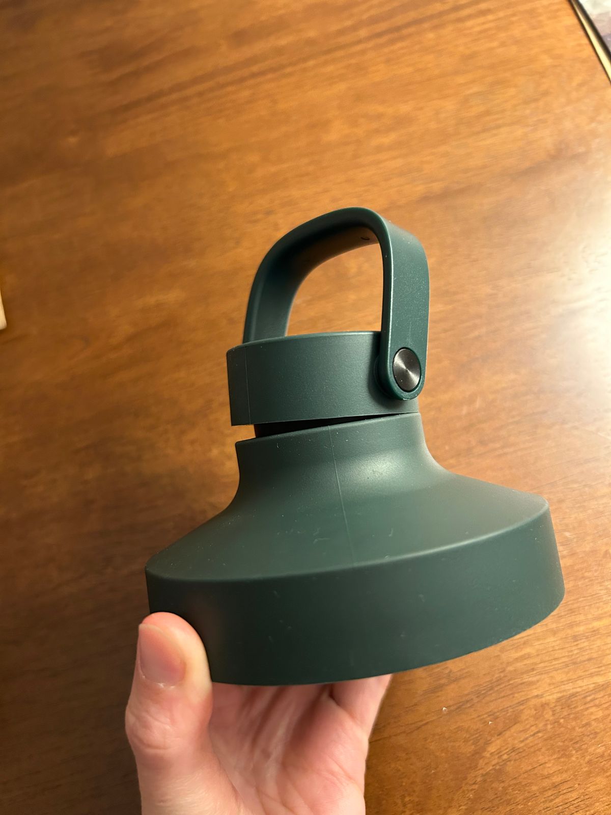
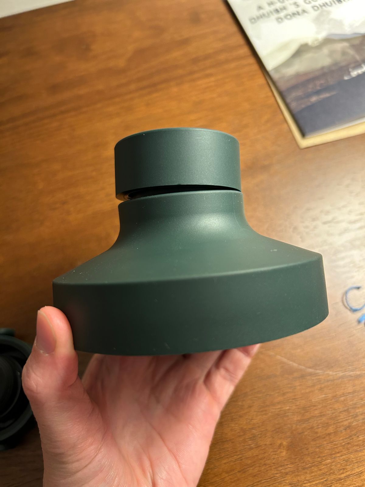
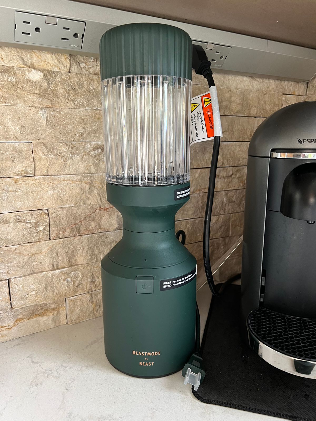
    Beastmode by Beast Blender1200W Blender Base, Blade Holder, and 1000mL Blending Vessel
  • Storage Lid, Drinking Lid, and Carry Cap
    Storage Lid, Drinking Lid, and Carry CapStore extras, or take your blends to go
  • Straw Cap + 2 Straws
    Straw Cap + 2 StrawsEnjoy your blended creations with no spills
  • Cleaning Brushes
    Cleaning Brushes
Specifications
  • Blender Voltage: 120V
  • Blender Wattage: 1200W
  • Blender Length: 4.92 in
  • Blender Width: 4.92 in
  • Blender Height: 15.75 in (includes 1000mL Blending Vessel attached)
  • Blender Weight: 6.9 lbs
  • Blender Total Volume: 1000mL (33.8 oz)
  • Blending Capacity: 750mL (25.4 oz)
  • Blending Vessel Materials: BPA-Free Tritan™, grippy TPE overmold
  • Blender Settings: 2 speeds (pulse + blend)
  • Warranty: 2 years
Smooth blends
Innovative 12-rib vessels
Leak-resistant
No spills here
Simple
Timed blend
Intelligent
A blade with a brain
Convenient
Take it to-go
Beastmode Starts From Within

Strong Inside. Beastmode.

Whatever you call it, it starts with how we fuel our bodies.

Fuel better, feel better.

Marshawn Lynch (Beast Mode) drinking out of the Beast Mode blender accessory cup
Marshawn Lynch (Beast Mode) in a series of poses, holding the Beastmode Blender
Don't Fumble Your Health

There's no substitute for nature's foods.

WILL IT BLEND?!

1200-watts is too much power for a toy.

Want to see how the Beastmode Blender stacks up against the hardest foods known to nature?

What about rare earthly minerals? What about unnatural pseudo-scientific food experiments gone awry?

watch now on YouTube
Marshawn Lynch (Beast Mode) wearing an orange hat, a green shirt, and a white apron, using the Beastmode Blender
Parts & accessories
Rated 4.7 out of 5
Based on 62 reviews
Click to go to reviews
1000mL Blending Vessel + Storage Lid
$30
+3
Rated 4.8 out of 5
Based on 1390 reviews
Click to go to reviews
Beast Performance Blade
$30
Rated 4.7 out of 5
Based on 18 reviews
Click to go to reviews
Blending Vessel Drinking Lid + Carry Cap
$20
+3
Rated 4.8 out of 5
Based on 41 reviews
Click to go to reviews
Vessel Spatula
$20
Reviews
average rating 4.6 out of 5
Based on 119 reviews
  • 5 Stars
    99 Reviews
  • 4 Stars
    7 Reviews
  • 3 Stars
    2 Reviews
  • 2 Stars
    4 Reviews
  • 1 Star
    7 Reviews
89% of reviewers would recommend this product to a friend
Customer photos and videos
119 Reviews
Reviewed by David W.
Verified Buyer
I recommend this product
Rated 5 out of 5
Review posted28 days ago

Changed our morning routine

The Beastmode has changed our morning routine. Before I worried about what to fix my wife to take to her office for breakfast, and since the Beastmode has arrived the only decisions I need to make now are what to put into her smoothies. She loves them as they allow her to drink them as time allows during her busy morning.

Loading...
Was this helpful?
Reviewed by Chase
I recommend this product
Rated 5 out of 5
Review postedabout 1 month ago

5 Stars

Best blender ever

Loading...
Was this helpful?
Reviewed by Cecilia
I recommend this product
Rated 5 out of 5
Review postedabout 2 months ago

5 Stars

Love the blender. Bought for my son and he is using daily for work

Loading...
Was this helpful?
Reviewed by Sara W.
Verified Buyer
I recommend this product
Rated 5 out of 5
Review posted2 months ago

Obsessed

Best purchase!!

Loading...
Was this helpful?
Reviewed by Timothy D.
Verified Buyer
I recommend this product
Rated 5 out of 5
Review posted2 months ago

Love it

My blends have never been smoother.

Loading...
Was this helpful?
What is Beastmode?
Beastmode is taking things to the next level - unlocking the strongest version of yourself. It’s the Marshawn Lynch way. With this limited edition blender, we supercharged something that was already great. The Beastmode by Beast Blender is the perfect tool to step up your nutrition game, fuel your life, and help you become a Beast.
Why did Marshawn Lynch make a blender?
As Marshawn always says, “Take Care Of Yo’ Bodies”. Caring for ourselves starts with the foods we consume, which is why Marshawn partnered with Beast to create the baddest blender on the market that can make it easier to consume more of nature’s foods.
What makes the Beastmode By Beast Blender different?
The original Beast Health Blender is loaded with technology to provide a perfect blending experience, such as our patented 12-rib vessel, electronic interlock system, temperature-sensing Beast Performance Blade, timed blending program, single-button operation, and a robust, sturdy base, and 1000W motor. We took our award-winning powerhouse blender and supercharged it with a 1200W motor for Marshawn Lynch.
What’s the difference between 1000W and 1200W?
A 1000W motor will crush ingredients into fine, silky smoothies in under 60 seconds. 1200W gets it done in 30. We built a motor that could lift a thousand-pound load and put it in a sexy blender to pulverize fresh whole foods into delicious blends, over, and over, and over, and over...
Can I blend and/or pulse frozen ingredients in the Beast Blender?
Absolutely. In fact, we encourage it to make your blend extra delicious. If you need any recipes including frozen ingredients, check out our Recipes page.
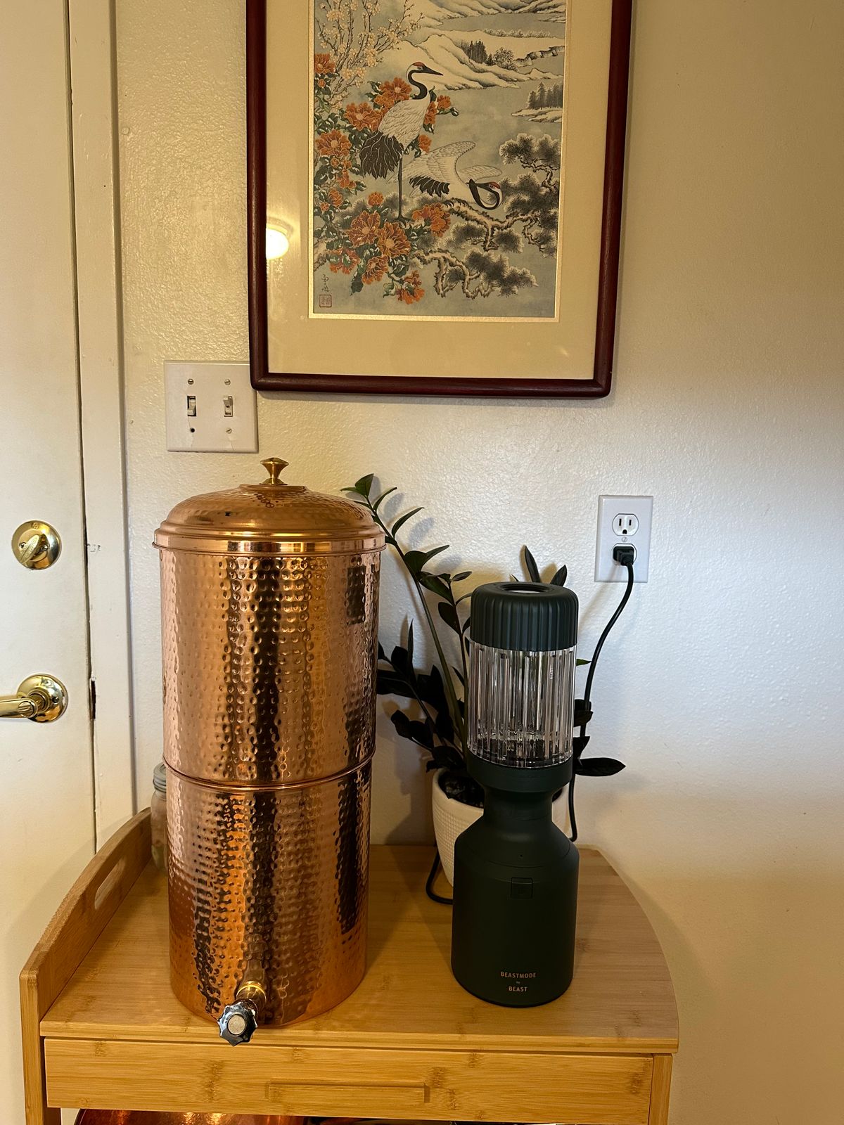
How should I store my Beast Blender?
Straight up. On the counter.
How do I care for my Beast® Health products?
Blender Base: clean periodically with damp towel. All other Components: dishwasher safe - top rack only.
In what order should I fill my Blending Vessel?
Add your preferred ingredients to the vessel in the following order for the best results: liquids; ice; produce; leafy greens; powders, seeds, nuts, nut butters, honey.
What's the return policy?
We truly believe you’ll love all of your Beast Health™ products, but if for some reason you’re not completely satisfied with your order, we will offer you a full refund excluding the return shipping cost, as long as you contact us and ship the return back to us within 30 days of your initial purchase. You, the customer, are responsible for all return shipping costs associated with your order. To initiate a return, reach out to our contact form in the footer of this webpage.
How do I make my blend extra smooth and creamy?
We’re not overexaggerating here, we really created the best blender technology could offer so all you have to do is kick back, relax, and enjoy the Beast Blender show. BUT here’s an insider tip: approximately ⅓ of your ingredients should be liquid to ensure a smooth blend.
Beastmode by Beast

Don't fumble your health. Go Beastmode.

Select your color
Forest Green