transition/transform
transition:アニメーション宣言
書式
- transition-property(動きの種類)
- transition-duration(アニメーション時間)
- transition-timing-function(変化のタイミング・進行割合)
ease:開始と完了を滑らかにする(初期値)
linear:一定
ease-in:ゆっくり始まる
ease-out:ゆっくり終わる
ease-in-out:ゆっくり始まってゆっくり終わる
- transition-delay(時間差)
- まとめて記述する事もできる
transition:プロパティ 時間 function delay
記述例:
div{
transition:background 1s linear 2s
};
- プロパティを省略すると、現在の設定されているCSSがすべてアニメーションの対象となる
transform:移動/拡大・縮小/回転
書式
- transform:scale(x方向の倍率、y方向の倍率)
- transform:scaleX(x方向の倍率)
- transform:scaleY(y方向の倍率)
- transform:rotate(回転角度)
- transform:translate(x方向の距離、y方向の距離)
- transform:translateX(x方向の距離)
- transform:translateY(y方向の距離)
- 新しい記述の仕方
- プロパティであるtransformの代わりにtranslate/scale/rotateをプロパティとして記述する方法
- scale例:
scale:1.2 1 (x方向)
scale:1 1.5 (y方向);
scale:1.5 (xy方向);
- rotate例:
rotate:360deg (右1回転)
rotate:x 180deg (x軸に半回転);
rotate:y 1turn (y軸に1回転);
- translate例:
translate:200px 0; (右に移動)
translate:200px 50px; (右下へ移動)
translate:0 150px; (下へ移動)
演習1:(scale)

使用html
1 2 3 4 5 6 7 8 9 10 11 12 13 14 15 16 17 18 19 20 21 22 23 24 25 26 27 28 29 30 31 32 33 34 35 36 37 |
<style> body{ text-align: center; } p{ width:50px; line-height:50px; margin-inline: auto; text-align: center; background: #00f; color:#fff; transition: 500ms; } /* Hover animation */ .xBtn:hover + p{ scale:4 1; background: #f00; } .yBtn:hover + p{ scale:1 1.5; } .xyBtn:hover + p{ scale:1.5; } </style> <button class="xBtn">X拡大</button> <p>拡大</p> <button class="yBtn">Y拡大</button> <p>拡大</p> <button class="xyBtn">XY拡大</button> <p>拡大</p> |
演習2

使用html
1 2 3 4 5 6 7 8 9 10 11 12 13 14 15 16 17 18 19 20 21 22 23 24 25 26 27 28 29 30 31 32 33 34 35 36 37 38 39 40 41 42 43 44 45 46 47 48 49 50 51 52 53 54 55 56 57 58 59 60 61 62 63 64 65 66 67 68 69 70 71 72 73 74 75 76 77 78 79 80 81 82 83 84 85 86 87 88 89 90 91 92 93 94 95 96 97 |
<style> /* Reset */ *{ margin: 0; padding: 0; } body{ line-height: 1; font-family: sans-serif; } ul { list-style: none; } a{ text-decoration: none; display: block; color: inherit; } /*Nav CSS*/ nav ul{ margin-top:50px; display: flex; gap: 30px; justify-content: center; } nav li{ text-align: center; width:150px; line-height:150px; font-weight: bold; } nav a{ color: #fff; border-radius:50%; transition: 300ms; } /* scale animation CSS */ nav a:hover{ scale:1.2; } /* background CSS */ nav li:nth-child(1) a{ background: rgba(0,0,255,0.3); } nav li:nth-child(1) a:hover{ background: rgba(0,0,255,1); } nav li:nth-child(2) a{ background: rgba(255,0,255,0.3); } nav li:nth-child(2) a:hover{ background: rgba(255,0,255,1); } nav li:nth-child(3) a{ background: rgba(0,200,0,0.4); } nav li:nth-child(3) a:hover{ background: rgba(0,200,0,1); } nav li:nth-child(4) a{ background: rgba(0,200,255,0.4); } nav li:nth-child(4) a:hover{ background: rgba(0,200,255,1); } nav li:nth-child(5) a{ background: rgba(255,150,0,0.4); } nav li:nth-child(5) a:hover{ background: rgba(255,150,0,1); } </style> <nav> <ul> <li><a href="#">HOME </a></li> <li><a href="#">PROFILE</a></li> <li><a href="#">WORKS</a></li> <li><a href="#">ABOUT</a></li> <li><a href="#">CONTACT</a></li> </ul> </nav> |
演習3:回転(rotate)

html
1 2 3 4 5 6 7 8 9 10 11 12 13 14 15 16 17 18 19 20 21 22 23 24 25 26 27 28 29 30 31 32 |
<style> body{ text-align:center; } p{ width:100px; line-height: 100px; background:#00f; color: #fff; margin:20px auto 30px; transition: 500ms; } .z:hover + p{ rotate:360deg; } .y:hover + p{ rotate:y 1turn; } .x:hover + p{ rotate:x 1turn; } </style> <button class="z">z回転</button> <p>Rotate</p> <button class="y">y回転</button> <p>Rotate</p> <button class="x">x回転</button> <p>Rotate</p> |
演習4:回転/拡大(rotate/scale)

1 2 3 4 5 6 7 8 9 10 11 12 13 14 15 16 17 18 19 20 21 22 23 24 25 26 27 28 29 30 31 32 33 34 35 36 37 38 39 40 41 42 43 44 45 46 47 48 49 50 51 52 53 54 55 56 57 58 59 60 61 |
<style> body{ text-align: center; } .sns a + a{ margin-left: 50px; } .sns i{ font-size: 8em; color: #aaa; transition: 500ms; } .sns a:nth-child(4) i{ font-size: 7.2em; } .sns a:hover i{ scale:1.2; rotate:1turn; } /* Facebook */ .sns a:nth-child(1):hover i{ color: #2e3192; } /* X */ .sns a:nth-child(2):hover i{ color: #000; } /* LINE */ .sns a:nth-child(4):hover i{ color: #06c755; } /* Instagram */ .sns a:nth-child(3):hover i{ background: radial-gradient( circle at 30% 107%, #fdf497 0%, #fdf497 5%, #fd5949 45%, #d6249f 60%, #285AEB 90%); color: transparent; /* ベンダープレフィックス */ -webkit-background-clip:text; background-clip:text; } </style> <h2>SNS Link</h2> <aside class="sns"> <a href="#"><i class="fab fa-facebook-square"></i></a> <a href="#"><i class="fa-brands fa-square-x-twitter"></i></a> <a href="#"><i class="fa-brands fa-instagram-square"></i></a> <a href="#"><i class="fa-brands fa-line"></i></a> </aside> |
演習5:(translate)
各ボタンホバーで下記のように0.5秒で移動する

使用html
1 2 3 4 5 6 7 8 9 10 11 12 13 14 15 16 17 18 19 20 21 22 23 24 25 26 27 28 29 30 31 32 33 34 35 36 37 38 |
<style> body{ text-align: center; } p{ width:50px; line-height: 50px; margin-inline: auto; background: #00f; color: #fff; transition: 500ms; } .riteBtn:hover + p{ translate:200px 0; } .diagBtn:hover + p{ translate: 100px 50px; } .btmBtn:hover + p{ translate:0 100px; scale: 1.5; rotate:1turn; background: #f00; } </style> <button class="riteBtn">右</button> <p>右</p> <button class="diagBtn">斜</button> <p>斜め</p> <button class="btmBtn">下</button> <p>下</p> |
演習6
ホバーで0.3秒かけてウィンドウ左からスライドで出現

使用html
1 2 3 4 5 6 7 8 9 10 11 12 13 14 15 16 17 18 19 20 21 22 23 24 25 26 27 28 29 30 31 32 33 34 35 36 37 38 39 40 41 42 43 44 45 46 47 48 49 50 51 52 53 54 55 56 57 58 59 60 61 |
<style> *{ margin: 0; padding: 0; } body{ line-height: 1; font-family: 'Raleway', sans-serif; } ul{ list-style: none; } a{ text-decoration: none; display: block; } /* Navigation */ nav ul { width: 565px; margin-top: 10px; display: flex; gap: 10px; translate:-550px 0; transition: 300ms; } nav ul:hover{ translate:0 0; } nav li { box-sizing: border-box; border: 2px solid #0cc; width: 100px; line-height: 35px; text-align: center; } nav a { color: #555; transition: 300ms; } nav a:hover{ color: #fff; background: #0CC; } /*3点リーダー*/ .btn{ width:15px; } </style> <nav> <ul> <li><a href="#">HOME</a></li> <li><a href="#">PROFILE</a></li> <li><a href="#">WORKS</a></li> <li><a href="#">ABOUT</a></li> <li><a href="#">CONTACT</a></li> <li class="btn">font-awsome使用</li> </ul> </nav> |
演習7:ホバーアニメーション(0.3s)

使用html
1 2 3 4 5 6 7 8 9 10 11 12 13 14 15 16 17 18 19 20 21 22 23 24 25 26 27 28 29 30 31 32 33 34 35 36 37 38 39 40 41 42 43 44 45 46 47 48 49 50 51 52 53 54 55 56 57 58 59 60 61 62 63 64 65 66 67 68 69 70 71 72 73 74 75 76 77 78 79 80 81 82 83 |
<style> *{ margin: 0; padding: 0; } body{ line-height: 1.0; font-family:sans-serif; } a{ text-decoration: none; display: block; } ul{ list-style: none; margin-top: 20px; display: flex; justify-content: center; gap: 20px; } /* liの指定 */ .link li{ width:400px; height: 300px; text-align: center; font-size: 24px; background: url(img/fit1.jpg) no-repeat center/100% auto; transition: 300ms; overflow: hidden; } .link li:nth-child(2){ background: url(img/man01.png) no-repeat center/100% auto; } /* 背景画像拡大 */ .link li:hover{ background-size:120% auto; } /* リンクエリア */ .caption{ outline: 3px solid #f00; color:#fff; font-weight: bold; height: 100%; padding-top: 250px; transition: 300ms; } .caption:hover{ color:#fc0; background:rgba(0,0,0,0.3); translate:0 -110px; } /* 詳細を見る */ .caption span{ display: block; color: #fff; background:#f00; padding-block:10px; width:40%; border-radius: 5px; margin:50px auto 0; transition: 300ms; } .caption span:hover{ color:#f00; background: #fc0; } </style> <ul class="link"> <li> <a href="#" class="caption"> WEIGHT CONTROL <span>詳細を見る</span> </a> </li> </ul> |
使用画像

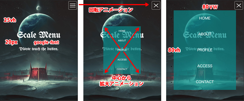
演習8:スマホボタン/メニュー
※背景画像は各自用意(400px/800px程度)

使用html
1 2 3 4 5 6 7 8 9 10 11 12 13 14 15 16 17 18 19 |
<header> <h1>Scale Menu</h1> <p>Plsese touch the button</p> <!-- Hambureger Btn --> <div class="btn"><span></span></div> <!-- Sp用メニュー --> <nav class="spnav"> <ul> <li><a href="#">HOME</a></li> <li><a href="#">ABOUT</a></li> <li><a href="#">PROFILE</a></li> <li><a href="#">ACCESS</a></li> <li><a href="#">CONTACT</a></li> </ul> </nav> </header> |