

Nothing Phone 1 Hands-On: So far, so good
The first phone from Carl Pei’s much-hyped company, Nothing, is here. Named the Phone 1 and stylized as “phone (1)” by marketing, it continues the minimalist design language established by the UK-based startup, with a transparent design, a clean interface with Nothing’s dot-centric visual language, and some clever design elements like flashing lighting strips on the backside that are both cool and gimmicky (I alternate between the two thoughts).
I’m just going to cut to the chase: this isn’t a groundbreaking, never-before-seen smartphone that will change the industry. But it is a surprisingly polished (for a new company), good-looking phone with a lot of personality. And the latter is increasingly rare in the smartphone space if you’re not paying four-digit flagship prices. I respect brands for trying something different, and the Nothing Phone 1 is a bit different.

Nothing Phone 1: Price and Availability
The Nothing Phone 1 is available for purchase starting July 21 in select markets including UK, France, Germany, Japan, Hong Kong, India, Malaysia, Finland, Portugal, among a half dozen more countries. Prices, in British pounds, Indian rupees, and Hong Kong dollars, are as follows.
8+128GB: £399/₹32,999/HK$3,699
8+128GB: £449/₹35,999/ HK$3,999
12+256GB: £499/₹38,999/HK$4,399

-
The Nothing Phone 1 is a stylish looking phone with a cool semi-transparent back and fast, zippy UI.
Nothing Phone 1: Specifications
| Specification | Nothing Phone 1 |
|---|---|
| Build |
|
| Dimensions & Weight |
|
| Display |
|
| SoC | Qualcomm Snapdragon 778G Plus |
| RAM & Storage |
|
| Battery & Charging |
|
| Security | In-display optical fingerprint scanner |
| Rear Camera(s) |
|
| Front Camera(s) | 16MP selfie camera |
| Port(s) | USB Type-C |
| Audio | Stereo speakers |
| Connectivity |
|
| Software | Nothing OS over Android 12 |
| Other Features | Glyph lighting interface |
About this hands-on: Nothing sent me a Phone 1 to test. This hands-on was written after about two days with the device, so it is not a review, but a first impression. Nothing had no input in this article.
Nothing Phone 1: Package and Unboxing
I normally don’t cover a smartphone’s packaging but Nothing’s packaging is different enough that it deserves its own section. I had been told by Nothing execs during a media briefing that the phone’s packaging would be really small, but I was still caught off guard by how slim it was.

Like every tech brand worth its salt, Nothing claims it’s making efforts to be more environmentally friendly, which obviously applies to the packaging too. Nothing says the entire box is made of recycled paper, printed with soy-based ink, and there is no plastic wrapping around the box. So how do you know if a Nothing package is brand new or previously opened? There is a peel-away tab that rips off a thin strip of paper that wraps around the box, which frees one side of the box.

Remove the loose part reveals two slots with the phone and another small paper box wrapped inside. These can be pulled out like a desk drawer. The slots to house the phone and box are padded with thick cardboard paper and designed to house the content just right. There is no wiggle room in there, which hopefully should be enough protection for the phone even if the box has been thrown around by rough deliverymen.


The phone is wrapped in a plastic sleeve, and inside the box are just some papers. a USB-C cable and a different-looking SIM ejector tool that looks like a small pill with a needle stuck in it.


And as most can probably already tell from the thin packaging, there is no charger in the box, so you have to buy your USB C charger. I do like this packaging and find it refreshing from the usual phone unboxing experience.
Nothing Phone 1: Design Overview

The overall shape and in-hand feel of the Nothing Phone 1 is very similar to the iPhone 12 and 13 series, with very flat sides and rounded corners. When you hold this phone, your palm feels mostly the aluminum frame, as the hard angles stop the phone’s back from sitting on your palm.

Xiaomi and Oppo also recently released phones with flat sides, but those brands added subtle chamfered corners to soften the sharp edges. Nothing Phone 1 doesn’t do this, going the entire iPhone route in which the sides of the phone end at an abrupt 90-degree angle.

I said this about the iPhone 12/13 series and I’ll have to say it here: this design looks cool but is not as comfortable to hold as phones with curvier sides. I’m not even talking about curved screens like most modern Android flagships, but even the iPhone X, and Google Pixel 5 type of rounded sides fit into the palm more comfortably. I suppose a big reason for my gripe is because I tend to use my phones naked, while a case will significantly soften the sharp corners of these flat-sides designs.
This design looks cool but is not as comfortable to hold as phones with curvier sides
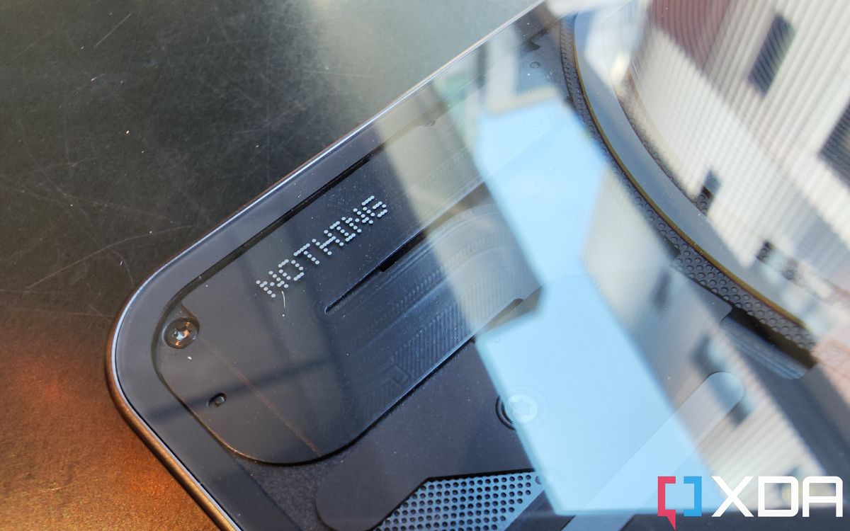
The most attention-grabbing feature of the Phone 1 is obviously the back design: a semi-transparent look that seemingly offers a glimpse at the phone’s internals. Most of what we see is actually a design piece covering the actual guts of the phone, but we can see the wireless charging coil and some carefully placed screws. I personally really like this look, particularly my black model. There is also a white model, as most of you have surely seen.
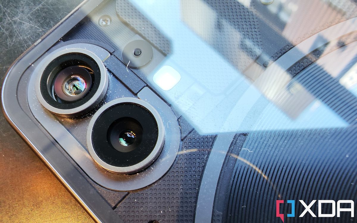
There are four strips of lights on the backside of the phone, including two that wrap around the camera module and the wireless charging coil respectively. This is what Nothing calls the “glyph interface” and the lights aren’t entirely for decoration. Nothing has designed the lights to flash specific patterns for various smartphone tasks, like when the phone is ringing, receiving a notification, or when Google Assistant is speaking. The sound effects that play along with the flashing lights are, according to Nothing, inspired by the classic Nintendo Entertainment System and Casio electronic watches. I’m just on day two with the phone, so right now, I can say I find the light and sound effects interesting and fun. I can’t guarantee I’ll still feel the same way five months in.

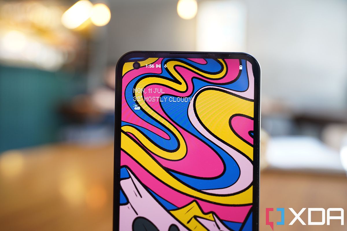
There are two more hardware components that stand out: the haptics on this phone are great — precise and strong, and the phone has entirely uniform/symmetrical bezels. All four sides are even. To be honest, I find most modern Android phone bezels perfectly fine the way they are, but on Twitter, there’s a vocal bunch that complain if the chin bezel is 0.3mm thicker, or if the left and right bezels are thinner than the top and bottom bezels. If you’re one of these people, the Nothing Phone 1 bezels should satisfy you.
All the other hardware components I haven’t mentioned yet are … nothing special. Don’t get me wrong, the 6.55-inch 120Hz OLED screen looks good, and it supports all the usual technical mumble jumble that gets thrown around like HDR 10+ and million to one contrast ratio. The Snapdragon 778G+ SoC, 50MP Sony IMX766 main camera, and 50MP ultra-wide camera are capable, proven components.
The 4,500 mAh battery, IP53 water and dust resistance rating, and just 15W wireless charging are a bit less than what you could get from other brands at a similar price point, but it’s fine. One component that’s been slightly bothersome is the optical in-display scanner. It’s located lower on the phone than usual (if you used the OnePlus 9 series or Oppo phone circa 2020, you will know this spot), and it seems a bit slower to respond than others. It’s not Pixel 6 level slow, however.
I’ll cover how this phone performs in terms of processing power, doing slightly intensive tasks, and battery life in the full review.
Nothing Phone 1: Software
The Nothing Phone 1 runs a very light, but very stylish, Android skin named Nothing OS over Android 12. The first thing I noticed that stood out about Nothing OS is the initial phone setup interface was entirely black, including the Google sign-up screen. I have gone through this Android setup process probably like 100 times in the last few years and the Google sign-in screen is always white. I think this all-black aesthetic is specific to my black model, I think the white model will likely have a more conventional white setup screen. I got two software updates in the first 48 hours of using the phone, by the way.


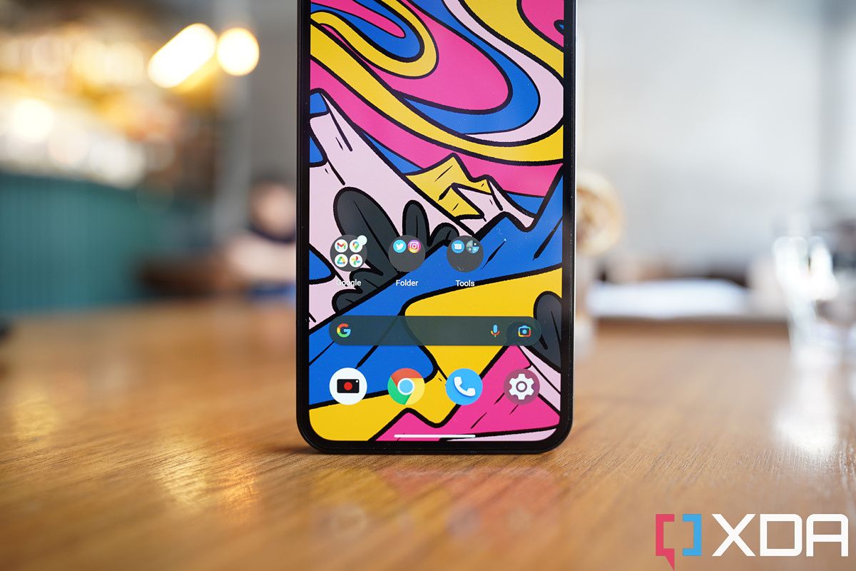
Once finished with setup and you’re in Nothing OS, the next thing you’ll likely notice is the phone only ships with Google’s core apps, with no bloatware — or at least, the conventional definition of bloatware (third-party apps that are pre-installed). I actually find Google’s increasingly large suite of apps overbearing and annoying. Sure, it makes sense to have Google Play, YouTube, Chrome, Google Contacts, and Maps pre-installed on all Android phones. But I do not give a damn about Google TV, Google Play Music, YouTube Music, Google One, Google Home, Google Pay, and Google Duo, and the fact these apps are now all crammed into recent Android phones, most of them can’t be uninstalled, means these are still bloatware. This is a GMS issue and not a Nothing issue, so no complaints on Phone 1 on this end. After all, the Nothing Phone 1 ships with the fewest pre-installed apps than any phone I’ve ever tested. The only non-Google apps pre-installed are the camera, calculator, and recorder apps.
The main interface feels very similar to typical stock Android. I’ve only noticed two new things so far. The first is the ability to make an app icon look giant on the homescreen (see the second image in the below set), which could be useful for those who want one or two apps to stand out from the pack on the homescreen for easier access or accessibility reasons.
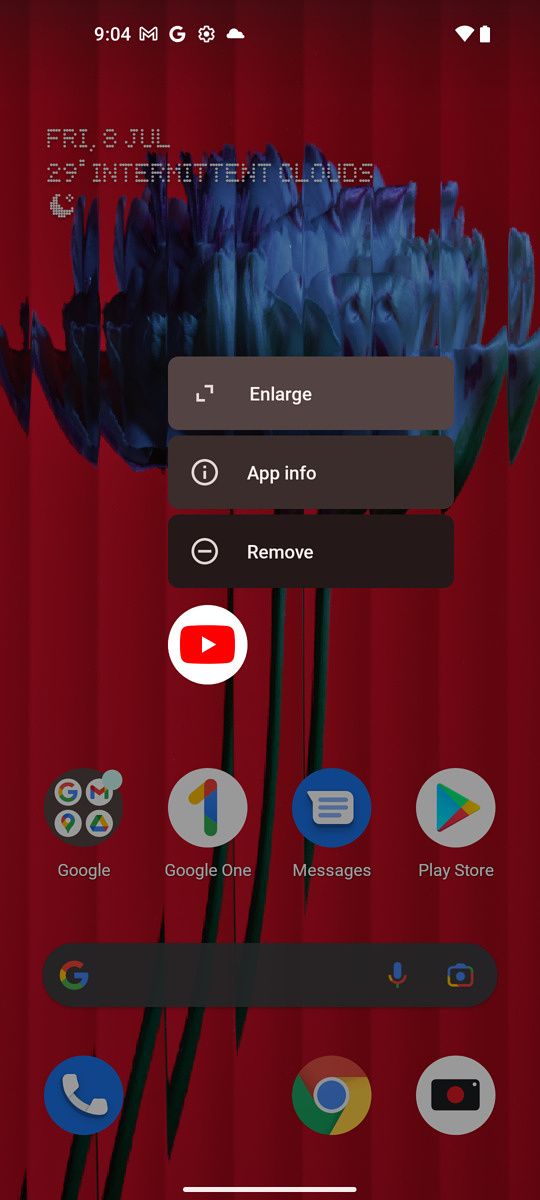
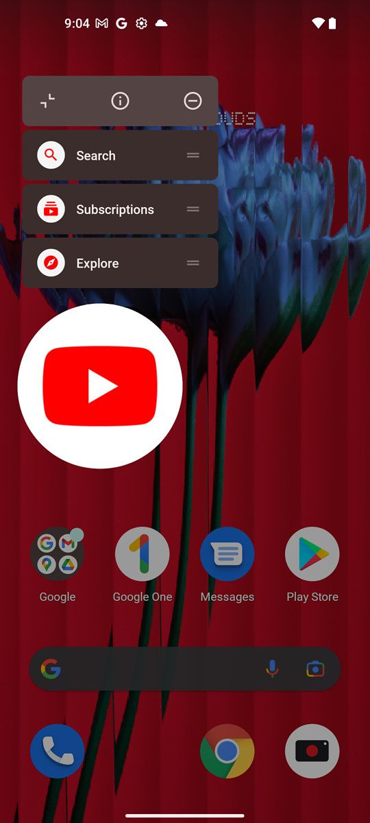

The other is that the shortcut toggle buttons in the notification shade have been simplified. In almost all Android phones, there are separate buttons for WiFi, cellular data, and mobile hotspot. Nothing combines all three of these into one larger-than-usual button (see the third pic in the above set) through which the user can cycle via horizontal swipes. This makes sense to me, as these are all related to getting an internet connection on the phone. I reckon some others may disagree here.
The Nothing Phone 1 ships with the fewest apps on the phone of any phone I've ever tested
Other than the ability to customize the glyph interface (those lights on the back), the phone’s settings panel looks similar to stock Android’s. And Nothing’s dot-driven font is only used sparingly, in the main time/weather widget and in the main title of each settings page. If you’ve used an Android phone recently, this UI feels very similar.
Similar to OxygenOS, I do notice Nothing OS zips around very fast, with animations that appear extra fluid (this is likely an illusion with more frames of animations). I like it. I always find Samsung’s OneUI noticeably janky (yes, even the 120Hz phones) compared to OxygenOS, ColorOS, and now, Nothing OS.
I do notice, however, some bugs right now, such as the auto brightness setting leaving the screen way too dark, particularly when I’m in the camera mode, and the fingerprint scanner doesn’t always unlock on first try for me. It’s still day two, so we’ll see if these problems are still here after a week.
Nothing Phone 1: Early Thoughts

Due to limited time and embargo restrictions, I can’t really go too in-depth about the camera and general performance yet until the full review coming later, and I’d rather just wait before I talk about the cameras. But I can say that everything has performed at or above expectations so far for a phone at a mid-tier price range. As mentioned at the top, the Nothing Phone starts at around the equivalent of $475.
At this price point, the benchmark scores, battery life, and camera performance are respectable so far. I will of course test more through the week and be back with my findings in the full review.

Nothing Phone 1 in the hand.
So far, Nothing Phone 1 feels like a well-designed phone with more polish than usual first attempts at smartphones. The hardware craftsmanship (including small flourishes like excellent haptics and stereo speakers) and very fast and zippy UI animations are better than one would normally expect from a new company’s first phone. But this is clearly not Carl Pei’s first rodeo.
I’ll be back later this week with the full review.


