Visualizing Graph Databases Using Gephi

What is Graph Database?
A graph is representation of data in terms of vertices and edges. The nodes hold information regarding the entity we are trying to relate, and edges are supposed to hold data regarding the relationship between two nodes. This data organization is based on graph theory. The edges can be directed or undirected, depending on the flow of relation.
The beauty of Graph does not lie in the connections, it lies in the possibilities of unexplored potential connections.
A very commonly known example would be finding out potential friends you might know on social media, depending upon the connections and common interests you have. Another example would be to figure out shopping patterns and suggest items based on a graph created from your profile, purchase history, interests, etc. If you want to read on more real life use-cases, check out this article.
Since we have an overview of graph database, let us dive in and explore how to visualize this data and analyze it, using Gephi!
Dataset Details
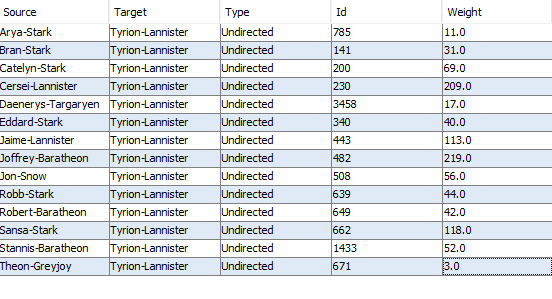
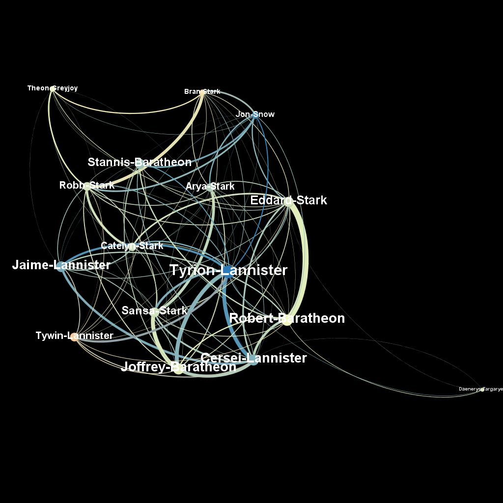
The dataset used in this example is Game of Thrones to visualize. This dataset constitutes a network and is given as a text file describing the edges between characters, with some attributes attached to each edge. This dataset was chosen as it is simple for the purpose of illustrating Gephi functions.
The dataset details are as follows:
Importing Data in Gephi
There are three components in gephi:
- Workspace: Workspace is used as a canvas to see the data on, and configure it. Workspaces in Gephi are similar to the worksheet tabs in Tableau or Excel, but each hold a different dataset that is not affected by what you do in other workspaces.
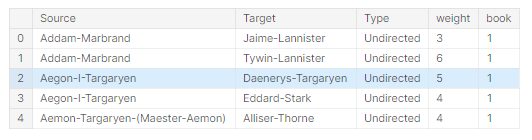
- Data Laboratory: You will see that all the information about the graph data/network can now be seen as a data table, as shown in the following screenshot, with columns or attributes such as nodes, node ID, and node label.
- Preview: This mode lets you alter the way the final network will look. One can then export a snapshot of it into a required format such as a PDF or a PNG image file from this tab.
Here are the supported data formats that you can use in Gephi: https://gephi.org/users/supported-graph-formats. A spreadsheet in .csv format usually works well.
To load data into Gephi, you can go to Data Laboratory — >Import Spreadsheet, and then select the csv file available for our purpose.
The Import As is an important input to understand:
- Nodes Table: This mode is selected when you have a file/database with all the node names. This File should contain “ID” for uniquely identifying the node and a “Label” to name the node. Both can have same values.
- Edges Table: The edge list CSV should include columns titled “Source” and “Target”, containing the node IDs of the start and end node for each edge, as well as any other edge attributes you would like to include. Gephi can recognize two more columns if you include them in your data: “Type” indicating the type of each edge (Undirected or Directed), and “Weight” containing the edge weight.

- Adjacency List: This format accepts the relationship between the nodes in Source →Target format.
- Matrix: In this file format, the Rows and columns are the node labels and the relationship is indicated by 0 or 1.
For our purpose, we will choose Nodes Table. Once you click on Finish, you should be able to go to Nodes tab and see the nodes, label, Weighted-In Degree, Out-Degree.
Visualizing the graph
Now that the graph is imported, the next step is to visualize the graph and tuning the visualizations. This is done in the Overview section of the workspace. Now, there are three tabs which will help you configure your graph:
- Appearance: Here, you can configure the size, color and weight of the nodes and edges depending on weight, in-degree, out-degree, etc. according to your needs.
- Layout: This tab can be a bit confusing since it comes with different names which you might not understand at first glance. My advice here is to just dive into it and play with it, and then read this article on details of what is the significance of each Layout is.
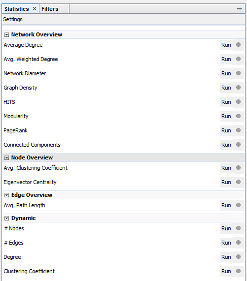
- Statistics: This tab will give you all the statistics for the graph in the workspace, with a graph representation wanted.

Exporting the graph
For exporting the graph, you can go to the Preview tab. In this tab, you can tweak the final looks of the graph using the Preview Settings.
Other Visualizing Tools
- Neo4j: The downside of this application is to use the data and manipulate it, you need to know Cypher Query Language(CQL) and the tool is less for analysis and more for discovering relationships in your database. For in-depth visualization, you can use the extension Neo4j bloom.
- KineViz GraphXR: GraphXR is a browser-based interactive visual analytics platform. Neo4j has a GraphXR plugin, which takes the visualization to next level, with advanced options like GeoTagging and a VR space to move in. It is worht a try, just follow this tutorial!
- Keylines: KeyLines is a toolkit used by developers to build sophisticated and powerful network visualization applications. These applications run completely in a web browser and can therefore be easily integrated into existing systems and dashboards, or as standalone applications. I haven’t used personally, but give it a try!
Hope you have a great time playing around with the application!


