


Figures
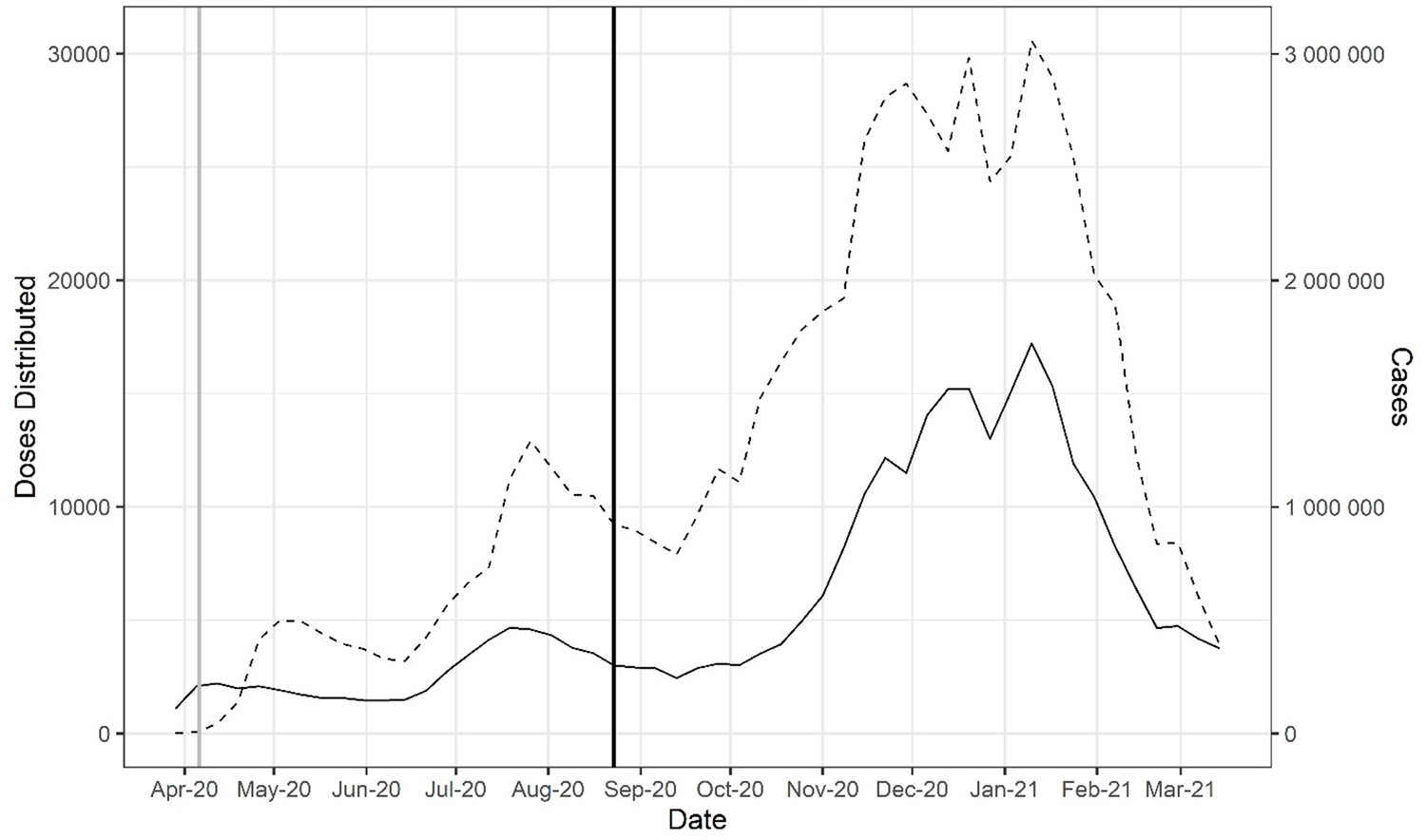
Doses of COVID-19 convalescent plasma (CCP) distributed in the USA by the American Red Cross and American Blood Centers (dashed) and total COVID-19 cases in the USA reported in Our World in Data (OWID) database (solid).
The vertical black line marks August 23, 2020, when the US Food and Drug Administration (FDA) announced that Emergency Use Authorization for CCP in the USA. The vertical gray line marks April 4, …
-
Figure 1—source data 1
Source data for Figure 1.
- https://cdn.elifesciences.org/articles/69866/elife-69866-fig1-data1-v2.csv
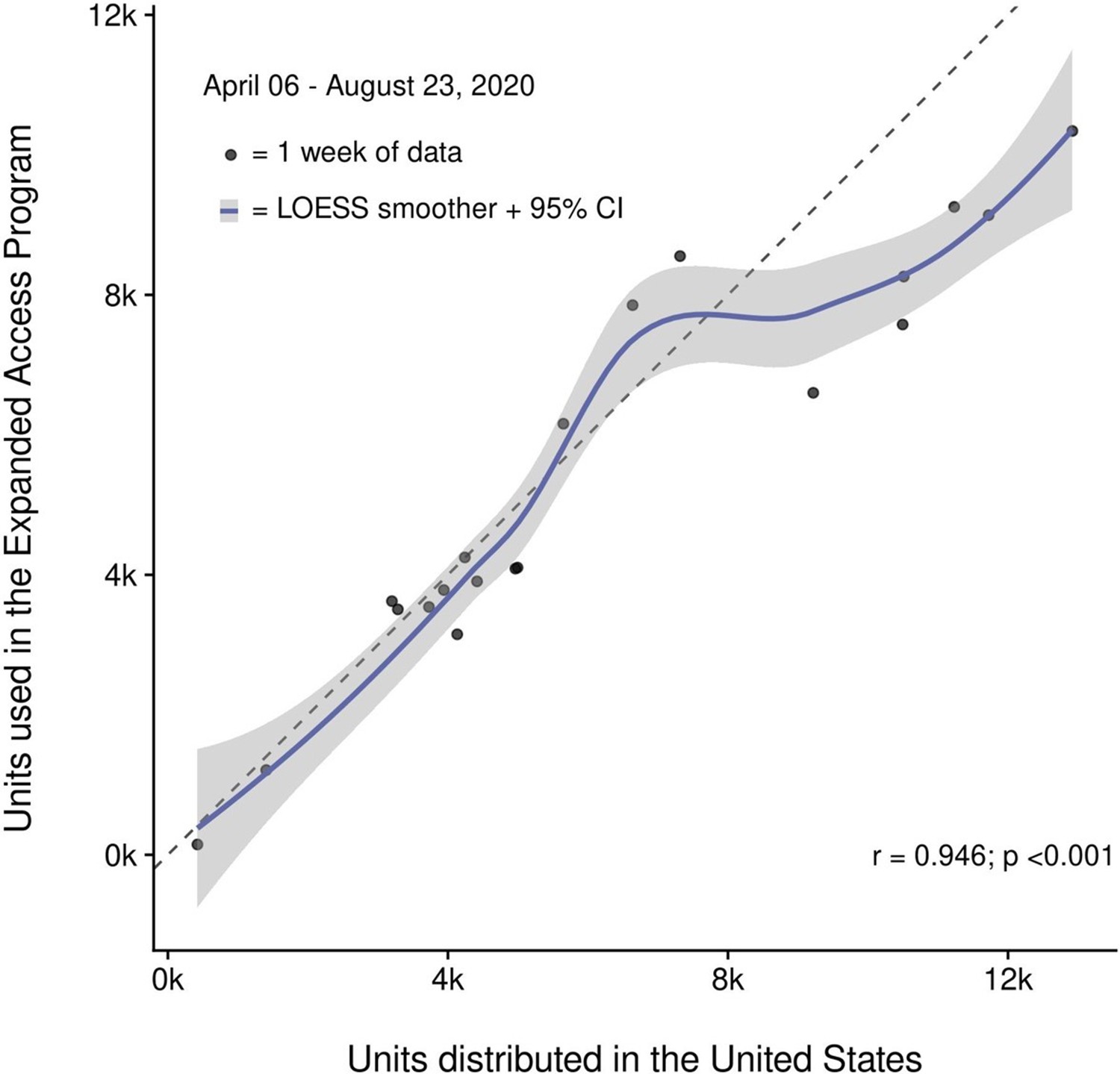
Correlation of convalescent plasma distribution and usage within the Expanded Access Program (EAP).
Shown is the progressive increase in the number of convalescent plasma units distributed in the USA and convalescent plasma units used in the EAP. Data between April 6 and August 23, 2020, are …

Doses of COVID-19 convalescent plasma (CCP) per hospital admission (red) and mortality calculated as deaths per hospital admission (green) using Our World in Data (OWID) database.
To account for time between admission to death, deaths from 2 weeks after admission are used to calculate mortality. The vertical line marks August 23, 2020, when the US Food and Drug Administration …
-
Figure 2—source data 1
Source data for Figure 2.
- https://cdn.elifesciences.org/articles/69866/elife-69866-fig2-data1-v2.csv
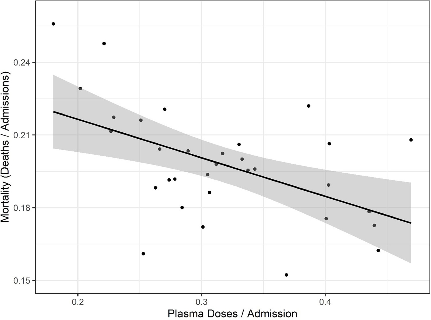
Correlation of mortality (death per admission) and COVID-19 convalescent plasma (CCP) doses per admitted patients using the Our World in Data (OWID) database.
Correlation analysis yields a Pearson’s correlation coefficient of −0.518 (p=0.0024). The black line represents a linear model regression with an R squared of 0.268.
-
Figure 3—source data 1
Source data for Figure 3.
- https://cdn.elifesciences.org/articles/69866/elife-69866-fig3-data1-v2.csv
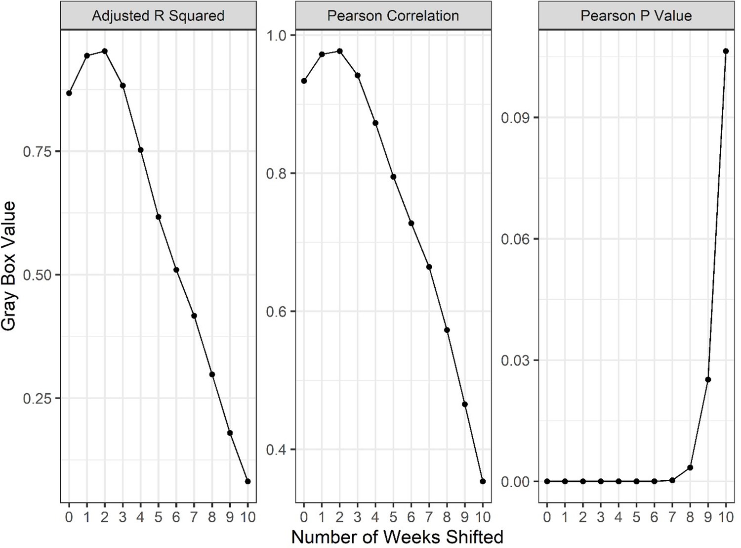
A series of linear regressions and Pearson’s correlation tests comparing weekly reported deaths to new weekly hospital admissions, offset by various numbers of weeks to identify the length of lag between admission and death of patients using Our World in Data (OWID) database.
y-Axis values reflect the parameter of each gray box throughout the shifted weeks. Correlations peak at 2–3 weeks shifted, suggesting the lag time between admission and reported death is roughly 2 …
-
Figure 3—figure supplement 1—source data 1
Source data for Figure 3—figure supplement 1 .
- https://cdn.elifesciences.org/articles/69866/elife-69866-fig3-figsupp1-data1-v2.csv
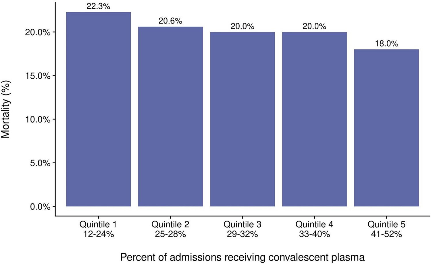
Mortality from COVID-19 by quintile of percent of admissions receiving COVID-19 convalescent plasma (CCP).
Regression analysis for the quintiles revealed R = 0.5 and p=0.03.
-
Figure 3—figure supplement 2—source data 2
Source data for Figure 3—figure supplement 2.
- https://cdn.elifesciences.org/articles/69866/elife-69866-fig3-figsupp2-data2-v2.csv
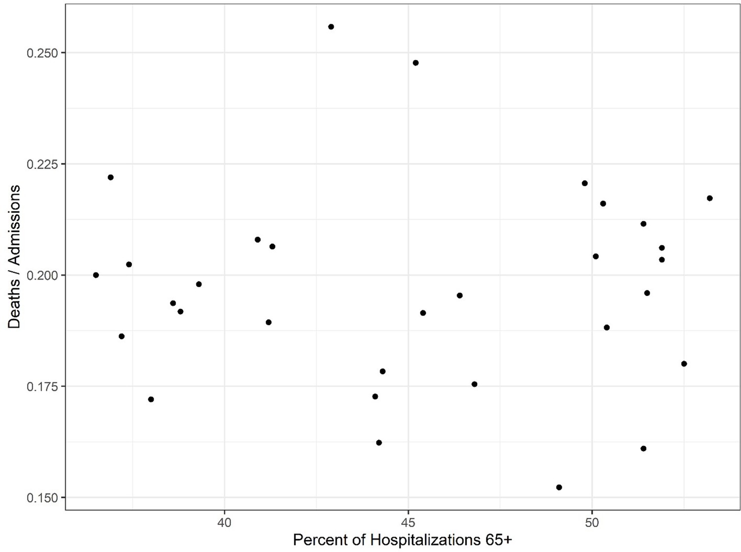
Investigation of high age group mortality.
The shifted mortality is compared to the percent of hospitalized patients 65+ each week as reported by the Centers for Disease Control (CDC). There is no significant correlation between the two …
-
Figure 3—figure supplement 3—source data 3
Source data for Figure 3—figure supplement 3.
- https://cdn.elifesciences.org/articles/69866/elife-69866-fig3-figsupp3-data3-v2.csv
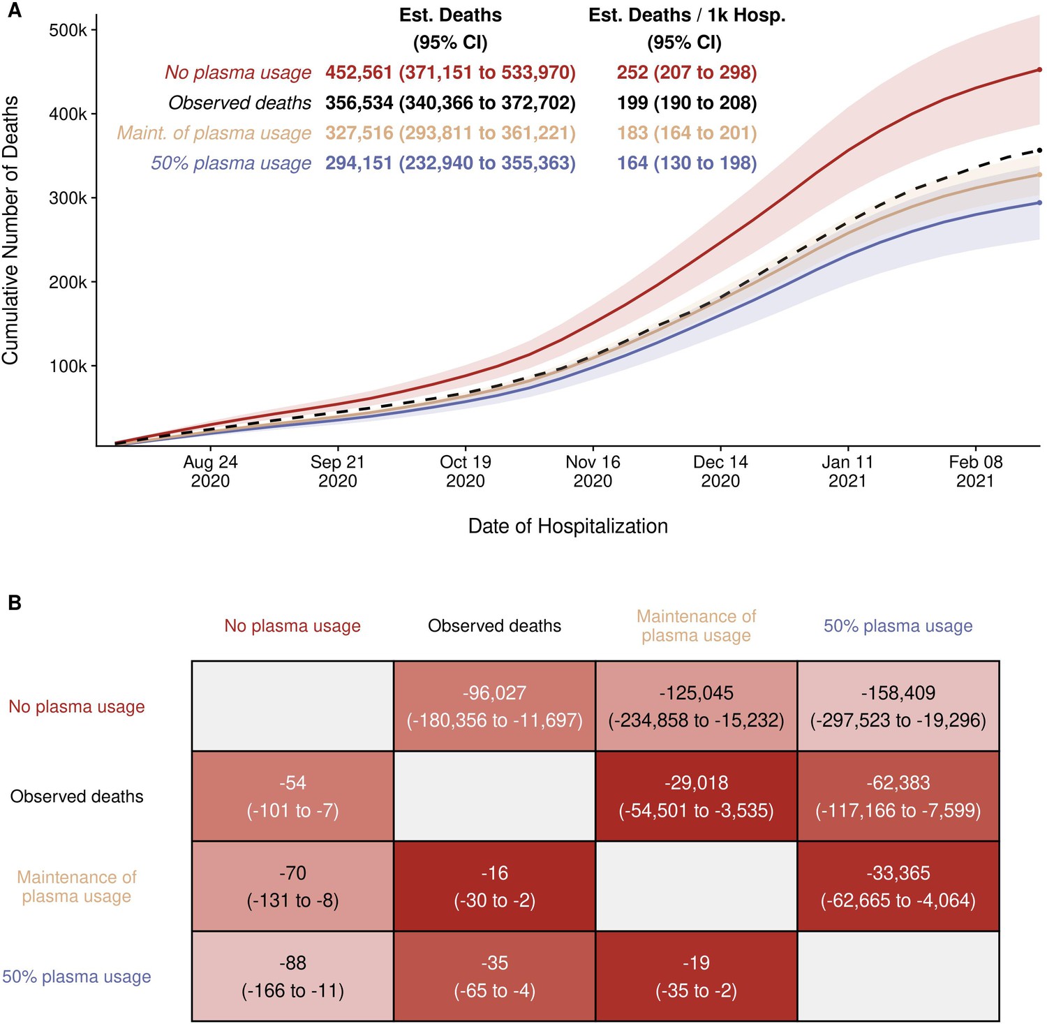
Estimated (Est.) deaths under modeled scenarios of COVID-19 convalescent plasma (CCP) using Centers for Disease Control (CDC) database.
Panel A presents the longitudinal observed (dashed line) and modeled number of deaths under three scenarios for CCP over the study period (August 3, 2020 to February 22, 2021) that included 356,534 …
-
Figure 4—source data 1
Source data for Figure 4.
- https://cdn.elifesciences.org/articles/69866/elife-69866-fig4-data1-v2.csv
-
Figure 4—source data 2
Source data for Figure 4.
- https://cdn.elifesciences.org/articles/69866/elife-69866-fig4-data2-v2.csv
-
Figure 4—source data 3
Source data for Figure 4.
- https://cdn.elifesciences.org/articles/69866/elife-69866-fig4-data3-v2.csv
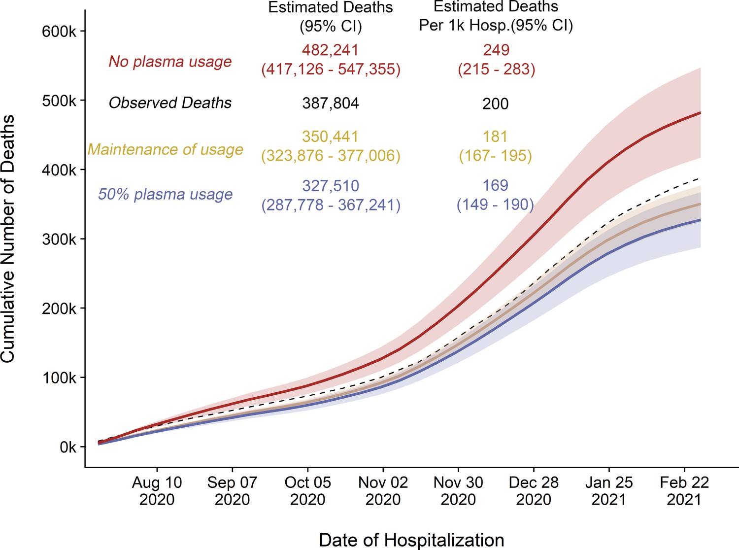
Replicated cumulative excess deaths analysis per Our World in Data (OWID) database for scenario 1 (orange).
Maintained plasma transfusion rate from October to November throughout period, scenario 2 (blue): 50% transfusion rate throughout period, and scenario 3 (red): 0% transfusion rate throughout period. …
-
Figure 4—figure supplement 1—source data 1
Source data for Figure 4—figure supplement 1.
- https://cdn.elifesciences.org/articles/69866/elife-69866-fig4-figsupp1-data1-v2.csv
Tables
Estimated number of excess deaths due to transfusion hesitancy.
| Time period | Transfusion rate | Number of admissions | Deaths | Mortality rate | Expected deaths if mortality had remained at 18.16% | Excess deaths in the low transfusion period | Excess deaths per 1000 admissions |
|---|---|---|---|---|---|---|---|
| High utilization ( September 21, 2021 to November 8, 2021) | 42.59% | 257,424 | 46,747 | 18.16% | 46,747 | – | – |
| Low Utilization (November 9, 2021 to March 22, 2021) | 27.43% | 1,344,463 | 270,019 | 20.08% | 244,148 | 25,871 | 19.2 |
Additional files
-
Source data 1
Centers for Disease Control (CDC) analysis data.
Summarized data of hospitalizations and deaths, from CDC data.
- https://cdn.elifesciences.org/articles/69866/elife-69866-data1-v2.xlsx
-
Source data 2
Blood banker distribution data for plasma units.
- https://cdn.elifesciences.org/articles/69866/elife-69866-data2-v2.xlsx
-
Supplementary file 1
Mortality of COVID-19 in US COVID-19 convalescent plasma (CCP) efficacy studies.
- https://cdn.elifesciences.org/articles/69866/elife-69866-supp1-v2.docx
-
Supplementary file 2
Data from and calculations for excess mortality from COVID-19 convalescent plasma (CCP) hesitancy based on the Centers for Disease Control (CDC) database.
- https://cdn.elifesciences.org/articles/69866/elife-69866-supp2-v2.docx
-
Supplementary file 3
Excess death calculations based on Our World in Data (OWID) database.
- https://cdn.elifesciences.org/articles/69866/elife-69866-supp3-v2.docx
-
Transparent reporting form
- https://cdn.elifesciences.org/articles/69866/elife-69866-transrepform-v2.docx


