

[GIF] Float Label Form Interaction
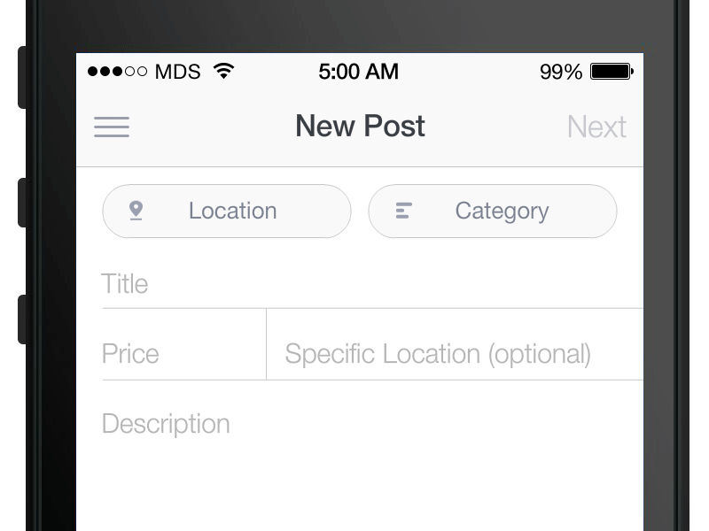
I've been experimenting a lot lately with mobile forms. Left aligned, top aligned, placeholder text only, etc. for client projects and personal projects.
Placeholder text works great for a simple username and password form, but not so much when there is more information. It's easy to forget which field is which once you've typed into all of the inputs.
If you opt for left aligned fields always exposed you end up with much less space. And space on mobile is precious. If top aligned fields are always exposed, it makes the vertical height grow very quickly.
This idea combines the best of both worlds with placeholder text and top aligned text. Only the placeholder text is showing by default, so there is a nice, clean and readable form. Once an input field is tapped and text is entered the placeholder text fades out and a top aligned label animates in. This way, with multiple fields a user won't forget what an individual field represents.
Tweet examples to @floatlabel.
-----------------------
Update 1
@jverdi created an iOS prototype here: https://github.com/jverdi/JVFloatLabeledTextField
-----------------------
Update 2
I wrote a blog post "How the Float Label Pattern Started" http://mds.io/S9Ob
-----------------------
Update 3
Google released their "Material" design guidelines on June 25, 2014, which contains "floating labels." Pretty cool!


![[GIF] Keynote animation of Matt Smith’s Label Form Interaction](data:image/gif;base64,R0lGODlhyACWAPYAAAQCBAcFCAgGCQsKDg0NEQ8QExISFhcVGBkXGR4cHh8dICcqLioqLTAuLywuMjAuMTU0NjY2OTg3Ojs6PD0/QkE/Qz9AREBCRUZGSkhHSkdIS0tKTU5NUVBPUVNTVVVVWVhVWl1bXl1dYWBfYmJiZWVlaWlna2dobGtqbW5tcXBvcnNydXh3d3d1eXh3eXt6fX59goB/gn+Ag4KBhYWEiYiHiYuKjo6NkZCPk5OSlZaVmZiXmZuanKCen56eoaGfoaKhpKimp6alqKinqK6srrCur7GvsbSztLe1uLm3ubu6vMC+v7+9wMG/wb/AwcTCxMjGx8fFyMnHyczLzdDOz8/N0NHP0dTS1NjW19fV2NnX2d3b3eDe39/d4OHf4eTi5Ojm5+fl6Onn6O7s7PDu7vLw7+/u8PHv8fXz9vf2+Pj3+P///wAAAAAAAAAAAAAAAAAAAAAAAAAAAAAAAAAAAAAAAAAAAAAAAAAAAAAAAAAAAAAAAAAAAAAAAAAAAAAAACH5BAgDAAAAIf8LWE1QIERhdGFYTVD/P3hwYWNrZXQgYmVnaW49Iu+7vyIgaWQ9Ilc1TTBNcENlaGlIenJlU3pOVGN6a2M5ZCI/PiA8eDp4bXBtdGEgeG1sbnM6eD0iYWRvYmU6bnM6bWV0YS8iIHg6eG1wdGs9IkFkb2JlIFhNUCBDb3JlIDUuNS1jMDE0IDc5LjE1MTQ4MSwgMjAxMy8wMy8xMy0xMjowOToxNSAgICAgICAgIj48cmRmOlJERiB4bWxuczpyZGY9Imh0dHA6Ly93d3cudy5vcmcvMTk5OS8wMi8yMi1yZGYtc3ludGF4LW5zIyI+IDxyZGY6RGVzY3JpcHRpb24gcmY6YWJvdXQ9IiIg/3htbG5zOnhtcD0iaHR0cDovL25zLmFkb2JlLmNvbS94YXAvMS4wLyIgeG1sbnM6eG1wTU09Imh0dHA6Ly9ucy5hZG9iZS5jb20veGFwLzEuMC9tbS8iIHhtbnM6c3RSZWY9Imh0dHA6Ly9ucy5hZG9iZS5jb20veGFwLzEuMC9zVHlwZS9SZXNvdXJjZVJlZiMiIHhtcDpDcmVhdG9yVG9vbD0iQWRvYmUgUGhvdG9zaG9wIENDIChNYWNpbnRvc2gpIiB4cE1NOkluc3RhbmNlSUQ9InhtcC5paWQ6QTVBMjVEQkM3M0E0MTFFM0JDMDZDRDQ2NThCNDU4QUMiIP94bXBNTTpEb2N1bWVudElEPSJ4bXAuZGlkOkE1QTI1REJENzNBNDExRTNCQzA2Q0Q0NjVCNDU4QUMiPiA8eG1wTU06RGVyaXZlZEZyb20gc3RSZWY6aW5zdGFuY2VJRD0ieG1wLmlpZDpBRjdCNTg5NzM3RjExRTNCQzA2Q0Q0NjU4QjQ1OEFDIiBzdFJlZjpkb2N1bWVudElEPSJ4bXBkaWQ6QUY0N0I1OEE3MzdGMTFFM0JDMDZDRDQ2NThCNDU4QUMiLz4gPC9yZGY6ZXNjcmlwdGlvbj4gPC9yZGY6UkRGPiA8L3g6eG1wbWV0YT4gPD94cGFja2V0IGVuZD3/InIiPz4B//79/Pv6+fj39vX08vHw7+7t7Ovq6ejn5uXk4+Lh4N/e3dzb2tnY19bV1NPS0dDPzs3My8rJyMfGxcTDwsHAv769vLu6ubi3trW0s7KxsK+urayrqqmop6alpKOioaCfnp2cm5qZmJeWlZSTkpGQj46NjIuKiYiHhoWEg4KBgH9+fXx7enl4d3Z1dHNycXBvbm1sa2ppaGdmZWRjYmFgX15dXFtaWVhXVlVUU1JRUE9OTUxLSklIR0ZFRENCQUA/Pj08Ozo5ODc2NTQzMjEwLy4tLCsqKSgnJiUkIyIhIB8eHRwbGhkYFxYVFBMSERAPDg0MCwoJCAcGBgUEAwIBAAAsAAAAAMgAlgAAB/6Aa4KDay0VJxQFAIuMjY6PkJGSk5SVlpeYmZqbkQUWJxUshKOChiiJnKmqq6ytrq4FFKAvaqSCtSsVp4qvvb6/wMGQnicXoraDpqjCzM3Oz52yxsjJusvQ2NnarLEoGC9o1GsvF4i82+jp6sMUKBsv4movGCkW5+v4+dixKu/i4xtSUCCgr6BBYbFSvKuFTI2MDSjsHQwWQAC+ivm6bYixhuEoNF9cBLRgwJlFfCfXpVS1slEASwk3eiSUBseHDQGvuRQwoKfPnz4JCCAA9CfPnkSBEkhaVGnTp1CjOkU6QKjUo1KhMv1JdCtWqC/Zqegw49aoMSQ2YOgg8B4jAf4FDMg9YICu3Lpz7+Lde+AAgr159Roo0Jdv3cKG89o17Pfv4cB0DxAGvDcuXruIIz+e25hyYMGgFd+lS3hygQFhHcVa4aGsLTQzJGDw0BbSAAMxihQhsrs3Ed7AgevW/bv48N3CiSMvztz48eXBmzeHLv03cuW9s1/nvZx69OHWj0t/bj05+d8TULNrAaLGzEGwZXtYoZPR7SJoypDRT+bMGTT7lSHggAQWSEaABB5Y4IID7oegfgwuOEaEFDYYoIMQVijhhAI6qOCBDyZ4IYQK8kfgGByo90gs7NWADGwRYADCChI9ch8ZY+A4xo489ujjjhfmeOCPPVo4JJFIlv7xo5I86idkkwJOuKOTSFZpJY9cAKmlg08OqaOQOHp55I5hpJhaI6u196IMEmwQAn1uLXKfkiDWyeGPYXLxxBJYgLEnFX2OwUWWWAIhgwxHfHHlomNgsQSPUPQAxRhQYLHjFjzkMMQWPWBRxhFKMCrqjmBgccQWPJIxKBdOXEHppFRQQQYWhD7Rw6244hoEFWaMAYaZ66n52gwRcPCmTmHdRgQaY2yBQw9jHEHDFFw8CwYVSdCqxBNgkHFEDEHUcAQLRSyRAxRlJNGDkmVwwQILMdRwwg1EfrkoGCyMsESnKuxgQg8QBKHkEh0QMUINDeQAhi6jikoFFEssAcaOVP6gcEQPOYBbQw1E7JDDFDugCoYMCSDQ18lyMdDDxGB0IEBLi3jSggguvhZDBBqE0EJ9chpAxIE4AHDAEBAAMIINAiAQxBJcHJEtFFR8ykIQLIx7BBXnfroDk2Aske/Rrjb8Y7goYAFF10ugQMUIQeyYRAdFjMBCBxZ38IKo9l65L6G+7hBEDFjsQMISSdTgsQ09UOErCzAvggAJ67Y8QOOriWDDi8Qau3OcACgrYA8GMPC2ACz0gIDoS1ChxBJPKOHpt0vE0AMLldaA7sVR+ppEDDZMKraPXKCAQgVHPBqECuhOPXAFORABBQoqjBCDDL9fCcYRQVg6ZRDhBm7CEv5GdNrDDTnksAW+b62EgApGlCFGByqqRoELJNywZrEibG7bAUQoCYYSUCDDFY6QpSVMymxZitWElFC6GhihdEnIQQ24V7pHkUoFOajej0ylgiRkj24KY0H/xrAEFVBsah04Qg3ypkEexSpiTSJcEGygMdthgQdU2MEOsmQDCDTgh0BkAAMqMEIxbCB+aKIADEpgg3CQAg0yKNYIdlYSG/GPSU7KHZLCdC0qcKFUgOJCrMToxR5NjIUa1N61oFYqQpWKVH3qE6rq1cKmceFLYPhipcYwBcVxAVVY0J6jIkZIQj7BjfA7EyNi4YIS3MCJHyGWB6Y4ENv4jEnVAxGYcv5kohZ68pMtnJiVxqSlKYUIQj06oiJjpkRH3o8DJaCiJYlwBlDa8pa4zFEubVkmJC5SiSfAwYtu5oETwKCSjgjAAPhXy10685nQBCUax2CGMCSSHTBIQQ4wFwEPlOAFyHTEMkcIzWlGU4PmdGY6recBX7Iym9u0hRlSAIEPnACcVRTnFc/Jz35eaZ2psuWv3AkAT8DzPYIIwwYiYE8Y1EicBSCnPwM60Yr2U3KrLCgFZLACHbyoBm4yJs8AIIB9WvSkKI0mRtkxgxX4gBpiqAINVCCDhzaCABEFqD/tpdOUEgmT0vSRvVa6IgtwdAcIJUQOUFBTzo2zpz4FJbuiev7LMhBVNRagwQp2EA8dpEAGFMhnI56qIzpRCZdQJRKtdrRWUWEhVtrDEz/zBgZFkaphkutEVl3wUnHogKZh3d8IVbWniBWWb1HlQgZGsKMQQKtISGoZBDIwARZMrENAGtIOjgBUqf5oC0ngglXPJlRdXsuM1ywqDVzAg6TeYgcrAKtTfaYjMXxhC6salCipygUIHKBtGchBGaDAA4kxDQyhddSOuDABHDSNAUv4AhESJ6ggJI4KEyCBp86JhSQ8wbZPCIMYsHAFMIABVbe9ghL41suMxoIGLegrNWBLA5syggD8q21uV7XbxE4gBBmgwgZ2oIQNsGADQQjBDZKQgP4j7ICxgppADbAQBNGNxQQZgMJYUBCCIDQgw539XTq5AIUpXEEMT/hCH68ghS88wWzkVcIcxyAGYKkWBvJFBmxnYN+eLStHejIk6xBL0S3ukrlBkFtwUdCBIIBAwSGoAQRqMIIdkGoCH55ADJYwAcVFWQUZmCAYRoCDEBe5hbOCgou3cEglxEoJX/jCEaZAhi/4bkc1Jqgn4OsD1wqCviNV1pcUdCczn5S5RoACBBLw4A70oAaSqkAHctCBCiguwjbAwhbIwGVPSW9fKoDAE0JgA0PfUlWT0sK2uOC6LZRX1U8Q1J3NkGf3ZhUGQIiHD1pQ39mS8wusC/aQd1olVf5NoAhlqIEAdtCDAYeAB2DYAASw2wFRMnddE+ICCExQgwmkzQQ4gEDaOnDpcm7Bd1JAAhikQAUWu5gLffyCjHn0Pj1nVQZC8PMaeOACGgT6kqT64xZwi1sxmFmnaa0SGBLXrh1Mimo8EC32xhCEJPBo4VPA5BVqsOUxUKEG5KJUDaK2qISb0Y1a8BV545yl8zZrxu0dhgVsIINci4Pf/o6TMg2A7B7tR0oWTefPgT6gKSVJqPwBU1mJTU3I6vLM1iSAeylAcyDomwcwqC9BbMRzU1M16OXMZS+jQYOa/8MHMGjqI3YuUTTncp0m/zqjzlqvqyaxBmanhhrQ3mtLFv5BR3EvuU/RGHi5/rNKXq9Svad+gxnYnBpAyHqg8yv3ylveSgOdug0c72c1GMoG//5xaVlIykFn1simLyUpn05HcxIeTyyk0+lbT0fDF5v1prWx/DZvdXH4QAagn+0QfGVelolBDMVPvvLNSyrzIn/5xke+r4jffOgn/65gOH7xj098lln/+yyjfvKfv3xfaV/53Qc/87dP/vMf/wuqZIcNcH124P/7CGpAg/7TUAb9+z8NaACA/ud/A8J/A3iA+td/B7ggCLiAAmKADSgg+TGBDbh/FuiABFKBBDiAEth/CqiB//eBIJgf7aR5Ndd5hnIDgcUIL7FzSvAPMNgRMf4YDzMog8hQBvpWg4OgBjk4Cj2og7agBiUof3lnC2HgBDgAAzZgAVsnTgbwgkAYhVIohTw4hVbog1cYg0KoZxRwAzTQZ69RAhBQAjSggmJ1XwbABD9ICGtog1bYhjUIh3BICghVhVQ4hCtCdTTQe6QwBi8gAinAOyvohEwQh7dQCx6RiGw4E3VoFjaIiIi4g1gYh+9RiYsoiZaoiI7ohpY4g3i4ezKQY4SABjfwAV+lgrOVBP/ALDT2I7XUK7C4I70iBjziH01Hi9NXTWYQi7xYi023i7NoBmdgh+KABv6BixNTTU1HTbGIi2Pwir9IY7rYK8vIjLLoi3hGTWFATf7DGA+fmETzJ4rwMQMUQIaoCAkEYACq+CITA4L/oX/vaIwH+B/xiID16H9qUI/3KI9nIIzxwI3uyI8aSI/zCI/+F48IWYH0SE2utYWaBwNCgDkSYI7/BoU+2I9owIMWKIANqJEXmJENCIAAmH8kOYD5p4EliQa98iJi8B8piY8V+JIHKIAnCZMIeJIyiZMB2I+u9Y2/VAOcNywTaX9OdQCF+ERmYJIBGIAvWZMXmJP/B5IgWJIyKZVq4I8+OAZSiYAjCZI82JU86JQwmZJpQJX7J5YWaJbGOAa2kAY+yUqNB4ZPFBtkGHzo+IS2IAb2+JFW2ZFKiZL4WJWBmZFiKf4G7+EfOhmSHHmAHvmXNjmChKl/+beY+IiVo6B7SdR4j/cRMjABdTmIY6WOSLmU+VgFTdAFkpmaA5gFSUmSOOmaxigGZuAFYSmZNamTaDmY+XgGbNiaA3gGUtAETcAEXYCb/mcGptkE9fgFthmZhOmatYmWaQCWOFlLtvCWGkVD4igIZ9ACE0kDSzhbR0kIu8iRWWAETWAEYcCYA9gErXkGWUCbZ6AFXoAGXqAFYZAFTRAG69kFWoAGYuAFXrCPr8meA2gGhOAff3mfXdAFw7iV/tcEA5oFW5CfXRAGEooGqKmS+HkG+RkGZ3Cf9VlLNtmYt6l/YYBQqbV7OIYMaP4RAScAnj3WOXg5Cklpm1PABANUn86ZmvuZf02gn11wmhKaBfoppEcapE0wBUGakrm5lTXZjdy5j2cgnLR5kxlZpfFopETqBUqqBU0ApkM6pFrABPo5nzzqlyVqBpWInbGgmcgQBhowhkR5lxY5CDfqf17ABEKgnE6pk01gmGPQBGrgpYTqocJJpIPaBPrXBFUQBl5QBU9aol6ZfwgKH/uooVbwoGMJj34qBl2gn0SKoYmaBWrgqJKaBVfAqGDKqAaamJHJpqTgplRXhKNQJmMInv+GBKTgH9MJj0Oql16JgI4qoEQ6pF6qn2CKocmaBWD6qJFqoqp5oqopq4LALP7PmaVDepqPSZj66aVgCq7HSqRg+q1hyqhmEKap2ZTdOgZtOgDR4IXbuQZiAALlqKvi+URaeZBaYAUp6pgZ6QVXcAVeYKFqMAZZ4KBa0KBncKEgqgVb4KH+sZ7r2qMFepy8SQiGiYBgSrAVu5WhippekLABGgZmQKHzqZ/iFZ8hmo/K+bG5eZL9SIe0Kq9J5Xku4AJ1ynXreBY2WY+3+Zph6ZHSCrDdapJoeZJi0KucOpaTCqsQCo9HapthqQVZMJVqeZWQRAi0On8RqXc/AHwzehvjOYr7ipJ/+qdH25EnCqttu5QqmbG9Oa1pO5WQOYIx25cgiZg0y4XhqG8+UP6GJHGXZZugWqmRFzusa/uxR0utzimWJ/mMQYitajqYEAq1gKm2Paqaeyulswqv7HADMbCZdBh5dsl1d/oRsvmOmdq6Dei6ATmQJPoPtJipBqmQd2u78giZ/iGMftZO0bB5PrC1pJCCFbmKtEaNrWiN2ci8y7uL2MgjsIiLsimb10hreJa8fAuDKpm91kuLwAi+1ISL0+u9s8iM2AuL2/iL1Ju85Ou5QVizQQl5gss5+JW6OnizQciGHdGINJiFejeJAkyHAyyJVuimFgCneme64RSa+AvAhgjBEjzBFDwKbum3MzCvg4B2ZoiOB/DAFRzCIjzCFeyQoduivicDHf6MuiTcwi78wgdsbwrcEAx8houQjiAMwzq8wy98wYzneP8QeefIwjxcxEbcwiach3F5djGwwk6Yw0ccxVIMhGrwAVxoswsMA07swFPcxV5MxTVrq7YABDNwA2Nbo1+cxmpMhx8QAIxHf+JAxmZsv2i8xnasxjULxzTcxMf7EV6AWyabf2vAlndcyCOcxFh1A3qMDEJ8xiC8BQjaK+h1sJdqyJYMwQismcTLhnLsyMjAnGtwoRGrKHG2tJd8ylOIyGiSwDPwA0HcxBegc7fxyOGAmuv5BQ36BaaMyrysg8AbujGgwSChAyo8uI+Aw59cy2gwyrYFor38zJ4ow0Dclv41VQLFTMcg7ETh8I5rsJLQ/M3igJmLxMrzOk8aEKNmbMM0CsXg3M6+DLpKPM1PZAPFRAM4YMxP7M76bIVogMA4IMbwoQIOQAL1a0kPHJlfOZ1qMJ1l6ZoNvdAKDZ0LHZ0OzdC/qtAIPdEJ3dCE+dAjqdEL/ZwgndEeHdEizdFfGZYf7dGwmdJfqX/XaW9JyIejcAYpsABkeM+yXMfwMZllGYA/jdEJjZMorZEYXdQMDdQAaAYmPdSSidRB3dBH/dBAPZmIC9FEfdU+XdFbjdVKfdVTfbOZ/IXIYNMLQNBzbNCFDID7LMJbqFcznVRngAI4XdDHzNNqLLdtPcFVrP5nF4ADZC1PJ3DWdp3PdyzIe03BfW1rM2yjg43WM4rMhbzJiX2Fby1zjU2eIkDYaU3EdpyPlU3BmSzPt8oBnI3PXDzZoS3BqrxIF3ADNUfZYvABhK3TdmrIlL3aUjjapIunJxABOR3ZeJ3Geq3bMexer03aNEEDHJACgqvOy8TOR1wLlWzcU9jP9pYD8/tEX/B7nW3YNb0jU0y82Pq/HQHTT6SDuQ0fq8i96z0K8KNXmhzHz024T5QFY+AFX3Ct4aCJcziDaaDXZ8AFs+lEDcksDpoGftwQksic3ehaKYqFIAHanNjgtAiDrR0zF5ADJ5jF6azWH9EFaxCiYXChO/7yBfUZBl8QBi28tWYQsQGL4v6B4gAqoGgAqahy41vwBbUAEteq3+spoM/oBV1wsooCEnG2zLfV4zxeys2y4mNwBR5qn16wI0IeogPKnPv9DxleUKzc26MABGUImvaB12hAsAO6BcyC4gsNn2Gg5odMvGdwW2eg5va54wIq4saoKNsIqWugzVu+jYVa5X9eSw57437On1uwBjw+yPy5tF2w4mtQ5Tyu3xkZ6VpZn2MQ6Voeg2664QAd5jCAA2R+w6L5EYsuCLQ5BiWef83ioS2s1+KN4/pH5OL15oPM6r2i6IMcDsucUGyJ6Qdb5ZTuoQHK6CrO6NssBuI16ck+oP60GWfueqFMDeQrzpwizuWfjgPK7YOGcs/QnYZ0yOKCsLG9ot9qUOLk7tZbqwYozpxbYOn2yZz5zZzriZG2teXLHOkgUeVITmOR3udaGaDMubSm7OMN2itaIOl2heS9wpvbqN+67ONcbsXIndnFW8zhzquqPYlfoOAA/N+koJd46q77Sw1a6Ybx69cYPwo+MAM5wISWVLhpTOGvYcgi/87IzeFgTghkHPNNeFPi3vHWncq/XFTc/gPv/e2e/ERDC9FUPdQOrdIWrdInHdEQrZISzdBUz9Fcv9FY/9NS39FVv9EUbdJfD/Vh/9Rlj9UxvfPbTYcvfwOxDOIfMdVHbf7UYB3VVV/VRs31VV2pRM33hO/Tff/1TGnVhl/4id/4Tm3ReP/3YZ1U4qzhLU8IP1DGdX/MH1z01n30WMXtPT8IP9/0nh/a2I3c/zz6gjD3qH1fnX/6q/3pObDIYywDMR/u0i37z9zlngDYND3GMwDut837iX3ZSB/qhBC4xO/Zxr/Piz0MGx7YNCwDze8I6Ujzzw/Ovm8Boh/EuC/zzr/97vzpmgm49vz6PbP75G/Jvr/hcV+8o17qNNqzZvveBbyJ7X/I/tztYZ7+gGAAMEgIMGCQtKa4uLb1JealtibJOMl4hqYo+YV2ppi5SFk5SlpqeoqaqrrKWukxEFBIWP5wkTMDhOoDg0MhKGtowES6JRkWNvbF6Xh2xvVl5vUVdtb15XWWdYyWzOkV3QoeLj5OXpn2GvtLe3N7qiYkg2PhK3uYOEq8NualFdbfNY1TGjRa1Bzroi8MJ4Vf1kiLxKmcxIkUy3GA9QtAAQs42p3yQUMevUIEgg3L1GXMFjPHxoTZ4gUNmjFcHO5TI0YMp0deHOp0mKai0KFER6HLuJEdEFGkgITslfGQElLWvozRJ22blzHQOInRZyZLNTUux6DRyenq16Js20rsgFFdLRm4TgGJNy+qgampmJZS09Ct4MFC1RxVZyEHjaUfd+X9ReAAX4p+CVu+zOqwrI056P6iciqPgN7JmEubHmx4QEaNc+uaAnnjsazIpE/bvk351WrOHk3dzSG7kFTcxIuTe6UasdJceEVD3ms8unRUqXfX6l0KyIwcF5zXgz49vHhFmgtxhgEEVPYZNy4UyFiy9vj5t9V8iLs5Md3KjHzMwOEefODRR6Bt1SGV2GLuaAfge78MV2CEppU3y3WM+cZegA8OKGGHgqWWTn4duVaKf+05+J18Hq44FIWD0GILiU1tp2EhAUDIYo4t4mdeYtjNeOJoOg5JERousnZDDDKOYqIFKJLEIZFShgOXdR3xsGCGIxGC45ReZsbjLPpduB5w3kGp4pdqjnJOmC8muGQlPqHEc8GWg3S5Zp6VgIiUhfwtol1sdgKTpp55HrnRiJ/JANyThMRnaKSMIOpjnP39VyOakkp6IGIxfvZfcFxKtmmkfMp1A3pZhiZkqYbq1ic7WNq1nZPwEVCoq0TCiuqPowRq64a56ppjp/l9+hGNjg4CKbFqnrrZBcvRGtuyADTr7JeIStsbfz7EEKSw2aoJV4g9KkptpqMOO66E0PY4rSKBAAA7)


keyboard shortcuts: L or F like


97 Responses (page 1 of 4)
Nice concept man!
about 6 years ago
I really like this concept @Matt D. Smith I could see this working nicely for desktop as well as tablets / mobile.
about 6 years ago
@Matt D. Smith I've been struggling with the same issue and I really like this solution. The only problem I could see is the font size for the top-aligned label. How legible is it?
about 6 years ago
YES.
about 6 years ago
Nice idea, congratulations!
about 6 years ago
@Regy That's been the biggest issue for me, too. Right now it's at 14pt (retina), which translates to 7pt. Really tiny, but still legible for me. It could potentially use a larger size, but this is kind of the starting point, yah know? I just attached the full size comp so you could check it out.
about 6 years ago
really nice idea Matt! Have you checked this on an actual iPhone? The top text becomes just a wee bit small IMO.
about 6 years ago
@Matt D. Smith Just took a look at the screen on my phone, I think this actually works. Considering its just for reference, it does a pretty good job of staying subtle, yet helpful. The description text is pretty clear on its own too. I know right away what each field implies without needing to look at the label
about 6 years ago
@Matt D. Smith Didn't see your comment above re:font size. Youre right, it is legible, I did have to get close though.
about 6 years ago
@Regy @Adam Yeah, I think that's the trick here - staying subtle and helpful with the field label.
about 6 years ago
really like the transition of placeholder text alias form name to above the user generated text as soon as he starts to type!
about 6 years ago
I love this. Honestly, the interaction wouldn't really have to be limited to mobile or native apps — it would be equally helpful on desktop and the web.
about 6 years ago
@Galen I think it could definitely work for desktop, etc. Might have to think about growing the text field vertically once text is entered to allow for a larger field label.
about 6 years ago
@Matt D. Smith I like this. Approved.
about 6 years ago
@Colin You are a gentleman and a scholar.
about 6 years ago
This is so clean. I love it.
about 6 years ago
Amazing!!
about 6 years ago
very nice!
about 6 years ago
Absolutely awesome! Love it.
about 6 years ago
Very nice... I think that this would be a great addition to any form, and in the case of actually getting it to work on mobile I think it would be overall pretty easy.
about 6 years ago
JESUS CHRIST!
about 6 years ago
I'm diggin it.
about 6 years ago
Nice accessibility bro
about 6 years ago
This is amazing! I'm going to learn from this for sure!
about 6 years ago
Big fan of this concept Matt, great work. I thought it warranted a quick iOS demo and open-sourced my work for those who are interested in contributing/furthering this idea: https://github.com/jverdi/JVFloatLabeledTextField
about 6 years ago