
(2016/03/15追記)ggplot2 v2.1.0で動作を確認しました。
Q
ggplot2で帯グラフを作成したいのですが、どうやったら描けるでしょうか?
A
以下の要素を組み合わせると帯グラフが描けます:
- 形状は棒グラフ(
geom = "bar") - y軸をフルに設定(
position = "full") - y軸をパーセンタイル標記に設定(
scale_y_continuous(labels = percent)) - x軸とy軸を入れ替えて横棒グラフに設定(
coord_flip()) - 項目順の調整 ※必要であれば
以下のコードから要素を追加していきます:
example1.R
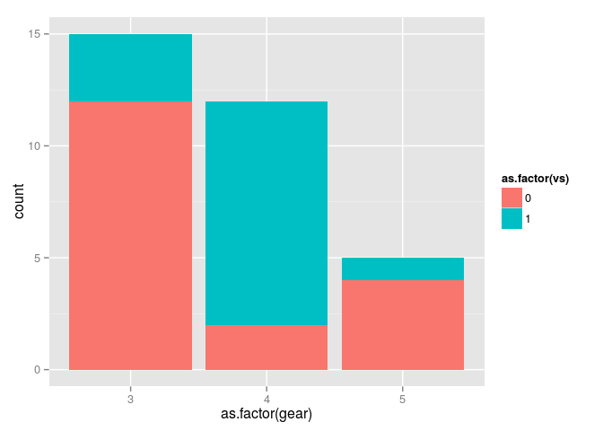
p <- ggplot(mtcars, aes(x = as.factor(gear), fill = as.factor(vs))) +
  geom_bar()
p
y軸をフルに設定
y軸を、一端からもう一端へと引き伸ばすには、position = "fill"を設定します:
example2.R
p <- ggplot(mtcars, aes(x = as.factor(gear), fill = as.factor(vs))) +
  geom_bar(position = "fill")
p

このとき、y軸のメモリが0-1.00と比率へ自動的に変化していることに留意してください。
y軸をパーセンタイル標記に設定
{scales}パッケージを読み込んで、scale_y_continuous(labels=percent)の設定を追加します:
example3.R
require(scales)
p <- ggplot(mtcars, aes(x = as.factor(gear), fill = as.factor(vs))) +
  geom_bar(position = "fill") +
  scale_y_continuous(labels = percent)
p
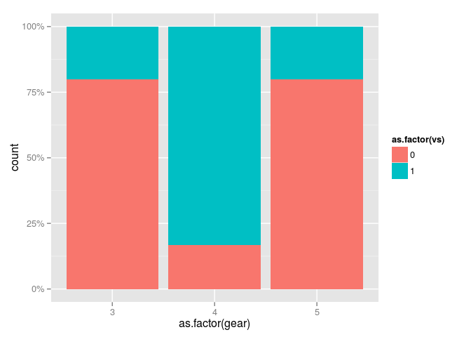
他にも方法はありますがこれが一番スムーズできれいにできます。{ggplot2}パッケージをインストールしているなら、{scales}はおそらくすでにインストールされています。
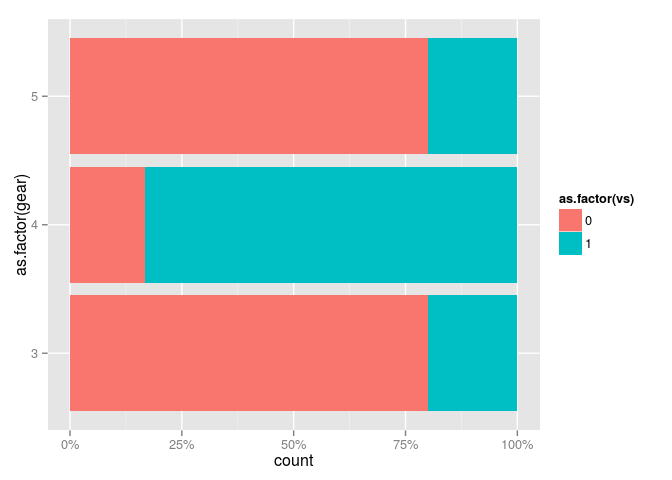
x軸とy軸を入れ替えて横棒グラフに設定
この方法については、ggplot2逆引き - ggplot2で縦軸と横軸をひっくり返したい - Qiitaを参照してください。
example4.R
require(scales)
p <- ggplot(mtcars, aes(x = as.factor(gear), fill = as.factor(vs))) +
  geom_bar(position = "fill") +
  scale_y_continuous(labels = percent) +
  coord_flip()
p
項目順の調整
この方法については、ggplot2逆引き - x軸を並べ替えたい - Qiitaを参照してください。
example5.R
require(scales)
mtcars.v2 <- transform(mtcars, gear2 = gear * -1)
p <- ggplot(mtcars.v2, aes(x = reorder(gear, gear2), fill = as.factor(vs))) +
  geom_bar(position = "fill") +
  scale_y_continuous(labels = percent) +
  coord_flip()
p
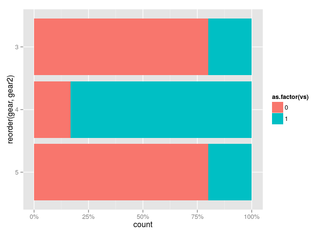
これで帯グラフの完成です。結構手間がかかります。
細かい点ですみませんが,説明で「
position = "full"を設定します」となっているところは「position = "fill"を設定します:」ではないでしょうか。ああっ、typoしてました。。ありがとうございます!