最近よく見かける、曇りガラス風の背景や透過された文字。
気になりつつも実装したことがなかったので、
色々試してみました。
文字にマスクをかける

background-clip: text;を使えば、
背景を文字の形で切り抜いたようなマスクをかけることが出来ます。
*必ずベンダープレフィックス-webkit-が必要で、IEは未対応。
html
<body>
  <div class="p-content">
    <article class="p-box">
      <p class="p-text">background-clip</p>
    </article>
  </div>
</body>
scss
body {
  background: #fff;
  line-height: 1.5;
  font-family: "Noto Sans Japanese", "ヒラギノ角ゴ Pro W3", "Hiragino Kaku Gothic Pro", "メイリオ", "Meiryo", "Osaka", "MS Pゴシック", "MS P Gothic",  sans-serif;
}

.p-content {
  width: 1200px;
  margin: 50px auto;
}

.p-box {
  width: 800px;
  margin: 35% auto;
  padding: 50px;
}

.p-text {
  color: rgba(255,255,255,0);
  font-size: 100px;
  font-weight: 900;
  letter-spacing: -.05em;
  text-align: center;
  background: url(../img/tyopress.jpg) no-repeat center center fixed;
  background-size: cover;
  -webkit-background-clip: text;
}
■s○preme風
bodyとコンテンツ、別々の背景を指定してあげれば、
こんなデザインもあっという間。

scss
body {
  background: #fff;
  line-height: 1.5;
  font-family: "Noto Sans Japanese", "ヒラギノ角ゴ Pro W3", "Hiragino Kaku Gothic Pro", "メイリオ", "Meiryo", "Osaka", "MS Pゴシック", "MS P Gothic",  sans-serif;
  background: url(../img/tyopress.jpg) no-repeat center center fixed;
  background-size: cover;
}

.p-content {
  width: 1200px;
  margin: 50px auto;
}

.p-box {
  width: 800px;
  margin: 35% auto;
  padding: 50px;
  background: #fff;
}

.p-text {
  color: rgba(255,255,255,0);
  font-size: 100px;
  font-weight: 900;
  letter-spacing: -.05em;
  text-align: center;
  background: url(../img/tyopress.jpg) no-repeat center center fixed;
  background-size: cover;
  -webkit-background-clip: text;
}
曇りガラス風のぼかしをかける
filter: blur();を使えば、
画像にぼかしをかけることが出来ます。
背景だけにぼかしをかけたい場合には、
::before(::after)擬似要素にかけることを忘れてはいけません!
要素自体にかけてしまうと、
中にあるテキストなどの要素にも全て適応されちゃいます。
html
<body>
  <div class="p-content">
    <article class="p-box">
      <p class="p-text">background-clip</p>
    </article>
  </div>
</body>
scss
body {
  background: #fff;
  line-height: 1.5;
  font-family: "Noto Sans Japanese", "ヒラギノ角ゴ Pro W3", "Hiragino Kaku Gothic Pro", "メイリオ", "Meiryo", "Osaka", "MS Pゴシック", "MS P Gothic",  sans-serif;
  background: url(../img/tyopress.jpg) no-repeat center center fixed;
  background-size: cover;
}

.p-content {
  width: 1200px;
  margin: 50px auto;
}

.p-box {
  width: 800px;
  margin: 35% auto;
  padding: 50px;
  position: relative;
  overflow: hidden;
  &::before {
    content: " ";
    display: block;
    width: 100%;
    height: 100%;
    background: url(../img/tyopress.jpg) no-repeat center center fixed;
    background-size: cover;
    position: absolute;
    top: 0;
    left: 0;
    right: 0;
    bottom: 0;
    filter: blur(10px);
  }
}

.p-text {
  color: #fff;
  font-size: 100px;
  font-weight: 900;
  letter-spacing: -.05em;
  text-align: center;
  position: relative;
}
さらに、このままではフチ部分がぼやけてしまうので、
少し修正します。

blurのpx分だけ、
要素の幅と高さ広げてあげます。
今回は、positionも設定しているので、
位置の修正も忘れずに!
scss
.p-box {
  width: 800px;
  margin: 35% auto;
  padding: 50px;
  position: relative;
  overflow: hidden;
  &::before {
    content: " ";
    display: block;
    width: calc(100% + 20px);
    height: calc(100% + 20px);
    background: url(../img/tyopress.jpg) no-repeat center center fixed;
    background-size: cover;
    position: absolute;
    top: -10px;
    left: -10px;
    right: 0;
    bottom: 0;
    filter: blur(10px);
  }
}
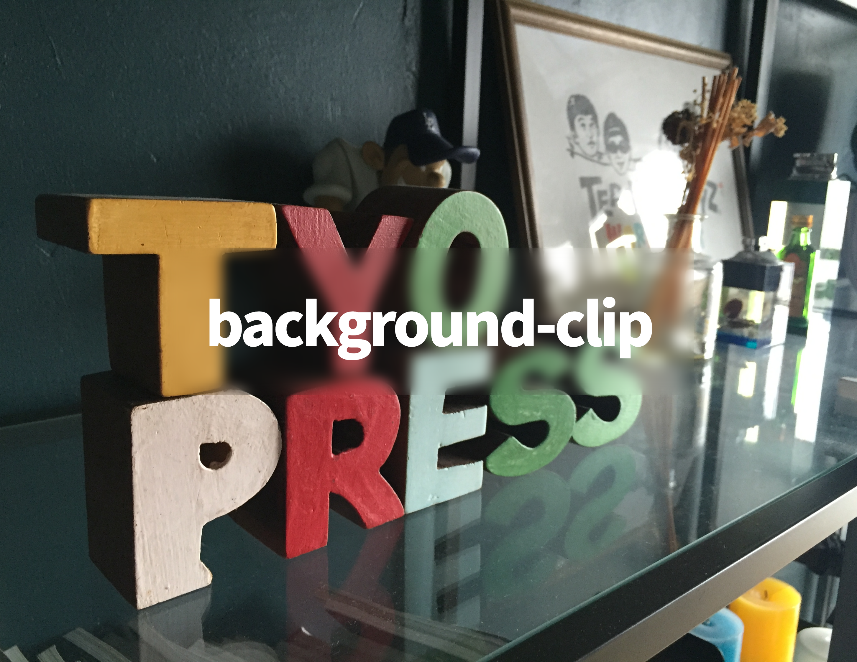
さらに、曇りガラス風のボックスに透過させた文字を載せてみます。

これは、さすがに読みにくいですね。笑
scss
.p-text {
  color: rgba(255,255,255,0);
  font-size: 100px;
  font-weight: 900;
  letter-spacing: -.05em;
  text-align: center;
  position: relative;
  background: url(../img/tyopress.jpg) no-repeat center center fixed;
  background-size: cover;
  -webkit-background-clip: text;
}
先程の画像はさておき。笑
色々な組み合わせで、
こんなデザインもcssだけで作ることが出来ちゃいます!


*background-clip: text;は必ずベンダープレフィックス付きで使うこと。IEには未対応。
*filter:blur();はIE,firefoxで未対応。
色々遊べて楽しいcss3ですが、
モダンブラウザのみで対応しているものが多いので、
使う際には必ず事前にチェックすることを忘れずに!