On popular health utilization metrics

This Commonwealth Fund report has been widely cited for explaining why US health expenditures are so high.

The analysis finds that the U.S. spends more than all other countries on health care, but this higher spending cannot be attributed to higher income, an aging population,
or greater supply or utilization of hospitals and doctors. Instead, it is more likely that higher spending is largely due to higher prices and perhaps more readily
accessible technology and greater obesity.

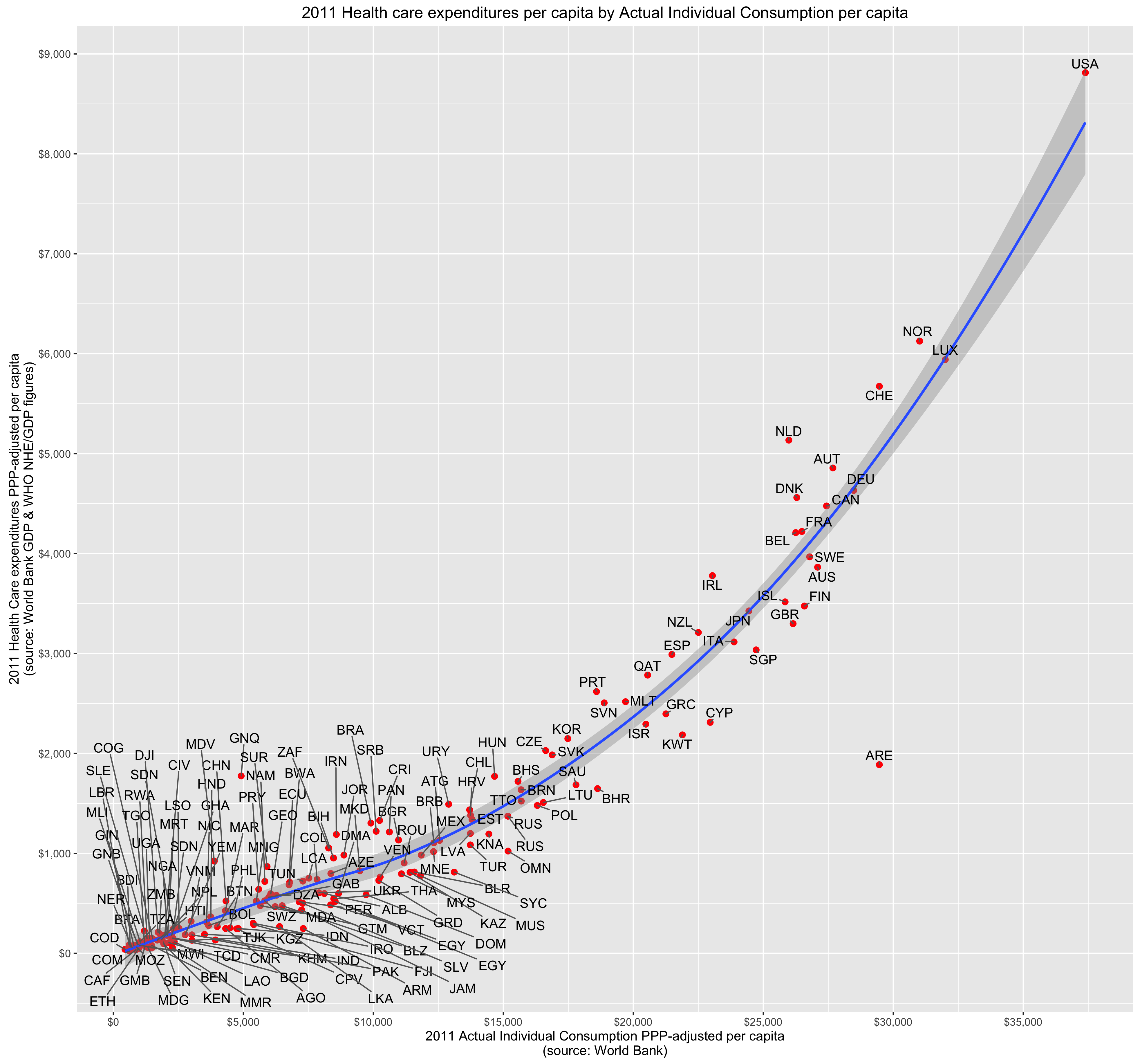
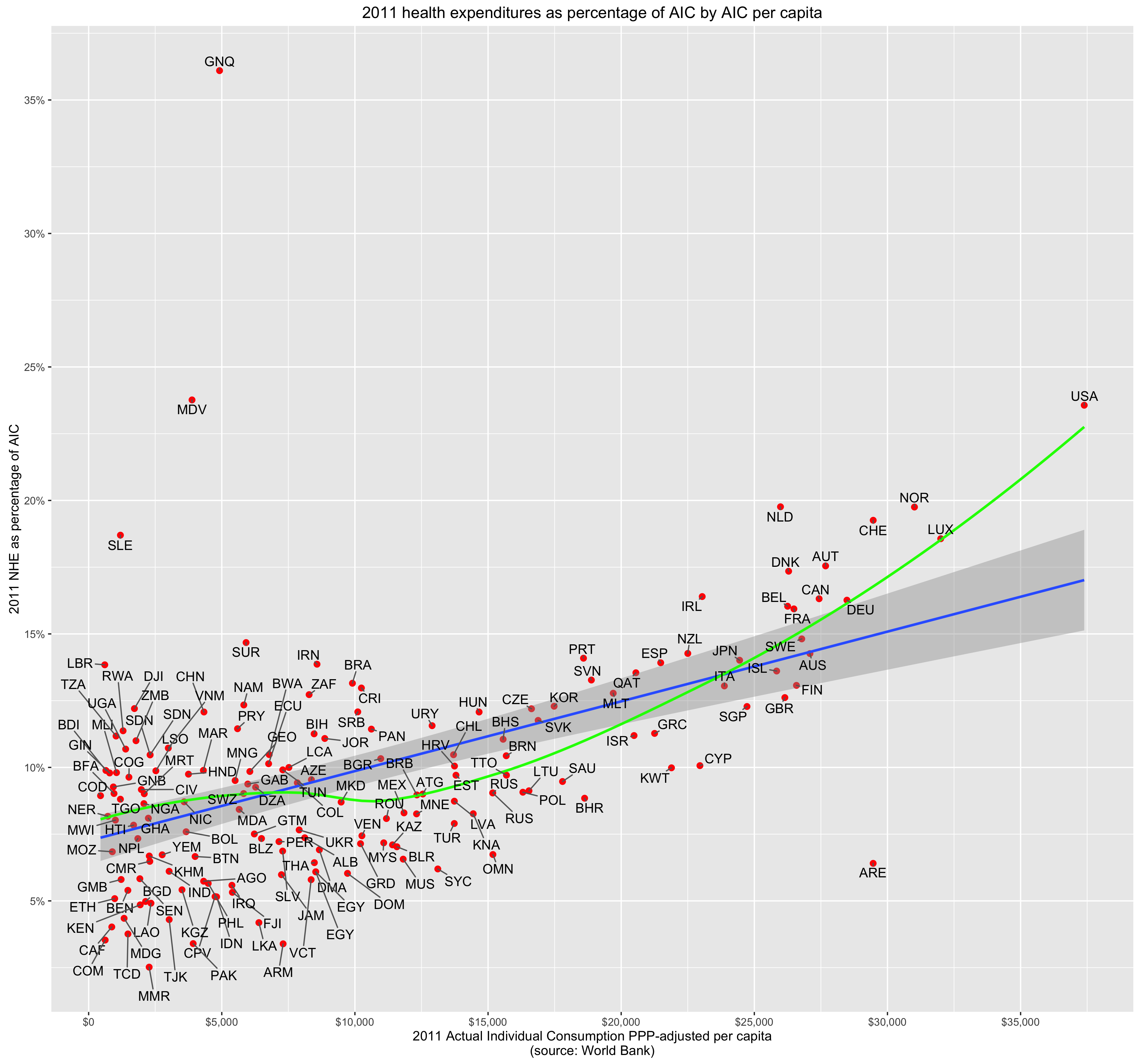
Since I have already spoken to the incomes argument at some length and explained why I find overall “high prices” to be unpersuasive as it pertains to NHE in general and the US specifically, I will instead focus narrowly on this utilization argument since there are a number of similar analyses with identical/similar indicators.

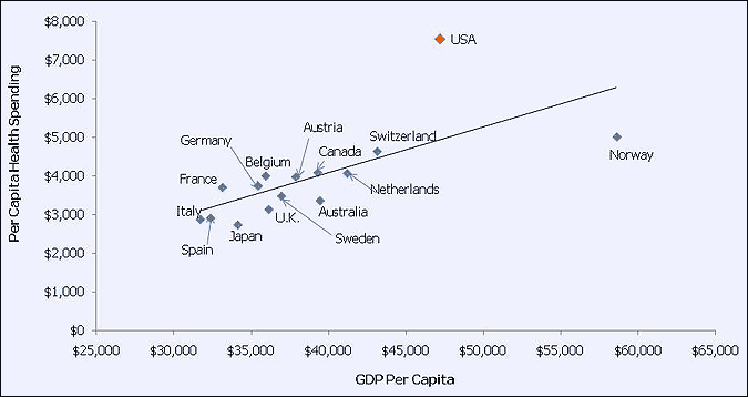
The report proffers this table as an explanation for why high utilization cannot explain high US health expenditures.

screenshot_1749.png

Similar analyses are found elsewhere:

screenshot_1752.png

source

My problem with these sorts of analyses is that these sorts of indicators do not themselves account for enough NHE directly or correlate with NHE well enough to claim to account meaningfully for utilization and other major non-price drivers of NHE (if you wish to remove quantities of technology, prescription medicines, etc from “utilization” for semantic reasons).  When (1) your utilization measures can only account for maybe 10-15% of the variance (2) only relates to a modest proportion of NHE in most developed countries and (3) one ought to know there are other major cost drivers to account for, it’s pretty silly to claim that your half-hearted attempt to explain the variance honestly means it cannot be utilization and that it must be (mostly) the result of some US specific prices.

Read More »

Some useful data on the dispersion characteristics of US health expenditures

Some people (1, 2, 3, 4)  have made hay out of data showing total health spending in the United States is heavily concentrated on a small fraction of the population:

screenshot_1587.png

source

My intuition and knowledge of the health care industry has long led me believe this likely not too dissimilar from what goes on in other developed countries (the young and/or reasonably healthy simply do not need or want much in the way of health care).   If nothing else it seems unreasonable to use this data to argue the US is an outlier without at least going through the exercise of comparing it to other countries.  Unfortunately the OECD and related entities provide little in the way of public data along these lines, so I have not been able to do this analysis myself.

However, I recently stumbled across a blog post from IFS regarding a study they published that speaks directly to these and related topics, so I thought I would briefly share this and related information in a quick-and-dirty blog post (full-text copy here).

Read More »

Disposable income also explains US health expenditures quite well

few months ago I argued consumption, specifically Actual Individual Consumption, is an exceptionally strong predictor of national health expenditures (NHE) and largely explains high US health expenditures.  I found AIC to be a much more robust predictor of NHE than GDP and at least an order of magnitude stronger than other components of GDP when disaggregated (collectively and separately) in multiple regression analysis.

However, because some people are inherently suspicious of consumption per se and because others are under the impression this is primarily about financing (health) consumption out of savings/debt, I think it useful to also demonstrate these patterns as it relates to household disposable income (tl;dr they’re very well correlated and produce very similar results in the long term)

Read More »

US life expectancy is below naive expectations mostly because it economically outperforms

In my prior few posts I made a strong case that the United States’ exceptionally high health care expenditures are well explained by its unusually high material standard of living.   In response to this several people I have interacted with have fallen back to the position that something still must obviously be uniquely wrong with the US health care system because US outcomes are significantly below what one might expect given its level of spending:

rcafdm_306_life_expectancy_by_hcepc_oecd.png
Life expectancy in OECD

They believe it cannot be a coincidence that the country that spends so much more than expected (according to naive expectations) also gets worse outcomes than expected and generally gets worse outcomes than the most developed countries of predominantly European and Asian origin.

In this blog post I will address the so-called “outcomes” dimension and explain why these apparently sub-par outcomes are not only not otherwise inexplicable, but can actually be explained in a fairly straight forward and parsimonious fashion  For the moment, I will narrow my focus on the subset of factors that drive US health outcomes significantly below naive expectations (not necessarily the full residual) and that I have good reason to suspect are significantly causally related to the expenditures issue.  Later, perhaps in another lengthy blog post, I will address other factors that are mostly orthogonal to expenditures and that further affect US health outcomes.

Read More »

Predicting health care expenditures in OECD data with non-linear model specification

In my prior post, wherein I argued at length that US health care expenditures are reasonably well explained by Actual Individual Consumption (AIC) and that GDP is an inferior predictor, I pointed out toward the end that the linear specification I used is likely to significantly overstate US residuals because there is good evidence for non-linearity and because the US is far out on the frontier vis-a-vis consumption.

This non-linearity can be seen pretty clearly if you look at the 2011 data derived from the World Bank (for AIC) and WHO (for HCE).

rcafdm_52_who_and_worldbank_nhe_by_aic
In per capita terms
rcafdm_54_who_and_worldbank_nhe_pct_aic_by_aic
In percentage terms

Since some people may (1) doubt the accuracy of these statistics outside of the few highly developed countries (2) imagine that these poor countries are somehow qualitatively different in a way that’s not well correlated with their level of economic development or (3) are particularly reluctant to accept non-linearity as a potential partial explanation for the US here, I thought I’d approach this from a somewhat different angle.


Read More »

High US health care spending is quite well explained by its high material standard of living

About two years ago I created a long blog post arguing that the United States is not an outlier in healthcare expenditures per capita.   Following renewed interest from a link from Marginal Revolution recently and some criticism from a few people on various comment threads, I thought I’d take the time to update the evidence, address some areas of criticism, and muster yet more lines of evidence to support my argument.   This post should largely make the earlier post obsolete, but I will keep the earlier post up for posterity and to retain data/information that won’t necessarily be perfectly duplicated in this post.

There exist several popular plots like these that people use to make the argument that the United States spends vastly more than it should for its level of wealth.

above-expected-500x406-1

health-care-spending-in-the-united-states-selected-oecd-countries_chart02

These plots and the arguments that usually go with them give the strong impression that US spends about twice as much as it should.  However, these are misleading for several reasons, namely:

  1. GDP is a substantially weaker proxy for “wealth” and a substantially weaker predictor of health care expenditures than other available measures.
  2. The US is much wealthier than other countries in these plots in reality.
  3. The arbitrary selection of a handful of countries tends to hide the problems with GDP in this context and, oddly enough, simultaneously downplay the strength of the relationship between wealth and health care spending
  4. Comparing these two quantities with a linear scale tends to substantially overstate the apparent magnitude of the residuals from trend amongst the richer economies when what we’re implicitly concerned with is the percentage spent on healthcare.

When properly analyzed with better data and closer attention to detail, it becomes quite clear that US healthcare spending is not astronomically high for a country of its wealth.  Below I will layout these arguments in much greater detail and provide data, plots, and some statistical analysis to prove my point.

Read More »

My response to the NYTimes article on school districts, test scores, and income.

On April 29th the New York Times posted a nominally data driven article on school districts, test scores, and socioeconomic status.   Though it contained some useful data, the analysis was terribly misleading and it excluded a tremendous amount of pertinent information.  Many progressives took the article as proof that the system is “rigged”.

screenshot_450.png

The NYTimes did not help matters by conflating the measures of socioeconomic status (SES) with income.  Although every one of their plots used a composite SES measure on the x-axis, the article itself and various annotations give a strong impression that money/income/wealth are the primary drivers of this:

screenshot_449.png

The words income, economic, wealth, money, rich, poor, and other related words were littered liberally throughout the  article.  Not a single mention was made of other predictors or even of the composition of the SES index they used, save for an easy to miss footnote at the end of the article.

The SES measure they used was defined in the SEDA archive as:

the first principal component factor score of the following measures: median income, percent with a bachelor’s degree or higher, poverty rate, SNAP rate, single mother headed household rate, and unemployment rate

[emphasis mine]

These non-economic dimensions actually exert significant influence on the correlations, are not directly tied to income/wealth/etc, and show marked racial/ethnic differences even at the same income level (e.g., single motherhood rates are much higher in the black community at any given level of income)

Rather than focus too much on what is wrong with this specific article (this sort of article is practically a genre unto itself these days), I will instead systematically address misperceptions here and attempt to shed more light on the nature and underlying causes of these patterns.   I will argue that (1) these gaps are mostly genetic (2) they generally have little to do with systematic differences in parental economics (3) they have even less to do with the school systems themselves (4) these patterns are not unique to the US.

I will use some data from the Stanford Education Data Archive (SEDA),  the same used by the NYTimes article, to help make some of my points but, unlike some of my other blog posts, I will try to cover each point in just enough depth to convey the gist of it (linking out for more in-depth analysis for those that are interested in the particular point).  I will also bring together good deal of supporting evidence that is buried in different academic articles, government databases, think-tank research, and so on.

Read More »

No, the SAT doesn’t just “measure income”

I started this post to refute some specific arguments, but I changed my mind midstream and decided to add a lot more material than I initially envisioned. This is best viewed as being akin to a FAQ (Frequently Refuted Objections – FRO?) relating to the standardized tests and their use in higher education.

SAT and income are not perfectly correlated

The SAT is certainly modestly correlated with parental income, but it is simply not true that the SAT is nothing more than a measure of family income.

I will briefly plot the 2011 SAT reading scores by income level to illustrate that the r**2 is considerably less than one.

There is significant overlap across the entire income distribution:

satv_boxwhiskers.png
Box and whisker plot of simulated test scores
satv_distribution_by_count.png
Simulated distribution by actual test taker counts

Read More »

On the relationship between negative home owner equity and racial demographics

There are a large and growing number of popular media articles alleging racial discrimination in the mortgage market.   It is simply assumed that if lenders are less willing to extend credit to blacks or make loans in “black neighborhoods” as often or with similarly favorable terms as they do whites or “white neighborhoods” that this apt to be explained by explicit racism or (subconscious) bias.  These naive arguments persist despite tremendous evidence that there are observable and unobservable differences that have profound effects on credit risk.

I will briefly describe some of this evidence before making my own modest contribution using data from zillow.com and the US census. You can click here if you are familiar with this literature already and wish to skip ahead to my analysis.

1- Blacks have much lower credit scores (e.g., FICO) 

Google Chrome.png

source

The difference in between the white and black means is about 1 standard deviation.

Read More »

Racial differences in homicide rates are poorly explained by economics

There are large racial differences in the homicide rates in the United States.  The FBI and other government organizations are not always forthcoming with detailed data, but you can quite readily estimate it (approximately) with the victimization/mortality data from the CDC and other sources (most crimes being committed intra-racially)

avg_hom_rate_nat

The black homicide rate is about 10 times higher than the white rate. It has been this way for quite some time (i.e., even as the rates have changed the differences themselves have remained fairly stable).

Google Chrome


Similar patterns can be found elsewhere, but I find the homicide statistic useful and interesting for many different reasons, namely:

Read More »