バージョンごとに進化するIEのバグ
備忘録も兼ねて記事にまとめました。
バグについての解決策と補足も併せて記載してますが、
記事に記載されていない遭遇率高めのバグやより良い解決策などがあれば、是非フィードバックをお願いします。
まとめてみた所感としては、IE6の頃から根本的な部分は変わってない気がします。
(ただし、パフォーマンスが大幅にアップしたのは認める。)
IE11はWindows10の場合、2025年までサポートが続きます。
https://support.microsoft.com/ja-jp/lifecycle/search/18165
ナンテ/(^o^)\\(^o^)//(^o^)\\(^o^)//(^o^)\コッタイ
もうね...アボカドまるごとバナナかと。
ちなみに今年の4月でVistaがサポート終了するので、1ヶ月後にはIE9を窓から放り投げてOKです。
https://support.microsoft.com/ja-jp/lifecycle/search?alpha=windows%20vista
@media以下にcss animationの@keyframeを指定すると動作しない。
以下の事例を見るとわかりますが、media type(@mediaルール)の内部でcss animationの@keyframeを指定すると動作しません。
IE bug: keyframe animations inside a media query block
http://blog.karenmenezes.com/2014/dec/26/ie-bug-keyframe-animations/
<div class="box-animate"></div>
.box-animate {
  width: 100px;
  height: 100px;
  background: teal;
}

@media only screen and (min-width: 600px) {
  @keyframes box-animate { /* media typeの内部で@keyframesを定義するとNG */
    50% {
      background: darkblue;
    }
  }

  .box-animate {
    animation: box-animate infinite ease 2000ms forwards;
   }
}
解決策
media type(@mediaルール)の外部で@keyframesを定義する。
.box-animate {
  width: 100px;
  height: 100px;
  background: teal;
}

@keyframes box-animate { /* media typeの外部で@keyframesを定義すればOK */
  50% {
    background: darkblue;
  }
}

@media only screen and (min-width: 600px) {
  .box-animate {
    animation: box-animate infinite ease 2000ms forwards;
   }
}
補足
CSS3 media queryの使用はバグの発生に関係なく、media typeの内部に指定するだけで発生する。
そのため、以下のコードも反映されない。
@media screen {
  @keyframes box-animate { /* media typeの内部で@keyframesを定義するとNG */
    50% {
      background: darkblue;
    }
  }

  .box-animate {
    animation: box-animate infinite ease 2000ms forwards;
  }
}
特定のフォントでテキストの下に隙間が空く。
游明朝、游ゴシック、Noto Sans CJK jpで確認済み。
- 游明朝、游ゴシック

- Noto Sans CJK jp
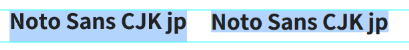
左側がIEで発生するテキストの隙間です。(比較しやすいようにスクリーンショットを切り取り、Photoshopでガイドを引いています。)
バグの現象としては、行間が膨れ上がった上にテキストの下に隙間ができるため、font-sizeが大きいほど顕著にズレが生じる。
比較するとNoto Sans CJK jpのほうがズレが大きいみたいですね。
例えばこちらのサイトでは、Noto Sans CJK jpが指定されていますのでIEで見ると下に隙間が空きます。
(見出しやページャーを見るとわかりやすいかも)
ttps://b.0218.jp/
解決策
IEのみハックでfont-familyをメイリオにするなどの対策をする。
Noto Sansを利用する場合はCJK jpをダウンロードして利用せずに、Noto Sans jp, Noto Sans JapaneseなどGoogle fonts経由で利用する場合は問題ないみたいです。
(サブセット化して軽くするためにCJK jpを利用しようとすると、逆にIEで問題が発生するという凶悪な罠)
補足
line-heightを限りなく0に近い数値にすることでズレを回避できますが、改行した瞬間に文字が重なって終わるので現実的な解決策ではありません。
ちなみにYu Gothic UIについては、他のブラウザと比べてテキストの折り返し位置がおかしくなる現象があります。
素晴らしいフォントもIEというフィルターを通すと立派な になります。
background-sizeがtransition or animationしない。
背景画像をbackground-sizeでtransition or animationしようとしてもIEだと動作しない。
<div class="box works"><img src="//placeimg.com/200/200/animals" width="200" height="200" alt="xxxx"></div>
<div class="box not"></div>
.box {
  height: 200px;
  width: 200px;
}

.not {
  -webkit-transition-property: all;
  -moz-transition-property: all;
  transition-property: all;
  -webkit-transition-duration: 0.3s;
  -moz-transition-duration: 0.3s;
  transition-duration: 0.3s;
  -webkit-transition-timing-function: ease-out;
  -moz-transition-timing-function: ease-out;
  transition-timing-function: ease-out;
  background: url("//placeimg.com/200/200/animals") 50% 50% no-repeat;
  background-size: 200px auto;
}
.not:hover {
  background-size: 160% auto;
}
解決策
wrapperにoverflow: hidden;を指定して、imgタグ(もしくは背景画像を引いた空div等でもOK)を配置し、
background-sizeの代わりにscaleをtransition または animationさせる。
.box {
  height: 200px;
  width: 200px;
}

.works {
  overflow: hidden;
}
.works img {
  -webkit-transition-property: all;
  -moz-transition-property: all;
  transition-property: all;
  -webkit-transition-duration: 0.3s;
  -moz-transition-duration: 0.3s;
  transition-duration: 0.3s;
  -webkit-transition-timing-function: ease-out;
  -moz-transition-timing-function: ease-out;
  transition-timing-function: ease-out;
  -webkit-transform: scale(1, 1);
  -moz-transform: scale(1, 1);
  -ms-transform: scale(1, 1);
  transform: scale(1, 1);
}
.works:hover img {
  -webkit-transform: scale(1.6, 1.6);
  -moz-transform: scale(1.6, 1.6);
  -ms-transform: scale(1.6, 1.6);
  transform: scale(1.6, 1.6);
}
補足
わかっていれば問題ないものの、対応が微妙に面倒。
どこかにpolyfillがあった気がします。
transformのプロパティでclacを使うと効かない。
css3 calc() bug inside transition or transform | Microsoft Connect
https://connect.microsoft.com/IE/feedback/details/762719/css3-calc-bug-inside-transition-or-transform
<div class="box works"></div>
<div class="box not"></div>
.box {
  height: 200px;
  width: 200px;
}

.not {
  transform: translate(calc(200px - 100px));
  -webkit-transform: translate(-webkit-calc(200px - 100px));
  -ms-transform: translate(calc(200px - 100px));
  background-color: red;
}
解決策
該当プロパティではcalcを使わないで、プロパティを連ねて書く。
http://stackoverflow.com/questions/21142923/ie-10-11-css-transitions-with-calc-do-not-work
.box {
  height: 200px;
  width: 200px;
}

.works {
  transform: translate(200px) translate(-100px);
  -webkit-transform: translate(200px) translate(-100px);
  -ms-transform: translate(200px) translate(-100px);
  background-color: green;
}
補足
こいつは簡単に回避可能ですね。
ただし、calcで簡単に書けるのにわざわざ連ねて書く意図が伝わり辛いので、
/* IE11 bugfix */とかコメントで書いといたほうがよさげ。
:before/:afterで2回目以降のfont-sizeの指定が効かなくなる。
[IE 11] CSS :before with font-size in em units ignores CSS precedence rules | Microsoft Connect
https://connect.microsoft.com/IE/feedback/details/813398/ie-11-css-before-with-font-size-in-em-units-ignores-css-precedence-rules
<div class="box">Lorem ipsum dolor sit amet, consectetur adipisicing elit. Ratione quaerat, fuga eaque quod quibusdam. Autem perspiciatis facilis reprehenderit quasi, soluta error, numquam atque excepturi recusandae eum labore reiciendis necessitatibus ducimus voluptates maiores. Tempore aut ducimus tempora repellendus, voluptate eos neque minima eveniet blanditiis qui, voluptatum molestias omnis alias molestiae eaque hic debitis, laborum optio. Consectetur, eligendi beatae voluptatibus a fuga deserunt natus hic quibusdam, error corporis dolore ea ex culpa perspiciatis modi delectus enim aspernatur sed repellat tempora eum.</div>
.box {
  background: #ccc;
}
.box::before {
  content: "Before. ";
  font-size: 3em;
}
.box::before {
 font-size: 1em;
}
.box::after {
 content: " .After";
 font-size: 3em;
}
.box::after {
 font-size: 1em;
}
解決策
疑似要素に直接font-sizeを指定せずに、疑似要素を内包する要素にfont-sizeを指定する。
補足
知らないと嵌る恐れがあるバグ。
コロン1つ、2つどちらの書き方でも同様の現象が起こる。
他の疑似要素::first-letter/::first-line等では発生しないっぽい。
currentColorがlinear-gradientで機能しない。
Can I Useだとie11はcurrentColor対応となっているが、
Known issuesにも記載されている通り...
http://caniuse.com/#feat=currentcolor
linear-gradientでバグがある。どうやら2回目以降の要素が、最初のcurrentColorで上書きされる?みたい。
https://connect.microsoft.com/IE/feedback/details/2018005/the-color-keyword-currentcolor-doesnt-work-in-the-css-linear-gradient-function
<div class="box" style="color: red;">
  <div class="current-color">The color of the background should be <code>red</code></div>
</div>
<div class="box" style="color: blue;">
  <div class="current-color">The color of the background should be <code>blue</code></div>
</div>

<div class="box" style="color: green;">
  <div style="color: yellow;">
    <div class="current-color">The color of the background should be <code>yellow</code></div>
  </div>
  <div class="current-color">The color of the background should be <code>green</code></div>
</div>

<div class="box current-color" style="color: cyan;">The color of the background should be <code>cyan</code></div>
<div class="box current-color" style="color: magenta;">The color of the background should be <code>magenta</code></div>
<div class="box current-color">The color of the background should be <code>grey</code></div>
.box {
  height: 200px;
  width: 200px;
}

.current-color {
  background-image: -webkit-linear-gradient(left, currentColor, currentColor);
  background-image: -moz-linear-gradient(left, currentColor, currentColor);
  background-image: linear-gradient(left, currentColor, currentColor);
  background-image: -ms-linear-gradient(left, currentColor, currentColor);
}
解決策
linear-gradientを使う場合、currentColorは諦める。
色を引き継ぎたい場合は、CSS Preprocessor/Postprocessorの変数やmixinで何とかする。
補足
変数といえばCSS variableがありますが、IEは未対応なので使えません。
https://developer.mozilla.org/ja/docs/Web/CSS/Using_CSS_variables
flexbox関連のバグ。
既に有名だと思いますが、flexbox関連のバグです。
https://philipwalton.com/articles/normalizing-cross-browser-flexbox-bugs/
こちらの記事では上記の記事が分かりやすく解説されています。
http://qiita.com/hashrock/items/189db03021b0f565ae27
解決策と補足は書かれているので割愛します。
from関連のバグ。
input type="submit"にname属性がない状態で送信されない。
This button will NOT work:
<form action="result.html" method="post">
<input type="submit" value="submit now 2">
</form>
解決策
name属性を付与する。
This button works:
<form action="result.html" method="post">
<input type="submit" value="submit now 1" name="example">
</form>
補足
こいつも簡単に回避可能ですね。
jQuery関連のバグ。
jQuery1.11/2.1.4以前だとevent delegateされたradioボタンを矢印キーで切り替えた場合、eventが正常に動作しない。
http://jsfiddle.net/damnmaudite/kt99moLf/24/
<form id="testform" onsubmit="return false;">
  <input type="text" value="focus here first">
  <br>
  <p>Tab to radio and then use arrows to change options.</p>
  <p>In IE11 the onclick event and the directly-bound click handler are triggered, but not the delegated one.</p>
  <label for="radio_a">Radio A</label>
  <input id="radio_a" class="radios" type="radio" value="a" name="radios" onclick="$('#onclick').html('a');">
  <label for="radio_b">Radio B</label>
  <input id="radio_b" class="radios" type="radio" value="b" name="radios" onclick="$('#onclick').html('b');">
  <label for="radio_c">Radio C</label>
  <input id="radio_c" class="radios" type="radio" value="c" name="radios" onclick="$('#onclick').html('c');">
</form>
<br>
<div>directly-bound: <span id="onjq"></span></div>
<div>delegated: <span id="onjq-form"></span></div>
<div>onClick: <span id="onclick"></span></div>
$('#testform').on('click', '.radios', function(e) {
  $('#onjq-form').html($(this).val());
});

$('.radios').on('click', function(e) {
  $('#onjq').html($(this).val());
});
解決策
jQuery1.12/2.2以降にする。
補足
アクセシビリティ対応の際はバージョンに注意。
その他のバグ。
検索するとわんさか出てくる/(^o^)\
https://connect.microsoft.com/IE/SearchResults.aspx?SearchQuery=css%20ie11
https://connect.microsoft.com/IE/SearchResults.aspx?SearchQuery=javascript%20ie11
IE以外のブラウザのバグ。
以下が参考になります。
Wall of browser bugs · Bootstrap
http://getbootstrap.com/browser-bugs/