OS X Yosemiteでウィンドウの閉じるボタン"x"が歪んで見えることを巡って面白い議論が起きていたので抄訳しました。詳細は以下から。
事の発端はArs TechnicaでOS X Yosemiteのレビューを担当したJohn Siracusaがツイートした以下のつぶやきで、
John Siracusa@siracusa
A reminder for glasses wearers: this is why the &vquot;x&vquot; looks like it's not centered in the close widget in Yosemite http://t.co/9HwCmjCfBm
2014/10/20 06:08:02
メガネ着用者へ:これ(色収差)がOS X Yosemiteの閉じるボタンの"x"印が中心でない理由です。
この主張に対し光学のテーマで博士号を得て現在研究機関に務めているRobbert Bloemさんが以下のような(色収差ではないという)異論を展開しています。
Robbert Bloem@RobbertBloem
@siracusa I took a close up of the screen and it is not chromatic aberration. http://t.co/MvC7QwKqi4
2014/10/20 23:48:25
内容としては「メガネを掛けた人が遠くから中心を見た時に色収差に苦しむ」として以下の様なテストを上げており、色収差自体は存在するがYosemiteの"x"印のズレがその補正のためかには疑問を呈しており、
Simple test: look at the close button straight, then turn your head sideways and see how the “x” appears to move, googly eye style.
>簡単なテスト:閉じるボタンをまっすぐ見て、頭を横にひねった時、閉じるボタンの"x"がgoogly eyeの様に動いたように見える。
However, when there is a straight line between the close button, the center of your glasses and your eyes, the chromatic aberration distorts the image in all directions equally.
>しかし、閉じるボタンとメガネと目が一直線に並んだ時、色収差がすべての方向に平等に画像を歪ませる。
実際に閉じるボタンを一眼レフカメラで撮影した画像を「ボタンに青い丸と、"x"に黄色い四角を付けるとよくわかりますが、ボタンの左には2.5ピクセルあり、右には3.5ピクセルあることから"x"印は半ピクセルだけずれている」として掲載しています。
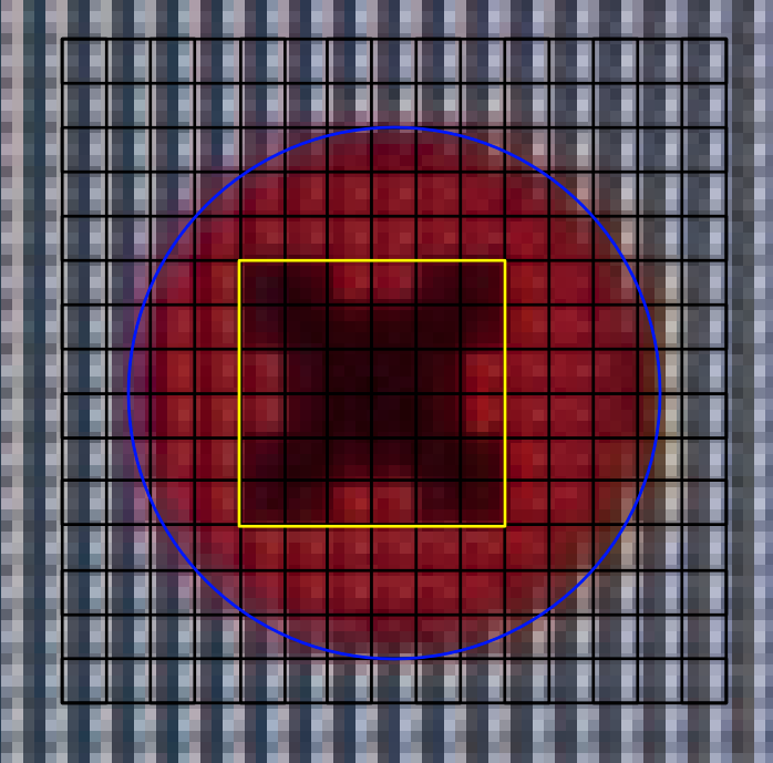
[画像2]
After some experimenting I had a picture with 4 camera pixels for every screen pixel, shown in Figure 2. I added a raster of the screen pixels, a yellow square around the “x” and a blue circle around the button. It is clear that the “x” is shifted in the button by half a pixel. On the left there are 2.5 pixels, on the right 3.5 (3). You can argue about the position of the blue circle
この画像2に対し「実際の1ピクセルは画像3の様に3つのサブピクセル(赤、緑、青)に分かれており、(MacBookで使用されているLCD方式では)これらのピクセルは水平に並んでいる、これが歪みが横のみに存在し、縦に存在しない理由だと思われます」主張、
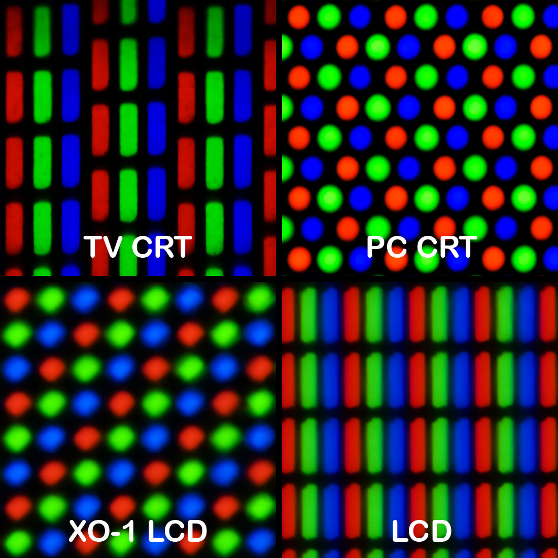
[画像3 - Wikipedia]
What I think we see is an artifact of the display. A pixel is really three sub-pixels (red, green and blue) positioned next to each other (Figure 3). The positioning of pixels next to each other, horizontally, would explain why we only see this distortion horizontally and not vertically.
最終的には「結論として、非中心の"x"印はおそらくディスプレイまたはレンダリングによってが作り出されたものであり、色収差のためではないでしょう」として締めています。
In conclusion, the off-center “x” is real and probably an artifact of the display or how it is rendered. It is unlikely that it is the result of chromatic aberration.
また、これを裏付けるようにMacBook Pro Retina displayを撮影したものと、OS X Yosemiteに含まれている画像を提供する方も現れ、歪みがないことからのOS X Yosemiteでウィンドウの閉じるボタンが左によって見えるのはディスプレイの影響のようです。
Bart Dorsey@bartdorsey
@siracusa Took my 105mm Nikon Macro and shot both of these. 15” Retina MBP screen and ASUS 24” PA248. http://t.co/qxC2nRU341
2014/10/21 00:38:00
@siracusa Here’s what retina and non-retina screenshots look like side by side. For comparison with the photos. http://t.co/aflSHqIWI0
2014/10/21 01:12:42
関連リンク:
・The off-center close button - Robbert Bloem
・OS X 10.10 YosemiteのシステムフォントをHelvetica NeueからOS X 10.9までのLucida Grandeに変更する「Lucida Grande Yosemite」を使ってみた
・画面のコントラストを上げ、透明度を下げてOS X Yosemiteの画面を見やすくする方法
コメント一覧
>>1.-
Apple7743
-
2014年10月28日 06:26 ID:uczAKL9G0 このコメントに返信
-
Retina使えってことだな(I Mac Retina買いたい
>>2.-
Apple7743
-
2014年10月28日 07:19 ID:FCFal8J90 このコメントに返信
-
こうやって検証してるのを見ると面白いねぇー
>>3.-
Apple7743
-
2014年10月28日 07:52 ID:tW124ZiO0 このコメントに返信
-
気になったから確認してみたけどMacBook Airの127ppiでは左に寄ってて
MBP Retinaの227ppiだと偏りは見えなかった
やっぱりAppleのRetina定義以下になるとダメなのかな?
>>4.-
Apple7743
-
2014年10月28日 08:24 ID:Zh.IBkW10 このコメントに返信
-
右から見ると x が左に、左から見ると x が右にずれて見える。
見る方向で変わるんだから、やっぱり色収差だよ。
コメントを書き込む