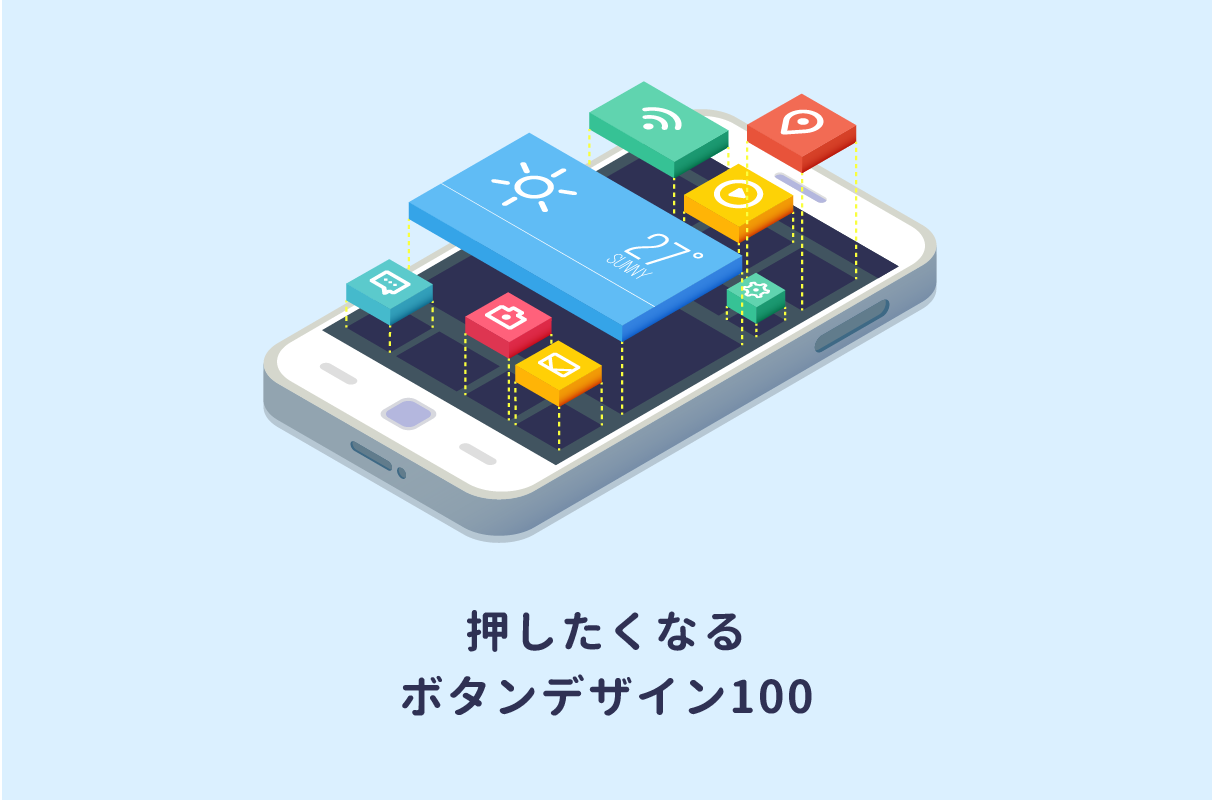
今回はWeb用のボタンデザインを100個まとめて紹介します。ユニークなボタンもたくさん作ってみました。どれもHTMLとCSSだけ。画像は使っていません。コピペ&必要に応じて修正してご利用くださいませ。
使い方
HTMLとCSSは、はじめは非表示になっています。ボタンをクリックすると、すぐ下にコードが表示されます。
1. 立体的なボタン
押し込み式
<a href="#" class="square_btn">BUTTON</a>
CSS
.square_btn{
    display: inline-block;
    padding: 0.5em 1em;
    text-decoration: none;
    background: #668ad8;/*ボタン色*/
    color: #FFF;
    border-bottom: solid 4px #627295;
    border-radius: 3px;
}
.square_btn:active {/*ボタンを押したとき*/
    -ms-transform: translateY(4px);
    -webkit-transform: translateY(4px);
    transform: translateY(4px);/*下に動く*/
    border-bottom: none;/*線を消す*/
}
最近Webでよく見かける厚みのあるボタンです。クリック(タップ)すると、沈みます。カーソルを当てるだけで沈むようにしたい場合は「:active」を「:hover」に変えましょう。
影付き
<a href="#" class="square_btn">BUTTON</a>
CSS
.square_btn{
    display: inline-block;
    padding: 0.5em 1em;
    text-decoration: none;
    background: #668ad8;/*ボタン色*/
    color: #FFF;
    border-bottom: solid 4px #627295;
    border-radius: 3px;
}
.square_btn:active {/*ボタンを押したとき*/
    -ms-transform: translateY(4px);
    -webkit-transform: translateY(4px);
    transform: translateY(4px);/*下に動く*/
    box-shadow: 0px 0px 1px rgba(0, 0, 0, 0.2);/*影を小さく*/
    border-bottom: none;
}
上のボタンに影をつけて、さらに立体感を出してみました。
文字をエンボスに
<a href="#" class="square_btn">BUTTON</a>
CSS
.square_btn{
    display: inline-block;
    padding: 0.5em 1em;
    text-decoration: none;
    background: #668ad8;/*ボタン色*/
    color: #4868ad;/*ボタン色より暗く*/
    box-shadow: 0px 2px 2px rgba(0, 0, 0, 0.29);
    border-bottom: solid 3px #627295;
    border-radius: 3px;
    font-weight: bold;
    text-shadow: 1px 1px 1px rgba(255, 255, 255, 0.5);
}

.square_btn:active   {
    -ms-transform: translateY(4px);
    -webkit-transform: translateY(4px);
    transform: translateY(4px);
    box-shadow: 0px 0px 1px rgba(0, 0, 0, 0.2);
    border-bottom: none;
}
文字色を暗めにして周りに白っぽいシャドウをつけることで、凹んでいるように見せています。
浮き出し文字
<a href="#" class="square_btn">BUTTON</a>
CSS
.square_btn{
    display: inline-block;
    padding: 0.5em 1em;
    text-decoration: none;
    background: #668ad8;/*ボタン色*/
    color: #668ad8;/*ボタン色と同じに*/
    box-shadow: 0px 2px 2px rgba(0, 0, 0, 0.29);
    border-bottom: solid 3px #627295;
    border-radius: 3px;/*角の丸み*/
    font-weight: bold;
    text-shadow: -1px -1px rgba(255, 255, 255, 0.44), 1px 1px rgba(0, 0, 0, 0.38);
  }

.square_btn:active{/*ボタンを押したとき*/
    -ms-transform: translateY(4px);
    -webkit-transform: translateY(4px);
    transform: translateY(4px);
    box-shadow: 0px 0px 1px rgba(0, 0, 0, 0.2);
    border-bottom: none;
}
文字の左と上に白の影を、右と下に黒の影をつけることで、文字が浮き上がっているような表現になります。
斜めから見たように
<a href="#" class="square_btn">BUTTON</a>
CSS
.square_btn{
    display: inline-block;
    position: relative;
    padding: 0.5em 1.4em;
    text-decoration: none;
    background: #668ad8;/*ボタン色*/
    color: #FFF;
    border-bottom: solid 5px #36528c;/*ボタン色より暗めに*/
    border-right: solid 5px #5375bd;/*ボタン色より暗めに*/
}

.square_btn:before{
    content: " ";
    position: absolute;
    bottom: -5px;
    left: -1px;
    width: 0;
    height: 0;
    border-width: 0 6px 6px 0px;
    border-style: solid;
    border-color: transparent;
    border-bottom-color: #FFF;
}

.square_btn:after{
    content: " ";
    position: absolute;
    top: -1px;
    right: -5px;
    width: 0;
    height: 0;
    border-width: 0px 6px 6px 0px;
    border-style: solid;
    border-color: #FFF;
    border-bottom-color: transparent;
}

.square_btn:active{ /*ボタンを押したとき*/
    border:none;
    -ms-transform: translate(6px,6px);
    -webkit-transform: translate(6px,6px);
    transform: translate(6px,6px);
}

.square_btn:active:after,.square_btn:active:before {
    content: none;/*ボタンを押すと線が消える*/
}
線をボックスの右と下につけることで、右斜め下から見たような立体感が出ます。線の角は擬似要素により斜めに削っています。
上から見たように
<a href="#" class="square_btn">BUTTON</a>
CSS
.square_btn{
    display: inline-block;
    position: relative;
    padding: 0.35em 1em;
    background: #668ad8;/*ボタン色*/
    color: #FFF;
    text-decoration: none;
}

.square_btn:before{
    content: "";
    position: absolute;
    top: -16px;
    left: 0;
    width: -webkit-calc(100% - 16px);
    width: calc(100% - 16px);
    height: 0;
    border: solid 8px transparent;
    border-bottom-color: #8eacec;/*ボタン色より明るめの色に*/
}

.square_btn:active{/*押したとき*/
    padding: 0.32em 0.9em;
    -ms-transform: translateY(-2px);
    -webkit-transform: translateY(-2px);
    transform: translateY(-2px);
}

.square_btn:active:before{
    width: -webkit-calc(100% - 12px);
    width: calc(100% - 12px);
}

.square_btn:active:before{
   top:-12px;
   border-width: 6px;
}
少し上から見たような形にしてみました。クリック時にはボタンサイズを小さくすることで、奥行きを表現をしています。
遊び心のあるボタン
<a href="#" class="square_btn">BUTTON</a>
CSS
.square_btn {
    position: relative;
    display: inline-block;
    padding: 0.25em 0.5em;
    text-decoration: none;
    color: #FFF;
    background: #fd9535;/*背景色*/
    border-bottom: solid 2px #d27d00;/*少し濃い目の色に*/
    border-radius: 4px;/*角の丸み*/
    box-shadow: inset 0 2px 0 rgba(255,255,255,0.2), 0 2px 2px rgba(0, 0, 0, 0.19);
    font-weight: bold;
}

.square_btn:active {
    border-bottom: solid 2px #fd9535;
    box-shadow: 0 0 2px rgba(0, 0, 0, 0.30);
}
少しカクカクしたような立体感を出してみました。ポップで明るめな色が合うはずです。
さらにポップに
<a href="#" class="square_btn">BUTTON</a>
CSS
.square_btn {
    position: relative;
    display: inline-block;
    padding: 0.25em 0.5em;
    text-decoration: none;
    color: #FFF;
    background: #fd9535;/*色*/
    border-radius: 4px;/*角の丸み*/
    box-shadow: inset 0 2px 0 rgba(255,255,255,0.2), inset 0 -2px 0 rgba(0, 0, 0, 0.05);
    font-weight: bold;
    border: solid 2px #d27d00;/*線色*/
}

.square_btn:active {/*押したとき*/
    box-shadow: 0 0 2px rgba(0, 0, 0, 0.30);
}
ボタン周りを線で囲うとさらにポップでかわいいボタンになります。なんとなく押したくなりますね。
おもちゃ風
<a href="#" class="square_btn">BUTTON</a>
CSS
.square_btn {
    position: relative;
    display: inline-block;
    padding: 0.25em 0.5em;
    text-decoration: none;
    background: #00BCD4;/*背景色*/
    color: #00BCD4;/*=背景色*/
    box-shadow: inset 0 2px 0 rgba(255,255,255,0.2);
    border-bottom: solid 2px #118e9e;
    border-radius: 4px;
    font-weight: bold;
    text-shadow: -1px -1px rgba(255, 255, 255, 0.44), 1px 1px rgba(0, 0, 0, 0.38);
}

.square_btn:active {/*押したとき*/
   border-bottom: solid 2px #00BCD4;
   box-shadow: none;
   text-shadow: -1px -1px rgba(255, 255, 255, 0.3), 1px 1px rgba(0, 0, 0, 0.3);
}
浮き出し文字にすることで、おもちゃっぽさ(レゴっぽさ)を出しました。丸の部分は、黒丸テキスト(●)で表現しています。
控えめなリッチボタン
<a href="#" class="square_btn">BUTTON</a>
CSS
.square_btn {
    position: relative;
    display: inline-block;
    padding: 0.25em 0.5em;
    text-decoration: none;
    color: #FFF;
    background: #03A9F4;/*色*/
    border: solid 1px #0f9ada;/*線色*/
    border-radius: 4px;
    box-shadow: inset 0 1px 0 rgba(255,255,255,0.2);
    text-shadow: 0 1px 0 rgba(0,0,0,0.2);
}

.square_btn:active {/*押したとき*/
    border: solid 1px #03A9F4;
    box-shadow: none;
    text-shadow: none;
}
テキストにも少し影をつけています。ボタンをクリックすると影が消えます(少し分かりづらいかもしれませんが)。
表面に丸みのある角丸ボタン
<a href="#" class="btn">BUTTON</a>
CSS
.btn{
    display: inline-block;
    position: relative;
    text-decoration: none;
    color: #f9a9ae;
    width: 120px;
    height: 50px;
    line-height: 50px;
    border-radius: 5px;
    text-align: center;
    vertical-align: middle;
    overflow: hidden;
    font-weight: bold;
    background-image: -webkit-linear-gradient(#fed6e3 0%, #ffaaaa 100%);
    background-image: linear-gradient(#fed6e3 0%, #ffaaaa 100%);
    text-shadow: 1px 1px 1px rgba(255, 255, 255, 0.66);
    box-shadow: 0 1px 1px rgba(0, 0, 0, 0.28);
}

.btn:active{/*押したとき*/
    -ms-transform: translateY(2px);
    -webkit-transform: translateY(2px);
    transform: translateY(2px);/*沈むように*/
    box-shadow: 0 0 1px rgba(0, 0, 0, 0.15);
    background-image: -webkit-linear-gradient(#fed6e3 0%, #ffbcbc 100%);
    background-image: linear-gradient(#fed6e3 0%, #ffbcbc 100%);/*グラデーションを明るく*/
}
グラデーションで丸みを表現しています。やわらかめのパステル色がよく合うかと思います。
いっそのこと文字ごと立体に
<a href="#" class="square_btn">BUTTON</a>
CSS
.square_btn{
    text-decoration: none;
    font-weight: bold;
    font-size: 37px;
    color: #799dec;
    text-shadow: 0px 4px 2px rgba(0, 0, 0, 0.32), 0px 1px 0px #6182ca, 0px 2px 0px #4f6aa7, 0px 3px 0px #5470ad;
}
.square_btn:active {
    top: 4px;
	box-shadow: none;
}
BUTTONという文字をボタンにしました。テキストは太めのものにするのがおすすめです。一見ボタンだと分かりづらいのですが、目を引きたいときには良いかもしれませんね。
少し浮き上がったふせん風
<a href="#" class="square_btn">BUTTON</a>
CSS
.square_btn{
    display: inline-block;
    padding: 0.5em 1em;
    text-decoration: none;
    background: #f7f7f7;
    border-left: solid 6px #ff7c5c;/*左線*/
    color: #ff7c5c;/*文字色*/
    font-weight: bold;
    box-shadow: 0px 2px 2px rgba(0, 0, 0, 0.29);
}
.square_btn:active {
    box-shadow: inset 0 0 2px rgba(128, 128, 128, 0.1);
    transform: translateY(2px);
}
クリックにより影が消えて沈みます。カーソルを当てると動きのつくホバーエフェクトにしても良いかもしれません(:activeを:hoverに)。
本物のような質感のボタン
<a href="#" class="btn">
	<i class="fa fa-power-off"></i>
</a>
CSS
.btn{
    display: inline-block;
    text-decoration: none;
    color: rgba(152, 152, 152, 0.43);/*アイコン色*/
    width: 80px;
    height: 80px;
    line-height: 80px;
    font-size: 40px;
    border-radius: 50%;
    text-align: center;
    vertical-align: middle;
    overflow: hidden;
    font-weight: bold;
    background-image: -webkit-linear-gradient(#e8e8e8 0%, #d6d6d6 100%);
    background-image: linear-gradient(#e8e8e8 0%, #d6d6d6 100%);
    text-shadow: 1px 1px 1px rgba(255, 255, 255, 0.66);
    box-shadow: inset 0 2px 0 rgba(255,255,255,0.5), 0 2px 2px rgba(0, 0, 0, 0.19);
    border-bottom: solid 2px #b5b5b5;
}

.btn:active {/*押したとき*/
    background-image: -webkit-linear-gradient(#efefef 0%, #d6d6d6 100%);
    box-shadow: inset 0 1px 0 rgba(255,255,255,0.5), 0 2px 2px rgba(0, 0, 0, 0.19);
    border-bottom: none;
}
画像に見えますが、HTMLとCSSだけで作られています。なお、はFontAwesomeのアイコンフォントを使って表示しています。FontAwesomeの導入方法と使い方は以下の記事で解説しています。
別のアイコンに変えることもできますし、iタグの代わりに一文字を入れるような表現もできます(以下のようなイメージです。押したくなりますが何が起こるか分からず怖いですね…)。
周囲をへこませた場合
<a href="#" class="btn">
	<i class="fa fa-home"></i>
</a>
CSS
.btn{/*周りの凹み*/
    display: inline-block;
    position: relative;
    text-decoration: none;
    color: rgba(3, 169, 244, 0.54);
    width: 100px;
    height: 100px;
    border-radius: 50%;
    text-align: center;
    background: #f7f7f7;
    box-shadow: inset 0 0 4px rgba(0, 0, 0, 0.08);
}
.btn .fa {/*ボタン自体*/
    position: absolute;
    content: '';
    width: 80px;
    height: 80px;
    line-height: 80px;
    vertical-align: middle;
    left: 10px;
    top: 9px;
    border-radius: 50%;
    font-size: 40px;
    background-image: -webkit-linear-gradient(#e8e8e8 0%, #d6d6d6 100%);
    background-image: linear-gradient(#e8e8e8 0%, #d6d6d6 100%);
    text-shadow: 1px 1px 1px rgba(255, 255, 255, 0.66);
    box-shadow: inset 0 2px 0 rgba(255,255,255,0.5), 0 2px 2px rgba(0, 0, 0, 0.19);
    border-bottom: solid 2px #b5b5b5;
  }

.btn .fa:active{
    background-image: -webkit-linear-gradient(#efefef 0%, #d6d6d6 100%);
    box-shadow: inset 0 1px 0 rgba(255,255,255,0.5), 0 2px 2px rgba(0, 0, 0, 0.19);
    border-bottom: solid 2px #d8d8d8;
}
ボタンの周辺にくぼみを作り、より立体感を出しました。アイコン色はカラフルにしてもOKです。
2. フラットデザインなボタン
次に影や立体表現のないボタンのデザイン例を紹介します。
シンプル
<a href="#" class="square_btn">
	<i class="fa fa-caret-right"></i> BUTTON
</a>
CSS
.square_btn{
    position: relative;
    display: inline-block;
    font-weight: bold;
    padding: 0.25em 0.5em;
    text-decoration: none;
    color: #00BCD4;
    background: #ECECEC;
    transition: .4s;
  }

.square_btn:hover {
    background: #00bcd4;
    color: white;
}
こちらもFontAwesomeを使って「」を表示しています。不要であればHTMLの<i class="~"></i>をまるっと削除すればOKです。
シンプルなボーダーで囲う
<a href="#" class="square_btn">BUTTON</a>
CSS
.square_btn {
    display: inline-block;
    padding: 0.3em 1em;
    text-decoration: none;
    color: #67c5ff;
    border: solid 2px #67c5ff;
    border-radius: 3px;
    transition: .4s;
}

.square_btn:hover {
    background: #67c5ff;
    color: white;
}
線で囲っただけのシンプルなボタンです。ホバーにより背景が塗られます。
二重線で囲う
<a href="#" class="square_btn">BUTTON</a>
CSS
.square_btn {
    display: inline-block;
    padding: 0.5em 1em;
    text-decoration: none;
    color: #67c5ff;
    border: double 4px #67c5ff;
    border-radius: 3px;
    transition: .4s;
}
.square_btn:hover {
    background: #fffbef;
}
二重線にしました。線の太さは好みで調整してください。
破線で囲う
<a href="#" class="square_btn">BUTTON</a>
CSS
.square_btn{
    display: inline-block;
    padding: 0.5em 1em;
    text-decoration: none;
    color: #67c5ff;
    border: dashed 1px #67c5ff;
    border-radius: 3px;
    transition: .4s;
}

.square_btn:hover {
    border-style: dotted;
    color: #679efd;
}
破線バージョンです。ホバーによりパッと点線に変わります。
背景色を塗ってみた場合
<a href="#" class="square_btn">BUTTON</a>
CSS
.square_btn{
    display: inline-block;
    padding: 0.5em 1em;
    text-decoration: none;
    color: #67c5ff;
    border: dashed 1px #67c5ff;
    background: #f2fcff;
    border-radius: 3px;
    transition: .4s;
}

.square_btn:hover {
    background: #cbedff;
    color: #FFF;
}
淡い同系色で塗ると、よりボタンの範囲が分かりやすくなります。
両端ボーダーばさみ
<a href="#" class="square_btn">BUTTON</a>
CSS
.square_btn{
    position: relative;
    display: inline-block;
    font-weight: bold;
    padding: 0.5em 1em;
    text-decoration: none;
    border-left: solid 4px #668ad8;
    border-right: solid 4px #668ad8;
    color: #668ad8;
    background: #e1f3ff;
    transition: .4s;
}

.square_btn:hover {
    background: #668ad8;
    color: #FFF;
}
左右をボーダーをはさんでいます。背景色とボーダーの色は相性が良いものを選びましょう。
丸みのある下線付き
<a href="#" class="square_btn">BUTTON</a>
CSS
.square_btn{
   position: relative;
   display: inline-block;
   font-weight: bold;
   padding: 0.25em 0;
   text-decoration: none;
   color: #67c5ff;
}

.square_btn:before{
   position: absolute;
   content: '';
   width: 100%;
   height: 4px;
   top:100%;
   left: 0;
   border-radius: 3px;
   background:#67c5ff;
   transition: .2s;
}

.square_btn:hover:before {
    top: -webkit-calc(100% - 3px);
    top: calc(100% - 3px);
}
擬似要素により丸みのある下線を作っています。ホバーにより少し浮き上がります。
上下線付き
<a href="#" class="square_btn">BUTTON</a>
CSS
.square_btn {
    position: relative;
    display: inline-block;
    font-weight: bold;
    padding: 12px 0 8px;
    text-decoration: none;
    color: #67c5ff;
    transition: .4s;
}

.square_btn:before{
   position: absolute;
   content: '';
   width: 100%;
   height: 4px;
   top:100%;
   left: 0;
   border-radius: 3px;
   background:#67c5ff;
   transition: .2s;
}

.square_btn:after{
   position: absolute;
   content: '';
   width: 100%;
   height: 4px;
   top:0;
   left: 0;
   border-radius: 3px;
   background:#67c5ff;
   transition: .2s;
}

.square_btn:hover:before {
    top: -webkit-calc(100% - 3px);
    top: calc(100% - 3px);
}

.square_btn:hover:after {
    top: 3px;
}
上にも線をつけてみました。文字がきゅっとはさまれるようなホバーエフェクトをつけています。
左右バージョン
<a href="#" class="square_btn">BUTTON</a>
CSS
.square_btn {
    position: relative;
    display: inline-block;
    font-weight: bold;
    padding: 5px 11px 5px 15px;
    text-decoration: none;
    color: #67c5ff;
    transition: .4s;
}

.square_btn:before {
   position: absolute;
   display: inline-block;
   content: '';
   width: 4px;
   height: 100%;
   top: 0;
   left: 0;
   border-radius: 3px;
   background:#67c5ff;
}

.square_btn:after{
   position: absolute;
   display: inline-block;
   content: '';
   width: 4px;
   height: 100%;
   top:0;
   left: 100%;
   border-radius: 3px;
   background:#67c5ff;
}

.square_btn:hover:before,.square_btn19:hover:after{
  -webkit-transform: rotate(10deg);
  -ms-transform: rotate(10deg);
  transform: rotate(10deg);
}
今度は左右を線ではさんだデザインにしてみました。ホバーにより線がカクっと斜めに倒れます。
片側だけ角丸に
<a href="#" class="square_btn">BUTTON</a>
CSS
.square_btn {
    position: relative;
    display: inline-block;
    font-weight: bold;
    padding: 0.25em 0.5em;
    text-decoration: none;
    color: #00BCD4;
    background: #ECECEC;
    border-radius: 0 15px 15px 0;
    transition: .4s;
  }

.square_btn:hover {
    background: #636363;
}
右側の角だけを丸くしてみました。丸みは好みで調整してくださいませ(border-radiusの値の大きさ=丸みです)。
THE フラット
<a href="#" class="square_btn">
	<i class="fa fa-chevron-right"></i> BUTTON
</a>
CSS
.square_btn {
    position: relative;
    display: inline-block;
    font-weight: bold;
    padding: 0.25em 0.5em;
    text-decoration: none;
    color: #FFF;
    background: #00bcd4;
    transition: .4s;
  }

.square_btn:hover {
    background: #1ec7bb;
}
いかにもフラットデザインらしい塗りつぶしボタンです。配色に「ニトリ感」がありますね。
塗りつぶし+下線
<a href="#" class="square_btn">
	<span>BUTTON</span>
</a>
CSS
.square_btn {
    position: relative;
    display: inline-block;
    font-weight: bold;
    padding: 7px 10px 10px 10px;
    text-decoration: none;
    color: #FFF;
    background: #a180dc;
    transition: .4s;
}

.square_btn>span {
    border-bottom: solid 2px #FFF;
}

.square_btn:hover {
    background: #91b5fb;
}
ボタンの中の文字に下線をつけています。ロゴっぽいですね。
塗りつぶし+上下線
<a href="#" class="square_btn">
	<span>BUTTON</span>
</a>
CSS
.square_btn {
    position: relative;
    display: inline-block;
    font-weight: bold;
    padding: 1em 0.5em;
    text-decoration: none;
    color: #FFF;
    background: #ff7f7f;
    transition: .4s;
}

.square_btn>span{
    border-bottom: solid 2px #FFF;
    border-top: solid 2px #FFF;
}

 .square_btn:hover span {
    padding: 0.1em 0;
}
文字の上下にボーダーをつけてみました。点線(solidをdottedに)や破線(dashedに)にしても面白いかもしれませんね。
上だけ角丸
<a href="#" class="square_btn">BUTTON</a>
CSS
.square_btn {
    position: relative;
    display: inline-block;
    font-weight: bold;
    padding: 8px 10px 5px 10px;
    text-decoration: none;
    color: #FFA000;
    background: #fff1da;
    border-bottom: solid 4px #FFA000;
    border-radius: 15px 15px 0 0;
    transition: .4s;
}

.square_btn:hover {
    background: #ffc25c;
    color: #FFF;
}
ピョコンと立っているようなデザインにしてみました。明るめの配色が合うはずです。
ストライプ
<a href="#" class="square_btn">BUTTON</a>
CSS
.square_btn {
    position: relative;
    display: inline-block;
    font-weight: bold;
    padding: 0.5em 1em;
    text-decoration: none;
    border-left: solid 4px #668ad8;
    border-right: solid 4px #668ad8;
    color: #668ad8;
    text-shadow: 0 0 5px white;
    padding: 0.5em 1em;
    background: -webkit-repeating-linear-gradient(-45deg, #cce7ff, #cce7ff 3px,#e9f4ff 3px, #e9f4ff 7px);
    background: repeating-linear-gradient(-45deg, #cce7ff, #cce7ff 3px,#e9f4ff 3px, #e9f4ff 7px);
    transition: .4s;
}

.square_btn:hover {
    background: -webkit-repeating-linear-gradient(-45deg, #cce7ff, #cce7ff 5px,#e9f4ff 5px, #e9f4ff 9px);
    background: repeating-linear-gradient(-45deg, #cce7ff, #cce7ff 5px,#e9f4ff 5px, #e9f4ff 9px);
}
ストライプで背景を塗りつぶしました。文字の見やすさを損なわないように薄めの色を選ぶのが良いですね。
先進感
<a href="#" class="square_btn">BUTTON</a>
CSS
.square_btn{
    position: relative;
    display: inline-block;
    font-weight: bold;
    text-decoration: none;
    color: #FFF;
    text-shadow: 0 0 5px rgba(255, 255, 255, 0.73);
    padding: 0.3em 0.5em;
    background: #00bcd4;
    border-top: solid 3px #00a3d4;
    border-bottom: solid 3px #00a3d4;
    transition: .4s;
}

.square_btn:hover {
    text-shadow: -6px 0px 15px rgba(255, 255, 240, 0.83), 6px 0px 15px rgba(255, 255, 240, 0.83);
}
なんとなくSF感、未来感を感じさせる配色のボタンです。ホバーにより文字の背景がふわっと白くなります。
ステッチ
<a href="#" class="square_btn">BUTTON</a>
CSS
.square_btn{
    display: inline-block;
    padding: 0.5em 1em;
    text-decoration: none;
    background: #668ad8;
    color: #FFF;
    border-radius: 4px;
    box-shadow: 0px 0px 0px 5px #668ad8;
    border: dashed 1px #FFF;
}

.square_btn:hover{
	border: dotted 1px #FFF;
}
角を丸くし、破線をつけることで少し可愛くなります。破線まわりはbox-shadowにより同色で塗りつぶしています。
3. グラデーションが美しいボタン
斜めにグラデーション
<a href="#" class="square_btn">BUTTON</a>
CSS
.square_btn{
    display: inline-block;
    padding: 0.5em 1em;
    text-decoration: none;
    border-radius: 3px;
    font-weight: bold;
    color: #FFF;
    background-image: -webkit-linear-gradient(45deg, #709dff 0%, #b0c9ff 100%);
    background-image: linear-gradient(45deg, #709dff 0%, #b0c9ff 100%);
    transition: .4s;
}

.square_btn:hover{
    background-image: -webkit-linear-gradient(45deg, #709dff 50%, #b0c9ff 100%);
    background-image: linear-gradient(45deg, #709dff 50%, #b0c9ff 100%);
}
左下から右下に向かって色が薄くなるようなグラデーションをかけています。
立体的に
<a href="#" class="square_btn">BUTTON</a>
CSS
.square_btn{
    display: inline-block;
    padding: 0.5em 1em;
    text-decoration: none;
    font-weight: bold;
    border-radius: 4px;
    color: rgba(0, 69, 212, 0.47);
    text-shadow: 1px 1px 1px rgba(255, 255, 255, 0.5);
    background-image: -webkit-linear-gradient(#6795fd 0%, #67ceff 100%);
    background-image: linear-gradient(#6795fd 0%, #67ceff 100%);
    box-shadow: 0px 2px 2px rgba(0, 0, 0, 0.29);
    border-bottom: solid 3px #5e7fca;

}

.square_btn:active{
    -ms-transform: translateY(4px);
    -webkit-transform: translateY(4px);
    transform: translateY(4px);
    box-shadow: 0px 0px 1px rgba(0, 0, 0, 0.2);
    border-bottom: none;
}
ボーダーと影により立体感を出しました。同系統の2色でグラデーションを作ると、オシャレに見せやすいのではないかと思います。
文字を白に
<a href="#" class="square_btn">BUTTON</a>
CSS
.square_btn{
    display: inline-block;
    padding: 0.5em 1em;
    text-decoration: none;
    border-radius: 4px;
    color: #ffffff;
    background-image: -webkit-linear-gradient(#6795fd 0%, #67ceff 100%);
    background-image: linear-gradient(#6795fd 0%, #67ceff 100%);
    box-shadow: 0px 2px 2px rgba(0, 0, 0, 0.29);
    border-bottom: solid 3px #5e7fca;
  }

.square_btn:active{
    -ms-transform: translateY(4px);
    -webkit-transform: translateY(4px);
    transform: translateY(4px);
    box-shadow: 0px 0px 1px rgba(0, 0, 0, 0.2);
    border-bottom: none;
}
文字をシンプルな白にしてみました。
オレンジにしてみた場合
<a href="#" class="square_btn">BUTTON</a>
CSS
.square_btn{
    display: inline-block;
    padding: 0.5em 1em;
    text-decoration: none;
    border-radius: 4px;
    color: #ffffff;
    background-image: -webkit-linear-gradient(45deg, #FFC107 0%, #ff8b5f 100%);
    background-image: linear-gradient(45deg, #FFC107 0%, #ff8b5f 100%);
    box-shadow: 0px 2px 2px rgba(0, 0, 0, 0.29);
    border-bottom: solid 3px #c58668;
}

.square_btn:active{
    -ms-transform: translateY(4px);
    -webkit-transform: translateY(4px);
    transform: translateY(4px);
    box-shadow: 0px 0px 1px rgba(0, 0, 0, 0.2);
    border-bottom: none;
}
橙色どうしのグラデーションにしてみました。
角丸のフラットボタン
<a href="#" class="square_btn">BUTTON</a>
CSS
.square_btn{
    display: inline-block;
    padding: 7px 20px;
	border-radius: 25px;
    text-decoration: none;
    color: #FFF;
    background-image: -webkit-linear-gradient(45deg, #FFC107 0%, #ff8b5f 100%);
    background-image: linear-gradient(45deg, #FFC107 0%, #ff8b5f 100%);
    transition: .4s;
}

.square_btn:hover {
    background-image: -webkit-linear-gradient(45deg, #FFC107 0%, #f76a35 100%);
    background-image: linear-gradient(45deg, #FFC107 0%, #f76a35 100%);
}
グラデーションはつけたまま角を丸くし、立体感を取り去りました。ホバーにより色が少し濃くなります。
シンプルな長方形に
<a href="#" class="square_btn">BUTTON</a>
CSS
.square_btn{
    display: inline-block;
    padding: 0.5em 1em;
    text-decoration: none;
    color: #FFF;
    background-image: -webkit-linear-gradient(#6795fd 0%, #67ceff 100%);
    background-image: linear-gradient(#6795fd 0%, #67ceff 100%);
    transition: .4s;
}

.square_btn:hover{
    background-image: -webkit-linear-gradient(#6795fd 0%, #67ceff 70%);
    background-image: linear-gradient(#6795fd 0%, #67ceff 70%);
}
さきほどのボタンから角の丸みをとってみたものです。
4. 円形(丸)
次に円形のボタンのデザインサンプルを紹介します。
シンプル
<a href="#" class="btn">BUTTON</a>
CSS
.btn{
  display: inline-block;
  text-decoration: none;
  background: #87befd;
  color: #FFF;
  width: 120px;
  height: 120px;
  line-height: 120px;
  border-radius: 50%;
  text-align: center;
  vertical-align: middle;
  overflow: hidden;
  transition: .4s;
}

.btn:hover{
    background: #668ad8;
}
正円形の背景をシンプルに単色の塗りつぶしました。
ステッチ
<a href="#" class="btn">BUTTON</a>
CSS
.btn{
    display: inline-block;
    text-decoration: none;
    background: #87befd;
    color: #FFF;
    width: 120px;
    height: 120px;
    line-height: 120px;
    border-radius: 50%;
    text-align: center;
    vertical-align: middle;
    overflow: hidden;
    box-shadow: 0px 0px 0px 5px #87befd;
    border: dashed 1px #FFF;
    transition: .4s;
}

.btn:hover{
    background: #668ad8;
     box-shadow: 0px 0px 0px 5px #668ad8;
}
刺繍ワッペン風です。線を太くするとよりかわいくなります。
文字と線をひかえめに
<a href="#" class="btn">BUTTON</a>
CSS
.btn{
    display: inline-block;
    text-decoration: none;
    background: #8cd460;
    color: rgba(255, 255, 255, 0.47);
    font-weight: bold;
    width: 120px;
    height: 120px;
    line-height: 120px;
    border-radius: 50%;
    text-align: center;
    vertical-align: middle;
    overflow: hidden;
    box-shadow: 0px 0px 0px 5px #8cd460;
    border: solid 2px rgba(255, 255, 255, 0.47);
    transition: .4s;
}

.btn:hover{
    border-style: dashed;
}
円の内側に少し太めの実線を入れました。不透明度の低い白を使うことで、主張しすぎないようにしています。
下側に影をつけた場合
<a href="#" class="btn">BUTTON</a>
CSS
.btn{
    display: inline-block;
    text-decoration: none;
    background: #ff8181;
    color: #FFF;
    width: 120px;
    height: 120px;
    line-height: 120px;
    border-radius: 50%;
    text-align: center;
    font-weight: bold;
    vertical-align: middle;
    overflow: hidden;
    box-shadow: 0px 2px 2px rgba(0, 0, 0, 0.29);
    border-bottom: solid 3px #bd6565;
    transition: .4s;
}

.btn:active{
    -ms-transform: translateY(2px);
    -webkit-transform: translateY(2px);
    transform: translateY(2px);
    box-shadow: 0 0 1px rgba(0, 0, 0, 0.15);
    border-bottom: none;
}
円の下側に線と影をつけることで、より「押せるボタン」感が出ます。
文字をエンボスに
<a href="#" class="btn">BUTTON</a>
CSS
.btn{
    display: inline-block;
    text-decoration: none;
    background: #ffba78;
    color: #ffba78;
    width: 120px;
    height: 120px;
    font-size: 21px;
    line-height: 120px;
    border-radius: 50%;
    text-align: center;
    vertical-align: middle;
    overflow: hidden;
    font-weight: bold;
    box-shadow: 0px 2px 2px rgba(0, 0, 0, 0.29);
    border-bottom: solid 3px #d29963;
    text-shadow: -1px -1px rgba(255, 255, 255, 0.43), 1px 1px rgba(0, 0, 0, 0.49);
    transition: .4s;
}
.btn:active{
    -ms-transform: translateY(2px);
    -webkit-transform: translateY(2px);
    transform: translateY(2px);
    box-shadow: 0 0 2px rgba(0, 0, 0, 0.35);
    border-bottom: none;
}
さきほどと同じパターンです。文字も浮き出ているように見せています。
文字を凹ませる
<a href="#" class="btn">BUTTON</a>
CSS
.btn{
    display: inline-block;
    text-decoration: none;
    background: #5dc3d0;
    color: rgb(82, 142, 150);
    width: 122px;
    font-size: 20px;
    height: 120px;
    line-height: 120px;
    border-radius: 50%;
    text-align: center;
    vertical-align: middle;
    overflow: hidden;
    box-shadow: inset 0px 3px 0 rgba(255,255,255,0.3), 0 3px 3px rgba(0, 0, 0, 0.3);
    font-weight: bold;
    border-bottom: solid 3px #549fa9;
    text-shadow: 1px 1px 1px rgba(255, 255, 255, 0.65);
    transition: .4s;
}

.btn:active{
    -ms-transform: translateY(1px);
    -webkit-transform: translateY(1px);
    transform: translateY(1px);
    box-shadow: 0 0 2px rgba(0, 0, 0, 0.35);
    border-bottom: none;
}
文字をくぼませるような表現で、リアルなボタンらしさを出しています。
シンプルな円形
<a href="#" class="btn">BUTTON</a>
CSS
.btn{
  display: inline-block;
  text-decoration: none;
  color: #668ad8;
  width: 120px;
  height: 120px;
  line-height: 120px;
  border-radius: 50%;
  border: solid 2px #668ad8;
  text-align: center;
  vertical-align: middle;
  overflow: hidden;
  font-weight: bold;
  transition: .4s;
}

.btn:hover {
    background: #b3e1ff;
}
文字と線だけで構成してみました。濃いめの色を使うのがおすすめです。
二重線
<a href="#" class="btn">BUTTON</a>
CSS
.btn{
  display: inline-block;
  text-decoration: none;
  color: #668ad8;
  width: 120px;
  height: 120px;
  line-height: 120px;
  border-radius: 50%;
  border: double 4px #668ad8;
  text-align: center;
  vertical-align: middle;
  overflow: hidden;
  transition: .6s;
}

.btn:hover{
  -webkit-transform: rotateY(360deg);
  -ms-transform: rotateY(360deg);
  transform: rotateY(360deg);
}
transformプロパティにより、カーソルを当てるとくるんと回転するホバーエフェクトをかけています。
ミステリアスなボタン
<a href="#" class="btn">BUTTON</a>
CSS
.btn {
    display: inline-block;
    text-decoration: none;
    color: #FFF;
    width: 120px;
    height: 120px;
    line-height: 120px;
    border-radius: 50%;
    text-align: center;
    vertical-align: middle;
    overflow: hidden;
    background-image: -webkit-linear-gradient(45deg, #709dff 0%, #91fdb7 100%);
    background-image: linear-gradient(45deg, #709dff 0%, #91fdb7 100%);
    transition: .4s;
}

.btn:hover{
  -webkit-transform: rotate(10deg);
  -ms-transform: rotate(10deg);
  transform: rotate(10deg);
}
青と緑っぽいグラデーションを斜めにかけることで、ミステリアスで透明感のあるデザインにしてみました。
カービー風
<a href="#" class="btn">BUTTON</a>
CSS
.btn{
    display: inline-block;
    text-decoration: none;
    color: #f9a9ae;
    width: 120px;
    height: 120px;
    line-height: 120px;
    border-radius: 50%;
    text-align: center;
    vertical-align: middle;
    overflow: hidden;
    font-weight: bold;
    background-image: -webkit-linear-gradient(#fed6e3 0%, #ffaaaa 100%);
    background-image: linear-gradient(#fed6e3 0%, #ffaaaa 100%);
    text-shadow: 1px 1px 1px rgba(255, 255, 255, 0.66);
    box-shadow: 0 1px 1px rgba(0, 0, 0, 0.28);
}

.btn:active{
    box-shadow: inset 0 0 5px rgba(128, 128, 128, 0.32);
    background-image: -webkit-linear-gradient(#fed6e3 0%, #ffcfcf 100%);
    background-image: linear-gradient(#fed6e3 0%, #ffcfcf 100%);
}
触りたくなるようなプニプニ感を表現してみました。グラデーションの配色はカービー風。
5. おしゃれなSNSボタン
ここからはソーシャルシェアボタン、フォローボタンのデザイン例を紹介します。
シンプルなアイコン風ボタン
<a href="#" class="fl_tw">
  <span class="twicon"><i class="fa fa-twitter"></i></span> Follow Me
</a>
CSS
.fl_tw {
  text-decoration: none;
  display: inline-block;
  text-align: center;
  color: #1da1f3;
  font-size: 25px;
  text-decoration: none;
  }

.fl_tw:hover {
  color:#88daff;
  transition: .5s;
}

.fl_tw .twicon{
  border-radius: 10px;
  position: relative;
  display: inline-block;
  width: 50px;
  height: 50px;
  font-size: 35px;
  line-height: 50px;
  vertical-align: middle;
  color: #FFF;
  background: #1da1f3;
}
<a href="#" class="fl_fb">
  <span class="fbicon"><i class="fa fa-facebook"></i></span> Follow Me
</a>
CSS
.fl_fb {
  text-decoration: none;
  display: inline-block;
  text-align: center;
  color: #4966a0;;
  font-size: 25px;
  text-decoration: none;
  }

.fl_fb:hover {
  color:#668ad8;
  transition: .5s;
}

.fl_fb .fbicon{
  border-radius: 10px;
  position: relative;
  display: inline-block;
  width: 50px;
  height: 50px;
  font-size: 35px;
  line-height: 50px;
  vertical-align: middle;
  color: #FFF;
  background: #4966a0;;
}

.fl_fb .fbicon .fa-facebook {
    position: absolute;
    bottom: -3px;
    right: 6px;
    font-size: 42px;
}
<a href="#" class="fl_inst">
  <span class="insta"><i class="fa fa-instagram"></i></span> Follow Me
</a>
CSS
.fl_inst {
  text-decoration: none;
  display: inline-block;
  text-align: center;
  color: #2e6ca5;
  font-size: 25px;
  text-decoration: none;
  }

.fl_inst:hover {
  color:#668ad8;
  transition: .5s;
}

.fl_inst .insta{
  border-radius: 13px;
  position: relative;
  display: inline-block;
  width: 50px;
  height: 50px;
  font-size: 35px;
  line-height: 50px;
  vertical-align: middle;
  background: -webkit-linear-gradient(135deg, #427eff 0%, #f13f79 70%) no-repeat;
  background: linear-gradient(135deg, #427eff 0%, #f13f79 70%) no-repeat;
  overflow: hidden
}

.fl_inst .insta:before{
  content: '';
  position: absolute;
  top: 23px;
  left: -18px;
  width: 60px;
  height: 60px;
  background: -webkit-radial-gradient(#ffdb2c 10%, rgba(255, 105, 34, 0.65) 55%, rgba(255, 88, 96, 0) 70%);
  background: radial-gradient(#ffdb2c 10%, rgba(255, 105, 34, 0.65) 55%, rgba(255, 88, 96, 0) 70%);
}

.fl_inst .fa-instagram {
  color:white;
  position: relative;
  z-index: 2}
iPhoneアプリのアイコンをイメージして作りました。アイコンは例によってFontAwesomeのものを使っています。Facebookのアイコンは右下へと位置をずらしています。インスタグラムのアイコンはコードが複雑になっています。どのような構成になっているかを知りたい方はInstagramフォローボタンの作り方をご覧ください。
横長のフォローボタン
<a href="#" class="fl_tw2">
  <i class="fa fa-twitter"></i> <span>Follow Me</span>
</a>
CSS
.fl_tw2{/*ボタンの背景*/
  color: #FFF;/*文字・アイコン色*/
  border-radius: 7px;/*角丸に*/
  display: inline-block;
  height: 50px;/*高さ*/
  width: 190px;/*幅*/
  text-align: center;/*中身を中央寄せ*/
  font-size: 25px;/*文字のサイズ*/
  line-height: 50px;/*高さと合わせる*/
  vertical-align: middle;/*垂直中央寄せ*/
  background: #1da1f3;
  overflow: hidden;/*はみ出た部分を隠す*/
  text-decoration:none;/*下線は消す*/
}

.fl_tw2 .fa-twitter {
    text-shadow: 2px 2px 0px #4287d6;
    font-size: 30px;
}

.fl_tw2 span {/*テキスト*/
  display:inline-block;
  transition: .5s}

.fl_tw2:hover span{/*ホバーで一周回転*/
  -webkit-transform: rotateX(360deg);
  -ms-transform: rotateX(360deg);
  transform: rotateX(360deg);
}
<a href="#" class="fl_fb2">
  <i class="fa fa-facebook"></i> <span>Follow Me</span>
</a>
CSS
.fl_fb2 {/*ボタンの下地*/
  color: #FFF;/*文字・アイコン色*/
  border-radius: 7px;/*角丸に*/
  display: inline-block;
  height: 50px;/*高さ*/
  width: 190px;/*幅*/
  text-align: center;/*中身を中央寄せ*/
  font-size: 25px;/*文字のサイズ*/
  line-height: 50px;/*高さと合わせる*/
  vertical-align: middle;/*垂直中央寄せ*/
  background: #4966a0;
  overflow: hidden;/*はみ出た部分を隠す*/
  text-decoration:none;/*下線は消す*/
}

.fl_fb2 .fa-facebook {
    text-shadow: 2px 2px 1px #224282;
    font-size: 30px;
}

.fl_fb2 span {/*テキスト*/
  display:inline-block;
  transition: .5s;
}

.fl_fb2:hover span{/*ホバーで一周回転*/
  -webkit-transform: rotateX(360deg);
  -ms-transform: rotateX(360deg);
  transform: rotateX(360deg);
}
<a href="#" class="fl_inst2">
    <i class="fa fa-instagram"></i> <span>Follow Me</span>
</a>
CSS
.fl_inst2{/*ボタンの下地*/
  color: #FFF;/*文字・アイコン色*/
  border-radius: 7px;/*角丸に*/
  position: relative;
  display: inline-block;
  height: 50px;/*高さ*/
  width: 190px;/*幅*/
  text-align: center;/*中身を中央寄せ*/
  font-size: 25px;/*文字のサイズ*/
  line-height: 50px;/*高さと合わせる*/
  vertical-align: middle;/*垂直中央寄せ*/
  background: -webkit-linear-gradient(135deg, #427eff 0%, #f13f79 70%) no-repeat;
  background: linear-gradient(135deg, #427eff 0%, #f13f79 70%) no-repeat;/*グラデーション①*/
  overflow: hidden;/*はみ出た部分を隠す*/
  text-decoration:none;/*下線は消す*/
}

.fl_inst2:before{/*グラデーション②*/
  content: '';
  position: absolute;
  top: 0;
  left: 0;
  width: 100%;/*全体を覆う*/
  height: 100%;/*全体を覆う*/
  background: -webkit-linear-gradient(15deg, #ffdb2c, rgb(249, 118, 76) 25%, rgba(255, 77, 64, 0) 50%) no-repeat;
  background: linear-gradient(15deg, #ffdb2c, rgb(249, 118, 76) 25%, rgba(255, 77, 64, 0) 50%) no-repeat;
}

.fl_inst2 .fa-instagram{/*アイコン*/
  font-size: 35px;/*アイコンサイズ*/
  position: relative;
  top: 4px;/*アイコン位置の微調整*/
}

.fl_inst2 span {/*テキスト*/
  display:inline-block;
  position: relative;
  transition: .5s}

.fl_inst2:hover span{/*ホバーで一周回転*/
  -webkit-transform: rotateX(360deg);
  -ms-transform: rotateX(360deg);
  transform: rotateX(360deg);
}
横長のフォローボタンです。カーソルをあてると(スマホならタップすると)、文字がくるんと回転します。
丸い立体ボタン
コードを見る
<!--以下twitter-->
<a href="#" class="circle_fl ftw">
  <i class="fa fa-twitter"></i>
</a>

<!--以下facebook-->
<a href="#" class="circle_fl ffb">
  <i class="fa fa-facebook"></i>
</a>

<!--以下pocket-->
<a href="#" class="circle_fl fpkt">
  <i class="fa fa-get-pocket"></i>
</a>

<!--以下feedly-->
<a href="#" class="circle_fl ffdly">
  <i class="fa fa-rss"></i>
</a>
CSS
.circle_fl{
    display: inline-block;
    position: relative;
    box-sizing: border-box;
    text-decoration: none;
    color: #FFF;
    width: 50px;
    height: 50px;
    line-height: 30px;
    padding: 5px;
    font-size: 25px;
    border-radius: 50%;
    text-align: center;
    vertical-align: middle;
    font-weight: bold;
    box-shadow: inset 0 2px 0px rgba(255, 255, 255, 0.25), inset 0 -2px 0px rgba(0, 0, 0, 0.18);
    transition: .2s;
}

.circle_fl:hover{
    box-shadow: none;
}

.circle_fl.ftw{
    background: #1da1f3;
    border: solid 5px #1da1f3;
}

.circle_fl.ffb{
    background: #3b75d4;
    border: solid 5px #3b75d4;
}

.circle_fl.fpkt{
    background: #ef4d4d;
    border: solid 5px #ef4d4d;
}

.circle_fl.ffdly{
    background: #7ece46;
    border: solid 5px #7ece46;
}
カラフルでおもちゃっぽいボタンにしてみました。他のSNSボタンを作りたいときは、HTMLのアイコンとCSSの背景色(background)・線色(border-color)を変えればOKです。
フラット
コードを見る
<!--以下twitter-->
<a href="#" class="flat_ss">
    <span class="iconback tw"><i class="fa fa-twitter"></i></span><span class="btnttl">TWEET</span>
</a>

<!--以下facebook-->
<a href="#" class="flat_ss">
    <span class="iconback fb"><i class="fa fa-facebook"></i></span><span class="btnttl">SHARE</span>
</a>

<!--以下pocket-->
<a href="#" class="flat_ss">
    <span class="iconback pkt"><i class="fa fa-get-pocket"></i></span><span class="btnttl">POCKET</span>
</a>

<!--以下feedly-->
<a href="#" class="flat_ss">
  <span class="iconback fdly"><i class="fa fa-rss"></i></span><span class="btnttl">FEEDLY</span>
</a>
CSS
.flat_ss {
    color: #484848;
    display: inline-block;
    height: 50px;
    font-size: 25px;
    line-height: 50px;
    vertical-align: middle;
    background: #eaeef1;
    text-decoration: none;
}

.flat_ss .iconback{
    display: inline-block;
    width: 50px;
    height: 50px;
    text-align: center;
    color: white;
}

.flat_ss .iconback .fa{
	transition: .3s;
}

.flat_ss .btnttl{
    display: inline-block;
    width: 120px;
    text-align: center;
}

.flat_ss .tw {background:#1da1f3}
.flat_ss .fb {background:#3b75d4}
.flat_ss .fdly {background:#7ece46}
.flat_ss .pkt {background:#fd7171}

.flat_ss:hover .iconback .fa{
    -webkit-transform: rotateX(360deg);
    -ms-transform: rotateX(360deg);
    transform: rotateX(360deg);
}
シンプルなフラットボタンです。ホバー時にはアイコンが回転します。
アイソメトリック
コードを見る
<!--以下twitter-->
<a href="#" class="isometric">
    <span class="iconback istw"><i class="fa fa-twitter"></i></span><span class="btnttl">TWEET</span>
</a>

<!--以下facebook-->
<a href="#" class="isometric">
    <span class="iconback isfb"><i class="fa fa-facebook"></i></span><span class="btnttl">SHARE</span>
</a>

<!--以下pocket-->
<a href="#" class="isometric">
    <span class="iconback ispkt"><i class="fa fa-get-pocket"></i></span><span class="btnttl">POCKET</span>
</a>

<!--以下feedly-->
<a href="#" class="isometric">
  <span class="iconback isfdly"><i class="fa fa-rss"></i></span><span class="btnttl">FEEDLY</span>
</a>
CSS
.isometric {
    color: #484848;
    display: inline-block;
    height: 50px;
    font-size: 25px;
    line-height: 50px;
    vertical-align: middle;
    background: #eaeef1;
    text-decoration: none;
}
.isometric .iconback{
    display: inline-block;
    width: 50px;
    height: 50px;
    text-align: center;
    color: white;
}
.isometric .btnttl{
    display: inline-block;
    width: 120px;
    height: 50px;
    text-align: center;
    border-bottom: solid 4px #dcdcdc;
}
.isometric .istw{
    background:#1da1f3;
    border-bottom: solid 4px #1484ca;
}
.isometric .isfb{
    background:#3b75d4;
    border-bottom: solid 4px #2a5caf;
}
.isometric .isfdly{
    background:#7ece46;
    border-bottom: solid 4px #65b130;
}
.isometric .ispkt{
    background:#fd7171;
    border-bottom: solid 4px #ef4d4d;
}
.isometric:hover{
    -ms-transform: translateY(4px);
    -webkit-transform: translateY(4px);
    transform: translateY(4px);
}
.isometric:hover .btnttl, .isometric:hover .iconback{
    border-bottom: none;
}
下線をつけて立体的にしてみました。「アイソメトリック」と呼ばれるようなカクカクしたデザインですね。
ギザギザ
コードを見る
<div class="unq_btn">
<!--以下twitter-->
<a href="#" class="twitter">
  <span class="fa-stack">
    <i class="fa fa-certificate fa-stack-2x"></i>
    <i class="fa fa-twitter fa-stack-1x"></i>
  </span>
</a>
<!--以下facebook-->
<a href="#" class="fb">
  <span class="fa-stack">
    <i class="fa fa-certificate fa-stack-2x"></i>
    <i class="fa fa-facebook fa-stack-1x"></i>
  </span>
</a>
<!--以下feedly-->
<a href="#" class="feedly">
  <span class="fa-stack">
    <i class="fa fa-certificate fa-stack-2x"></i>
    <i class="fa fa-rss fa-stack-1x"></i>
  </span>
</a>
<!--以下pocket-->
<a href="#" class="pocket">
   <span class="fa-stack">
    <i class="fa fa-certificate fa-stack-2x"></i>
    <i class="fa fa-get-pocket fa-stack-1x"></i>
  </span>
</a>
<!--以下google plus-->
<a href="#" class="gplus">
   <span class="fa-stack">
    <i class="fa fa-certificate fa-stack-2x"></i>
    <i class="fa fa-google-plus fa-stack-1x"></i>
  </span>
</a>
</div>
CSS
.unq_btn a{
    display: inline-block;
    text-decoration: none;
    font-size: 25px;
}
.unq_btn .fa-stack-1x {
    color: white;
    font-size: 18px;
}
.unq_btn .fa-stack-2x {
    transition: .3s;
}
.unq_btn .twitter .fa-certificate {
  color: #74c1f8;
}
.unq_btn .fb .fa-certificate {
  color: #668ad8;
}
.unq_btn .pocket .fa-certificate {
  color: #f79393;
}
.unq_btn .feedly .fa-certificate {
  color: #acde71;
}
.unq_btn .gplus .fa-certificate {
  color: #ed7168;
}
.unq_btn a:hover .fa-stack-2x {
    -ms-transform: rotate(60deg);
    -webkit-transform: rotate(60deg);
    transform: rotate(60deg);
}FontAwesomeのアイコンは簡単に2つ重ねることができます。上のボタンの場合、となどを重ねているわけですね。もちろん他のアイコン種類を使ってもOKです。コードの書き方が気になる方は「FontAwesomeのアイコンの重ね方」を読んでみてください。
スマホの中にアイコンを表示
コードを見る
<div class="unq_btn2">
<!--以下twitter-->
<a href="#">
  <span class="fa-stack">
    <i class="fa fa-tablet fa-stack-2x"></i>
    <i class="fa fa-twitter fa-stack-1x"></i>
  </span>
</a>
<!--以下facebook-->
<a href="#">
  <span class="fa-stack">
    <i class="fa fa-tablet fa-stack-2x"></i>
    <i class="fa fa-facebook fa-stack-1x"></i>
  </span>
</a>
<!--以下feedly-->
<a href="#">
  <span class="fa-stack">
    <i class="fa fa-tablet fa-stack-2x"></i>
    <i class="fa fa-rss fa-stack-1x"></i>
  </span>
</a>
<!--以下pocket-->
<a href="#">
   <span class="fa-stack">
    <i class="fa fa-tablet fa-stack-2x"></i>
    <i class="fa fa-get-pocket fa-stack-1x"></i>
  </span>
</a>
<!--以下google plus-->
<a href="#">
   <span class="fa-stack">
    <i class="fa fa-tablet fa-stack-2x"></i>
    <i class="fa fa-google-plus fa-stack-1x"></i>
  </span>
</a>
</div>
CSS
.unq_btn2 a{
  text-decoration: none;
  line-height: 70px;
  font-size: 18px;
  margin: 5px;
}
.unq_btn2 .fa-stack-2x {
  color: black;
  font-size:70px;
}
.unq_btn2 .fa-stack-1x{
  display: inline-block;
  position: relative;
  font-size: 20px;
  top: 12px;
  left:5px;
  transition: .4s;
}
.unq_btn2 .fa-twitter {
  color: #74c1f8;
}
.unq_btn2 .fa-facebook {
  color: #668ad8;
}
.unq_btn2 .fa-get-pocket {
  color: #f79393;
}
.unq_btn2 .fa-rss {
  color: #acde71;
}
.unq_btn2 .fa-google-plus{
  color: #ed7168;
}
.unq_btn2 a:hover .fa-stack-1x {
  -ms-transform: rotateX(360deg);
  -webkit-transform: rotateX(360deg);
  transform: rotateX(360deg);
}
こちらも先程と同じで、スマホ(タブレット)アイコンの上にSNSアイコンをのせているだけです。カーソルを当てると、中のアイコンだけが回転します。
光沢のある滑らかな円形ボタン
コードを見る
<!--twitter-->
<a class="share_btn shtw">
  <i class="fa fa-twitter"></i>
</a>
<!--facebook-->
<a class="share_btn shfb">
  <i class="fa fa-facebook"></i>
</a>
<!--はてぶ-->
<a class="share_btn shhtb">
  B!
</a>
<!--pocket-->
<a class="share_btn shpkt">
  <i class="fa fa-get-pocket"></i>
</a>
<!--feedly-->
<a class="share_btn shfdly">
  <i class="fa fa-rss"></i>
</a>
<!--googleplus-->
<a class="share_btn shgp">
  <i class="fa fa-google-plus"></i>
</a>
CSS
.share_btn{
    display: inline-block;
    text-decoration: none;
    width: 50px;
    height: 50px;
    line-height: 50px;
    font-size: 23px;
    border-radius: 50%;
    text-align: center;
    vertical-align: middle;
    overflow: hidden;
    font-weight: bold;
    text-shadow: 1px 1px 1px rgba(255, 255, 255, 0.66);
    box-shadow: 0 1px 1px rgba(0, 0, 0, 0.28);
    transition: .3s;
}
.share_btn:hover {
    box-shadow: 0 3px 3px rgba(0, 0, 0, 0.28);
    -webkit-transform: translateY(-5px);
    -ms-transform: translateY(-5px);
    transform: translateY(-5px);
}
.shtw {
    color: #22b8ff;
    background-image: -webkit-linear-gradient(#aeecff 0%, #57c8ff 100%);
    background-image: linear-gradient(#aeecff 0%, #57c8ff 100%);
}
.shfb {
    color: #6183f3;
    background-image: -webkit-linear-gradient(#b5d3ff 0%, #6b8bff 100%);
    background-image: linear-gradient(#b5d3ff 0%, #6b8bff 100%);
}

.shhtb {
    color: #49a8fb;
    background-image: -webkit-linear-gradient(#d2efff 0%, #76befb 100%);
    background-image: linear-gradient(#d2efff 0%, #76befb 100%);
}
.shpkt{
    color: #ff6d82;
    background-image: -webkit-linear-gradient(#ffcfd7 0%, #ff7285 100%);
    background-image: linear-gradient(#ffcfd7 0%, #ff7285 100%);
}
.shfdly{
    color: #60d245;
    background-image: -webkit-linear-gradient(#b9ffca 0%, #80e067 100%);
    background-image: linear-gradient(#b9ffca 0%, #80e067 100%);
}
.shgp{
    color: #ea4158;
    background-image: -webkit-linear-gradient(#ffa8a8 0%, #ff5d5d 100%);
    background-image: linear-gradient(#ffa8a8 0%, #ff5d5d 100%);
}
淡い色のグラデーションをかけて丸みのあるデザインにしてみました。
シンプルなフラットボタン
コードを見る
<!--twitter-->
<a class="share_btn2 shtw">
  <i class="fa fa-twitter"></i>
</a>
<!--facebook-->
<a class="share_btn2 shfb">
  <i class="fa fa-facebook"></i>
</a>
<!--はてぶ-->
<a class="share_btn2 shhtb">
  B!
</a>
<!--pocket-->
<a class="share_btn2 shpkt">
  <i class="fa fa-get-pocket"></i>
</a>
<!--feedly-->
<a class="share_btn2 shfdly">
  <i class="fa fa-rss"></i>
</a>
<!--googleplus-->
<a class="share_btn2 shgp">
  <i class="fa fa-google-plus"></i>
</a>
CSS
.share_btn2{
    display: inline-block;
    text-decoration: none;
    width: 50px;
	margin:2px;
    height: 50px;
    line-height: 50px;
    font-size: 23px;
	color:white;
    border-radius: 12px;
    text-align: center;
    vertical-align: middle;
    overflow: hidden;
    font-weight: bold;
    transition: .3s;
}
.share_btn2:hover{
    -webkit-transform: translateY(-5px);
    -ms-transform: translateY(-5px);
    transform: translateY(-5px);
}
.share_btn2.shtw {background: #22b8ff;}
.share_btn2.shfb {background: #6680d8;}
.share_btn2.shhtb {background: #49a8fb;}
.share_btn2.shpkt {background: #ff6d82;}
.share_btn2.shfdly {background: #7bda72;}
.share_btn2.shgp {background: #fd6969;}
シンプルな単色で塗りつぶしました。どんなデザインにも合うのではないかと思います。
Twitter風
<a href="#" class="tw_followb">
  <i class="fa fa-user-plus"></i> <span>フォローする</span>
</a>
CSS
.tw_followb {
    text-decoration: none;
    background-image: linear-gradient(#fff,#f5f8fa);
    border: 1px solid #e6ecf0;
    border-radius: 4px;
    color: #393e42;
    cursor: pointer;
    display: inline-block;
    font-size: 14px;
    font-weight: bold;
    padding: 8px 14px;
    position: relative;
 }

.tw_followb .fa-user-plus{
  color: #1da1f3;
}

.tw_followb:hover{
    background-color: #e6ecf0;
    background-image: linear-gradient(#fff,#e6ecf0);
    border-color: #e6ecf0;
}
Twitterで見かけるフォローボタンを再現しました。リンクに自分のアカウントのURLを入れて使います。クリックで一度Twitterサイトに飛び、もう一度フォローボタンを押してもらう必要がありますが、クリック率は上がるかもしれませんね。
インスタグラム用ボタン
このボタンの作り方とコードはこちらの記事で解説しています。
新しいInstagramアイコンはグラデーションがおしゃれなので、それを存分に活かせるような正方形にしてみました。
6. ユニーク・かっこいい系
斜めにカットしたようなデザイン
<a href="#" class="deg_btn">
  BUTTON
</a>
CSS
.deg_btn {
    position: relative;
    display: inline-block;
    text-decoration: none;
    padding: 0 30px;
    font-size: 19px;
    height: 40px;
    line-height: 40px!;
    vertical-align: middle;
    background: #51587b;
    font-size: 20px;
    color: rgb(255, 255, 255);
    transition: .4s;
}

.deg_btn:before {
    position: absolute;
    content: '';
    left: 0;
    top: 0;
    width: 0;
    height: 0;
    border: none;
    border-left: solid 21px white;
    border-bottom: solid 41px transparent;
    z-index: 1;
    transition: .4s;
}

.deg_btn:after {
    position: absolute;
    content: '';
    right: 0;
    top: 0;
    width: 0;
    height: 0;
    border: none;
    border-left: solid 21px transparent;
    border-bottom: solid 41px white;
    z-index: 1;
    transition: .4s;
}

.deg_btn:hover:before, .deg_btn:hover:after{
    border-left-width: 25px;
}

.deg_btn:hover{
    background: #2c3148;
}
擬似要素でボタンを斜めに切っています。かっこいい系のサイトデザインにマッチするはずです。
一部にだけ線
<a href="#" class="part_line">
	<i class="fa fa-caret-right"></i> BUTTON
</a>
CSS
.part_line{
    position: relative;
    display: inline-block;
    font-weight: bold;
    padding: 0.25em 0.5em;
    text-decoration: none;
    border-bottom: solid 3px #668ad8;
    border-left: solid 3px #668ad8;
    color: #668ad8;
    transition: .4s;
    }

.part_line:hover {
    padding-left: 0.7em;
    padding-right: 0.3em;
}左と下にだけ線をつけました。ホバー時には、ぬるっと文字がスライドします。はFontAwesomeで表現しています。不要であれば、iタグをまるごと削除してくださいませ。
交差線
<a href="#" class="cross_line">
  BUTTON
</a>
CSS
.cross_line{
    display: inline-block;
    position: relative;
    padding: 0.25em 1em;
    border-top: solid 2px black;
    border-bottom: solid 2px black;
    text-decoration: none;
    font-weight: bold;
    color: #03A9F4;
}
.cross_line:before, .cross_line:after{
  content: '';
  position: absolute;
  top: -7px;
  width: 2px;
  height: -webkit-calc(100% + 14px);
  height: calc(100% + 14px);
  background-color: black;
  transition: .3s;
}
.cross_line:before {left: 7px;}
.cross_line:after {right: 7px;}
.cross_line:hover:before{
  top: 0px;
  left:0;
  height: 100%;
}
.cross_line:hover:after{
  top: 0px;
  right: 0;
  height: 100%;
}
ホバー時には長方形へと形が変わります。線や文字の色を変えても良いでしょう。
角括弧
<a href="#" class="square_btn35">
	BUTTON
</a>
CSS
.square_btn35{
    display: inline-block;
    position: relative;
    padding: 0.5em 1em;
    text-decoration: none;
    color: #000;
    transition: .4s;
}
.square_btn35:hover {
    color:#ff7f7f;
}
.square_btn35:before,.square_btn35:after{
  position: absolute;
  top: 0;
  content:'';
  width: 8px;
  height: 100%;
  display: inline-block;
}
.square_btn35:before{
  border-left: solid 1px #ff7f7f;
  border-top: solid 1px #ff7f7f;
  border-bottom: solid 1px #ff7f7f;
  left: 0;
}
.square_btn35:after{
  content: '';
  border-top: solid 1px #ff7f7f;
  border-right: solid 1px #ff7f7f;
  border-bottom: solid 1px #ff7f7f;
  right: 0;
}
ひかえめな角括弧ボタンです。シンプルなWebデザインによく合いそうです。
下側を切り取られちゃった風
<a href="#" class="square_btn39">
	BUTTON
</a>
CSS
.square_btn39{
    position: relative;
    padding: 0.35em 0.7em 0.2em;
    background: #668ad8;
    color: #FFF;
    text-decoration: none;
}
.square_btn39:before{
    content: '';
    position: absolute;
    z-index: -2;
    height: 10px;
    box-sizing: border-box;
    width: 100%;
    top: 100%;
 	top: calc(100% - 2px);
    left: 0;
    background: linear-gradient(-135deg, #668ad8 4px, transparent 0) 0 4px, linear-gradient(135deg, #668ad8 4px, #fff 0) 0 4px;
    background-color: #668ad8;
    background-position: left bottom;
    background-repeat: repeat-x;
    background-size: 10px 10px;
    transition: .2s;
}
.square_btn39:hover:before {
    background-size: 13px 10px;
}
ボタンの下側を切り取られたようにギザギザにしてみました。ホバー時にはギザギザの大きさが変化します。
参考
この記事中で使用しているボタンのフォントはGoogle FontsのQuicksandです。Google Fontsの使い方は次の記事で解説しています。
「そもそもウェブサイトでリンクボタンってどうやって作るの?」という方は次の記事が参考になるはずです。
見出しのデザインサンプルも作っています。よろしければどうぞ。